|
| Group |
Round |
C/R |
Comment |
Date |
Image |
| 60 |
Feb 21 |
Reply |
Hi Damon, you are right this is a much better rendition although there is a subtle difference, the image seems to pop more - the whites are crisper and the sky is more dramatic. Did you try playing with the s curve in LR?
35 sec vs 40 min is very dramatic difference - but the good thing about LR is you can save the settings as a preset and next time it won't take as long. You might look for a noir preset on the web for LR. I have seen so many folks selling presets or giving them away on instagram. |
Feb 19th |
| 60 |
Feb 21 |
Comment |
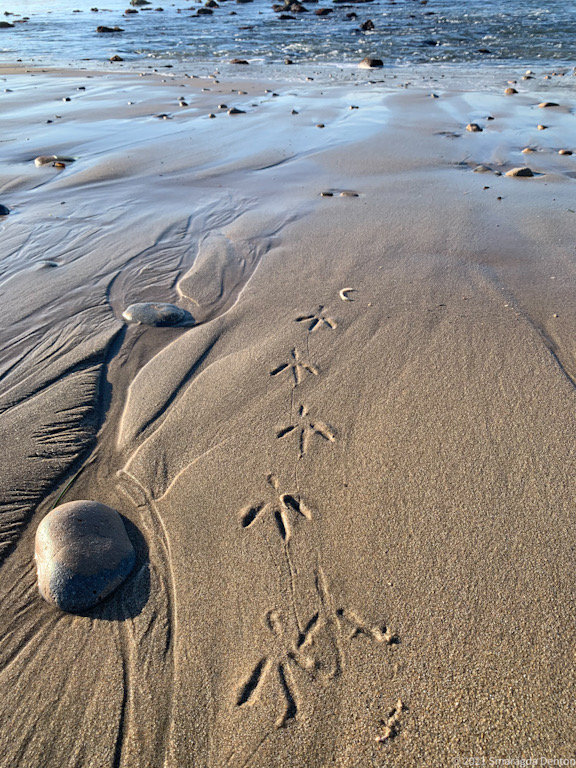
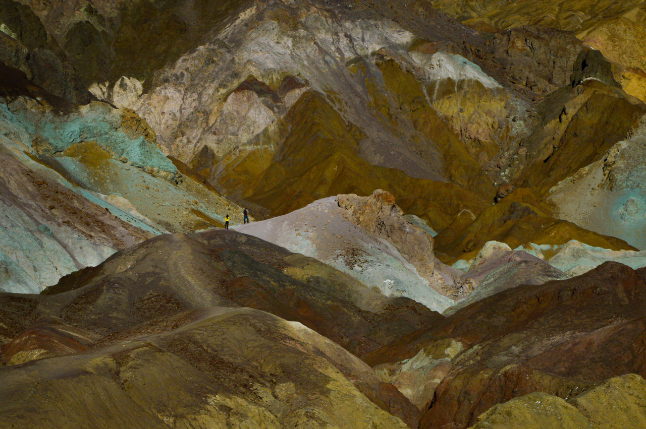
Hi Jane, this photo reminds me of some shots I took a long time ago using my Nikon F2 and Ilford film. I think the z patterns in the sand have been capture very nicely. The only thing is the sky to me seems to be noisy. I would consider selecting it and actually turning the clarity down and the sharpness down. It cleans that noise right up, and softens the clouds. Boy just the opposite of what Damon suggested... I truly like not having a figure in the photo I think you have a wonderful subject the fog lifting the play of light in the sand what more do you need and you even have a sense of scale as the trees give that. I would consider cropping from the sky and the right slightly to bring more attention to the z pattern in the sand and maybe increasing the contrast in the z pattern just slightly. |
Feb 11th |
| 60 |
Feb 21 |
Comment |
Hi Damon,
I'd like to see your Mac Noir filter version. Maybe what you can do - if you have a very large screen on your MAC is do a screen capture instead of exporting the photo if exporting corrupts the image. I believe you can save the captured image as a jpg. (I hate those halos too and fight them all the time). I think this photo captured the grandness of this cathedral and you have a very interesting sky. I don't think I would do anything more as I usually make things very dramatic in my black and and I think this is just right. I would maybe lighted the doors just a bit. |
Feb 11th |
| 60 |
Feb 21 |
Comment |
Hi Bernie,
I like the simplicity of this photo. The water on the flower petals and leaves make the photo feel very fresh. The leaves at the bottom and left make for very nice leading lines to the main subject the flower. I see that you used depth of field to blur the steps in the background and cropped them just enough to add a sense of place. About the only thing I can think of is to maybe blur the leaves in the port more - but then you might loose the detail in the flower. I like the first crop better because it placed the flower in the upper left 1/3 quadrant. I probably would have darkened the steps slightly and lowered the contrast to keep them from competing with the flower. Nice work! |
Feb 9th |
3 comments - 1 reply for Group 60
|
3 comments - 1 reply Total
|