|
| Group |
Round |
C/R |
Comment |
Date |
Image |
| 45 |
Jan 26 |
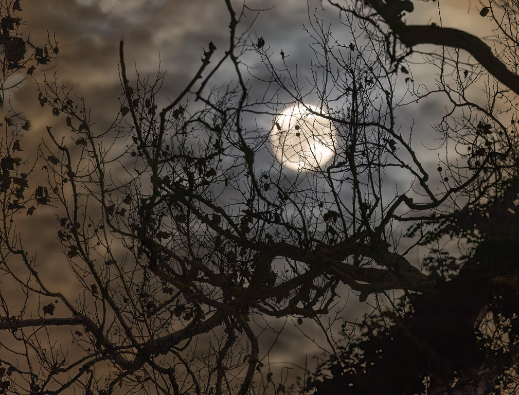
Reply |
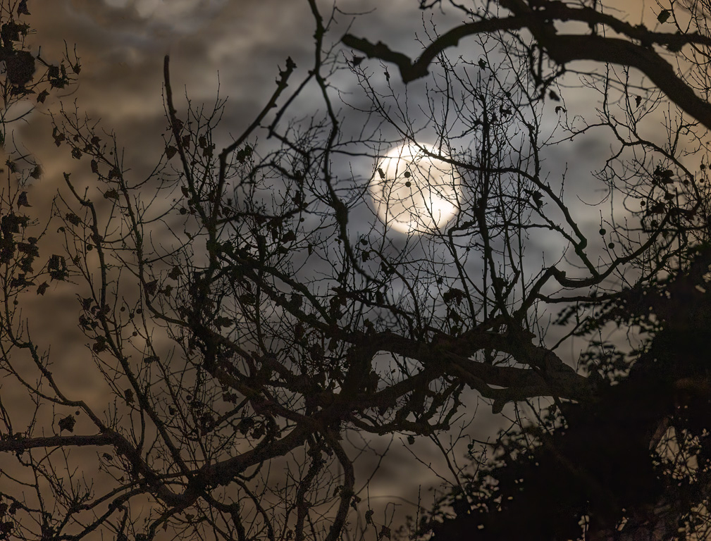
Yes, I probably should have used a smaller f-stop. I was already at 1/4 second, so I didn't want to go any slower. I could have pushed up the ISO to 1600 or maybe even 3200. Too many decisions on such a cold night with my fingers freezing! |
Jan 15th |
| 45 |
Jan 26 |
Reply |
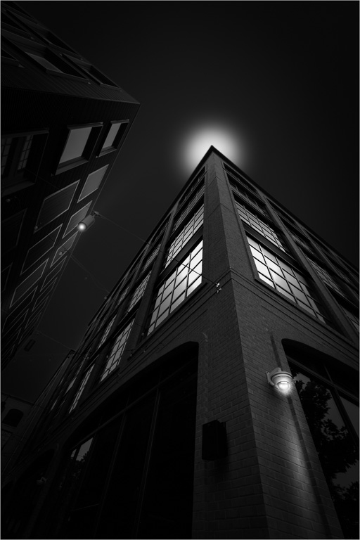
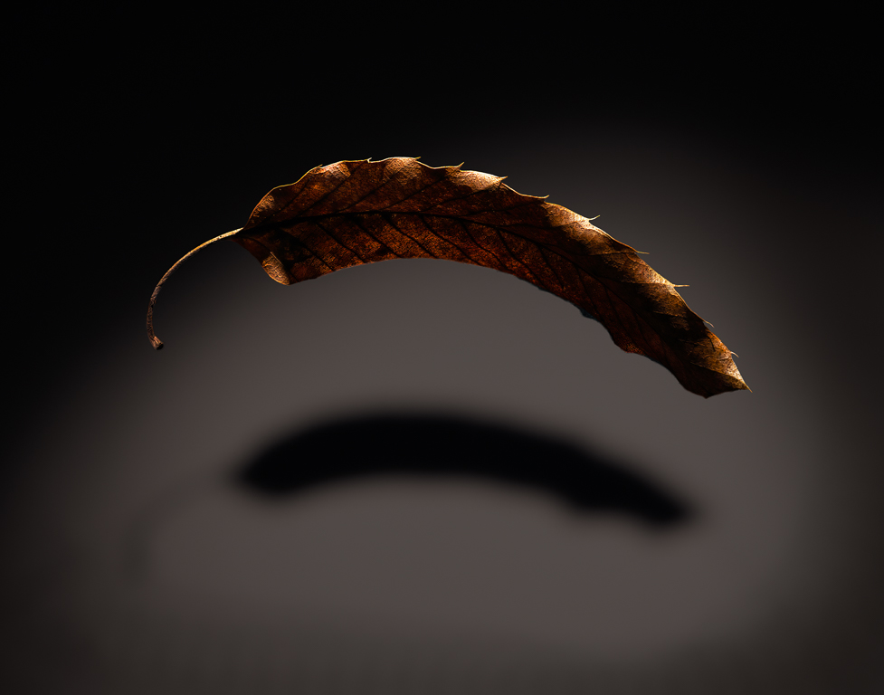
Thank you, Robert. The top left of the image bothered me, too, as if it needs something in the blank area. |
Jan 15th |
| 45 |
Jan 26 |
Comment |
I love this image! And, your decision to make the background pure black and to darken the ground beneath the alligator makes it stand out even more. My only suggestion would be to put a thin white line around the border (i.e., stroke) so one can tell where the left margin is. |
Jan 12th |
| 45 |
Jan 26 |
Reply |
Thank you, Cindy. I agree your comment to eliminate the out-of-focus branch. Instead of cropping it out, I used Photoshop's remove tool to eliminate the branch. |
Jan 12th |
 |
| 45 |
Jan 26 |
Comment |
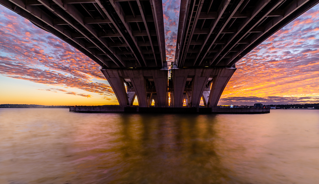
I like the contrast between the old and new as well as the misty overall look of the image. In some ways, I prefer the less-saturated look of the bridge in the original because it seems more realistic and blends in better with the misty buildings behind it. I might also suggest cropping a bit of the water from the bottom as the bright reflection calls for too much attention. |
Jan 5th |
| 45 |
Jan 26 |
Comment |
This is a wonderful image, and the fact that you took it handheld in jpeg format is remarkable. I like your explanation on how you used LR's calibration sliders to change hue and saturation. My only suggestion is to add a slight vignette to keep one's focus on the stream. |
Jan 4th |
| 45 |
Jan 26 |
Comment |
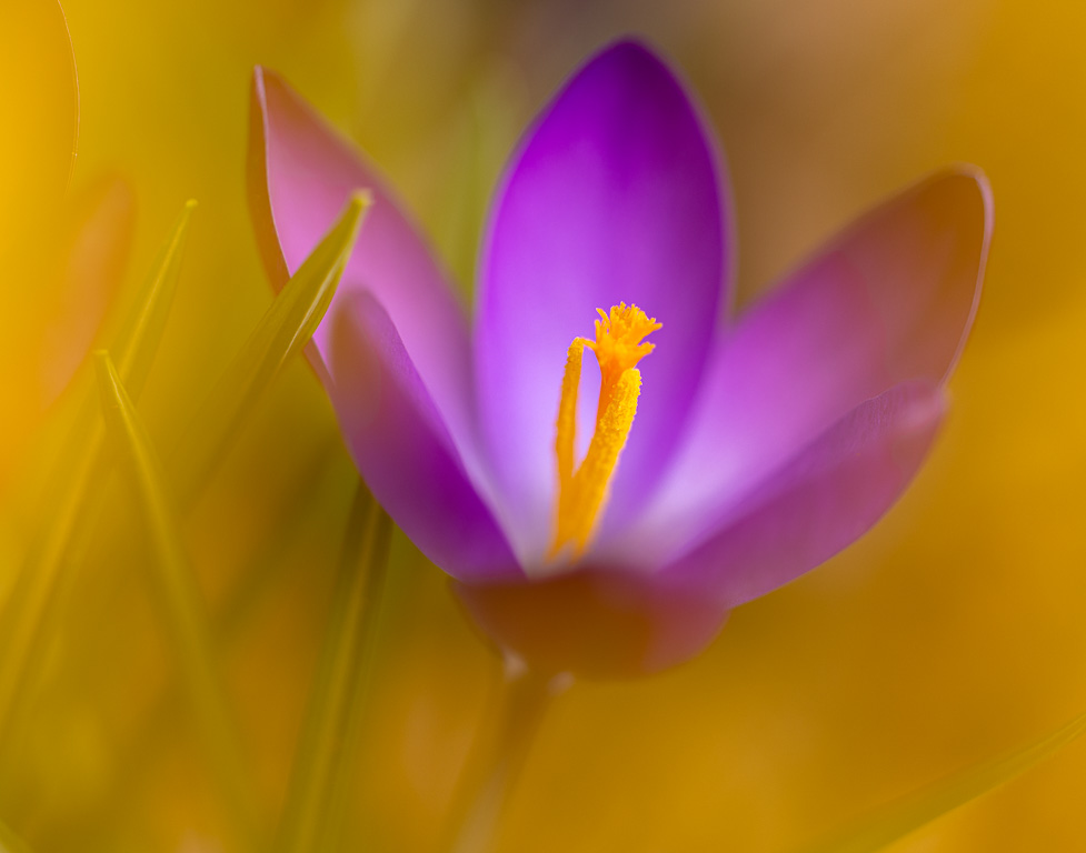
I like this image primarily because of the unusual wavy lines of the foreground structure that frame the fishing-port scene. The curves in the bridge also mimics the foreground's wavy lines. The orangish-red cast adds interests, too, although it seems a bit strong and unreal. |
Jan 2nd |
| 45 |
Jan 26 |
Comment |
This is a beautifully composed image! Starting with the simple, dark pews that lead my eyes into the bright candles - especially the red votive candles. The arches above nicely frame the center scene with the hanging lamp as a foreground subject. The silhouetted person also adds a sense of being there. And, everything is in sharp focus. I agree with removing the painting on the right as it only creates a distraction. Very well seen and post-processed! |
Jan 2nd |
5 comments - 3 replies for Group 45
|
| 65 |
Jan 26 |
Reply |
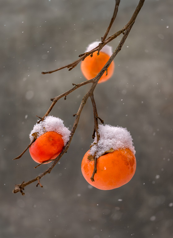
Thank you, Maria. I also found that the gray-and-white winter background simplified the colors and helped make the orange persimmons stand out. |
Jan 15th |
| 65 |
Jan 26 |
Reply |
Yes, I was quite fortunate to come outside when it was snowing and find this scene. |
Jan 15th |
| 65 |
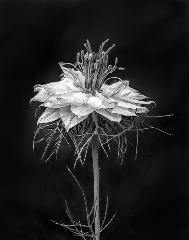
Jan 26 |
Comment |
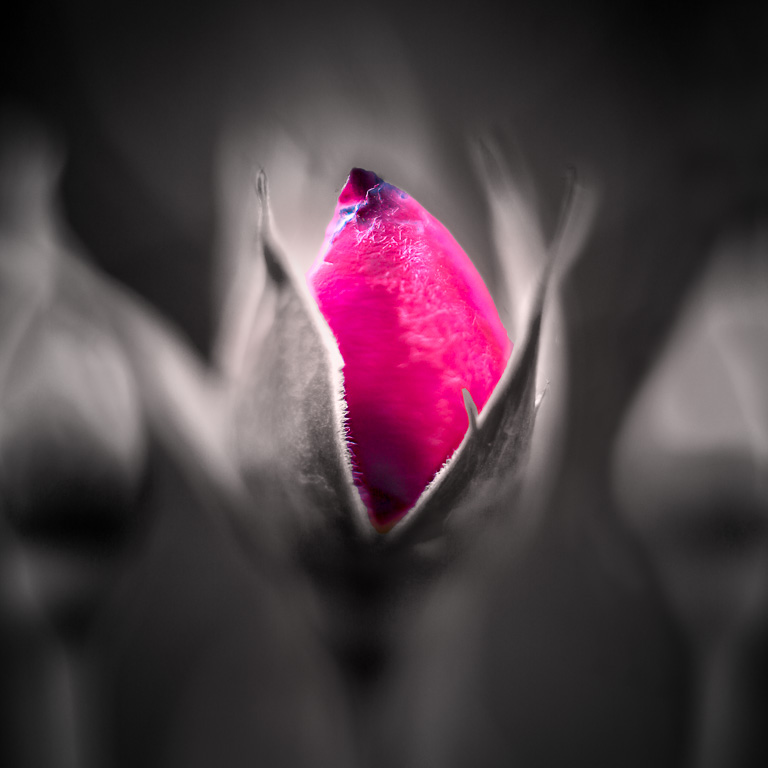
Both images are beautiful, but I much prefer the B&W because the image is all about the bright white contrasting with the black background with a smooth gradient connecting them. The white center seems to have a glow to it. The B&W image has a uniqueness to it. |
Jan 7th |
| 65 |
Jan 26 |
Reply |
Thank you, Denise. The early December snow was an unexpected benefit that enhanced the persimmons on the tree. I previously shot the persimmons before the snow, but I felt it needed something more. |
Jan 2nd |
| 65 |
Jan 26 |
Reply |
Thank you, Dick. I like your suggestion to crop off a bit from the bottom. |
Jan 2nd |
| 65 |
Jan 26 |
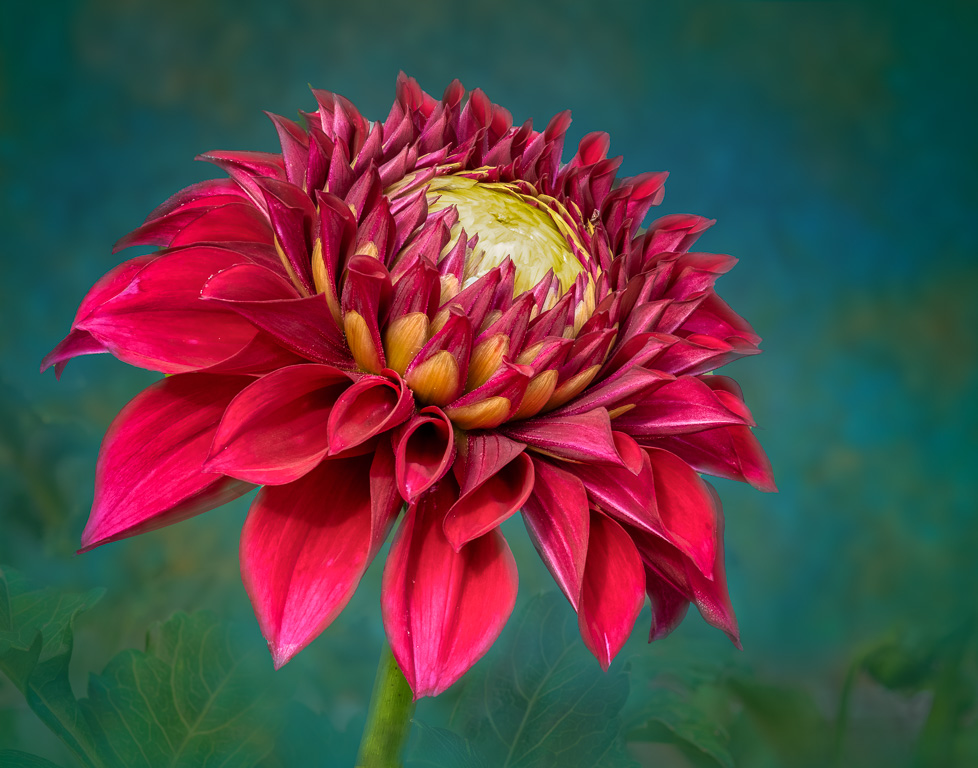
Comment |
Now that's a Christmas cactus! I was almost going to submit my shot of one this month, but I couldn't find a decent background other than black. And, mine drooped so badly. I also like your blurred green background. The red and green colors just says, "Christmas." Very nicely done! |
Jan 2nd |
| 65 |
Jan 26 |
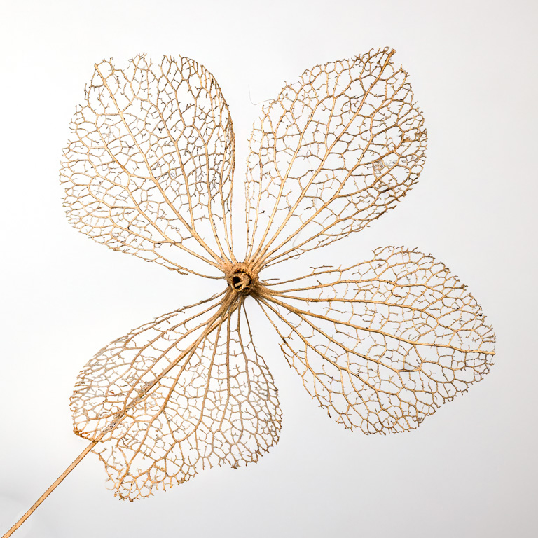
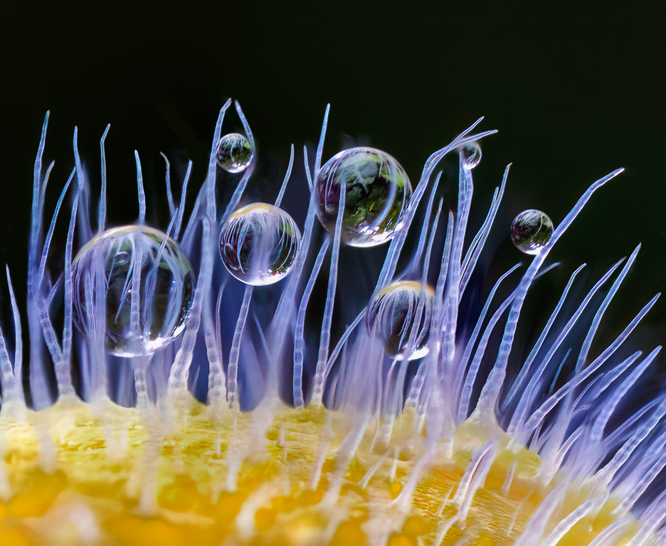
Comment |
You captured a beautiful light on this unusual lily pad standing on its side. The texture in the lily pad's underside and its reflection are clearly the main subjects. On that basis, I would suggest adding a dark gradient to the top of your image to darken those bright lily pads. Your removing the distracting flower improved the image significantly. |
Jan 2nd |
| 65 |
Jan 26 |
Comment |
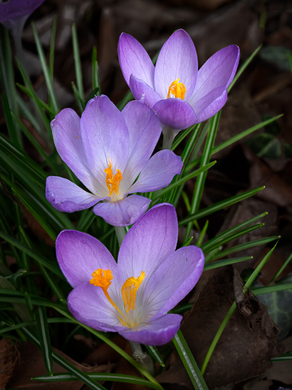
I like this image and admire your creativity! The zoom burst works well with these flowers because the dark green background make the bright orange flowers jump out, and the zoom blur gives the flowers some motion. Well done! |
Jan 2nd |
4 comments - 4 replies for Group 65
|
9 comments - 7 replies Total
|