|
| Group |
Round |
C/R |
Comment |
Date |
Image |
| 45 |
Jan 25 |
Reply |
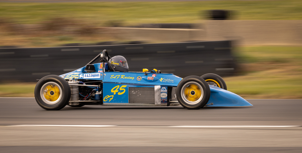
Thank you, Bai! As others have also suggested, the shadow areas could be lightened to bring out some details. I tried it, and it does enhance the overall image. |
Jan 25th |
| 45 |
Jan 25 |
Reply |
Thank you, Cindy! I will say that the images generated using this lens is not to everyone's taste. It is also difficult finding the right subject to shoot with this lens. Lots of trial and error. |
Jan 4th |
| 45 |
Jan 25 |
Comment |
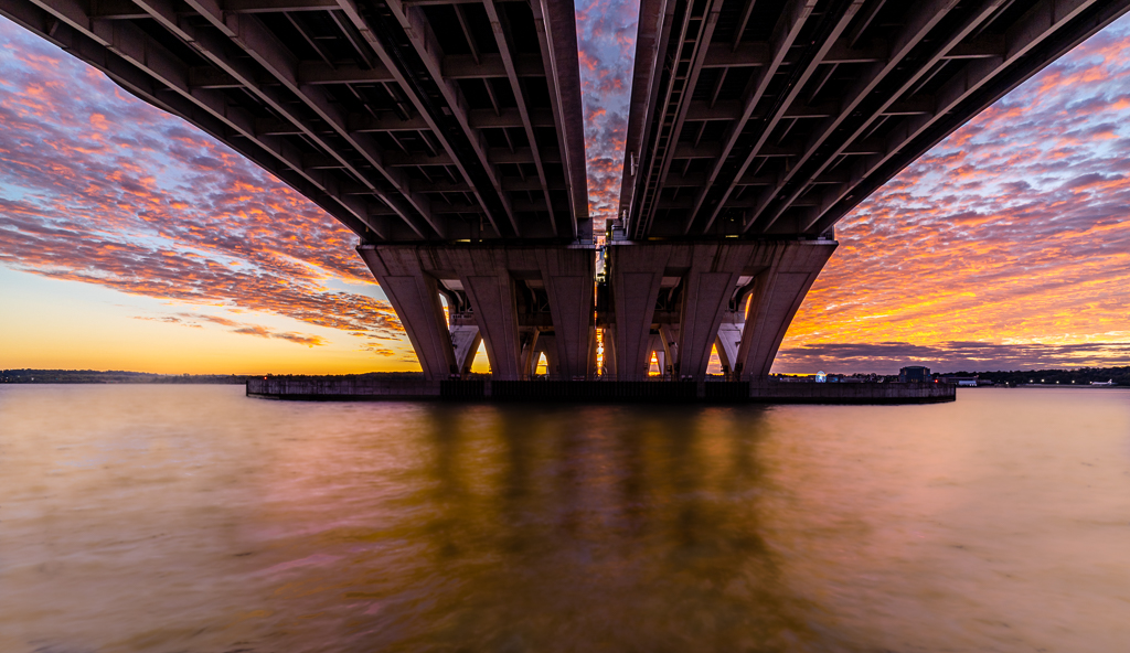
Phyllis, you captured a beautiful image with this one! I especially like the way the colorful sunrise backlights the diagonal pier supports and their reflection at the bottom. I also find the clear blue sky works in this image to create a simple framing of the pier with no distractions. Very nice! |
Jan 3rd |
| 45 |
Jan 25 |
Reply |
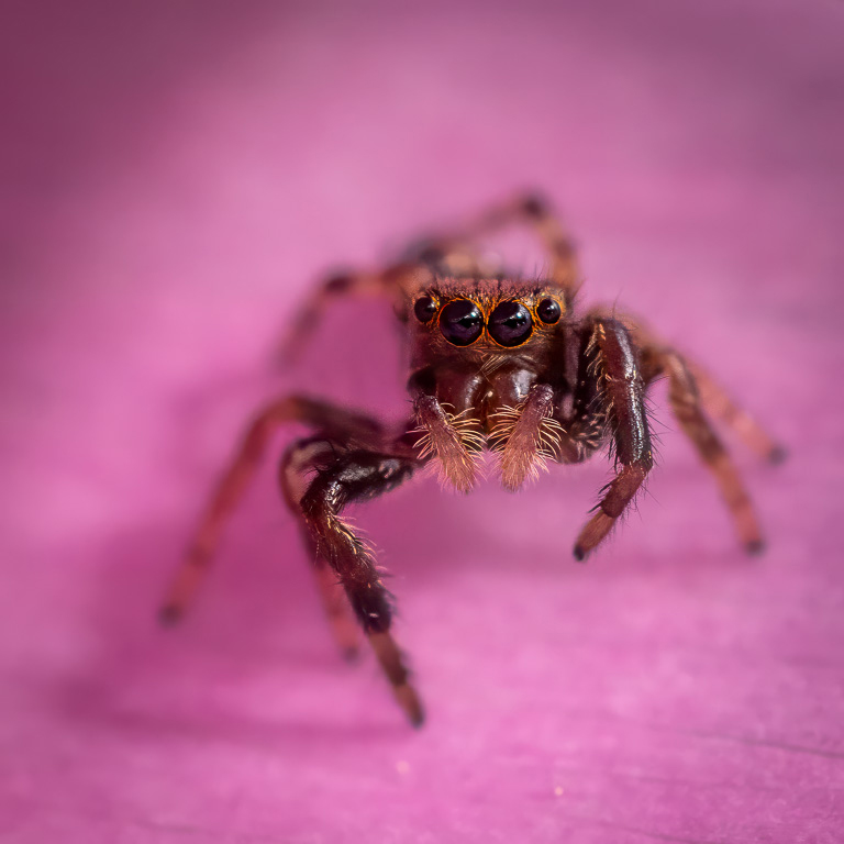
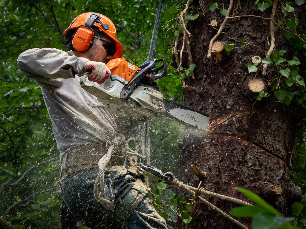
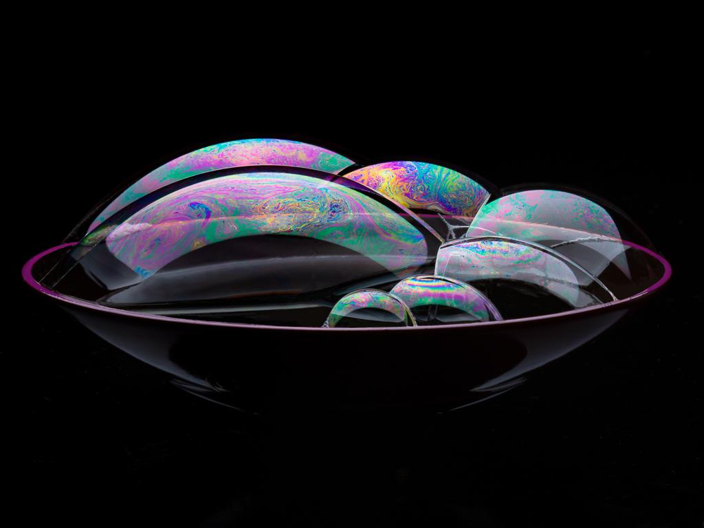
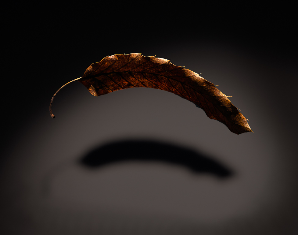
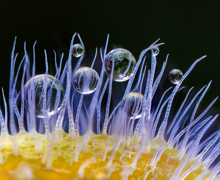
The main feature of the unmodified Helios 44-2 lens is its swirly bokeh. The lens is a copy of the Carl Zeiss Biotar 58mm f/2 lens which was also noted for its swirly bokeh, but was much more expensive. By reversing the front element, the bokeh gets even crazier as you can see. |
Jan 3rd |
| 45 |
Jan 25 |
Comment |
There is something uniquely appealing about this image. Maybe it's the close-up, abstract quality of the translucent wine glasses revealing a distorted, monochromatic scene with the red and blue colors of the flag punctuating the background and the lettering on the front glass grabbing your attention in the foreground. The image wouldn't have the same impact without the flag and lettering. |
Jan 2nd |
| 45 |
Jan 25 |
Comment |
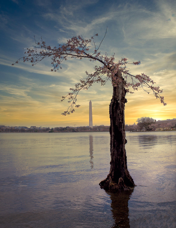
I like the image because it is so different with the tall structures sticking up from a traditional tea field. However, the color of the sky and clouds has a brownish cast that gives the overall image a strange feeling. Maybe it can be fixed with a simple white balance adjustment. |
Jan 2nd |
| 45 |
Jan 25 |
Comment |
Such a beautiful rustic scene! I agree that cropping out the sky was a good idea, and you created a lovely composition. The color seems a bit off though. For a sunrise, I would expect a more orange-ish hue rather than the brownish-yellow color. I tried fixing it, but because the file is a jpeg, I couldn't change the tint properly. If you still have the raw file, you might try adjusting the color or else convert the image to black and white. :-) |
Jan 2nd |
| 45 |
Jan 25 |
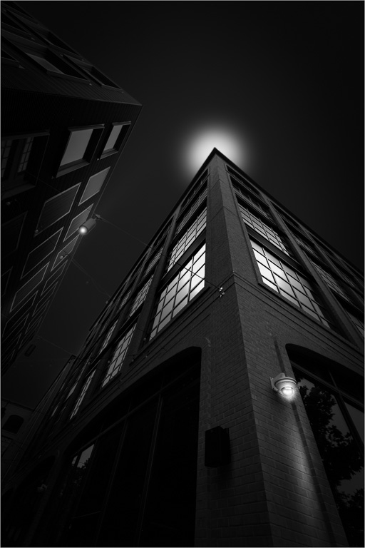
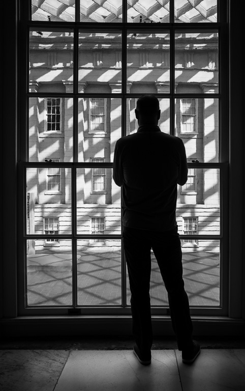
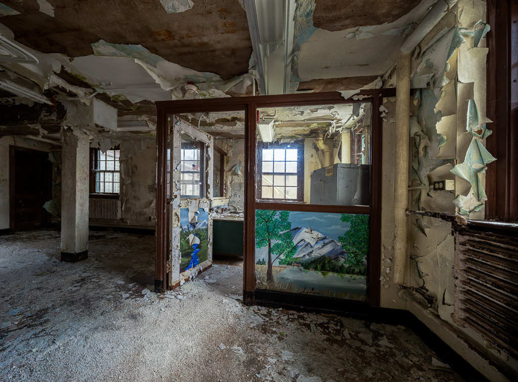
Comment |
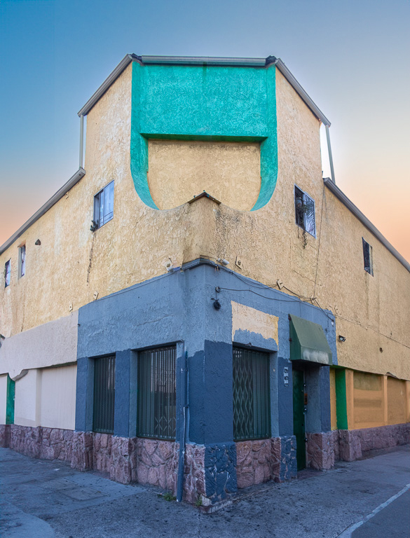
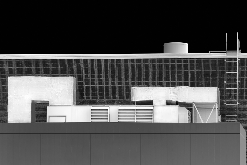
You captured a dramatic angle of the building to resemble an ocean liner between icebergs coming directly at you. Maybe that's what the architect intended, and you nailed it. Making the image B&W might make it even more dramatic. I would also try darkening the sky and adding more contrast to the building. I gave it a try. Maybe something like this? |
Jan 2nd |
 |
| 45 |
Jan 25 |
Comment |
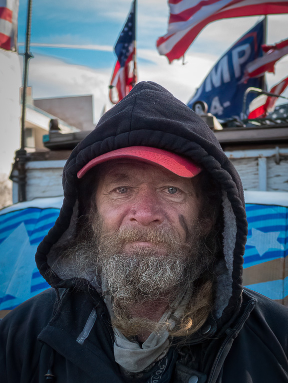
Happy new year, Charlie! I've never seen a caribou before much less gotten a shot of one. So I compliment you for getting this shot. I like the simple background with no distractions. The lighting is a bit harsh. I might try darkening the bright areas on the caribou and lightening its face around the eyes a wee bit. |
Jan 2nd |
| 45 |
Jan 25 |
Reply |
Thanks, Robert. I'll see what I can about bringing out some detail in the shadow areas. This old, Russian Helios 44-2 lens was relatively inexpensive and quite well used. I didn't use it much either. So I wasn't too worried if I messed up. |
Jan 2nd |
6 comments - 4 replies for Group 45
|
| 65 |
Jan 25 |
Reply |
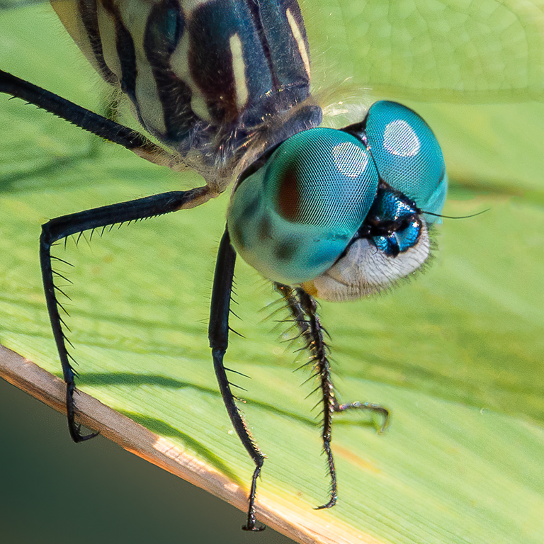
Yes, getting desired look from the Helios lens is difficult. And, finding the right subject is not easy. I have the same problem when using Lensbaby lenses. |
Jan 20th |
| 65 |
Jan 25 |
Reply |
Thank you for your feedback. Now that you mention it, I see what you mean about the original image. It does have more contrast and depth. Hmm... |
Jan 15th |
| 65 |
Jan 25 |
Reply |
Thank you, Diana. The same thing happened to me the first time I reversed the front element. After removing the top retaining ring, the front element was stuck, so I turned the lens upside down and tapped it on the table. Everything came out haphazardly, and it took me a couple tries putting all the parts back in in the correct manner. |
Jan 15th |
| 65 |
Jan 25 |
Reply |
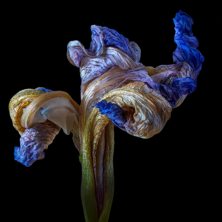
Thanks, Dick. Yes, it looks like it was taken with a Lensbaby...on steroids. |
Jan 15th |
| 65 |
Jan 25 |
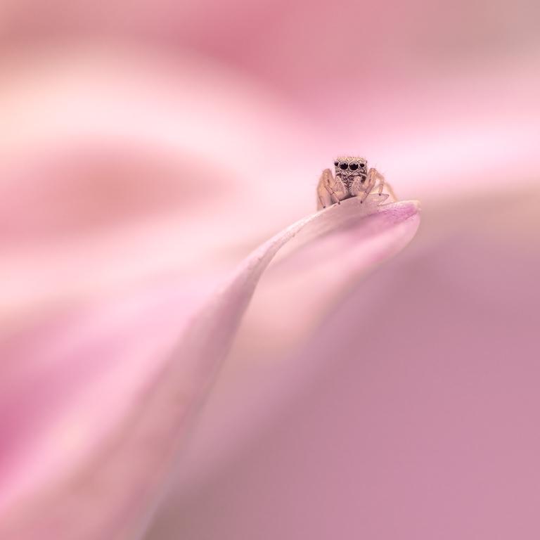
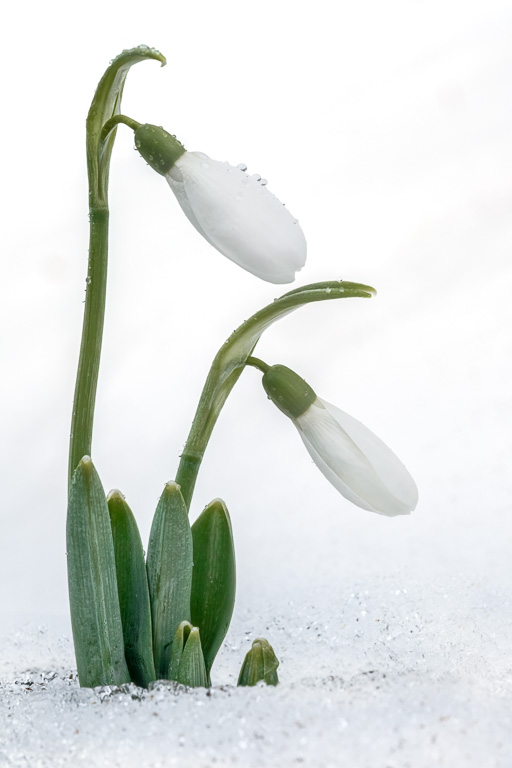
Comment |
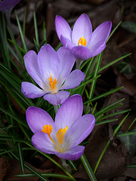
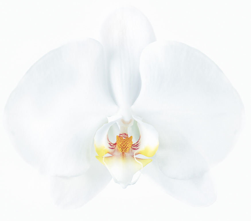
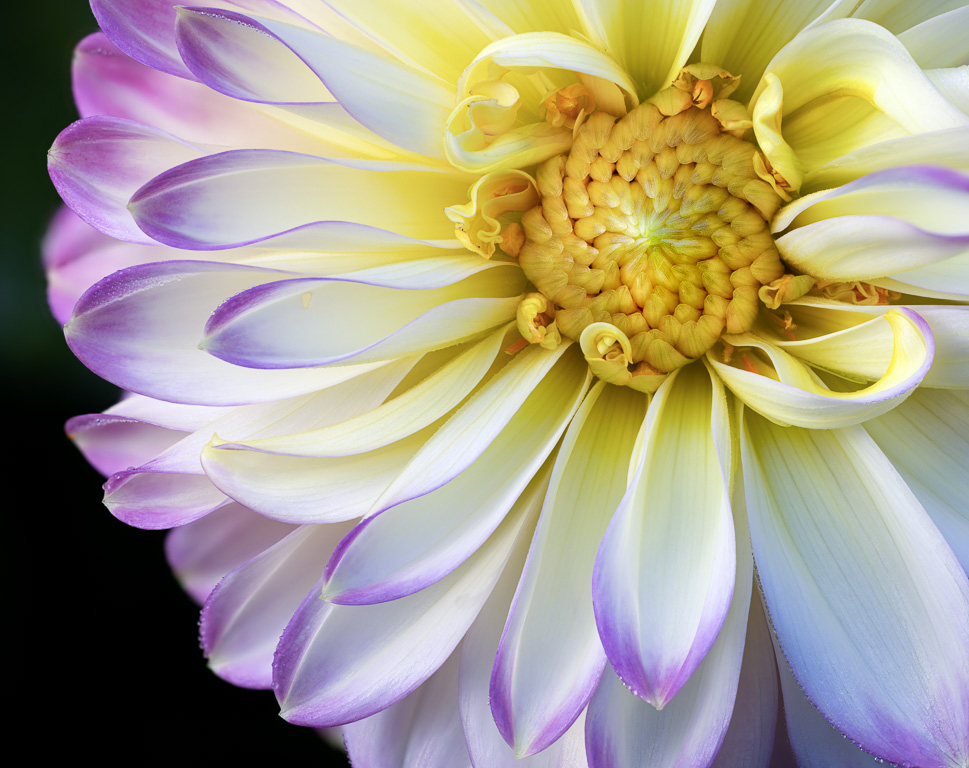
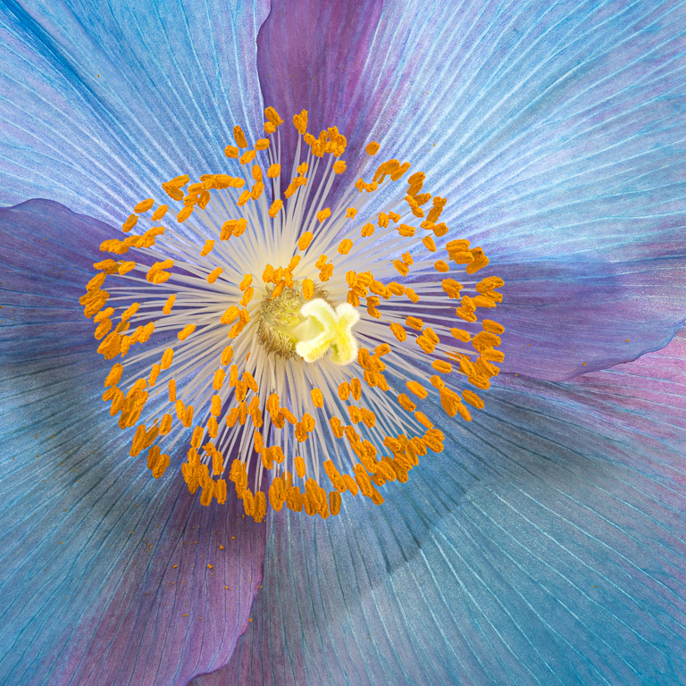
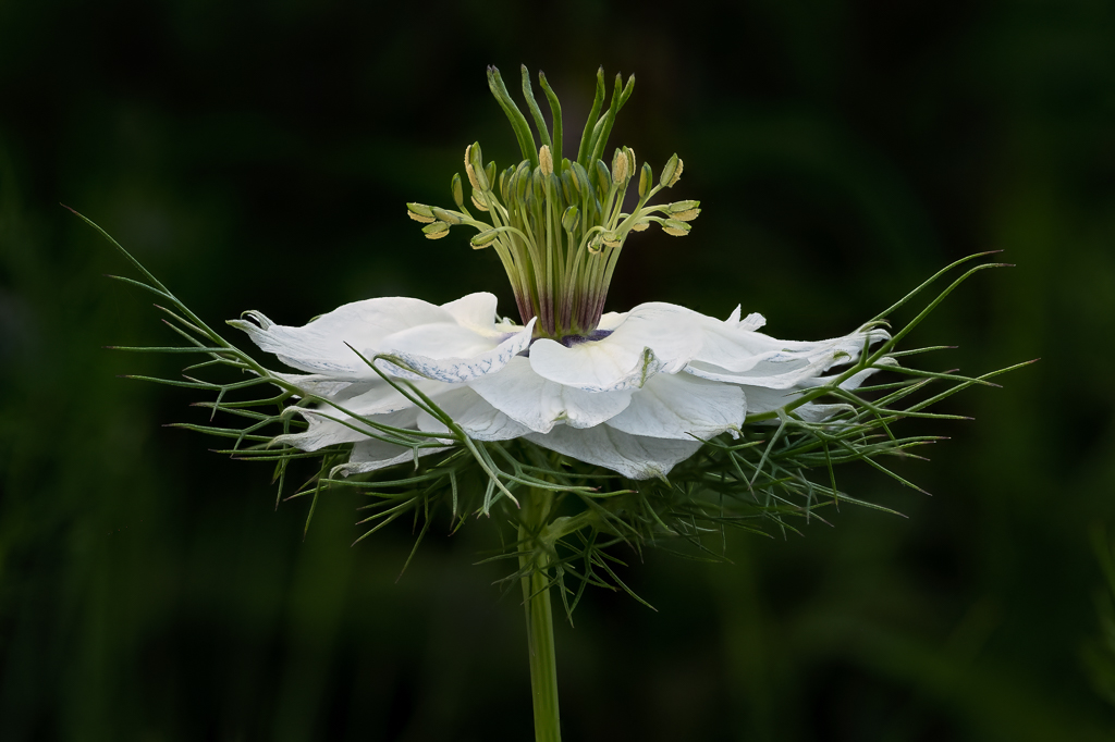
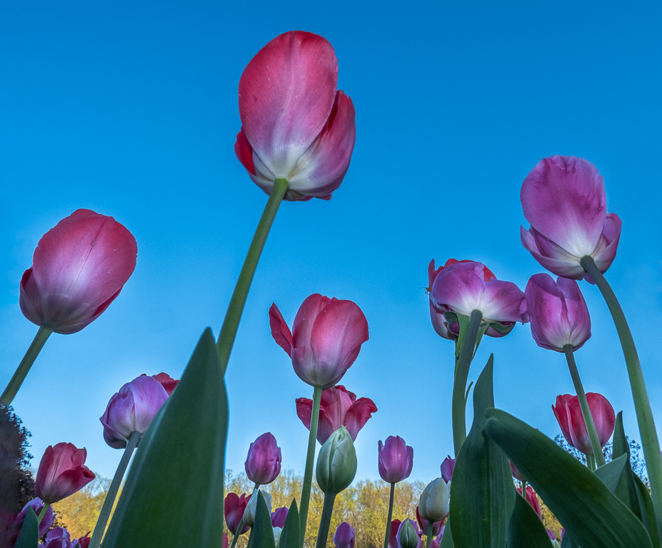
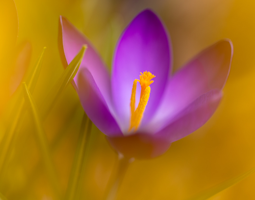
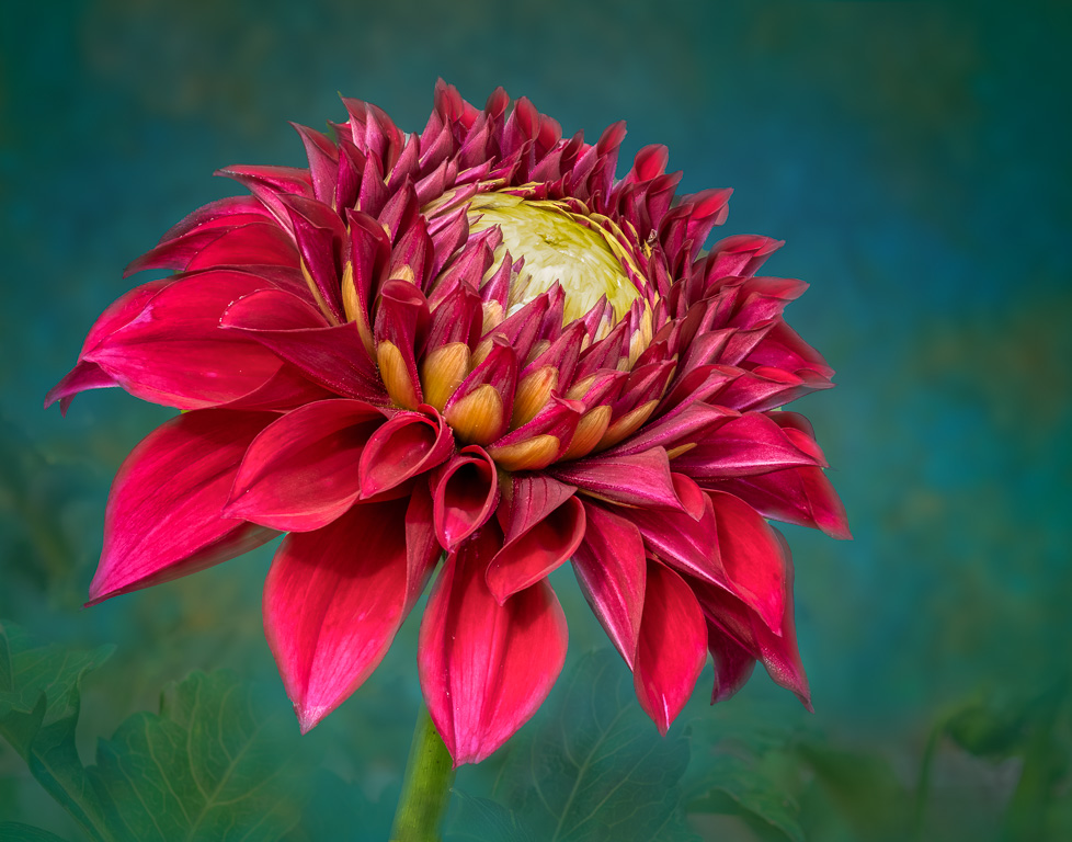
This is a simple and calming image with a certain softness about it. I especially like the few petals bending upwards that give the flower character and make the image unique. Nicely done! |
Jan 11th |
| 65 |
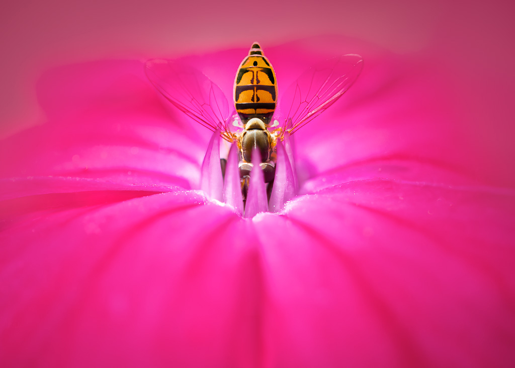
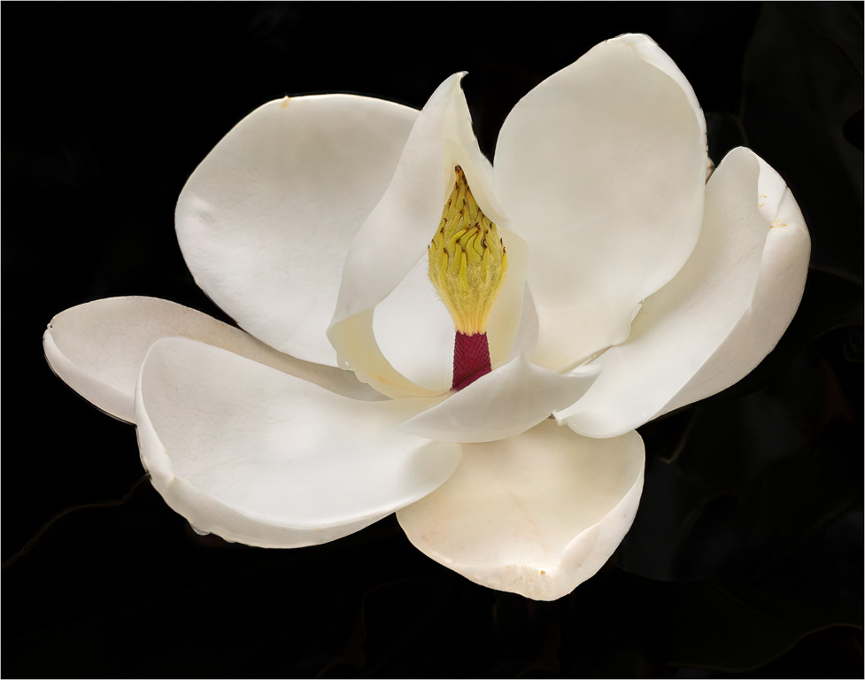
Jan 25 |
Comment |
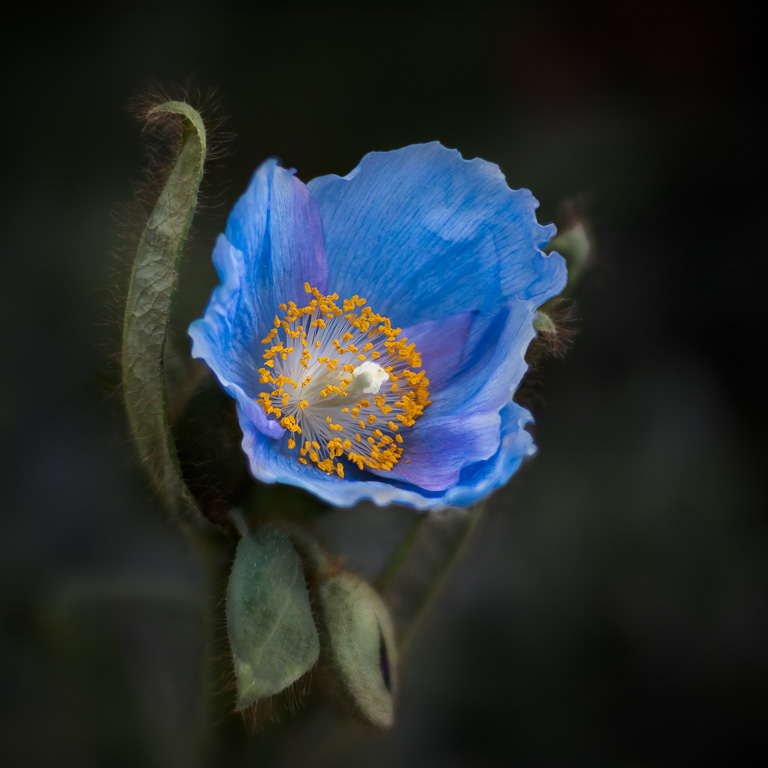
Hi, Maria. This is a beautiful shot of a water lily which, in my opinion, is one the most photogenic of all flowers. You captured its subtle colors perfectly. I agree with your toning down the highlights, but I think they can be toned down further, especially in the corners. And, since you removed some dark spots on the water lily, I still see a couple that you missed - one in the lower left petal and one in the center - just to be a little picky. |
Jan 11th |
| 65 |
Jan 25 |
Comment |
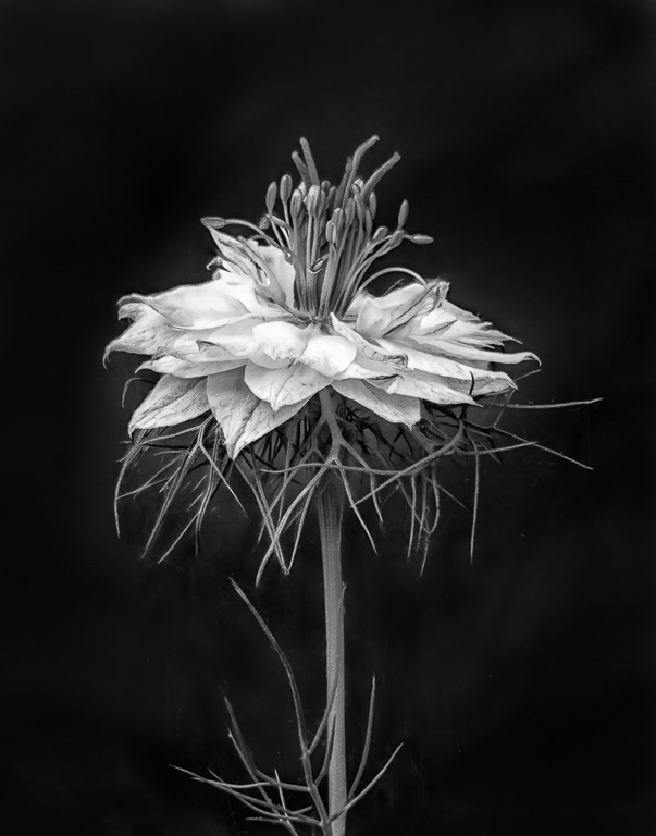
Interesting story about the skunk cabbage. To me, it's not a particularly pretty plant, but maybe to a botanist it is. You captured it well with focus stacking. If this were my image, I would darken the yellowish-brown background a tad to keep one's attention on the skunk cabbage. |
Jan 6th |
| 65 |
Jan 25 |
Comment |
Happy new year, Barbara! First, it's amazing that you were able to keep this plant thriving for 35 years. I remember those days when banks would give you gifts for opening an account. The lighting on the plant is beautiful. I wouldn't have guessed it was light painted. I'm curious why you cropped off the left and right sides. |
Jan 2nd |
4 comments - 4 replies for Group 65
|
10 comments - 8 replies Total
|