|
| Group |
Round |
C/R |
Comment |
Date |
Image |
| 45 |
Oct 24 |
Reply |
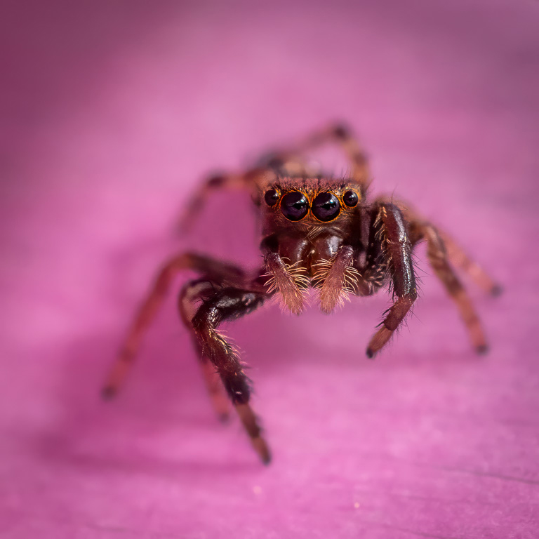
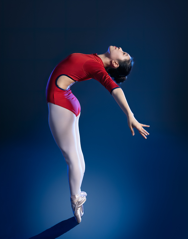
Thanks, Charlie. I, too, feel the head doesn't need to be shown as strongly as the lower part of the body because it isn't the focal point. There is a sense of anonymity this way. |
Oct 13th |
| 45 |
Oct 24 |
Reply |
Thanks, Cindy. It's a trade-off between lightening the background to make the head more distinct and making the background look unnatural. |
Oct 11th |
| 45 |
Oct 24 |
Comment |
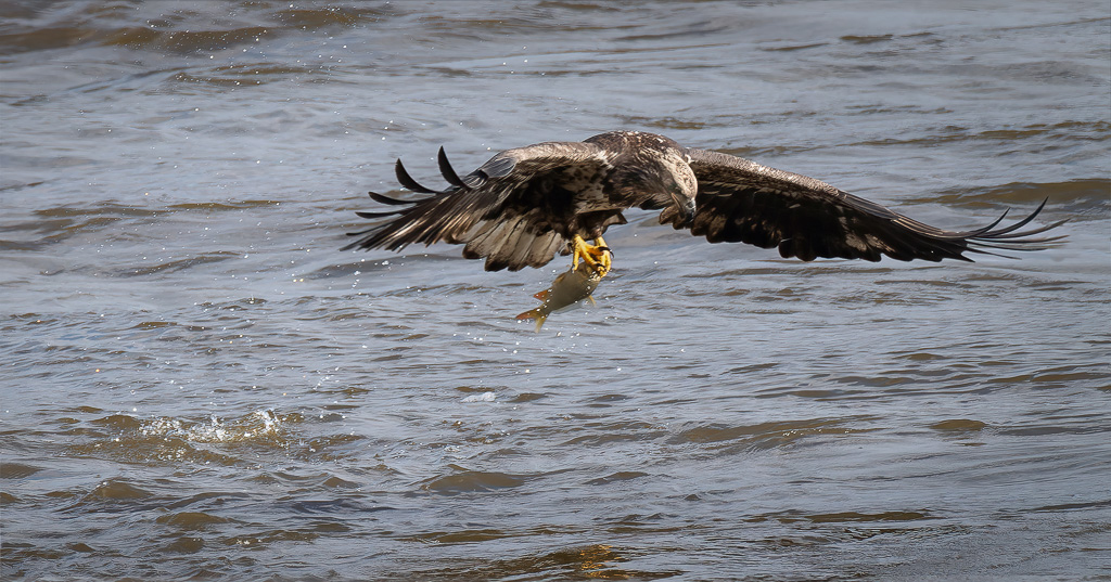
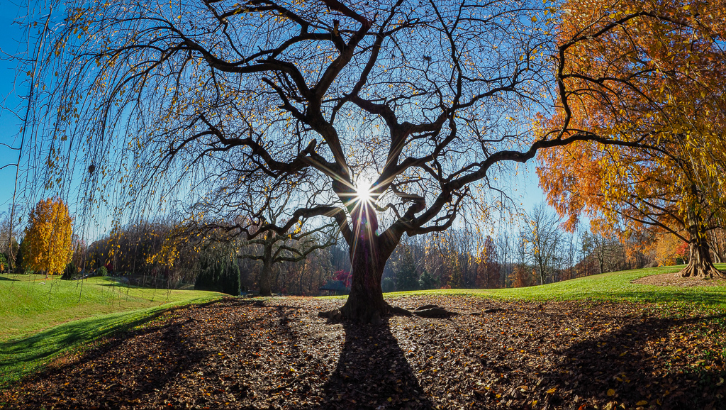
This is such an unusual landscape. It looks man-made. Photographically, I like your cropped composition and your decision to convert the image to black and white. The dark rocks create an S-curve flowing between the white rocks. The man definitely adds scale. I wonder if you could brighten his jacket so that he stands out more from the dark rocks? |
Oct 6th |
| 45 |
Oct 24 |
Comment |
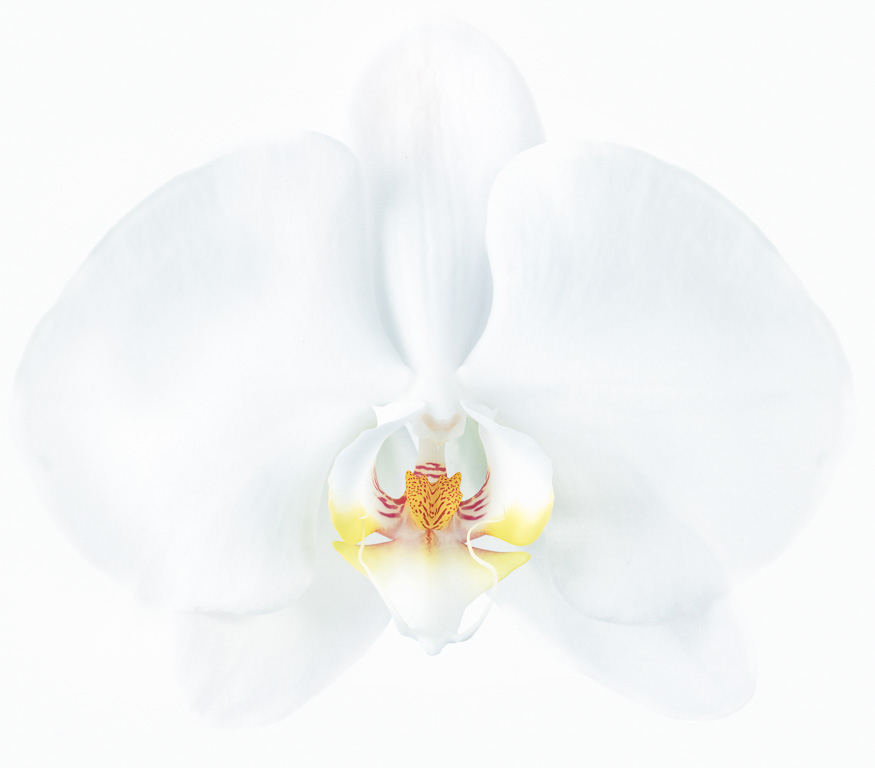
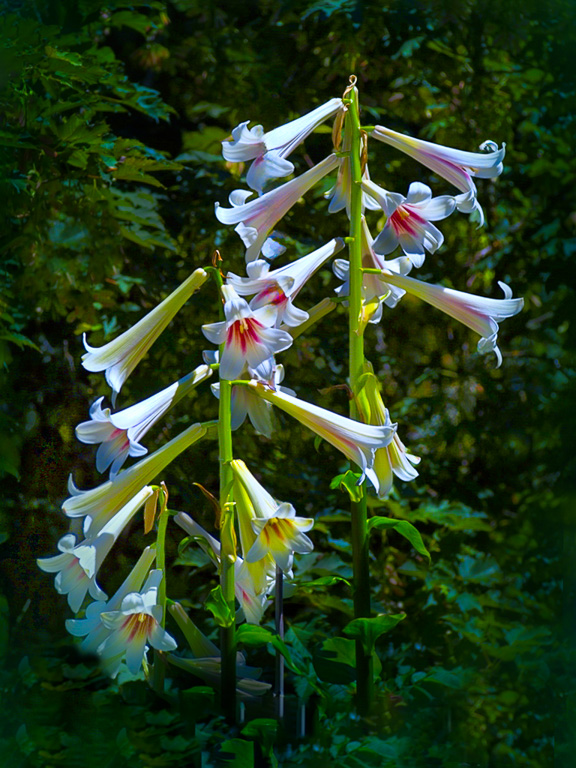
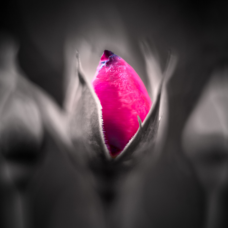
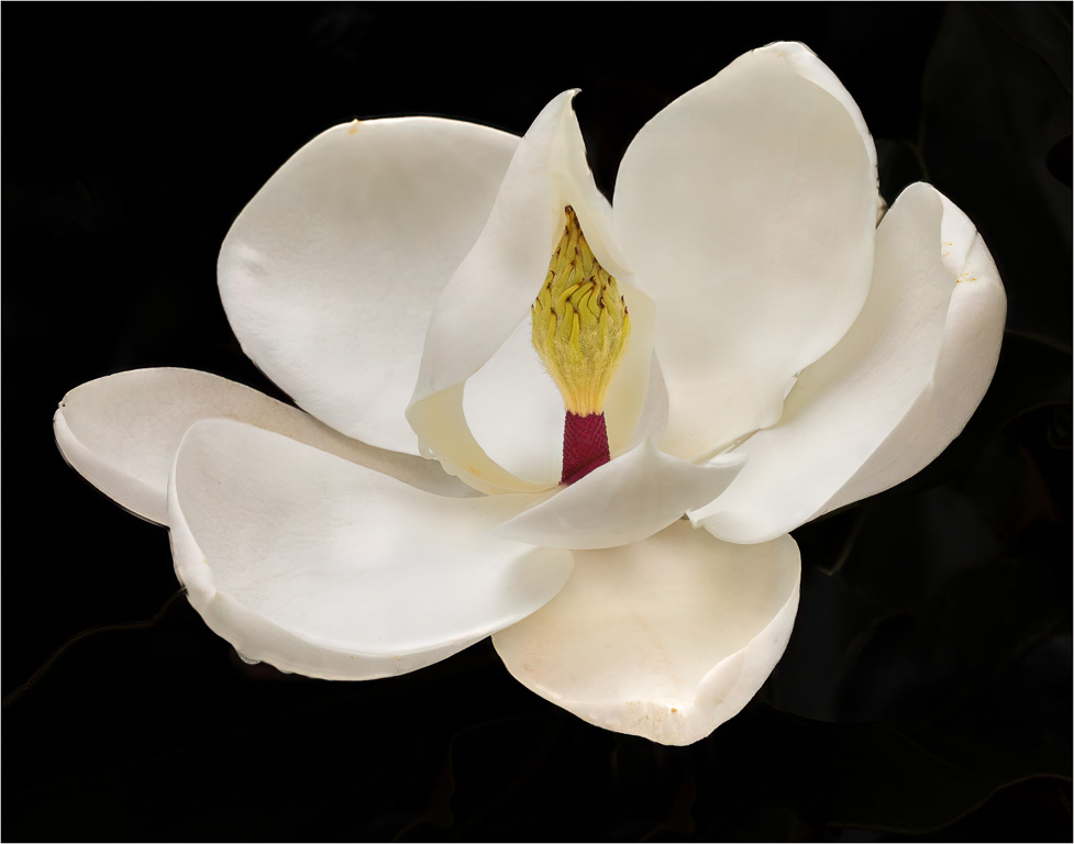
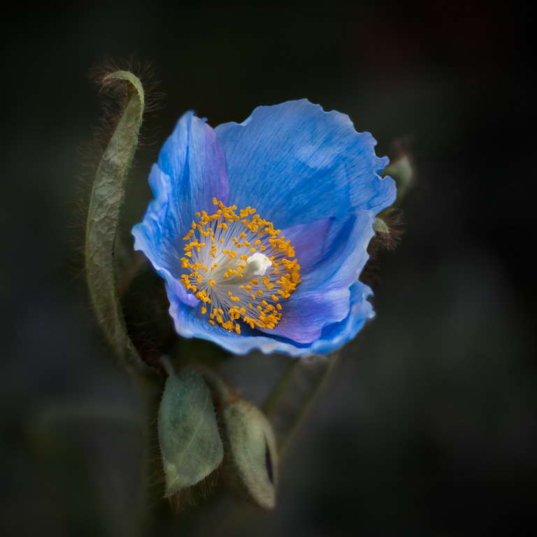
Wonderful image, Cindy! Usually when shooting more than one orchid in a bunch, some of them are out of focus. In this case, you captured most of petals in sharp focus. My only suggestion would be to lighten the lower portion of the orchid on the far left and remove the dark leaf covering part of it. |
Oct 2nd |
| 45 |
Oct 24 |
Comment |
It appears the edited image is the one labeled "Original." If so, I like how you toned down the bright yellow flowers. However, I might suggest you lighten the brown butterfly in the lower part of the image or crop it out altogether. |
Oct 2nd |
| 45 |
Oct 24 |
Comment |
Well Done, Charlie! Everything seems to be in focus and well composed. I like that the subject boat is white and catches my eye immediately with no other major distractions. I might suggest cropping a little off the left and right sides including the exit sign. |
Oct 2nd |
| 45 |
Oct 24 |
Comment |
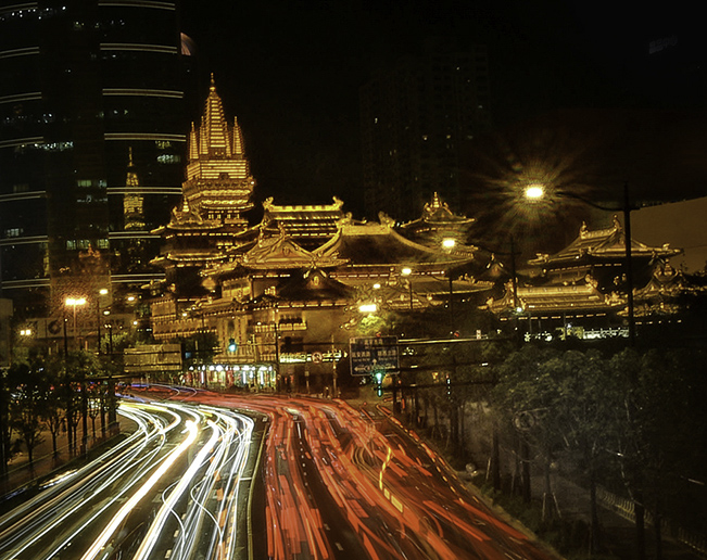
I agree with Robert's suggestion to crop the image. I would recommend cropping the car trails so that the upper 2/3rds of the image is the temple. Something like this. |
Oct 2nd |
 |
| 45 |
Oct 24 |
Reply |
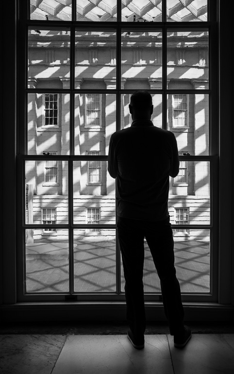
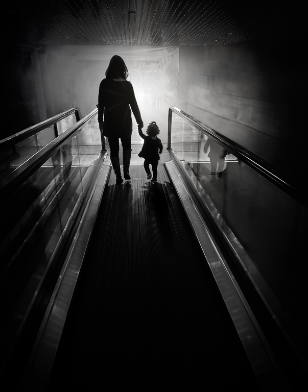
Thank you, Robert. I thought about doing it, but decided it didn't need it. Based on your comment, I took a stab at lightening the area behind the woman's head. It's rather subtle, but I think it improves the image. |
Oct 2nd |
 |
5 comments - 3 replies for Group 45
|
| 65 |
Oct 24 |
Reply |
Thank you, Shirley. In the end, I did crop off the bottom of the image about half of what Dick suggested. |
Oct 27th |
| 65 |
Oct 24 |
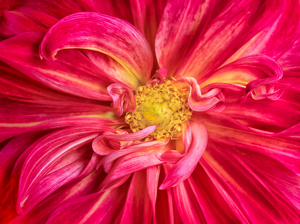
Reply |
Thank you, Maria. The vibrant red color and curving "arms" create a strong, abstract graphic image. |
Oct 26th |
| 65 |
Oct 24 |
Reply |
Thank you, Diana. I usually don't photograph hibiscuses because they don't speak to me. I was trying to "shoot through" the red petals when I saw this shot. It was purely serendipitous. |
Oct 16th |
| 65 |
Oct 24 |
Comment |
For a photo using slide film taken over 50 years ago, it's an amazing image! The exposure is perfect with no blown-out highlights or crushed shadows. The colors are still vibrant, and the details are quite sharp, but not clinically sharp like today's cameras. The overall image also has a filmic rendering to it. Thanks for sharing it!
|
Oct 13th |
| 65 |
Oct 24 |
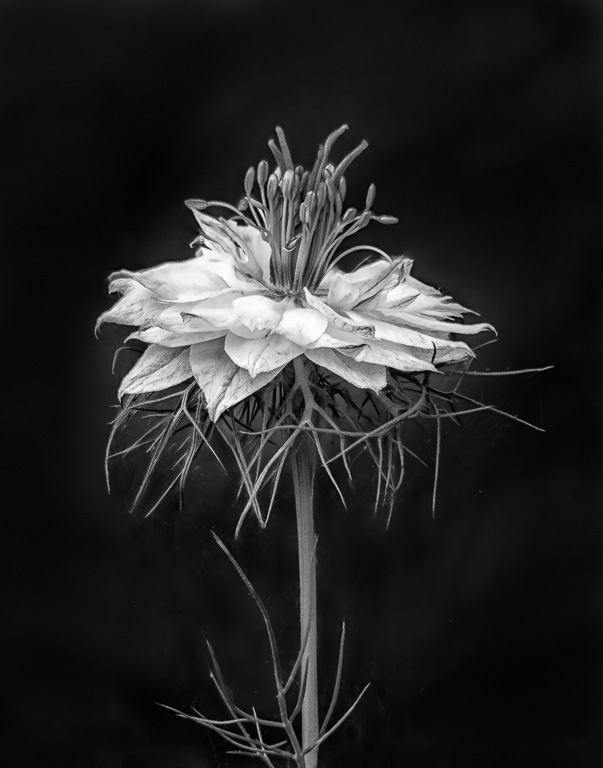
Comment |
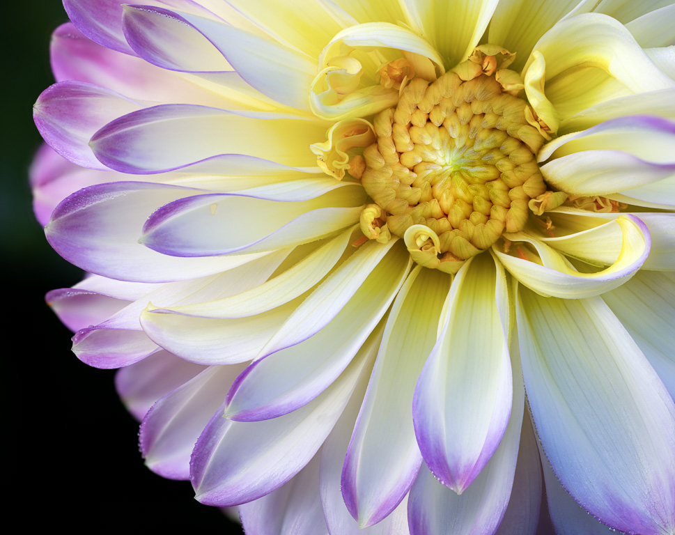
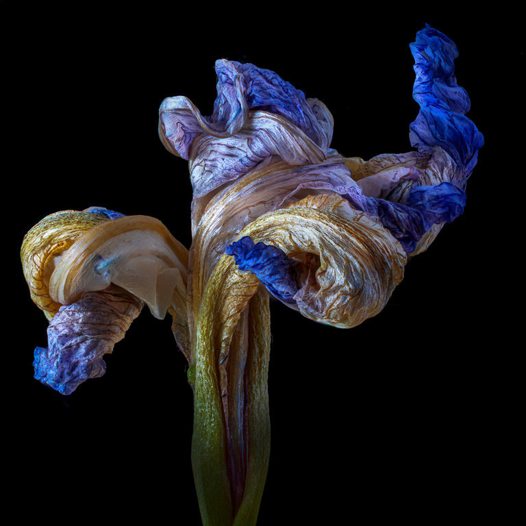
Such a sad looking dahlia. But, that's what wabi-sabi is all about...finding beauty in impermanence. |
Oct 12th |
| 65 |
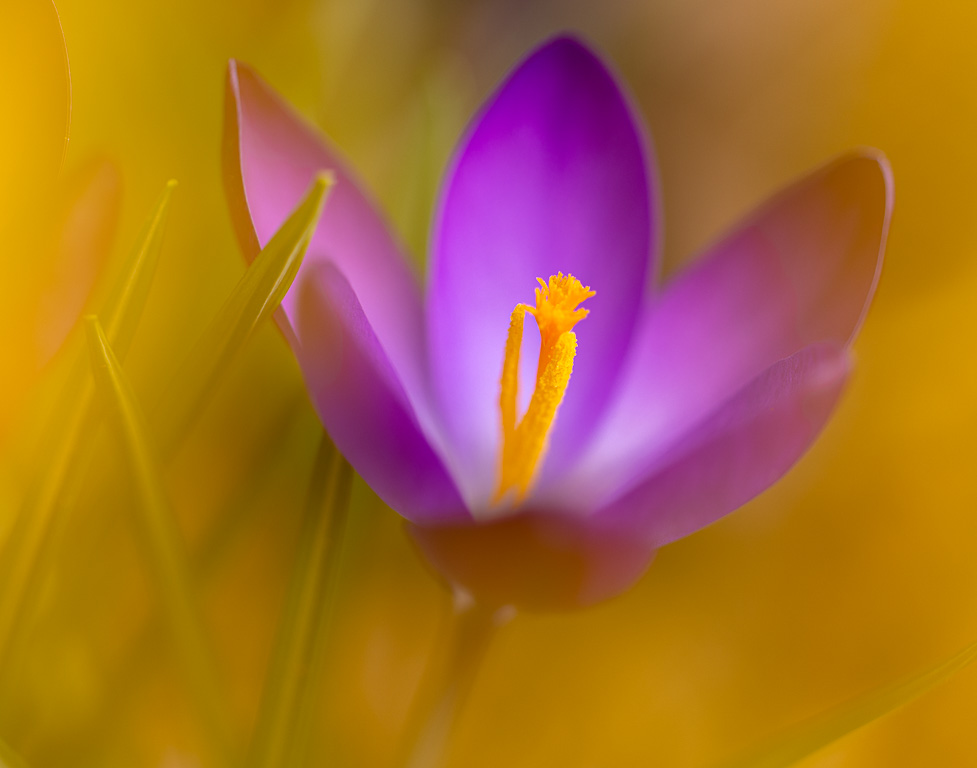
Oct 24 |
Reply |
Thank you, Barbara. I don't usually shoot abstract flower images, so I was quite pleased with this one. |
Oct 10th |
| 65 |
Oct 24 |
Reply |
Thank you, Dick. It's one of those shots you don't see with your eyes; only through the camera viewfinder. I've been debating whether to crop off the bottom as well. There is nothing of interest there, and it's blurry, but it seems to add a sense of balance to the image. |
Oct 7th |
| 65 |
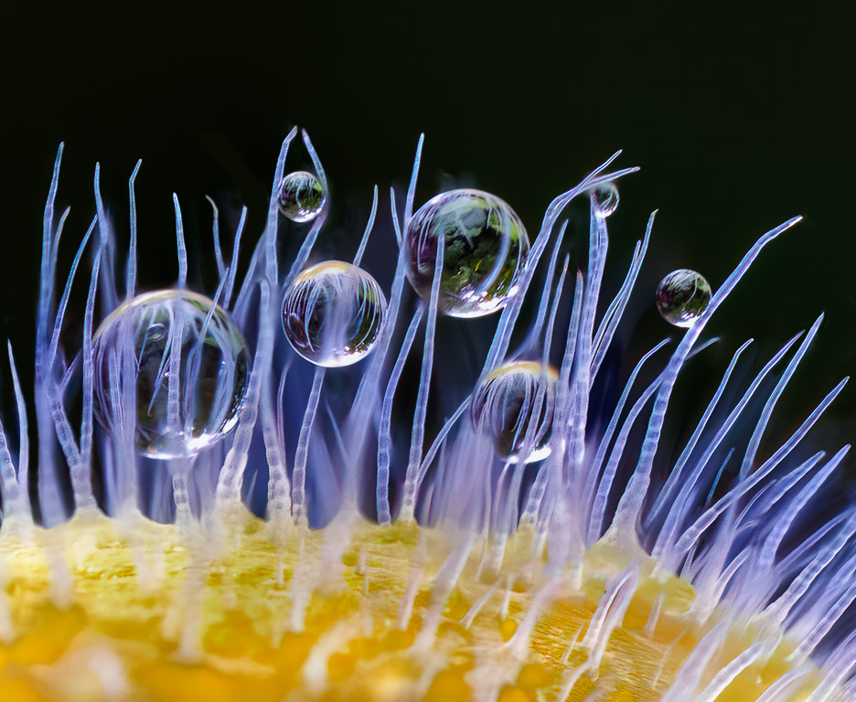
Oct 24 |
Comment |
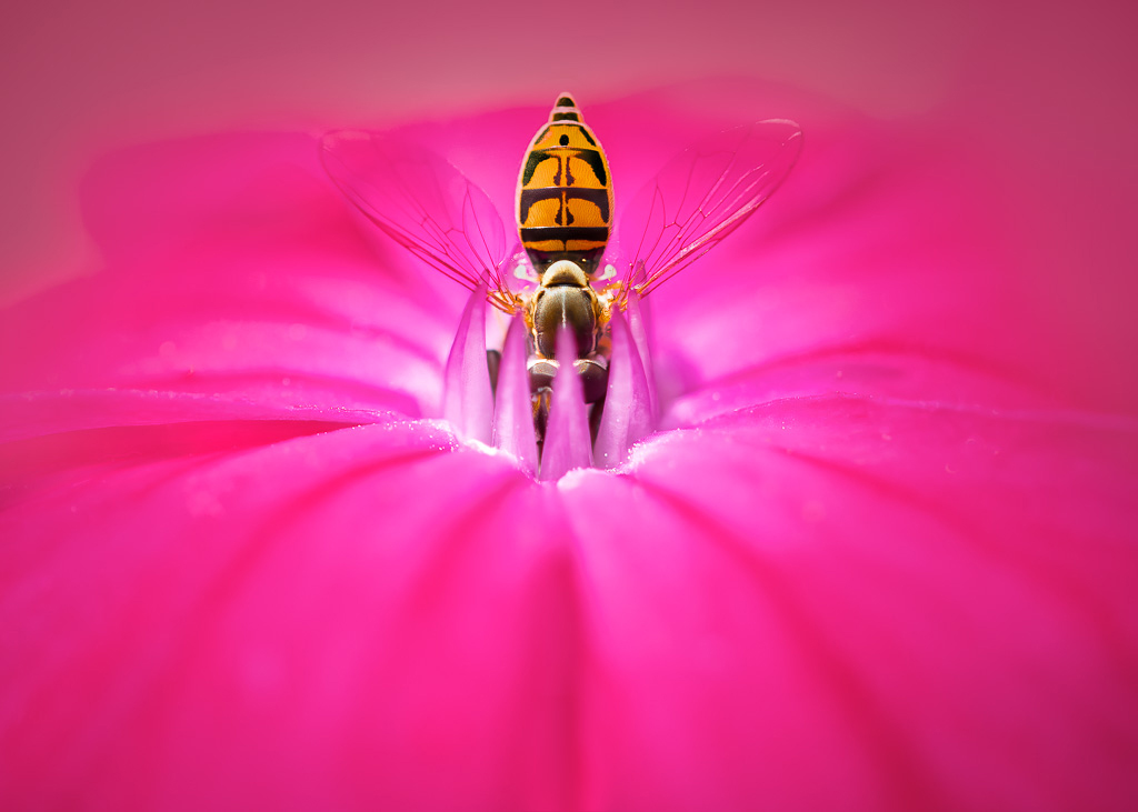
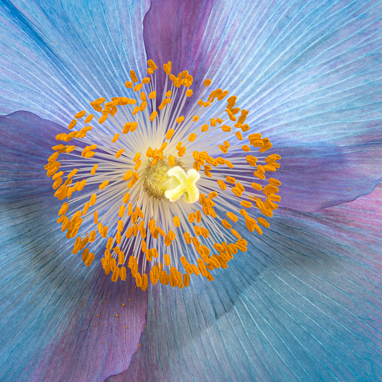
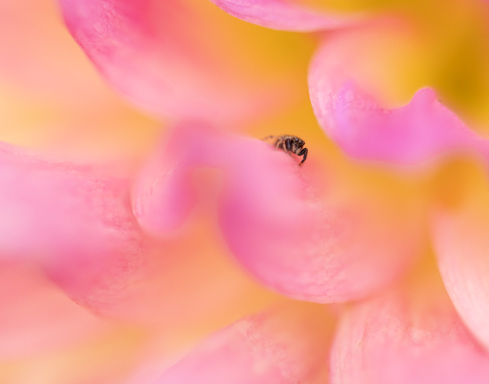
Well done, Maria! All the important orchid petals look to be in sharp focus and contrasts nicely with the smooth, blurred background. My only thought is that the bottom dark stems pulls my eye away from the lovely petals. If this were my image, I would crop off the lower part of the image to the top of the dark stem. |
Oct 5th |
| 65 |
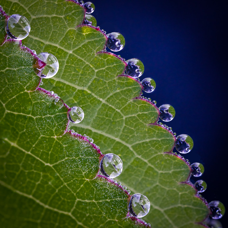
Oct 24 |
Comment |
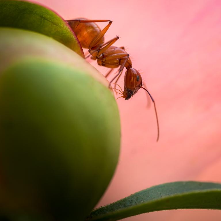
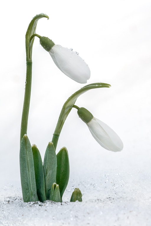
Great shot! I like the sharpness throughout the image. The rain drops really make the image with all their different sizes. The composition is also well-thought out. Did you desaturate the green leaves of the kale? |
Oct 3rd |
| 65 |
Oct 24 |
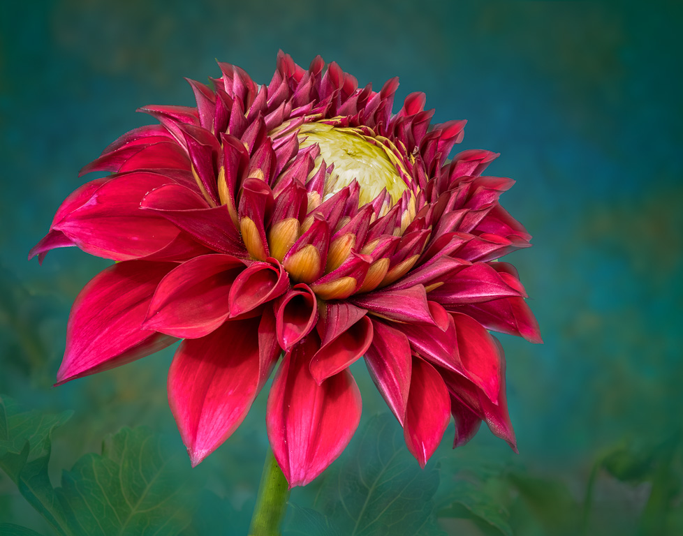
Comment |
Another great dahlia image! The entire dahlia looks sharp from front to back with a beautiful gradation of colors. I also like the little bit of yellow peeking out of the magenta petals. I would not change a thing. |
Oct 2nd |
5 comments - 5 replies for Group 65
|
10 comments - 8 replies Total
|