|
| Group |
Round |
C/R |
Comment |
Date |
Image |
| 5 |
Mar 24 |
Comment |
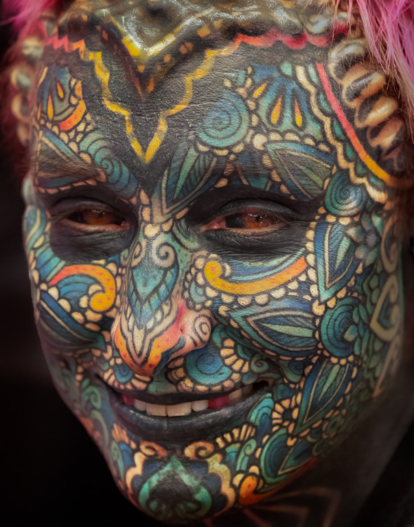
Hi, Pete, or maybe I should address you as "Oliver" here. Great tattoo images here and in Group 62. Although I prefer your B&W tattoo in Gr. 62, I also like the clean, natural portrait above. But, after looking at your image in Gr. 62, the face of the tattoo artist above seems so empty! btw, thank you for telling me about the Tattoo Expo. I went on Friday, and you can see my image in Group 45. |
Mar 3rd |
1 comment - 0 replies for Group 5
|
| 45 |
Mar 24 |
Reply |
Thank you, Bai. Increasing saturation does help. |
Mar 28th |
| 45 |
Mar 24 |
Reply |
Absolutely, they are permanent tattoos; not just face painting. They wouldn't have been allowed in the expo as tattoo artists if their tattoos were fake. |
Mar 11th |
| 45 |
Mar 24 |
Reply |
Thank you, Robert. I, too, have no desire to get a tattoo and wonder why people do it, especially to this extent. The tattoo lady's partner also had a full-face tattoo, but I didn't feel comfortable asking him if I could take his photo. He didn't look as friendly. |
Mar 11th |
| 45 |
Mar 24 |
Reply |
Thanks, Charlie. Yes, I will modify my revised image using your comments. |
Mar 7th |
| 45 |
Mar 24 |
Reply |
Yes, great photography! It's almost too easy when all the tattoo artists and their customers are eager to have their pictures taken! |
Mar 6th |
| 45 |
Mar 24 |
Reply |
Yes, I agree. Why would anyone make such a permanent change to their face? I re-edited the image and included the chin. I also noticed the bumps on the upper portion of her face that I hadn't noticed before. So, I included those in this version. I'm not sure which version I like better. Any thoughts? |
Mar 5th |
 |
| 45 |
Mar 24 |
Comment |
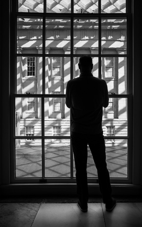
Very effective job using HDR to bring out the details in the shadows and reduce highlights in the background buildings and sky. It looks very natural. The slight tilt even adds a little interest to the scene. |
Mar 3rd |
| 45 |
Mar 24 |
Reply |
Yes, a tad. But, you gave me incentive to play around with my image some more. Thanks! |
Mar 3rd |
| 45 |
Mar 24 |
Reply |
Thank you for your comments, Pete! I would like to see how you edited the image, but, for some reason, your edited image didn't get posted. Even without seeing your edits, I agree the image does need more contrast. |
Mar 3rd |
| 45 |
Mar 24 |
Comment |
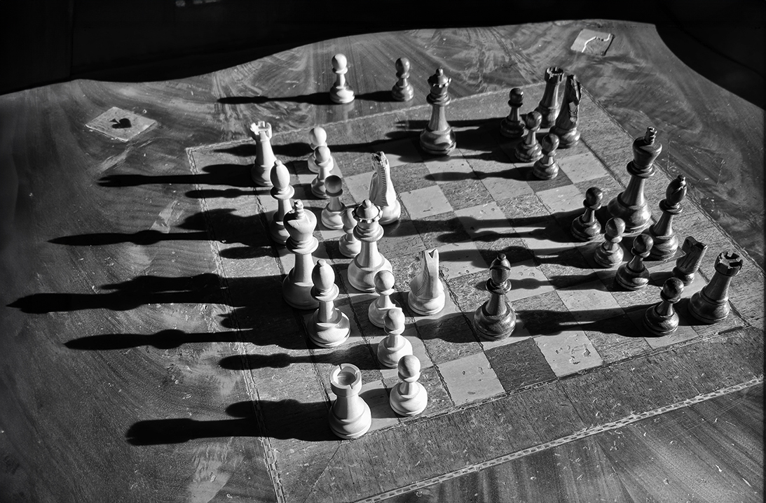
I like this shot because of the shadows cast by the chess pieces. And, converting it to B&W brings out the contrast. My only suggestion would be to not cut off the shadows on the left side. If you use Photoshop, you can easily complete the shadows using the Generative Expand crop feature. |
Mar 2nd |
 |
| 45 |
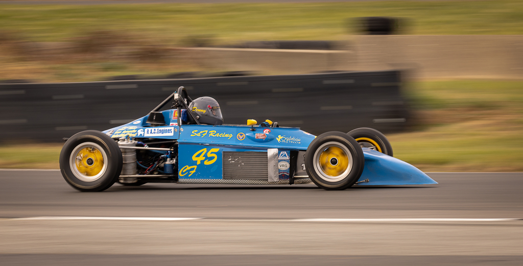
Mar 24 |
Comment |
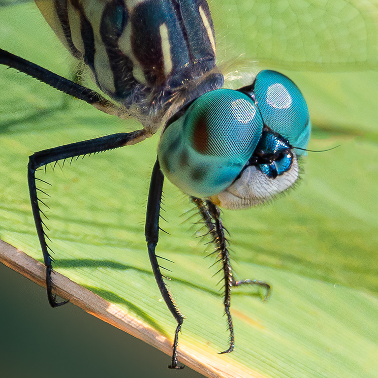
I like this shot a lot, Charlie. It's amazing what denoise software can do with high ISO images these days. You'd never guess this was shot at ISO 20,000. And, with a shutter speed of 1/32,000, you certainly wouldn't get any motion blur. When cropping, especially full-head shots, I try to keep the margins about equal on the left, right and top. I like the square crop you did, but I would add back a little more space to the left side. |
Mar 2nd |
| 45 |
Mar 24 |
Comment |
This is a wonderful seascape with dramatic waves crashing against the building. To me, the most interesting part of the image are the crashing waves. The original image seems to capture the waves better. By lightening the waves, you seem to lose all the interesting detail. I played around with your original image to lighten the shadows in the dark center and add contrast to the water. |
Mar 2nd |
 |
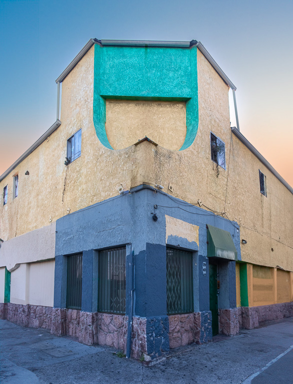
| 45 |
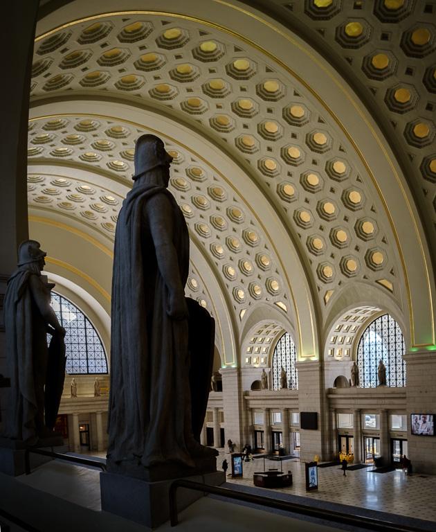
Mar 24 |
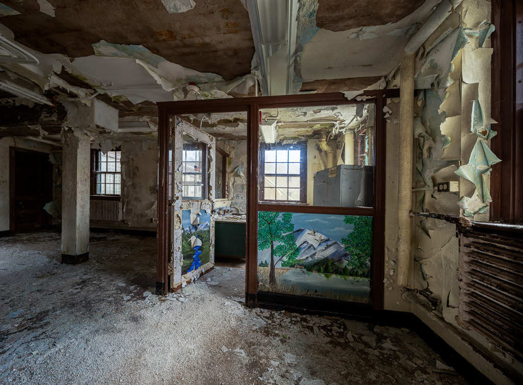
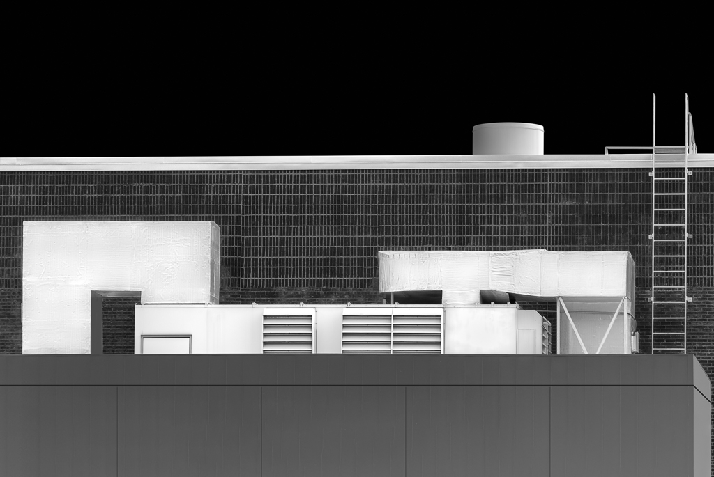
Comment |
Who would have thought this was a sewage station? At first glance, I thought it was a palace or monastery. Very nicely captured with good symmetry and lots of interesting detail in sharp focus. |
Mar 2nd |
| 45 |
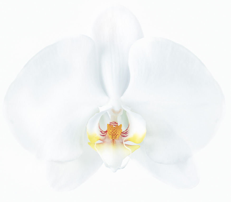
Mar 24 |
Comment |
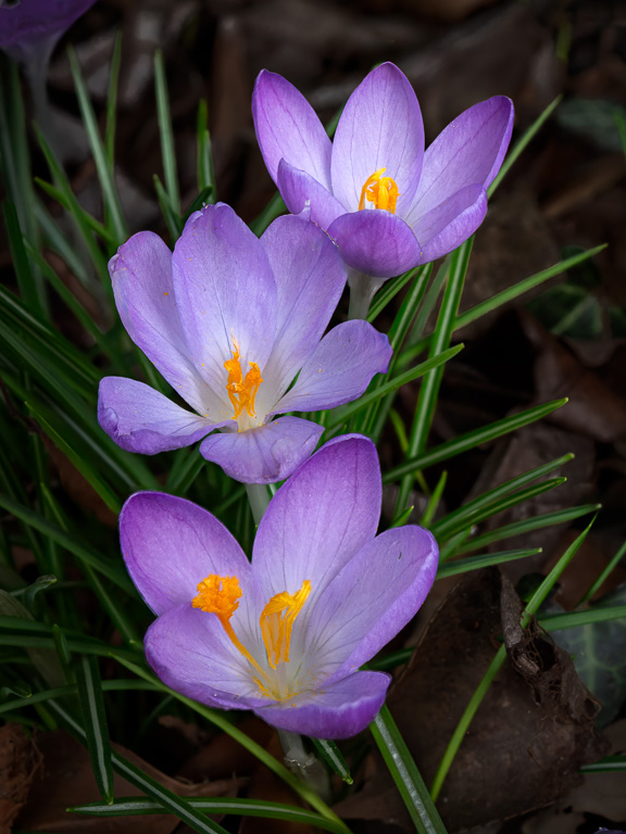
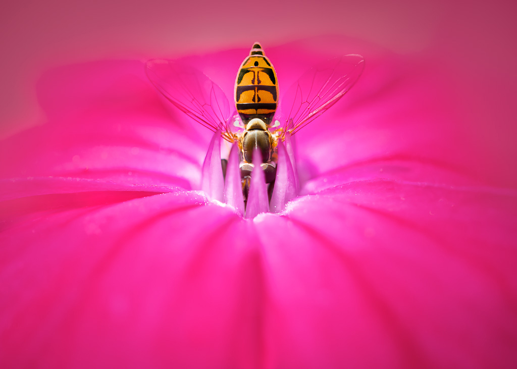
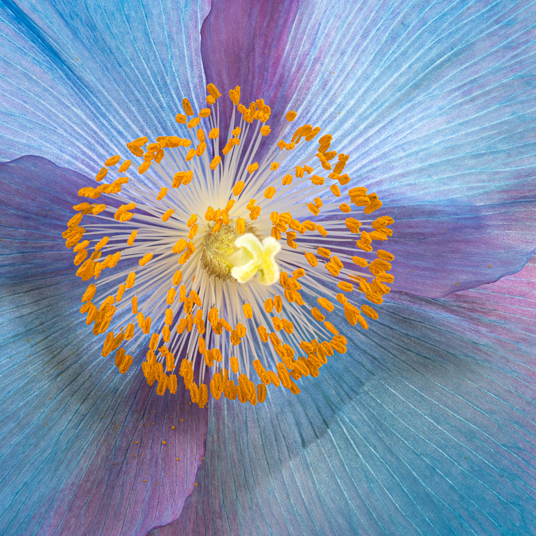
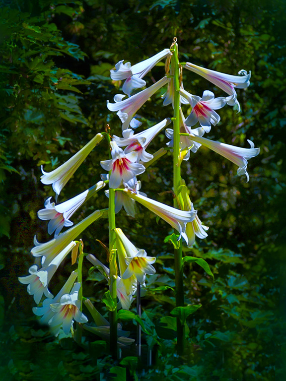
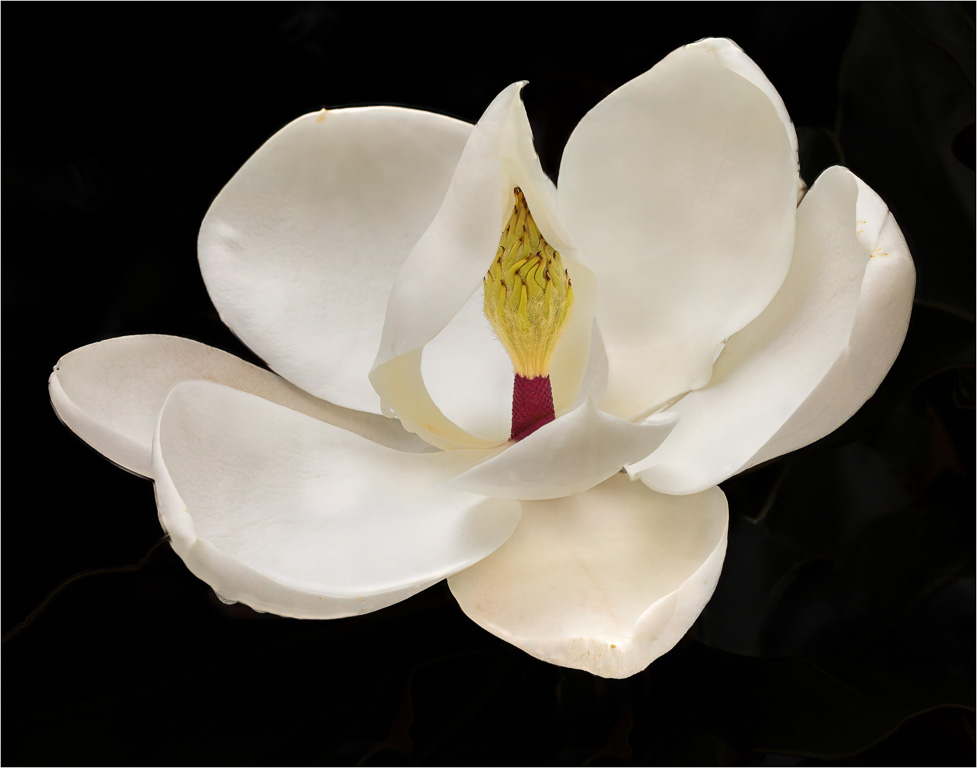
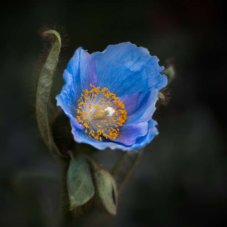
Beautiful orchid shot! Orchids are difficult to shoot because there is usually so much background clutter. You did a nice job of eliminating the distracting clutter and leaving enough leaves for context. The water drops add sparkle, and your decision to flip the orchid does improve the composition. Nice work! |
Mar 2nd |
6 comments - 8 replies for Group 45
|
| 61 |
Mar 24 |
Reply |
Thank you, Marti! And, best wishes in your new Group 80. It was a pleasure posting under your management of the group. |
Mar 20th |
| 61 |
Mar 24 |
Reply |
Yes, I just saw it, too. I will indeed miss seeing your beautiful creations and receiving your valuable critiques. |
Mar 19th |
| 61 |
Mar 24 |
Reply |
Thank you, Ingrid! You and Marti are absolutely correct with your suggestion to eliminate the purplish areas in the background. I also toned down the purple orchid end on the right side to match the brightness of the left side.
Here's my stab at it. |
Mar 19th |
 |
| 61 |
Mar 24 |
Comment |
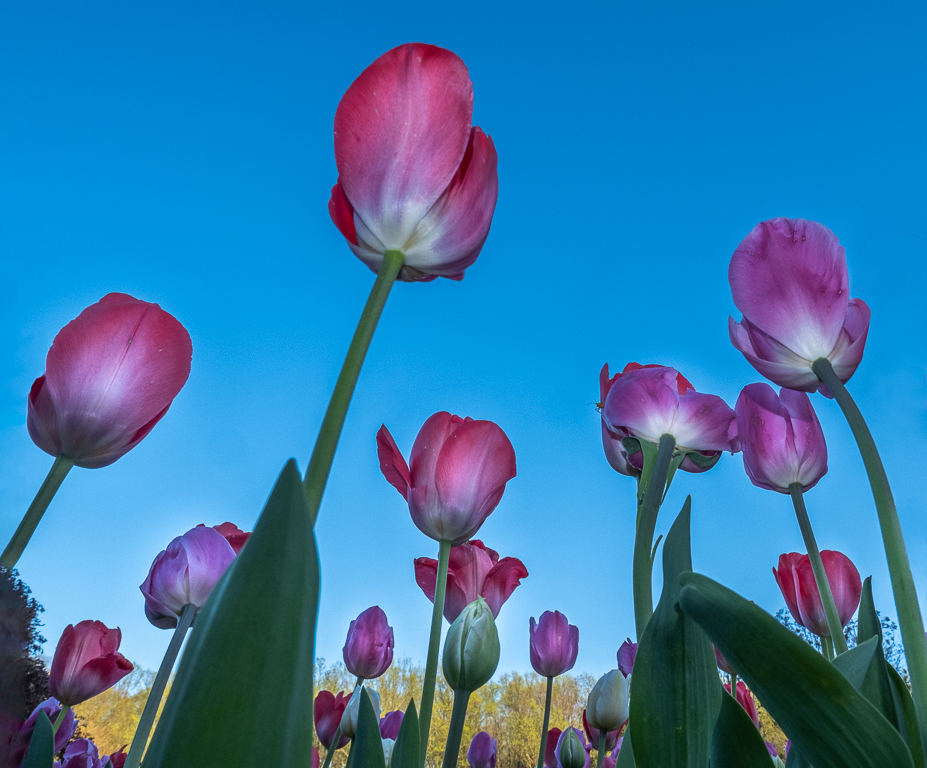
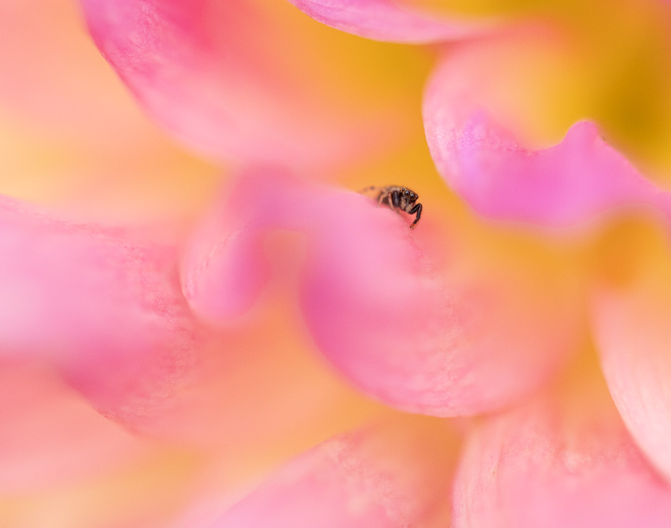
There is something quite satisfying looking at this composition of daisies with the simple colors and the diagonal grasses adding a sense of motion. However, I can't help but notice that all the yellow flowers in the foreground are not obstructed by the grass like the orange flowers in the background. I wonder if the image would have more impact if you cropped the image into a square format including only the yellow flowers? |
Mar 10th |
| 61 |
Mar 24 |
Comment |
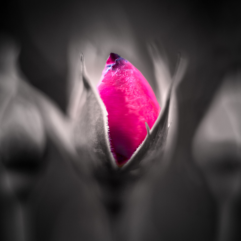
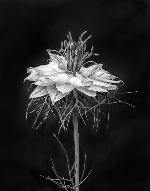
This is quite a pleasing image of a cluster of redbud blossoms. I like that the center blossom is facing forward and completely open while the surrounding buds encircle it. The background is nicely out of focus with a pleasing bokeh. Well done! |
Mar 10th |
| 61 |
Mar 24 |
Comment |
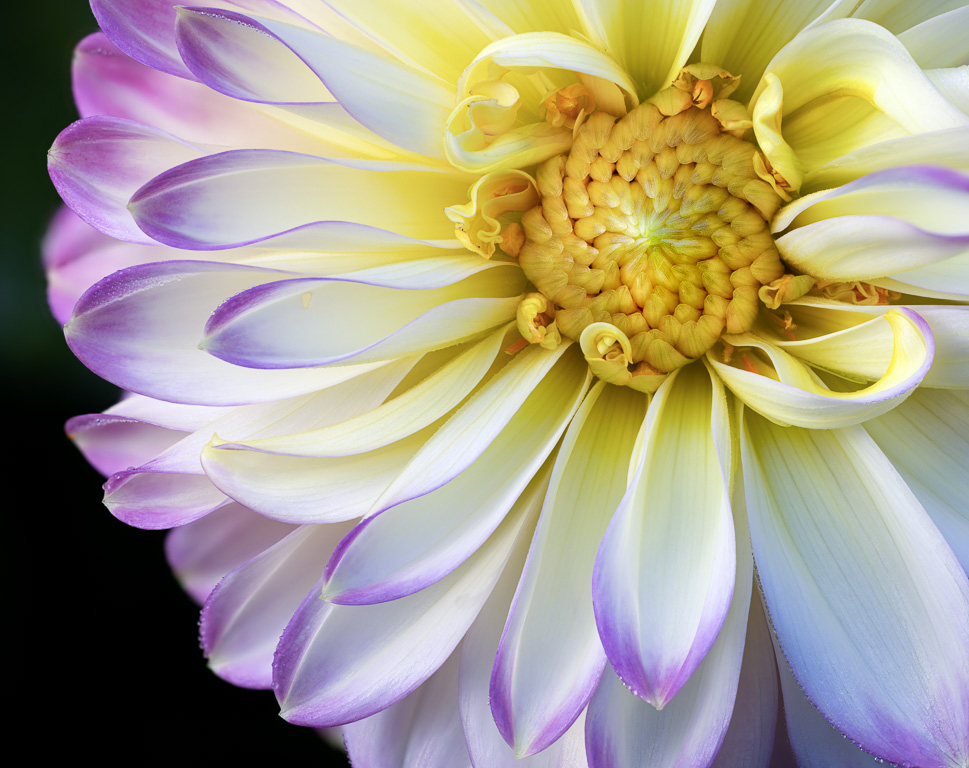
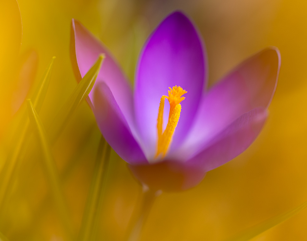
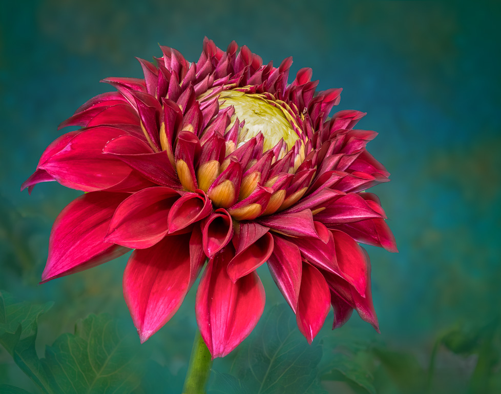
You really made a creative flower image! I especially like the egg-shell pots. The tulips and water lily sparkle nicely. However, the other three flowers seem a little dull and can use some brightening and maybe a little more contrast to match the tulips and water lily. Also, I might try lightening the hole of the egg shell on the right to match the other two. You got a winner with this one! |
Mar 8th |
| 61 |
Mar 24 |
Reply |
Thank you, Marti! I actually like hearing very picky comments because they are usually addressing issues I completely missed. And, I definitely will fix that brighter highlight area! |
Mar 7th |
| 61 |
Mar 24 |
Reply |
Thank you, Ester! What a beautifully written comment. I may use it for this image's description if I ever submit it to a competition. |
Mar 7th |
| 61 |
Mar 24 |
Comment |
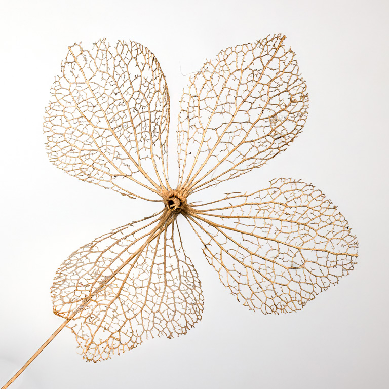
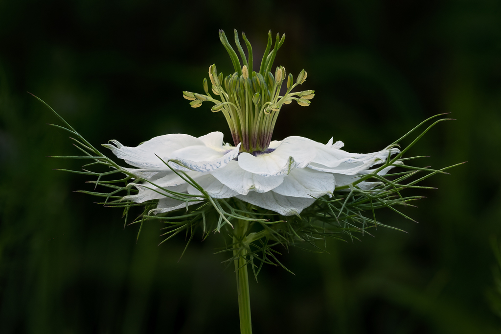
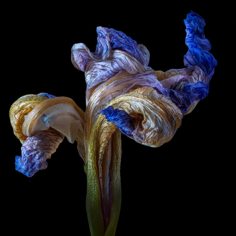
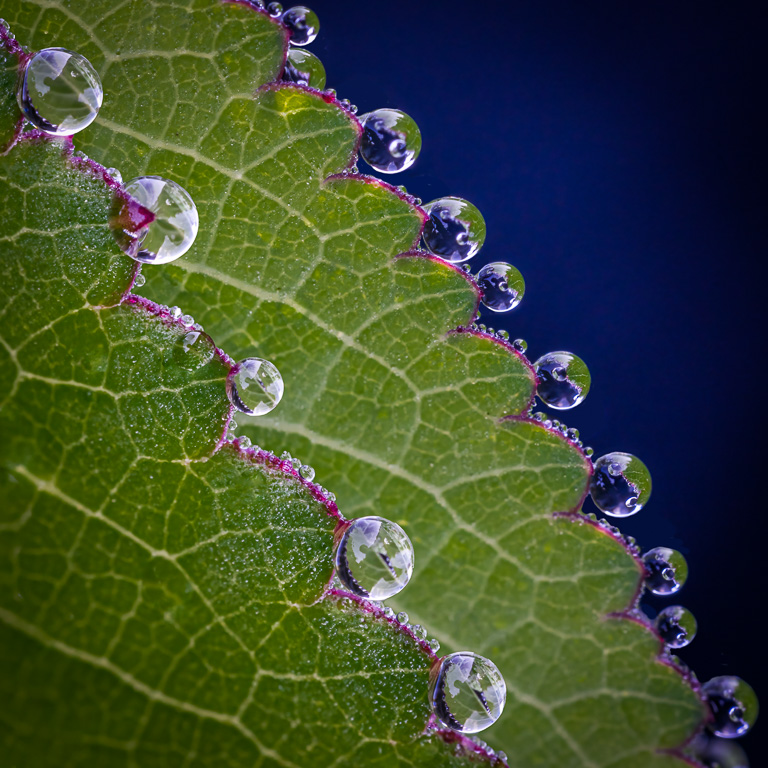
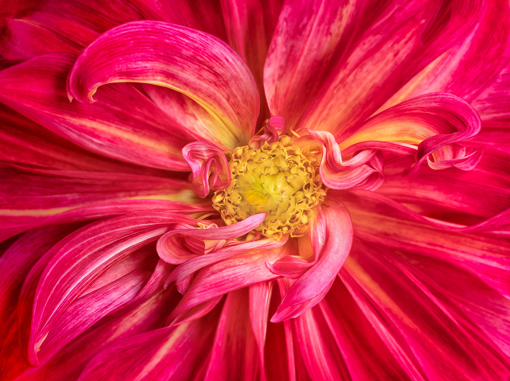
A very simple yet pleasing image with strong complementary colors, and the diagonal stem adds a sense of motion. I also like how the flowers and leaves fill most of the frame without having too much black background. Shooting the back of the flowers also adds a different perspective. Very well done! |
Mar 3rd |
4 comments - 5 replies for Group 61
|
11 comments - 13 replies Total
|