|
| Group |
Round |
C/R |
Comment |
Date |
Image |
| 45 |
Jan 24 |
Reply |
Thank you, Bai! |
Jan 30th |
| 45 |
Jan 24 |
Reply |
Thank you, Ray. |
Jan 16th |
| 45 |
Jan 24 |
Reply |
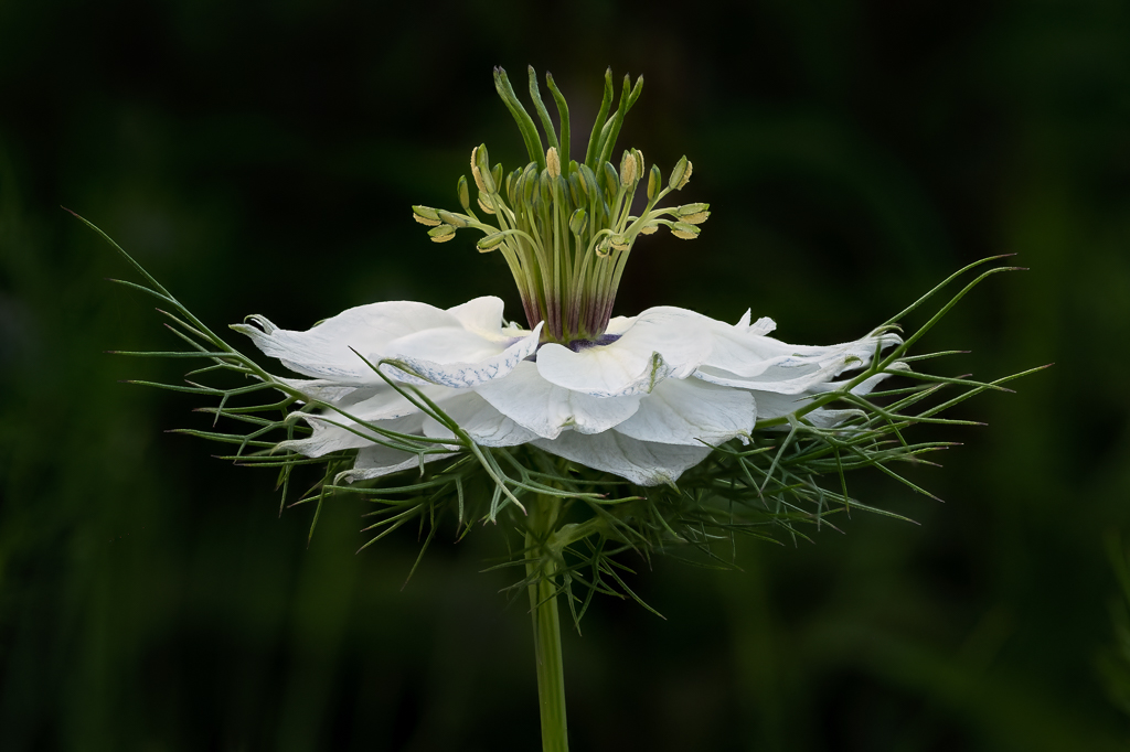
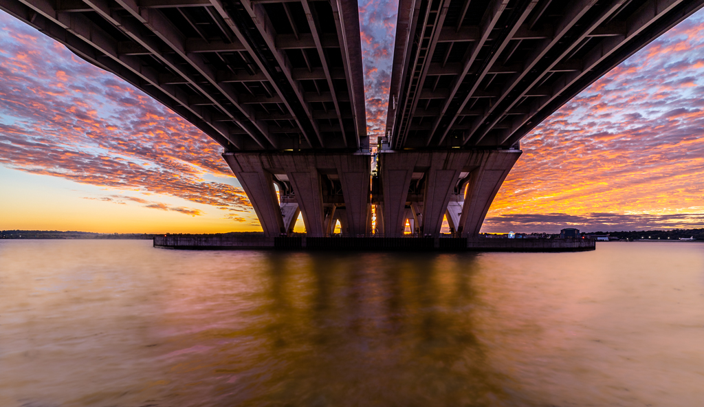
Thank you, Phyllis. In my set-up, I placed the staples on a sheet of Kleenex with a reflective black plastic sheet underneath. But I didn't like the reflection, so I ended up inverting the image in Photoshop to get a better reflection. To get the ripples in the water, I followed a video with quite a few steps that I cannot remember. The ping pong ball is an orange ball, not white. |
Jan 12th |
| 45 |
Jan 24 |
Reply |
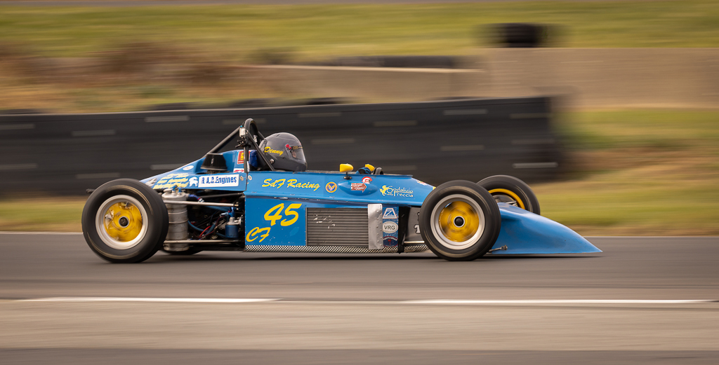
For some reason, I like the white waves. It adds a sense of motion and balances the highlights in the sky. |
Jan 9th |
| 45 |
Jan 24 |
Reply |
In my comments, I was going to suggest darkening the background, but then thought it would lose the details in the fur on forehead. But, now seeing what you did, I like it a lot! With the dark background, the gorilla's face is brought into strong focus because the bright background doesn't pull one's attention from it. |
Jan 5th |
| 45 |
Jan 24 |
Reply |
Thank you, Charlie! |
Jan 4th |
| 45 |
Jan 24 |
Reply |
Thank you, Cindy! I'll suggest we get you to judge our competition. :-) |
Jan 4th |
| 45 |
Jan 24 |
Comment |
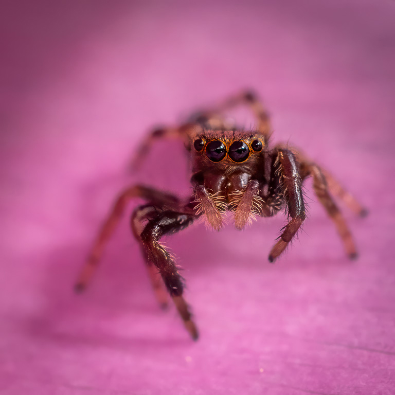
Nice capture of a baby sandhill crane in warm morning light. Its eyes are in perfect focus. The dark green reeds in the background are nicely out of focus, but the bright yellow reeds are too much in focus and blend with the baby crane's head. If you can select the baby crane and then darken and blur the yellow reeds, it will allow the baby crane to stand out. |
Jan 4th |
| 45 |
Jan 24 |
Comment |
I can see what you were trying to achieve in this image, but, unfortunately, it doesn't quite hit the mark. First, the colors are too warm and very difficult to correct. Secondly, the white side of the plastic barrier in dead-center splits the image in two. Maybe using the remove tool to eliminate the barrier would create more interaction between the children and the train set. |
Jan 2nd |
| 45 |
Jan 24 |
Comment |
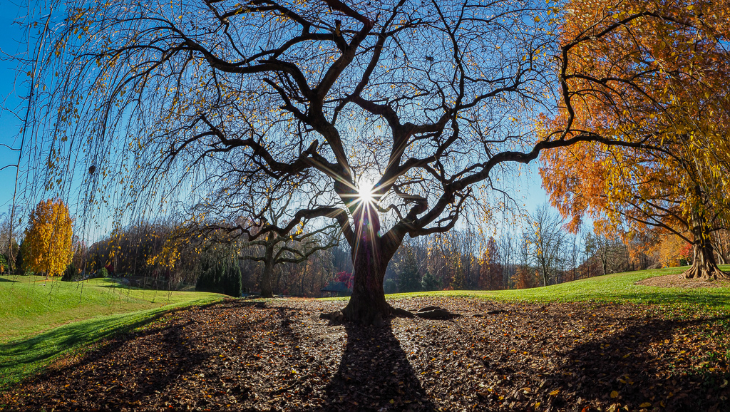
You captured a beautiful and timeless foggy landscape that evoke strong feelings. Converting it to B&W also emphasizes the moody feel of the dark trees in the misty fog. I, too, don't like the border as it is too gimmicky, and I find it pulls my eye from the image. Similarly, I find the distressed portions do not add to, but rather detracts from the image. |
Jan 2nd |
| 45 |
Jan 24 |
Comment |
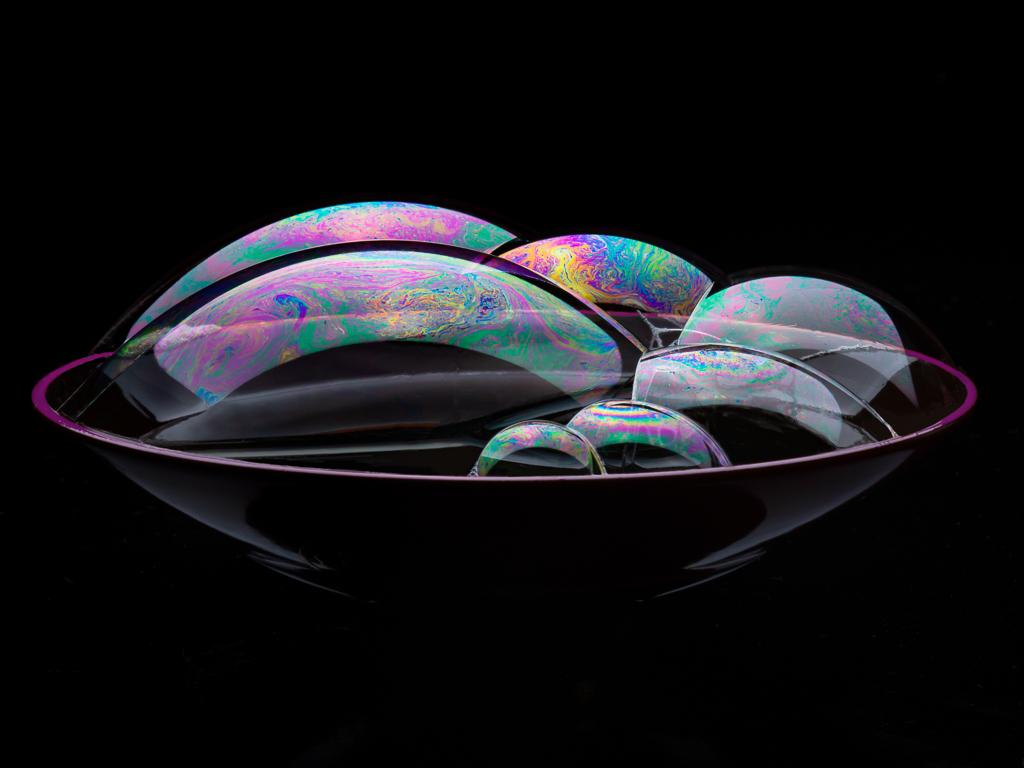
You captured a nice moment with the children grabbing at the bubbles. I like how you blurred the background, but I don't understand why some legs and feet are blurred and some are in focus. Maybe if everyone's legs and feet were blurred, it wouldn't seem so incongruous. |
Jan 2nd |
| 45 |
Jan 24 |
Comment |
Gorillas are also one of my favorite zoo subjects. And, you did an excellent job capturing this gorilla's side portrait. The way you cropped the image brings the viewer up close and personal with the big guy. You also brought out the fine details of the fur in your post processing. Well done! |
Jan 2nd |
| 45 |
Jan 24 |
Comment |
This is a peaceful and serene scene that you captured beautifully. I like how the two groups of trees on the left and right sides frame the small stone shed and landscape in the background. I wonder what that small shed is? I also like the trail of people in the distance walking along the path going up to the crest of the hill. Very nicely seen! |
Jan 1st |
| 45 |
Jan 24 |
Reply |
Thank you for your suggestion, Robert. I rippled the water to the shore using PS Liquify tool. It does look better. Thanks! |
Jan 1st |
 |
6 comments - 8 replies for Group 45
|
| 61 |
Jan 24 |
Reply |
You're absolutely right! I took too much off. Why didn't I see that? As far as photo stacking 70 images goes, it wasn't any more work than photo stacking 3 images when the camera does all the work automatically. And, it doesn't really matter how many images you put in the photo stacking program (Helicon Focus). It doesn't take that much more time with 70 images unless one has a very slow computer.
Here's the revised image with your suggestion. Much better! Thanks! |
Jan 20th |
 |
| 61 |
Jan 24 |
Reply |
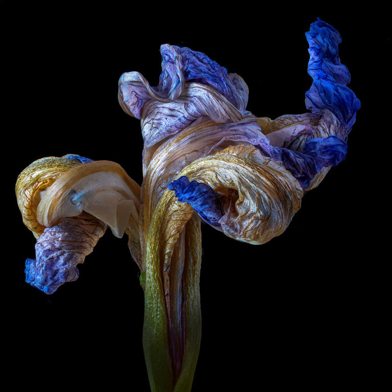
Thank you, Ingrid. The reason I didn't like the original image was that it looked too much like a person running away to the right, and for me it took my attention away from the beautiful texture of the decaying petals. |
Jan 18th |
| 61 |
Jan 24 |
Comment |
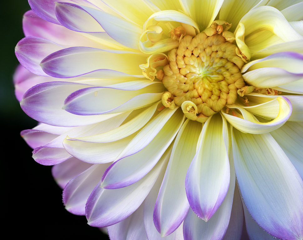
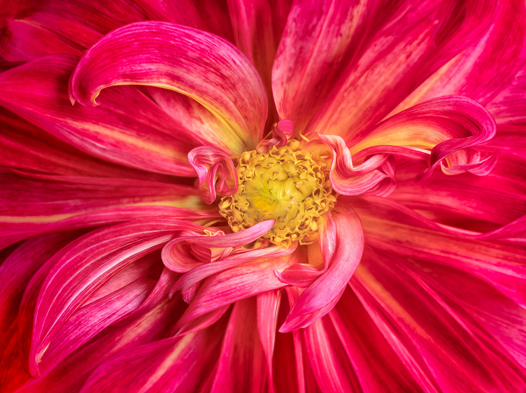
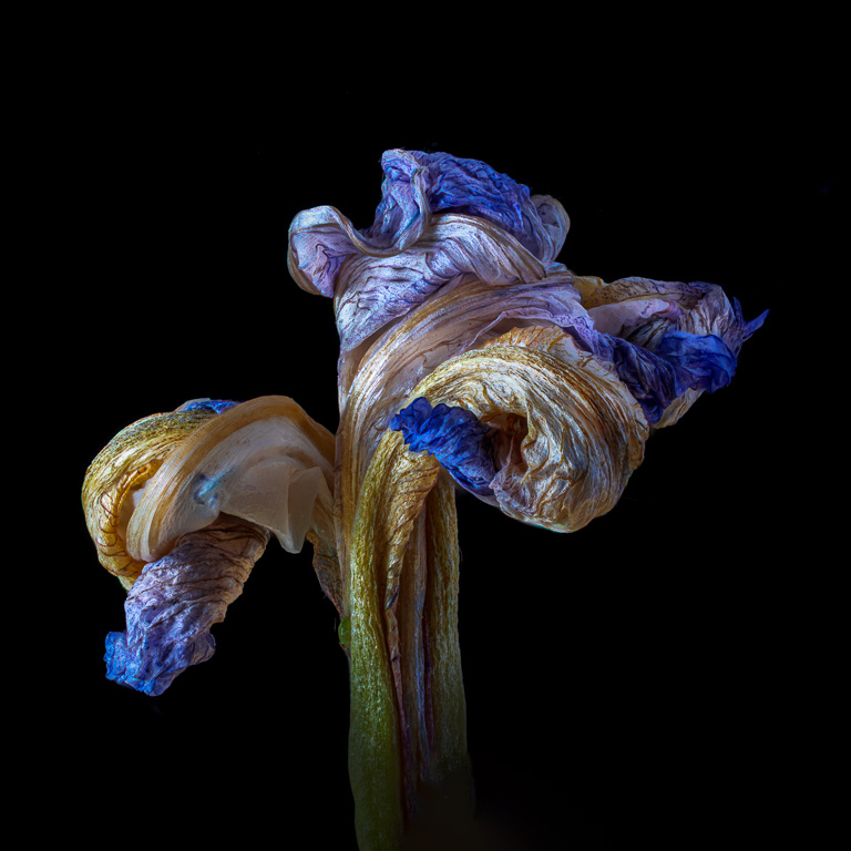
After submitting my image above, I didn't like the composition - specifically the upward facing petal on the right that is rather distracting. So, I eliminated it and came up with this image instead. Please feel free to comment on either one. |
Jan 9th |
 |
| 61 |
Jan 24 |
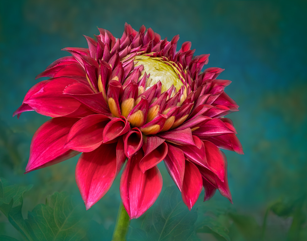
Comment |
Now this is a beautiful wabi sabi image with the withered dahlia petals creating a strong contrast with the smooth petals on top. The withered petals show the beauty of impermanence. Your textured background and border nicely complements the image. Well done! |
Jan 9th |
| 61 |
Jan 24 |
Comment |
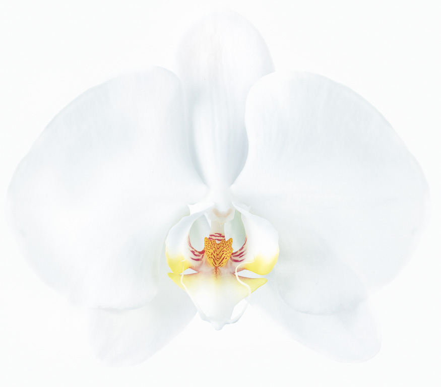
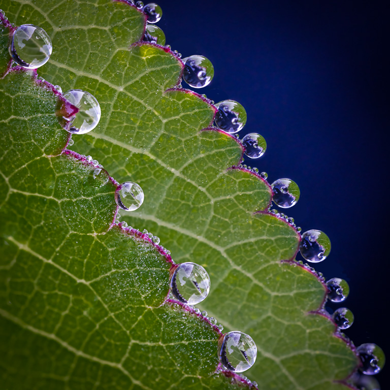
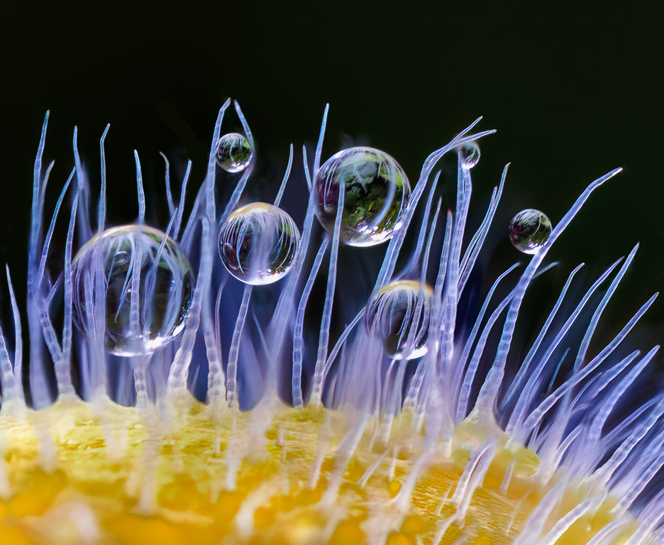
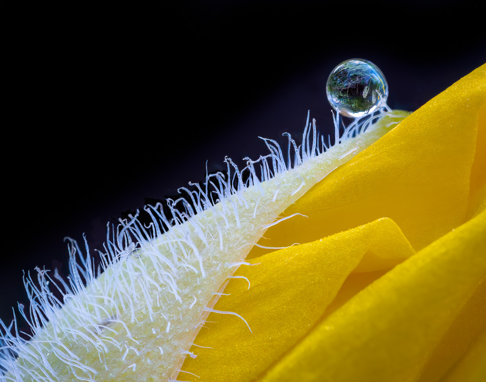
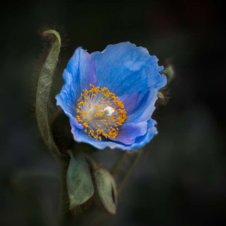
Hi, Marti, I'm sorry to hear of your hospitalization. I wish you a speedy recovery. This is an unusual image. The bubbles (or dew drops?) intrigue me because I don't know how they were formed on the flower and why there are so many of them. I wish there was more depth of field to capture all the bubbles in focus. Were the bubbles supposed to be the wabi sabi subject? |
Jan 9th |
| 61 |
Jan 24 |
Comment |
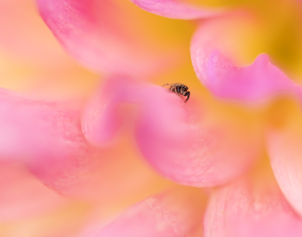
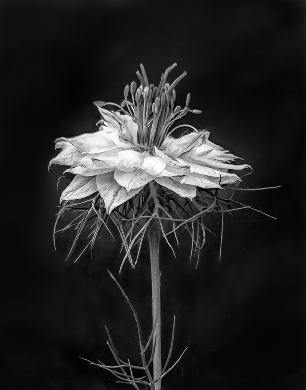
Hello, Ester, and welcome to the group. This month's wabi sabi assignment is probably not the easiest assignment for your first post. So, I'll be lenient. :-)
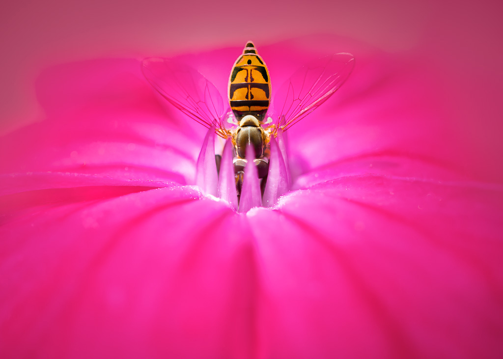
As you know, wabi sabi is finding beauty in impermanence, imperfection and incompleteness. Based on your crop, your image seems to focus on the bee, not the damaged flower. There might be some beauty in the withered white flower petals, but it's hard for me to see it. There is a lot of noise in the image. Your bee is in decent focus though. |
Jan 9th |
4 comments - 2 replies for Group 61
|
10 comments - 10 replies Total
|