|
| Group |
Round |
C/R |
Comment |
Date |
Image |
| 45 |
Nov 23 |
Reply |
Thank you, Bai! |
Nov 27th |
| 45 |
Nov 23 |
Reply |
Yes, I agree smooth curved lines would look better in an ICM image. But, they are hard, if not impossible, to create handheld. They can be created with a camera on a tripod with a lens collar though. |
Nov 27th |
| 45 |
Nov 23 |
Reply |
I find ICM fun and addictive, at least for now. |
Nov 27th |
| 45 |
Nov 23 |
Reply |
Thank you, Robert. I'll play it safe and go with the more recognizable image. I'll use the image above for an abstract photography competition. |
Nov 9th |
| 45 |
Nov 23 |
Reply |
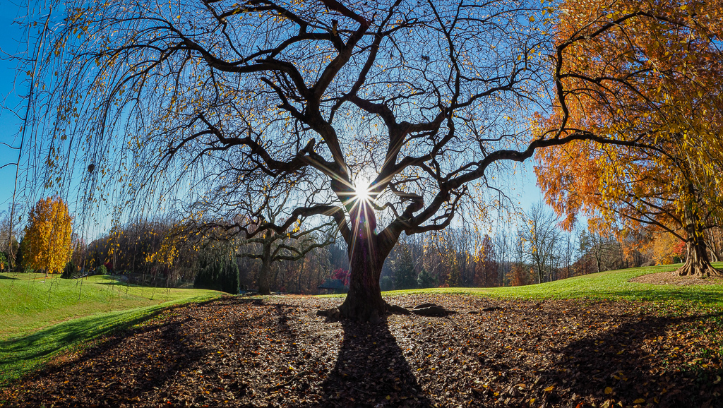
Thanks, Cindy. After giving this image some thought, I came to the conclusion that if I submitted it to an ICM competition, it probably wouldn't do very well because it is too abstract. Judges of ICM images would more likely be looking for impressionistic painterly images. So, I've shot a few of those types of ICM images that might be better for the competition. Here's an example of one of my impressionistic images. This was actually shot the same morning at the same beach as the abstract image, but with a little more sunlight. |
Nov 8th |
 |
| 45 |
Nov 23 |
Comment |
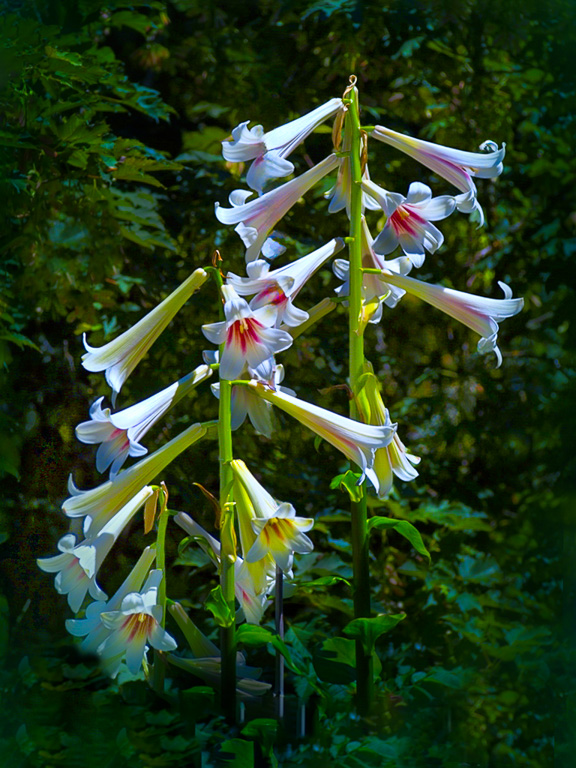
This is such a lovely and timeless scene! Something you might have seen hundreds of years ago. I only wish I could have been there. My only suggestion would be in increase the exposure just a tad and, maybe, add some contrast. A beautiful image! |
Nov 1st |
| 45 |
Nov 23 |
Comment |
This is a lovely image of a quilt barn and its rural surroundings. The barn is nicely offset from center, and the surrounding environment is simple with no distractions. To me, there is a little too much grass in the foreground. And, the upper center sky is washed out. So, starting with your final image, I cropped the image to 16x9 (and also cropped out the brown field on the right), used a linear gradient in LR to darken the upper sky and lower the temperature, and added a vignette. |
Nov 1st |
 |
| 45 |
Nov 23 |
Comment |
There is good interaction in this image with the two workers as they work together to pour the molten metal. The focus should be on the molten metal being poured out of the pot. The fellow on the left, however, is too predominant, and most of him is unnecessary to tell the story. Also, the off-white tarp behind them is a bit distracting. I played with the image to crop the left side and darken the white tarp to match the rest of the floor. I think it emphasizes the pouring action better. I didn't do a very good job of selecting the edges of the white tarp though. |
Nov 1st |
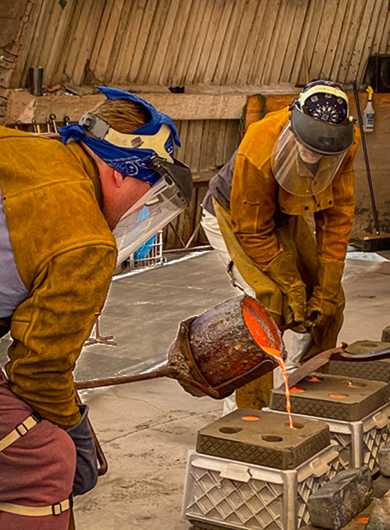 |
| 45 |
Nov 23 |
Comment |
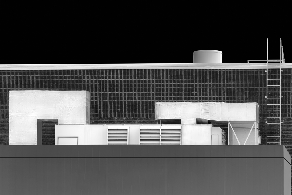
The architecture of this brewery has some unique appeal to it with conical, curved and square shapes all interacting together. The B&W treatment brings out those shapes. But, I'm not sure if the fence and shadows add to the image or create distractions. The image is a lot cleaner without them. |
Nov 1st |
| 45 |
Nov 23 |
Comment |
You caught an interesting moment at this art museum in which one lady is pointing out something about the art piece. Whether or not the other lady is interested is not really important as the interaction between the ladies and the art piece. I wonder if you need all that space on the left side though. I might consider cropping off the left portion up to where the yellow square begins. That way, the lady is pointing directly to the upper left corner. |
Nov 1st |
| 45 |
Nov 23 |
Reply |
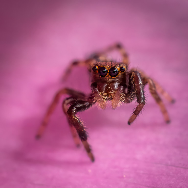
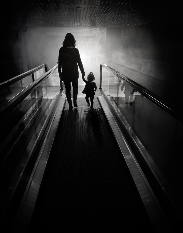
Thanks for your feedback, Robert. You're right about different styles of ICM. In this image, I was striving for more of an abstract image without a recognizable subject. I've tried some ICMs with more recognizable subjects. But, I've seen too many of those trees-with-vertical-panning ICM images that they don't appeal to me at all. There is a photographer/YouTuber, David Day, who does ICM in creative ways using wire, colored paper, small pieces of dead plants, etc. and comes up with some striking and unusual ICM images. |
Nov 1st |
5 comments - 6 replies for Group 45
|
| 61 |
Nov 23 |
Reply |
Thank you, Shirley. |
Nov 23rd |
| 61 |
Nov 23 |
Reply |
Thanks, Marti. Will do. |
Nov 21st |
| 61 |
Nov 23 |
Reply |
Thank you, Ingrid! |
Nov 21st |
| 61 |
Nov 23 |
Comment |
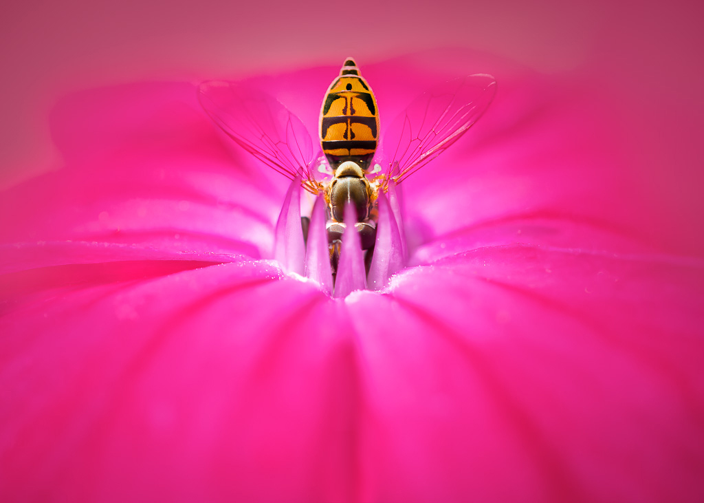
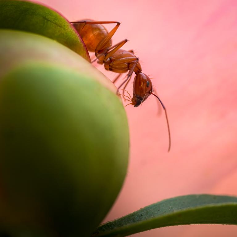
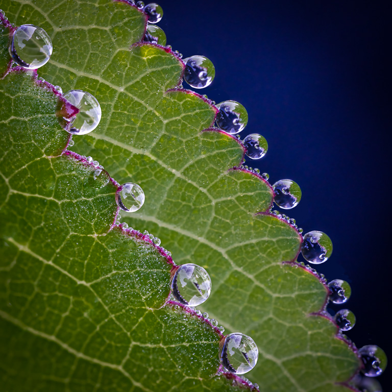
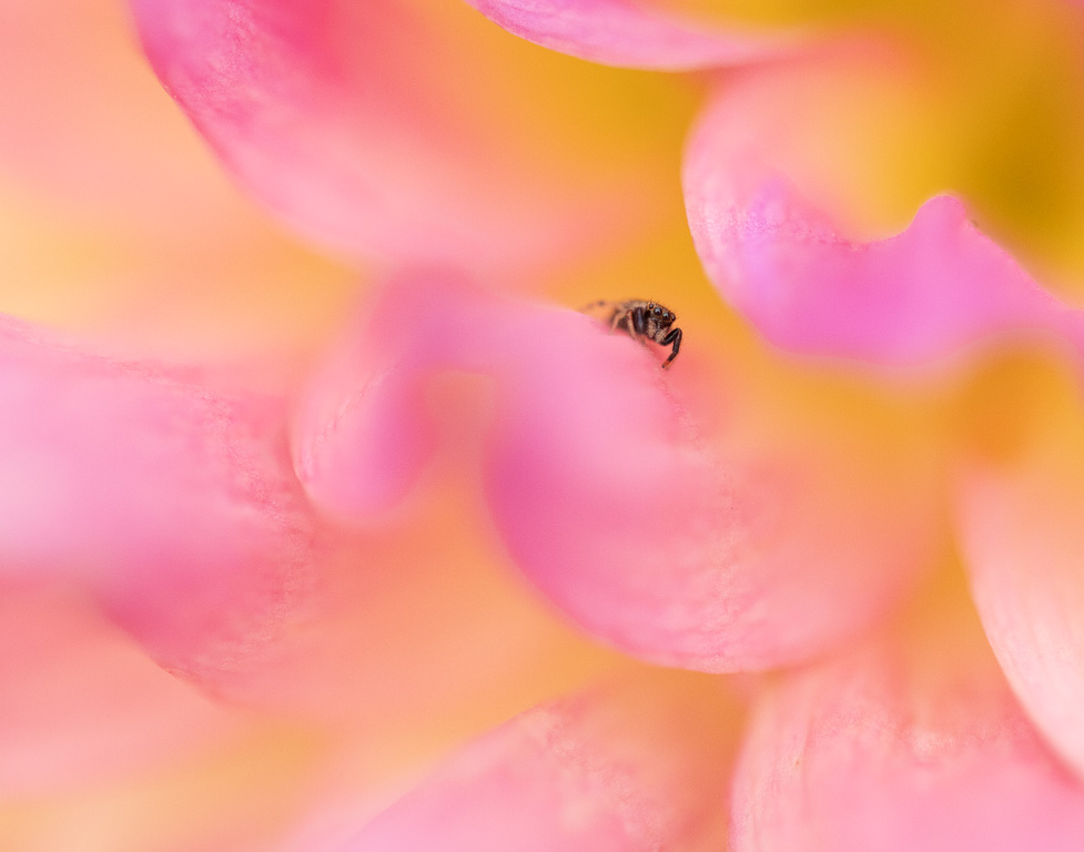
This is a well-composed image of a bee on a flower, and it has a pleasing color theme of browns, greens and whites. My only suggestion would be to lighten the center where the flower is in shadow and, perhaps, the lower left corner (both the stem and the dark brown areas). |
Nov 10th |
| 61 |
Nov 23 |
Comment |
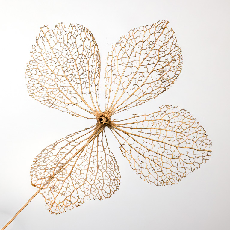
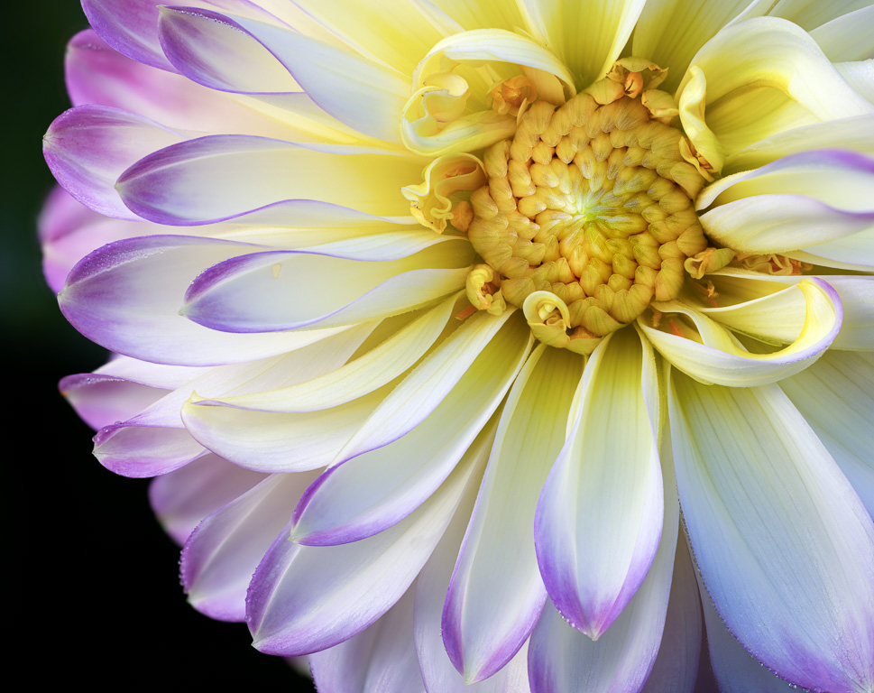
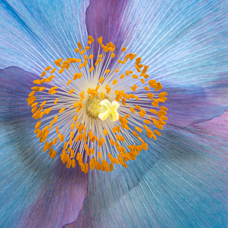
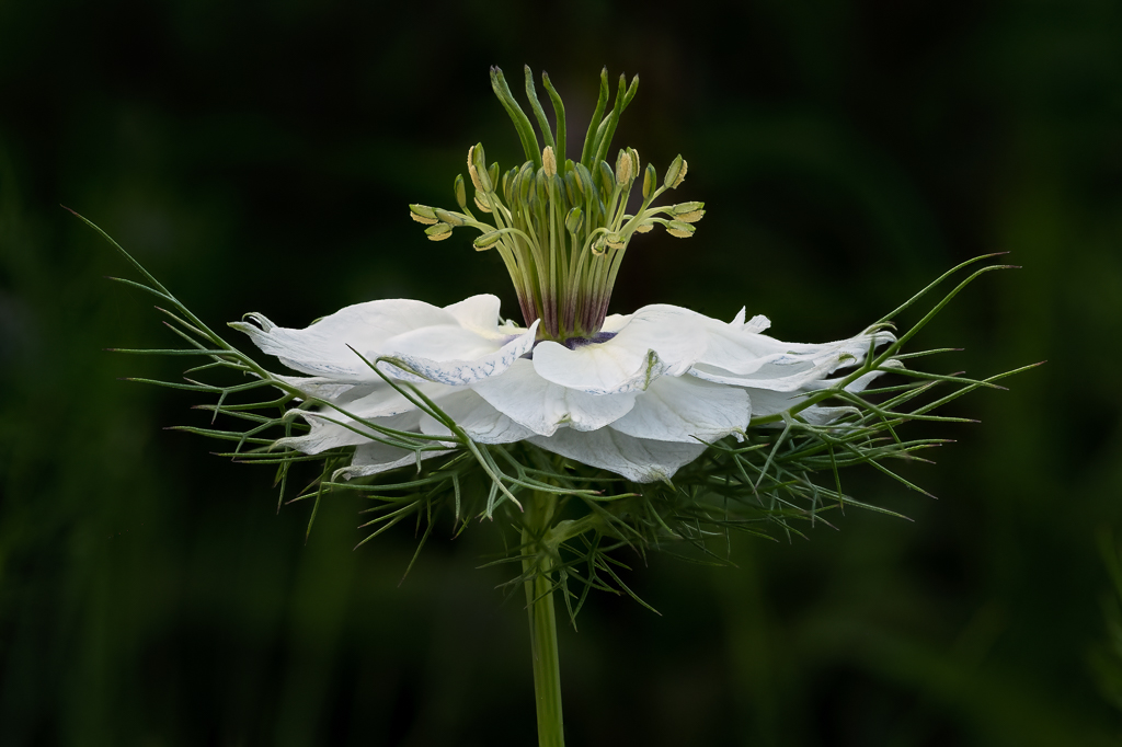
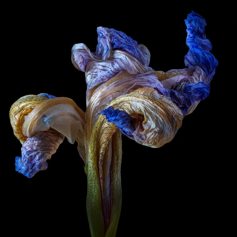
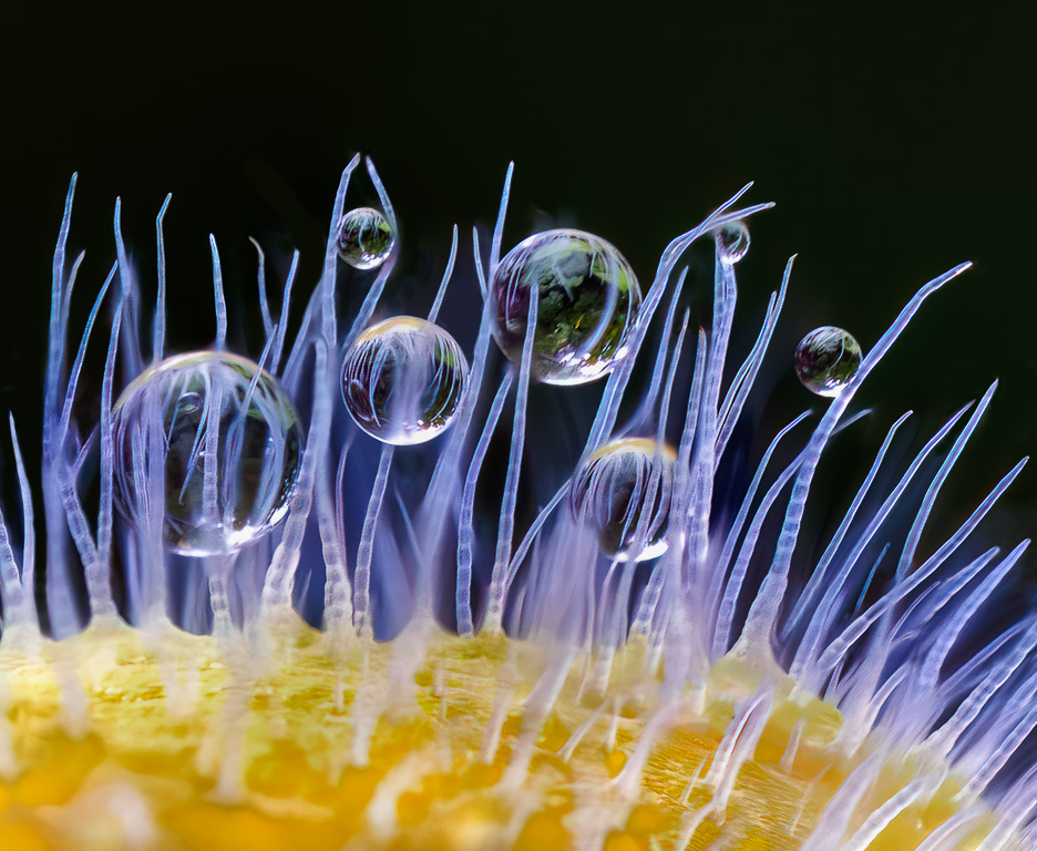
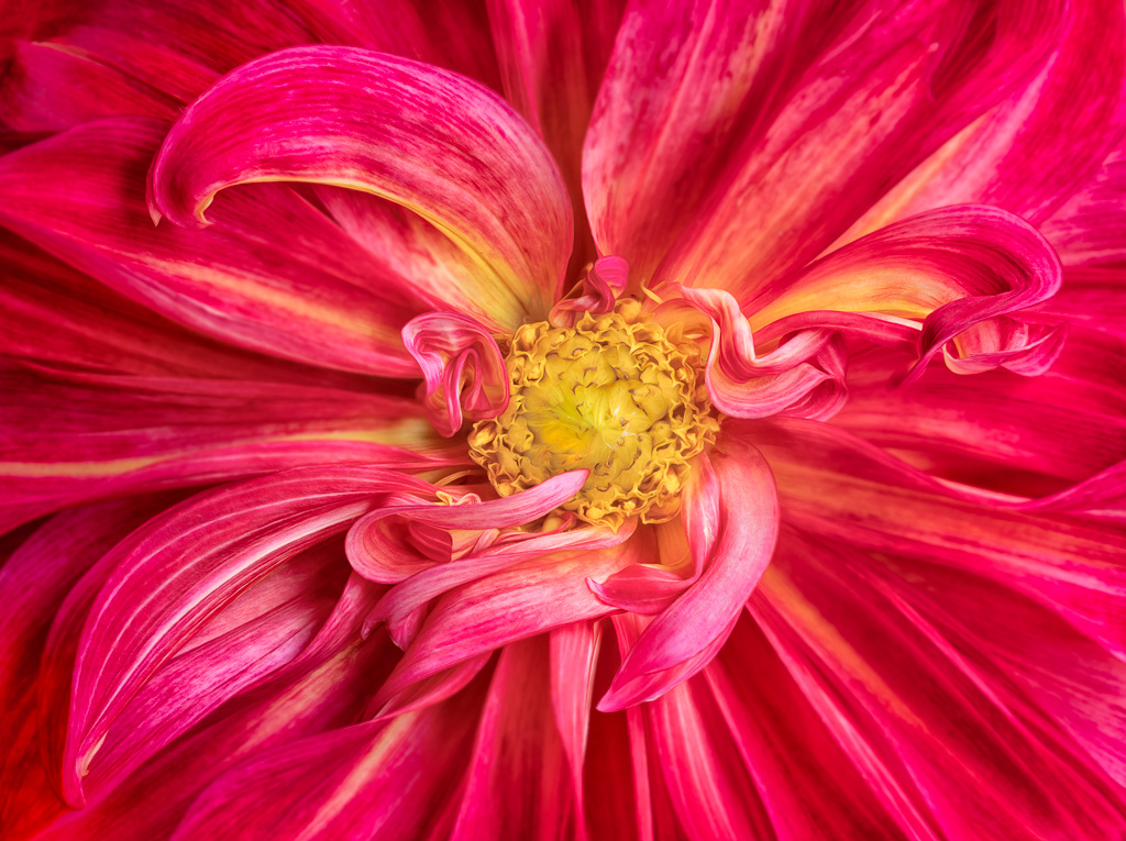
Another beautiful textured flower image! You really got the post-processing down to get a consistent look. I like this one even more than the one you submitted last month. I think the color of the frame and stamp are fine. |
Nov 6th |
| 61 |
Nov 23 |
Comment |
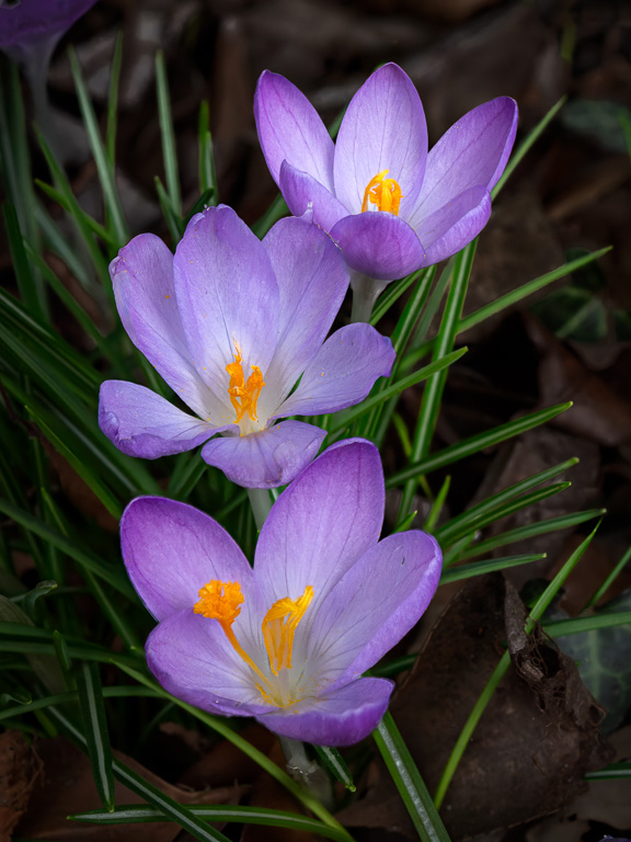
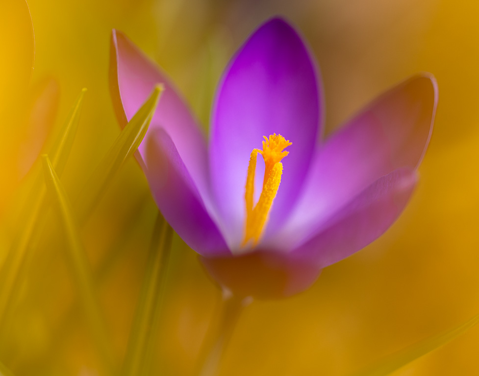
This is a lovely image of bleeding hearts. The colors are so rich and vibrant, and they stand out well against the dark background. I wonder if cropping the image to eliminate the last three flowers would put more attention on the flowers in focus. |
Nov 6th |
3 comments - 3 replies for Group 61
|
8 comments - 9 replies Total
|