|
| Group |
Round |
C/R |
Comment |
Date |
Image |
| 45 |
Mar 23 |
Reply |
The ding I'm referring to is where the bottom of the green railing is dented. |
Mar 30th |
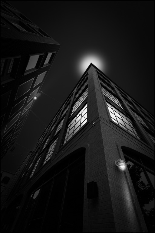
| 45 |
Mar 23 |
Reply |
Yes, I prefer the B&W version, too. It has a rather apocalyptic feeling about it. |
Mar 30th |
| 45 |
Mar 23 |
Reply |
Thank you, Bai. |
Mar 30th |
| 45 |
Mar 23 |
Reply |
Thanks, Charlie! I darkened the background and converted the image to B&W as I thought B&W would have more impact. |
Mar 20th |
 |
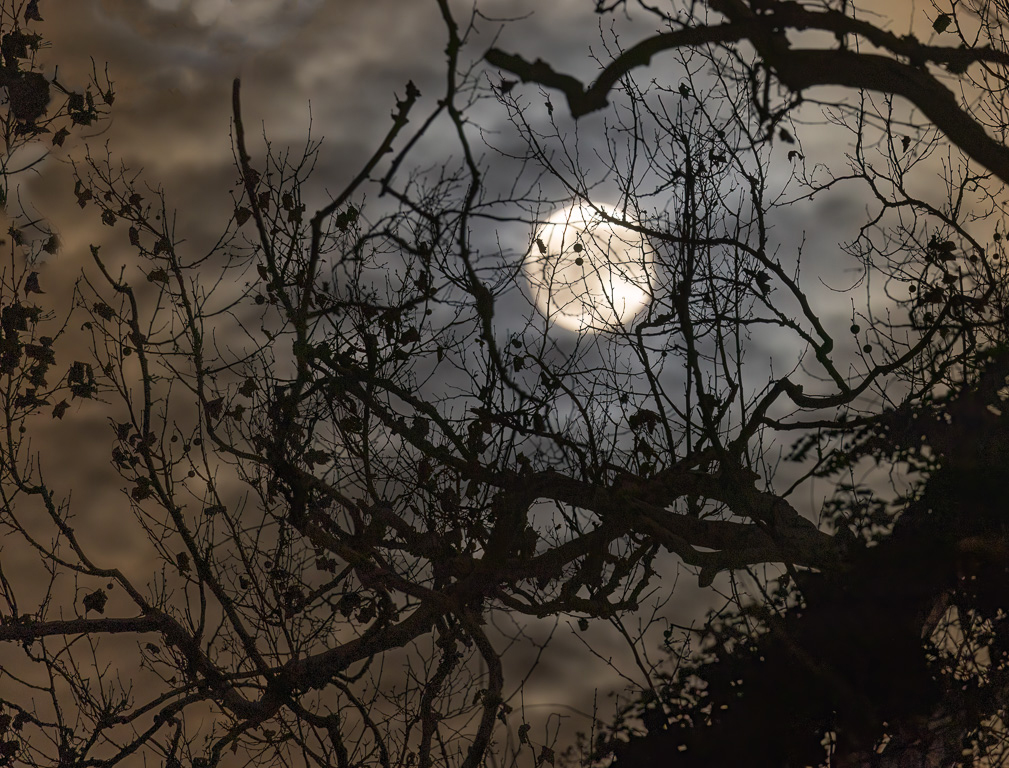
| 45 |
Mar 23 |
Comment |
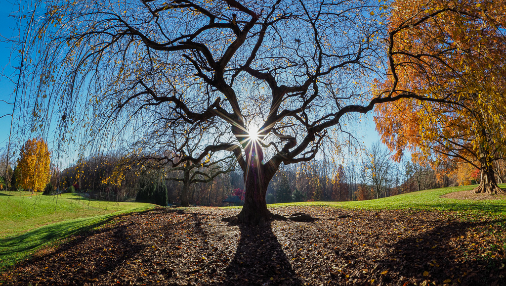
Of the three images, I like the B&W image the best because the dark tree branches and trunks stand out against the lighter background. The skunk cabbage is also quite interesting, but the background is a bit busy. |
Mar 18th |
| 45 |
Mar 23 |
Reply |
Yes, and that ding in the staircase in the lower right corner always bugs me! |
Mar 16th |
| 45 |
Mar 23 |
Reply |
Sounds like a technique used by Joel Tjintjelaar. |
Mar 16th |
| 45 |
Mar 23 |
Reply |
Yes, it always helps to brighten the face! Thanks! |
Mar 16th |
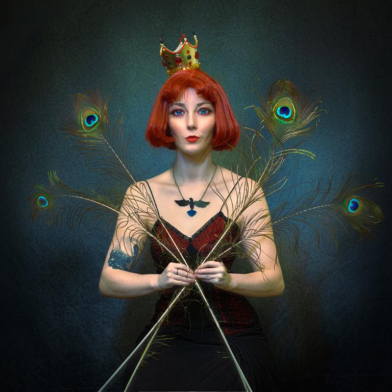
| 45 |
Mar 23 |
Reply |
Thanks, Ray. It's hard to keep this image apolitical. And, believe me, I wasn't trying to make a political statement. I was going for an environmental portrait - a competition topic. |
Mar 16th |
| 45 |
Mar 23 |
Comment |
I like the colorful concession stand at the festival. However, the flags are backwards and not so colorful from that side. You might be better off cropping off the flags and focusing on just the concession stand - something like this. |
Mar 3rd |
 |
| 45 |
Mar 23 |
Comment |
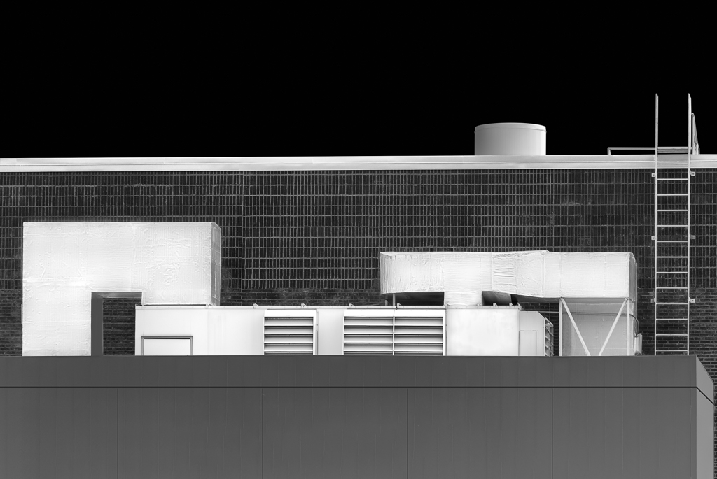
Somehow, my comments were deleted, and I can't remember what I stated. So, I'll give new comments.
The sharp angles of the foreground structure nicely reflects the sharp angles of the Shard. You also did an excellent job toning down the highlights in the clouds to give the overall image a very even brightness. The minimal blue and brown colors of the overall image are also very pleasing to the eye. You did a great job fixing the complex horizontal and vertical perspectives of this image. Nicely seen and nicely post processed. |
Mar 2nd |
| 45 |
Mar 23 |
Reply |
I'm in complete agreement. One is an environmental portrait, the other is a portrait. I only wish I had asked the man to put his coffee cup down for a minute! |
Mar 2nd |
| 45 |
Mar 23 |
Comment |
This is an excellent shot of an old, rustic barn, and the view through the open door really makes the shot. You did a fine job in post processing the image (not making it too grungy for my taste). My only suggestion might be to darken the grayish side of the barn on the left. In some way, I almost prefer the darker shade of the original because it doesn't pull my eye away from the view through the open door. |
Mar 2nd |
| 45 |
Mar 23 |
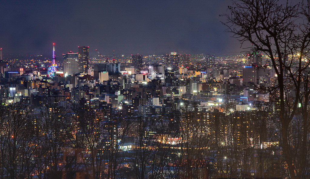
Comment |
You are truly fortunate to be able to visit many photogenic places at night while attending conferences. I never realized Sapporo became a "night-scene" destination, and you captured the city lights magnificently. Compositionally, I like the silhouetted tree in the foreground on the right and the brighter lights leading my eye to the ferris wheel and tower on the right. However, the scene appears a little too dark overall, it might help to boost up the shadows and blacks to bring out more detail in the foreground. I took a stab at it here. |
Mar 2nd |
 |
| 45 |
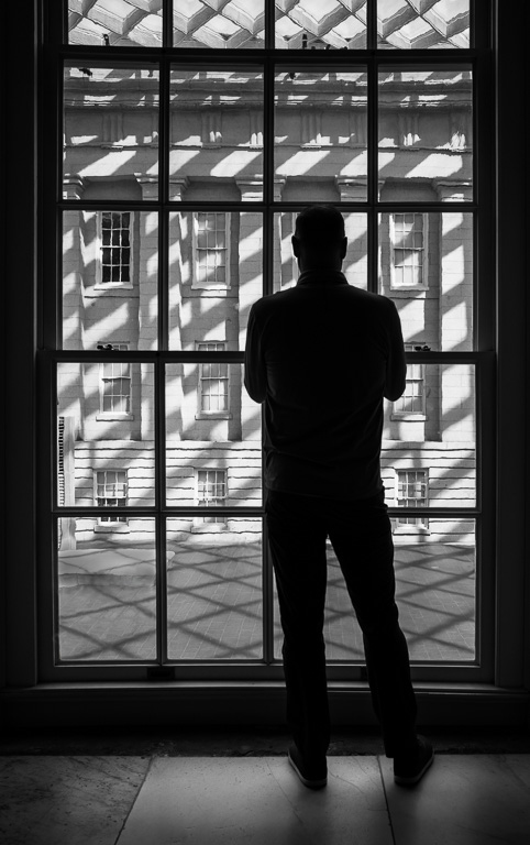
Mar 23 |
Comment |
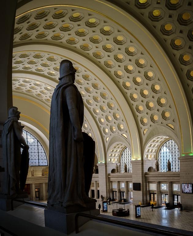
Nice capture of the spiral staircase in the Peabody library. This is such a photogenic structure, and you did it justice. I like that you chose to have the spiral start in the corner and end off center. Well done! |
Mar 1st |
6 comments - 9 replies for Group 45
|
| 61 |
Mar 23 |
Reply |
Thank you, Ingrid. I didn't notice the halo. I'll have to check more carefully. |
Mar 22nd |
| 61 |
Mar 23 |
Reply |
Thanks, Marti. It's always informative to get other photographers' perspectives on an image that you're too close to. |
Mar 16th |
| 61 |
Mar 23 |
Comment |
Back-lighting the image produced interesting lighting on the rear petals. However, the lighting on the front petals doesn't seem to work with the backlit areas. The two lighting seem to compete with each other rather than complement each other. |
Mar 13th |
| 61 |
Mar 23 |
Reply |
I like what you did with this image, Marti. The vertical image works well with the added stem. |
Mar 13th |
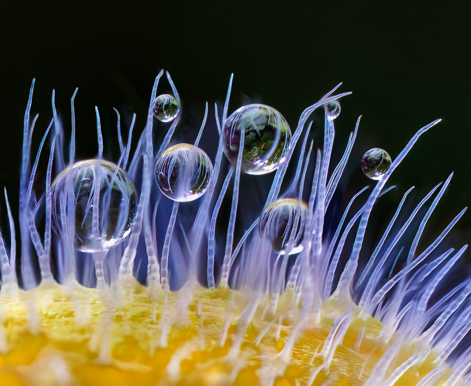
| 61 |
Mar 23 |
Reply |
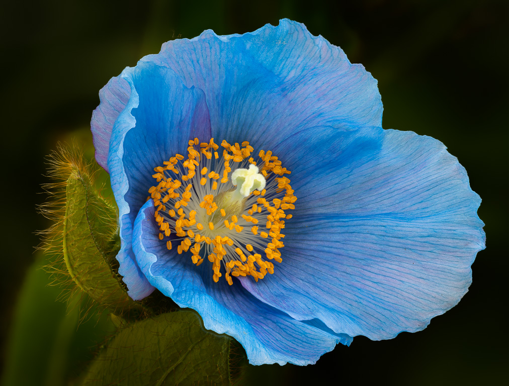
Randall, as you suggested, I toned down the highlights/whites on the tip of the fuzzy pod. It was a subtle, but dramatic change. You have a great eye! |
Mar 11th |
| 61 |
Mar 23 |
Reply |
Hmm...I assume you mean the upper part of the fuzzy pod. |
Mar 10th |
| 61 |
Mar 23 |
Reply |
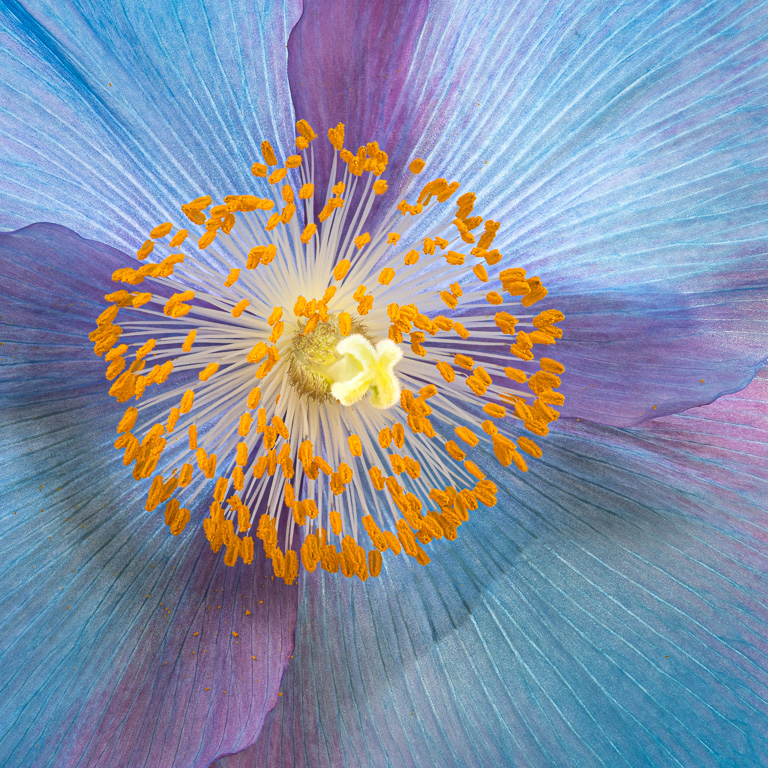
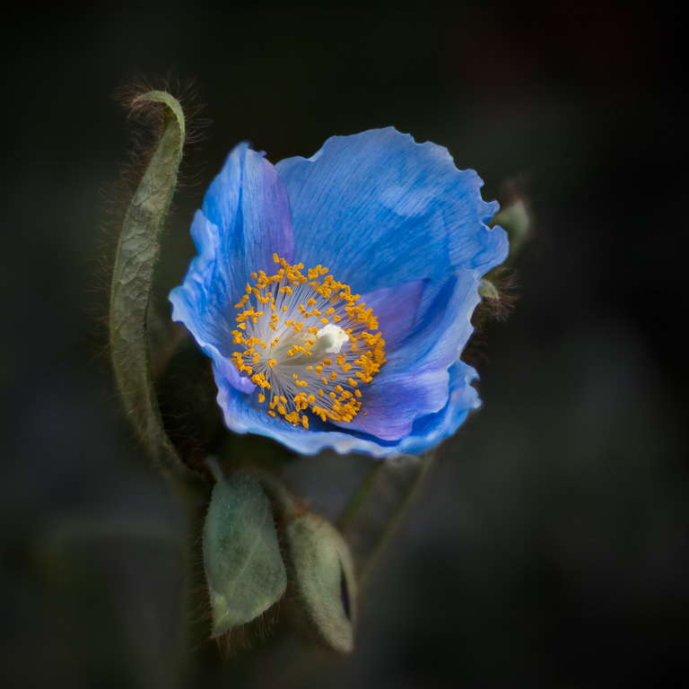
Randall, I did try blurring the fuzzies, but I didn't like what I was getting. It looked like a blob to me. However, I did try only slightly blurring the fuzzies as well as darkening the fuzzies and pods, and the image is much improved. It makes the blue petals and yellow stamen stand out more. |
Mar 10th |
 |
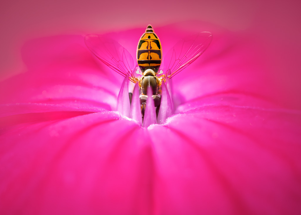
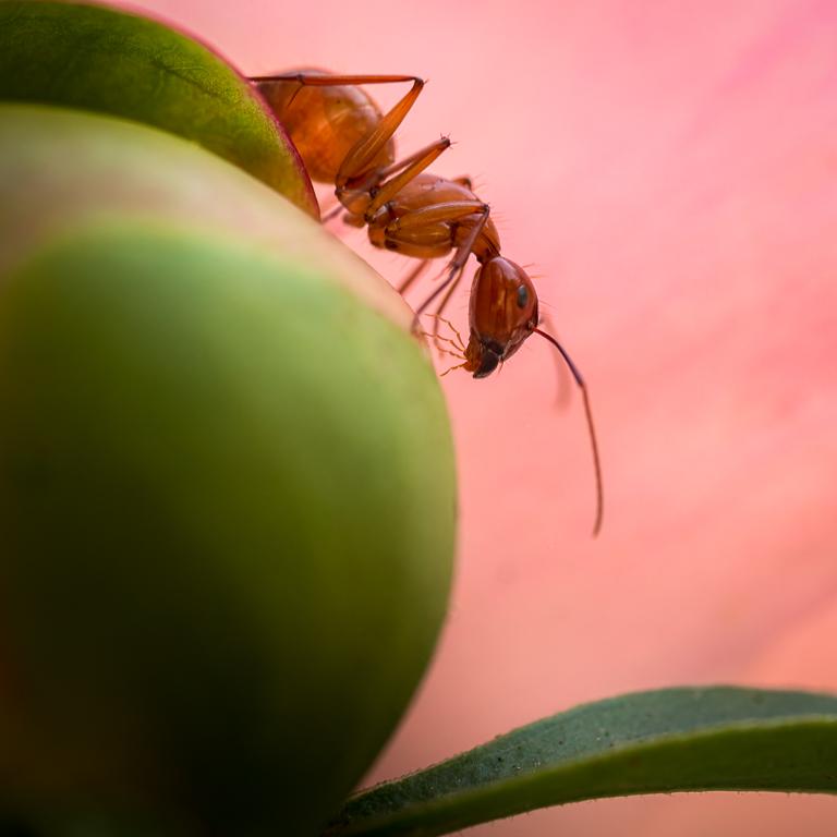
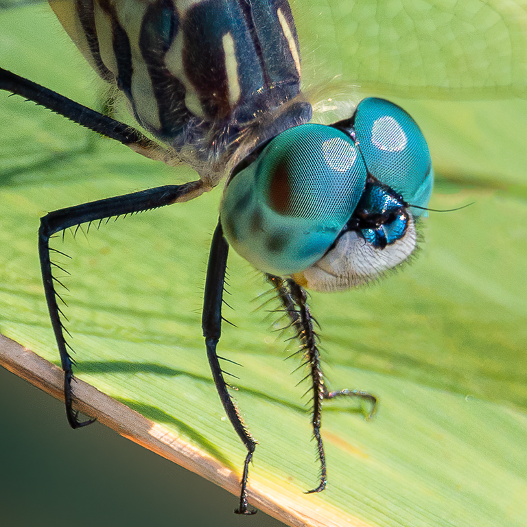
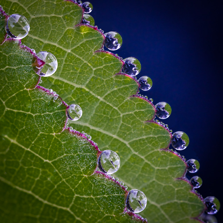
| 61 |
Mar 23 |
Comment |
Great shot of a wasp in a water lily! That little wasp (or is it a hoverfly?) really makes the shot. And, what a crop! Amazing what one can do with 100 megapixels. My only suggestion would be to add a vignette to focus attention on the water lily and clone out those hot spots on the background leaves. |
Mar 10th |
| 61 |
Mar 23 |
Reply |
Thank you, Randall! I thought about darkening the left pod, but didn't consider blurring it. After all, I spent all that time getting those fuzzy things sharp with 30 focus stacked images. :-) I tried darkening the left pod, but found it very difficult as it would also darken the fuzzy things. |
Mar 10th |
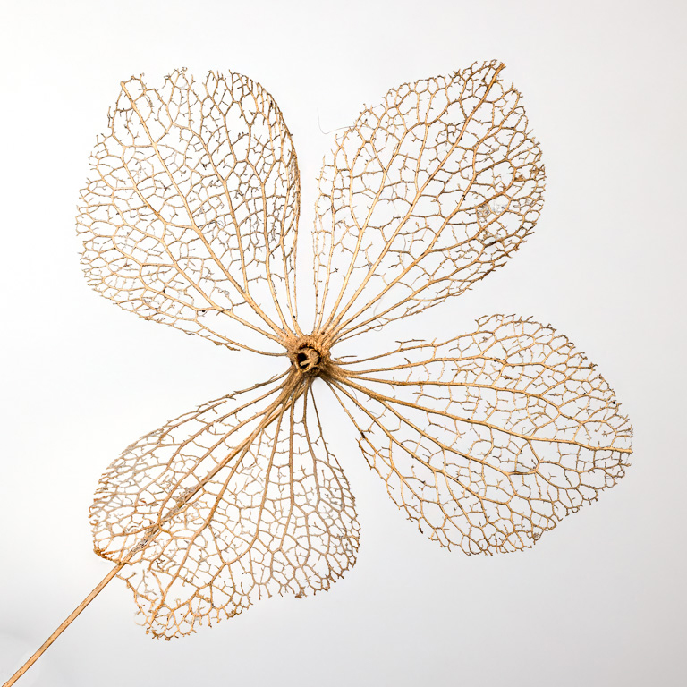
| 61 |
Mar 23 |
Comment |
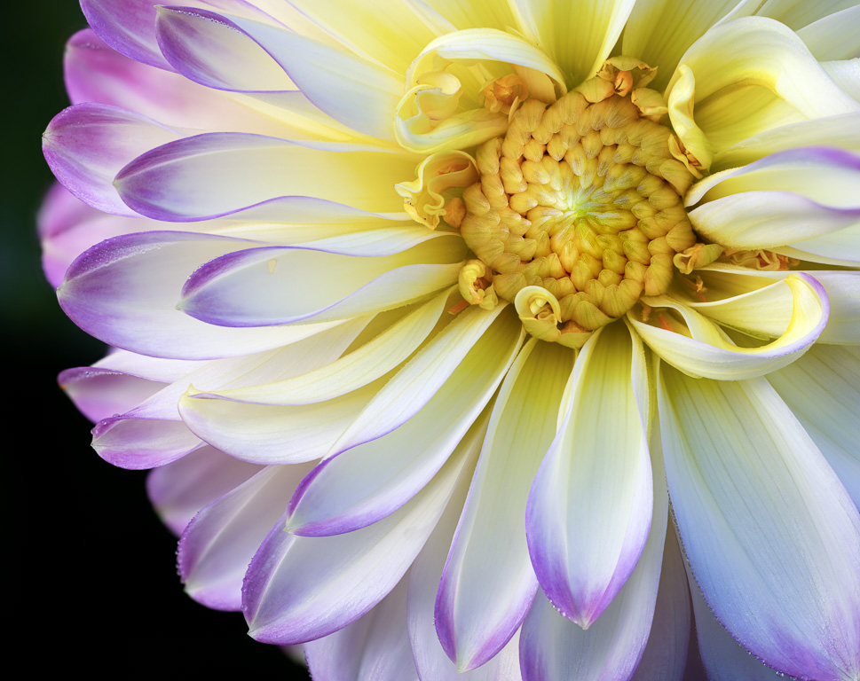
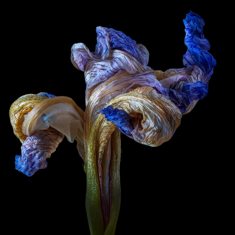
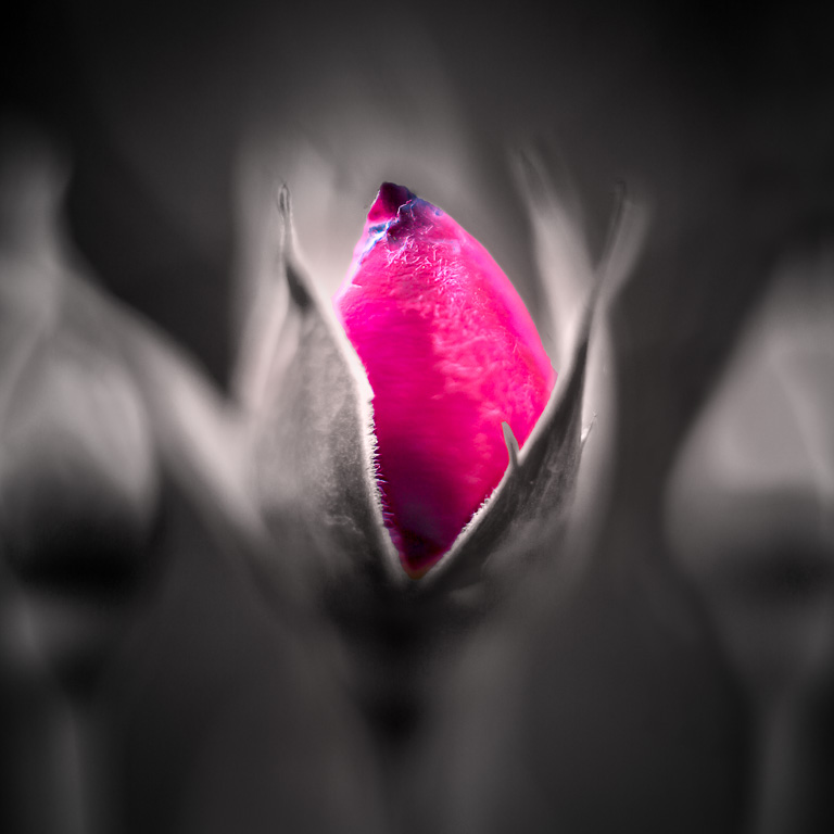
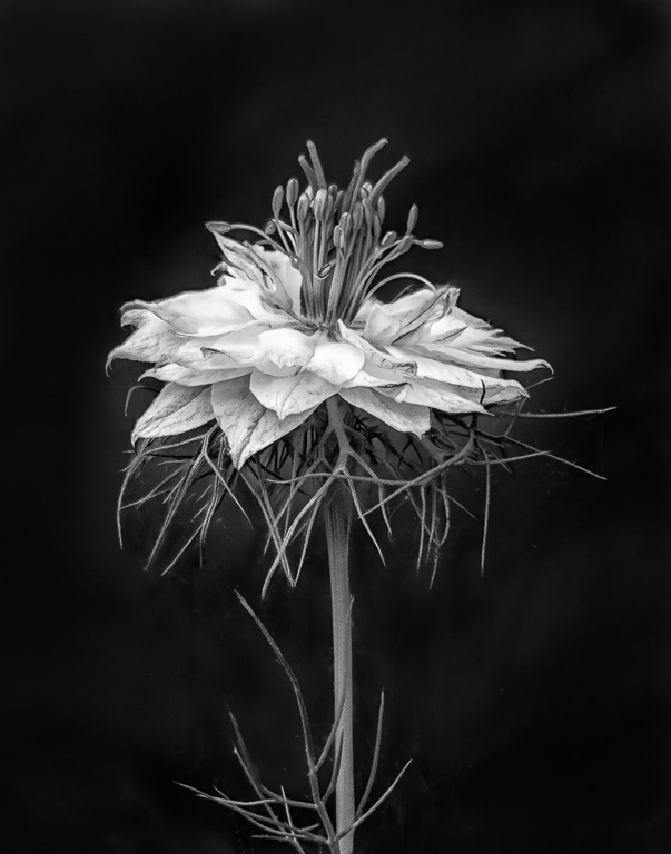
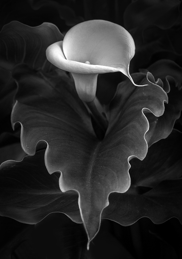
Wow! Love the black and white treatment of this image. Not that it matters, but the original appears to be a different image with a slightly different perspective. Although it is fine as is, I might suggest cloning out the bottom-most leaf, darkening the upper-most leaves and brightening the highlights in the calla lily to make it pop. |
Mar 8th |
 |
| 61 |
Mar 23 |
Reply |
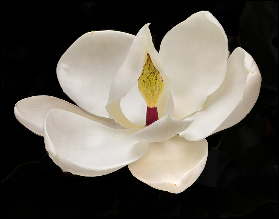
Thank you for stopping by and commenting, Stuart. Even though I did darken the background, perhaps darkening the right side a little more would eliminate some minor distractions. I will try it. Thanks! Yes, I like it! |
Mar 8th |
 |
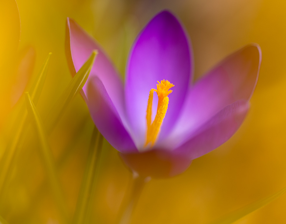
| 61 |
Mar 23 |
Comment |
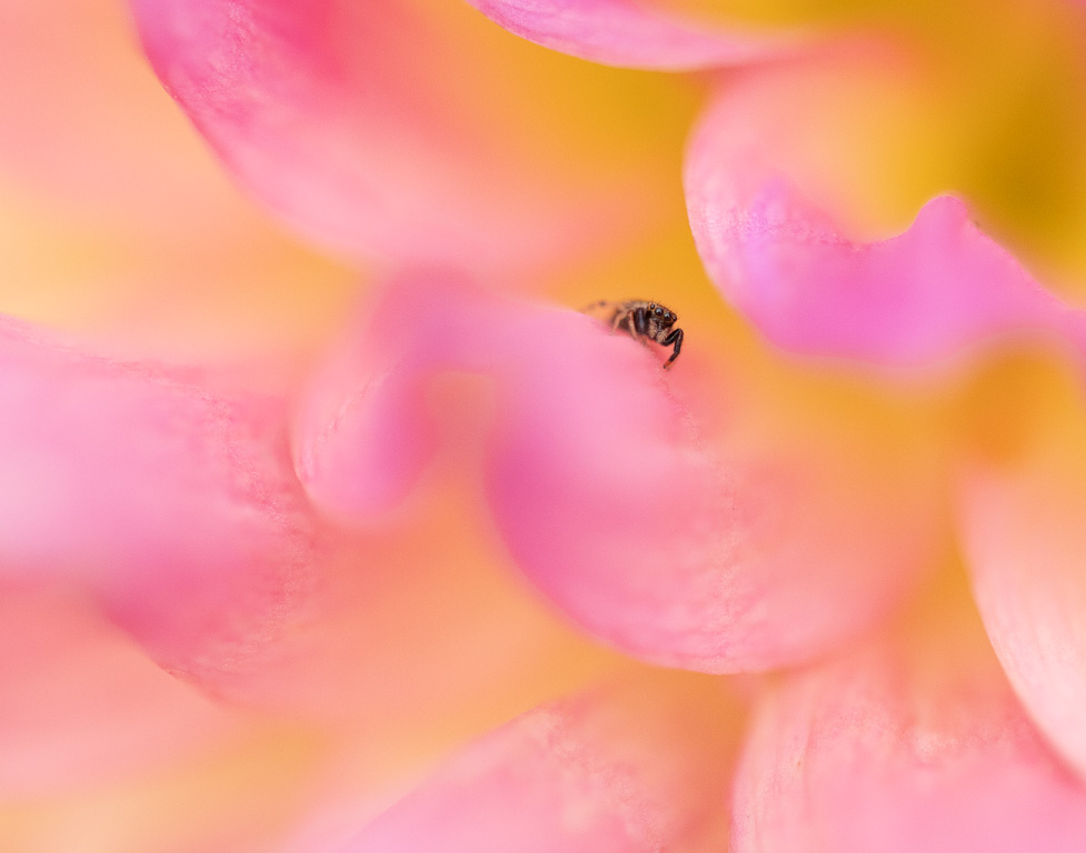
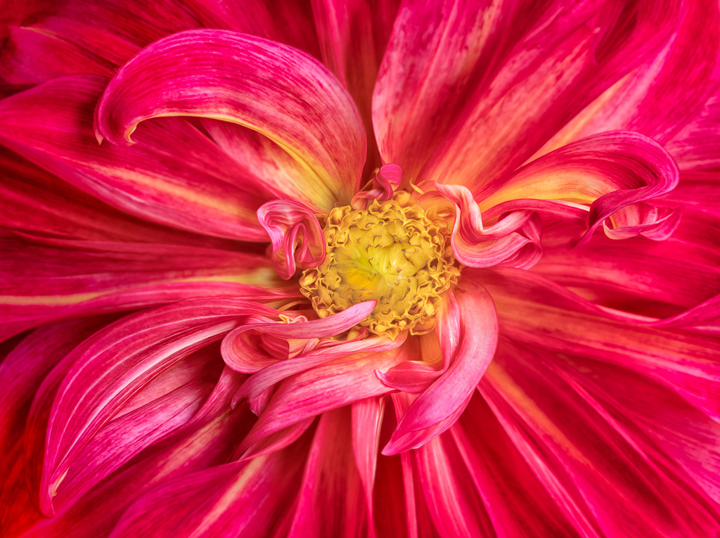
Simple complementary colors and nice diagonal composition. But, I'm not sure whether the moth adds or detracts from the image. |
Mar 3rd |
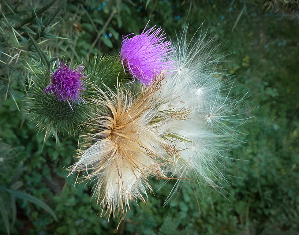
| 61 |
Mar 23 |
Comment |
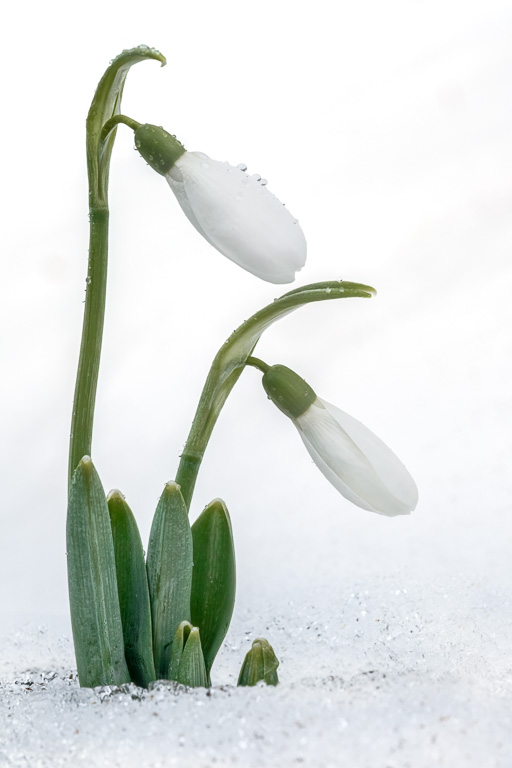
I like the concept your going after - the three phases of the life cycle - birth, life and death. I would like to have seen more on the right side without cropping off part of the white fluff or whatever they're called. Also, the final image seems a little too crunchy. I took the liberty to reprocess the image to reflect these comments. |
Mar 3rd |
 |
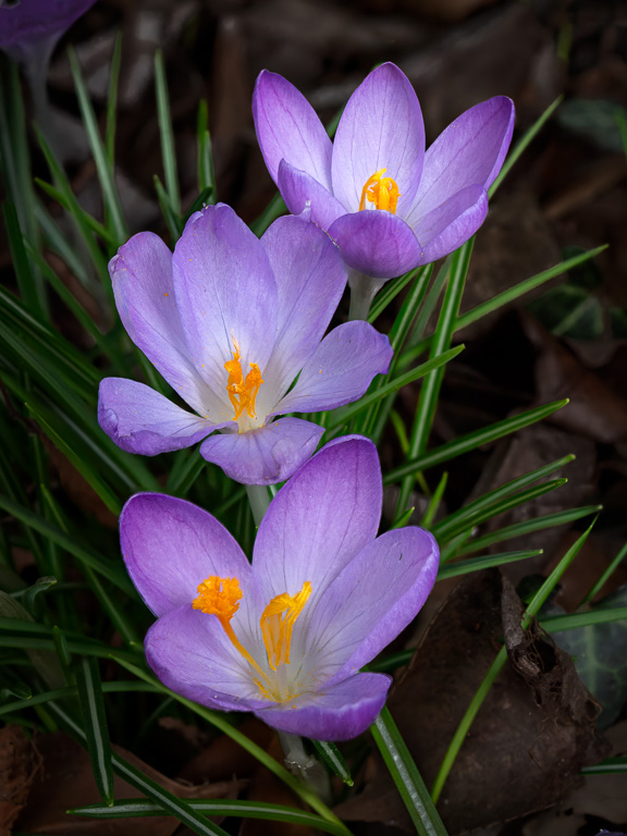
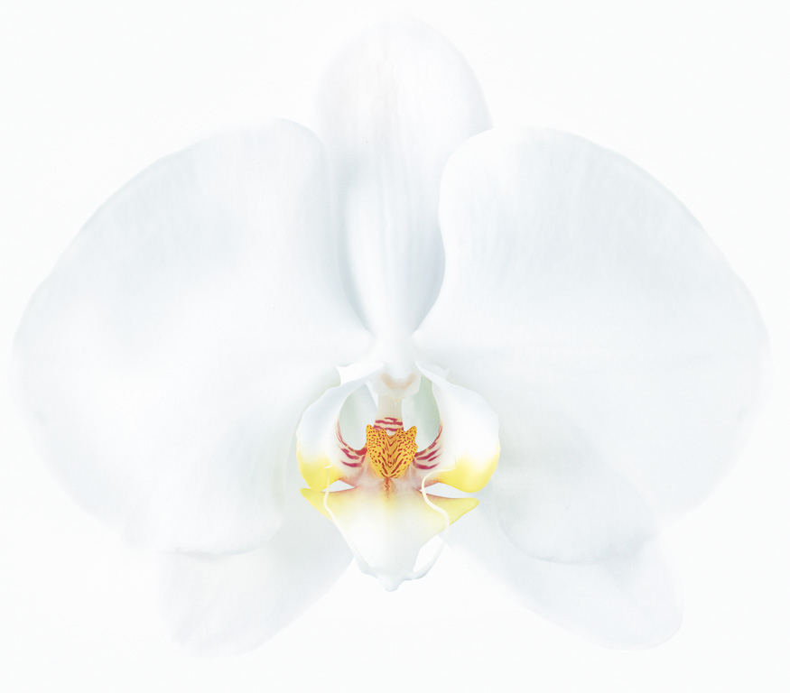
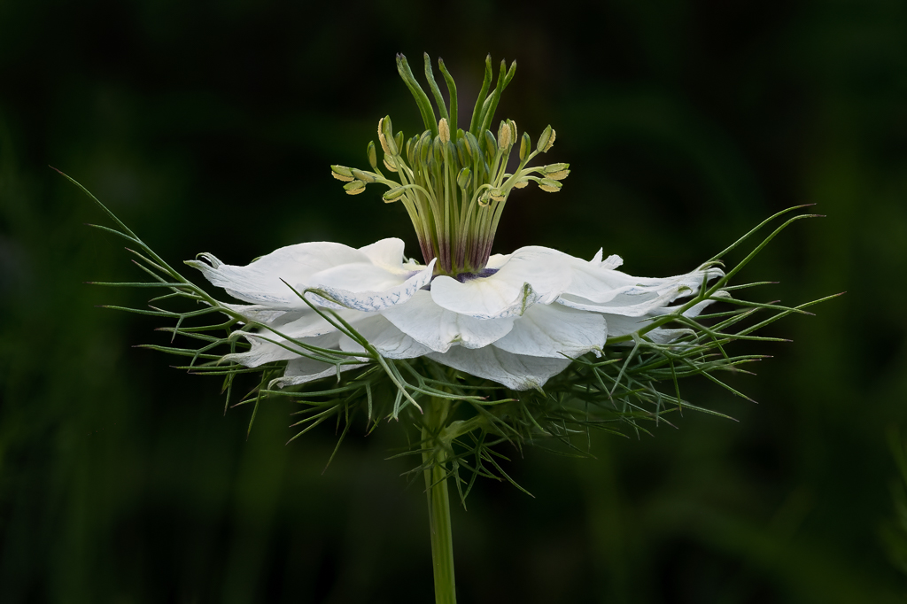
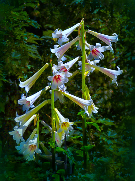
| 61 |
Mar 23 |
Comment |
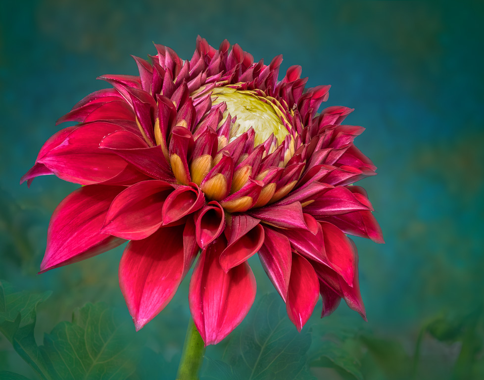
Beautiful, Linda! I like the high-key effect, and backlighting the stargazer lily makes it glow from the inside. If you shot this at f/2, did you then use focus stacking to get it all in focus? Love it! |
Mar 3rd |
6 comments - 8 replies for Group 61
|
12 comments - 17 replies Total
|