|
| Group |
Round |
C/R |
Comment |
Date |
Image |
| 45 |
Feb 23 |
Reply |
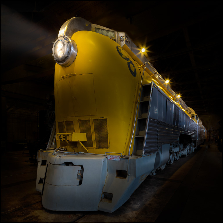
Thank you, Charlie. Yeah, it took a little bit of work to get it to look like a night shot. |
Feb 12th |
| 45 |
Feb 23 |
Reply |
I like it! |
Feb 7th |
| 45 |
Feb 23 |
Reply |
Thank you, Cindy. I wasn't sure I could darken the background evenly, but it came out rather nicely. |
Feb 7th |
| 45 |
Feb 23 |
Reply |
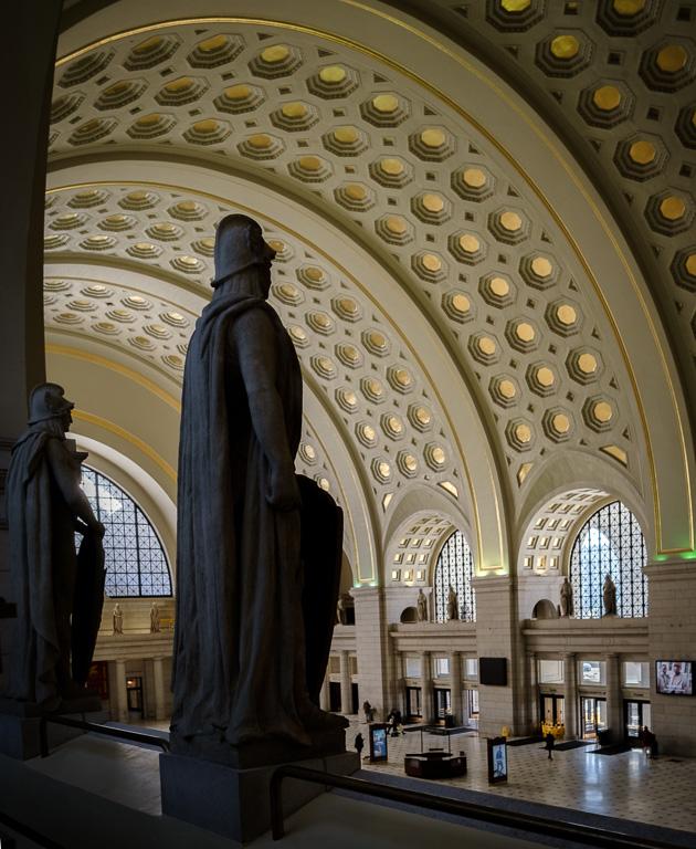
Thank you, Ray. The first top light and all the lights (except the headlight, obviously) are on the ceiling. I intentionally lined them up so they would look like they were on the train. |
Feb 7th |
| 45 |
Feb 23 |
Comment |
I like the night-time winter scene of this image with the falling snow. I can feel the cold as if I'm standing there myself. But, I'm a little confused as to what exactly I should be looking at. Is it the lighted bridge, or the canal boats, or the brightly lit building on the right? Nothing seems to be in sharp focus, perhaps due to the camera being handheld at 1/2 seconds. |
Feb 2nd |
| 45 |
Feb 23 |
Comment |
This image is so Charleston. The colors of the pale green wall and plants in the window box work well with the black shutters and beige window and shades. Nothing competes for attention. As for the composition, I might have added a little more wall at the bottom (which can also be easily done in post processing with some content aware cropping) because the flower box seems a little heavy way down at the bottom of the image. |
Feb 2nd |
| 45 |
Feb 23 |
Reply |
Thank you, Stephen. The lights don't belong on the train, but I do like them in some respect because they do look like they are on the top of the train. And,they add to the night-time effect. |
Feb 2nd |
| 45 |
Feb 23 |
Reply |
Yeah, I wondered about those lights. I expect it to be quite difficult to remove them, but I'll give it a try. |
Feb 2nd |
| 45 |
Feb 23 |
Comment |
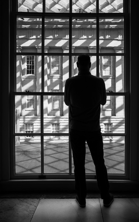
This image definitely has a "solitude" feeling associated with it. But, it also has a nice old filmic look to it; as if it were shot with a classic negative film stock. If I were to suggest bringing out some detail in the sky, the image might lose its filmic look and look more digital. So I would not change anything. |
Feb 2nd |
| 45 |
Feb 23 |
Comment |
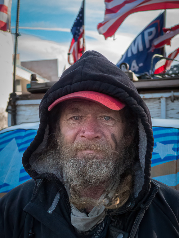
I like this environmental portrait of an old carpenter sawing wood. Everything in the image just fits together. The carpenter's beard is what makes this image for me. But, I wonder if cropping the image just above the carpenter's knees and a little off the top would focus more attention to the carpenter's face and beard. Great image as is, too! |
Feb 2nd |
| 45 |
Feb 23 |
Comment |
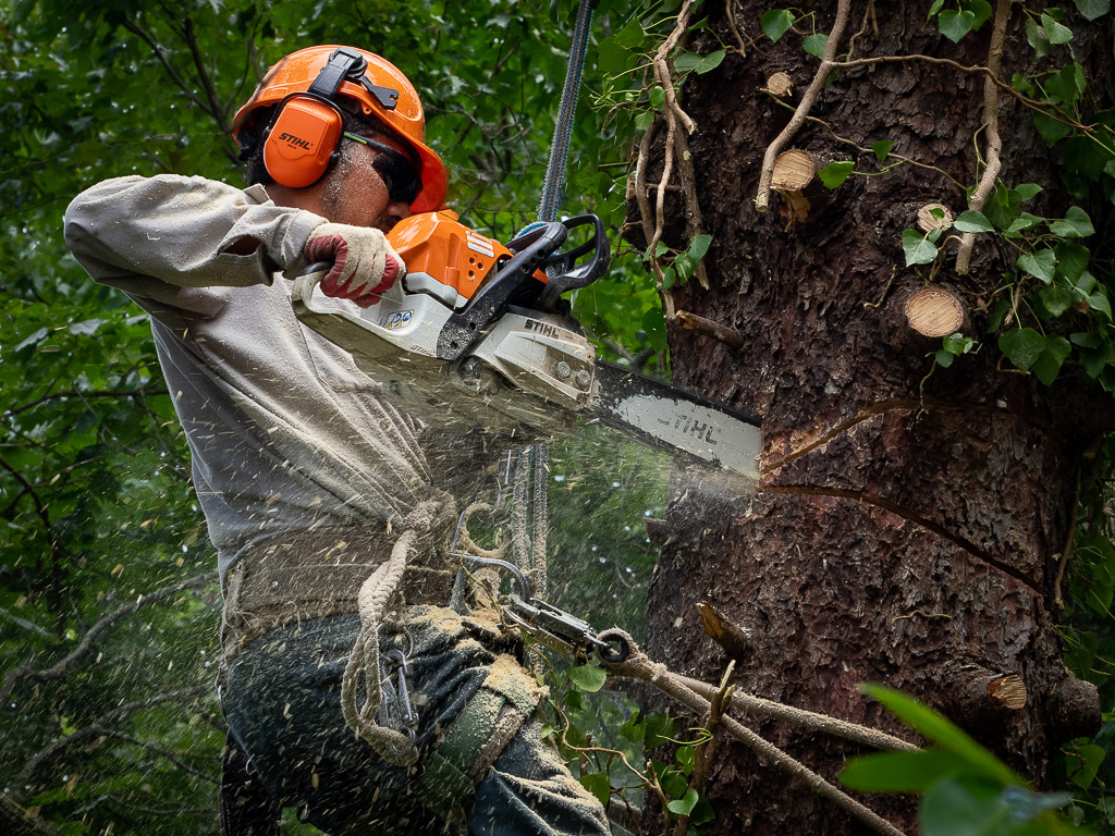
I like this image, and not just because I like old trains. I have a hard time getting train images with the train in motion and with steam coming out of the smoke stack. The conductor adds a nice humanistic value. The only suggestion I might make is to crop a little off the sides. It might help focus more attention on the interaction between the conductor and train. After looking at the original, I wonder if leaving the closest passenger's head sticking out of the train would add some more interest. It would look like the conductor and passenger are looking at each other. |
Feb 2nd |
| 45 |
Feb 23 |
Comment |
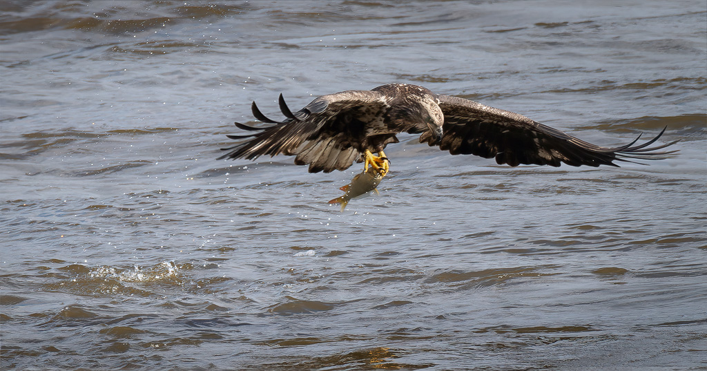
Hi, Charlie. I like how you composited the two images of sandhill cranes together. It looks realistic except for the lighting. The color of the closer cranes appear much warmer than the other cranes that are almost white. Perhaps, if you cooled the temperature (or desaturated the yellow tones) of the closer cranes, the colors might match better. Other than that, it's a great shot! |
Feb 2nd |
6 comments - 6 replies for Group 45
|
| 61 |
Feb 23 |
Reply |
You shoot what's there. I can't arrange the flowers in a public garden. :-) |
Feb 24th |
| 61 |
Feb 23 |
Reply |
I, too, prefer the original, but even then I wasn't convinced it was competition worthy. I used it because it was a good candidate for this month's selective-color theme. |
Feb 24th |
| 61 |
Feb 23 |
Reply |
Thank you, Ingrid. I fully agree with you. |
Feb 24th |
| 61 |
Feb 23 |
Reply |
Oh, no...please don't burn out those beautiful bokeh balls! :-) |
Feb 19th |
| 61 |
Feb 23 |
Reply |
I'm just having too many senior moments these days! |
Feb 10th |
| 61 |
Feb 23 |
Comment |
This is a beautiful image - both the original and the selective-color one. The bright orange color of the monarch butterfly jumps out in the B&W conversion, but stands out just as nicely in the original because of the muted colors of the flowers and background. The more I look at both images, I'm starting to like the color image more. Great shot! |
Feb 8th |
| 61 |
Feb 23 |
Reply |
Sorry, Randell. I'm not sure where Russell came from! |
Feb 7th |
| 61 |
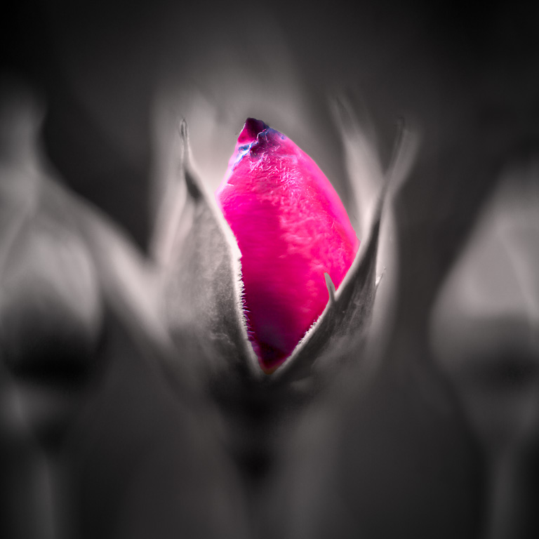
Feb 23 |
Comment |
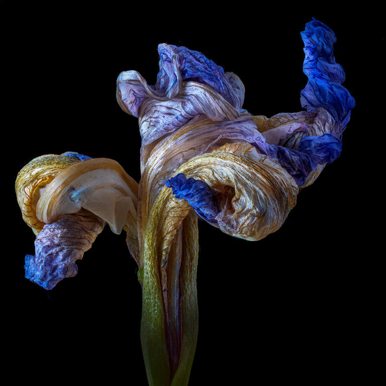
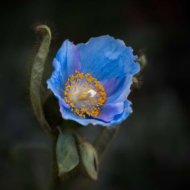
Nice selection of the iris bud. Iris buds are quite fascinating, and the conversion of everything but the bud allows one to concentrate on the bud's colors and texture. I might suggest cropping off the top of the petal behind the bud. I don't think it's important to see the entire petal, and it draws my eye away from the bud. |
Feb 6th |
| 61 |
Feb 23 |
Comment |
I like what you did to this image as far as color selection is concerned - keeping both the orange and green colors, but de-saturating them. Keeping only one color probably would not have worked quite as well. |
Feb 6th |
| 61 |
Feb 23 |
Reply |
Thanks, Russell. Sorry to hear about your injury. Yeah, the black tip was unfortunate. So, I took a stab at fixing it. |
Feb 6th |
 |
| 61 |
Feb 23 |
Comment |
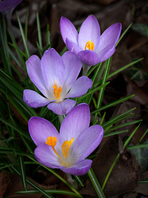
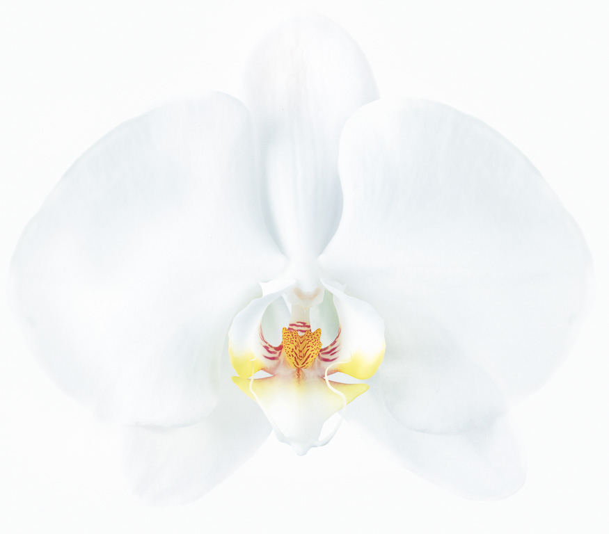
A very interesting approach making only one of three orchids in color. It makes me stop to think, "Why did she pick the bottom orchid?" "Why not the middle or top one?" And, then I noticed that the bottom orchid is standing straight up the most with the middle one leaning back somewhat, and the top one leaning back the most. With that progression, it makes sense to color the bottom orchid where the progression starts. But, I'm probably way off! |
Feb 2nd |
| 61 |
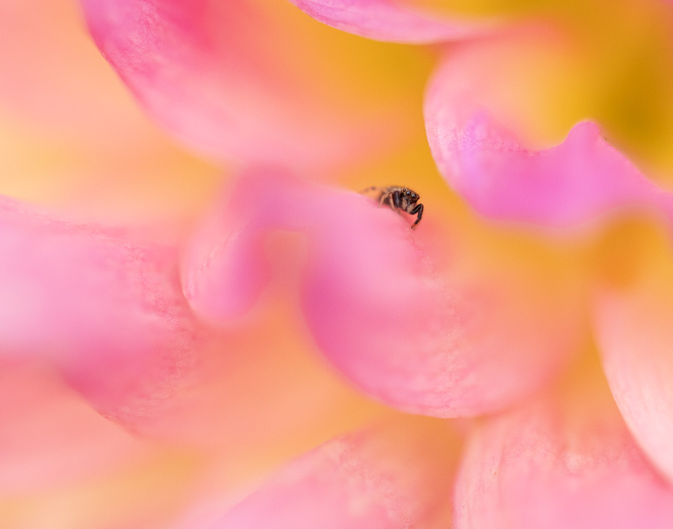
Feb 23 |
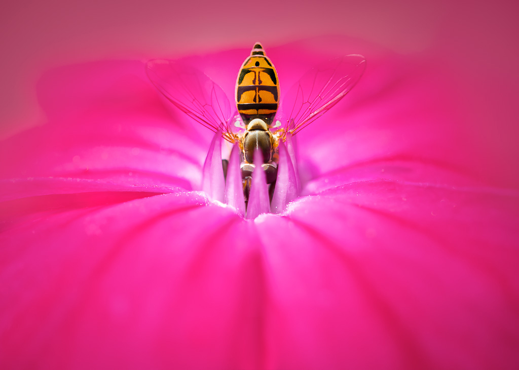
Comment |
This is a very pleasant macro image of a butterfly on a sunflower. You did a nice job isolating the colors of the butterfly. If I were to make any recommendations, I might suggest cropping a little bit of the sunflower off the top (making it a square format) and possibly rotating the image 90 degrees counter-clockwise. |
Feb 2nd |
5 comments - 7 replies for Group 61
|
11 comments - 13 replies Total
|