|
| Group |
Round |
C/R |
Comment |
Date |
Image |
| 45 |
Jan 23 |
Reply |
Thank you, Bai! |
Jan 31st |
| 45 |
Jan 23 |
Reply |
Thank you, Ray! |
Jan 18th |
| 45 |
Jan 23 |
Reply |
Wow! You've got a winning image now! I like it in color better than in B&W. |
Jan 10th |
| 45 |
Jan 23 |
Reply |
Thank you, Robert. The lighting was atrocious, and it took some effort in post to get the colors and tones to an acceptable level. |
Jan 9th |
| 45 |
Jan 23 |
Reply |
Thanks, Charlie! |
Jan 9th |
| 45 |
Jan 23 |
Comment |
This is a beautiful twilight image with the blue sky nicely complementing the warm yellows of the tea room. You did a good job of balancing the exposure across the image especially on the left side. If I were to suggest anything, it might be to add a little contrast back into the overall image. Some of those brown areas could be darkened a bit, but not so far as to lose the details. |
Jan 8th |
| 45 |
Jan 23 |
Reply |
Thanks, Cindy. It was so crowded there that no one noticed me taking pictures, or they thought I was taking pictures of the lights. |
Jan 8th |
| 45 |
Jan 23 |
Comment |
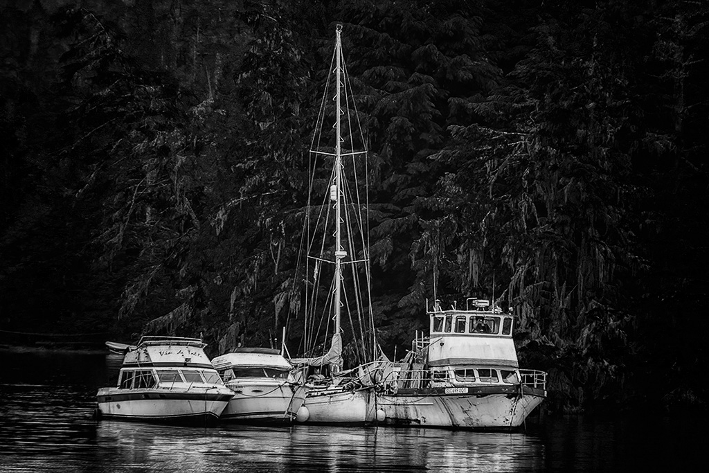
I also like the scene of the brighter boats nestled in the dark tree lined cove, especially the composition of the boats with the tall mast creating a triangle with the boats' hulls. But, the brighter parts of the trees seem to compete with the white boats, and the triangle shape is obscured. Maybe converting the image to B&W and darkening the lightest portions of the trees would help bring out the boats. This might be a good example where color is more of a distraction. But, it all depends on what you want the viewer to see. |
Jan 5th |
 |
| 45 |
Jan 23 |
Comment |
This is an unusual image that you don't see very often. Must be a Nantucket thing. If I were to make any suggestions, it might be to darken and/or crop off some of the white fence. It is so bright that it immediately grabs my attention as if it were the main subject. Cropping the bottom portion of the fence might focus one's attention on the roses instead. |
Jan 5th |
| 45 |
Jan 23 |
Comment |
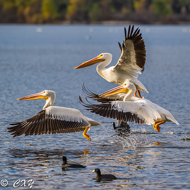
I like this image of pelicans taking off in flight. You caught them at the right moment in time just as their feet were leaving the water. However, I wonder if there are too many birds in the scene. It might make a stronger image, if you were to crop the image to a square format eliminating the three birds in the rear. |
Jan 5th |
 |
| 45 |
Jan 23 |
Comment |
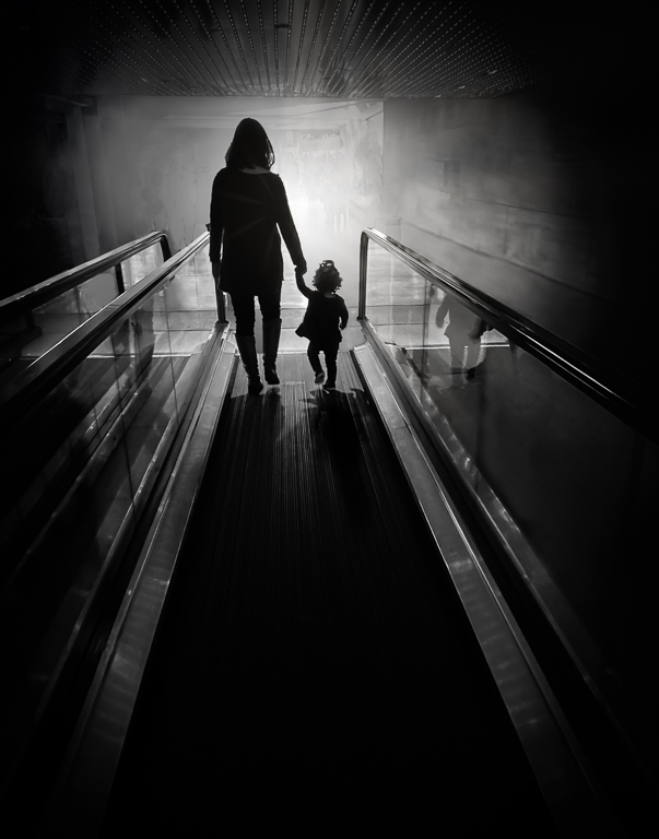
This is an interesting composition of diagonal lines. Taking the picture of the staircase at an oblique angle adds a lot of dynamics and a sense of movement as one's eyes moves up the staircase. My only suggestion would be to increase the tonal range - darken the blacks and lighten the whites to their fullest black and white points. |
Jan 5th |
| 45 |
Jan 23 |
Comment |
It's a shame you couldn't get fireworks shots in this scene. The empty sky would have provided a nice canvas for the exploding fireworks. As it is, the city skyline is okay, but lacks interest in the sky. The streaking horizontal lines from car lights does not add much interest and is more of a distraction. The buildings are nicely exposed. |
Jan 5th |
6 comments - 6 replies for Group 45
|
| 61 |
Jan 23 |
Reply |
Thank you, Ingrid. I played around with the angle of the flower, but, in the end, I preferred it in the original vertical position. |
Jan 17th |
| 61 |
Jan 23 |
Reply |
Thanks, Marti. I'm still on the fence about Lensbaby lenses though. They're fun to use, but not very versatile. |
Jan 13th |
| 61 |
Jan 23 |
Reply |
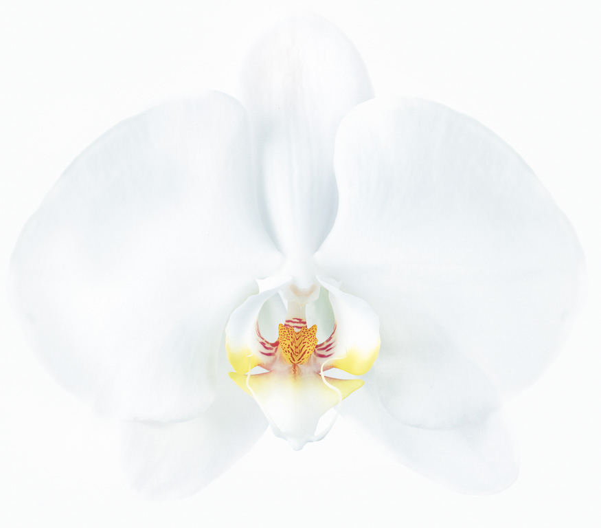
Nice! I like it as a white flower. |
Jan 12th |
| 61 |
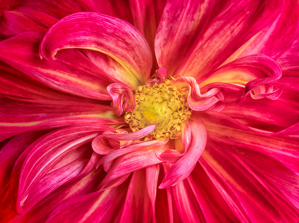
Jan 23 |
Comment |
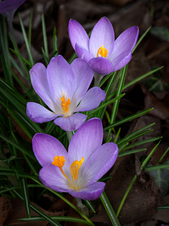
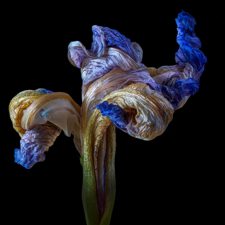
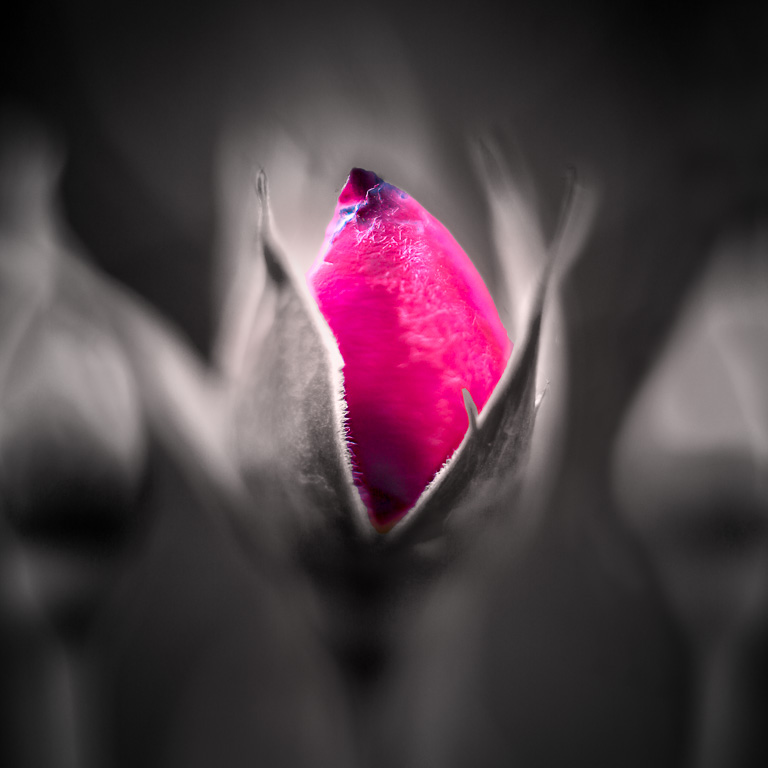
To me, your "grunge" image and Linda's more natural image are two interpretations of an ice rose. I like them both. It's just a matter of personal preference. I like your square crop, but I also like how Linda toned down the bright areas in the background, added a tip of the bottom leaf and added a border. Great subject! Wait...why are roses growing in the middle of winter? |
Jan 12th |
| 61 |
Jan 23 |
Reply |
What an interesting idea! It does make the image more dynamic. I'll have to play around with it some more. |
Jan 12th |
| 61 |
Jan 23 |
Reply |
Yes, I agree the image would have more punch if the top petals were a little more in focus. I've since learned when using Lensbaby lenses to focus bracket at several apertures. By doing so, I can use Photoshop layers to selectively paint in areas that would look better sharp. |
Jan 8th |
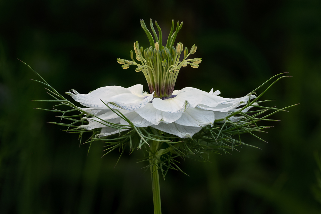
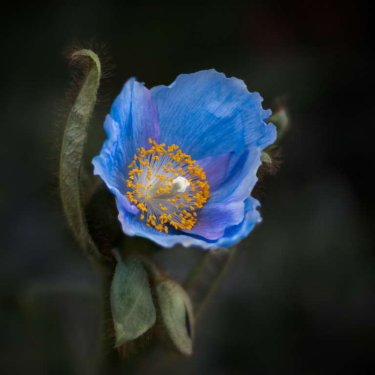
| 61 |
Jan 23 |
Comment |
Calla lilies are one of my favorite flower subjects, and you captured this one very well. I like how the hard shadows actually works well in this image as it brings out the details in the petals and makes the yellow pistil stand out even more. However, that little bright triangular highlight to the left of the pistil is a little distracting. I wonder if you can darken it or somehow make it blend in more with the shadow area? |
Jan 6th |
| 61 |
Jan 23 |
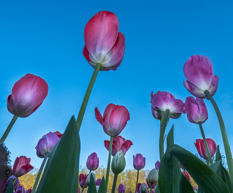
Comment |
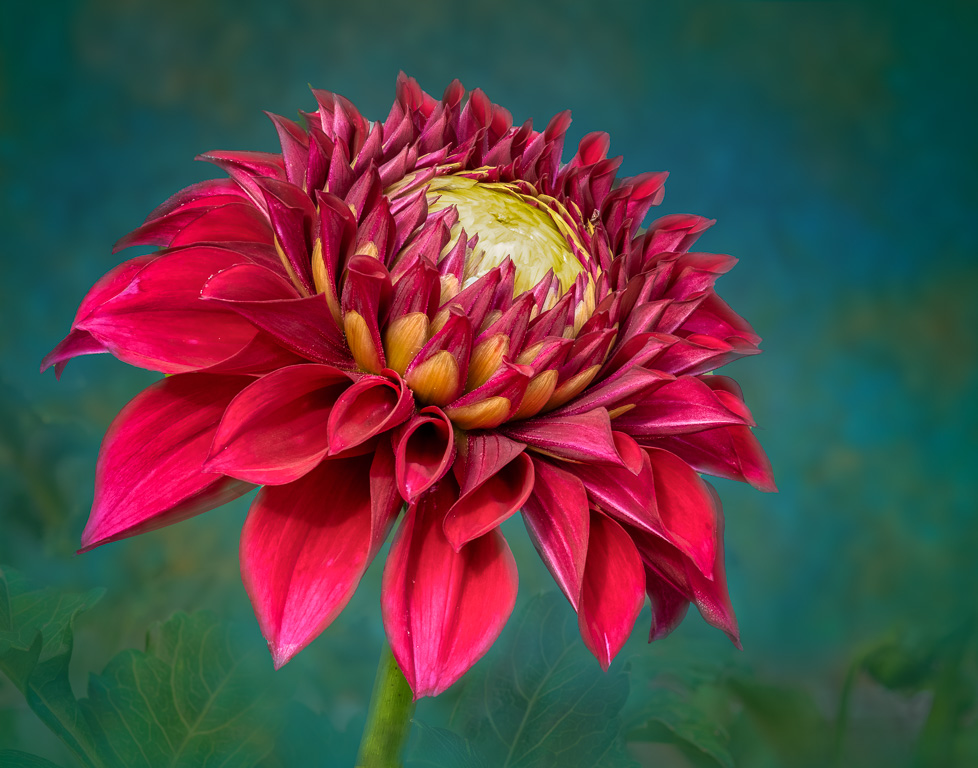
Happy new year, Shirley! I like this simple, natural shot of rain-drenched roses. The pinkish-white roses jump out from the dark, green leaves in the background. The image is nicely cropped with no stray distracting elements on the border although I might try darkening the reflections in the leaves in the upper part of the image. Very well done! |
Jan 6th |
| 61 |
Jan 23 |
Comment |
Happy new year, Marti! You've created a striking image from the original bouquet of flowers by pulling out a lot of detail. You mentioned you used "Topaz Detail." I'm not familiar with that software. It seems similar to DxO's Nik Collection's, "Detail Extractor," in ColorEfex Pro. However, the image seems a wee bit contrasty to my taste. But, I do like the extra detail. |
Jan 6th |
| 61 |
Jan 23 |
Comment |
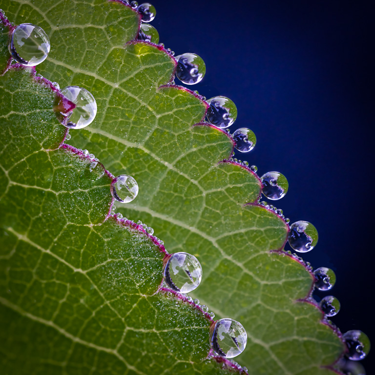
I always wished I could get a shot of a night-blooming cereus in bloom. You captured it at the perfect time, too. Your selection and darkening the background was very nicely done. It appears you used a flash or some point light source that is causing some hard-edge shadows. That might not be a bad thing as it separates the white petals from each other. My only suggestion would be to keep the petals as white and bright as they are in the original. The outer petals appear too yellow and unnatural in the final image. |
Jan 5th |
| 61 |
Jan 23 |
Comment |
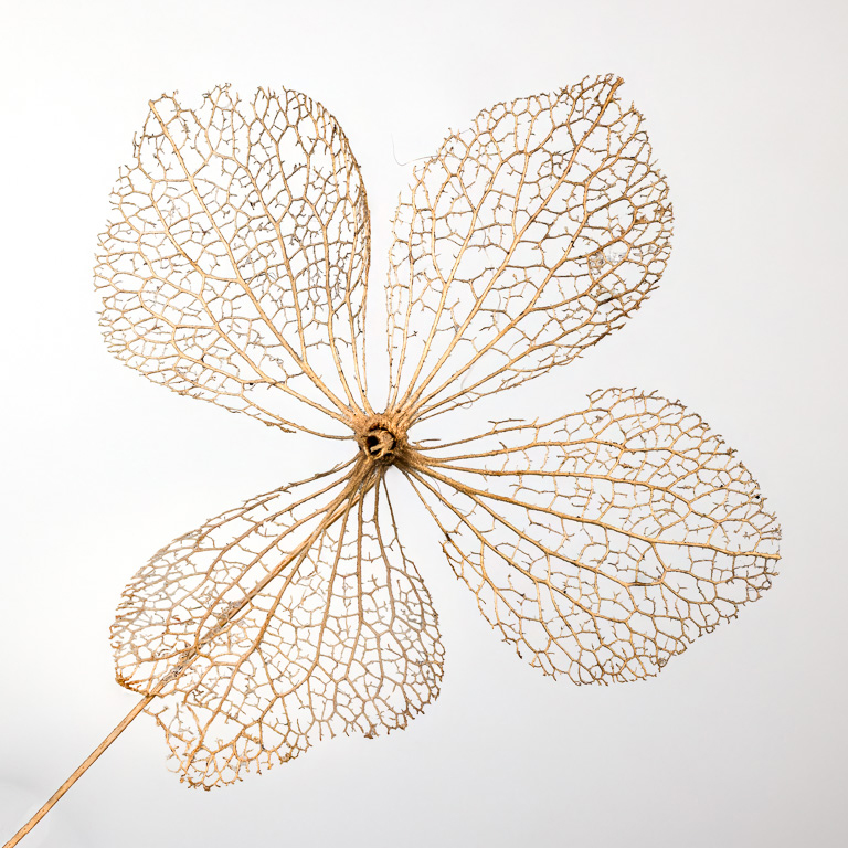
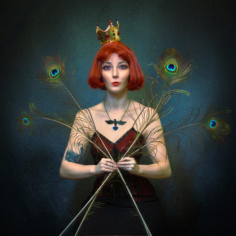
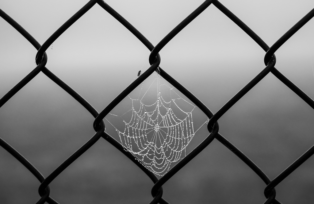
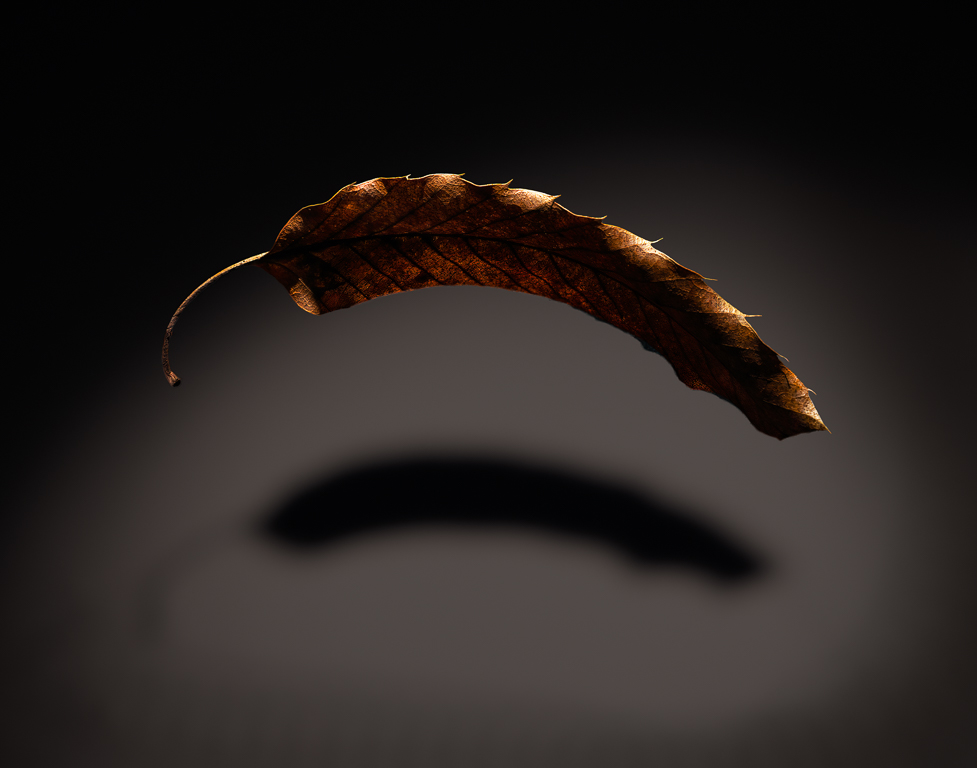
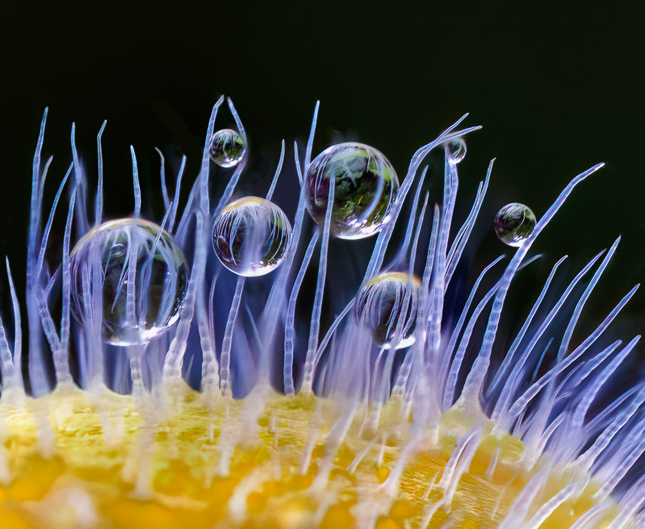
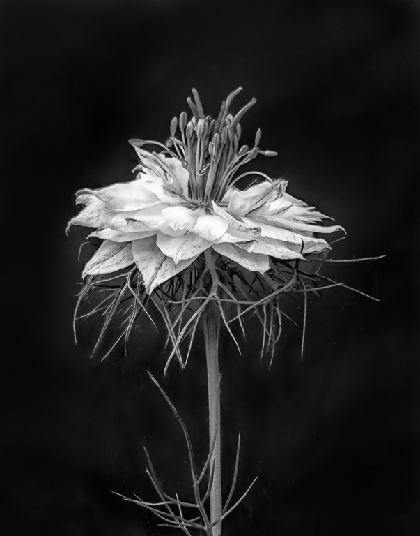
I really like this shot! It certainly looks like a close-up shot of a bird's feather. You did some amazing post-processing magic to get this final image. I have no suggestions on how to improve the image. Great job! |
Jan 5th |
6 comments - 5 replies for Group 61
|
12 comments - 11 replies Total
|