|
| Group |
Round |
C/R |
Comment |
Date |
Image |
| 45 |
Nov 22 |
Reply |
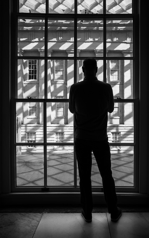
Thank you, Phyllis. I like them both as well, leaning more towards the "lone-walker" shot. |
Nov 27th |
| 45 |
Nov 22 |
Reply |
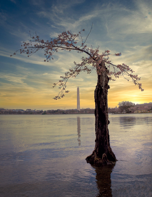
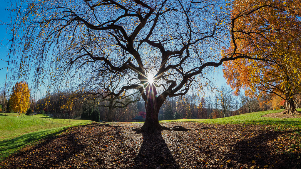
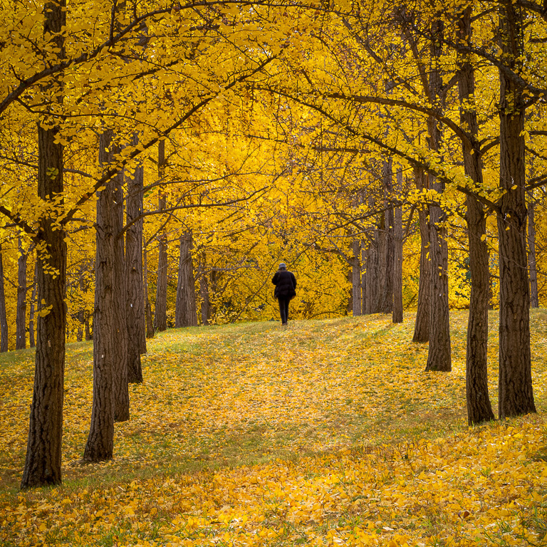
Thanks, Ray. Most images of this ginkgo grove by me and others show only the trees and ground cover. I was quite elated to find a composition with the sky in it because it was so different. The shot might seem obvious, but in reality, there are only a few spots to stand to get this image. |
Nov 9th |
| 45 |
Nov 22 |
Reply |
Thank you, Charlie. Actually, in a different image, I did have a lone walker in it. |
Nov 9th |
 |
| 45 |
Nov 22 |
Comment |
Charlie, I kept coming back and looking at this image, but, I wasn't sure what I liked (or didn't like) about it. As far as it being a reflection shot, it works because of the still water. The trees are nicely reflected. However, I wish the trees had either more leaves on them or no leaves on them. The little bit of brown leaves on the center tree and that clump of gray-green in the upper center seem to draw my attention the most, but are the least interesting parts of the image. It might be worth going back when all the leaves have fallen and capture just the branches reflecting in the water. Or, next year, capture a reflection of the leaves showing off their fall colors. |
Nov 8th |
| 45 |
Nov 22 |
Reply |
Much better...I love it. Perfect! |
Nov 5th |
| 45 |
Nov 22 |
Comment |
With the frog looking directly at the camera, the image does look like a nicely posed portrait. All you would have needed was for the frog to say, "cheese" (just kidding). I wonder if the image would be stronger cropped to a square as the leaf doesn't add a whole lot to the image and actually pulls my attention from the frog. |
Nov 5th |
| 45 |
Nov 22 |
Reply |
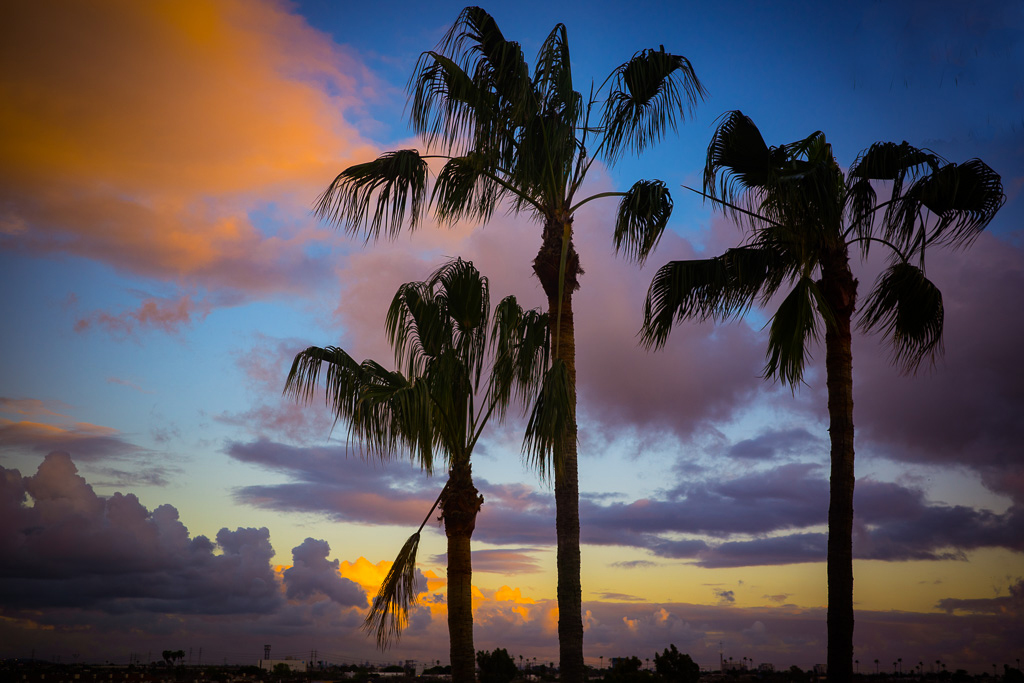
Thank you, Cindy. Sometimes I get too close to my images. With both your and Robert's comment about the blue tint in the mountains and sky, I'm inclined to reduce the blue somewhat.
btw...I usually get notifications in my email when someone comments on my image, but lately, I haven't. Did something change? |
Nov 5th |
| 45 |
Nov 22 |
Reply |
Yes, I like it. With the reduced bluish tint, the image looks more natural. |
Nov 5th |
| 45 |
Nov 22 |
Comment |
A beautiful landscape scene with nice fall colors. The image has interesting features in the foreground, mid-ground and background. When I opened the original, I found that I liked it more than the processed image. The original color of the water has a pleasing and natural blue tint, and the original texture is smoother compared to the slightly "crunchy" texture of the processed image. I realize it's all personal taste, and it's what you want to convey. |
Nov 3rd |
| 45 |
Nov 22 |
Comment |
This is a striking and timeless canal image with nice fall colors. Everything is sharp from front to back. And, the water provides a nice S-curve to lead one's eyes from the boat through the tunnel. Also, you did an excellent job of eliminating that ugly black tube and object as well as the orange cone that ruin the timelessness of the image. |
Nov 3rd |
| 45 |
Nov 22 |
Reply |
Thank you, Robert. I've learned to trust my eyes rather than the images in my camera monitor knowing that details in dark areas can be brought back in post processing. For that reason, I expose to ensure the highlights are not blown out. Sometimes, I take several shots at bracketed exposures to be sure I get all the shadow details (which I did in this case), but I didn't need to use the other bracketed shots. |
Nov 3rd |
| 45 |
Nov 22 |
Comment |
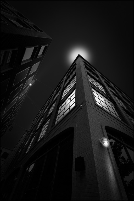
I, too, could only see a small thumbnail of the image making it difficult to provide any useful comments. If it's similar to your other night scenes, I'm sure it has plenty of detail. |
Nov 3rd |
5 comments - 7 replies for Group 45
|
| 55 |
Nov 22 |
Comment |
Very creative shot, Pauline! I would only suggest lightening the shadow area in the book with the tapenade recipe as that area is in the center of the image and where one's eyes goes first. It doesn't have to be as bright as the rest of the pages, but shouldn't be so dark. |
Nov 13th |
1 comment - 0 replies for Group 55
|
| 61 |
Nov 22 |
Reply |
I don't shoot with my camera either, but, in this case, it was all I had with me. For close-up shots, I like the large depth-of-field due its small sensor. |
Nov 26th |
| 61 |
Nov 22 |
Reply |
Thank you for stopping by, Dhananjay! |
Nov 19th |
| 61 |
Nov 22 |
Reply |
Thank you, Linda! |
Nov 15th |
| 61 |
Nov 22 |
Reply |
Thank you, Ingrid. Yes, I was quite surprised how much detail the iPhone retained - even cropped. |
Nov 13th |
| 61 |
Nov 22 |
Reply |
Thank you, Randall. I tend to lean towards B&W while my wife likes color. |
Nov 13th |
| 61 |
Nov 22 |
Reply |
Good job, Linda! I like it a lot. |
Nov 12th |
| 61 |
Nov 22 |
Reply |
Thank you, Marti. Yes, the cropping was deliberate and fortuitous. |
Nov 11th |
| 61 |
Nov 22 |
Comment |
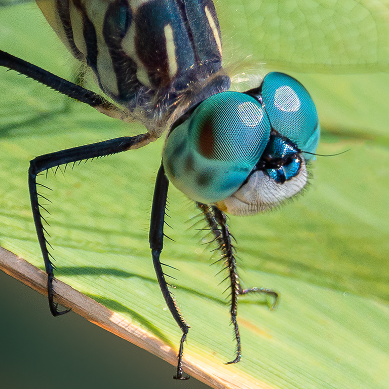
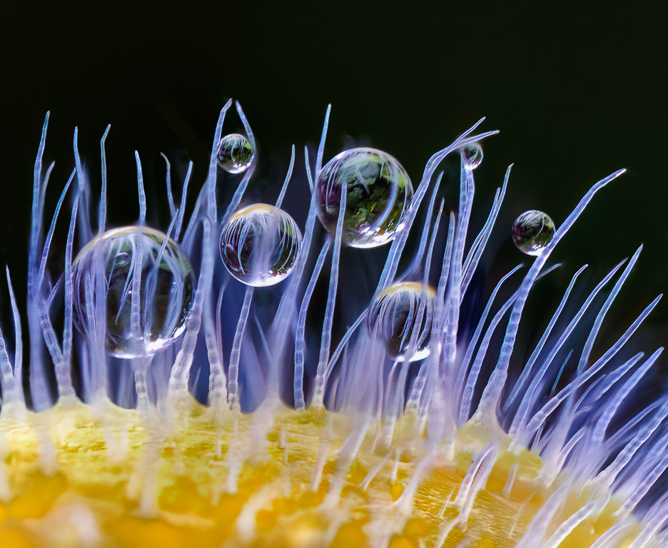
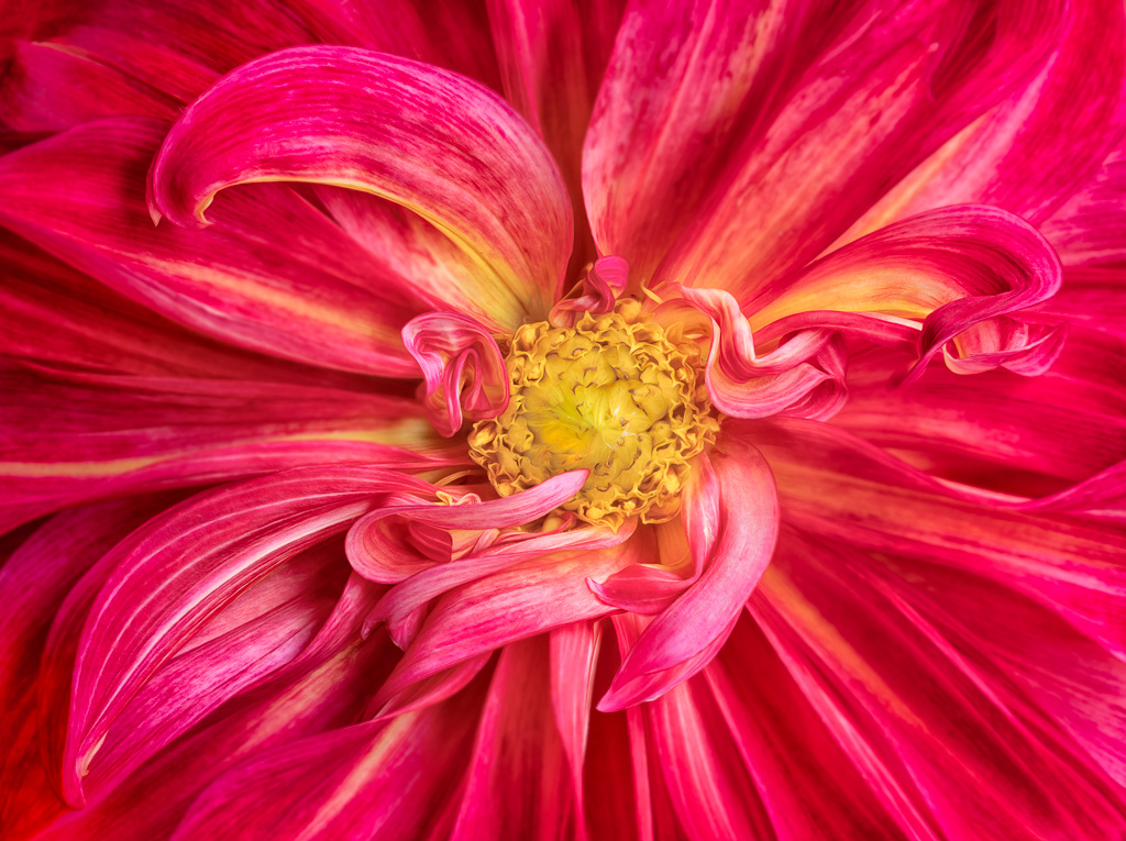
Not being a big fan of textures, I hesitate to comment on your image. But, I don't want to ignore it either. So here goes. I like the diagonal composition of the blossoms that leads the eye from the front blossom to the back blossoms, gradually becoming more out of focus. To me, the white blossoms could be brightened somewhat as the overall image seems slightly underexposed. Lastly, the textured background looks like white worms similar to when I over-sharpen my Fuji X-trans-sensor images too much. I'm wondering what the image would look like without the texturing. |
Nov 9th |
| 61 |
Nov 22 |
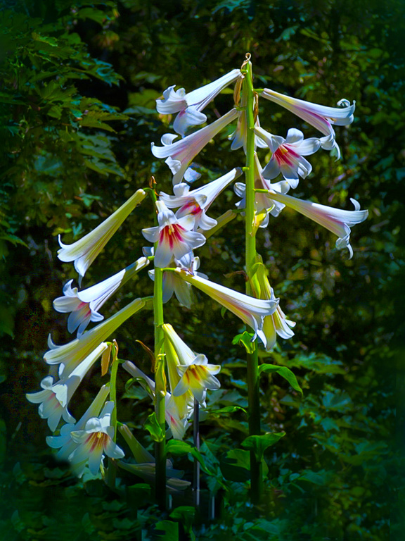
Comment |
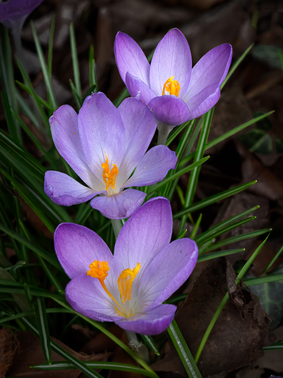
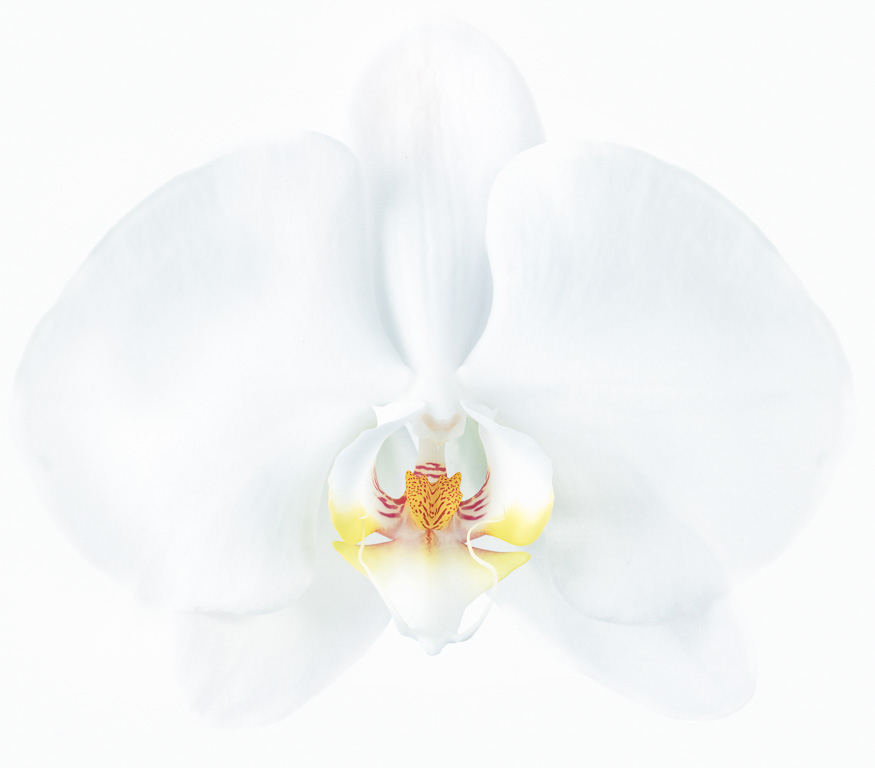
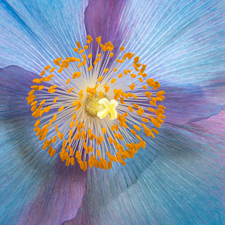
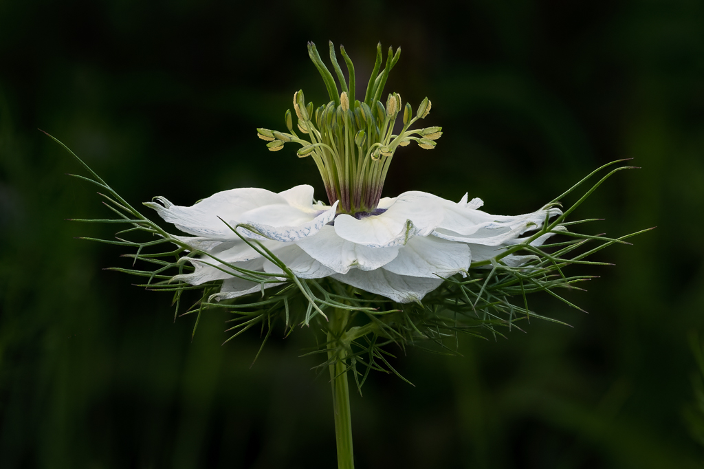
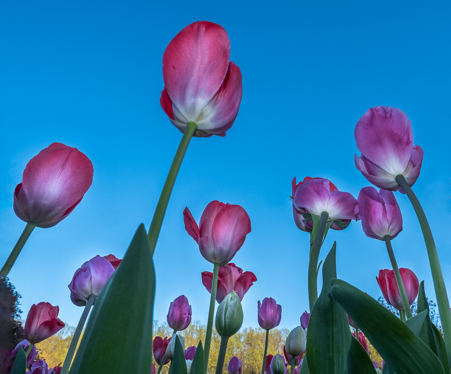
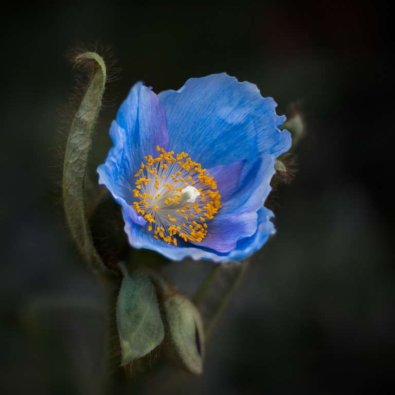
You captured an unusual perspective with this shot...looking up. I like the simplicity of it, too. The entire flower appears to be in good focus with nice cropping and rotation giving the final image a nice diagonal component. If I were to make any changes, I would rotate it a little more so the stem comes directly from the corner. Also, I'm not sure about the color of the sky. It seems to have too much green giving it an aqua tint; but, maybe that's what you were going for. |
Nov 9th |
| 61 |
Nov 22 |
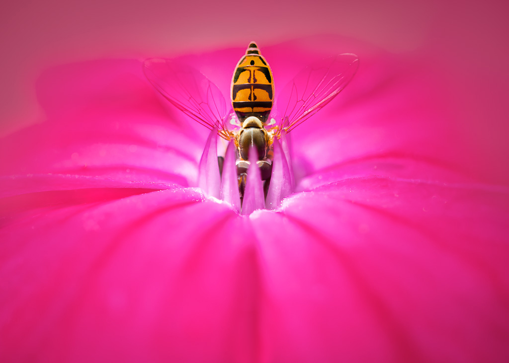
Comment |
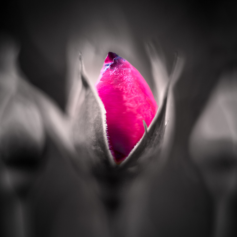
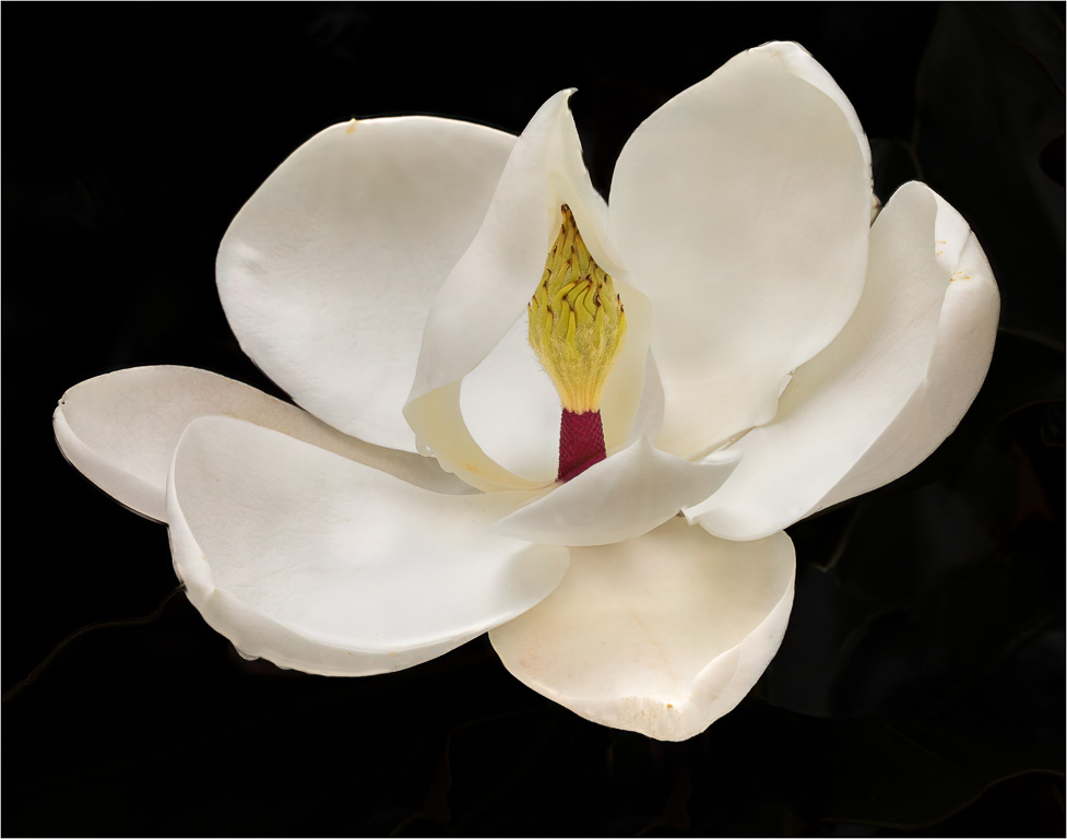
This looks to be some kind of rose variety with interesting stamen that appear to be in good focus. The rose petals also provide a nice frame for the stamen. However, it would have been more effective if you could have moved the rose petal on the left out of the way. If this was a public garden, that suggestion would not be possible. You did a good job of brightening the stamen, but, to me, they could be a touch brighter with a little more contrast. |
Nov 5th |
| 61 |
Nov 22 |
Comment |
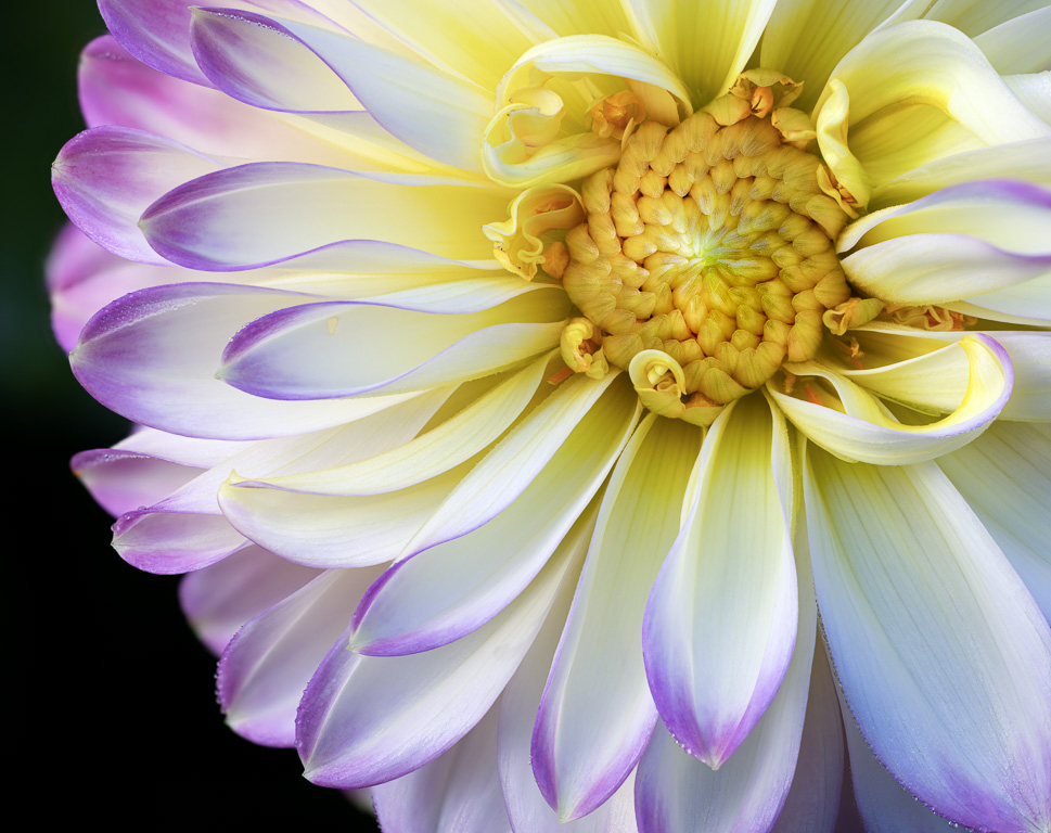
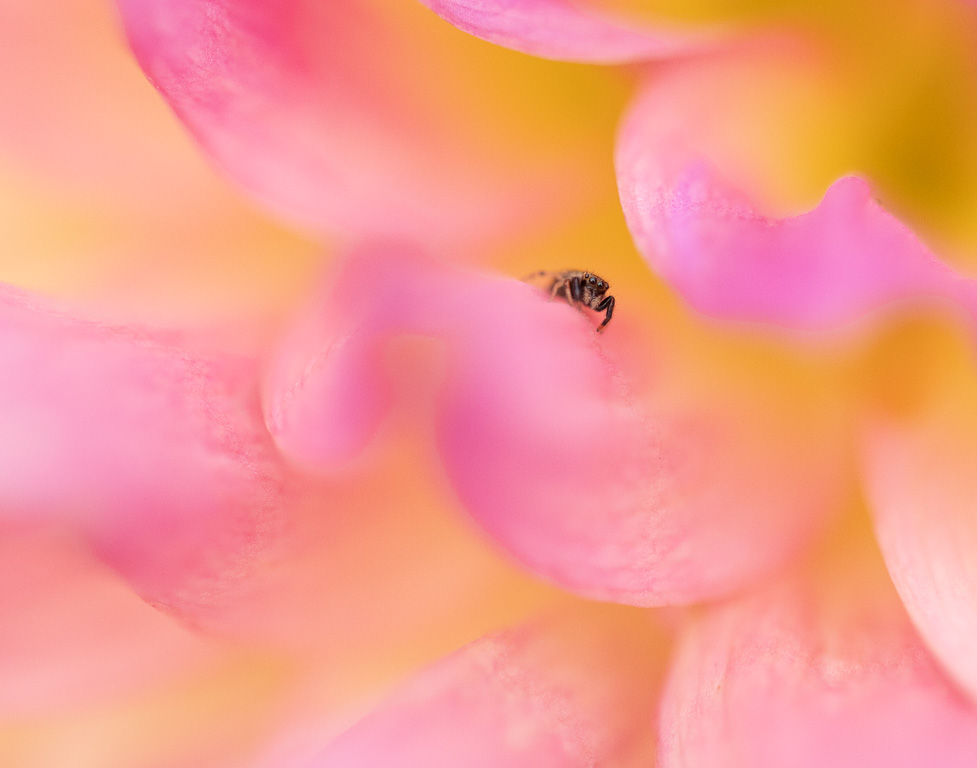
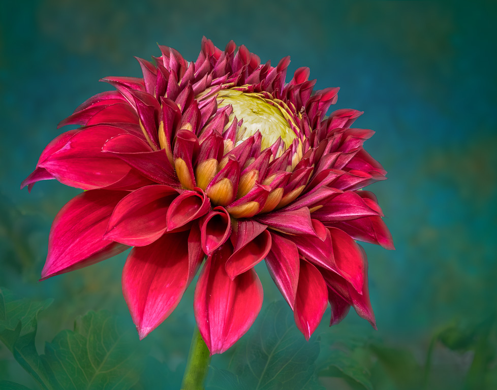
Your dahlia image looks a lot like my chrysanthemum image this month. Both were shot with an iPhone, too! You captured the circular pattern of the petals beautifully. And, I like how you offset the center allowing it to show off the open petals on the left side. The direct sunlight, however, produced harsh shadows that can't be fixed in post. When I find myself without a diffuser in bright sunlight, I stand in front of the flower to cast a shadow on it resulting in a much softer image. |
Nov 5th |
| 61 |
Nov 22 |
Comment |
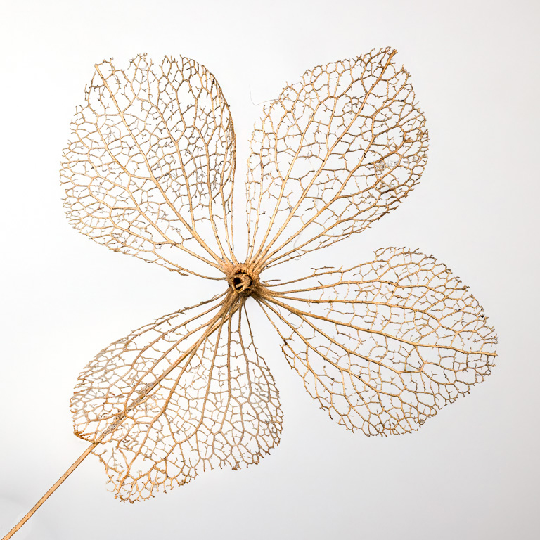
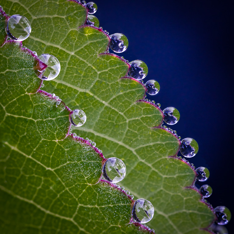
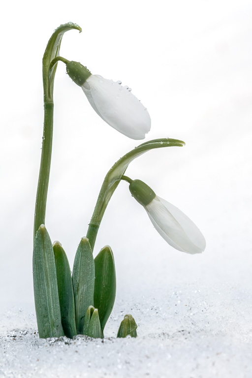
I like this image very much. The violet color nicely complements the green shades. The tall brighter light-green buds are sharp and provide a nice focal point. Your selections, masking and blurring looks very natural and makes the plant pop out of the image. I might suggest eliminating or toning down some of those bright white edges along the leaves as they are quite distracting. |
Nov 3rd |
| 61 |
Nov 22 |
Comment |
A nice image indeed. I like how you used PS's liquify tool to stretch the petals to make them more even. And, using the zinnia as background was quite creative. It seems the zinnia have been rotated as well? The final result is very pleasing. I wonder if adding a little more room on the left would improve the image as that is the direction the flower is facing? |
Nov 3rd |
6 comments - 7 replies for Group 61
|
12 comments - 14 replies Total
|