|
| Group |
Round |
C/R |
Comment |
Date |
Image |
| 45 |
Oct 22 |
Reply |
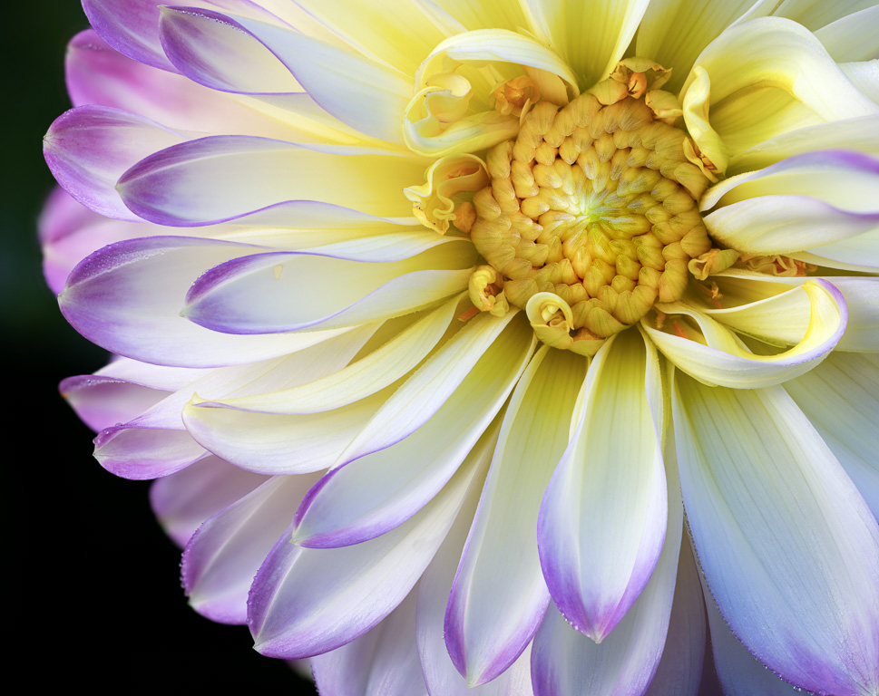
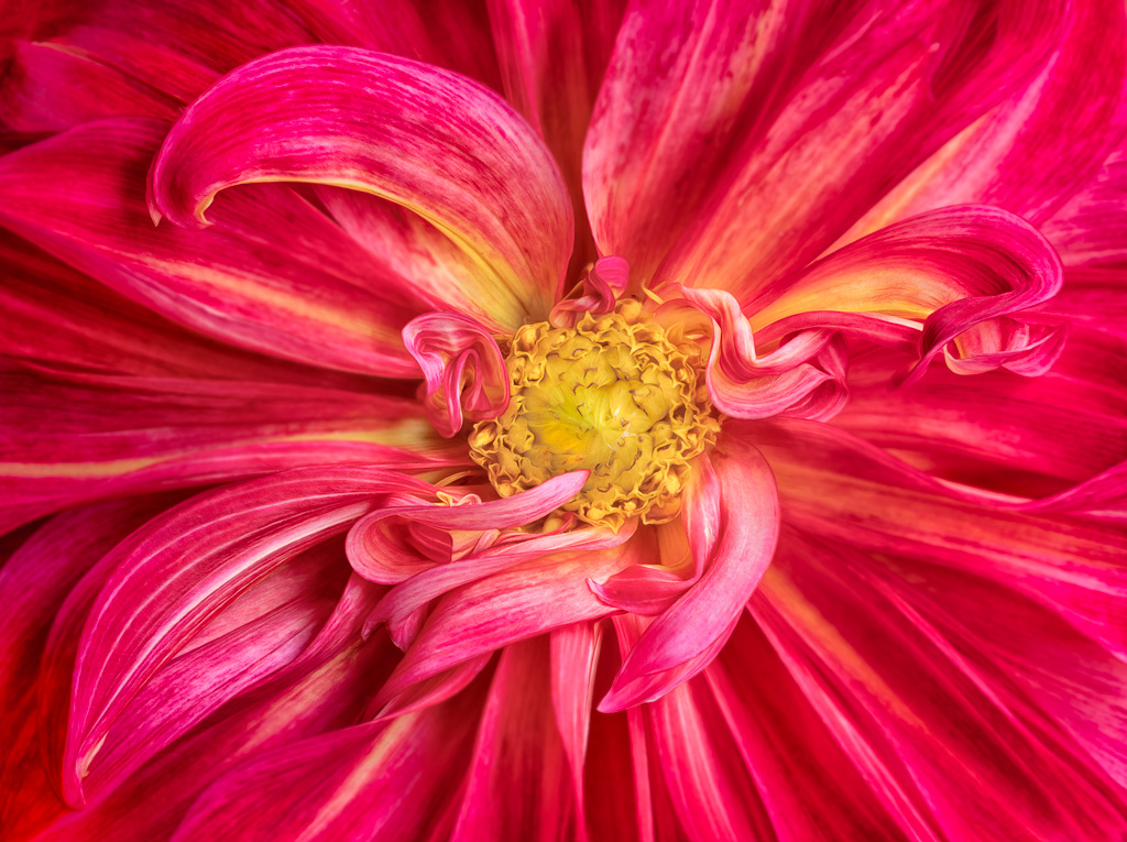
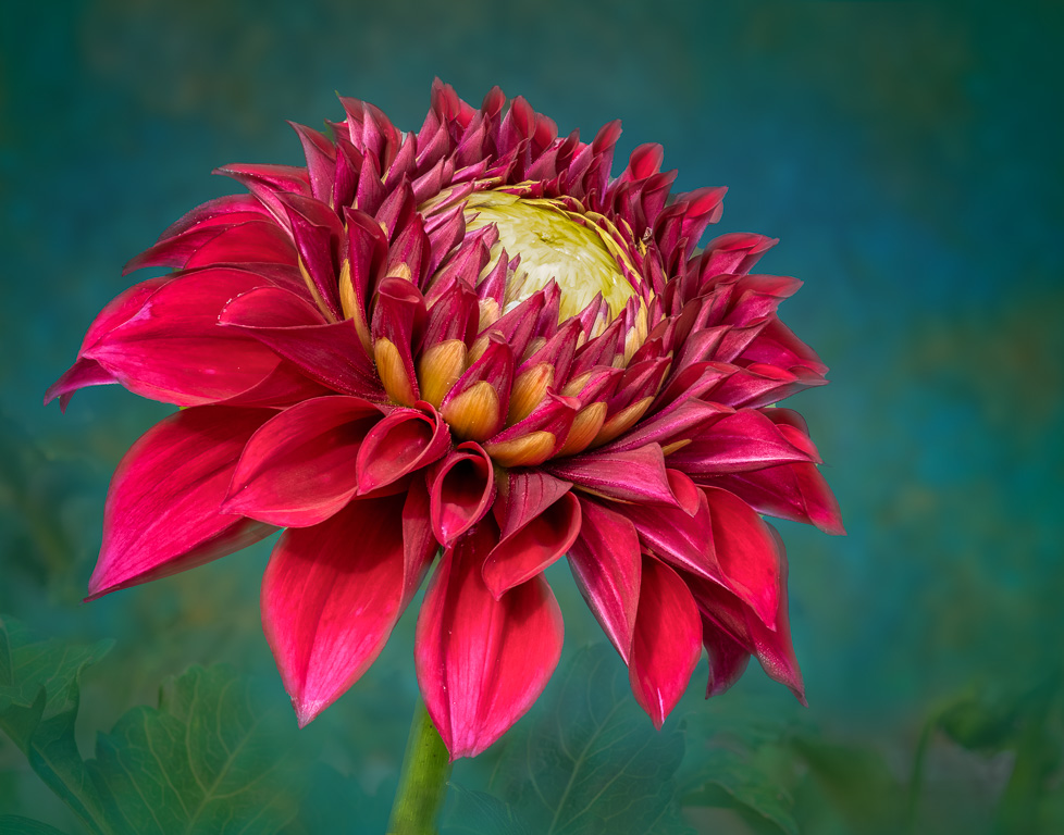
Thank you, Bai. This was a particularly striking variety of dahlia. |
Oct 31st |
| 45 |
Oct 22 |
Reply |
Thank you for commenting, Ray. I didn't change or create any colors of the flower. I only reduced the warmth of the overall image caused by the early morning sun. |
Oct 11th |
| 45 |
Oct 22 |
Reply |
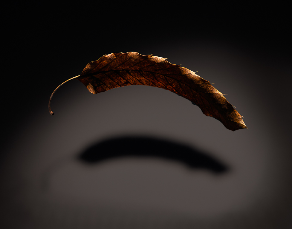
Thank you, Robert. I see what you mean about the petals being out of focus. It didn't bother me before, but since you and Charlie both mentioned it, I might have to fix it. It was not intentional. Here's the fixed version. |
Oct 8th |
 |
| 45 |
Oct 22 |
Comment |
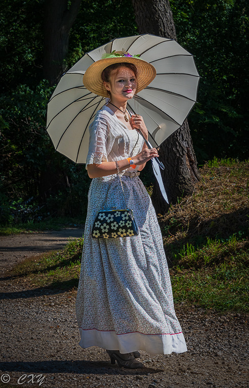
Hi, Charlie. You captured a nice pose in this portrait of 1900's lady. Typically, in such portraits, it would be better to blur the background by using a very small aperture because the sharp background starts to compete with the lady and becomes distracting. Because you can't reshoot it, you might try darkening the background instead. Use Lightroom to select the subject (lady) and then invert it to select the background. You can then darken the brighter background areas and add a vignette. You might also want to try brightening the lady's face that is in a shadow of the umbrella. I took a stab at it. It's not very good, but you get the idea. |
Oct 7th |
 |
| 45 |
Oct 22 |
Reply |
Thank you, Charlie. Sometimes I focus stack manually particularly when I only need to shoot a few images or when I use a manual focus lens. But, in this case, I used a Canon RF 100mm macro lens that can automatically bracket the images. |
Oct 7th |
| 45 |
Oct 22 |
Reply |
Thank you, Cindy. Dahlias have become my favorite flower to photograph, in part, because there are so many different varieties. |
Oct 7th |
| 45 |
Oct 22 |
Reply |
I did indeed notice. I seem to remember photographs more than I do people these days. |
Oct 4th |
| 45 |
Oct 22 |
Comment |
A very pleasant landscape scene. I haven't been to a desert very often, so I enjoy seeing cacti and its different varieties. The sky replacement was well done and looks very natural. My only comment would be to crop off about one-third of the right side as the high peak on the right pulls my attention from the organ cacti with nothing of real interest there. |
Oct 4th |
| 45 |
Oct 22 |
Comment |
The composition of this image is excellent with the S-curve leading the eye from the bottom to the top. I also like the way you captured the layers of waterfalls. However, I'm not sure I like the conversion to black and white. It seems keeping it in color would be my preference, but I don't see the color original to compare it to. |
Oct 4th |
| 45 |
Oct 22 |
Comment |
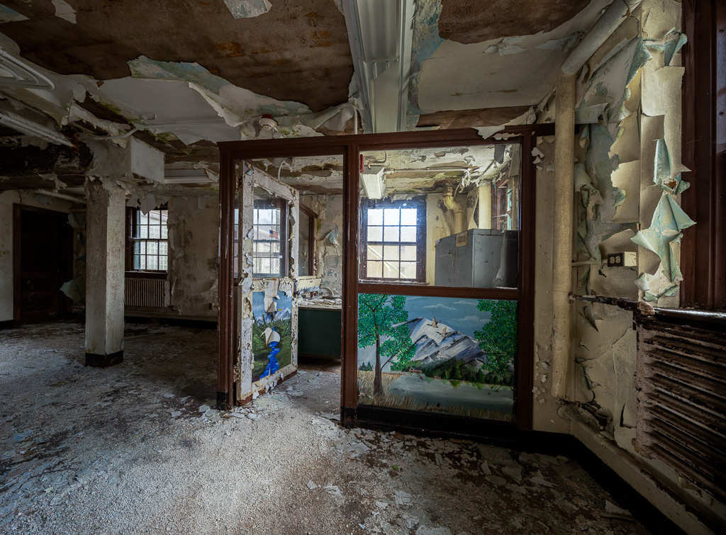
Beautiful grunge shot! It closely resembles an image someone submitted back in July 2021. :-) |
Oct 4th |
| 45 |
Oct 22 |
Comment |
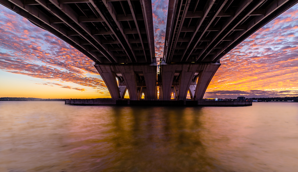
What a beautiful and creative shot! The sunset sky with clouds is almost perfect. The foreground is nicely processed to bring details to the shadow areas. The runway reflects the sky to add leading lines to the "comet." My only suggestion would be to fix the halo on top of the clouds on the left. |
Oct 4th |
| 45 |
Oct 22 |
Comment |
This is a great street photography shot! Architecture? hmm...
maybe a great street photo with interesting architecture. The woman's stride, clothing and blowing hair is what draws my attention. The architecture doesn't really stand out except as an excellent framing for her and for the symmetry of the buildings on either side. I can't see a thing I would change.
After thinking about this for a while, it would be a nice architecture image without the woman. The architecture would stand out more with the tree in the courtyard not being as prominent as the woman.
|
Oct 4th |
6 comments - 6 replies for Group 45
|
| 61 |
Oct 22 |
Reply |
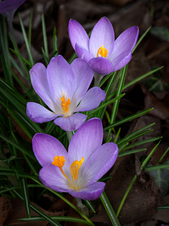
Thank you, Ingrid. I, too, like the abstract pattern of the dahlia petals. |
Oct 23rd |
| 61 |
Oct 22 |
Reply |
You're absolutely correct about there being so much one can do with this image. I'm still playing around with how to get the best out of it.
|
Oct 22nd |
| 61 |
Oct 22 |
Comment |
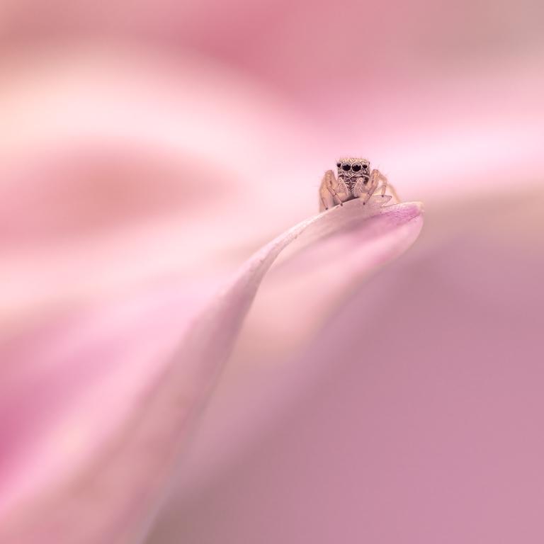
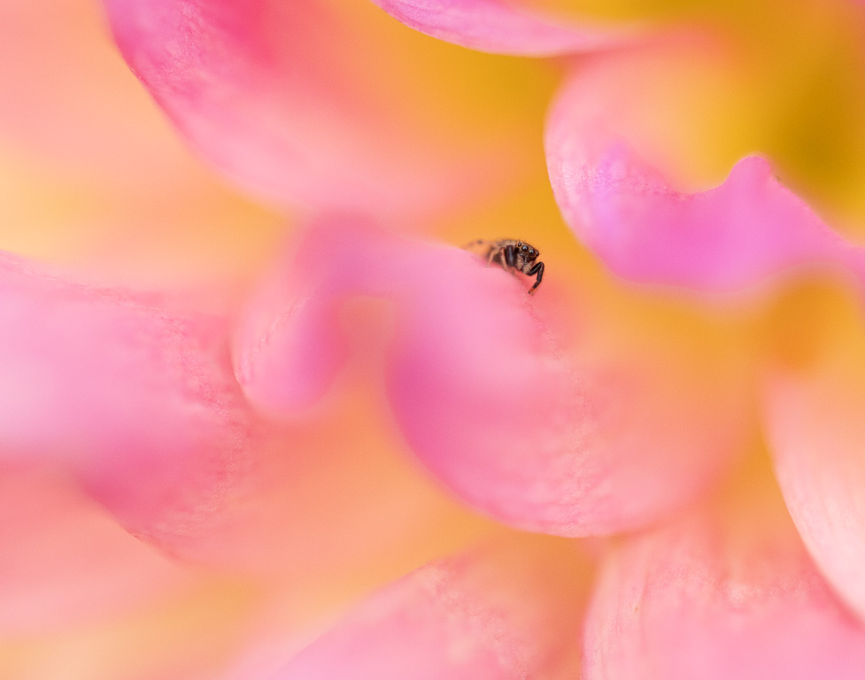
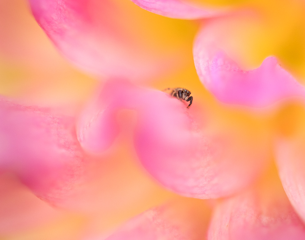
Thank you, Shirley. I've since played around with this image, and like it best with the spider, but cropped to a square format from the left. |
Oct 20th |
| 61 |
Oct 22 |
Comment |
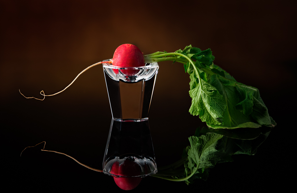
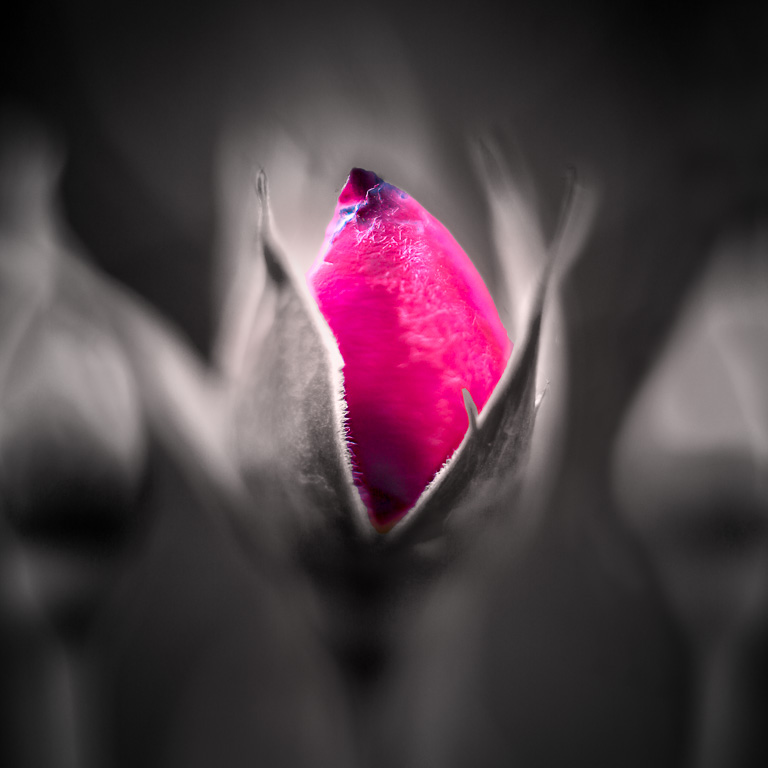
A nice, abstract rose image. The original seemed too saturated, and you de-saturated it nicely to bring out the details. The final image seems a little dark though. It might help to brighten the image without adding the saturation back. Welcome to the group! |
Oct 9th |
| 61 |
Oct 22 |
Reply |
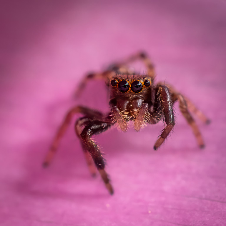
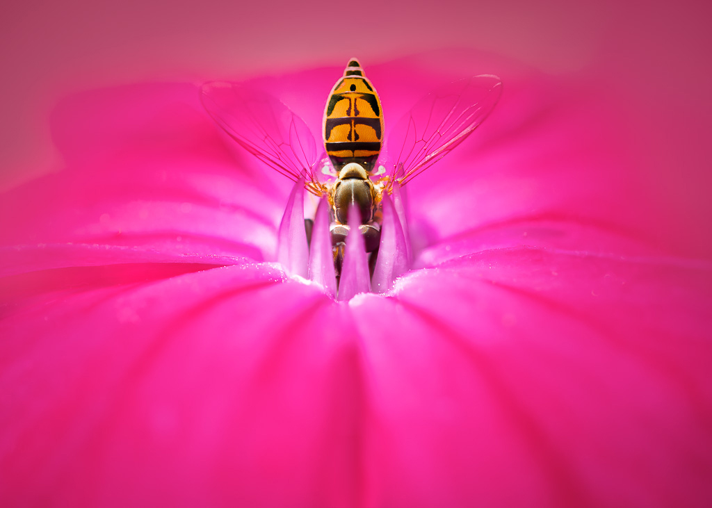
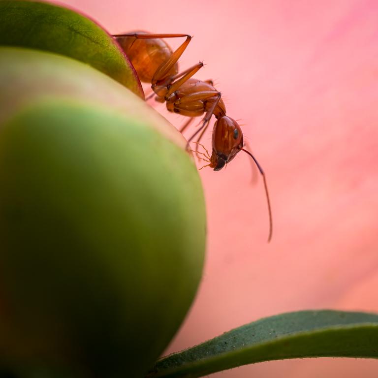
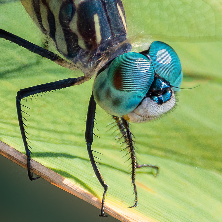
Thank you, Marti. To me, the bug is rather cute with its four pair of eyes. :-) |
Oct 1st |
| 61 |
Oct 22 |
Comment |
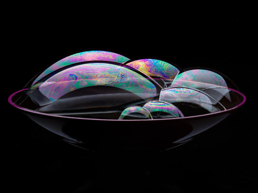
I had to think about this one for a while. Overall, I like this as an abstract image. But, like Randall, I'm not fond of the graininess. To me, the soft lime-green and pinks call for a smoother texture. I like the composition with the lime-green thingy's poking out of the pink blossoms. |
Oct 1st |
| 61 |
Oct 22 |
Reply |
Randall, I certainly do appreciate your comments. It's just that I don't like my image without the spider. It looks so empty. So, I'll just chalk up the empty image as a no-go. I did, however, use your suggestions to modify the image with the spider. And, I think it improves it a lot! Thanks, again! |
Oct 1st |
 |
| 61 |
Oct 22 |
Reply |
Thanks for your comments. I was split between submitting the image with and without the spider. The one without the spider was more abstract, but I felt there was no particular center of attention. But, adding the spider might attract too much attention making the image more about the spider than the blurred abstract dahlia petals. |
Oct 1st |
| 61 |
Oct 22 |
Comment |
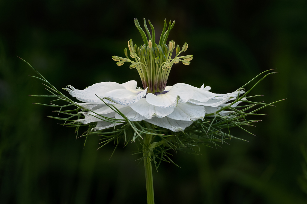
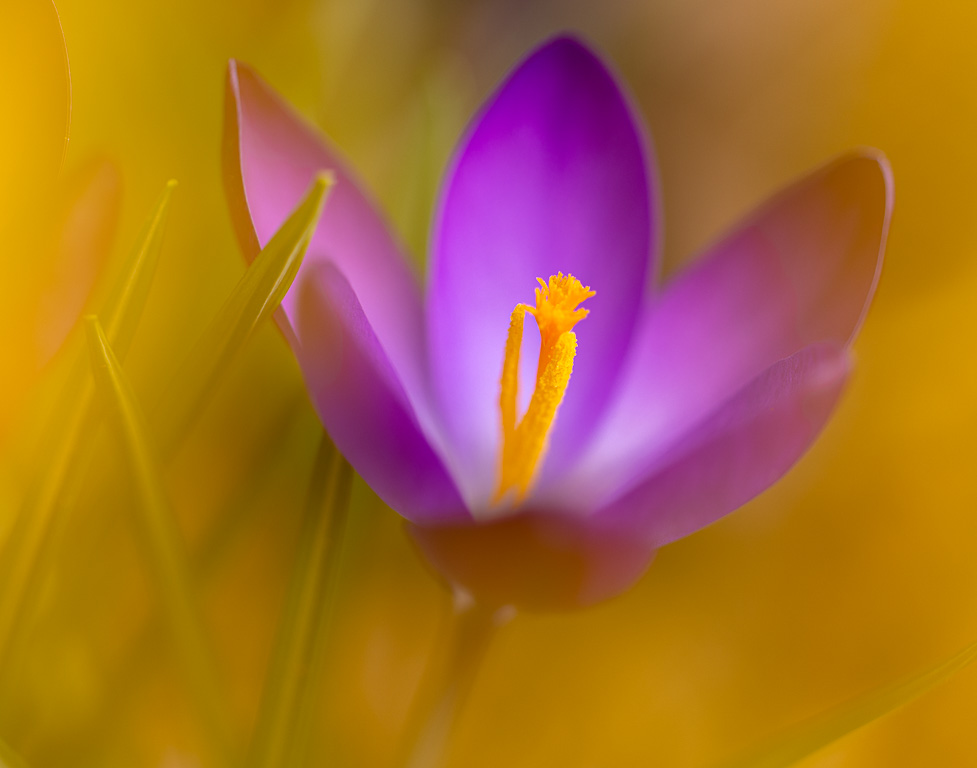
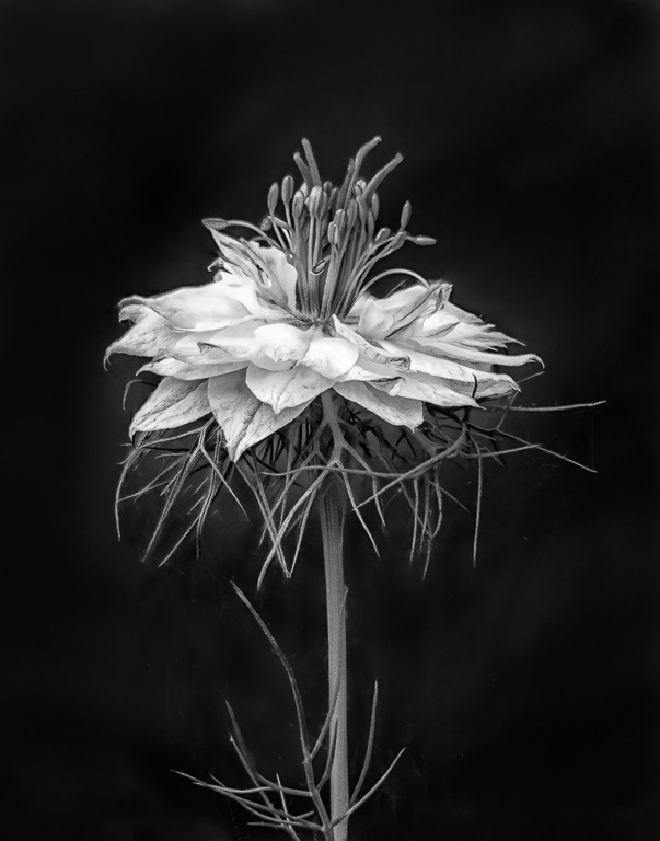
Another truly unique abstract flower image! To me, I like the overall effect, but there is something about the colors that I don't find very appealing. Again, it's just personal taste. In some ways, I like the Original 2 image better because it looks like a solarized flower with no additional distortion. |
Oct 1st |
| 61 |
Oct 22 |
Comment |
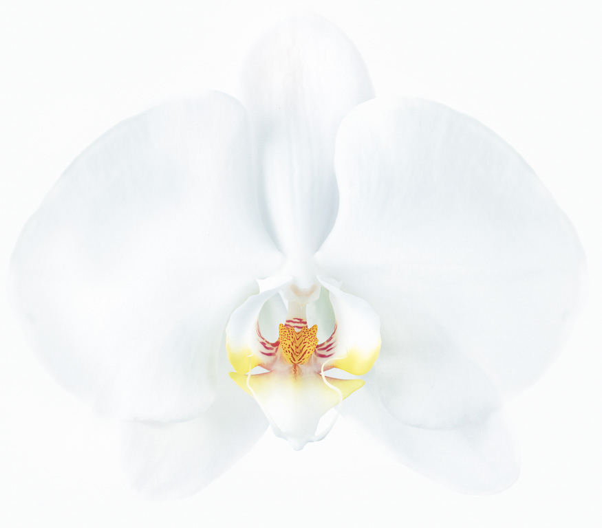
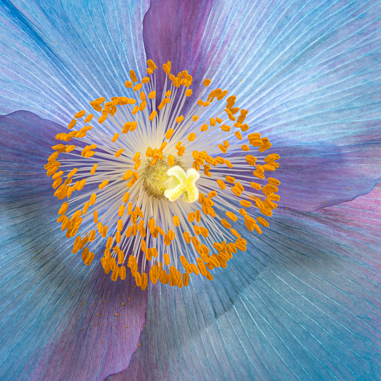
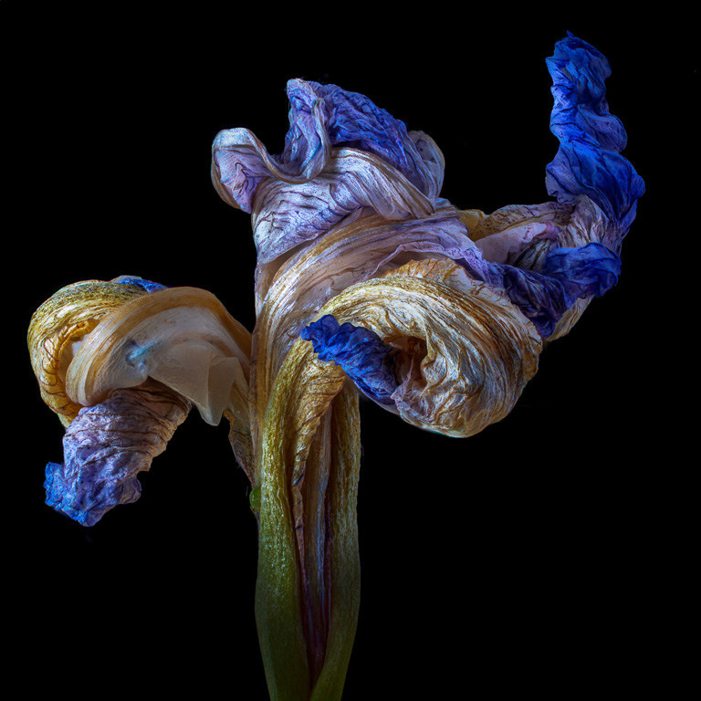
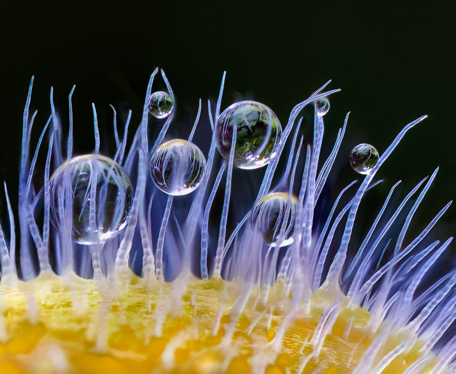
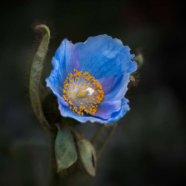
Now this is an abstract flower image! To me, there is just enough of the flower to make the image recognizable, but in a twisted way (pun intended). I love the pastel colors and the way the bright, white petal lines pull one's attention to the center. And, I especially like how the yellow and white stamen are made to look like mushrooms. Beautiful! |
Oct 1st |
| 61 |
Oct 22 |
Comment |
I love this! What a moody image created by the use of lighting, textures and colors. But, is it "abstract?" In a purist's abstract image, the objects are unrecognizable and the impact is based on colors, lines, patterns and texture. In this image, the dandelion is clearly identifiable, and the textures and colors give it a surreal environment. But, whether it is or is not an abstract, I love it! |
Oct 1st |
| 61 |
Oct 22 |
Comment |
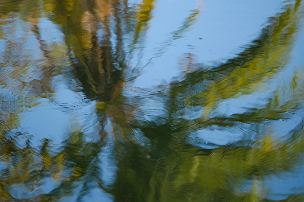
Commenting on abstract images is always difficult for me because "abstract" is all about what appeals to each viewer personally. Having said that, I like the watercolor painting effect of this reflection image. But, to me, the colors and texture seem a little too harsh. I prefer the more natural soft patterns, texture and colors of the original image except that the original image is a tad too dark. Running the original through LR and hitting the "auto" tone button, I came out with this. Of course, it's only my preference. |
Oct 1st |
 |
7 comments - 5 replies for Group 61
|
13 comments - 11 replies Total
|