|
| Group |
Round |
C/R |
Comment |
Date |
Image |
| 45 |
Sep 22 |
Reply |
Thank you, Phyllis. |
Sep 24th |
| 45 |
Sep 22 |
Reply |
Thanks, Cindy. |
Sep 11th |
| 45 |
Sep 22 |
Reply |
Thank you, Charlie! |
Sep 10th |
| 45 |
Sep 22 |
Reply |
Thank you, Ray! |
Sep 7th |
| 45 |
Sep 22 |
Comment |
You are so fortunate to get this picture. I would love to get a close-up shot of a kingfisher one day. I only saw a kingfisher once, and it was too far away for a decent image. The composition is well balanced, and the bird and branch stand out nicely against the blurred background. But, that blue tint seems a bit strong. |
Sep 5th |
| 45 |
Sep 22 |
Comment |
A very pleasant image of a croquet game. It's relaxing just looking at the image. I like that the three men are wearing white which makes them stand out. And, their placement forms a strong triangle. Then, the cut-grass lines lead my eye to the back towards the cathedral. Well seen! |
Sep 5th |
| 45 |
Sep 22 |
Reply |
Thank you, Robert. You very well could have been at this location. It's right by the National Portrait Gallery. |
Sep 5th |
| 45 |
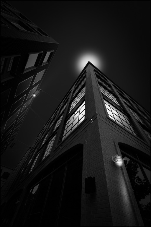
Sep 22 |
Comment |
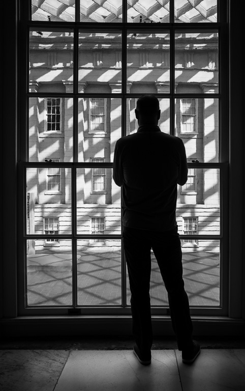
A very well-exposed night scene. The two starburst light in the bottom left first grabs my attention, then the blue lights lead my eye to the center of the image and, finally, the bright lights in the far distance takes my eye to the top of the image. Well done! |
Sep 1st |
| 45 |
Sep 22 |
Comment |
You did a nice job heavily cropping the image to bring focus to the barn. The sky replacement works well, too. My only suggestion would be to lighten the whitish portions of the barn to make it the brightest parts of the image...maybe even brighten the red as well, so one knows the barn is the main subject. Nice shot! |
Sep 1st |
| 45 |
Sep 22 |
Comment |
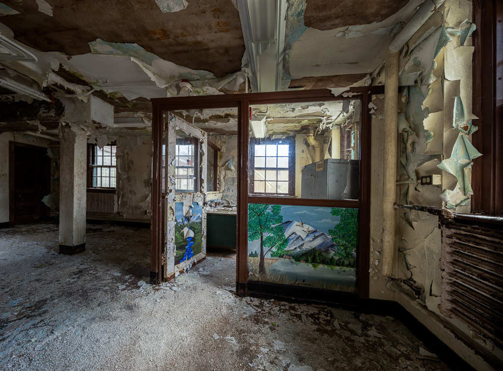
Nice picture of days gone by. Not seeing the original, I'm guessing you must have done quite a bit of post processing to bring out the shadow areas especially in such a harsh time of day. Good job! It looks very natural. My only comment would be that the outer portion of the image along the borders are a tad too bright. Perhaps, a dark vignette would help to tone down the highlights. |
Sep 1st |
| 45 |
Sep 22 |
Comment |
I like your creativity and experimentation here. I've never tried multiple exposure with a digital camera yet. It does give an impressionistic look to the image. |
Sep 1st |
6 comments - 5 replies for Group 45
|
| 61 |
Sep 22 |
Reply |
Thank you, Doug! Only you would notice that. :-) |
Sep 28th |
| 61 |
Sep 22 |
Reply |
The large, purple flower is actually the flower of the tall, stemmed plant that has bloomed. But, I see what you mean about it being a little distracting. |
Sep 16th |
| 61 |
Sep 22 |
Reply |
Thank you, Ingrid. I wasn't going to mention it, but the original image without the flower is also a composite...basically two images with the left half merged with the right half. |
Sep 13th |
| 61 |
Sep 22 |
Reply |
Bob, thank you for stopping by and commenting. I see you also photograph flowers a lot, and very creatively, too! |
Sep 12th |
| 61 |
Sep 22 |
Comment |
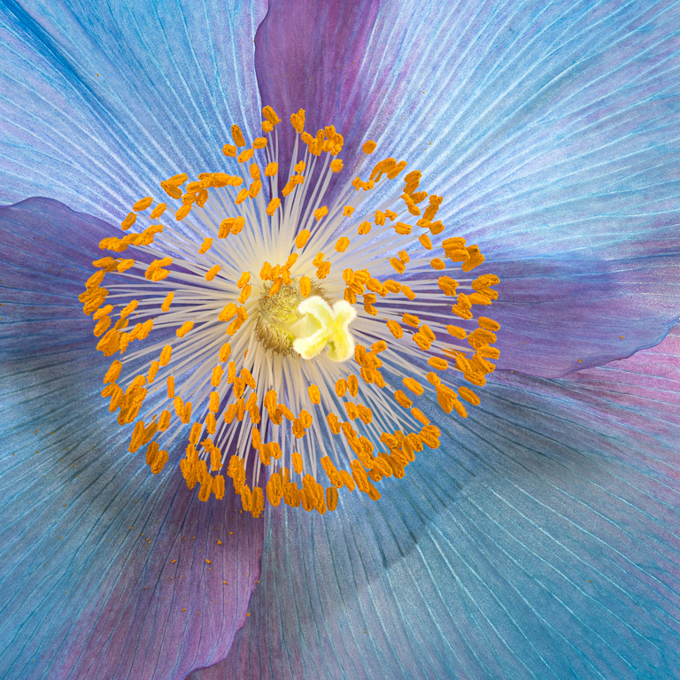
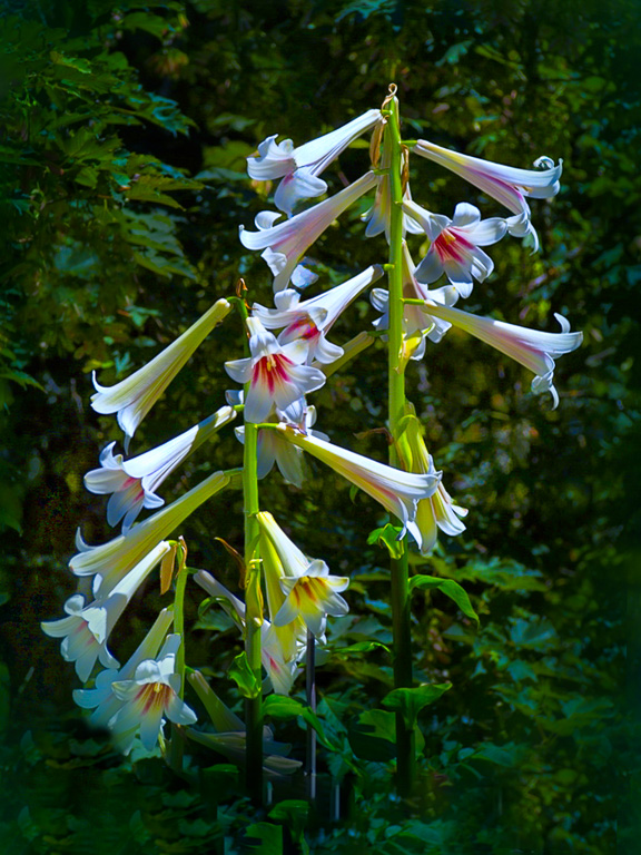
A very nice image indeed! The background is blurred beautifully and makes the iris pop. All the fine details make this image shine. I especially like that petal on top and the wavy edges along all the petals. The whole flower looks to be in focus from front to back. Did you use focus bracketing? I can't see anything I would change. |
Sep 2nd |
| 61 |
Sep 22 |
Reply |
Nice editing! |
Sep 2nd |
| 61 |
Sep 22 |
Reply |
Thanks for the suggested edit. That works, too! |
Sep 2nd |
| 61 |
Sep 22 |
Reply |
Okay, taking Donna's and your comments into consideration, I decreased the brightness a tad in the upper third of the image. It's subtle, but does improve the image.
After giving this some thought, I must have set the white and black points of this image in LR, as I do habitually, thereby increasing the brightness of the yellow and oranges. But, having full white points might not be necessary for this image. |
Sep 1st |
 |
| 61 |
Sep 22 |
Reply |
Thank you, Donna. I wasn't thinking how the eye moves around the image when composing it. I was only trying to fill in the dark, empty corner in the lower left with the flower. But, now that you mention it, maybe the light on the right is a tad too bright. I'll play with it and see what happens. |
Sep 1st |
| 61 |
Sep 22 |
Reply |
Thank you, Randall. I'm still learning how to shoot out-of-focus images with just a sliver in focus. At least, I'm starting to learn what works and what doesn't. |
Sep 1st |
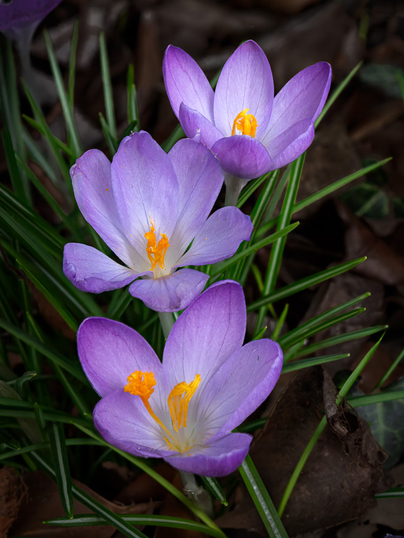
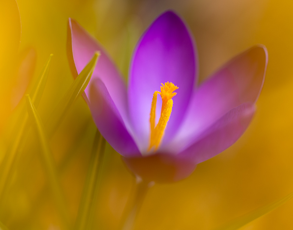
| 61 |
Sep 22 |
Comment |
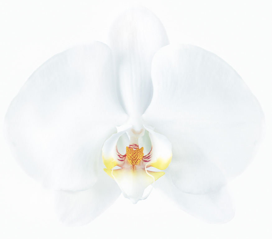
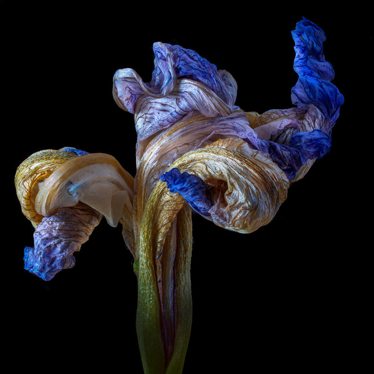
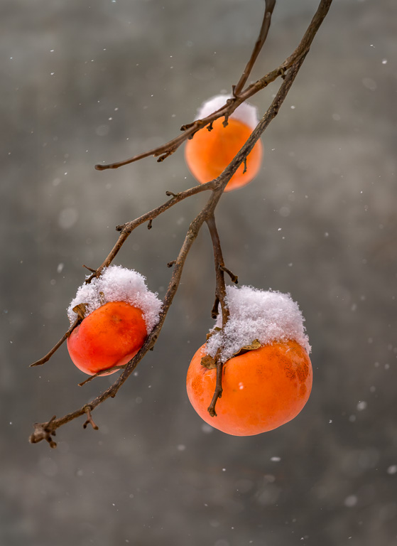
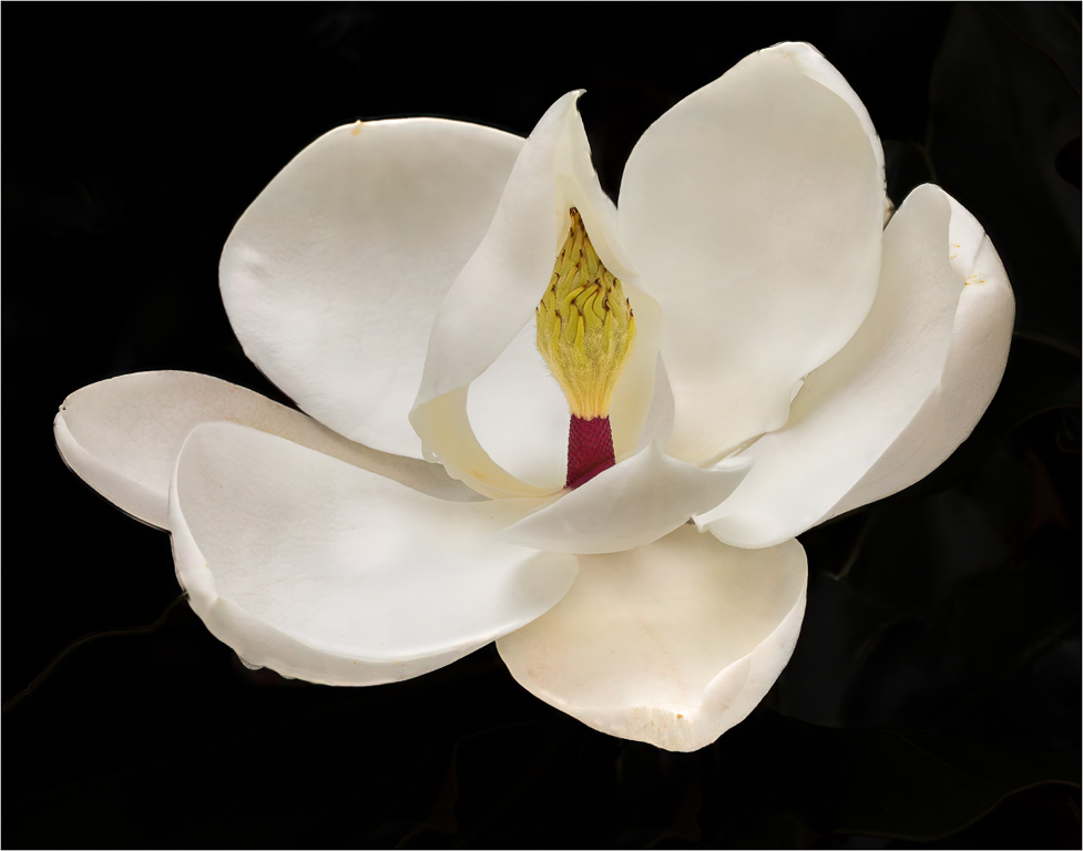
I can see why this image won many awards...just beautiful! The soft flowers contrast nicely against the prickly cactus needles. I particularly like the way the three buds lead up to the open flower. Even though this image was originally shot with slide film, you might use the wonders of the digital age to add some room on the right where the petal touches the border. In Photoshop, a simple content-aware crop might do the trick. |
Sep 1st |
| 61 |
Sep 22 |
Comment |
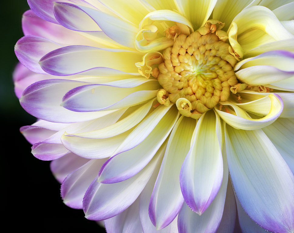
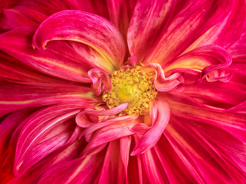
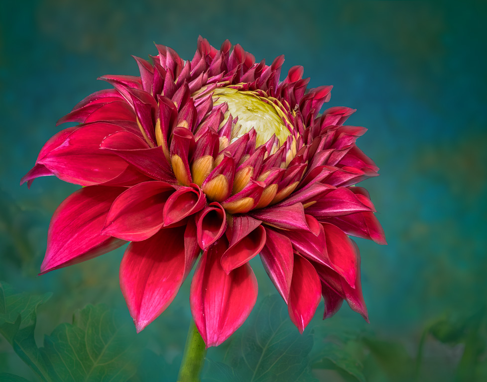
I love dahlias and was going to submit a dahlia image this month myself...maybe next month. You captured this straight cactus dahlia beautifully, but your post processing skills really bring out the details. The black background works nicely with this dahlia because there is so much detail to explore in the flower itself without a distracting background. Well done! |
Sep 1st |
| 61 |
Sep 22 |
Comment |
You captured these cone flowers nicely. I agree with you that the petals on the left need more room. I might suggest trying to darken the brown leaves and ground cover leaving the magenta and green leaves as the primary subjects. |
Sep 1st |
| 61 |
Sep 22 |
Comment |
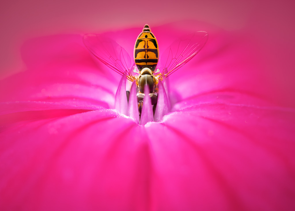
A very nice shot of water lilies. I love the way they seem to glow from the center. Your cropping and darkening of the water bring out the details of the flowers while keeping the lily-pad environment in context. I might even darken the water a little more, especially in the upper part of the image. |
Sep 1st |
| 61 |
Sep 22 |
Comment |
The complementary colors of magenta and green make the cone flower pop out from the background. The flower is in good focus, but perhaps some detail is lost from the cropping. The cropping certainly makes for a better image with the flower off center. If I were to make any suggestion, it might be to tone down the brightness of the green leaves and/or add a vignette. |
Sep 1st |
6 comments - 9 replies for Group 61
|
| 96 |
Sep 22 |
Comment |
Hello, Haru. Again, your image caught my eye as I was browsing through this month's images. I like your idea of making a B&W calligraphy drawing out of this image. So, I took a stab at it. I first converted the color image to B&W in LR and used the targeted adjusted tool to darken the greens. I then used Nik Collection's Color Efex to create a high-key image and adjusted the contrast. |
Sep 7th |
 |
1 comment - 0 replies for Group 96
|
13 comments - 14 replies Total
|