|
| Group |
Round |
C/R |
Comment |
Date |
Image |
| 45 |
Feb 21 |
Reply |
Thank you for stopping by, Jack, and I appreciate your feedback. |
Feb 7th |
| 45 |
Feb 21 |
Reply |
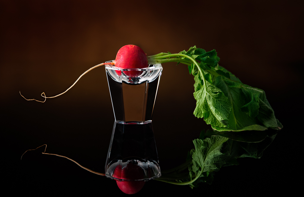
Thank you, Arief, for visiting our Group and taking the time for your constructive comments. I first considered a black background, but thought the image would lose a sense of dimension. A white background? Hmmm...I'm not sure it would make the radish pop more. In fact, it might cause the whitish root to be lost against the white background. Also, the black plastic base I used might create a stark line against a white background. I prefer a smoother, more graduated flow in the background. Thank you again for looking at my image and commenting. All constructive comments are welcome! |
Feb 6th |
| 45 |
Feb 21 |
Reply |
Something is not right with this website. I keep trying to post one thing, and something else is posted instead. Not sure what is happening. I'm trying a third time. |
Feb 4th |
 |
| 45 |
Feb 21 |
Reply |
Thank you for your comments, Phyllis. I still prefer to keep all the leaves as is. That's the way it grows.
As far as lighting goes, I used a Photoflex Starlite 500w tungsten lamp in a softbox to the left and a large reflector on the right. I also aimed a small snooted 75w tungsten light on the background to give a spotlight effect behind the radish. |
Feb 4th |
| 45 |
Feb 21 |
Reply |
Thank you for your suggestion, Phyllis. I deliberately kept the right side of the leaf in shadow in order to not make the green leaf so dominant. To me, the stem tip on the left was the point of interest of the radish. I'll try highlighting the lighter lines of the leaf in the shadow as it might add some texture to that dark area. Here's my revised image. |
Feb 3rd |
 |
| 45 |
Feb 21 |
Comment |
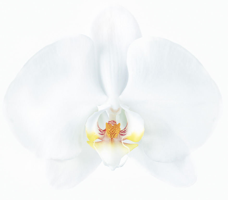
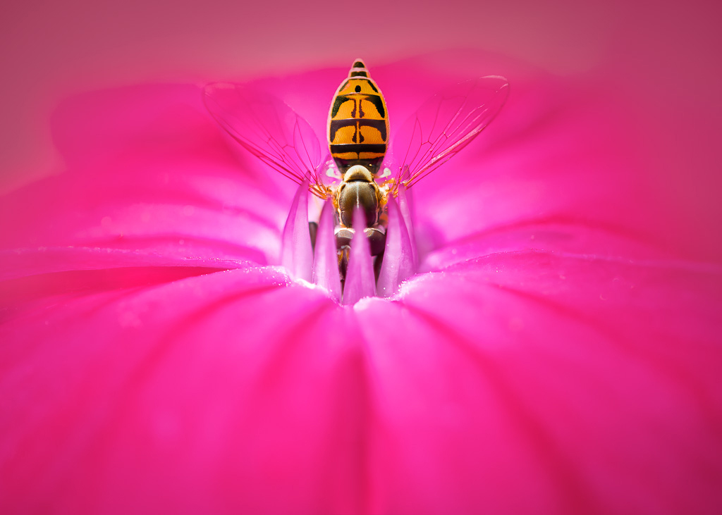
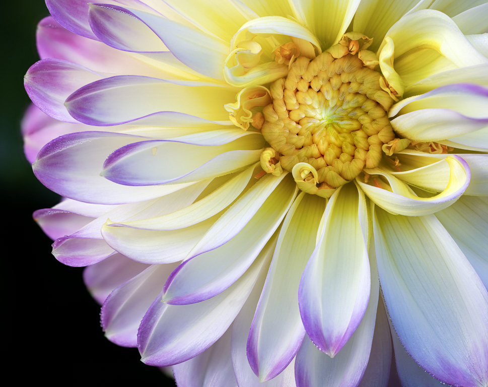
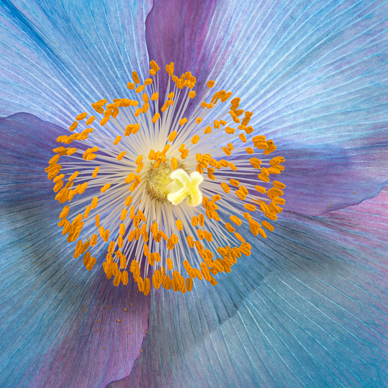
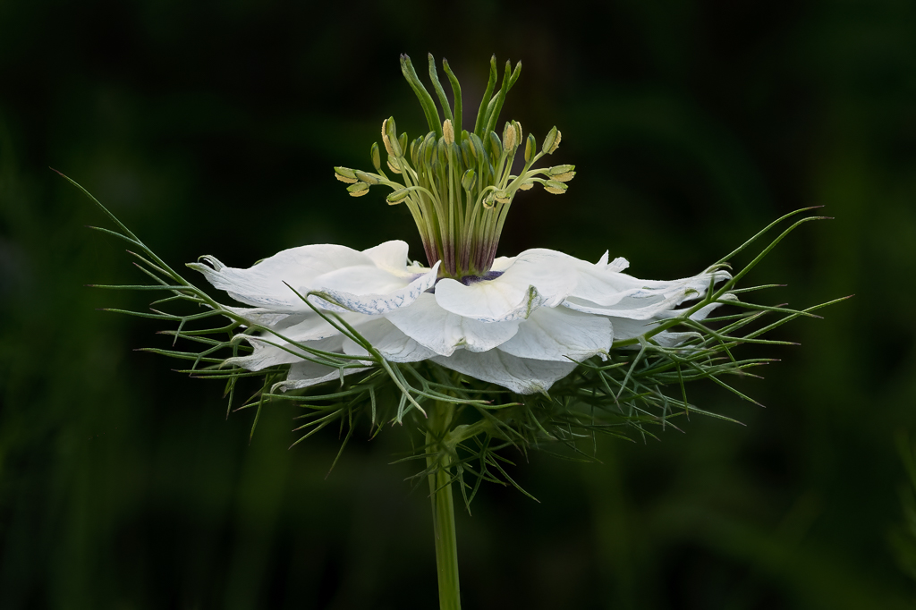
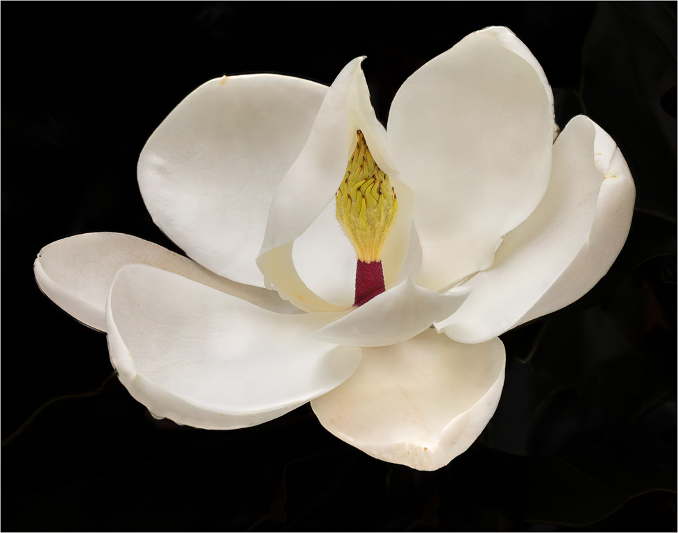
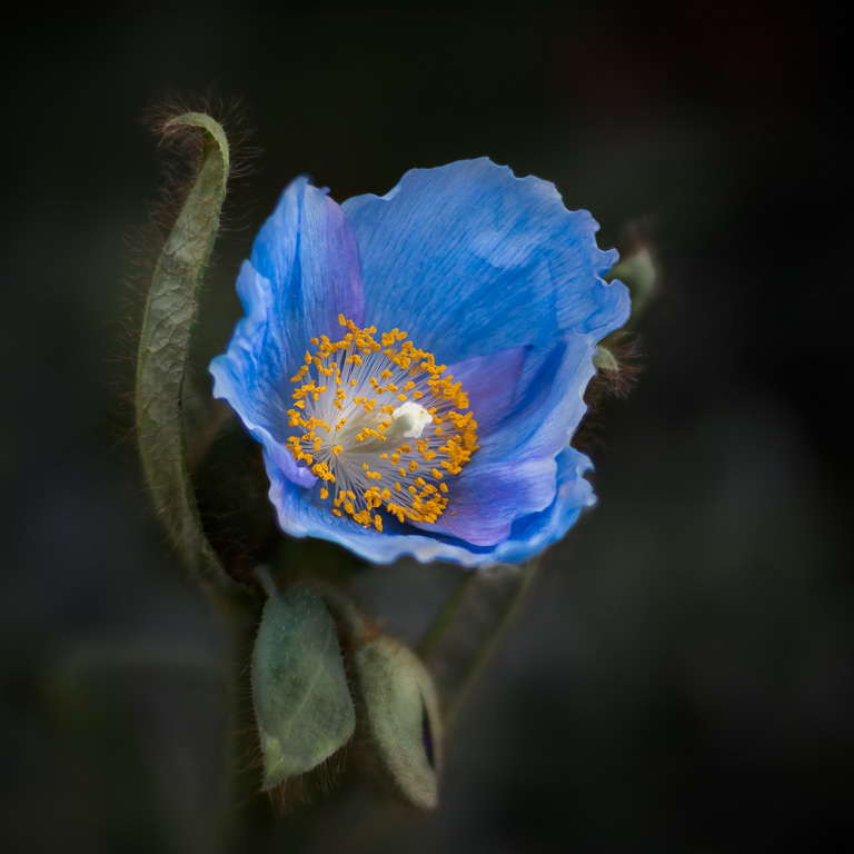
The subject flower is well exposed and nicely composed. Focus stacking is often tedious and requires lots of patience, but not really painful. I'm a little surprised that you used such a small aperture, f/22, when focus stacking. You likely got diffraction blur at that f-stop. The benefit of focus stacking is that you can use f/5.6 or f/8.0 to achieve the sharpest images. |
Feb 3rd |
| 45 |
Feb 21 |
Reply |
Thank you, Cindy. The base is a 2x2 ft black acrylic plastic sheet that I bought at a plastics store. I usually don't like the reflectivity of the plastic, but, in this case, it seems to work. For the backdrop, I used a Lastolite vintage backdrop with a spot light on it that was also subtly reflected on the black plastic sheet. |
Feb 2nd |
| 45 |
Feb 21 |
Comment |
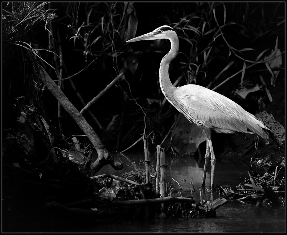
This is a excellent shot - very well composed. With respect to the color, I prefer under-saturation to over-saturation these days, but perhaps this shot might actually have more impact as a B&W. I would also have darkened some of the branches in the background to make the heron stand out better. And, I would definitely clone out the branch sticking out of the heron's head. Maybe, something like this. |
Feb 2nd |
|
| 45 |
Feb 21 |
Comment |
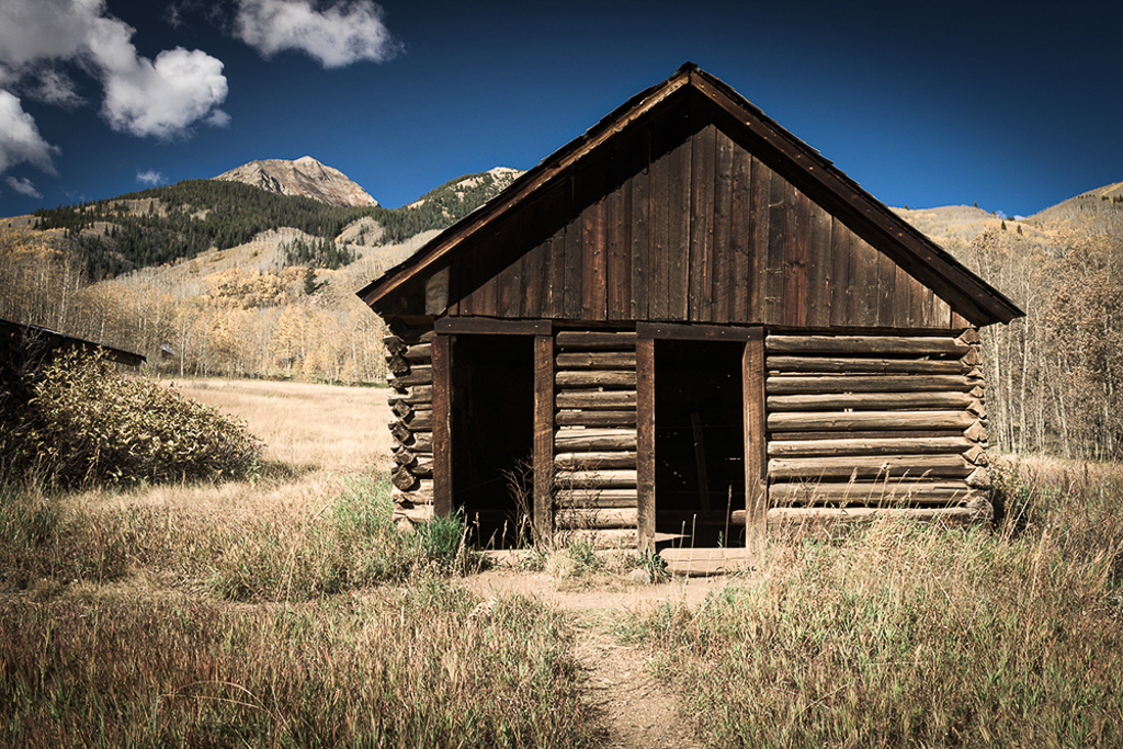
It always amazes me when I see images of old shacks in the middle of nowhere, that people actually lived in them at one time. I like the composition with the shack offset to the right and the mountains in the background on the left. I might prefer to de-saturate the image rather than add saturation to give the image more of a dusty, deserted feel to it. I took a stab at it and added some constrast, but it might not suit your taste. |
Feb 1st |
 |
| 45 |
Feb 21 |
Comment |
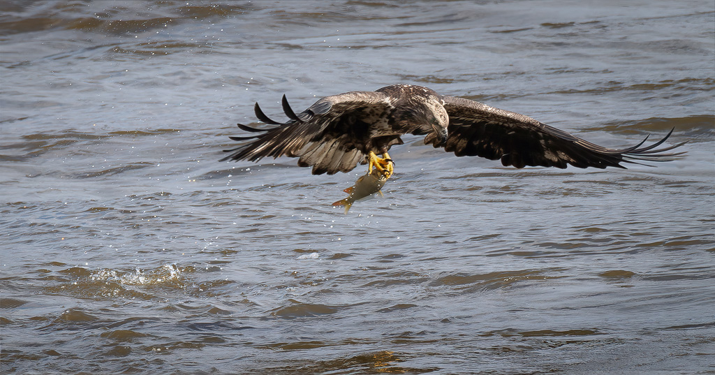
Great capture of the hawk looking straight at you. The bird is in nice focus; particularly the eyes. The bright highlights in the background could be darkened a little to make them less distracting though. And, maybe the hawk's shoulder can be brightened a tad to bring out some detail in the feathers. I love the Wakodahatchee wetlands - one of my favorites places in Florida to photograph birds. |
Feb 1st |
| 45 |
Feb 21 |
Comment |
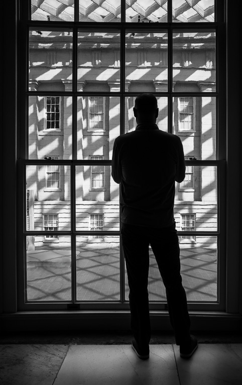
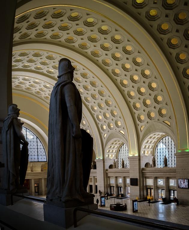
I like the way you composed this image with the offset dome. It adds a dynamic interest and complements the movement of the people. I'm not sure I like the one still man on the left, but he doesn't distract from the overall motion of the image very much. Of course, the colors are beautiful. But, to me the image is all about movement in the underground setting. |
Feb 1st |
| 45 |
Feb 21 |
Comment |
I love this still life! It's simple, and it has consistent colors and wonderful texture. The keys are a nice touch; adding a focus point for the eyes to settle on, especially with them being the lightest objects in the image. I definitely prefer the straight-on perspective you made from the original. Great job! I can't add anything to improve it. |
Feb 1st |
6 comments - 6 replies for Group 45
|
6 comments - 6 replies Total
|