|
| Group |
Round |
C/R |
Comment |
Date |
Image |
| 91 |
Apr 20 |
Comment |
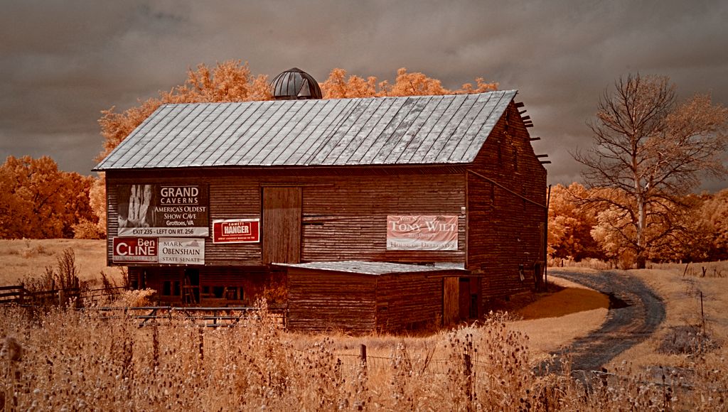
"We're not in Kansas anymore..."
That was the first thing I thought of when I saw the image. The colors are wonderful and the colors in the corn field and the road really balance each other. The overall feel looks like a pastel painting.
I actually like the crop because the grass in the center of the frame and the corn field takes your eye out into the road just below the horizon and then your eye continues up the road. If you had the whole frame that motion would have been lost. The right side of the image doesn't add anything. |
Apr 20th |
| 91 |
Apr 20 |
Comment |
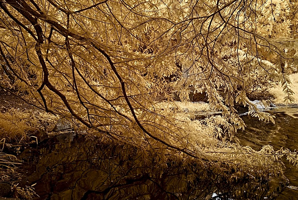
I like the contrast between the mechanical objects and the organic surround. Chan mentioned the overall purple tint which I think works in this image because the rust almost looks like real rust color and the purple tint brings everything together.
If I had to change anything I would eliminate some of the pine needles and leaves from the lower part of the image. They are a little distracting to my eye. |
Apr 20th |
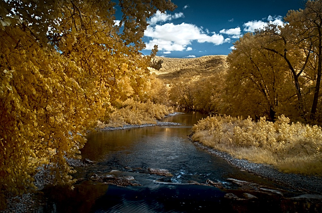
| 91 |
Apr 20 |
Comment |
Hi all,
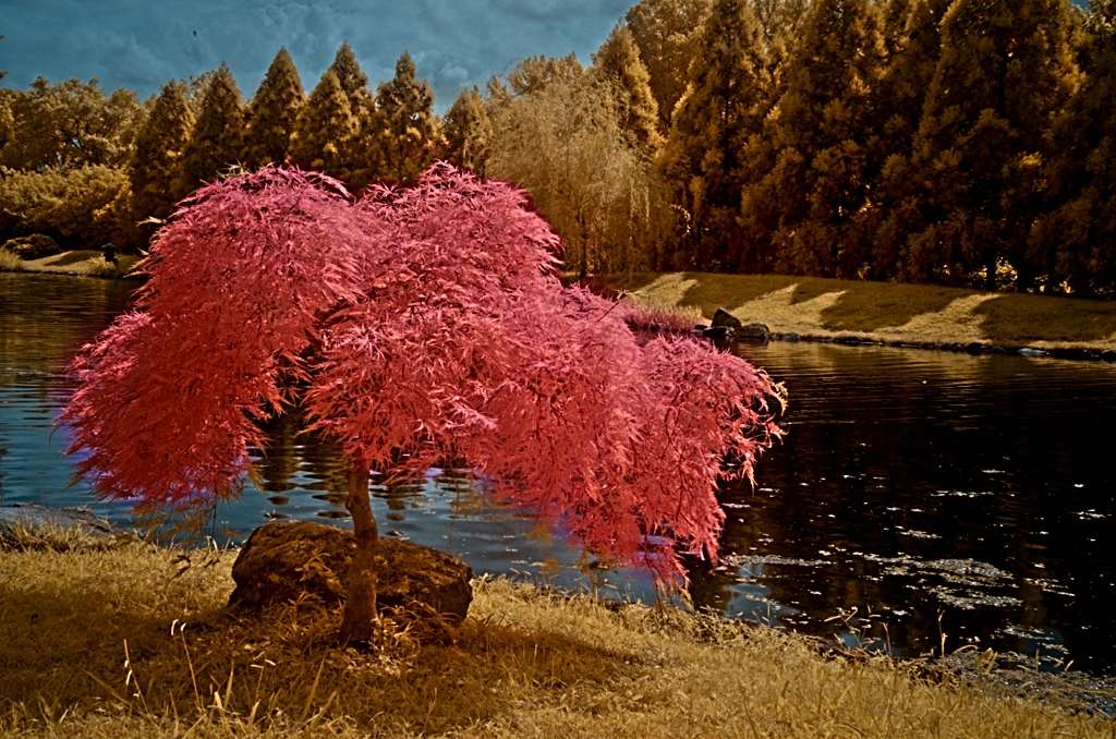
Thanks for all the comments. Based on other images I've taken of foliage I knew I was going to get the yellows and browns that you see here. I was trying to emphasize the diagonal branch coming down from the top left and also the calm serene setting.
Looking at Judy's modifications, I like the richer yellow/gold tones but I kept the water in the lower left darker in my image to help highlight the branches. By bringing out a lot of the detail in the water I think it conflicts with the upper part of the image.
Thanks again for the comments!
Jeff |
Apr 20th |
3 comments - 0 replies for Group 91
|
3 comments - 0 replies Total
|