|
| Group |
Round |
C/R |
Comment |
Date |
Image |
| 91 |
Dec 19 |
Comment |
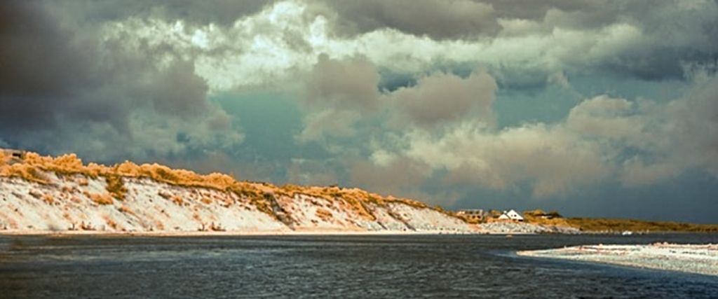
In my opinion the colors work really well for this landscape composition. The variety of tones in the sky create a nice dramatic effect. I believe moving the horizon down to the bottom horizontal 'Rule of Thirds' line will create a more dramatic scene and give you a nice panorama feel to the image. The sky is the more dominate element than the water so moving the horizon also gives more emphasis to the sky. I did a quick modification and hopefully it will upload. |
Dec 13th |
 |
| 91 |
Dec 19 |
Comment |
I believe the contrast and the bright magenta leaf provide a nice focal point for the composition. I am not a fan of real heavy use of vignetting to darken the edges but it works well for this composition. |
Dec 13th |
| 91 |
Dec 19 |
Comment |
To my eye the image is a little flat so I would use the 'whites' and 'blacks' slider to give me some absolute black and some whites that are just ready to clip. The original has some space to the right of the large rock which I believe I would try to keep so it doesn't look cutoff. The last thing I would try is to clone out the small rectangular sign. I really like the placement of the statue on the right looking to the left with a lot of image space between the statue and the left edge of the frame. |
Dec 13th |
| 91 |
Dec 19 |
Comment |
To me the contrast in the sky gives a nice dramatic look. The tree on the right balances the frame and stops your eye. The leading lines in the fence and the repetition of the fence posts provides a nice composition. In my opinion I'm not a fan of 'things' coming out of the corner of an image so I would recommend you experiment with a different cropping if you can for the fence board in the lower left. |
Dec 13th |
4 comments - 0 replies for Group 91
|
4 comments - 0 replies Total
|