|
| Group |
Round |
C/R |
Comment |
Date |
Image |
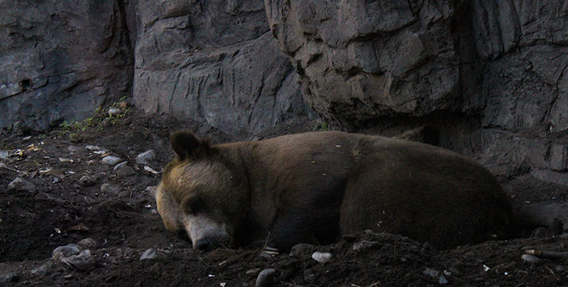
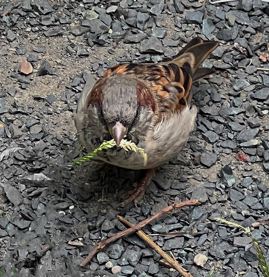
| 69 |
Nov 23 |
Comment |
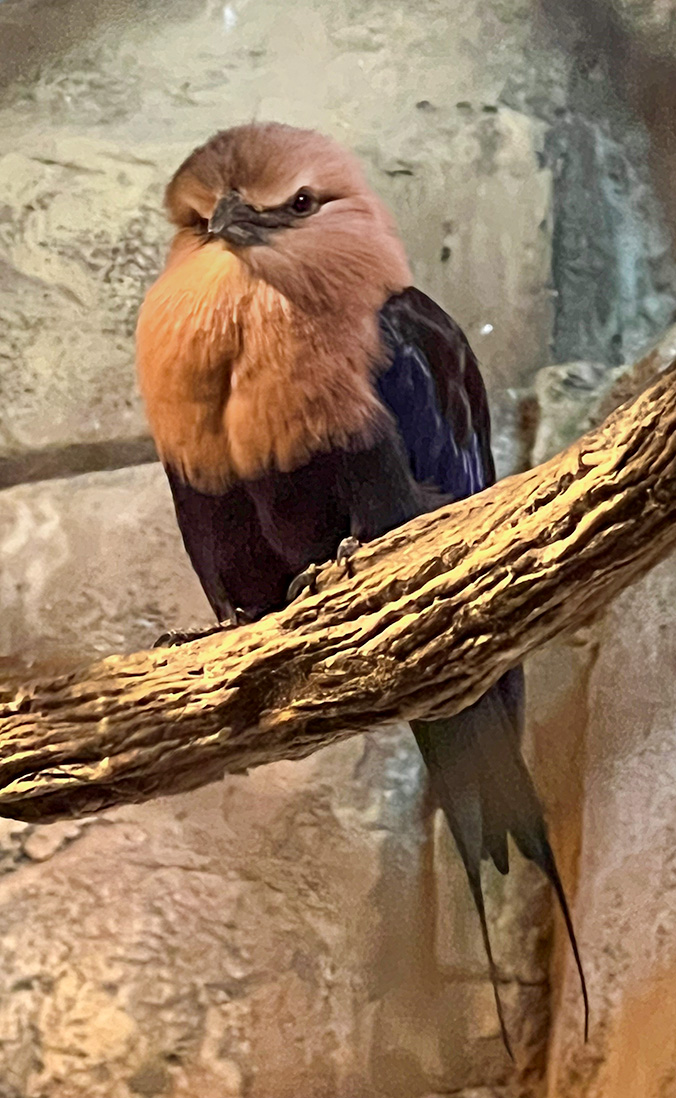
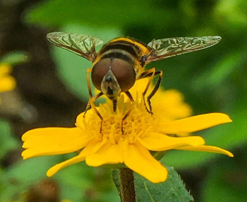
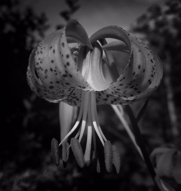
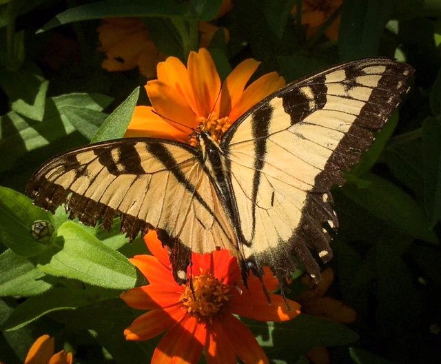
This a great image. I do agree that the subject is a little dark. I am unsure if that is my own computers problem or if the image was dark. Beyond that I think the subject was framed well and it is very dynamic photo. |
Nov 13th |
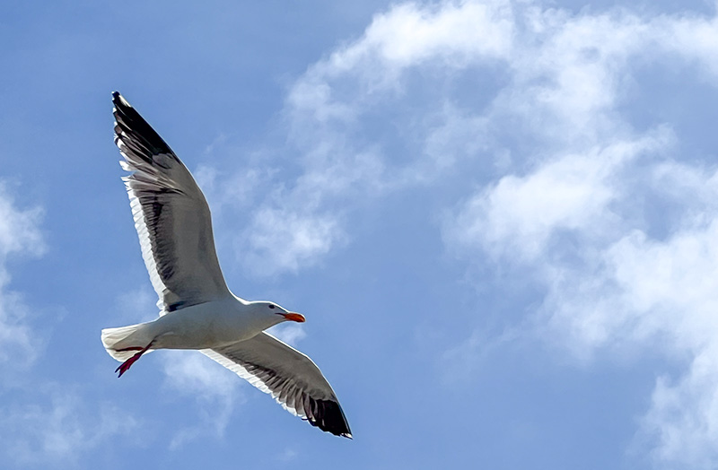
| 69 |
Nov 23 |
Comment |
This is a lovely photo. The subjects really stand out against the background. Looking at the image I wonder how it would look as a blacnk and white image. |
Nov 13th |
| 69 |
Nov 23 |
Comment |
This is a great photo. The detail is great. I think the colors are lovely and overall it is a strong image. I think it is centered well and cropped nicely. |
Nov 13th |
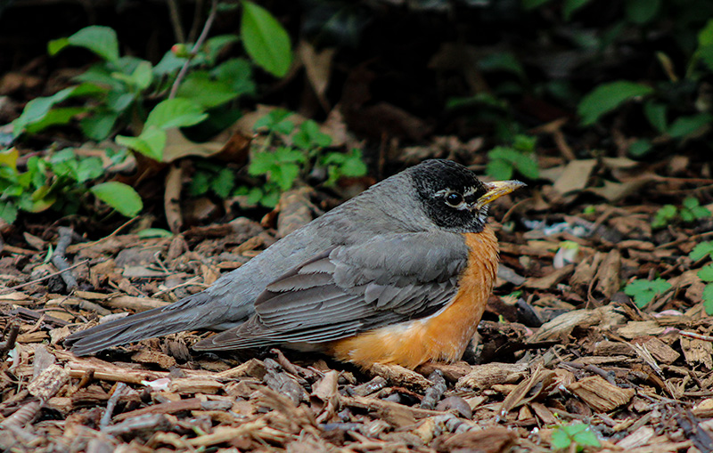
| 69 |
Nov 23 |
Comment |
This is a nice image.Looking at the two photos I think your main one works better as we get to see the face clearly. I think the crop was well done also. Overall it is well done. |
Nov 13th |
| 69 |
Nov 23 |
Comment |
This is a nice photo.The subject is very expressive and the colors are nice. I think that it is very well done. |
Nov 13th |
5 comments - 0 replies for Group 69
|
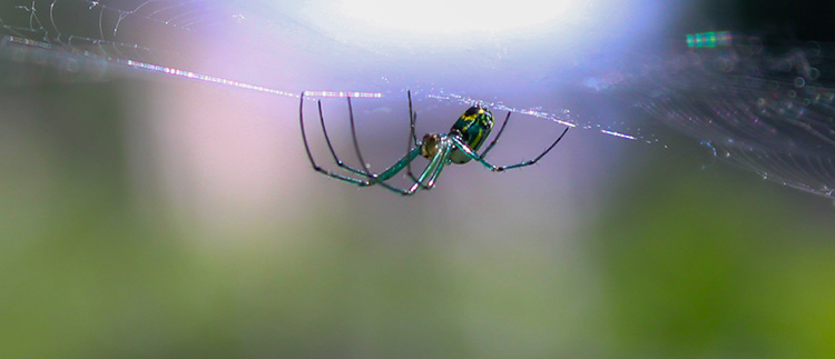
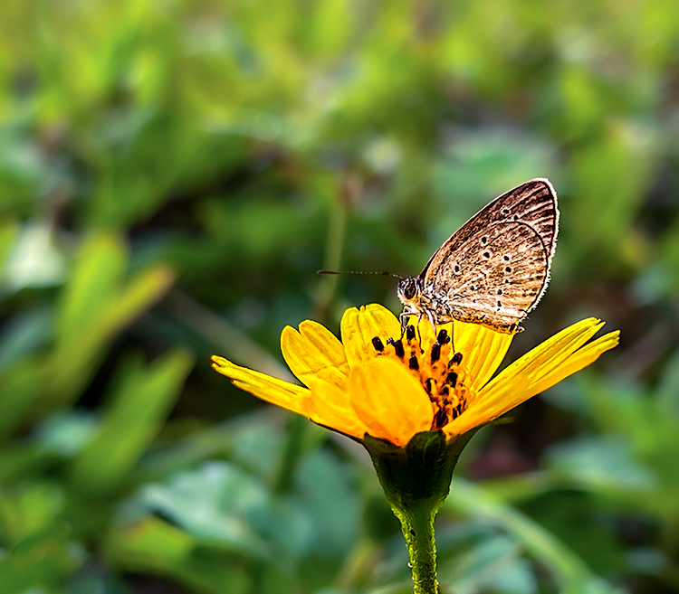
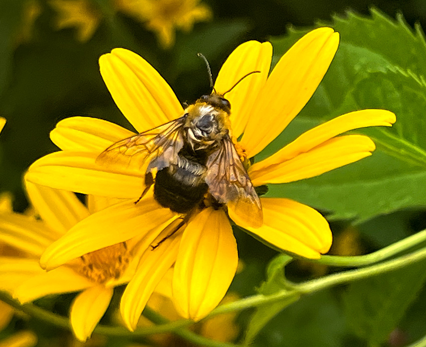
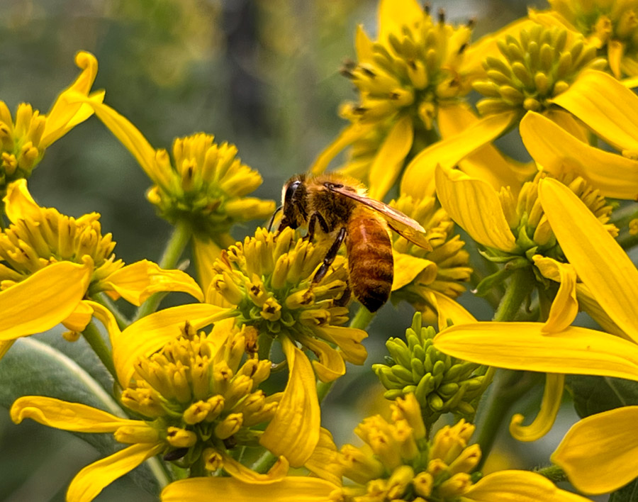
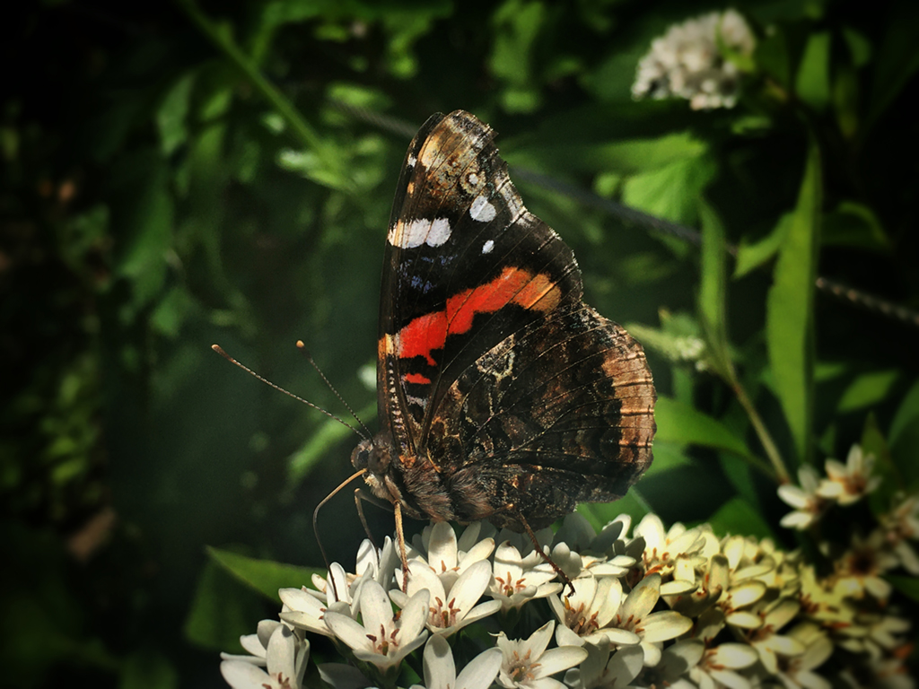
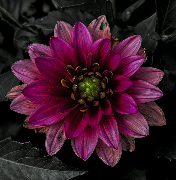
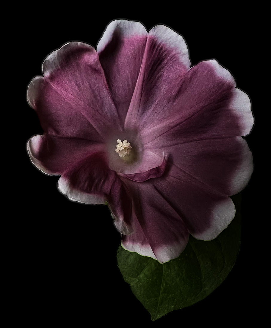
| 80 |
Nov 23 |
Comment |
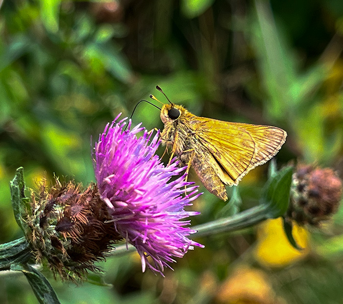
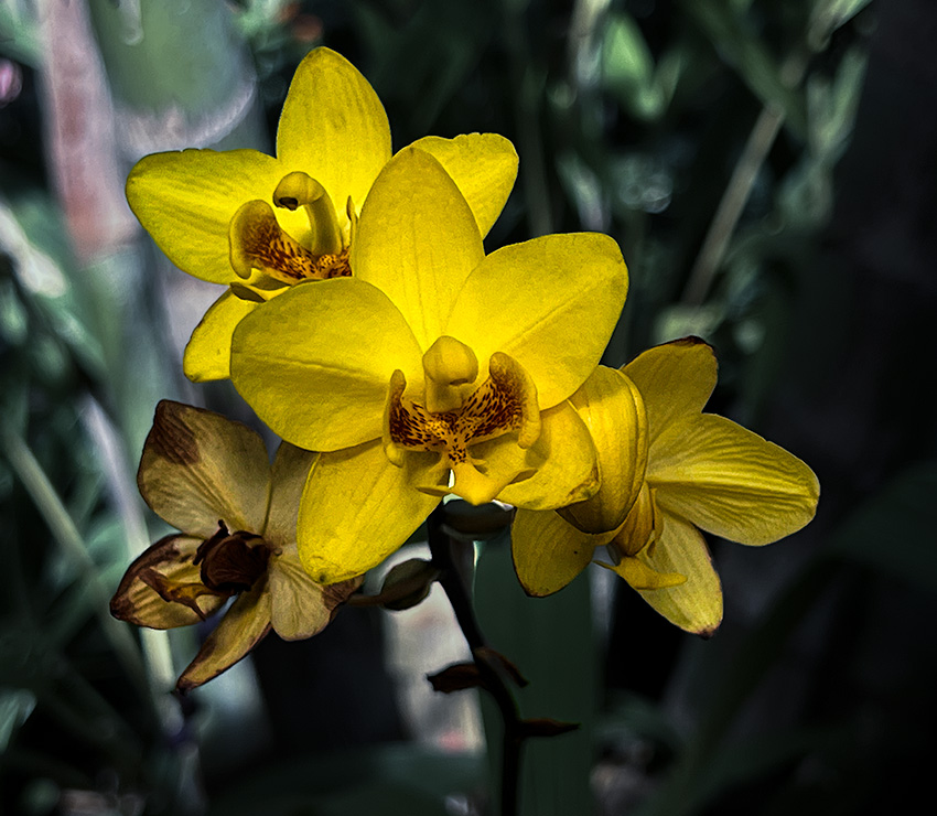
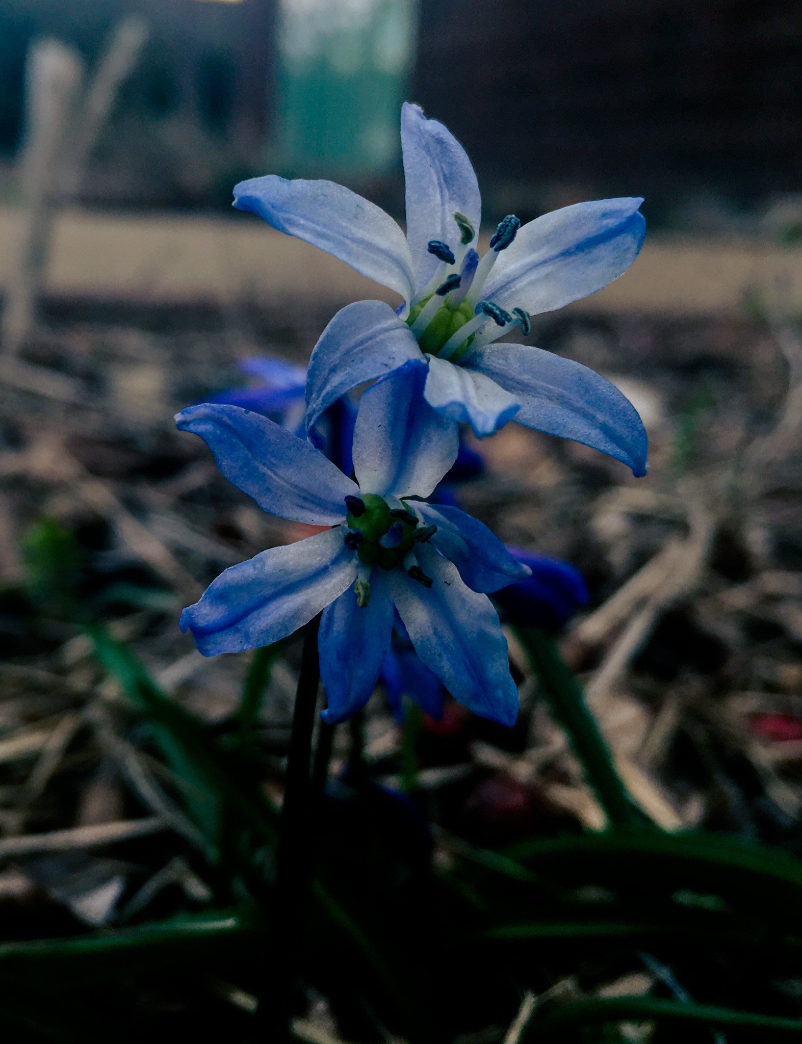
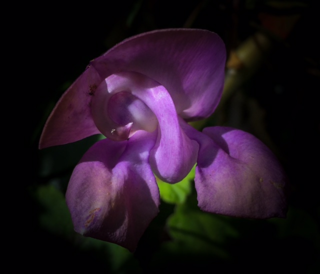
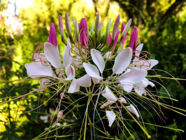
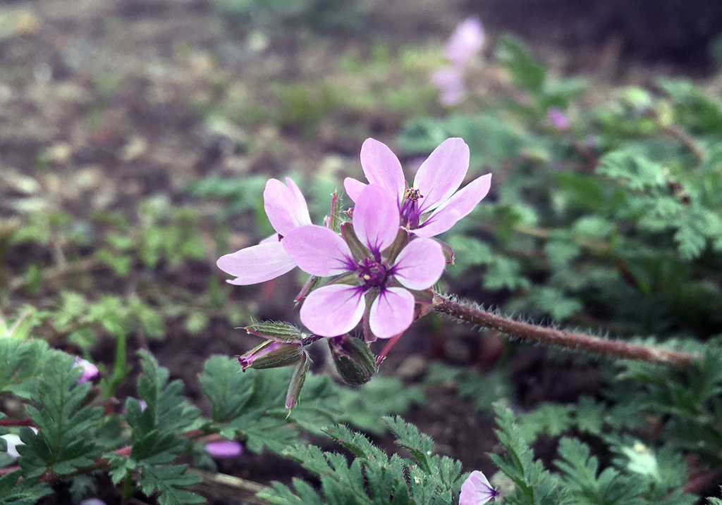
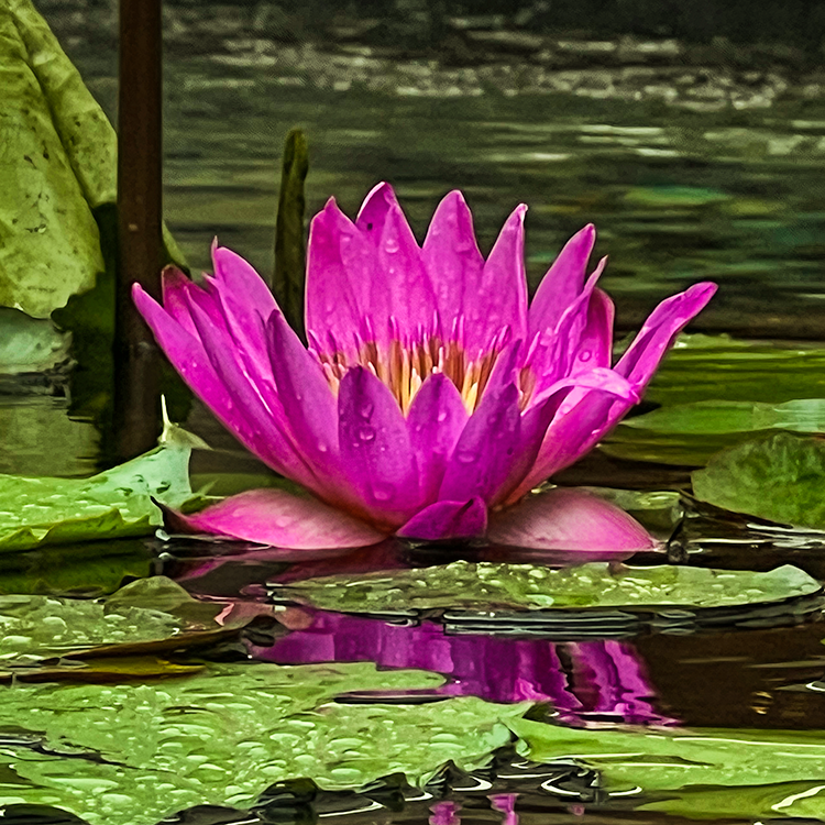
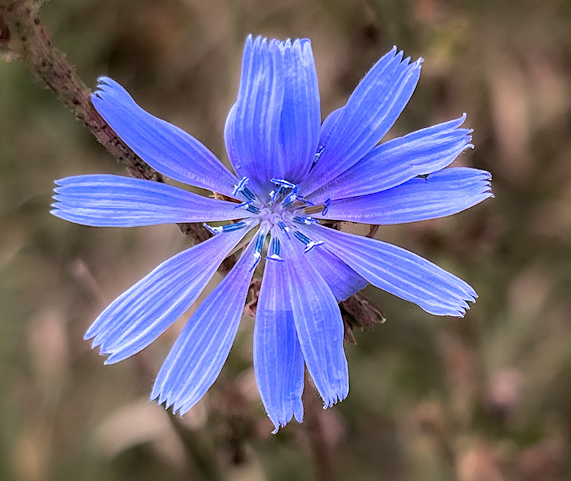
So I agree with everyone else's assessment. It does look like you darkened the background flowers. This kind of makes them stand out to me a bit. I would recommend muting their colors a tiny bit to make the yellow a bit weaker would make the subject more pronounced. |
Nov 15th |
| 80 |
Nov 23 |
Comment |
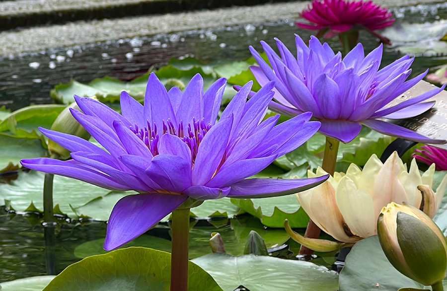
This is lovely. I love the colors with the only concern being the pink spot in the upper left corner. If that could be turned green then I think you would truly isolate the subject. I think one solution is to select the background and adjust the green and red levels. I think by lowering the red/orange/purple levels on the background should remove the pink spot. Another option could be to try adding a feathered vignette to darken the background and focus the subject this could mute the pink spot and draw focus to the flower. This would also make the stem less sharp. Overall though I I've the image and I think the large crop was a good choice as it places the subject well. |
Nov 15th |
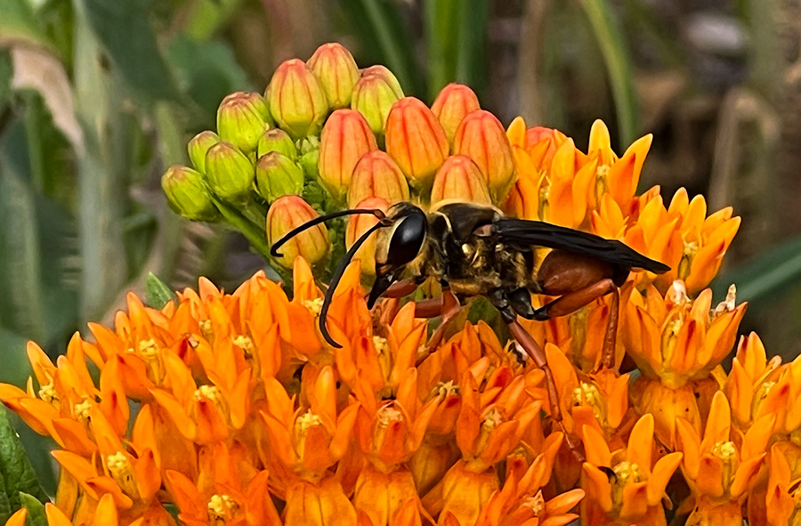
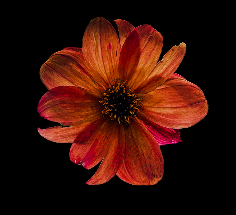
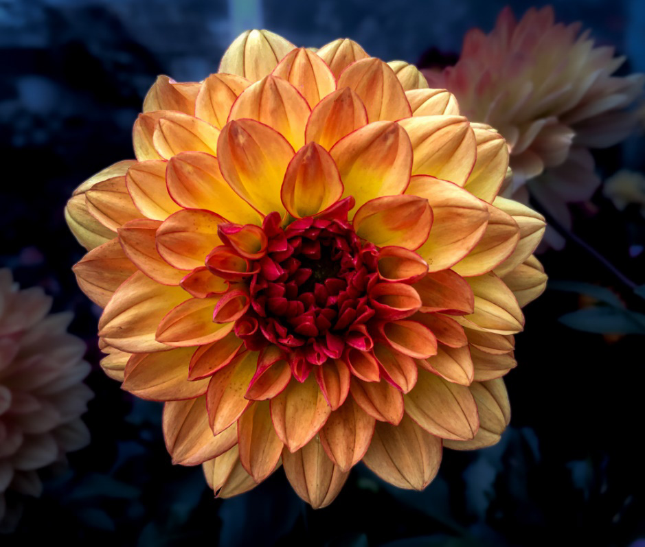
| 80 |
Nov 23 |
Comment |
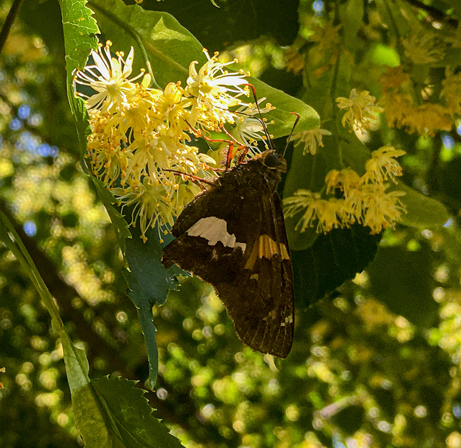
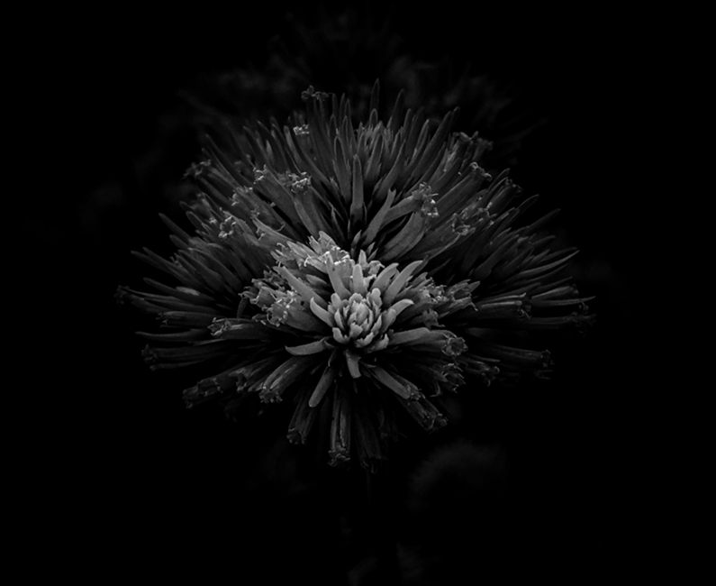
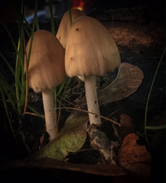
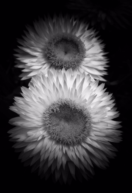
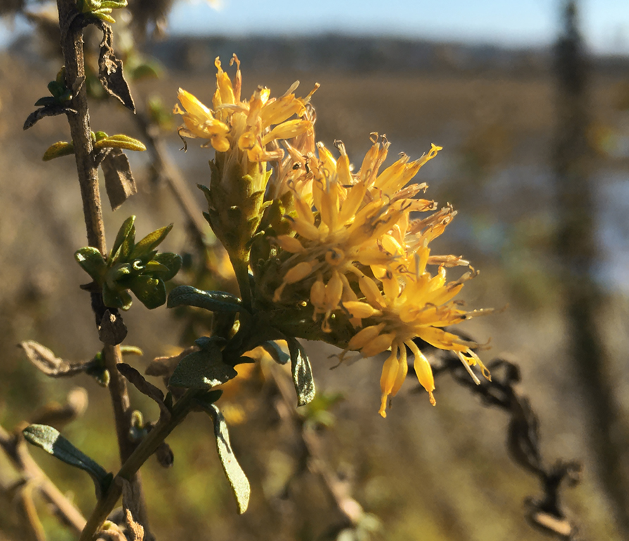
Looking at this I think you did a great job. It is an interesting way of displaying the flower. The image almost reminds me of a fossil. I wonder if you experimented with the background like giving the subject a grey border that was an odd rock shape might make it look fully like a fossil. |
Nov 15th |
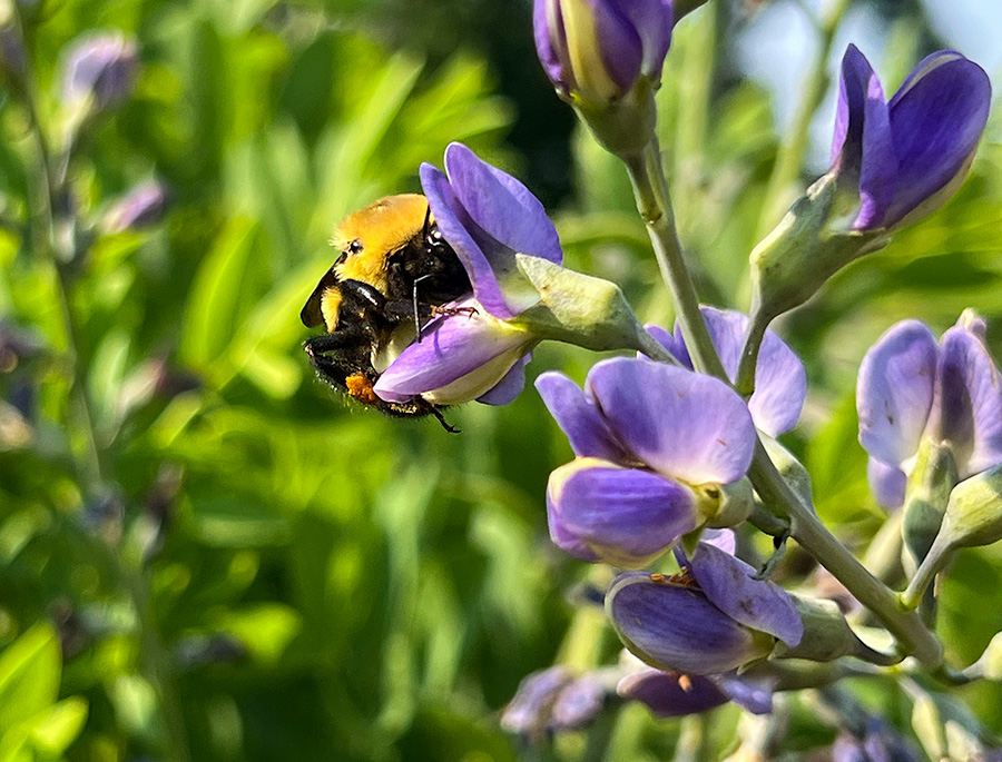
| 80 |
Nov 23 |
Comment |
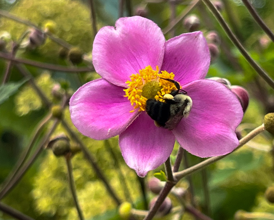
The detail in the photo is really nice. The green line really is a drawing point for the whole image. I think that there is plenty to keep one focused. The limited color pallet works really well here and really engages the viewer. |
Nov 15th |
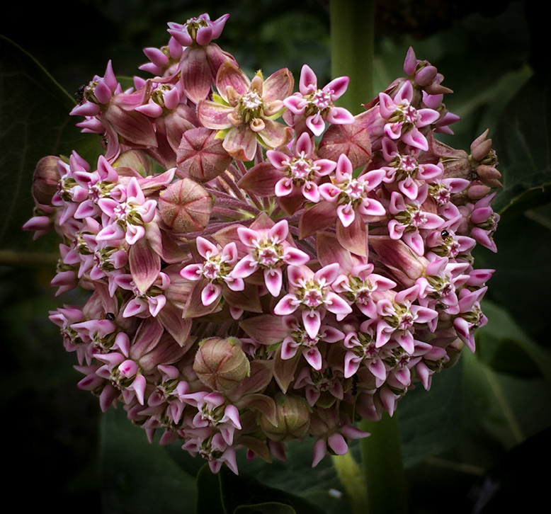
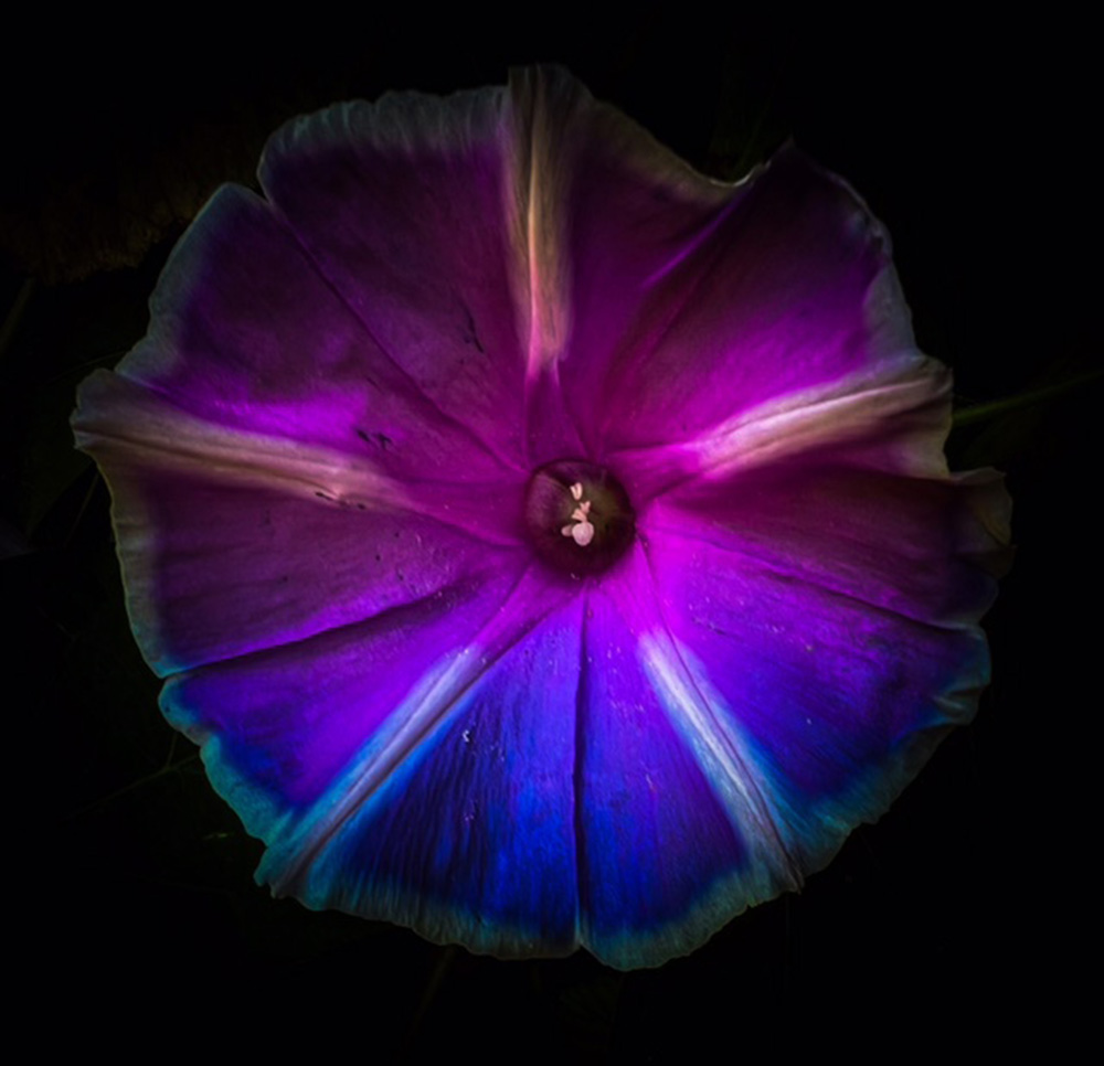
| 80 |
Nov 23 |
Comment |
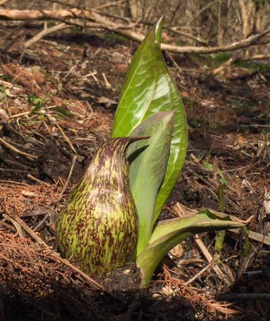
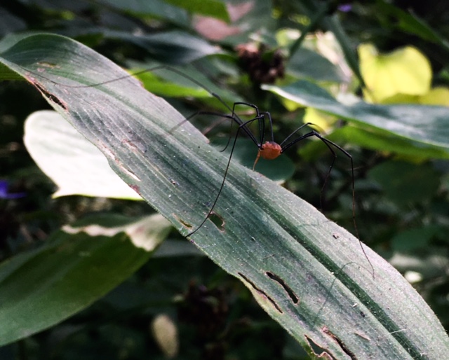
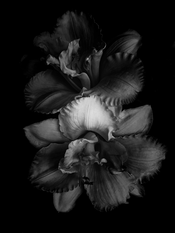
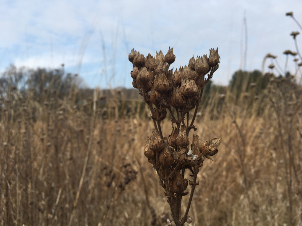
This is a lovely photo. I think that your removal of the background was done really well. I think that the colors are nice and you did a great job. |
Nov 13th |
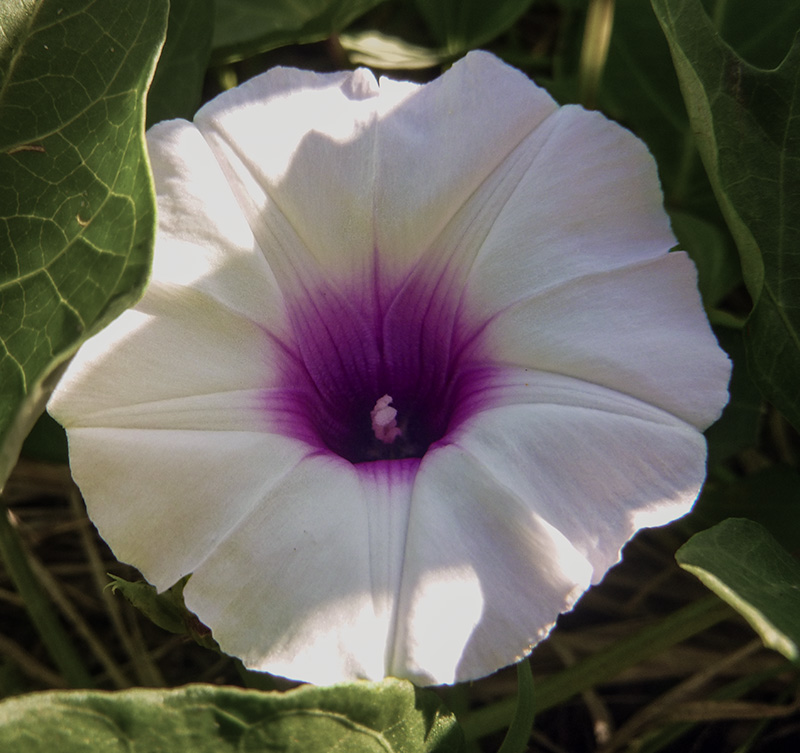
| 80 |
Nov 23 |
Comment |
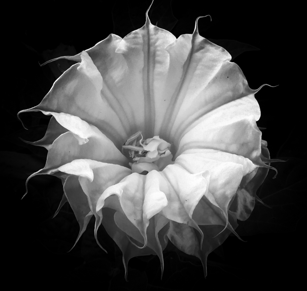
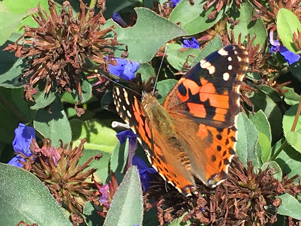
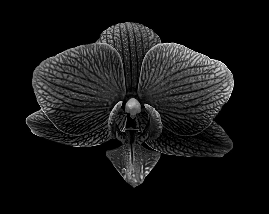
Hi Bob, I enjoyed your image. Looking at it looks like some of the petals are a bit sharp with pixilation. If there is a way to soften them that might help the image or if the transition from petal to black could be expanded. It might also make the flower less "floaty". |
Nov 13th |
6 comments - 0 replies for Group 80
|
11 comments - 0 replies Total
|