|
| Group |
Round |
C/R |
Comment |
Date |
Image |
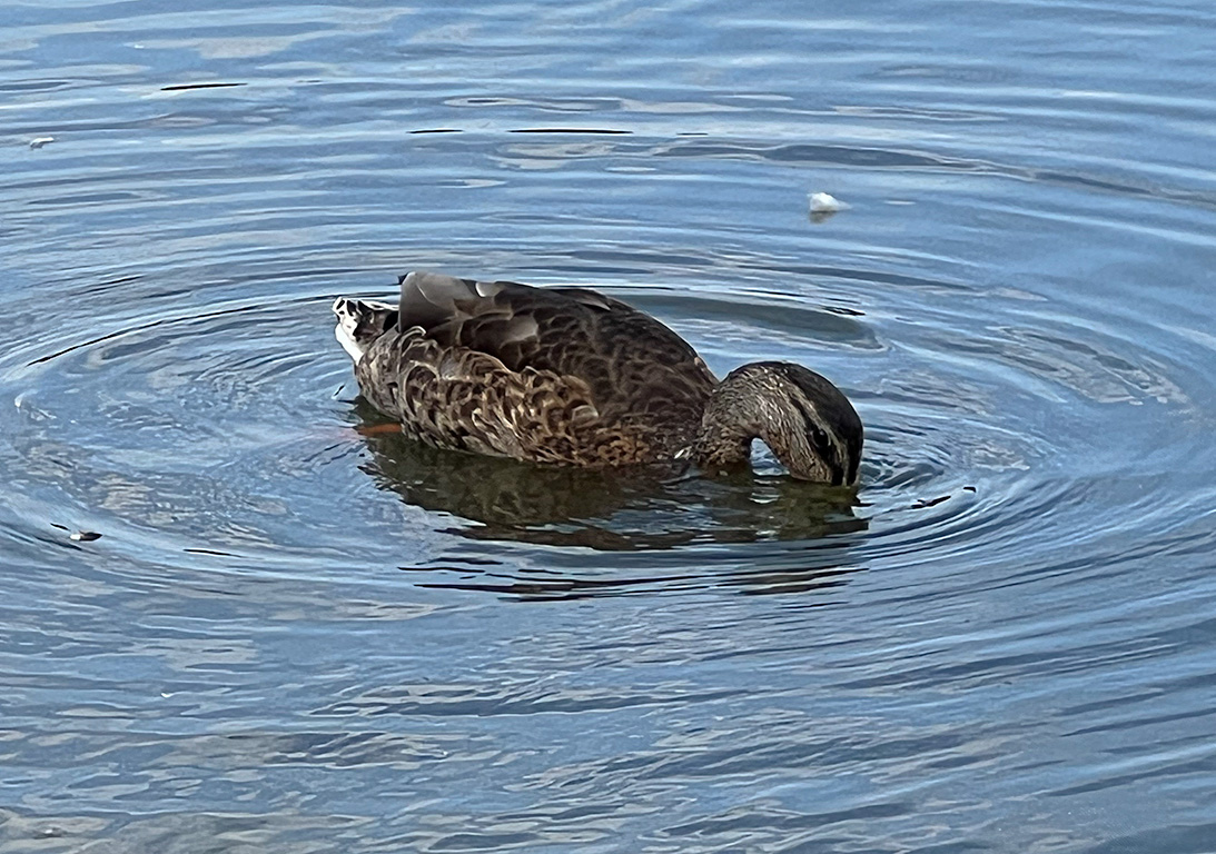
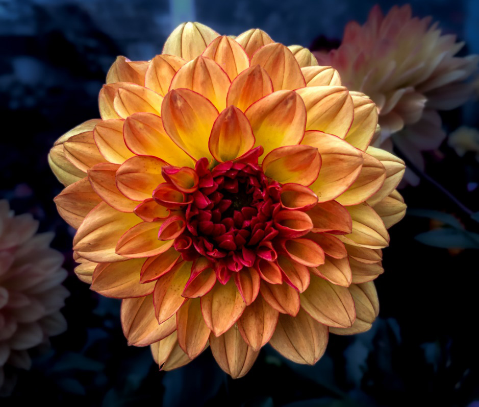
| 69 |
Jun 23 |
Comment |
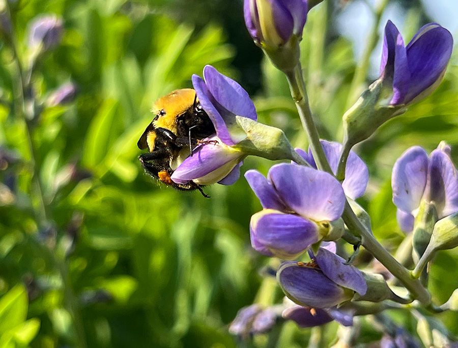
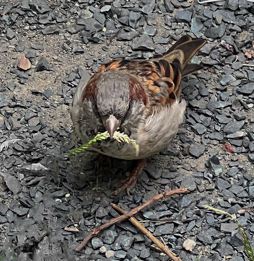
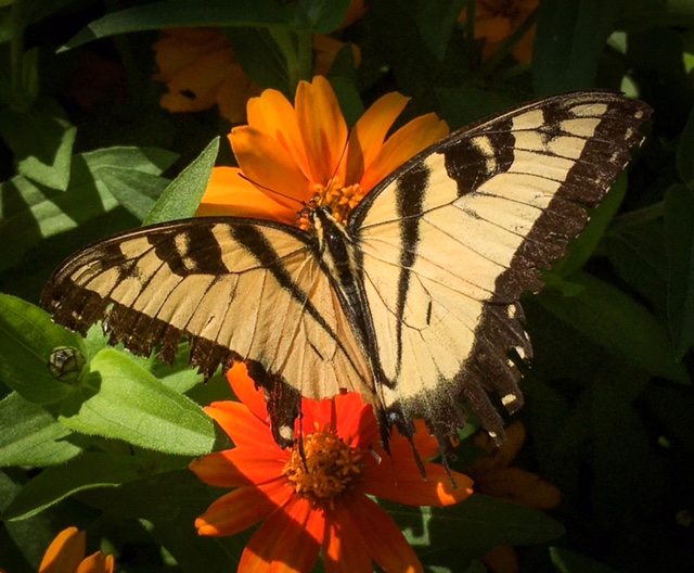
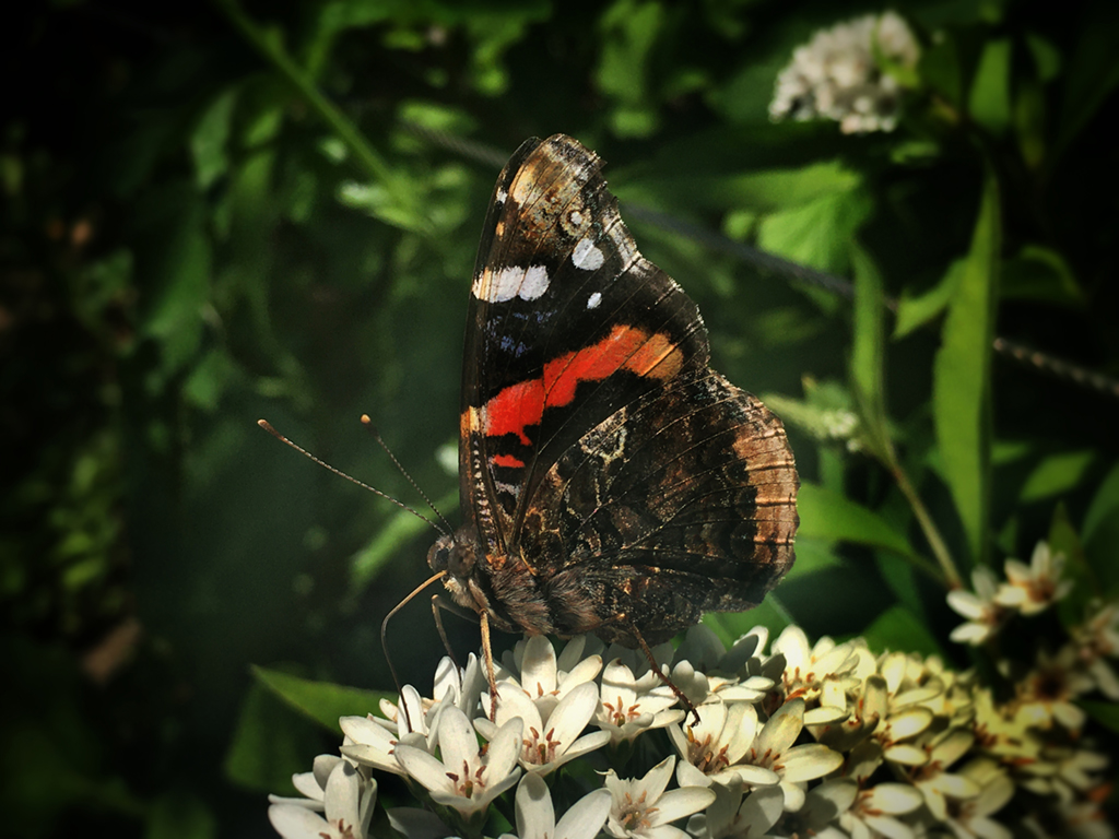
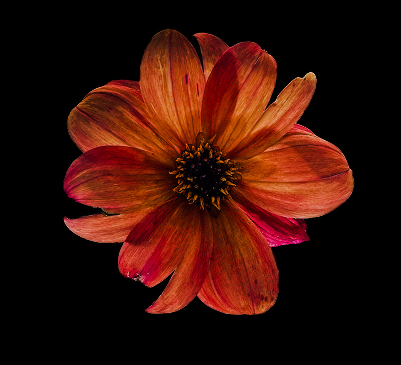
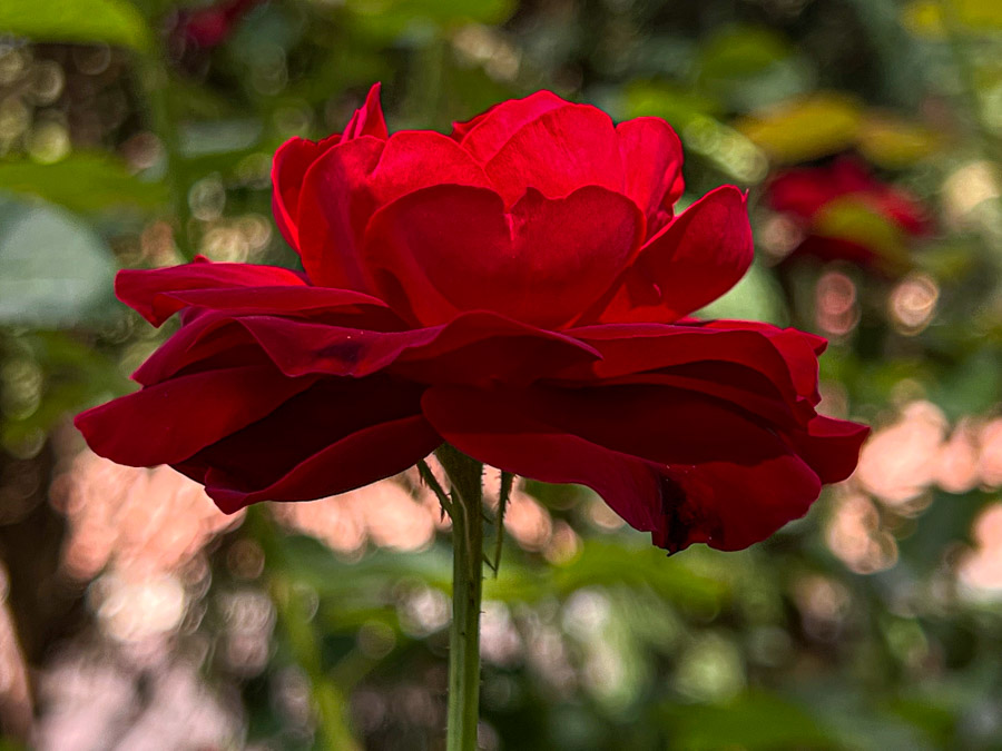
This is an impressive shot. The subject is very expressive and the eyes are clear. I think that a tighter crop would help to focus the image. I also think that if textures are the goal then a black and white variant of the photo might help to do that. Overall I think that all that is needed is a tighter crop as I think the colors of the original image are already very enjoyable. |
Jun 14th |
| 69 |
Jun 23 |
Comment |
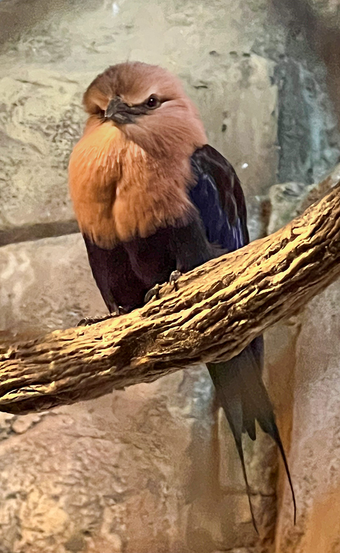
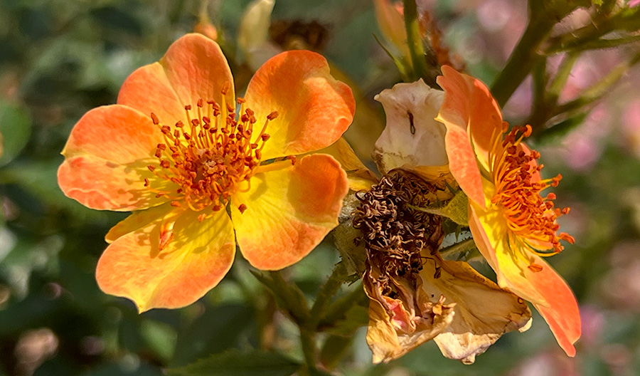
This is a nice photo. I do agree with Dean that the bright blue background is a bit strong. I think darkening it would help the photo and bring the subject in to more focus. Again this is a very nice photo. |
Jun 14th |
| 69 |
Jun 23 |
Comment |
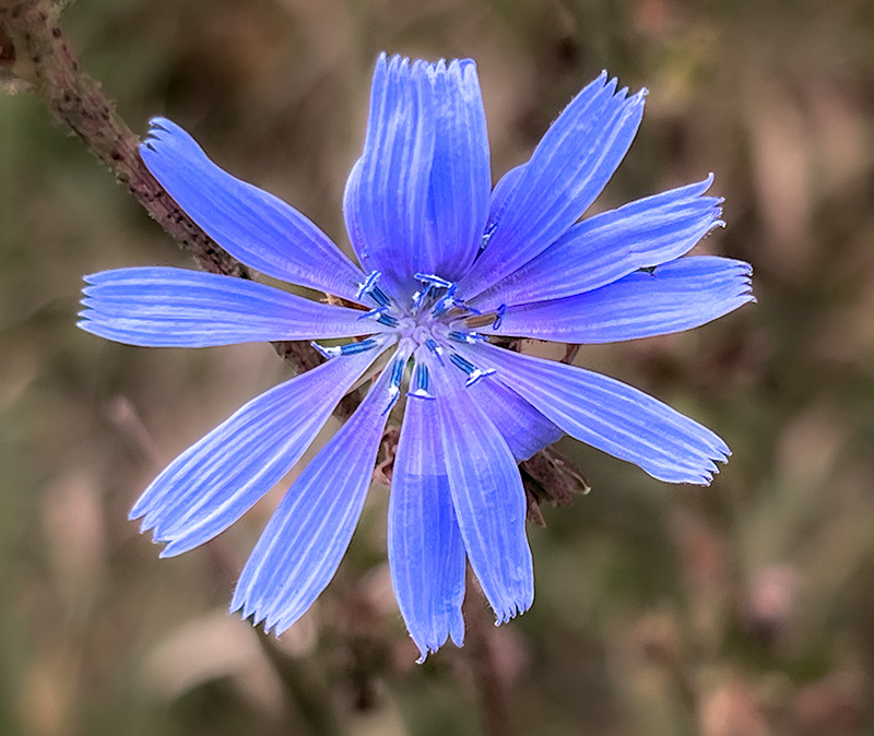
The colors are very nice and the image is great. I think your composition works very well for this piece. I was going to suggest a tighter crop but looking more at the photo it looks like a lot of what makes the photo nice would be lost if we crop the image. |
Jun 14th |
| 69 |
Jun 23 |
Comment |
This is a very striking image. The subject really stands out and I think that the colors are beautiful. |
Jun 14th |
4 comments - 0 replies for Group 69
|
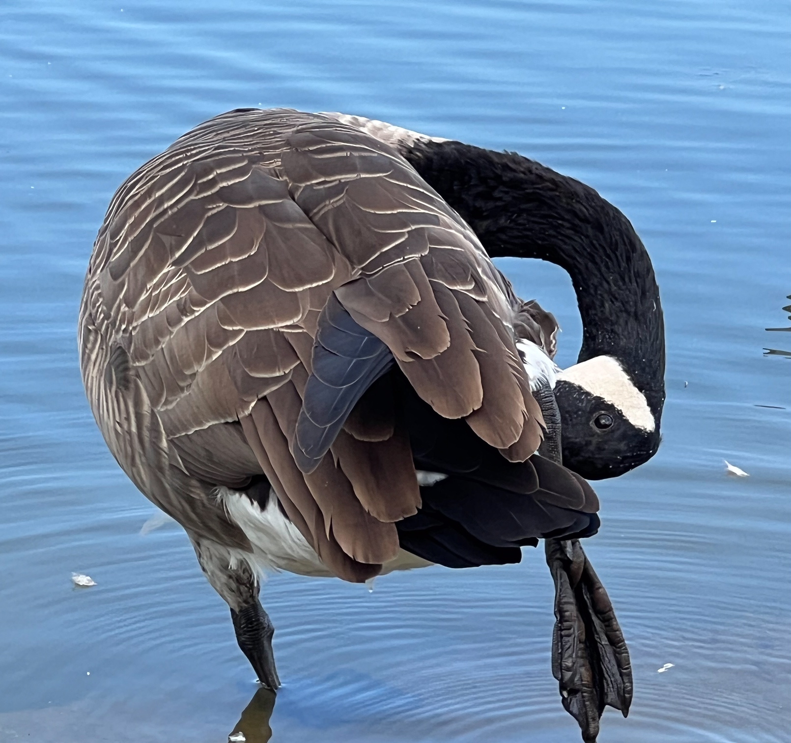
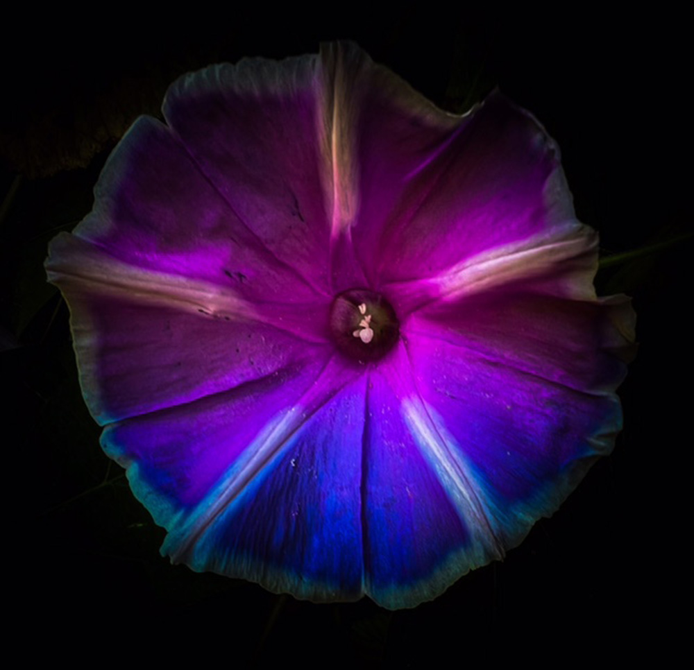
| 80 |
Jun 23 |
Reply |
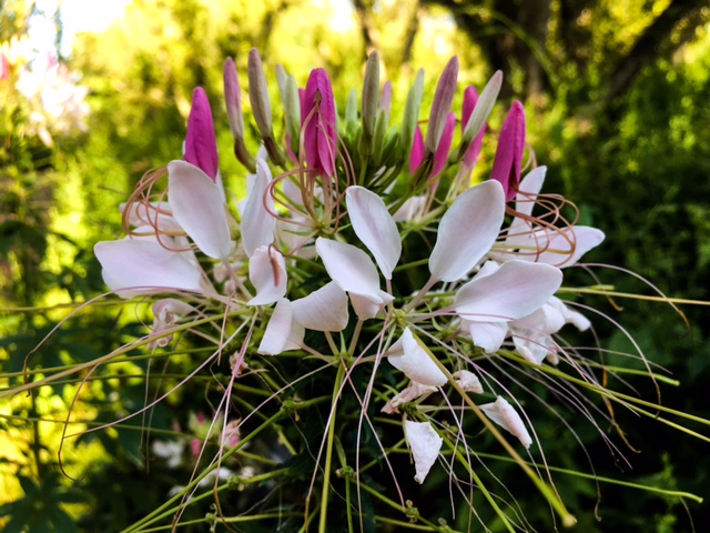
That looks very lovely. The detail is a lot clearer now. |
Jun 18th |
| 80 |
Jun 23 |
Reply |
Hi Bob, That does sound like a very good suggestion. I am unsure how to go about that but will try and look into it. Do you have a preferred app that you use for that? |
Jun 18th |
| 80 |
Jun 23 |
Comment |
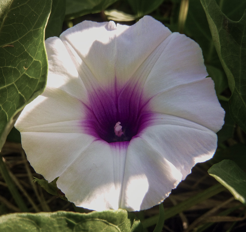
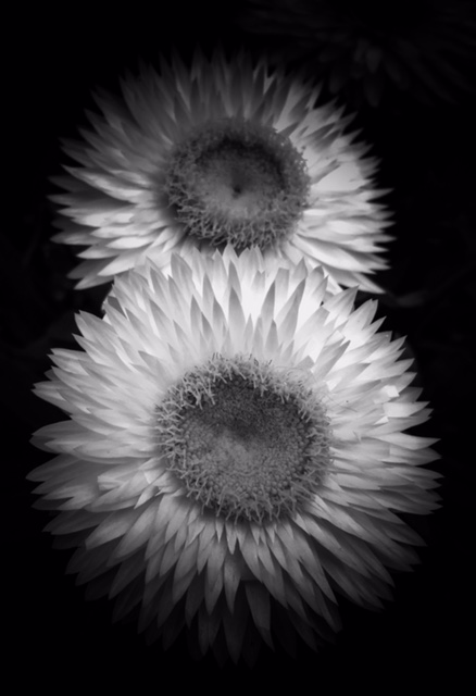
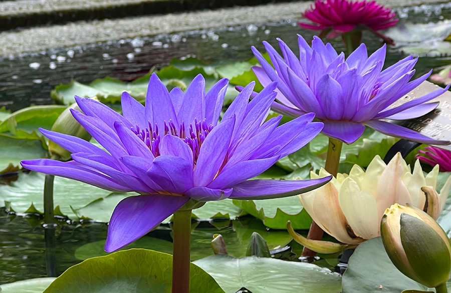
This is a lovely photo. The colors are nice and I think the rotation of the image is a nice touch. I do not have any notes on the piece. |
Jun 14th |
| 80 |
Jun 23 |
Comment |
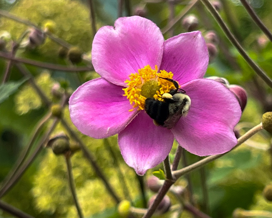
This is a lovely photo. The merging of the two images is enjoyable and perfect in my mind. You truly capture the softness of the flowers. I also think the colors you use are very nice and work well with the subject. Also the title is a nice touch with this piece. |
Jun 14th |
| 80 |
Jun 23 |
Comment |
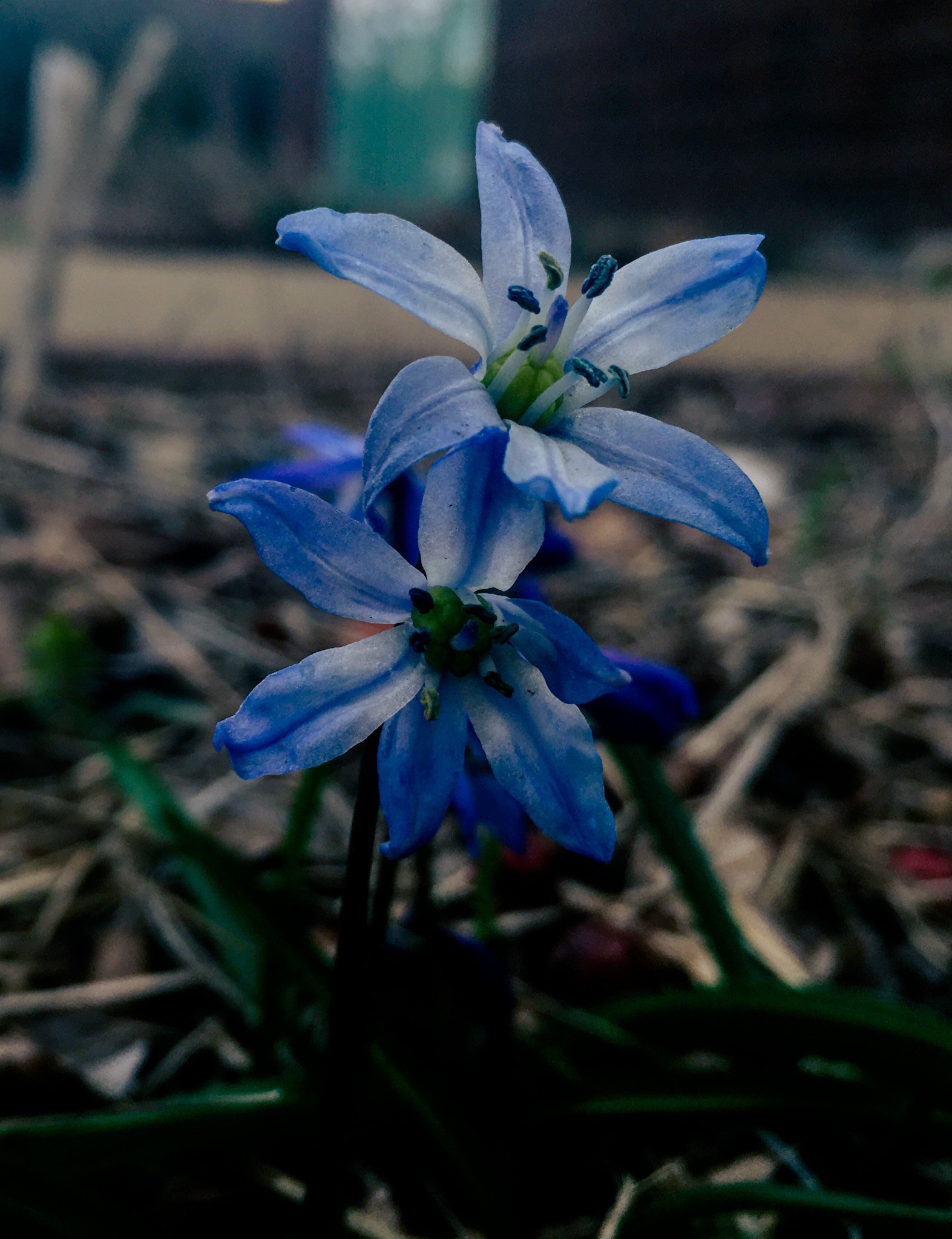
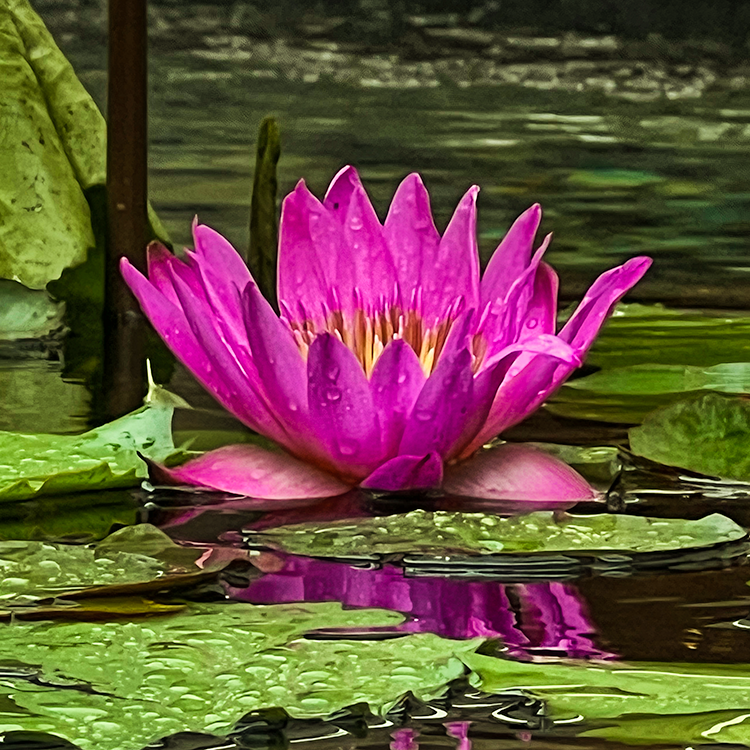
Looking at the photo it appears that some of the detail for the flower was lost. I found issues with that when I take pictures using my iphone. I think altering the contrast can help return some of the detail lost in the petals. It is a very nice photo though and it has very lovely colors. |
Jun 14th |
| 80 |
Jun 23 |
Comment |
This is a lovely photo. Looking at the image I think that the ripple effect is a very nice touch and really communicates the softness of the flowers. I don't see anything that I would change. |
Jun 14th |
| 80 |
Jun 23 |
Comment |
This is a lovely photo. Looking at the photo I do agree with Bob that I do not see the cloud shapes. I think that the piece looks very nice but I wonder if the second flower is needed or not for the composition of the piece. I do think that you did create a good sense of movement and it is well reflected. |
Jun 14th |
| 80 |
Jun 23 |
Comment |
This is a lovely photo. The editing makes it appear to look like an oil painting. It really draws out the softness of the flowers. It does appear that there are several spots that could be focused on by using a tighter crop. This would depend on what the desired target is for the photo. In this case cropping to focus specifically on the central flower or those in the lower left corner would produce interesting pieces. Again it is a beautiful piece and my suggested crops would be designed to produce other pieces in addition to the one you submitted. |
Jun 14th |
6 comments - 2 replies for Group 80
|
10 comments - 2 replies Total
|