|
| Group |
Round |
C/R |
Comment |
Date |
Image |
| 69 |
Feb 23 |
Reply |
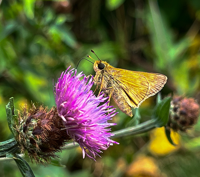
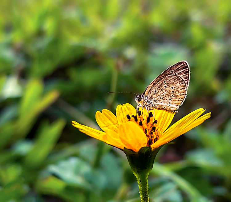
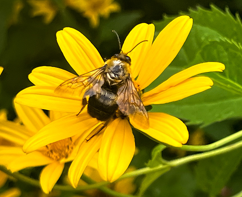
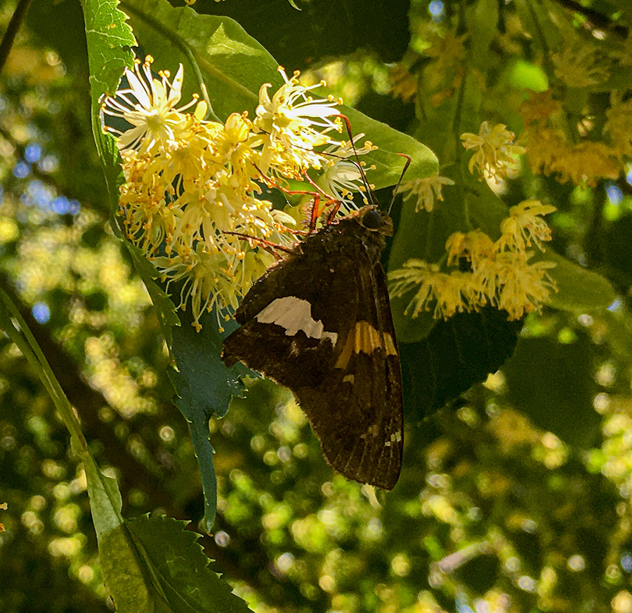
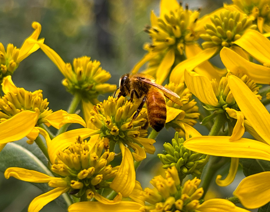
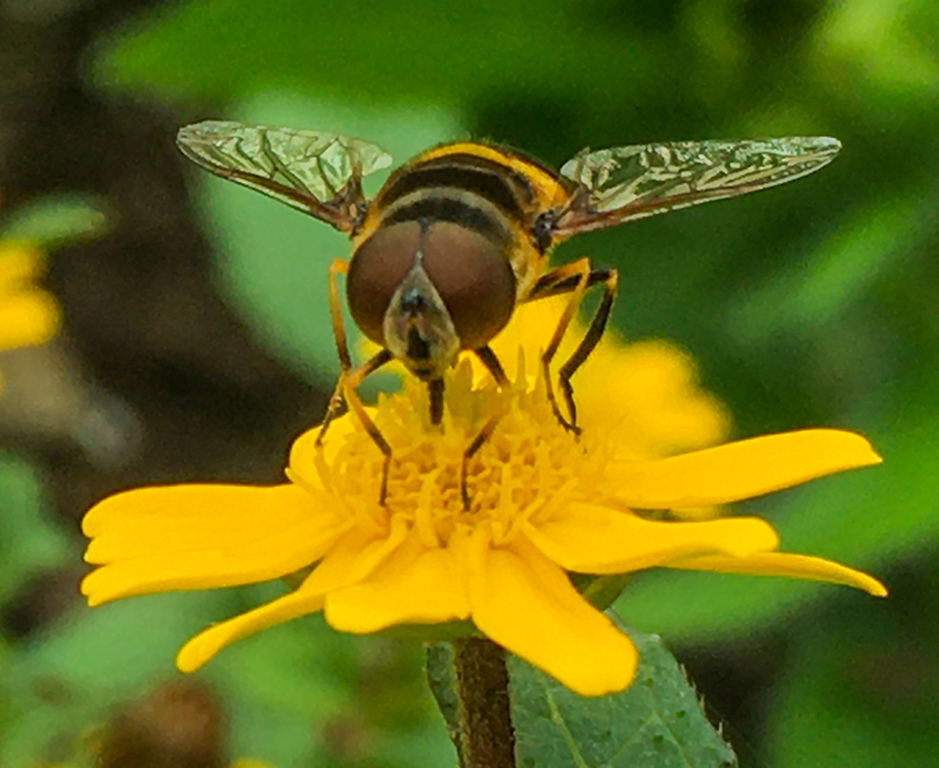
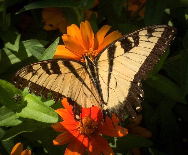
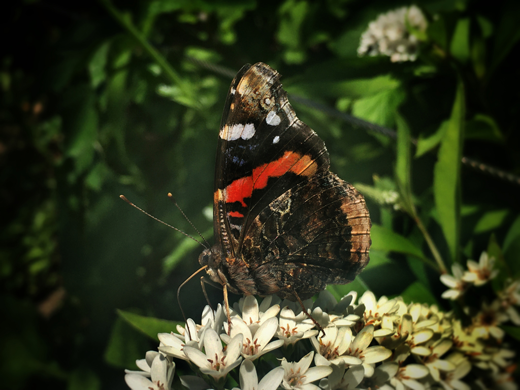
Hi Pierre, this was taken using my iphone. I did upgrade to teh iphone 13 pro for the higher quality camera which has improved my images a lot. I will have to try your suggestions on the bee as I was losing detail on the bee with my attempts at editing.
|
Feb 17th |
| 69 |
Feb 23 |
Comment |
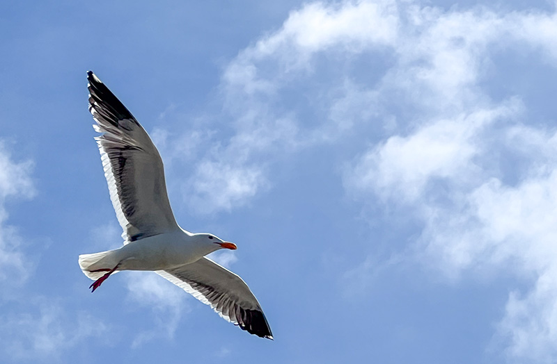
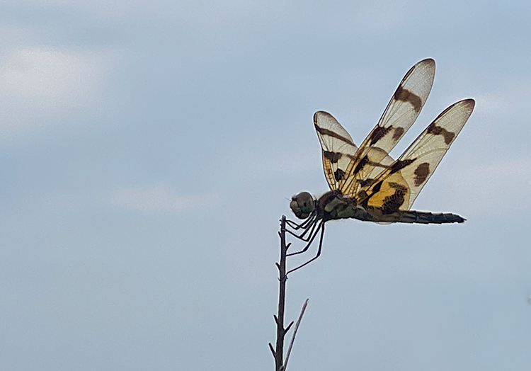
This is a great image. The detail in the wings is very nice. I think that if possible darkening the wings would help make them stand out as I find them to be the most engaging. I think the other option could be to try to increase contrast and make the image a monochrome image as that may help increase the detail seen in the wings. |
Feb 17th |
| 69 |
Feb 23 |
Comment |
This is a great image. The fish have a lot of movement and feel dynamic. It is well balanced and the colors are also great. Overall it is a very strong piece. |
Feb 17th |
| 69 |
Feb 23 |
Comment |
This is a great image. The fish have a lot of movement and feel dynamic. It is well balanced and the colors are also great. Overall it is a very strong piece. |
Feb 17th |
| 69 |
Feb 23 |
Comment |
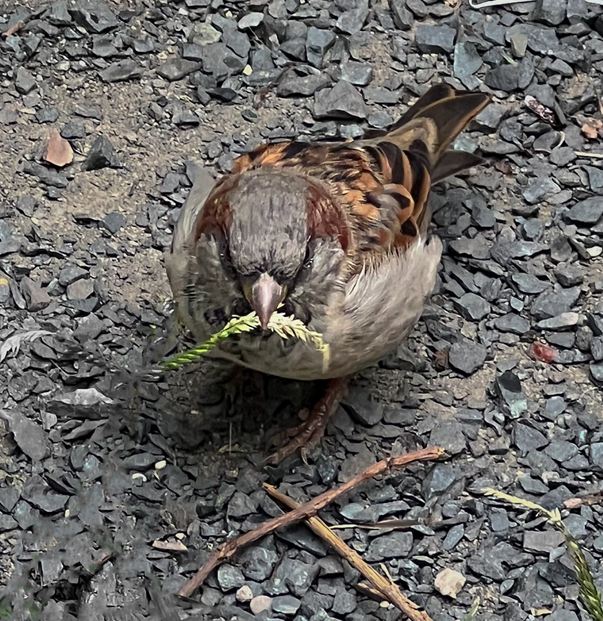
REviewing the feedback from the others and looking at the image I do think that a tight crop on the baby might make a stronger piece. Doing that might also help frame the baby better and its face might stand out more clearly against all the hair. |
Feb 17th |
| 69 |
Feb 23 |
Comment |
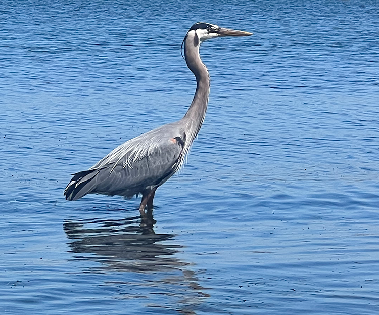
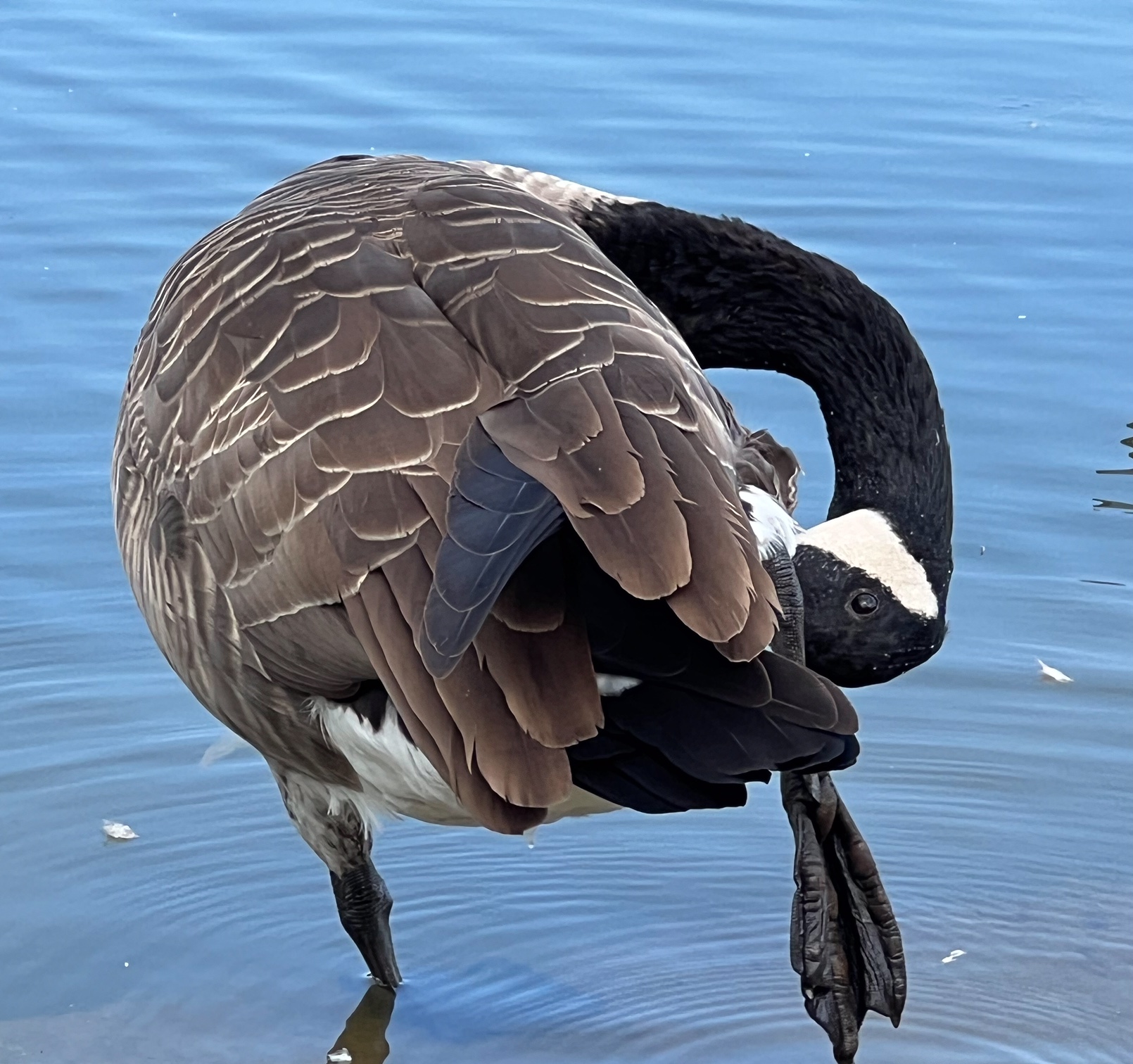
This is a lovely photo. I was a little confused initially looking at as I was trying to figure out if we saw the birds relection or shadow. It is a very nice image. Ido agree that any editing to the eye to make it more obvious would help draw focus to the subject. |
Feb 17th |
| 69 |
Feb 23 |
Comment |
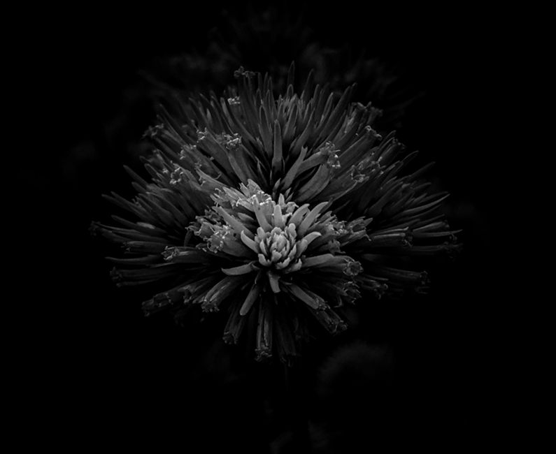
Comparing the origonal and the monochrome photo I think both are very nice and work well. I personally think the monochrome is bit more interesting but I wonder how it would look with an increased contrast. |
Feb 17th |
| 69 |
Feb 23 |
Comment |
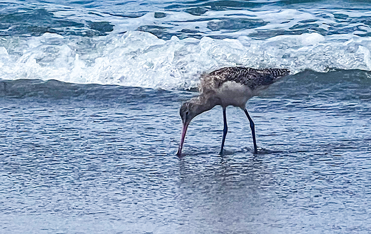
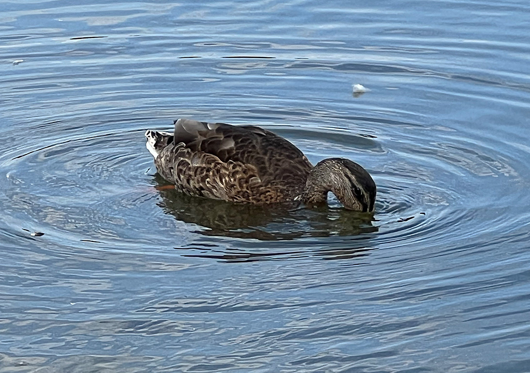
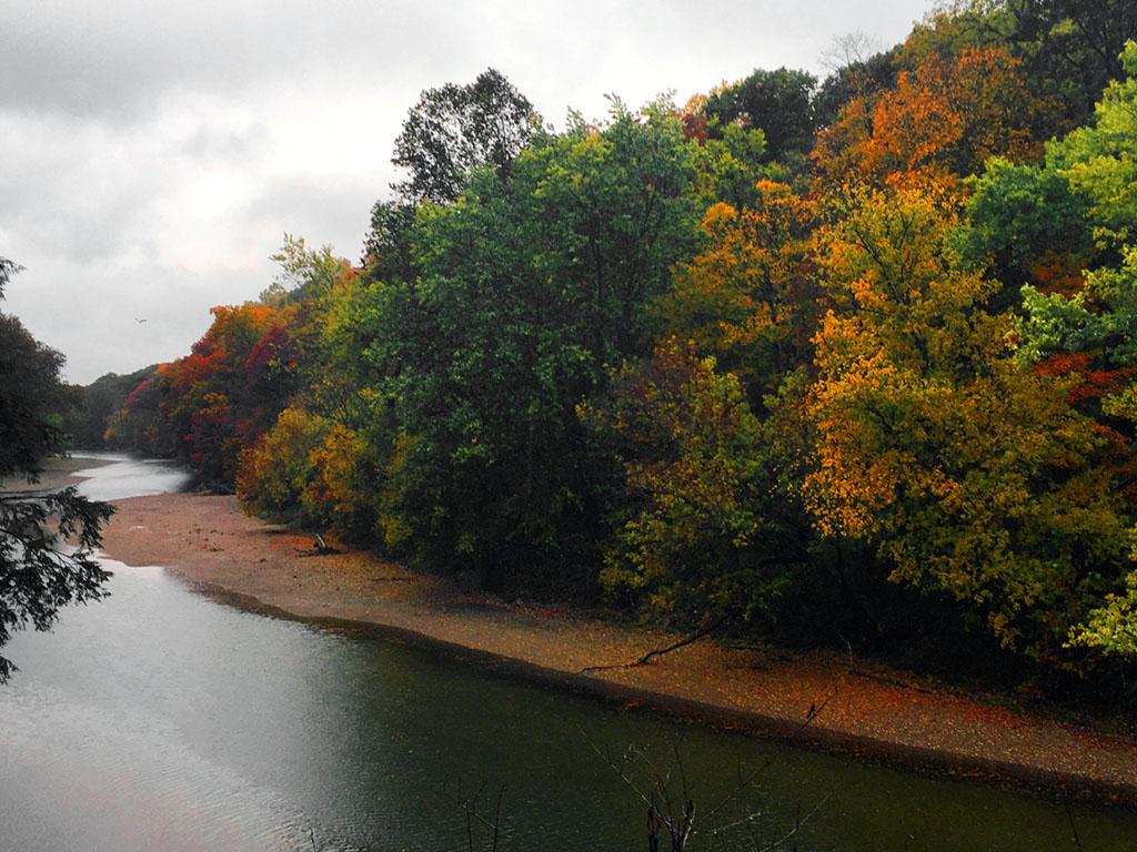
This is a very nice capture. The water is very nice and complements the bird very well. Personally I think that the square crop is nice but I think that an off center rectangular crop might had bit more movement to the photo. |
Feb 17th |
7 comments - 1 reply for Group 69
|
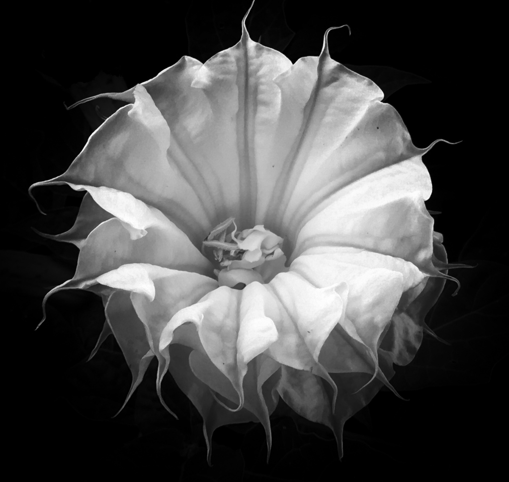
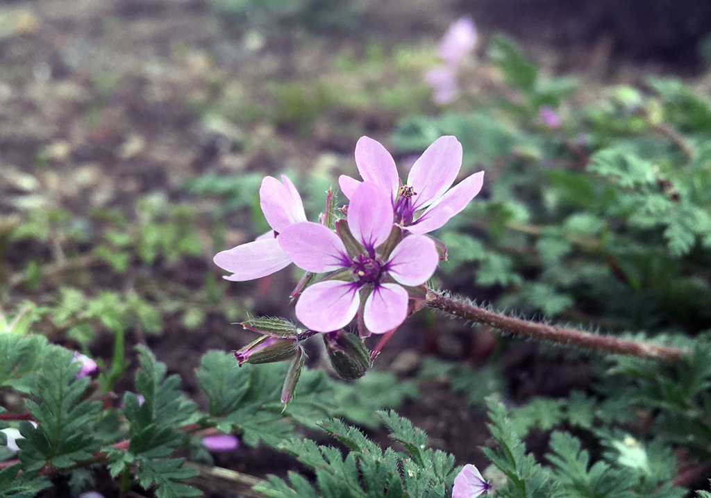
| 80 |
Feb 23 |
Comment |
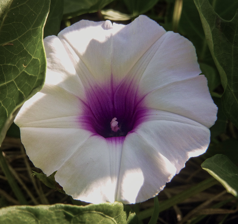
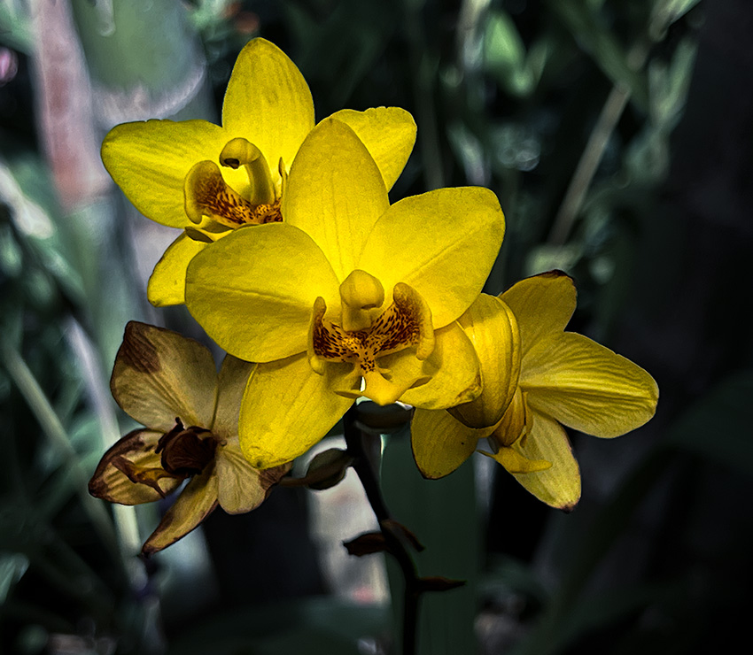
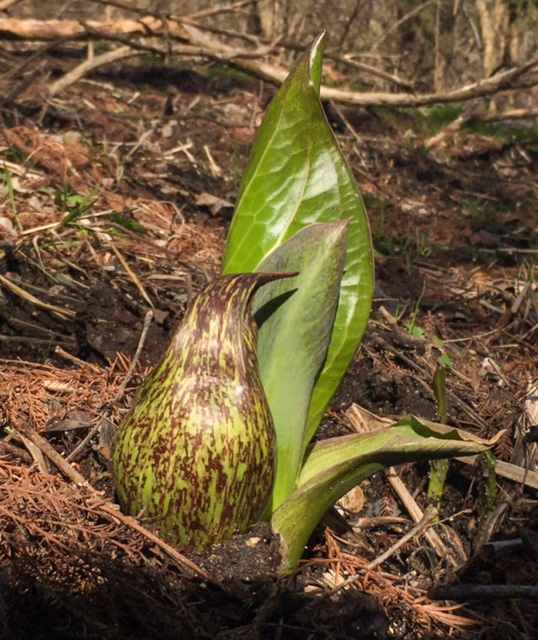
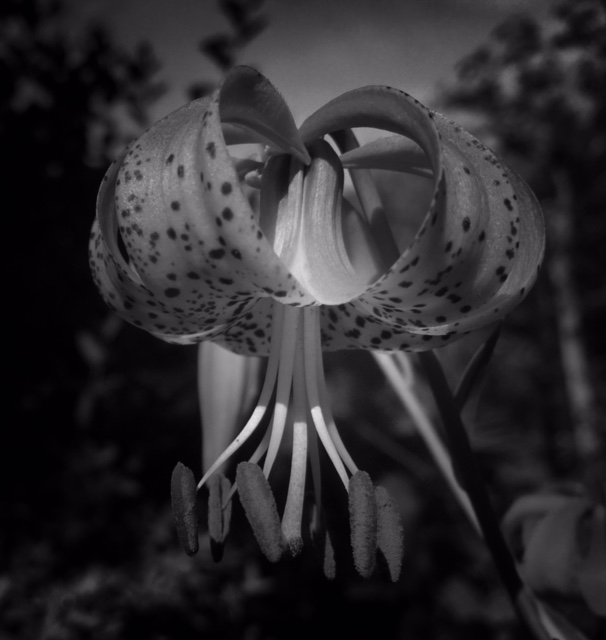
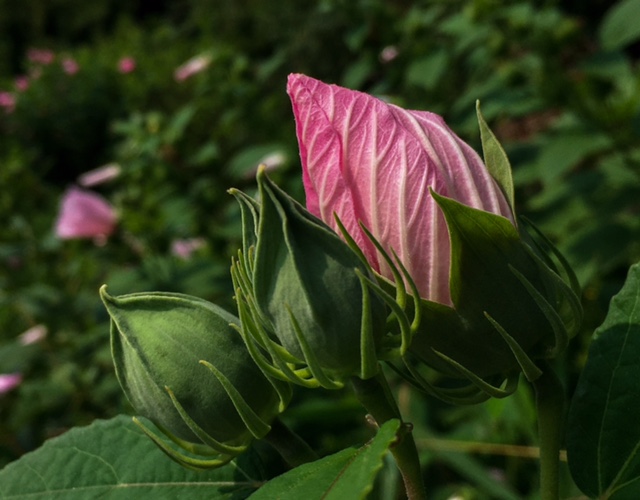
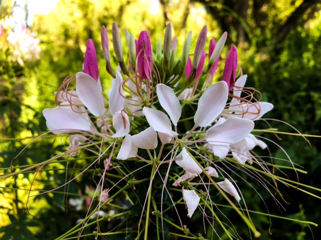
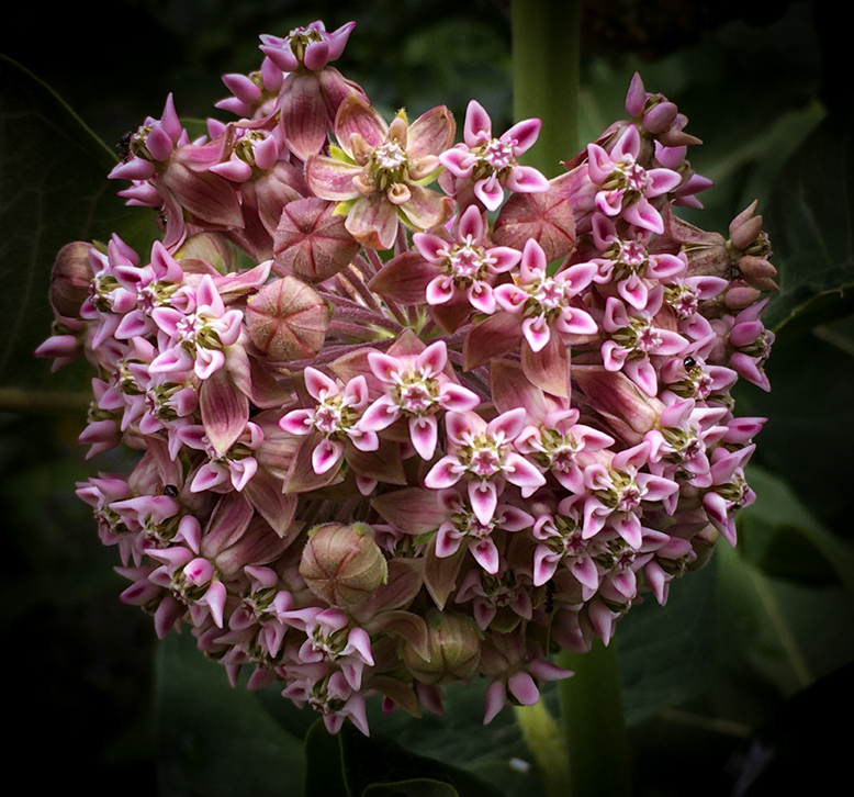
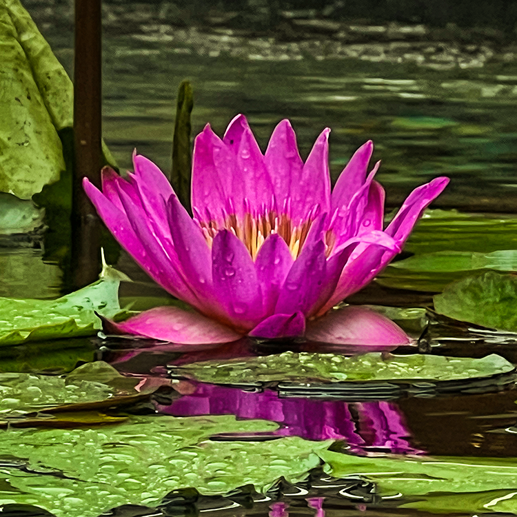
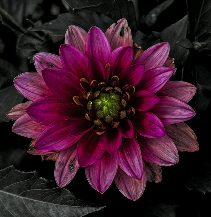
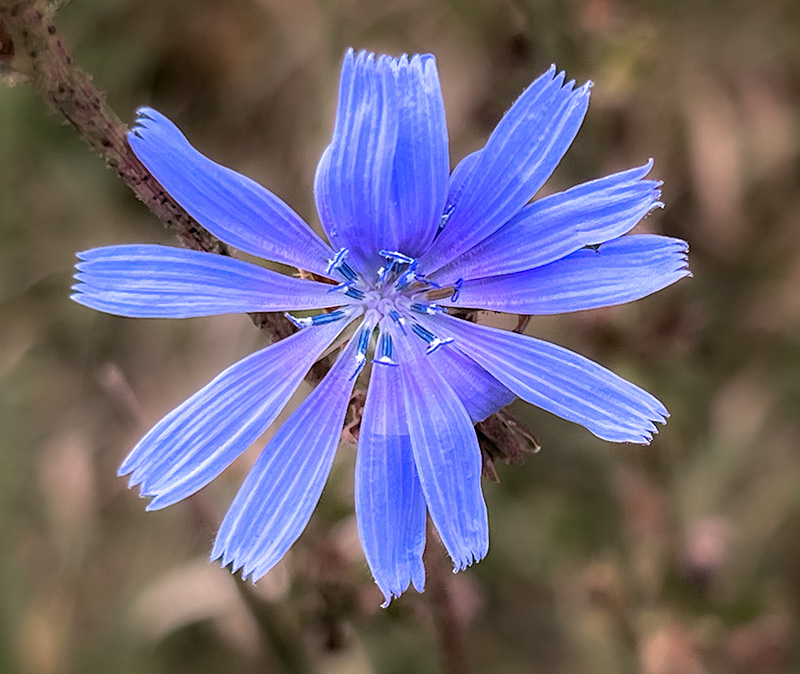
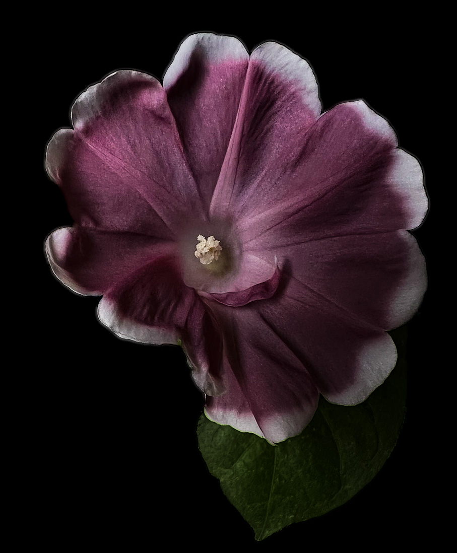
The close crop is an interesting way of presenting the flower. I think that maybe it might be nice if you brighten the flower a bit similar to the origonal photo as this is a bit dark. Beyond that I think it is presented well and is a nice image. |
Feb 17th |
| 80 |
Feb 23 |
Comment |
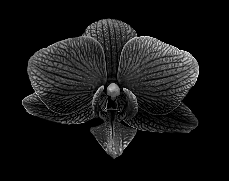
This is an interesting photo. The edits are interesting and I do think it would work well as a print. Overall it is a nice photo. |
Feb 17th |
| 80 |
Feb 23 |
Comment |
This is a very nice image. I agree with doug that a tighter crop might help improve the image. I would leave the colors alone and maybe try altering the contrast. |
Feb 16th |
| 80 |
Feb 23 |
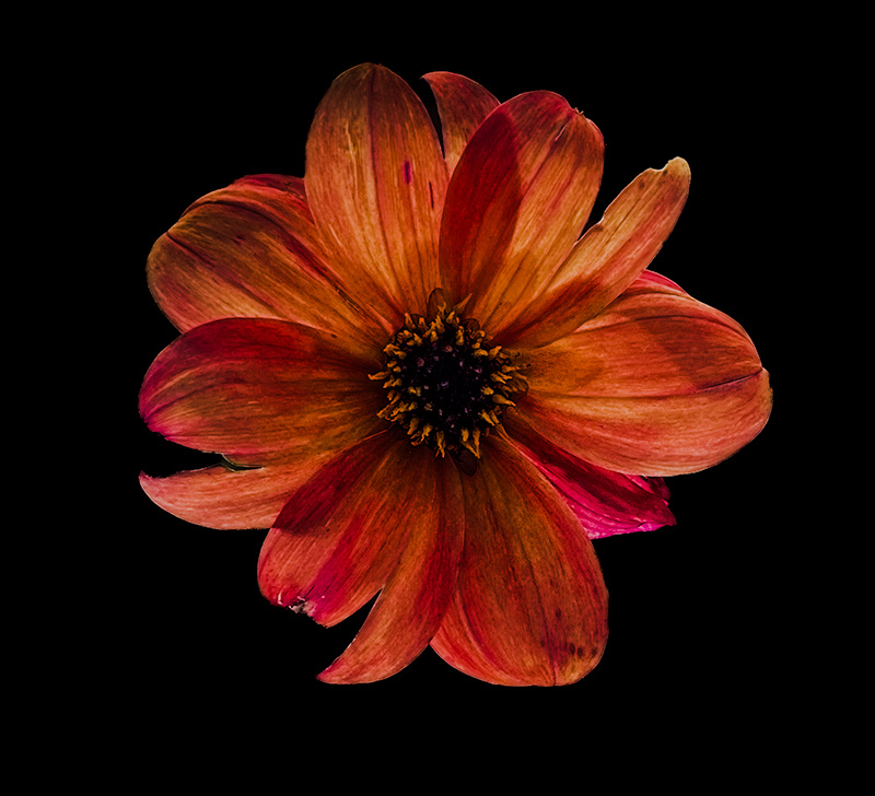
Comment |
This is a very nice image. The abstraction is very nice and engaging. I like the color pallet but I do think that trying some other color pallets may improve contrast and detail. |
Feb 16th |
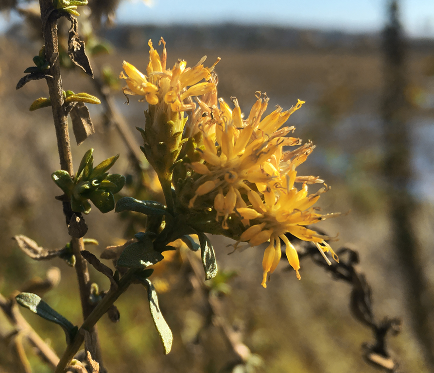
| 80 |
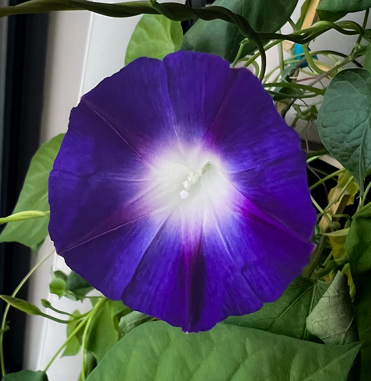
Feb 23 |
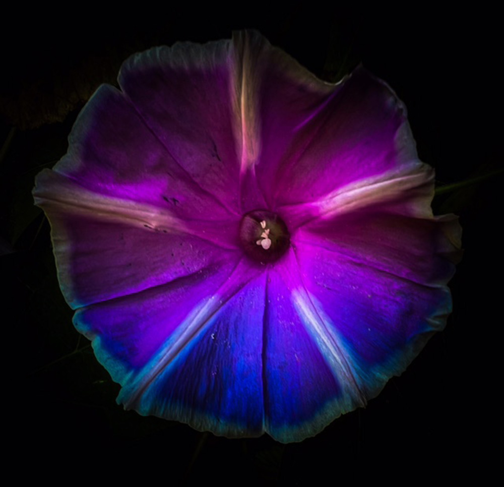
Comment |
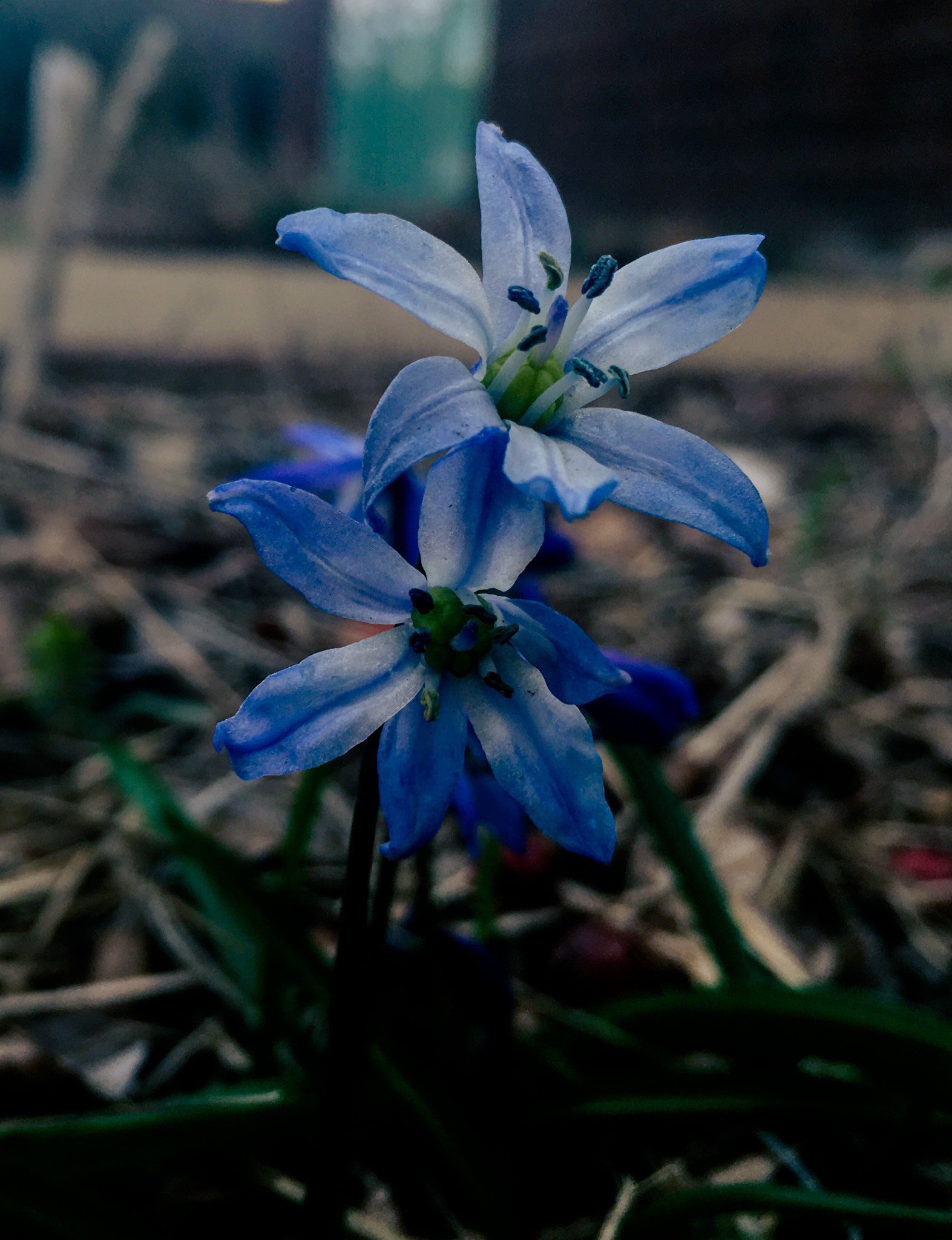
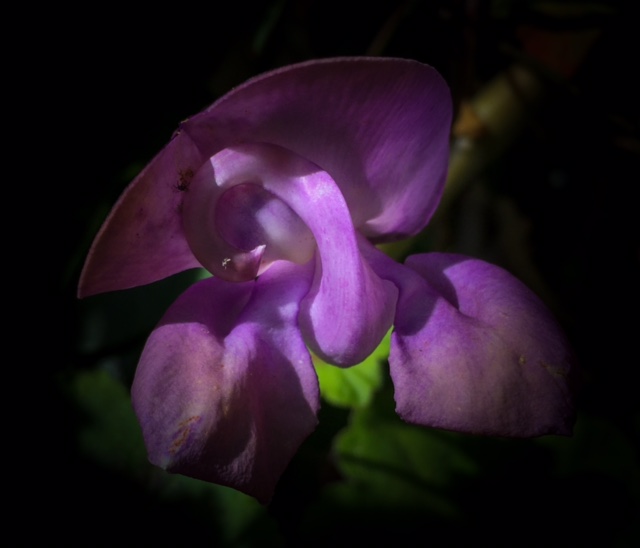
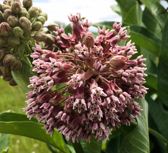
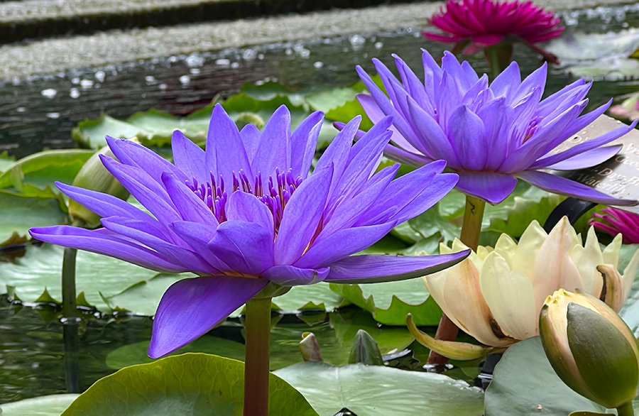
The final image and the original are very interesting and nicely captured. The colors are lovely and the flower stands out very nicely. |
Feb 16th |
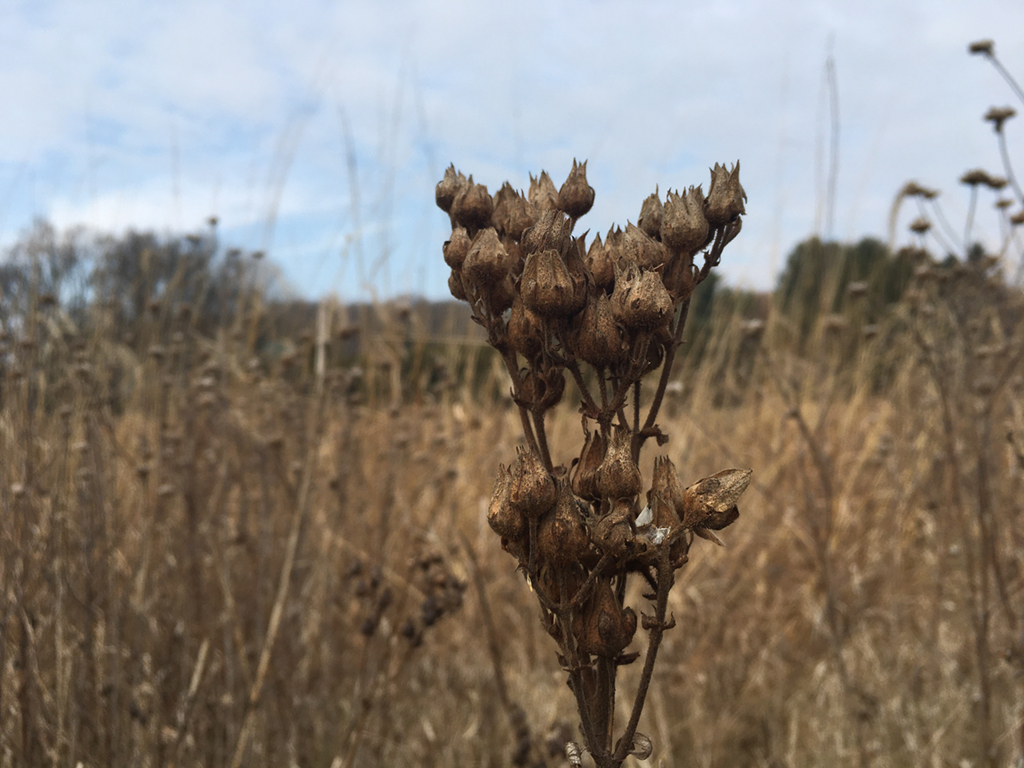
| 80 |
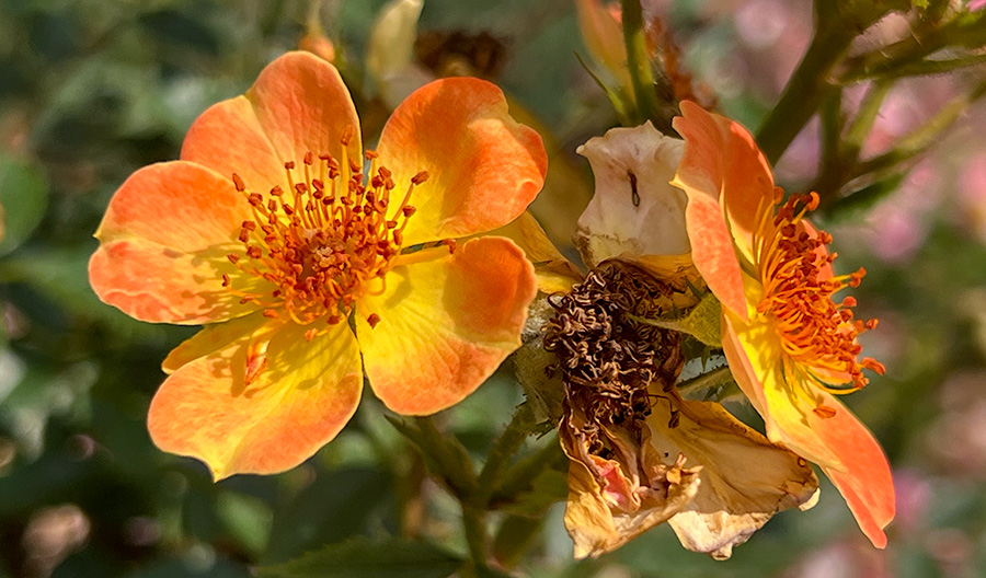
Feb 23 |
Comment |
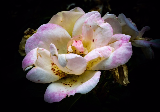
This is a very interesting photo. It is a very interesting take on the image. I think that the later versions posted to the group are interesting and the crops that have been done are very interesting. |
Feb 16th |
6 comments - 0 replies for Group 80
|
13 comments - 1 reply Total
|