|
| Group |
Round |
C/R |
Comment |
Date |
Image |
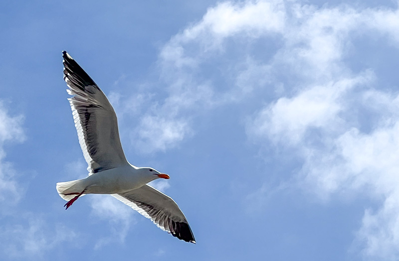
| 69 |
Oct 22 |
Comment |
Overall I think this is a very nice photo. I think the tight crop helps draw focus to the bird with the outstretched wings. Personally I think both the original and the square crop work but it depends on what you are trying to draw focus to. I would use the square crop only because I would be more interest in the three but I would leave that more up to artistic choice. |
Oct 18th |
| 69 |
Oct 22 |
Comment |
This is a lovely photo. The colors are very engaging and overall it feels very balanced. I think the raw image itself is also a nice image and works as well. I don't think I would change anything. |
Oct 18th |
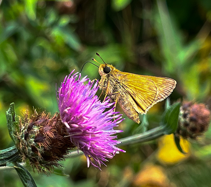
| 69 |
Oct 22 |
Comment |
This is a very lovely image. The composition is very nice and the colors are great. I think the tighter crop helps focus the image a bit by making it feel more balanced. Beyond that I don't see any alterations that I would make. |
Oct 18th |
| 69 |
Oct 22 |
Comment |
The detail in the photo is very nice. I do agree with the others that a tighter crop would probably help draw focus to the subject and remove some of the background. Beyond that I would not change anything. |
Oct 18th |
| 69 |
Oct 22 |
Comment |
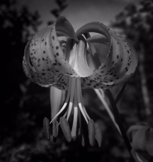
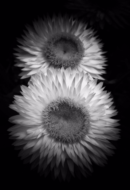
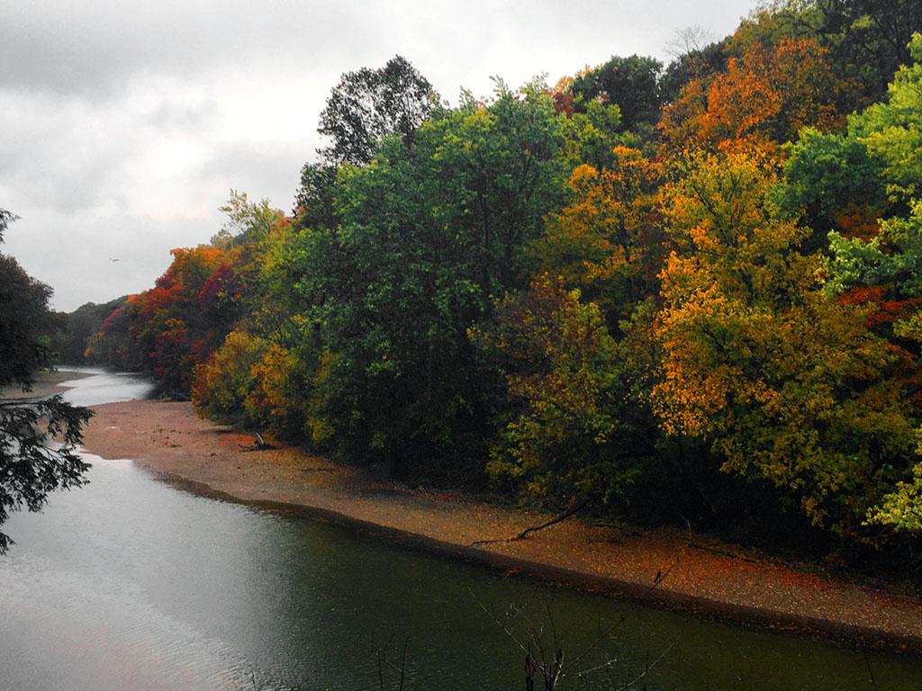
This is a very interesting capture. Seeing the color version I agree that the image did lend itself well to becoming black and white. I think the detail is very good I do agree with Brenda that if I look at the horizon line I do see what looks like bulging but I am unsure why. |
Oct 18th |
| 69 |
Oct 22 |
Comment |
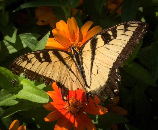
This is truly an amazing photo. The subjects are clear and detailed and are very clear even though the colors are similar to the background. It is a really nice capture. |
Oct 18th |
6 comments - 0 replies for Group 69
|
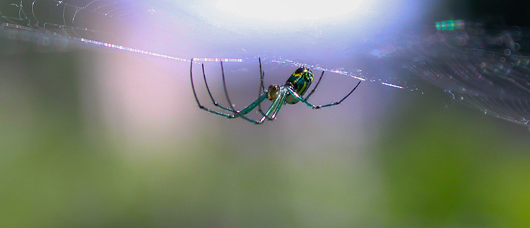
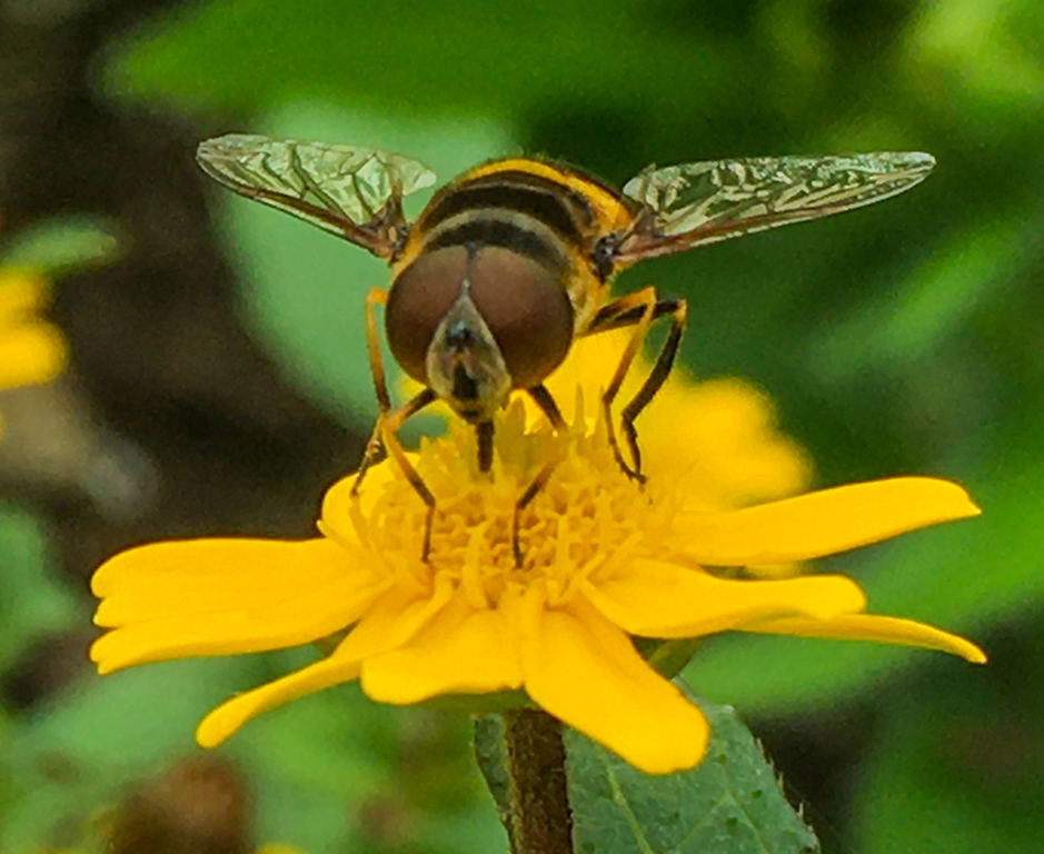
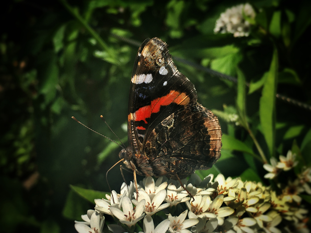
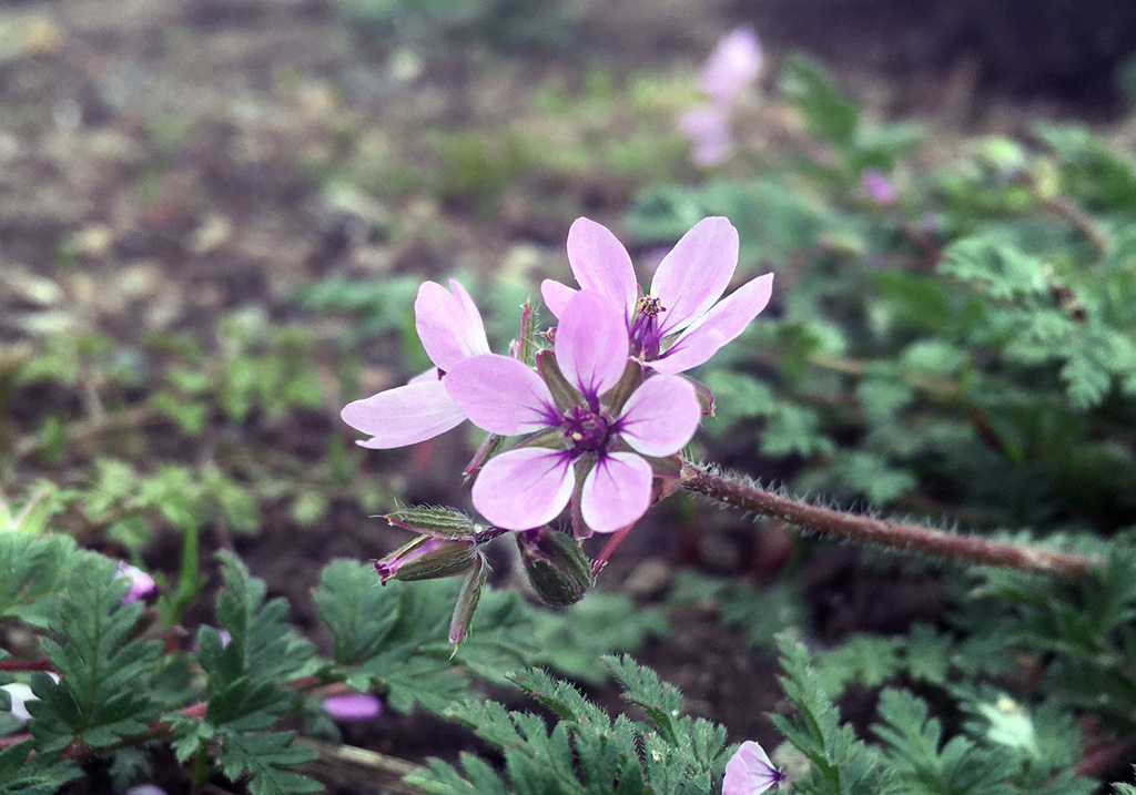
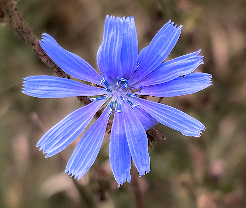
| 80 |
Oct 22 |
Comment |
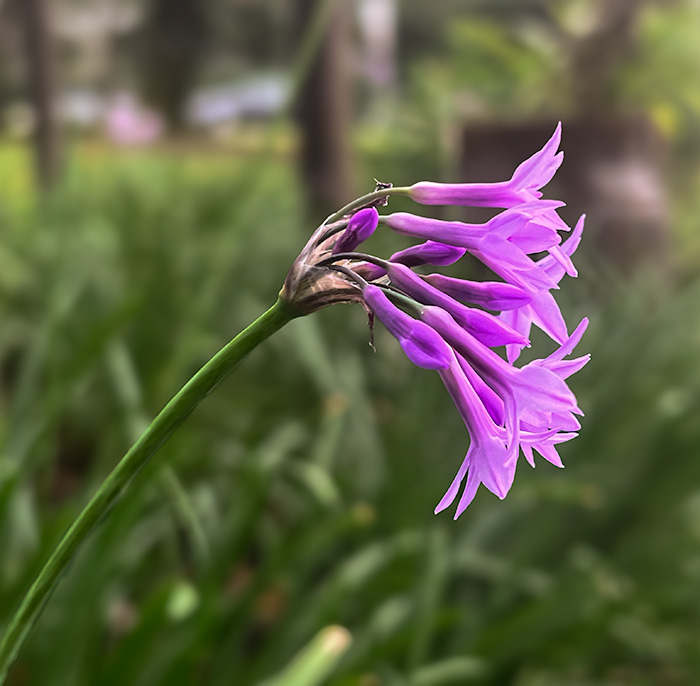
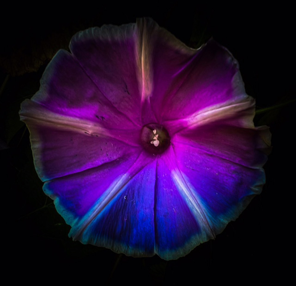
Hi Kathryn, The image is very nice and I think the croping is well done.I wonder if rotating the iage by 90 degrees might make it appear less floating if you want to avoid that. |
Oct 23rd |
| 80 |
Oct 22 |
Comment |
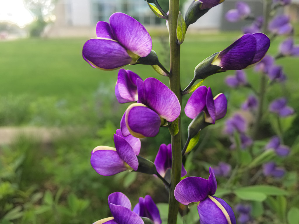
This is a very nice image. The varying focus is interesting. I agree with Kathryn that cropping the image to bring focus to the part that is in focus might make a stronger composition. OVerall the vivid colors against the green image is very nice and helps focus the image. |
Oct 23rd |
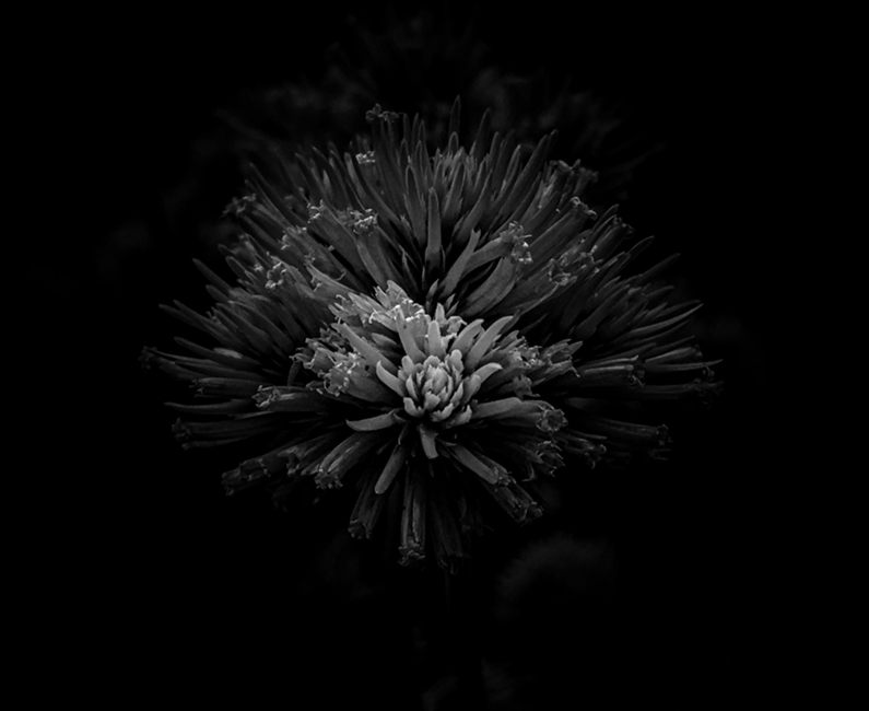
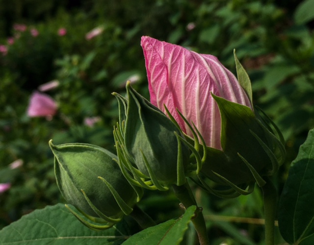
| 80 |
Oct 22 |
Comment |
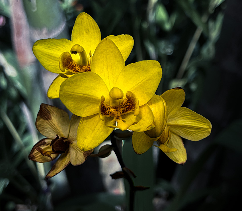
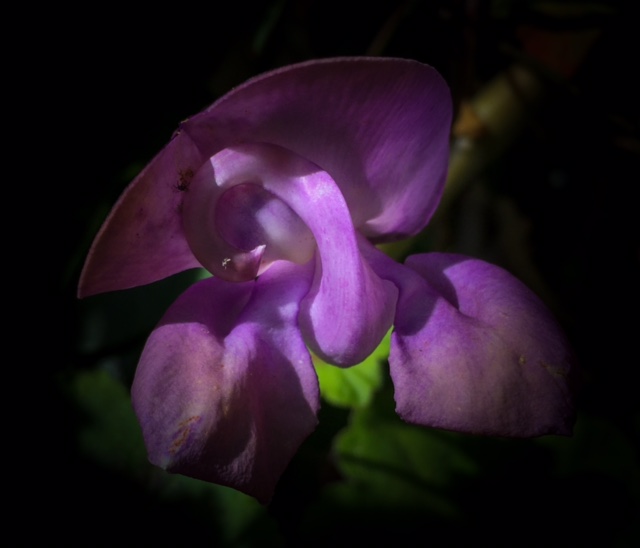
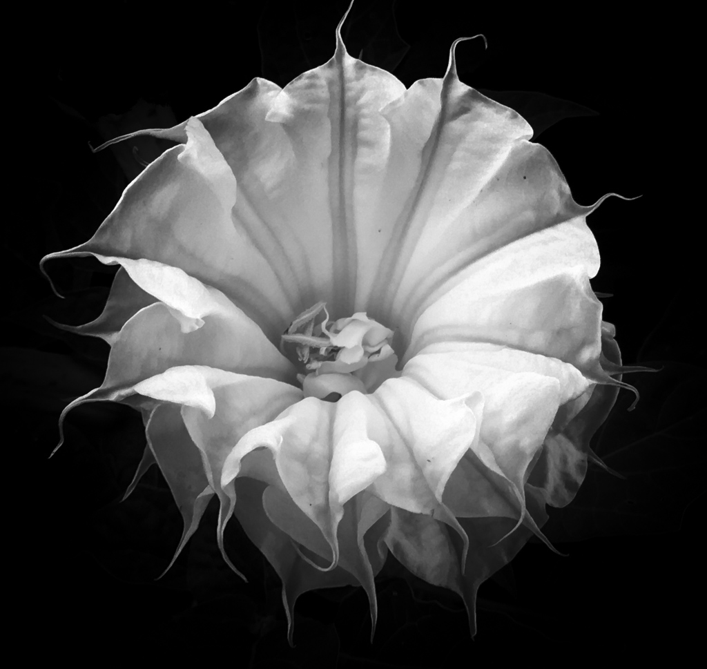
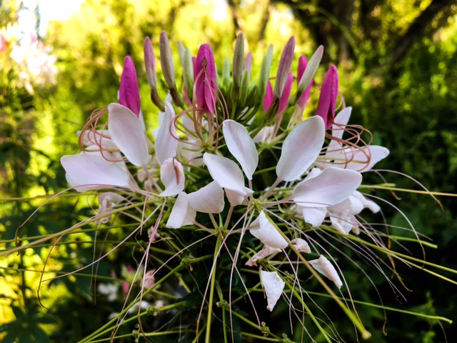
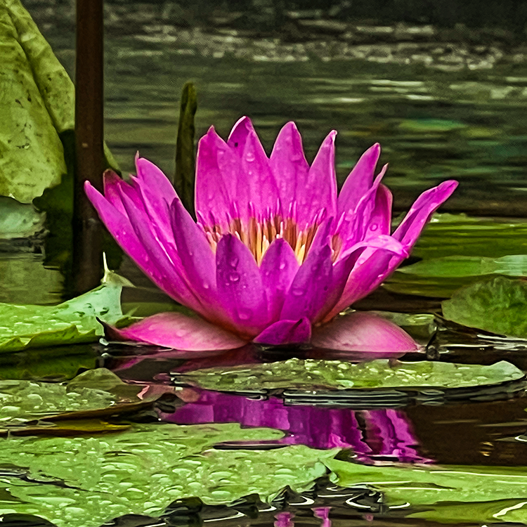
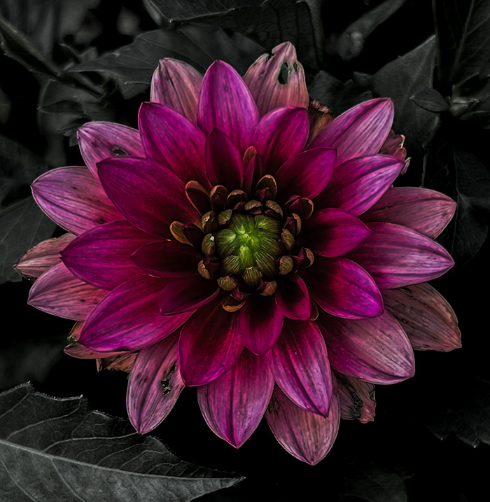
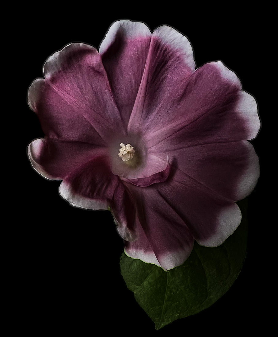
This is a lovely image. I am not entirely sure what feeling I am getting from it but it is very engaging. I want to say it gives a fall/summer feeling. Your original image is also truely beautiful with vibrant color and the black background really brings out the flower. |
Oct 23rd |
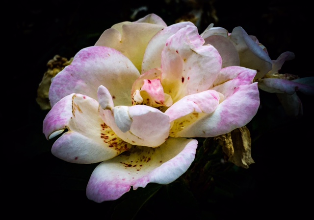
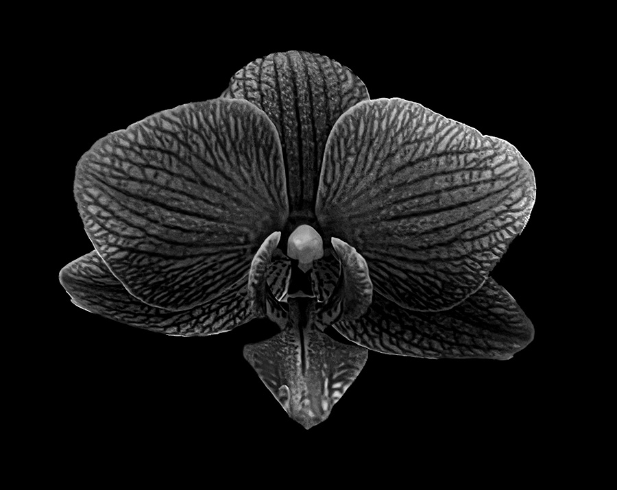
| 80 |
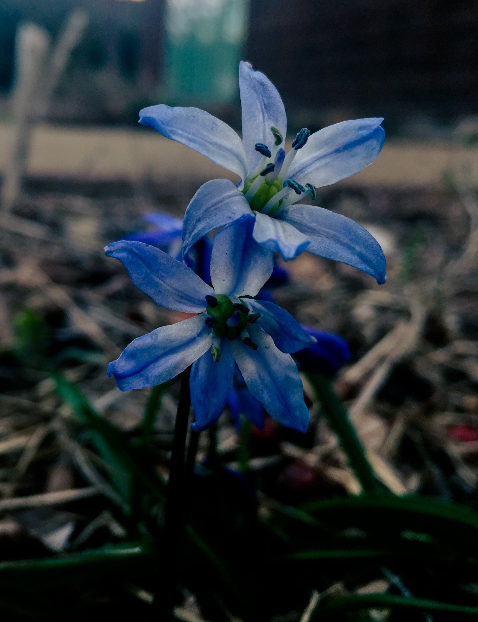
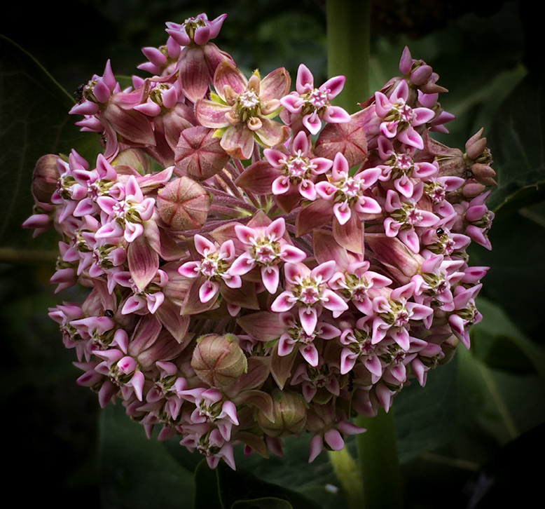
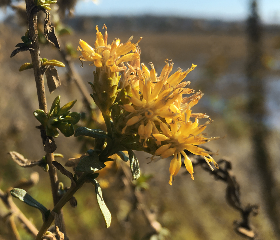
Oct 22 |
Comment |
I love the edits you made. The texture changes really help soften the image and the colors are engaging. My main concern is that the stem appears to blend into the background and I would probably try and brighten that if it was me but that is really up to individual choice. |
Oct 18th |
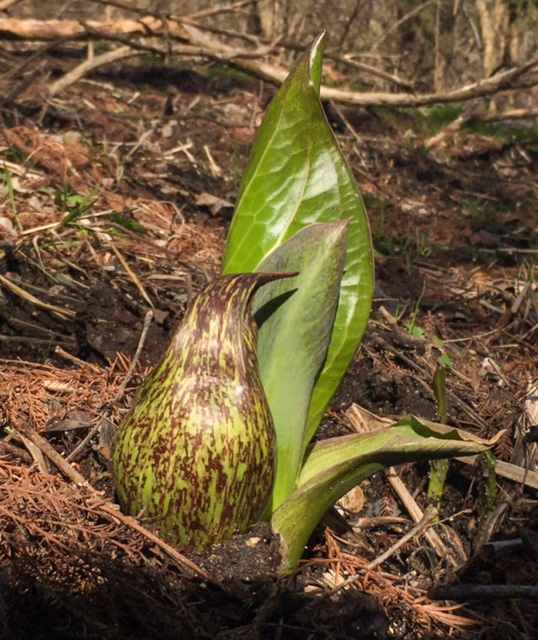
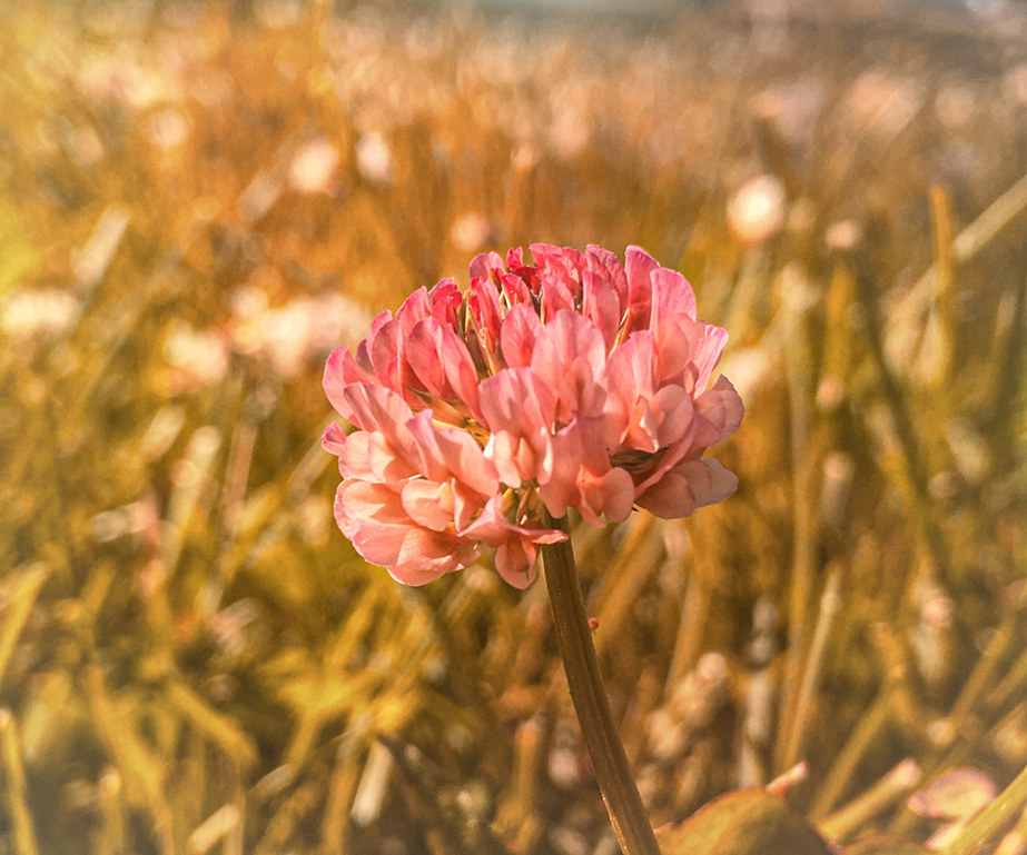
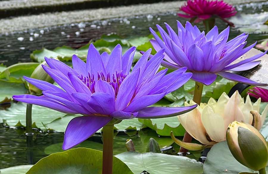
| 80 |
Oct 22 |
Comment |
The mirror is an interesting direction to take the photo but I do think Kathryn's edit makes it more focused if we choose to use a mirror. Overall I like the colors and I think the edits helped make an interesting piece. |
Oct 18th |
5 comments - 0 replies for Group 80
|
11 comments - 0 replies Total
|