|
| Group |
Round |
C/R |
Comment |
Date |
Image |
| 69 |
Sep 22 |
Reply |
Hi Mervyn,
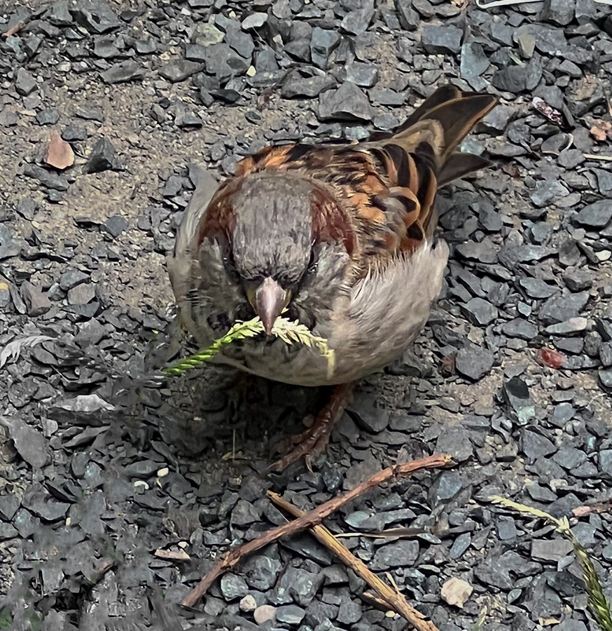
Thank you for the feedback. I didn't even notice how the foot was left out until reviewing the images. |
Sep 21st |
| 69 |
Sep 22 |
Reply |
Hi Dean,
I will make sure next time to get a wider photograph. I normally don't photograph birds so this was a bit more challenging because I'm not use to photographing moving subjects. |
Sep 21st |
| 69 |
Sep 22 |
Reply |
Hi Pierre,
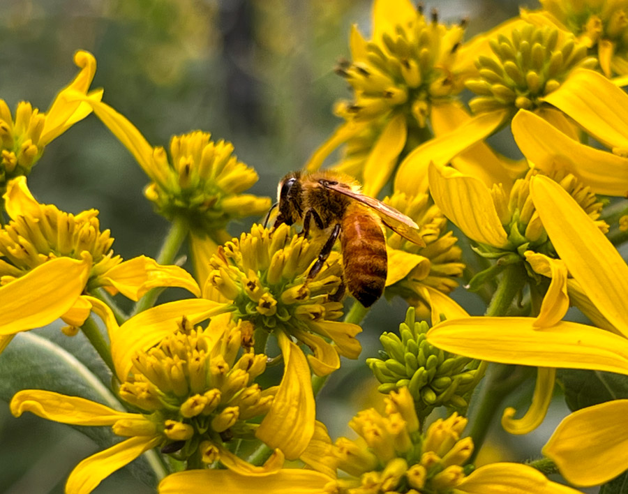
Thank you for the feedback. I was having a difficult time trying to figure out how best to process the image. I'm going to try this in my next photo. |
Sep 21st |
| 69 |
Sep 22 |
Reply |
Hi Brenda,
The new iphone helps a lot. I upgraded to the 13pro specifically to get a better camera. I'm glad that it has been reflected in the photo. |
Sep 21st |
| 69 |
Sep 22 |
Comment |
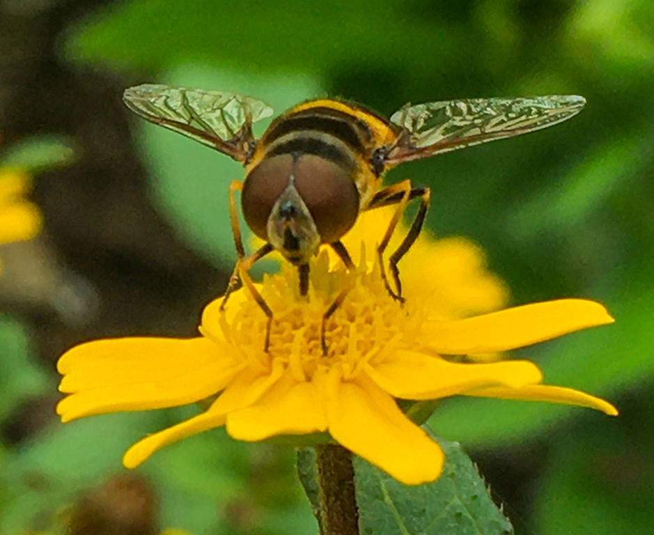
I love this photo. The eyes are very engaging. I love the colors in the eyes and the animal really stands out against the green background. I think that this is a really nice image and I didn't even notice the tree in the background. I think that the plants in the foreground work as a way of framing your subject and help give more depth to your photo. |
Sep 12th |
| 69 |
Sep 22 |
Comment |
I agree with Mervyn that I was also confused by what was in the alligator's mouth as it took me a bit to realize it was a log. I think that the log is very interesting as we see the movement from the water. The editing really helped fix the colors and the crop really helps draw focus to the correct subject. |
Sep 12th |
| 69 |
Sep 22 |
Comment |
I agree with the others that a tighter crop will help draw more focus to your subject. I think the anole stands out well and the textures are very engaging. I think that the first crop is very interesting with the more rectangular image. |
Sep 12th |
| 69 |
Sep 22 |
Comment |
I agree with the others that the original image seemed a little off. Specifically, the colors but it looks like you adjusted this in your edits. In your edits it the deer looks really nice as it stands out well against your background. |
Sep 12th |
| 69 |
Sep 22 |
Comment |
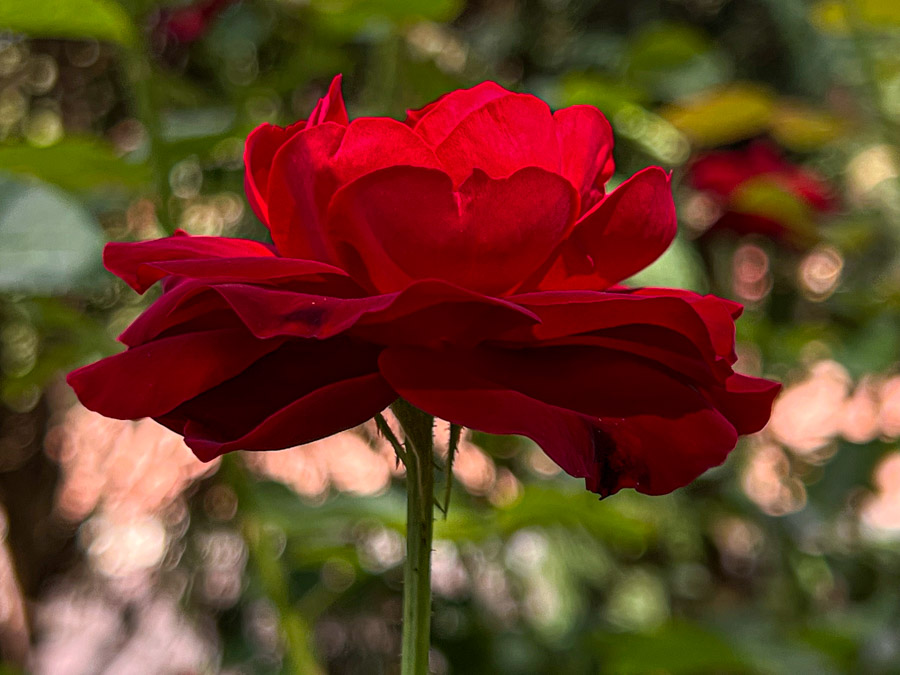
This is a lovely photo. It is well centered and balanced. Overall I think the lighting works well and the composition of the photo is very nice. |
Sep 12th |
| 69 |
Sep 22 |
Comment |
This is a really interesting photo. I didn't even see the other frogs at first. I don't think there is any change I could recommend. The detail is very nice and it is very impressive for being taken at night in the rain. |
Sep 11th |
6 comments - 4 replies for Group 69
|
| 80 |
Sep 22 |
Reply |
Hi Doug,
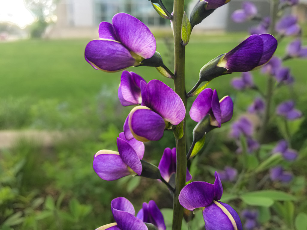
That is an interesting idea. I will have to try that soon. I have some plants I'm growing that should have similar coloring when they bloom so I can take some more optimal photos and try that out. |
Sep 28th |
| 80 |
Sep 22 |
Reply |
Hi Nadia. Thank you for the feedback. I usually use Lightroom but I will start experimenting more with photoshop as I'm switching over to the computer apps over the iPad at the moment. I did see bleeding but I think in my next submission you'll see some improvement on that front. |
Sep 28th |
| 80 |
Sep 22 |
Reply |
I am so sorry for the late reply in the comments but thank you for the comment. I do take photos on the iPhone usually at a higher contrast to avoid over whitening in my images. I do usually use portrait mode but I've been experimenting with using the regular focus on the camera and switching between the different cameras on the phone. Ive started trying some of the settings you showed in my next submission. |
Sep 28th |
| 80 |
Sep 22 |
Reply |
Personally I don't think it leads me out of the image. I think it is engaging and helps break symmetry that would otherwise make the image less interesting. So I agree with you and I think disagree with the judge. If that is an issue then I think you could also address it by having a less tight crop. |
Sep 28th |
| 80 |
Sep 22 |
Comment |
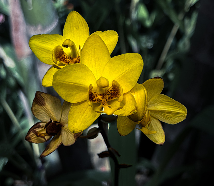
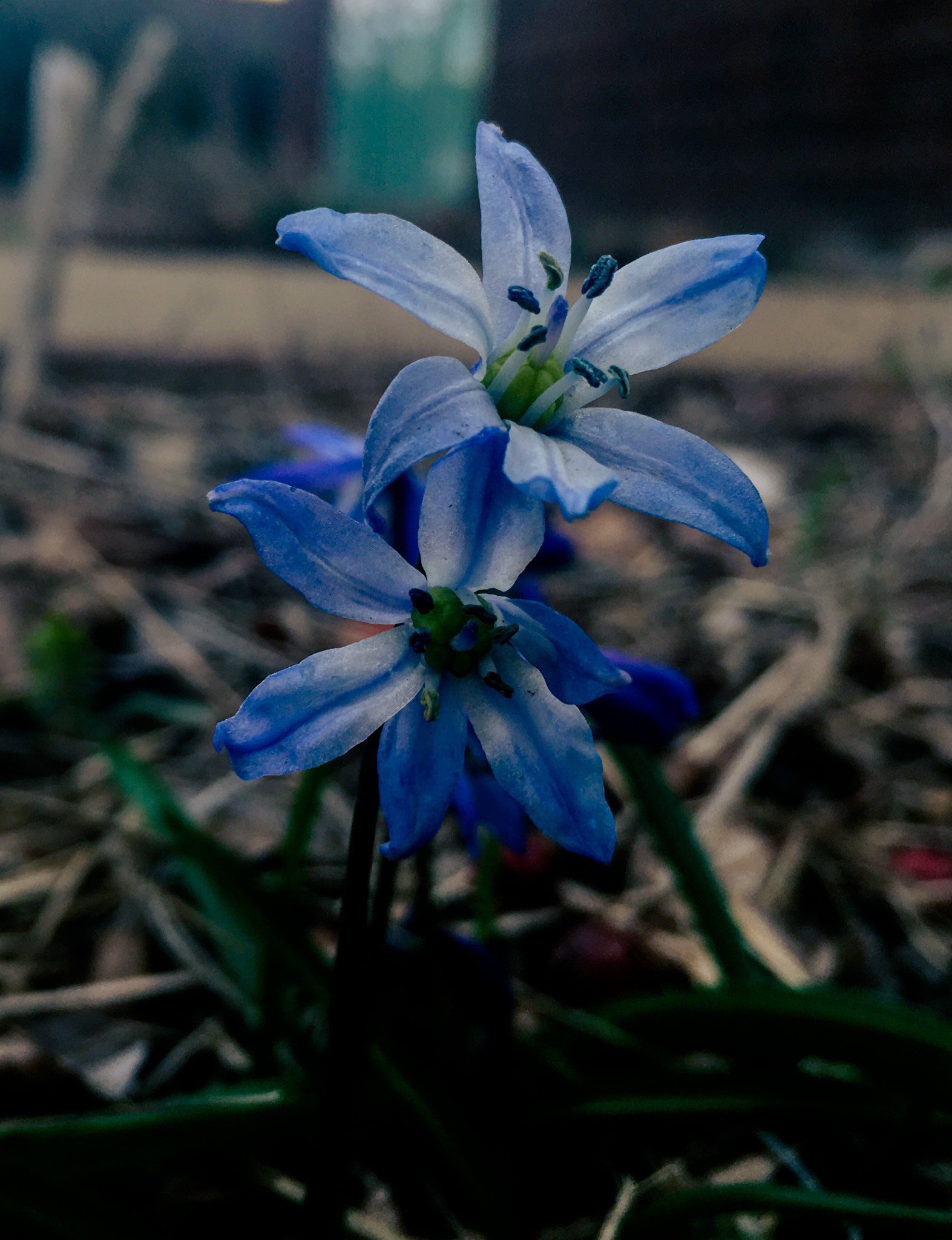
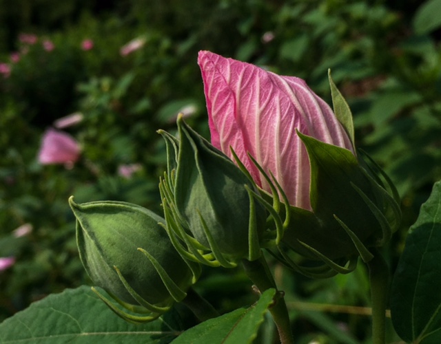
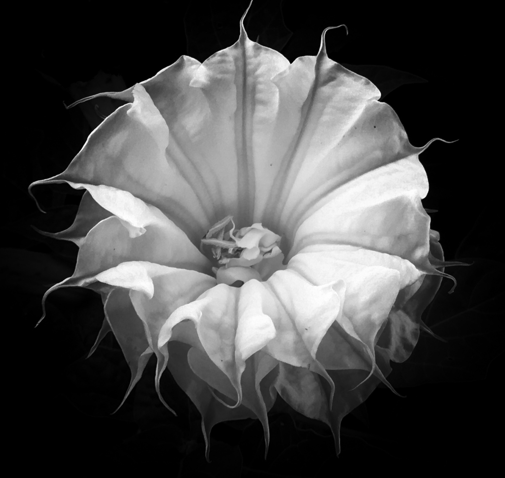
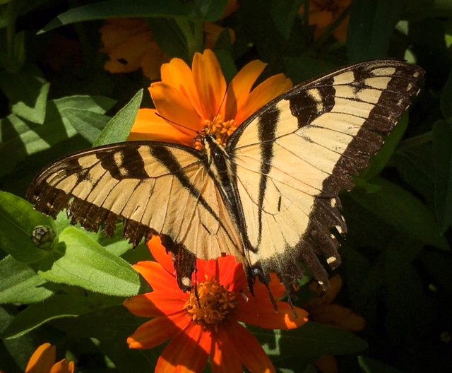
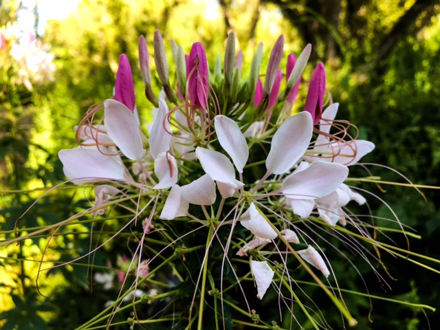
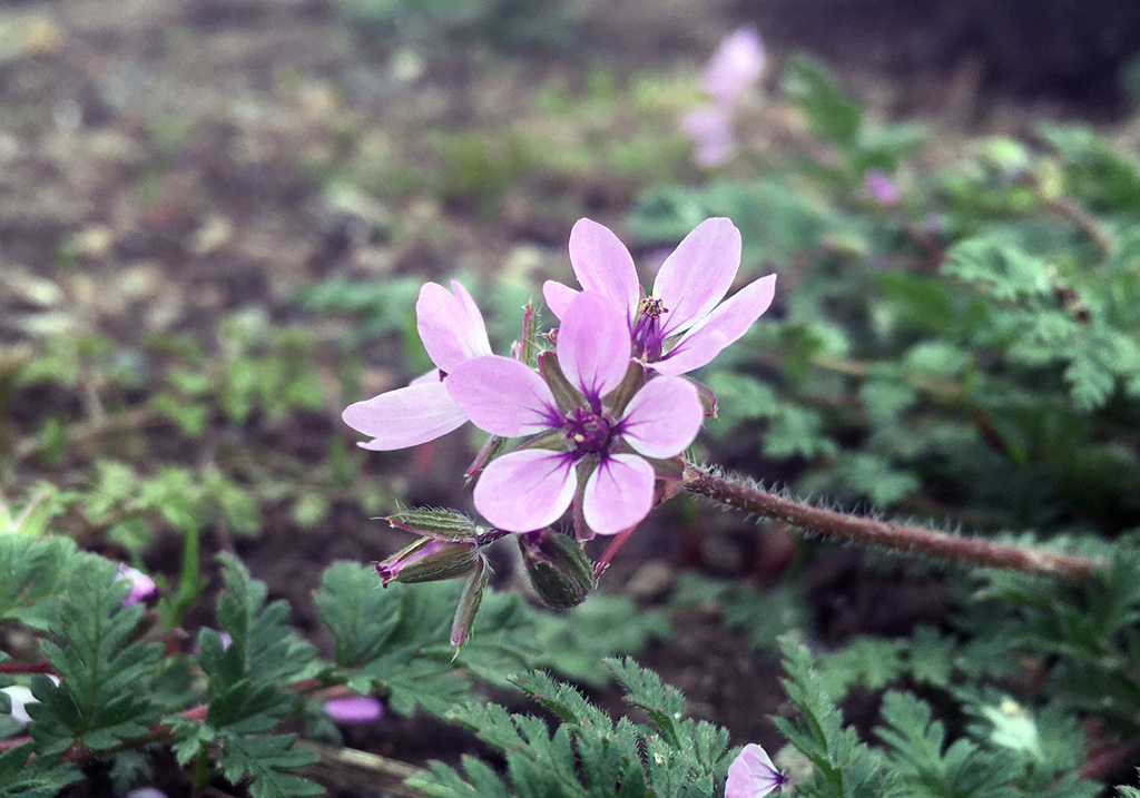
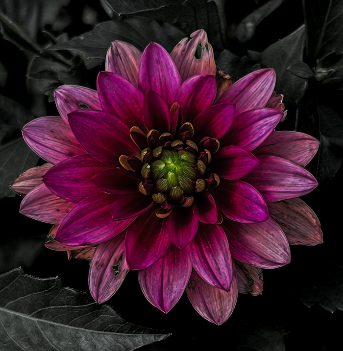
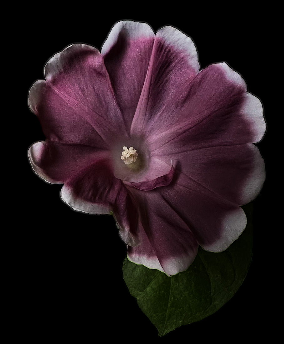
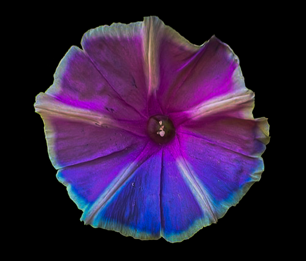
So the first thing I enjoy about your original submission is the whisps you put in. They really help highlight the soft and delicate qualities of the flower and when viewed from a distance they make the image look more like a painting. Beyond that I think the colors of your flower really come through the photo really are great to look at. I think the name really compliments the photo. Overall I am really impressed by the image and can't see anything I would alter. |
Sep 7th |
| 80 |
Sep 22 |
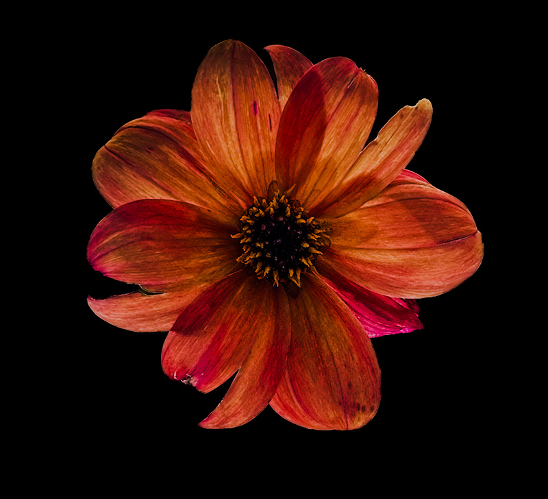
Comment |
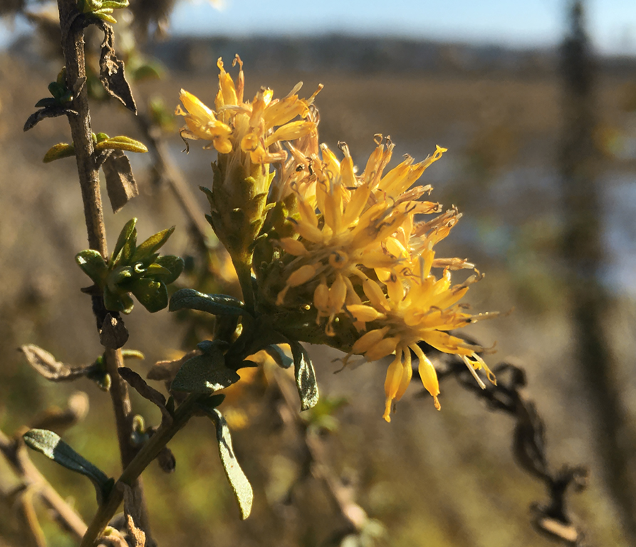
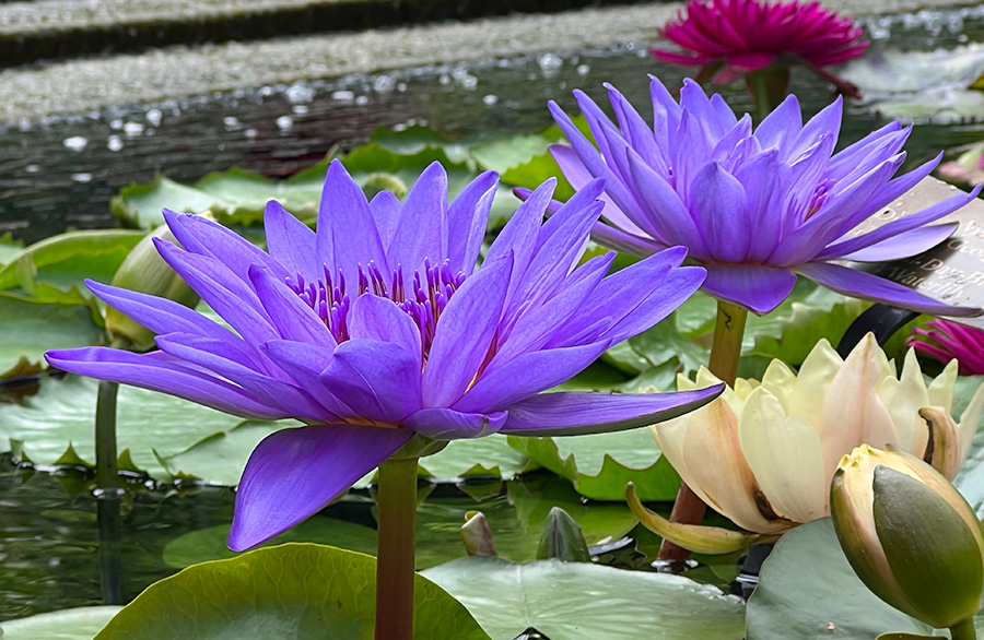
This is a very nice image. I do agree with the others that a sharper crop should help draw focus to the flower. I do think darkening the background would help make the poppy really pop out to the viewer. Beyond that I think this is a really nice image as the detail in the center of the flower is really nice and I enjoy it. |
Sep 7th |
| 80 |
Sep 22 |
Comment |
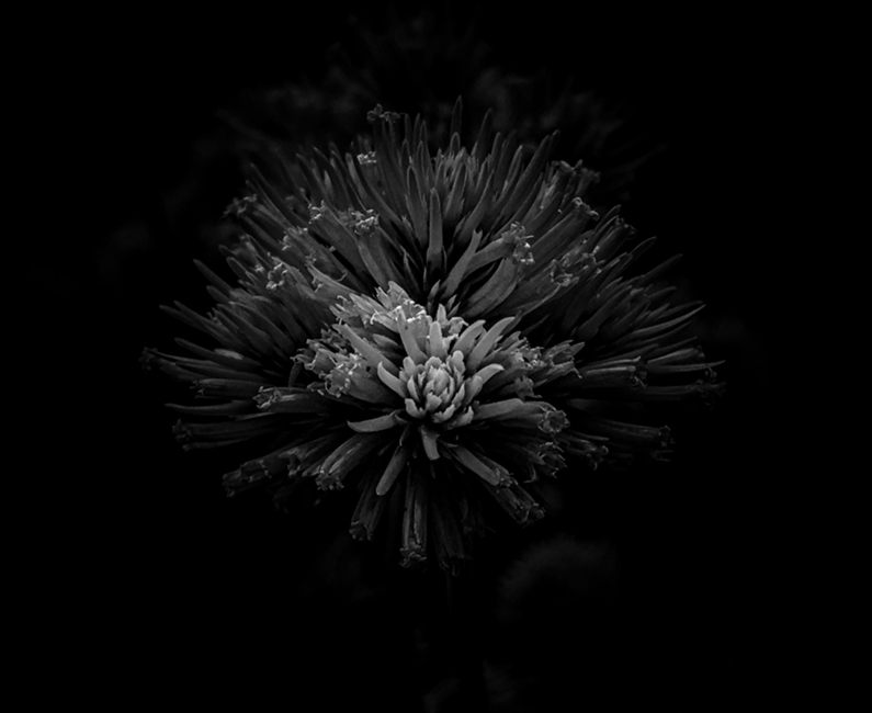
This is a really interesting photo. I am amazed that you were able to get this from your original image. It really gives the photo a new life that I would not have thought possible. Well done. |
Sep 7th |
| 80 |
Sep 22 |
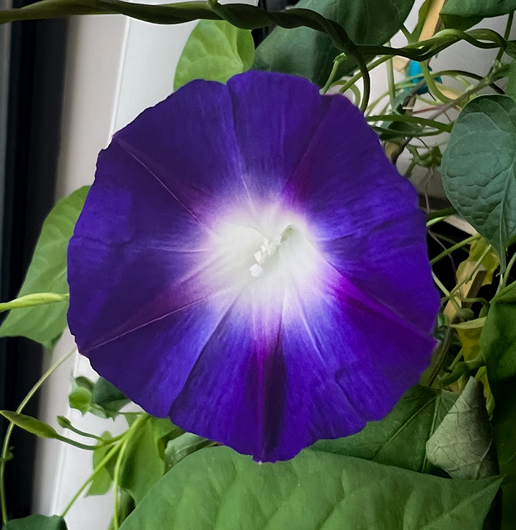
Comment |
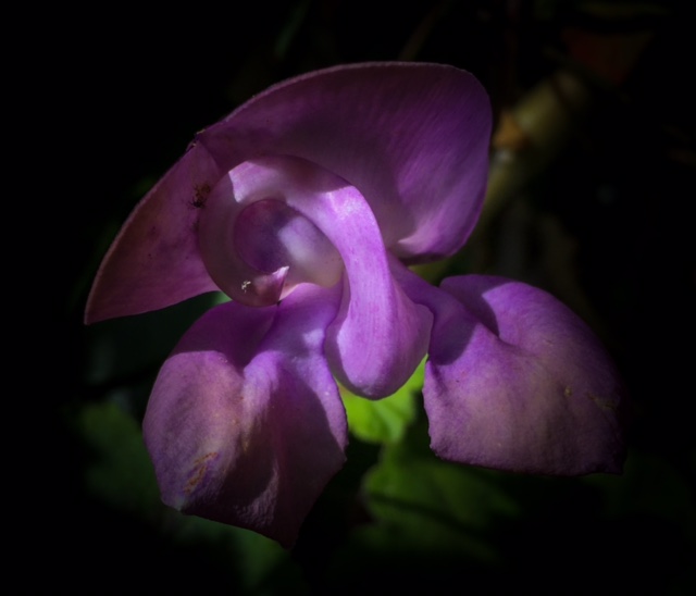
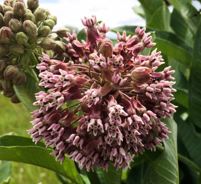
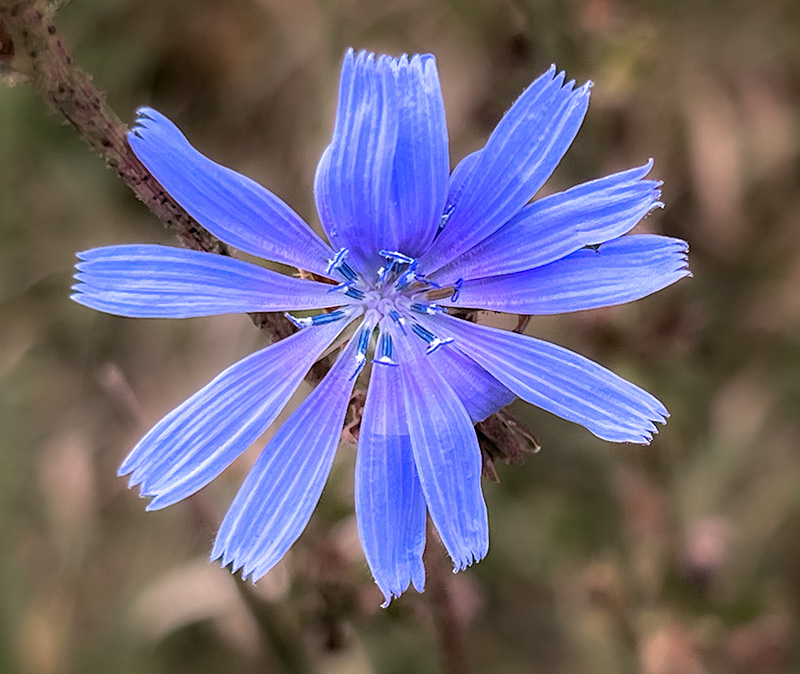
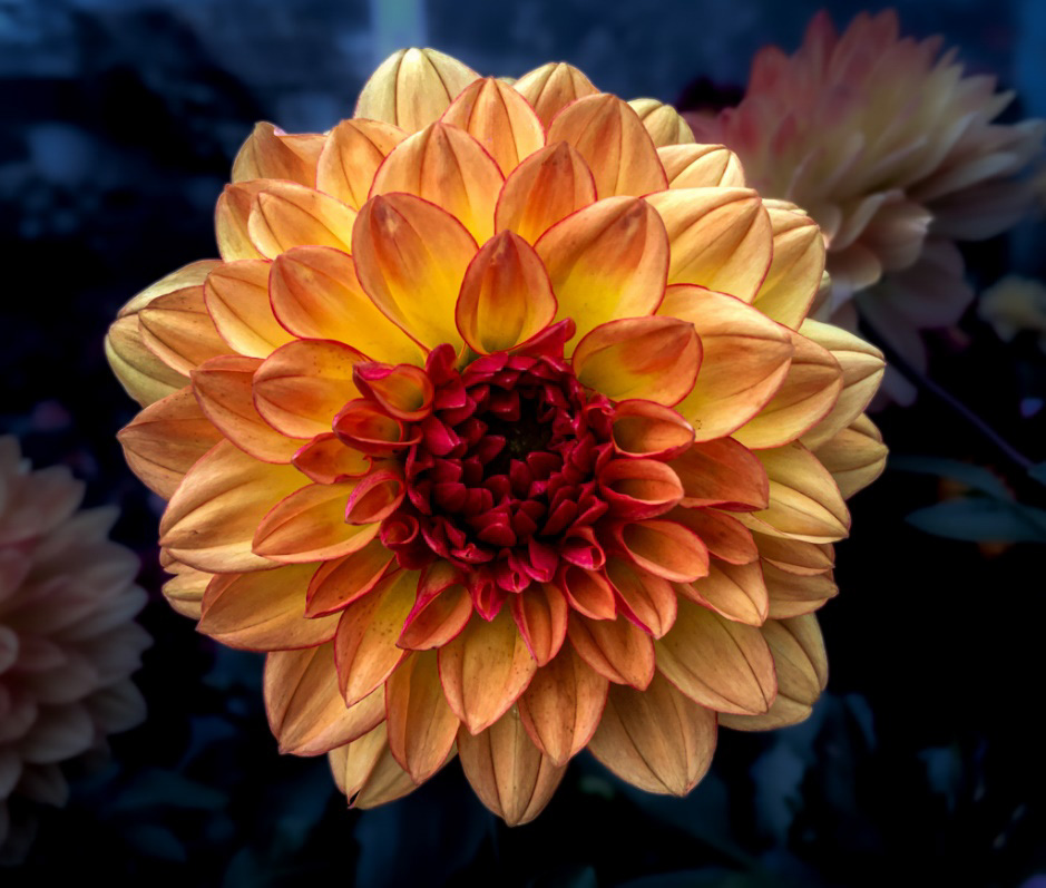
Personally I love the energy this image has. You really give the flower a strong sense of weight against the background, as the purple really pops against the green and yellow of your background. |
Sep 7th |
| 80 |
Sep 22 |
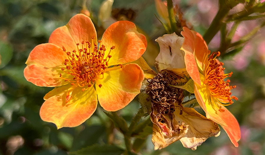
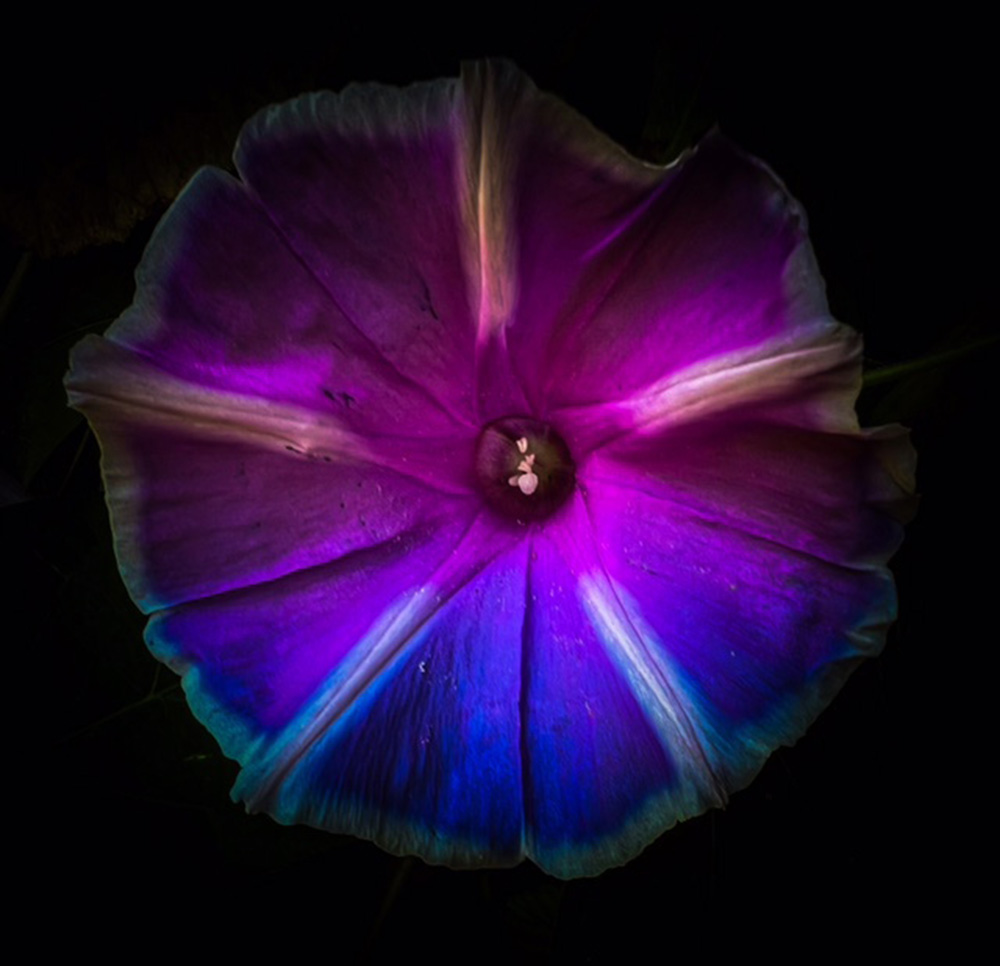
Comment |
This is a lovely image, it reminds me of the impressionist art style a bit. I like the colors and it is a really interesting take of the original photo. I agree with Kathryn's comment that brightening the central flower may help draw more attention to the flower. beyond that I think that the style adds a really interesting take on the photo. |
Sep 7th |
| 80 |
Sep 22 |
Reply |
Hi Bob,
I tried out what you said (I think) and got this out. You are right that made the work a lot easier with smoother edges. I also cropped it a bit more to try and draw focus. Thank you for the advice. |
Sep 7th |
 |
5 comments - 5 replies for Group 80
|
11 comments - 9 replies Total
|