|
| Group |
Round |
C/R |
Comment |
Date |
Image |
| 32 |
Dec 21 |
Comment |
Love the basic design of the image. I tried for a midpoint between the original and Stephen's. |
Dec 8th |
 |
1 comment - 0 replies for Group 32
|
| 44 |
Dec 21 |
Comment |
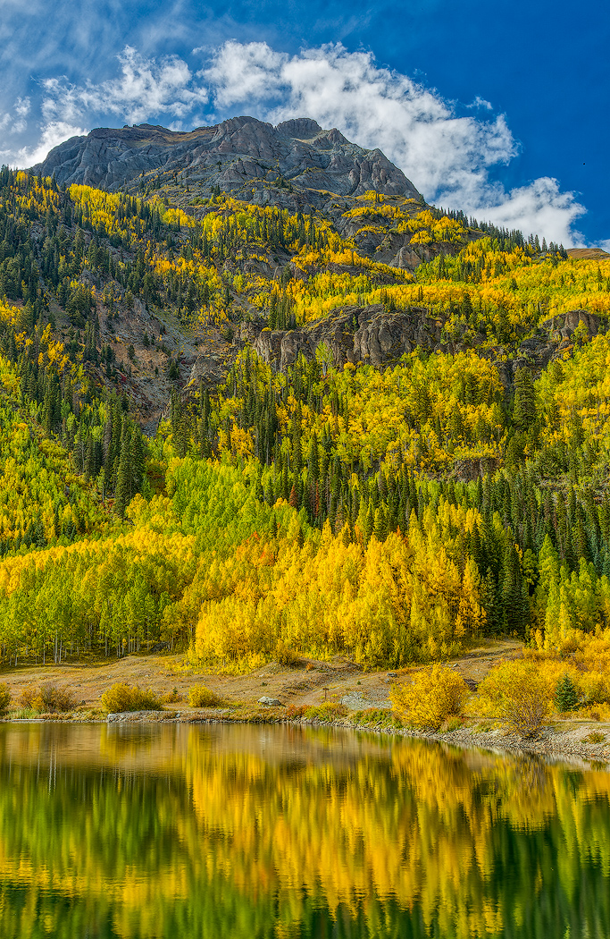
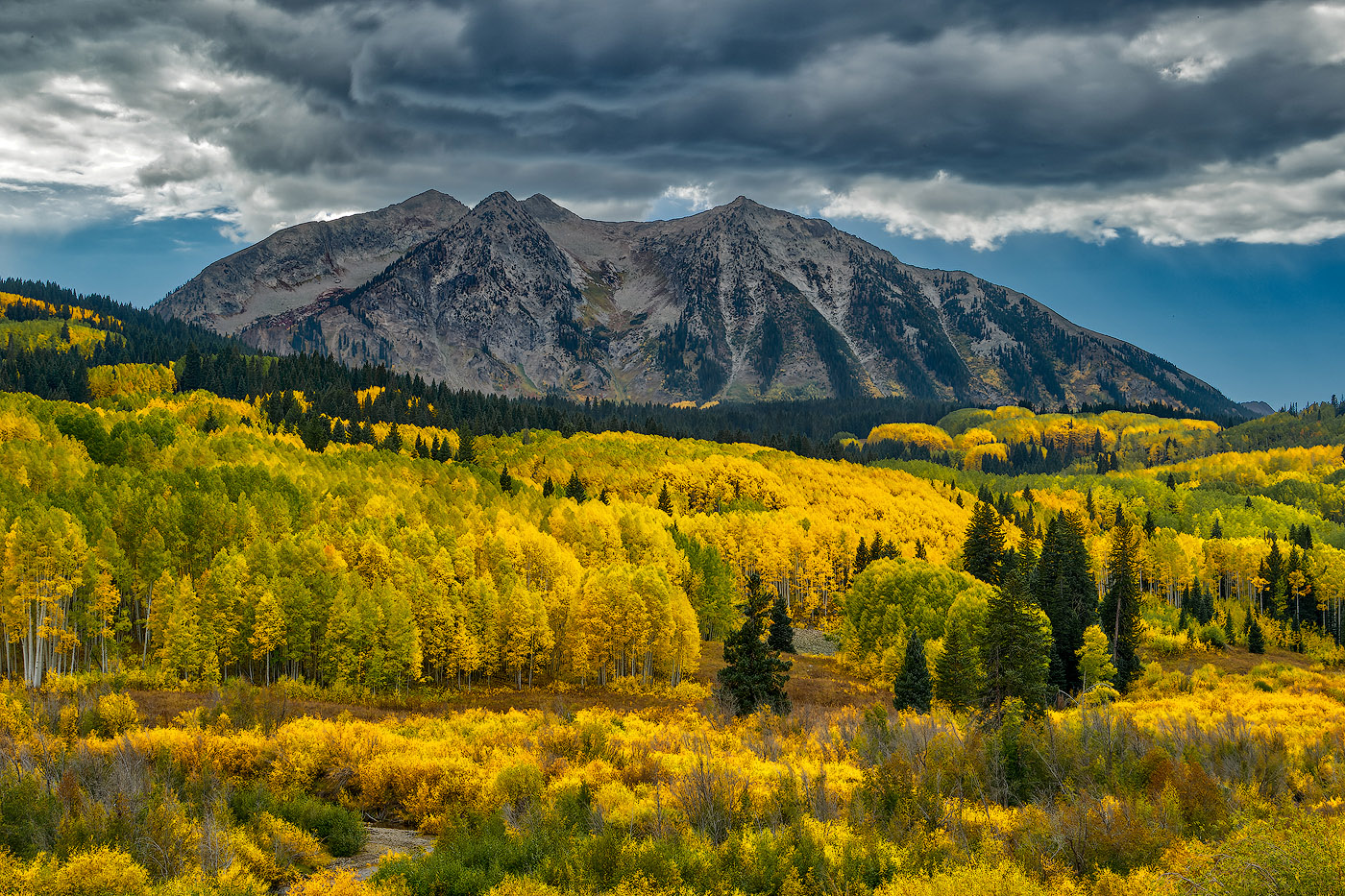
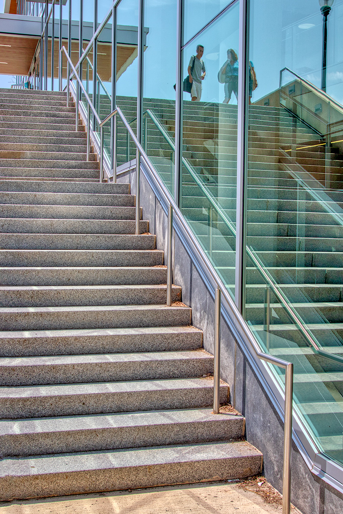
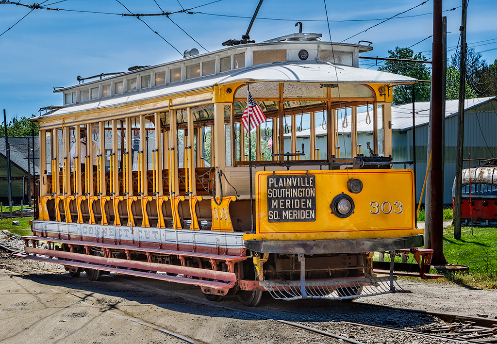
The color impact is immediate even if the green is more intense than I would normally look for. The blend is clean. The lines make for an interesting secondary graphic pattern. Possibly a little more sharpening on the edges on the top? The one thing that doesn't line up for me (literally) is that I always expect reflections to be true to the source. Here it looks like the verticals were trued on the actual element, but the reflection was left untouched. It might just be a matter of the angle of view. |
Dec 27th |
| 44 |
Dec 21 |
Comment |
Thanks to all for the feedback on this one. I do think it has better impact with the added contrast.
Merry Christmas and Happy Holidays to all. |
Dec 25th |
| 44 |
Dec 21 |
Reply |
Hi Brad, Max and Lisa echoed your thought, so I did some added tonal sculpting. Revised image down in a reply to Lisa. See what you think. |
Dec 25th |
| 44 |
Dec 21 |
Reply |
Max, I did a little tonal sculpting based on your feedback and Lisa's. See what you think on the image I posted back to her comment. |
Dec 25th |
| 44 |
Dec 21 |
Reply |
Hi Lisa, I'm finding the same thing. Whether it is a combination of better dynamic range on the sensors and the improved ability in the RAW processor algorithms to give us the full range in the source capture I can't say, but I am seeing that same trend. Normally at this time of day I would have needed 5 shots in the bracket, and now only 3 with the R5. Interesting thought on the sky.
With Max's comment I went for sculpting the contrast overall. It doesn't push the top as much as your version but see what you think. |
Dec 25th |
 |
| 44 |
Dec 21 |
Reply |
Great question Bob. I haven't gone there yet, but will give it a go. |
Dec 17th |
| 44 |
Dec 21 |
Comment |
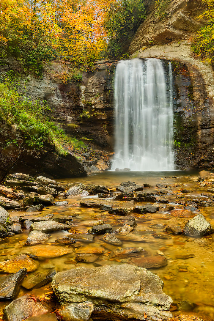
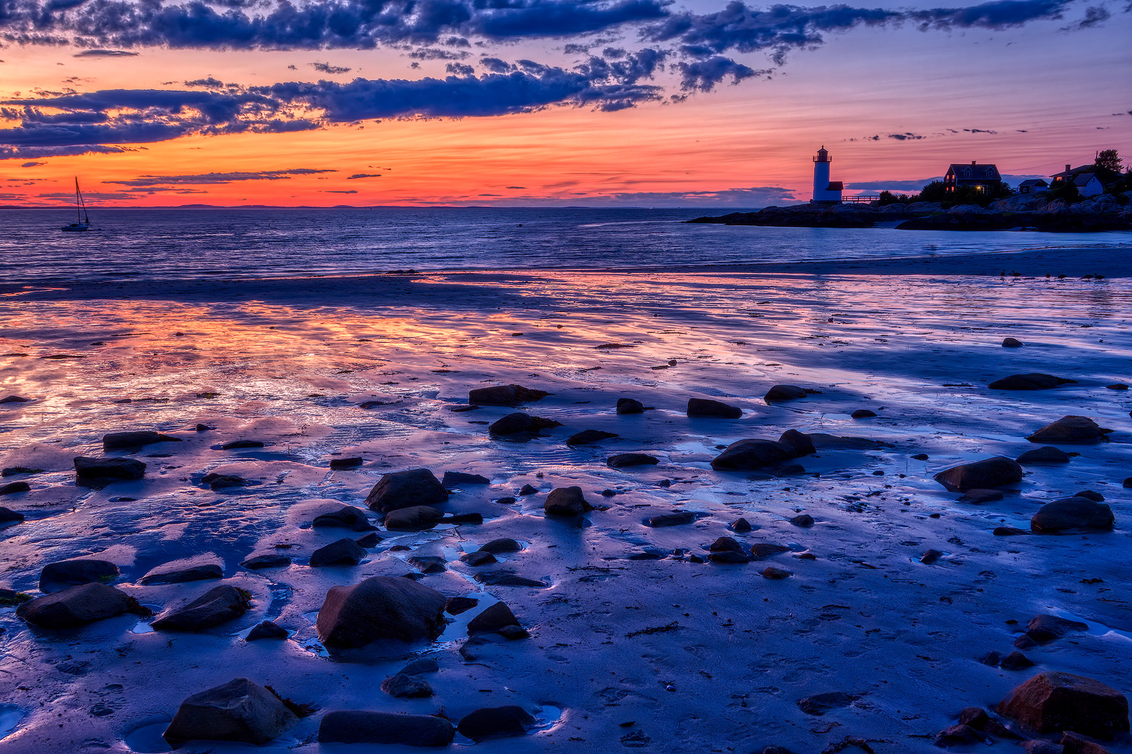
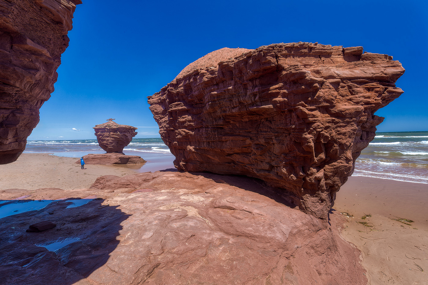
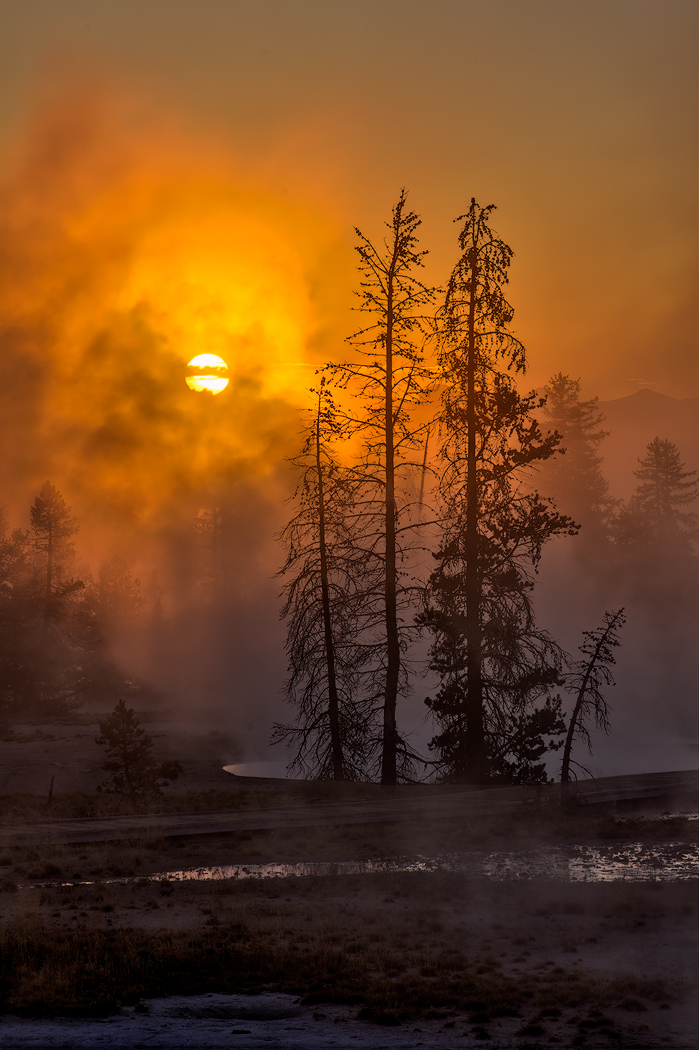
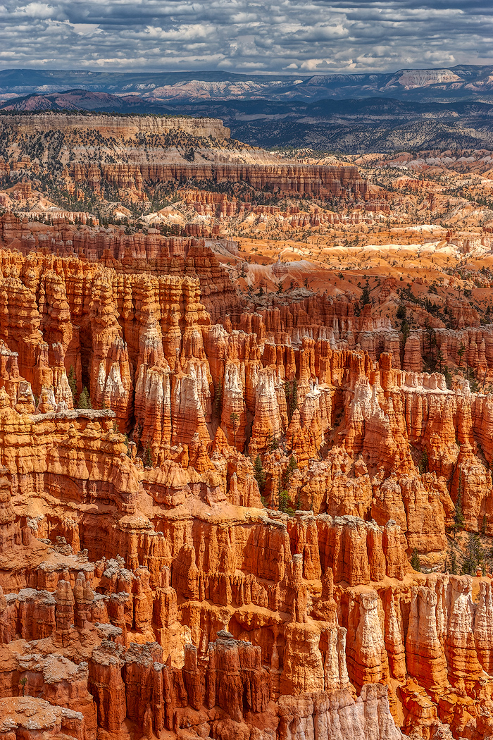
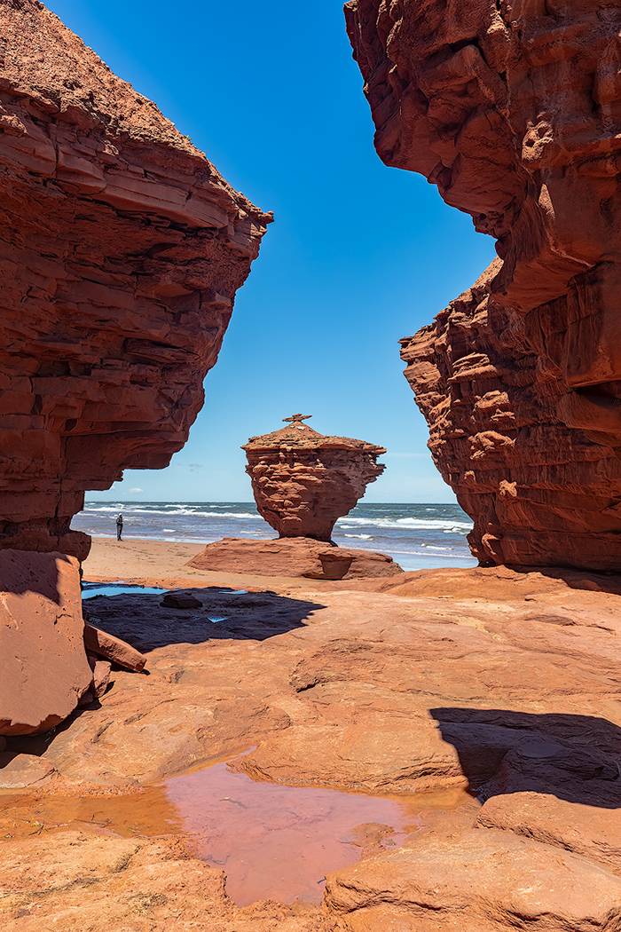
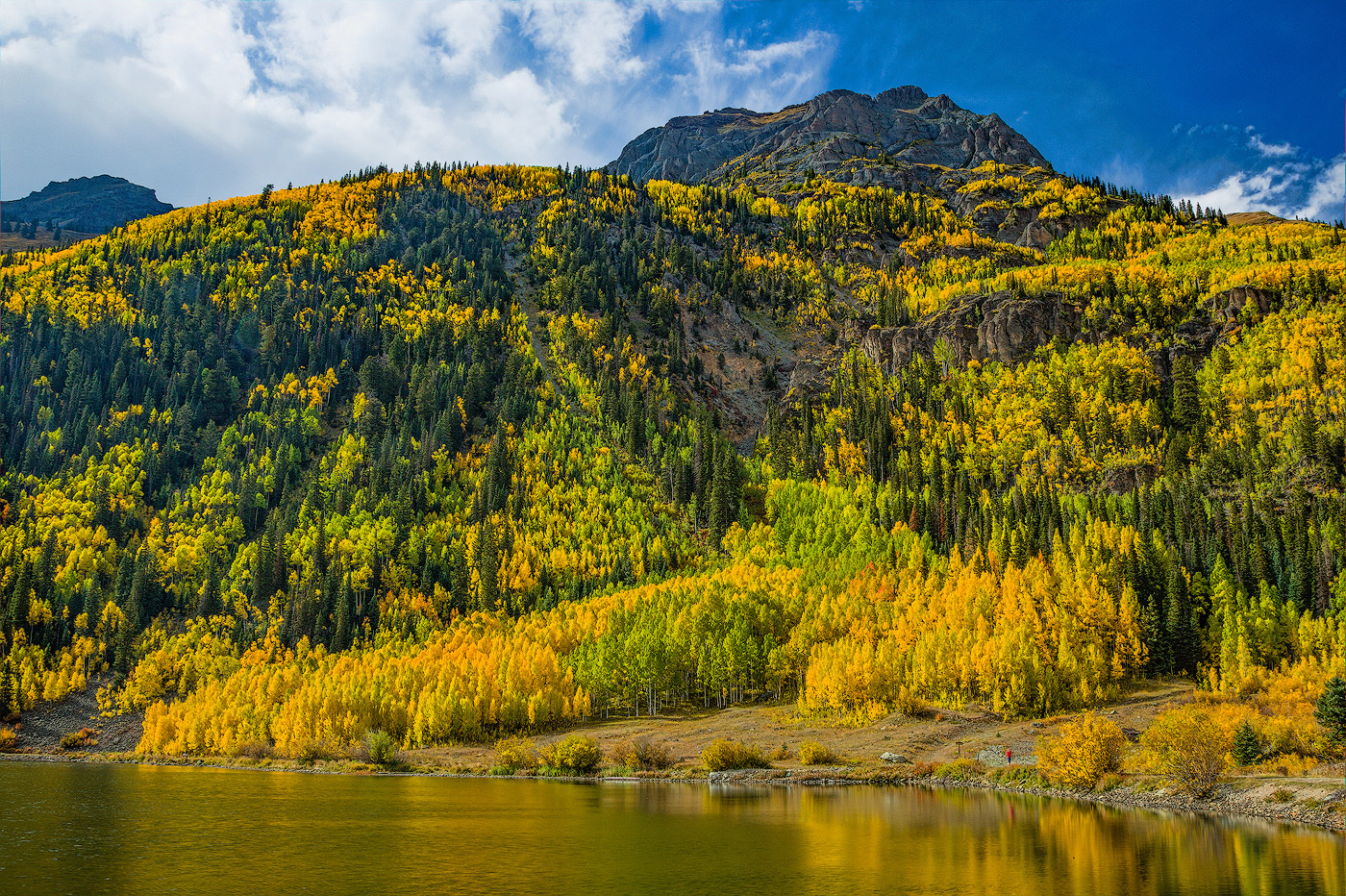
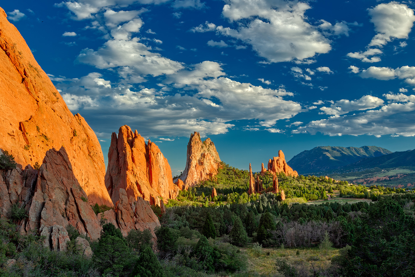
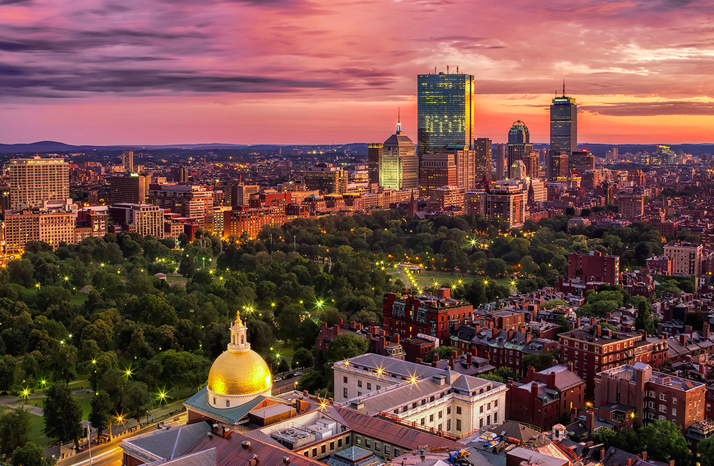
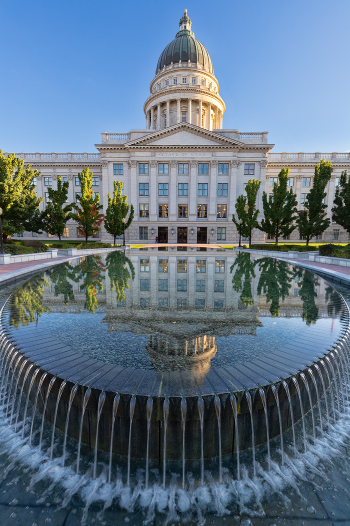
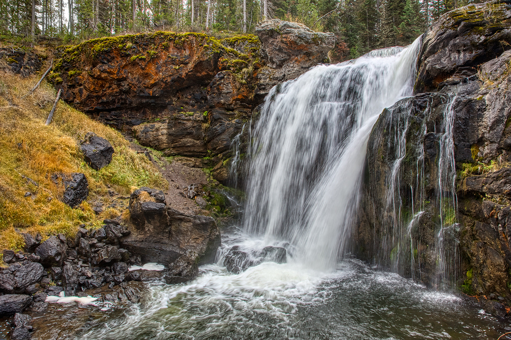
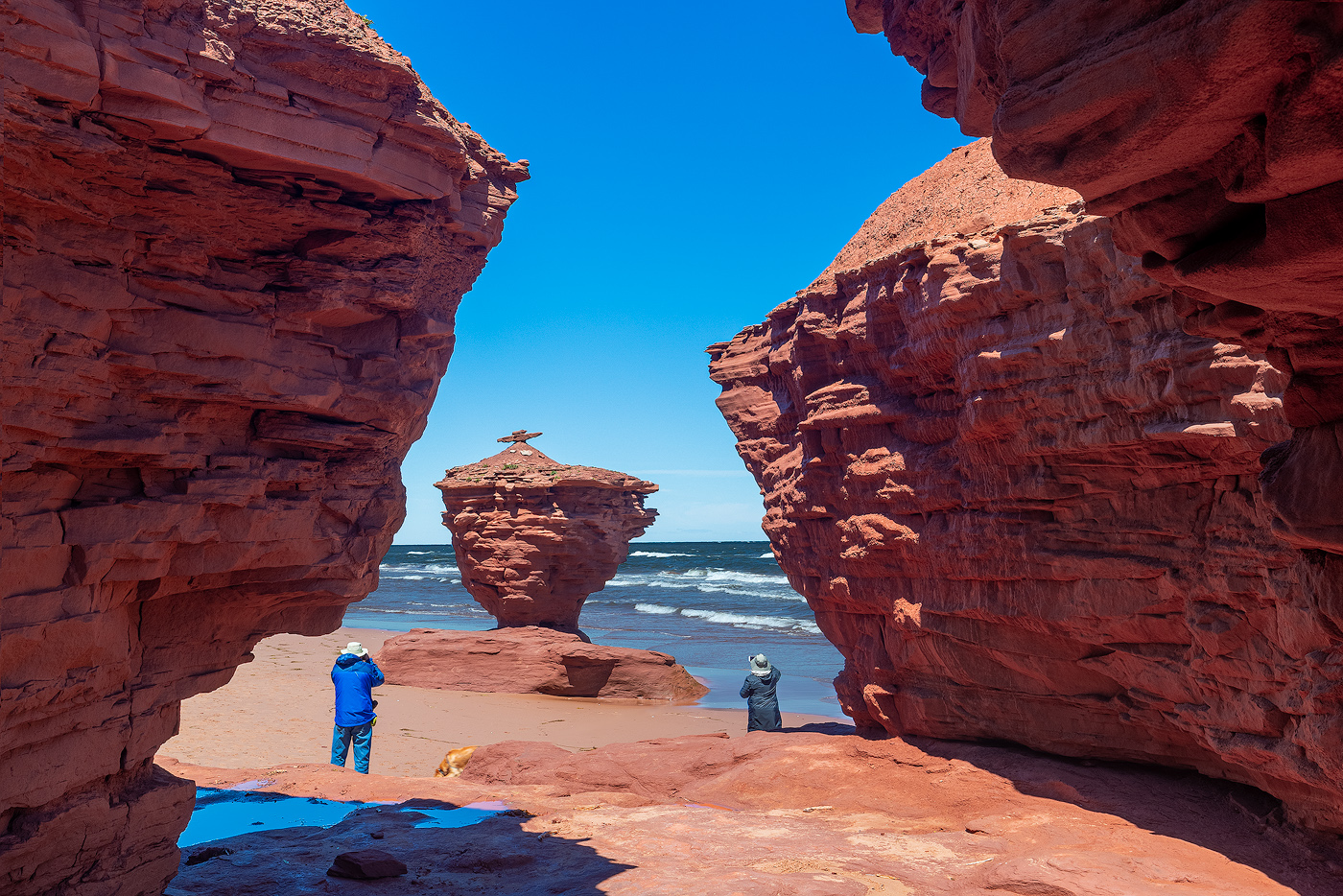
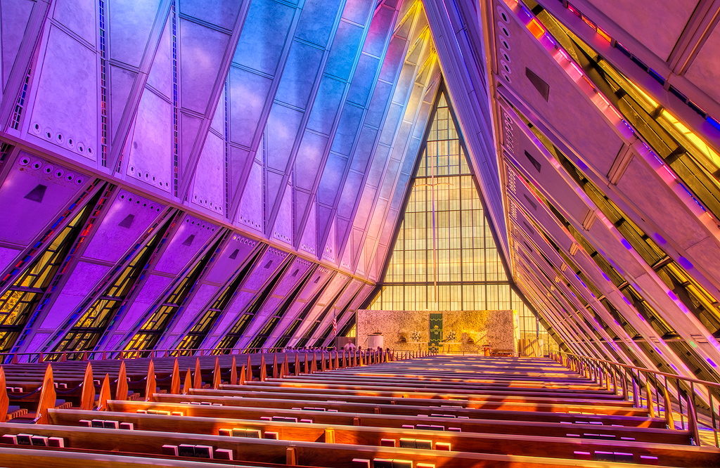
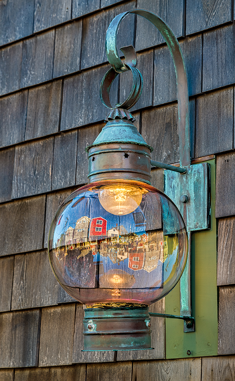
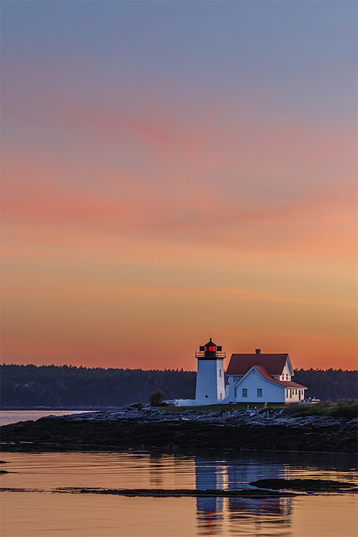
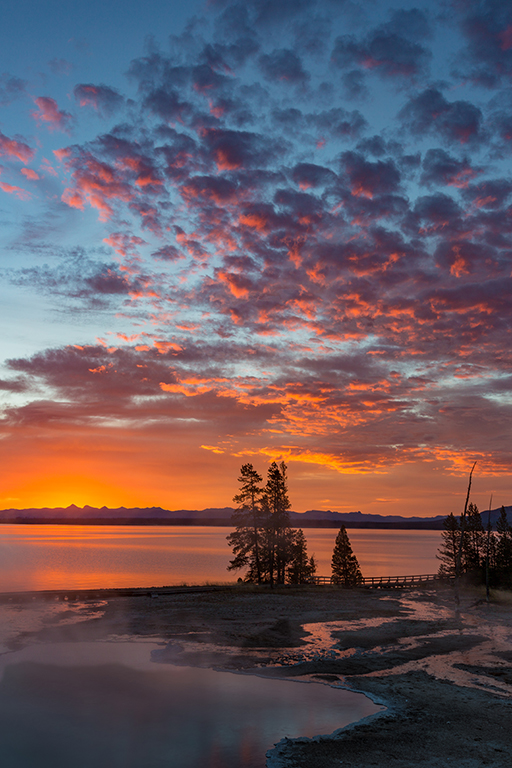
Nice composition and impact with the sun wrapping around the stack. The blend looks smooth. The few shadows that block up are in the reflection and that doesn't bother me at all. The only thing that feels off is the relative difference between the contrast in the sky and that of the stack and foreground. I don't think you need as much contrast in the sky as in the stack. A little Dehaze might bump the dark areas in the clouds just enough to have the sky and foreground feel more connected. |
Dec 9th |
| 44 |
Dec 21 |
Comment |
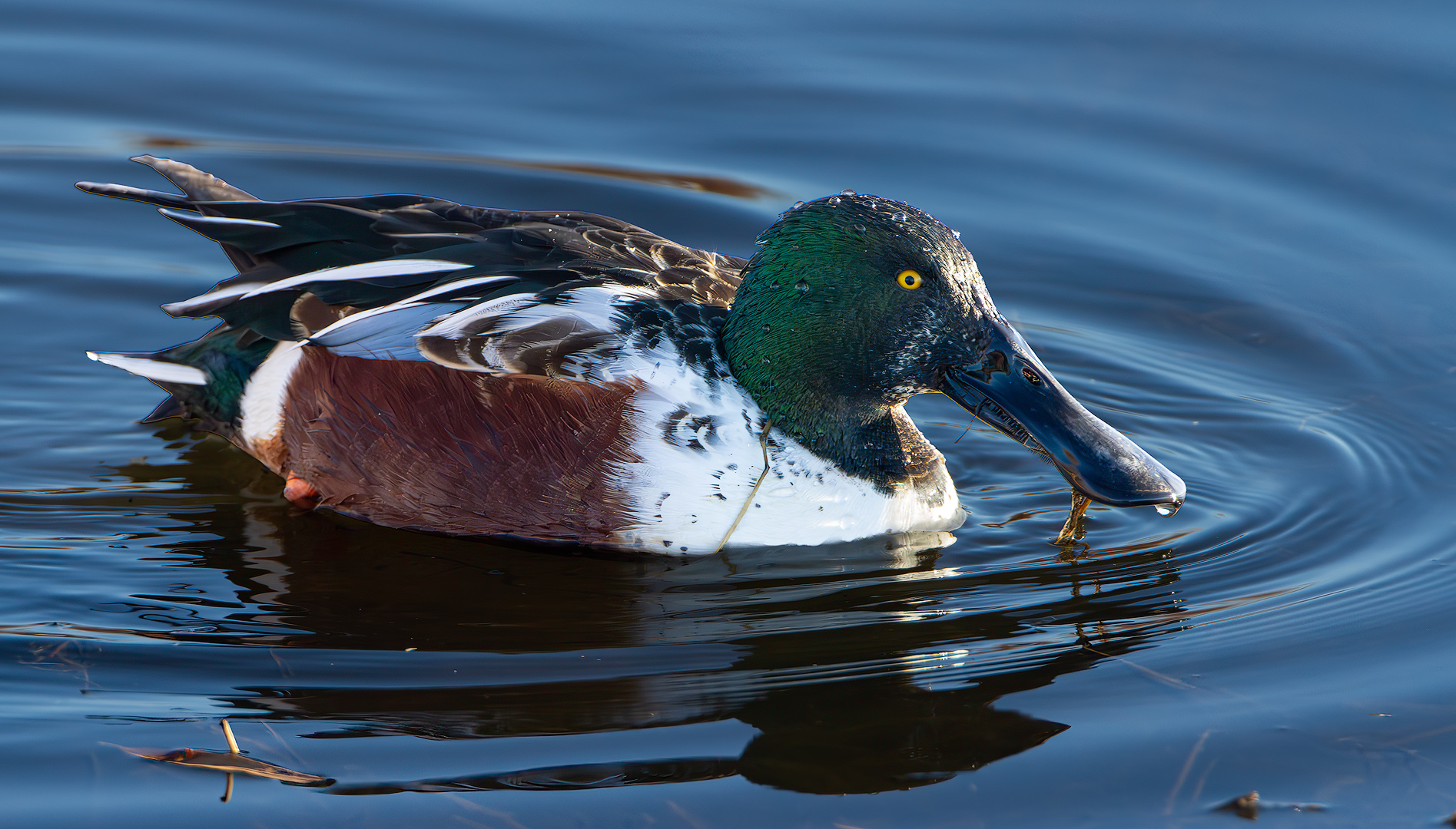
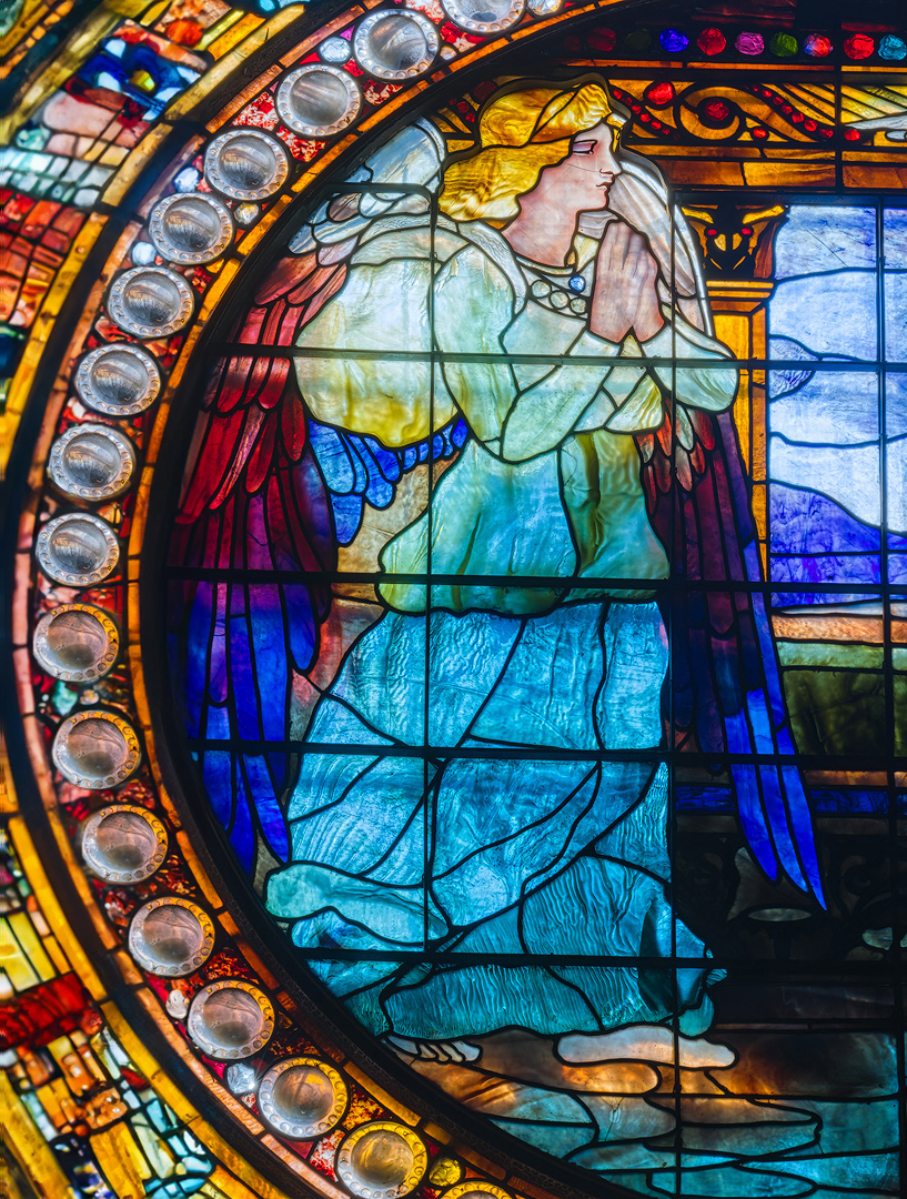
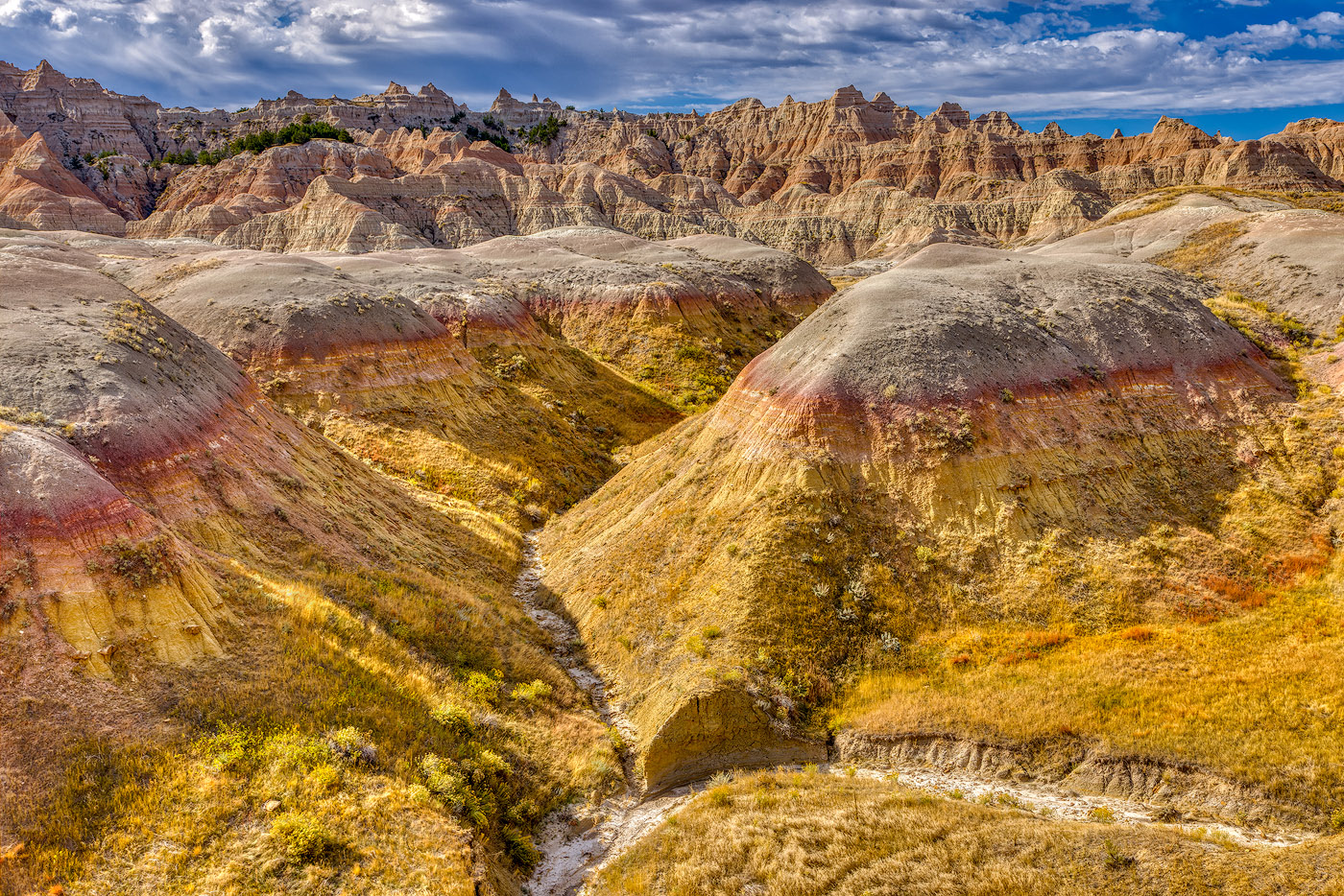
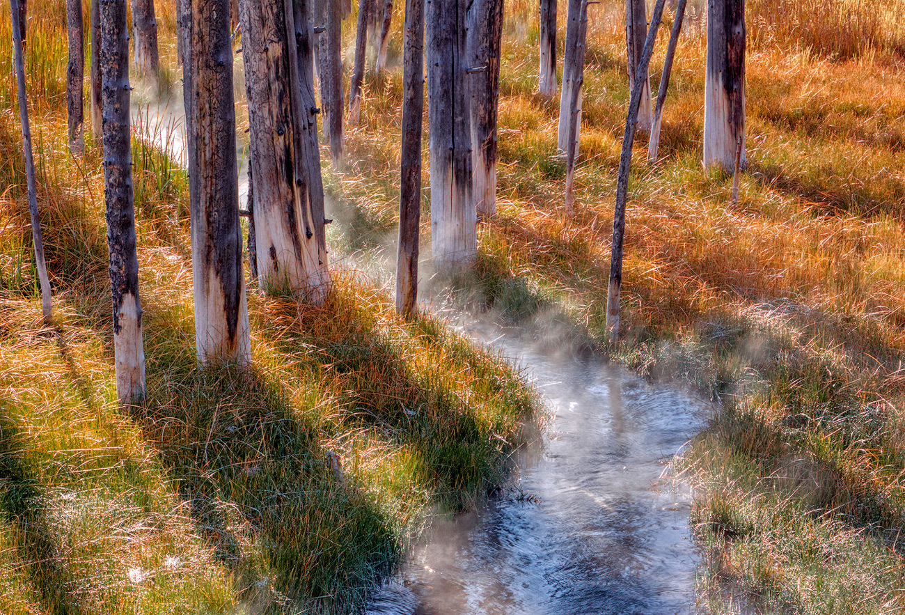
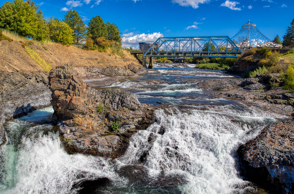
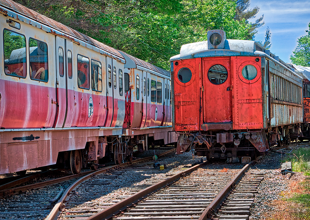
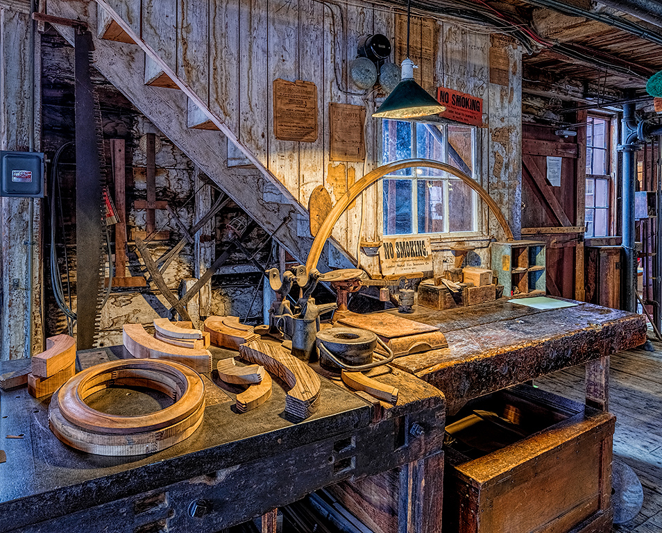
Greetings Tom, welcome to the group. The blend itself looks smooth if, as you note, on the grunge side of things. The mess is what you get at Old Car City, so I can live with that. I would be inclined to pull back a fair bit on the greens. They are too intense for my taste, particularly on the edge of the frame. I would also like to see if it might be possible to get the white areas on the dollar bill to something closer to normal. For me that is one of the key elements and it would be stronger if more realistic even with the grunge everywhere else. |
Dec 9th |
| 44 |
Dec 21 |
Comment |
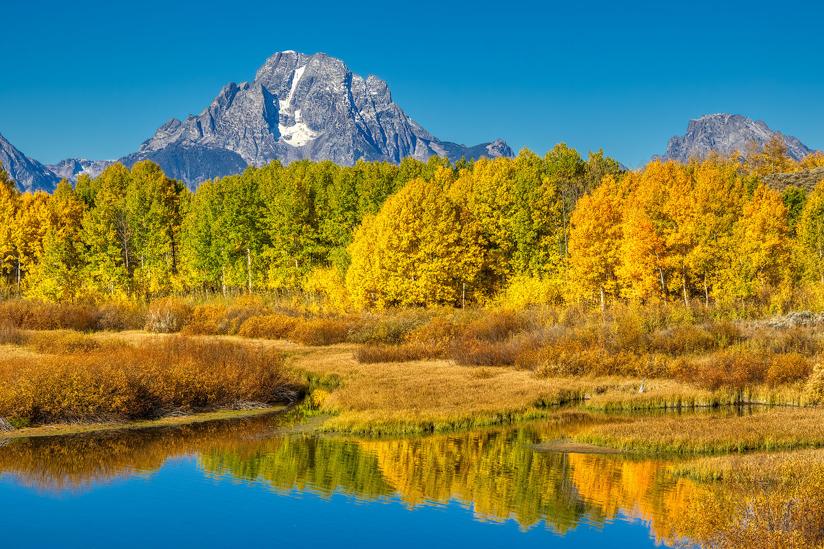
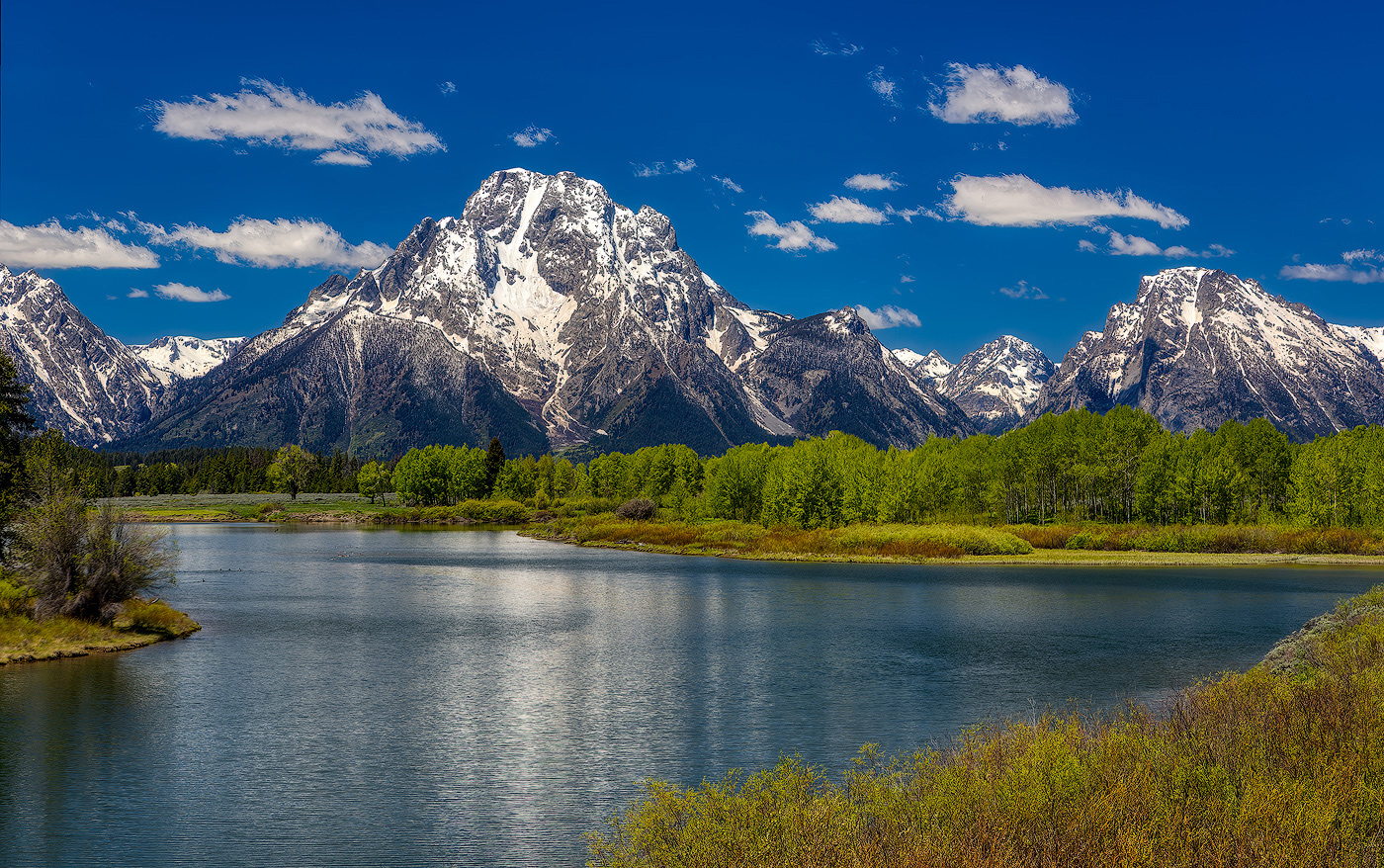
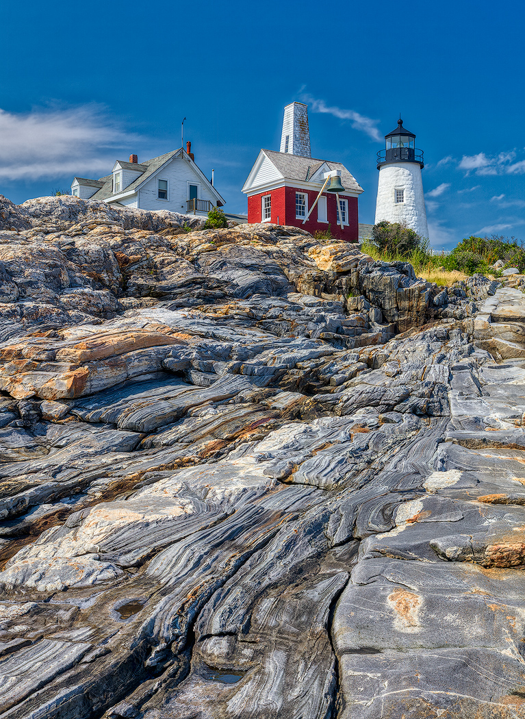
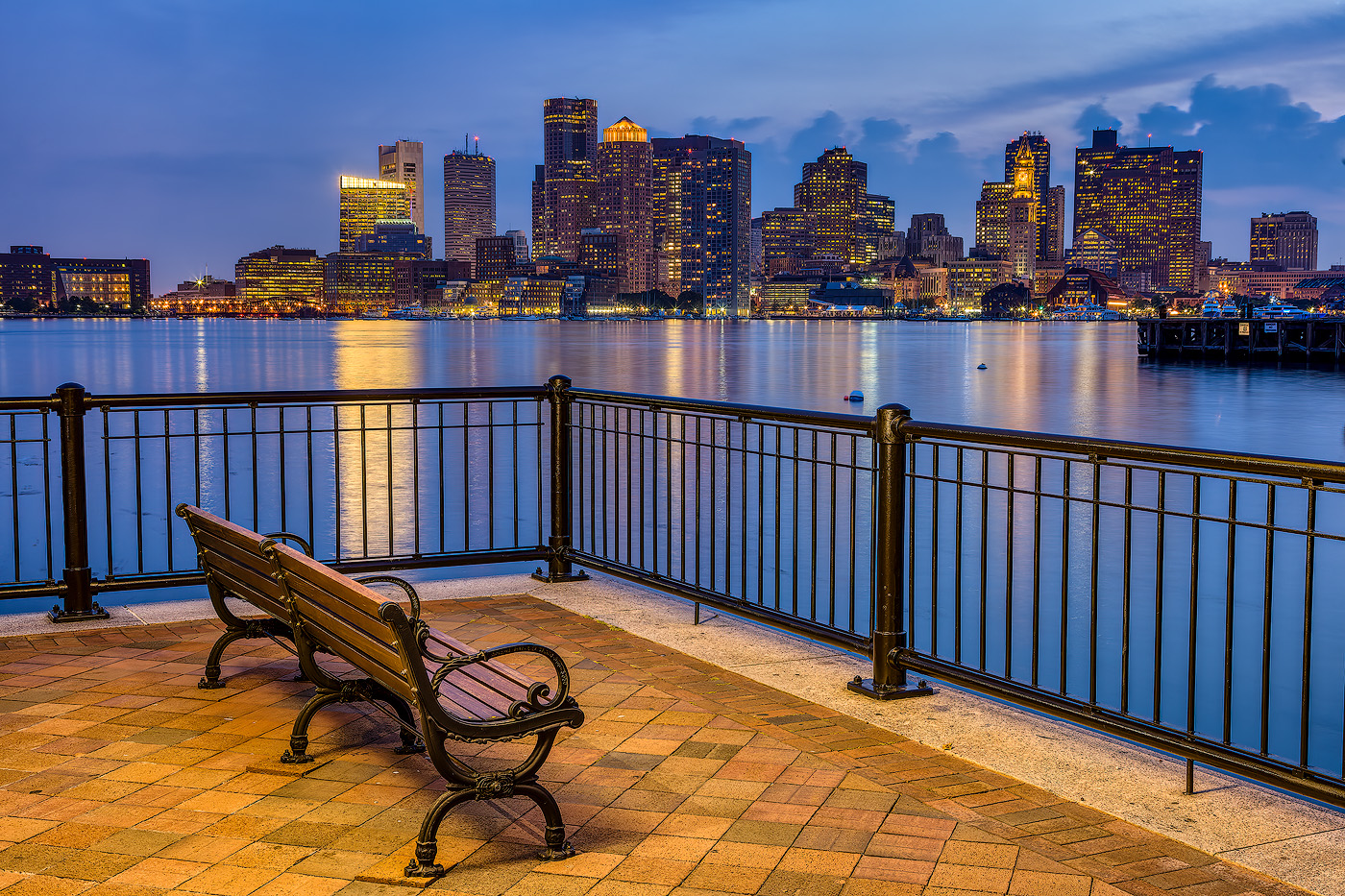
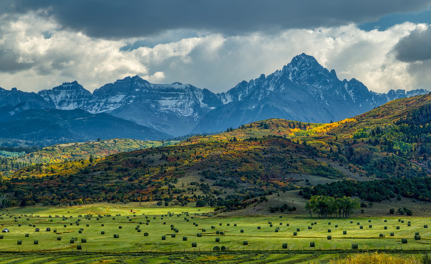
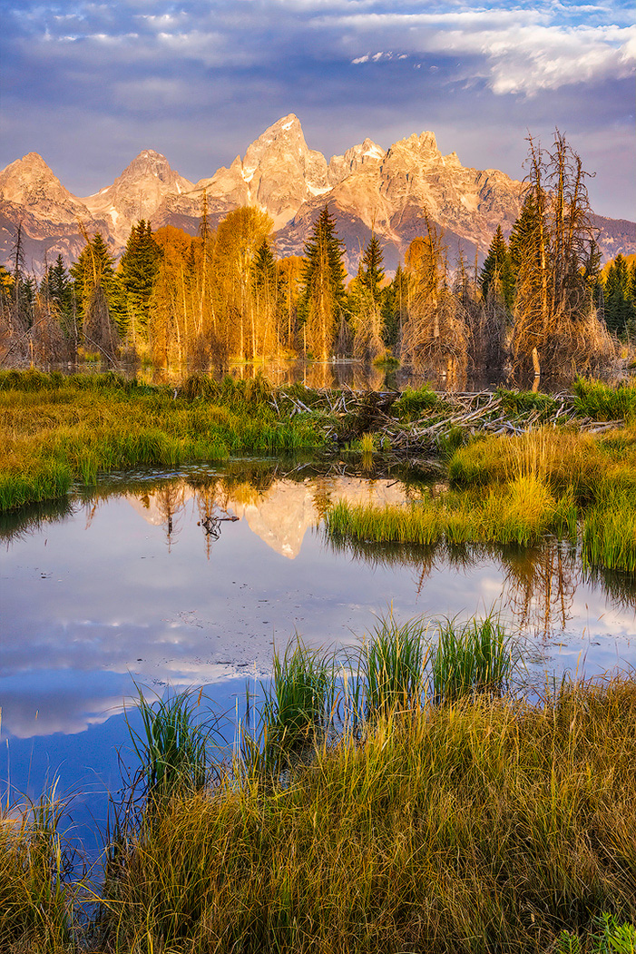
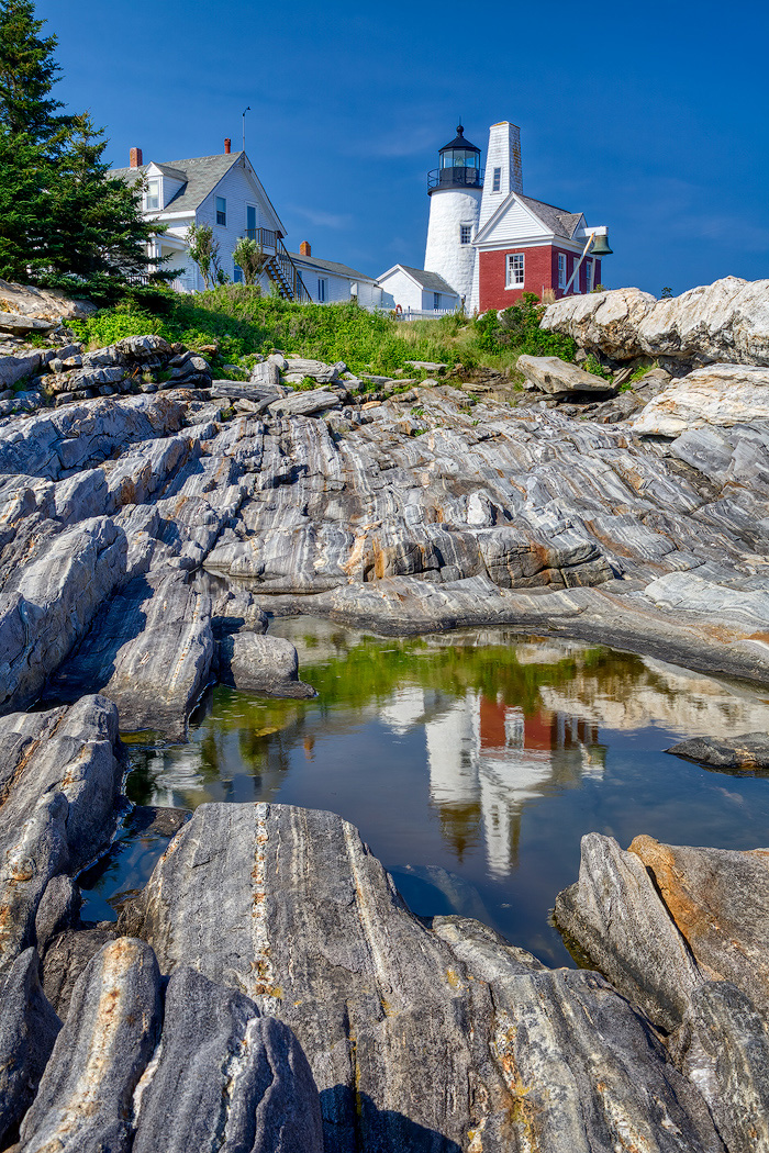
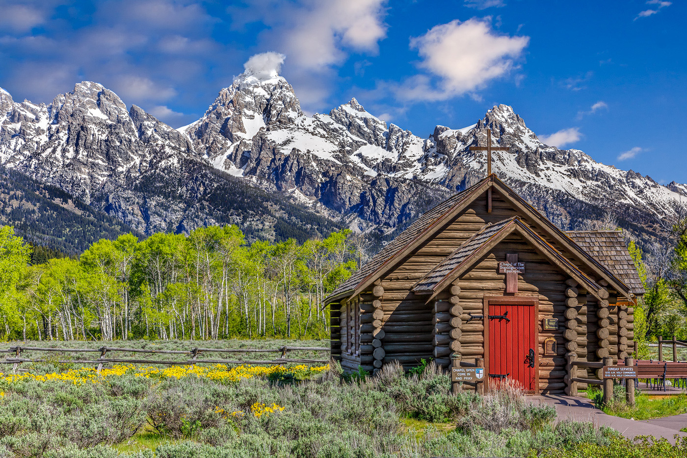
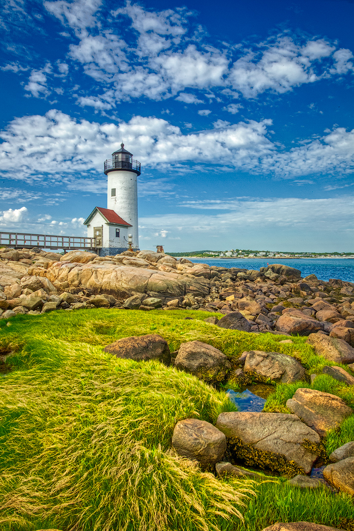
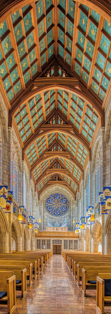
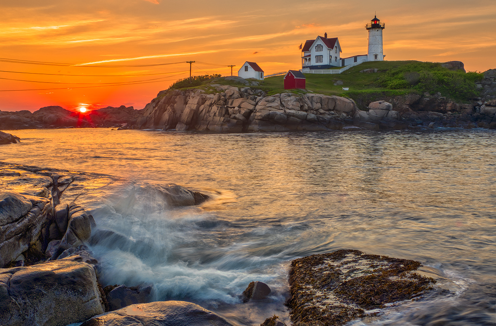
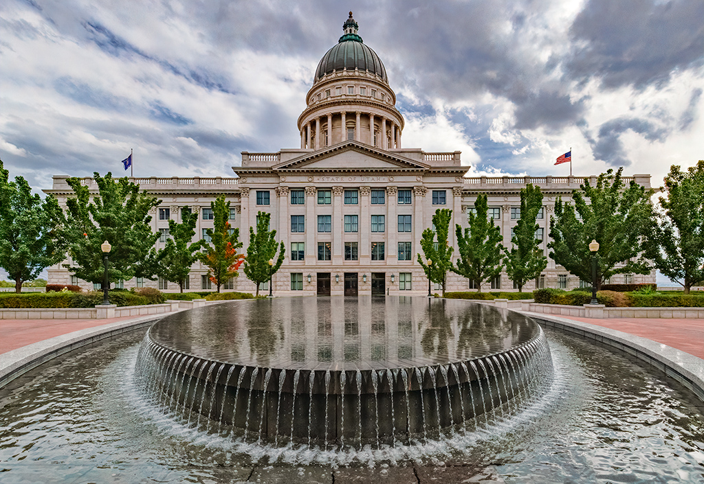
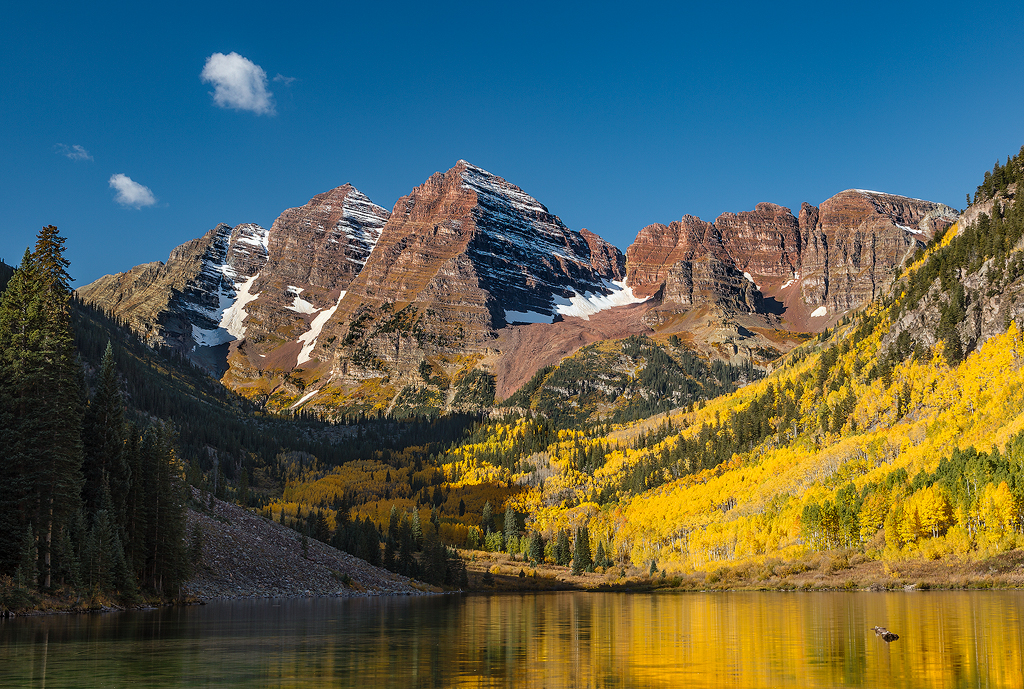
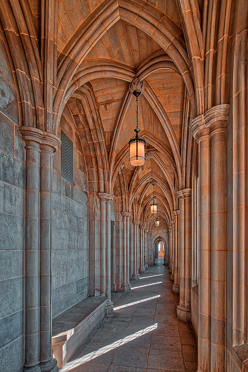
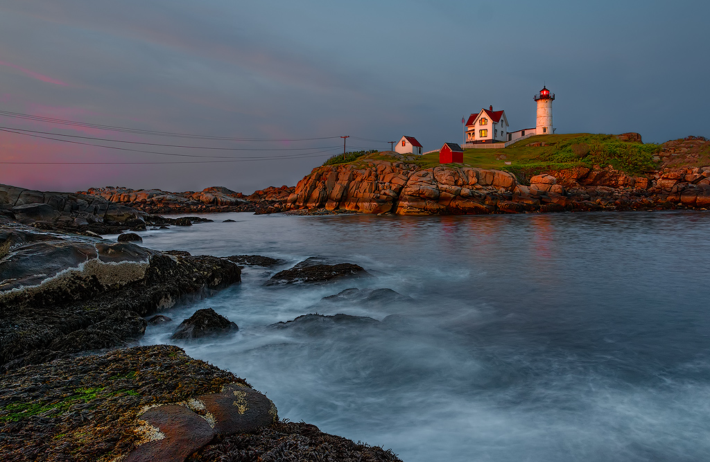
Sorry to hear you have been stuck in the house. Hopefully nothing serious. The sky looks on the money. The verticals on the structures on the left look true, so I'm guessing you have a slight hill, as the building on the right edge looks a little tilted. I think the luminosity of the foreground looks about right for the late light, but I wouldn't mind boosting the shadows a little to see into those more. |
Dec 8th |
| 44 |
Dec 21 |
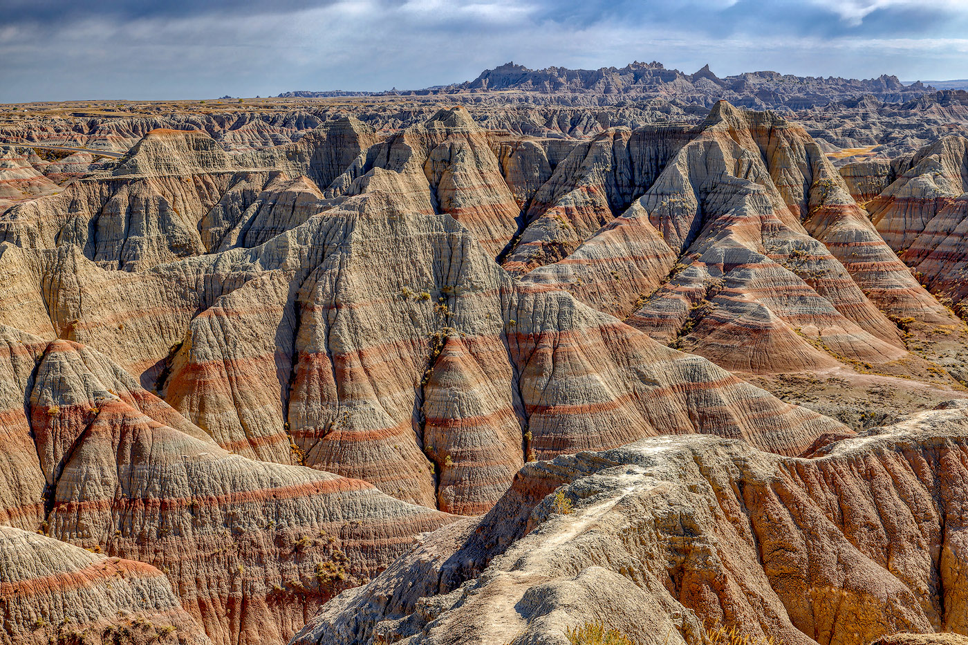
Comment |
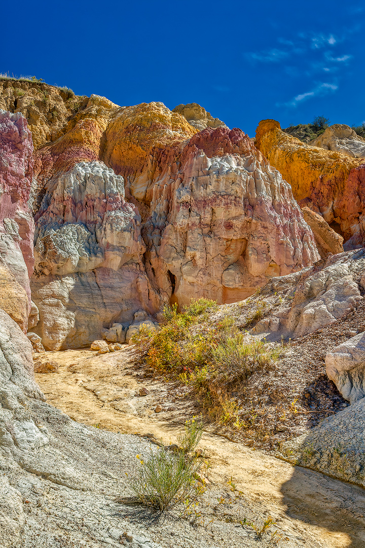
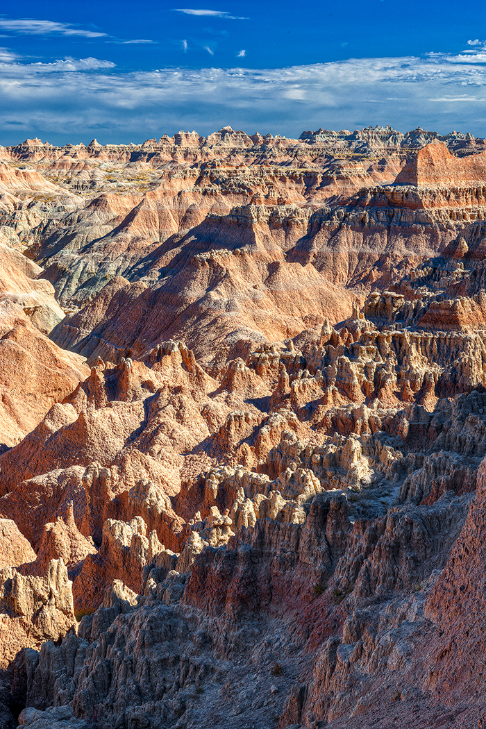
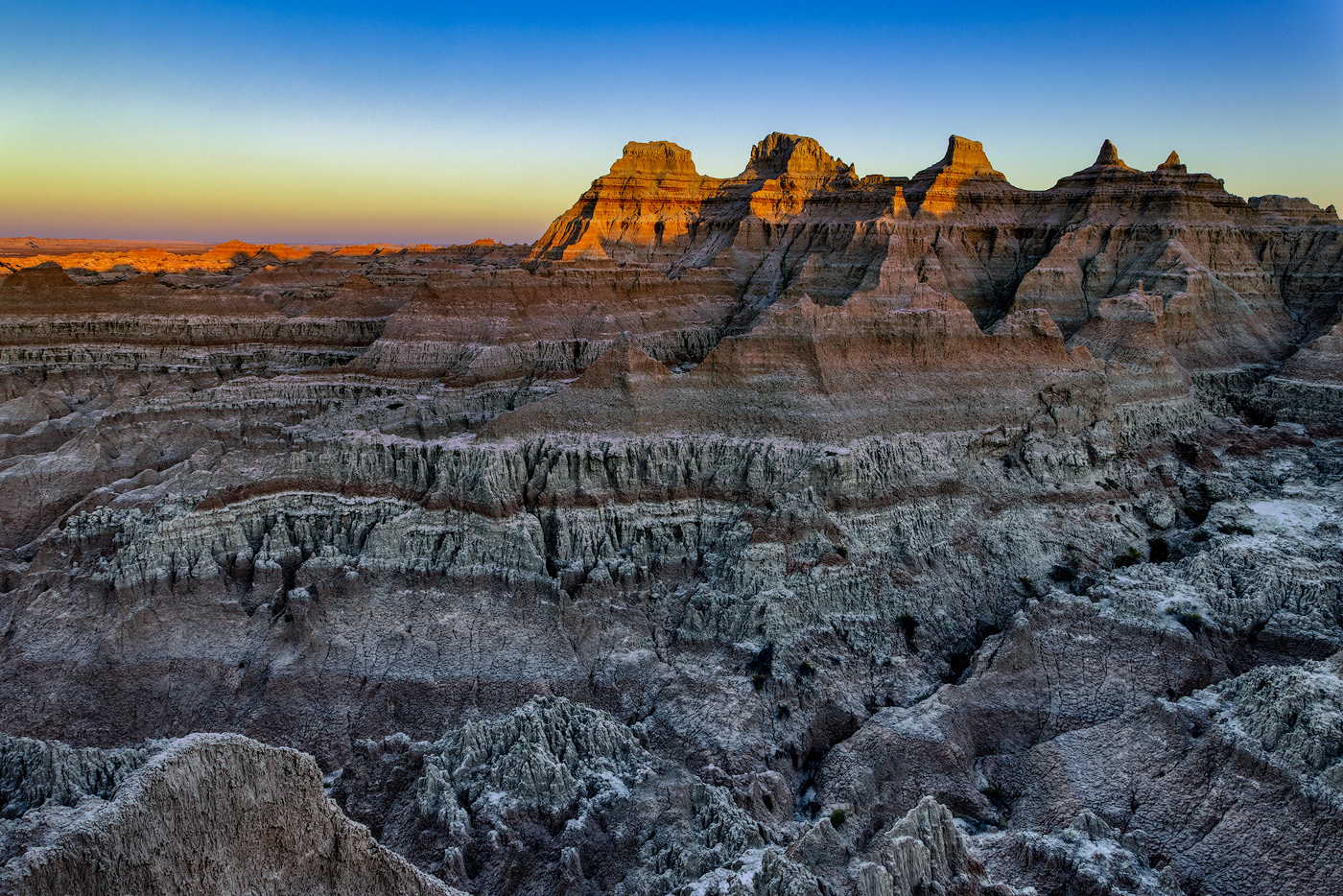
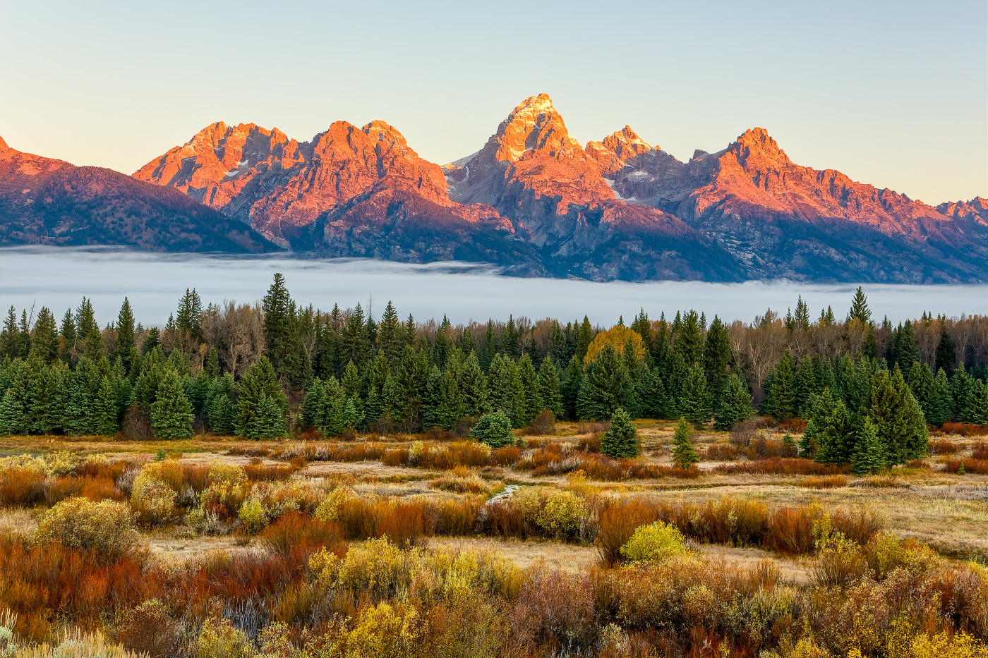
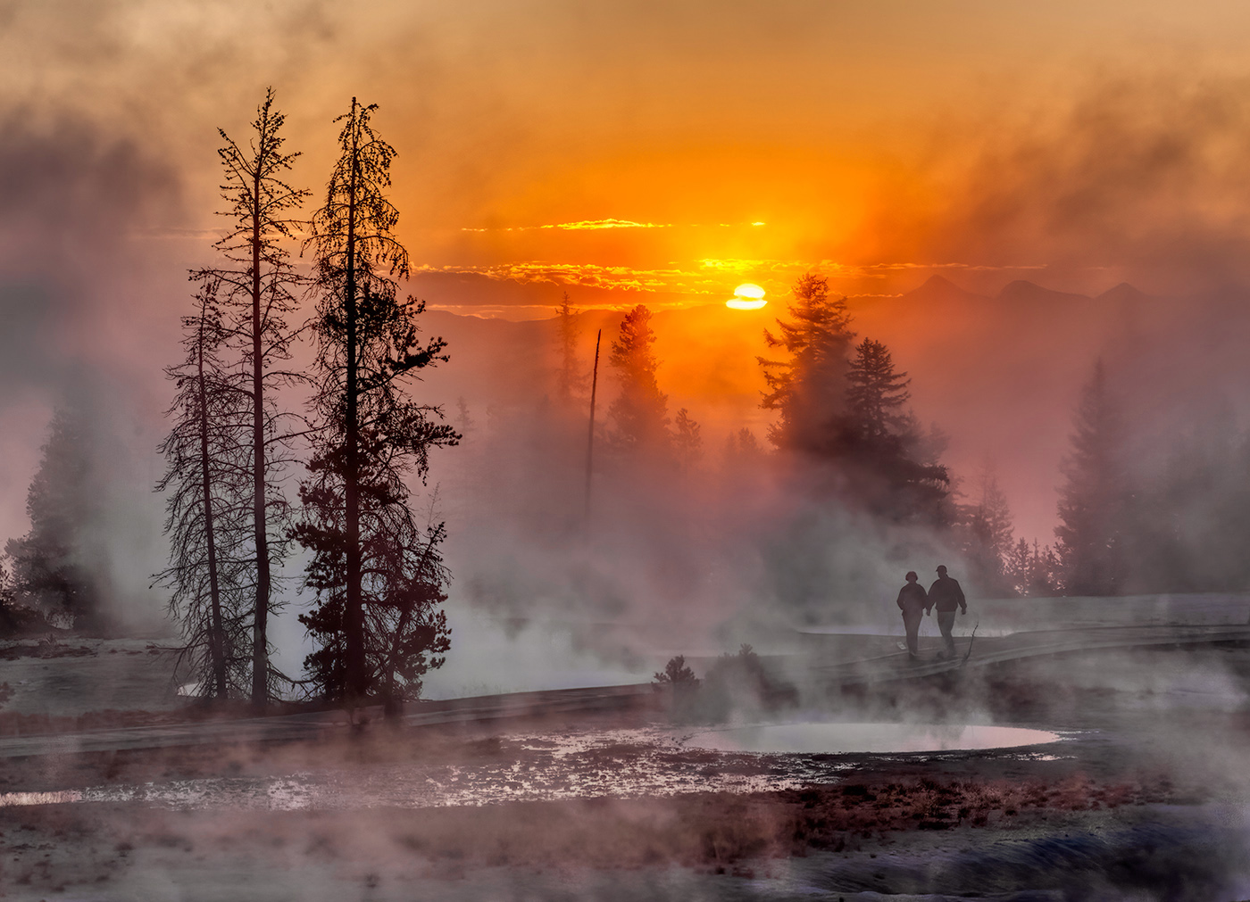
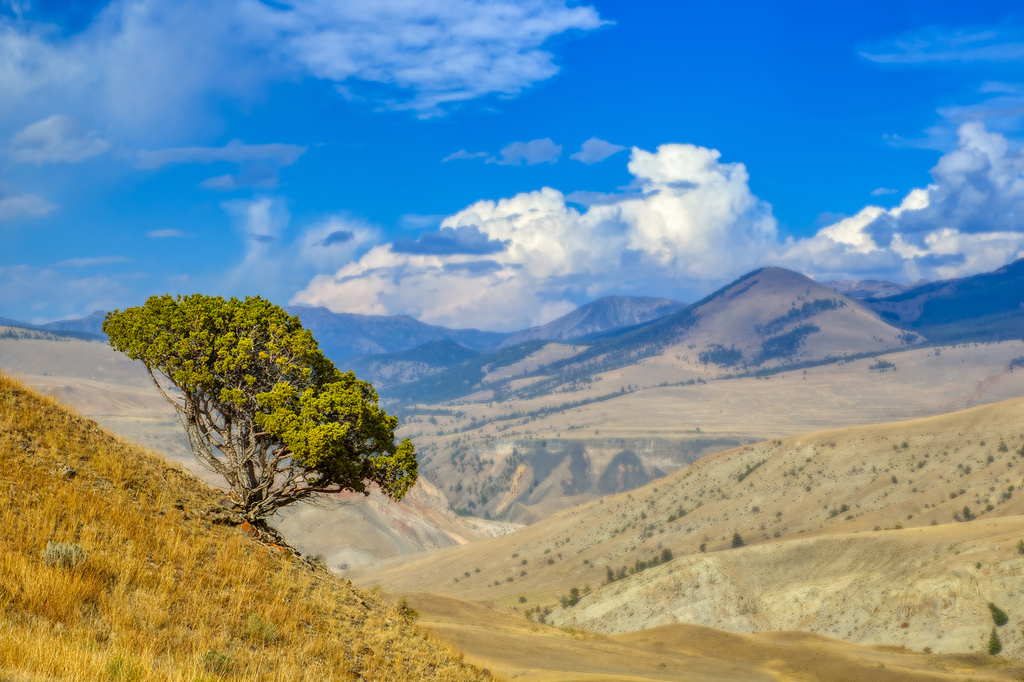
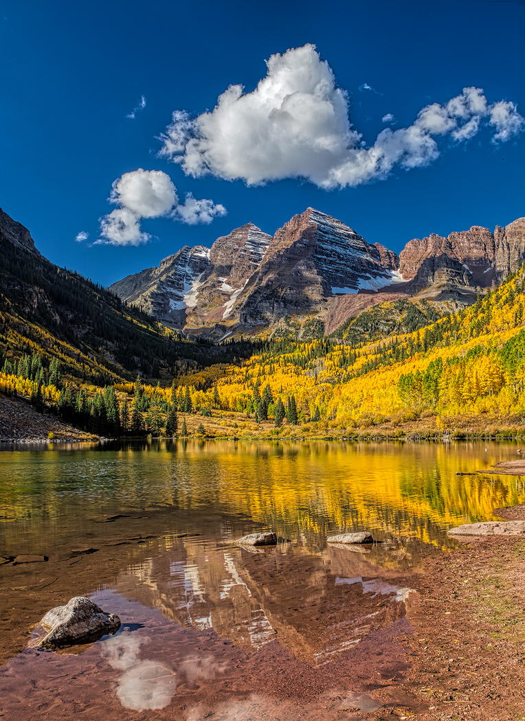
The blend looks smooth and the tones realistic even to the very dark shadows. Given the sun location and angle, I think you pretty much got everything one could expect out of the bracket. The lack of clouds may have been a downer when you captured it, but the sky fits the scene. I'm not sure you would find too many to swap in that would feel right given the lighting you had. |
Dec 8th |
6 comments - 4 replies for Group 44
|
7 comments - 4 replies Total
|