|
| Group |
Round |
C/R |
Comment |
Date |
Image |
| 5 |
Apr 21 |
Comment |
Thanks all. I completely spaced on the background highlights. That definitely needs work. Might be a good job for luminosity masking. |
Apr 14th |
| 5 |
Apr 21 |
Comment |
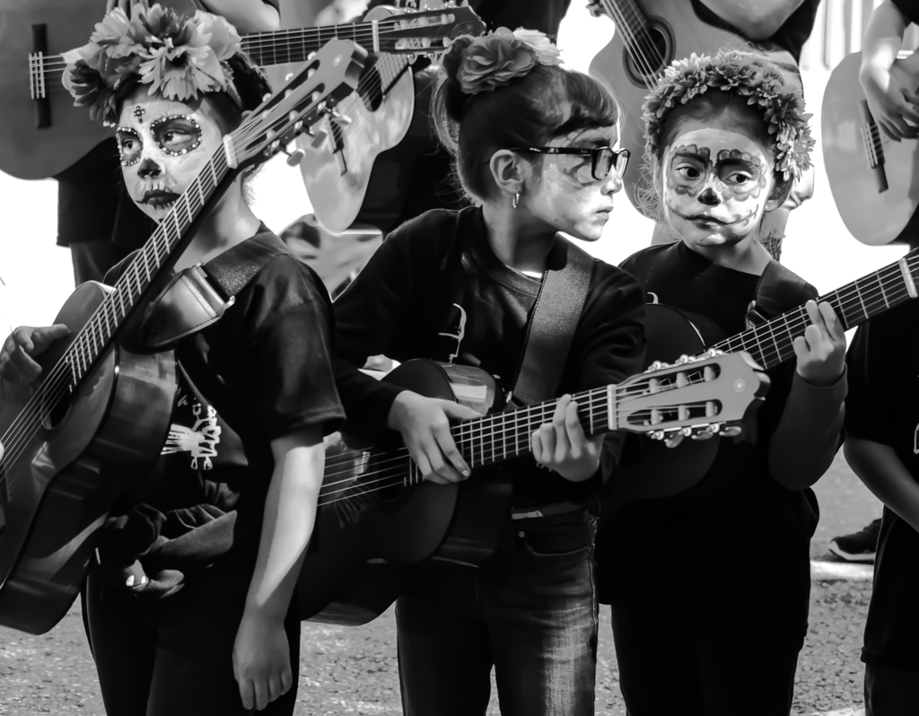
Let me start out by saying that I am a fan of this subject, namely silver or gold coins on black fabric. Unfortunately, this image suffers from several problems, some controllable and some not. First the coins show quite a bit of use. This might work with a different arrangement on a wood background, but the use of black is supposed to highlight the beauty of the coins. Uncirculated coins are required to make that kind of shot. I can't say that the image is out of focus, but the coins look just a bit soft, also taking away from their beauty. Aperture choice could be the culprit or perhaps your closeup lens is not up to the task. Plenty of dust is showing up on the fabric and that is a shot killer for me. The velvet has to be pristine. I've been waiting to say something critical about your images. When you finally gave me a chance, I decided to unload it all at once. :) |
Apr 10th |
| 5 |
Apr 21 |
Comment |
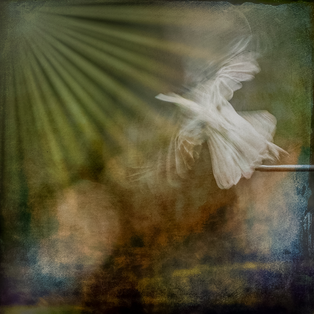
Ah yes, our Snowmageddon. David's edit works, but I would not remove any snow from the bird. It adds to the uniqueness of the scene, at least here in central Texas. Like David says, there is a faint yellow cast to the image. I would likey have removed it from the whole image, but Dave did it the right way. I like the fact that you left a little room to the right and placed the eye near a rule of thirds crosspoint. |
Apr 7th |
| 5 |
Apr 21 |
Comment |
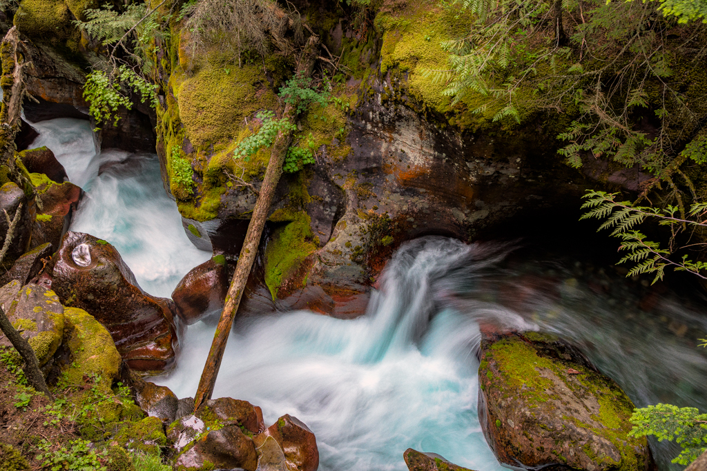
Great job with timing and processing. You have reduced the image to its essentials and made the subject more prominent. I like the faint purple line (pole?) that runs parallel to the rider as sort of an echo. |
Apr 7th |
| 5 |
Apr 21 |
Comment |
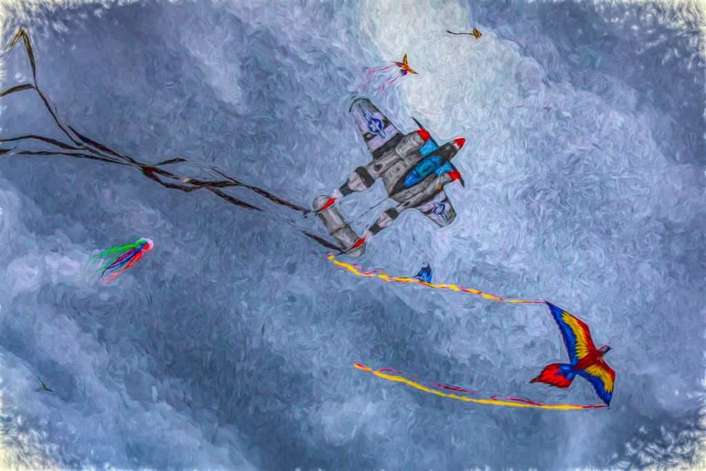
This immediately makes me think of jellyfish at the aquarium.Using an odd number of subjects almost always works better. I like the colors and the slanted orientation of the figures makes the image more dynamic than if they had been perpendicular to the stage. A very creative idea executed well. |
Apr 7th |
| 5 |
Apr 21 |
Comment |
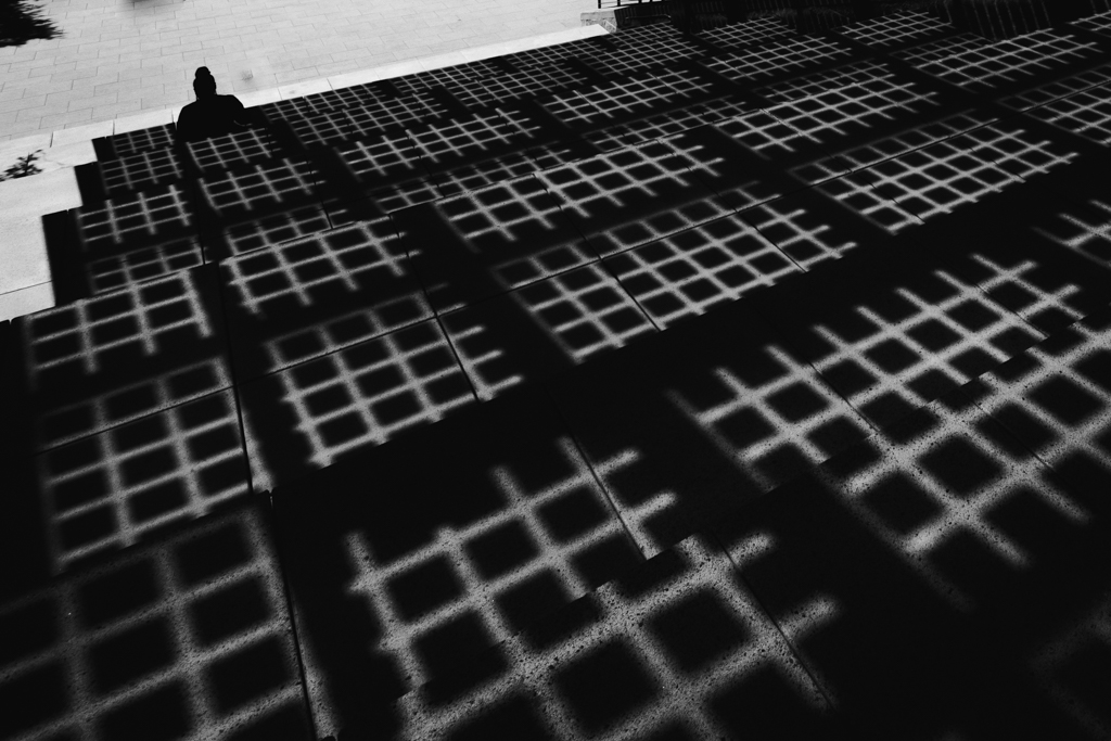
I like your composition here. Removing the other people was brilliant. The sky is believable, to me anyway. A recent presentation to our local club by Luminar has prompted a lively discussion about using skies by other photographers. Most of us agree that they shouldn't be used in competitions. |
Apr 7th |
| 5 |
Apr 21 |
Comment |
I have to go with the crowd on this one. The muted contrast of the final image gives it a muddy look that detracts from the shapes and textures that the image is all about. |
Apr 7th |
7 comments - 0 replies for Group 5
|
7 comments - 0 replies Total
|