|
| Group |
Round |
C/R |
Comment |
Date |
Image |
| 5 |
Mar 21 |
Reply |
I expected no less! |
Mar 11th |
| 5 |
Mar 21 |
Comment |
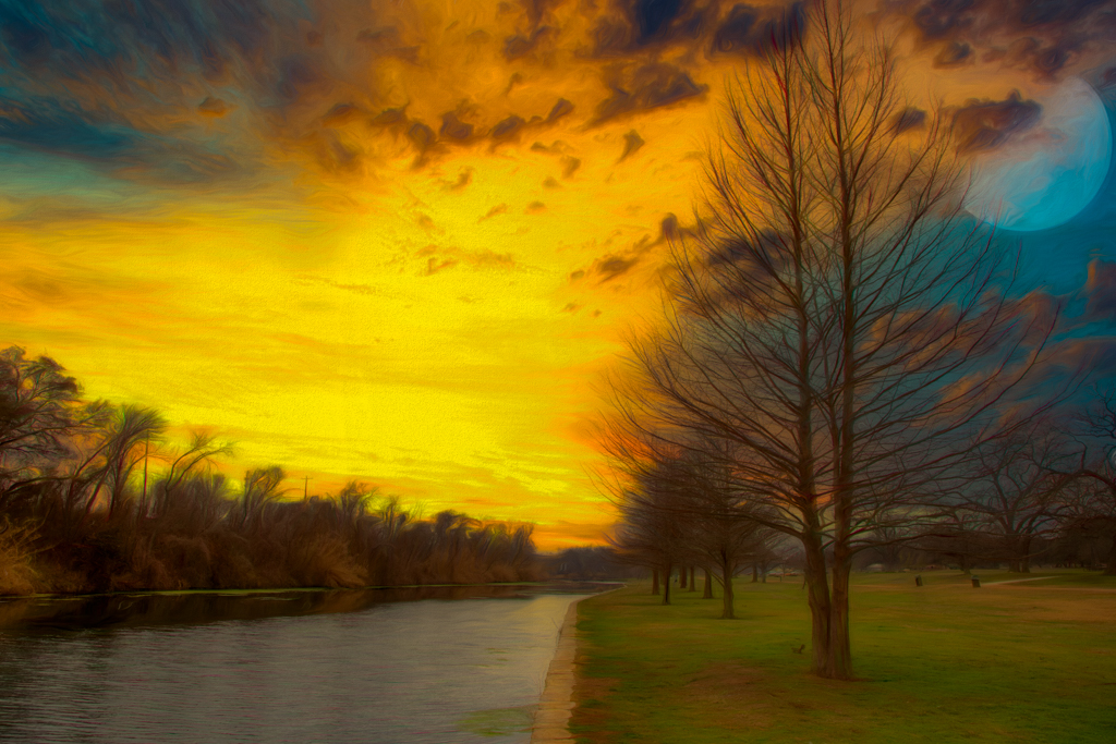
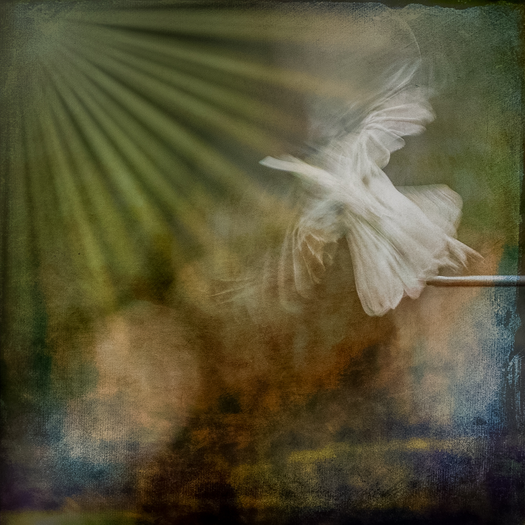
I am not surprised by the various minor criticisms. This was an exercise in learning new software and I took it over the top because I was having fun. I almost put a giraffe in the shot instead of the moon as an homage to Nick |
Mar 6th |
| 5 |
Mar 21 |
Comment |
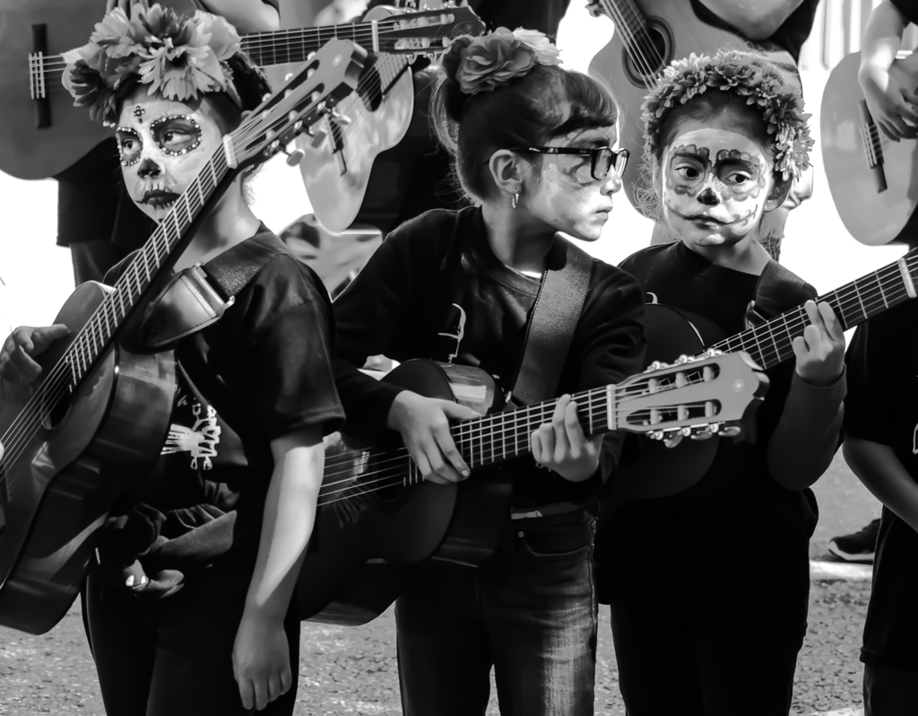
The story is the thing and you nailed it. Exposure, composition, and focus are all excellent. I have mixed emotions about cloning out the third attendant. I agree it is a little cleaner, but I don't mind having a third person hovering around the bride, accentuating her starring role. |
Mar 6th |
| 5 |
Mar 21 |
Comment |
Another wonderful example of pushing the creative envelope. One of the key elements for me as a photographer is to have fun taking pictures and then "adjusting" them to my taste. Nick, your work shows that you have lots of fun with our shared passion and I salute you for that.I really like the idea behind this effort. I love the reflections in the bubble craft. Exposure and composition are very good. My only suggestion would be for the bubble to be a little more transparent. Well done. |
Mar 6th |
| 5 |
Mar 21 |
Comment |
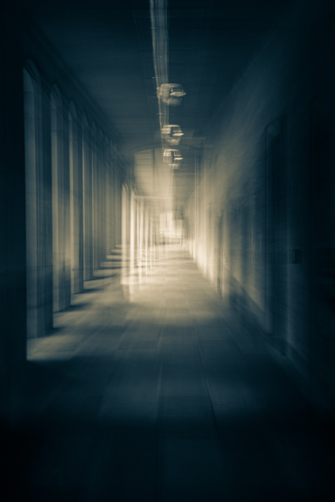
The dodging of the front part of the building immediately draws the eye to the main subject, so I like that. It is believable because the sky could be less cloudy behind the photographer.It certainly changes the mood from its original gloomy look. Shooting from an angle also makes the shot more interesting showing more of the building and its relationship to the river and town. |
Mar 2nd |
| 5 |
Mar 21 |
Comment |
Mono was an excellent choice for the old world look. I think that your crop is what takes this image up in class. The more diagonal course of the street makes the image more dynamic and encourages the eye to move from bottom right to top left. There are patterns in the crowd which give additional interest.Well done. |
Mar 2nd |
| 5 |
Mar 21 |
Comment |
When I cropped based on my taste, it ended being just like Richard's. My goals were to crop some of the dead space on the right while keeping the bird to the left of center. This meant cropping off more of the tree. In any case, you have a good picture of a very beautiful bird with great exposure, detail and color. |
Mar 2nd |
| 5 |
Mar 21 |
Comment |
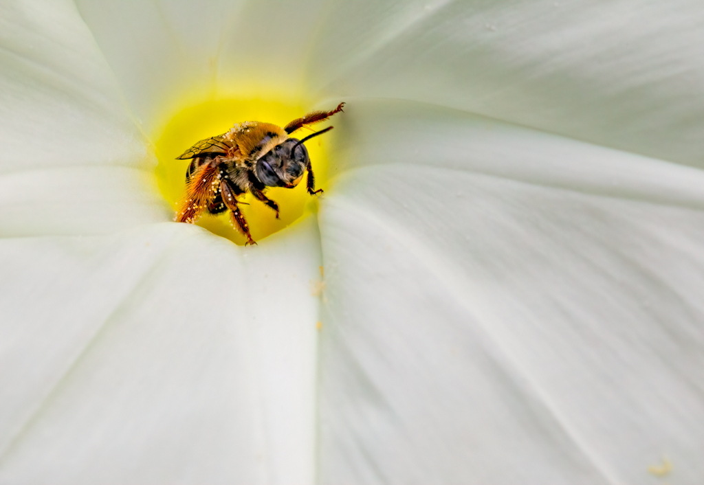
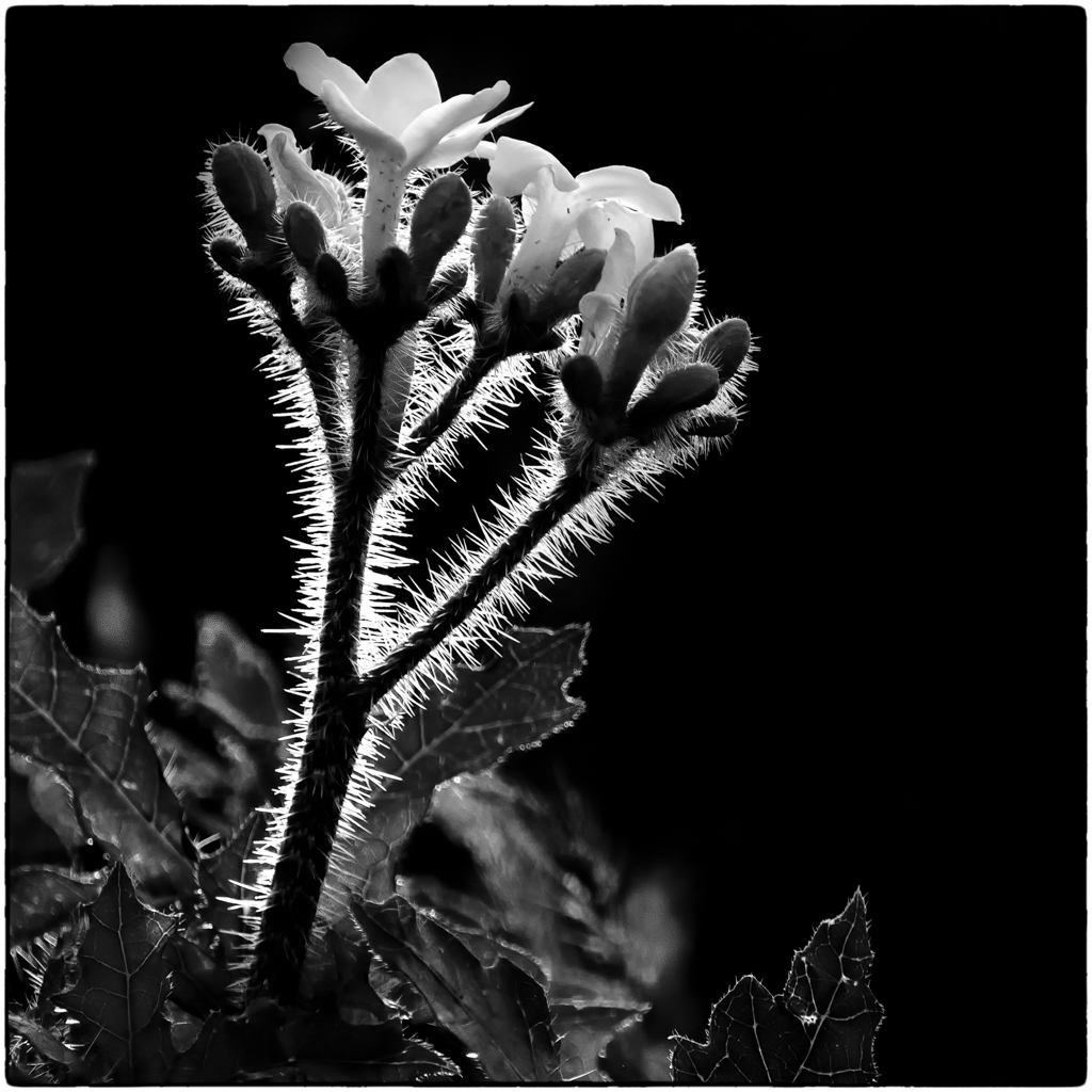
Barbara, this flower jumps off the page! The colors are stunning and the curve of the flower and stem is beautifully composed. your background treatment was well executed. Bravo! |
Mar 2nd |
7 comments - 1 reply for Group 5
|
7 comments - 1 reply Total
|