|
| Group |
Round |
C/R |
Comment |
Date |
Image |
| 5 |
Feb 21 |
Reply |
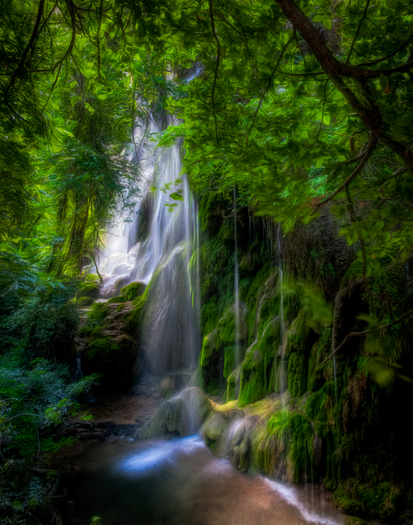
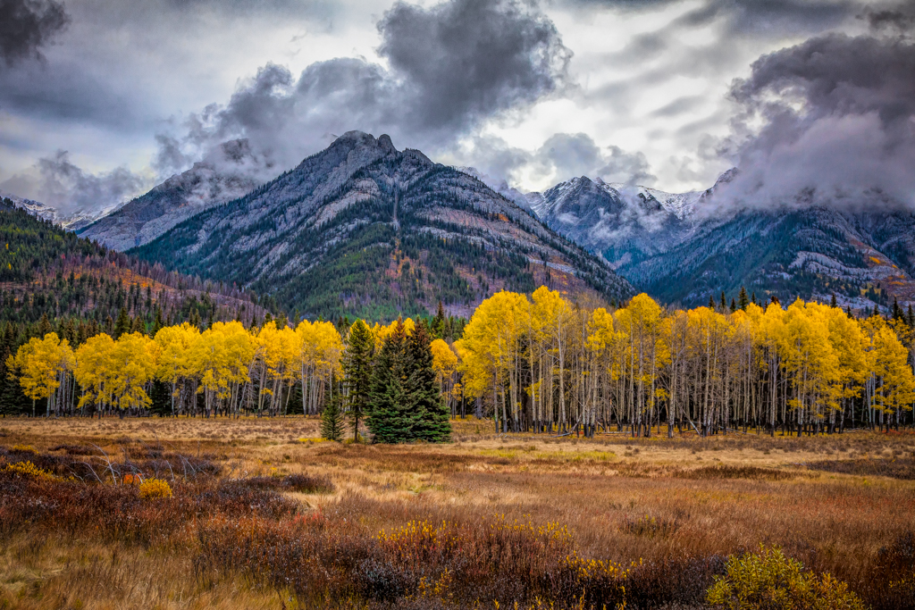
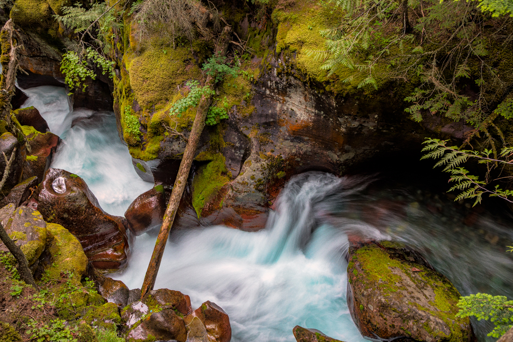
Thanks to all of you. I agree that Oliver's changes make the falls more prominent. I left the yellow area a little bright because I was attracted to the dappled light pattern in the scene. Perhaps it is distracting. Another case of less is more? |
Feb 14th |
| 5 |
Feb 21 |
Comment |
Nice composition and use of complimentary colors. I like your use of depth of field to make the foreground pop. The falling snow gives the picture the final touch to make it very interesting. Well done. |
Feb 14th |
| 5 |
Feb 21 |
Comment |
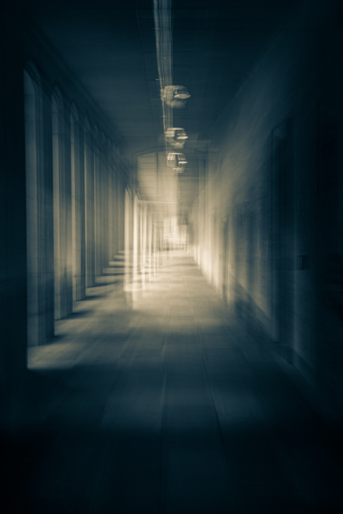
I really like this image because of the mood and place. I really want to visit it myself. The staircase is the star of the show so the attempts to increase contrast add to the quality of the shot, in my opinion. You did a good job of cropping and straightening. |
Feb 14th |
| 5 |
Feb 21 |
Comment |
Another fun composite demonstrating your ever present sense of humor. I wont repeat the comments of others, but I do agree that some work is necessary if you want a more realistic appearance. I'm not sure that this is one of your goals. Humor and creativity seem to be your priorities. |
Feb 14th |
| 5 |
Feb 21 |
Comment |
Barb,
I, too really like the composition of the riders. I'm guessing that you used a telephoto to compresses them.I like the crop. The original was a little too wide on the right. The curve of the road is a nice leading line. My only critique is about the processing. I don't think it added to what was already a good image. |
Feb 9th |
| 5 |
Feb 21 |
Comment |
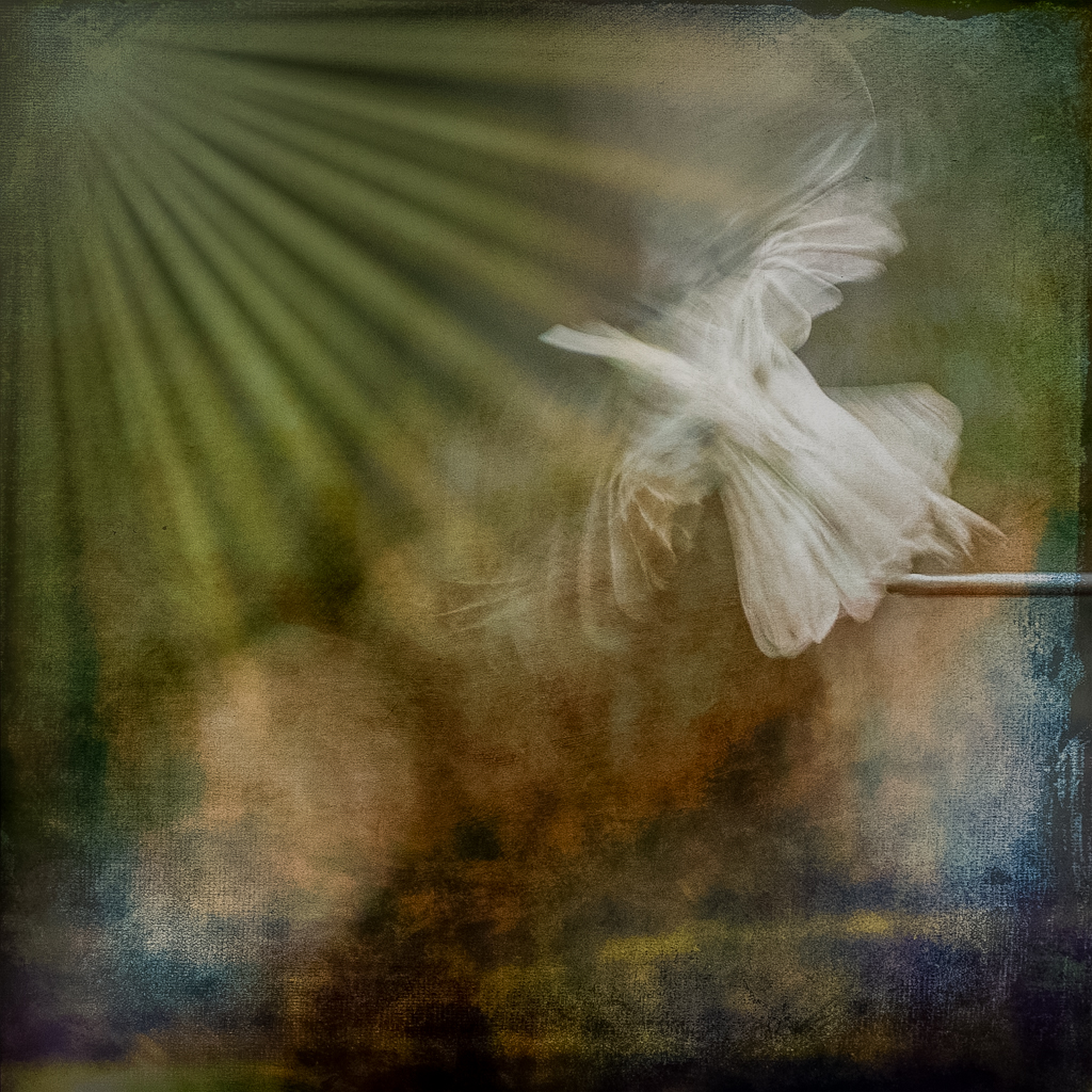
Freddie,
Beautiful and creative. I got the sense of birds over water. Very peaceful and full of graceful motion. I like your treatment, It really elevates the mood. |
Feb 9th |
5 comments - 1 reply for Group 5
|
5 comments - 1 reply Total
|