|
| Group |
Round |
C/R |
Comment |
Date |
Image |
| 5 |
Jan 21 |
Comment |
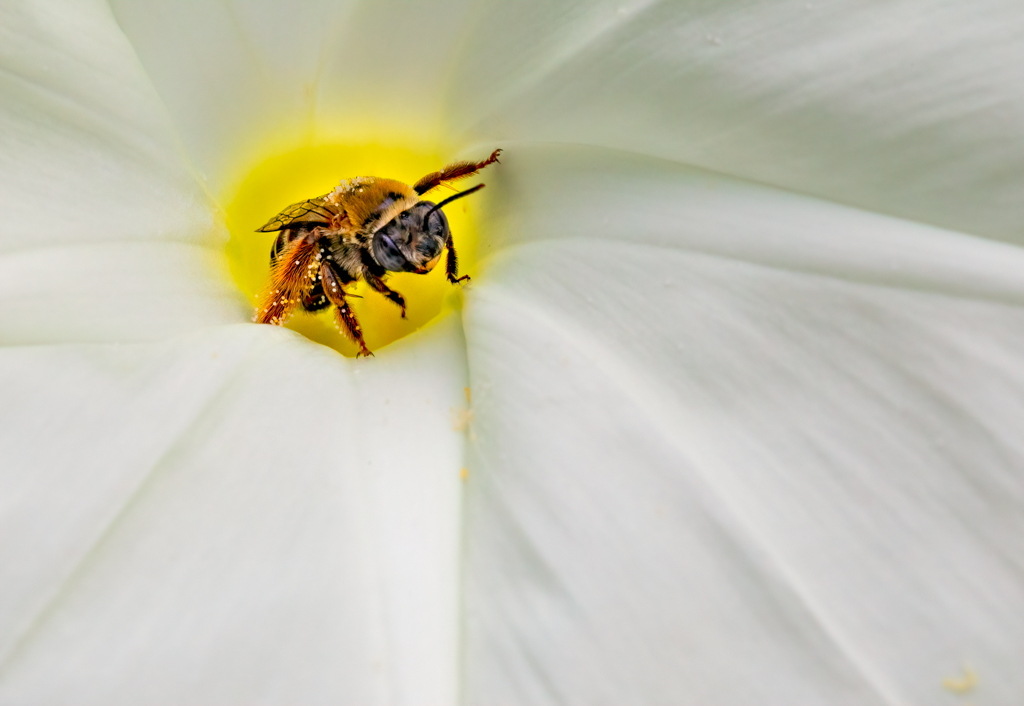
Richard, I agree that the bee is over processed. I got a little carried away With Topaz AI Clear. Thanks for pointing that out. |
Jan 4th |
| 5 |
Jan 21 |
Comment |
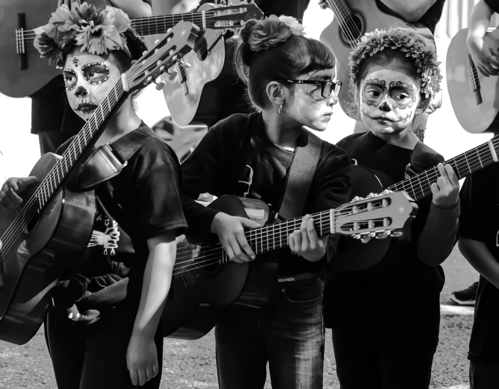
I really like the story here. I can hear the kids chattering and feel the train car moving. Not to be argumentative, but the wider crop gives me more of a feeling of being in the car. |
Jan 4th |
| 5 |
Jan 21 |
Comment |
Nick,
Once again some not so serious eye candy. I always enjoy your creations. I must agree with everything said above. The exposure changes made by David are an improvement. I see you attempted to make shadows of the hooves, but that still needs work to make it more realistic. Your home gallery must be insane looking! Keep the great ideas coming. |
Jan 4th |
| 5 |
Jan 21 |
Comment |
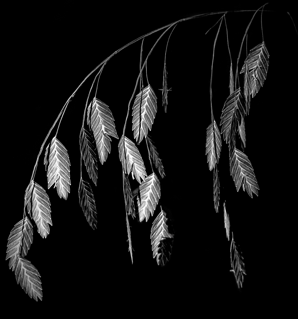
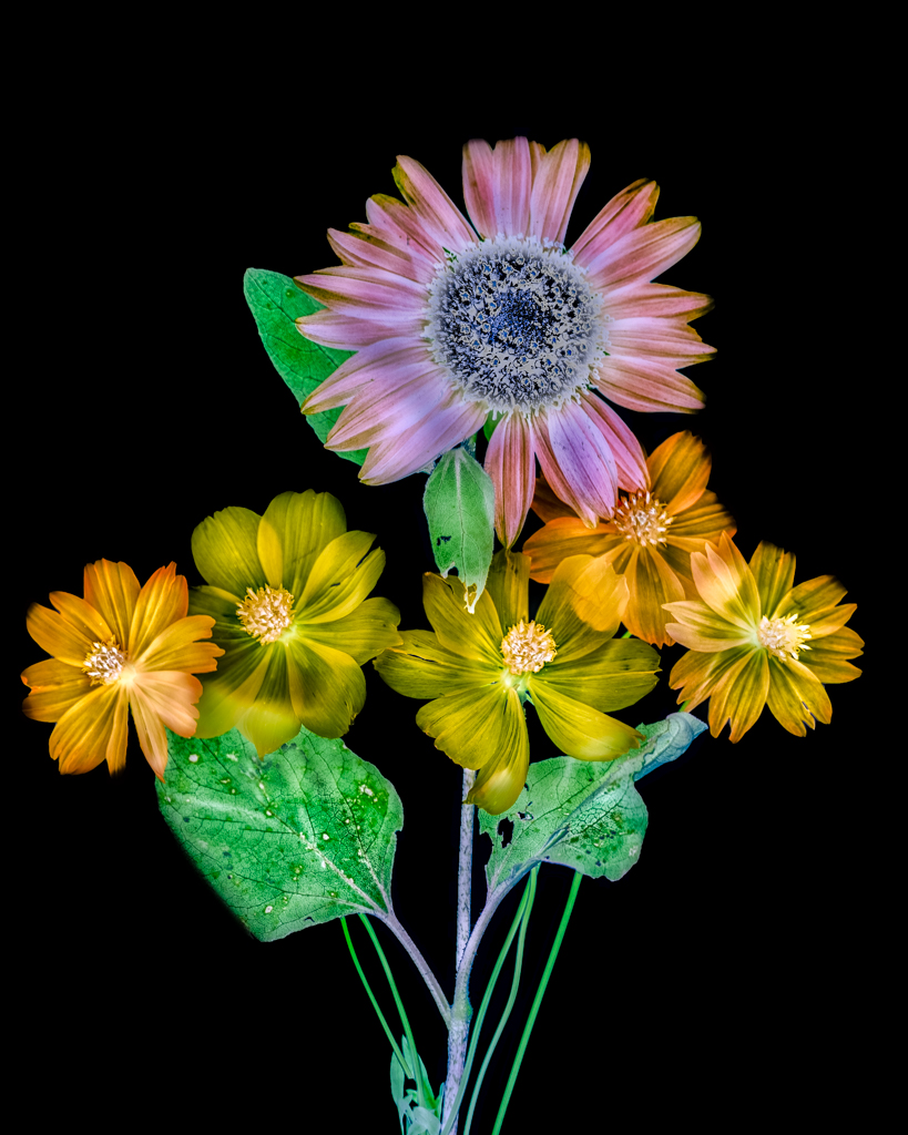
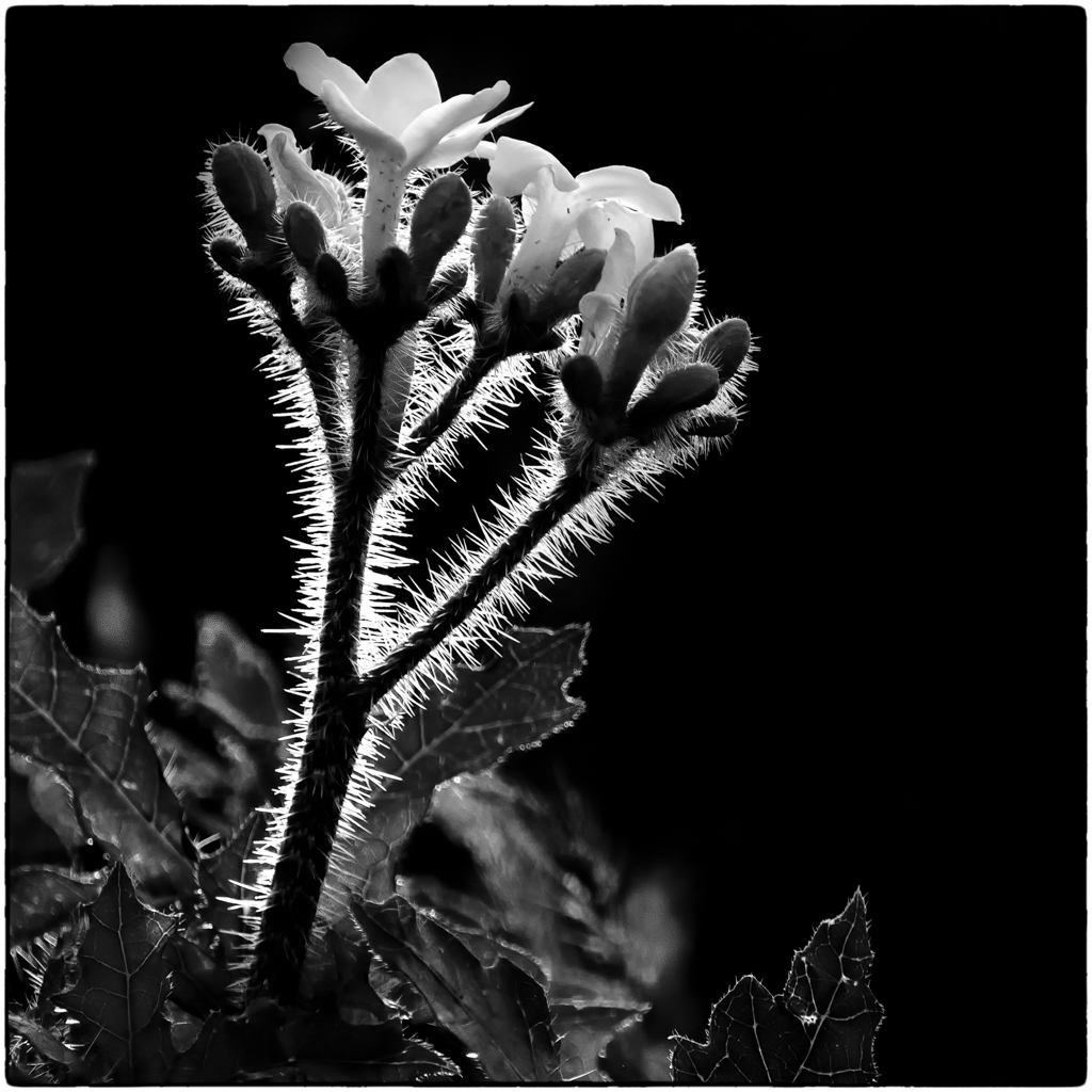
Pete,
I really love the quality of the light in this photograph. The colors are beautiful and the flowers are tack sharp. The background treatment is excellent, in my view. It also contains a few muted echoes of the colors in the foreground. I think that the compositional issues mentioned may stem (no pun intended) from the even number of main subjects. Odd numbers are supposed to be more pleasing to the eye. That may be true in this case. |
Jan 4th |
| 5 |
Jan 21 |
Comment |
I like this composition. The boats form an oblique leading line that takes the eyes across to the far shore.From there, they follow the beautiful horizon and then come back to the foreground. Well done. Warming up the light adds a mood to the image. I love the way the light hits the boats and then reflects off of the water. With a horizon fix, you have a beautiful shot. |
Jan 4th |
| 5 |
Jan 21 |
Comment |
I agree with all of the above comments. It was a very good composition and pose to begin with and your exposure looks very good. Your edits removed several distractions making this a much stronger image. |
Jan 4th |
| 5 |
Jan 21 |
Comment |
The eyes have it! No doubt about the subject here.I like your treatment of the scarf. The design takes away from the main subject. This is one of those rare pictures where I like the original better than the post-processed version. Cropping in does increase the impact of the eyes, but they do not seem as sharp to me on the cropped version and this is not a good trade-off in my opinion. Also, the tonality on the original is very good, while the revision seems a little over exposed.I am no facial retouching expert, so you will have to educate me about the black liner on the eye. |
Jan 4th |
7 comments - 0 replies for Group 5
|
7 comments - 0 replies Total
|