|
| Group |
Round |
C/R |
Comment |
Date |
Image |
| 5 |
Oct 19 |
Reply |
Ian,
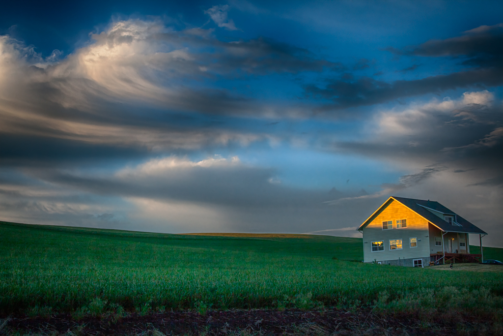
Thanks for the comments. I tried the crop and like the sea of grass effect. Wondering if it makes the house too low in the scene. There are always trade offs. |
Oct 10th |
| 5 |
Oct 19 |
Reply |
Oliver, I like the deeper gold and darker foreground. Thanks!
|
Oct 10th |
| 5 |
Oct 19 |
Reply |
Barbara,
On my monitor I see noise in the dark feathers. |
Oct 7th |
| 5 |
Oct 19 |
Comment |
Thank you all for the comments. I have really enjoyed my first round of images with all of you and look forward to many more. |
Oct 7th |
| 5 |
Oct 19 |
Comment |
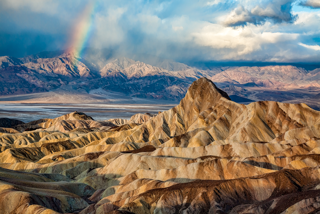
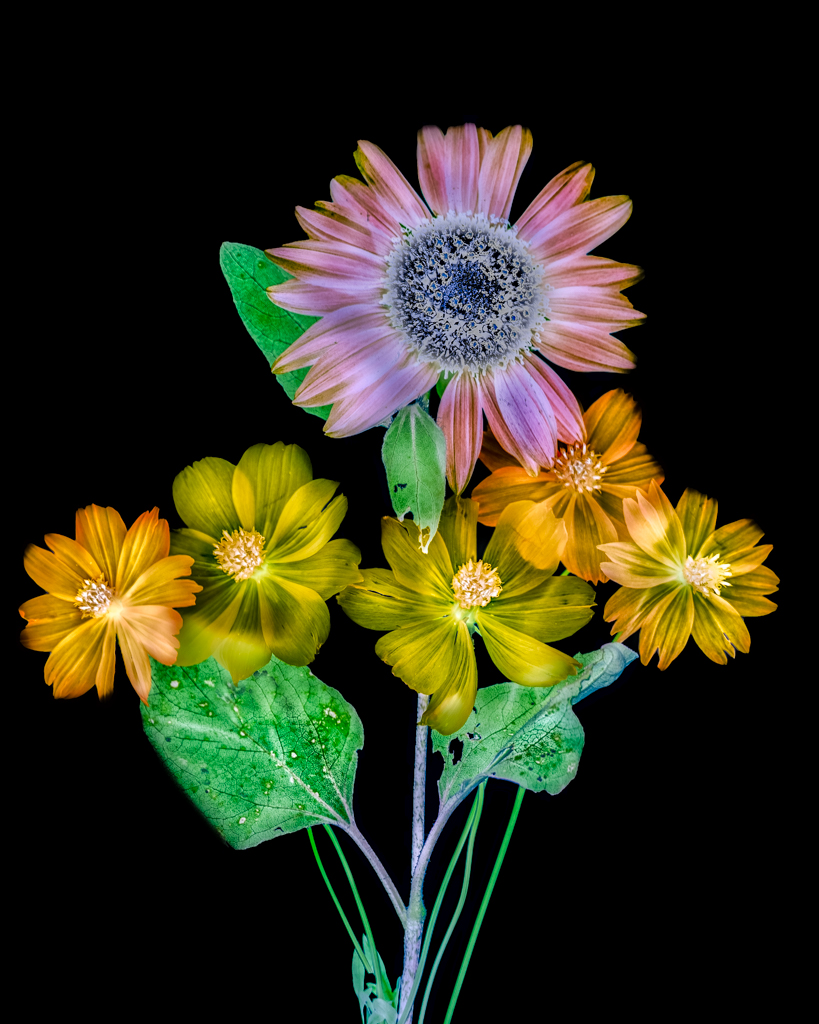
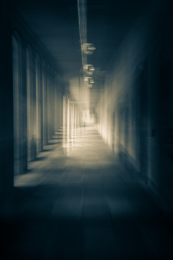
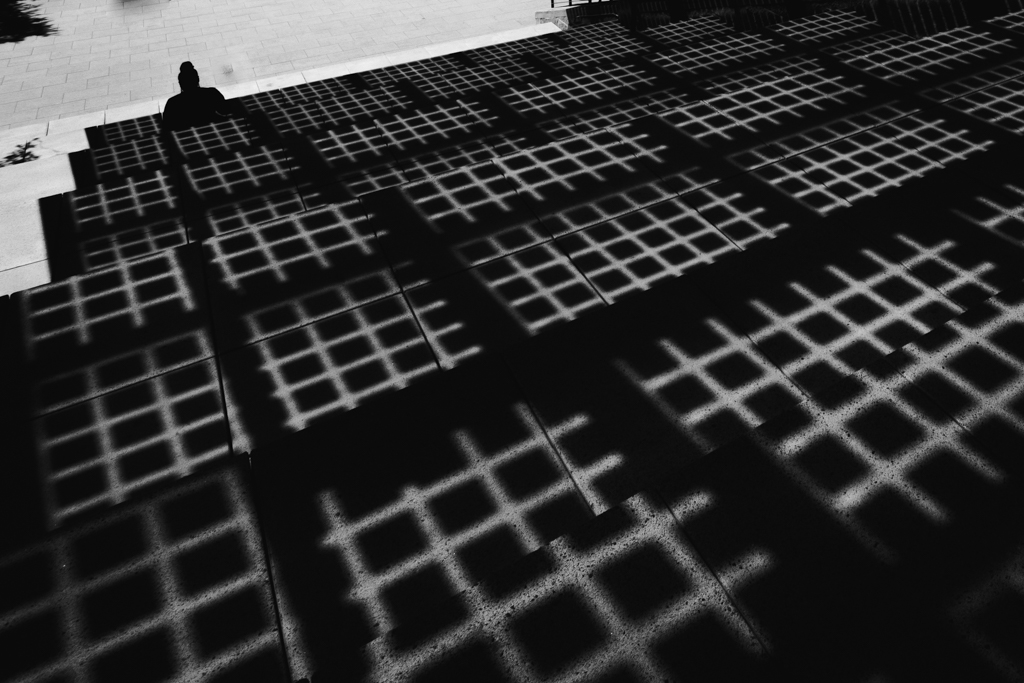
You might guess that I really like this kind of image. You have a beautiful and interesting subject. The color palette is very pleasing. I have to agree that second image looks better. You've gained the interesting downed fence and lost the distracting and unattractive dead trees. You have a great deal of depth with areas of interest in foreground, midground and background. Well done. |
Oct 7th |
| 5 |
Oct 19 |
Comment |
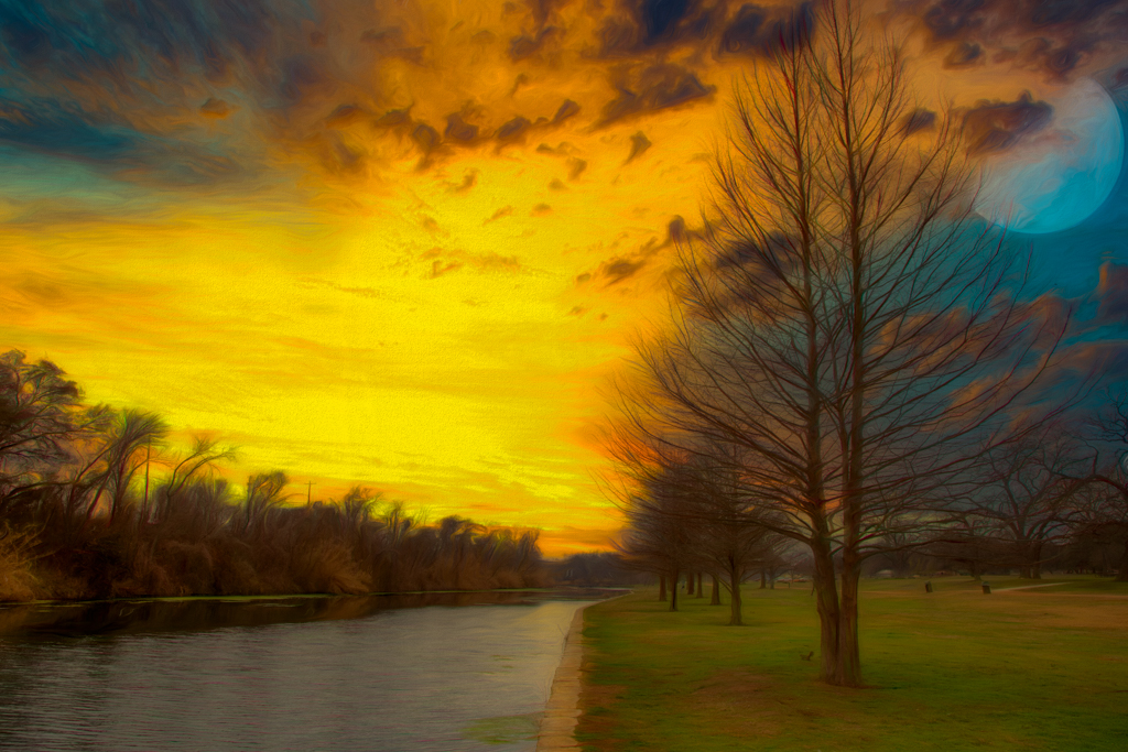
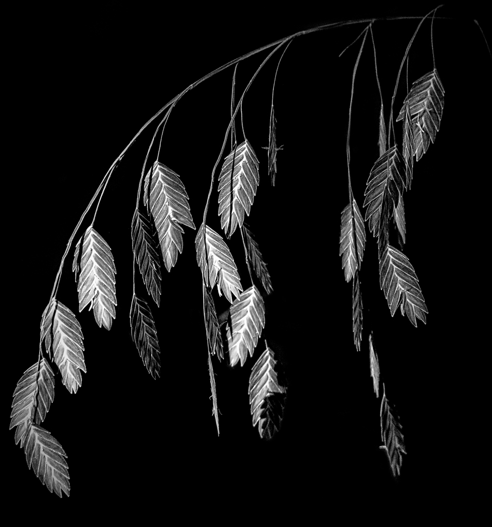
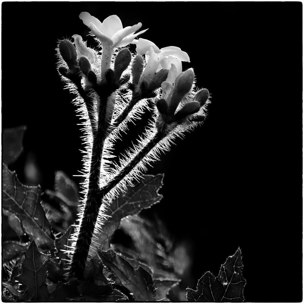
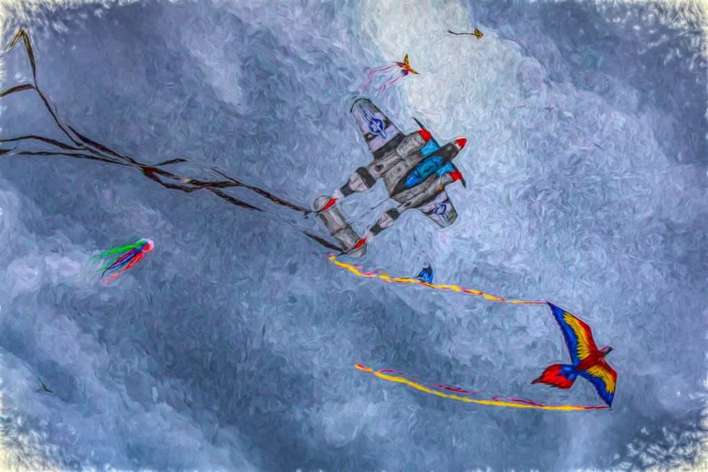
I really like this abstract. Without the history, I would be clueless as to the subject, which is a good thing, in my opinion. I love the detail and color palette. There truly is a 3d look with the grass looking liked raised buttons. You have a good eye for subjects. |
Oct 7th |
| 5 |
Oct 19 |
Comment |
Richard,
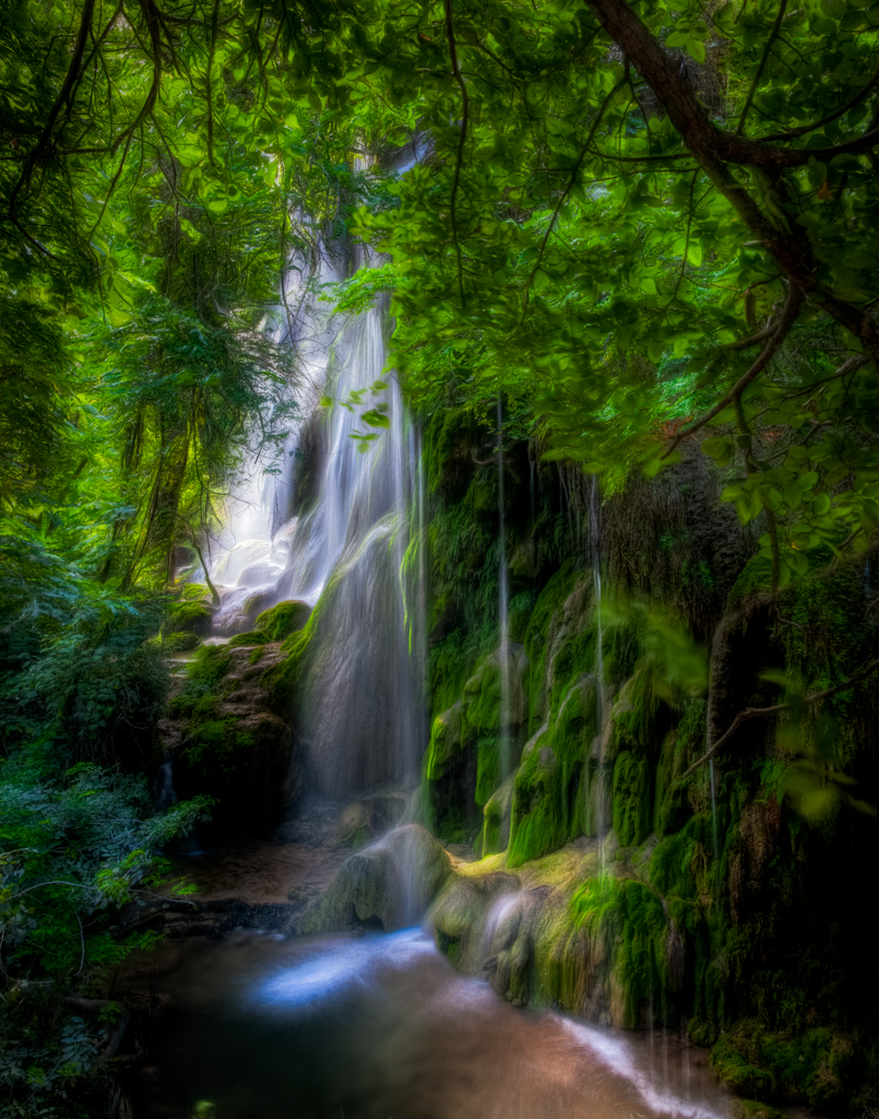
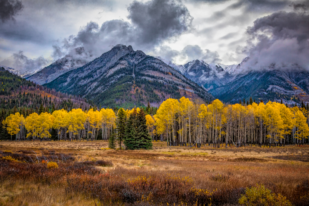
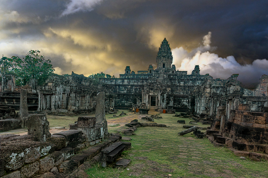
This is a very interesting subject. It has lots of texture and detail to examine. I like the composition, with the path angling from left to right. I agree that the sky needed replacing, but I thinkthe old sky is leaking through the tree on the left. This could be solved by using a combination of blending modes and masking. I gave it a try with a different sky that tries to maintain the mood you developed. This must have been a fascinating trip! |
Oct 7th |
 |
| 5 |
Oct 19 |
Comment |
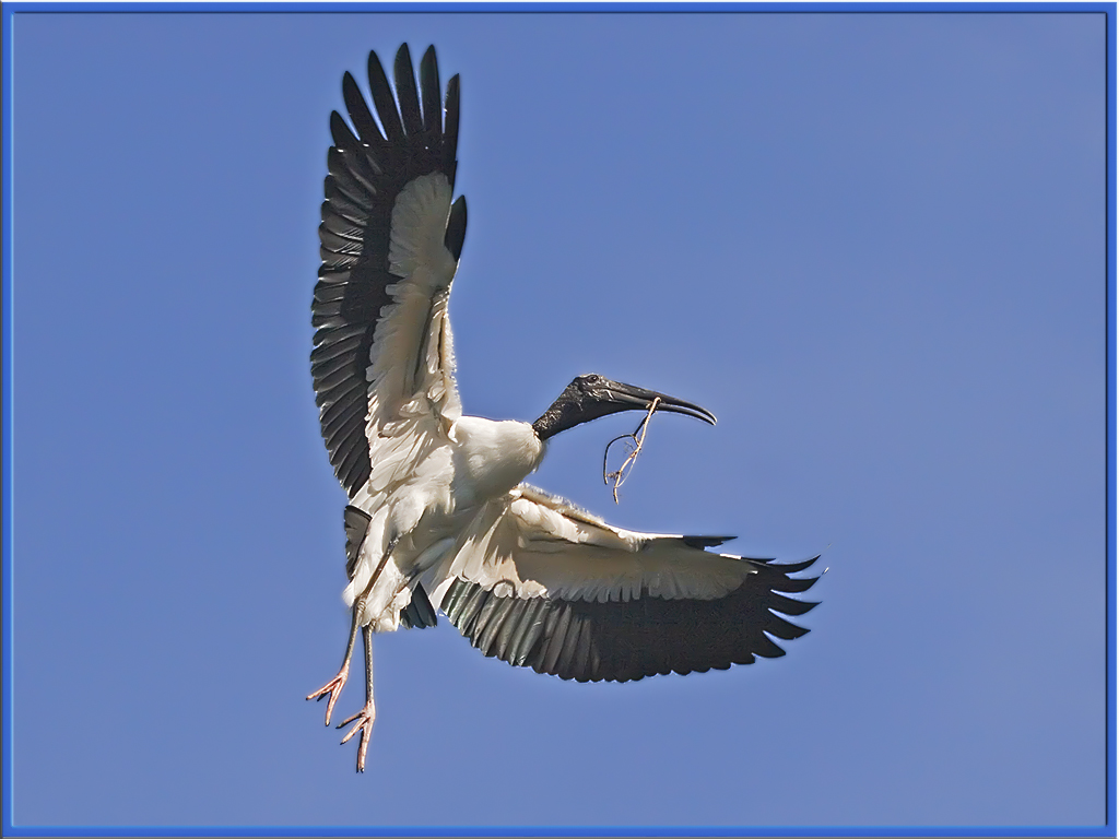
Nick,
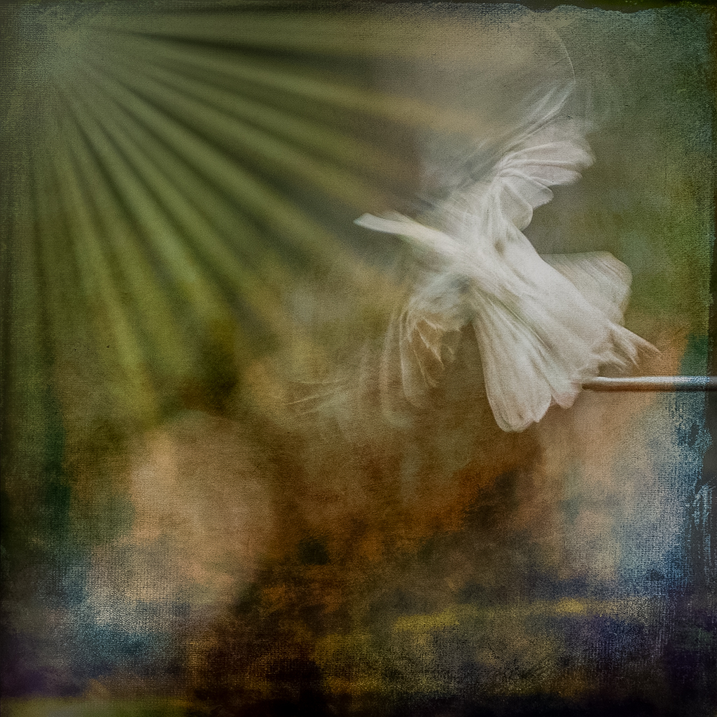
I really like this shot. The full wingspread gives it a strong impact. I think that the framing is perfect. The detail in the feathers is very good. The twig does tell the story. My only suggestion is to use some noise reduction in the shadows. Perhaps you might consider reducing your ISO the next time out. Here is my attempt at noise reduction with Lightroom.
|
Oct 4th |
 |
| 5 |
Oct 19 |
Comment |
Thanks Richard,
I should have made better use of the rule of thirds. |
Oct 3rd |
| 5 |
Oct 19 |
Comment |
Barbara,
Nice job on capturing this dog's woeful expression. Good use of depth of field to add emphasis to your subject. Your sharpening and or clarity modifications are also well done. The background and grey light seem to increase the desperate feel to the subject. The stroke looks good to me, as well. I would like to see a little more exposure in the collar to bring out some detail, but this is a rather minor issue.
|
Oct 2nd |
| 5 |
Oct 19 |
Comment |
David,
First let me say that this a very creative use of the original image. It gives a strong impact of other worldliness. The central character has sort of a Norman Rockwell look to him. You did a great job illuminating him. His pose is perfect as he stares out into the distance. I like the use of complimentary colors for the 2 major spaces. The use of textures gives the foreground a very fantastical look while the background has a foreboding desert like appearance, giving a strong contrast between the two spaces.I have no worthwhile suggestions for improvement. This is a job well done!
|
Oct 2nd |
8 comments - 3 replies for Group 5
|
8 comments - 3 replies Total
|