|
| Group |
Round |
C/R |
Comment |
Date |
Image |
| 5 |
Sep 19 |
Comment |
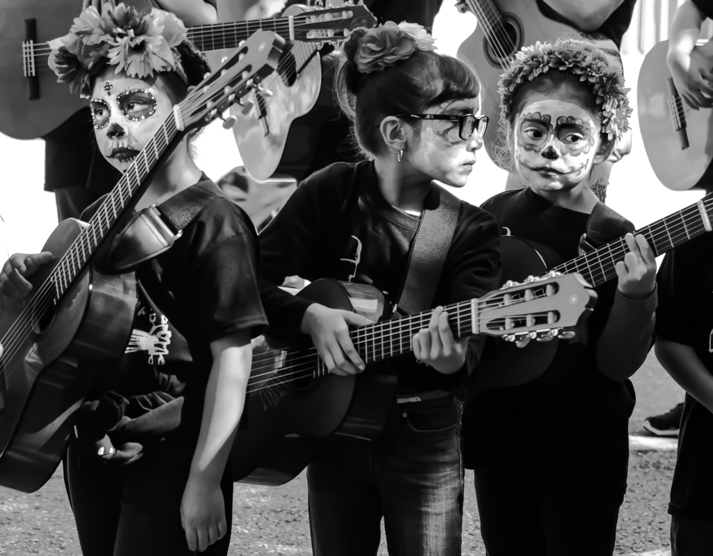
I think that you did a good job toning down the background highlights and cloning out distracting elements. The facial features and hair are quite sharp which brings the viewer's eyes back to them. |
Sep 23rd |
| 5 |
Sep 19 |
Comment |
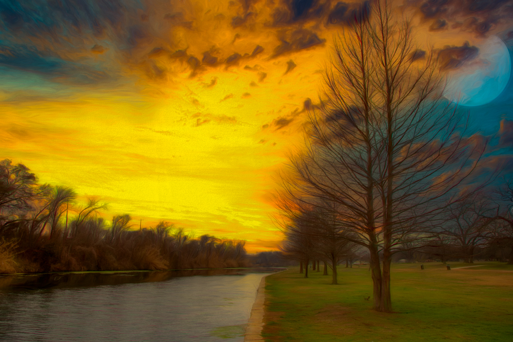
Excellent lighting and good use of depth of field. Looks like you really leveled up on the "cuteness" slider. |
Sep 23rd |
| 5 |
Sep 19 |
Comment |
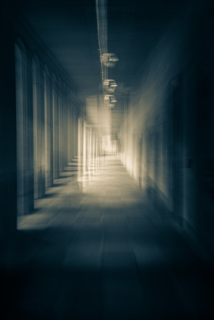
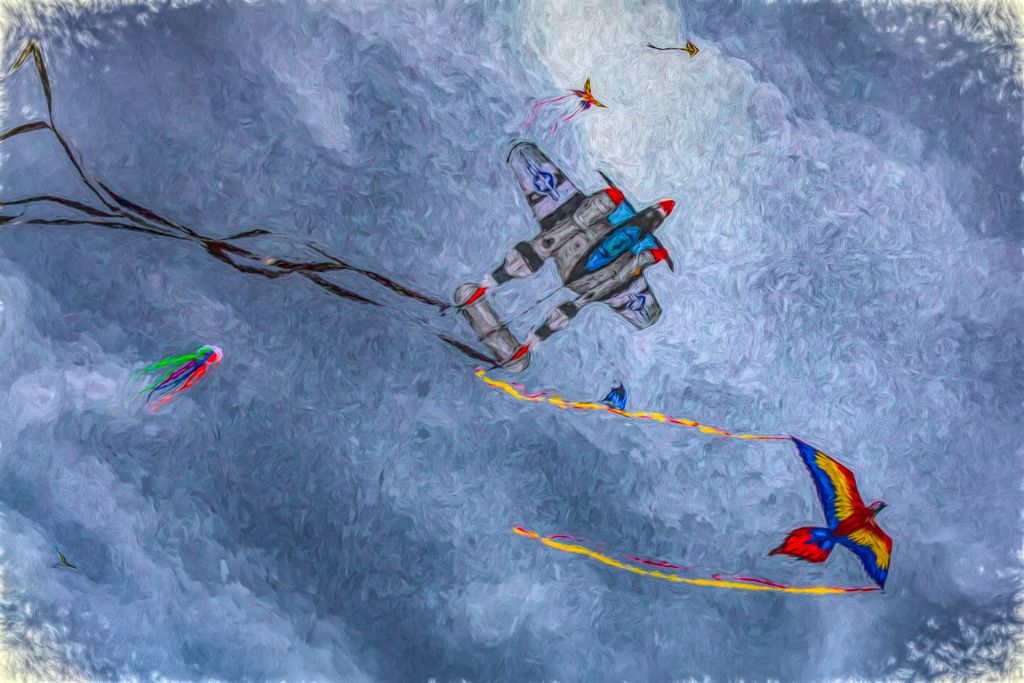
Nicely conceived and executed. I like the fade in of the clouds over the checkerboard pattern. |
Sep 23rd |
| 5 |
Sep 19 |
Comment |
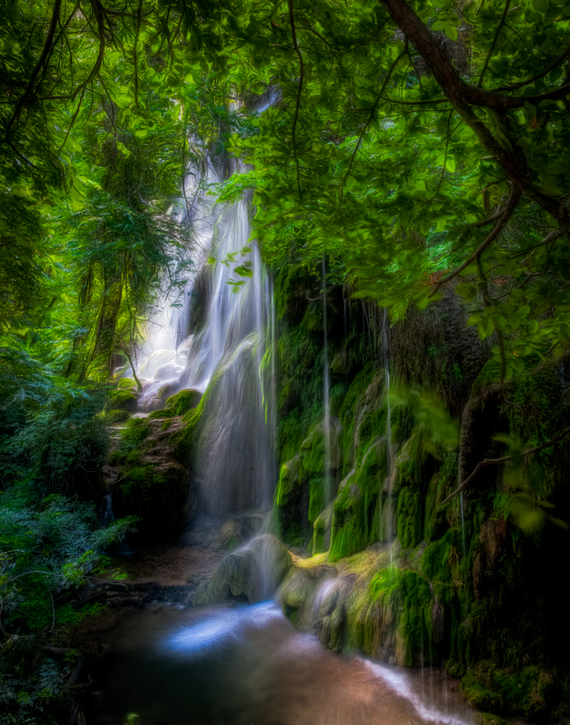
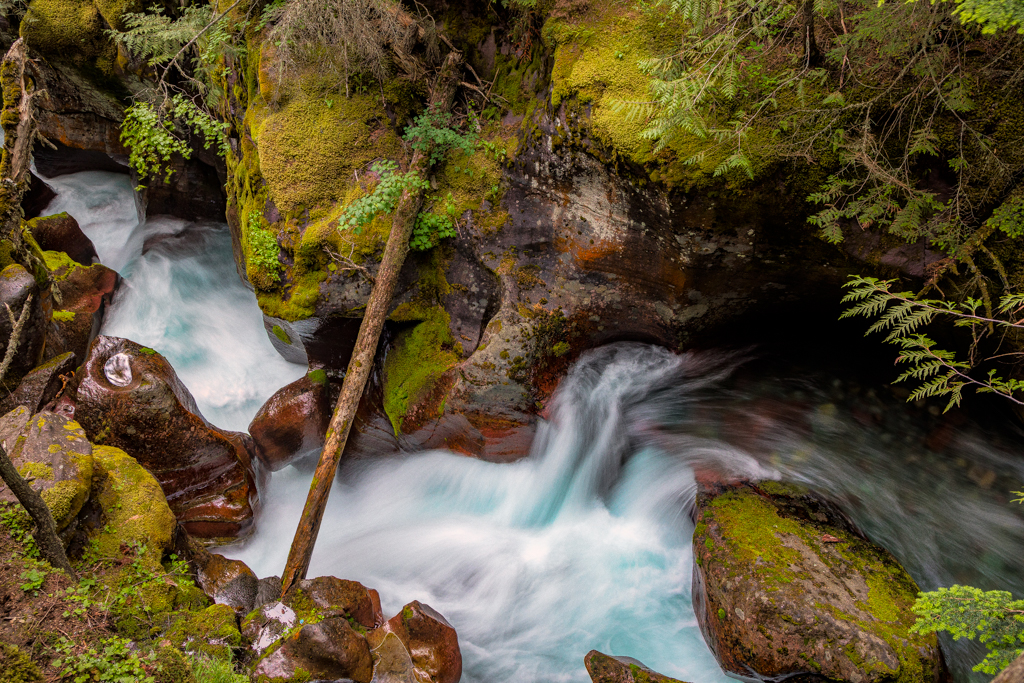
This is a great capture. Everything that needs to be sharp is sharp. I like the lighting and framing. The noise or grunge around the subject's head is distracting to me, however. I would try to reduce that. |
Sep 18th |
| 5 |
Sep 19 |
Comment |
David,
I love the scene and do not find it too blurry. The color palette works for me. The boy seems incongruous to me and not just because of the color. The scene speaks of a place that has seen better days, so perhaps an aged person in the scene would work. |
Sep 18th |
| 5 |
Sep 19 |
Comment |
Barbara, I really like the lighting for this still life. I too, like the darkening of the background and the use of a mister. Both help create some pop. I also agree that it needs more depth of field. I find the blur distracting. Lastly, I feel that these luscious cherries deserve a better bowl. A darker ceramic bowl would be my choice. |
Sep 18th |
6 comments - 0 replies for Group 5
|
6 comments - 0 replies Total
|