|
| Group |
Round |
C/R |
Comment |
Date |
Image |
| 40 |
Feb 20 |
Comment |
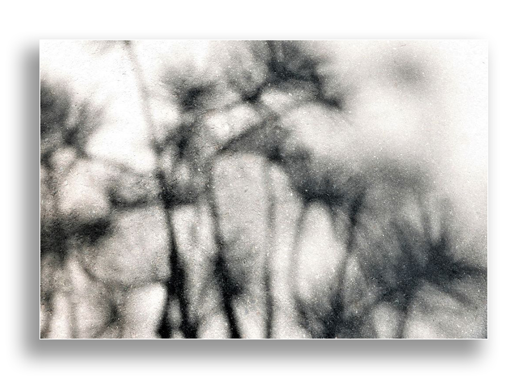
Hi Catherine. I like the interesting texture of this black & white abstract image and think that the placement of the black shapes create a pleasing composition.The reason for your taking this image was the shadows and I think you have done a good job cleaning them up and creating some nice contrast against the sidewalk. I wonder if this image would be improved by including a frame. I've added a white frame, might be worth looking to see if a black frame is better. |
Feb 11th |
 |
| 40 |
Feb 20 |
Comment |
Hi Alison
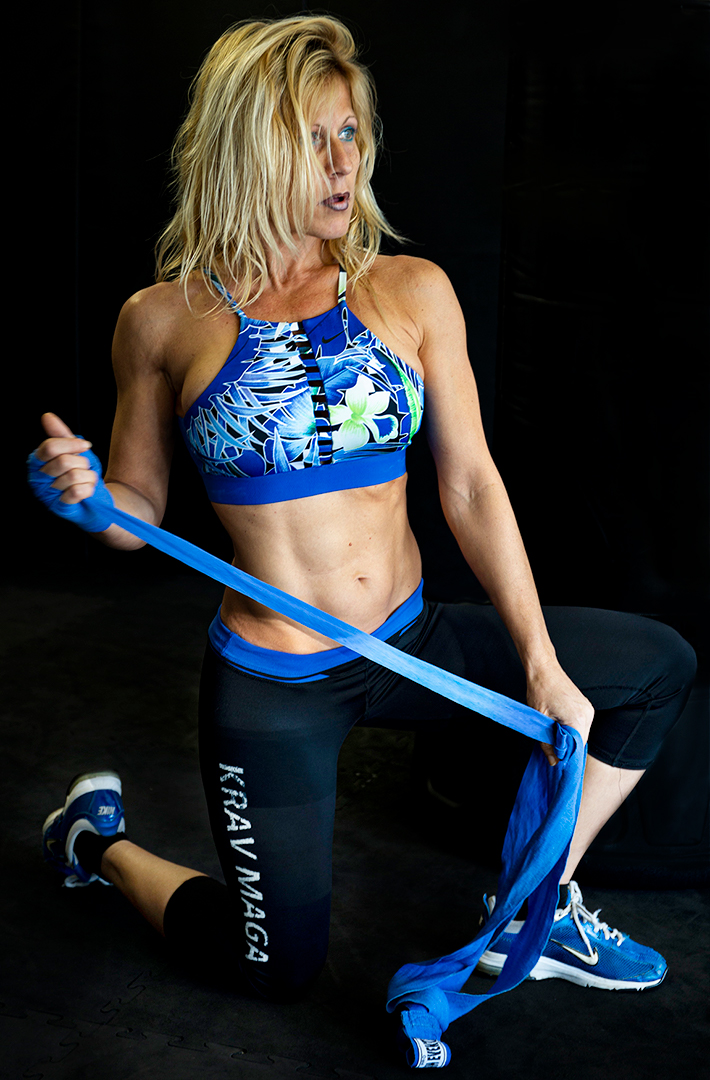
To me this is a lovely image of someone working out and given the poor lighting conditions, I think you have done a great job capturing the detail as you have. I like your composition with the blue strap creating a diagonal line, and the gorgeous bright blue colour against the dark background. To me, the punching bag doesn't add anything & perhaps the image could be improved by removing it completely - by painting it over with the background colour or clone stamping. I wonder if it would be worth lightening the shadows & bringing a bit more detail into the black lycra as to me they are lost against the dark background. |
Feb 11th |
 |
| 40 |
Feb 20 |
Comment |
Hi Jamie
I think this is a nice snowscape.I like how you have captured the creek creating a leading line into your image. To me, your image almost looks cross processed which I think adds to this black & white image. For me, the mountains are the main feature with their lovely texture & contrast.
I am inclined to think the the trees are a distraction, stopping the eye in the middle of the image. I am not sure whether its the darkness of the trees or a sort of "haziness" along the tops of the trees or perhaps they just make the scene too busy.
Might be the image quality on this website but to me the foreground focus looks soft in comparison to the mountains.What were your camera settings? |
Feb 11th |
| 40 |
Feb 20 |
Comment |
Hi Andrew
Great job on stitching all these images together, I wouldn't have noticed.Although to me the perspective is a bit distracting, for my eye the vertical & horizontal lines are all nice and straight. I like your choice of aperture to bring out the textures and colours of the building. I am drawn to the archway and what is behind the building. Perhaps increasing contrast, brightness and saturation in that area would enhance the image. |
Feb 11th |
| 40 |
Feb 20 |
Comment |
Hi Henry
I am also not too keen on the blue filter and feel that the original image has some real potential. There seem to be some lovely pastel tones in the sky which could be enhanced and & for me, the bench would make a nice main subject with a bit more contrast & brightness to draw the eye more towards it.I think the original actually looks more freezing& uninviting. I find the composition of this image pleasing. |
Feb 7th |
| 40 |
Feb 20 |
Comment |
Hi Julie. I really like this image and for me the use of sepia tones is perfect with the slightly dull & misty lighting. I think that having the boat reflected in the water adds interest and its nice to be able to see the water falling off the paddles.
I would prefer to see a bit more space on the right side of the image, the direction in which the boat is travelling, but cannot see much else I would change.Nice job. |
Feb 7th |
6 comments - 0 replies for Group 40
|
6 comments - 0 replies Total
|