|
| Group |
Round |
C/R |
Comment |
Date |
Image |
| 10 |
Feb 26 |
Comment |
Thanks Mark. It's my go creative unless I need to make some layers. |
Feb 17th |
| 10 |
Feb 26 |
Comment |
I'm seeing your work thru a different light, It's the presented view as the artist intended and that works for me. Well done. |
Feb 12th |
| 10 |
Feb 26 |
Comment |
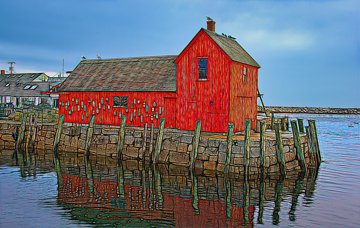
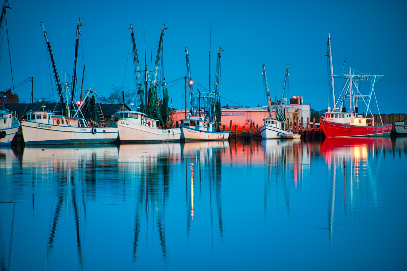
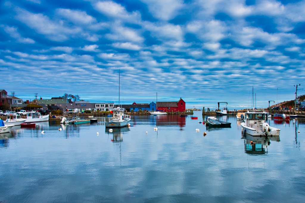
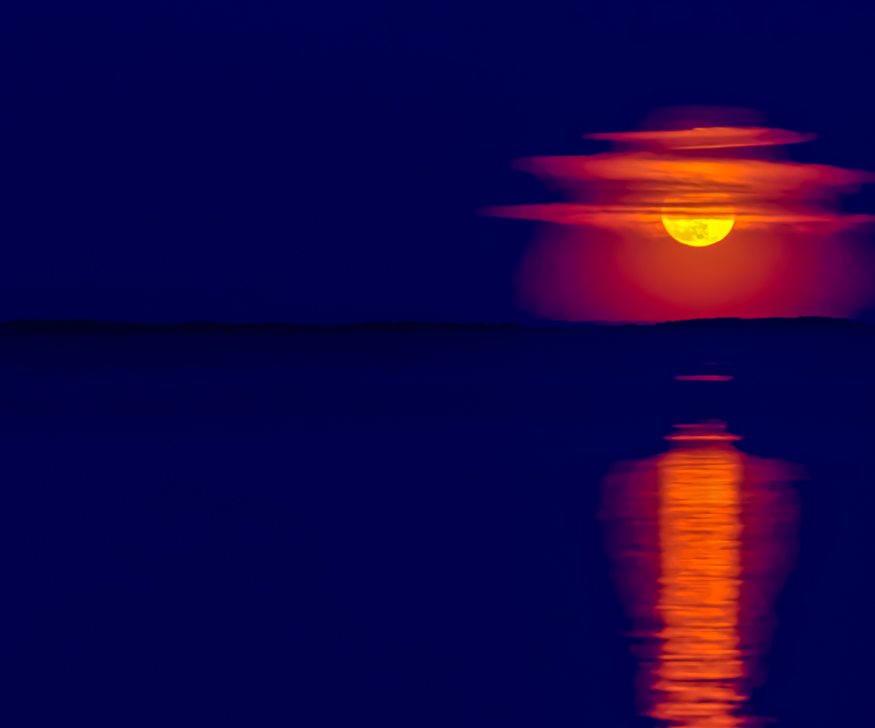
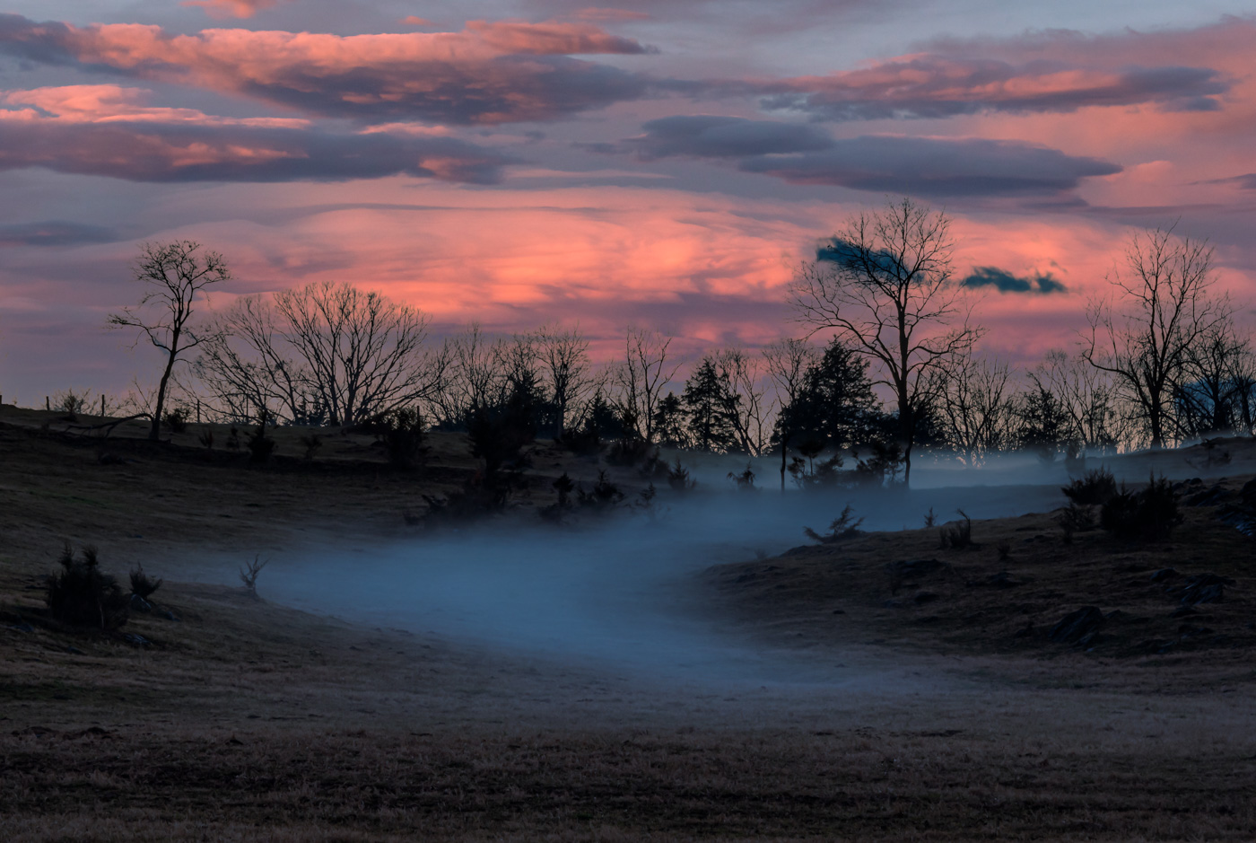
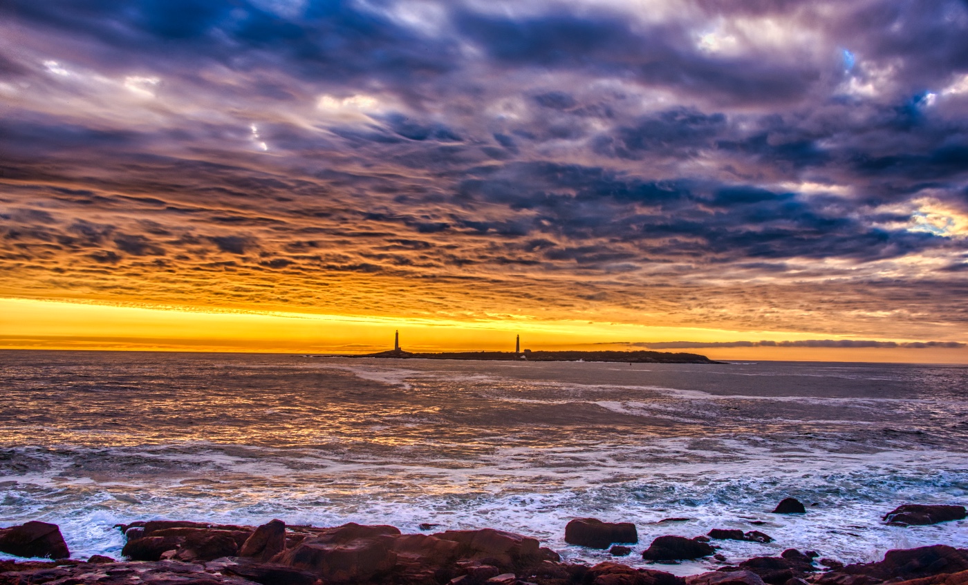
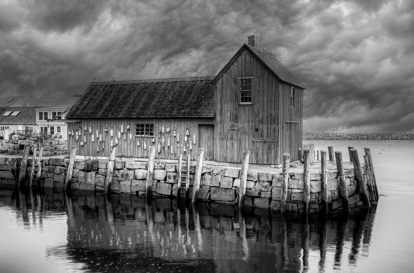
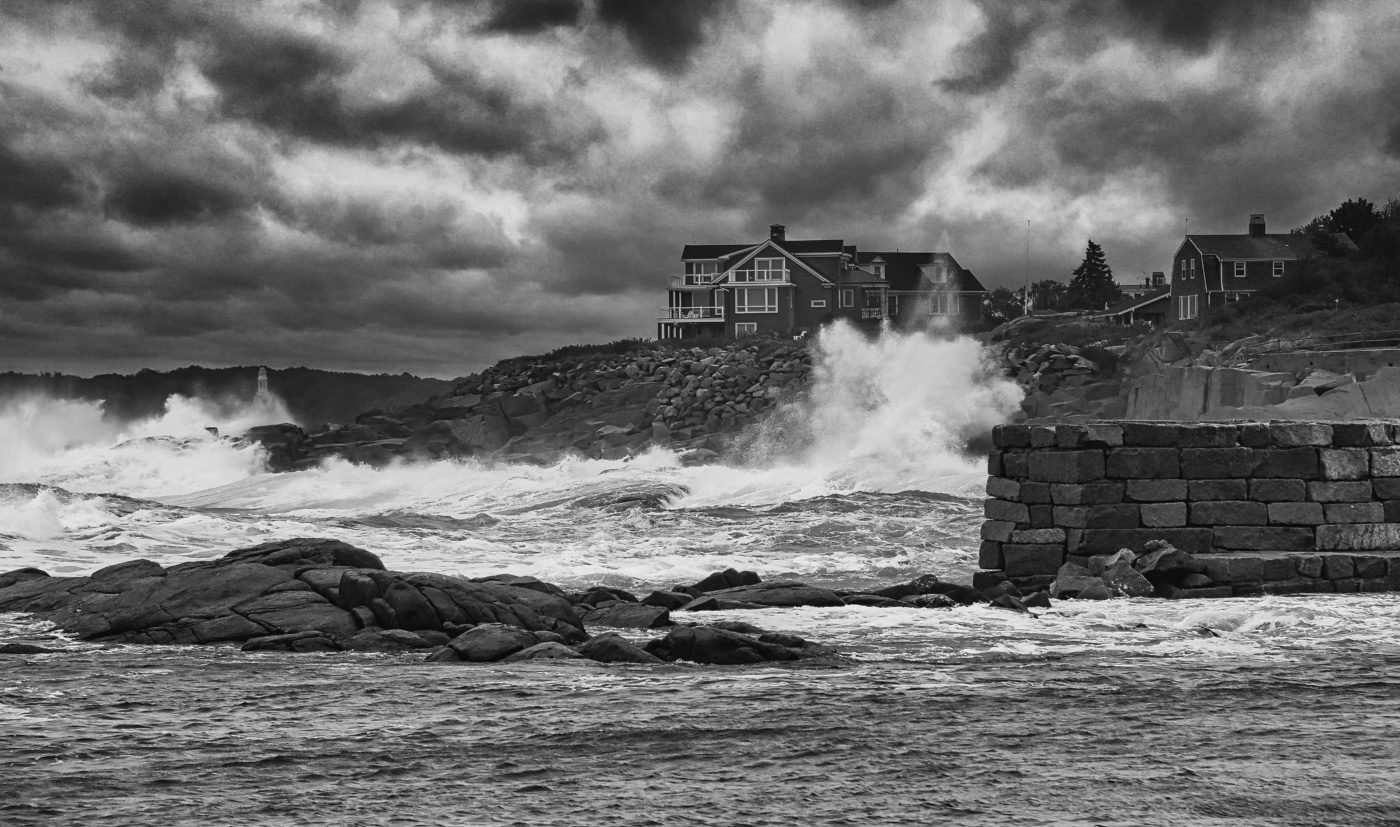
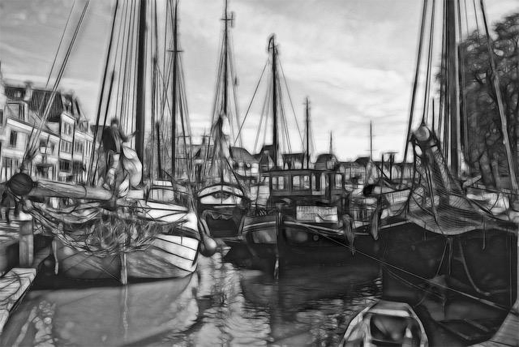
Peter, I'm not a IR photog but think the resulting original colors and objects are confusing. You the artist are free to do as you see fit, but I've been having difficulty commenting on your image as presented. It appears that the beautiful clouds, sky and sun (not a 10AM time on the east coast) in your original came from a well done sky replacement. The water, as a result of the IR gives you final a beautiful tone and the buoy? has more dramatic lighting compared to the original. Perhaps the images are not loaded as you intended? |
Feb 10th |
| 10 |
Feb 26 |
Comment |
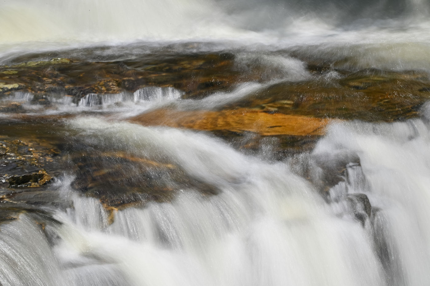
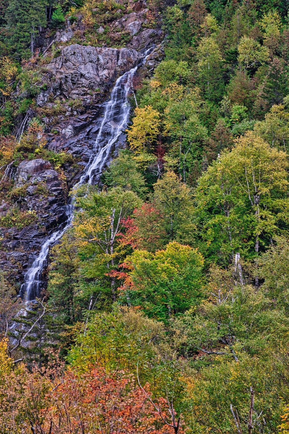
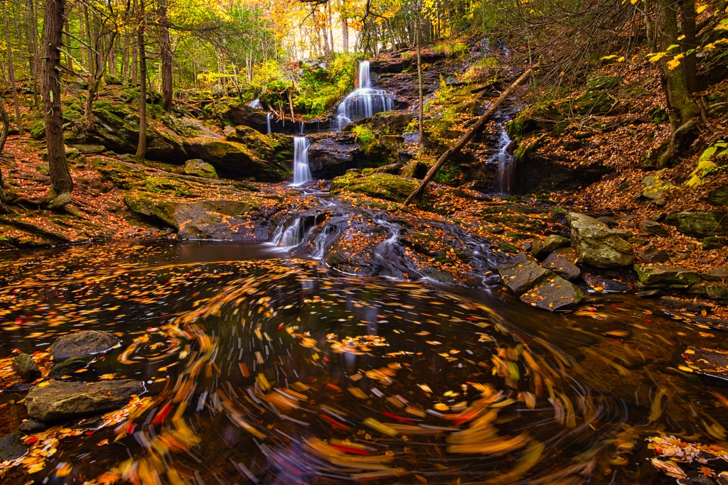
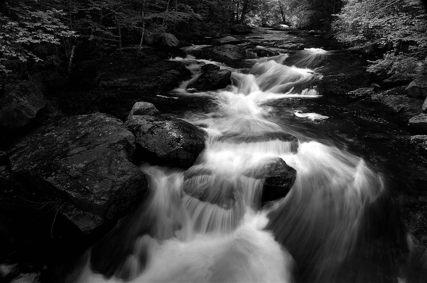
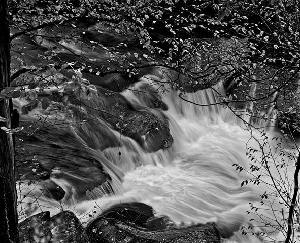
Meredith, you have chosen a beautiful location and I am suggesting you use the landscape options mask selection and reduce the hi lights of the wet rocks. I would also suggest cropping down from the top to eliminate the bright sky. It adds nothing to the image and yes I would remove the tree(s) on the lower left and crop in on the lower left and right (just a little) to bring in balance. Your water is beautiful and since that is really the only subject reducing the distractions will strengthen the waterfalls. |
Feb 10th |
| 10 |
Feb 26 |
Comment |
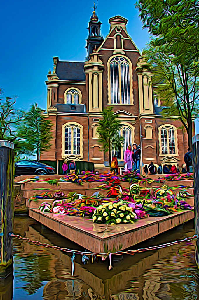
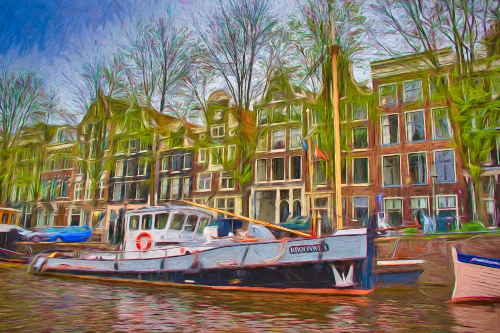
I like the colors and the composition of the final image. I would use the ai remove filter and anticipate that it will do a very good job removing the windows or distractions in the lower left corner. Sometimes Ps does a better job than LrC but try both or regenerate if you need more choices. Cropping or leaving it as is not a better option. |
Feb 10th |
| 10 |
Feb 26 |
Comment |
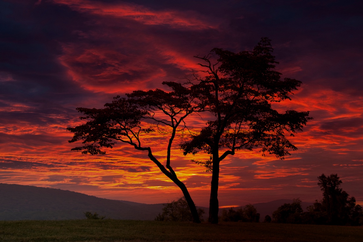
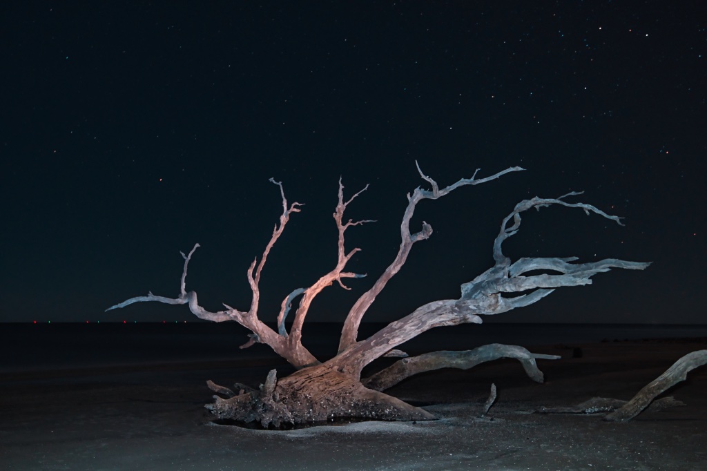
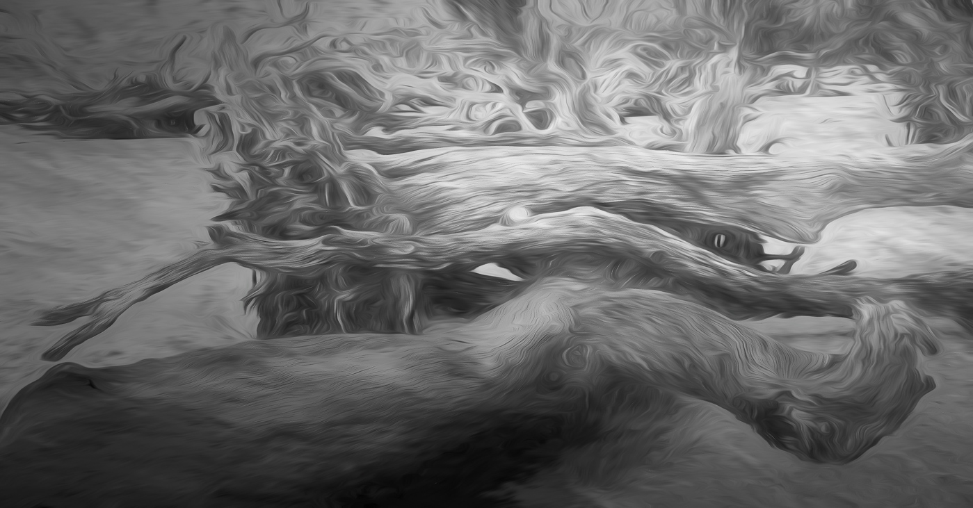
A very nice shot Mark with beautiful composition, and colors. I really enjoy the exposure and resulting texture and structure of the oak tree on the eight side of the frame. |
Feb 10th |
| 10 |
Feb 26 |
Comment |
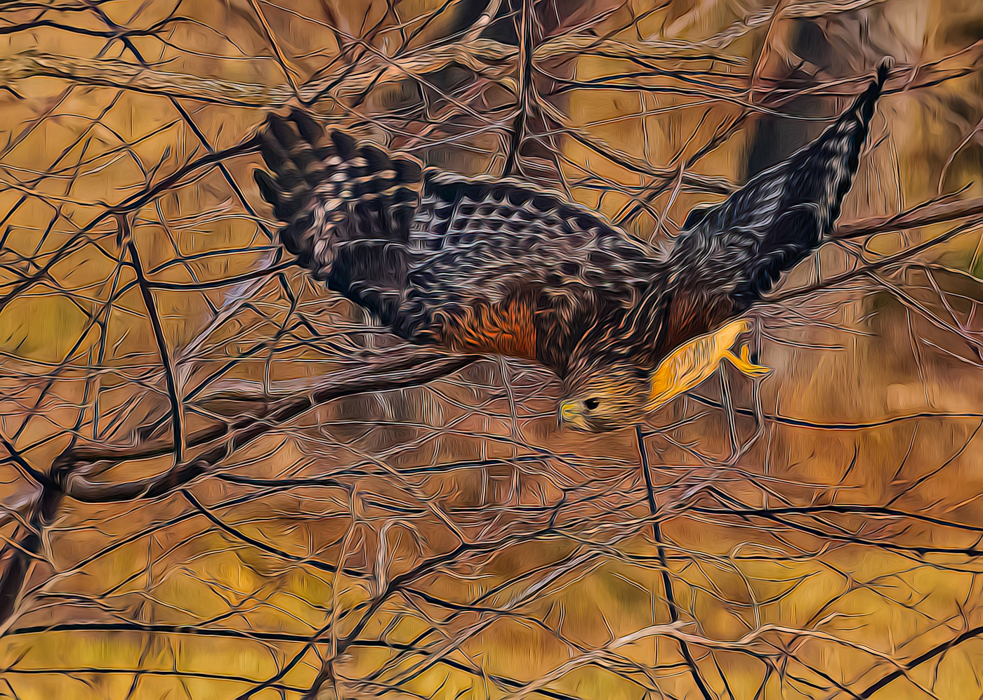
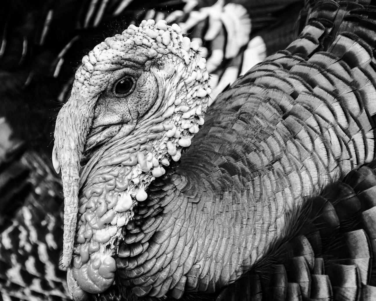
Donna, your Merlin is very well composed and sharp, however, I agree that a higher f-stop would give the image more depth and clarity to the birds prey. Understand it's probably not pretty, but birds of prey need to eat and that's part of the nature story should you wish to enter in nature competition. It is a great capture. |
Feb 10th |
| 10 |
Feb 26 |
Reply |
Thanks Kathy for visiting and your comments. |
Feb 10th |
| 10 |
Feb 26 |
Reply |
Thanks Doug, yes on the crop. I still favor my more natural vibrant colors. |
Feb 10th |
| 10 |
Feb 26 |
Comment |
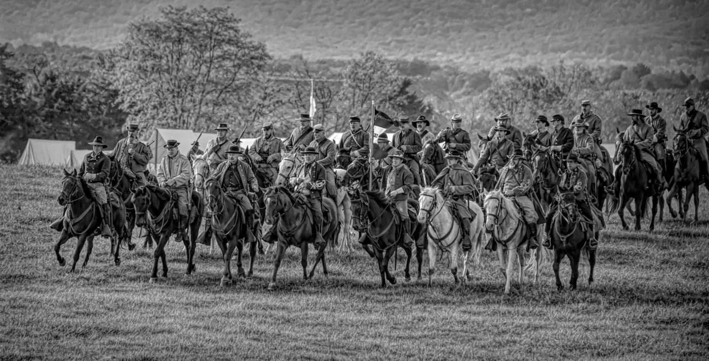
Frans, this is a fantastic image with great colors, composition and perfectly sharp. Even if staged, you did a masterful job of bringing it all together. The red bandana, the riders expression, aqua yolk, beyond colorful water and mud and all in focus.
Score 9.9. |
Feb 6th |
8 comments - 2 replies for Group 10
|
| 29 |
Feb 26 |
Comment |
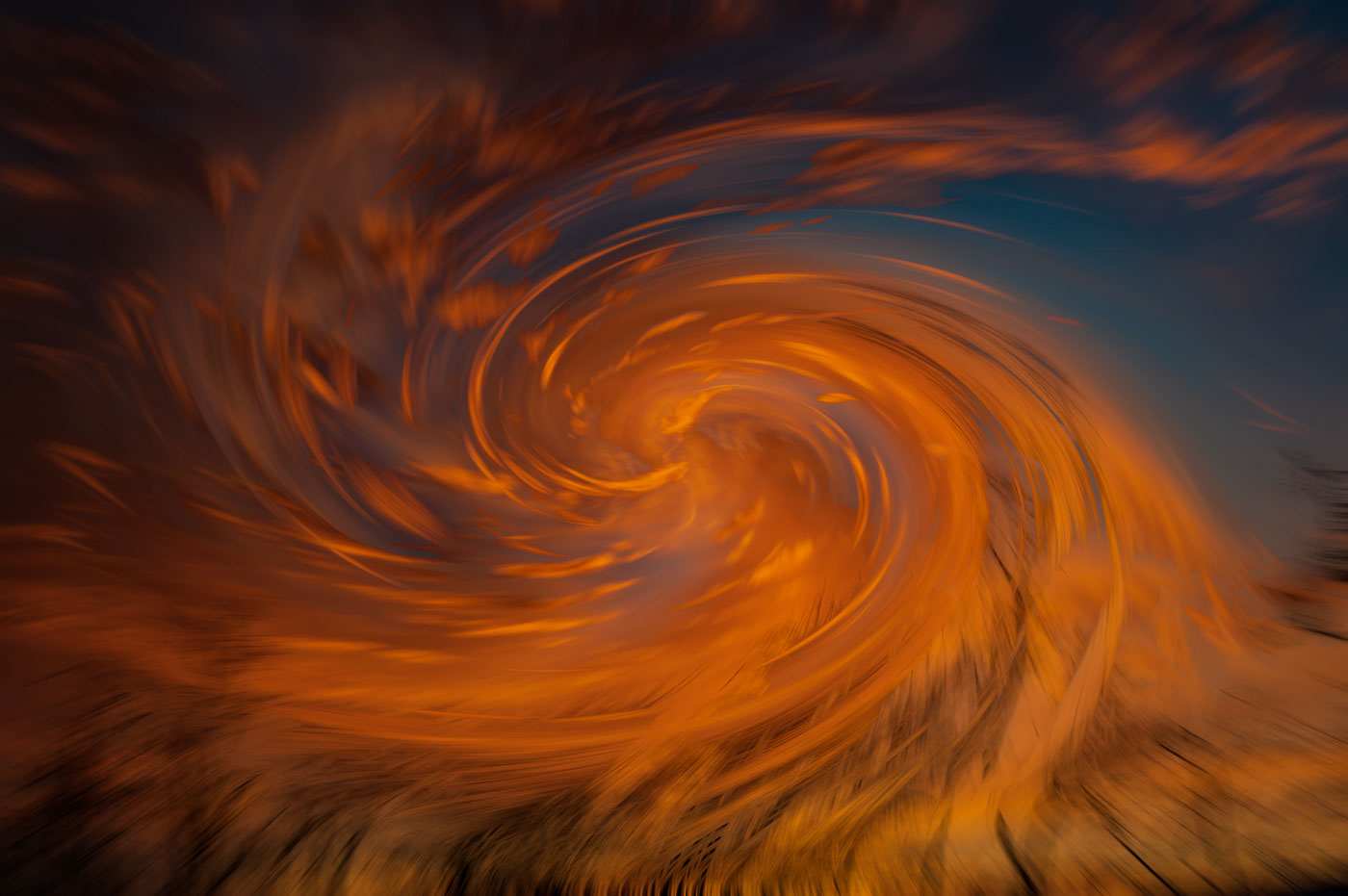
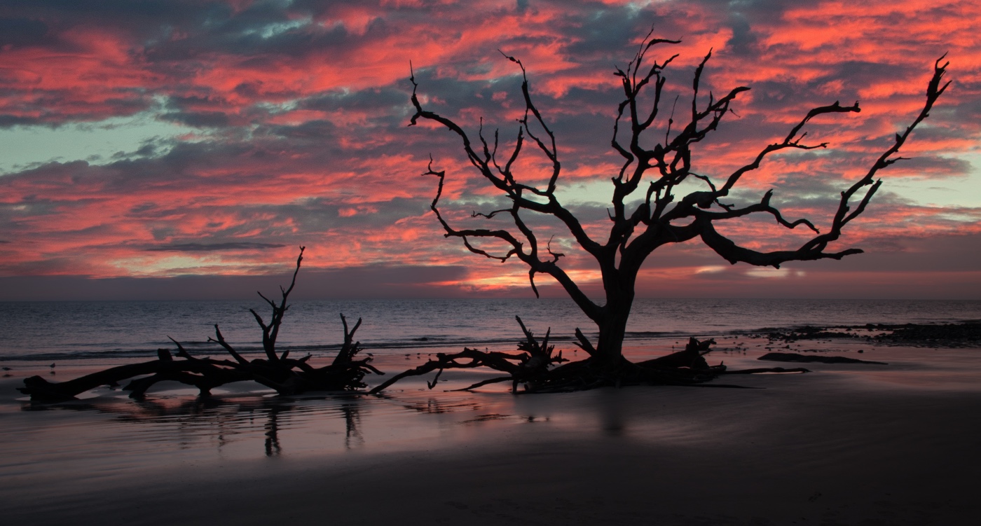
Great shot Tim. I agree on darkening the hi lights on the tree branch, the bright spots in background and cropping tighter. |
Feb 10th |
1 comment - 0 replies for Group 29
|
| 80 |
Feb 26 |
Reply |
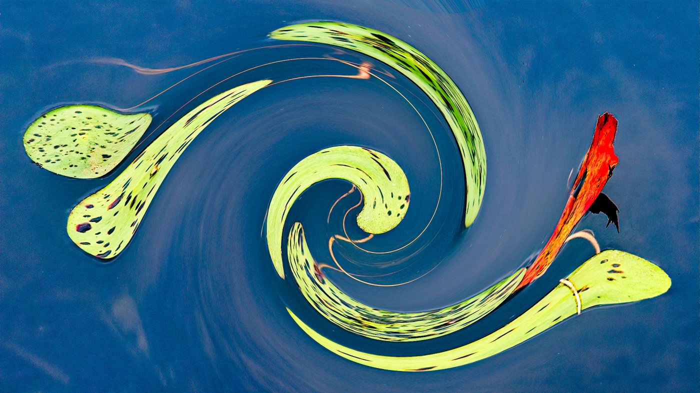
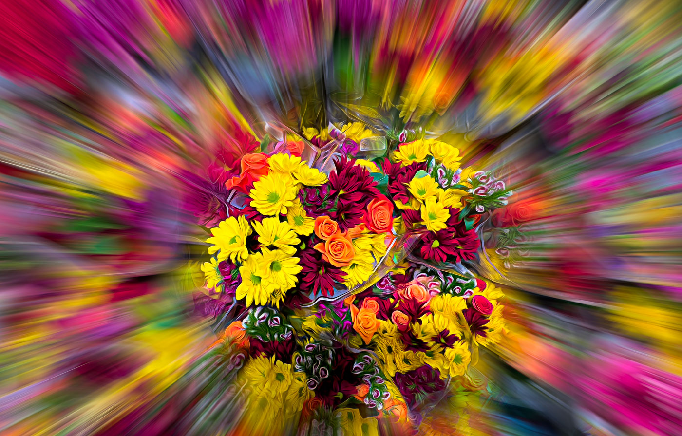
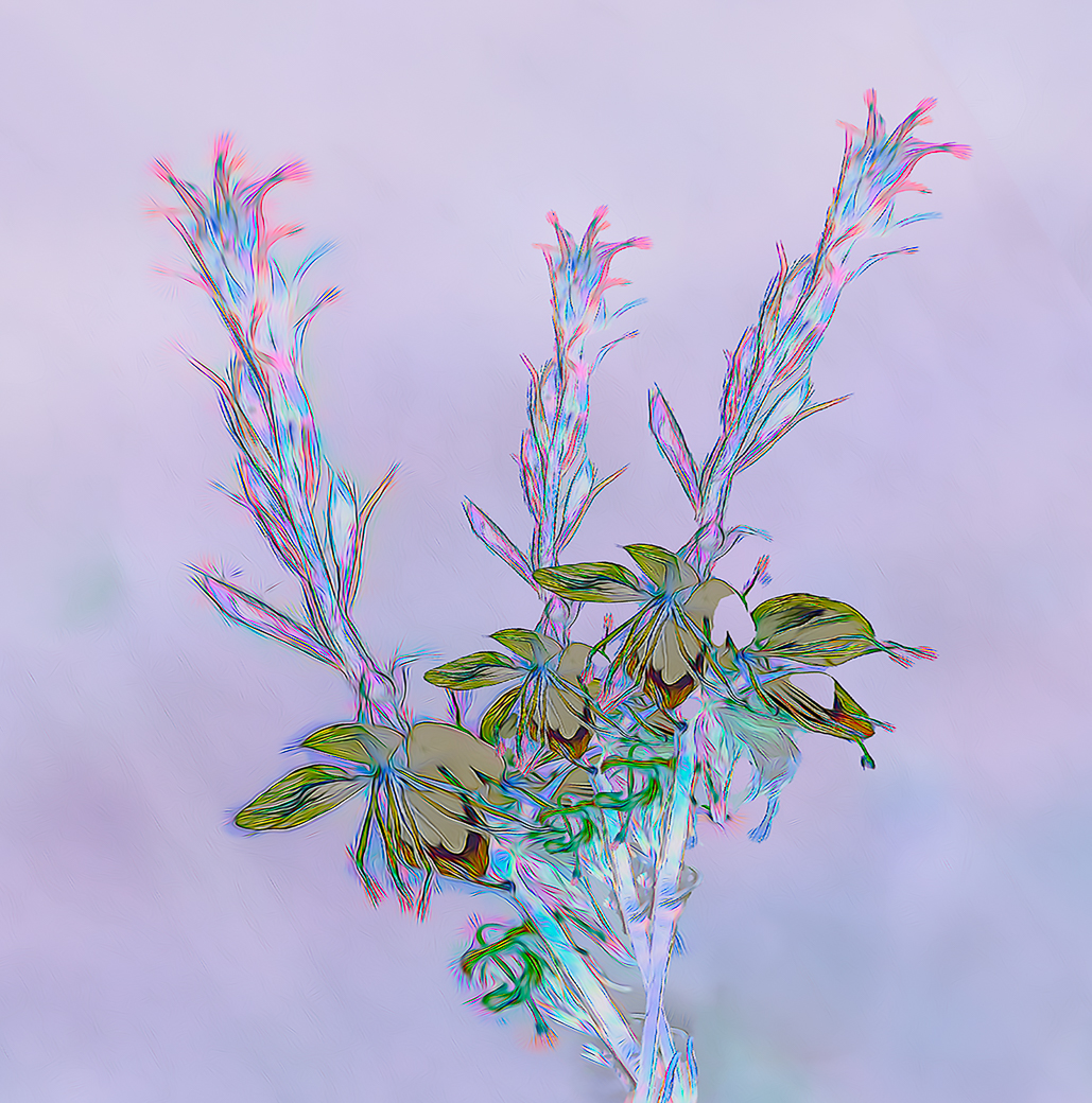
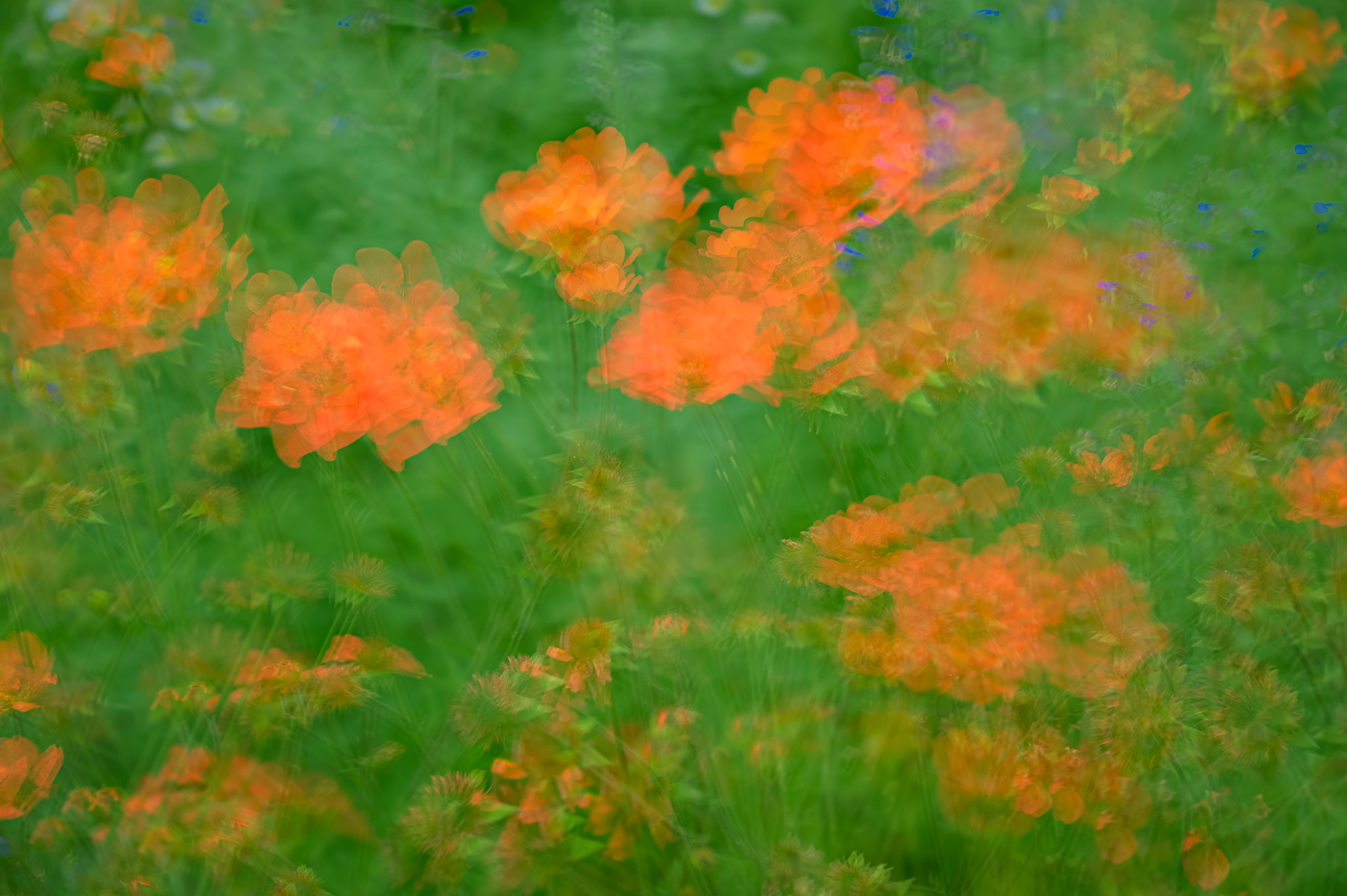
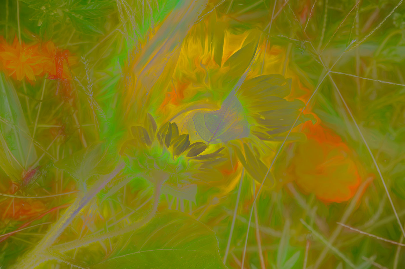
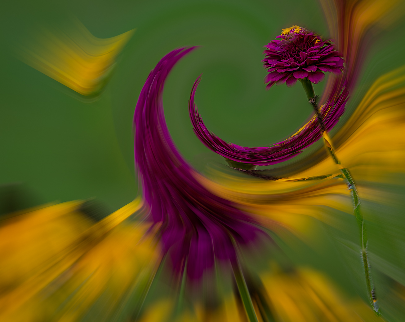
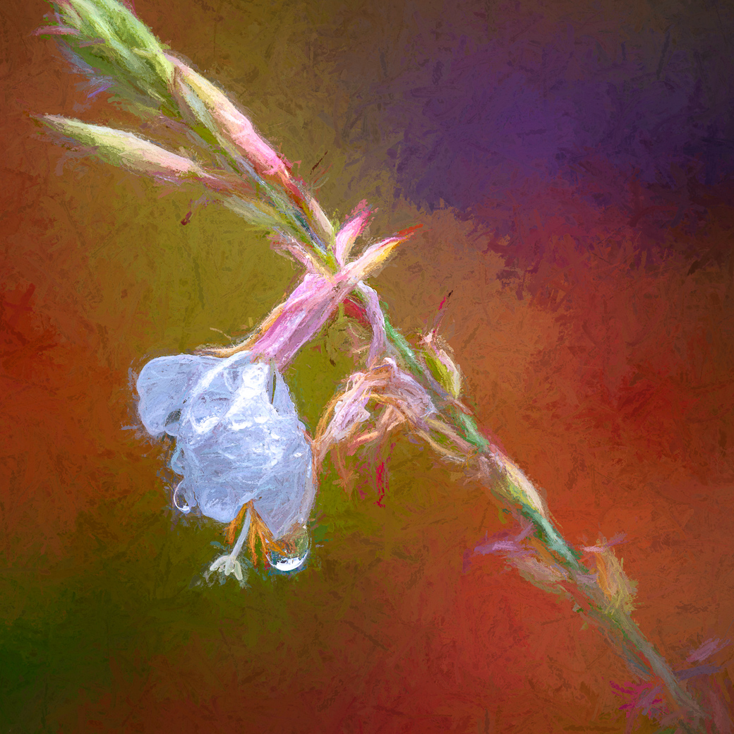
Thanks Ingrid. Water is wonderful to photograph, But,there is non is none in this image. I just played around with the darkening of the stems and using a glow filter to prevent the stems from taking attention away from the blooms. |
Feb 16th |
| 80 |
Feb 26 |
Comment |
Thanks Kamal |
Feb 14th |
| 80 |
Feb 26 |
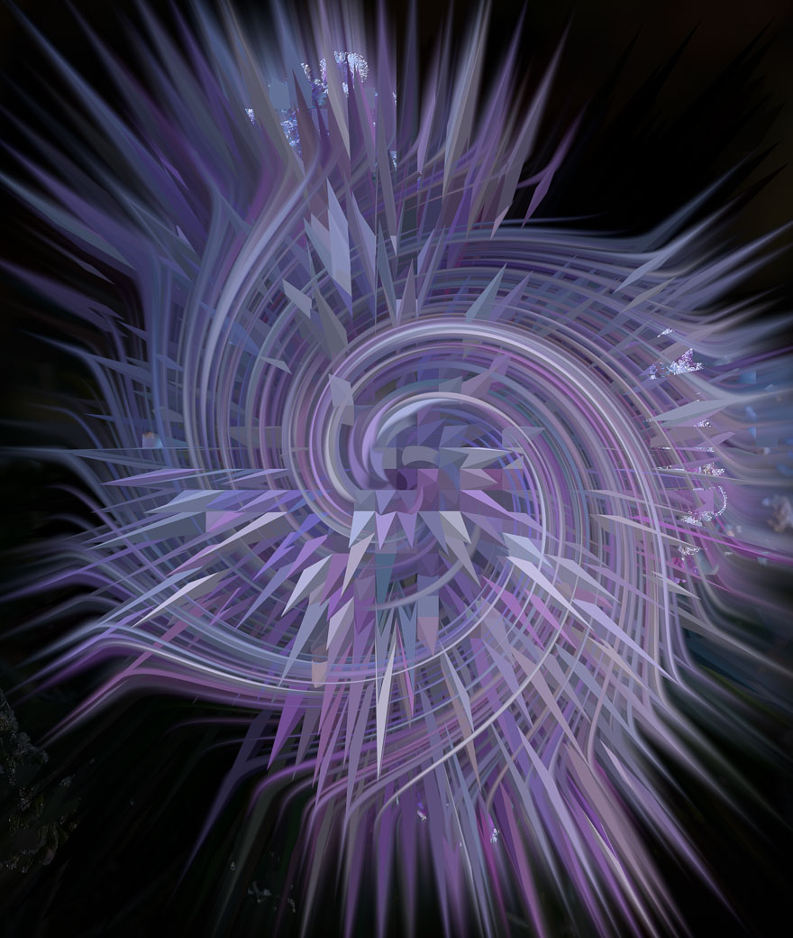
Comment |
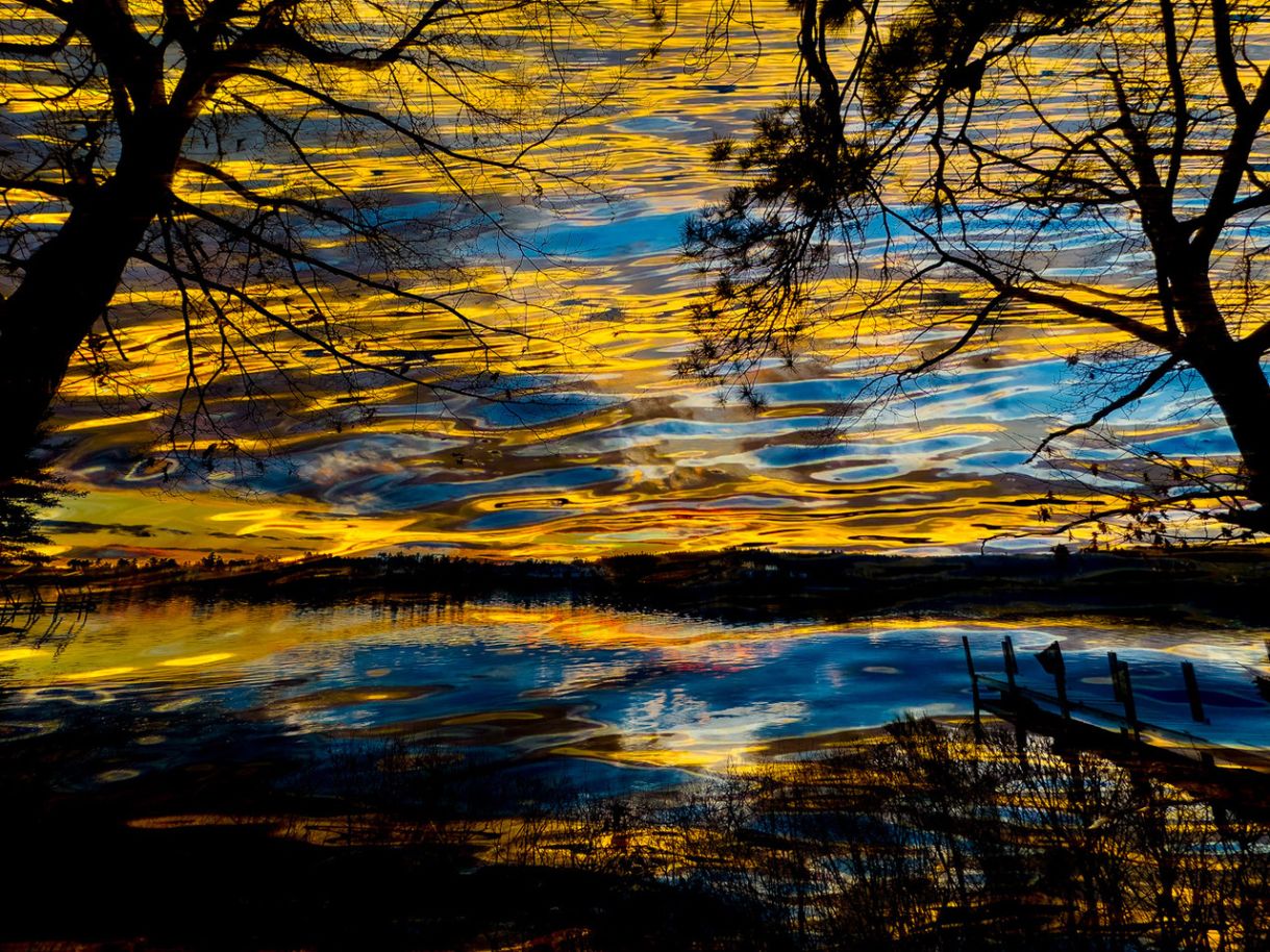
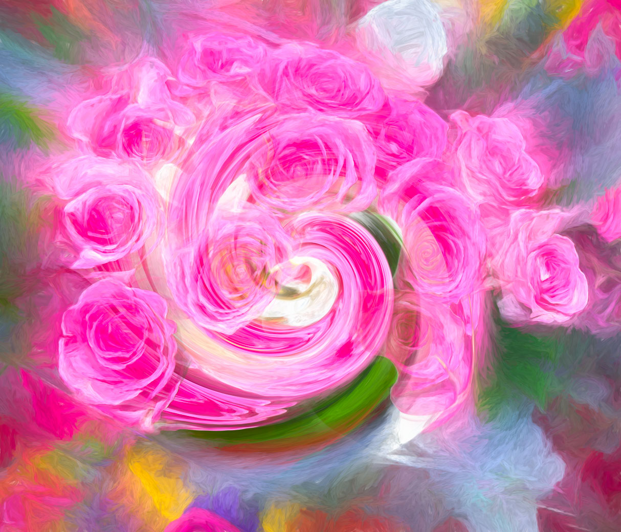
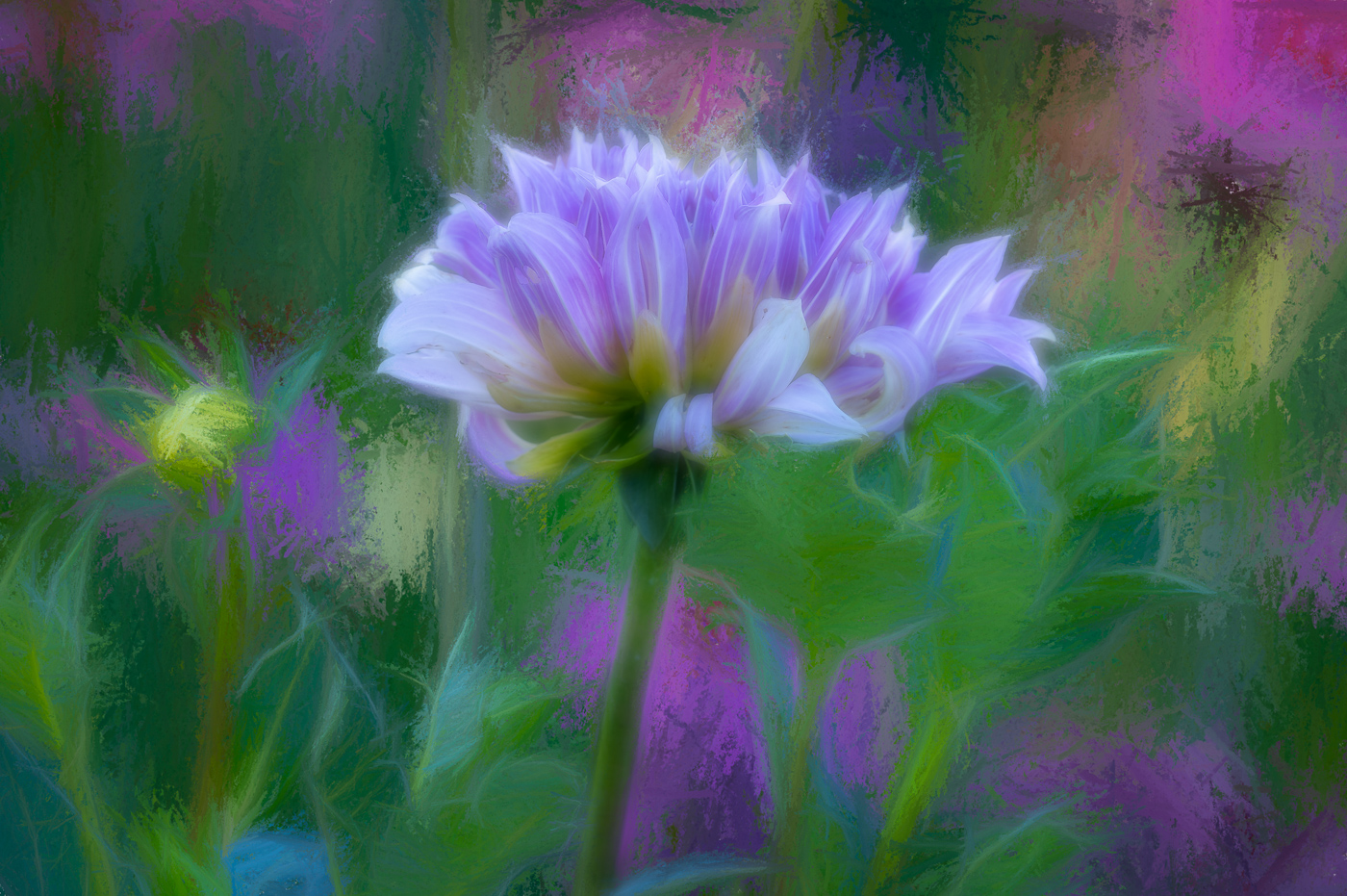
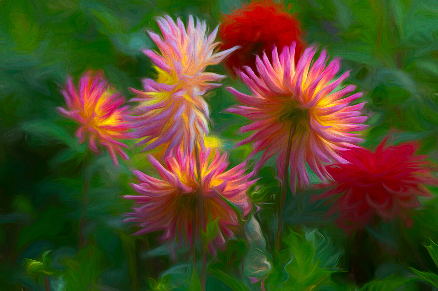
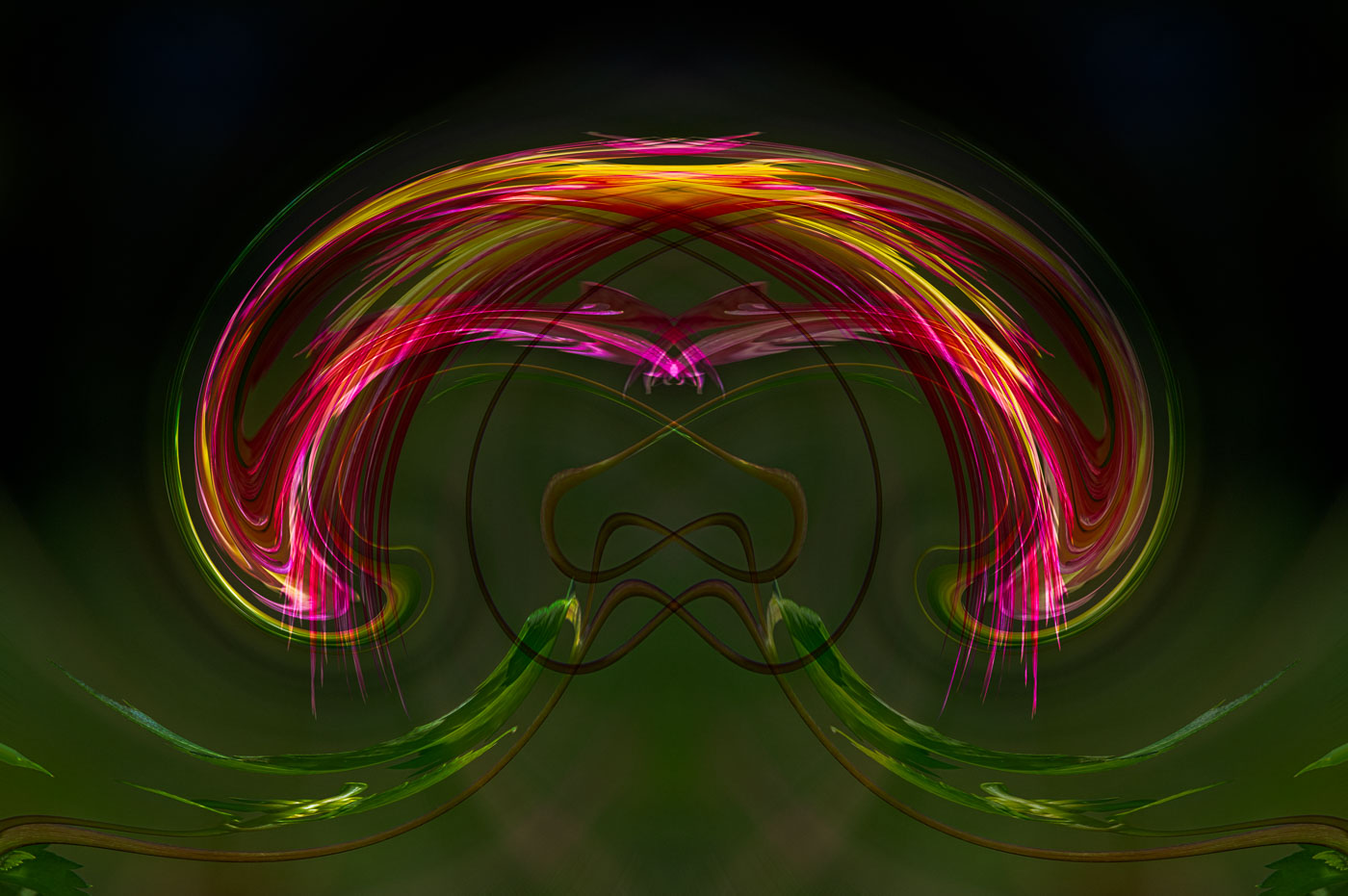
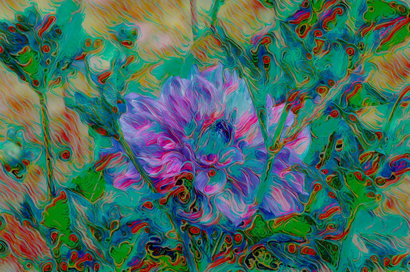
It's great to see many different opinions and solutions as I dip in having taken a break for income taxes. I Love what Rich has done here. The original is nice, but it's just nice, not a "work of Art" that Rich has created from the original. I favor the "Heartfelt" version because it is do unique and comes his heart (and his new equipment) and the extra light in the center is the crowning jewel. Well done. |
Feb 12th |
| 80 |
Feb 26 |
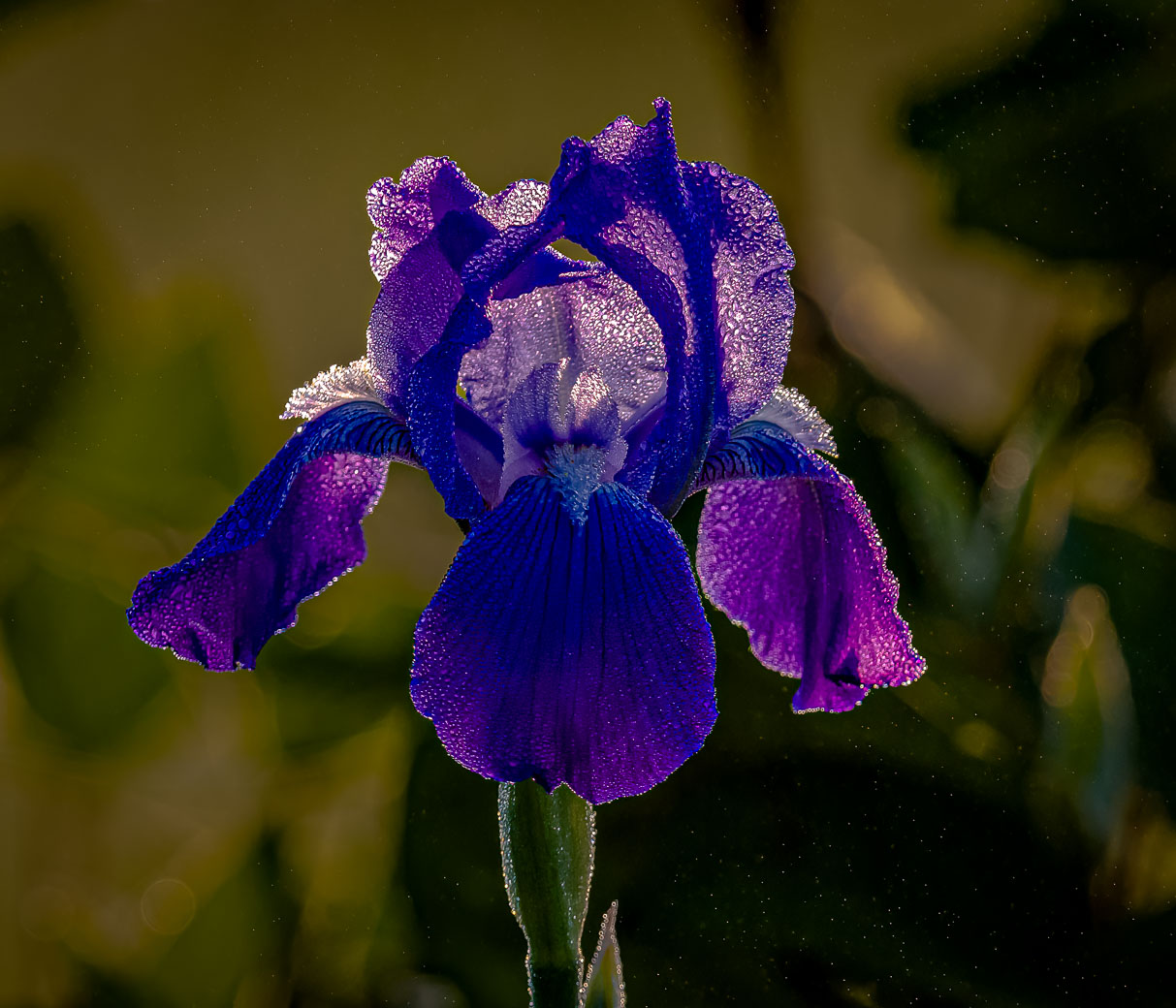
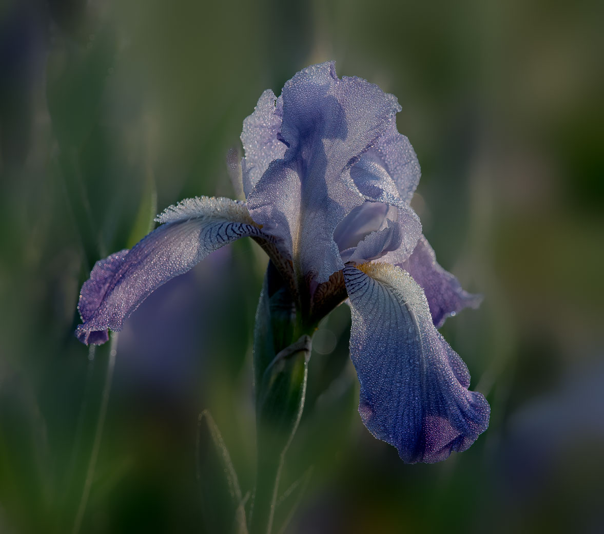
Comment |
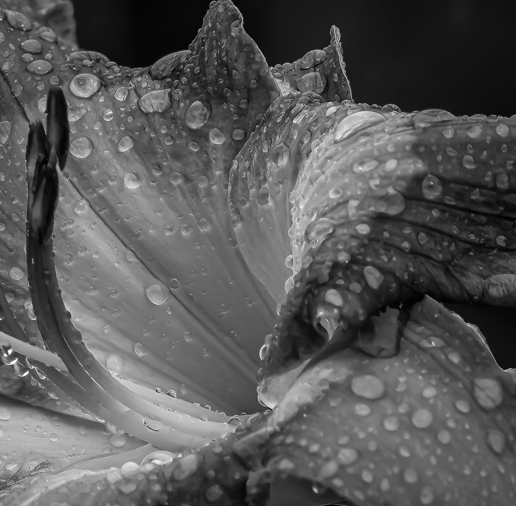
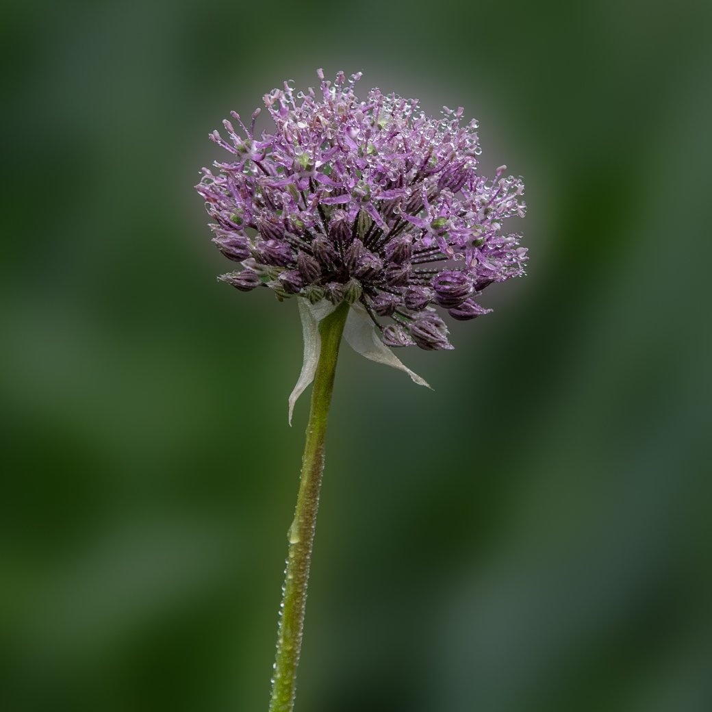
A beautiful job Ingrid. The mono just makes it more beautiful. Doug's done a great job enhancing the left side, even though it's not allowed in PSA Nature. But we aren't in Nature mood here. I do find Marti's crop to be very good also and it also has the added benefit of enlarging the snow and water drops. |
Feb 12th |
| 80 |
Feb 26 |
Comment |
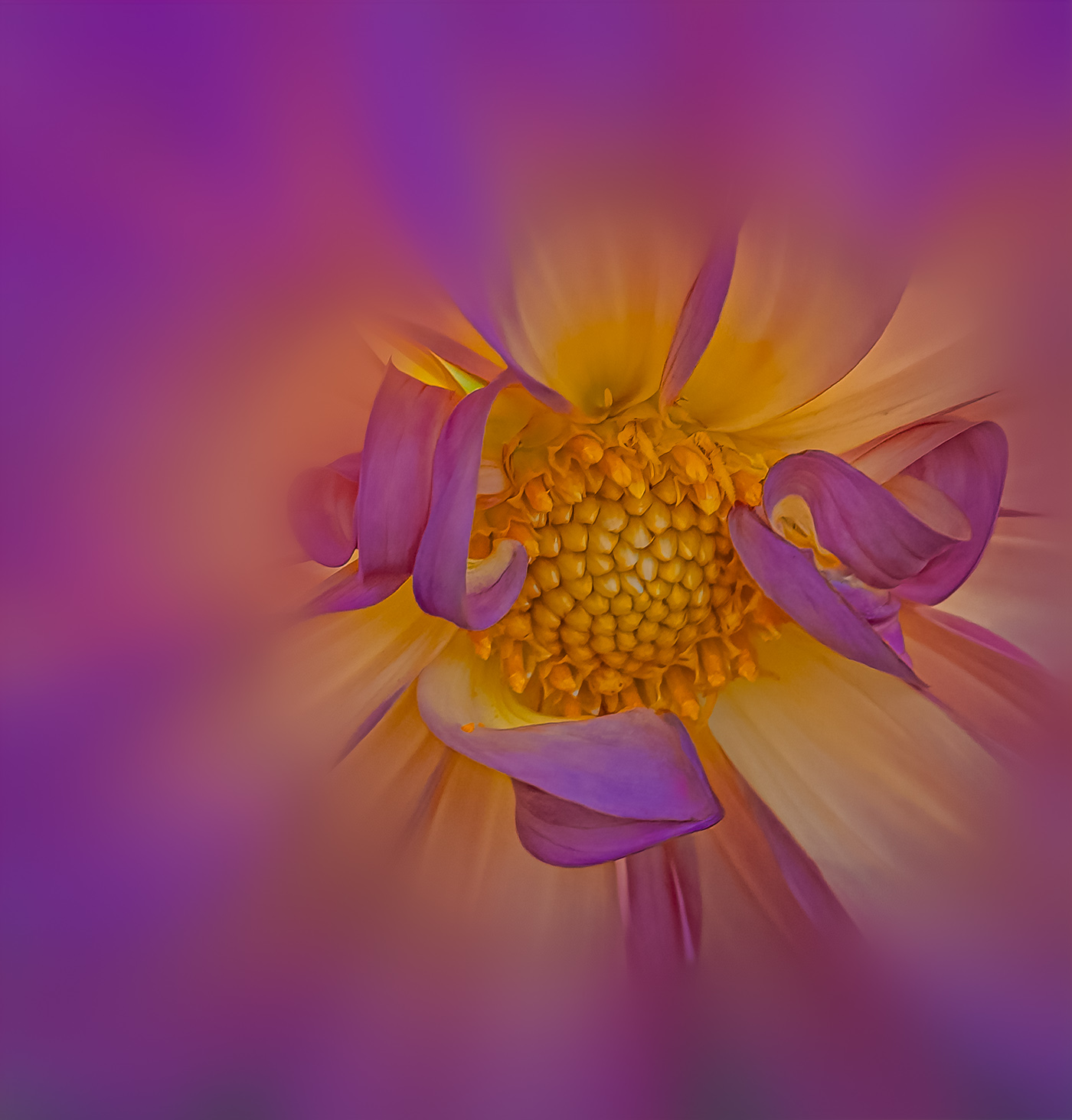
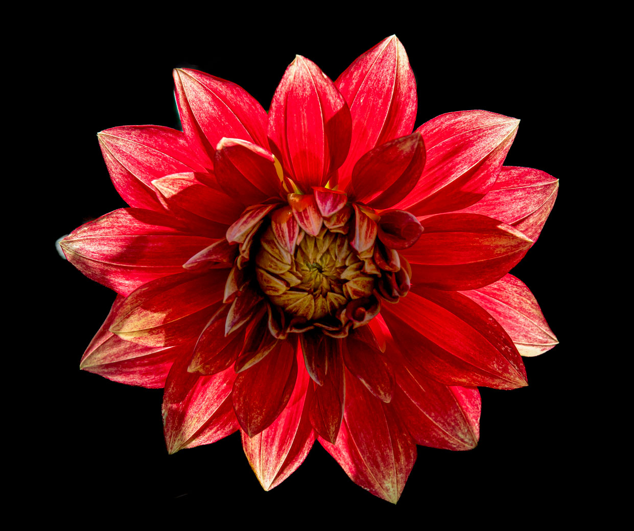
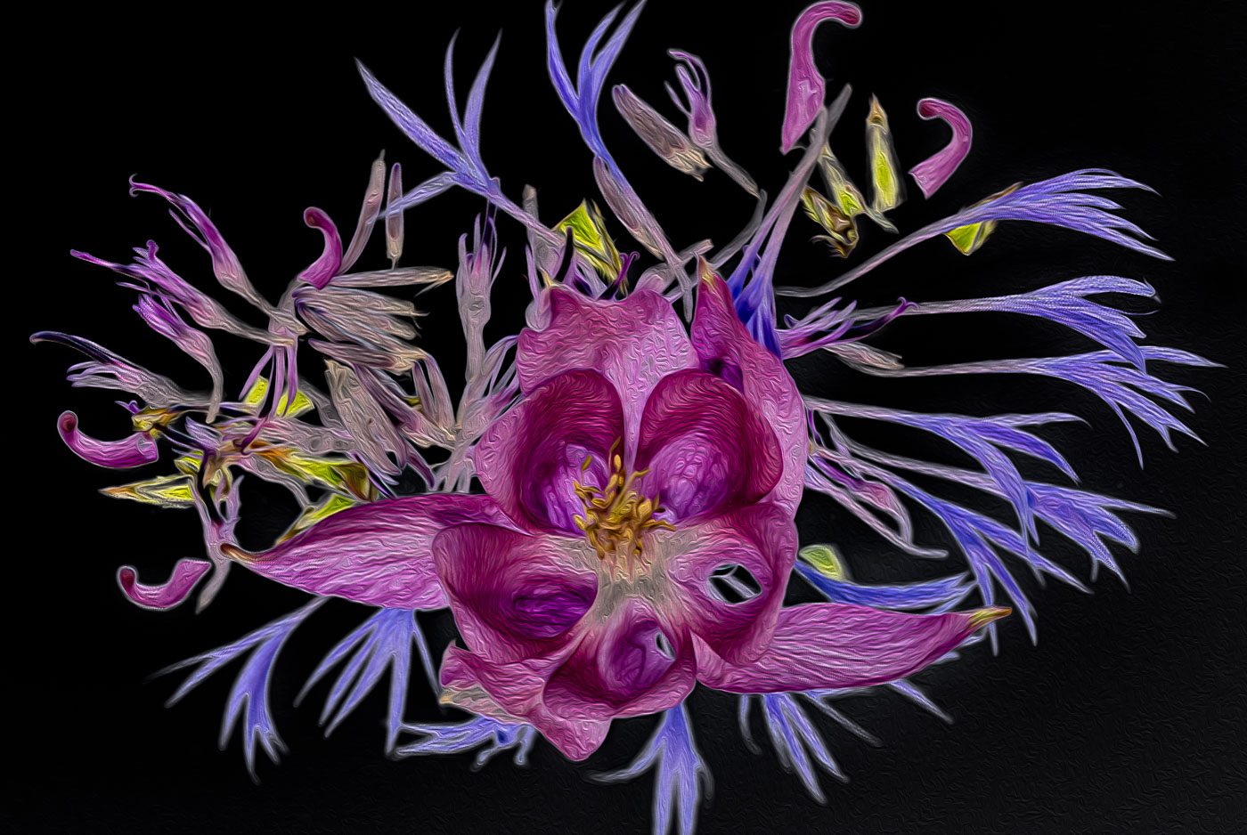
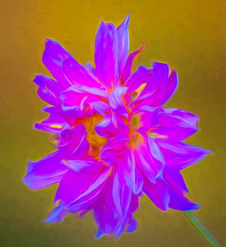
Kamal, great job. What a difference a year makes. I just looked at last years. Great job with your background texture. I do agree with having a less soft background than you chose. The Dahlia is beautiful and you are fortunate to have such nice January weather. I Love the results that Marti has helped you create. Well done. |
Feb 12th |
| 80 |
Feb 26 |
Comment |
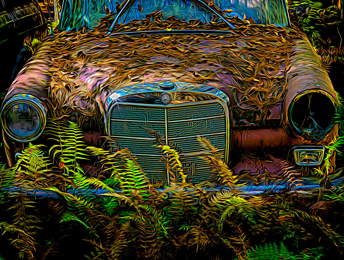
Doug, I know you were cut short with time this month otherwise you would have been more creative with this. Marti's version above does remove all the distractions and works for me. Like you regularly say Doug. Crop, Crop, and crop again. |
Feb 12th |
| 80 |
Feb 26 |
Comment |
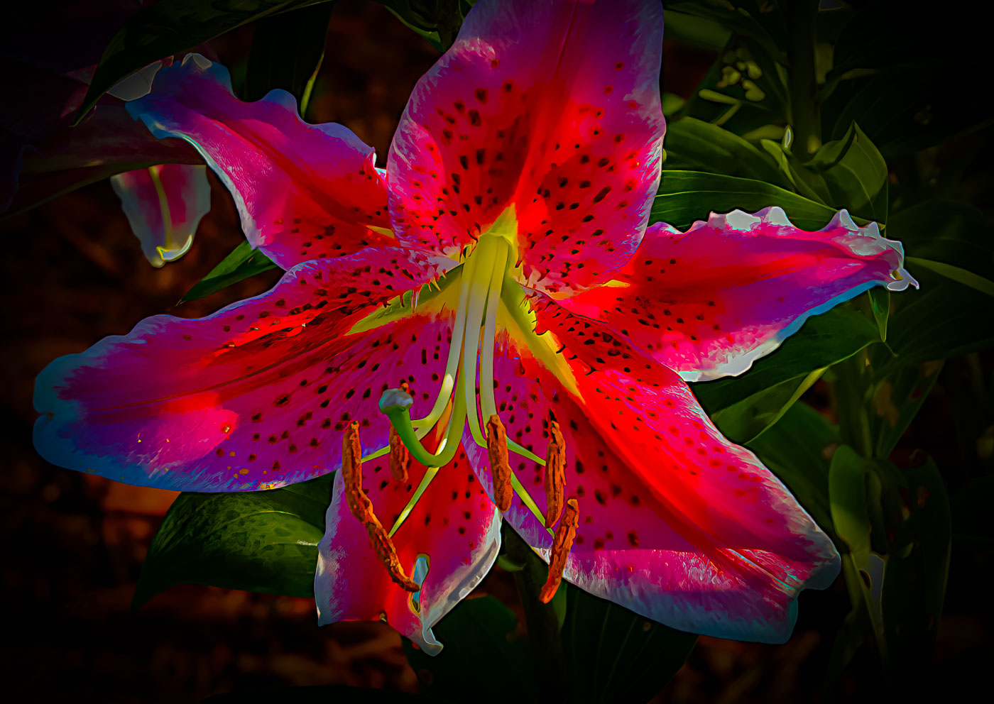
You all other members aren't being fair to Nadia. I don't see a stem on any of our images this month. It's Nadia's prime season and if she's like my wife, "Don't you dare got one of my Lily's, go photograph another flower." No complaint about your stemless Tiger. Well done Nadia. |
Feb 12th |
| 80 |
Feb 26 |
Comment |
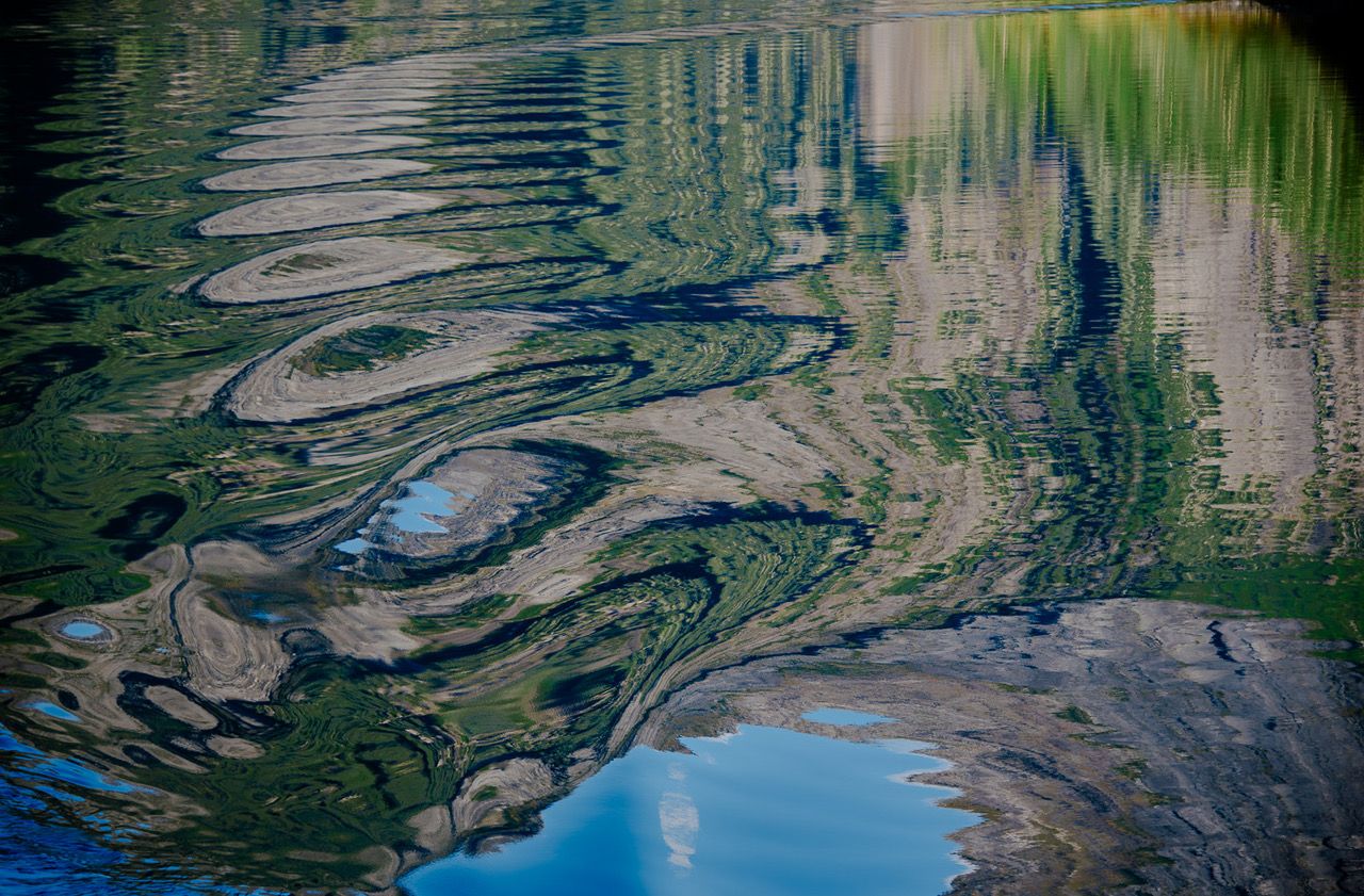
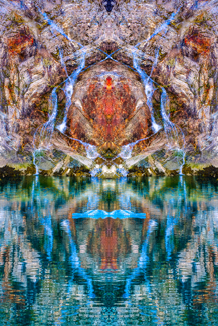
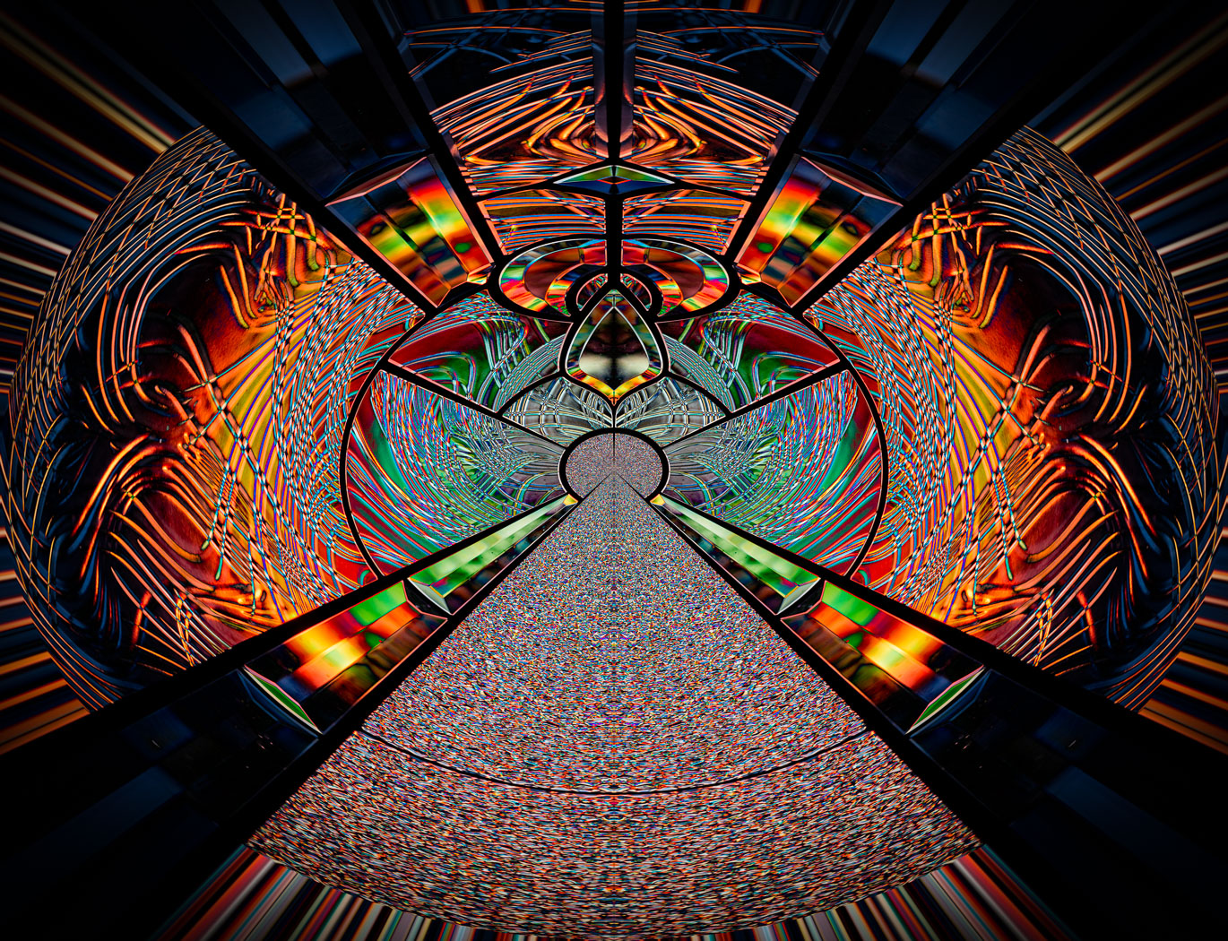
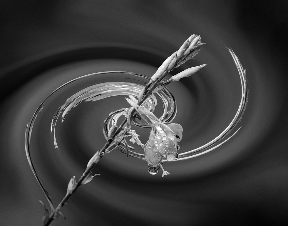
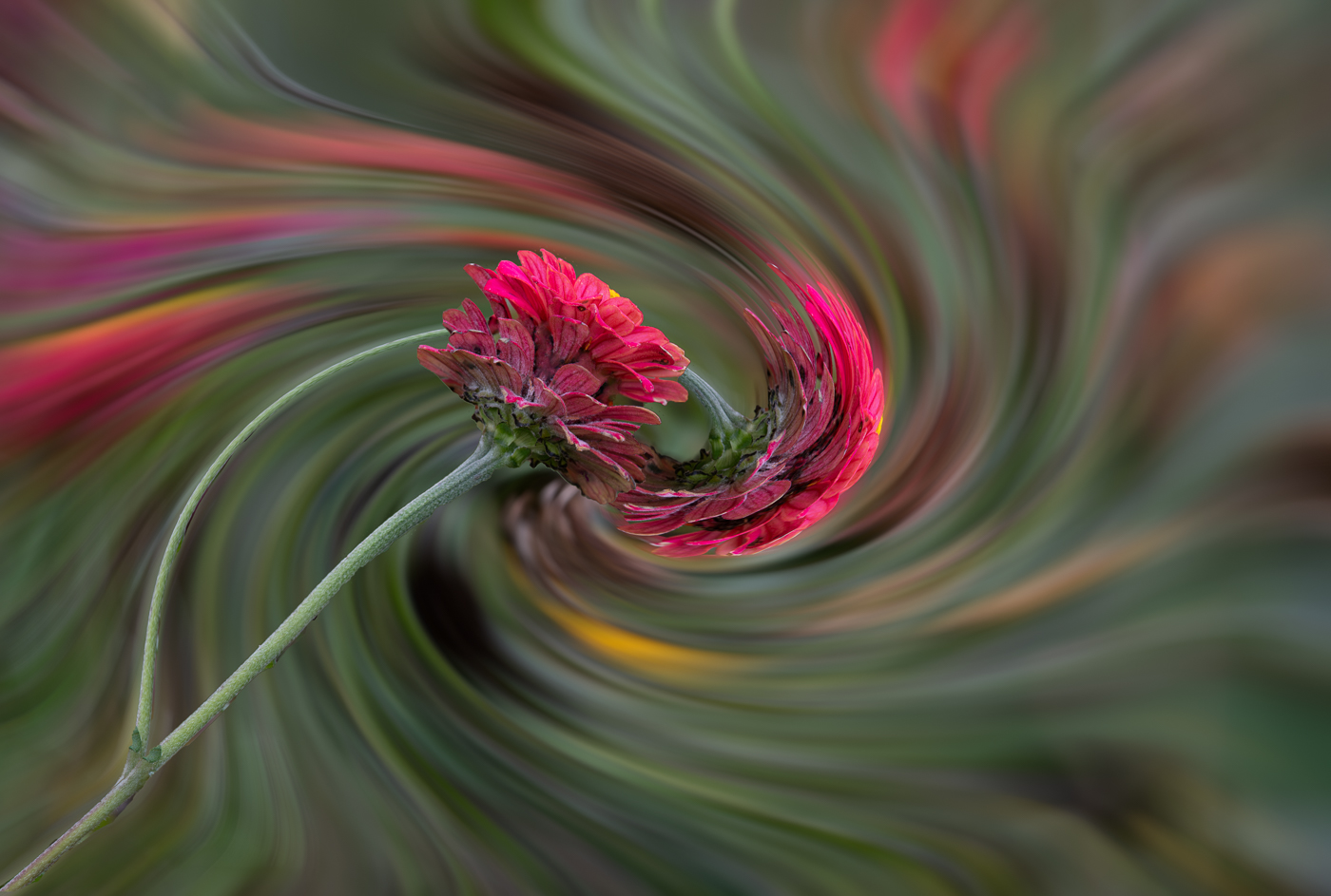
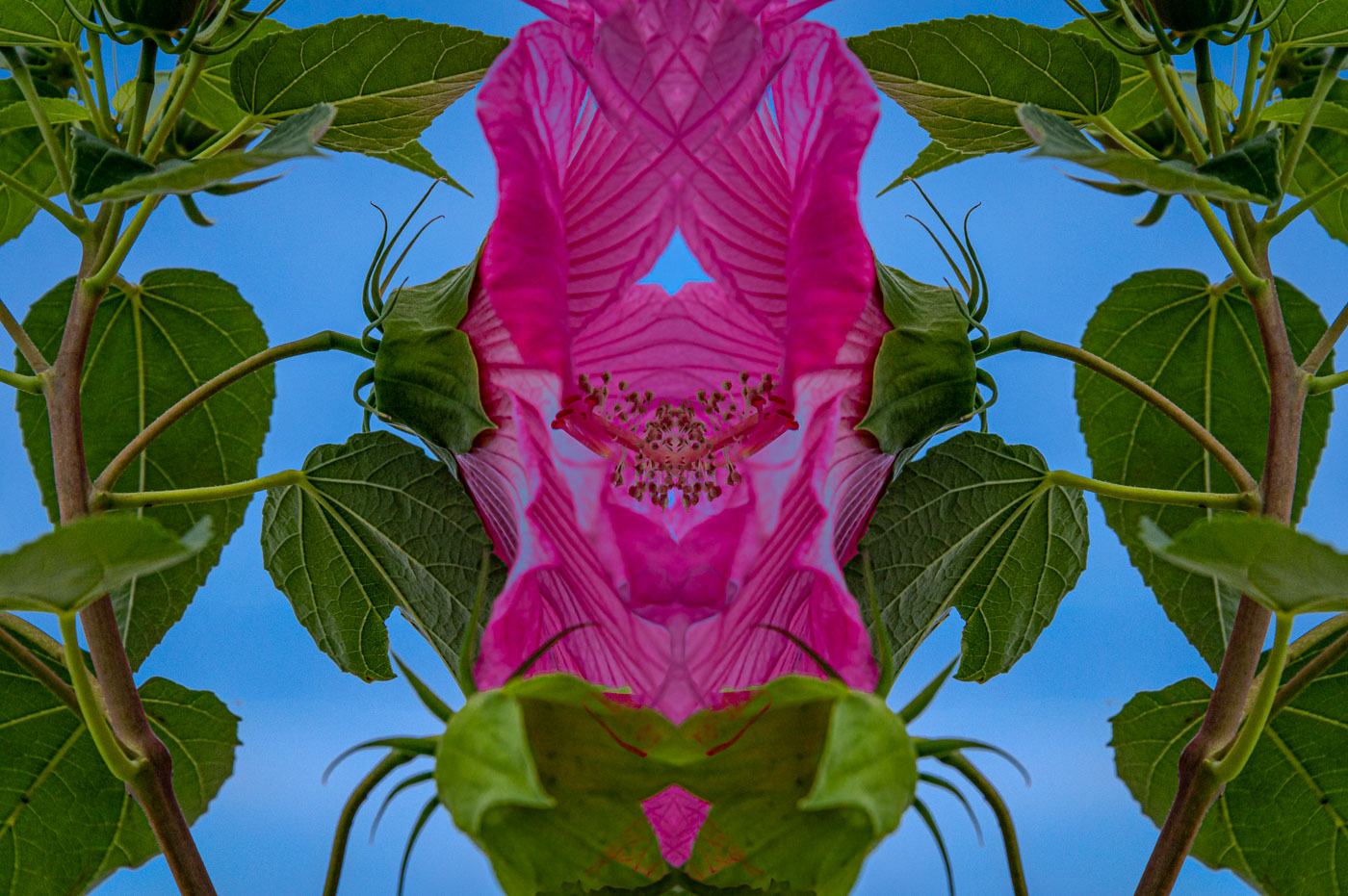
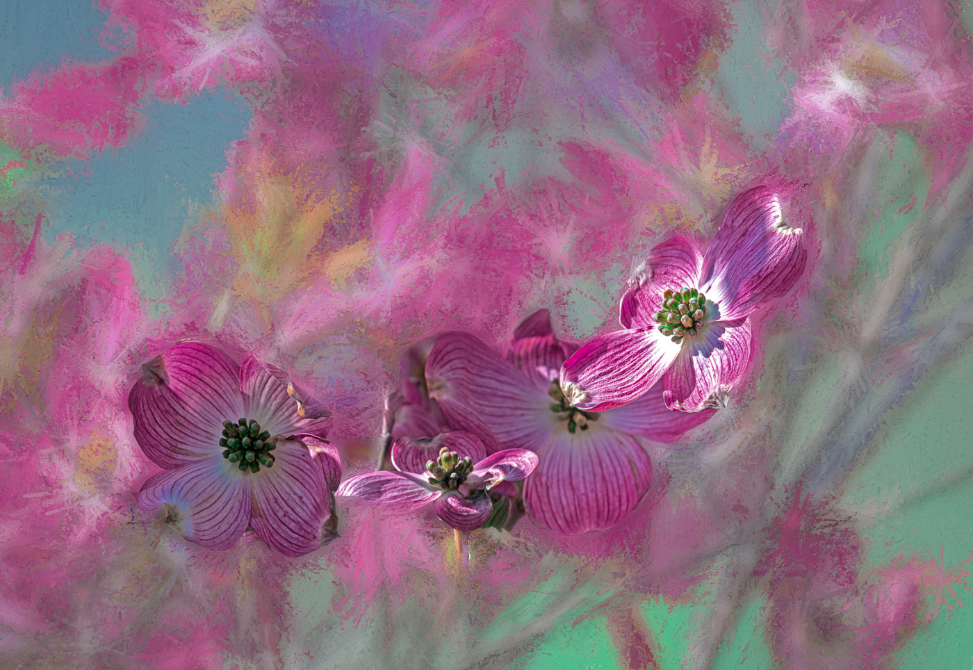
Marti, I LOVE your creativity and the use of the reflection. Glowing edges is one of my favorites, except it generally creates more of a Creative/abstract image. Nothing wrong with that except it limits applications. I have no recommendations for changing your image. Just perfect to my taste. Thanks for sharing. |
Feb 12th |
| 80 |
Feb 26 |
Reply |
Thanks Doug, if you read my other replies you'll see the softened vs the harsh can't be totally solved. I have been trying to go towards the idea of the subject and the flower closely matching each other and not having dark backgrounds, more closely like the backgrounds that Nadia regularly shows us. Your rendition is nice with the blue being replaced with more green. |
Feb 12th |
| 80 |
Feb 26 |
Reply |
Thanks Marti, Rich didn't really like the softness, it's just one of those images that's not going to please most. I was going to remove that bud but found it interesting so I actually enhanced it. Your instincts are generally right on. |
Feb 12th |
| 80 |
Feb 26 |
Reply |
Thanks Rich. I think I actually softened the image to make it more artsy. The original was photographed in harsh sunlight and that's what is wrong with it in my mind anyway. Thanks for your suggestions. |
Feb 12th |
7 comments - 4 replies for Group 80
|
16 comments - 6 replies Total
|