|
| Group |
Round |
C/R |
Comment |
Date |
Image |
| 10 |
Dec 25 |
Reply |
Thanks Frans. I watched and will need to match it step by step as my use of several of those tools has been zero. I've never even heard of onionskin layer. I've made a copy of the link so I can watch numerous times.
BTW; Welcome to Group 10. This was my first submission to Group 10, but I've been hanging around DD's for 6-7 years at this point. |
Dec 20th |
| 10 |
Dec 25 |
Reply |
Thank you Meredith. Sorry, I'm unable to edit in a way that wouldn't offend you. I often use Topaz Studio 2, but it is discontinued except for some of old time users. And someday I'll do an Apple OS update and it will be gone. What I liked may not be 5% to your tastes. I liked an Expressionism filter that used curvy lines on the tree and over the entire foreground. I assume you wouldn't want to change the tree and sky very much at all. Staying in Lightroom, I suggest you using the Linear gradient in the Dev menu and stretch it across the bottom front of tree and road. with the idea of darkening any brite areas. My personal edits would be to make the tree truly unique. I would have left that branch that Donna mentioned. But you are the artist and do as you like. |
Dec 19th |
| 10 |
Dec 25 |
Reply |
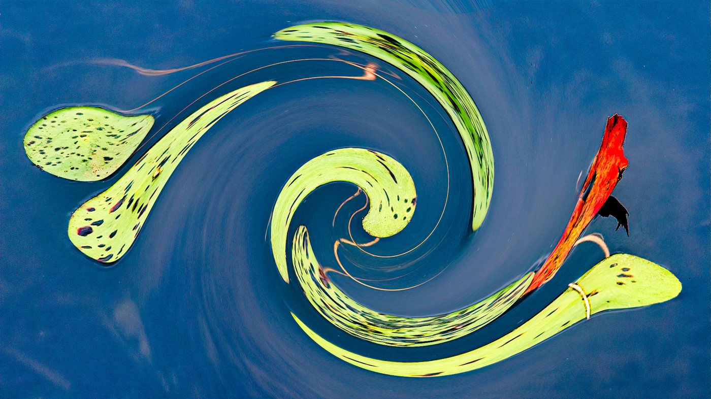
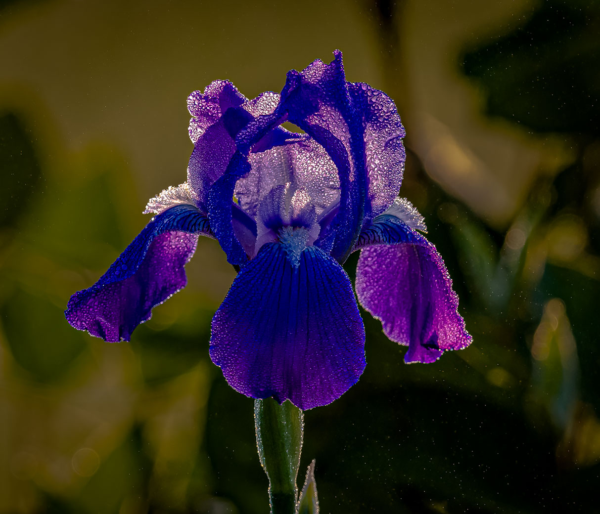
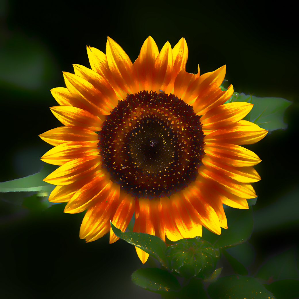
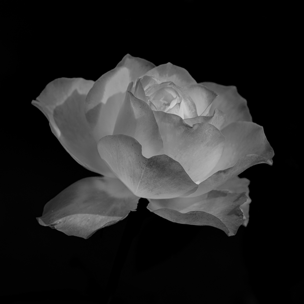
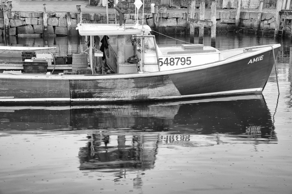
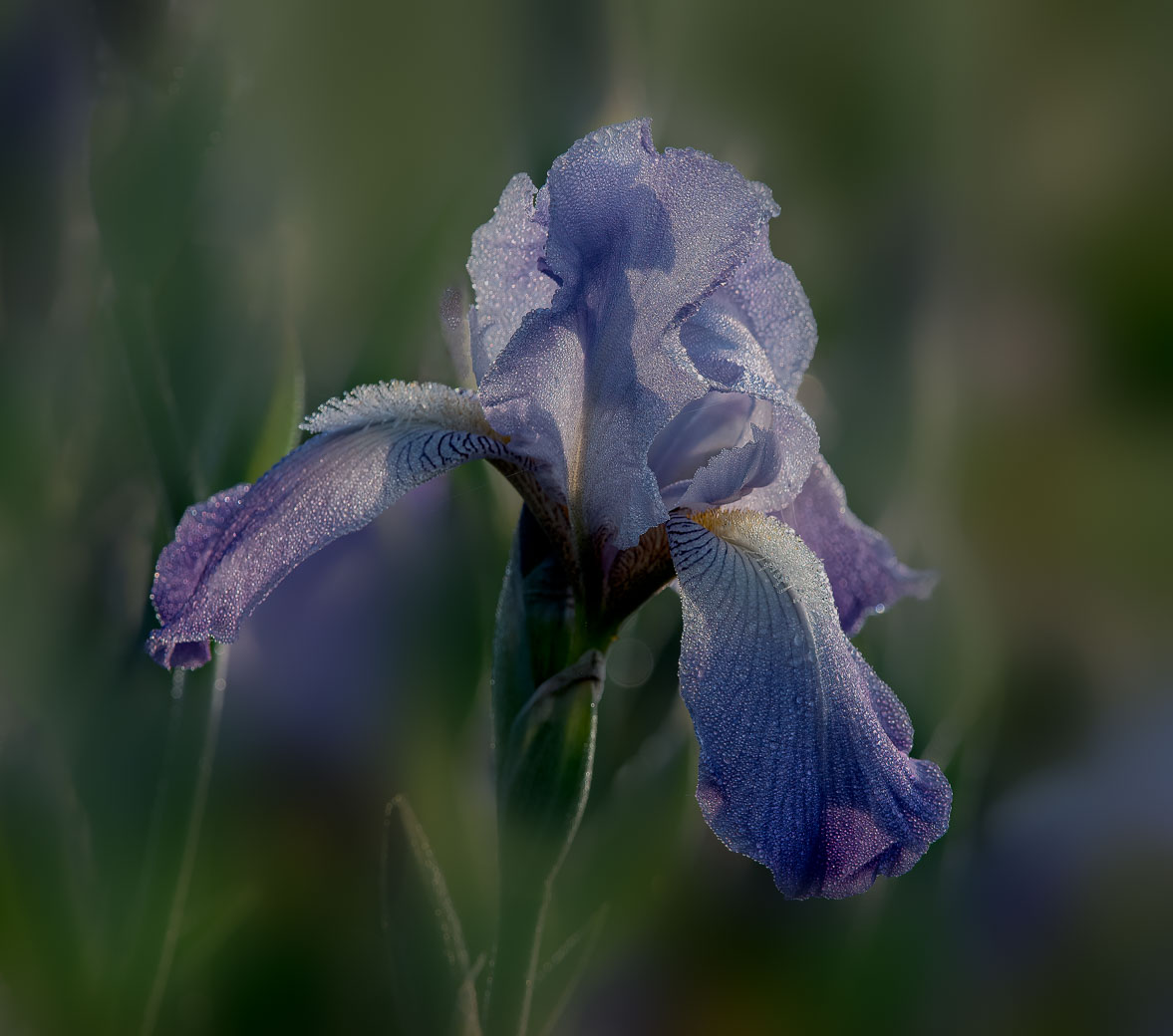
Thanks Donna for your comments. I don't expect you to understand me as we have known each other for only a minut period of time. I rarely use made backgrounds and have resorted to black or reduced exposures. I therefore have very little to choose from when needing a lighter color background. I shoot and make many different images and if I get 50% or more approval then it's a win. I also get positive comments that allow me to improve the image. It's almost impossible to get camera club judges to give you a winning score for a black or flat background. But something different increases the odds. Yes that bluish line was caused by Ps when I did "remove background" on the rose. But it only shows on some of the edges. You are the 3rd or 4th to spot that defect and it's on my list to fix. Yes, cloning might work. You're suggesting using shadows. I had removed tool the shadows that went up into the center. I have to conquer the flower background against the different colors of the water & seafoam along with your suggestions. If someone doesn't spot them then I have a good idea they don't do good looking. Well done on your part. Thanks |
Dec 12th |
| 10 |
Dec 25 |
Comment |
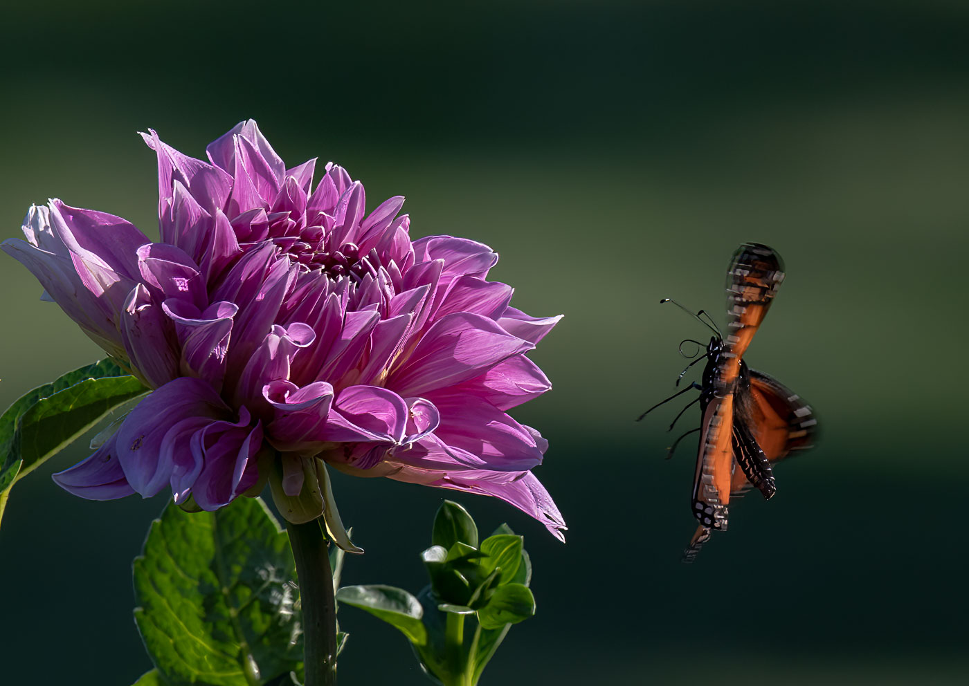
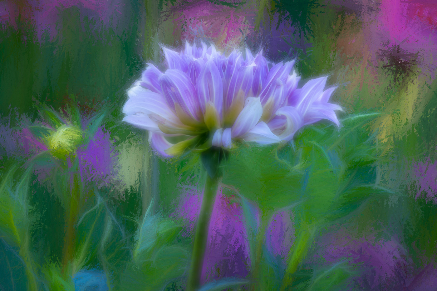
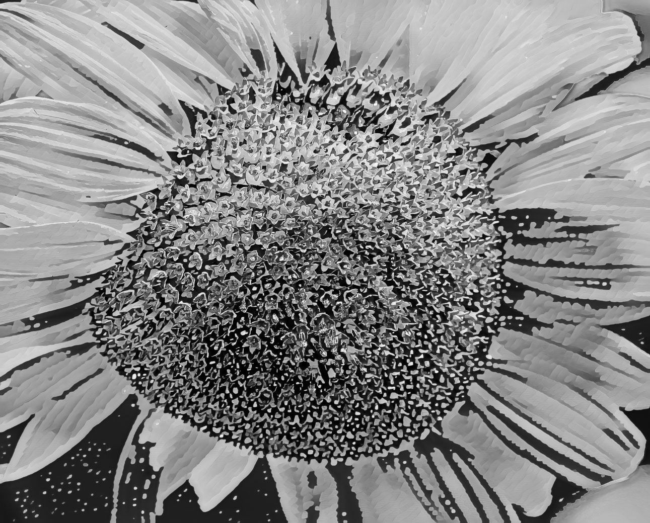
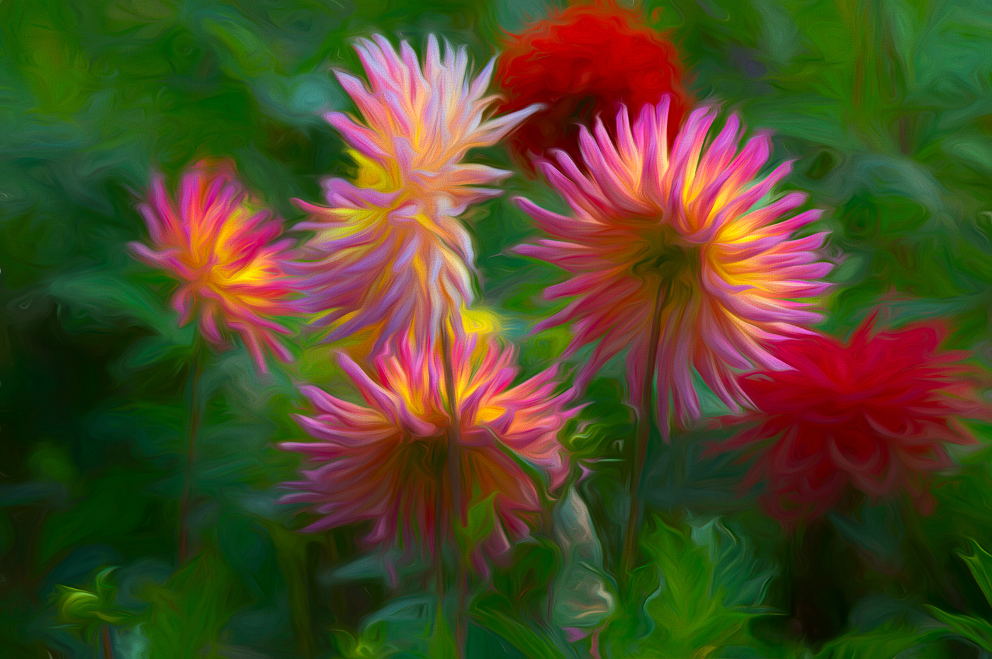
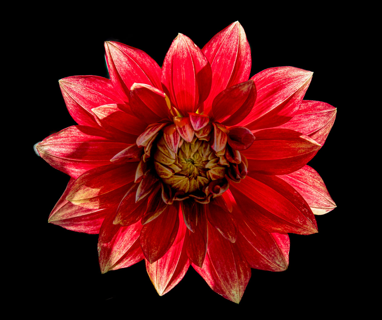
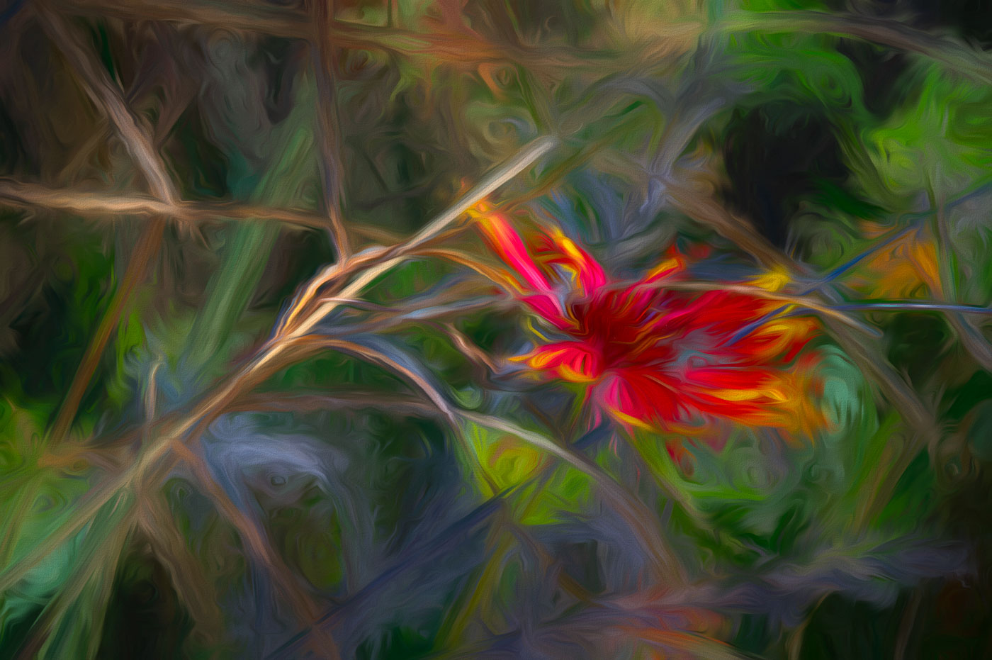
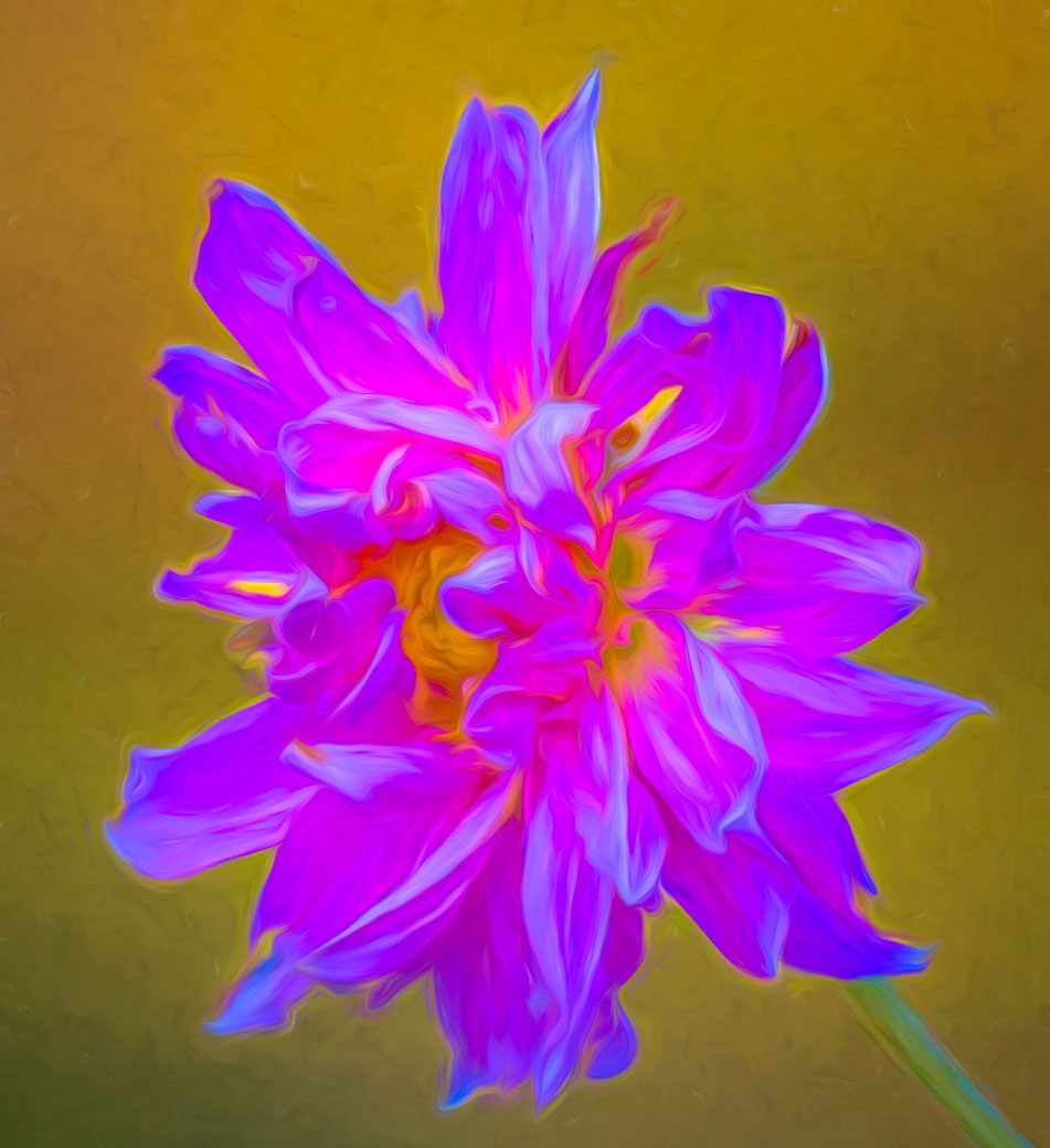
Doug, another well composed Dahlia. I agree with Donna that a smaller f-stop might have worked better. Your lens and camera certainly could have done a better job of DoF as the center of the flower does not appear sharp to me. I'm beginning to think that you might of have had a great f-stop, F11-F18 but to the point its suffer from "too slow" of a shutter speed. And that is 1/160th is too slow for hand held closeups and your cam would easily come up with acceptable images with shutter speed of 1/1000 th sec. and higher. I always use unprecedented ISO to conquer camera or subject movement. I also use "back button focus" on my Nikon that keeps the subject in focus while I rock back and forth. I know you are younger but always keeping rhythm. Does your OM1 have the back button that would keep you image in focus? |
Dec 12th |
| 10 |
Dec 25 |
Comment |
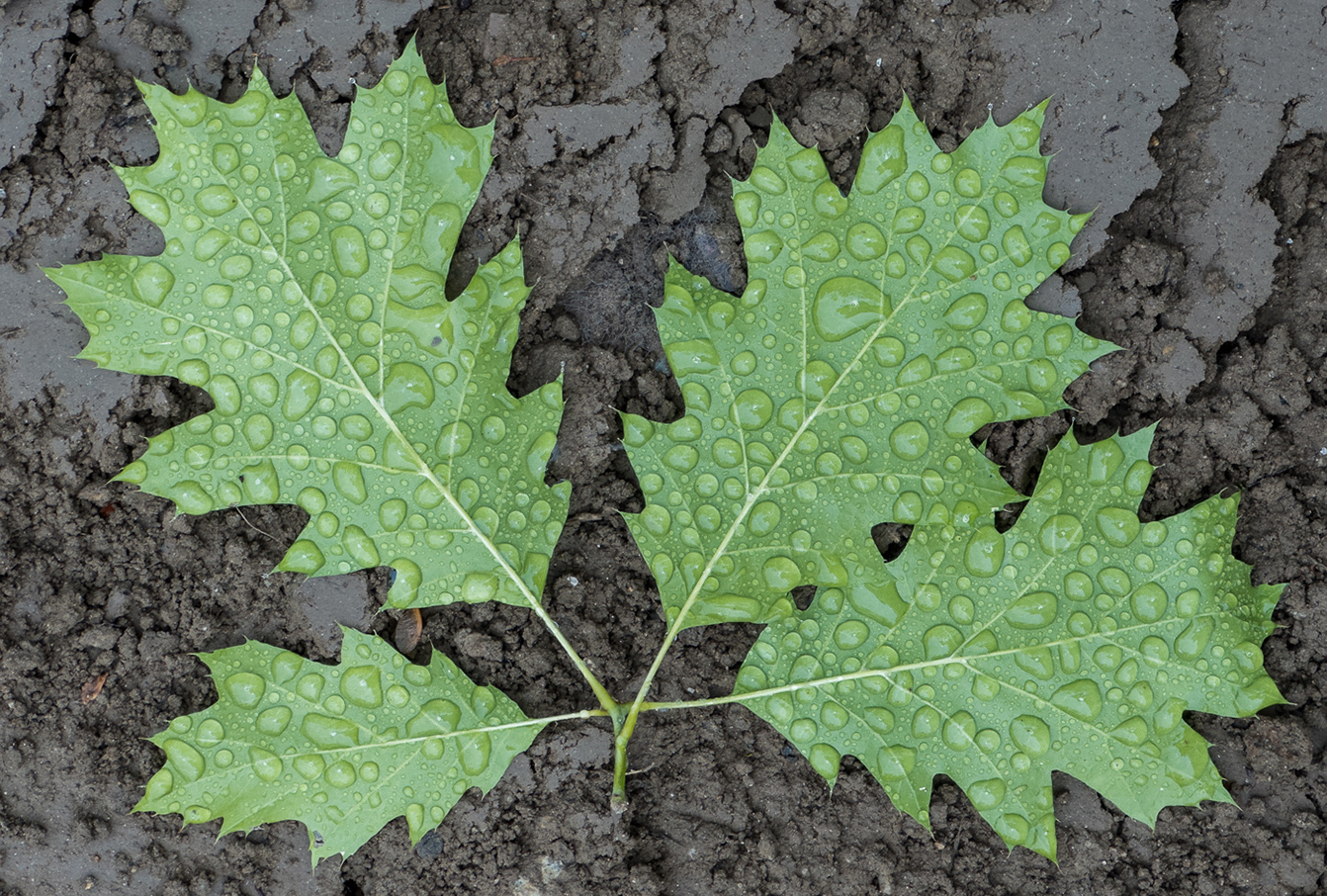
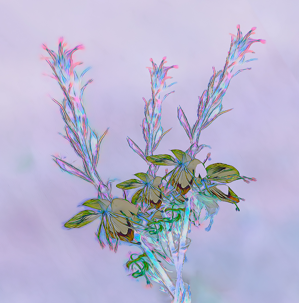
Mark, texture and color of your leaves, along with very little damage by insets, made me wonder if they were plastic. A wonderful job of selecting a great branch and leaves. Ahhh. Solved, my picture this app shows the ID as Oak Leaf Hydrangea and I just put it on my wish list and it should do well in my NH. The vignette is perfect because it doesn't look obvious. Well done Mark. |
Dec 12th |
| 10 |
Dec 25 |
Comment |
Donna, I have never photographed burrowing owls, or used "bird" call app. I do really like the composition using 1 eye on each owl. You did very well on making the eye on the front owl to be sharp. You probably tried to get the front bird in focus but the eyes are the secret. Using a newer cam body (Even a used D750) would of allowed a much higher iso, using existing lenses, and combined with your Topaz software made you happier with all your images, I think. |
Dec 12th |
| 10 |
Dec 25 |
Comment |
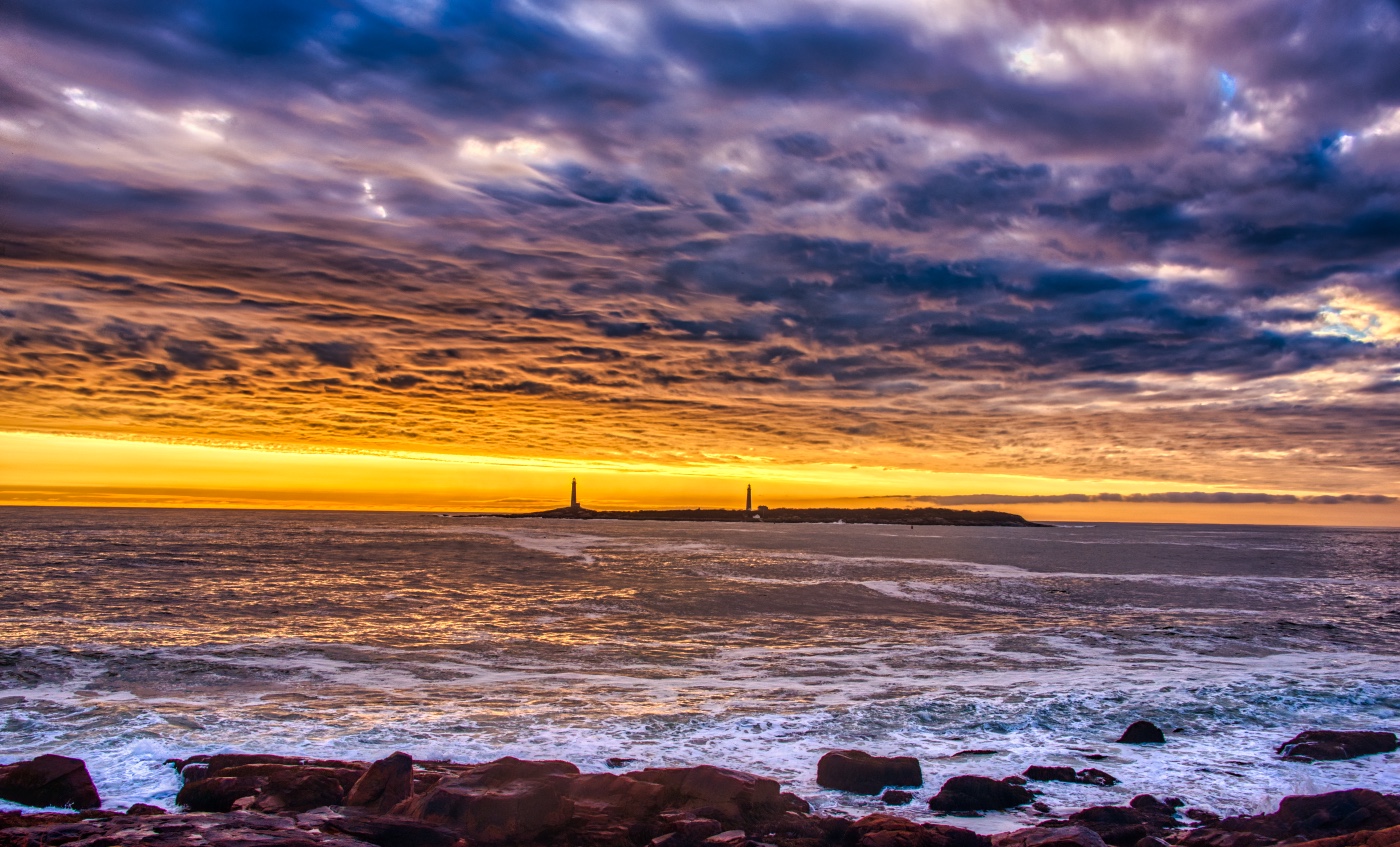
A beautiful image Peter. Wow, a world traveller I thought before reading your description. I like your composition and colors and the sunset is clearly a big bonus. I have to admit to knowing nothing about the DXO products so I did a 2 minute extremely short review. I see vs 9+ promotes being the best end to end Raw processor. I'm making assumption that with that nice camera that you made the shot using Raw? Please don't be offended, I'm only trying to help. If you were using Lightroom, I'd suggest having LrC select the sky and invert to select the architecture. What I'm seeing Peter is a lighter area of the sky around the outside of the Temple. LrC can select these automatically making a layer that can be edited naturally without the lighter colors that go around the temple where it merges with the sky in your image. Virtually everyone previously had this issue because of the difficulty of selecting something like the Temple as it would naturally be in shadow and you or your software by lightening the Temple and having some of that merge into the sky. I would be surprised if DxO didn't have that ability or try Trial of Lightroom. Please get back to me because you have a great photo here that could benefit from a 5-10 minute edit. |
Dec 6th |
| 10 |
Dec 25 |
Comment |
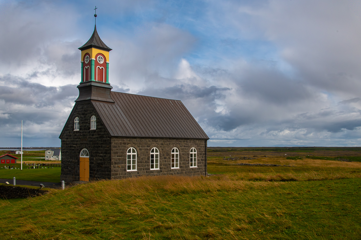
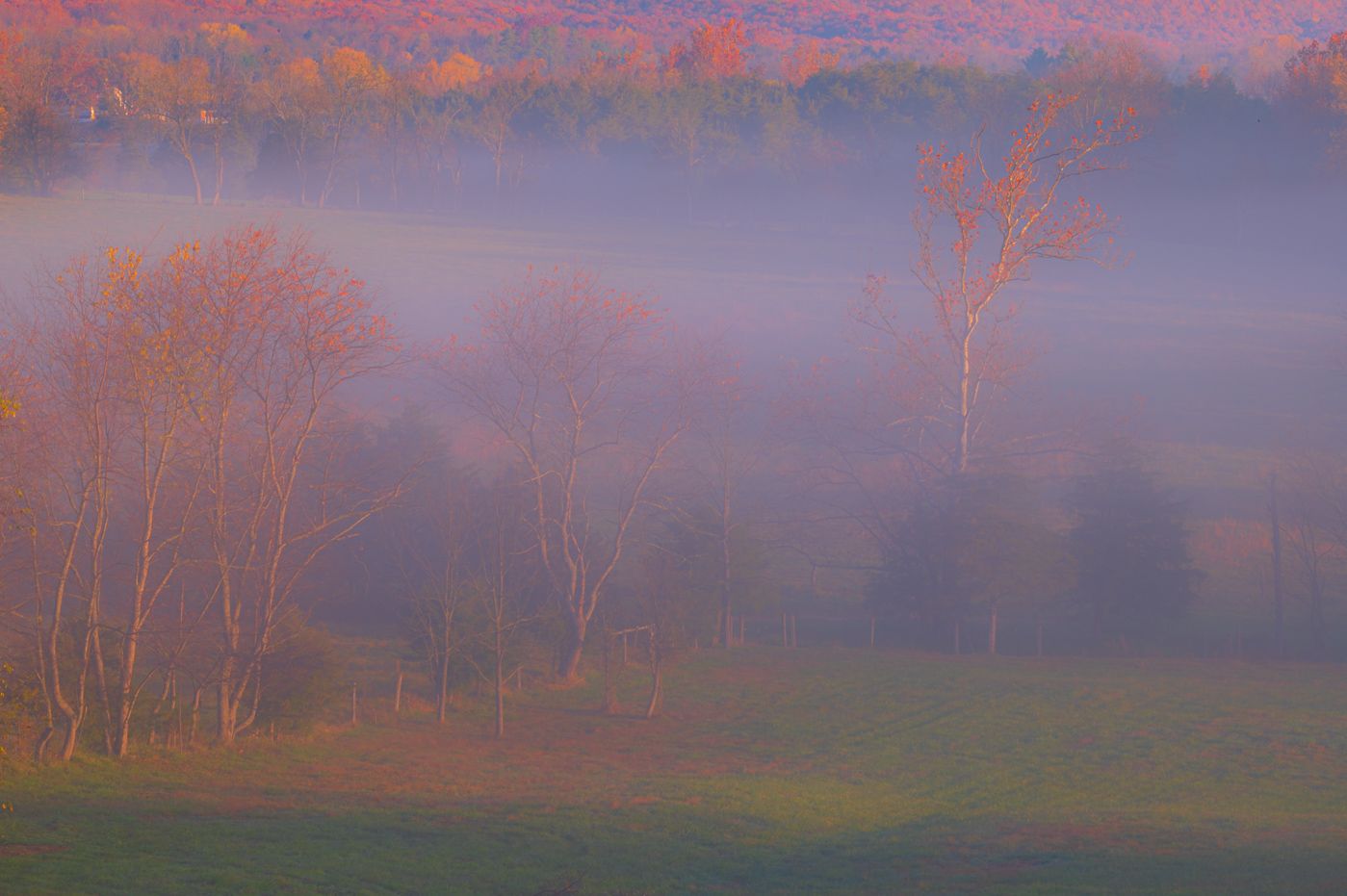
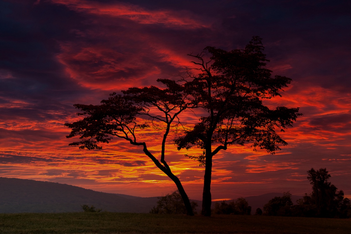
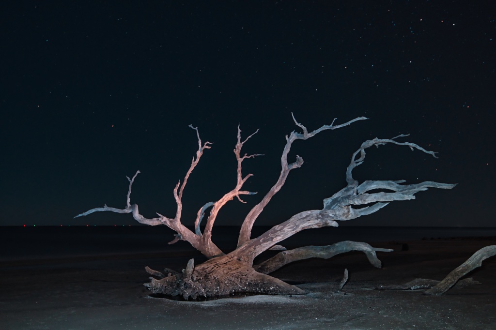
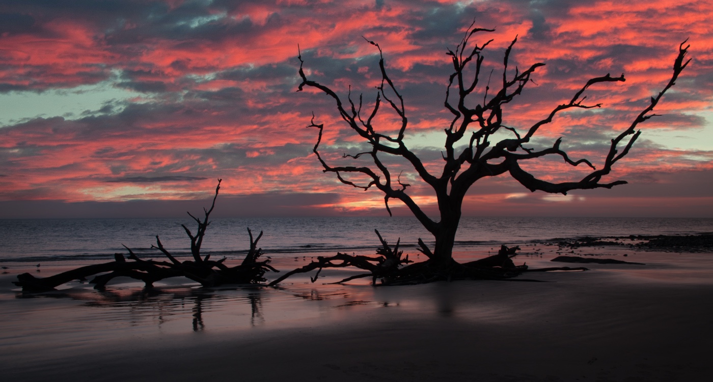
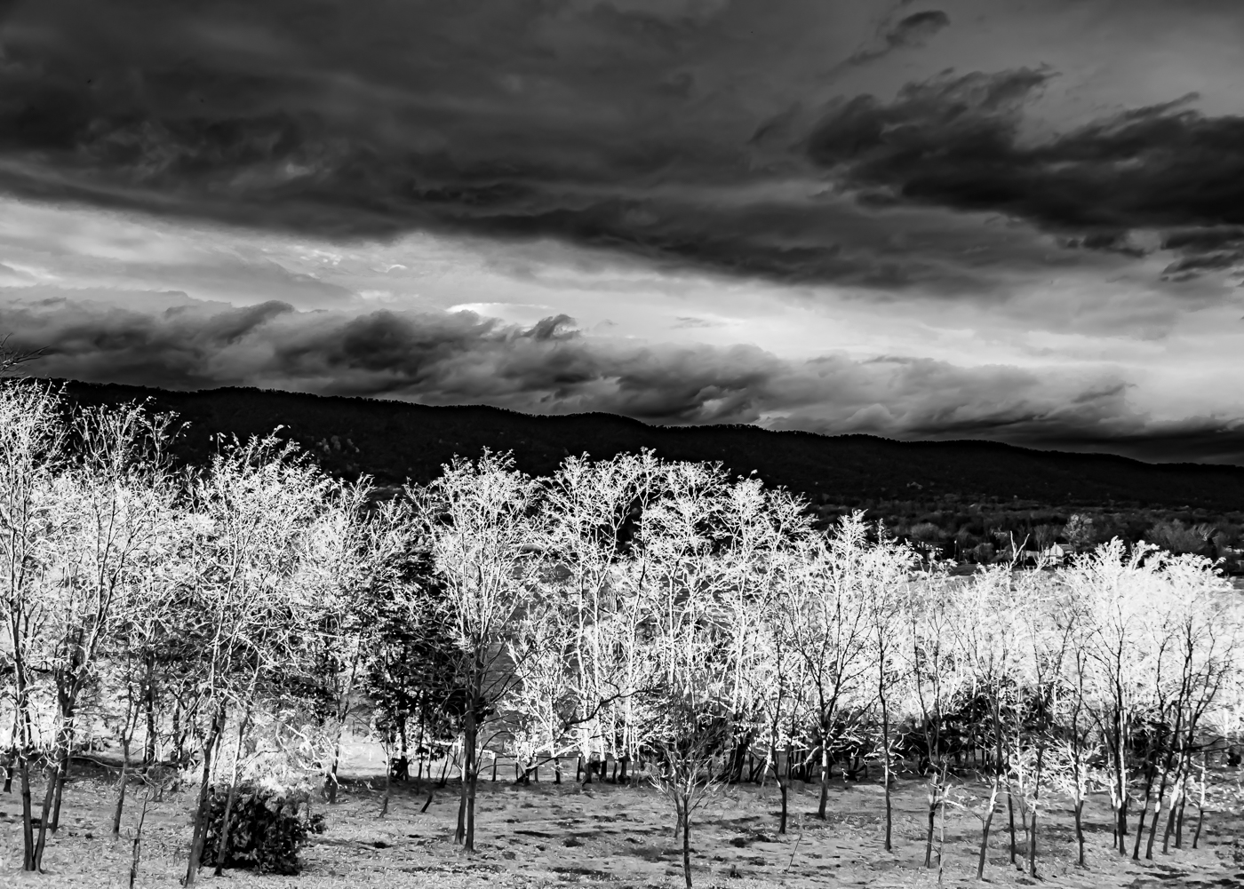
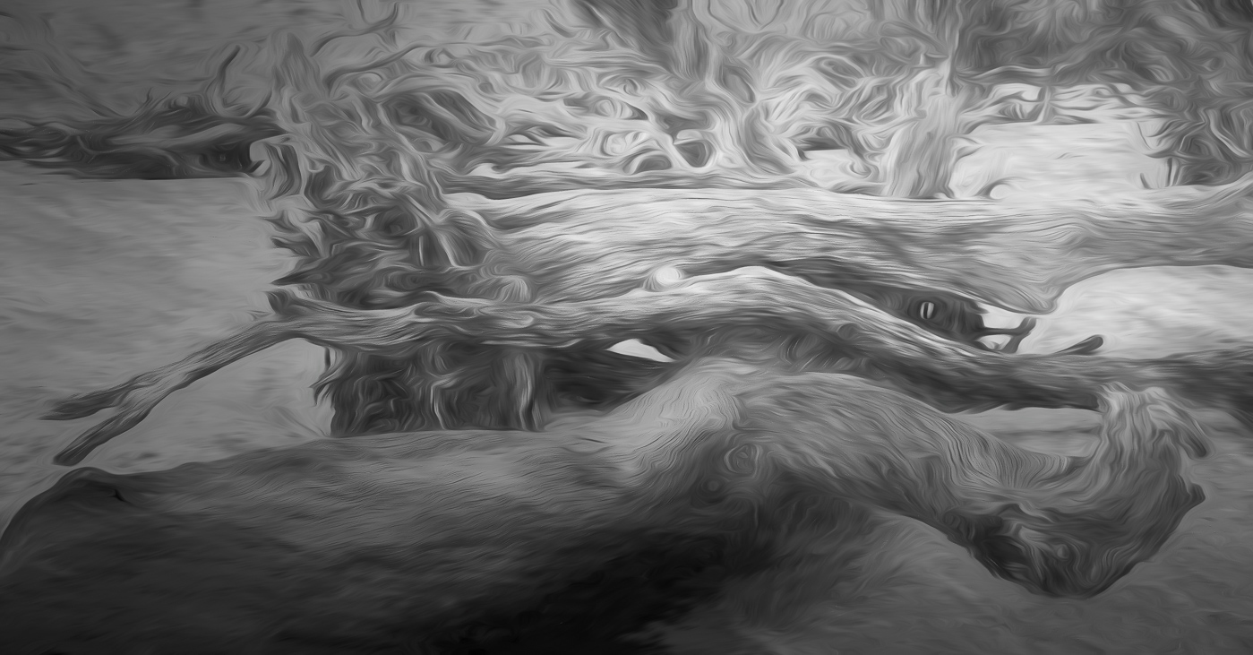
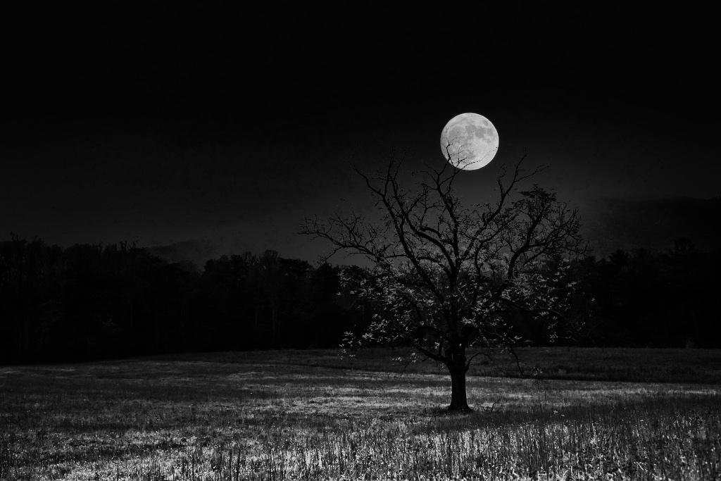
Hi Meredith. This is a lovely tree and I understand your being attracted to it. I agree with your square crop, but would like to suggest that you submit the original for everyone to see. My reason for that request is that the lighter color or road/path at the base of the tree leads my eyes out of the photo without stopping to appreciate the structure of the tree and the sky. |
Dec 6th |
5 comments - 3 replies for Group 10
|
| 80 |
Dec 25 |
Reply |
Thanks Ingrid, I appreciate your comments, except that you're not anxiously waiting for the next one. |
Dec 20th |
| 80 |
Dec 25 |
Reply |
Well your editing is getting better Kamal. I think that, even for me, that the center of the flower is over saturated. But I appreciate the edit and stay well. |
Dec 20th |
| 80 |
Dec 25 |
Reply |
Thanks Nadia. |
Dec 20th |
| 80 |
Dec 25 |
Reply |
Well Rich, that clarifies them for me. Kill them and move on and be thankful that you didn't touch them when you were cleaning up around them. |
Dec 12th |
| 80 |
Dec 25 |
Comment |
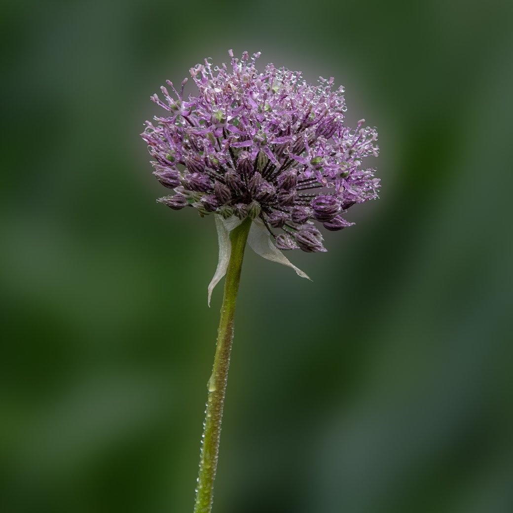
Ingrid, I agree that this is a very nice vivid image. The proceeding gentlemen assumed it was taken in full sun, but I don't see it in your comments and wonder if you could clarify. The stems work very nice for your composition. Great Job. |
Dec 12th |
| 80 |
Dec 25 |
Reply |
Rich, home those mushrooms aren't causing this slip up. You mean Doug. His image. Rich as I understand it those lens baby's are all manual focus and designed to on your intended spot and blur most other. |
Dec 12th |
| 80 |
Dec 25 |
Reply |
Marti, that's one of the great features of the DD's. Try it out and generally get valid responses. |
Dec 12th |
| 80 |
Dec 25 |
Reply |
Thanks Doug, I'll try adjusting the Opacity some more.
|
Dec 12th |
| 80 |
Dec 25 |
Reply |
Thanks Rich. I didn't think of that tone, it works and thanks for sharing. |
Dec 12th |
| 80 |
Dec 25 |
Comment |
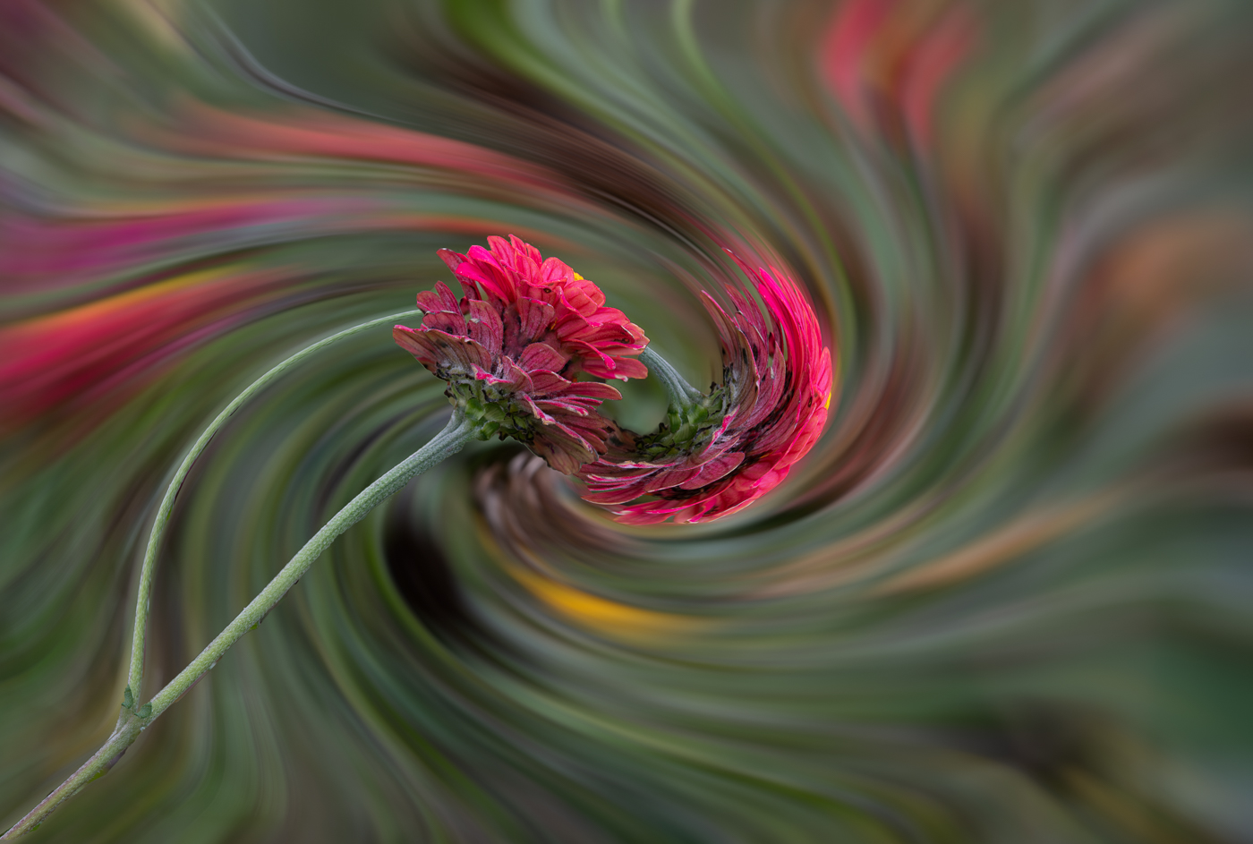
A great find Rich. I find you getting lower to the ground and finding some great specimens. I do find your auto stacking doing a great job. I would have put a brush to darken the bright spots in the sky especially the blown out white spot on the right. I also think that the mushroom with the extra white stem on the left could be toned down. |
Dec 7th |
| 80 |
Dec 25 |
Comment |
Kamal, I like your steady improvement with little background distractions. (Yes I would have removed that flower bud & stem on the top left). Like Marti, I would have reduced the texture on the background to separate it from the flower. |
Dec 7th |
| 80 |
Dec 25 |
Comment |
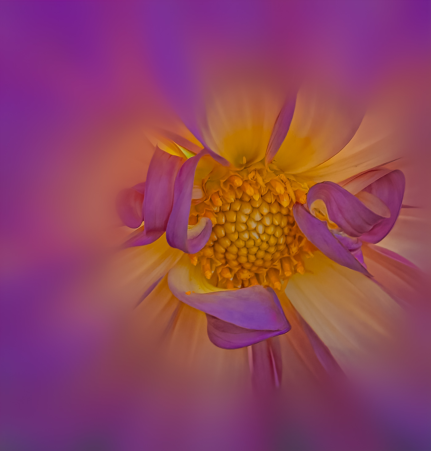
Nadia, a beautiful color to this Poney an I really like the texture of the flower petals. I think I would have also shot a view of the center, but maybe that's not idea as I'm not finding a good shot of that. Of course your backgrounds are fantastic, as well as highlighting the water drops. |
Dec 7th |
| 80 |
Dec 25 |
Comment |
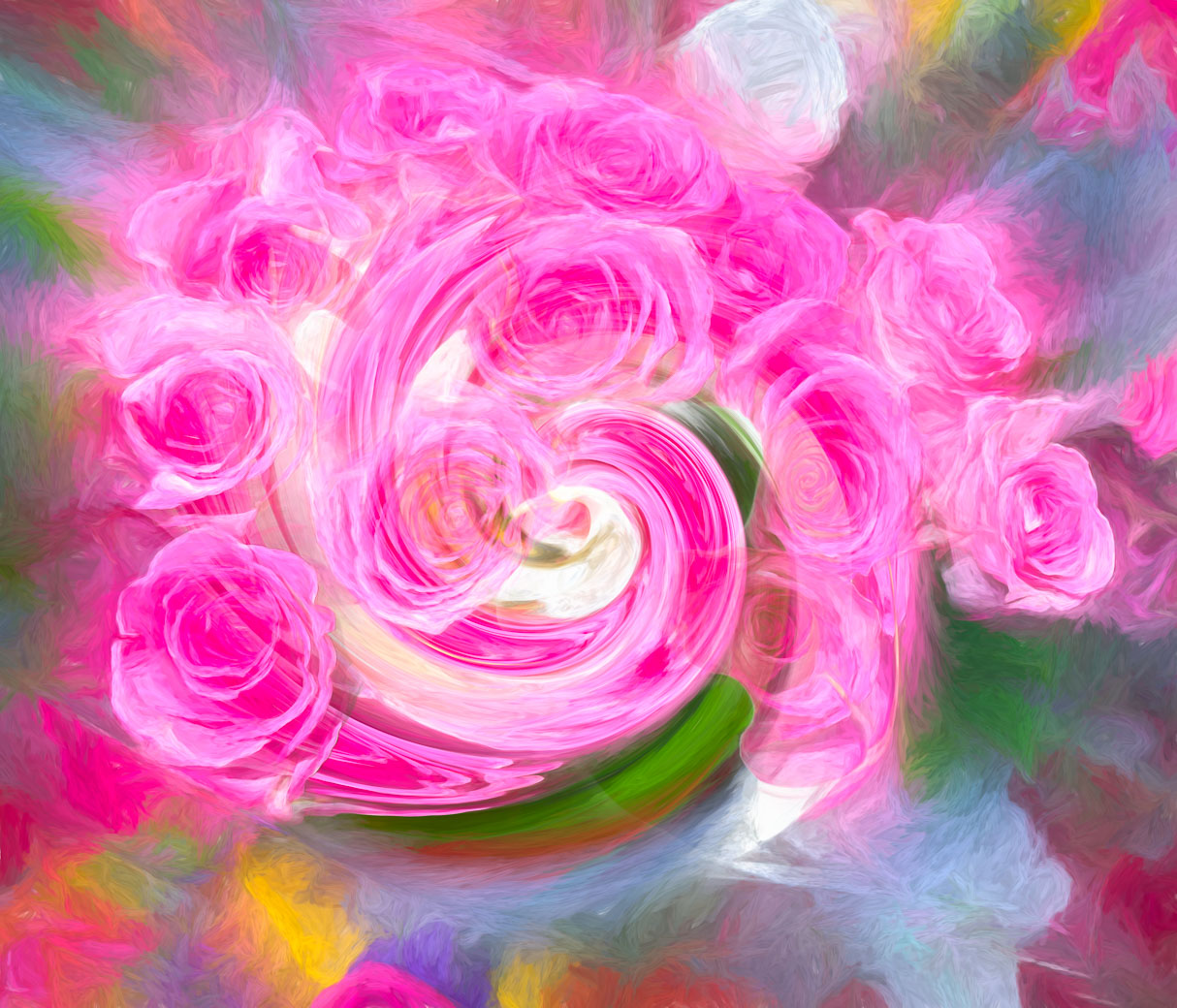
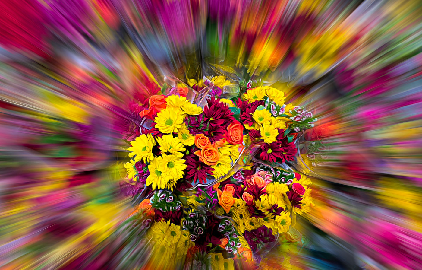
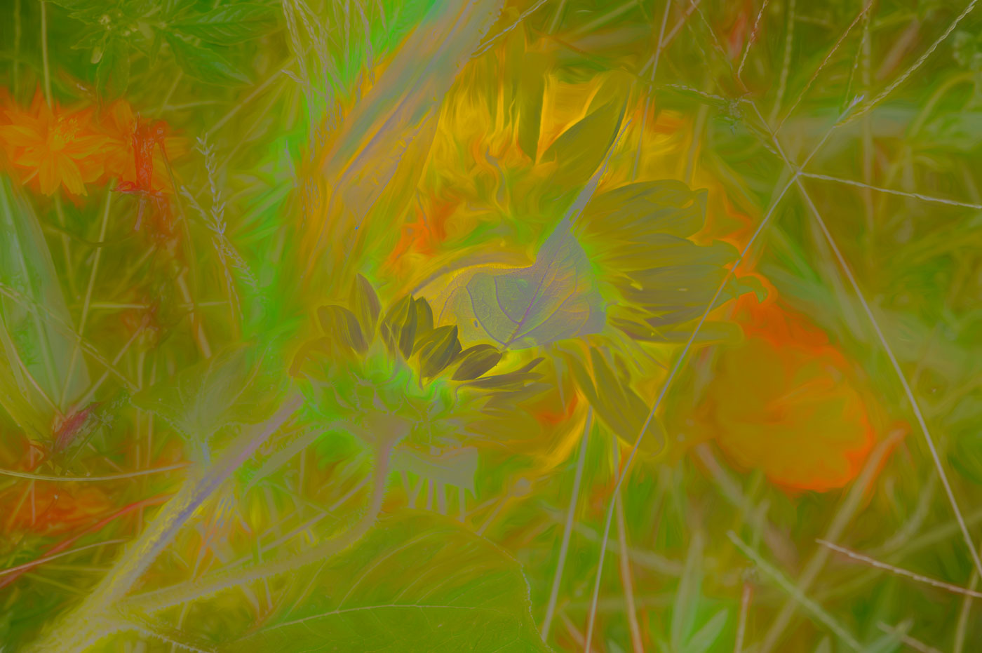
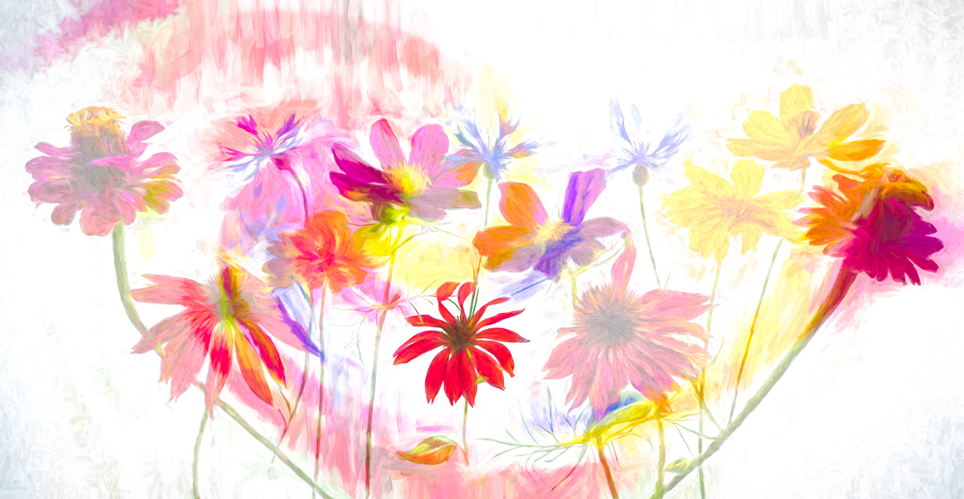
Hi Marti. As one of those regulars who takes a nice image and attempts to enhance only to not meet the approval of all, I get it. However, I took your Original image and enhanced to my liking, which is like the original but more unique. I used Topaz Studio 2 and they have a look called Bloom, which enhances the veins and the red to a point that it is a Poinsettia, But different in a bright new way to those viewing. Some might view your version as what's wrong with your flower and you reply, nothing, I just used a texture. Sorry, I was unable to find a Ps that would do the same thing but you used a filter on your Purple Warp that might do the same thing to Poinsettia. Sorry, the Red is to vibrant. I'm good with the removal of the odd colored leave in the top right. |
Dec 7th |
 |
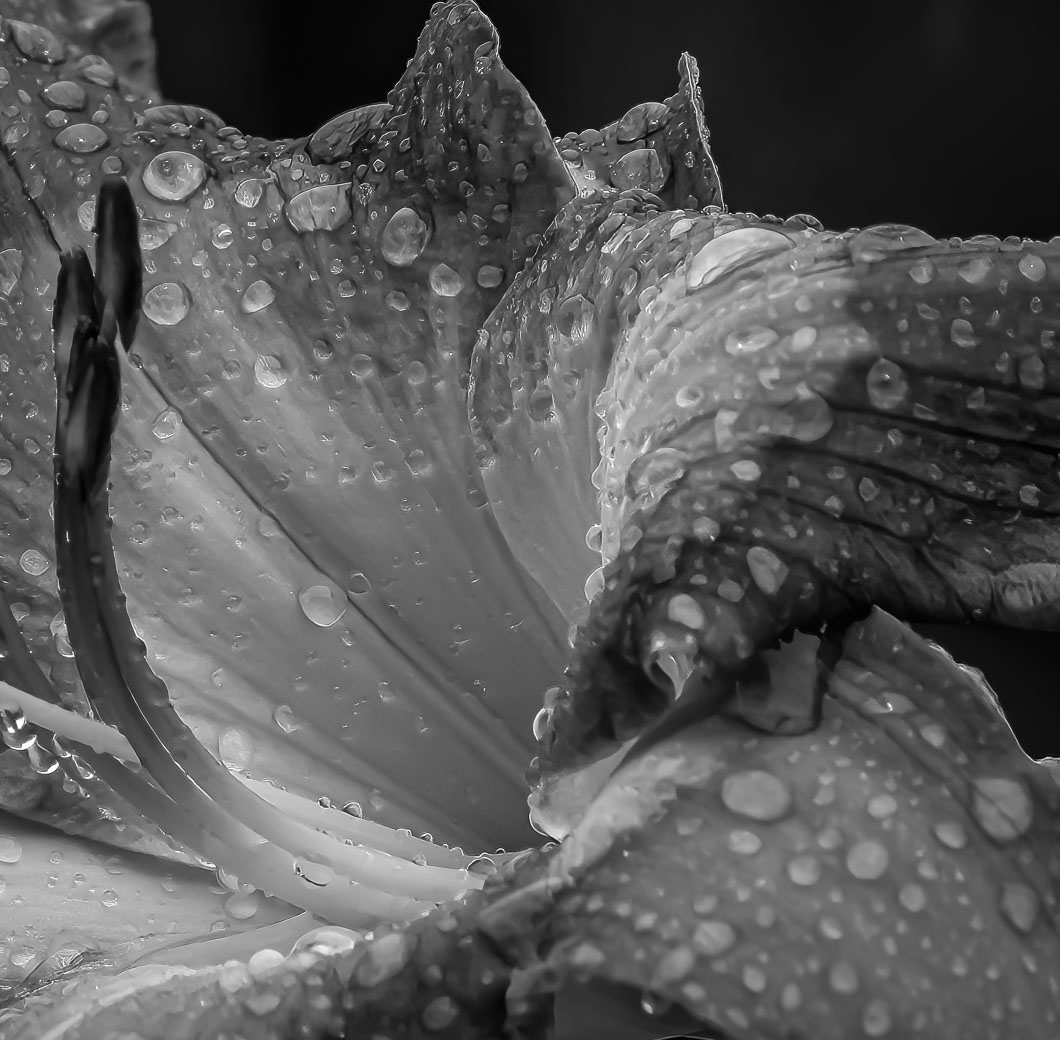
| 80 |
Dec 25 |
Reply |
Thanks Marti for your comments and suggestions. My intent was not to make it look natural, but to use similar images that are a more consistent white and less water on the flower to replace the white high key and soft backgrounds that I never can produce. I'm also working on using the remove tool to control areas with more water. |
Dec 7th |
5 comments - 9 replies for Group 80
|
10 comments - 12 replies Total
|