|
| Group |
Round |
C/R |
Comment |
Date |
Image |
| 29 |
Aug 25 |
Reply |
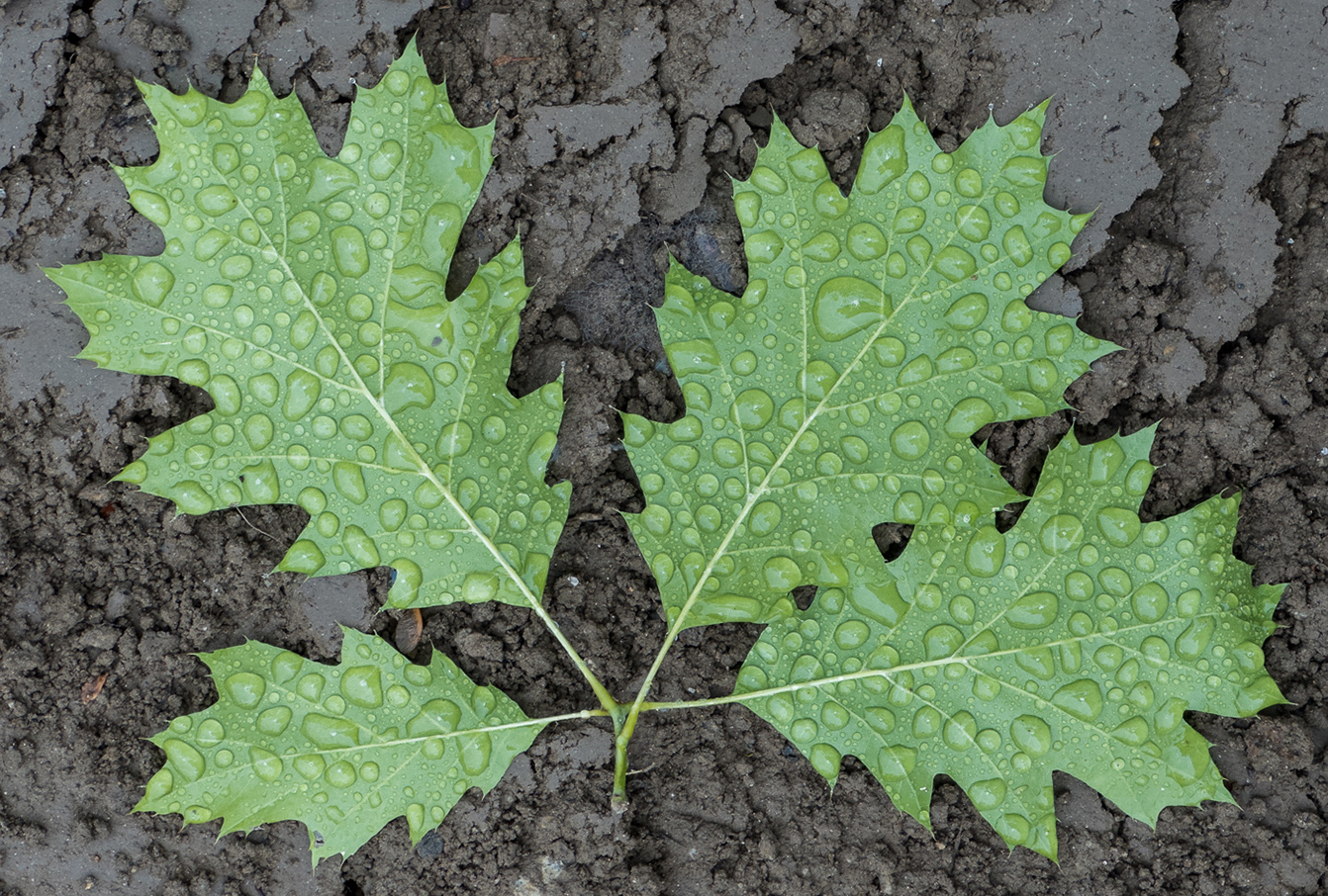
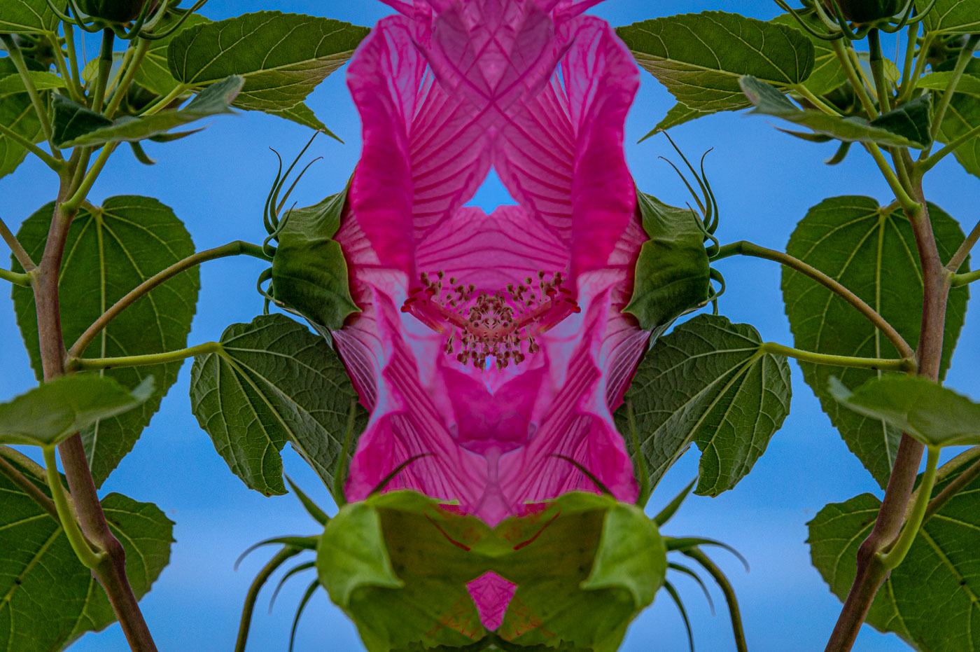
No problem, its your image. I was thinking to enhance the blue hour that is currently showing thru the leaves. |
Aug 18th |
| 29 |
Aug 25 |
Comment |
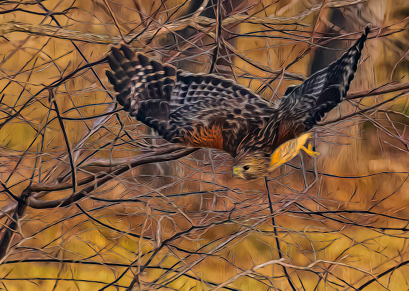
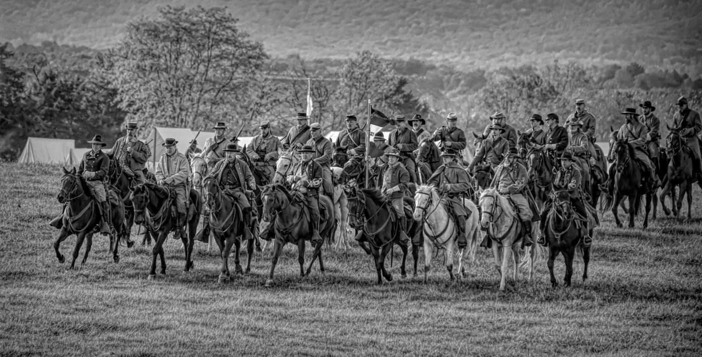
Bob, I've never shot animals in the Wild West. But If this image were mine I would use LrC or Ps and the new masking tools to reduce the whites from the trail in front of the horses and under the horses feet. I suggest using the mid tone curves and that allow the highlights to be reduced and the new masks will select the mountains behind and darken those mountains while adding color to them. You can also reduce shadows and lighten areas on the red/brown horse. Use the tools, whether Ps or LsC, to fill shadows and reduce highlights to reduce the harsh lighting. |
Aug 15th |
| 29 |
Aug 25 |
Comment |
NECCC. Yes, I only missed 3 between'89 and 2019. Shame it ended as it did. Your model is well lit and has a beautiful background. The catchlights seem natural. I do agree with Elaine's edits toning down the color casts. The NECCC folks did a great job setting up the shot variables giving the knowledgeable photographers, like yourself, fighting odds to produce a great image. Well done. |
Aug 15th |
| 29 |
Aug 25 |
Reply |
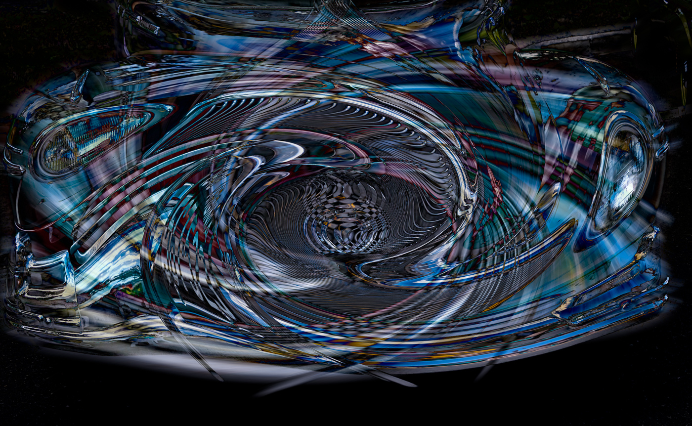
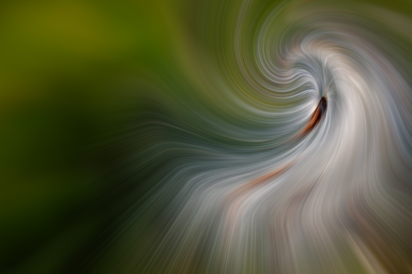
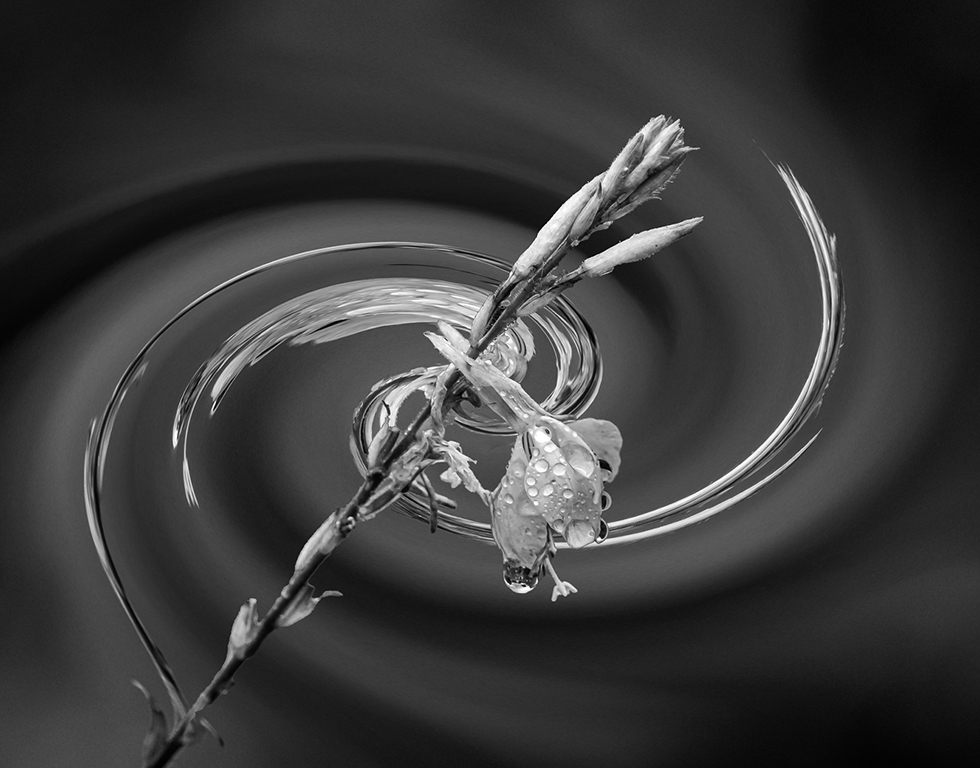
Sorry Bob, I don't see the boa. The small bit of white is a reflection of either the ship, snow/ice, or the sky as we went thru this narrow passage. I have no problem with it being removed. It isn't relative to the composition or the abstract and thank you for your suggestion. |
Aug 15th |
| 29 |
Aug 25 |
Comment |
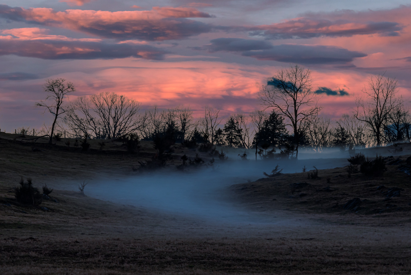
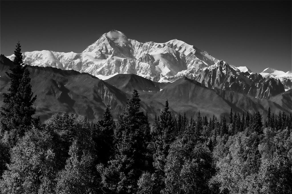
Karen, I like your composition with the buck in the blue triangle that leads the viewers eyes back into the composition and mountain tops. If it was mine, I would pull just a tad back on the midtone highlights. I'm thinking those yellows put the highlights pretty close to the right and the image would look better with more golden colors. Please give it a try and let us know. Thank you. |
Aug 15th |
| 29 |
Aug 25 |
Comment |
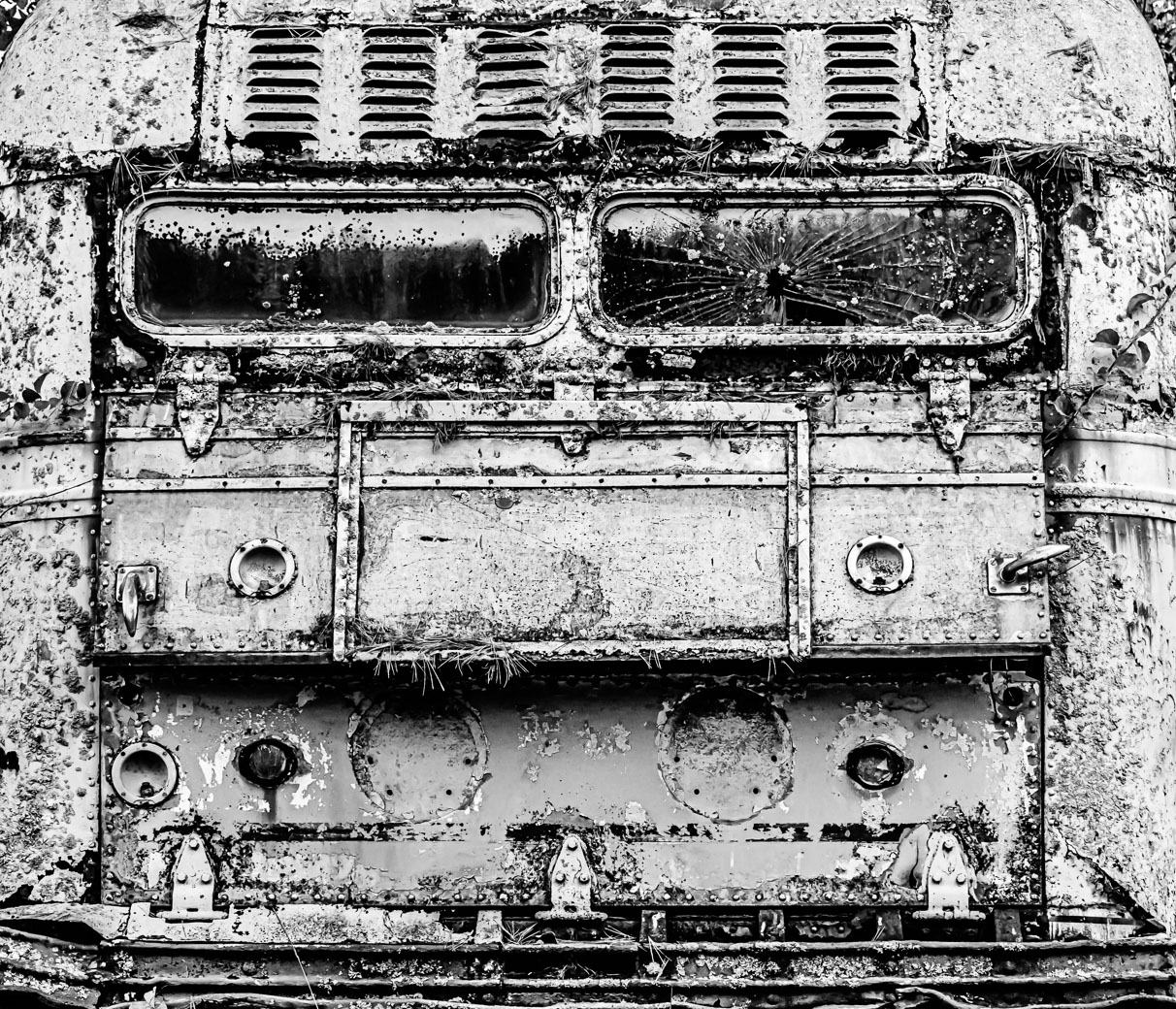
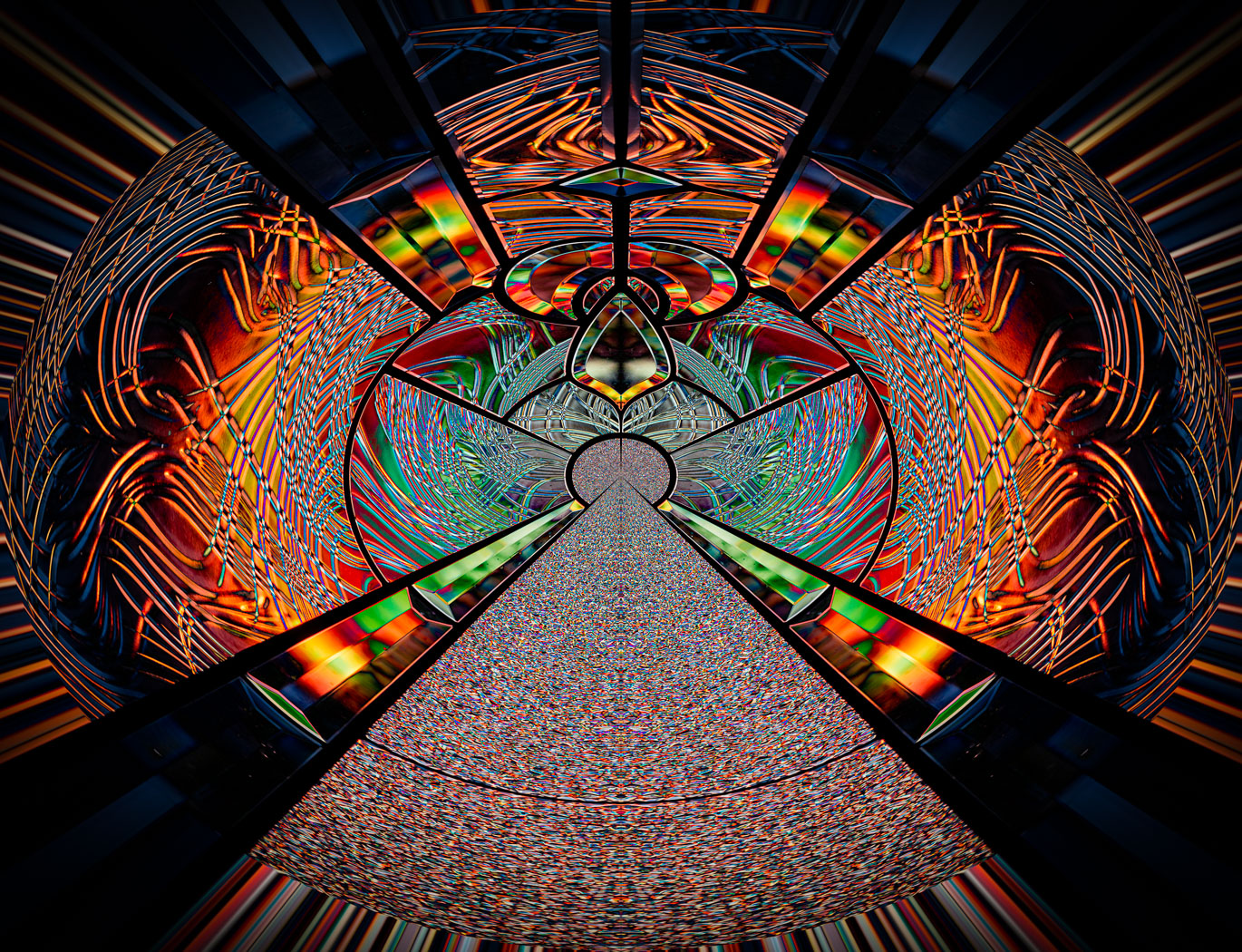
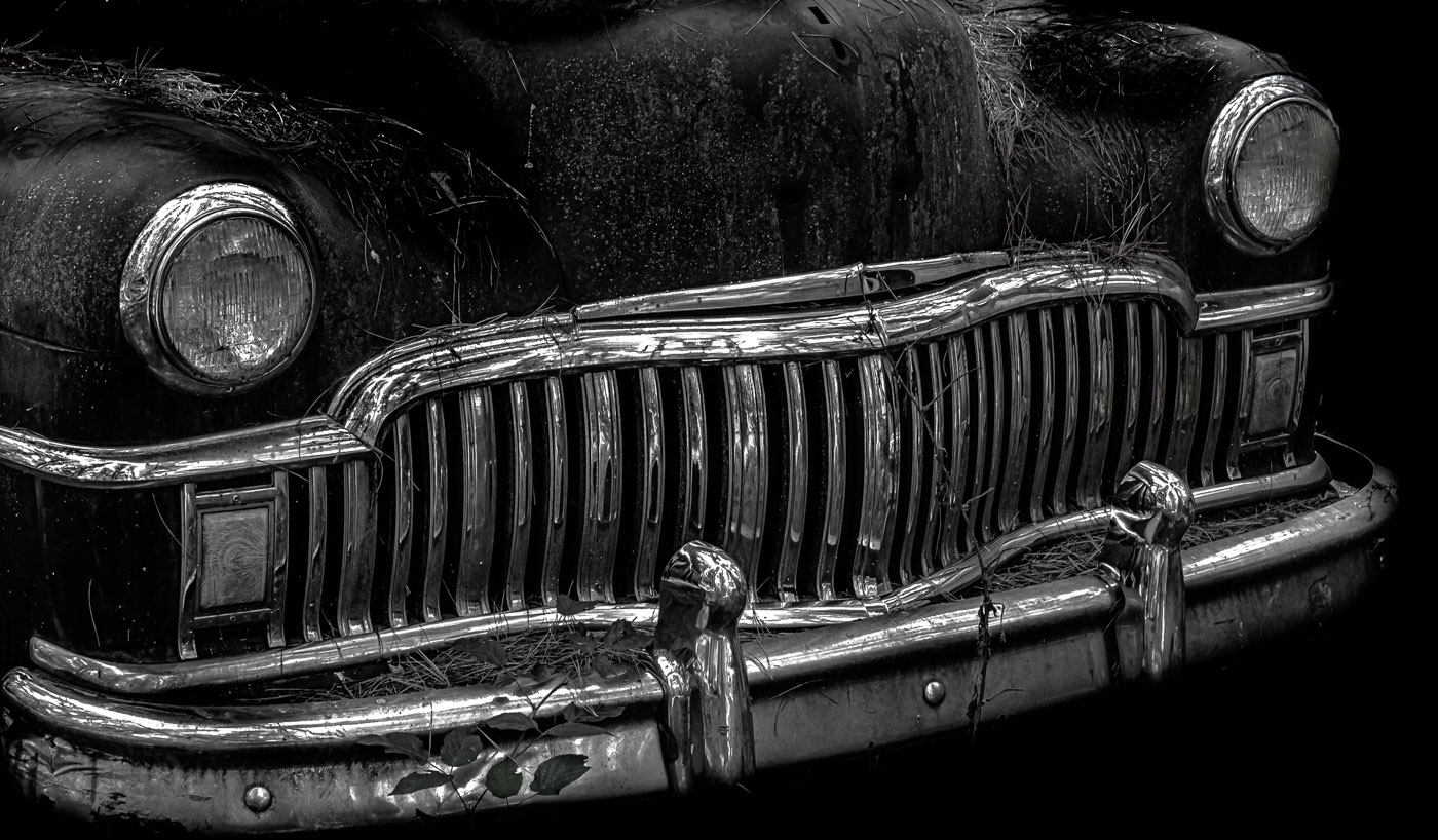
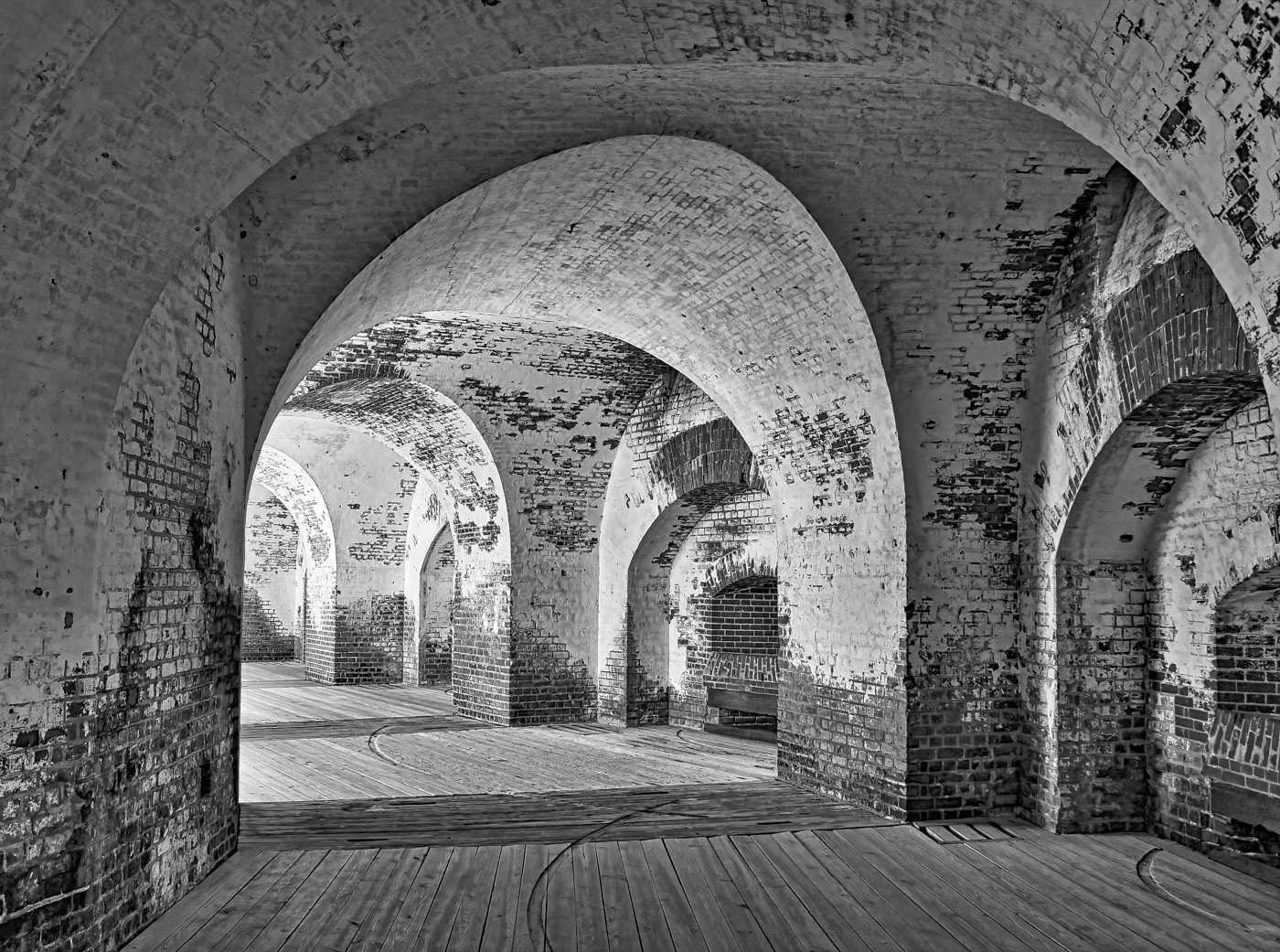
Judy, I'm glad to take time (and money) to visit this old iconic locations. I water and reflection in the floor brings a whole host of features to you. I think the down the center composition works very well with these machines. The green light and reflection in the floor give the impression that the roof leak was not recent. The light along the spindle holders and the underneath supports is well done. |
Aug 11th |
| 29 |
Aug 25 |
Comment |
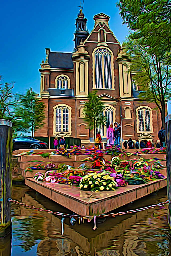
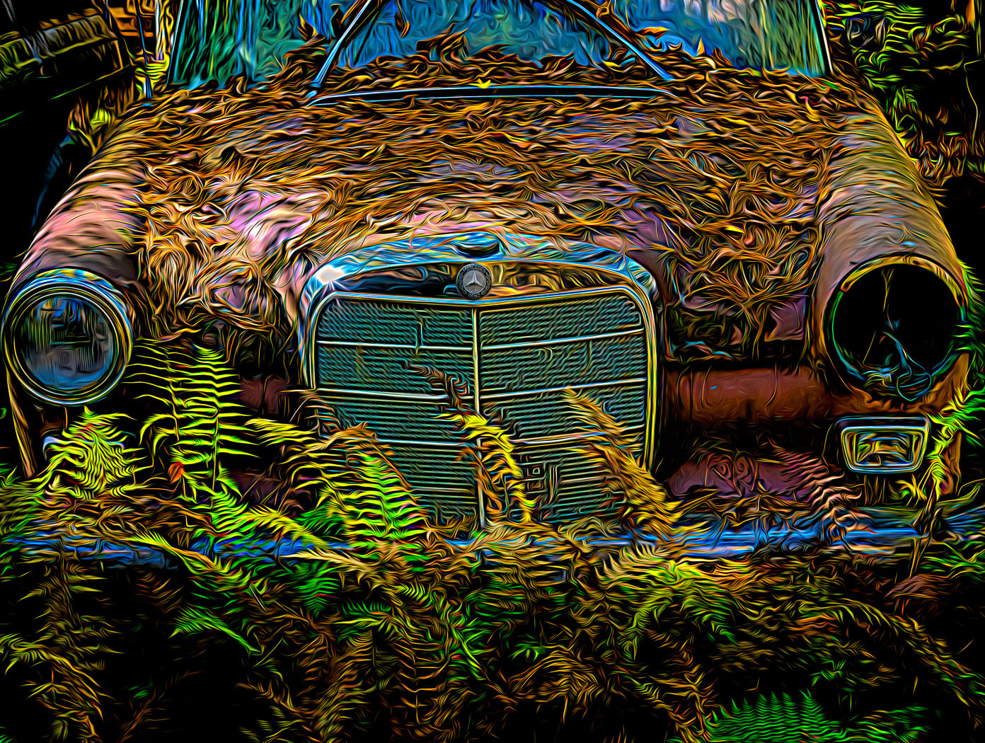
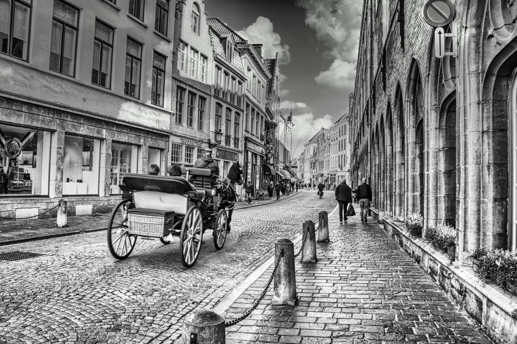
Elaine. A great find with a light color bike. You did a great job toning down the bright lights of the stores. I'm not sure why you wished for a brighter sky. I would suggest going the opposite way and capturing more of the blue sky. That would also light up the canal and bring in more of the blue sky thru the trees. |
Aug 11th |
| 29 |
Aug 25 |
Comment |
Tim, another fantastic PJ shot. Weird how you always get great locations to shot from or into and with great lighting. All the right choices. No suggestions to improve. |
Aug 11th |
6 comments - 2 replies for Group 29
|
| 80 |
Aug 25 |
Reply |
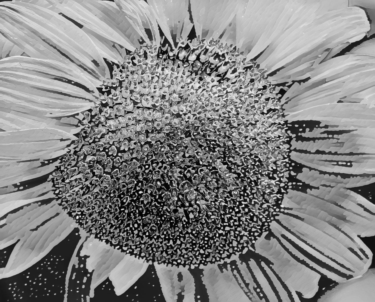
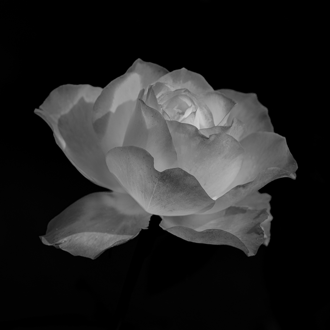
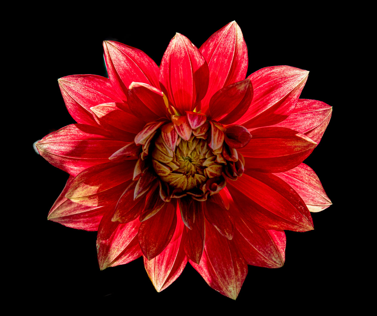
Doug, I agree that the elimination of the leaves and background misc make the center flower stand out better. A very nice image, I Crown you a Creative Artist. |
Aug 18th |
| 80 |
Aug 25 |
Reply |
Thanks Nadia. Enjoy your month off. |
Aug 18th |
| 80 |
Aug 25 |
Comment |
|
Aug 15th |
| 80 |
Aug 25 |
Comment |
Found it. Must be time for bed.
|
Aug 15th |
 |
| 80 |
Aug 25 |
Comment |
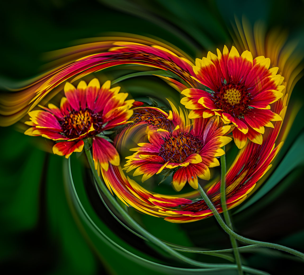
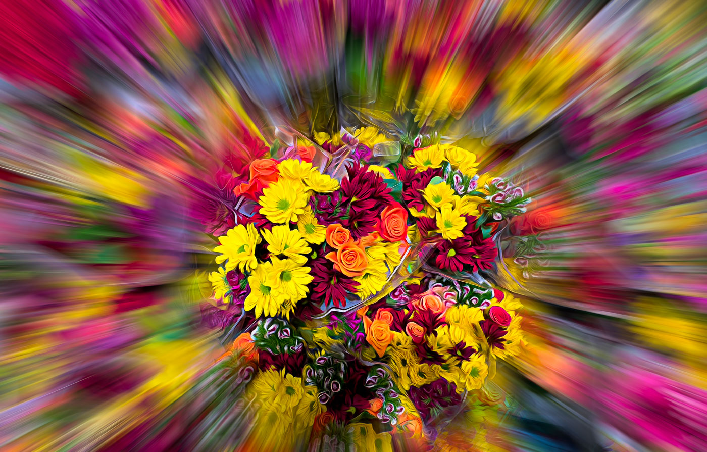
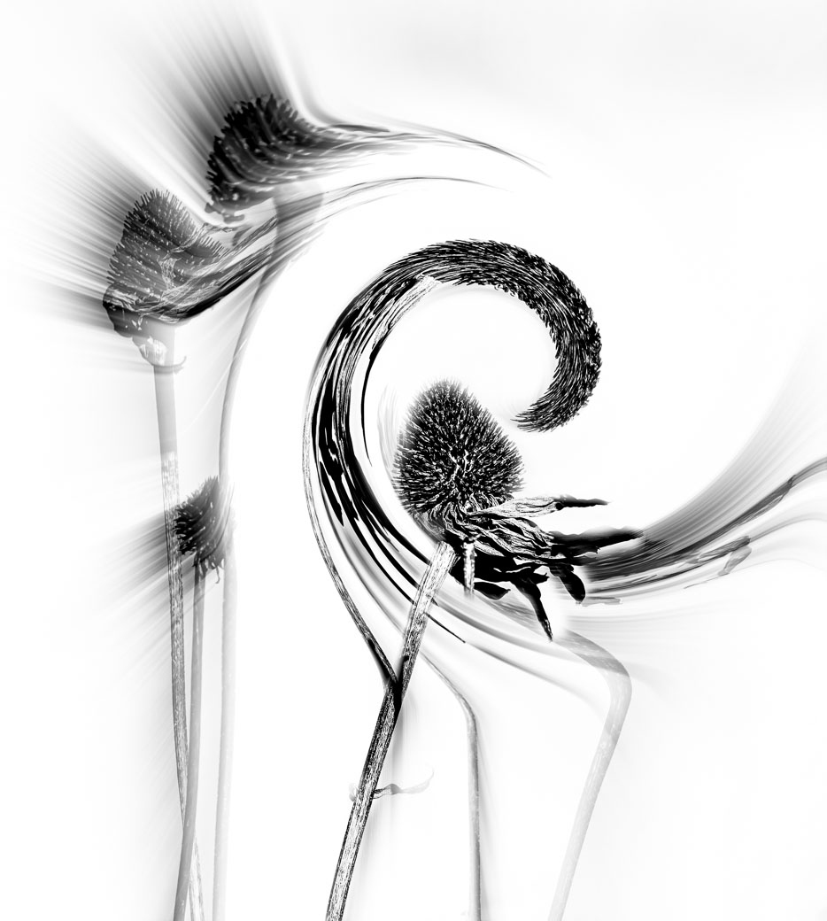
Hello All. Well it took me an hour plus to come up with this version. I saturated (I used point color)for some (like Ingrid's) but not as much as Doug, I sharpened for most in Photo Ai,I cropped, I fixed the lighter background (Marti's Halo) tight around the flower (by redoing and adjusting the brush feather etc) I also tried to improve the background. Also I follow Brian Matiash and he has a short video about the brand new updates that talks about the importance of following a recommended order of doing Ai edits as shown here. https://www.matiash.com/blog/lightroom-8-5-update?cid=43eaf138-c221-4b69-9c59-756d7d729d97&utm_campaign=len-54&utm_medium=email&utm_source=kajabi
Sorry for the blanket reply to everyone, but with so many useful hints and suggestions I thought it best this way. Be sure to let me know if I failed on this. I lost it so sending this before I lose this also |
Aug 15th |
| 80 |
Aug 25 |
Comment |
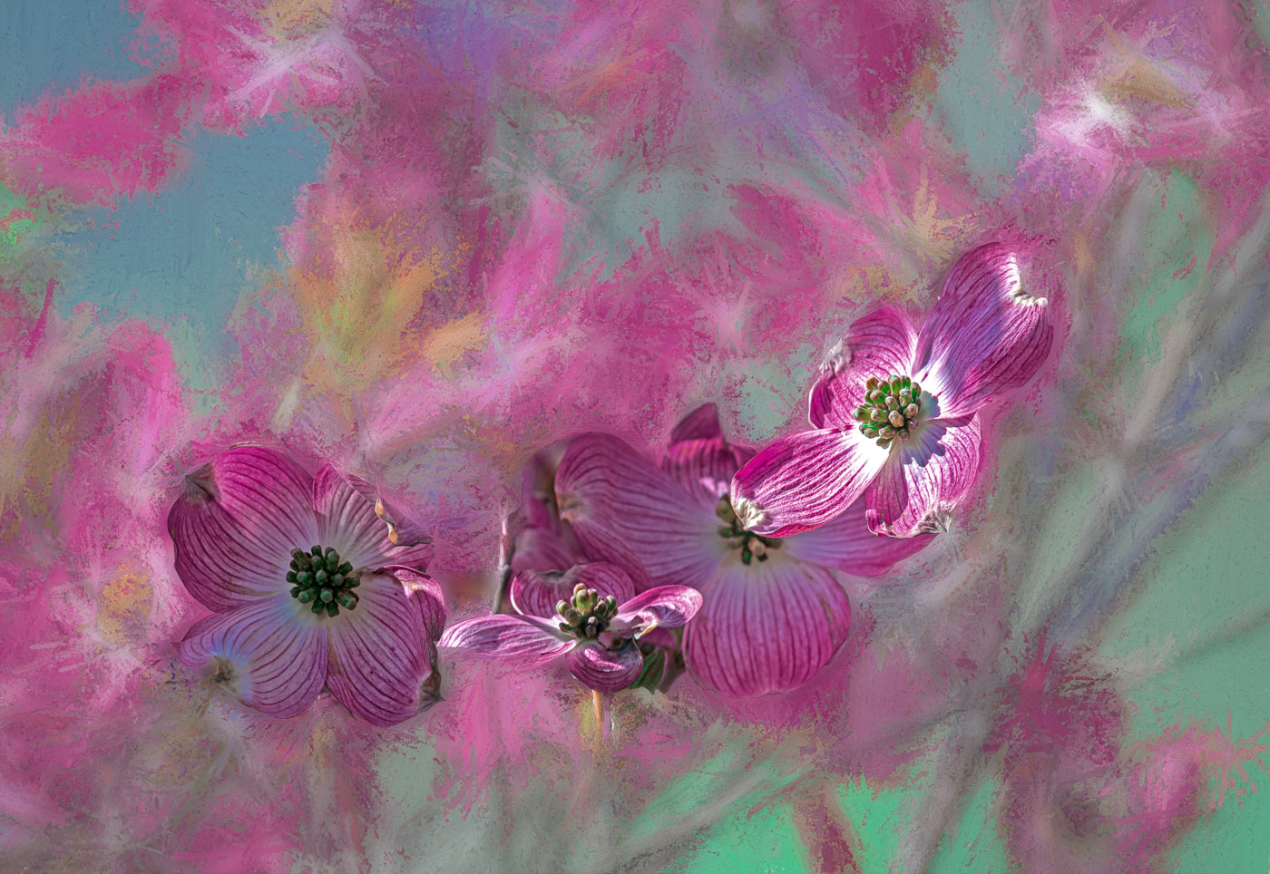
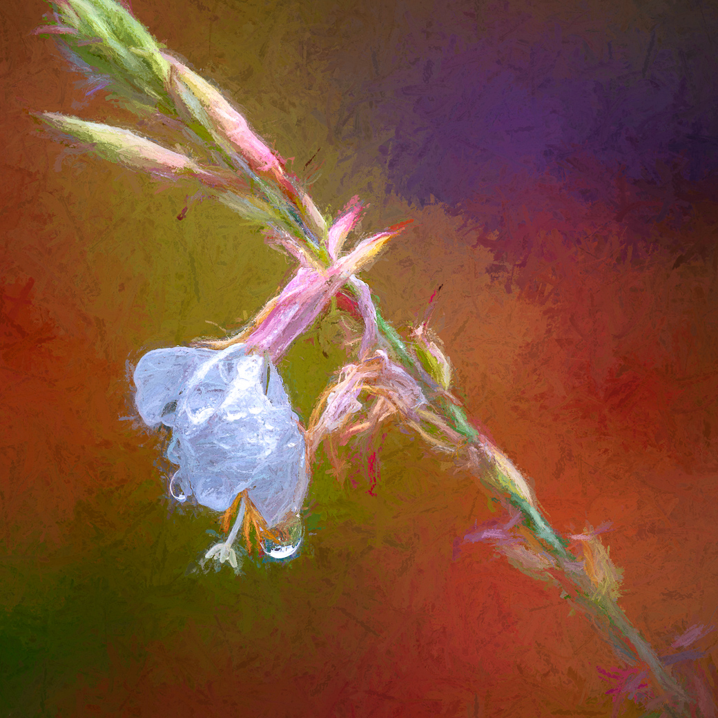
Rich, this is quite interesting with the portrait style mat you created.. It definitely does have a painterly feeling. Another nice touch are the lighter tones inside the flowers. I'm quite sure that I would have made that background come out to encompass the blue of the flowers. But then again I'll leave that thought up to you all, or the more artistic amongst you. I really like the blue and green colors against the colored background. |
Aug 11th |
| 80 |
Aug 25 |
Comment |
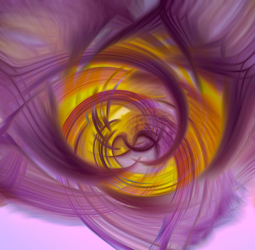
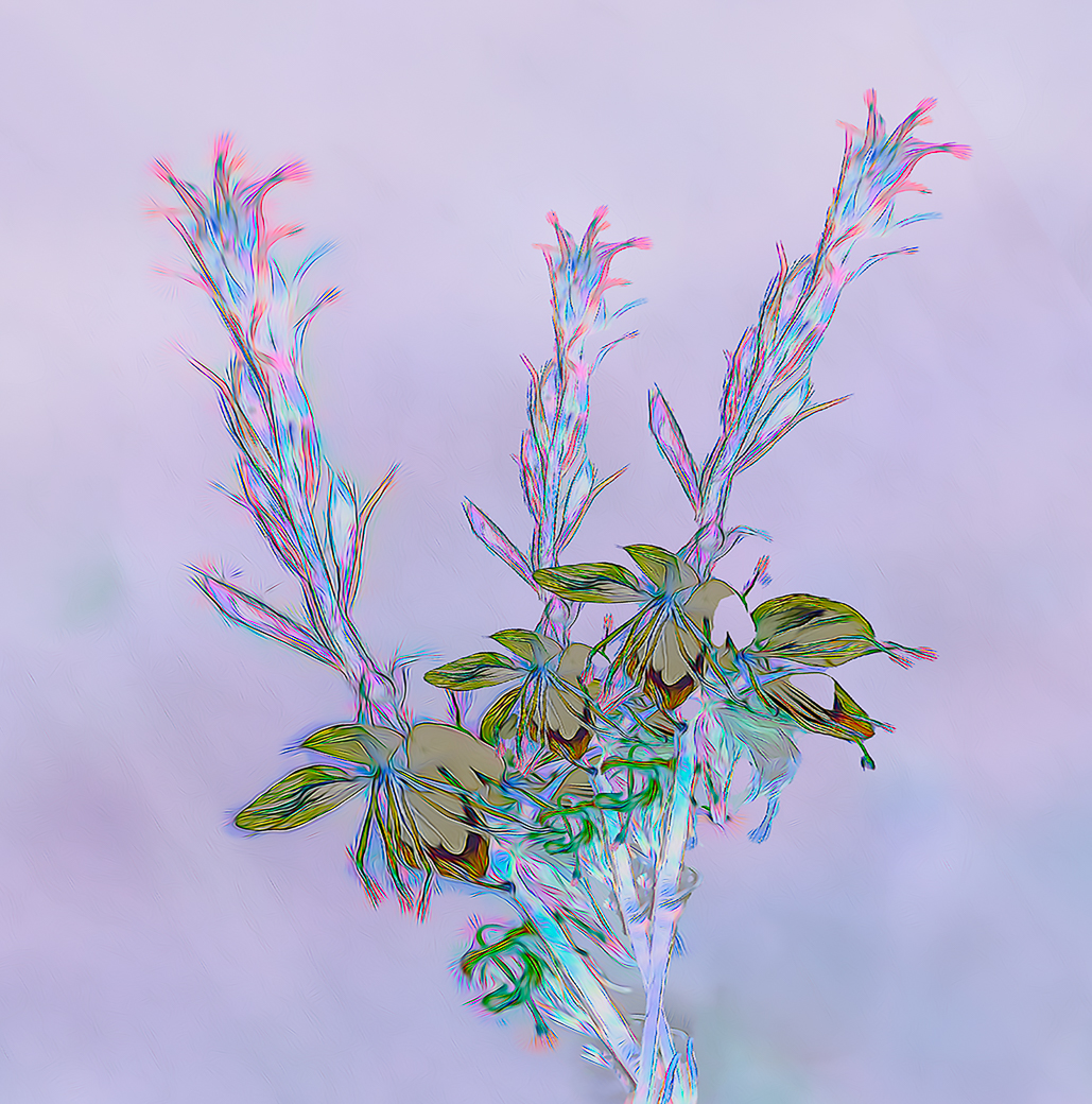
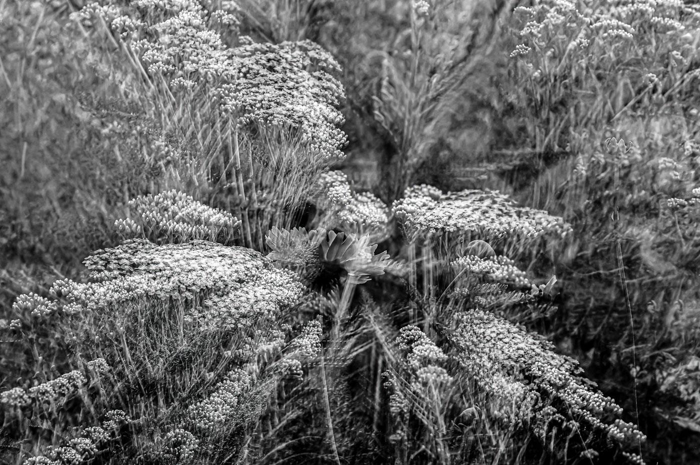
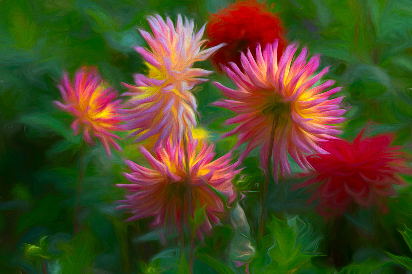
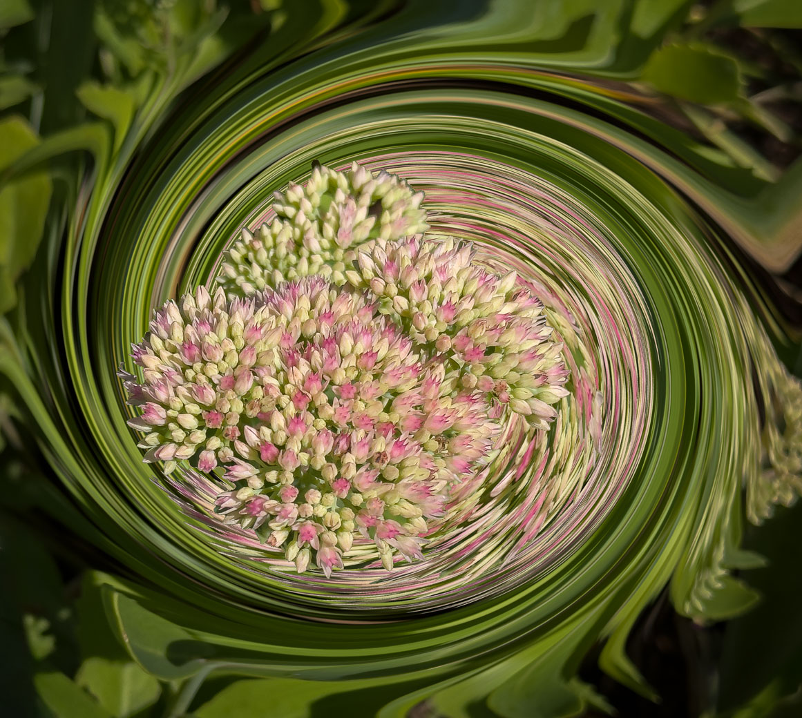
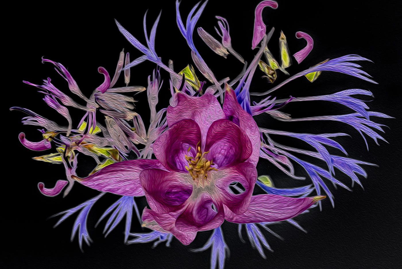
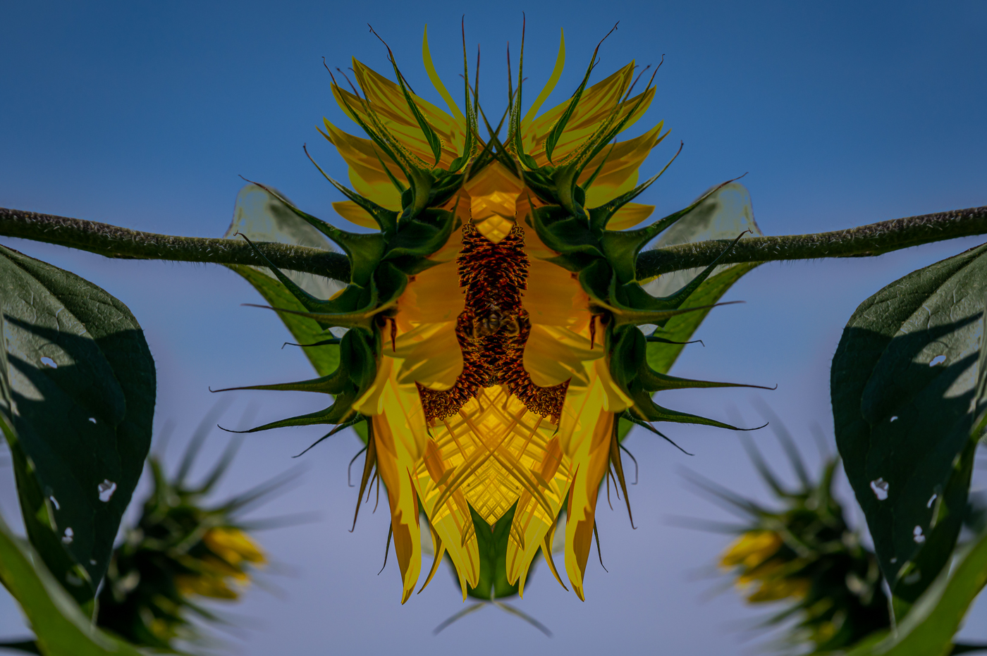
Kamal, I agree that your texture (oil paint) works well to give the background and the flower a texture. I liked the texture when I posted your image, but with the image having a large area outside the subject I feel that the texture detail is lost. The image should be cropped to square, just bring the top margin down to make the square. |
Aug 11th |
| 80 |
Aug 25 |
Comment |
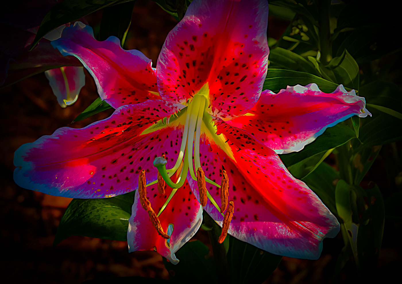
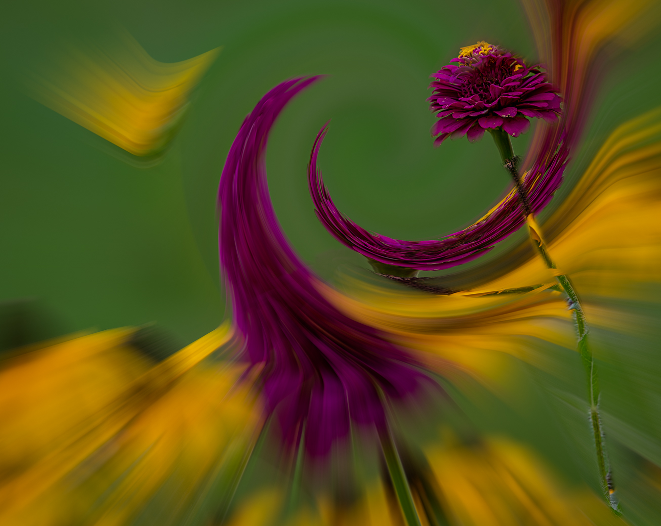
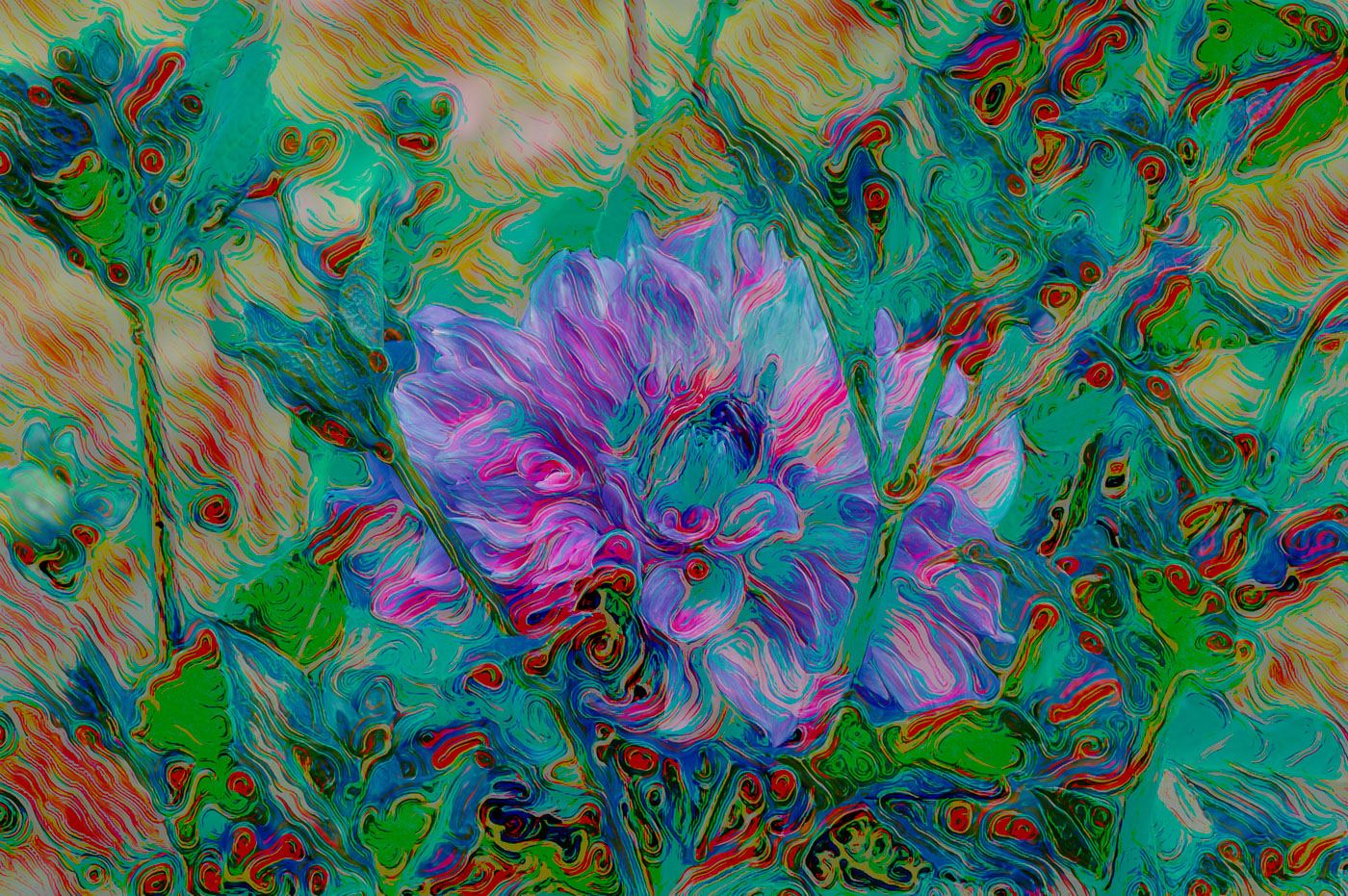
Nice observation on the green thingy. None of old guys would have noticed. Doug, the image is well composed and is sharp, maybe more so than a water color image would be but then again with the vibrant colors it isn't a traditional watercolor. Just a minor nite, a bright rain drop on the water to the top right corner. It just brought up there to notice because it wasn't in the original. Keep on finding these creative editing methods. They are not all perfect, but that happens when you (we) work outside of the norms. We done. |
Aug 11th |
| 80 |
Aug 25 |
Comment |
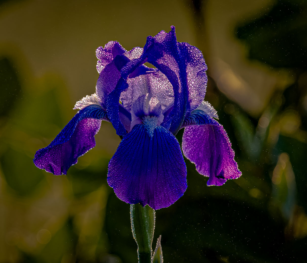
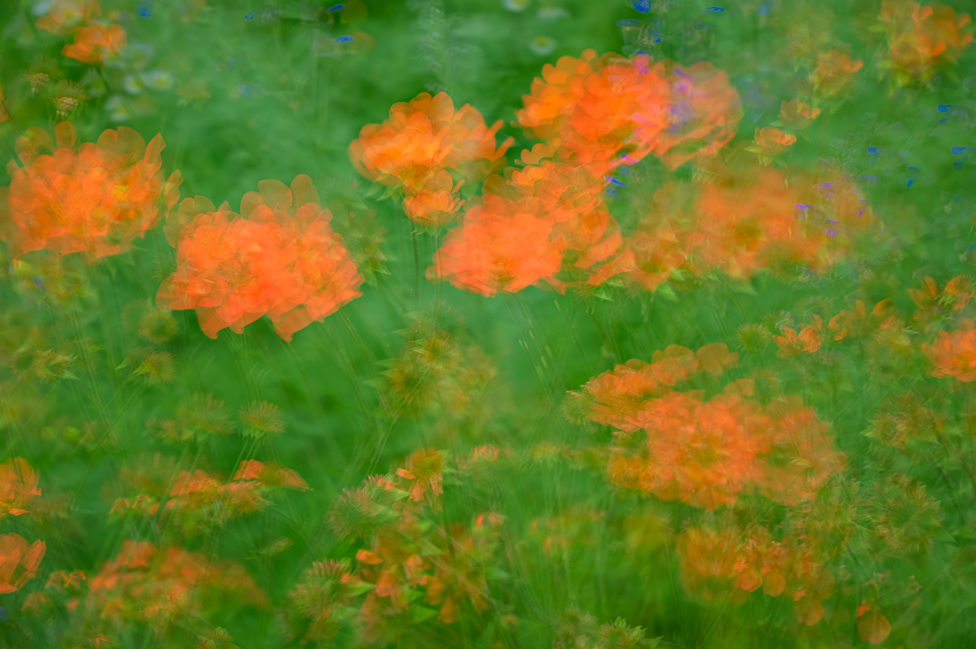
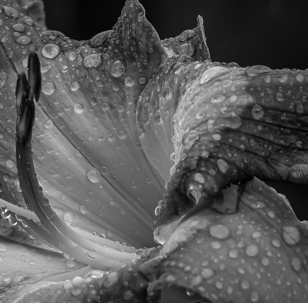
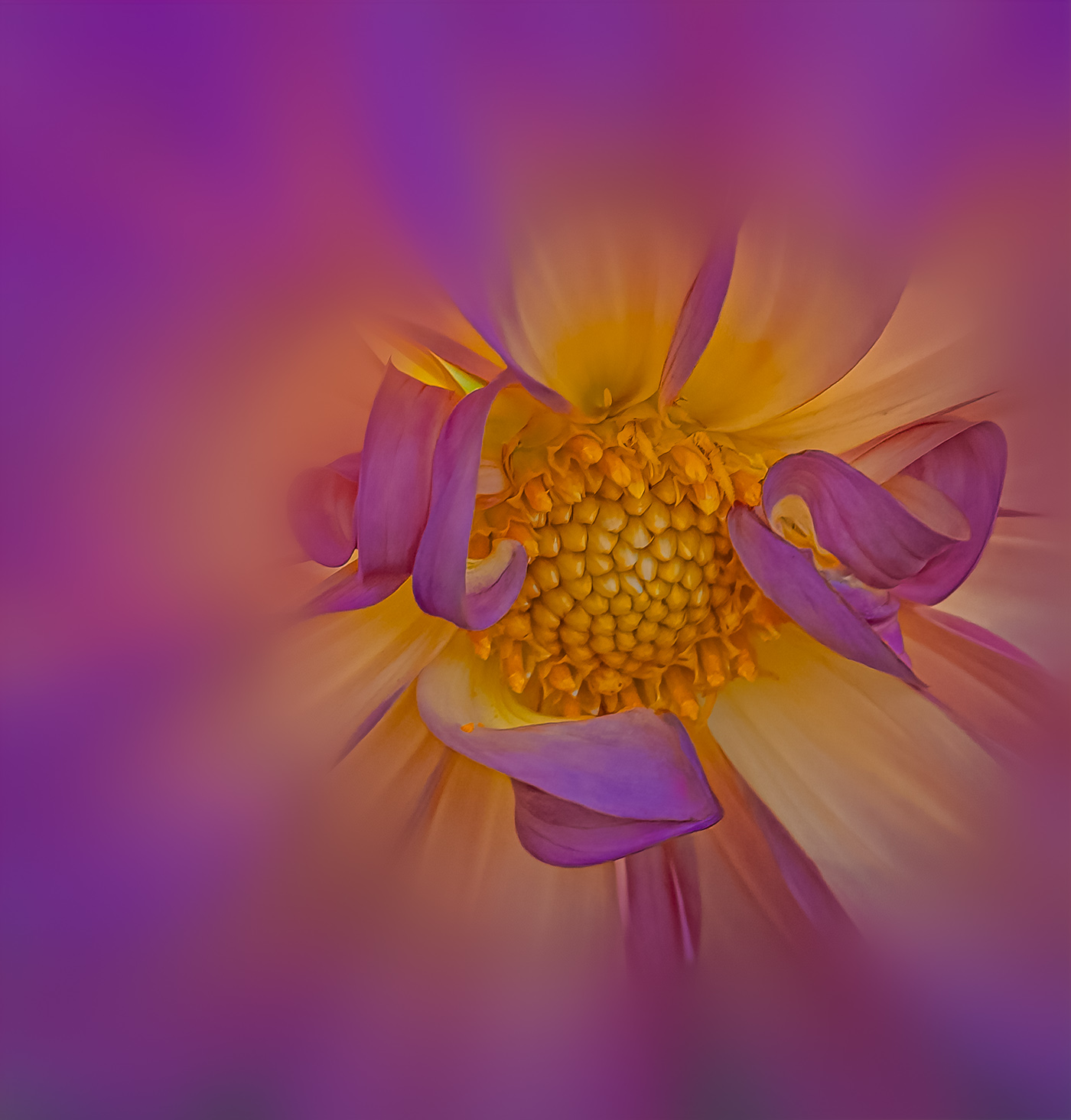
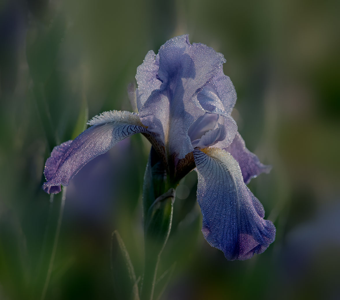
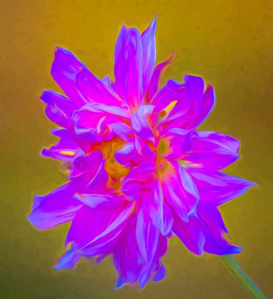
Nadia, another beautiful art piece. I'm fine with sharpness of the whole image. A very nice touch to get some paint splatter onto the flower, I think there is a filter for that. The white petals probably were white, but I'm thinking the purple border seems to me a bit over saturated but maybe this Iris has that as a selling point.
Happy winter to you. |
Aug 11th |
| 80 |
Aug 25 |
Comment |
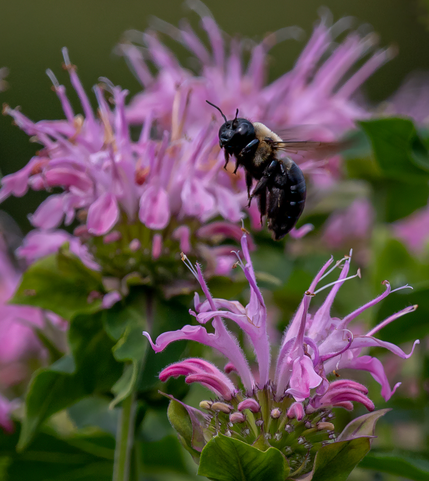
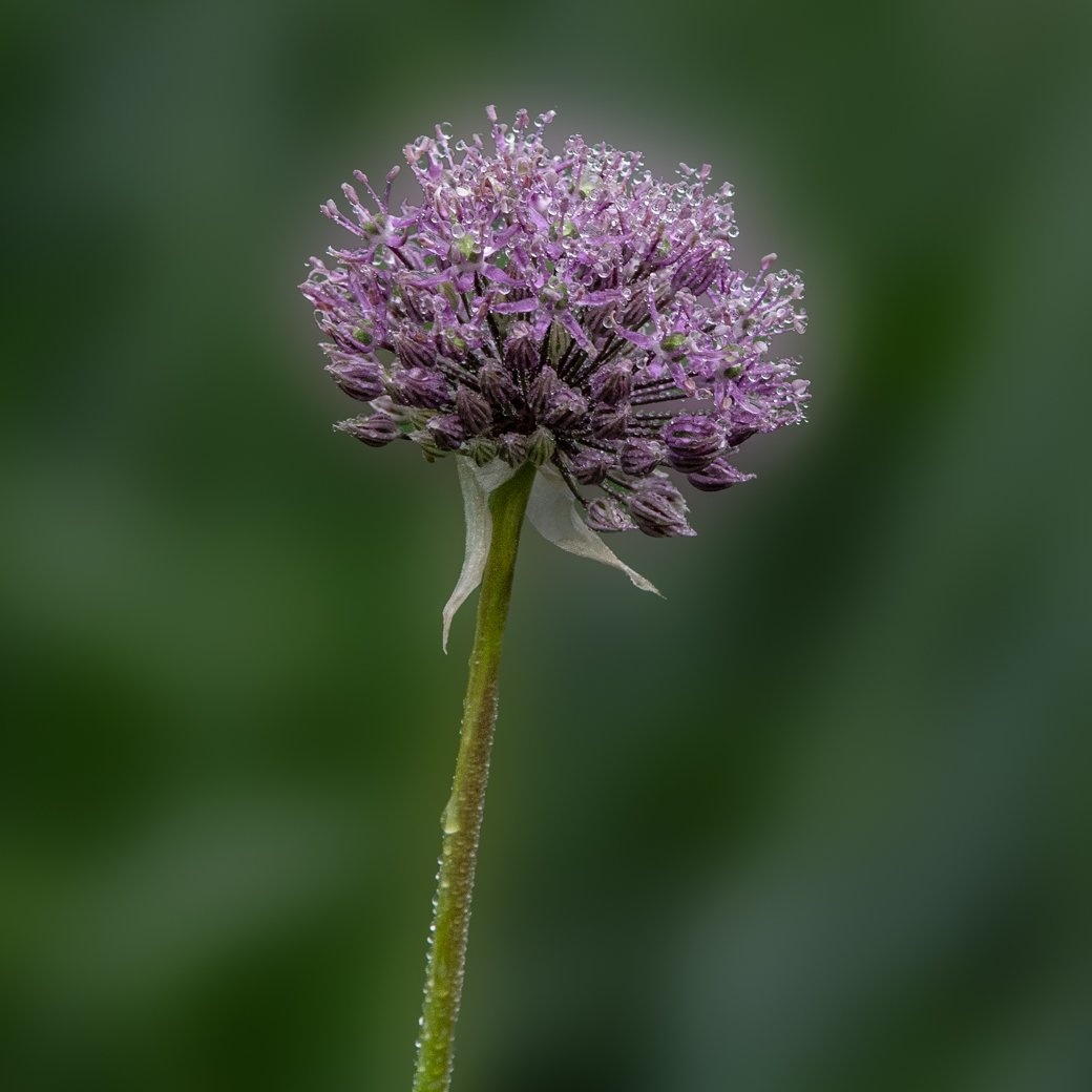
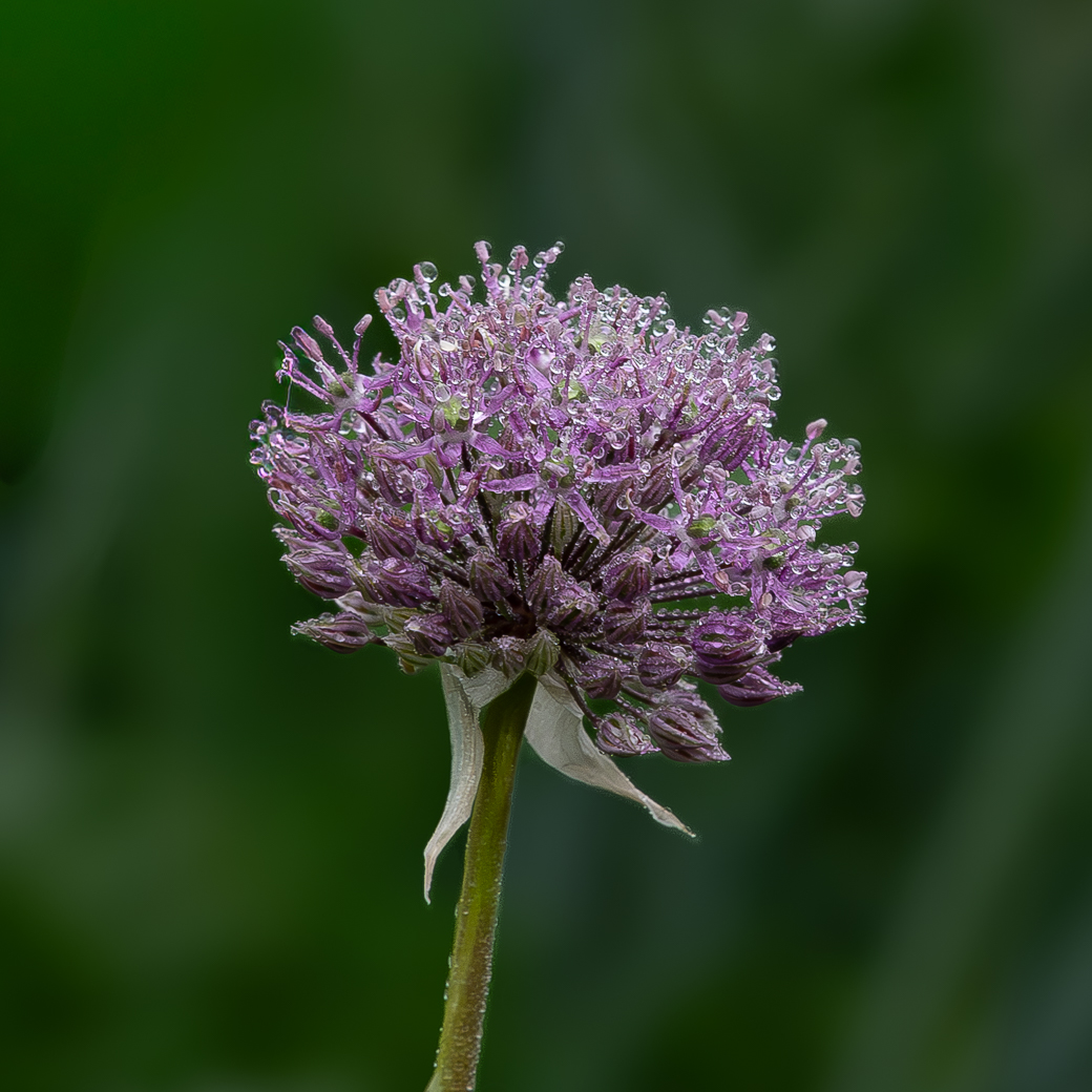
A very nice image, Marti. The bee is perfect, no suggestions there. To me, I would have selected the flower as subject and selected background and darkened the pale grey/beige that now leads my eyes out of each corner. Not sure if it would have worked, but I reduce the highlights with hopes of removed some of the white on the flower and then the brightening like you did. Love the composition. |
Aug 11th |
8 comments - 2 replies for Group 80
|
14 comments - 4 replies Total
|