|
| Group |
Round |
C/R |
Comment |
Date |
Image |
| 29 |
Jul 25 |
Reply |
Bob, you should be using modern shooting techniques to match that Z8. Checkout Steve Perry, Nikon guides. Shoot at min of iso 800+ when handholding and learn back button focus and hold it in to focus as you rock back and forth and shoot a group of 2-5 shots and you find that you percentages are close to 100%. |
Jul 17th |
| 29 |
Jul 25 |
Reply |
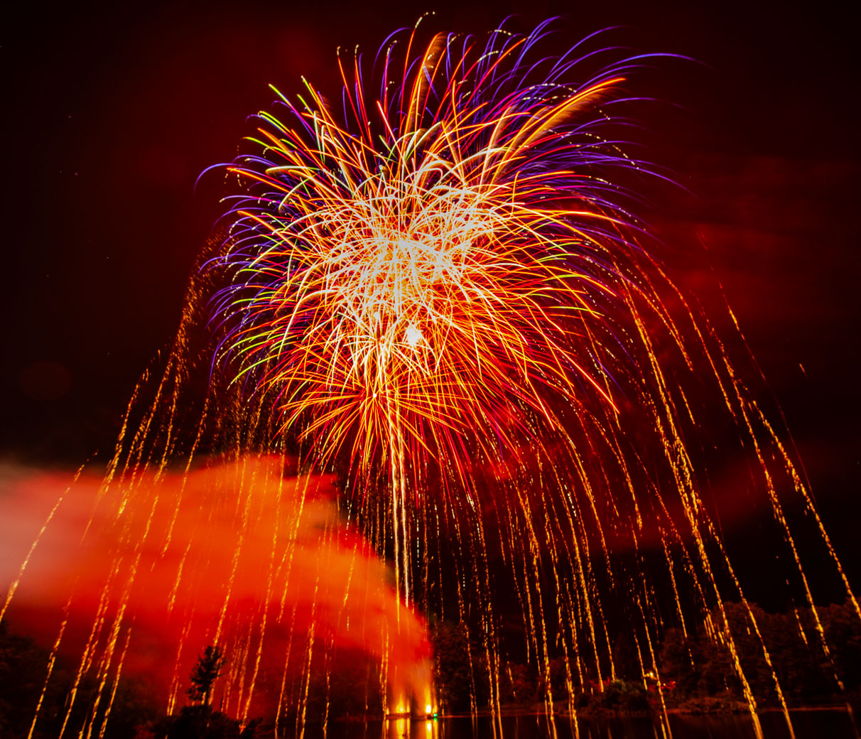
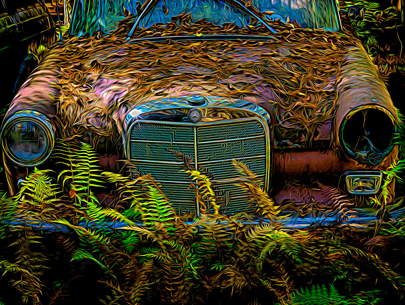
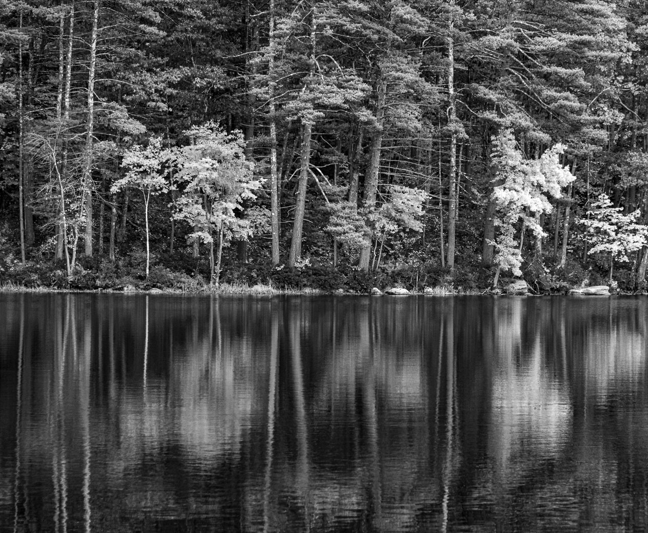
Hey Bob, I think those artifacts are in fact ripples in the water that catch the red colored lights. |
Jul 17th |
| 29 |
Jul 25 |
Reply |
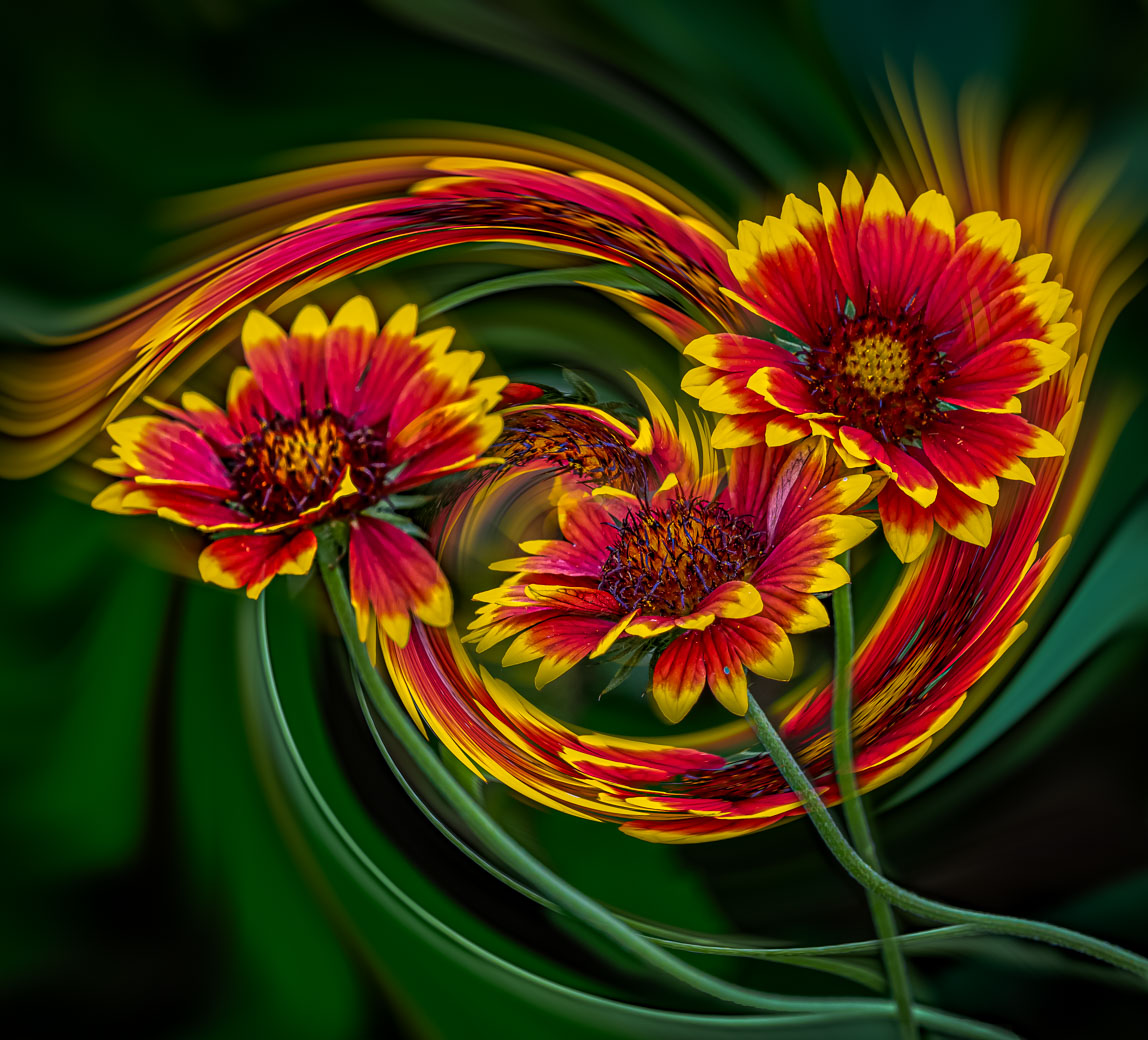
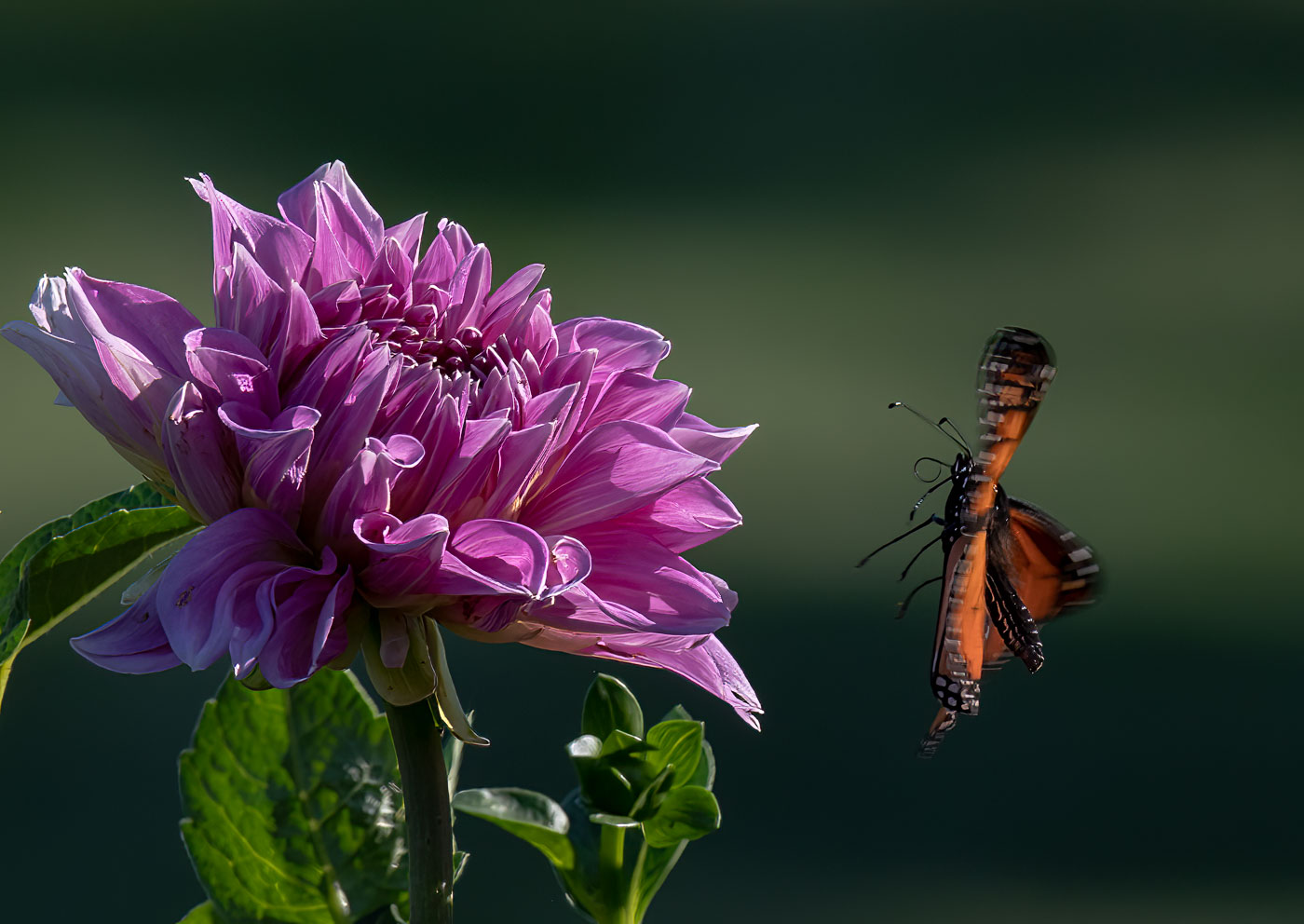
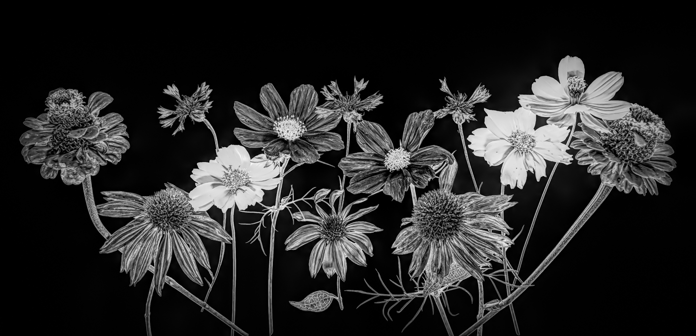
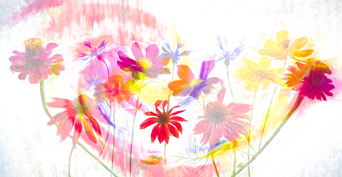
Thanks Kathy. Two parts of the creativity. Including it all in the original and using your imagination, ability to start over a couple of times, and ability to do basic editing. I don't do as much Ps editing as I should but I've been fortunate to have some good instructors from my many years in camera clubs. You can go back in the various rounds to see my other creatives and even more involving flowers in DD80.
BTW, you are off to a fantastic start with your image and point on comments. |
Jul 17th |
| 29 |
Jul 25 |
Reply |
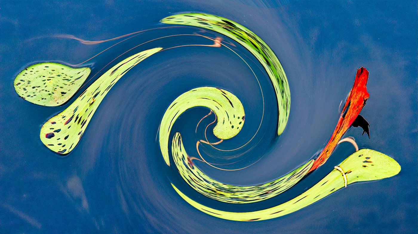
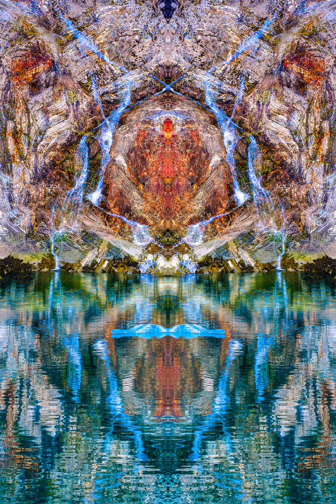
Bob, I use layers as seldom as necessary. I made the virtual copy layer in LrC and then flipped horizontally, took them both into Ps and used Lighten Blend mode. That's 2 layers, I believe. Now Bob, I must of offended you, but you didn't have to take down my finished image. Only see black image and 1 on the right.
Sorry, I don't see your fish in my photo. I do see your lovely angel fish. BTW, you should have used extended margins so the poor guy could eat or kiss you. :-)
Here's my finished image. |
Jul 17th |
 |
| 29 |
Jul 25 |
Comment |
Thanks Bob. I don't find your fish and you didn't note if it was in the water or in the stone? Your color doesn't do anything for me. |
Jul 10th |
| 29 |
Jul 25 |
Reply |
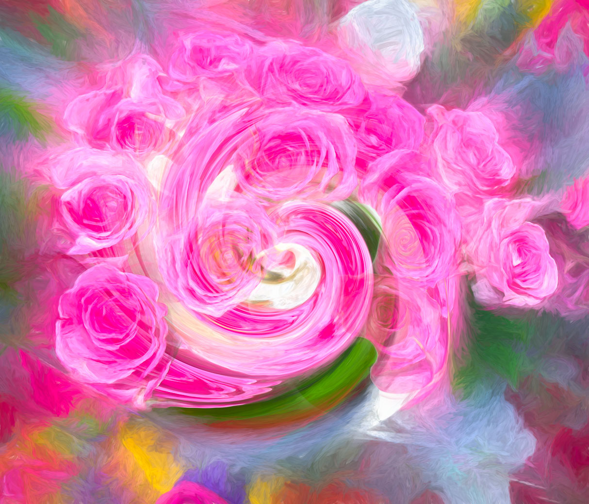
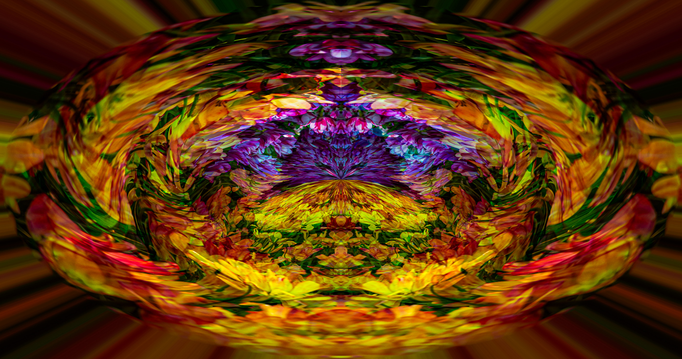
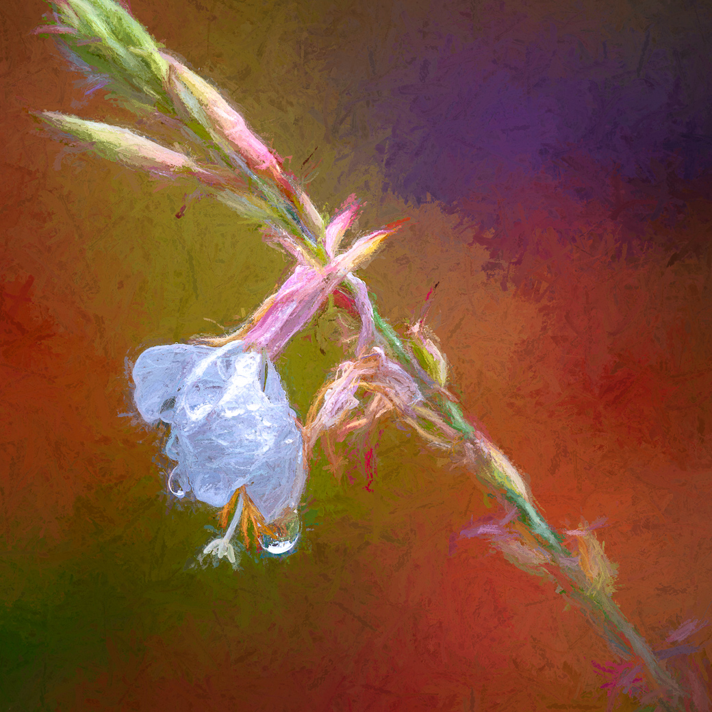
Thanks Judy. My intended final did have lower saturation. See above.
|
Jul 10th |
| 29 |
Jul 25 |
Reply |
Thank you Kathy. Per my reply to Elaines comments the "Reflected Beauty" is the finished image and its a mirrored image of the large image. |
Jul 10th |
| 29 |
Jul 25 |
Reply |
Thanks Karen. |
Jul 10th |
| 29 |
Jul 25 |
Reply |
Thanks Elaine. Yes, on the edge of over-saturation is where I live. Actually the image shown on the right is the final image. I failed to make it clear to Bob W which was the final. |
Jul 10th |
| 29 |
Jul 25 |
Reply |
Sorry, Judy. They are on the phone, but with flower season in full bloom, I've not taken any time to use them. Thanks for reminding me. |
Jul 10th |
| 29 |
Jul 25 |
Comment |
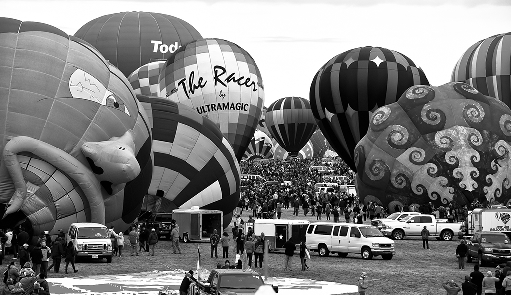
Hi Tim. You've done an outstanding job of capturing the race as it happens with the cars coming out of the turn at an angle that reinforces your choice of shooting location and capturing the smoke/dust hiding most of the crowd in the background. Time, I won't change a thing except to add to my "best of" collection. Wonderful job. |
Jul 10th |
| 29 |
Jul 25 |
Comment |
Hi Elaine. I agree with your composition, light temp/color and I agree the iPhones excel in this type of image, however, it does take a very good photographer to stand in the right spot, compose and make sure the camera phone doesn't have bad settings. Well Done. |
Jul 6th |
| 29 |
Jul 25 |
Comment |
Karen, I agree with your thinking about the blue water and your composition gives great depth of field but I think I would crop down and up leaving the crocodile to mark the 1/3 third line up from the bottom. |
Jul 6th |
| 29 |
Jul 25 |
Comment |
I agree with Tim, and with several of his comments. The music stands also detract. Good documentary image and memories of the trip. It's not a PSA entry and nothing wrong with that. We take images for many reasons and this circumstance is interesting. Period. |
Jul 6th |
| 29 |
Jul 25 |
Comment |
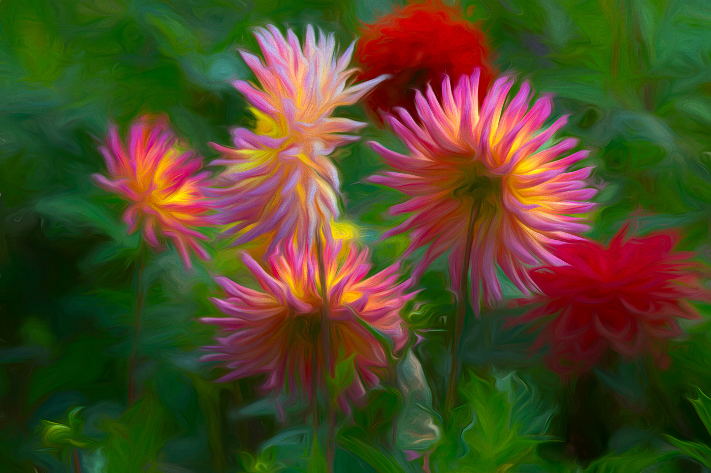
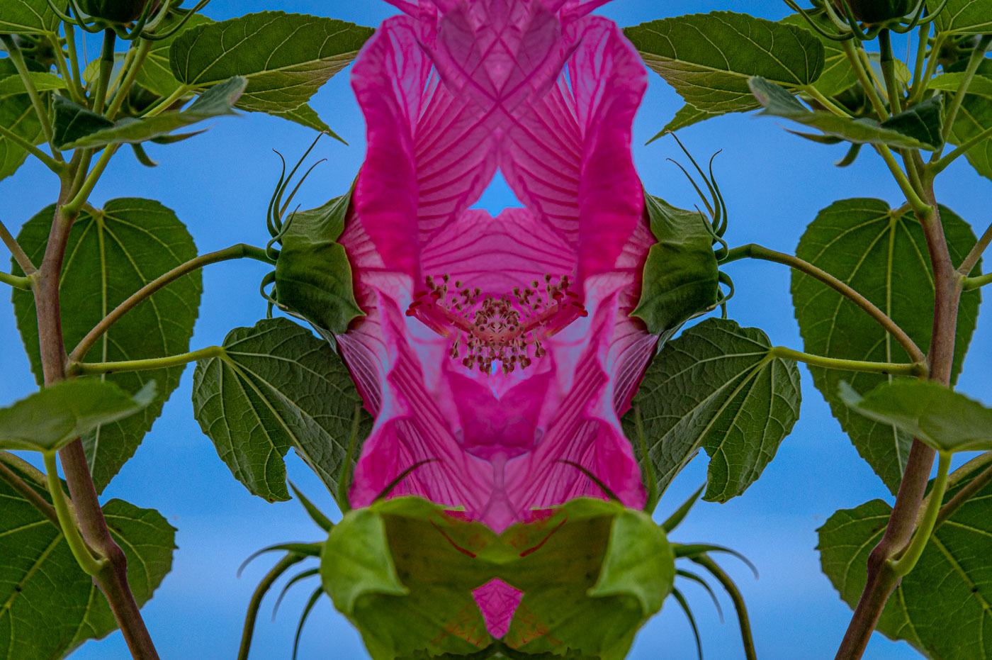
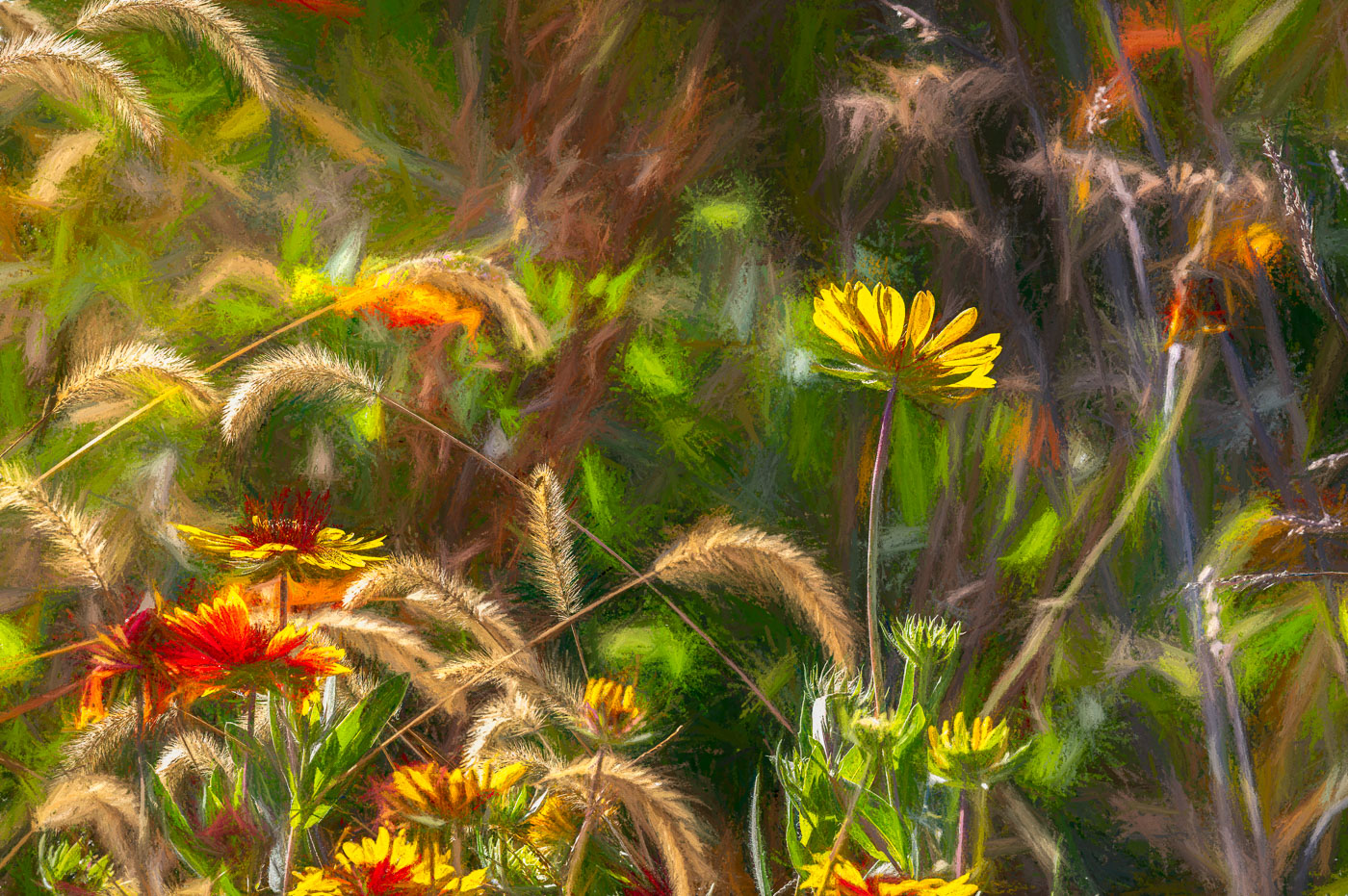
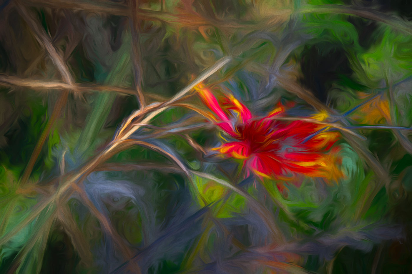
Bob, the description above is an excellent idea as to why you chose the composition and calming effect. Without your reasoning I would state that it was too green and lacking a subject. This image does make a very good choice for a background. Leaving the red flower on the right might work very well in a balanced foreground. Looking forward to seeing some foregrounds using this background. I personally struggle with finding the best foregrounds to complete the composition. |
Jul 6th |
| 29 |
Jul 25 |
Reply |
I agree with Kathy about your red flower edit. |
Jul 6th |
| 29 |
Jul 25 |
Comment |
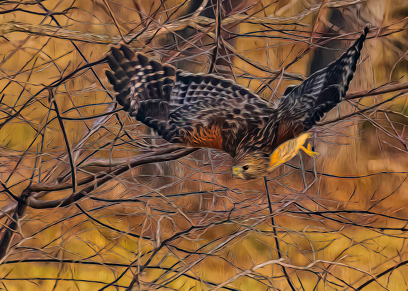
Hi Kathy, Welcome to DD29. A beautiful image you have created here. The blue color was an ideal choice for this type of racing. Your composition is very good but maybe a tad shy of catching the rooster tail effect on the right side. Your shutter speed is perfect for stopping and displaying the spray. Spray job is fantastic. With nothing happening with the driver, the spray is next most important. (In my mind). I don't have any suggestions for improving your image. Very well done. |
Jul 6th |
7 comments - 10 replies for Group 29
|
| 80 |
Jul 25 |
Comment |
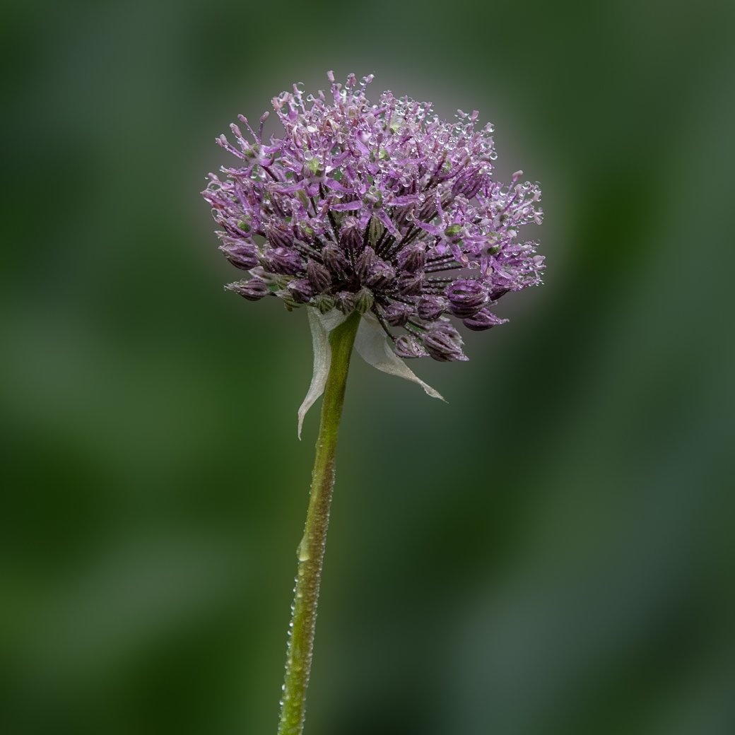
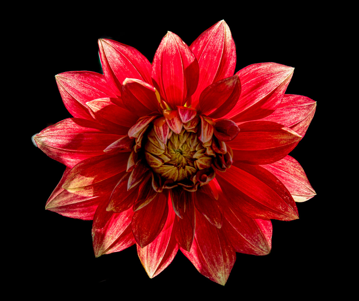
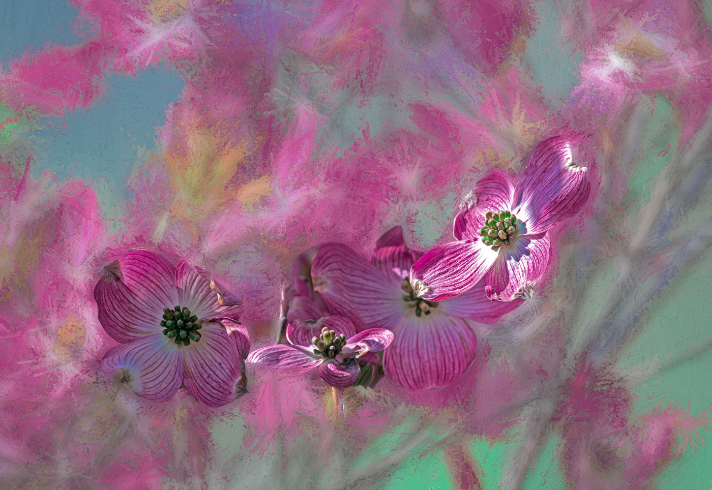
Thanks Rich. But I'm not getting your comment. The blossom showing in my original? That's not the entire blossom. And because of the size and depth not all is in focus. Was taken in a "No cutting zone" of the Legg property so limitations on getting whole. |
Jul 10th |
| 80 |
Jul 25 |
Comment |
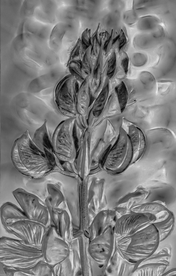
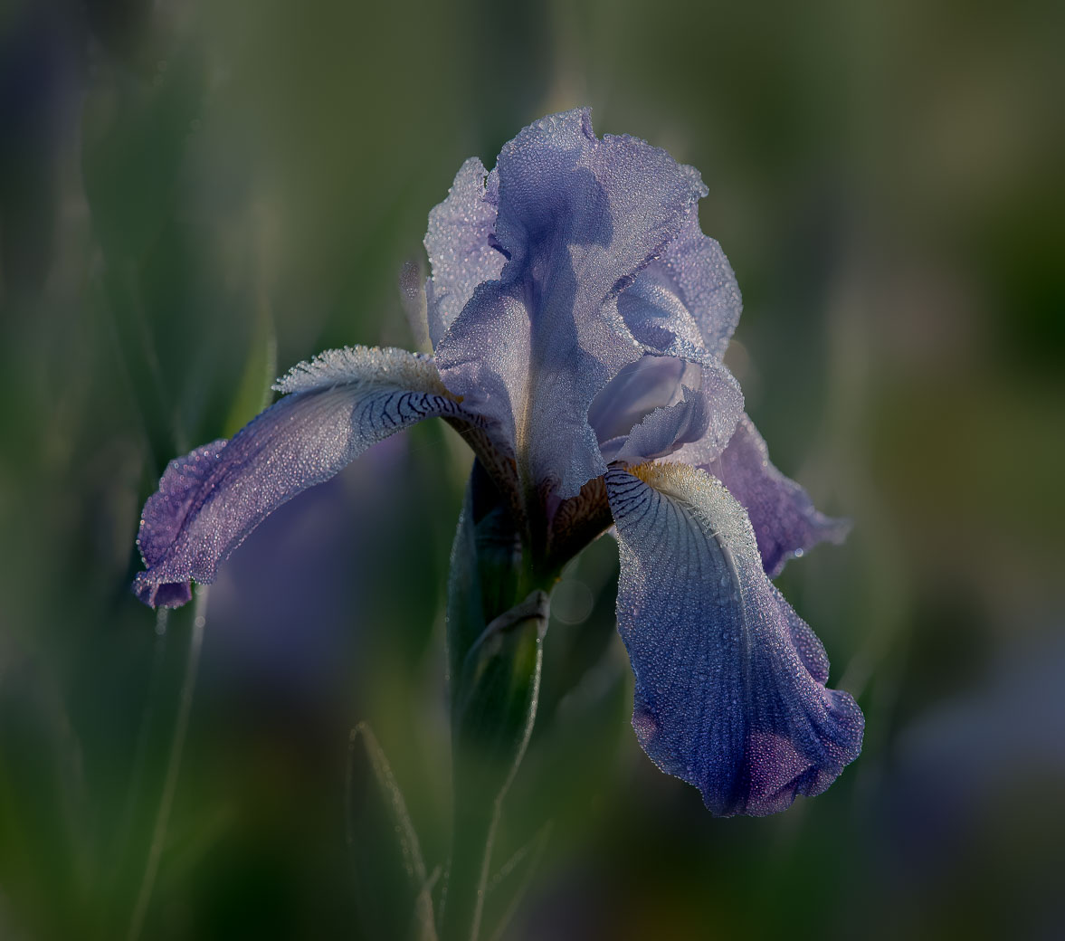
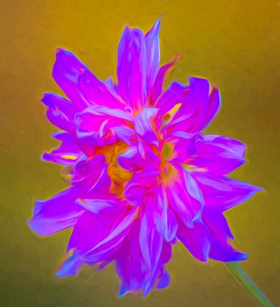
Rich, I believe that your image captures "velvet" petals as I envisioned, but then again I have not seen this flower before. The lightened center piece looks odd, and not part of the flower, but that could be natural and . I'll defer to the ladies on the use of the "stroke" because I rarely use a stroke. Rich, if you had included an original it would have gone to address its parts, even if it didn't show the velvet nature. Up North we do have trumpet flowers on trumpet vines but your FL version must be another animal. |
Jul 8th |
| 80 |
Jul 25 |
Comment |
Ingrid, this is a very powerful color combination. I like your composition and would keep your logo in the corner but tone down to match a toned down stroke to match the yellow in the flower. I'm not sure if this was intentionally soft, but the center parts appear more soft than the petals. |
Jul 8th |
| 80 |
Jul 25 |
Comment |
A nice specimen Doug. I take it that the bonding of left & right sides makes the "Dangerous". I would not of used the blue silver vs white edges. I do however like the centers being brighter than the black/dark brown. |
Jul 8th |
| 80 |
Jul 25 |
Comment |
Nadia, this is another beautiful job with picking the sample and doing a very good job with the creative edits. A great job with envisioning that the blue background needed to be edited and your unique way of accomplishing that. Nothing comes to mind on how I would edit it differently. A very nice job. |
Jul 8th |
| 80 |
Jul 25 |
Comment |
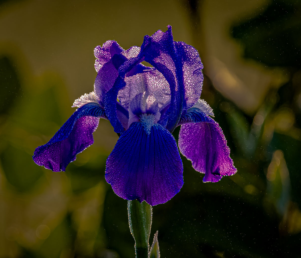
Mart, I really like your purple It is. You caught it at the peak of composition with its petals/ears up. I have to admit that I like your natural background better than the black. I think that is because your subject's petals are naturally dark and your natural background doesn't contain anything out of character. |
Jul 8th |
| 80 |
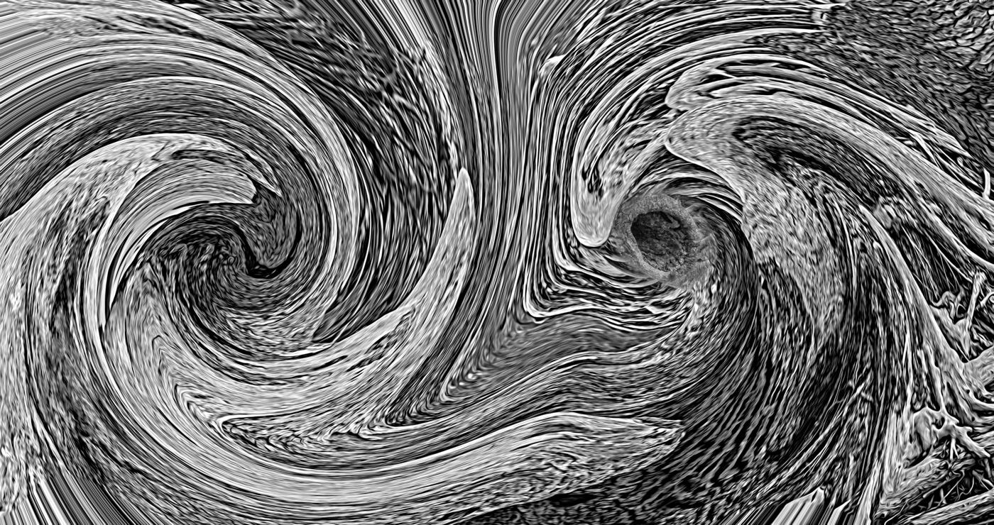
Jul 25 |
Comment |
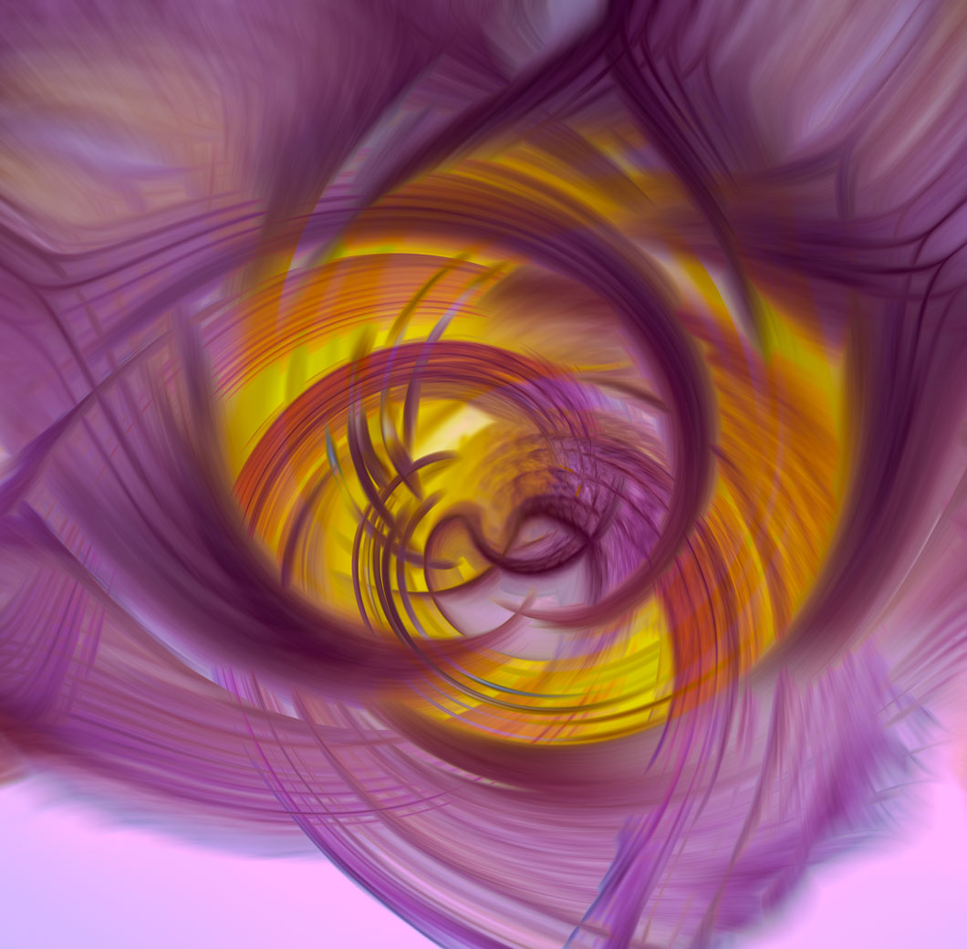
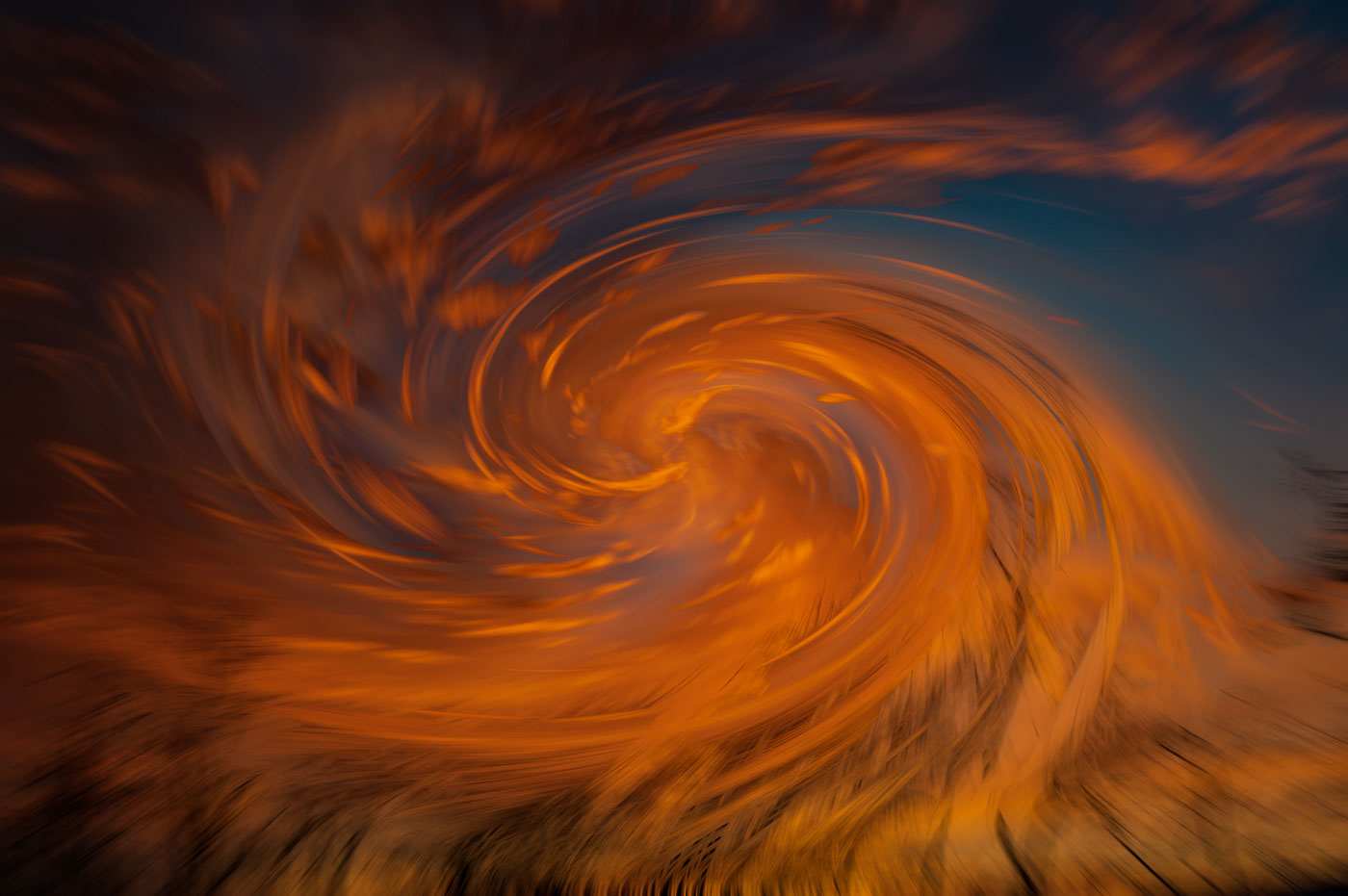
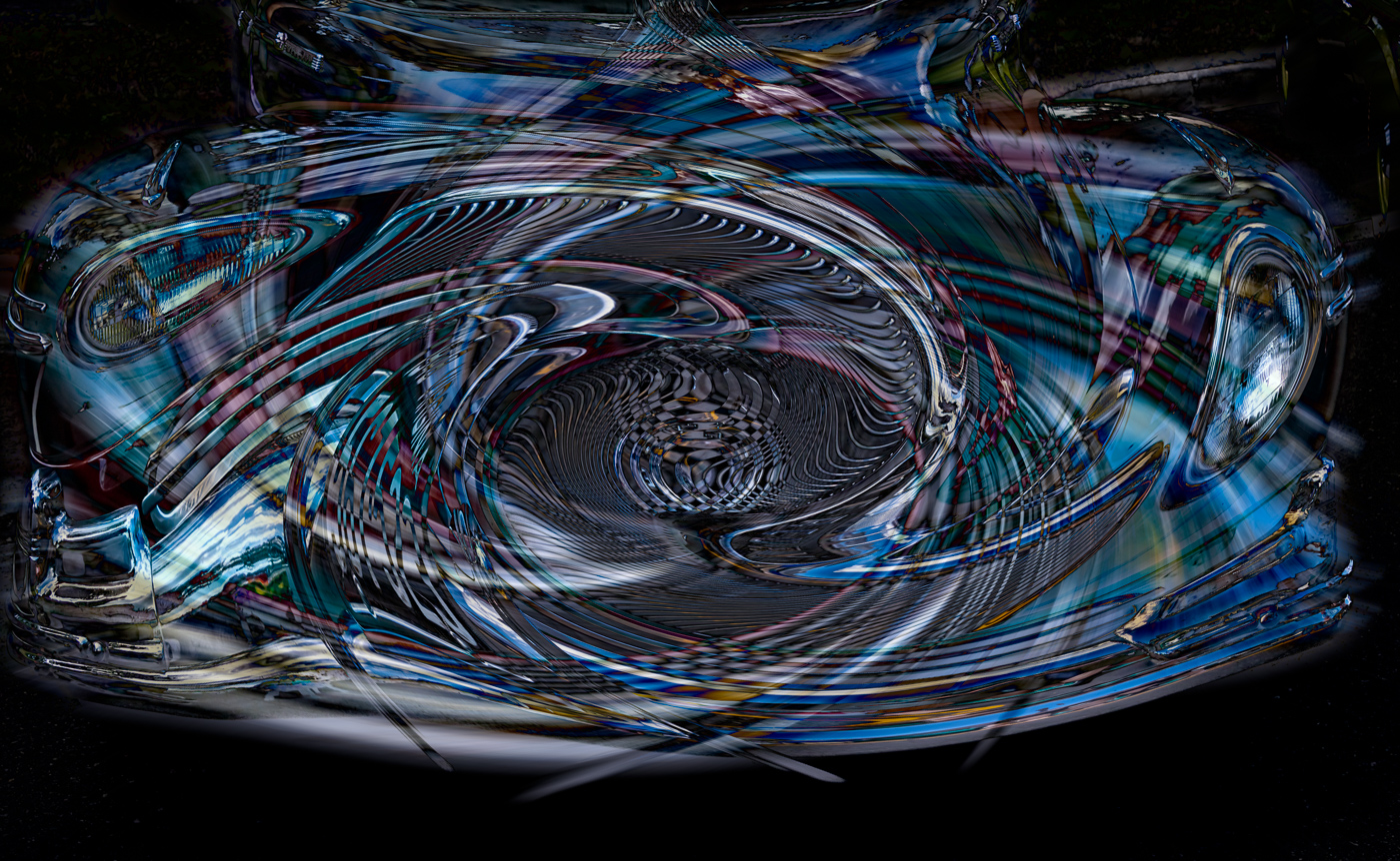
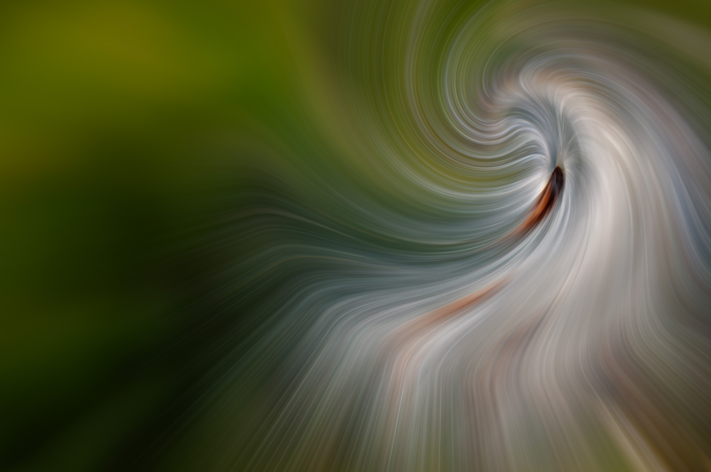
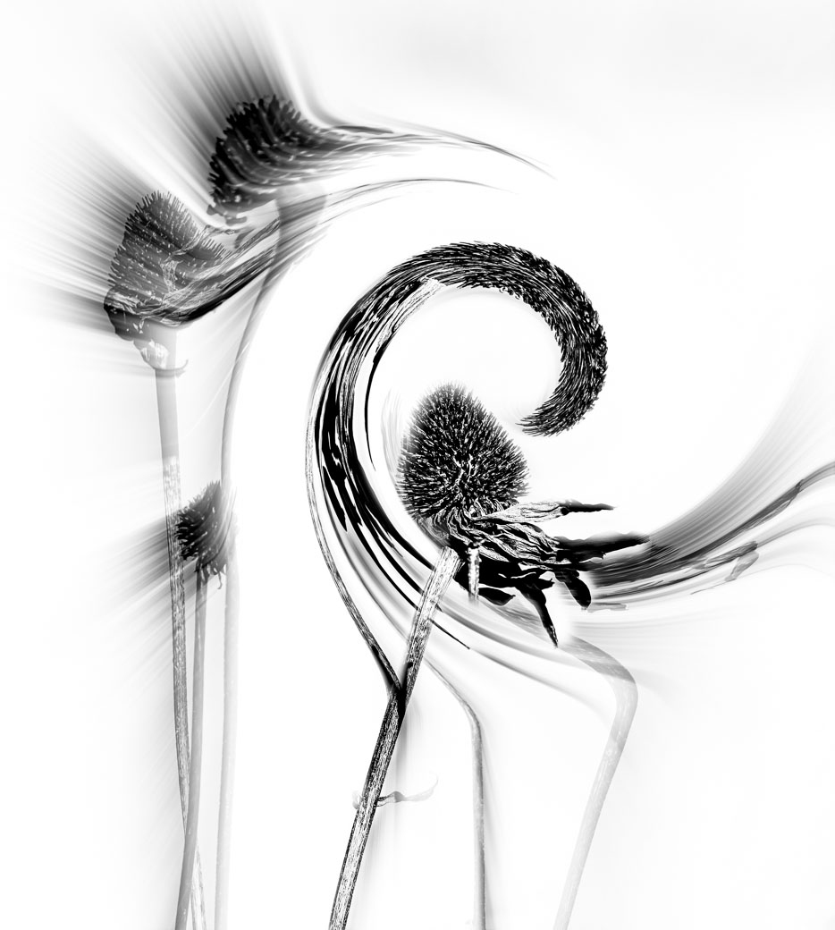
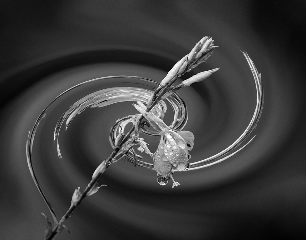
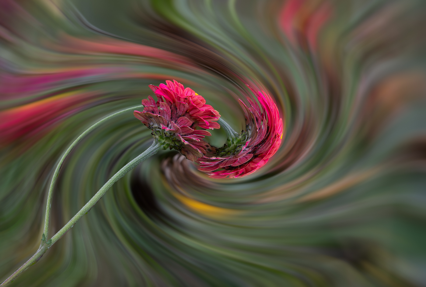
But you can't like the twirl and not the color of the twirl. I understand tone down the background. Thanks Marti |
Jul 7th |
7 comments - 0 replies for Group 80
|
14 comments - 10 replies Total
|