|
| Group |
Round |
C/R |
Comment |
Date |
Image |
| 29 |
Jan 25 |
Reply |
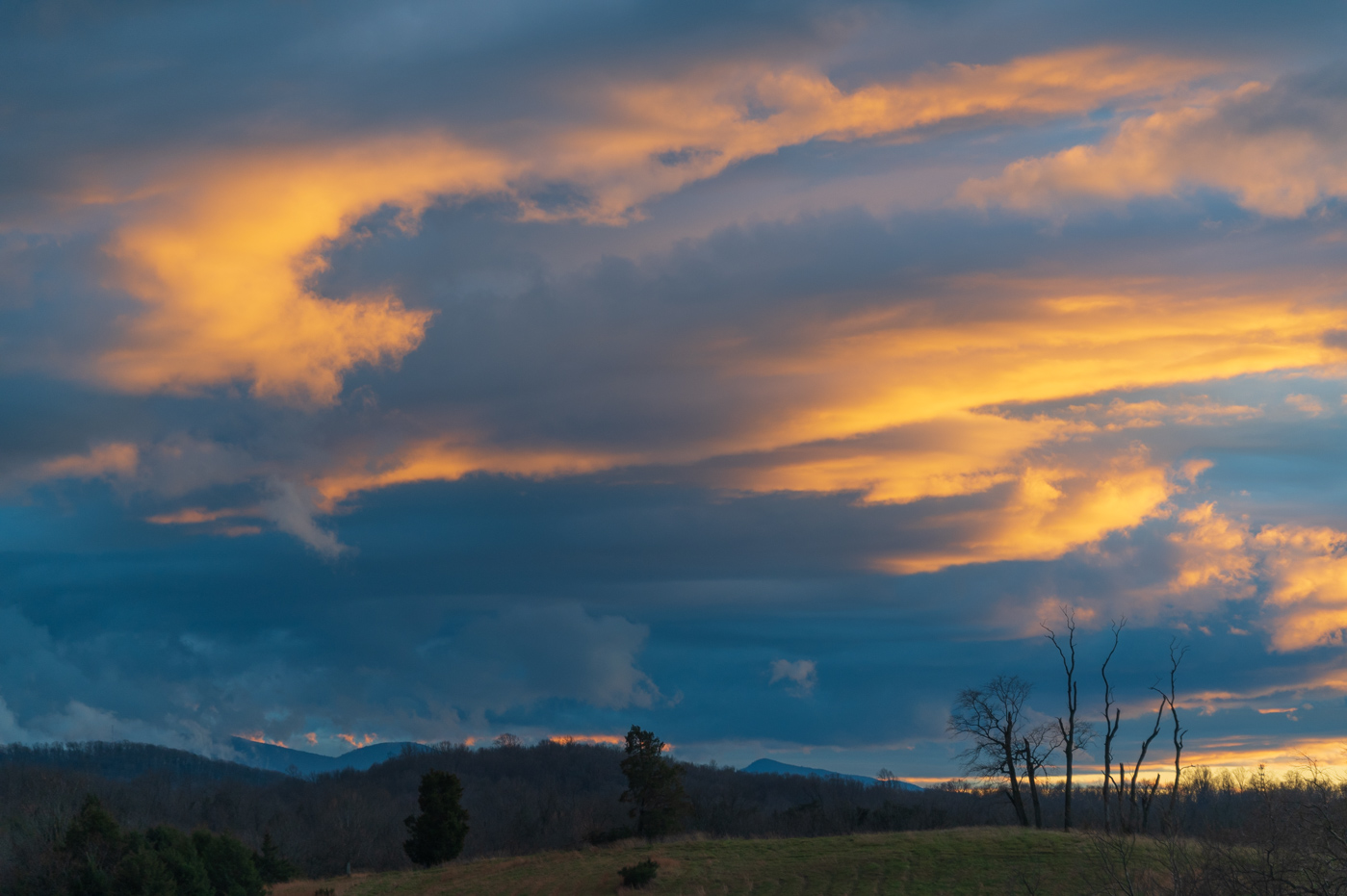
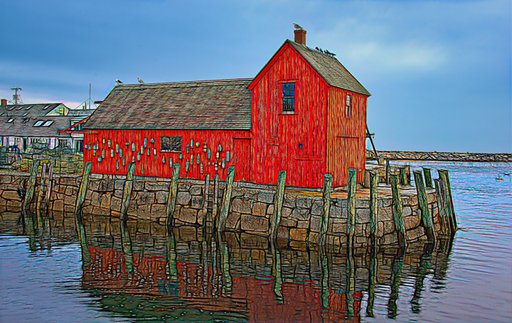
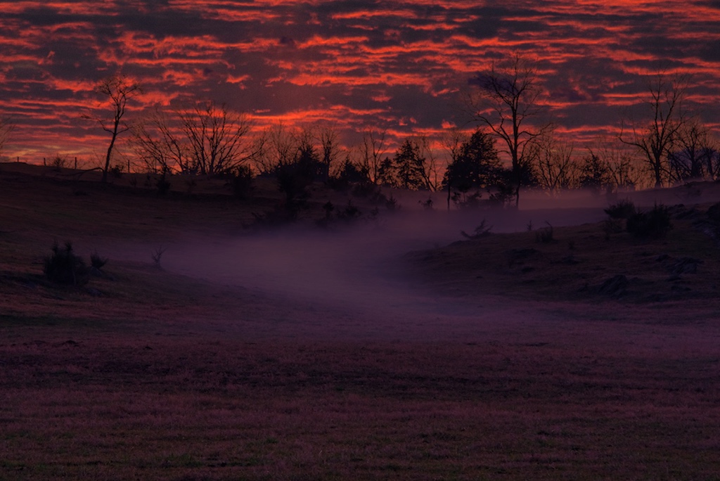
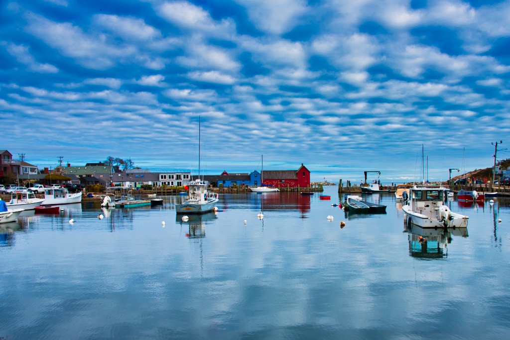
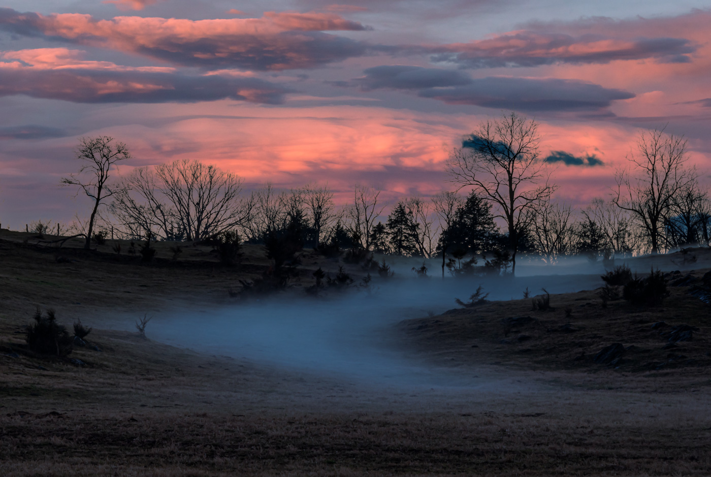
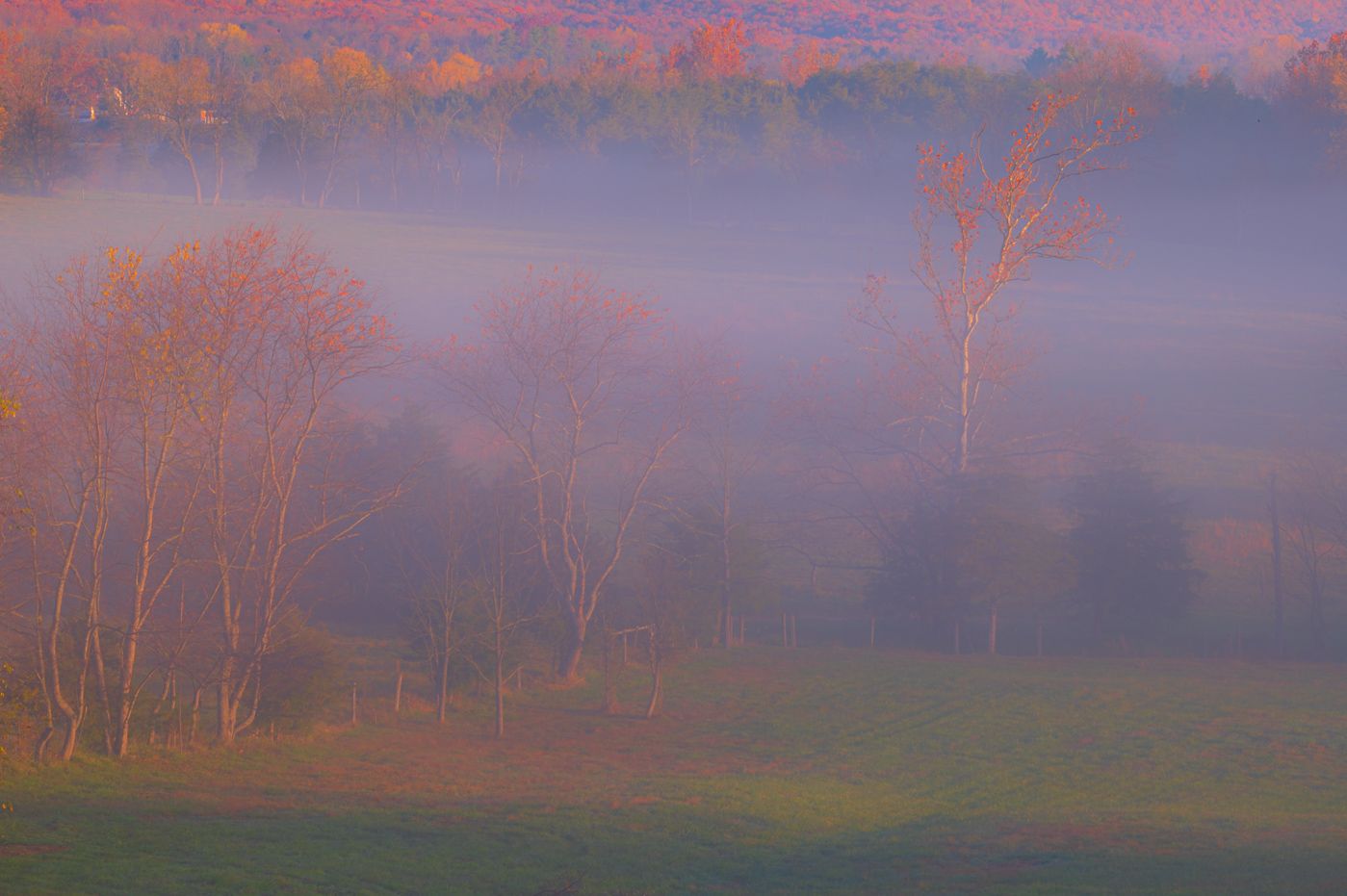
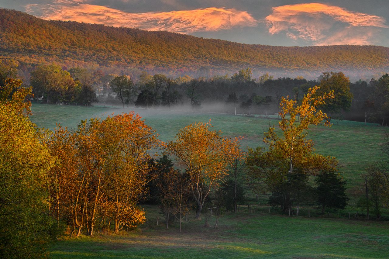
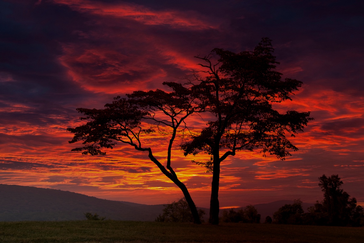
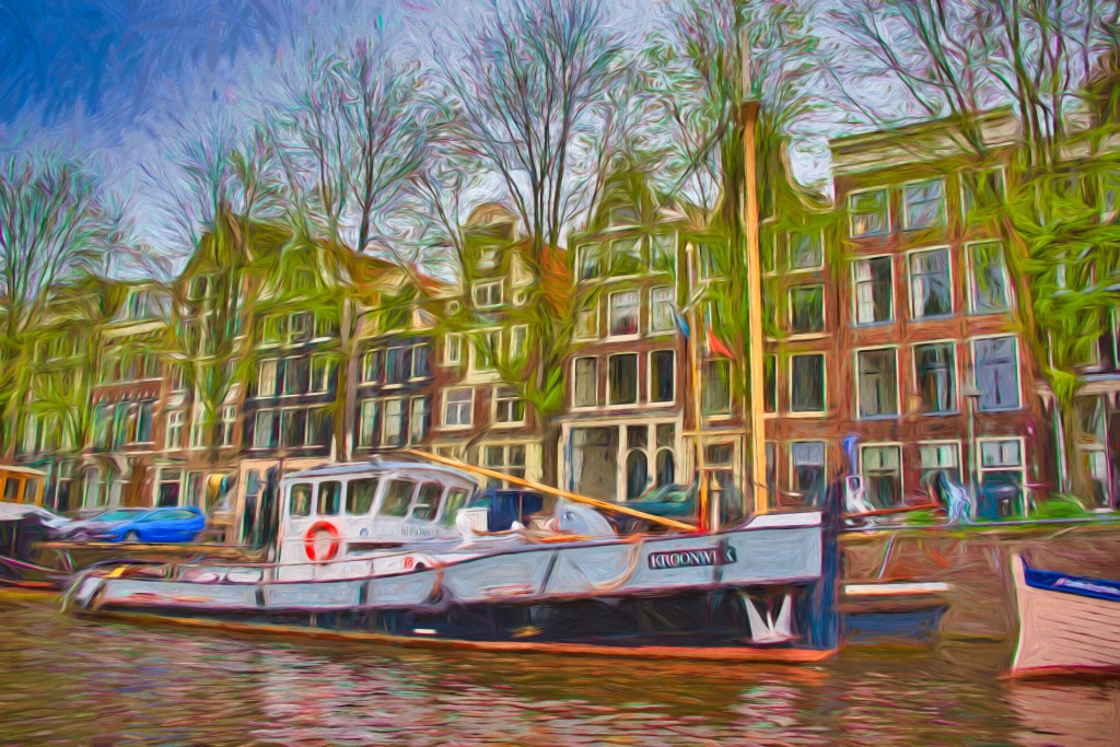
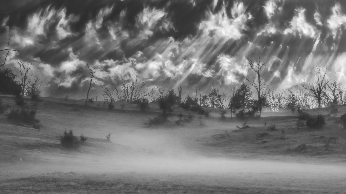
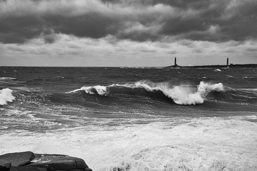
That's what I have. Combos of blue /gray fog and yellow/orange skies in the background. |
Jan 25th |
| 29 |
Jan 25 |
Reply |
Ron, I can't be specific because I did a combo as my original edit gave me a yellow sky and very little of the blue fog/haze. Using the select sky in LrC I brought the image back with a combo of both. I know for a fact that the foreground colors were not present because of a hill blocking the sun from them. |
Jan 25th |
| 29 |
Jan 25 |
Comment |
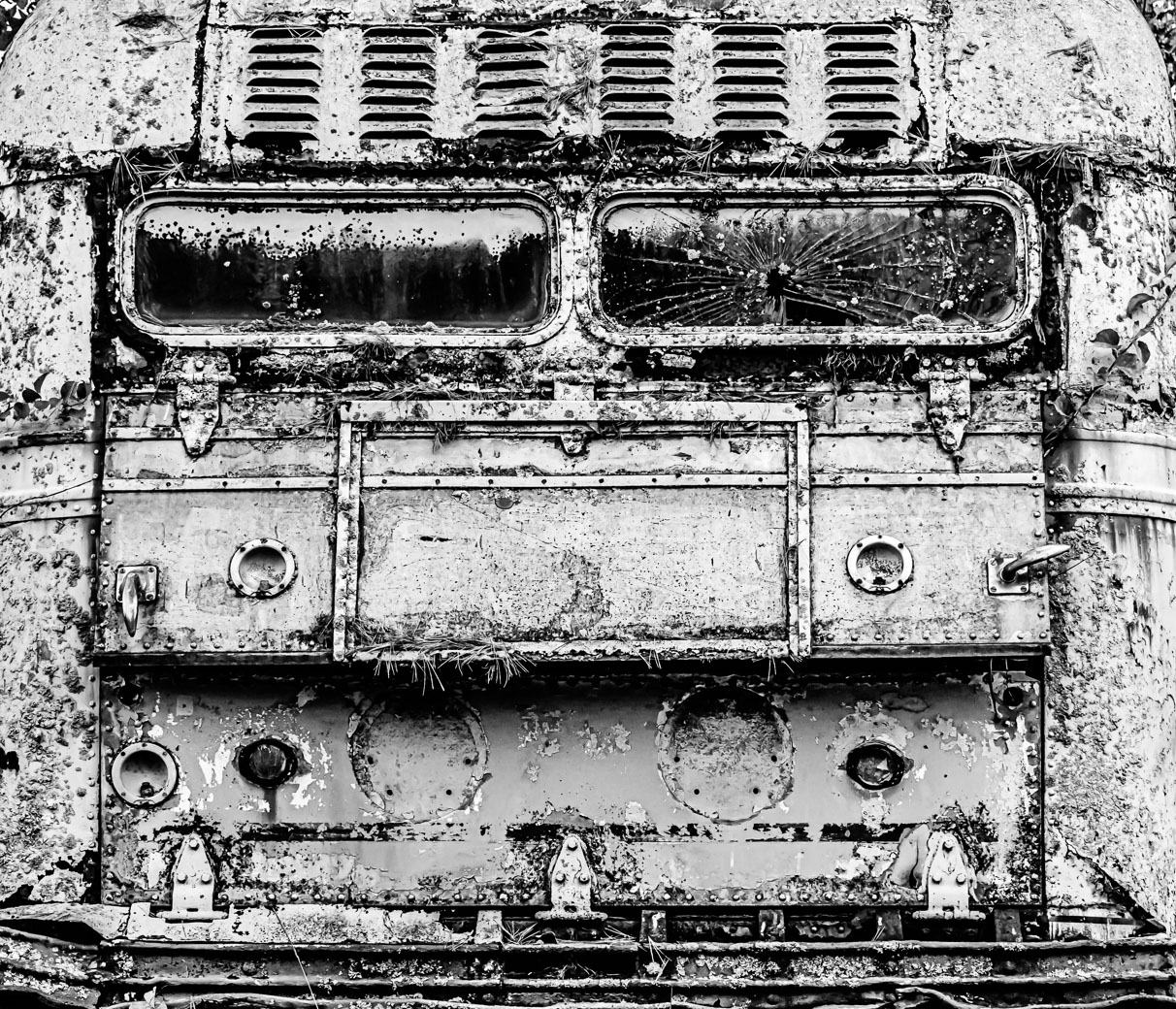
Benefits of having a group of interested viewers spotting such little things that a judge or buyer might punish you for.
|
Jan 11th |
| 29 |
Jan 25 |
Comment |
Thank you Elaine. |
Jan 11th |
| 29 |
Jan 25 |
Comment |
Thanks Gunter for your thoughts. I haven't run Photo Ai on those images but I did run the clarity and Lr DeNoise and I thought it best to stay with the fog.
Also very short on time these days, but not your fault. |
Jan 10th |
| 29 |
Jan 25 |
Comment |
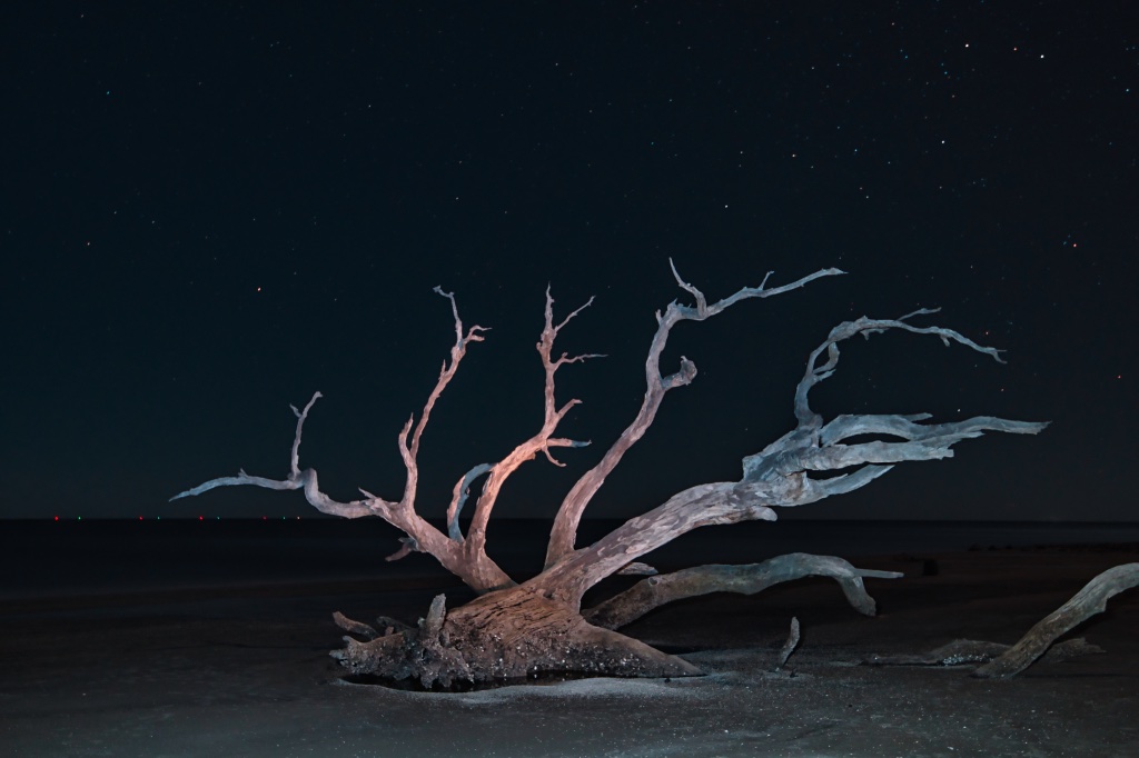
Ron, here are my thoughts, however, I have little experience with night sky photography and zero experience with deep space. You have made an interesting image as it is not something that easily seen in most cameras. My thought is the center of the galaxy is overexposed but maybe that's the way it is. I like the blue sky and the stars look pretty sharp as they should with a 10 sec shutter. I'd keep experimenting and see what other results you come up with.
|
Jan 9th |
| 29 |
Jan 25 |
Comment |
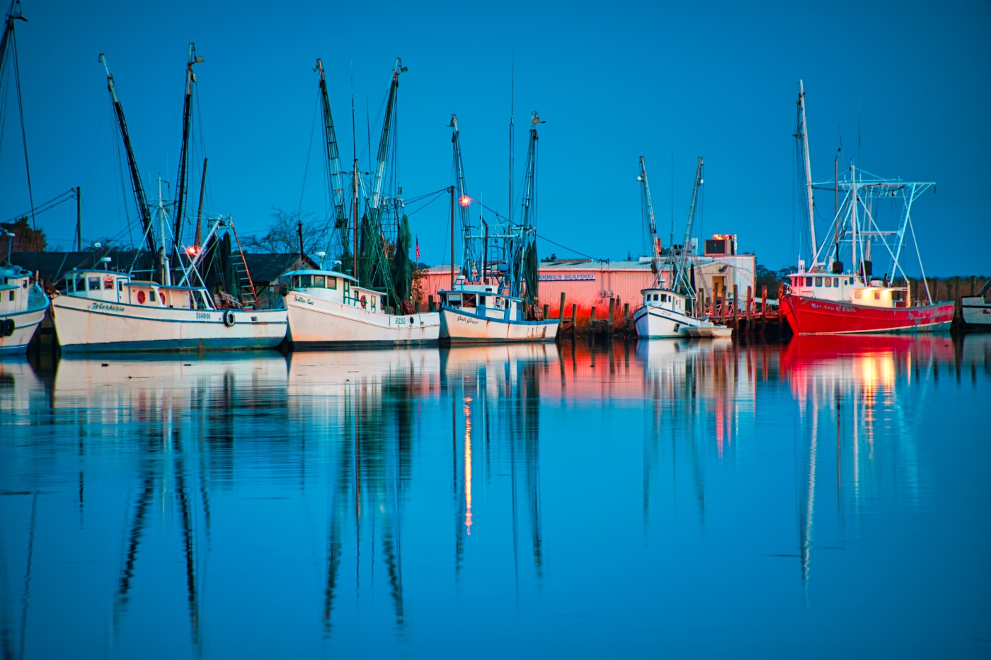
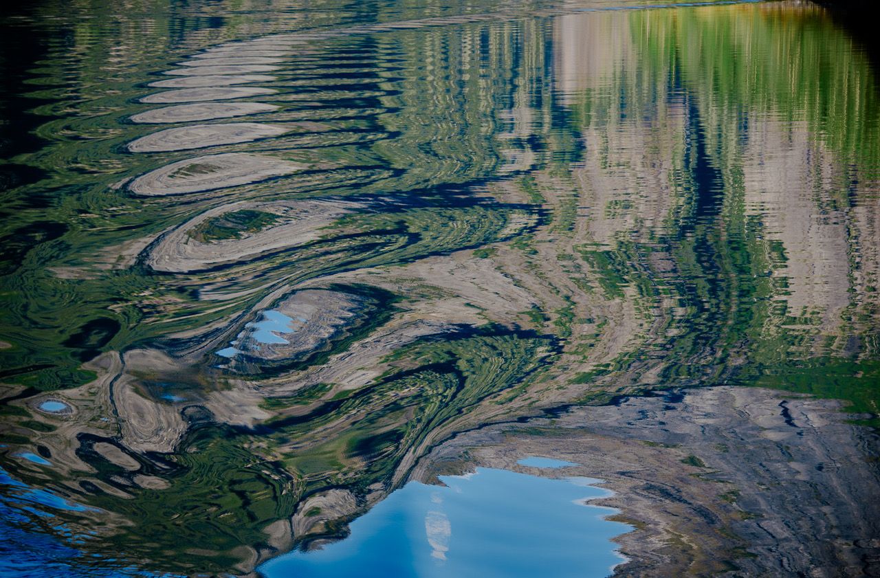
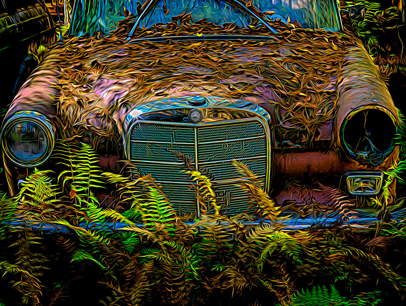
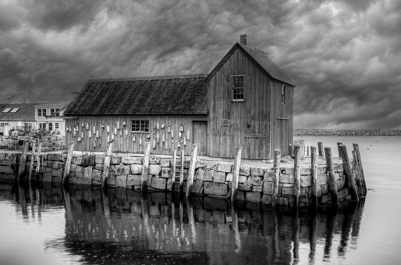
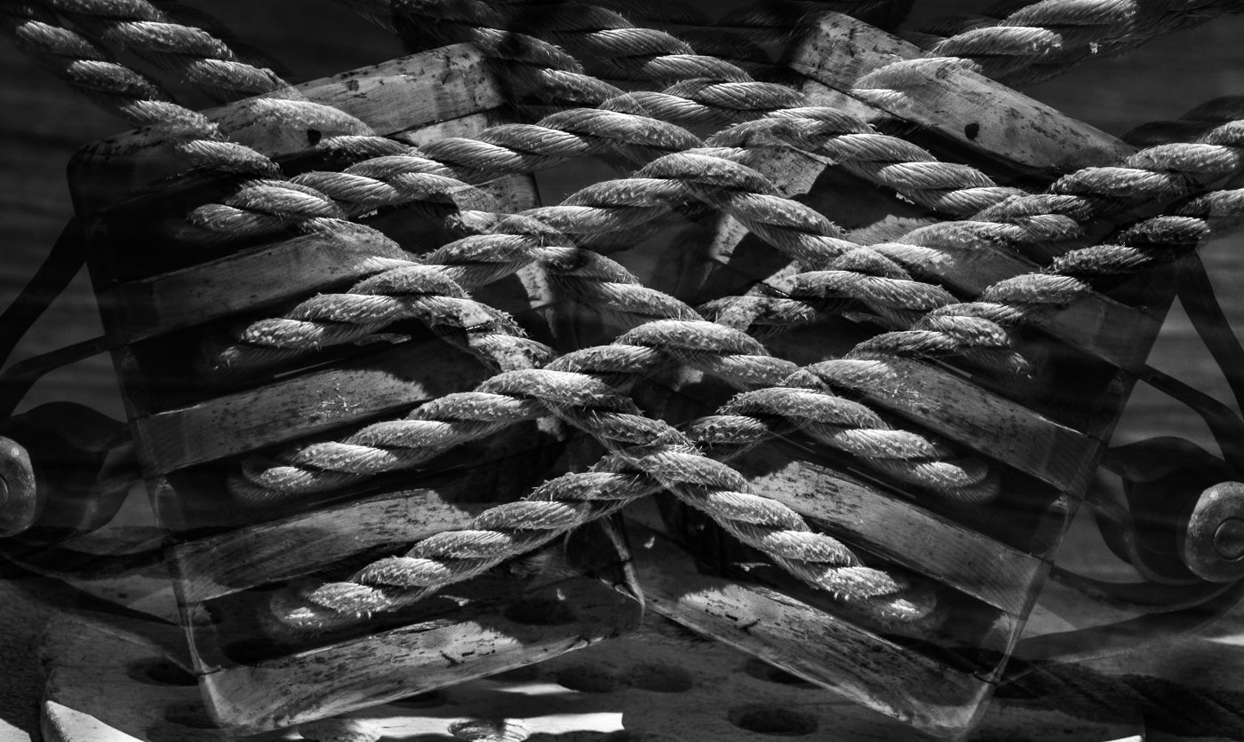
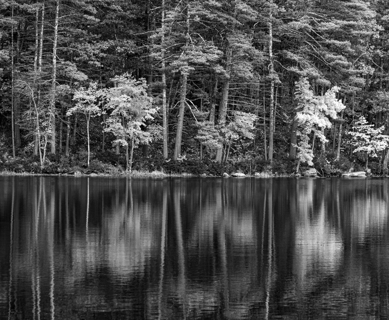
Gunter, the BW improves the image and gives it a very nice reflection. I wonder if you darkened the light grasses on the left side at the mid point. My eye stopped there because of the briteness but that's just a distraction. I would also try to increase the texture in the clouds of the sky. The sky in the color version is too brite making the water and reflection too dull in the foreground. I would settle on my purpose taking the image. If I needed reflections then go with BW. If I needed color I'd increase exposure of the clouds in the water. With the masks & editing tools I'd see if I could make an image from it. I think the BW offers the best rewards. |
Jan 9th |
| 29 |
Jan 25 |
Comment |
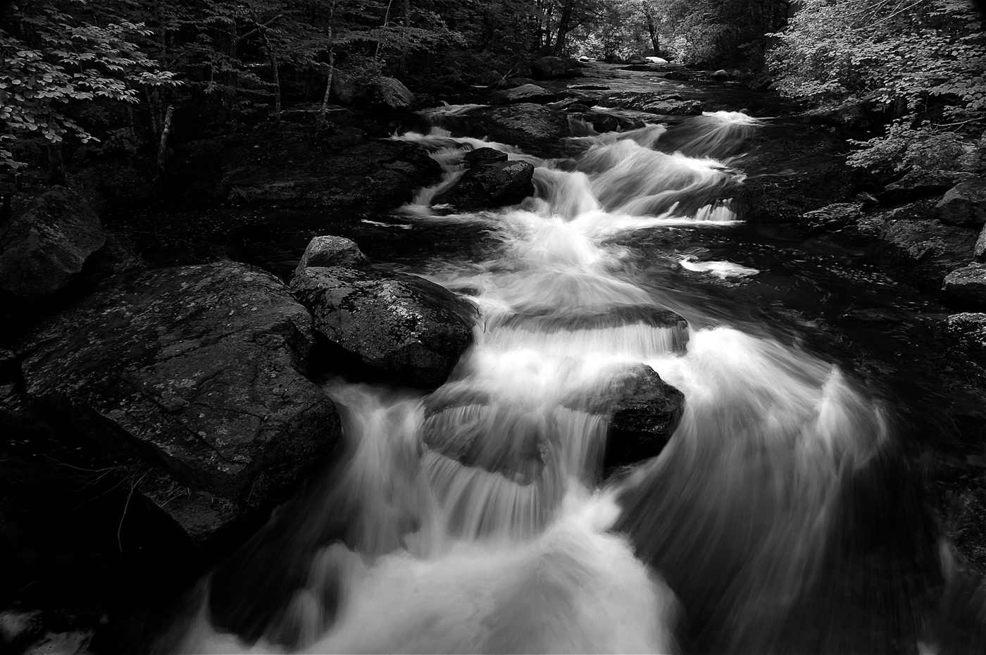
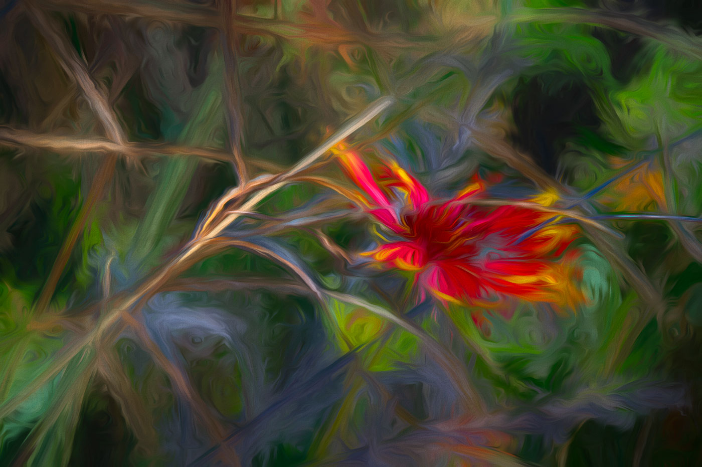
Hi Judy. This is a different topic for you. I know the green attracted your eye, but my eye followed the white water thru the opening and the aqua water. The green algae might of caused you to be interested but it generally smells and does not command attention for an interesting local. Probably just above the high tide line and doesn't flush clean except for very high tides. I would of shot just the 1 photo and and played with the S turn at the waters edge |
Jan 9th |
| 29 |
Jan 25 |
Comment |
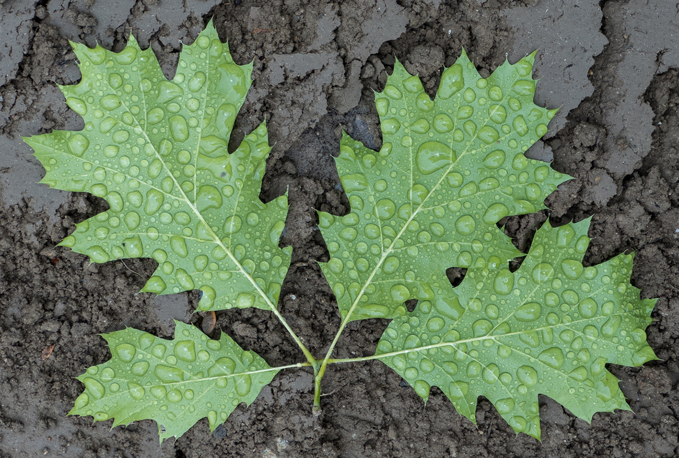
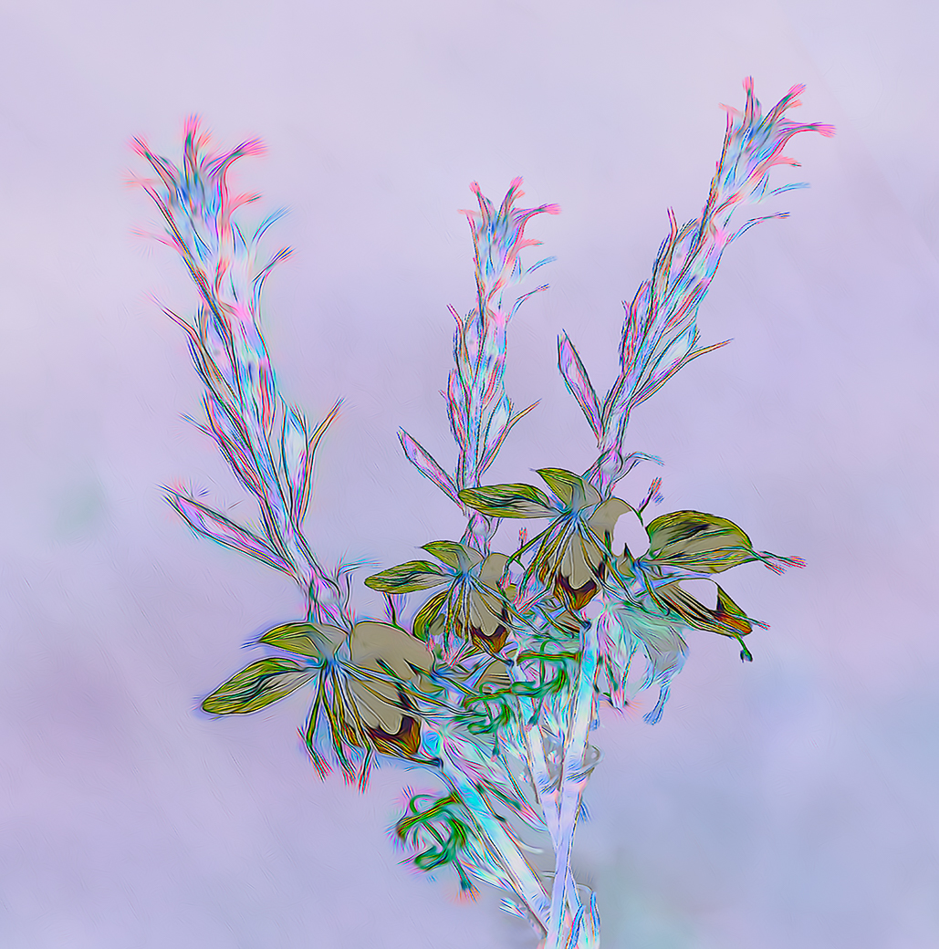
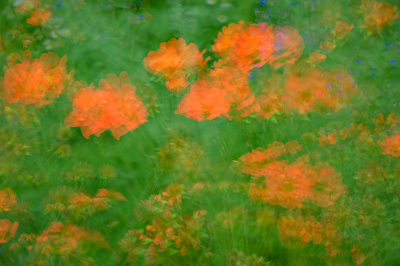
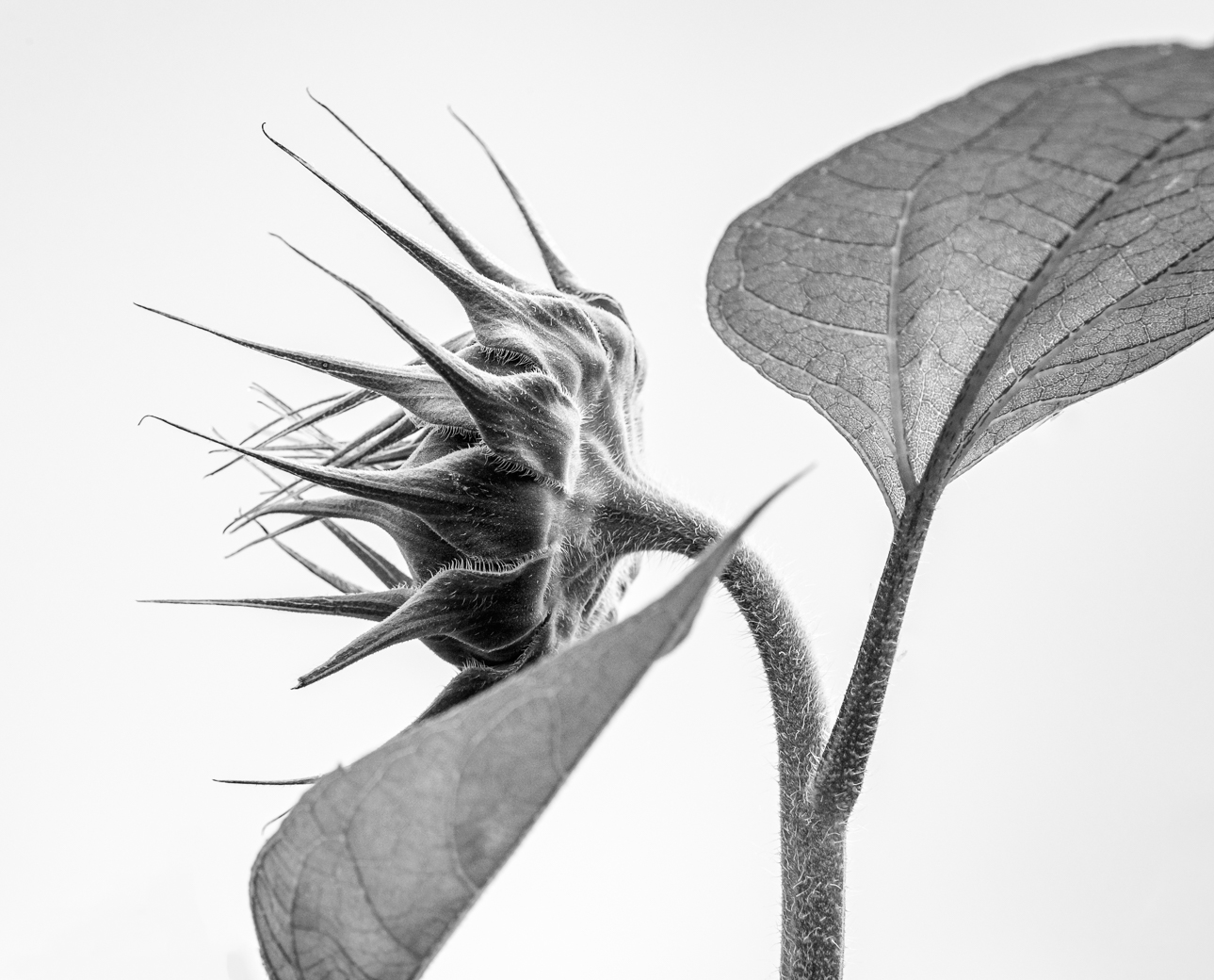
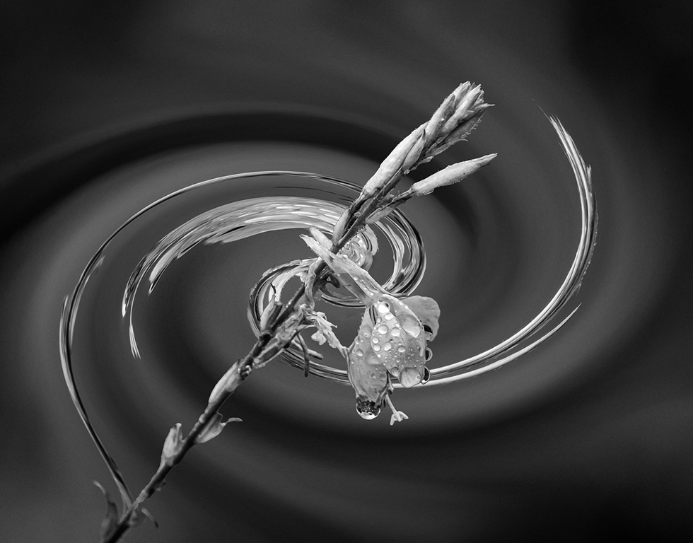
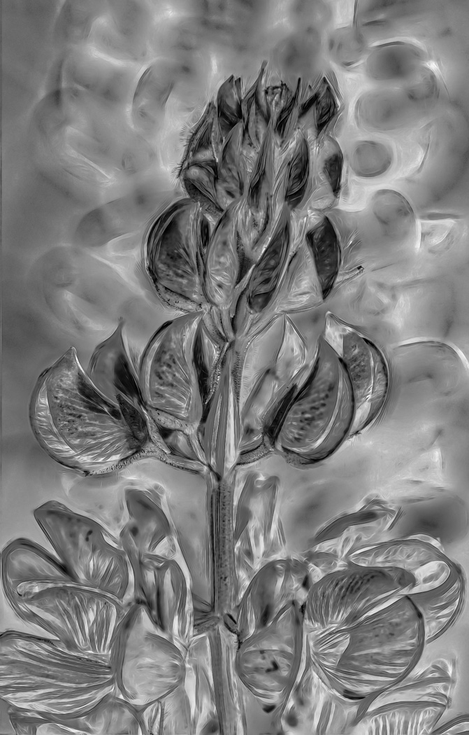
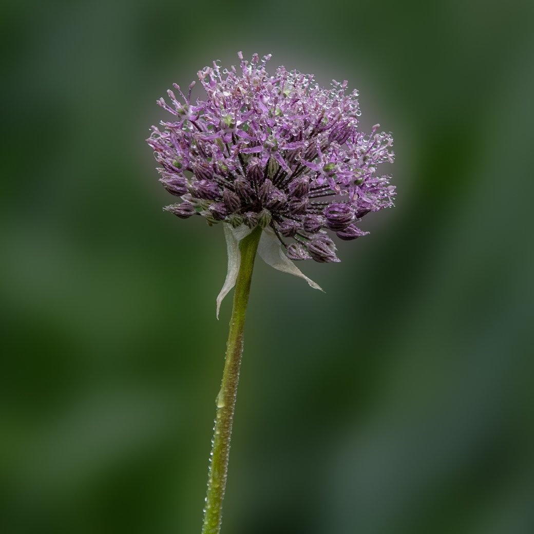
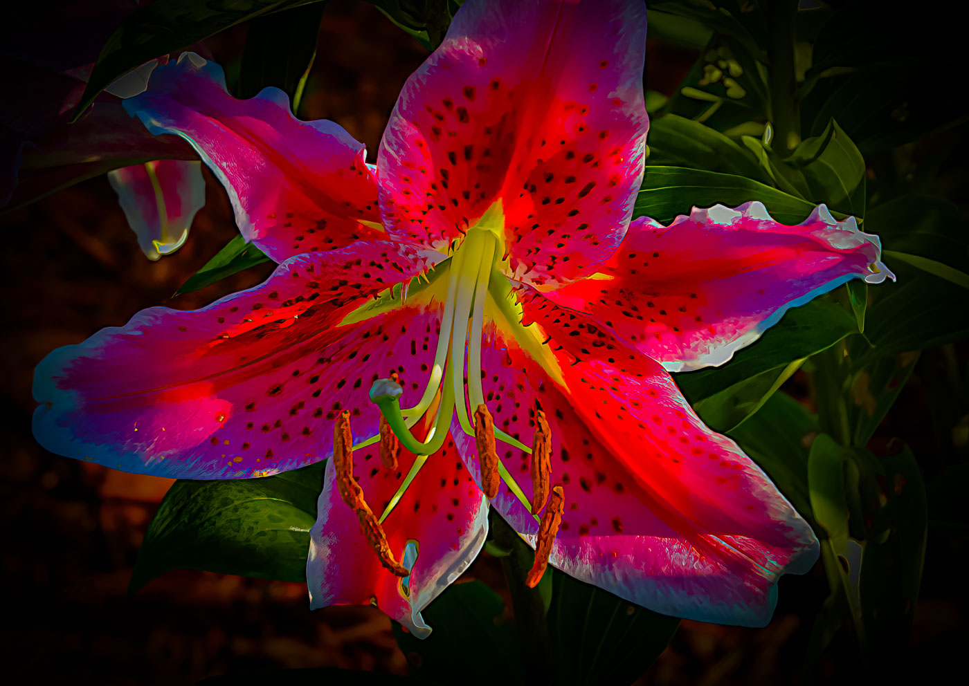
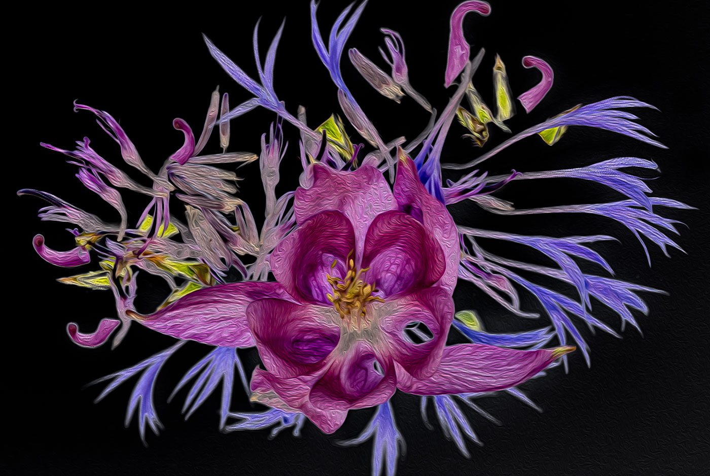
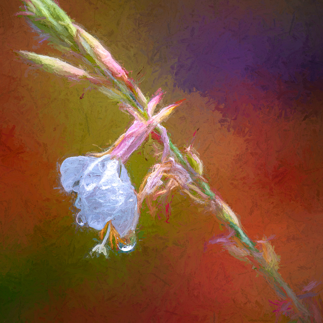
A really beautiful sample and photographed image making it a true work of art. I never have seen such a plant so I told pic in my "picture this" and it came back as "Indian shot" a species of Canna Lilies. Their examples were terrible, The sharpness and translucent quality of the coverings make it really pop against your background. Well Done. |
Jan 9th |
| 29 |
Jan 25 |
Comment |
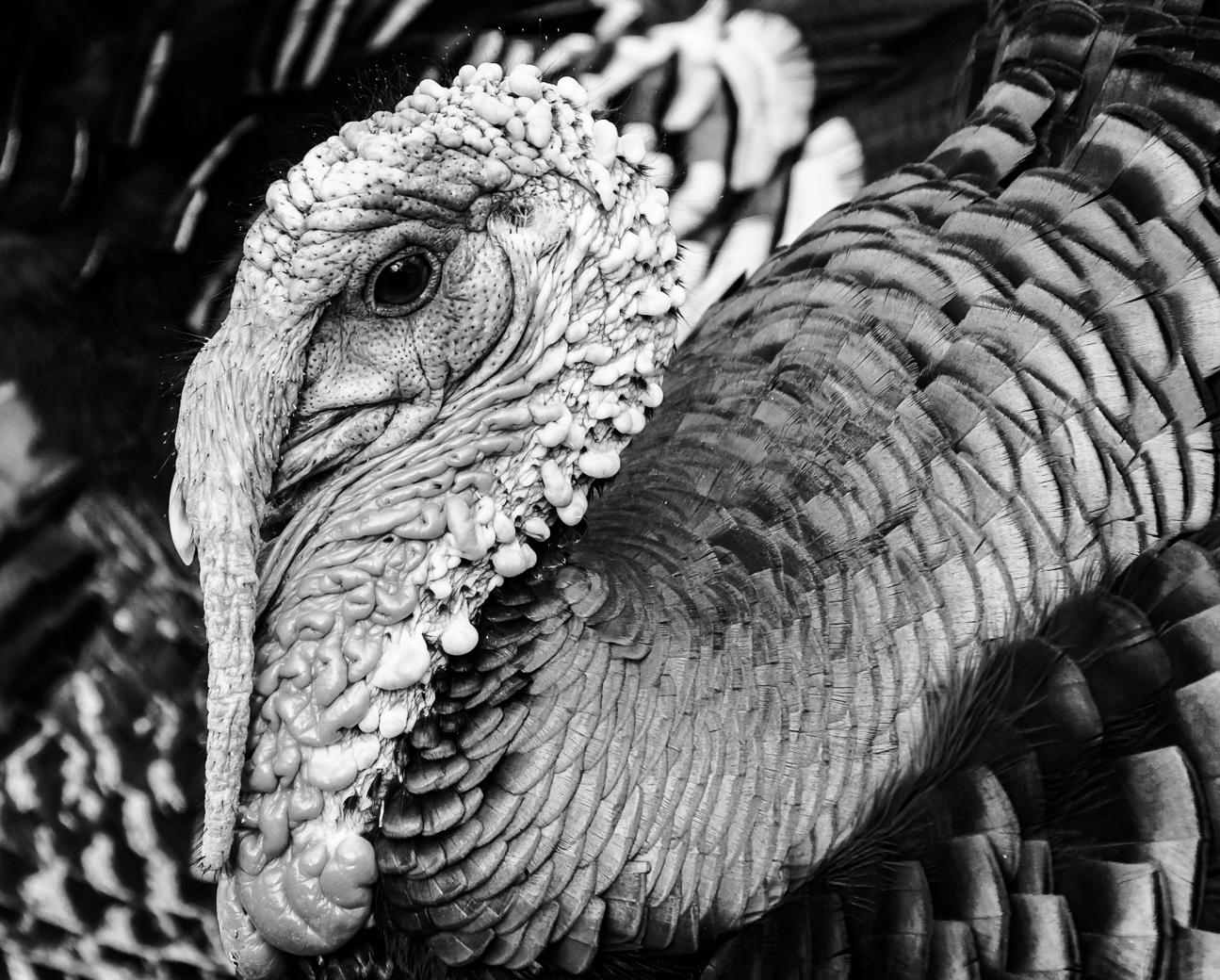
Well done Tim. Great focus on the details and composition. I like the details at the neckline and the glasses are bright white attracting my eyes. No suggestions. |
Jan 9th |
8 comments - 2 replies for Group 29
|
| 80 |
Jan 25 |
Comment |
Thank you Nadia. You are absolutely correct as I responded to Rich's comments above. |
Jan 22nd |
| 80 |
Jan 25 |
Comment |
Thanks Doug
|
Jan 21st |
| 80 |
Jan 25 |
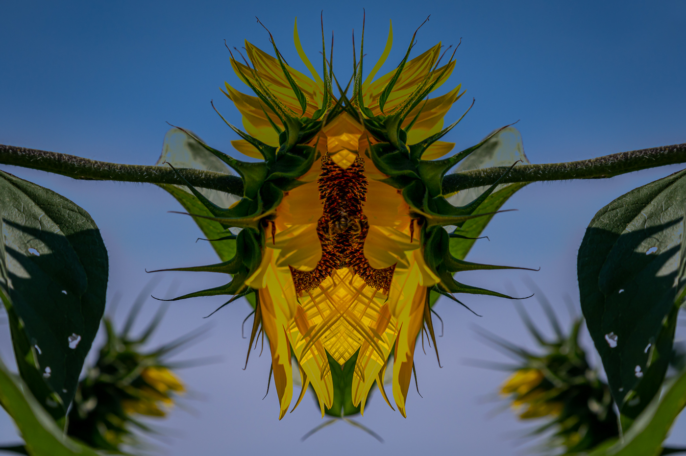
Reply |
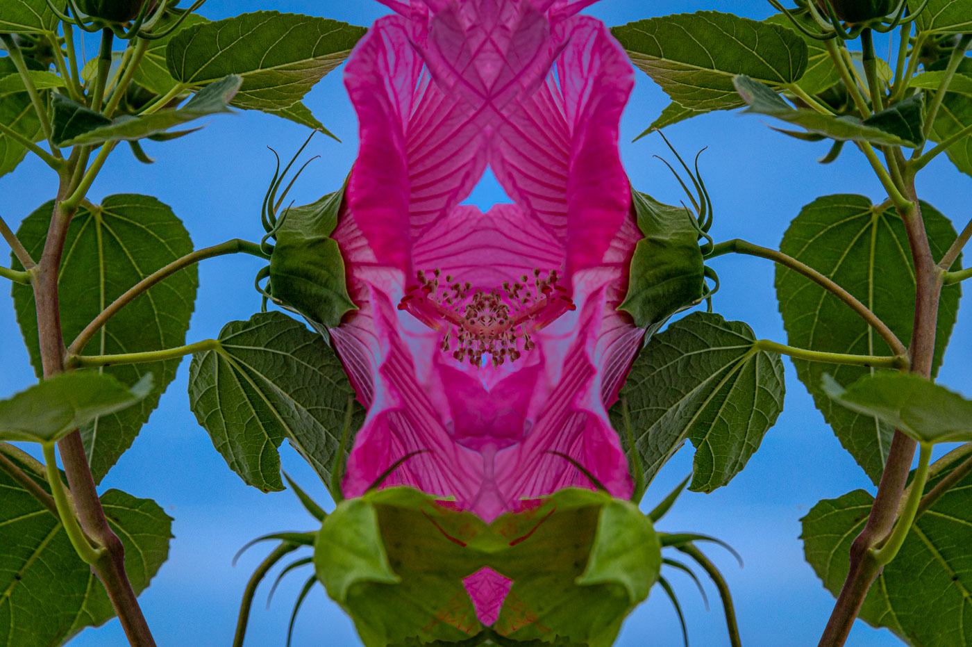
Thanks Ingrid. As suggested, I labeled that mirror image as minimalism as that is a subject I always have to hunt extra for. |
Jan 16th |
| 80 |
Jan 25 |
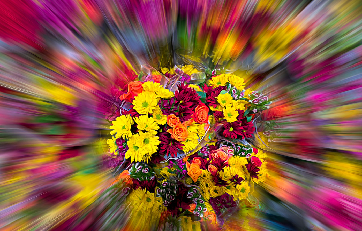
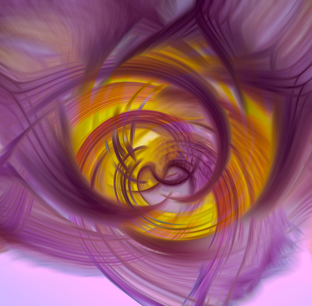
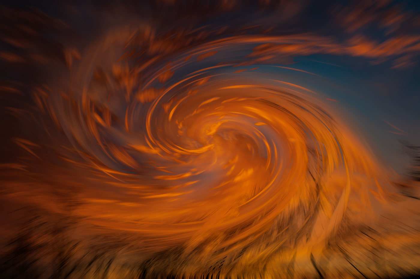
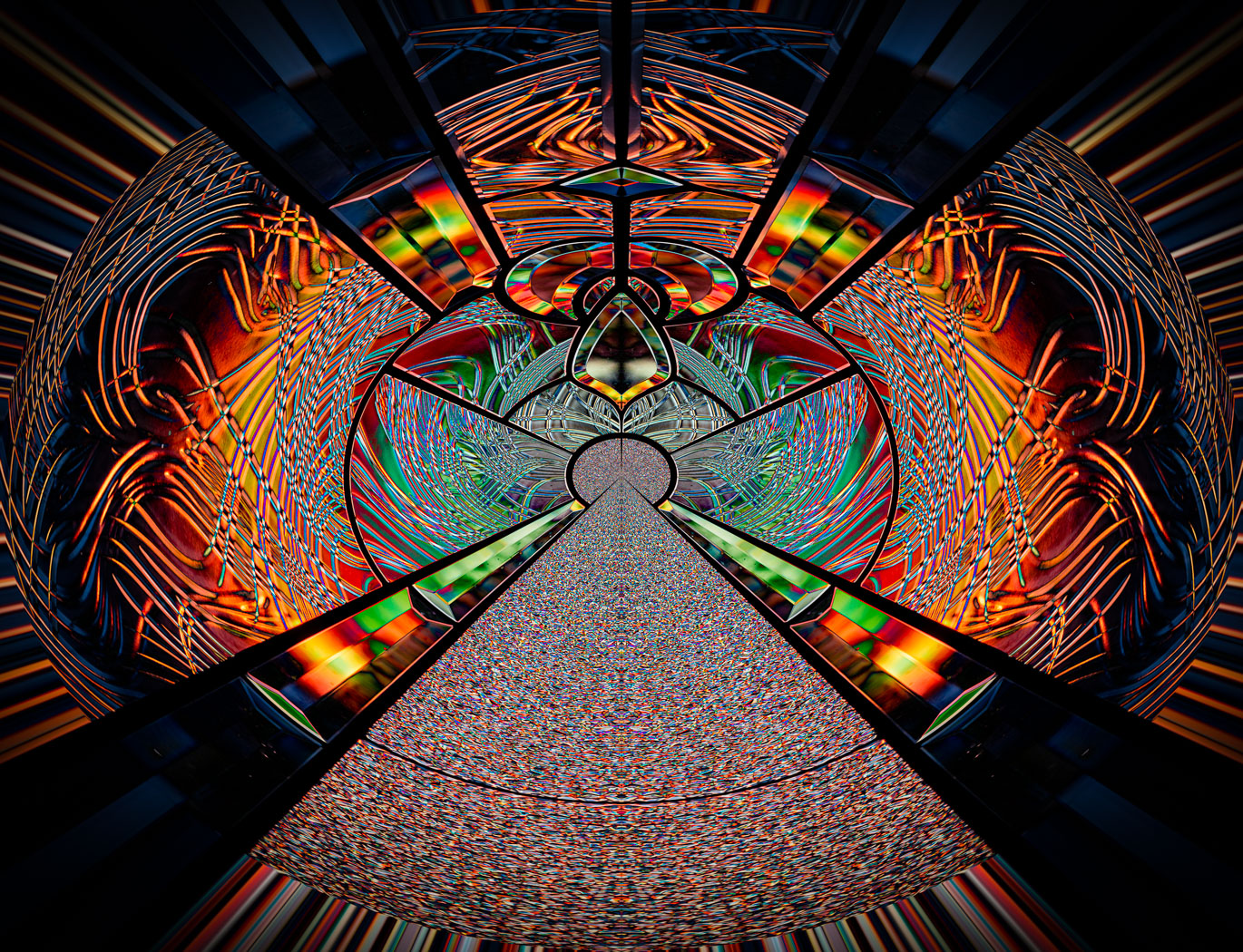
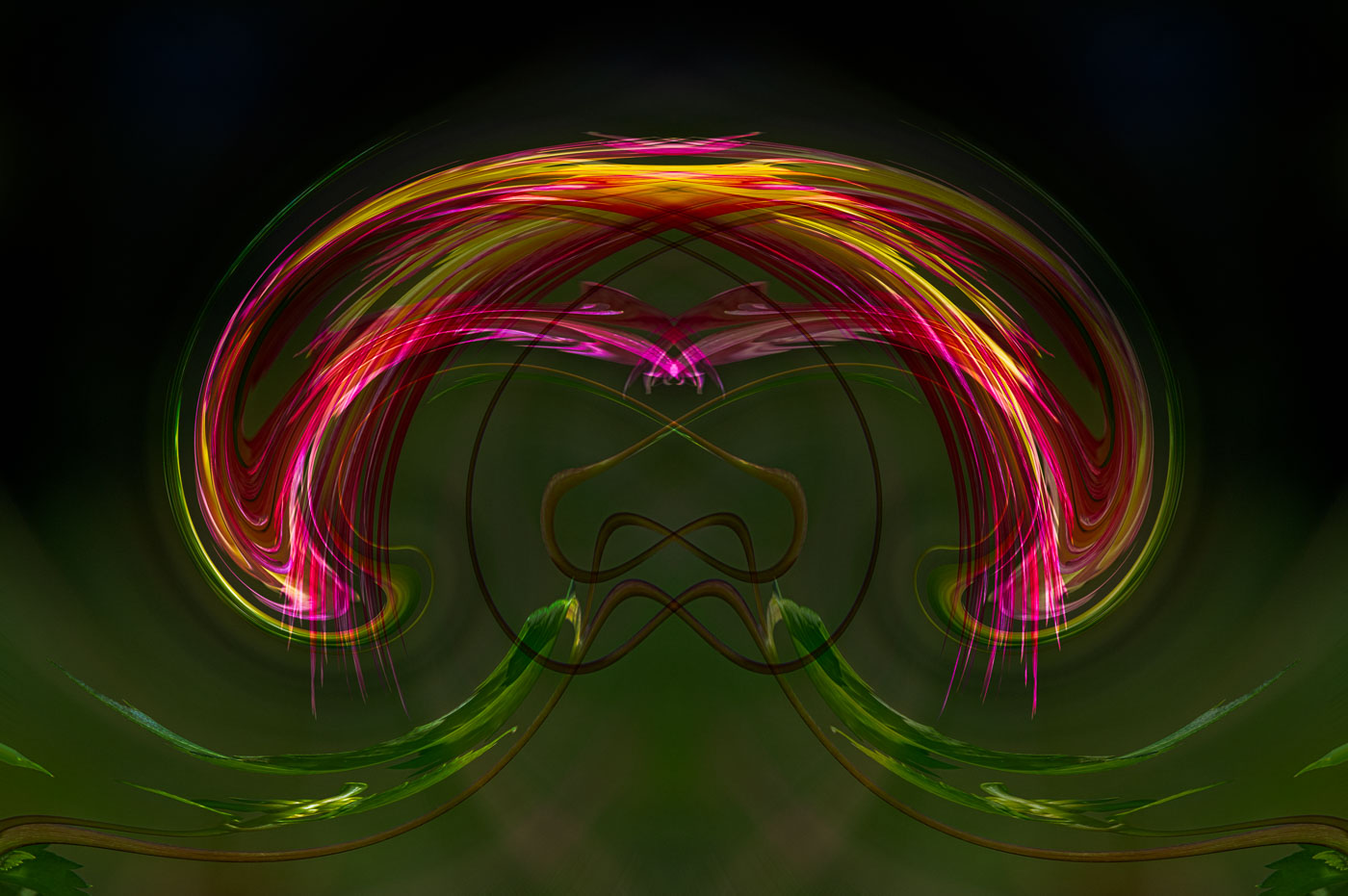
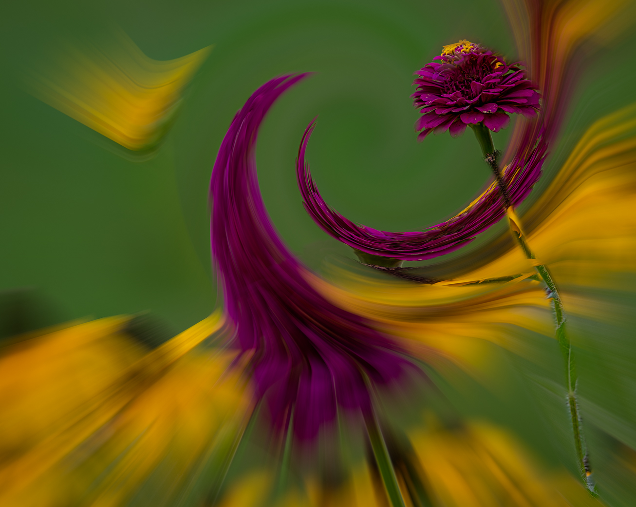
Comment |
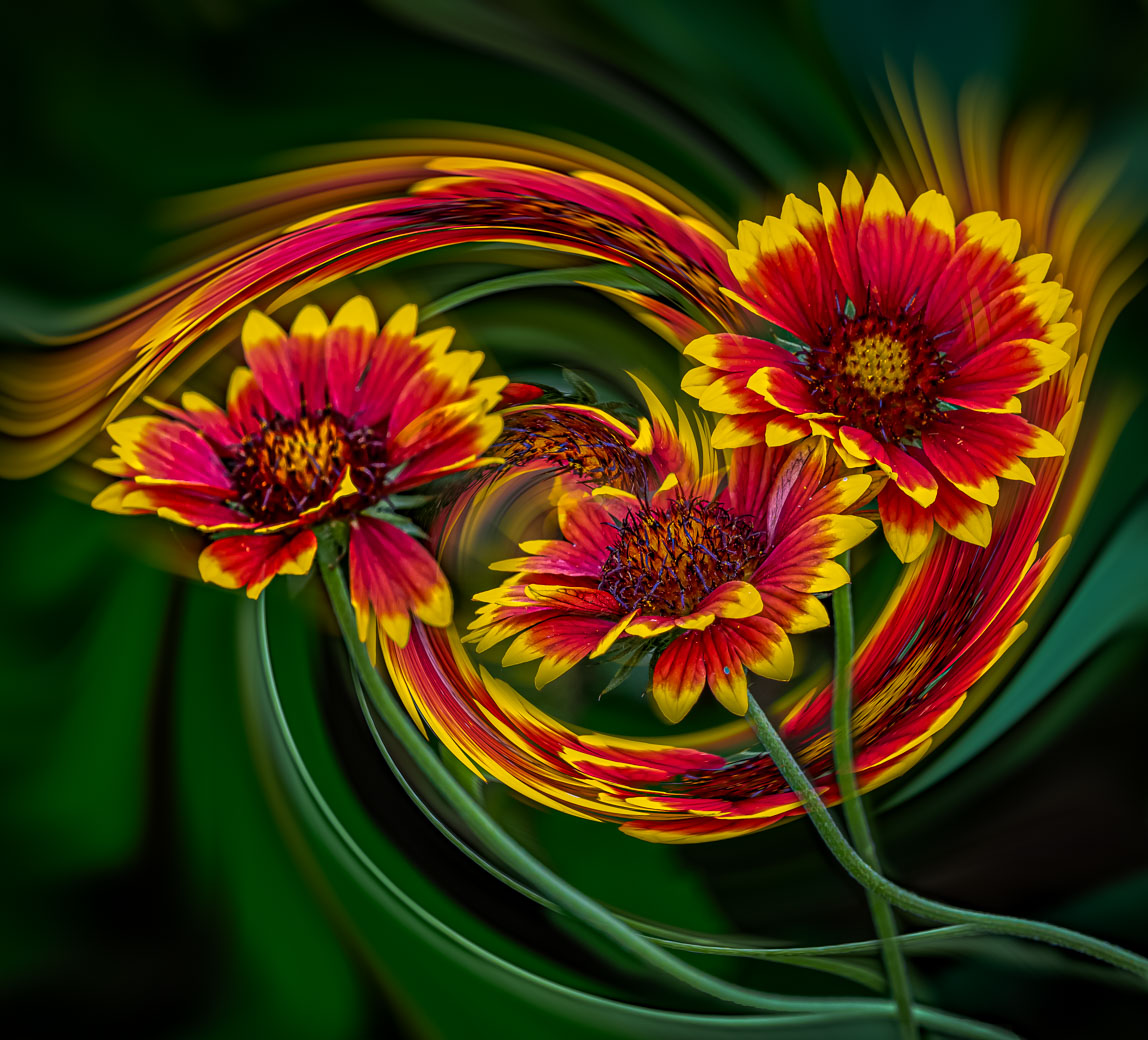
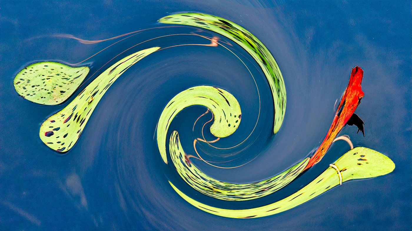
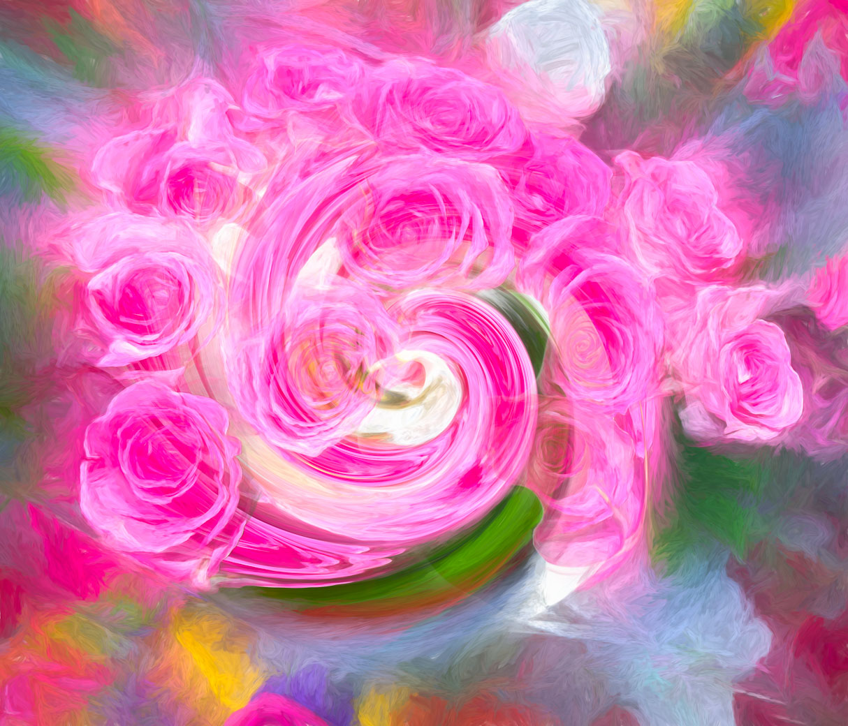
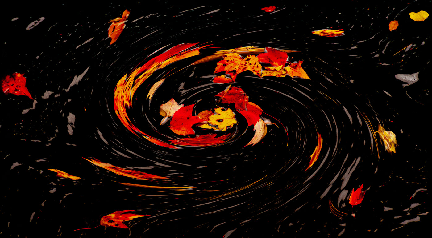
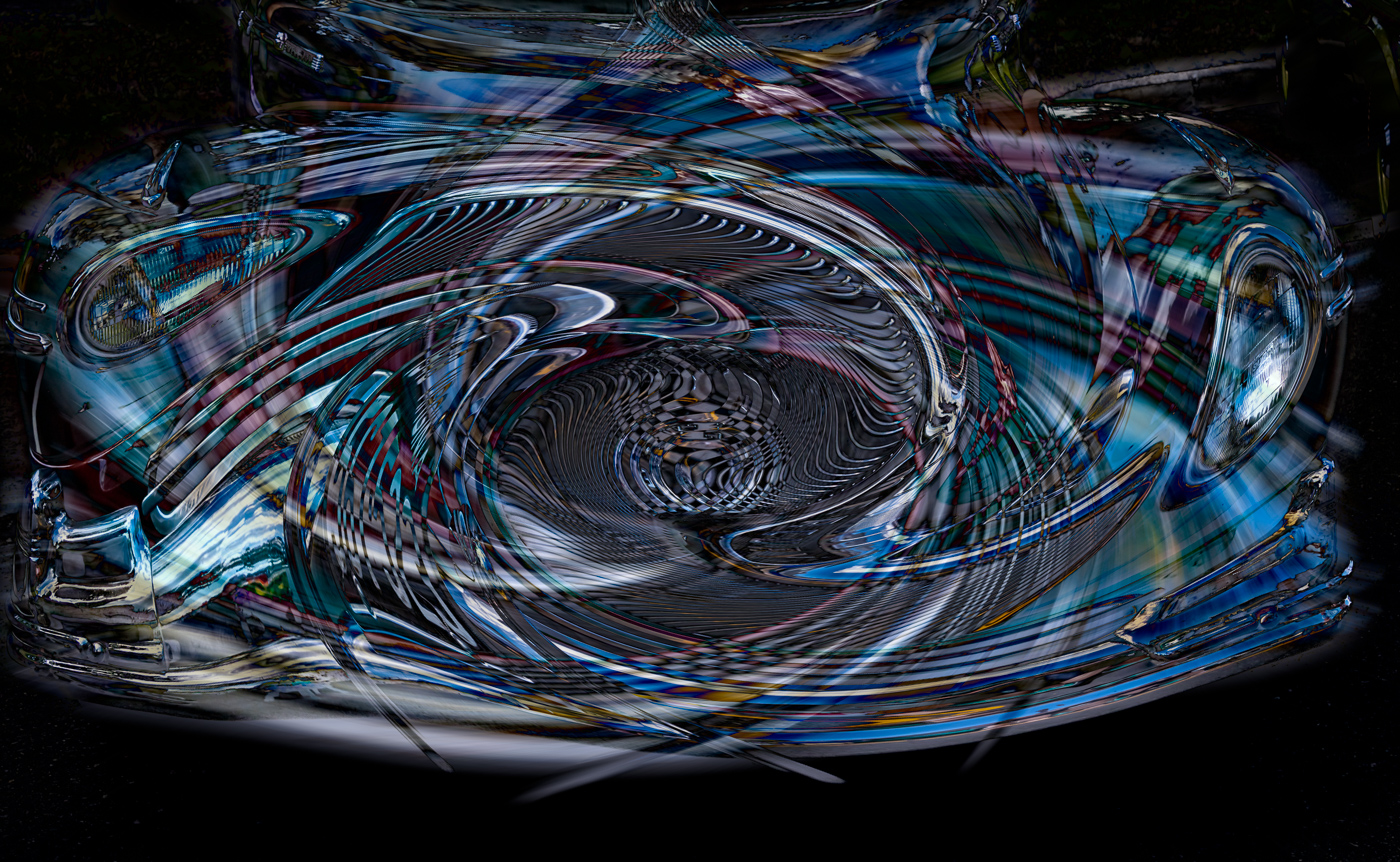
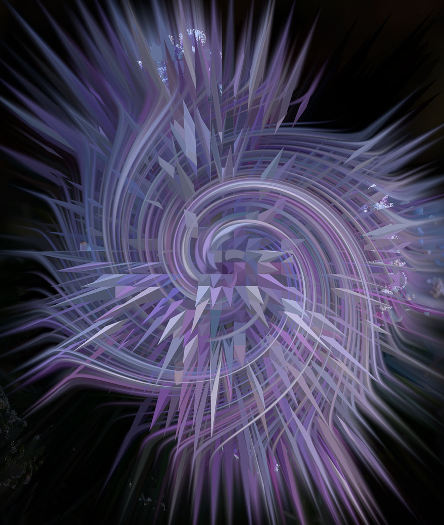
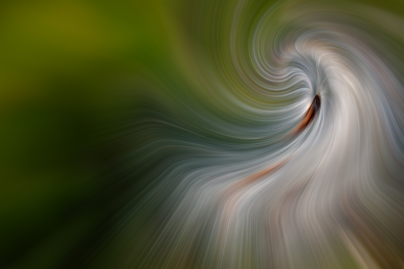
Thanks Rich, however, I'm not inclined to do that. I look at them leading your eyes into the center, and I also think of Abstracts straying from the traditional rules. In this case, the color, and overwhelming central focal point prevents the viewers eye from getting drawn to the outside. Thank you for you comments. |
Jan 9th |
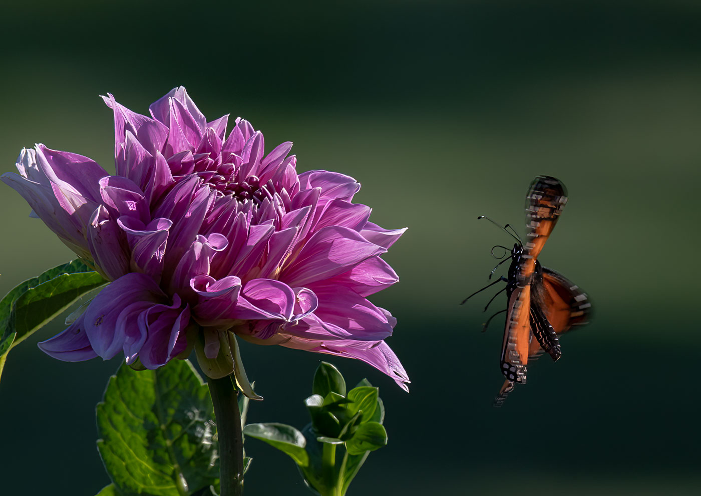
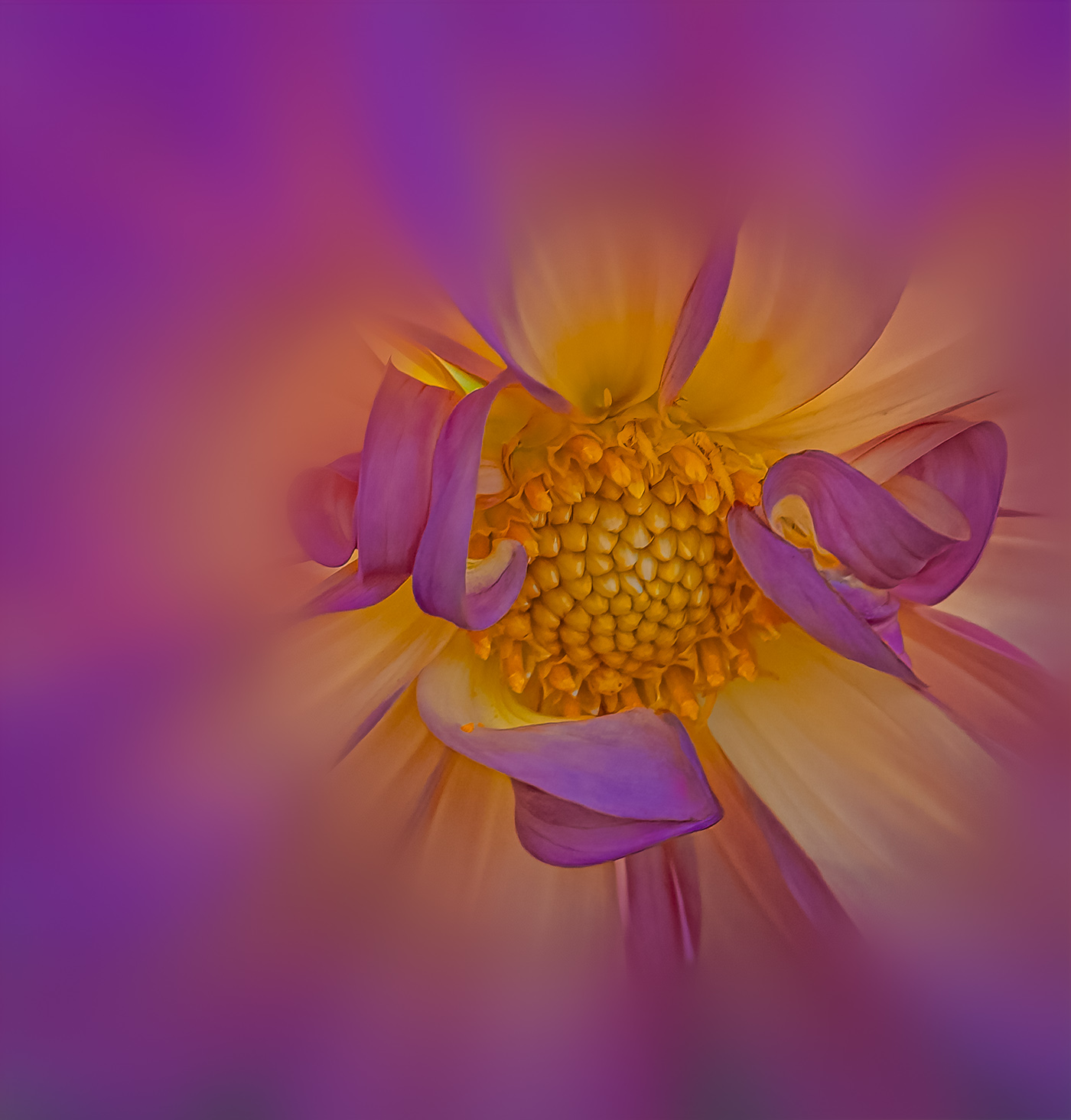
| 80 |
Jan 25 |
Comment |
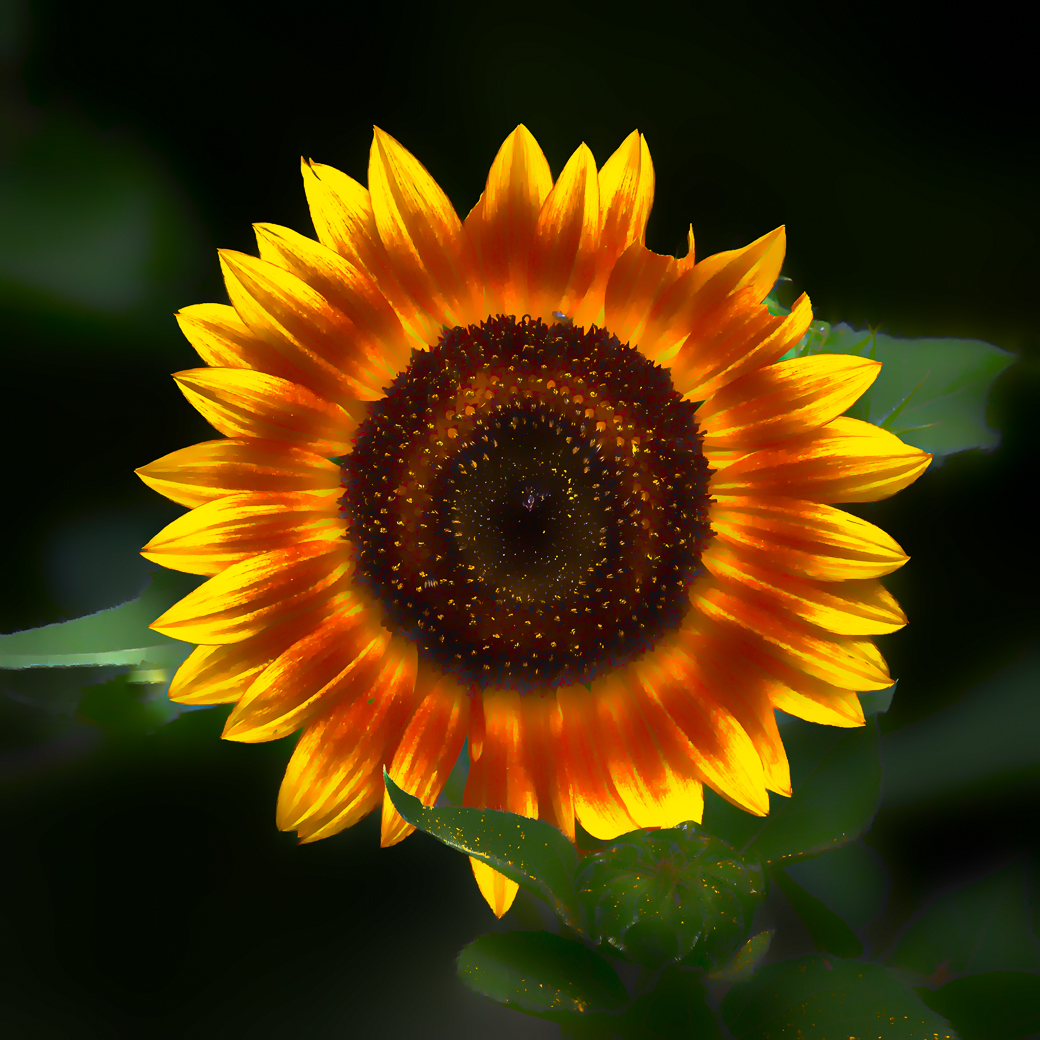
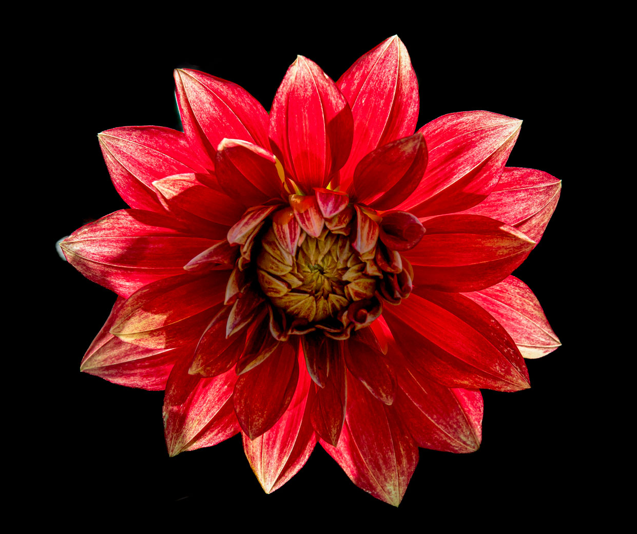
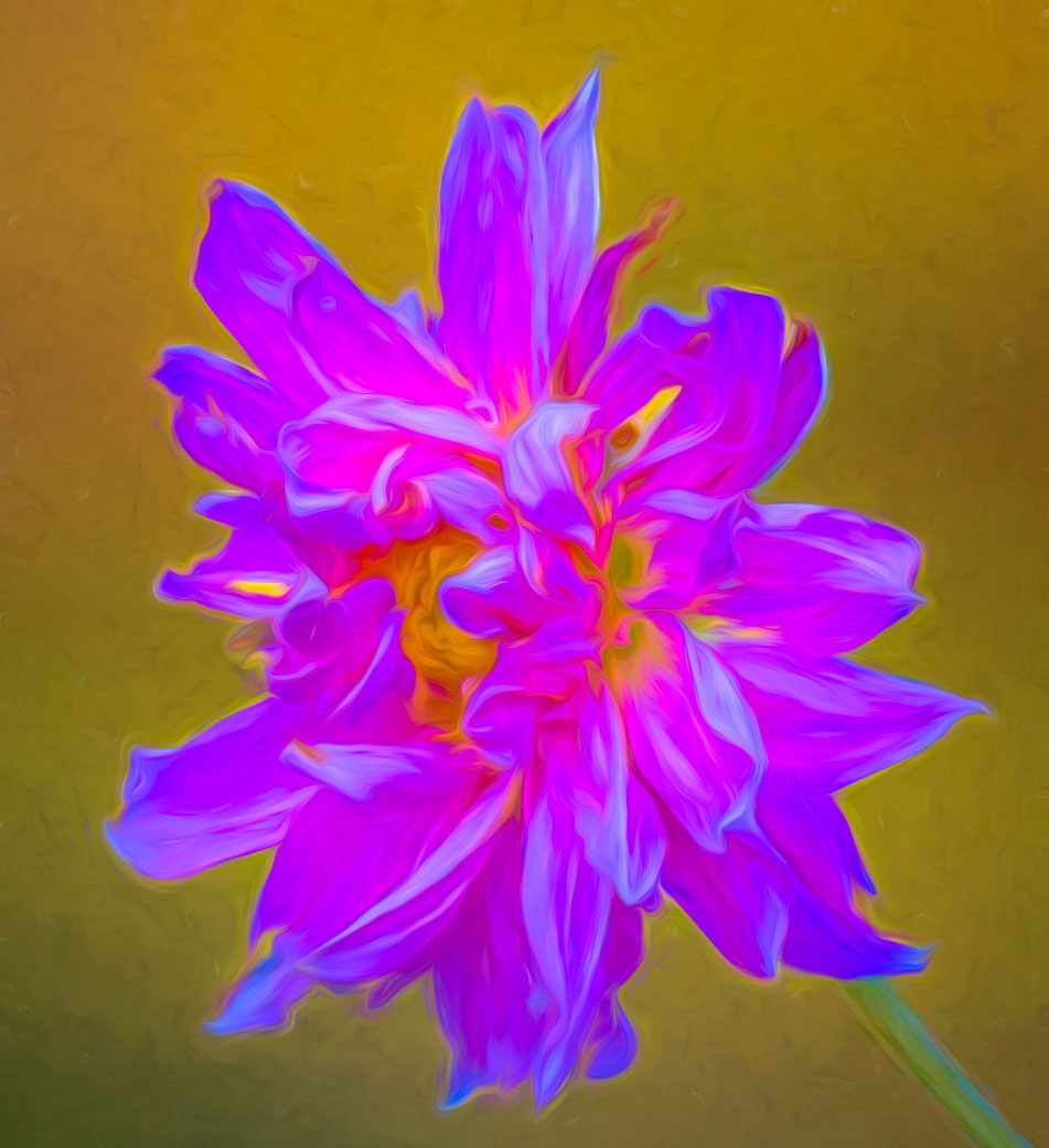
Rich, another beauty. Love the brilliant colors, focus and overall composition. I guess in your climate you have access to cut or grow Parrott heads. The only little nit is the white hotspot on the middle petal at the corner, I would try to cut hi lights on it or use the remove tool. I've seen it the remove tool do magic that would have seem impossible last year. |
Jan 9th |
| 80 |
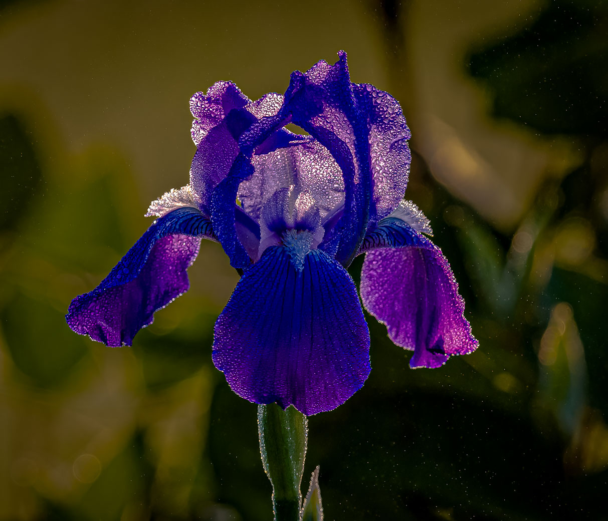
Jan 25 |
Comment |
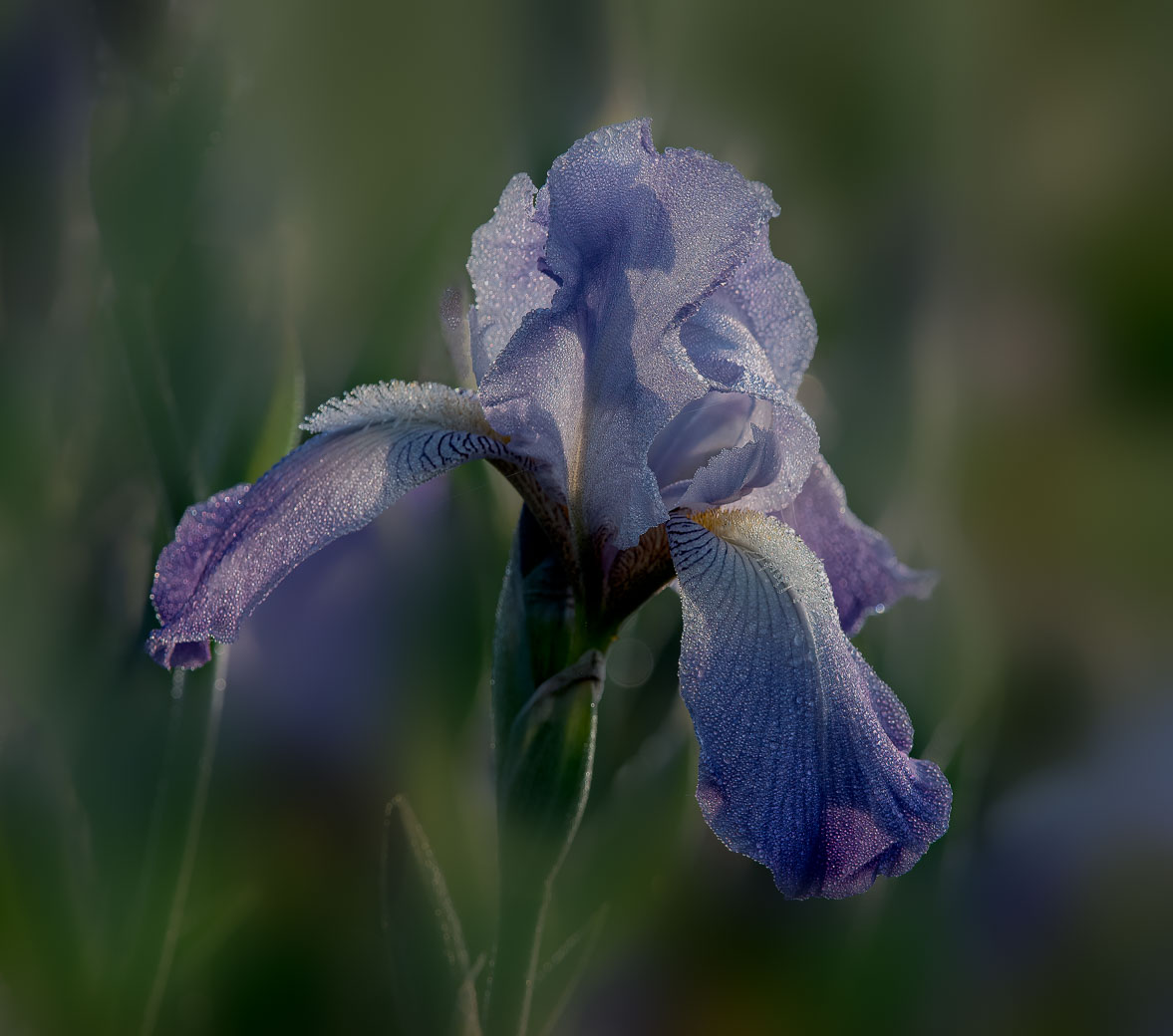
Ingrid, I agree with Marti and this is a beautiful image. The color in these gladiolus is just so inviting to move in closer and see beautiful viens and to smell them. I like the composition and think you picked a perfect intentional spot to cut the top of the stem. A really beautiful image. |
Jan 9th |
| 80 |
Jan 25 |
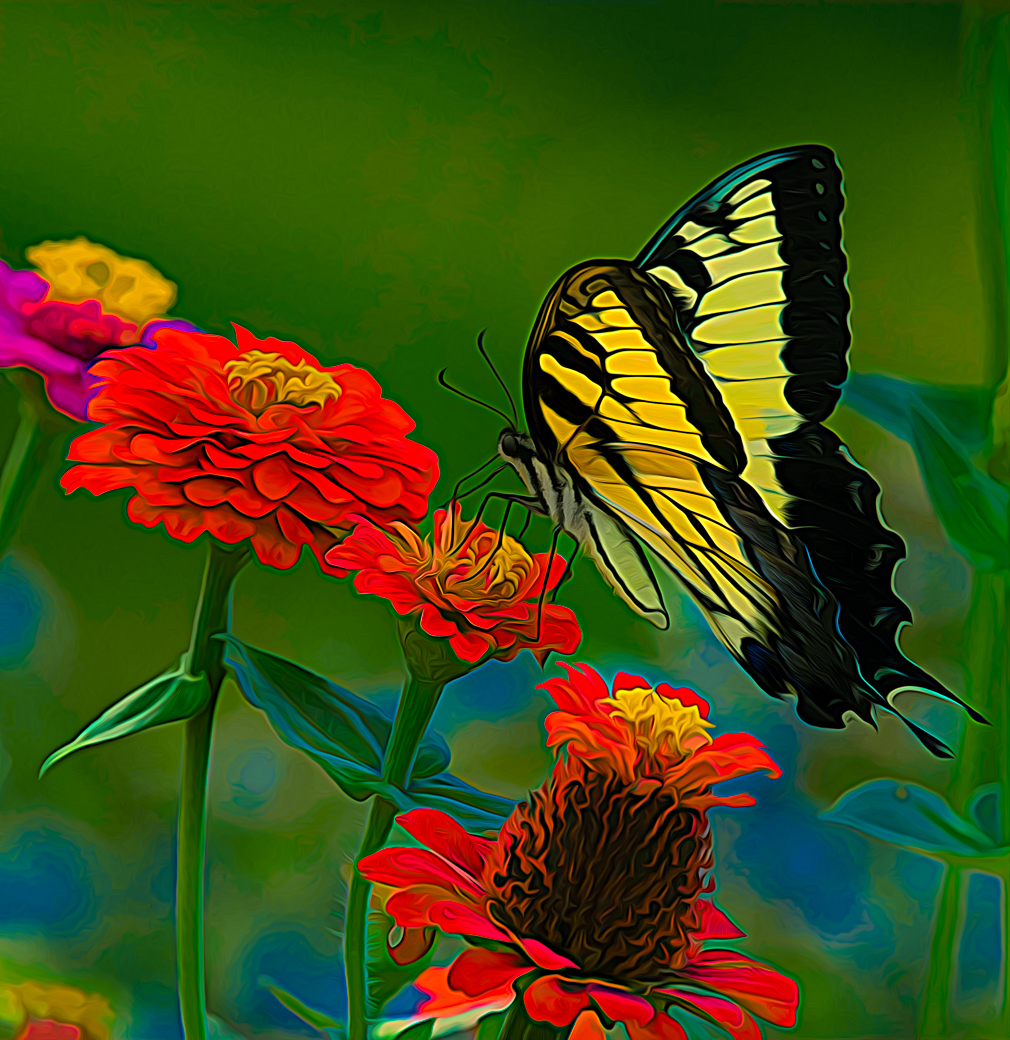
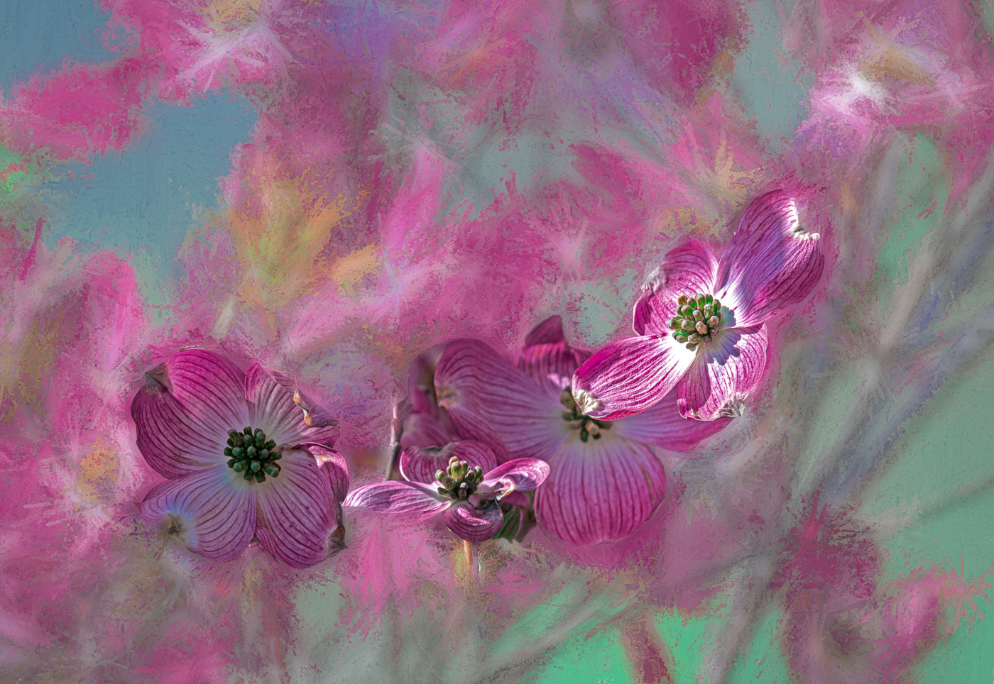
Comment |
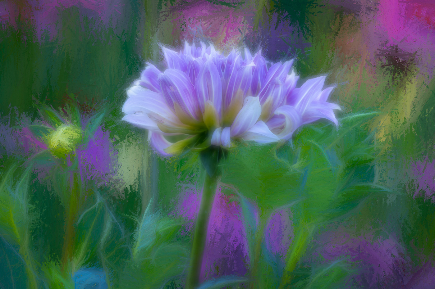
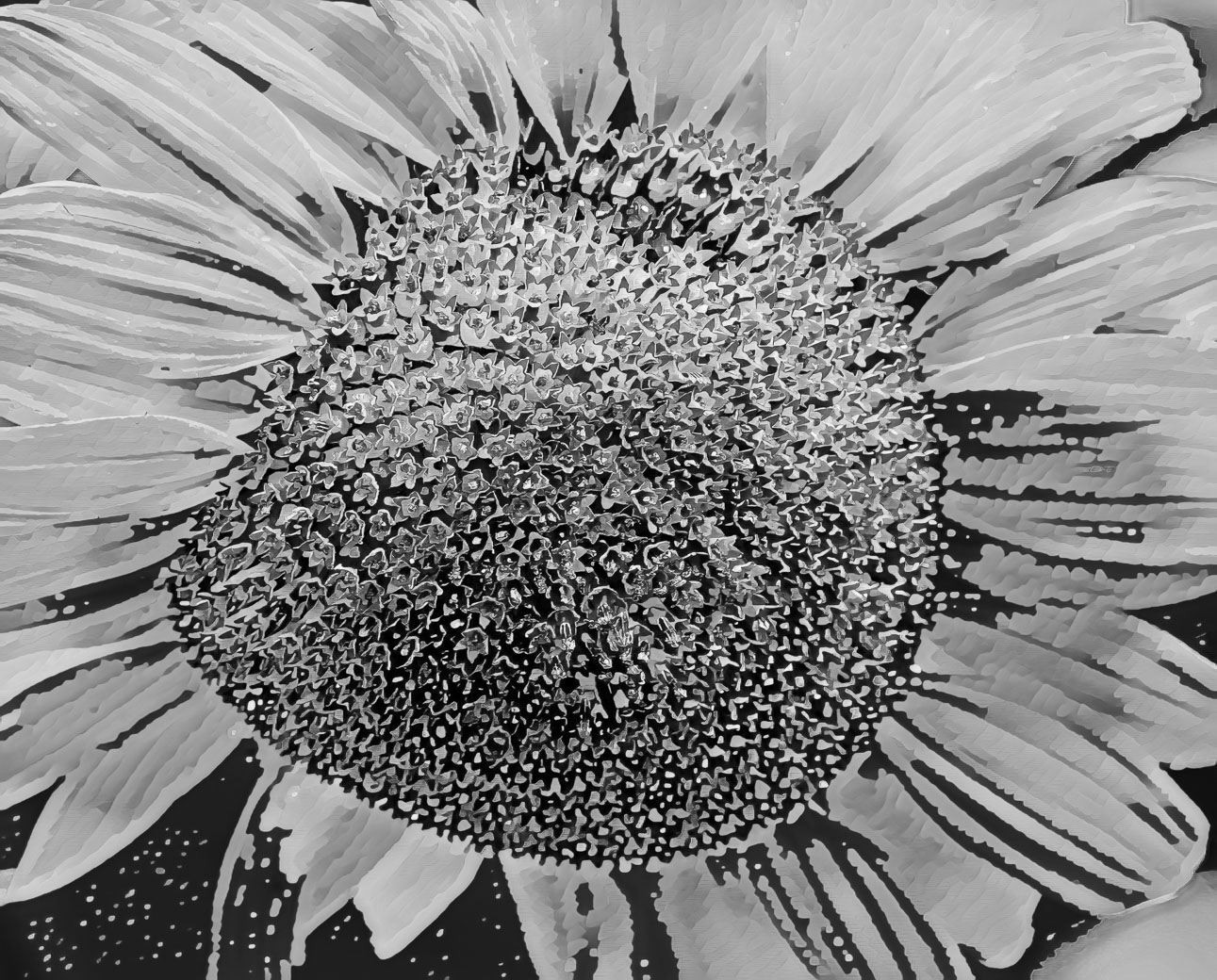
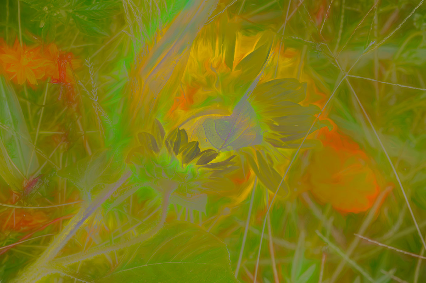
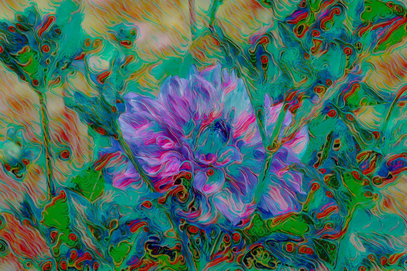
Kamal, a Great Job to separate the flower from the background. I also like the paint texture on the flower and background. I would like to suggest that you take this flower/ or the one for next month to the next level and put a mask over the yellow center of the flower, mast goes before the texture, thereby removing the texture from the center. I would also suggest that you use the remove/erase tool and remove the spots/holes on the flower petals. You are advancing very well. |
Jan 9th |
| 80 |
Jan 25 |
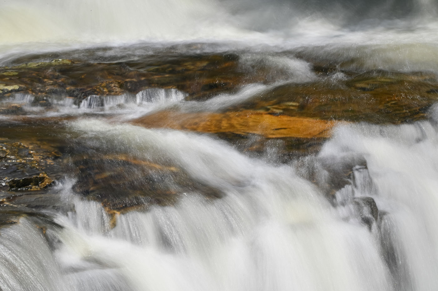
Comment |
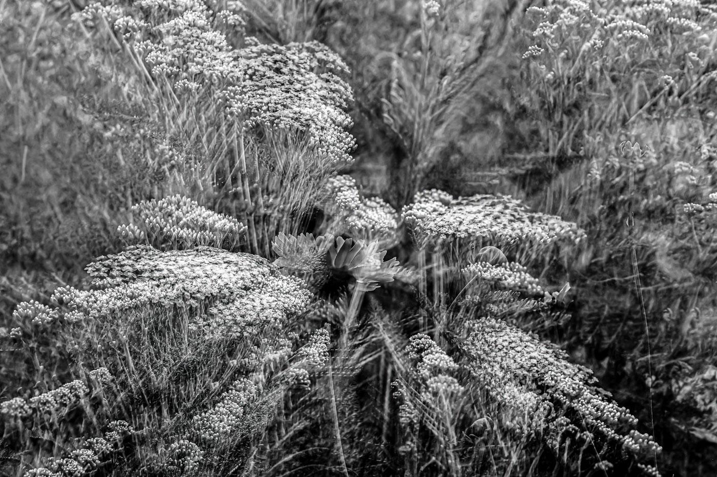
Doug, yes you do a fantastic job with these image stacks. I don't have an issue with the focus. I really like the depth of the veins. (mountain tops to the valleys). The colors are great but the textures are the beauty of the captures. Without sharp vein lines (mountain ridges to valleys) the color wouldn't be in discussion. It's ALL Texture in my point of view. Well done. |
Jan 9th |
| 80 |
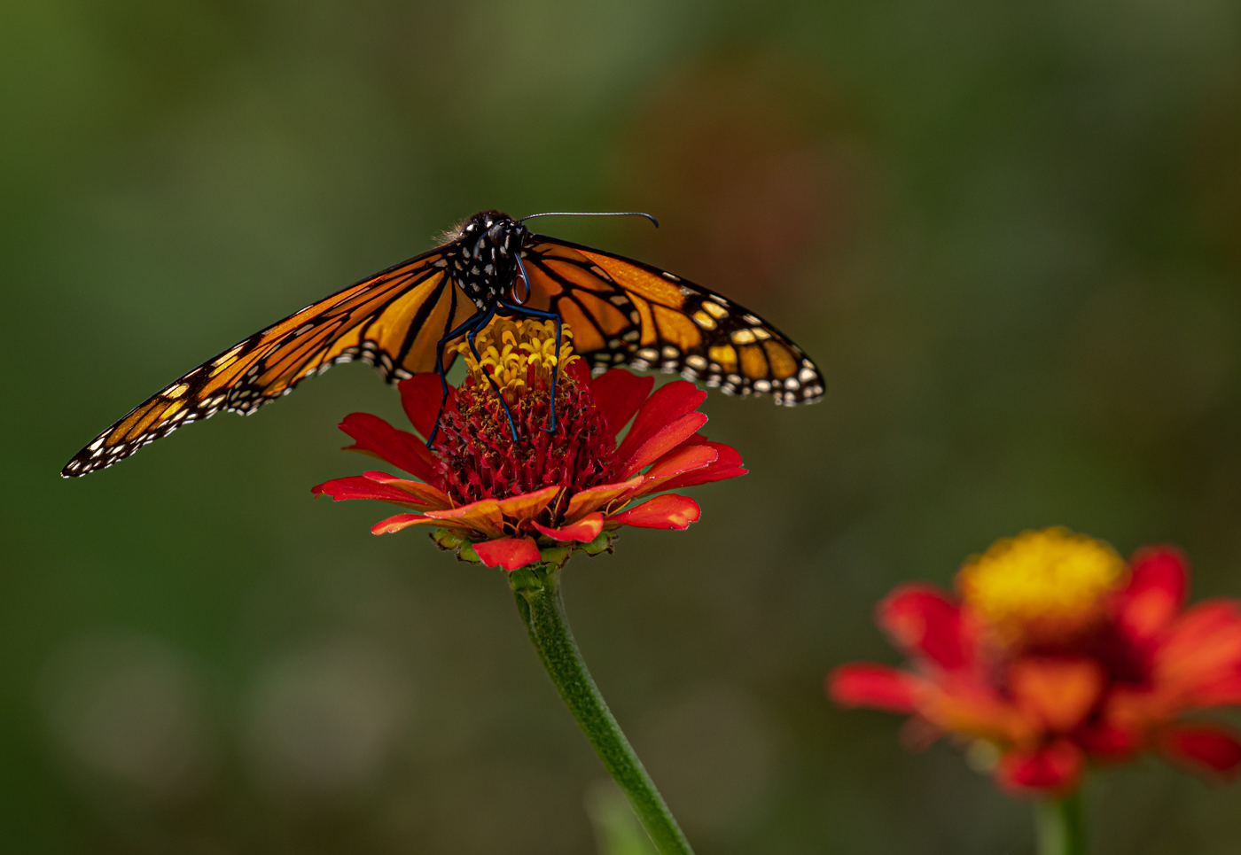
Jan 25 |
Comment |
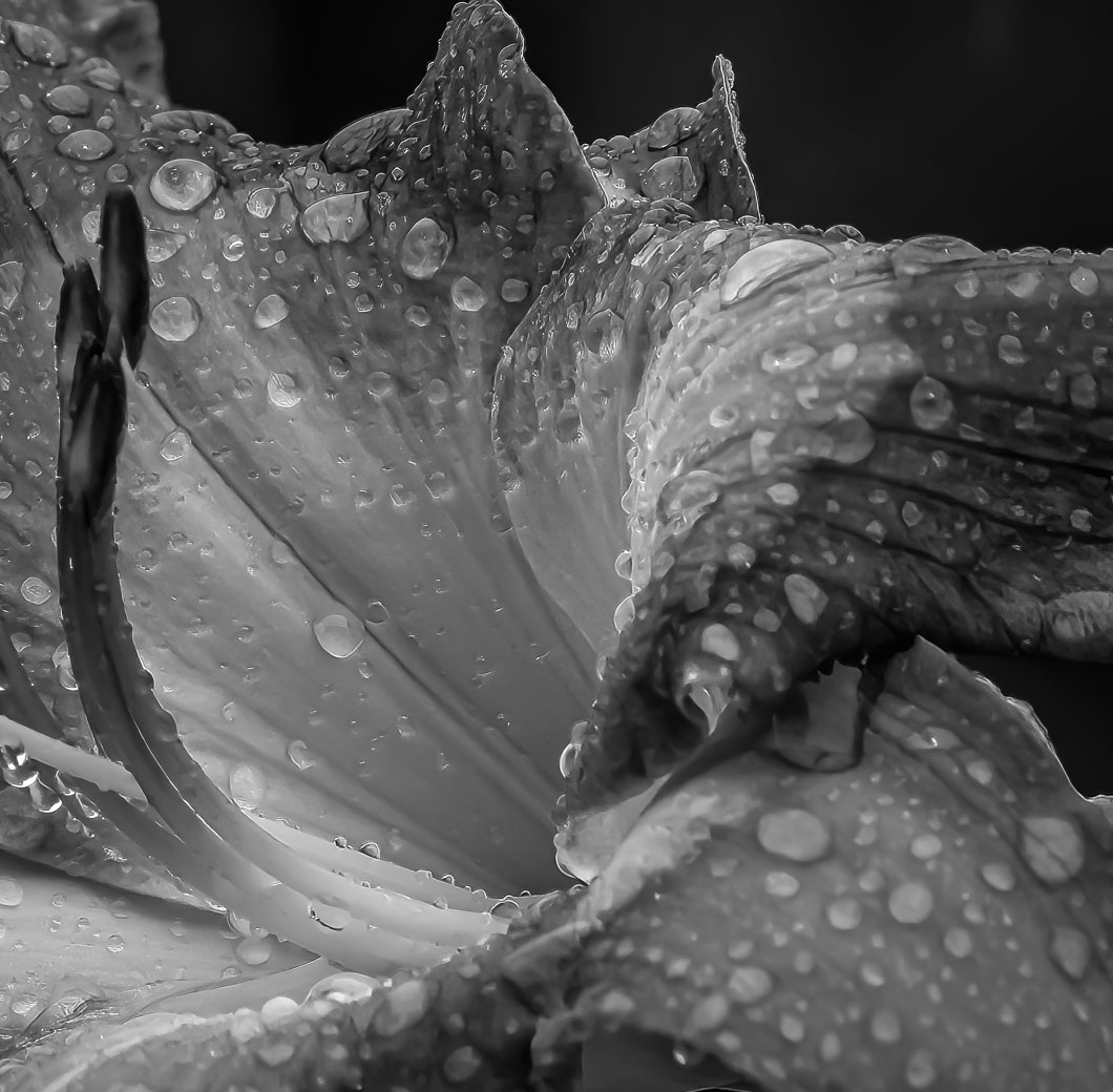
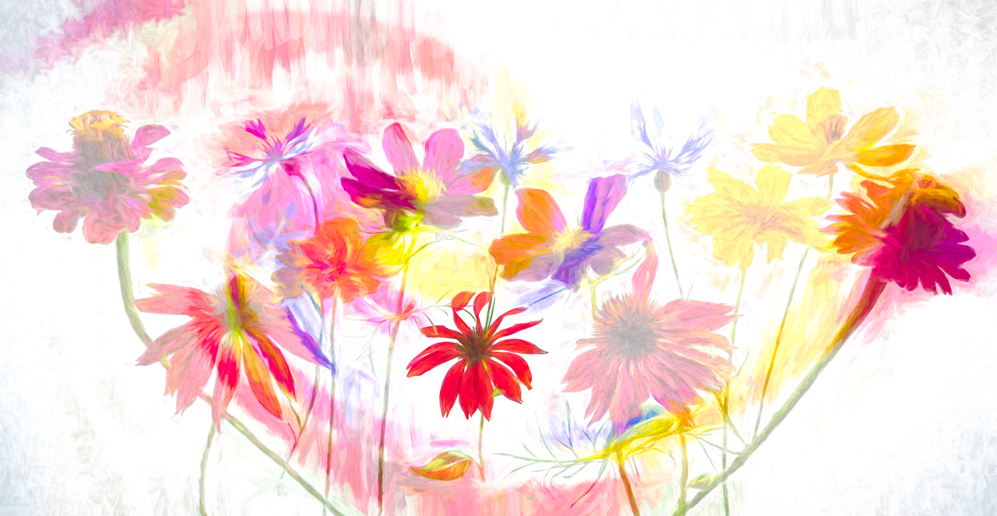
Nadia, you've done a beautiful job of removing the background clutter and replacing with a natural looking background. Doing a great job bringing the water drops into focus and the composition is the signature of a great floral photographer. Can't think of a single change I'd recommend. Perfect.
|
Jan 9th |
| 80 |
Jan 25 |
Reply |
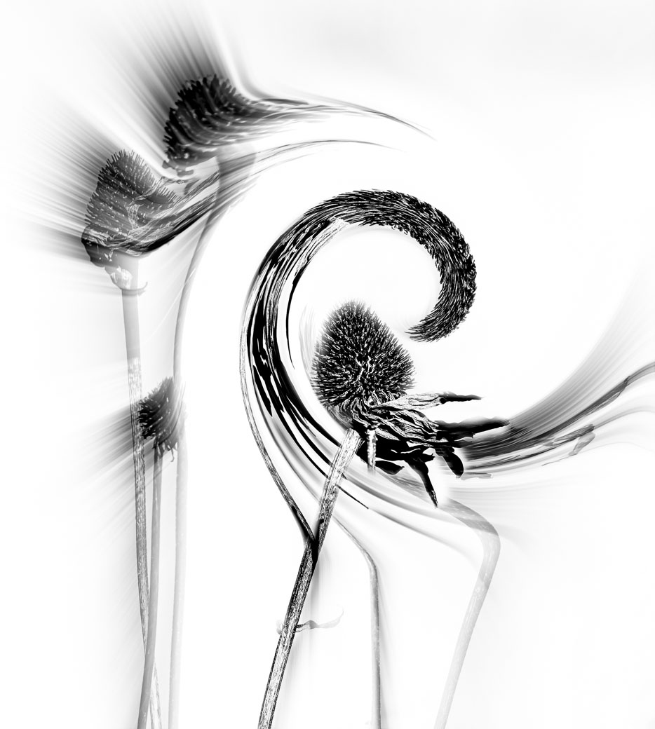
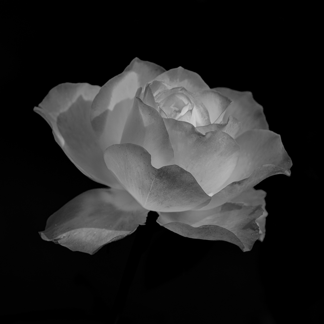
Marti, you image has a pleasing composition and sharpness throughout. I'm personally not a fan of plants/flowers that lack a pleasing color or tones in B&W. I might try an abstract on something like this, but not coming up with ideas where to start. So...I'll keep thinking.
|
Jan 9th |
| 80 |
Jan 25 |
Comment |
Thanks Marti. Yup, I strive for 50% approval. Your comments are all valid and appreciated. |
Jan 9th |
9 comments - 2 replies for Group 80
|
17 comments - 4 replies Total
|