|
| Group |
Round |
C/R |
Comment |
Date |
Image |
| 10 |
Oct 24 |
Comment |
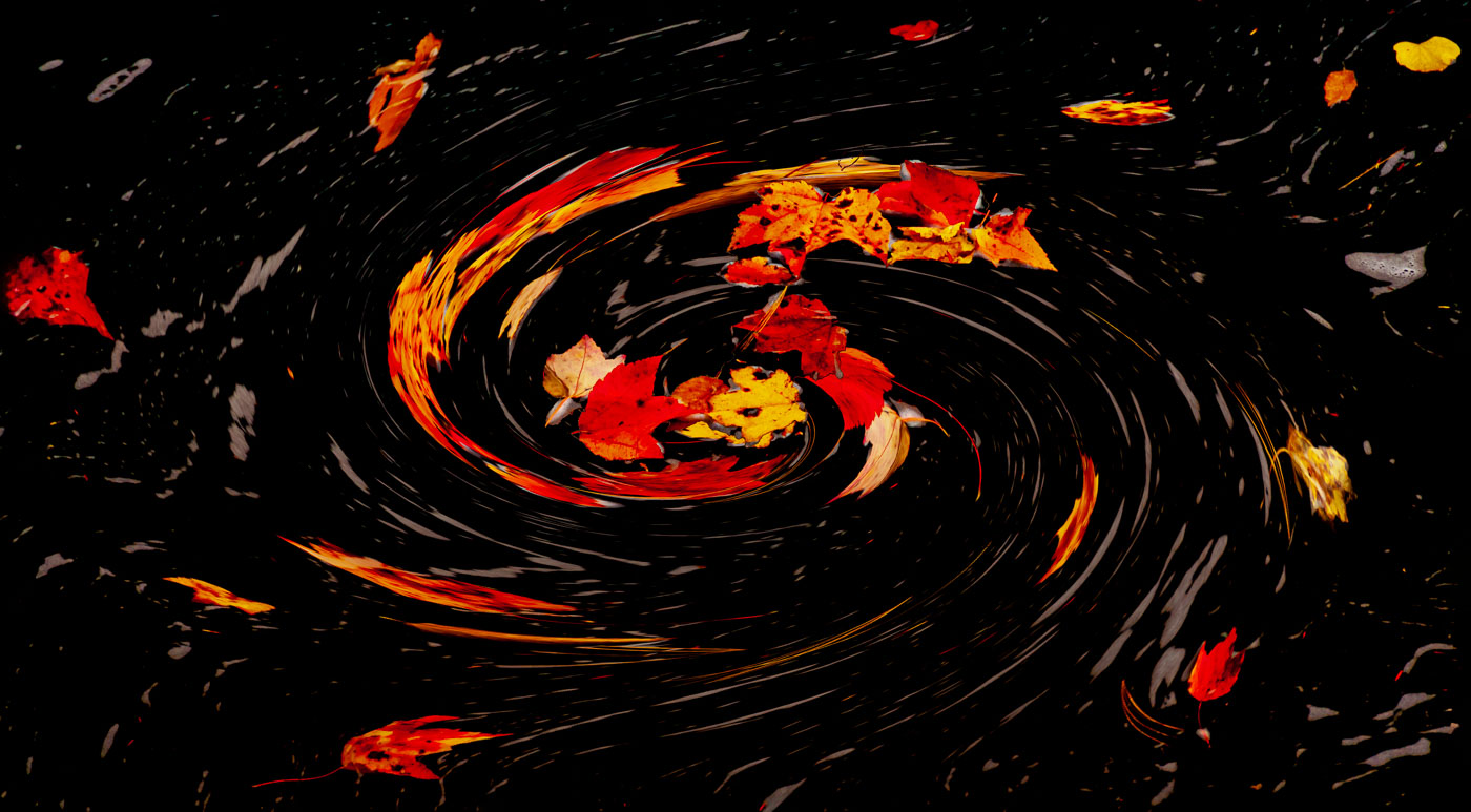
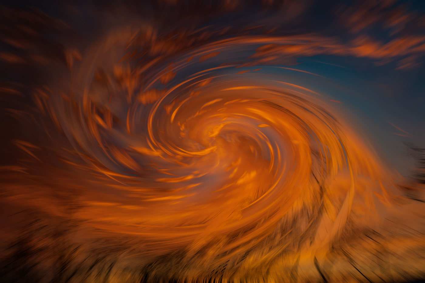
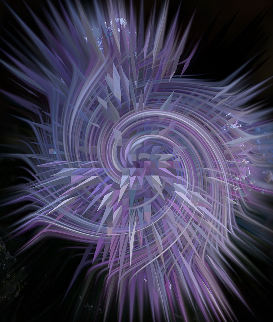
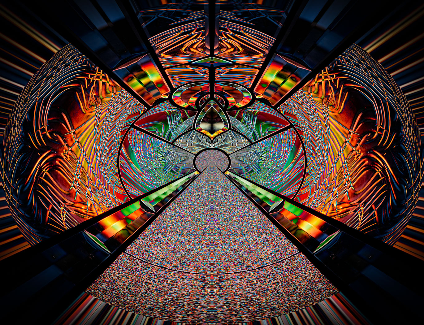
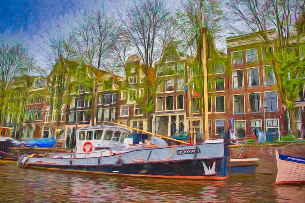
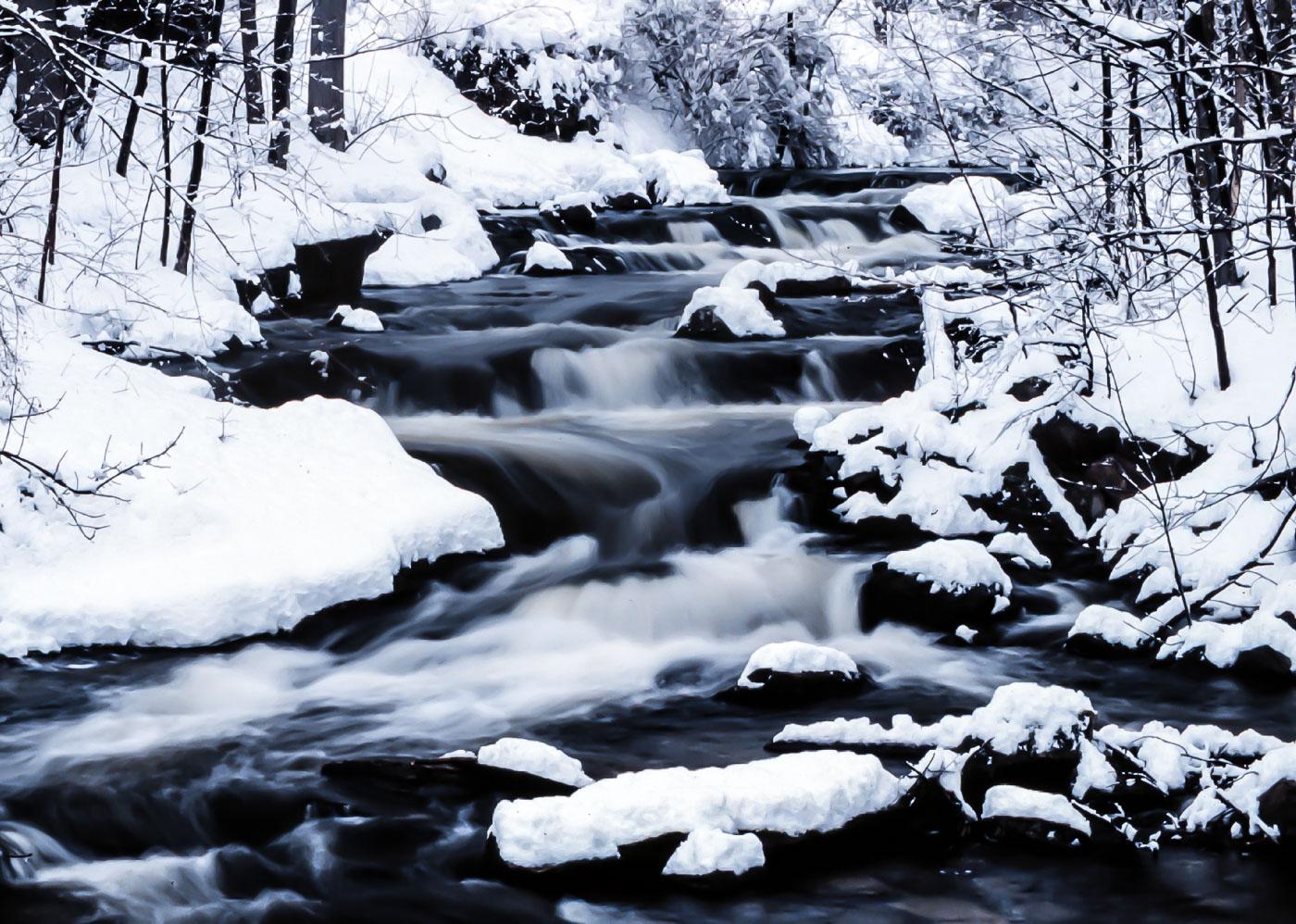
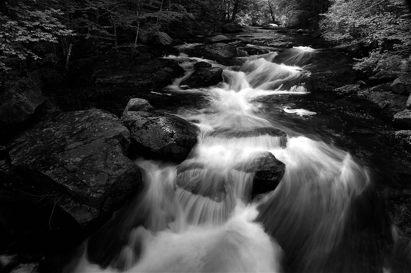
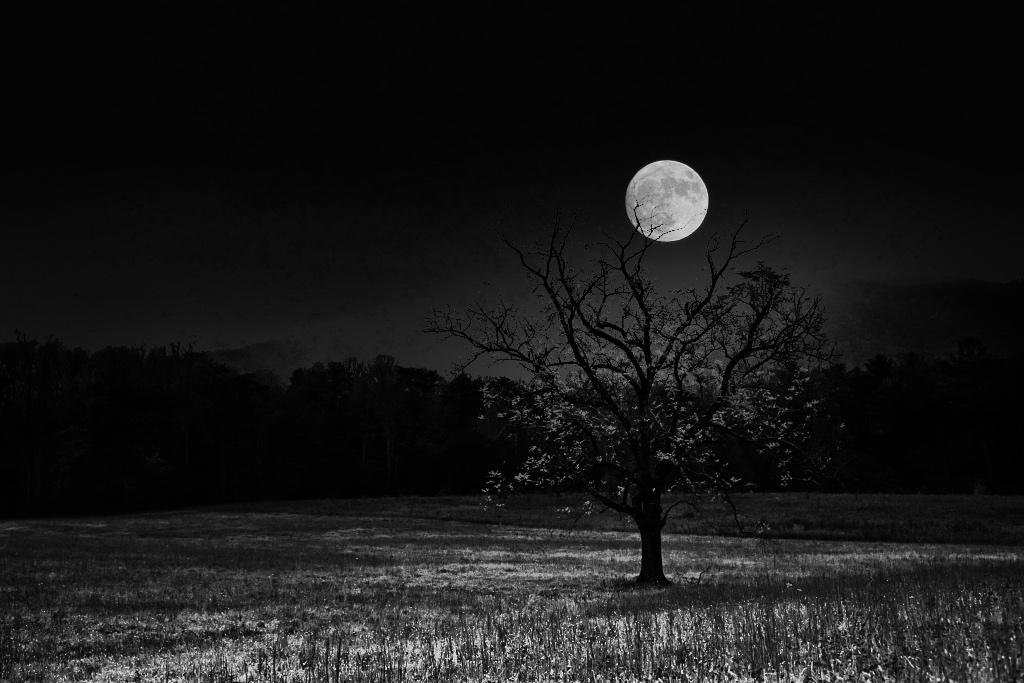
Great seeing Doug and using the snow to make the abstract. I believe the square crop increases the quality of the image. I can't think of any improvements. |
Oct 11th |
1 comment - 0 replies for Group 10
|
| 29 |
Oct 24 |
Comment |
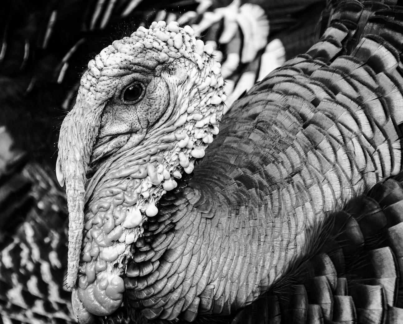
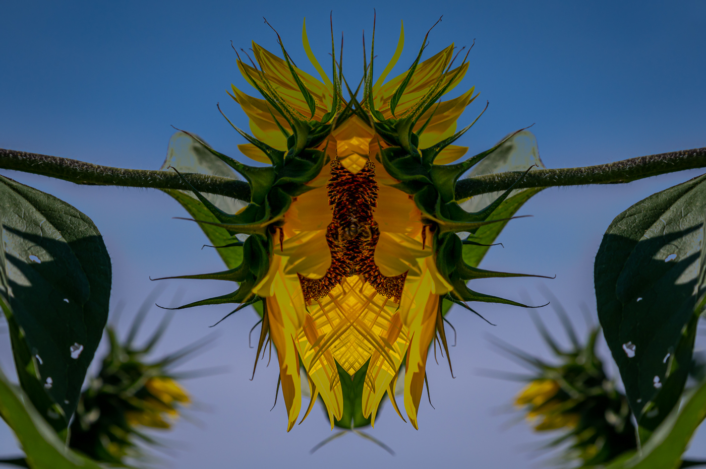
Ron, a fantastic capture of the face and chest. Colors are fine, but I can't get my brain to be excited about the blown out areas. Maybe B&W would work better?
|
Oct 22nd |
| 29 |
Oct 24 |
Comment |
Thanks Elaine. |
Oct 9th |
| 29 |
Oct 24 |
Comment |
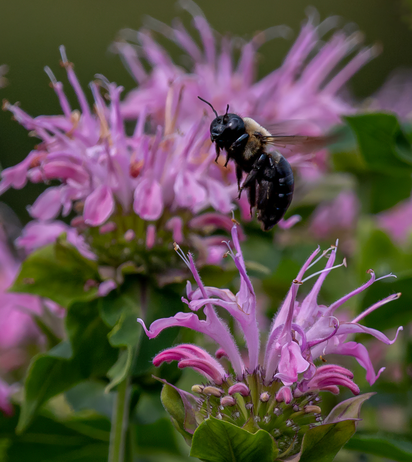
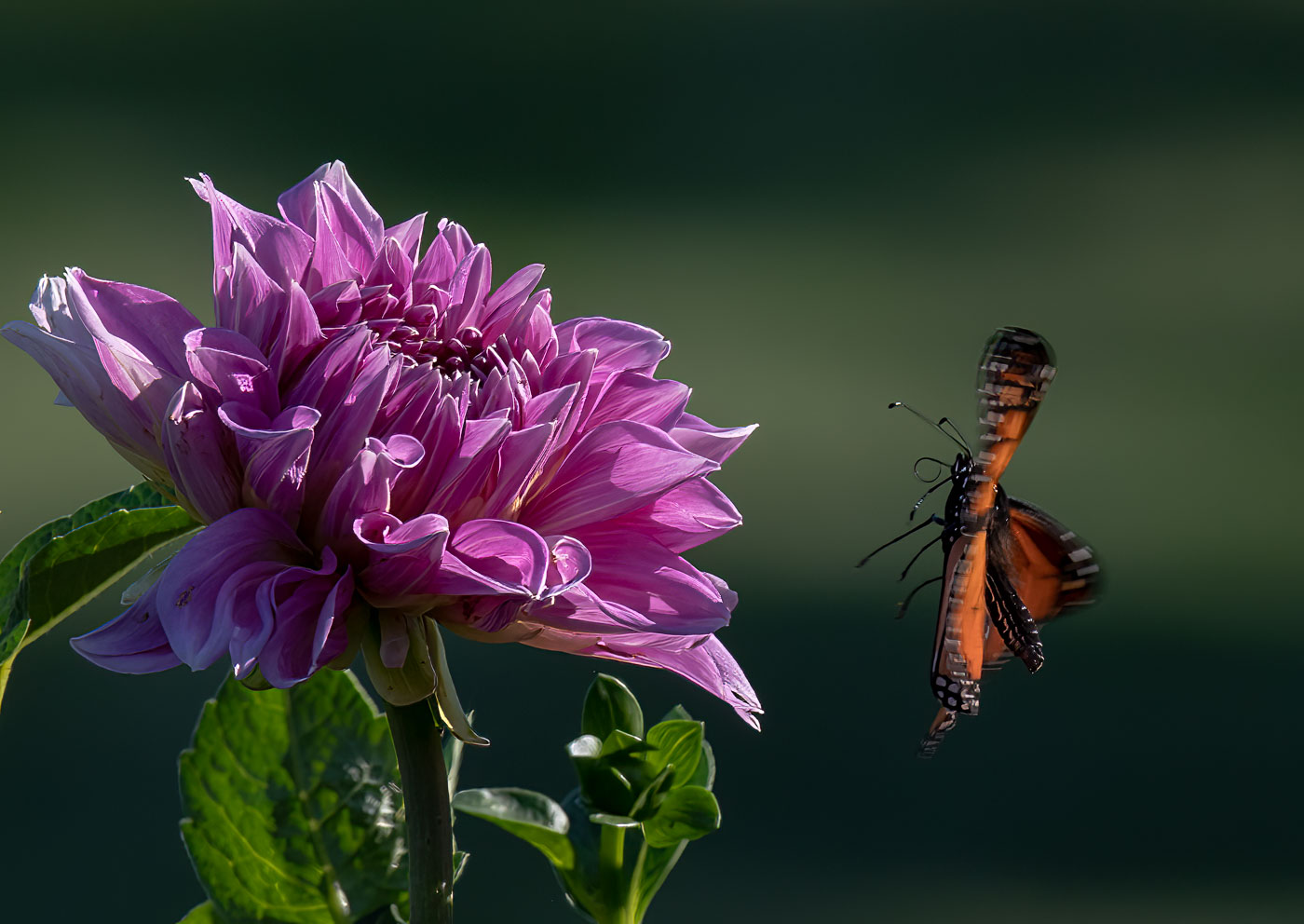
A beautiful in flight shot Gunter. Great DOF and details on butterflies head. What I'm bothered by, a little, is the out of focus flowers beneath. Cropping them out will beg the question as to where he's going to land. A larger f-stop might of clarified whether those flowers beneath are from, where he took off from or where he will land? I think that numerous viewers will be troubled or confused by the lack of detail on the flowers and overlooking the beautiful in focus details of the butterflies head. |
Oct 8th |
| 29 |
Oct 24 |
Comment |
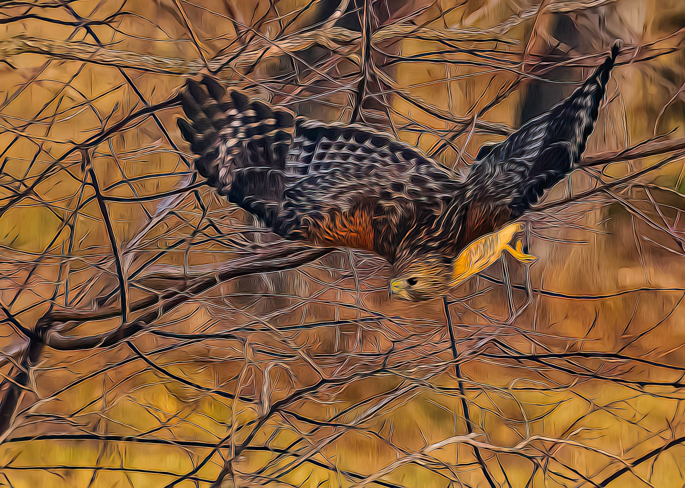
Yes, another beautiful wildlife shot. It's amazing how often you come up with these great shots. I agree, that rack on his head is imposing. I might try to crop off the droppings in the bottom front, just to the bottom of the stick. No other recommendations. Great job. |
Oct 8th |
| 29 |
Oct 24 |
Comment |
Hi Judy. I find the final composition to be very pleasing with great colors. Your original is Not something I would have shot and the software is programmed for you only. Nothing I would change in your image unless it was mine and I'd make it less static.
|
Oct 8th |
| 29 |
Oct 24 |
Comment |
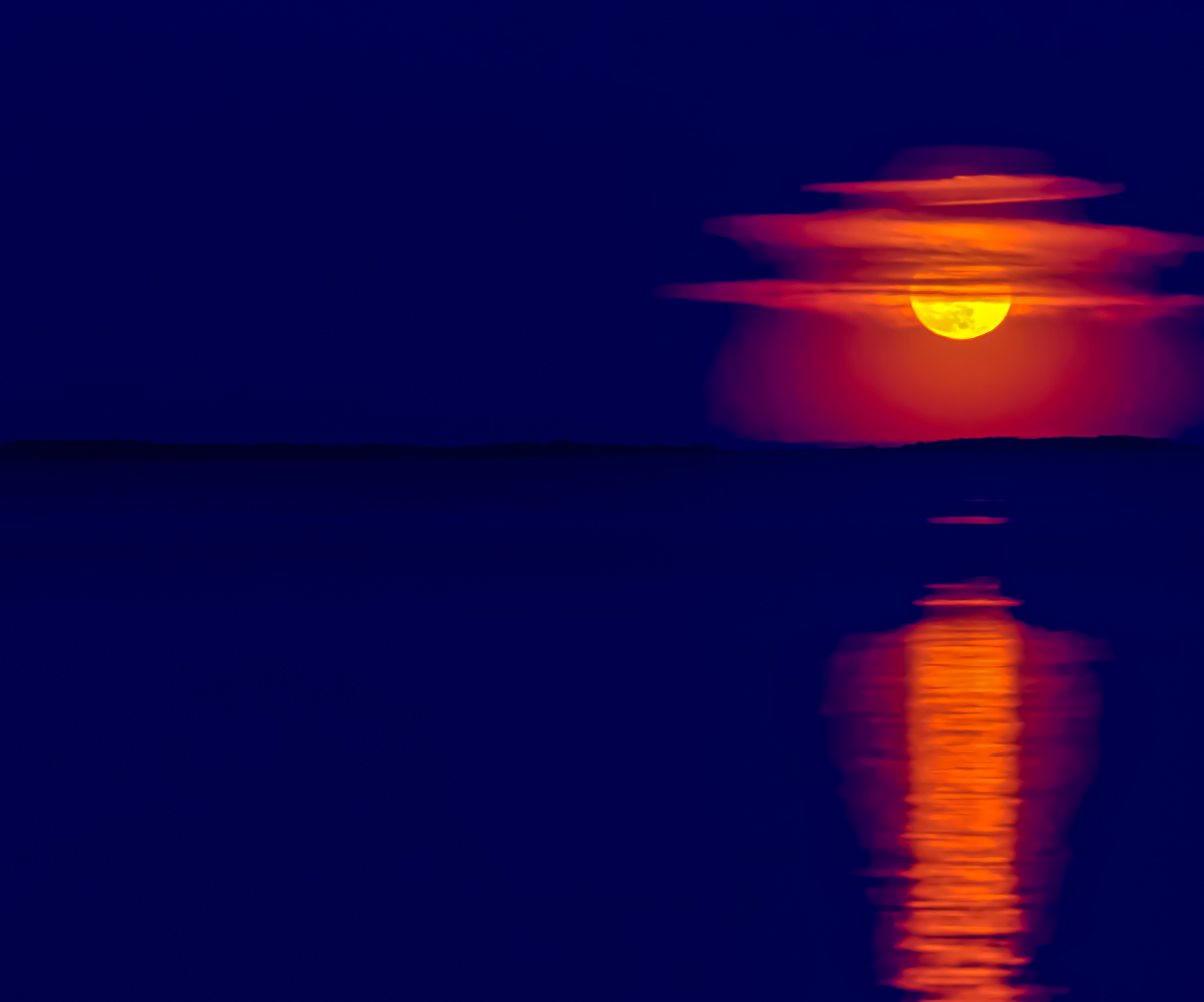
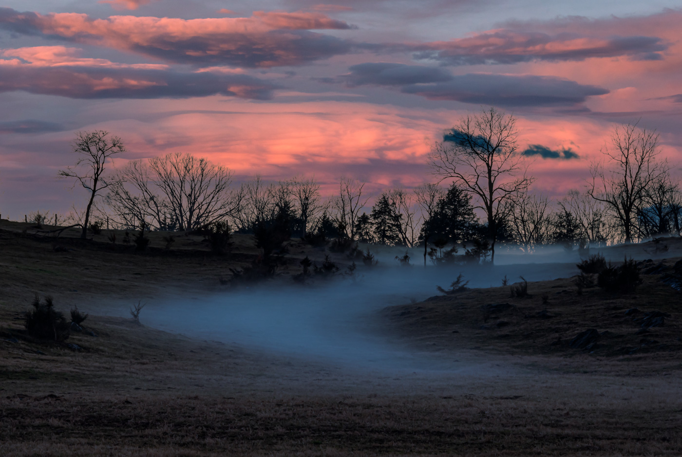
Elaine, I like the lighted boat ramp leading into the Milky Way. I like the exposure on the land at the edge of the lake. Milkyway exposure is also very good. Myself, I would try to make the Milkyway brighter, not a lot, but just exposed more so the viewer knows 100% that your subject was the Milkyway. Good job |
Oct 8th |
| 29 |
Oct 24 |
Comment |
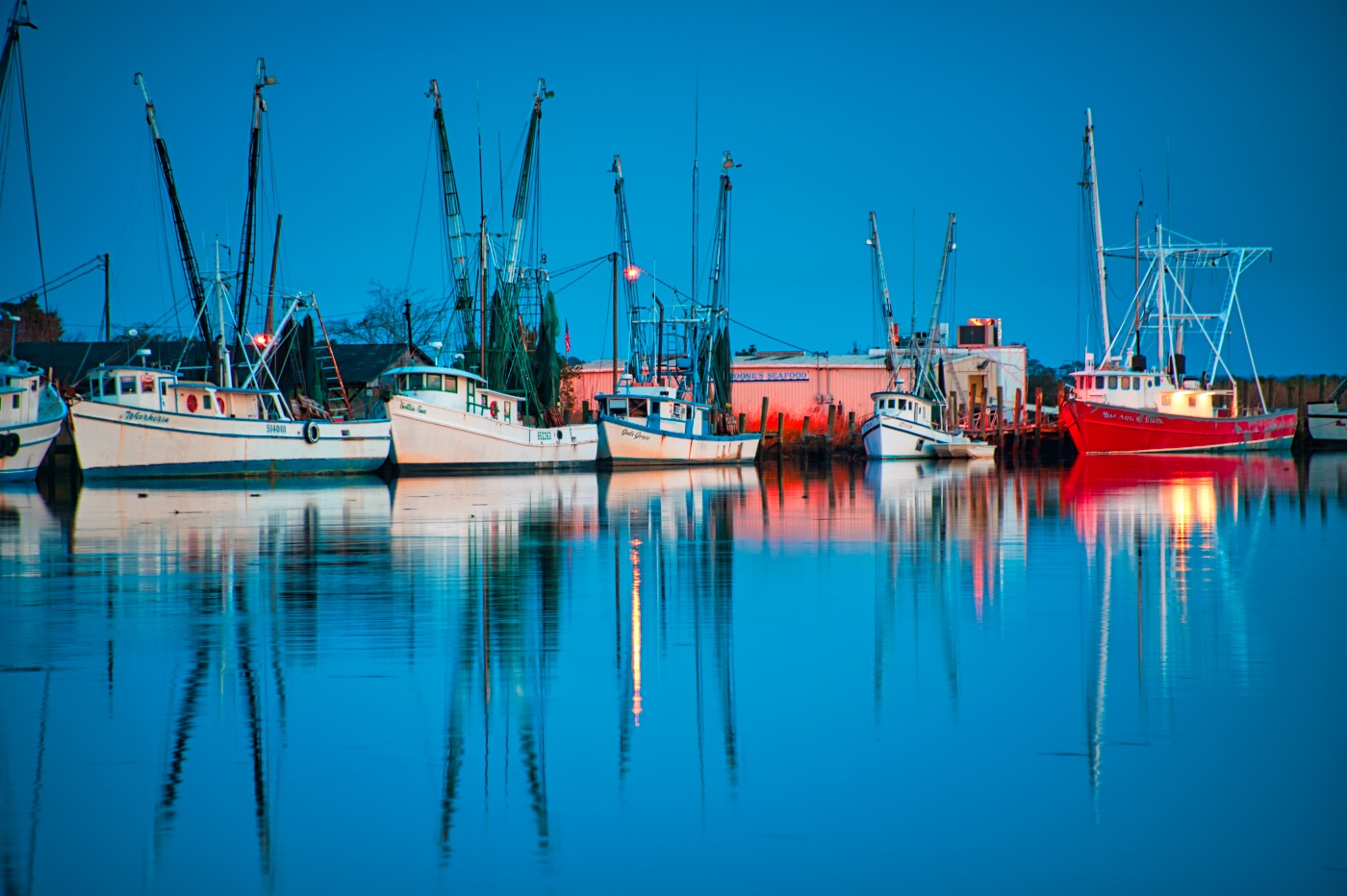
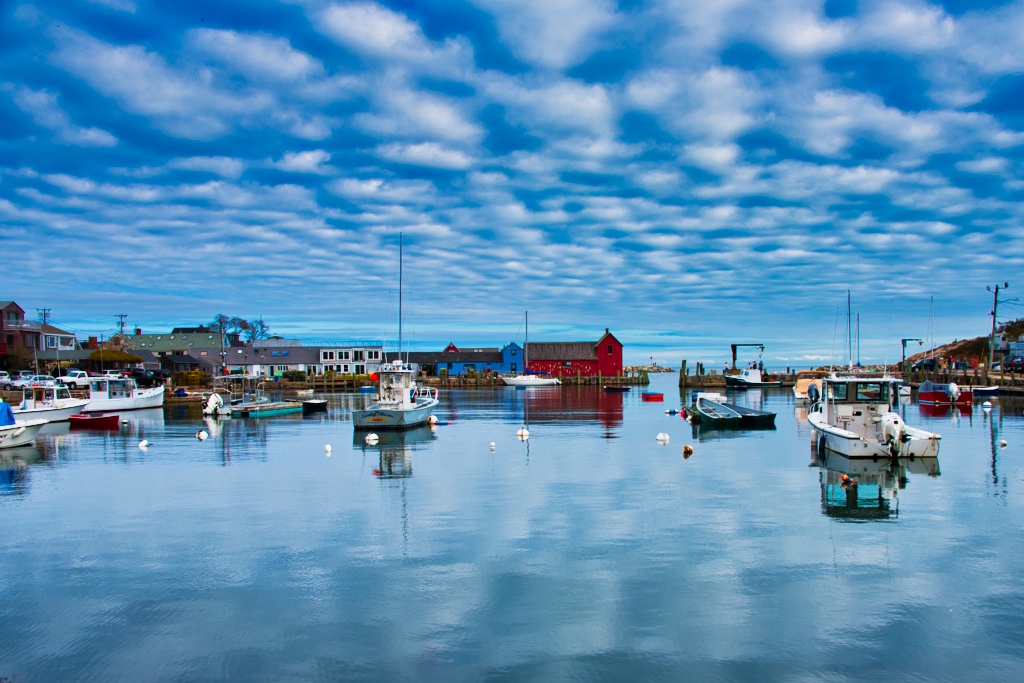
Tim, you have all the basics covered with this image, good composition, exposure, and sky. The pier with water reflections, stop sign, and rocks supporting the pier.
But...that leaves me looking for the subject. A pleasant seascape? Some kind of boat or vehicle on the horizon line? If the subject is the stop sign at end of pier then I'd be inclined to move it off center or zoom into it. |
Oct 8th |
| 29 |
Oct 24 |
Comment |
Thanks Gunter. It's possible I also saw it in a non-documentary way. Stay tuned. |
Oct 8th |
8 comments - 0 replies for Group 29
|
| 80 |
Oct 24 |
Reply |
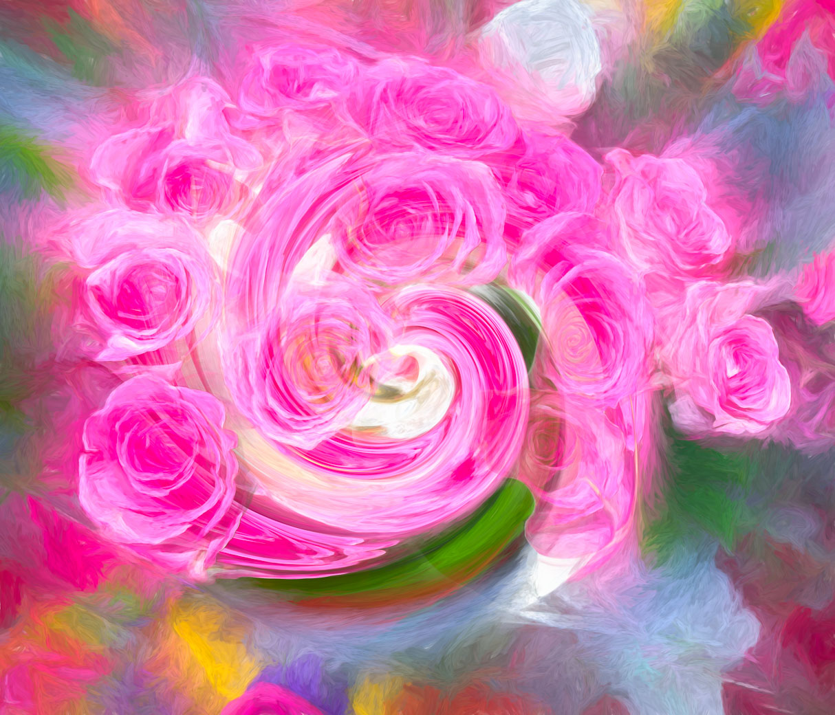
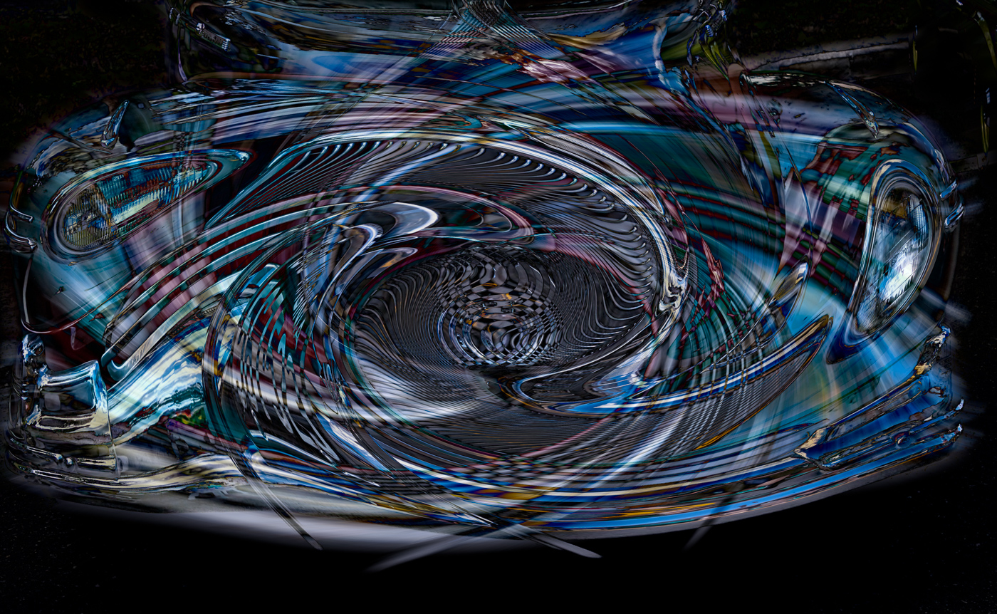
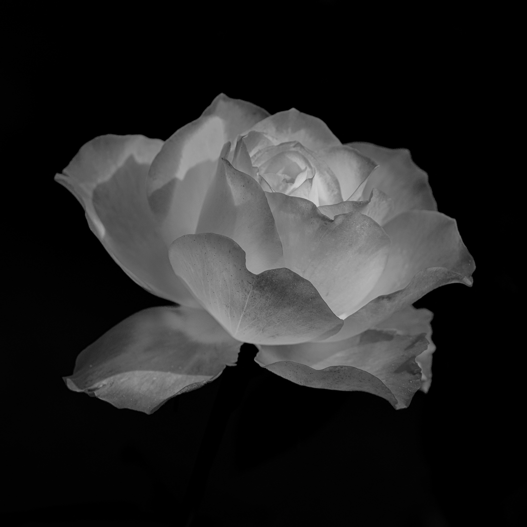
Thanks Doug. In Lr or LcR the Radial Blur is in Ps (vs Topaz) under filters>Blur>Radial and you can use the grid in upper right to compensate if subject is off center. I also use a low number depending on the amount of disguise/blur of the subject that you desire.
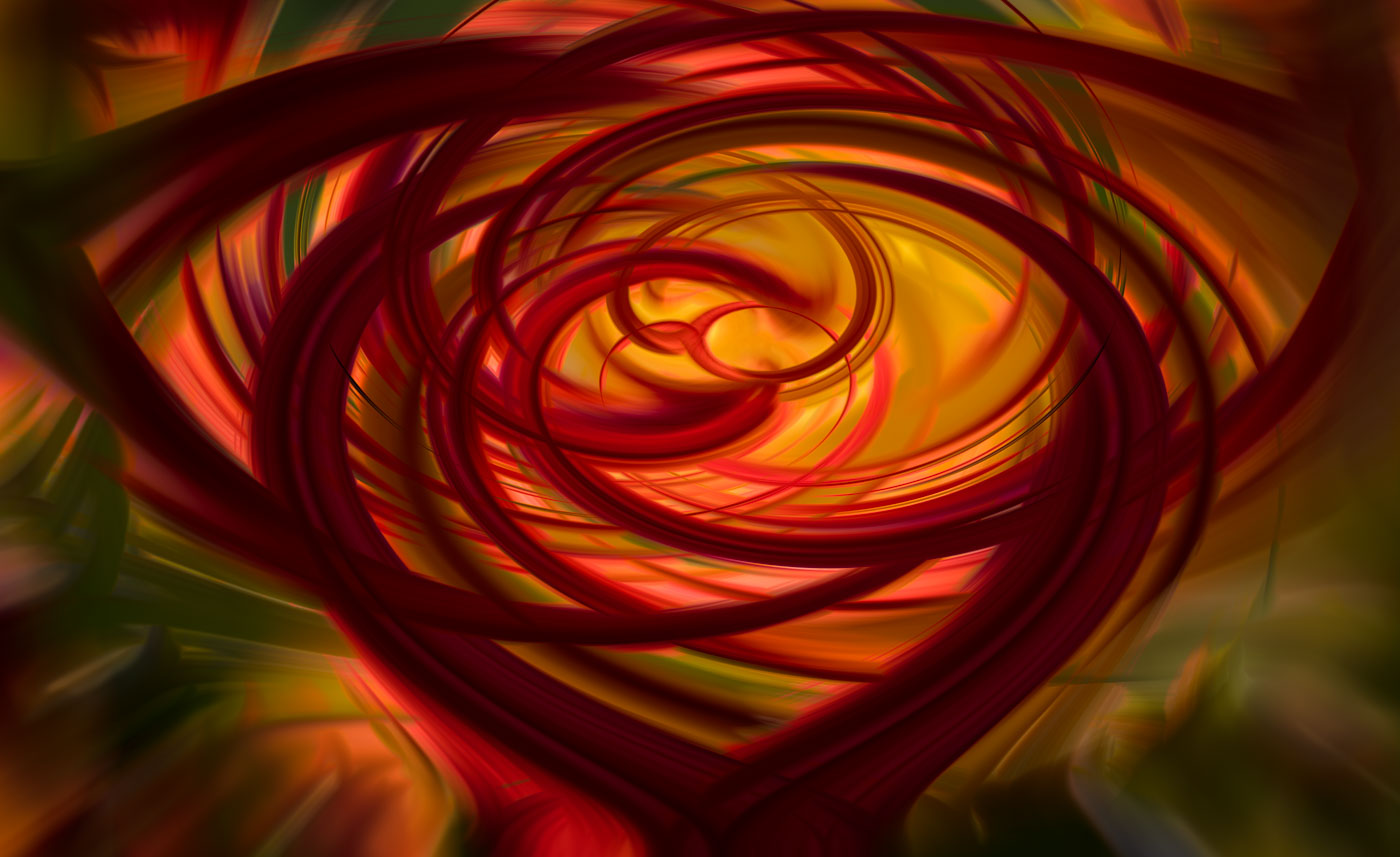
Regarding your Rose edit, you have done a great job (although it only shows in the thumbnail version, Too big?) background blurring is great except the upper left corner. The centered Rose is fantastic. For me that's the best way to go, but not everyone in the DD group agrees so I try to temper/bring down my vibrant edits. I'll try your editing success's
|
Oct 24th |
| 80 |
Oct 24 |
Comment |
Thank you Ingrid. |
Oct 20th |
| 80 |
Oct 24 |
Reply |
Marti, I find the lighter colored background to still be distracting. I'm fine with darkening the background to be darker than you processed. Thank you for your valuable comments. |
Oct 19th |
| 80 |
Oct 24 |
Reply |
Excellent job my friend, Nadia. I tried to remove the red flower in upper right and while gone, I was still left with a distracting "dirt" so that needed to be darkened also. I was very short on time and couldn't reproduce as I had hoped so darkening the background is the solution. Well done Nadia. |
Oct 19th |
| 80 |
Oct 24 |
Reply |
Thank you Rich. |
Oct 19th |
| 80 |
Oct 24 |
Comment |
Well, please take a few minutes and hit the submit button below. Thanks |
Oct 10th |
| 80 |
Oct 24 |
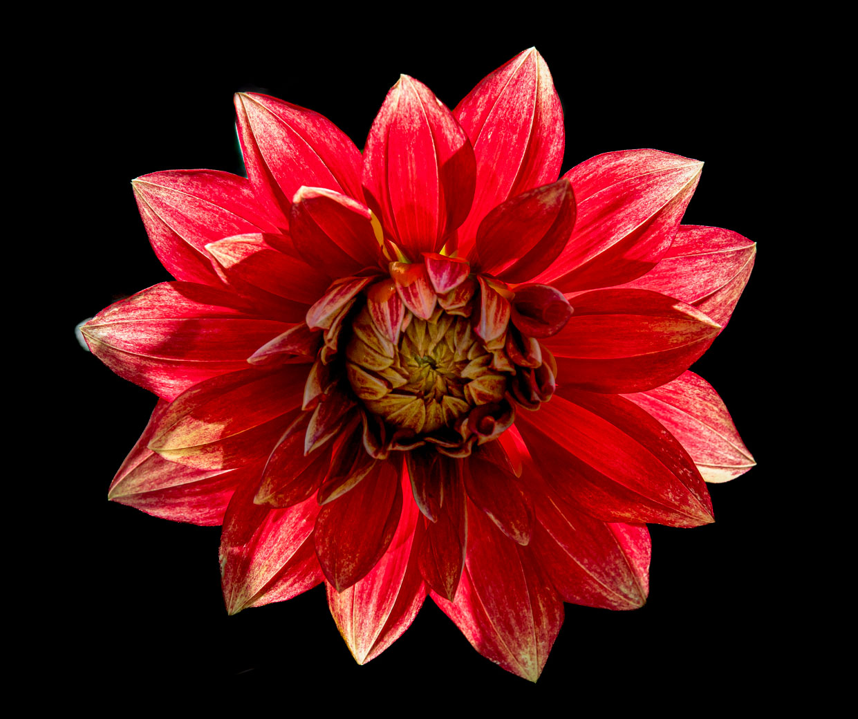
Comment |
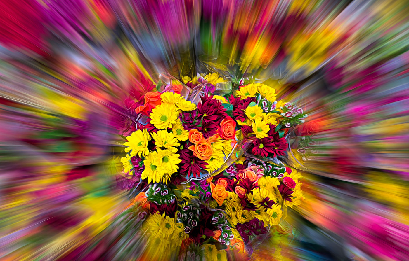
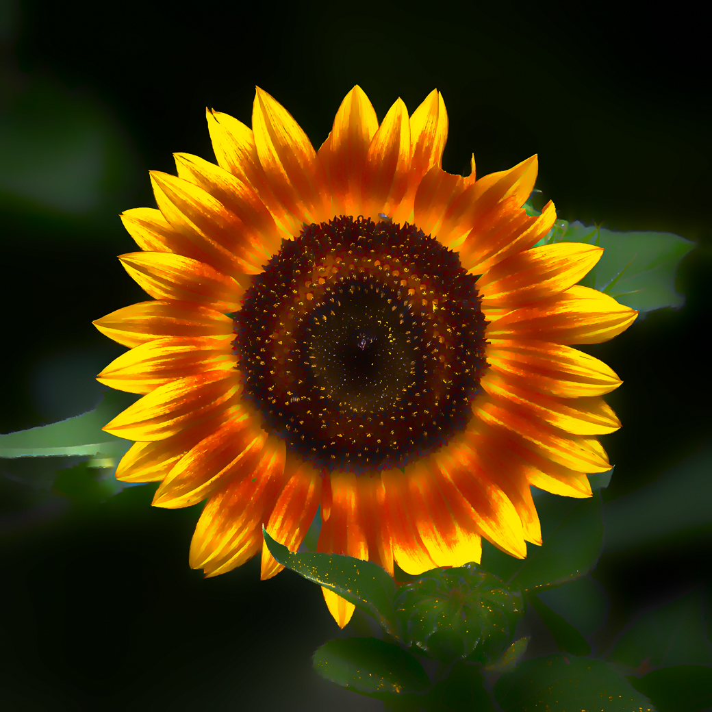
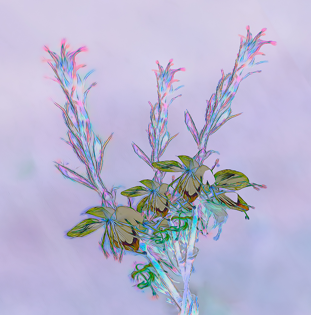
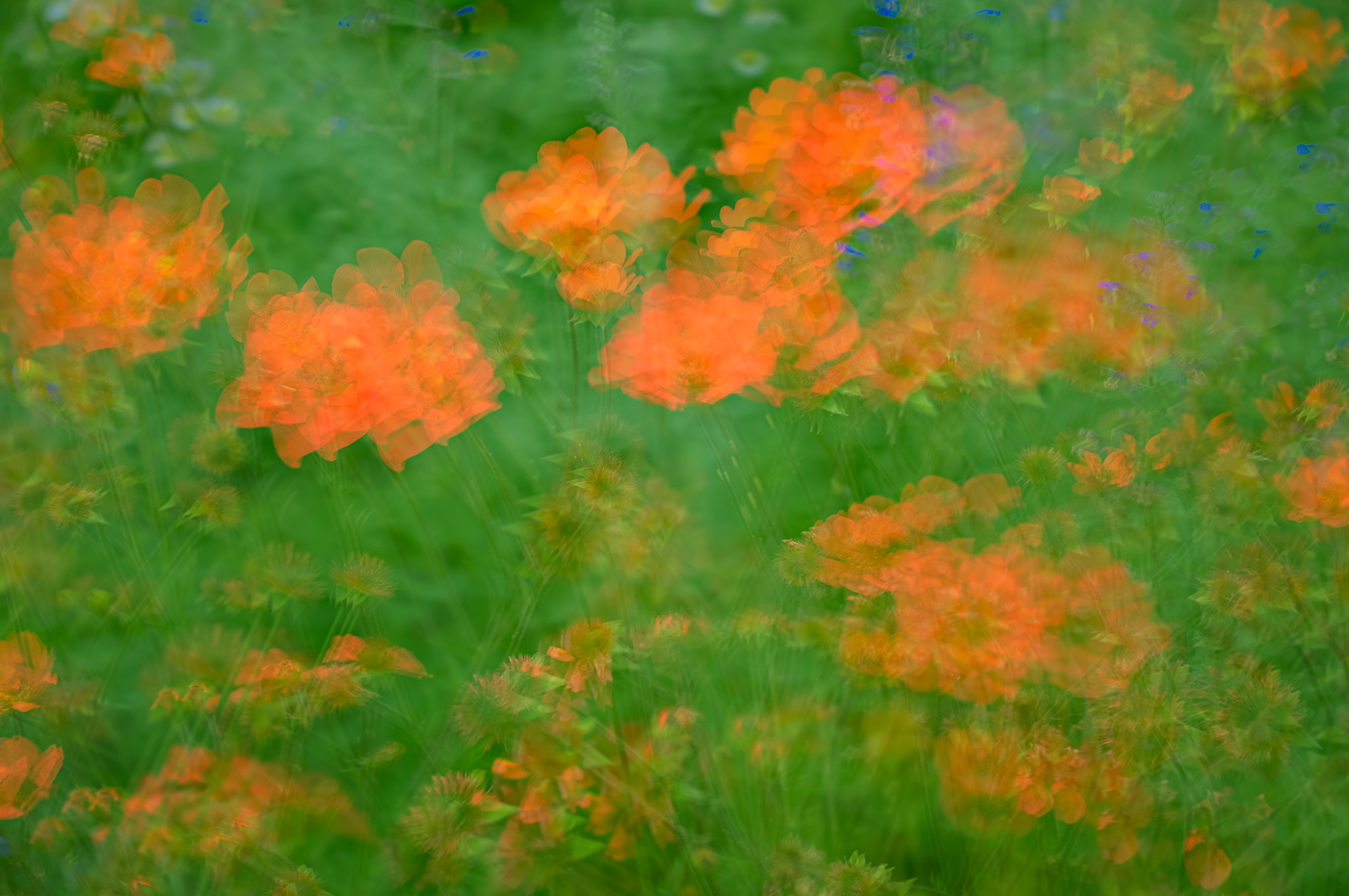
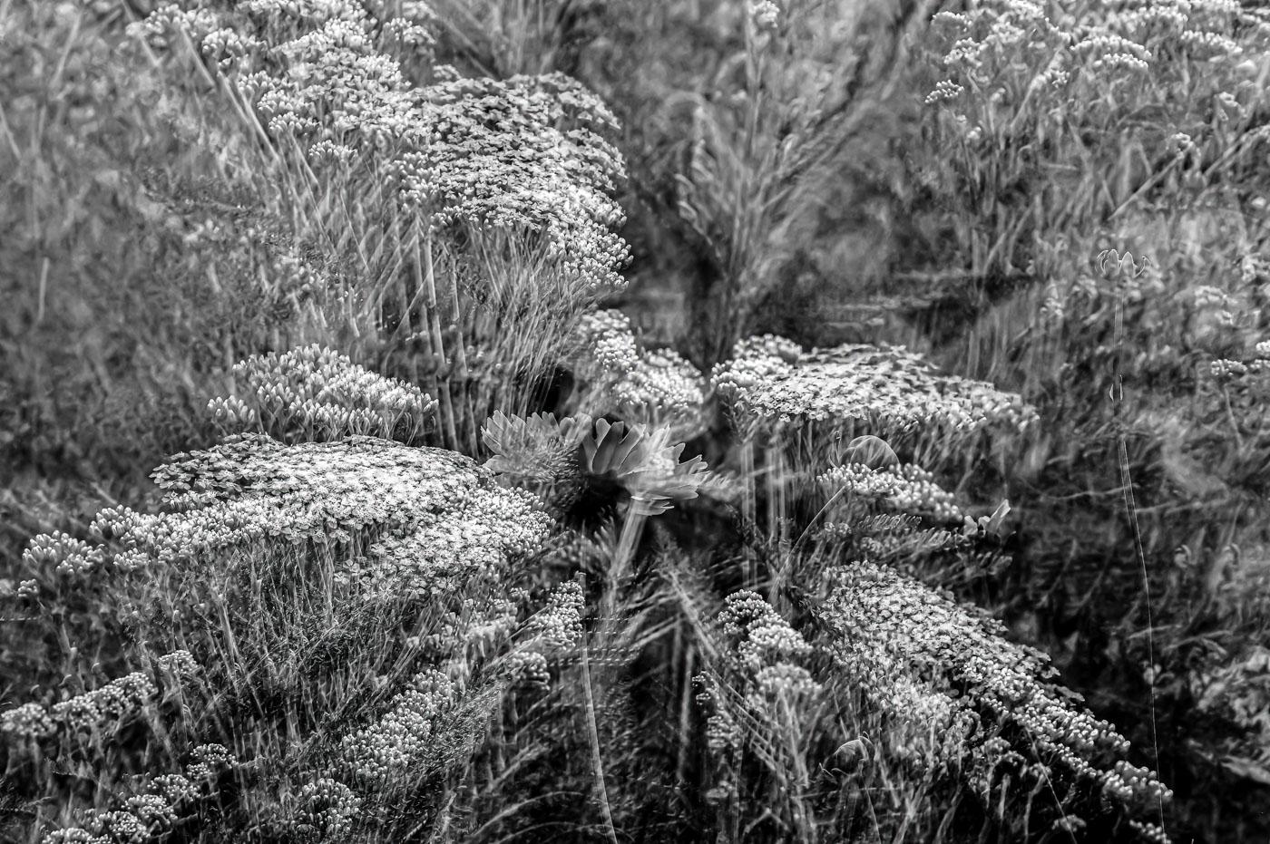
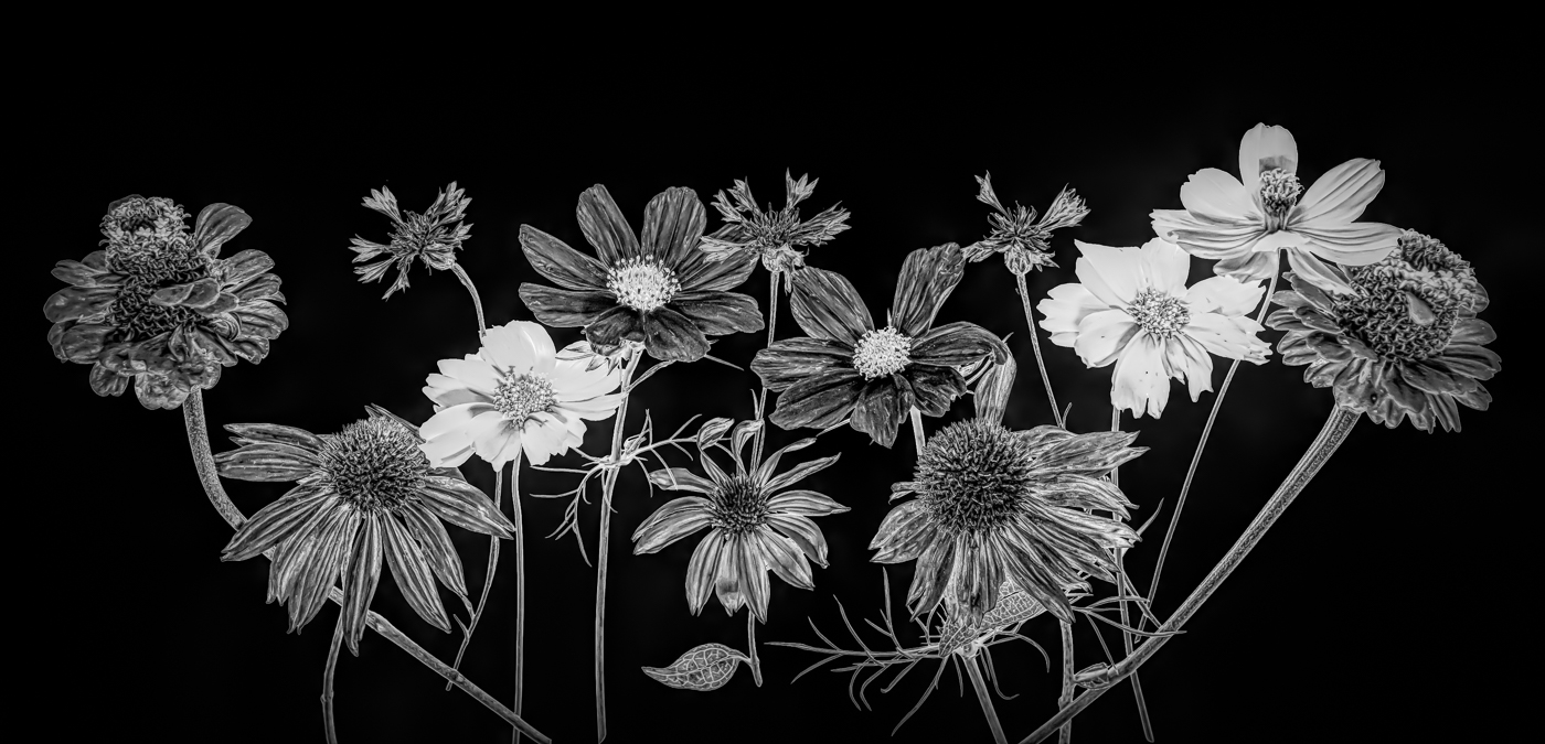
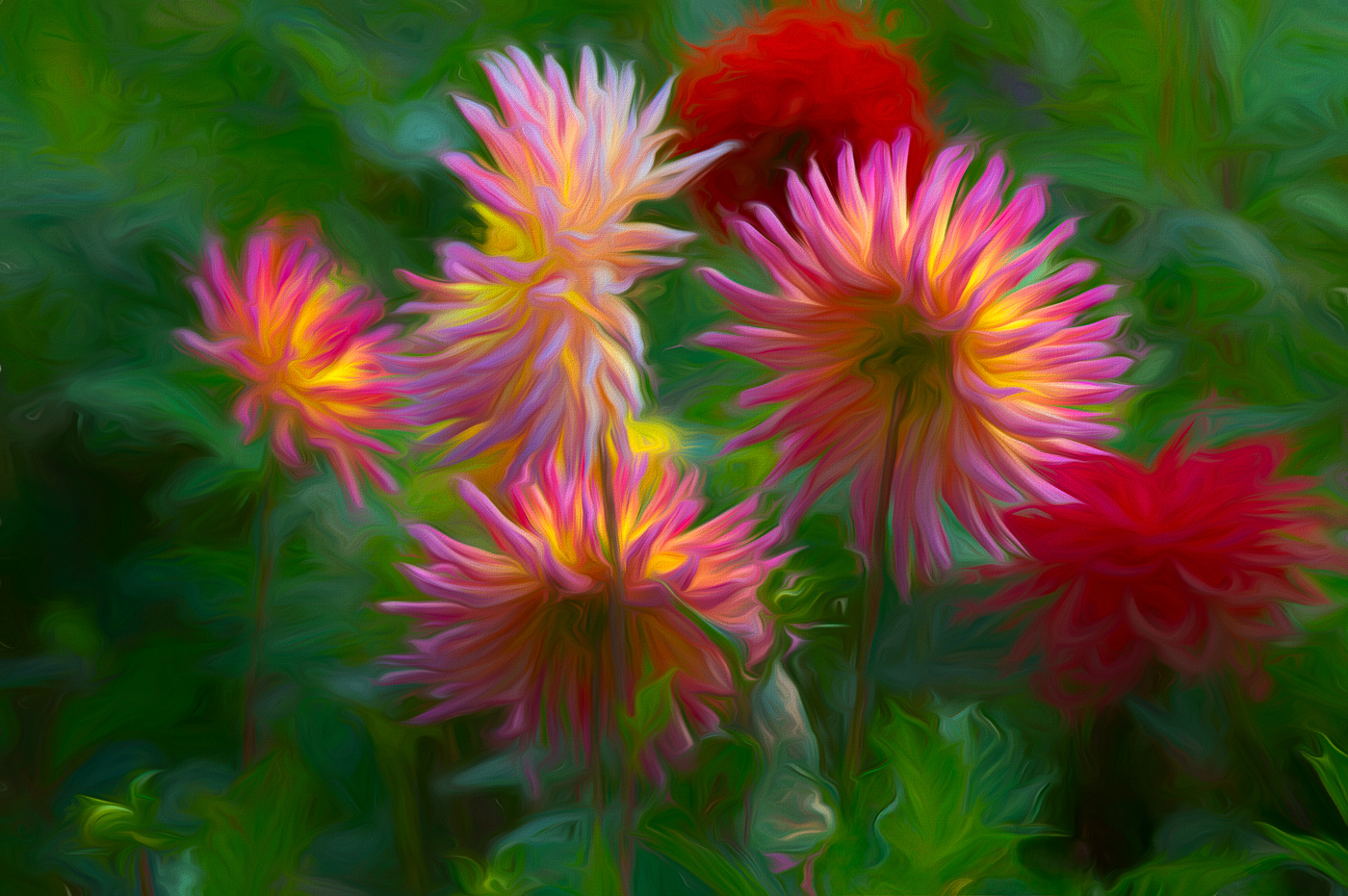
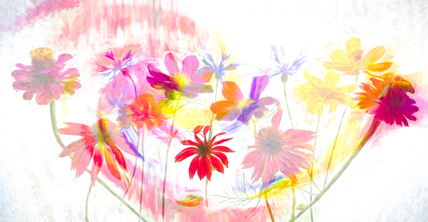
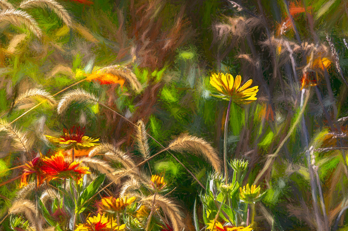
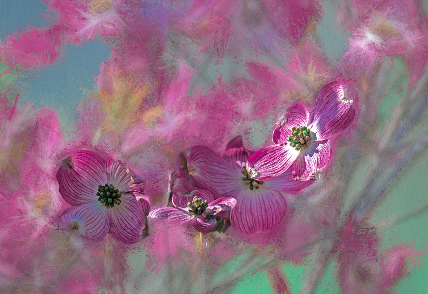
Great job picking out the group of 3 blooms. Nice colors and composition. I think I would try to knock down the highlites as it appears to me that the blooms and the stalks (light green things) could be darkened to give them a betterapearance. Well Done. Preserving Anniversary flowers is a winner. |
Oct 10th |
| 80 |
Oct 24 |
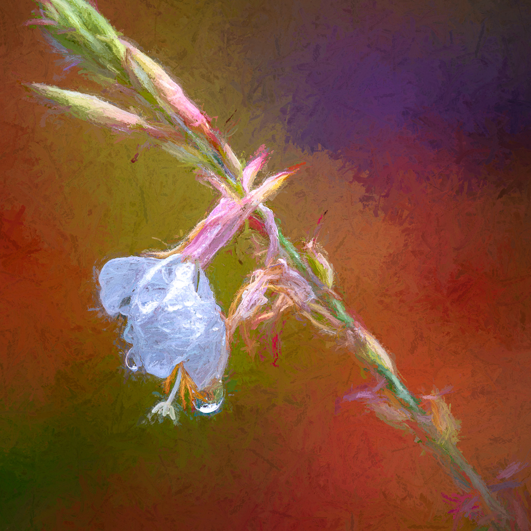
Comment |
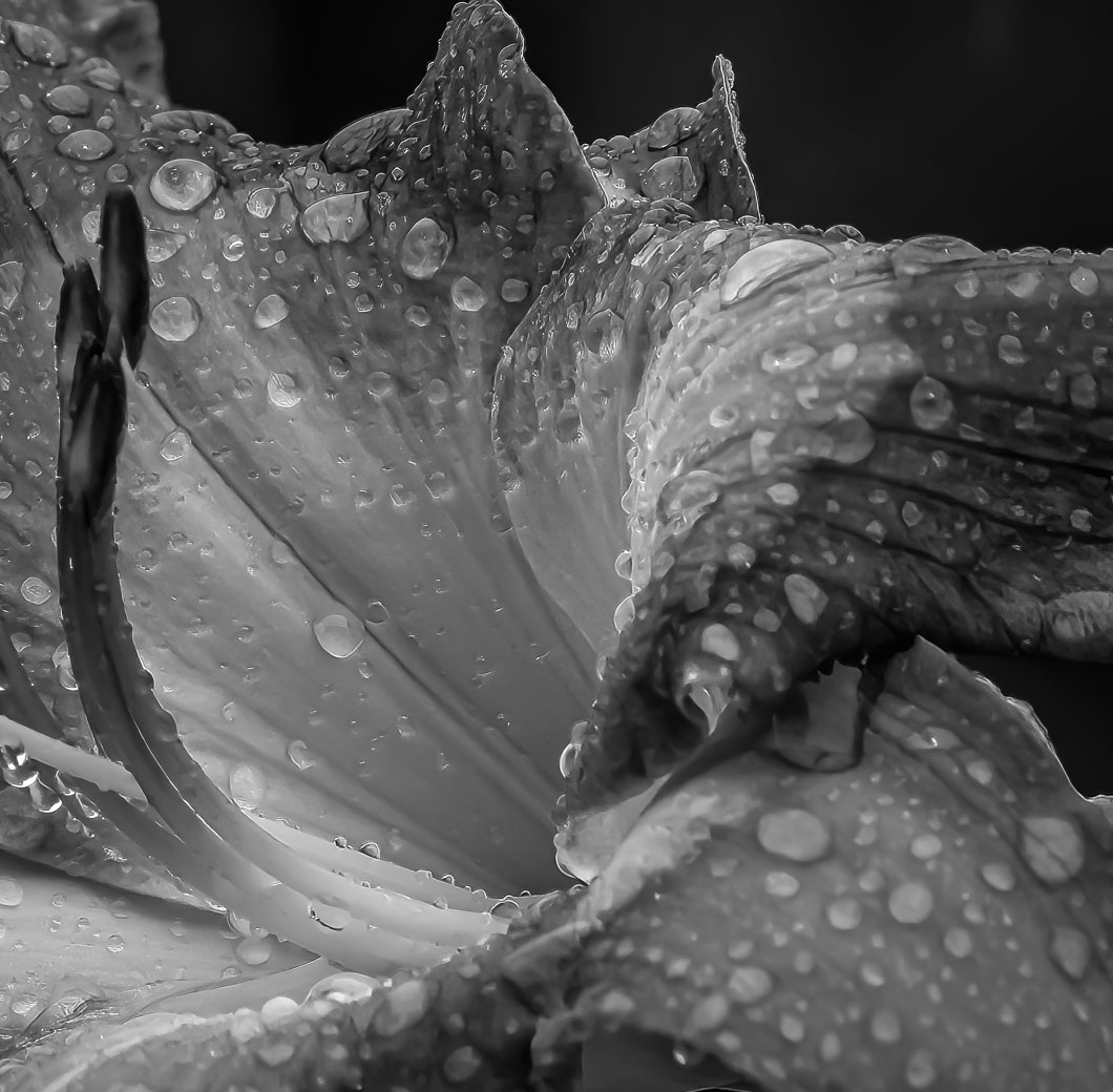
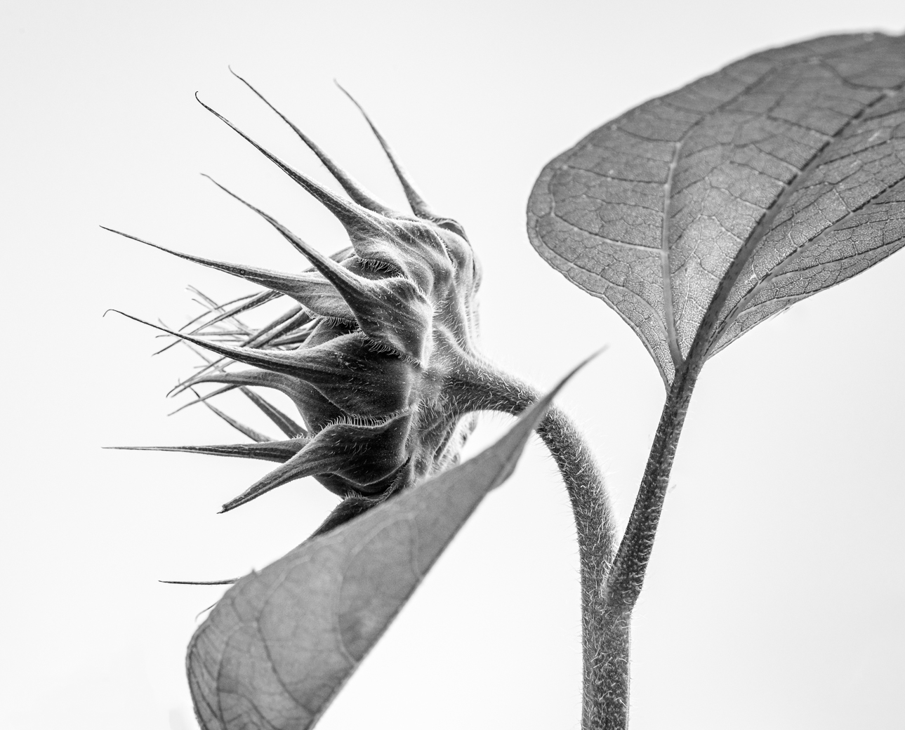
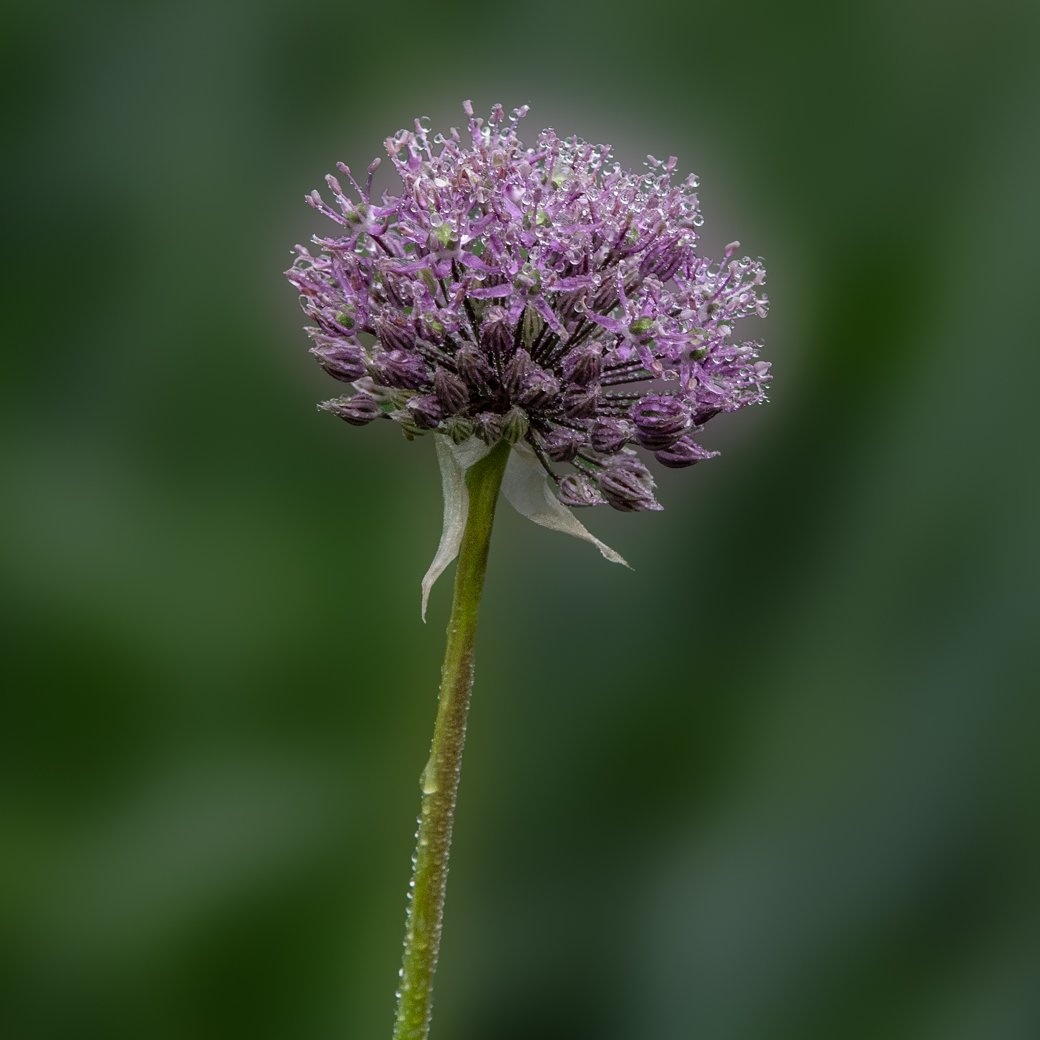
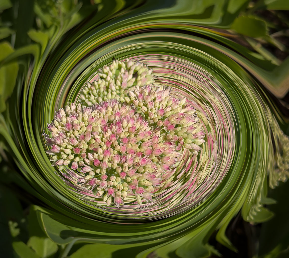
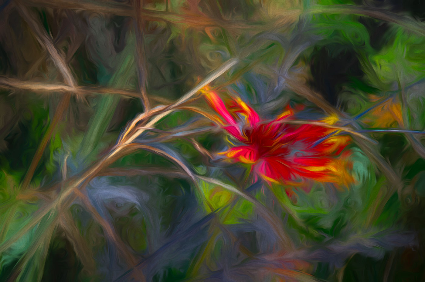
Ingrid. I really like the colors and composition of your flower. My comment is, if you have many of these flowers, why did you pick this one with the damage or mess of flowerets in the center of the image slightly below the one image that the viewer can see inside of. Maybe the plant only had 1 flowerets (sorry can't think of another terminology) that's open and visible? Some below seem to be open but your angle didn't include those. I like the other plants/or colors in the corners. |
Oct 10th |
| 80 |
Oct 24 |
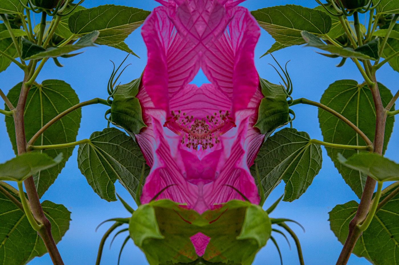
Comment |
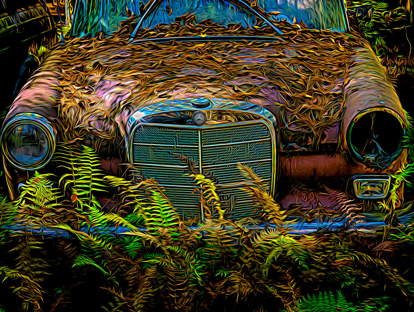
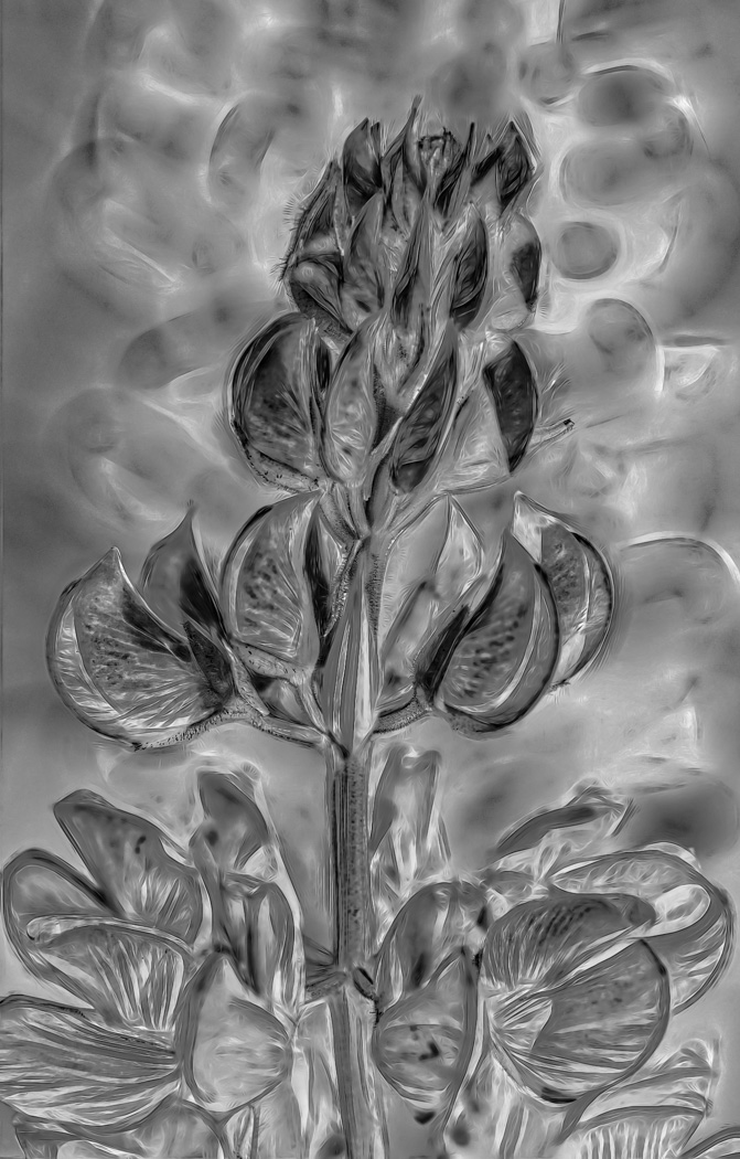
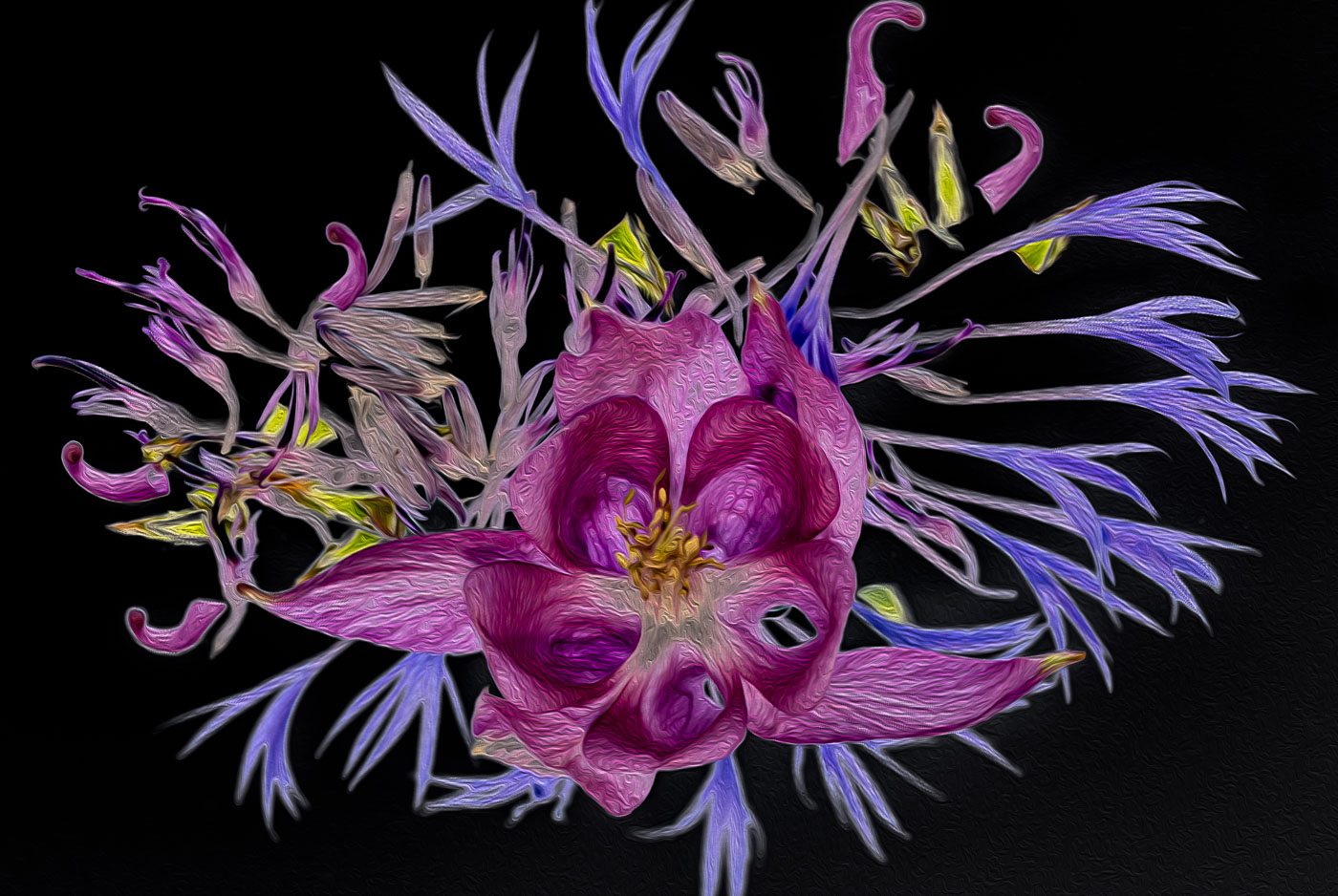
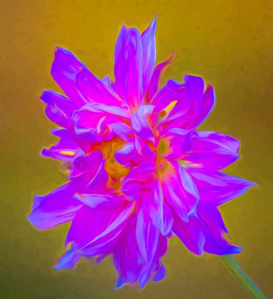
Kamal, you have taken a giant step forward from images with distracting backgrounds by making this Hibiscus sharp, making a beautiful green background and using the Oil Paint filter in Ps to bring out the beautiful texture and lines if your Hibiscus. Wow. You should be very pleased with this image. |
Oct 10th |
| 80 |
Oct 24 |
Comment |
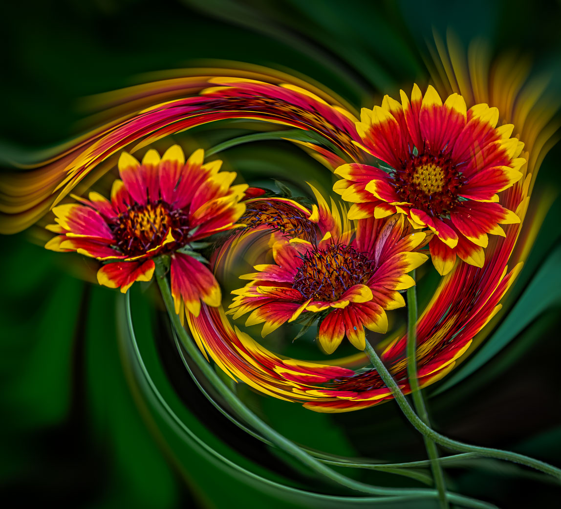
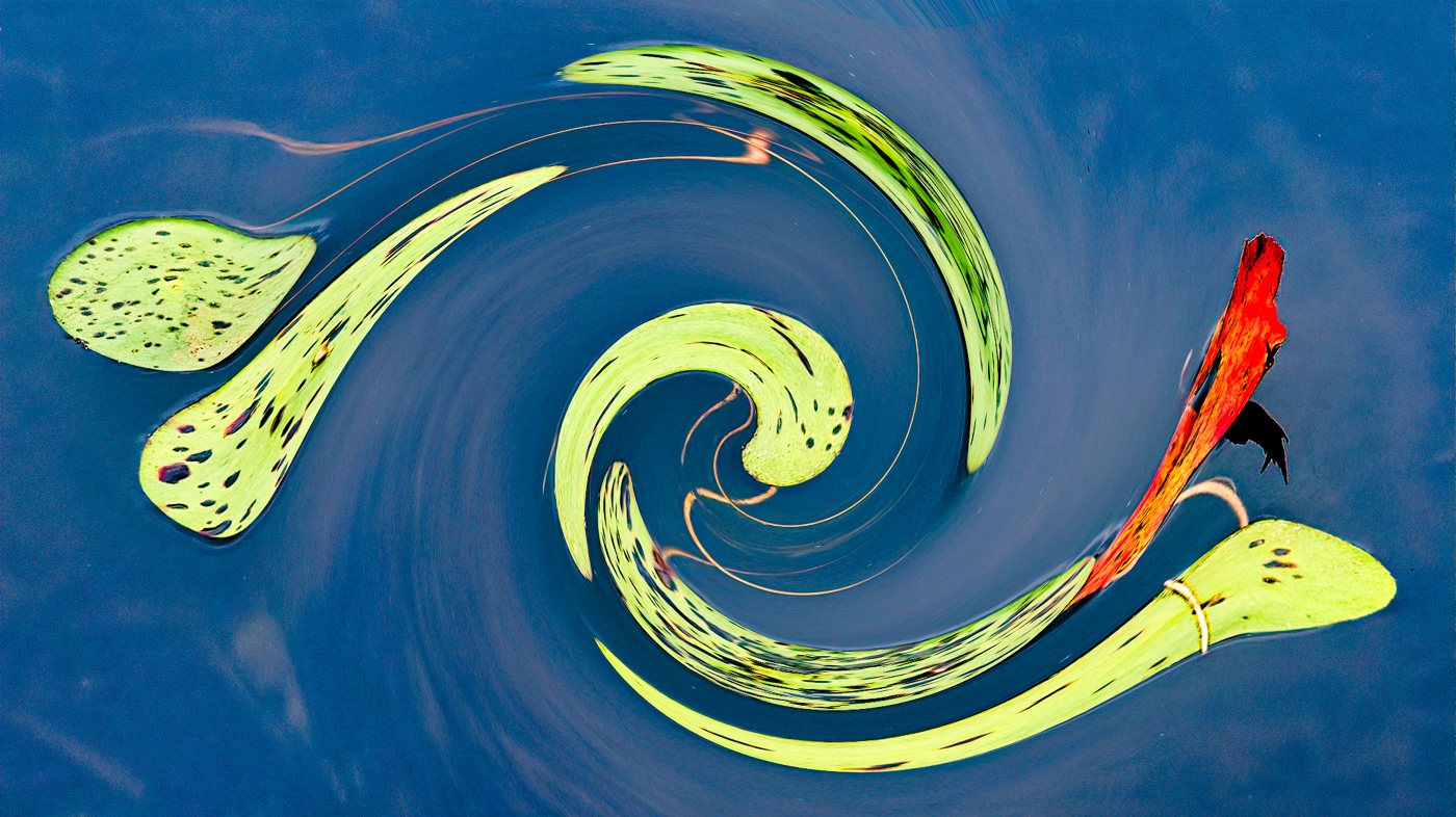
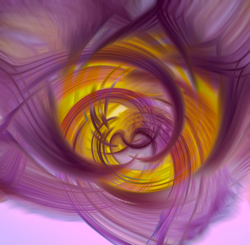
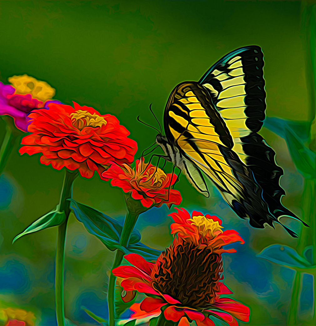
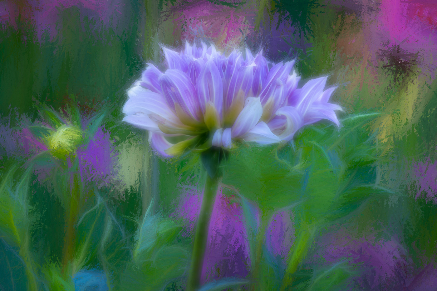
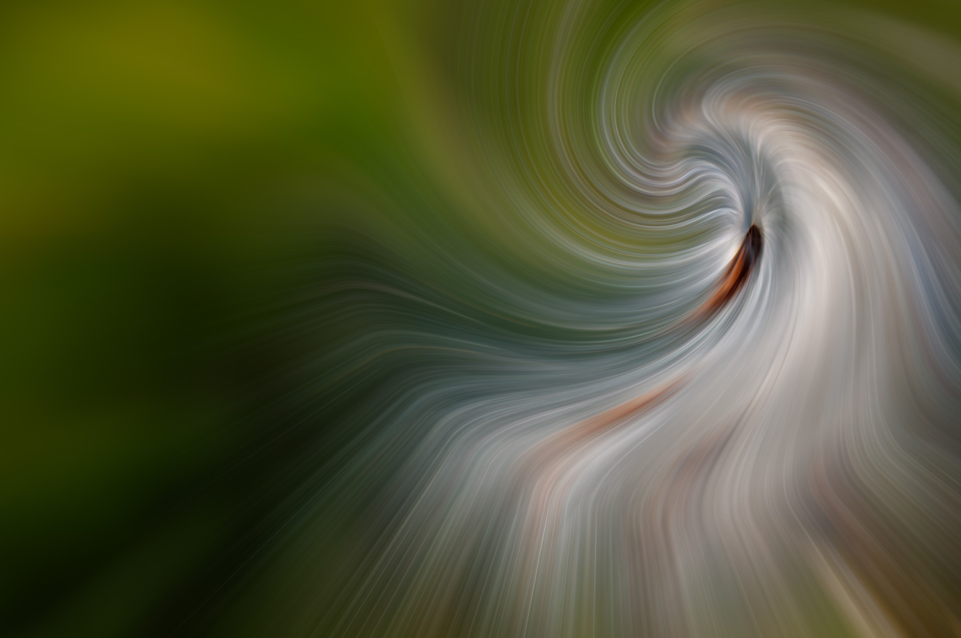
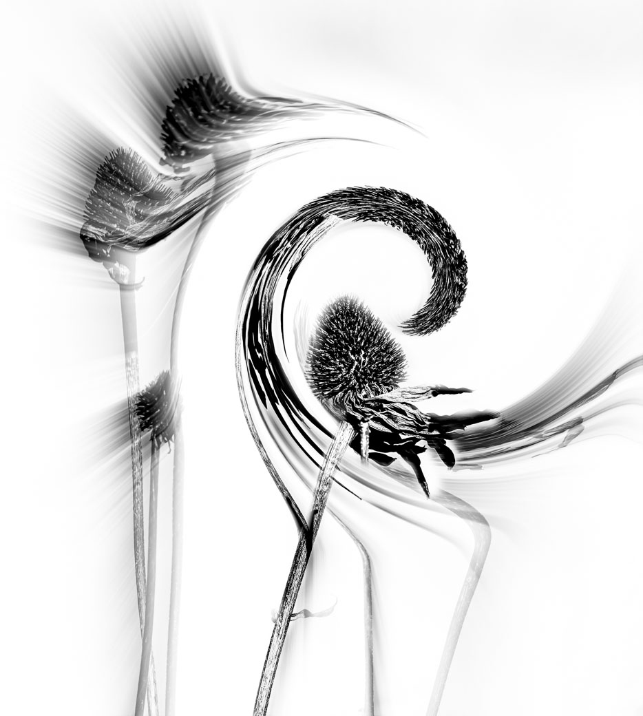
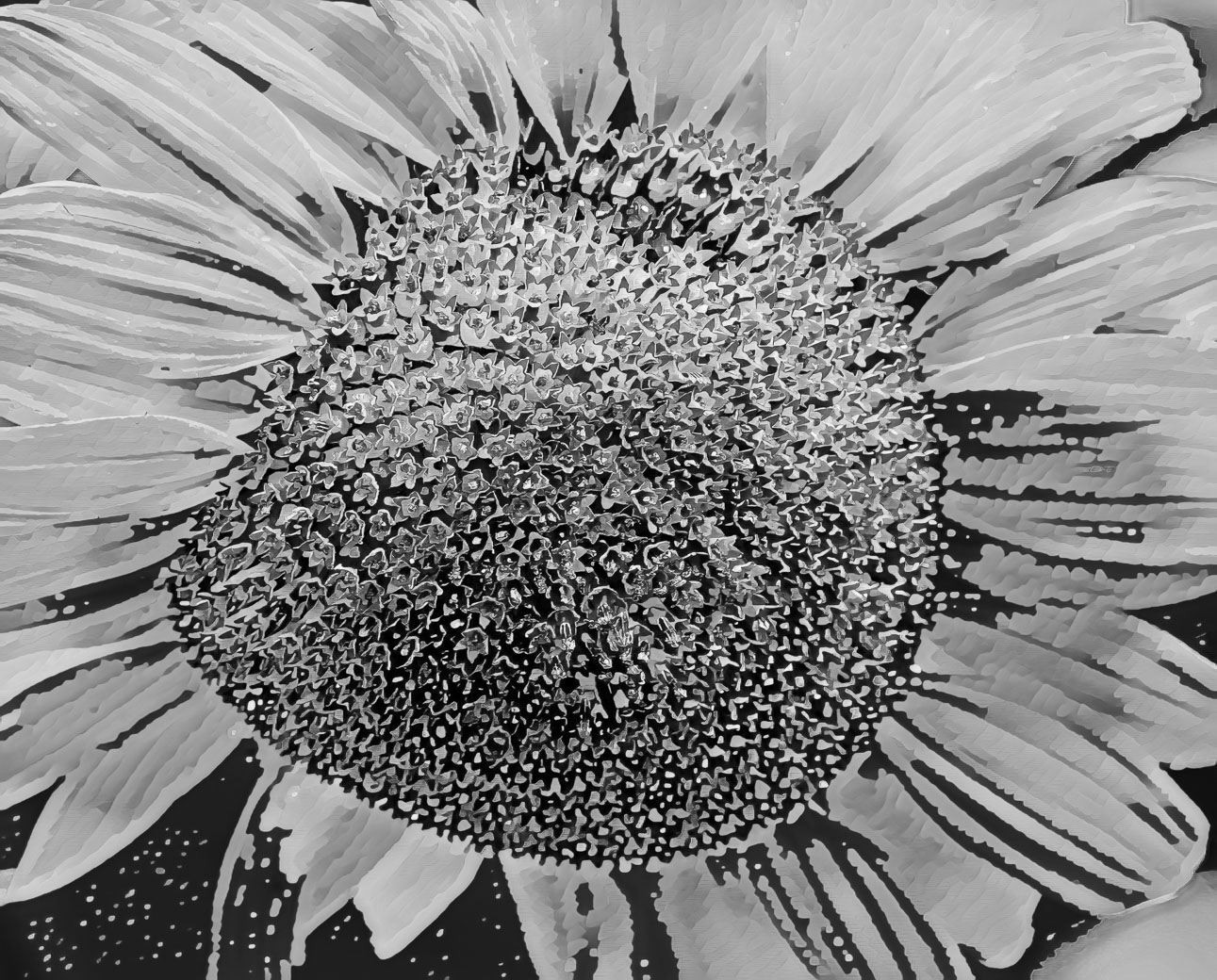
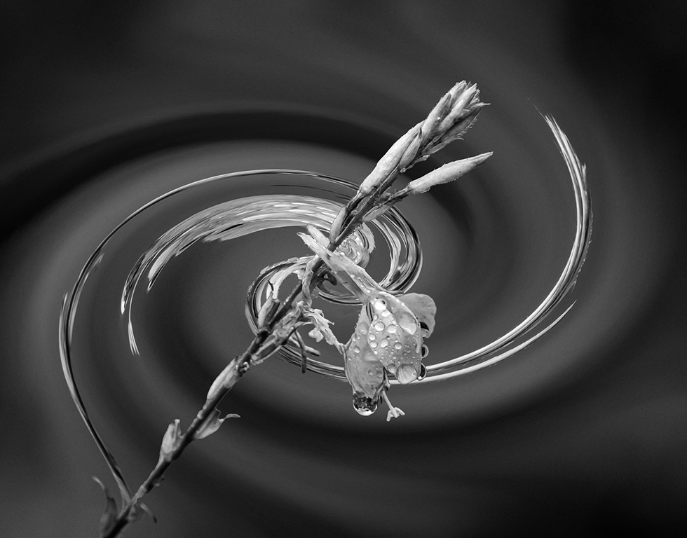
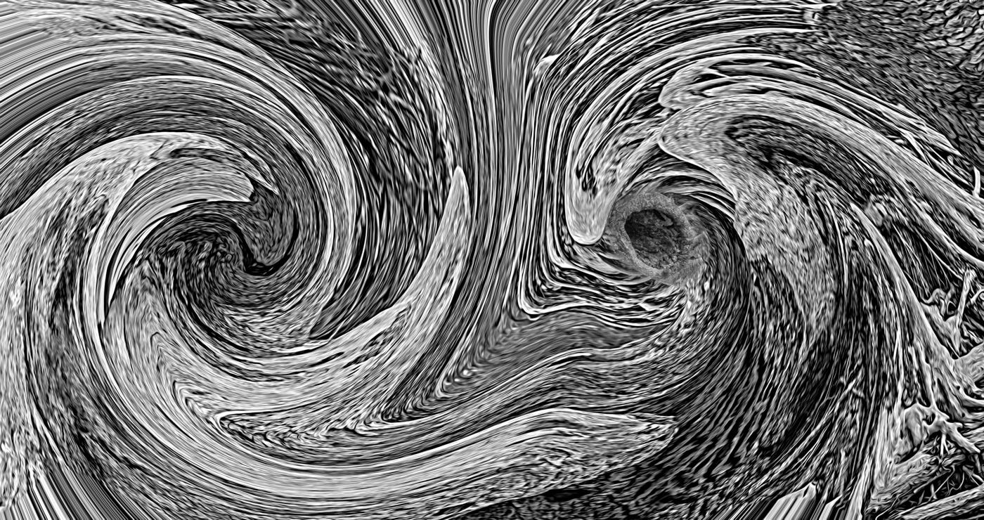
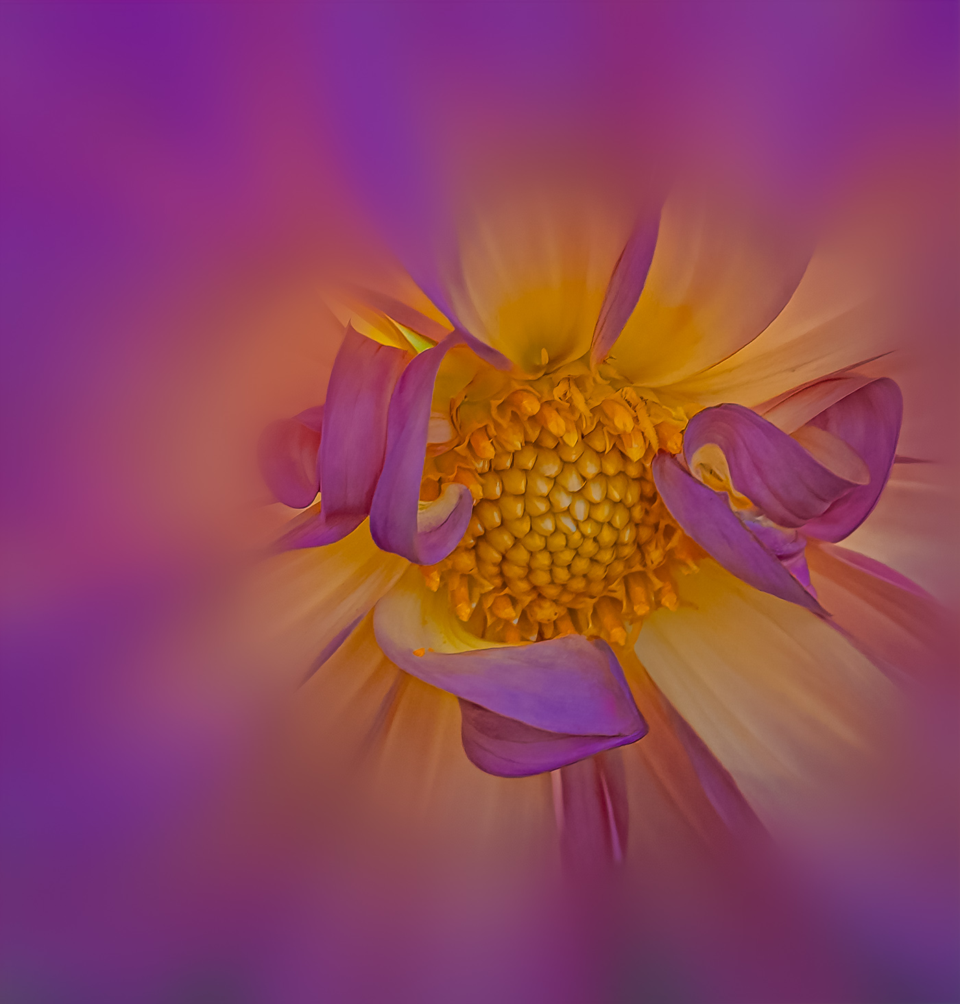
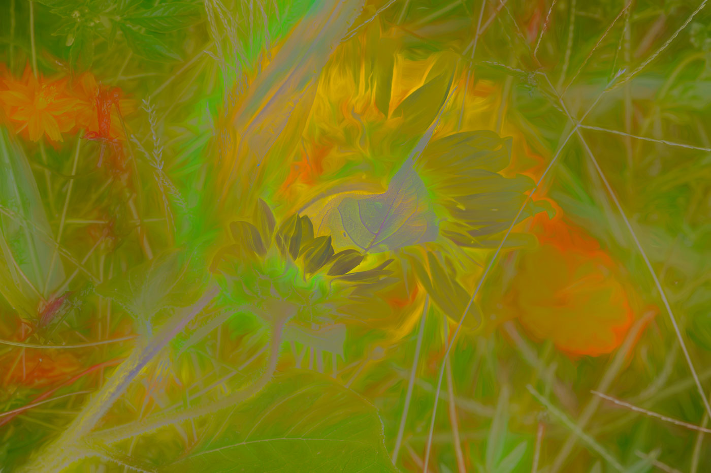
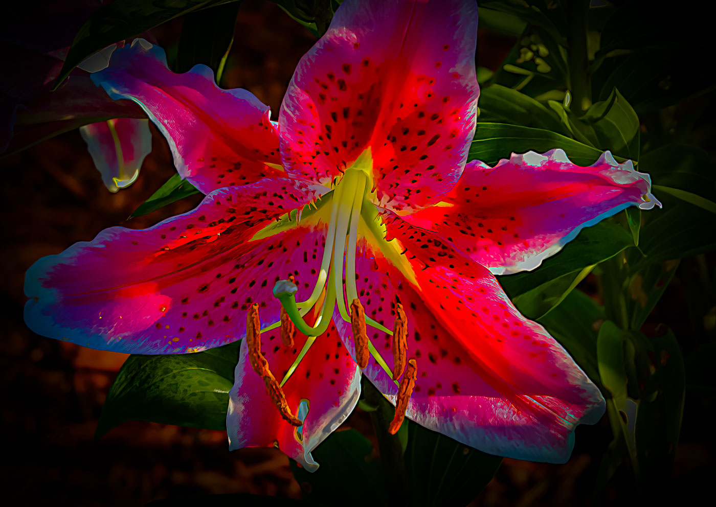
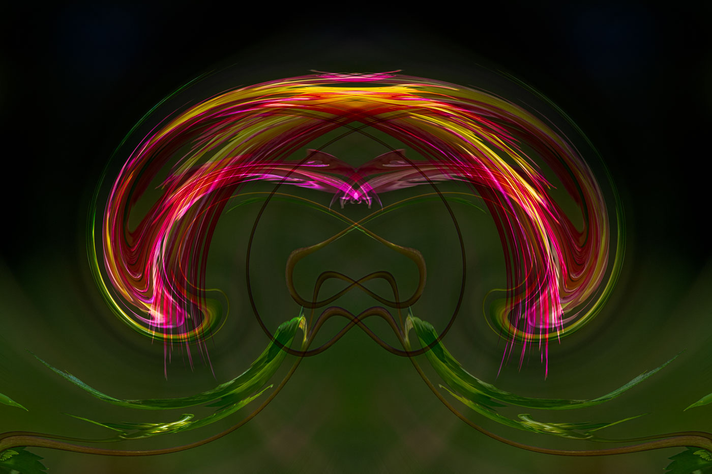
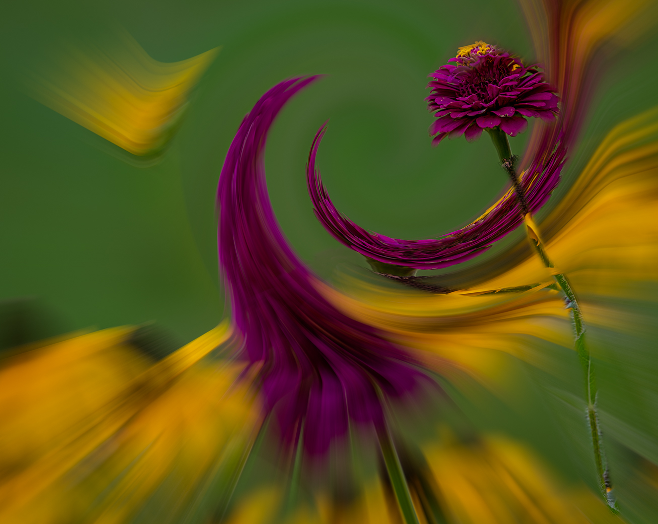
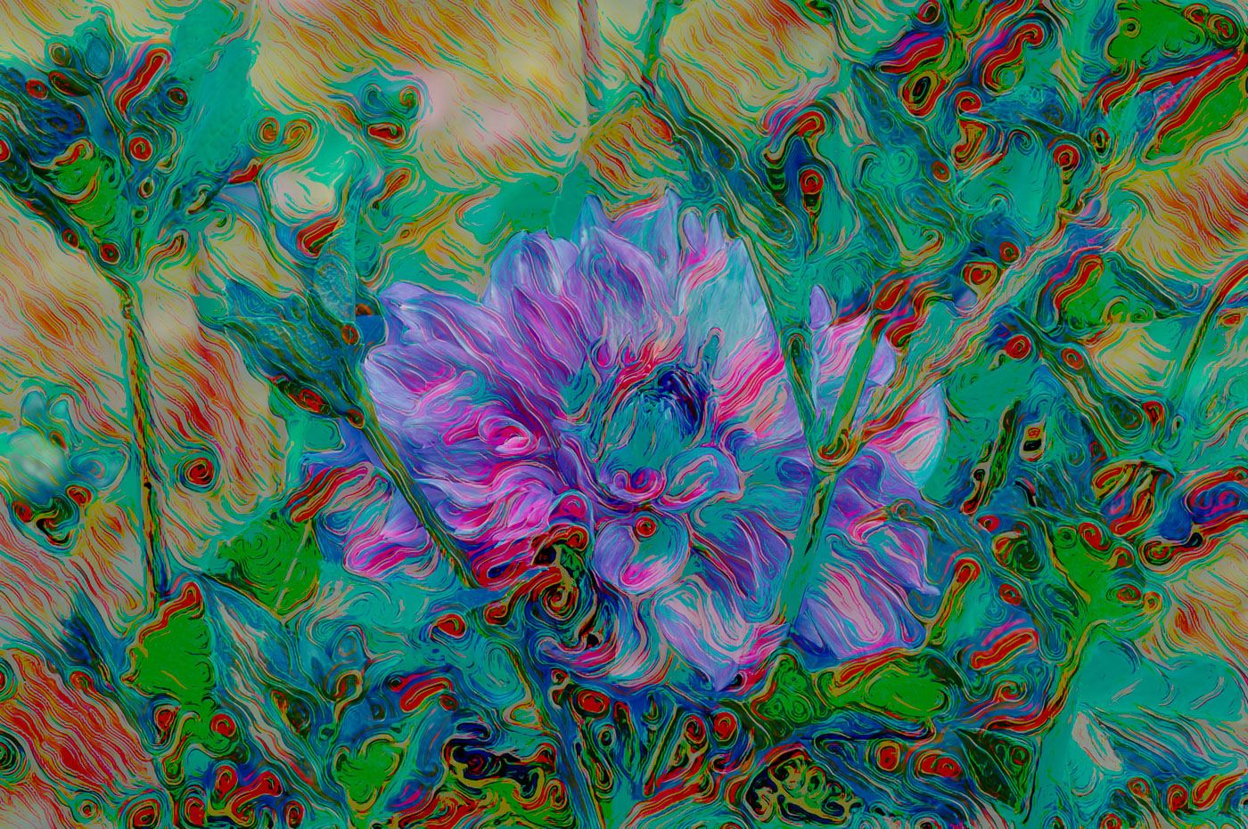
A fantastic job of portraying the colors and veins of the flower in a more artistic twirl. My only suggestion would be to use the highlight adjustment or brush to mask and to remove those whites without detail. Very well done. |
Oct 10th |
| 80 |
Oct 24 |
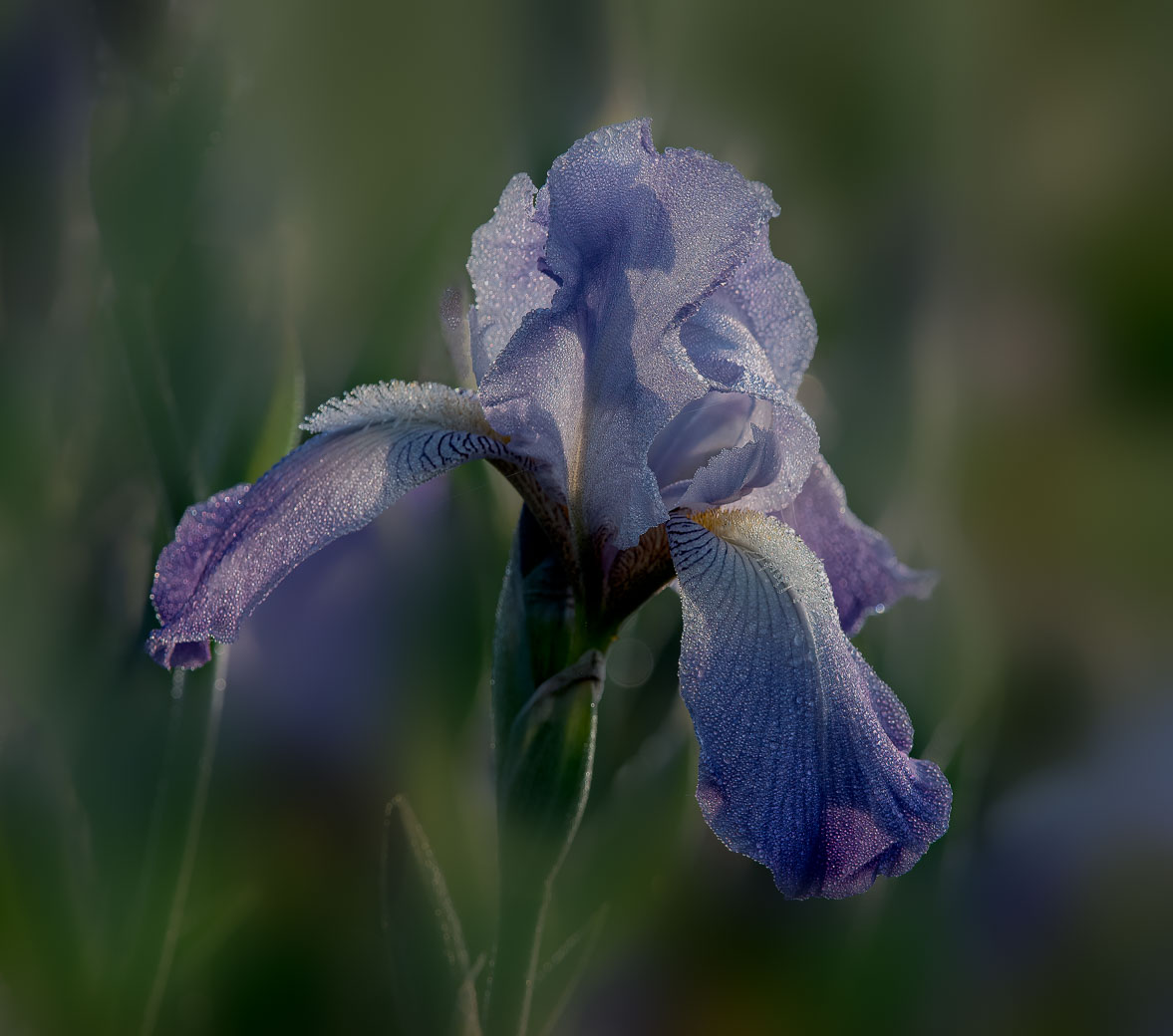
Comment |
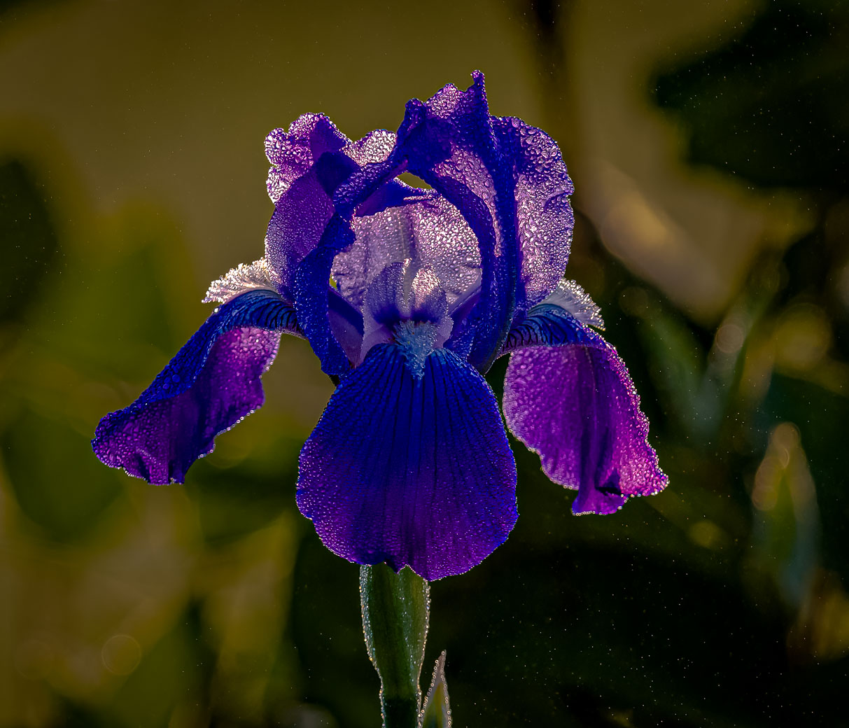
Nadia, another lovely, colorful and sharp flower with a background that is very natural feeling. I think the stem (dark) in the background doesn't add anything to the image, however, if I didn't have another shot of the iris as great as this one, I'd be perfectly happy with this. |
Oct 10th |
| 80 |
Oct 24 |
Comment |
Marti, I like the composition of your image, but.. For me it is under exposed and the blue/purple would be more pleasing if it had more light/exposure. |
Oct 10th |
| 80 |
Oct 24 |
Comment |
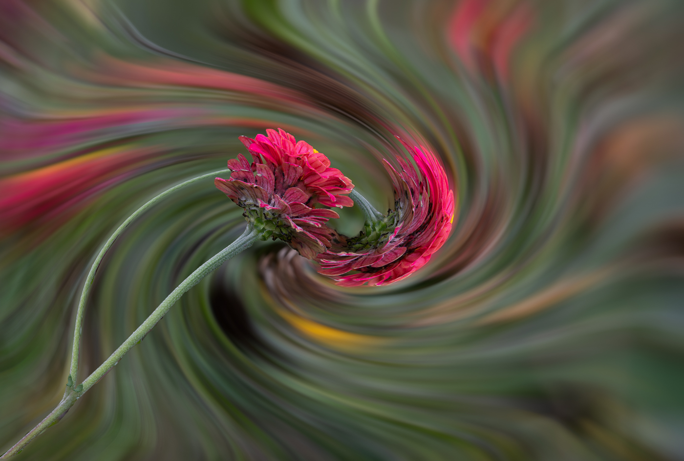
Marti, I can accept the upper left being distracting. That leaves me with removing it or making it lighter and blurred. Your choice? As can be seen in the original, that was out of focus and distracting. |
Oct 10th |
9 comments - 4 replies for Group 80
|
18 comments - 4 replies Total
|