|
| Group |
Round |
C/R |
Comment |
Date |
Image |
| 29 |
May 24 |
Reply |
Thanks Tim. Good seeing, those should be easy to remove. |
May 19th |
| 29 |
May 24 |
Comment |
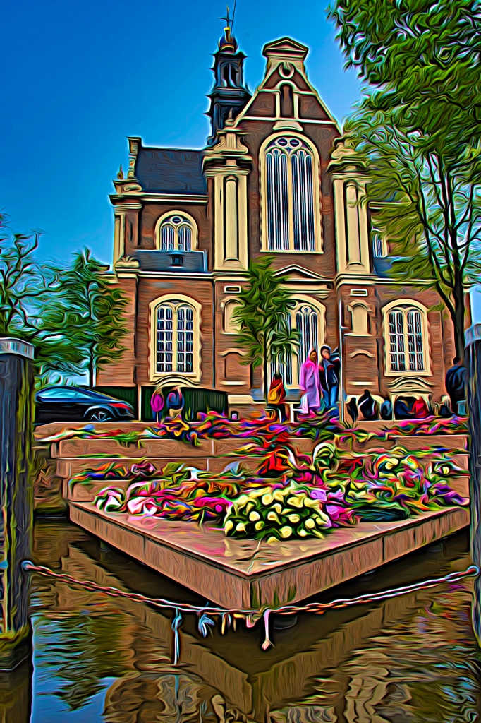
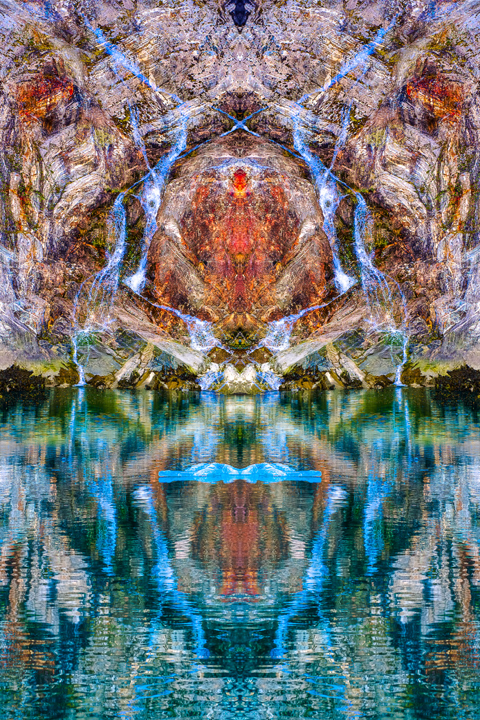
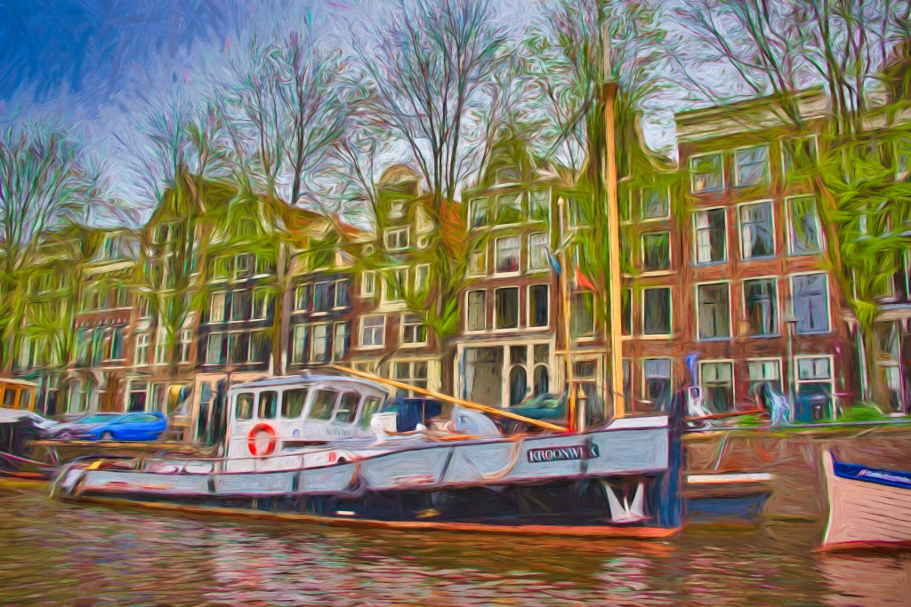
Very nice Gunter. I agree, Altered Reality, is the way to go some of the time. I can see where you could use the sky picture, but other subjects do you use with it?
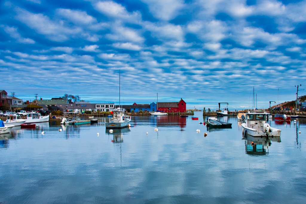
Great fun to find and match up something as nice as this bridge. |
May 16th |
| 29 |
May 24 |
Comment |
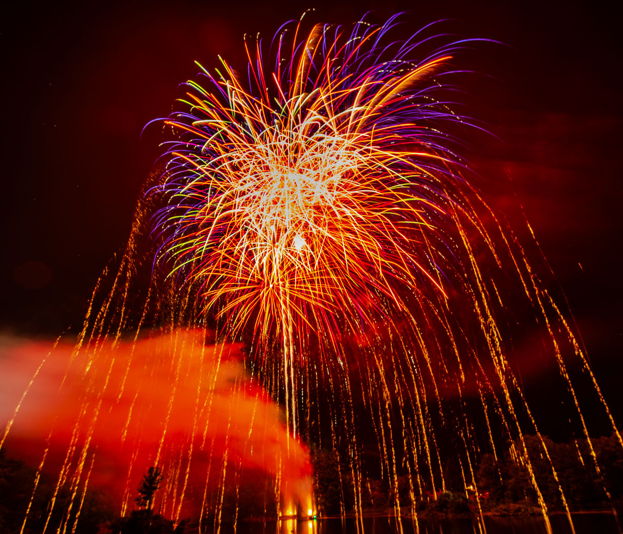
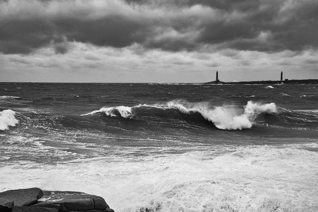
Excellent Karen. I Love fireworks photos. Your 6 sec is right on. I shoot on bulb with a remote on tripod. And time is based on how bright those 2-5 bursts actually are. Bulb allows for variable times and when that frame filling blast on the first exposure its let go of the remote and go on to the next blasts without over-exposing. Of course we all have had overexposed fireworks images. |
May 16th |
| 29 |
May 24 |
Comment |
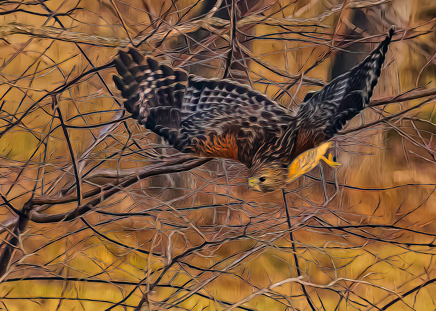
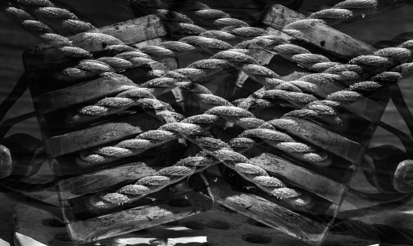
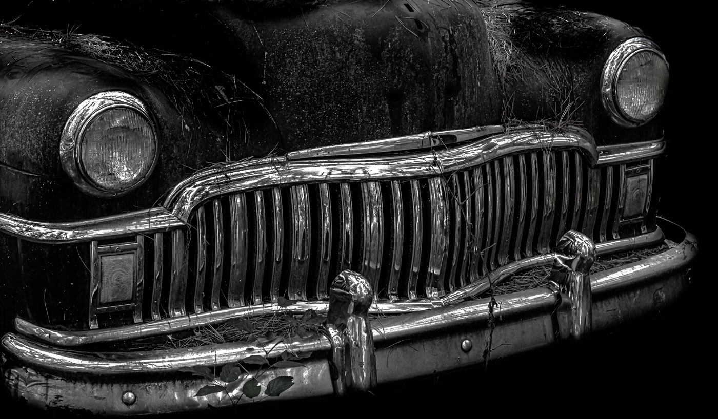
Well done Judy, Nice lighting on the spools and composition is good with exception of getting the tops of the spools. I would try to use Tone Curve's and open up the darks and shadows to get light into the right 3rd of the image without effecting the light on the spools. Not sure if Gunter is aware how long the Looms are? Measured in hundreds of feet in the large mills. |
May 16th |
| 29 |
May 24 |
Reply |
Elaine, I prefer Judy's version in regard to the sky and straightening but prefer Gunter's changes to the tonalities. You probably are familiar but the Transform tool in LrC has various methods of aligning the image but there is check box "Constrain Crop" that does an automatic generative fill that fills in the edges for you. It wasn't that long ago that I discovered it and it does a beautiful job. Like you I don't do many Architecture shots here in NH but I used it for anything where the perspective is off. |
May 16th |
| 29 |
May 24 |
Comment |
Well done Tim. No sense me mentioning the out of focus leaves. I prefer the cropping that Judy used. Note to Elaine, that if you export using the 1400 or 1040 if vertical that LrC will export at your desired cropping specs. Unless making a print, the original ratio need not be considered. |
May 16th |
| 29 |
May 24 |
Comment |
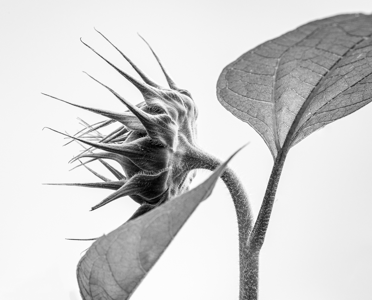
Judy and Gunter, I tried to further separate the foreground flower from the background and reduce hi lights on the background. Not a quick fix but I pushed it along when I realized I could got outside of thegforeground structure as the background was already out of focus. Gunter I believe you are correct and 1/2500 or 1/3000 would do a good job if of course the image was still property composed. What do you think? |
May 16th |
 |
5 comments - 2 replies for Group 29
|
| 80 |
May 24 |
Comment |
Thanks Nadia. Harold Davis is quite well noted in USA. You can find some YouTube stuff as well as the numerous books he has written. I think you will enjoy learning of him. |
May 25th |
| 80 |
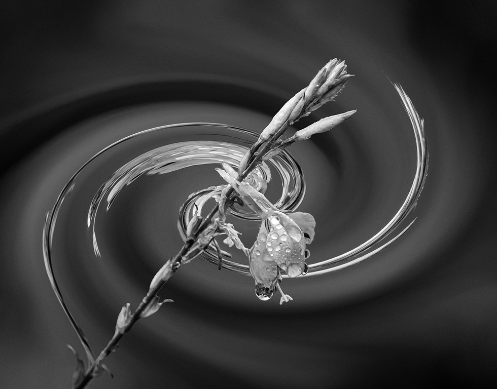
May 24 |
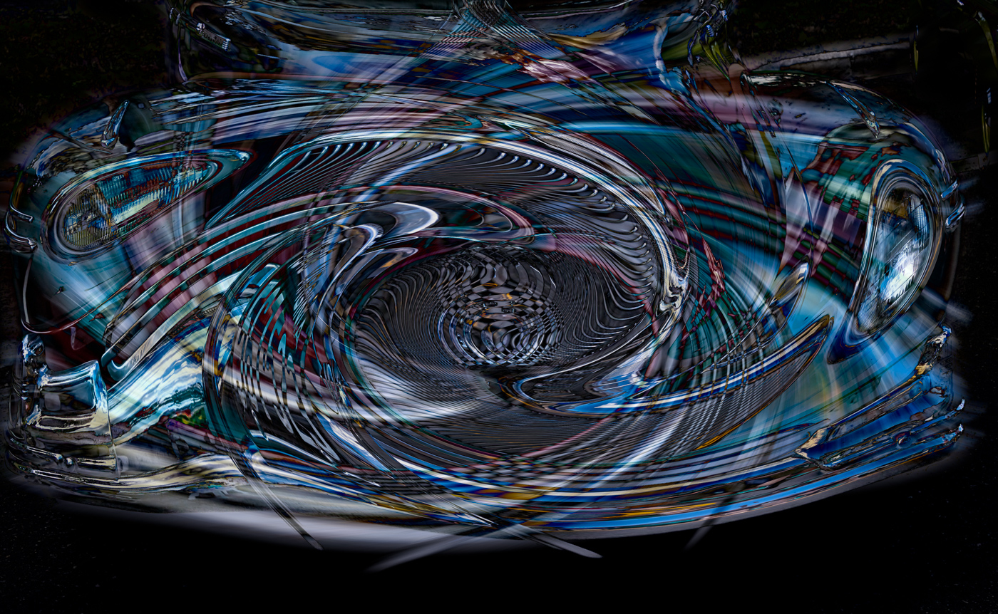
Comment |
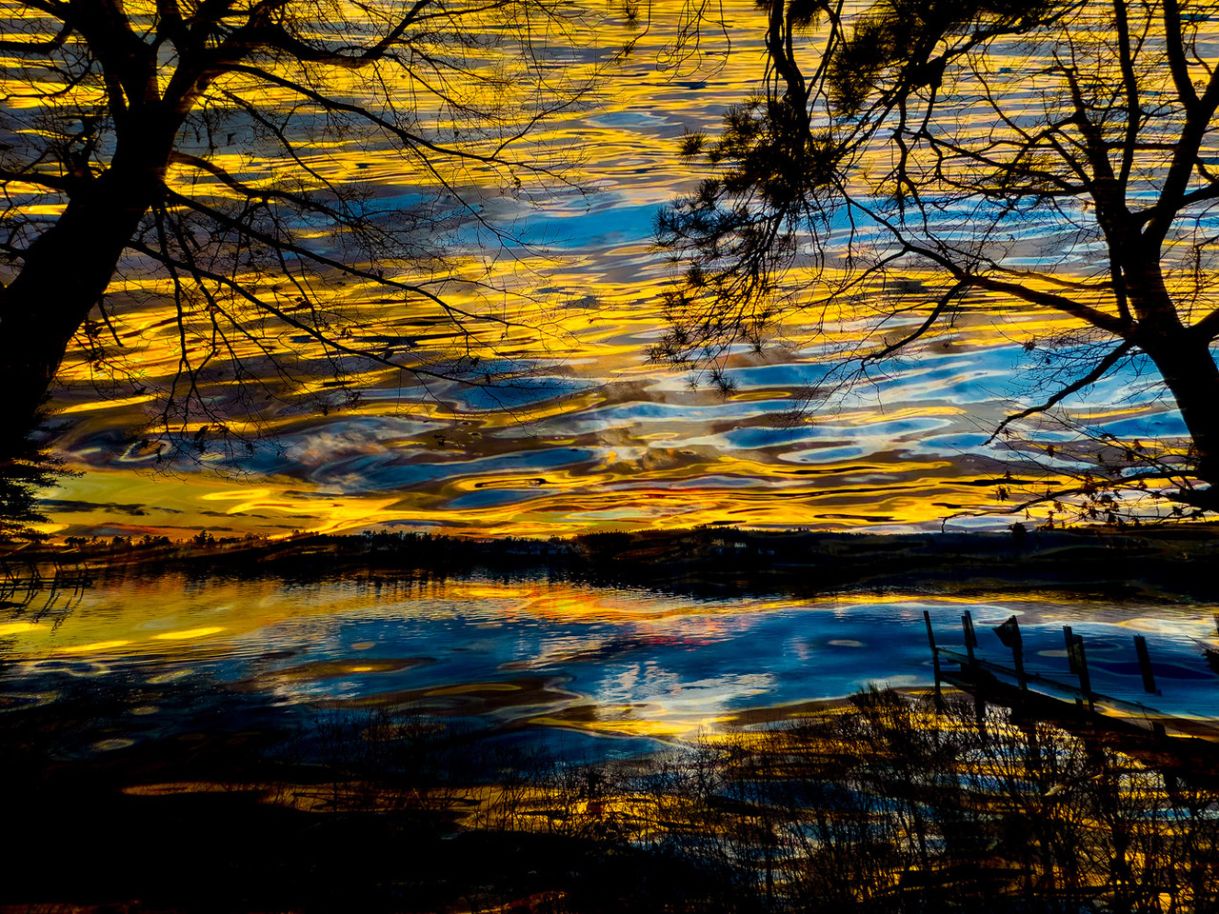
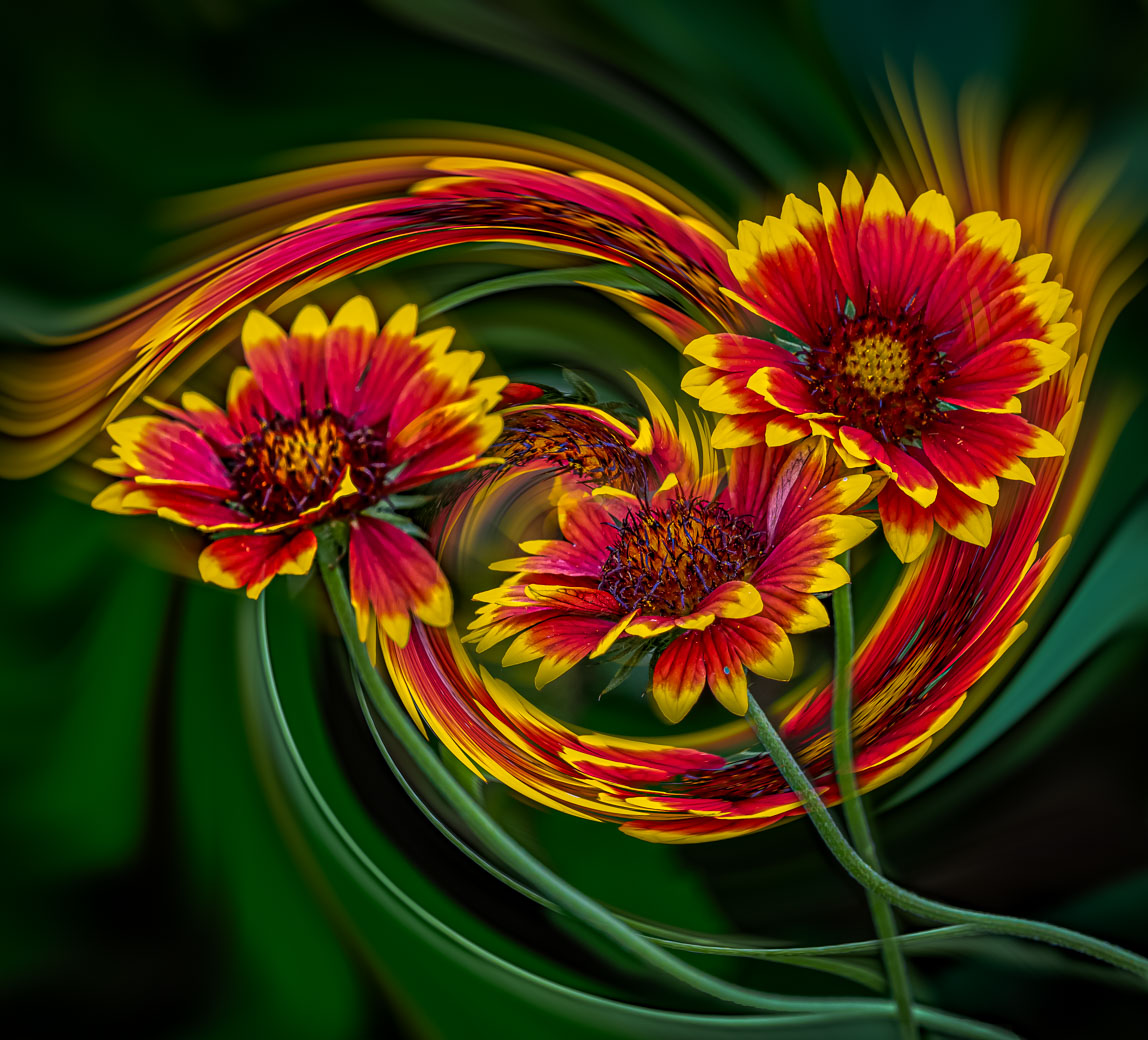
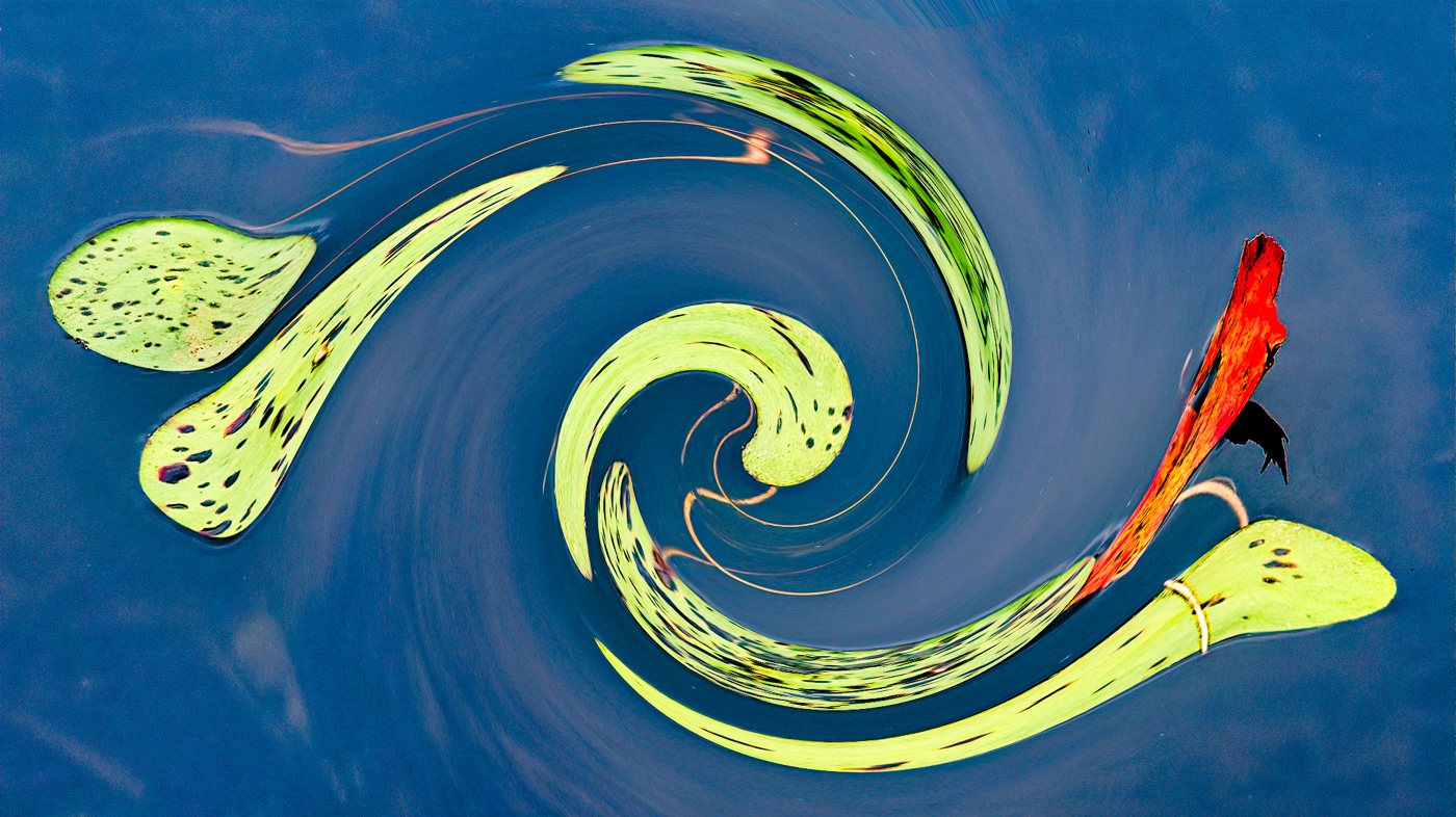
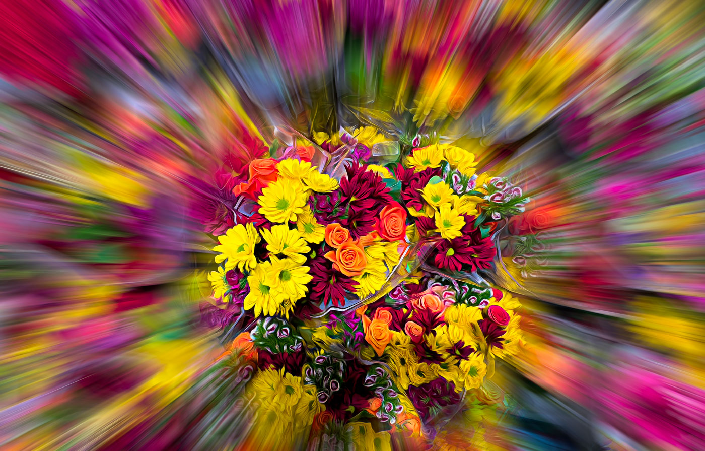
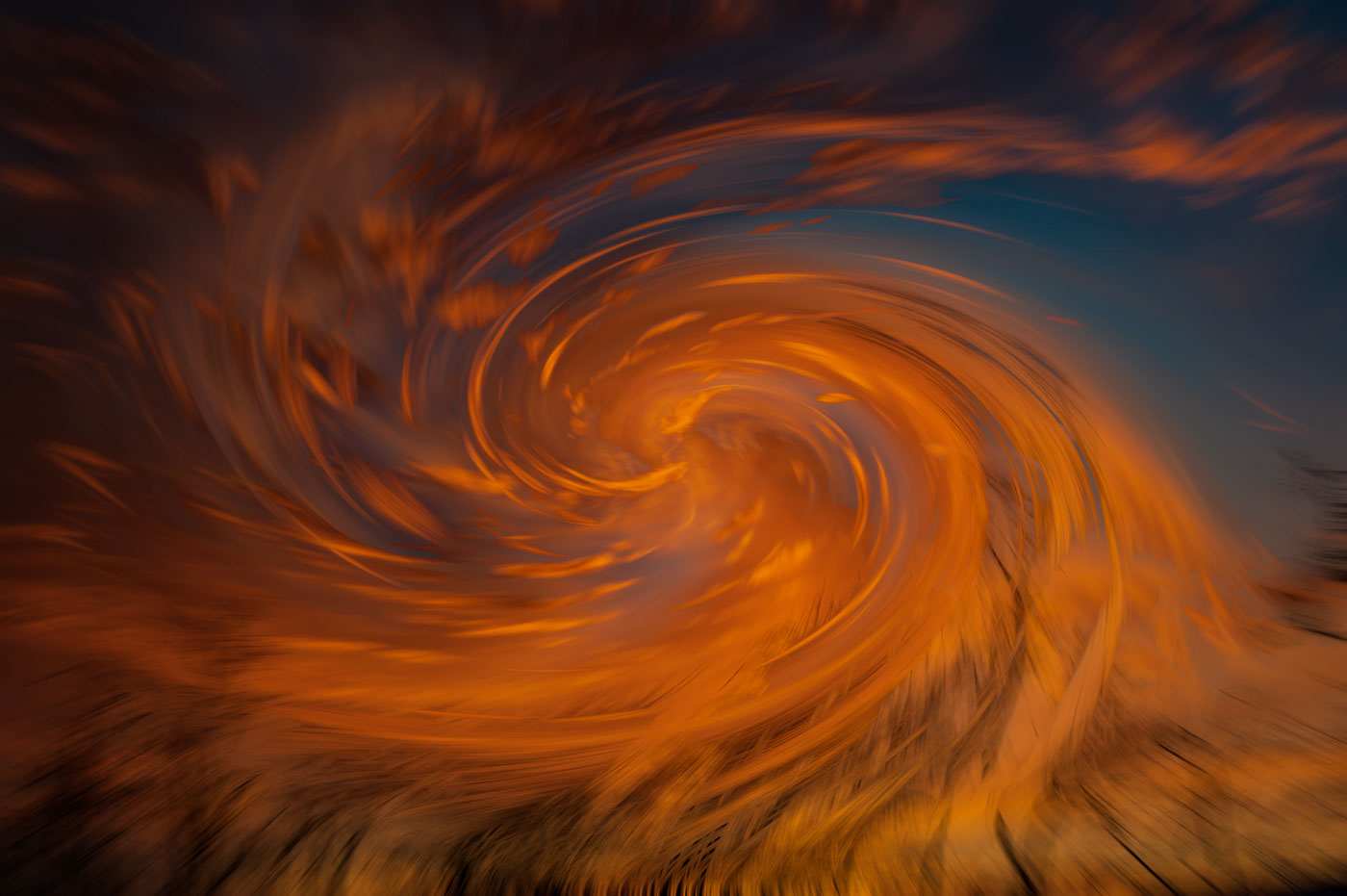
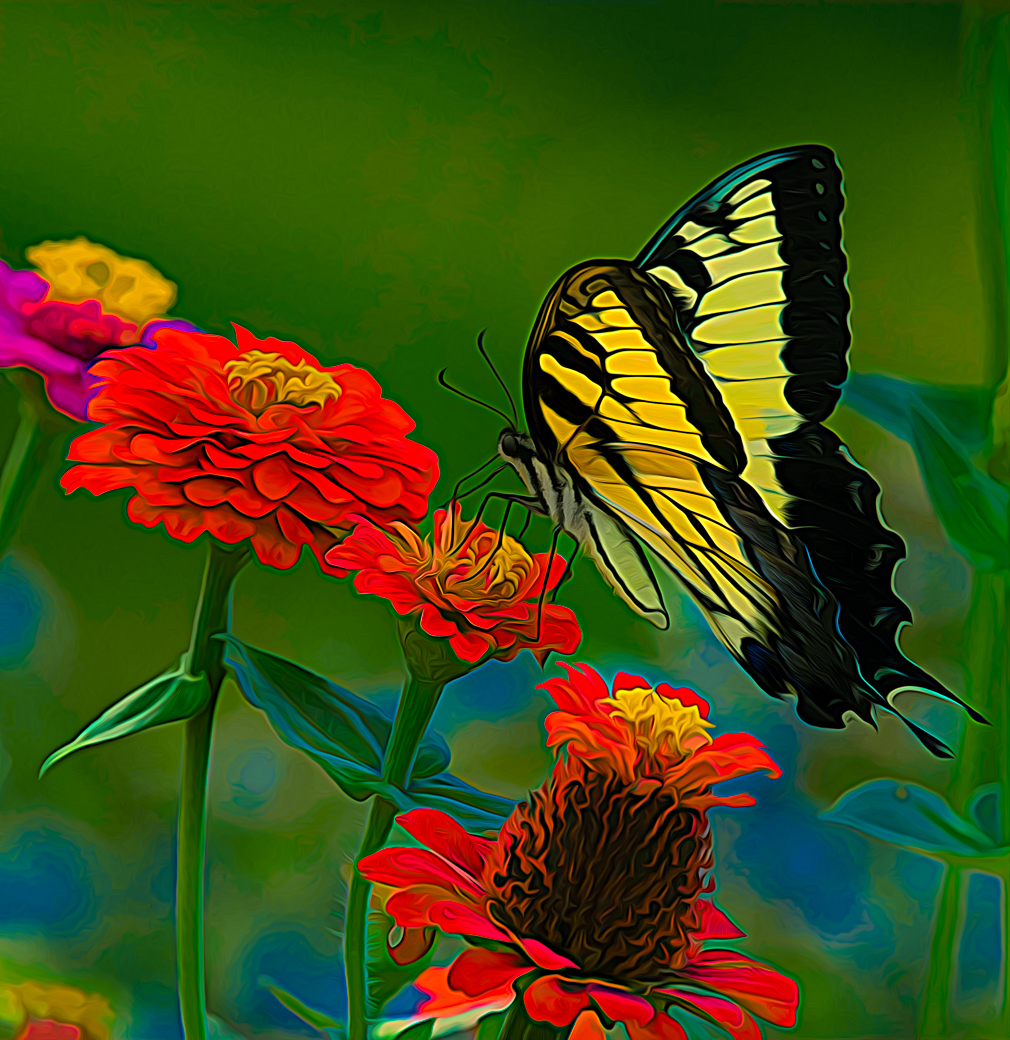
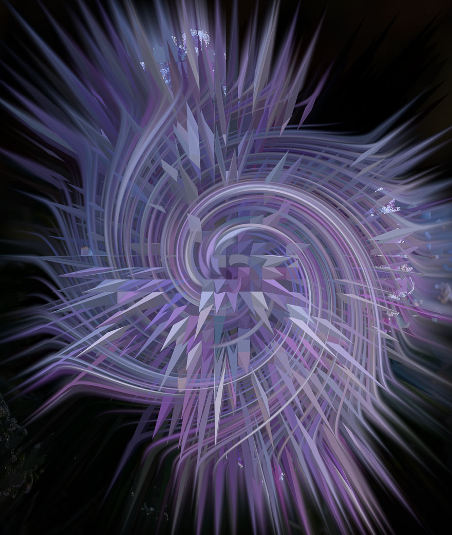
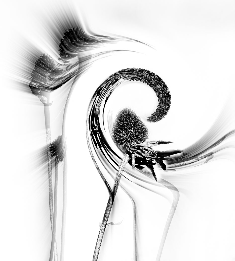
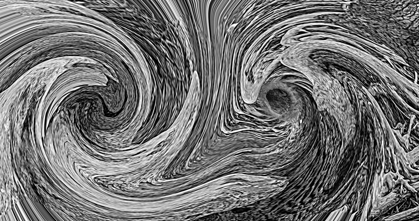
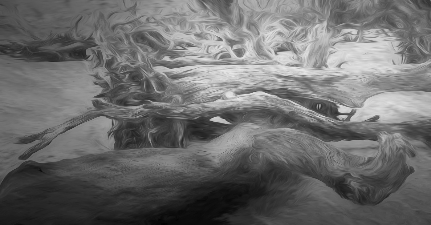
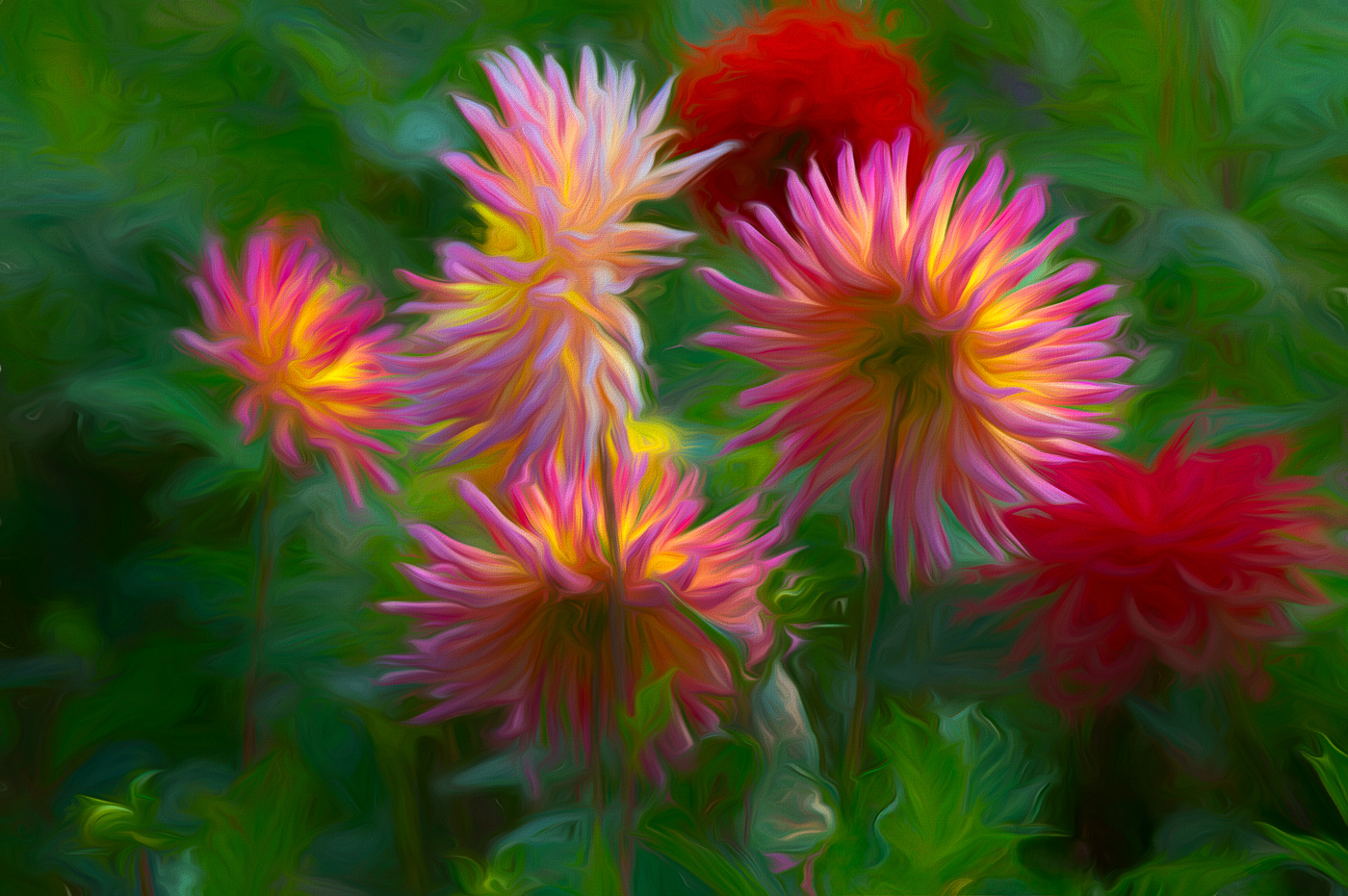
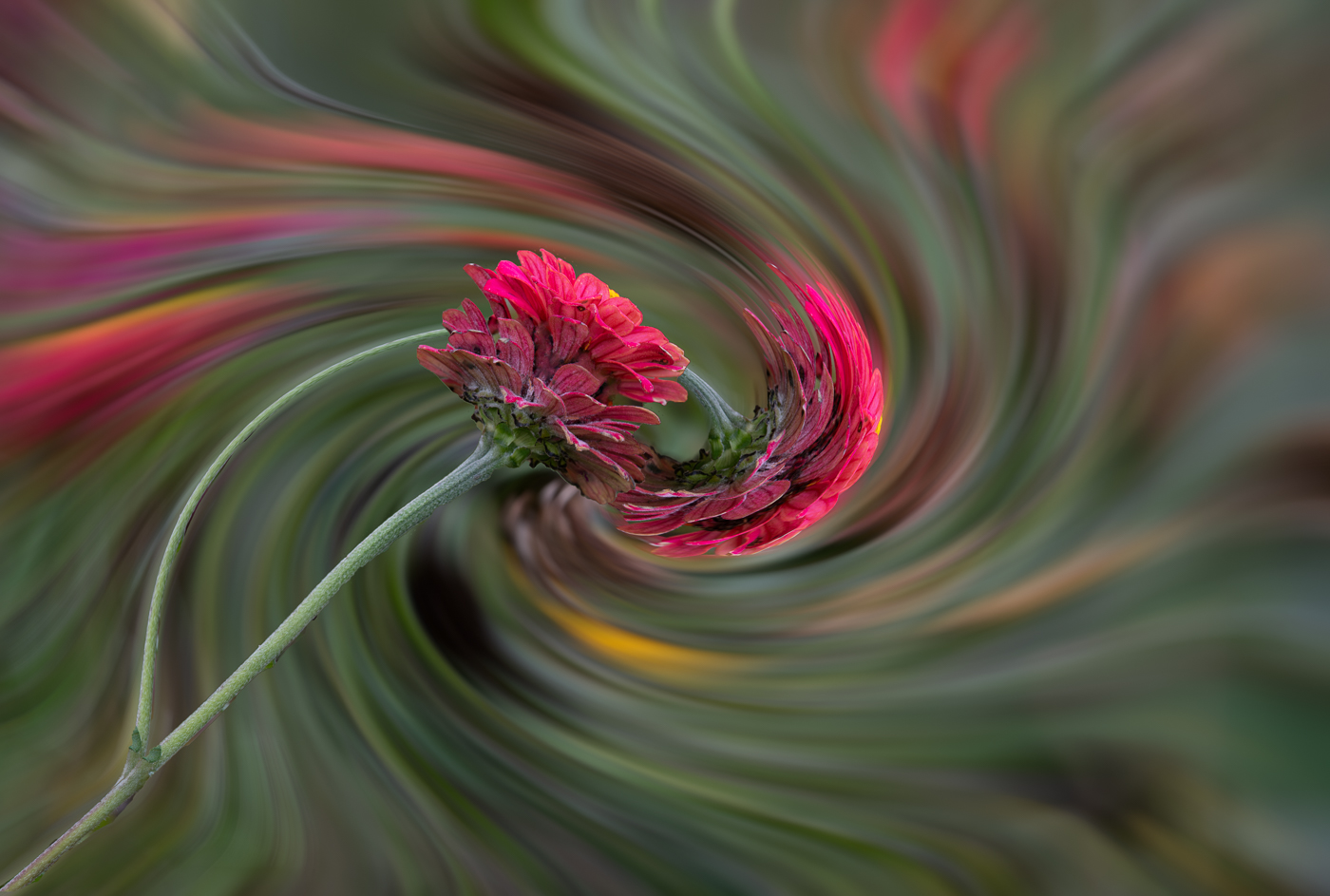
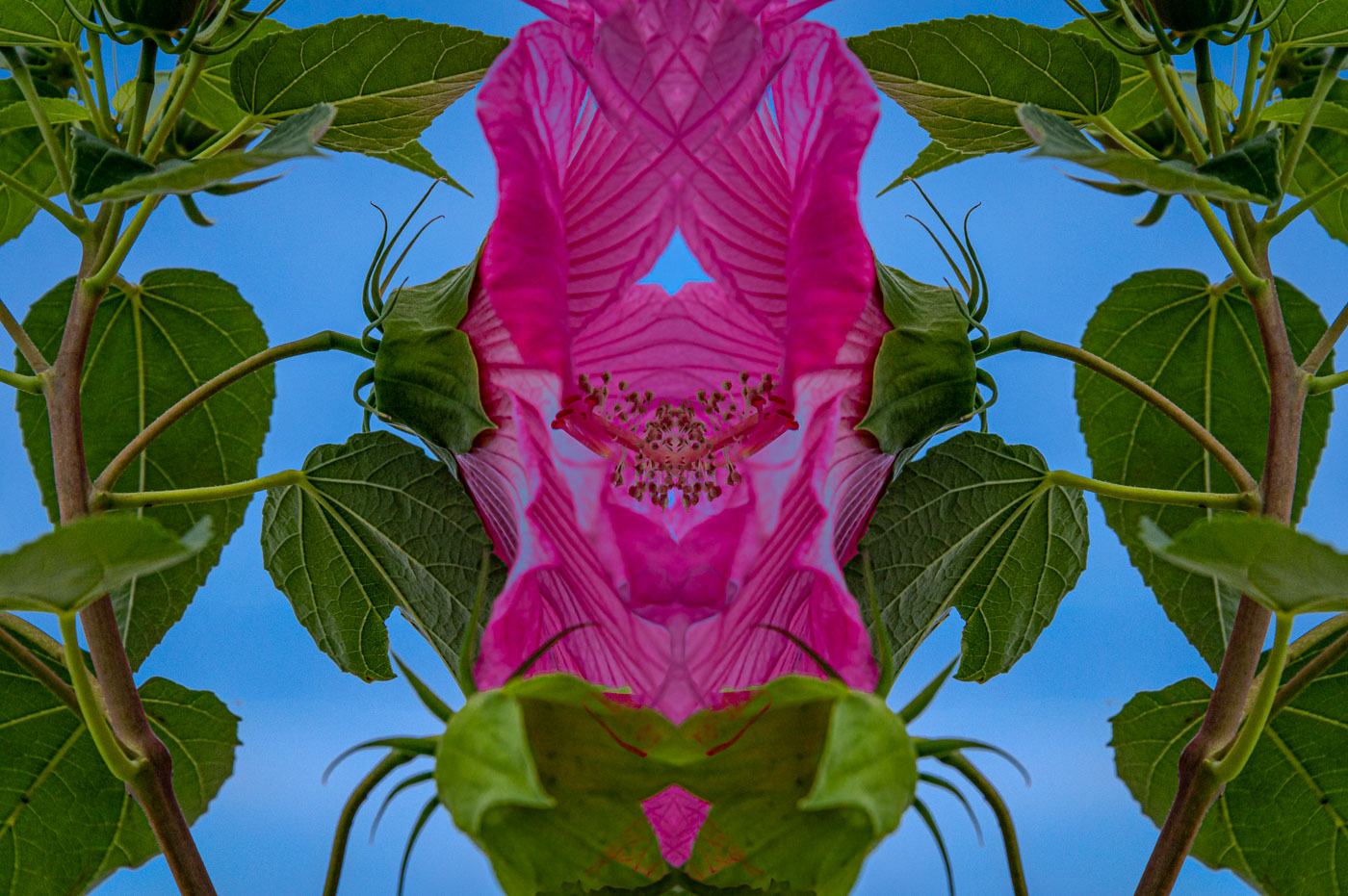
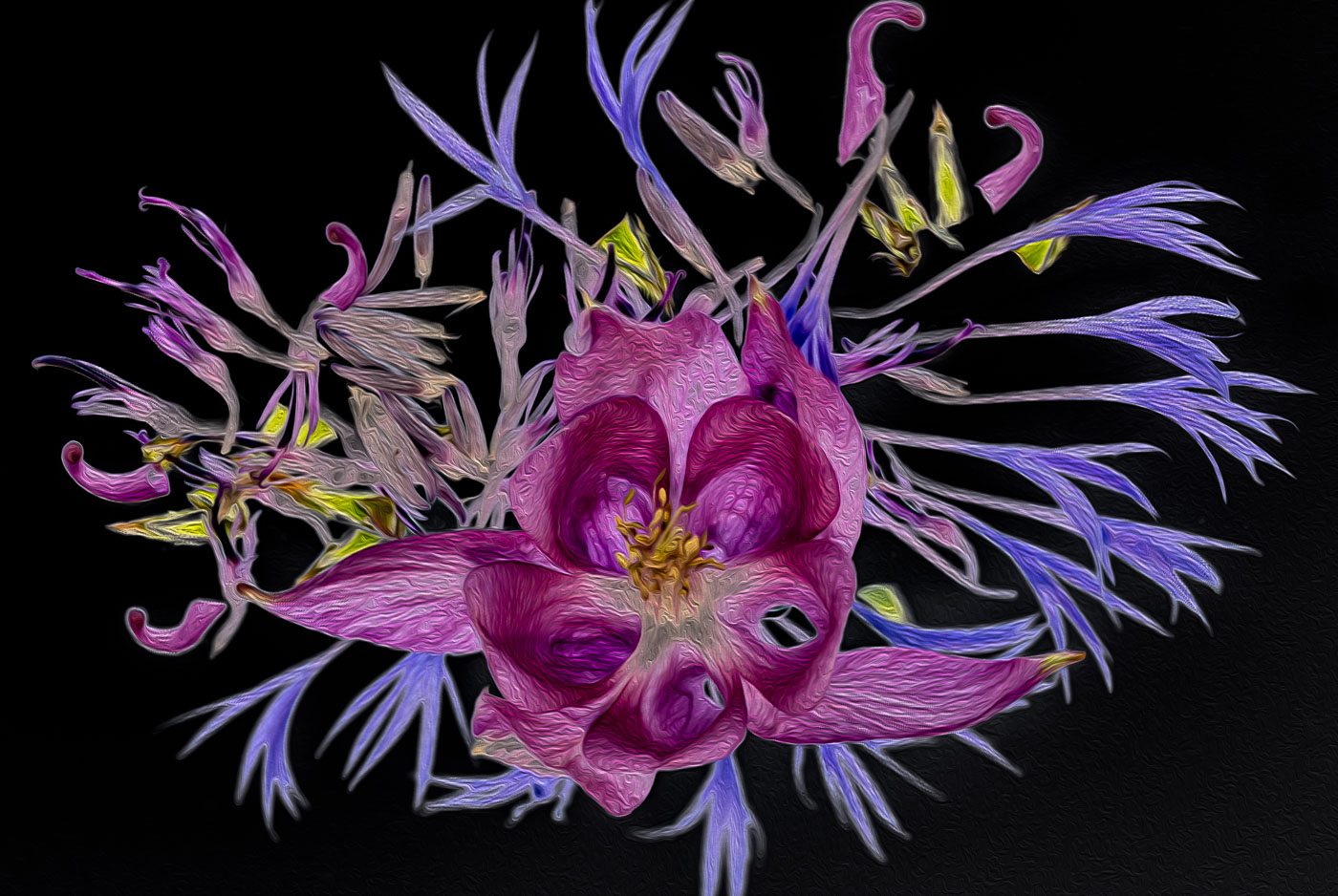
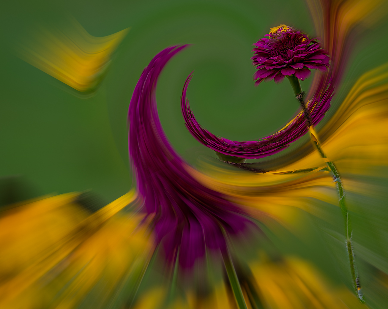
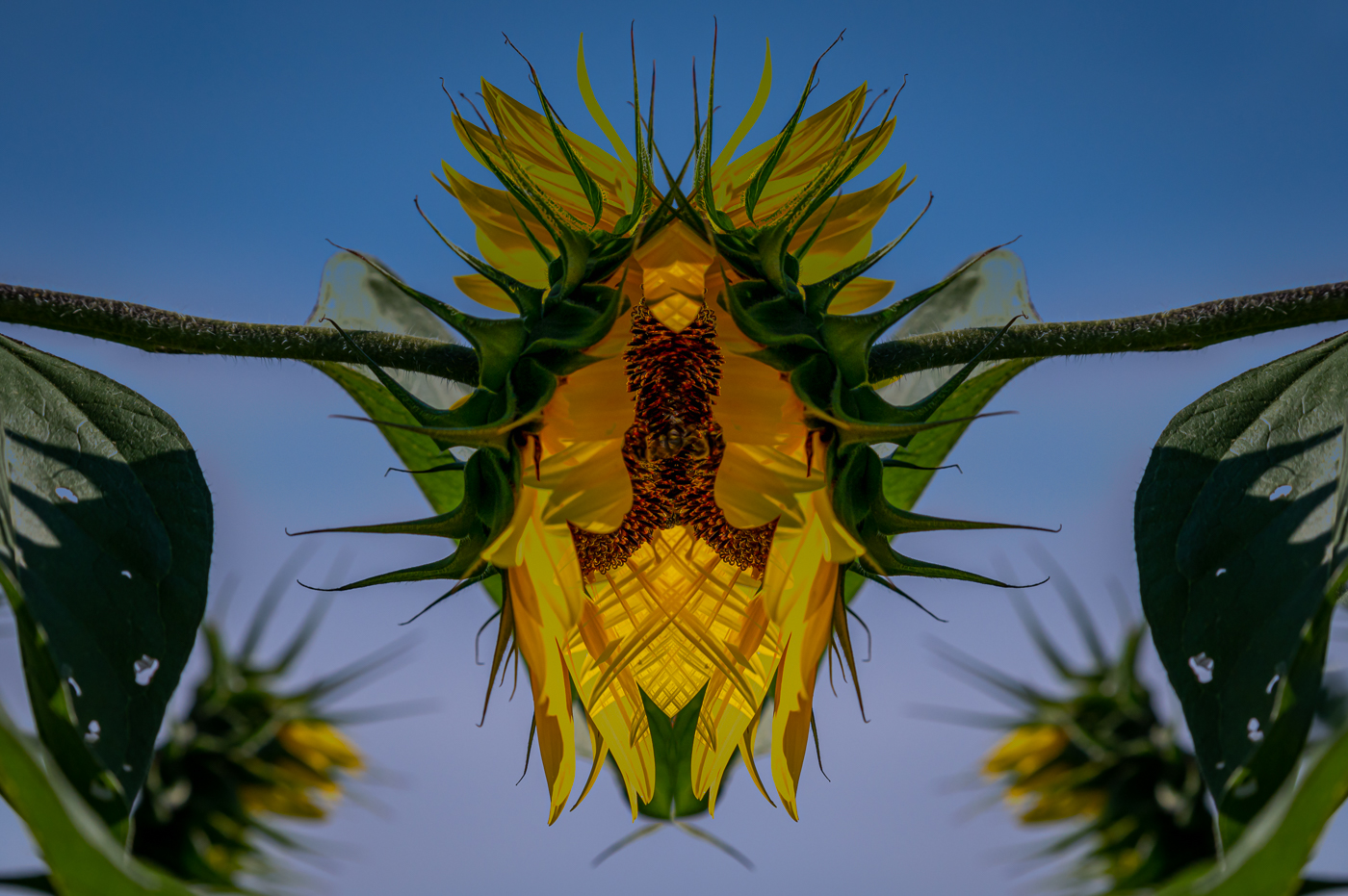
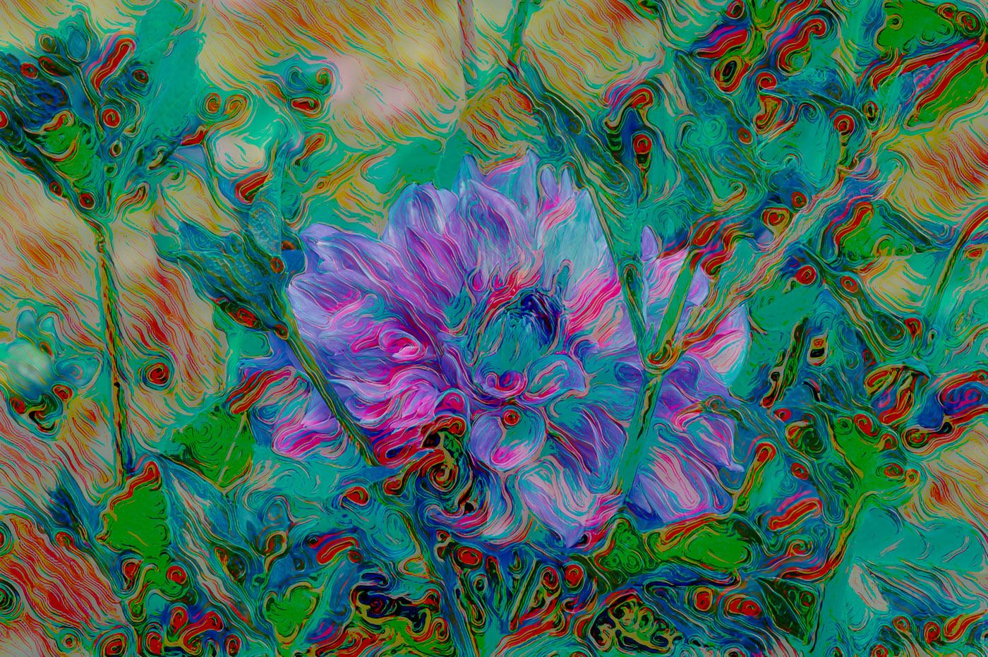
Thank you Ingrid. It looks like everyone's comments have covered the spectrum for this image. The original is too regular, its needs a swirl or two. I've fallen into a pattern of swirls and twirls so I'm thinking I will continue down that road. Thank you for your comments. |
May 23rd |
| 80 |
May 24 |
Reply |
Great point Doug. Sometimes just moving a couple of inches will create the separation. |
May 16th |
| 80 |
May 24 |
Comment |
Fantastic job Marti. I appreciate it and the revision shows Kamal the potential using the clone tool. |
May 13th |
| 80 |
May 24 |
Comment |
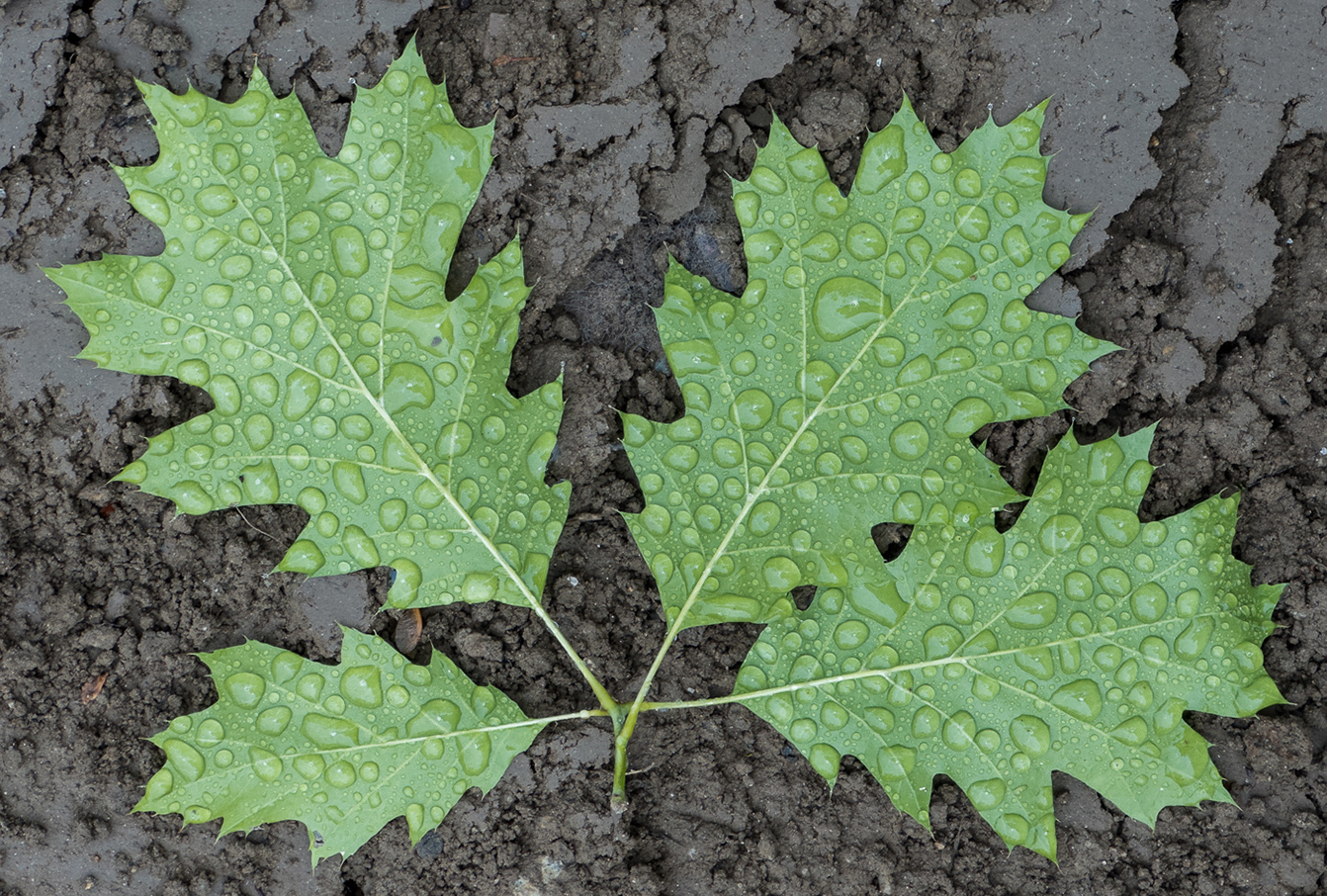
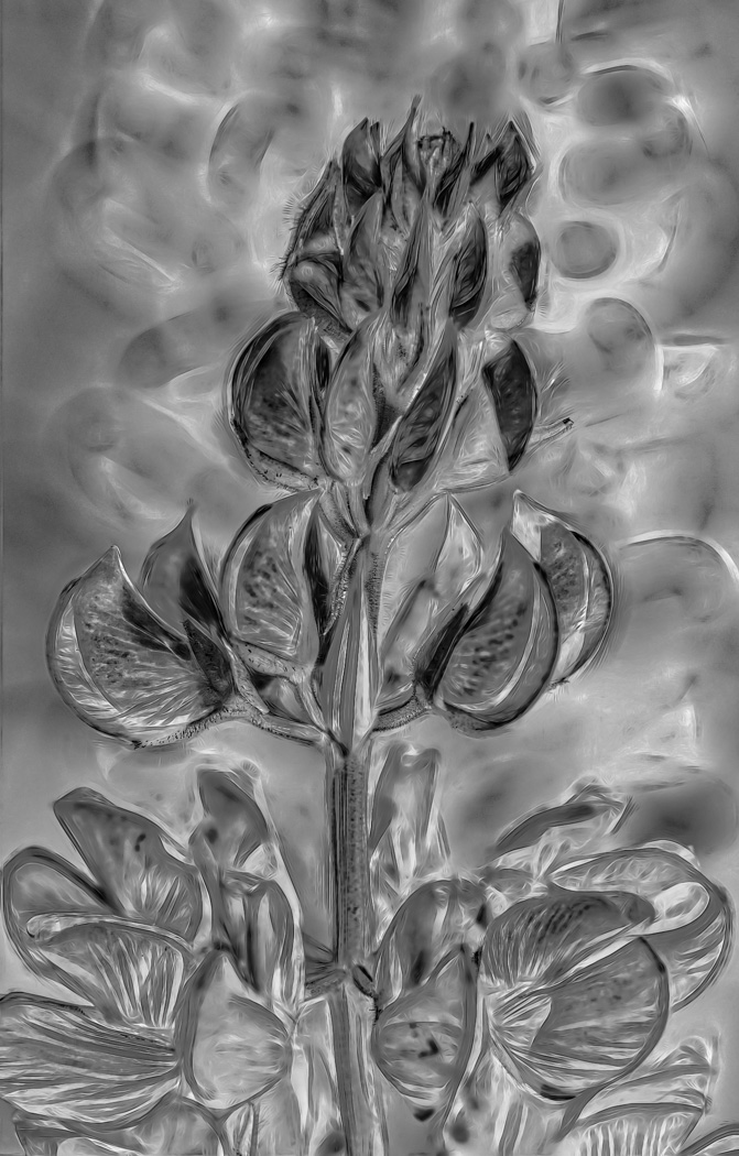
Kamal, you've grown well in our group and the texture layer you have chosen works very well. The image is well exposed and composed nicely. To me, the editing required to remove the damaged portion of the right leaf make this a difficult image to edit. CS6 photoshop should offer you the ability to remove the fly and much of the brown spots on the white. |
May 12th |
| 80 |
May 24 |
Comment |
If time permits I try to use the suggestions of our members. I Cropped and removed the bright color that Marti noted in the top left and Used the Ps generative fill after cropping and rotating suggestion from Doug. Thanks Rich for your comments. Here is the revision. |
May 10th |
 |
| 80 |
May 24 |
Reply |
Appreciate your edit and cropping ideas. I generally do not crop thru flowers or even their edges. Old school I guess. I do think that I would prefer to crop off the yellow on the bottom edge but that leads to the question of how much. Yellow under the sharp red flower no problem but then how to crop thru the yellow in the right corner?
I'm thinking more and more about using the "remove" tool to resolve cropping issues. Thanks again. |
May 10th |
| 80 |
May 24 |
Comment |
Thanks Rich. Yes, I have several of his books and did a Zoom with him. He does know much more than me when editing and creating in Ps. He wasn't a big fan of my artistry in the computer but that was 2-3 years ago and this is a newer image. Thanks for your thoughts. |
May 10th |
| 80 |
May 24 |
Comment |
Thanks Marti for your suggestion. I will do that. I just noticed that Original 2 is not supposed to be there. |
May 8th |
| 80 |
May 24 |
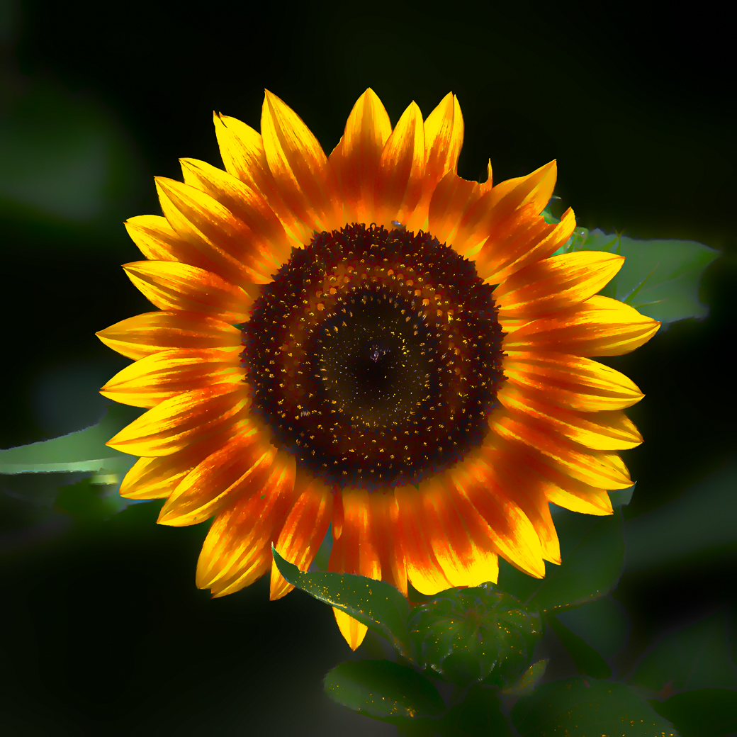
Comment |
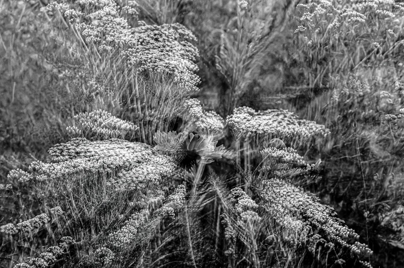
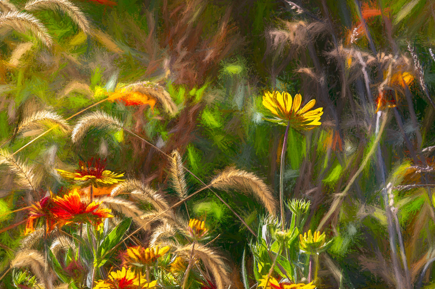
A beautiful image Rich. Capturing the landscape and natural growing conditions of these wild flowers. At first I couldn't see the difference between the original and the final. After reading your comments I concur with removing those bright spots and the targeted saturation all made a difference. Well done. |
May 7th |
| 80 |
May 24 |
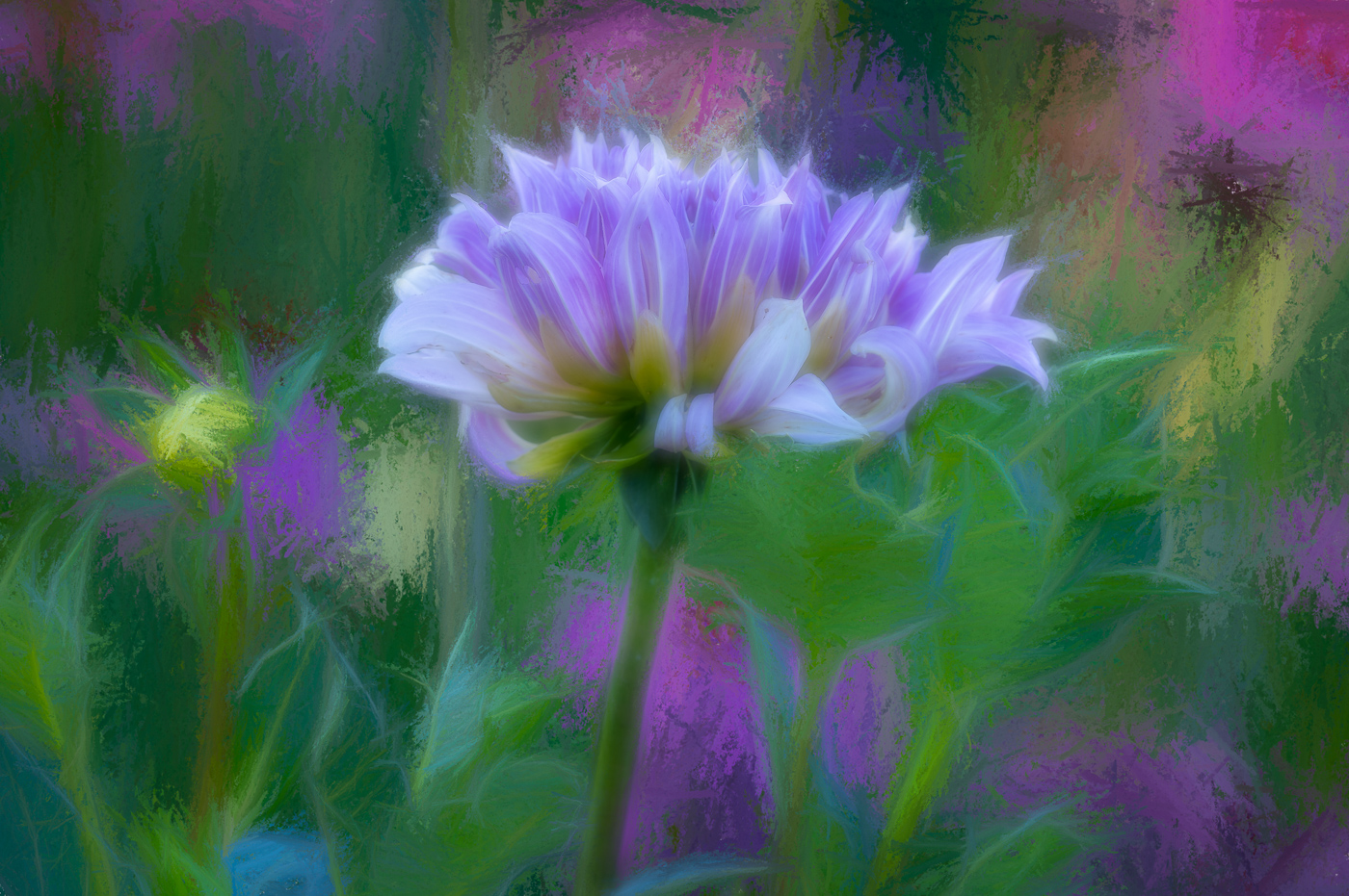
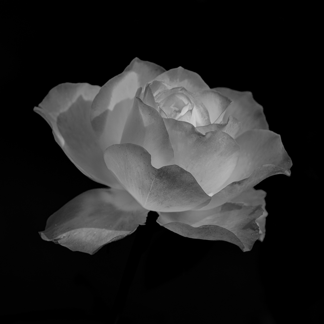
Comment |
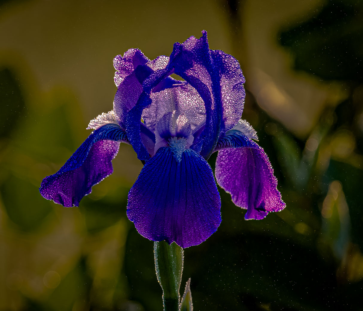
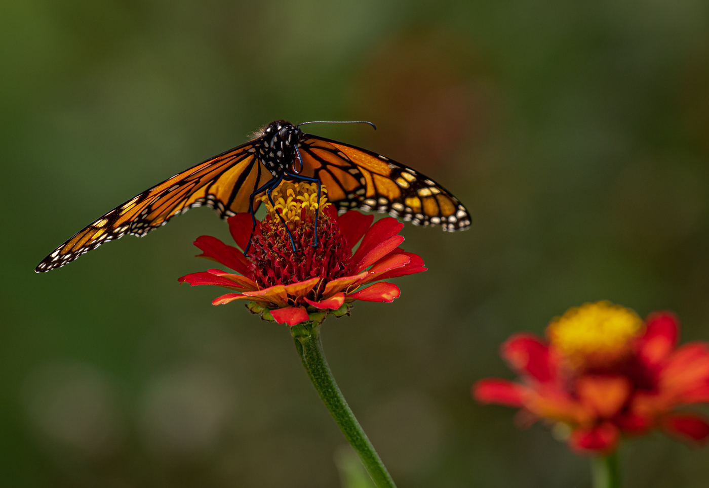
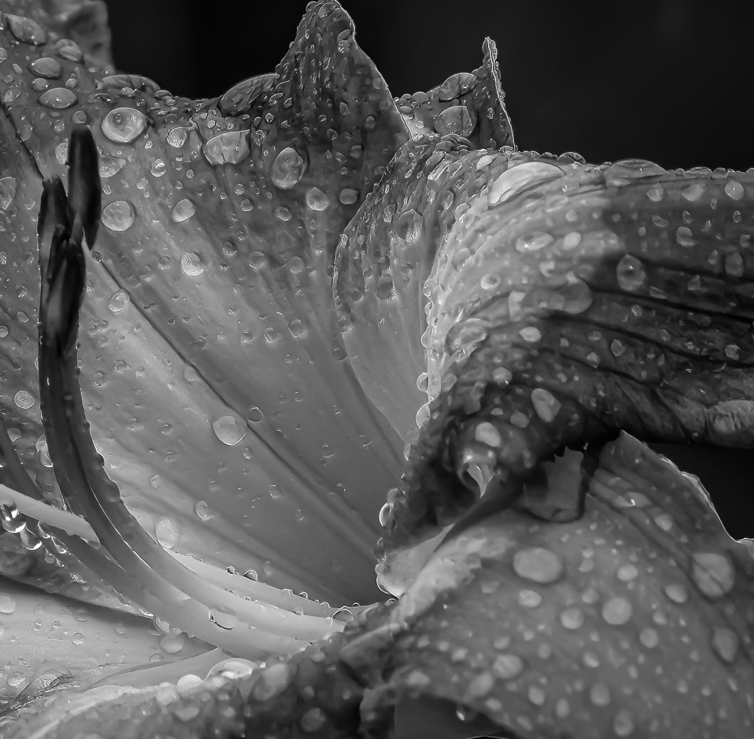
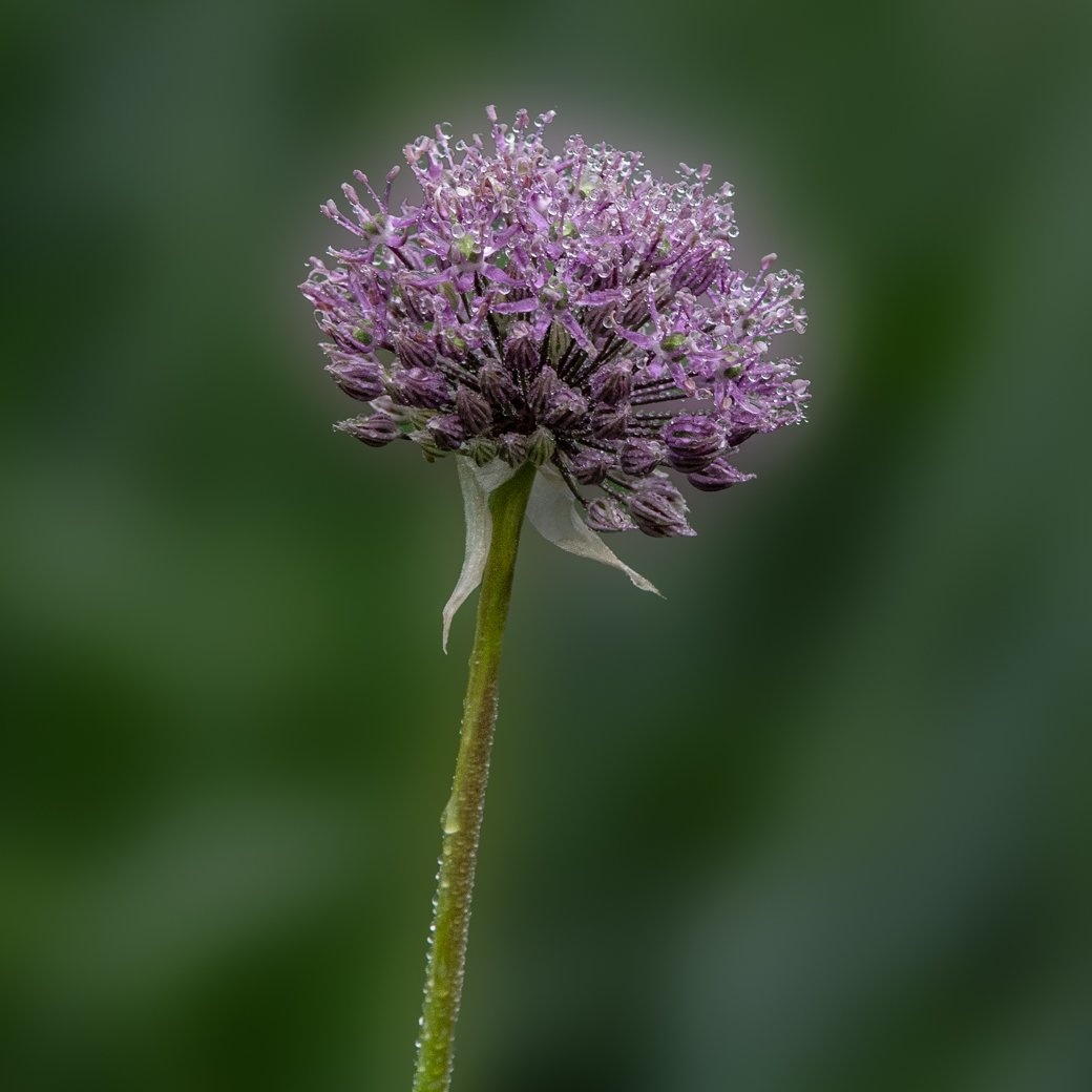
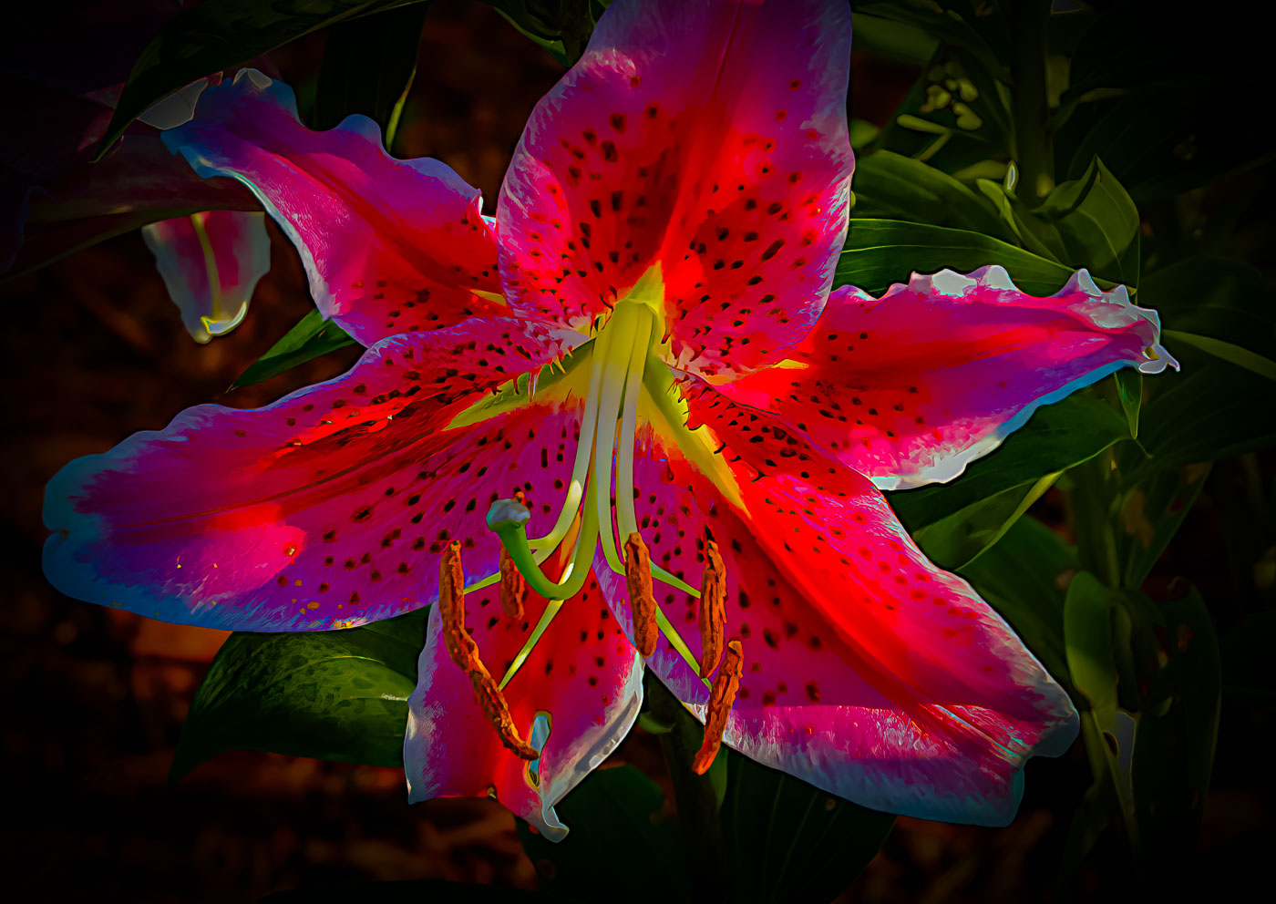
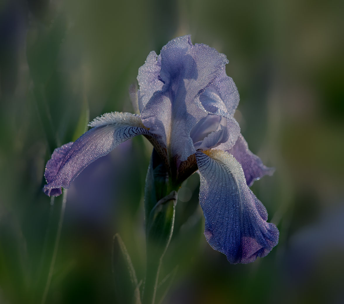
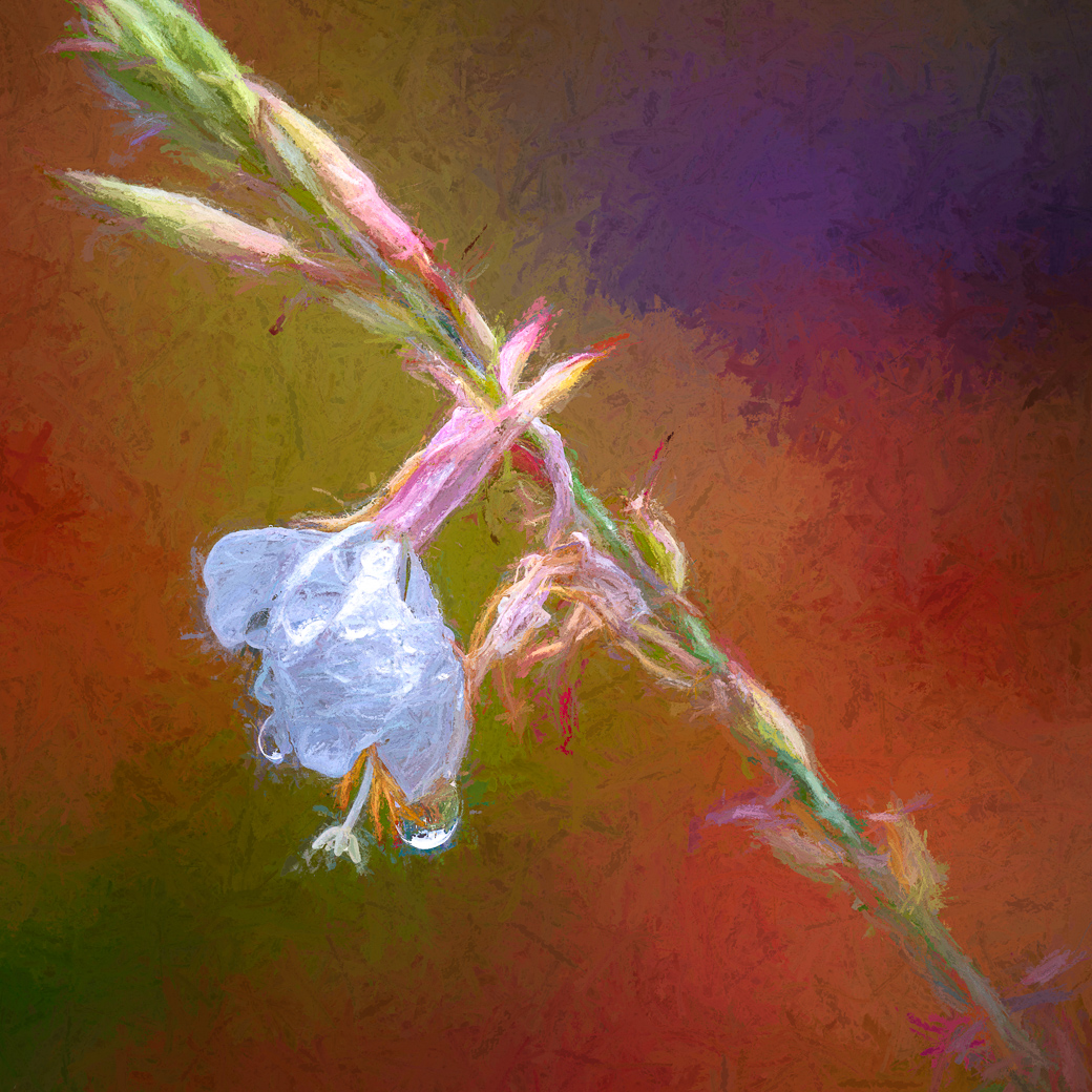
Ingrid, this is a very nice image. Love the colors, texture, composition (very nice to see the flower and stem placed off center) and the few drops of water. Great editing to capture the yellow in the center of the flower making it appear to be lite from within. I can't see anything that I would recommend being changed. |
May 7th |
| 80 |
May 24 |
Comment |
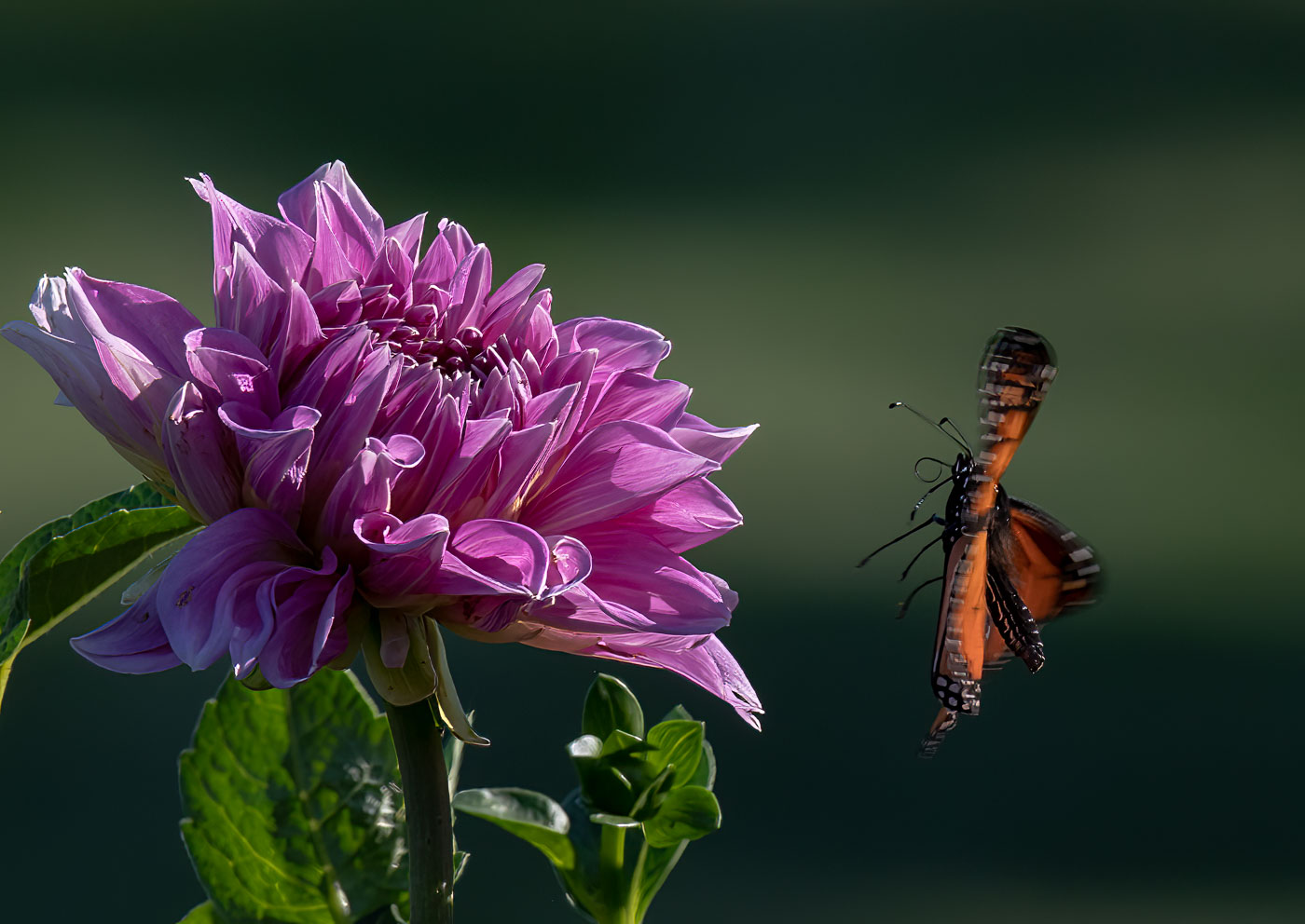
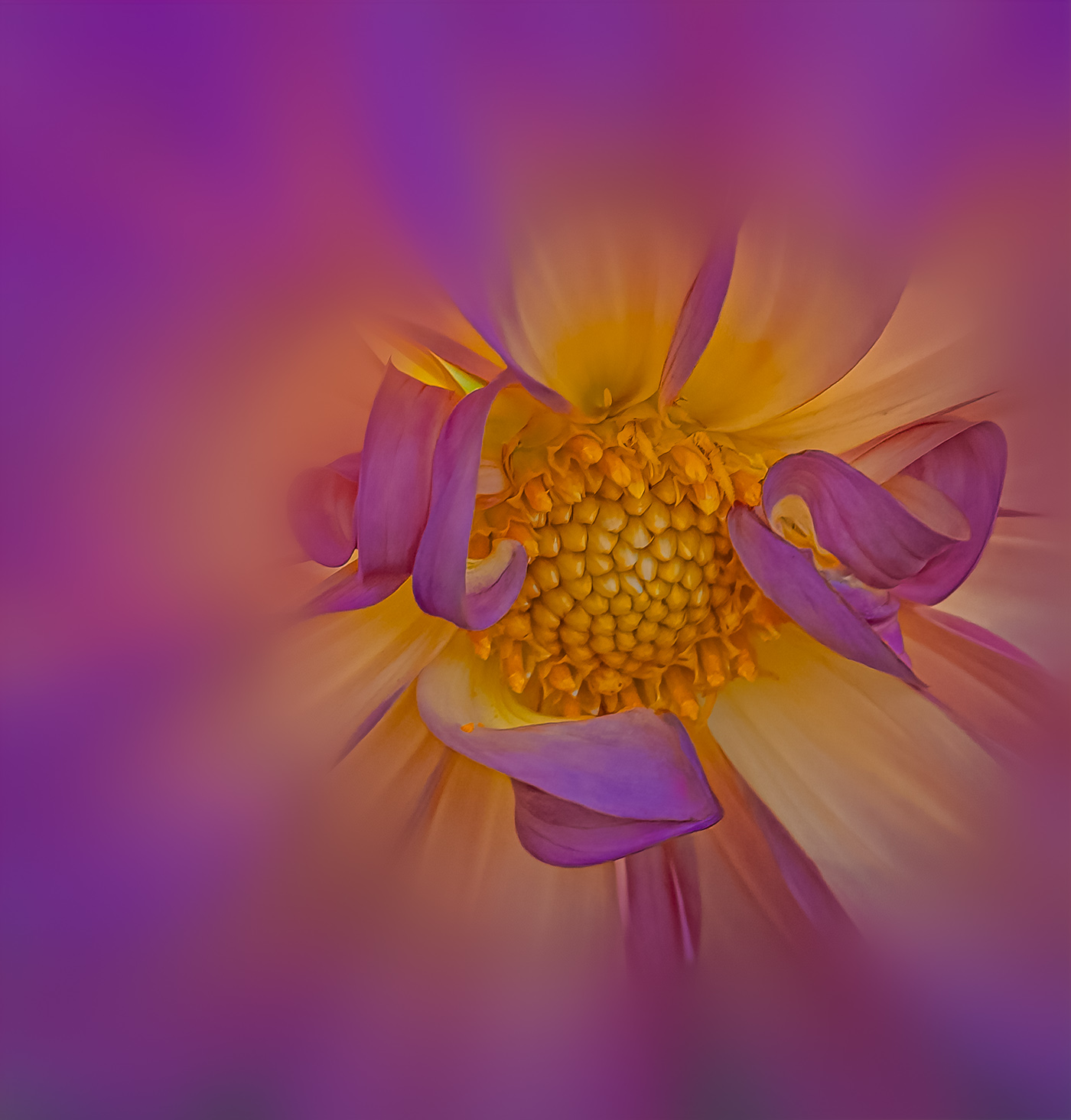
Doug, I really like the color combination and the center composition is fine with your closeup image. I do feel that if you increased the ISO substantially, to maybe 3200, you could have increased your aperture to gain focus on the lower left wrapped petal as well as the green leaf on the left. I feel sure that your OM1 would handle the noise easily. In the event you didn't have an image with greater DOF I would suggest for you to crop in from the left, right and bottom to remove the out of focus areas. The viewer does not need to know that the subject is a wrapped tulip. Great seeing the best of the image that you were presented with. |
May 7th |
| 80 |
May 24 |
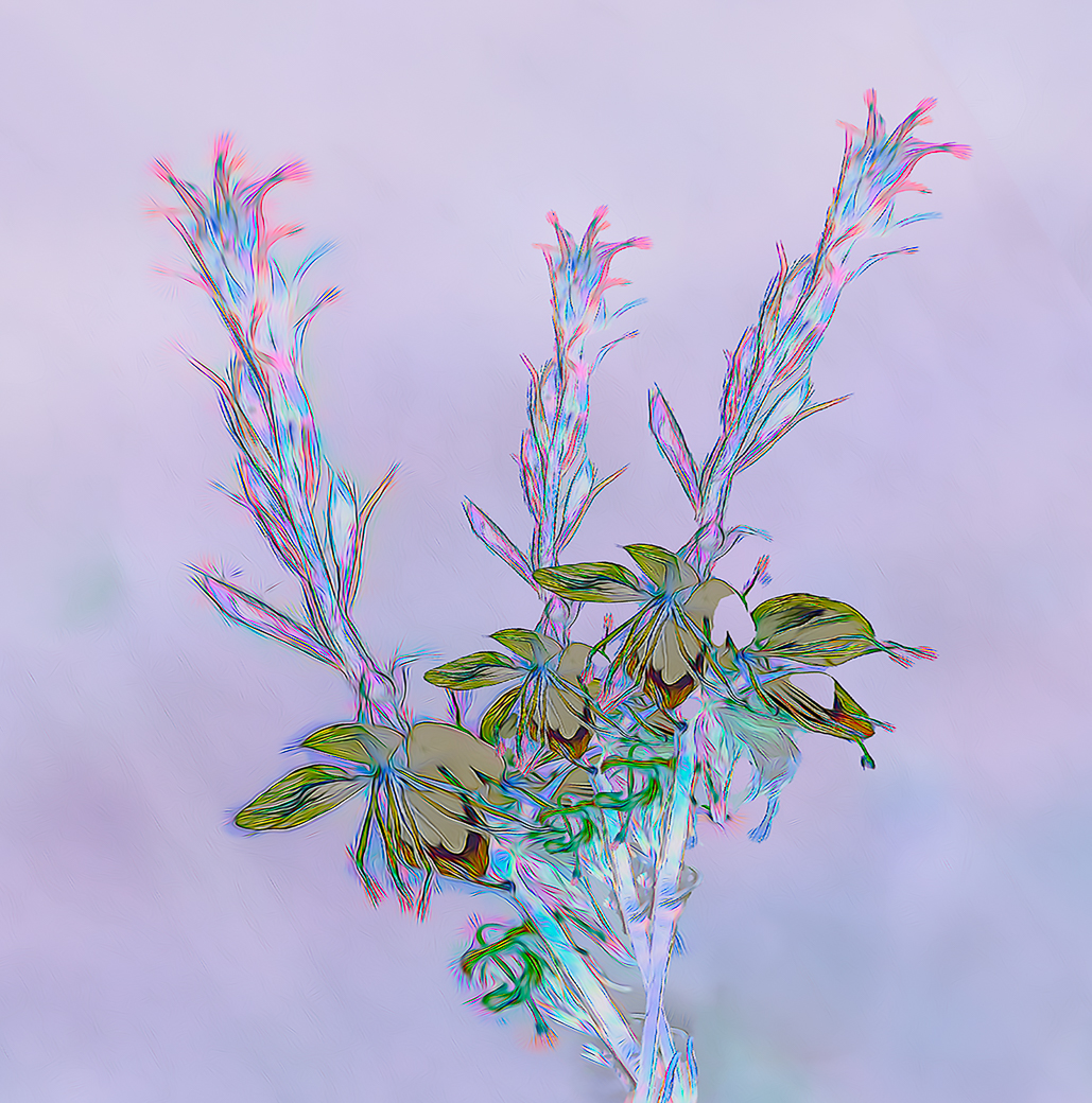
Comment |
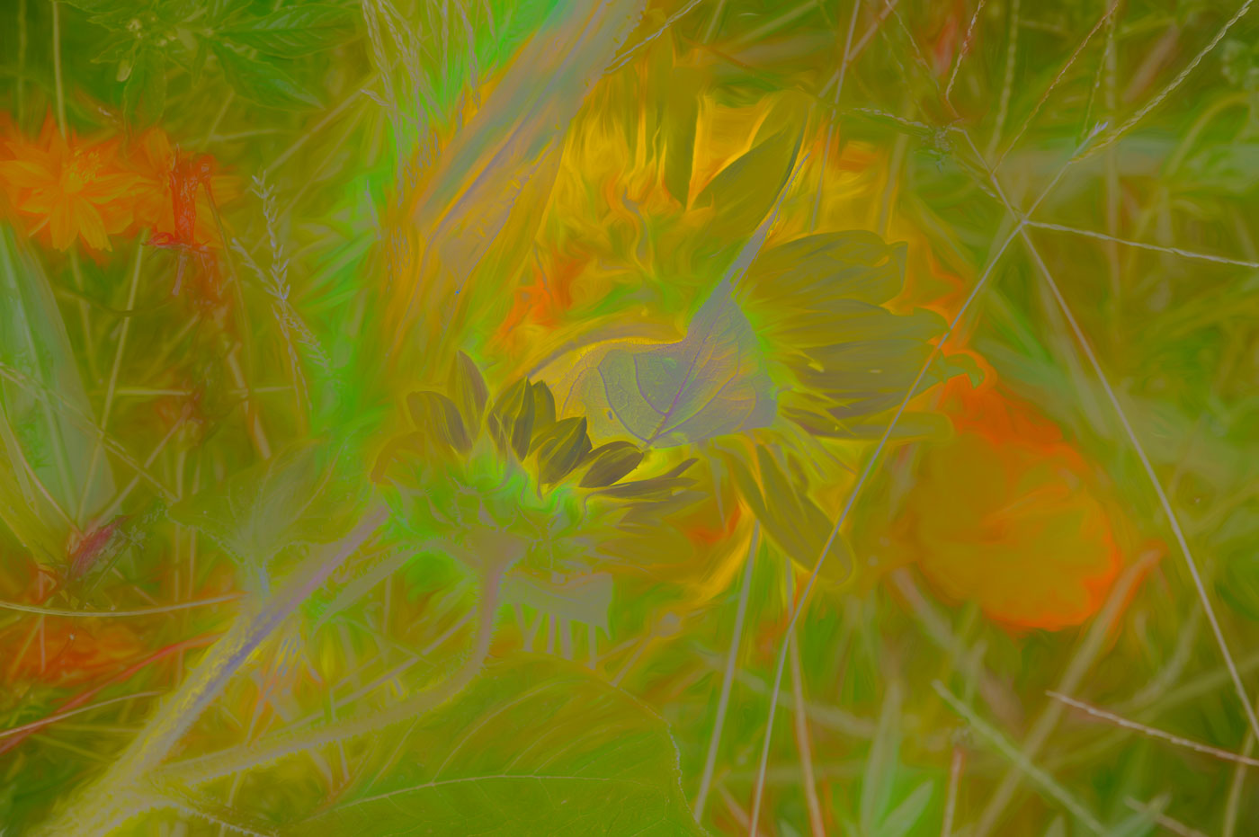
A Very Nice image Nadia. My favorite color and another background that fits perfectly. A unique flower for those of us that live North of the equator. Nice composition and depth of field. If the image were mine, I would remove the "dot" at about 10 o'clock in the green. I also do like the texture overlay. |
May 7th |
| 80 |
May 24 |
Comment |
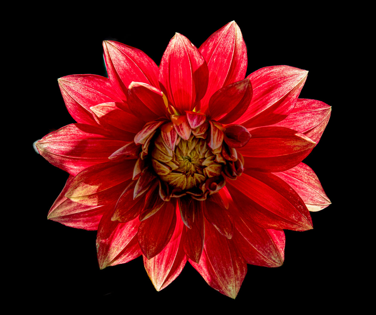
An Excellent image Marti, I love the rich colors, crisp focus, and off center composition. The editing to blur the background is fantastic. So what's not to Love. I tiny nit and remove/edit tool of your choice but the bright yellowish something in the bottom right corner should be darkened or removed. Well done. |
May 7th |
12 comments - 2 replies for Group 80
|
17 comments - 4 replies Total
|