|
| Group |
Round |
C/R |
Comment |
Date |
Image |
| 3 |
May 23 |
Comment |
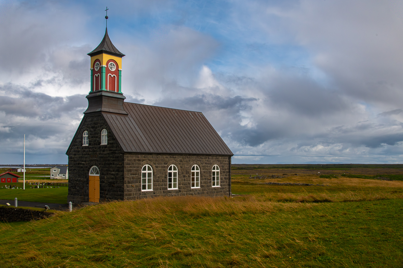
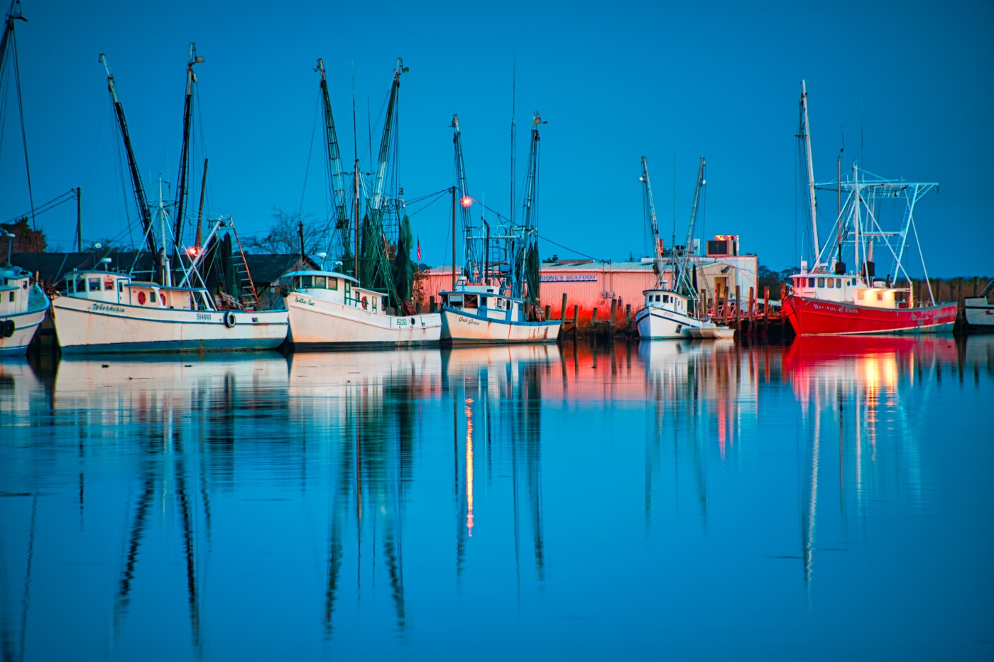
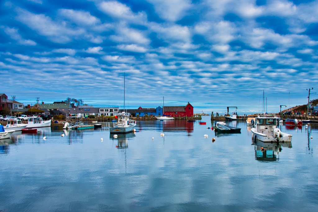
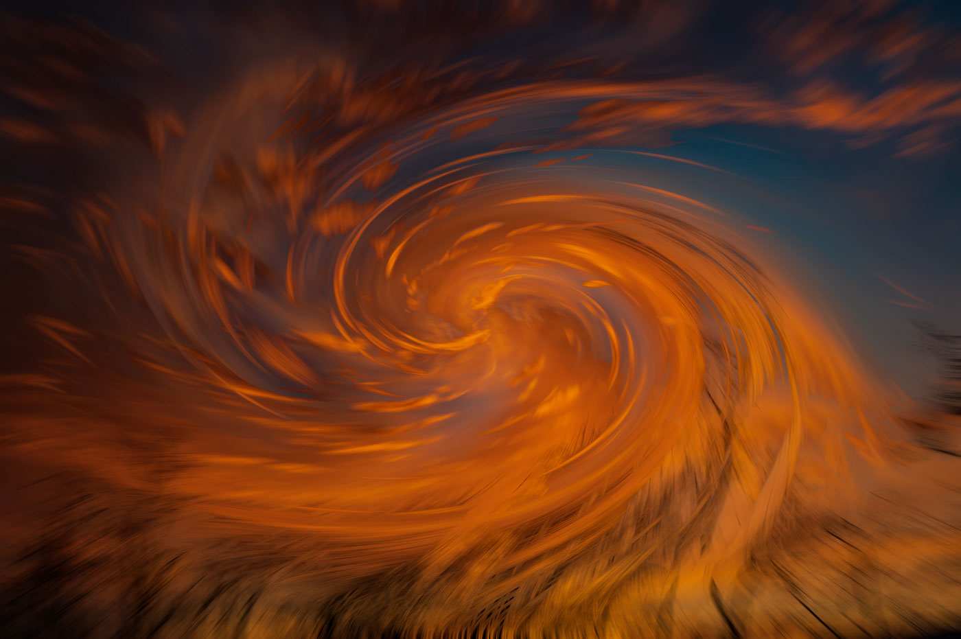
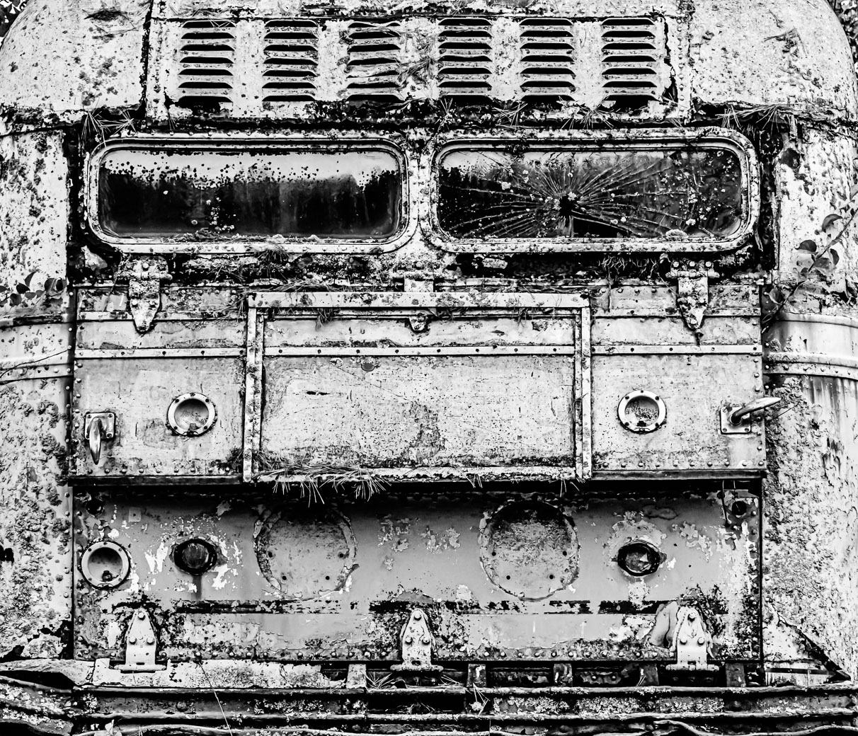
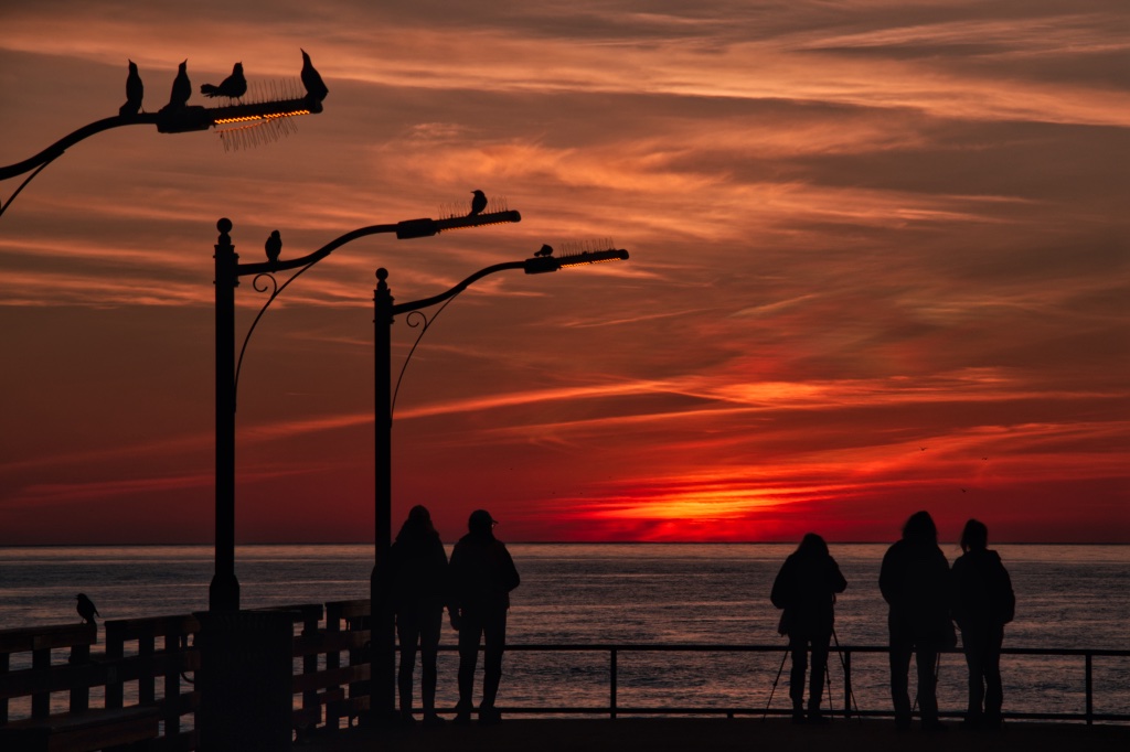
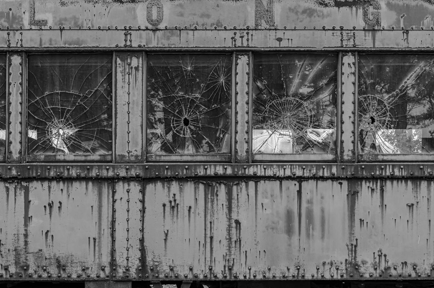
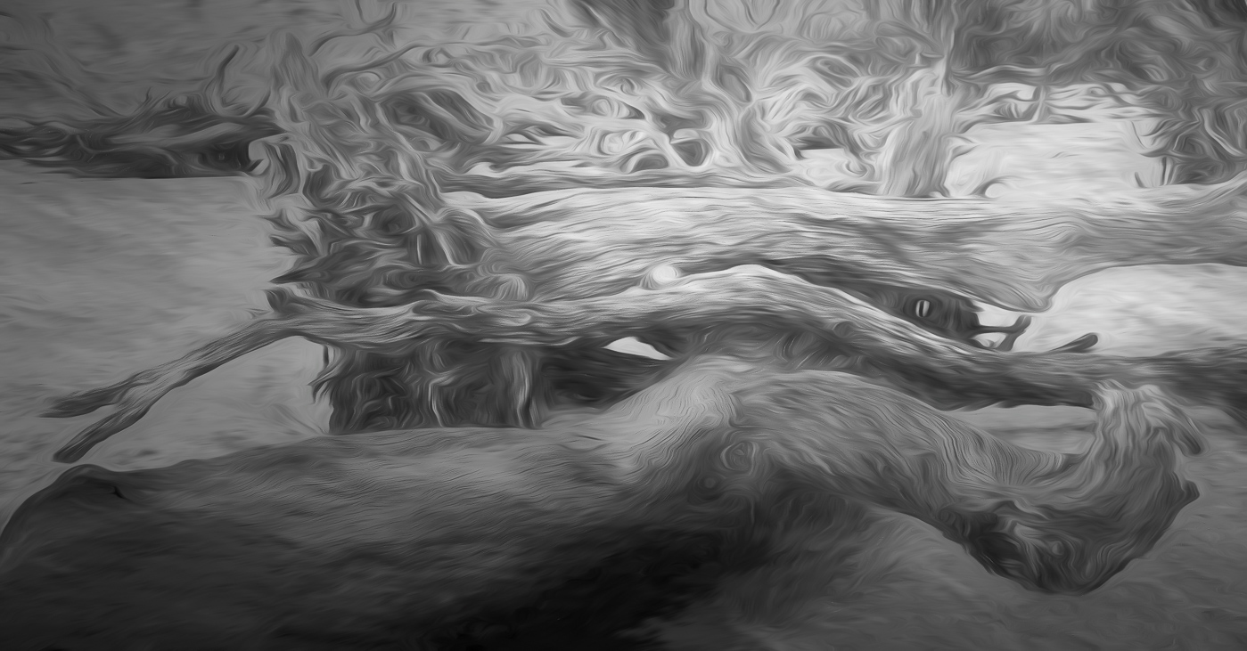
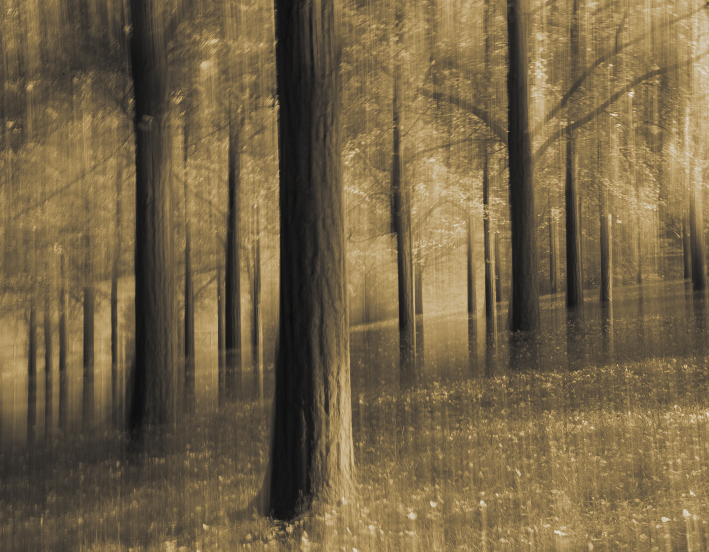
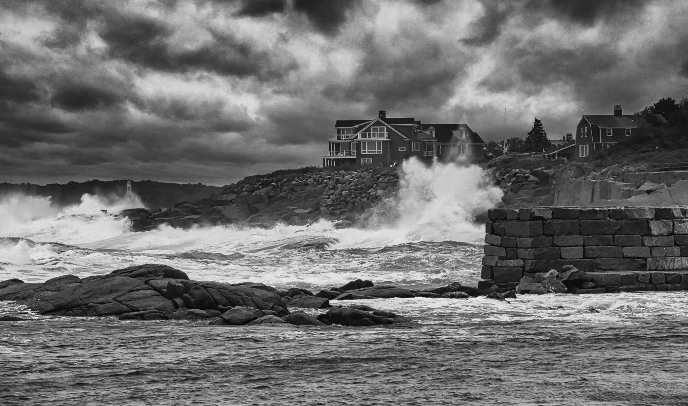
Wow, LuAnn I spotted this compelling image from way down in DD80. Beautifully captured, exposed and edited. |
May 17th |
1 comment - 0 replies for Group 3
|
| 29 |
May 23 |
Reply |
Thanks Judy. Thanks for wanting to be a student, but I'm quite short of any time as I try to move and get settled. I know crazy, but true that I might be in this condition through early 2024. |
May 22nd |
| 29 |
May 23 |
Reply |
Thanks Karen. Equipment cost is pretty low and Create Create |
May 22nd |
| 29 |
May 23 |
Comment |
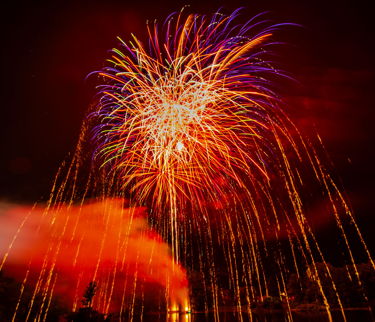
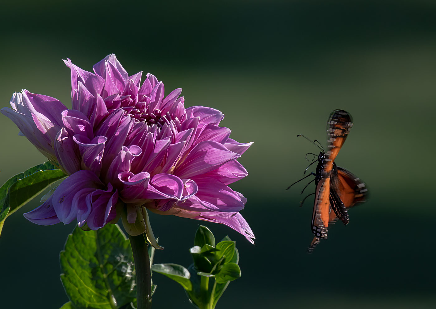
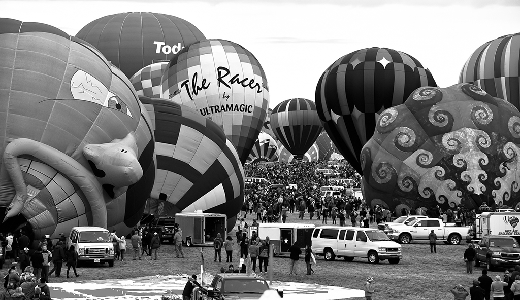
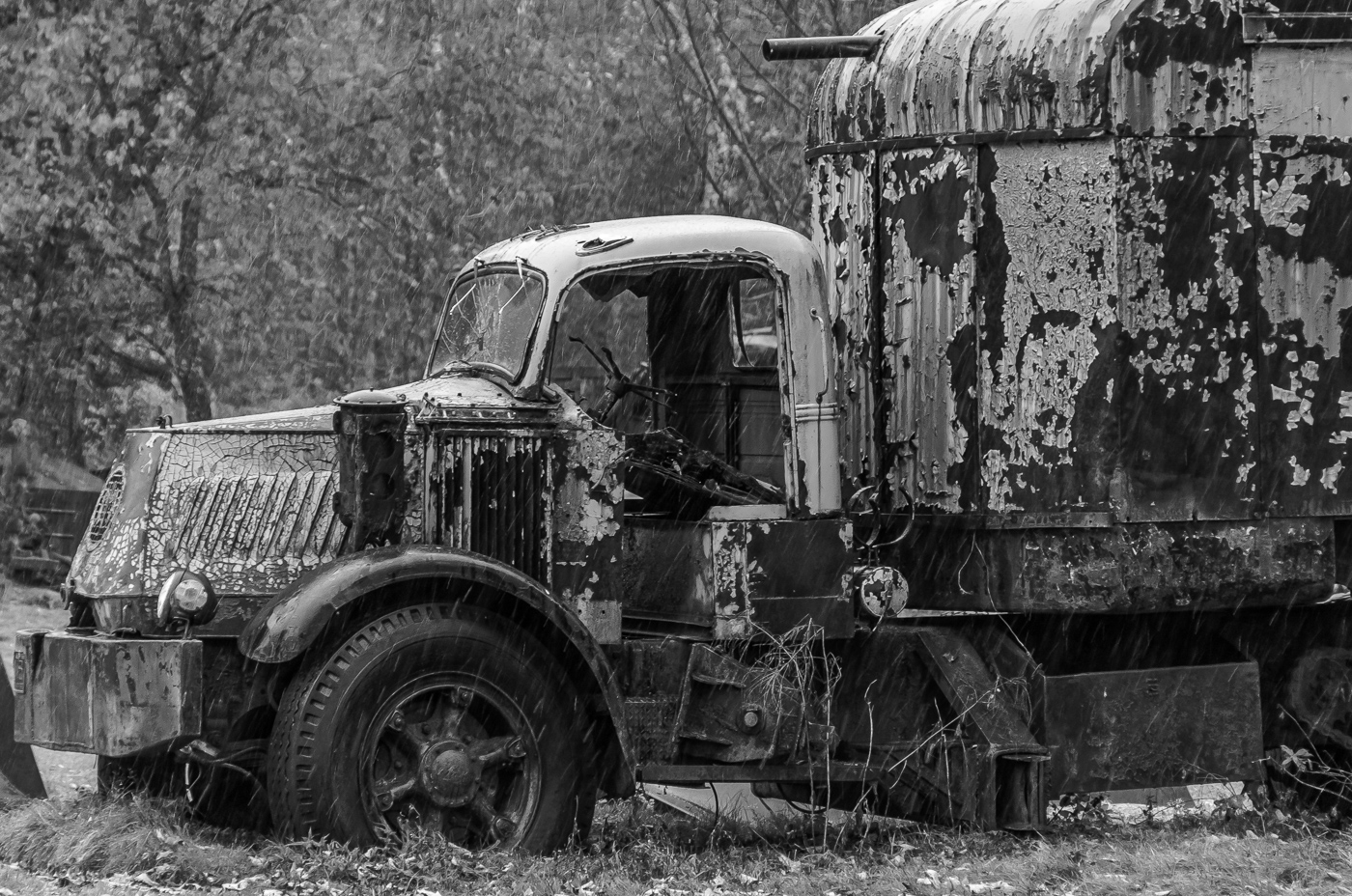
A Great grab shot Ron. Quickly composed, and the phone gives great sharpness and color. |
May 17th |
| 29 |
May 23 |
Comment |
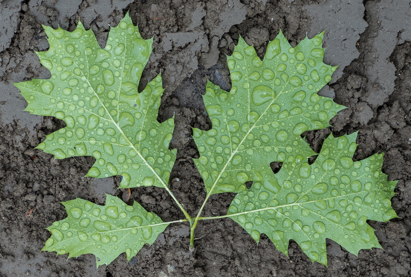
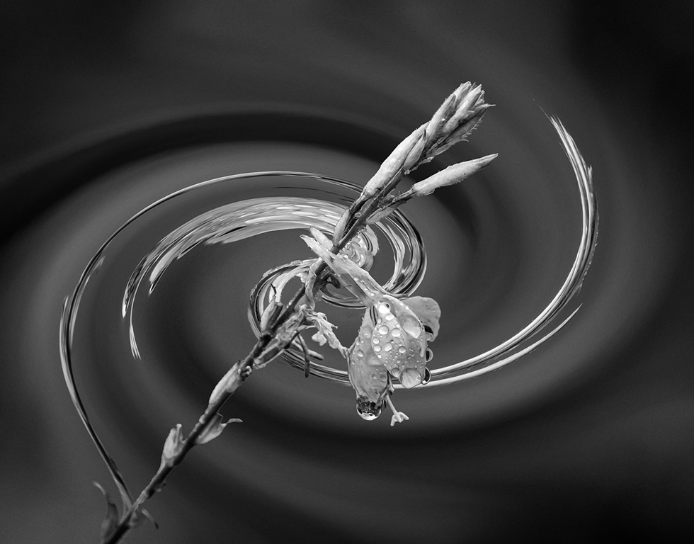
Karen, this is a very nice water drop. Yes, I bet you did go thru a thousand attempts. I like the color and the reflection and shape of the umbrella. You captured something that viewers do not see. Well done. |
May 17th |
| 29 |
May 23 |
Comment |
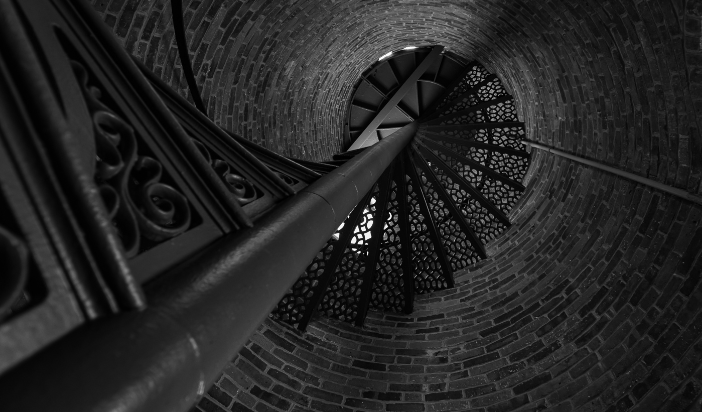
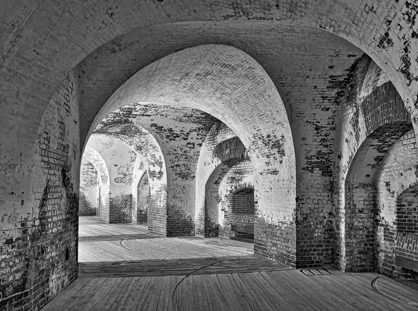
A very nice stairway Judy. Nicely composed and lit by natural light.
I like the use of the single chair to stop by eyes from wandering past the stairs. I'm not sure if you might of cropped the top top further down to prevent that hot spot and eyes wandering off up in that corner. |
May 17th |
| 29 |
May 23 |
Reply |
Thanks Tim. I was concerned about the PSA limitations, as generally don't see panoramas and agree for some cropping on the top and the bottom. |
May 17th |
| 29 |
May 23 |
Comment |
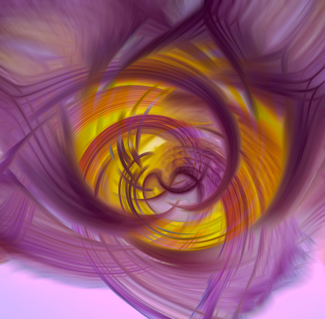
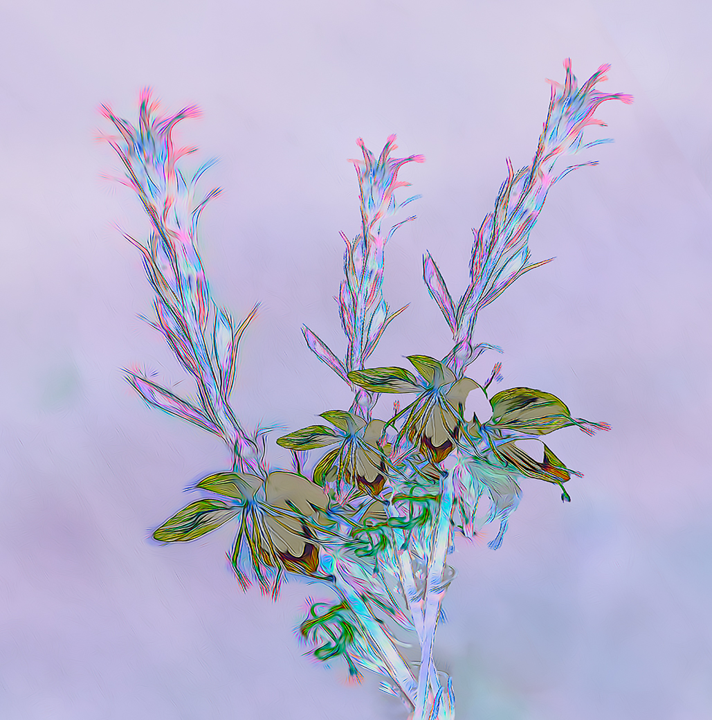
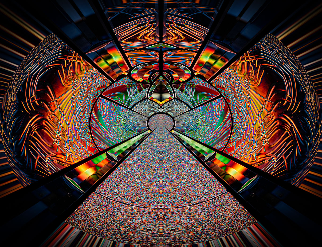
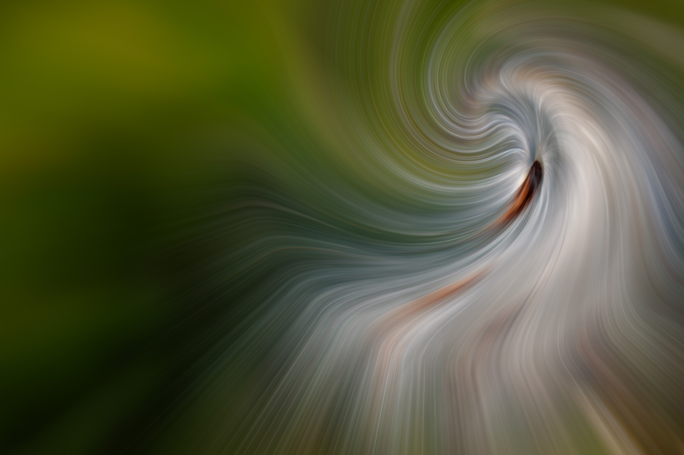
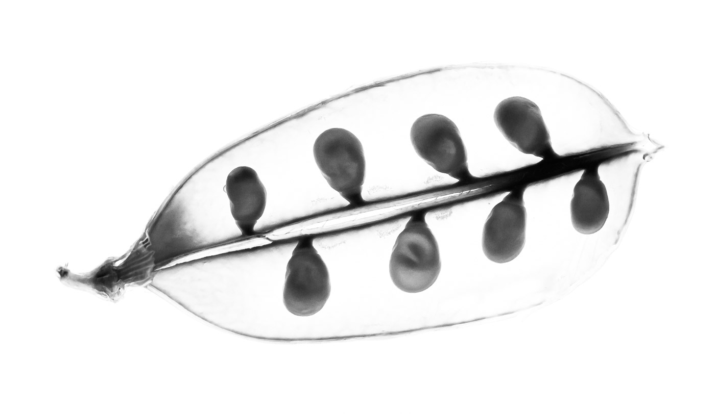
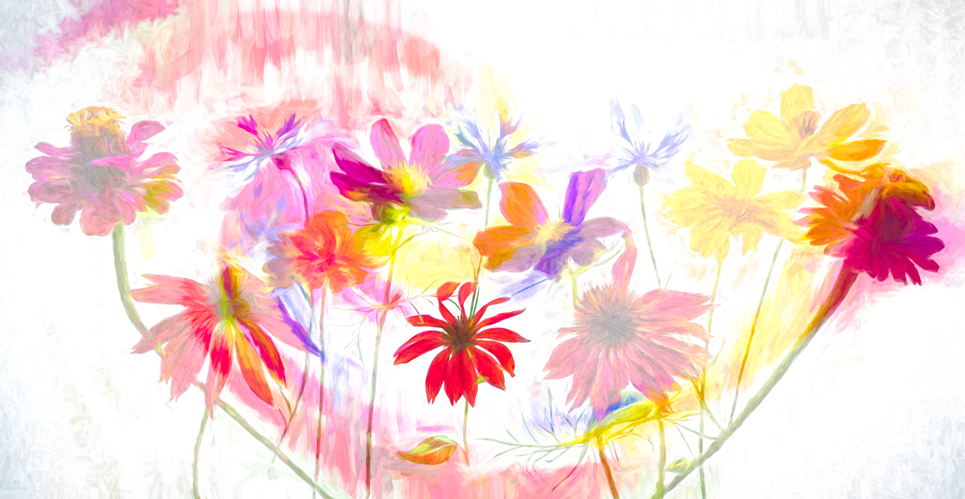
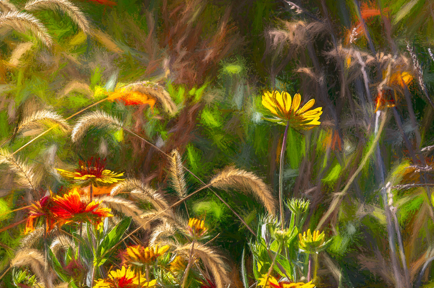
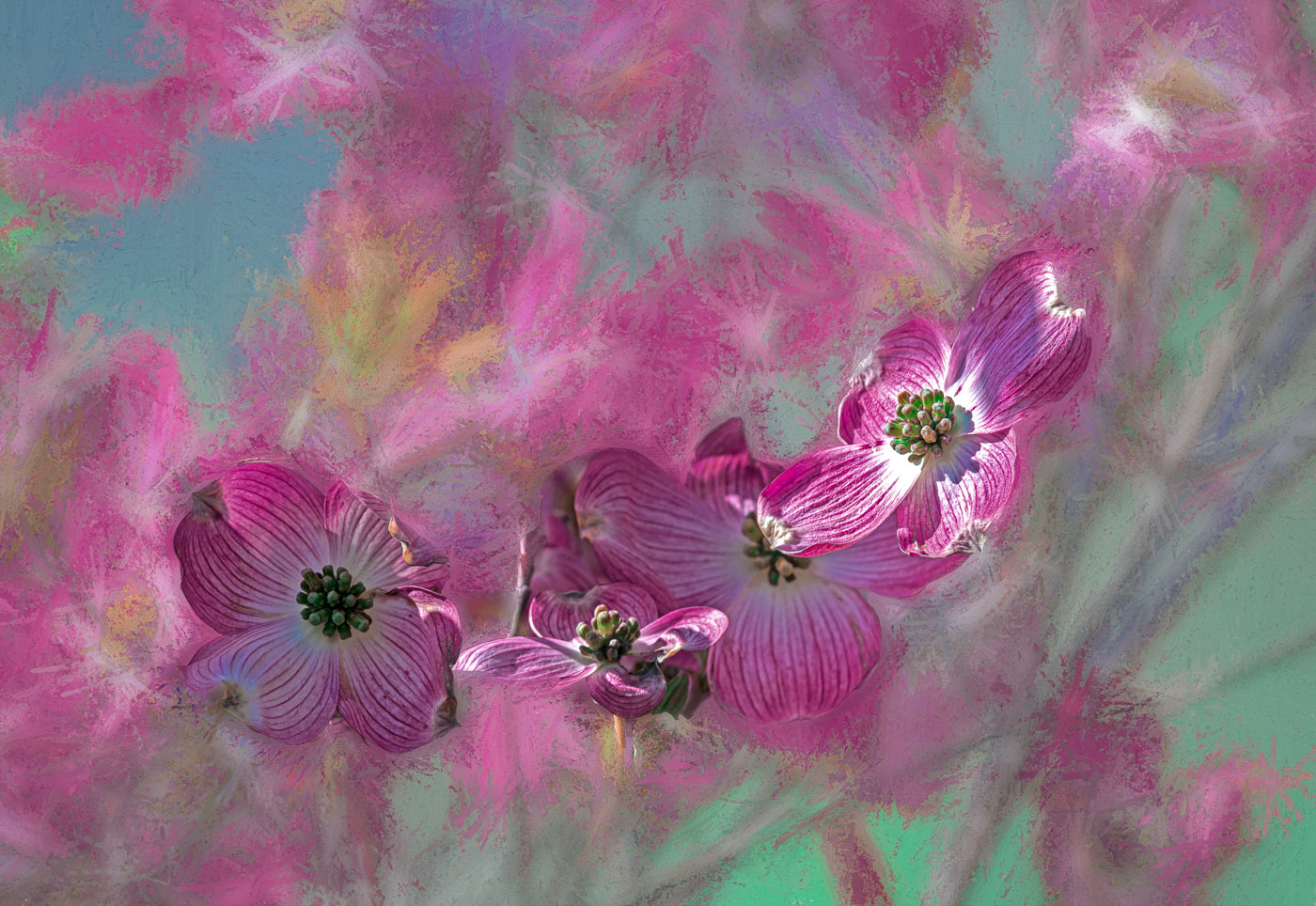
Gunter, I wish you had placed the original image also. I guess I'm thrown off by the title of wallflowers. Maybe on top of stonewall? Very nice placement of flowers along a diagonal, however, I'm troubled by the top plant and yellow flowers leading my eyes out of the image. I think transform tool might be able to bend them back within the frame. I'm thinking that perhaps Topaz Studio was used to add the blue to the rocks. That's a nice touch of creativity.
|
May 13th |
| 29 |
May 23 |
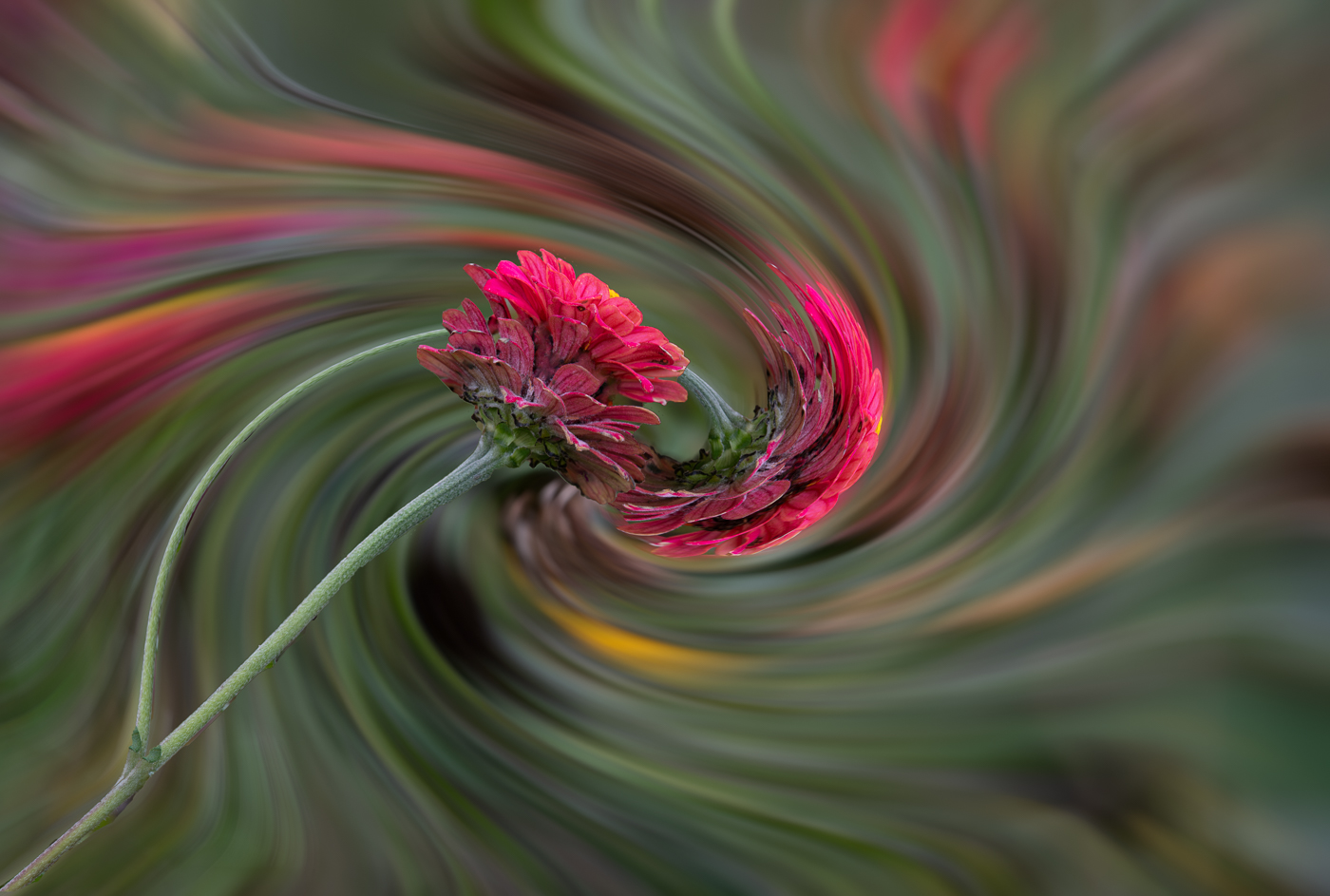
Comment |
Thanks Gunter. Yes, I think the gray can be made lighter, but the lengthening of some steps as to go back to the original lightpad shot. Yes, not many embossed pics of flowers, but I don't get hung up with the past or majorities and just create. Thanks for your ideas. |
May 13th |
| 29 |
May 23 |
Comment |
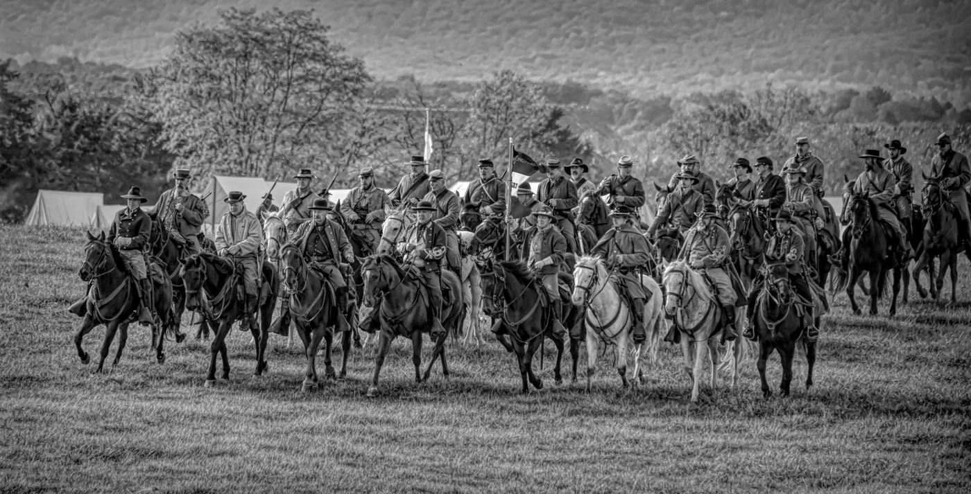
Well Tim, I think you exceeded this challenge. Nice and sharp and well composed. One of the factors that you didn't mention is that you might of only captured 1 image of this set of horses due to your good sense of timing and shutter speed. But could you have captured 3 frames and picked the best? Regardless you have a perfectly fantastic shoot. |
May 12th |
6 comments - 3 replies for Group 29
|
| 62 |
May 23 |
Reply |
Thanks Mark. |
May 24th |
| 62 |
May 23 |
Comment |
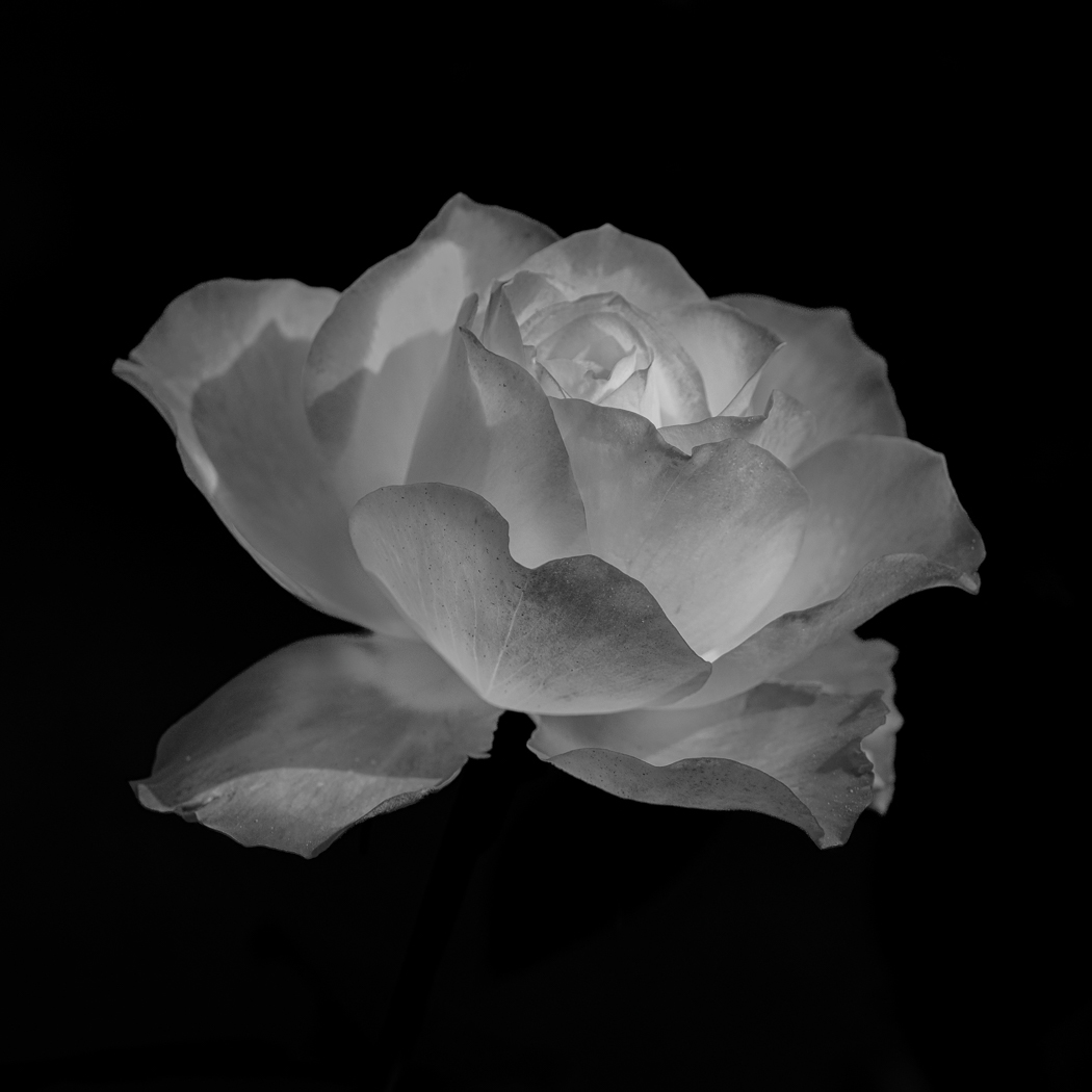
A wonderful image LuAnn. I like it just the way it is. I generally am not able to see the subtile nuances and changes in tones and Love your image as is. I don't know why but I rarely shoot the group of two. If I compared to Peonies, I just focus on 1 ball. Nothing wrong with shooting two and succeeding. |
May 17th |
| 62 |
May 23 |
Comment |
Emil, very nice image and you've proven the way to find, isolate from the background, and edit to make a beautiful image. Well composed. I like the lighter background like LuAnn's and Israels'. Definitely the flipped version. |
May 17th |
| 62 |
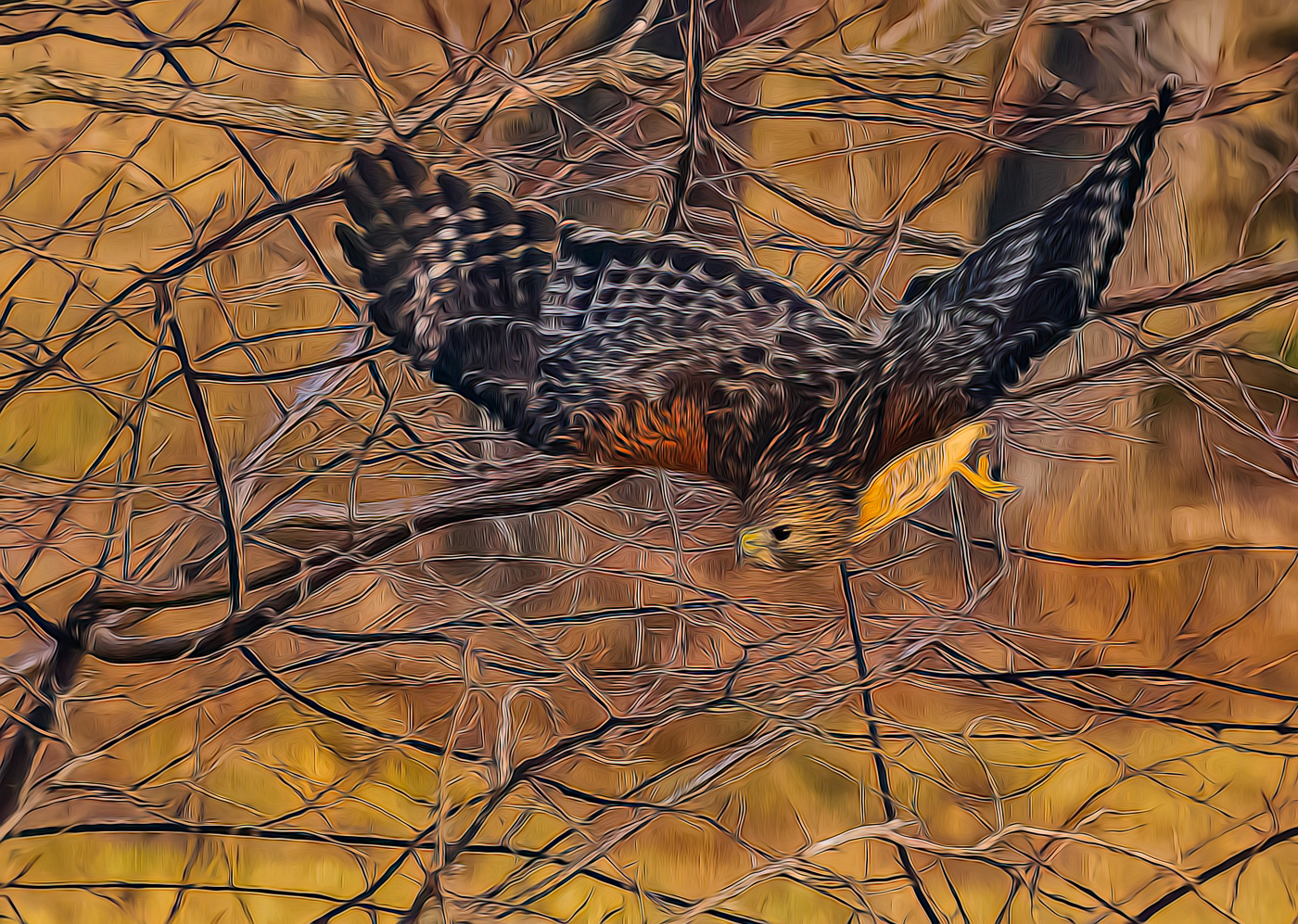
May 23 |
Comment |
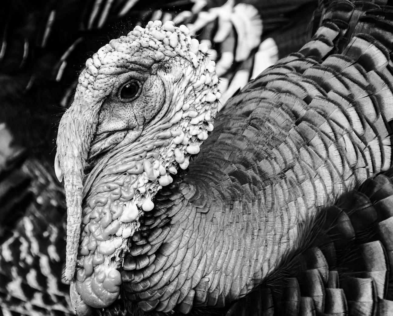
A beautiful bird Bunny with great composition and DOF. I too agree with the darker feathers in Emil's version. |
May 12th |
| 62 |
May 23 |
Comment |
Hi Israel, I fall into the more PJ camp with bringing out the details in the shadows of both the right and left sides and overall. There is so much interesting detail and textures in the subjects you captured that they need to be brought to life. |
May 12th |
| 62 |
May 23 |
Reply |
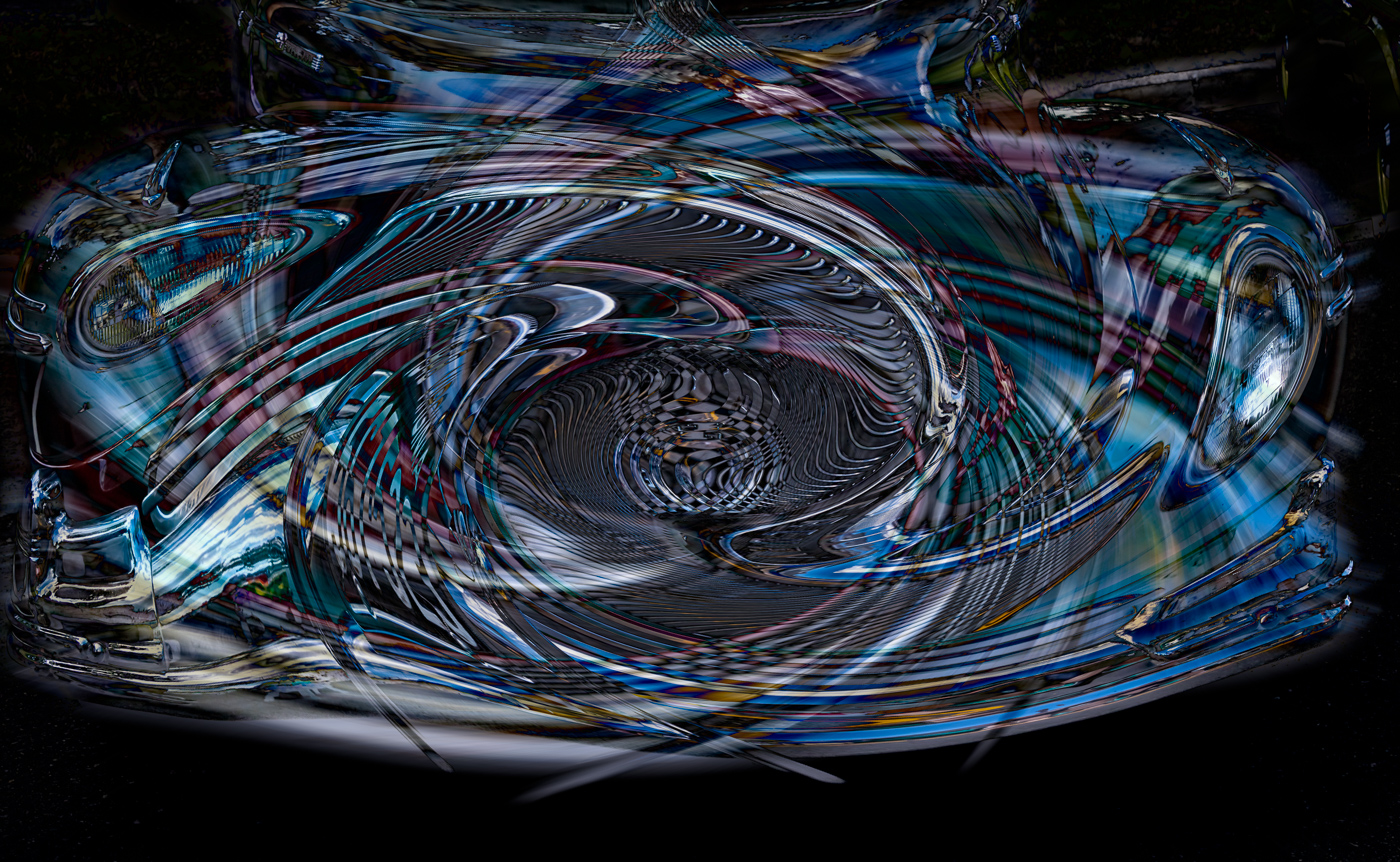
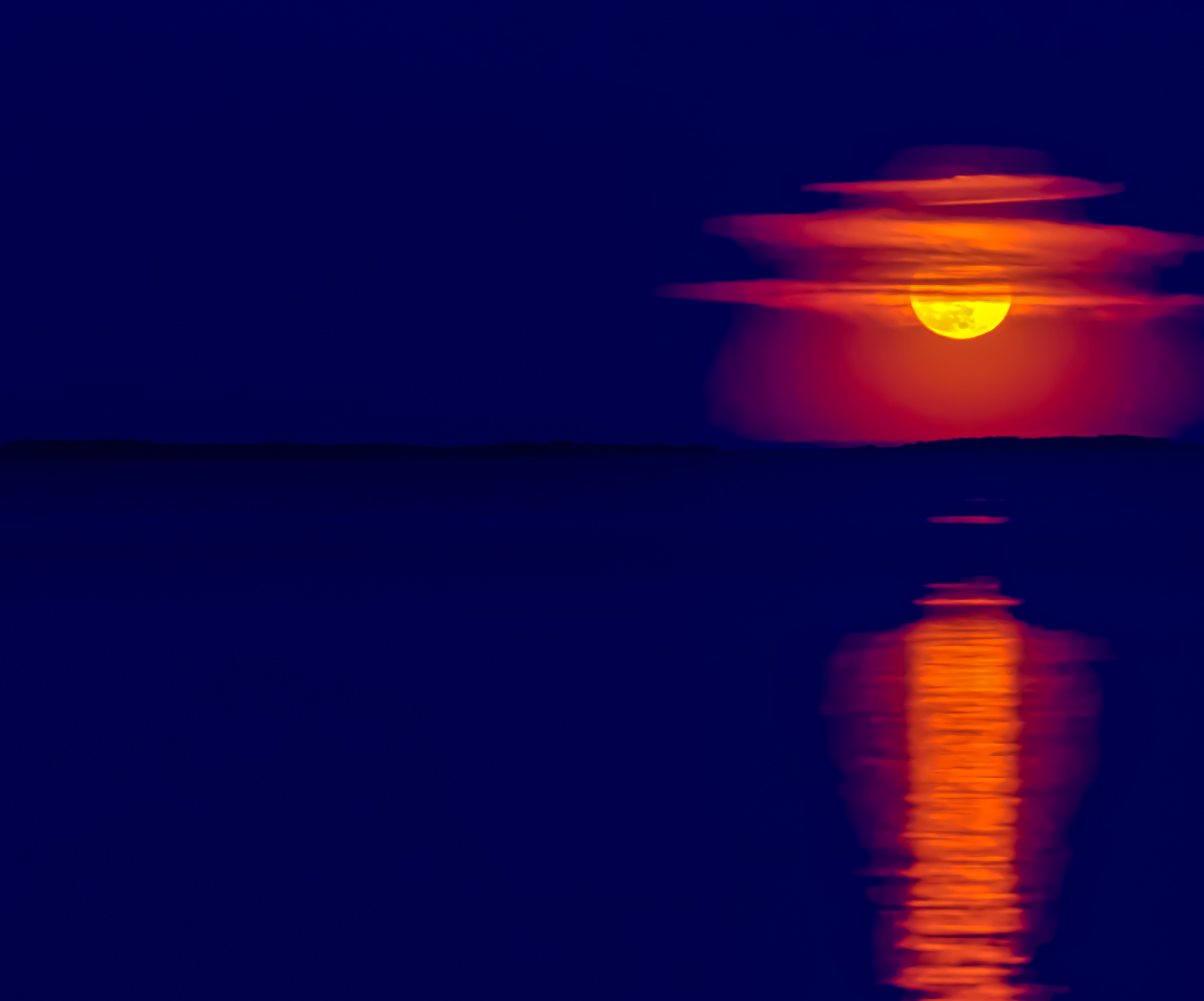
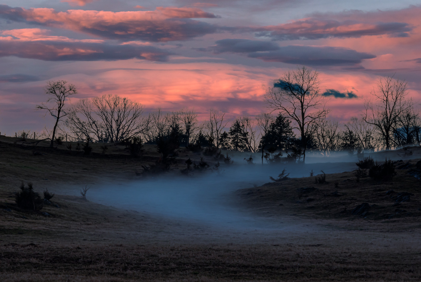
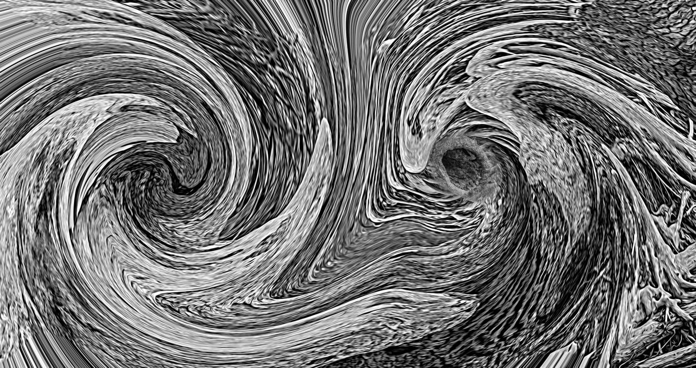
Hi LuAnn. I like your idea of the ethereal style but feel it could of pushed the contrast a little more while masking the fisherman. |
May 12th |
4 comments - 2 replies for Group 62
|
| 80 |
May 23 |
Reply |
That's the size I have also. Great size to work with. |
May 24th |
| 80 |
May 23 |
Reply |
Thanks Nadia and Doug. That works for me. And yes, now I'm seeing those beautiful triangles. And here's hoping that Doug likes that top flower cropped. My life is still very hectic and some of the obvious things just escape my mind.
|
May 24th |
| 80 |
May 23 |
Reply |
Thanks Doug. Does this improve the image? |
May 22nd |
| 80 |
May 23 |
Reply |
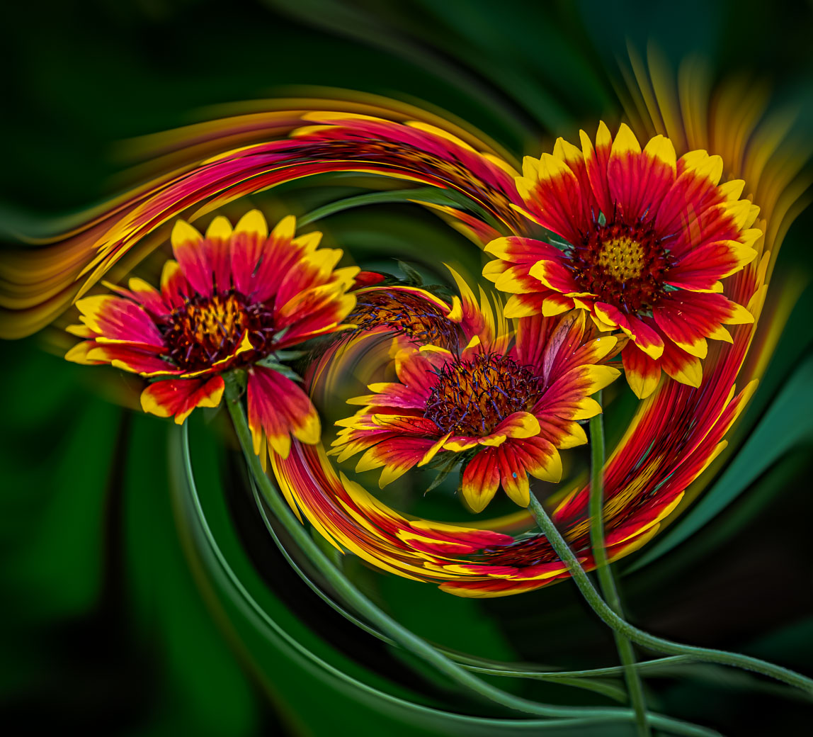
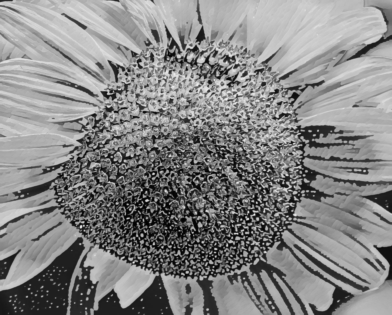
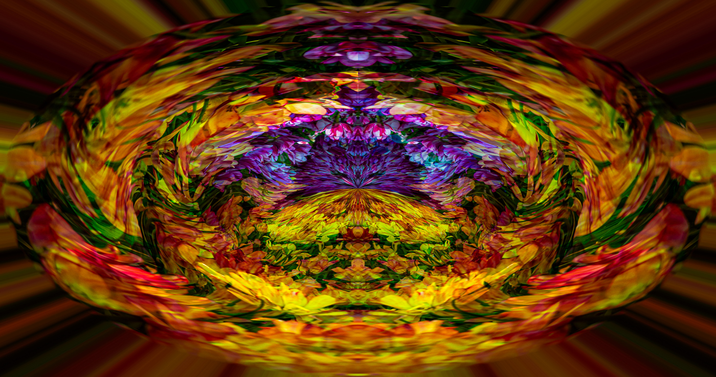
Thanks for your ideas Nadia and Doug. I couldn't change much with the original as that Topaz filter was using light blending and color tuning but since only yellow and green in the image. I did use the Remix filter and your cropping suggestion and flipped it. I think it is more conventional and more likely to get booted because the yellow gold and non dark center is too close to the natural way but let me know what you all think about this. |
May 20th |
 |
| 80 |
May 23 |
Reply |
Thanks Rich |
May 20th |
| 80 |
May 23 |
Comment |
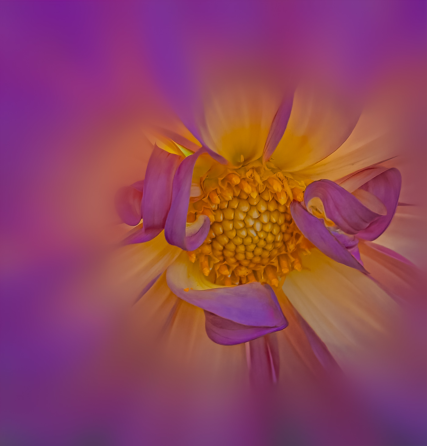
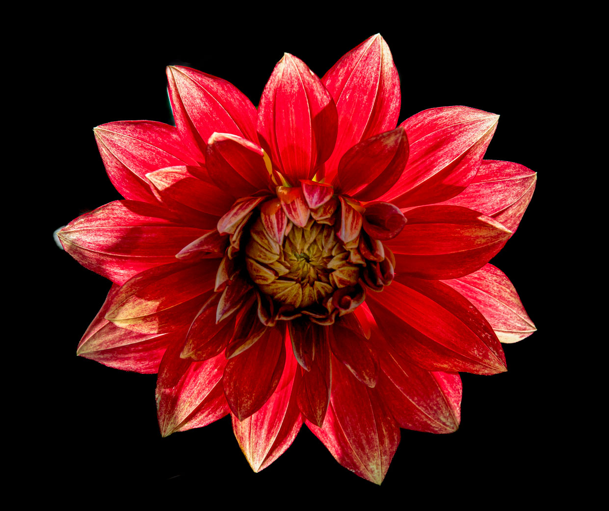
Doug, yes, a beautiful job of capturing all of this detail. Like Rich, you should bring down the highlights of that lower left white pedal. |
May 18th |
| 80 |
May 23 |
Comment |
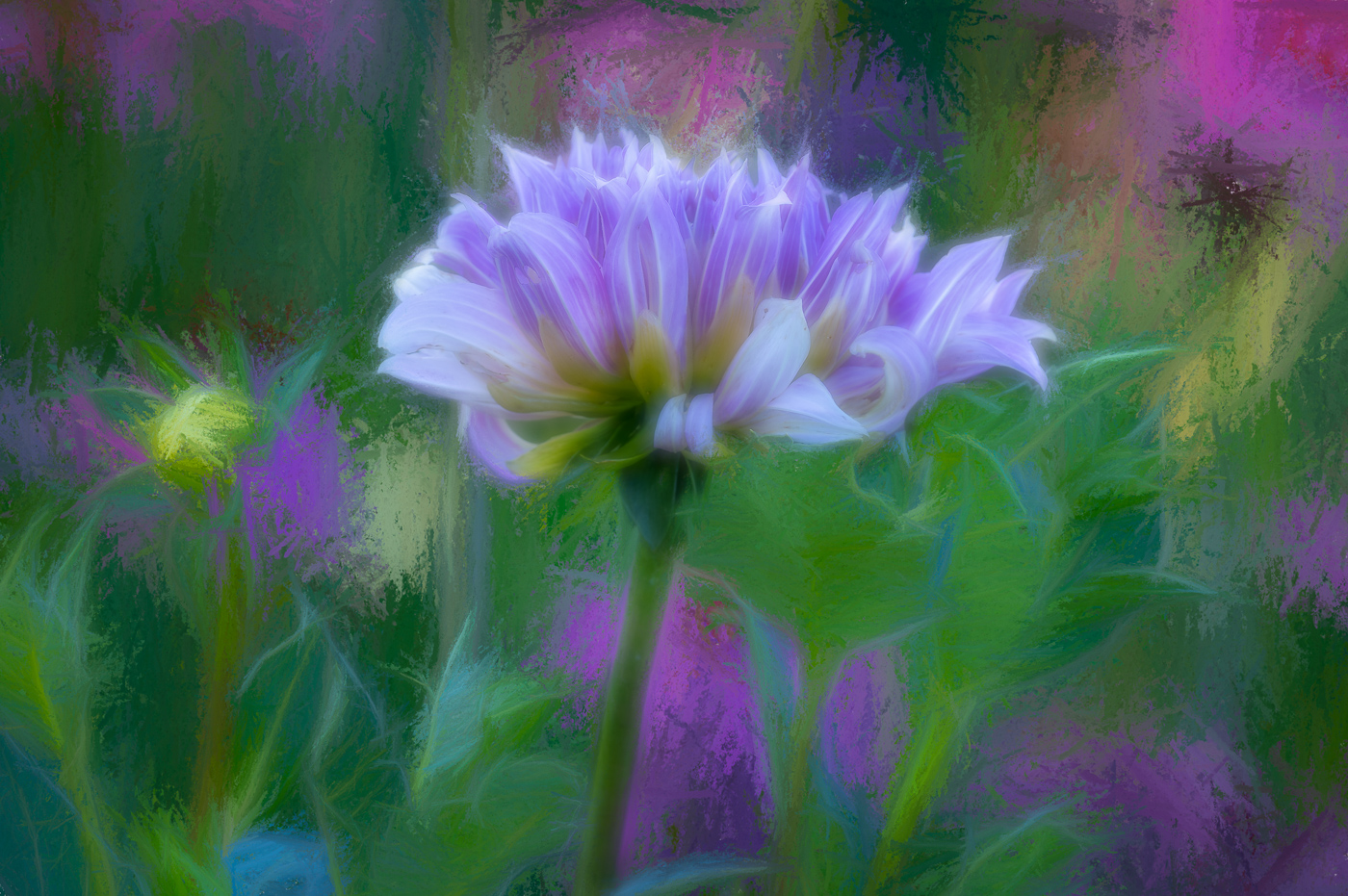
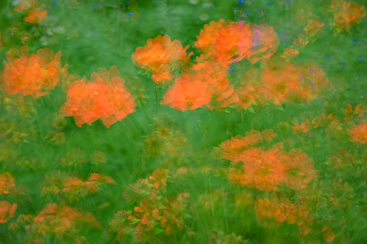
Rich, Wow what a beautiful image. It's taking a light pad (board) image and really making it pop. I think it is the multiple images and getting perfect focus and fantastic translucency that makes it work. I'm going to give that a try someday. The idea of the tall one getting chopped is perfect. Did you lay down the tulips on the board or prop up the board so the tulips were standing in front of the board?
|
May 17th |
| 80 |
May 23 |
Comment |
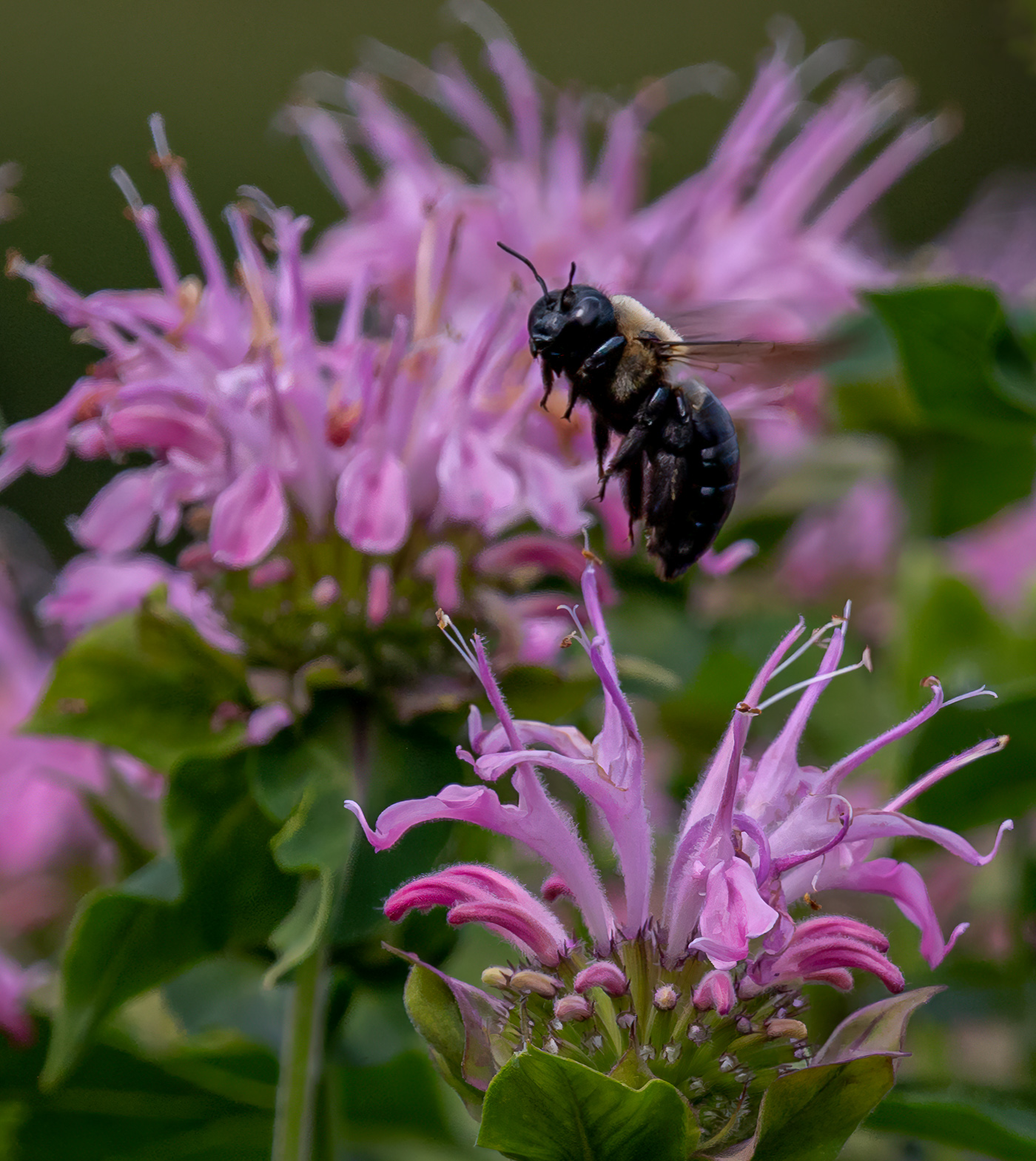
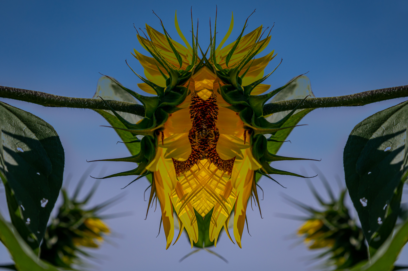
Kamal, you are doing great with noticing the background and removing the distractions. This is well done, sharp and set at a pleasing angle. I don't have a problem with the darker leaves in the lower right. |
May 17th |
| 80 |
May 23 |
Comment |
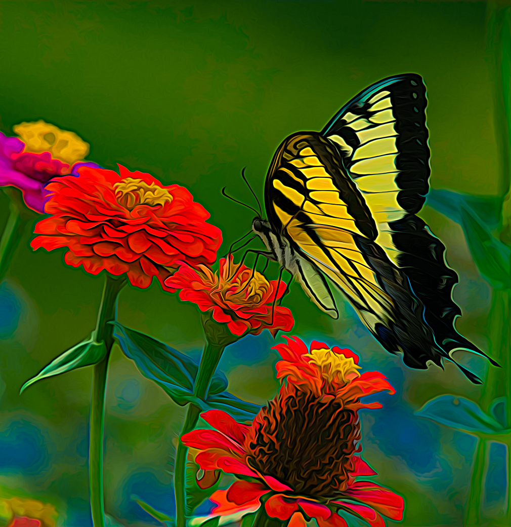
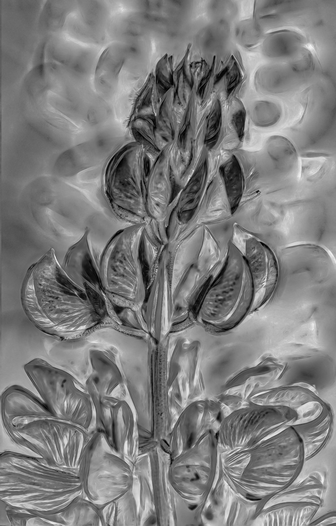
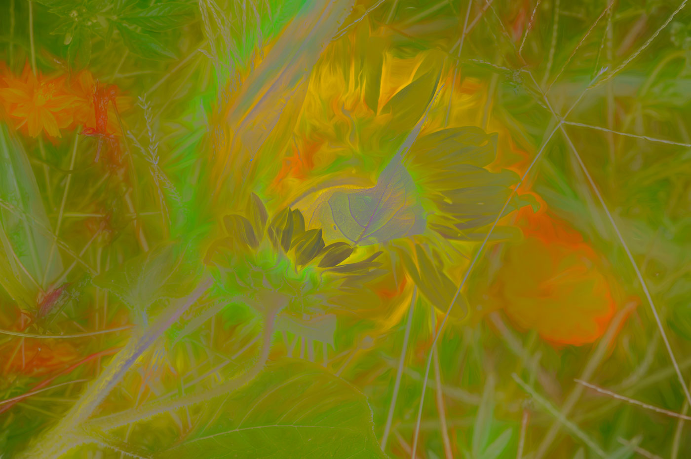
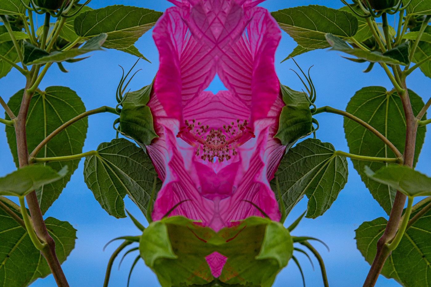
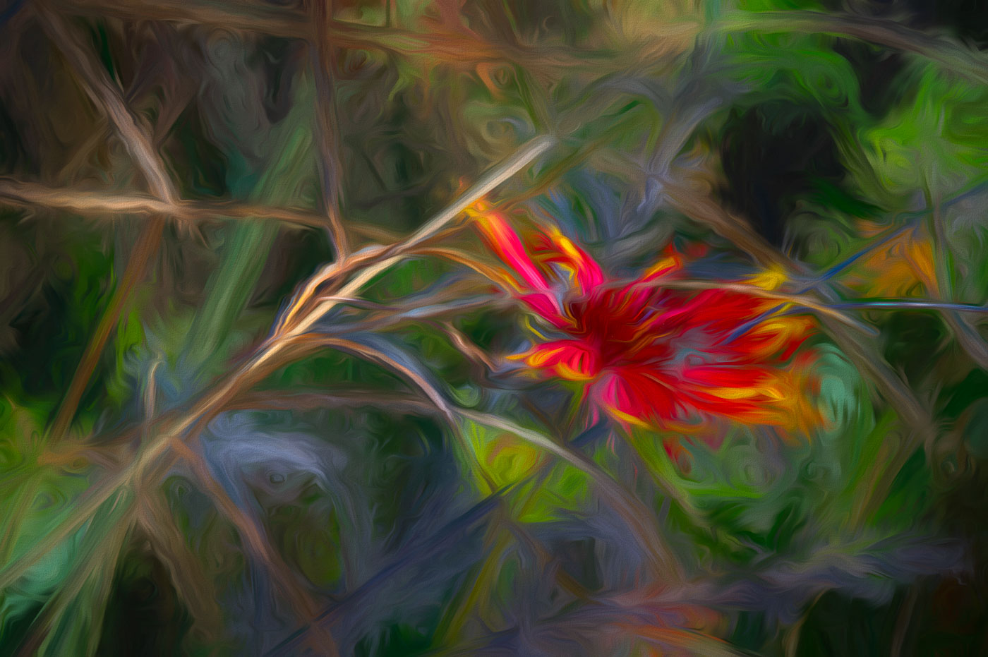
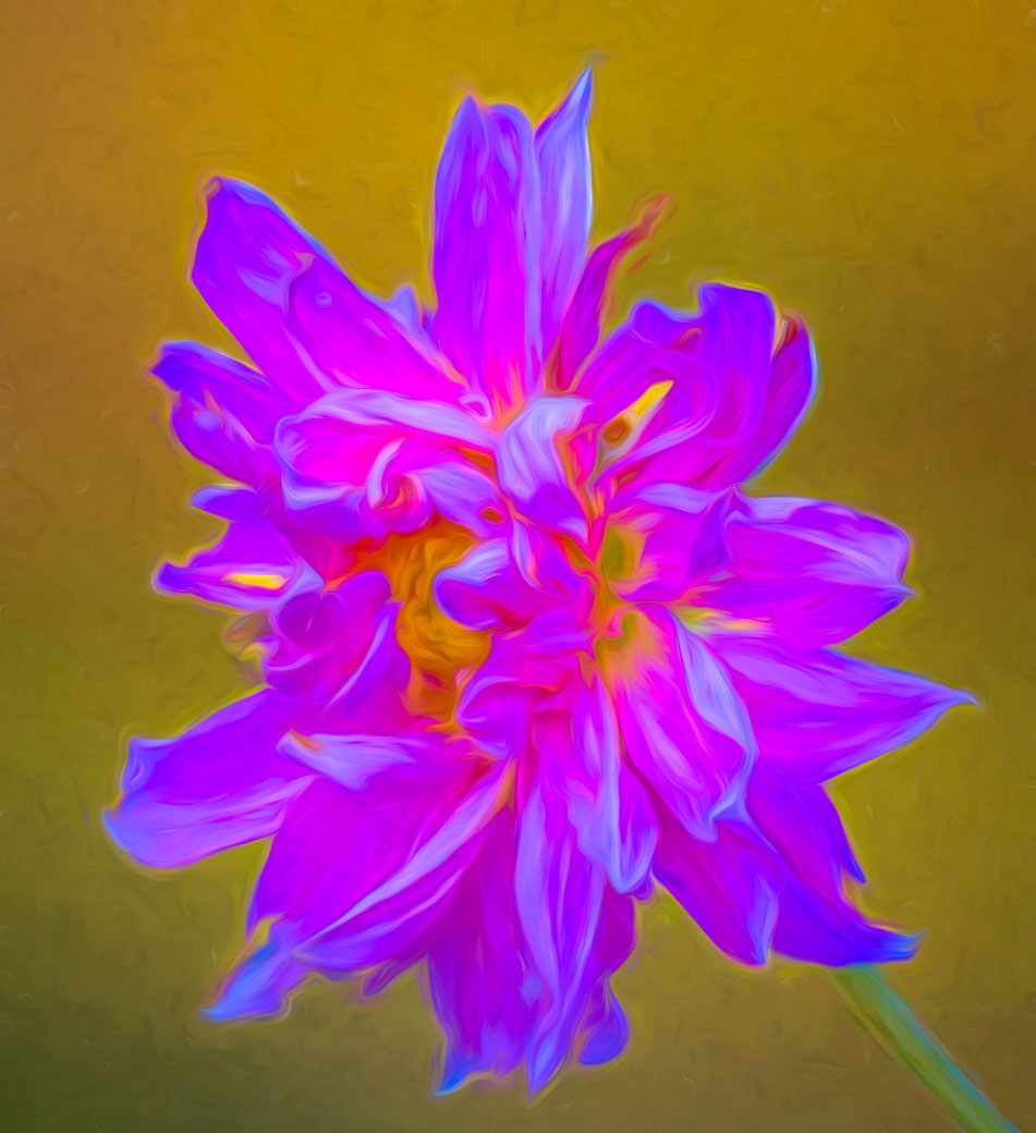
Thanks Kathryn for your comments. I agree with the mono-tonal comment and that is what caused me to look for a solution for the original. Yes, I might use an impressionistic edit but nothing has hit me yet. I take some of these images and search for an edit that brings on a Wow. Perhaps this image has no redeeming qualities and it gets deleted. Any suggestions? |
May 17th |
| 80 |
May 23 |
Comment |
Jacob, I agree with Kathryn that you did a good job of dropping the background tones in your image. Try Lightroom or Ps selecting image or try selecting background (check to make sure the selection is complete) and drop the exposure. You will be amazed how this process helps your flower pop. |
May 16th |
| 80 |
May 23 |
Comment |
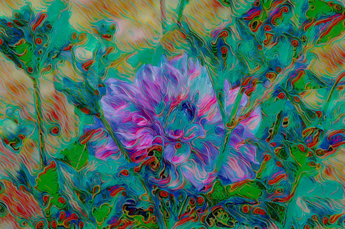
Kathryn, I like your creative editing. The background to the flower was distracting and your editing did very well to remove the distractions. Yes, the dripping colour was the right choice. |
May 15th |
| 80 |
May 23 |
Reply |
Thanks Kamal. I appreciate your comments and ideas. |
May 15th |
| 80 |
May 23 |
Reply |
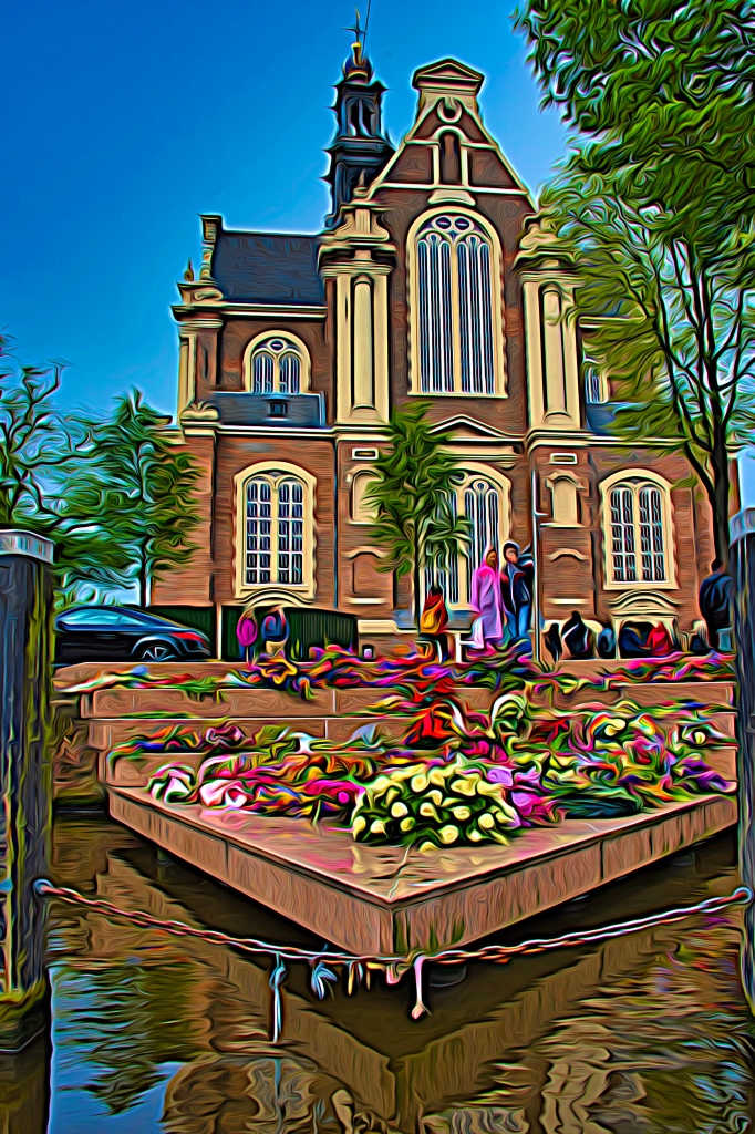
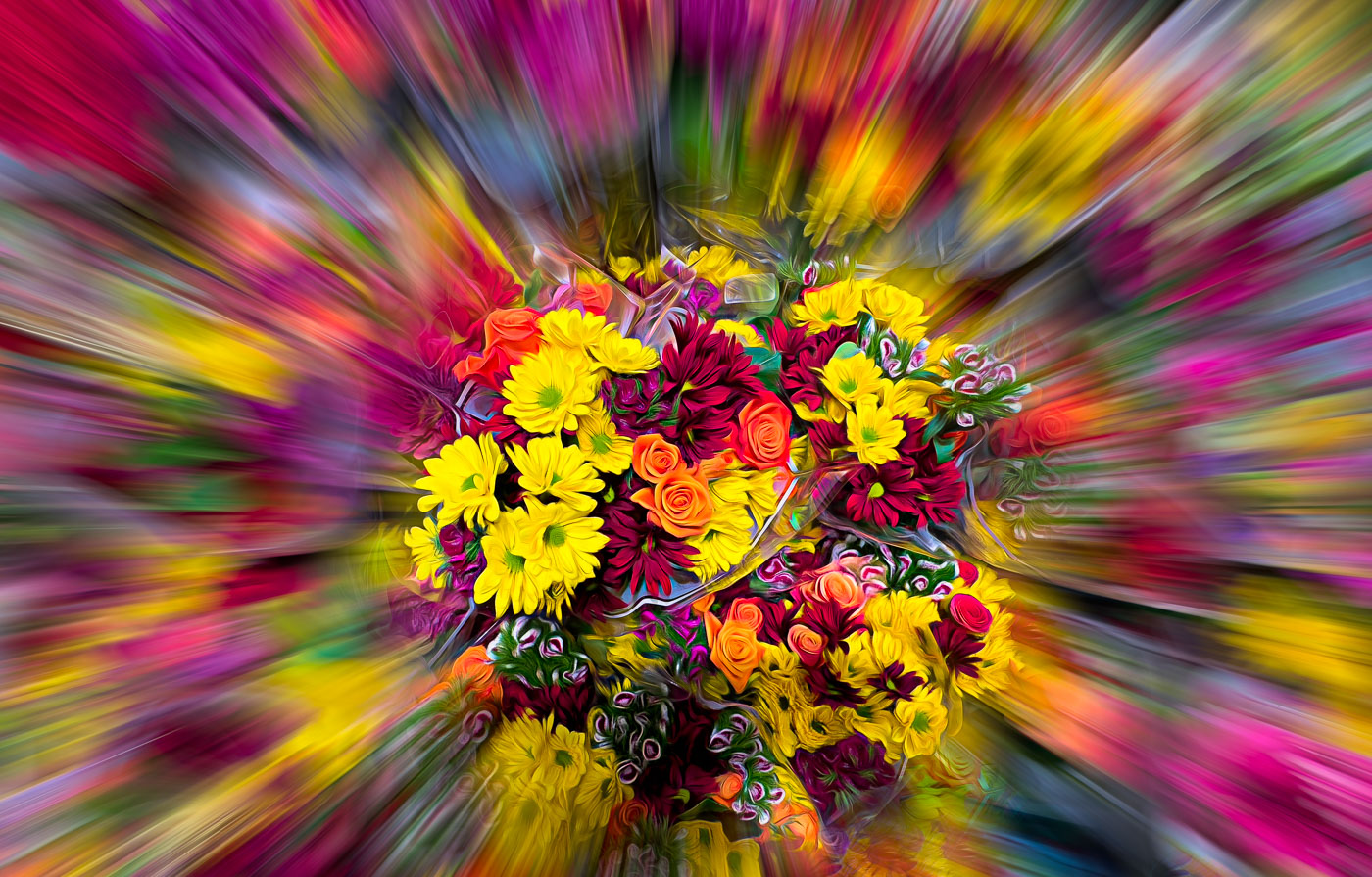
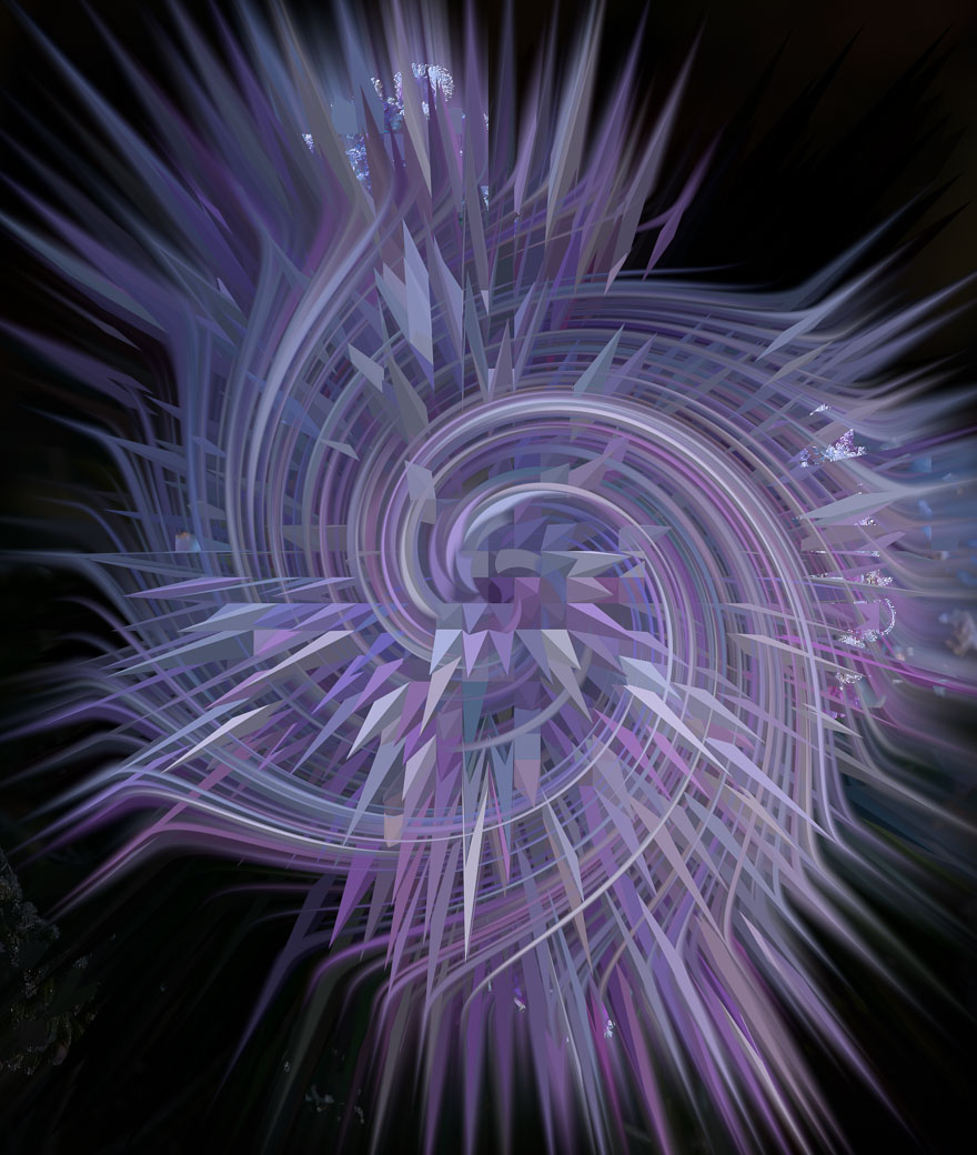
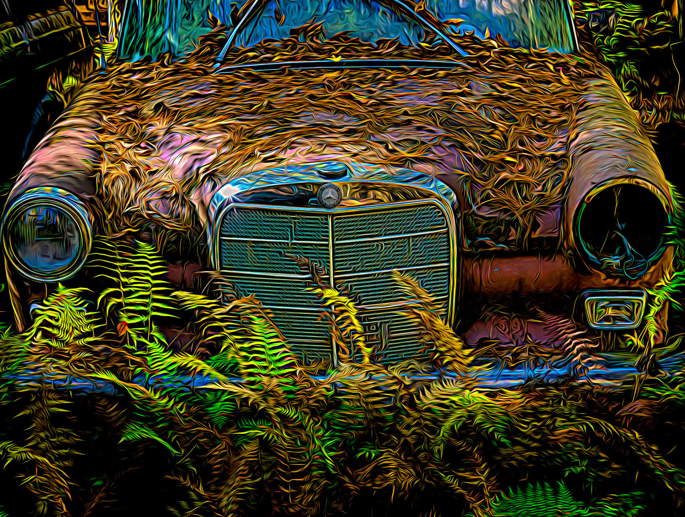
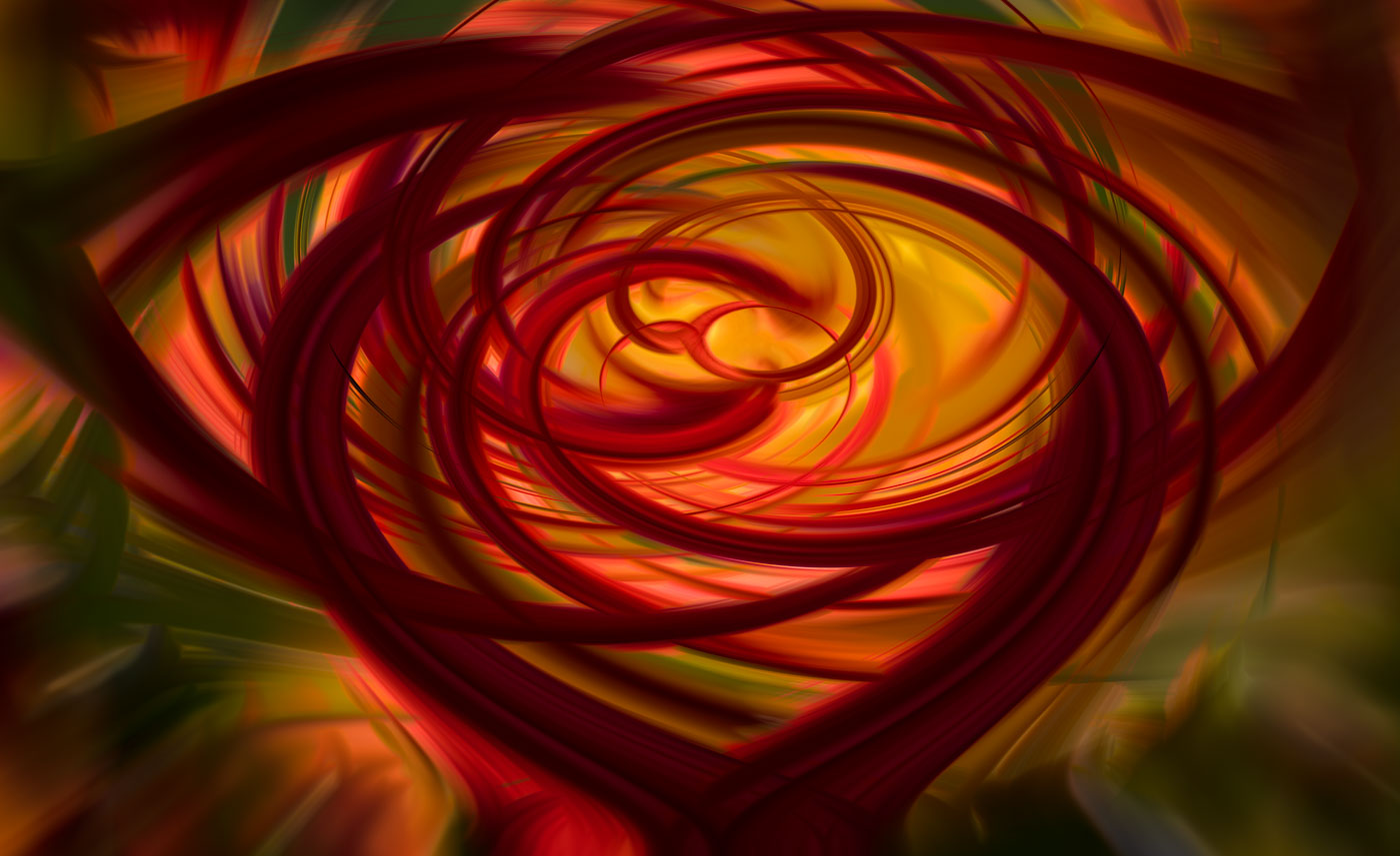
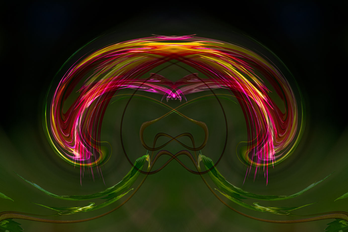
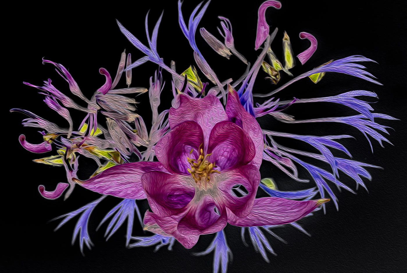
Thanks Jacob for your thoughts. Just an exercise in altered reality and textures to get folks thinking. |
May 15th |
| 80 |
May 23 |
Comment |
Thanks Rich |
May 10th |
| 80 |
May 23 |
Comment |
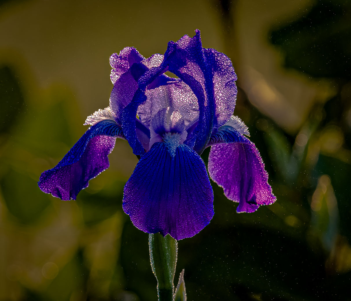
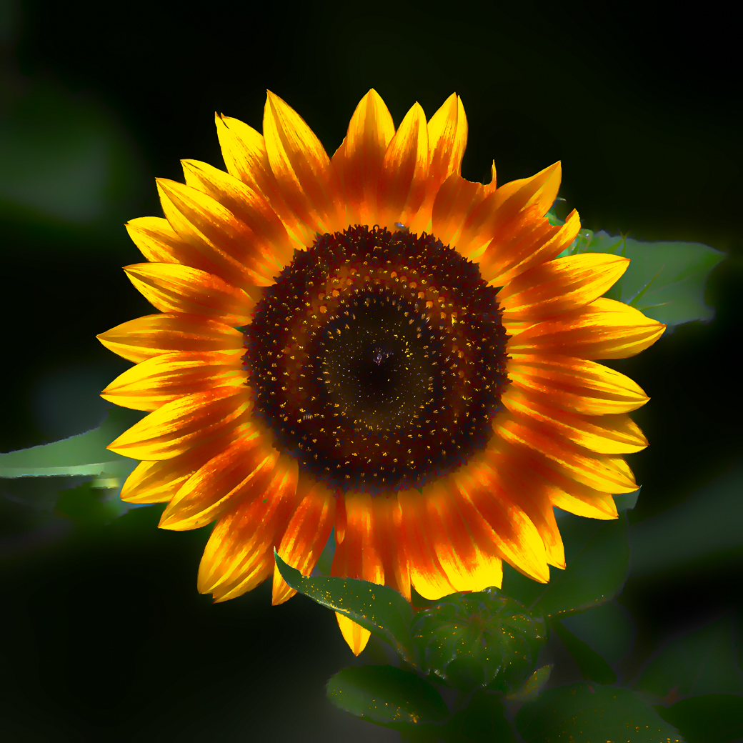
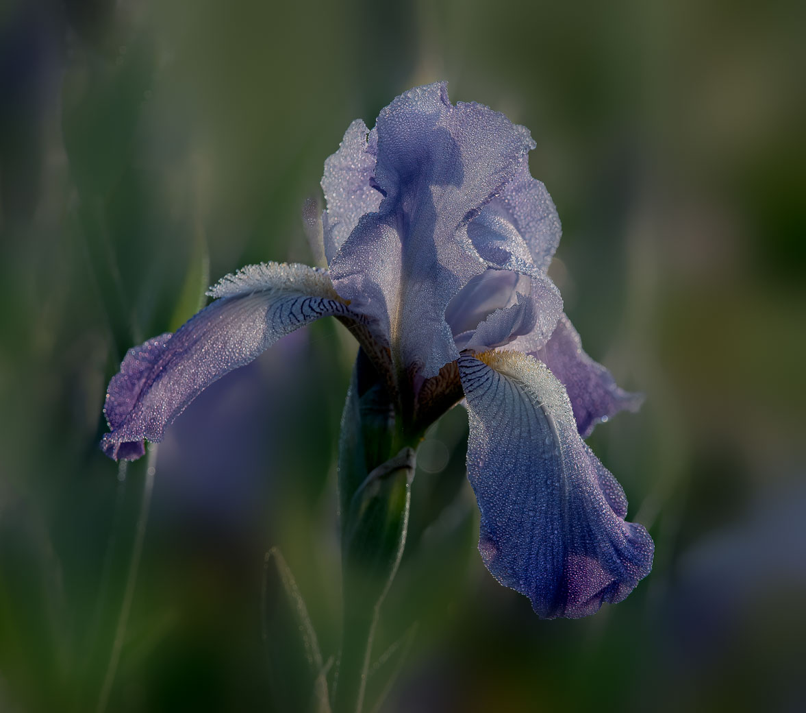
Nadia, this is beautiful, especially the lines and colors of the calla lily enhanced by the colors and textures of the background. No suggestions to improve. |
May 7th |
8 comments - 7 replies for Group 80
|
19 comments - 12 replies Total
|