|
| Group |
Round |
C/R |
Comment |
Date |
Image |
| 29 |
Feb 23 |
Comment |
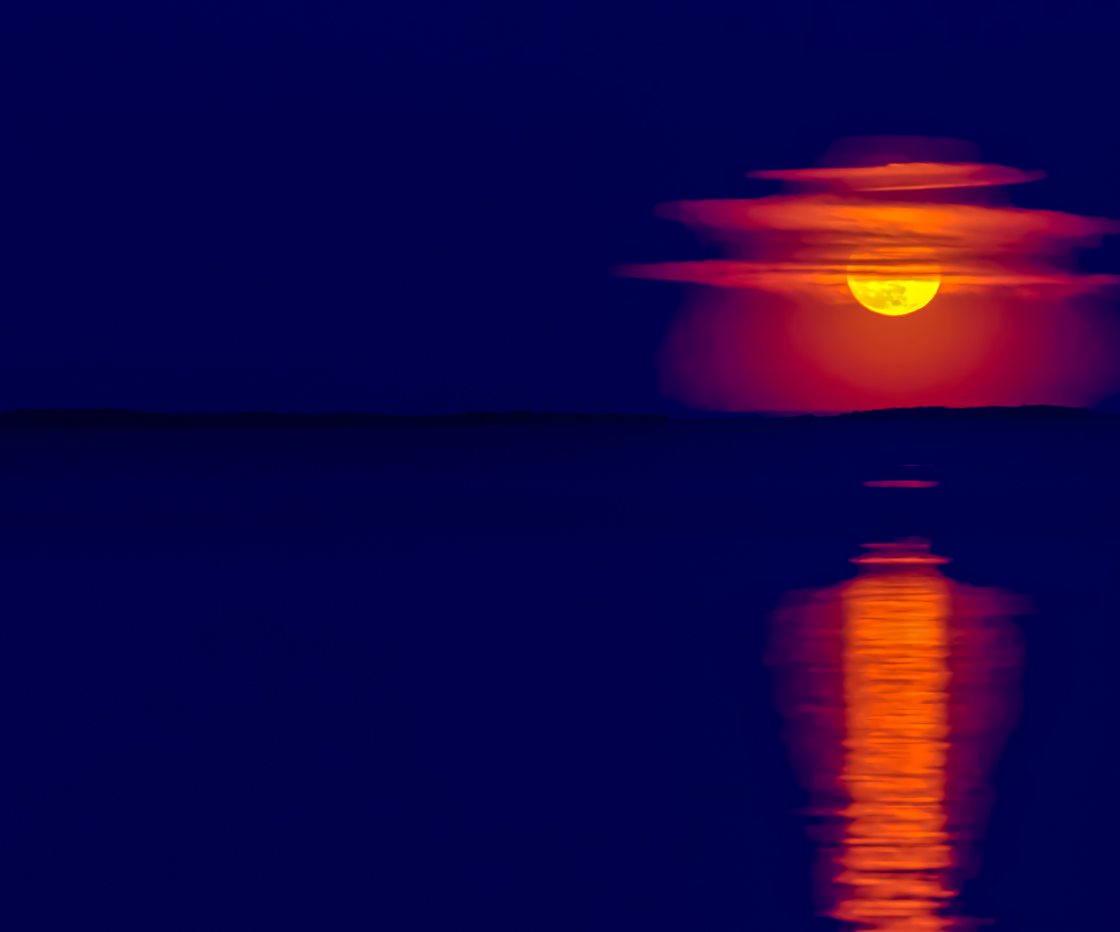
Hi Karen. a Great composition and lighting. I've never had a good result from that solarization filter. I'll try it again because you have a beautiful photo here. |
Feb 19th |
| 29 |
Feb 23 |
Comment |
Hi Ron. I like your subject and believe it can be easily cropped, square, to reflect its importance as the subject. The purple and white flowers in the background add only a distraction. |
Feb 19th |
| 29 |
Feb 23 |
Comment |
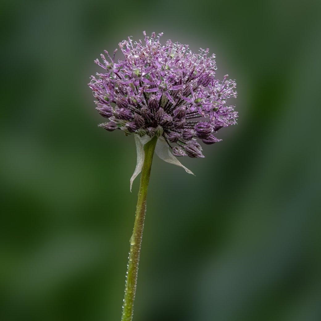
A super image Judy. Yes newer cell phones offer quite a bit of quality and depth of field like you have here. I would, however, move in closer to fill the frame with the center cactus balls. You probably can do much in post to give your image impact. |
Feb 19th |
| 29 |
Feb 23 |
Comment |
An excellent image Madeline. I like composition and everything is sharp. You are progressing quickly and I wouldn't change a thing. |
Feb 19th |
| 29 |
Feb 23 |
Comment |
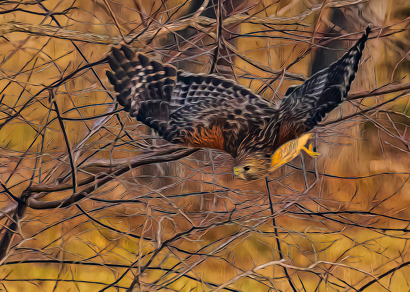
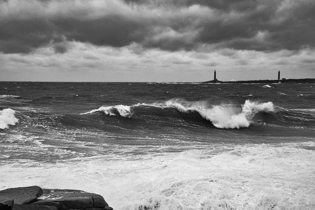
Very good Nature image Tim. Even though the caption might not say Rutting Season, you caught this guy at the peak of action letting everyone know he concerned. Super composition, sharp and background is not a problem. |
Feb 19th |
| 29 |
Feb 23 |
Comment |
Thanks Tim |
Feb 18th |
| 29 |
Feb 23 |
Reply |
Thanks Karen
|
Feb 18th |
| 29 |
Feb 23 |
Comment |
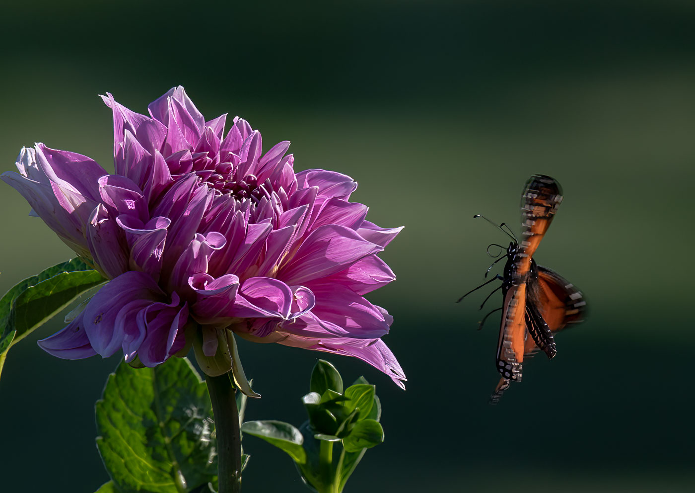
Hi Gunter, thanks for your feedback. I agree with both the bottom left and right edge suggestions. If I had only used content aware it would be easy. I like most of your changes to the original, except I think the yellow top on the far left flower is too bright and causes my eye to go there vs to the butterfly. |
Feb 17th |
| 29 |
Feb 23 |
Comment |
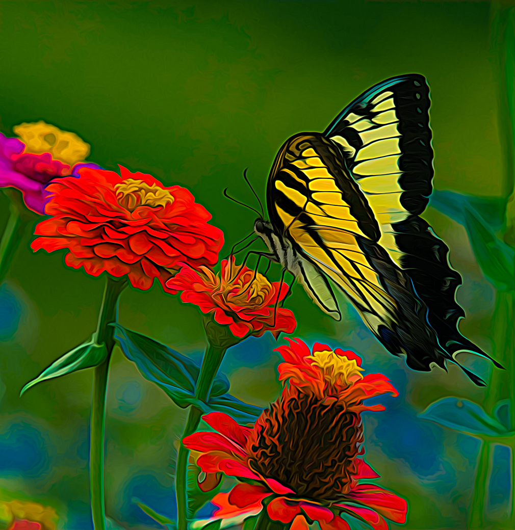
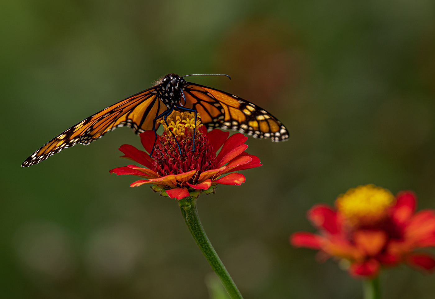
Well done Gunter. Right up my alley. I have to admit that I haven't tried compositing the two images like this. Don't be shocked if you see one someday. Will need to pull from archives as the snow and weekend temps are a deterrent. I really like the angles leading up to the upper right. No suggstions for improving. |
Feb 5th |
| 29 |
Feb 23 |
Comment |
Thanks Ron. Yes, I believe because we have had extra time on our hands, the quality of the Raw photos give us so many options and many of us have the urge to produce something beyond the ordinary great images. Everyone doesn't like this approach but they keep reinforcing that we shoot for ourselves and our PSA friends. |
Feb 5th |
9 comments - 1 reply for Group 29
|
| 62 |
Feb 23 |
Comment |
Thank you Israel. I had left that bottom leaf to direct the eye up and because it was going to take time I didn't have to remove, but yours looks perfectly fine. (Except for the bugs you left :-) ). Thanks Again for the suggestion. |
Feb 25th |
| 62 |
Feb 23 |
Comment |
Well done Israel. Sorry for being late to the DD. I'm not a mushroom fan at all, and rarely even take their image. I don't do much focus stacking, but have been moving the focus spot when hand holding and using Auto Align and Auto Blend and it does a great job. To me using a tripod close to ground level and then repositioning for every shot takes the fun out shooting something I have no interest in. Horrah for the sandwich. |
Feb 24th |
| 62 |
Feb 23 |
Comment |
Fantastic photos Bunny. I agree with shooting as you see it on such a trip. Can always do editing in post after the trip. I would be scared of losing the iPhone overboard. With fingertip neuropathy the phone is a tad too wobbly but they do the best job in most situations. Do you have a special method of attaching the phone to you? Your edited version does such a dramatic job of really making the iceberg jump off the page. Enjoy the months of editing and recalling the experiences. So fortunate. |
Feb 24th |
| 62 |
Feb 23 |
Reply |
A very nice image Mark. My preference is to favor the edits that don't go to black on the side walk and as they cut off the patron's feet. The detail is fantastic and your picture within the picture works really well. |
Feb 24th |
| 62 |
Feb 23 |
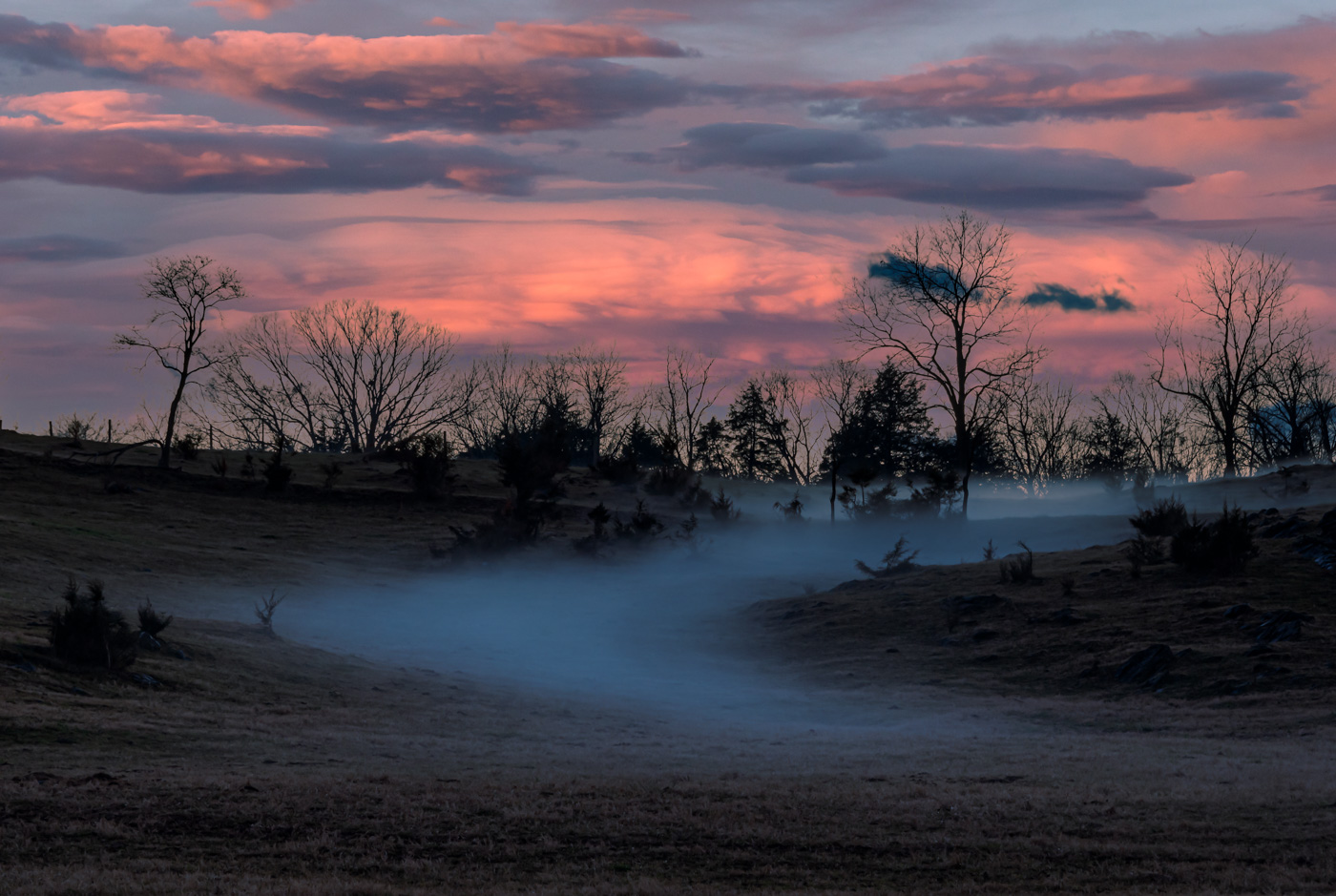
Comment |
Beautiful image with killer reflection, leading line on the left side and the tonality of this whispery clouds around the peaks are all fine qualities for an excellent image. And your edit darkening the sky is just perfect. Great job and you were most fortunate that you caught this image. |
Feb 24th |
| 62 |
Feb 23 |
Comment |
Hi LuAnn. Sorry for being late to the DD. I like Gibbon as you edited it. Nice and sharp, and well composed. Background is not distracting and a great job of making sure his arm does not merge with the stub limb. |
Feb 24th |
| 62 |
Feb 23 |
Reply |
Great Edit Emil. I do like your blacks on bud better than my own. |
Feb 6th |
| 62 |
Feb 23 |
Reply |
Thanks Emil |
Feb 6th |
| 62 |
Feb 23 |
Reply |
No, by the time I scroll to the top of the page I would not of remembered what your edit looked like. I'm sure you had a good reason like saving 'K" memory or mine was out of proportion or ? |
Feb 4th |
| 62 |
Feb 23 |
Comment |
Yes Pete, you are a great people photographer and this little sweetie will be forever thankful that such a great photo was taken. No suggestions for improving.
* All DD62 Pete has another great people photo in the "Member Showcase" for this month. |
Feb 4th |
| 62 |
Feb 23 |
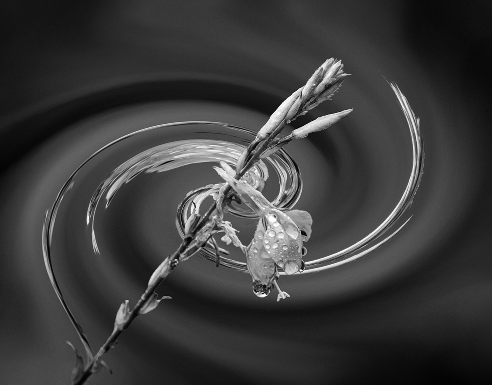
Reply |
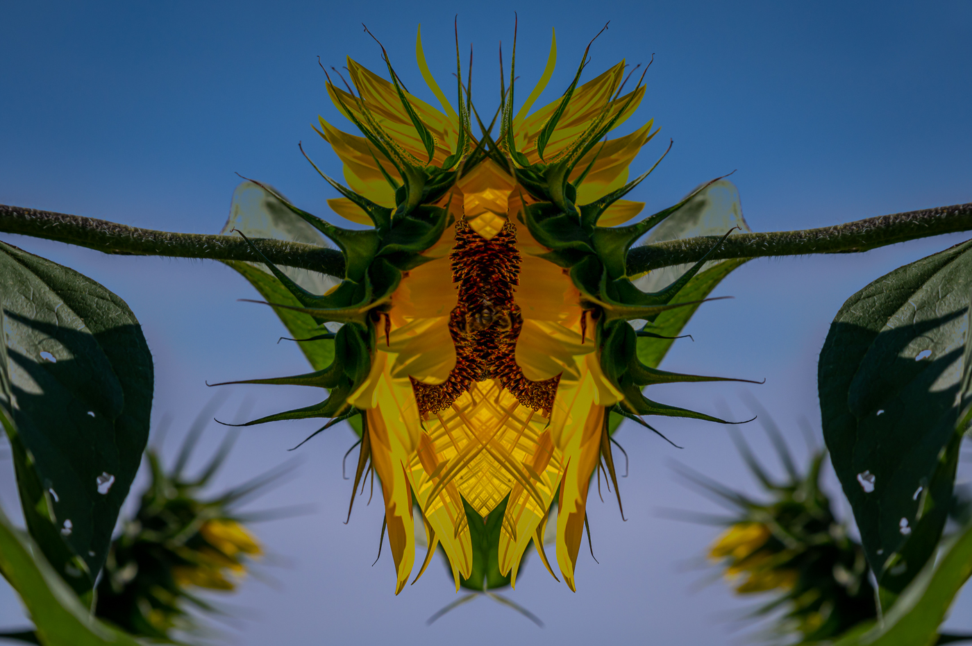
Great job Pete. Looks like a monotone to me. Can you imagine LuAnn edited my sunflower on the very first comment? No sensitivity for getting my flower during the Extreme Vortex that was happening yesterday and today. With the feel like temp at -40 it was crazy. |
Feb 4th |
| 62 |
Feb 23 |
Reply |
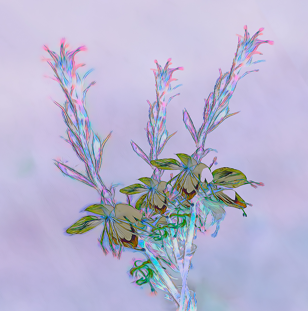
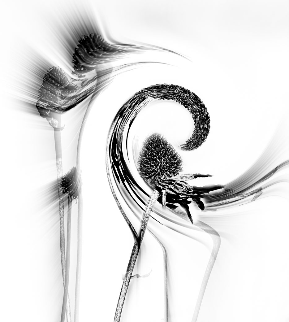
Yes, LuAnn it is perfectly fine for all to use their corrective talents and touches. However, you failed to fall the B&W or Mono rules. You have more than 1 color. You know how I'm the one to never break the rules. I do approve of the white squiggles and your breaking the rules for this image. |
Feb 4th |
6 comments - 6 replies for Group 62
|
| 80 |
Feb 23 |
Comment |
The DD80 group is doing a great job of sharing and everyone can learn from these discussions.
Thank you
Bob |
Feb 23rd |
| 80 |
Feb 23 |
Comment |
The DD80 group is doing a great job of sharing and everyone can learn from these discussions.
Thank you
Bob |
Feb 23rd |
| 80 |
Feb 23 |
Comment |
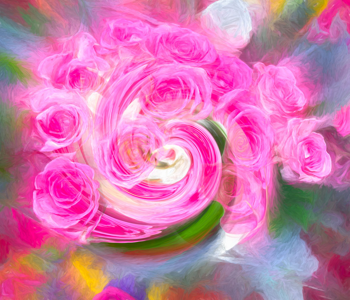
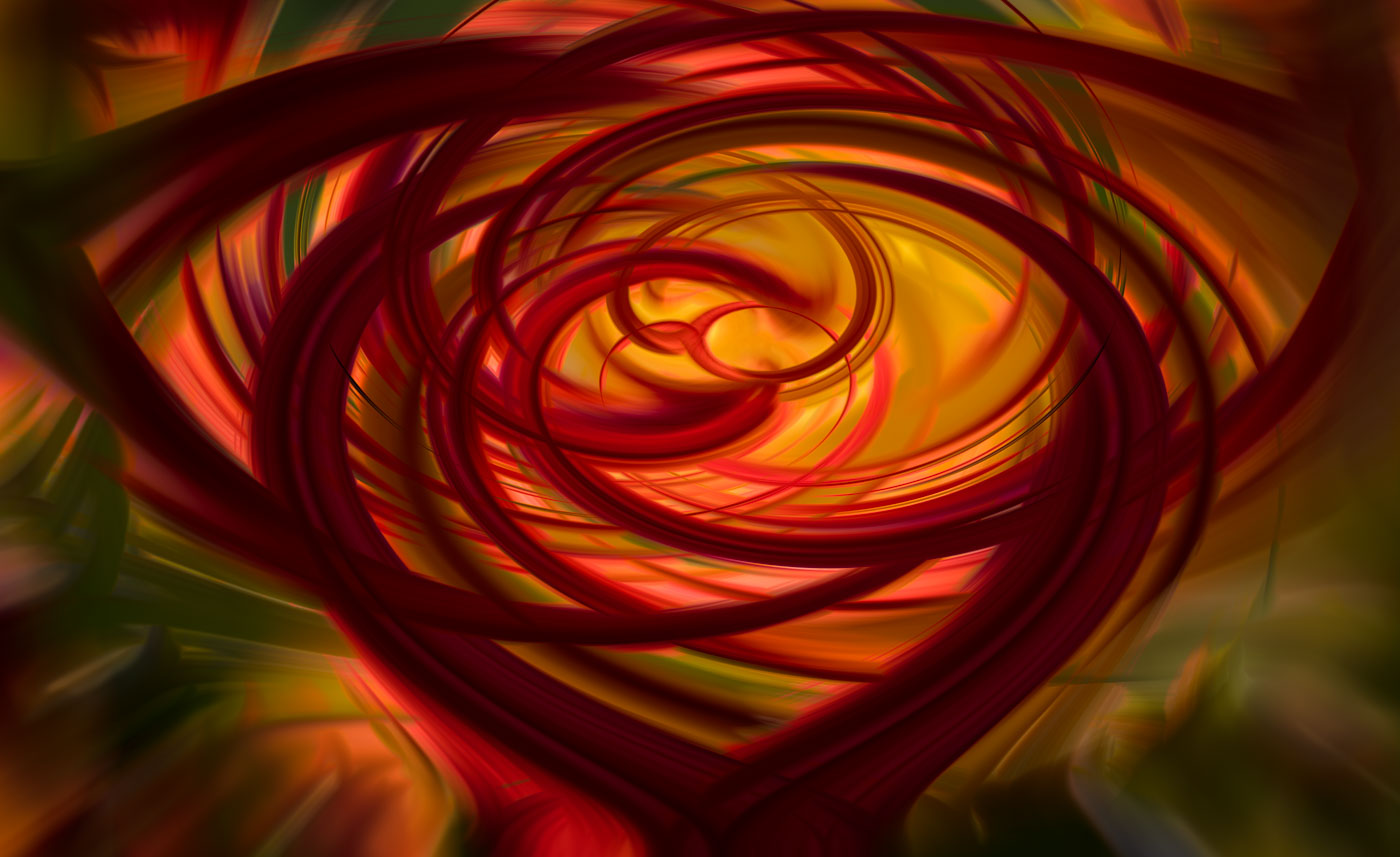
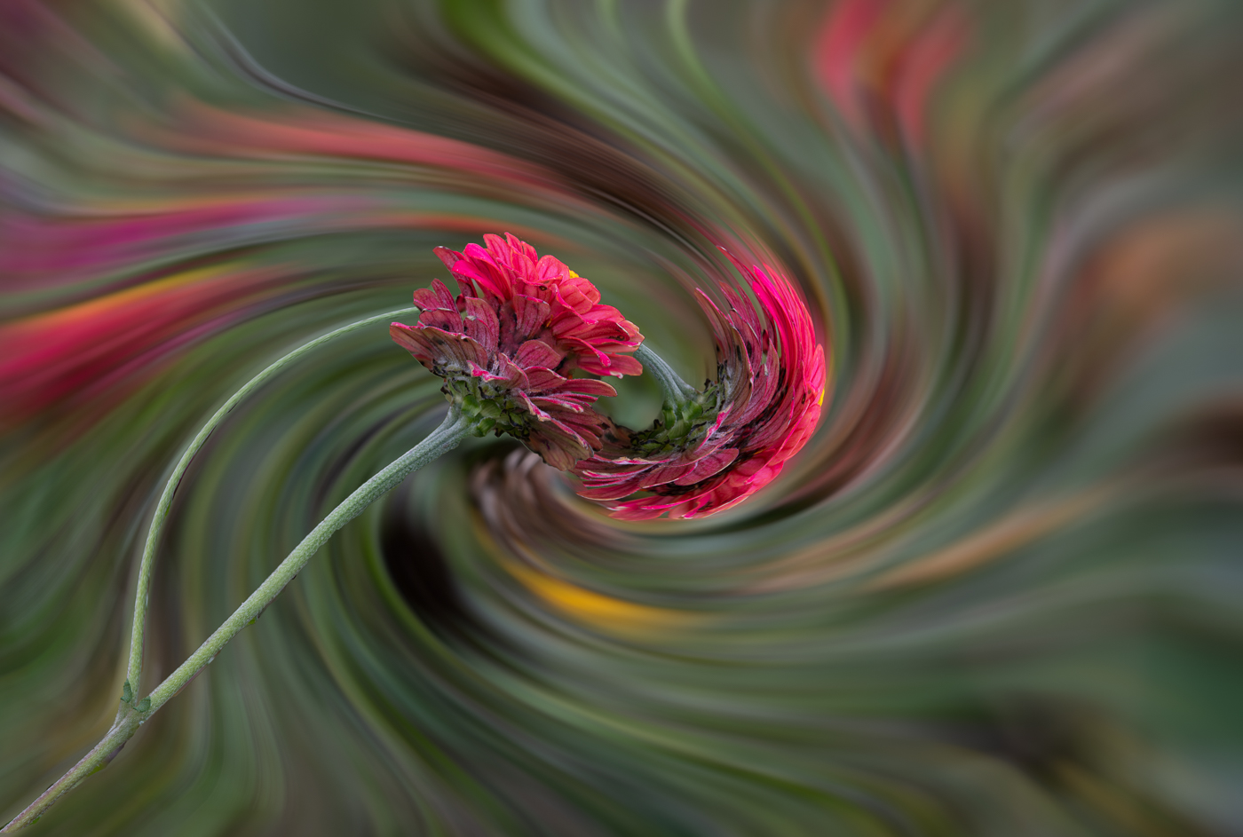
Kathryn, this Red is much more into my color preferences. Thanks for explaining and providing the newer versions. I think it still has a translucent quality with the muted details behind. I prefer the main image over the goldfish version above. Cheers to your success. |
Feb 18th |
| 80 |
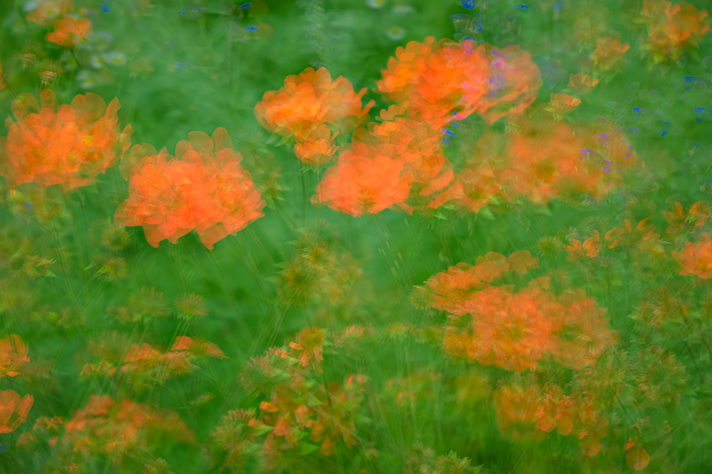
Feb 23 |
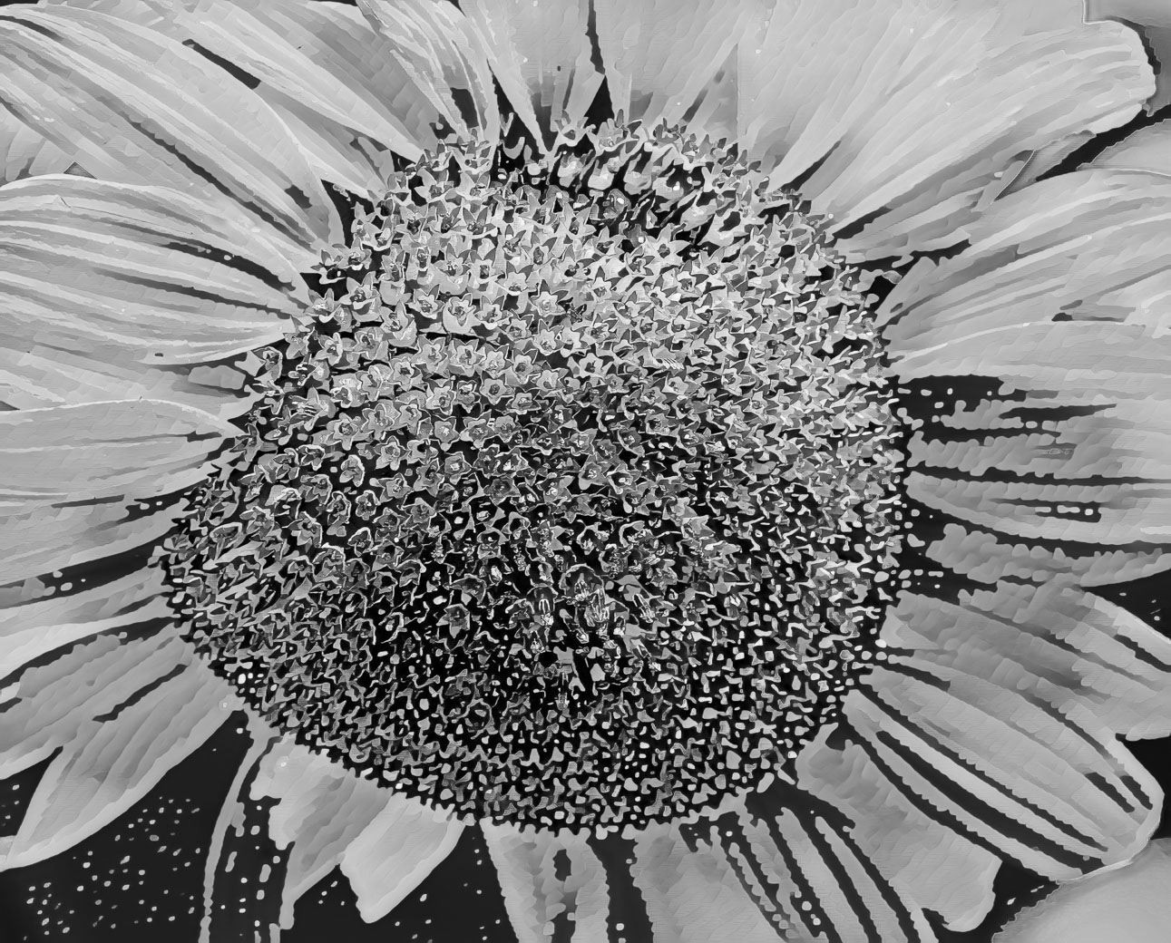
Comment |
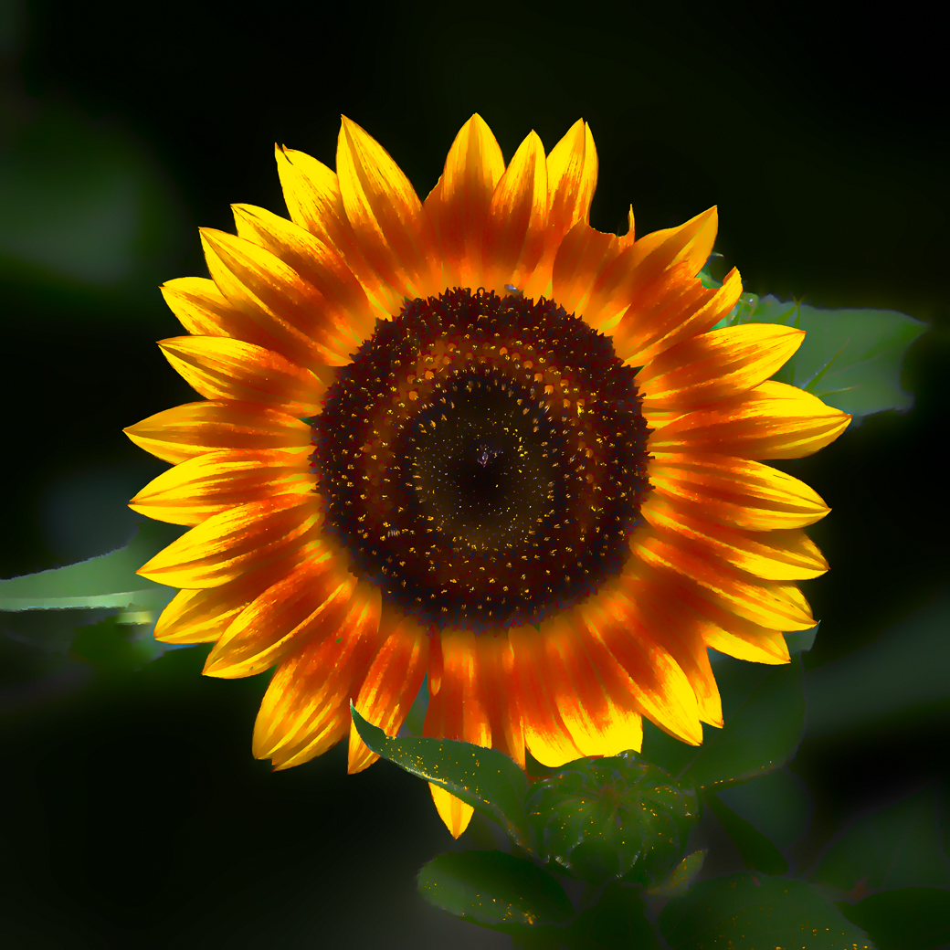
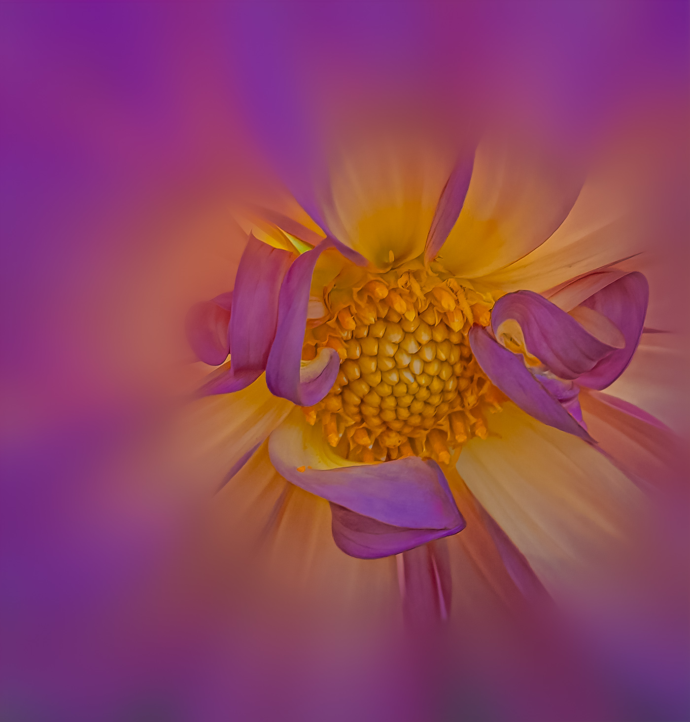
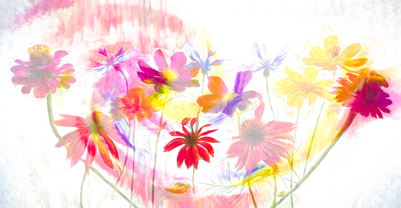
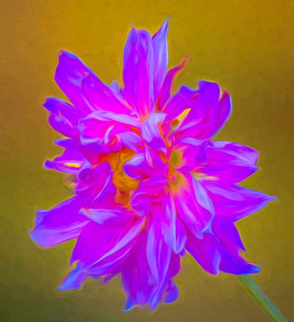
Rich, I Love your edits of the sunflower, especially the crisp details of the petals and the quarter section of the center. No suggestions. Keep up the great work. |
Feb 17th |
| 80 |
Feb 23 |
Comment |
Nice job Doug. I agree with Kathryn about cropping out the green stem on the bottom. Very nice job to keep the outer curves sharp and keep the background soft. That background is generally lacking color and sharpness so you handled it well. |
Feb 17th |
| 80 |
Feb 23 |
Comment |
What a beautiful image Nadia and the digital border is perfect. Perfect composition and sharp at the flower center. Well done with no suggestions to improve. |
Feb 17th |
| 80 |
Feb 23 |
Reply |
Great job Doug. |
Feb 17th |
| 80 |
Feb 23 |
Reply |
Thank you Kamal. Glad you are getting ideas from everyone on our group. |
Feb 17th |
| 80 |
Feb 23 |
Reply |
Thanks Jacob. |
Feb 17th |
| 80 |
Feb 23 |
Reply |
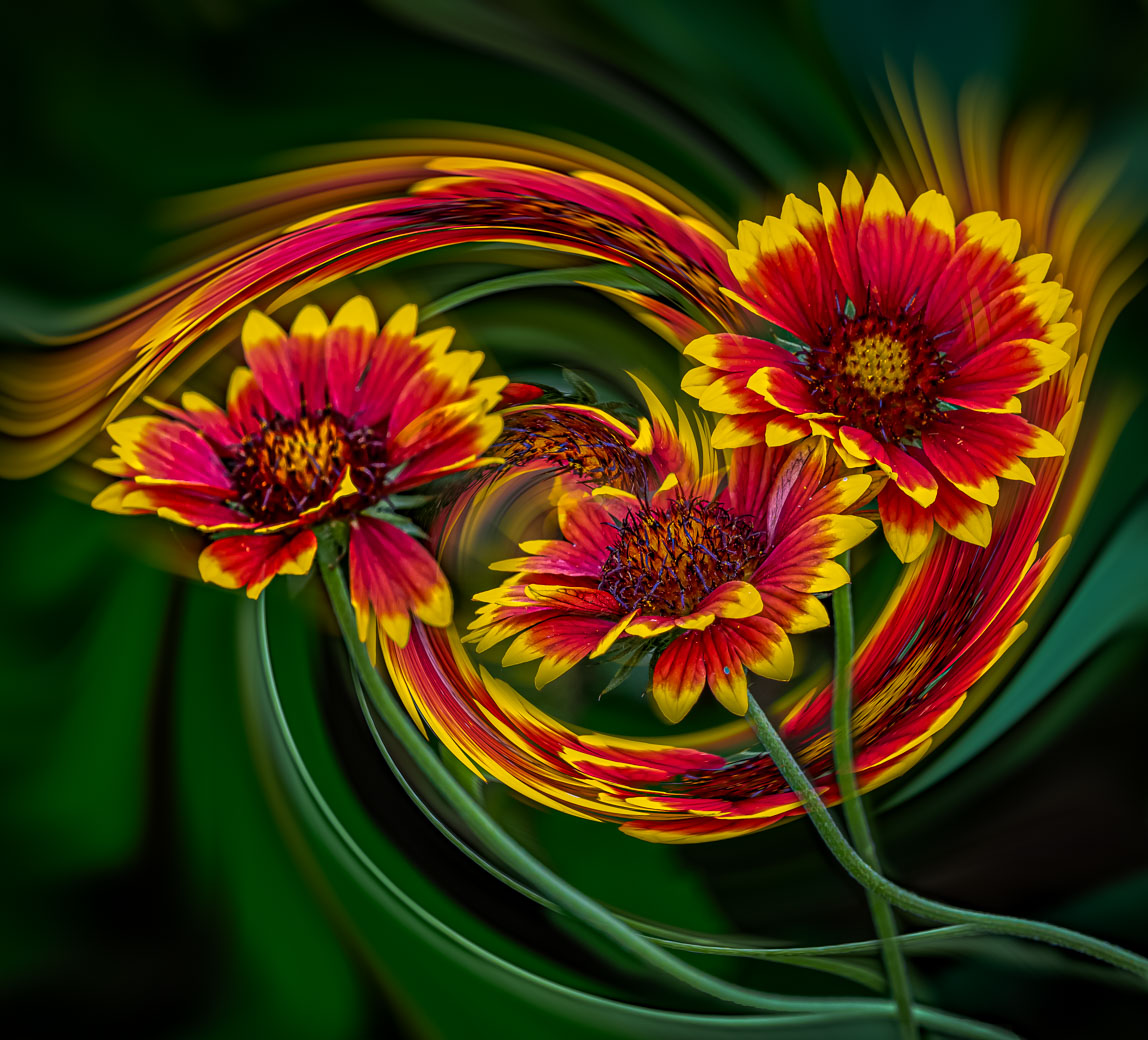
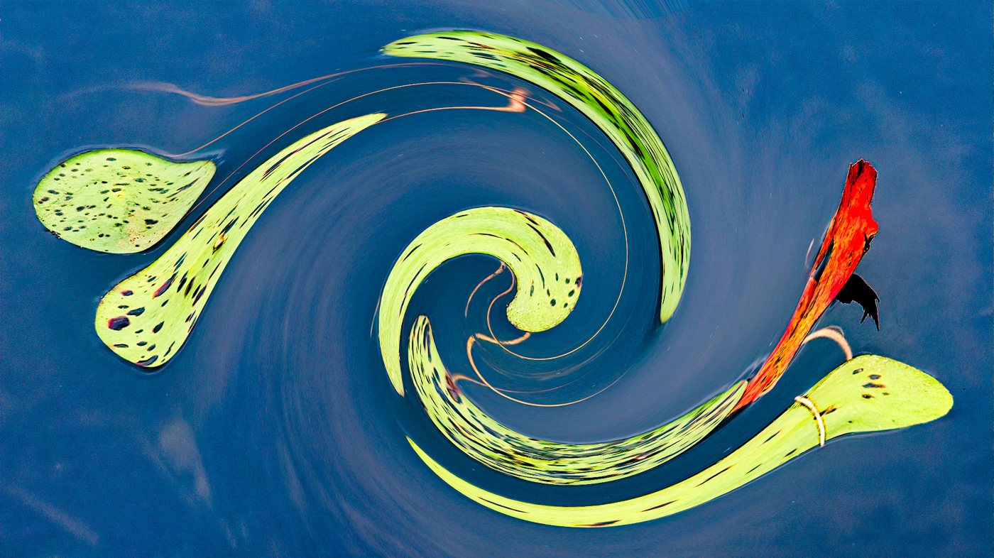
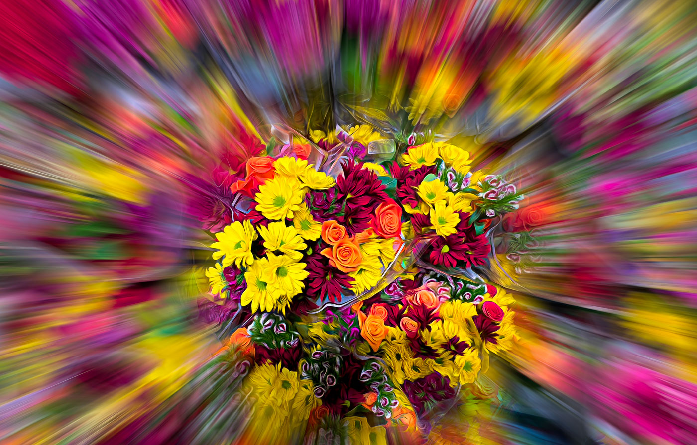
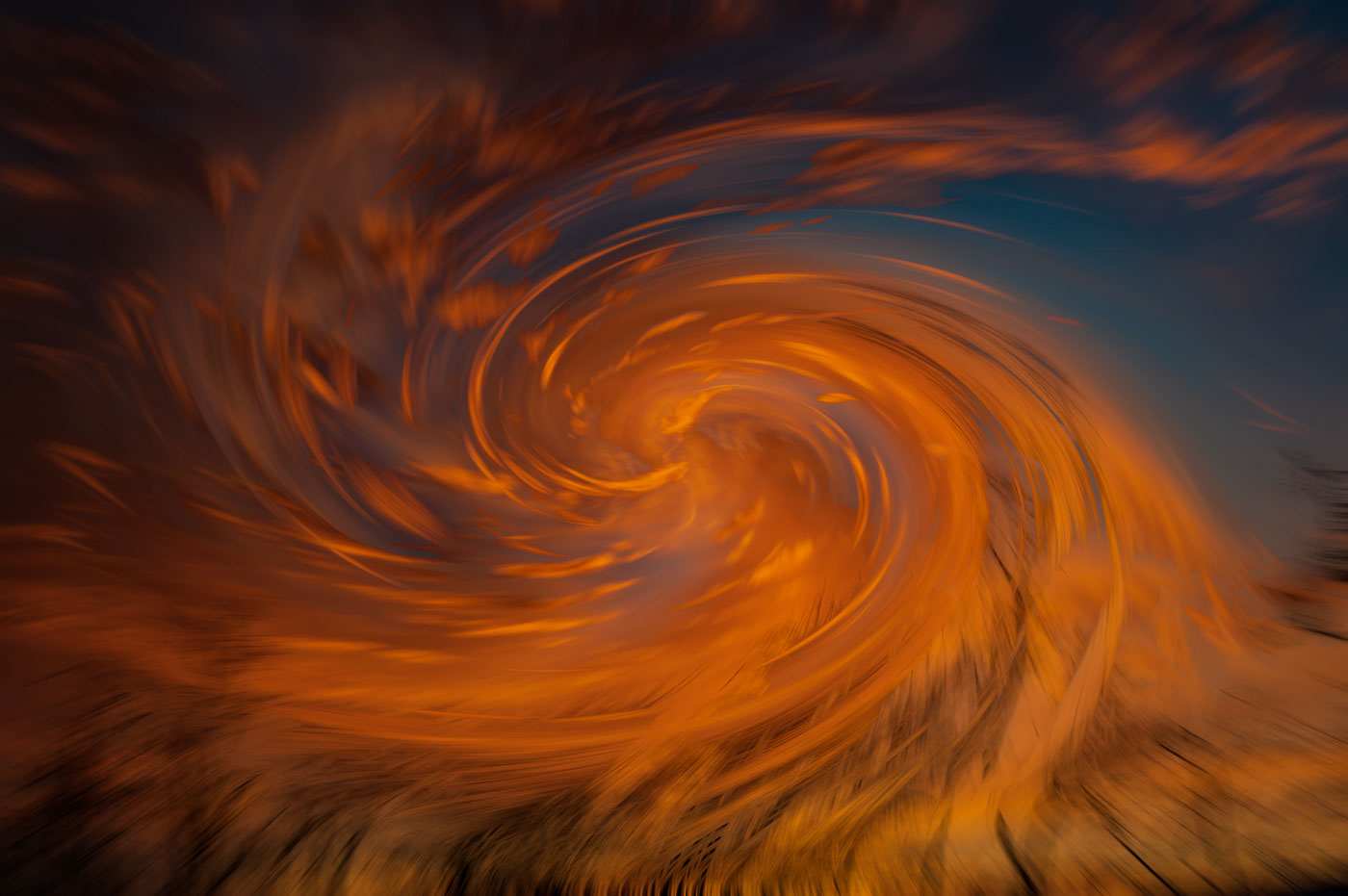
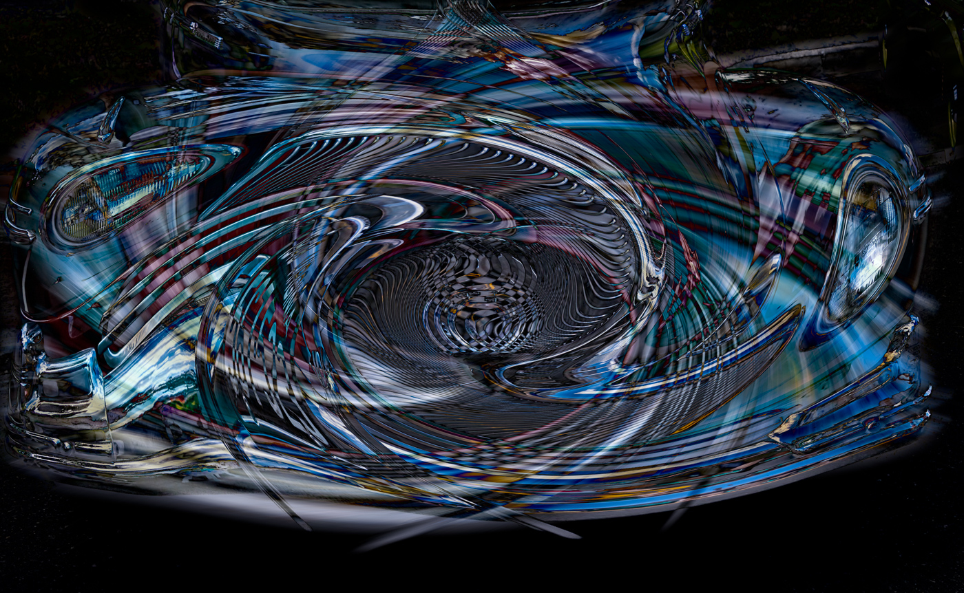
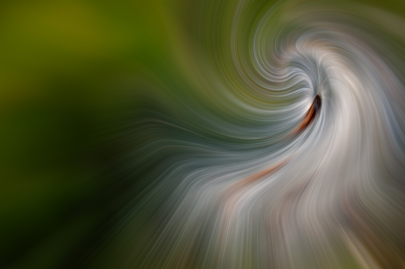
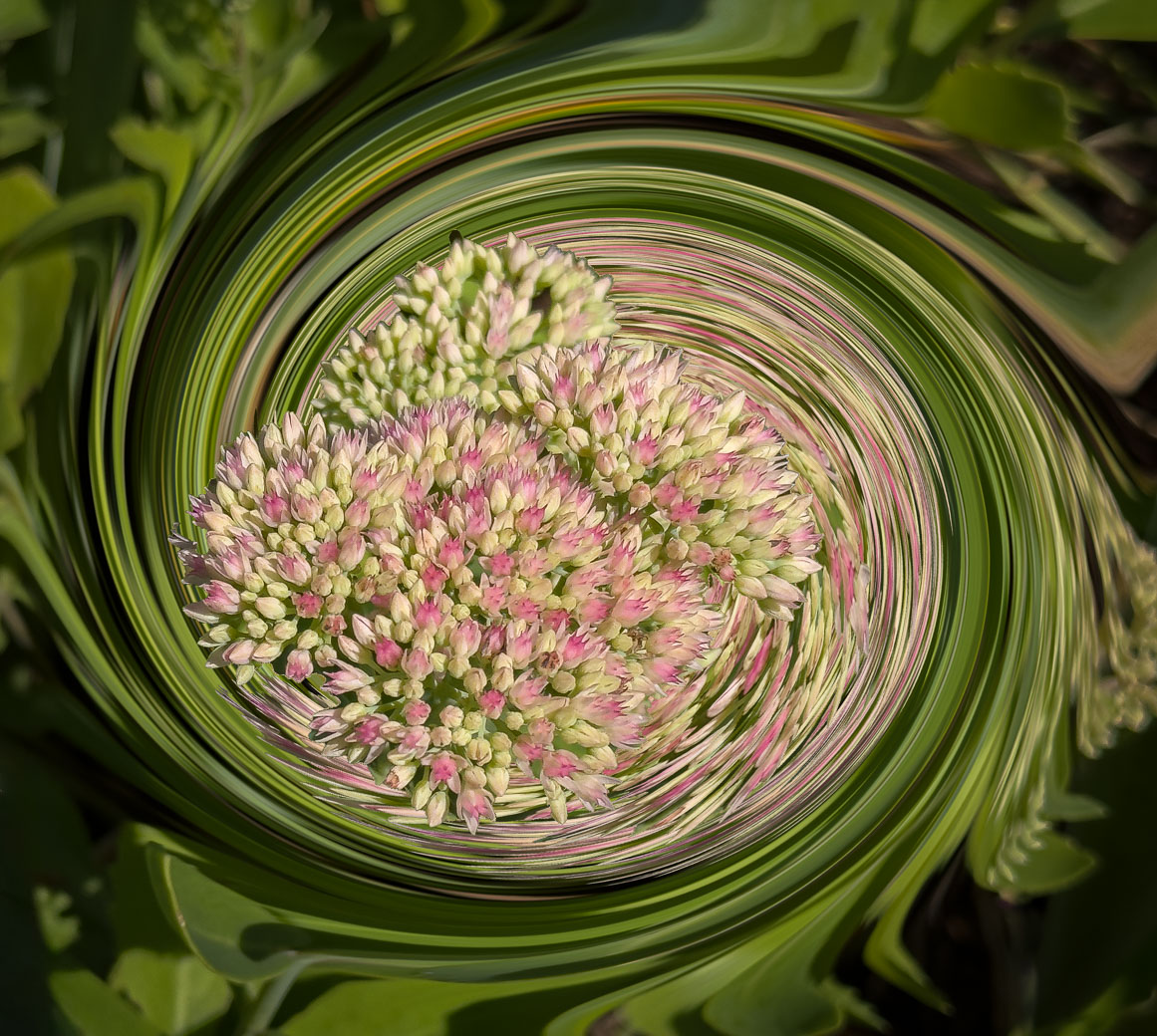
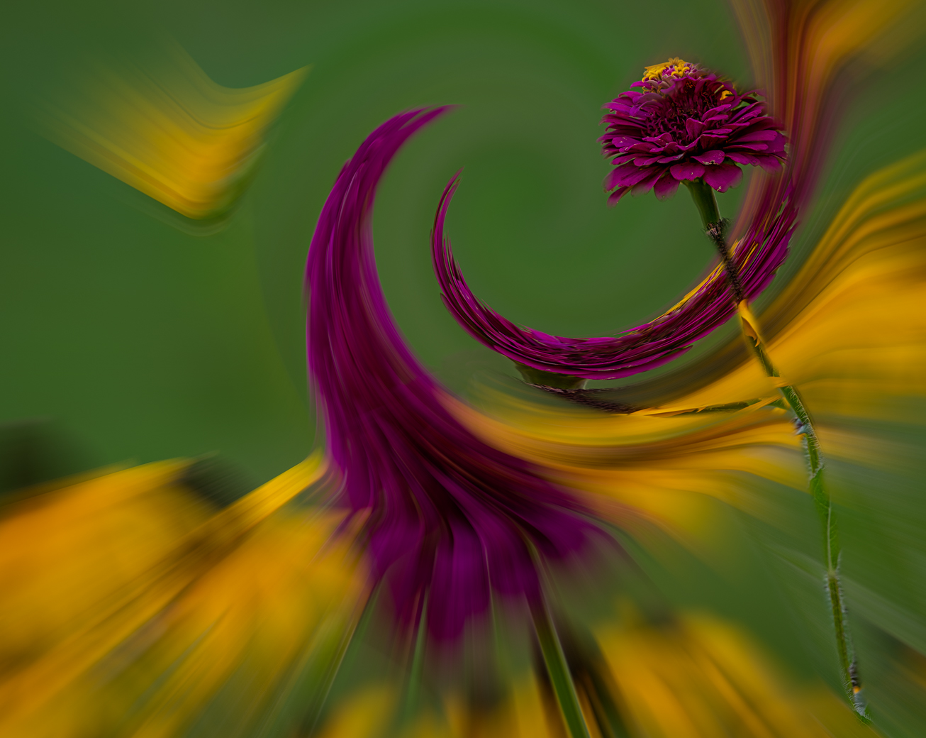
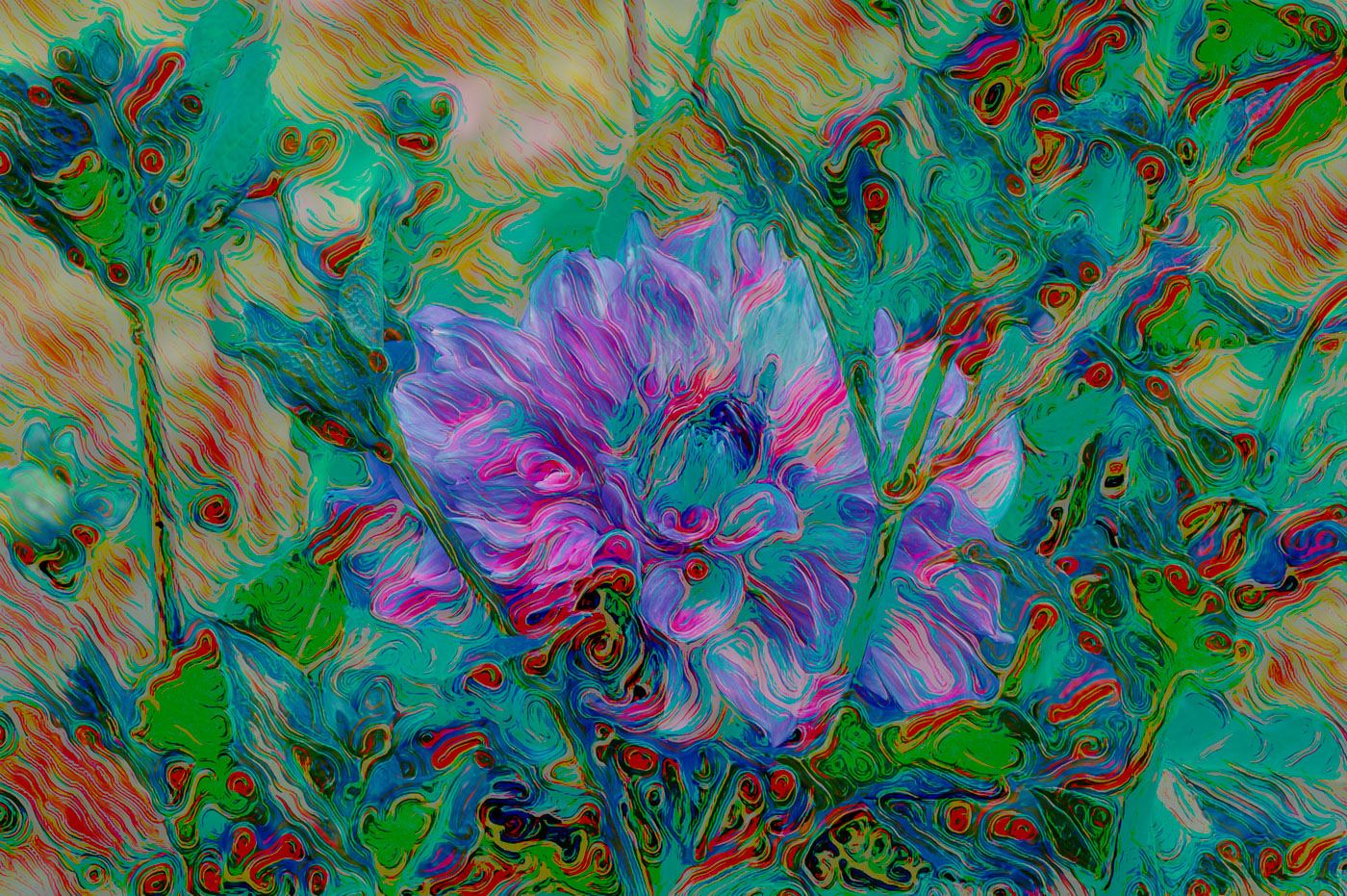
Thanks Doug for your suggestions and cropping. I like the idea of adding more light the main flower. I do feel that the yellow swirl tail on the upper left should. e removed via content aware. I do prefer the heavier Swirl 2nd Swirl in the image. |
Feb 17th |
| 80 |
Feb 23 |
Reply |
Thanks Kathryn. I agree that more light on the main subject is beneficial. I do however, disagree with your crop leaving that small piece of purple on the left and your crop leaves not enough space between the purple swirl and the left border. |
Feb 17th |
| 80 |
Feb 23 |
Reply |
Thanks Rich, Yes, I have tried cropping that top yellow flower and I could go either way with cropping out or not. Appreciate your ideas. |
Feb 17th |
| 80 |
Feb 23 |
Comment |
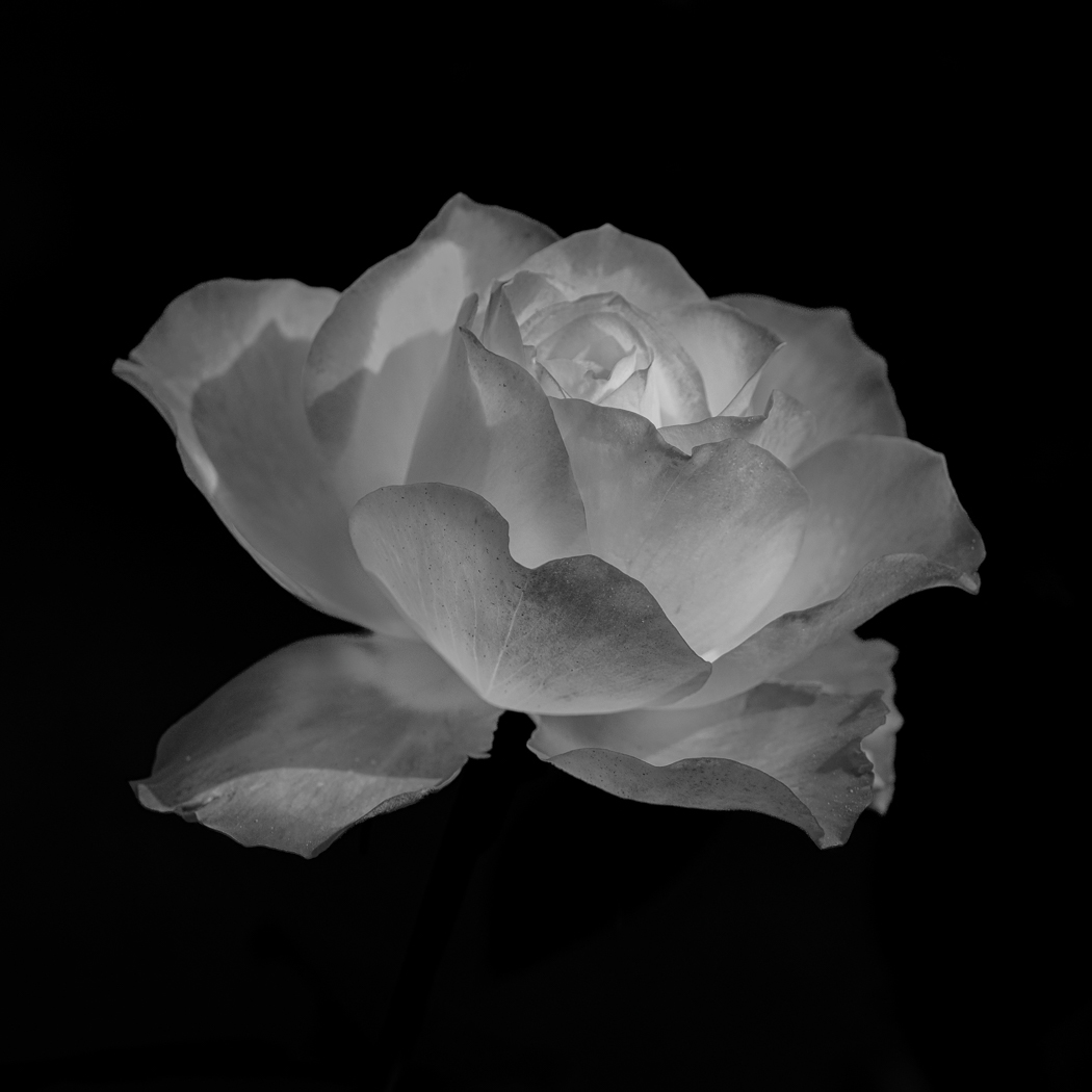
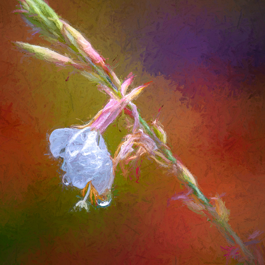
Jacob, A beautiful Rose you have chosen with nice color and sharpness. As an assignment I would like you to Open the Rose in Photoshop and Select subject, make any additions or subtractions that are necessary and then select inverse and then Blur> Gaussian blur and move the slider, maybe 20 to 50) and see what you like with the effect of softening the background, and maybe even knocking down highlights. Let us know your thoughts. |
Feb 17th |
| 80 |
Feb 23 |
Comment |
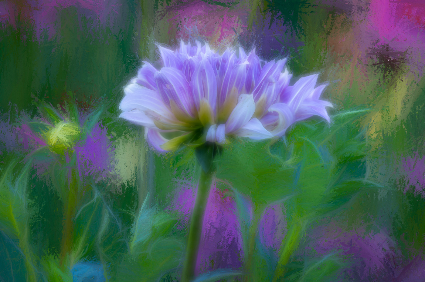
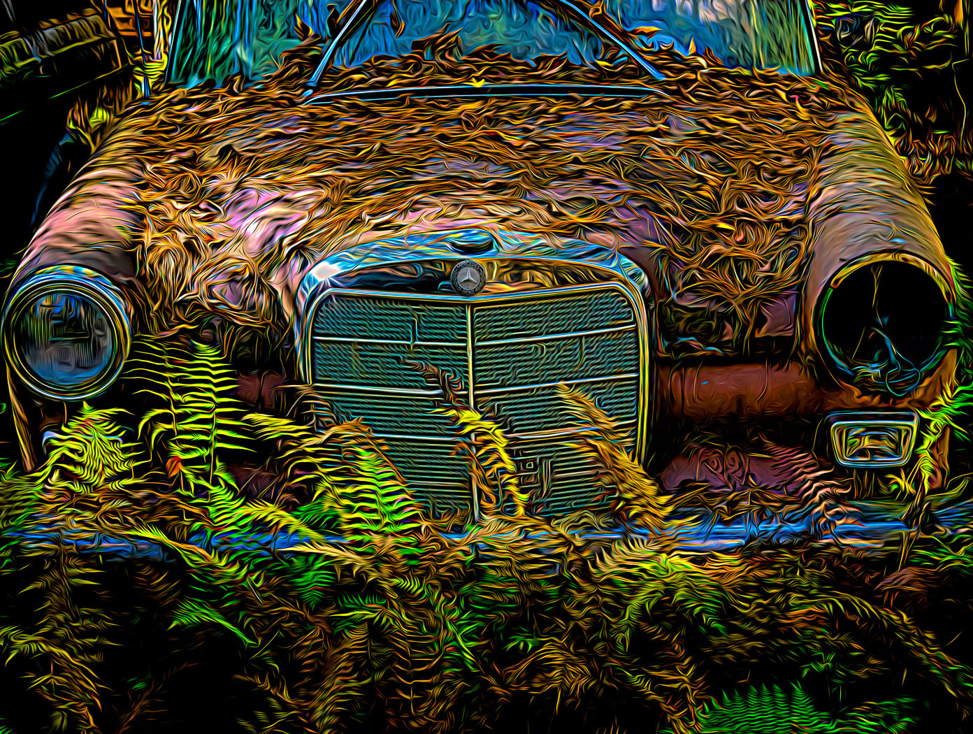
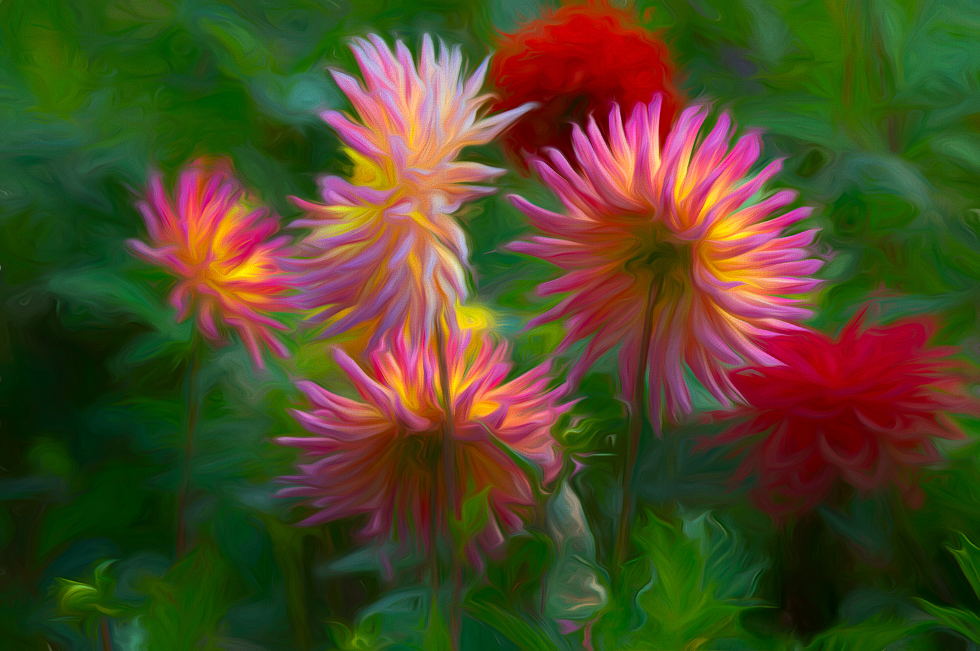
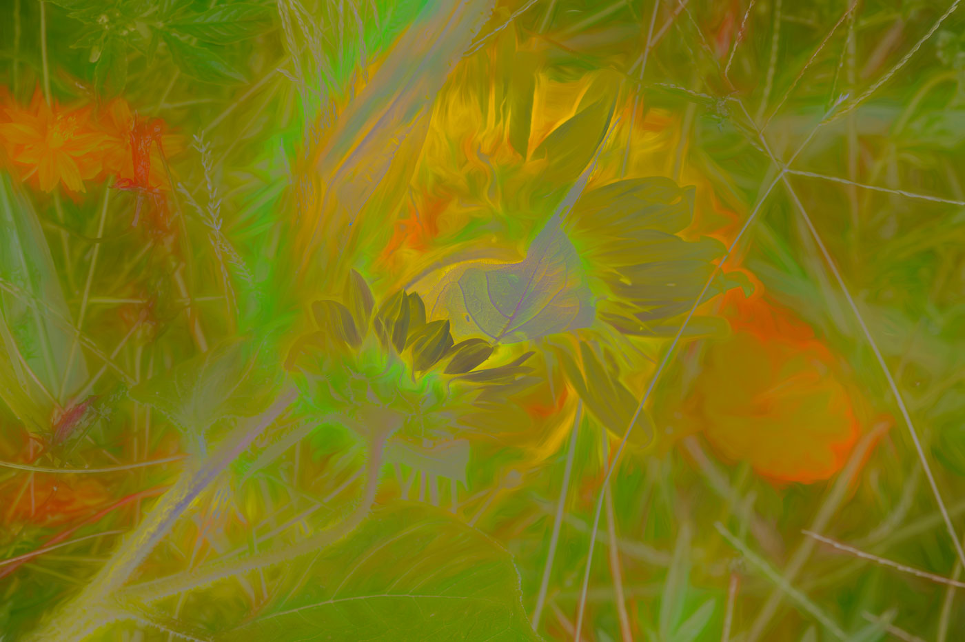
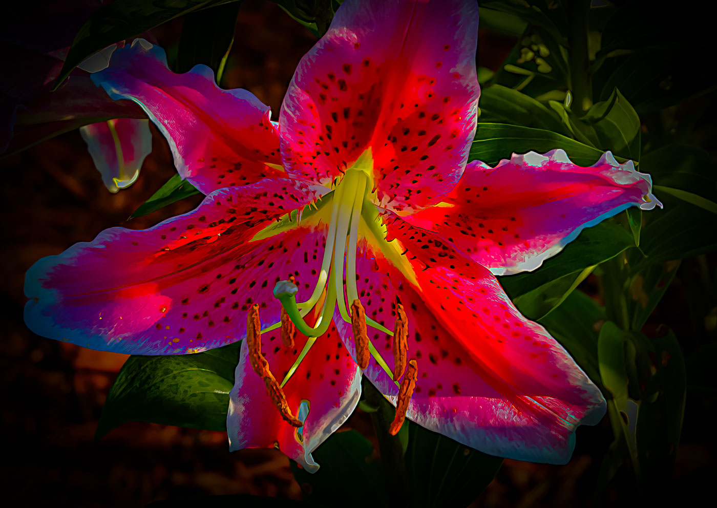
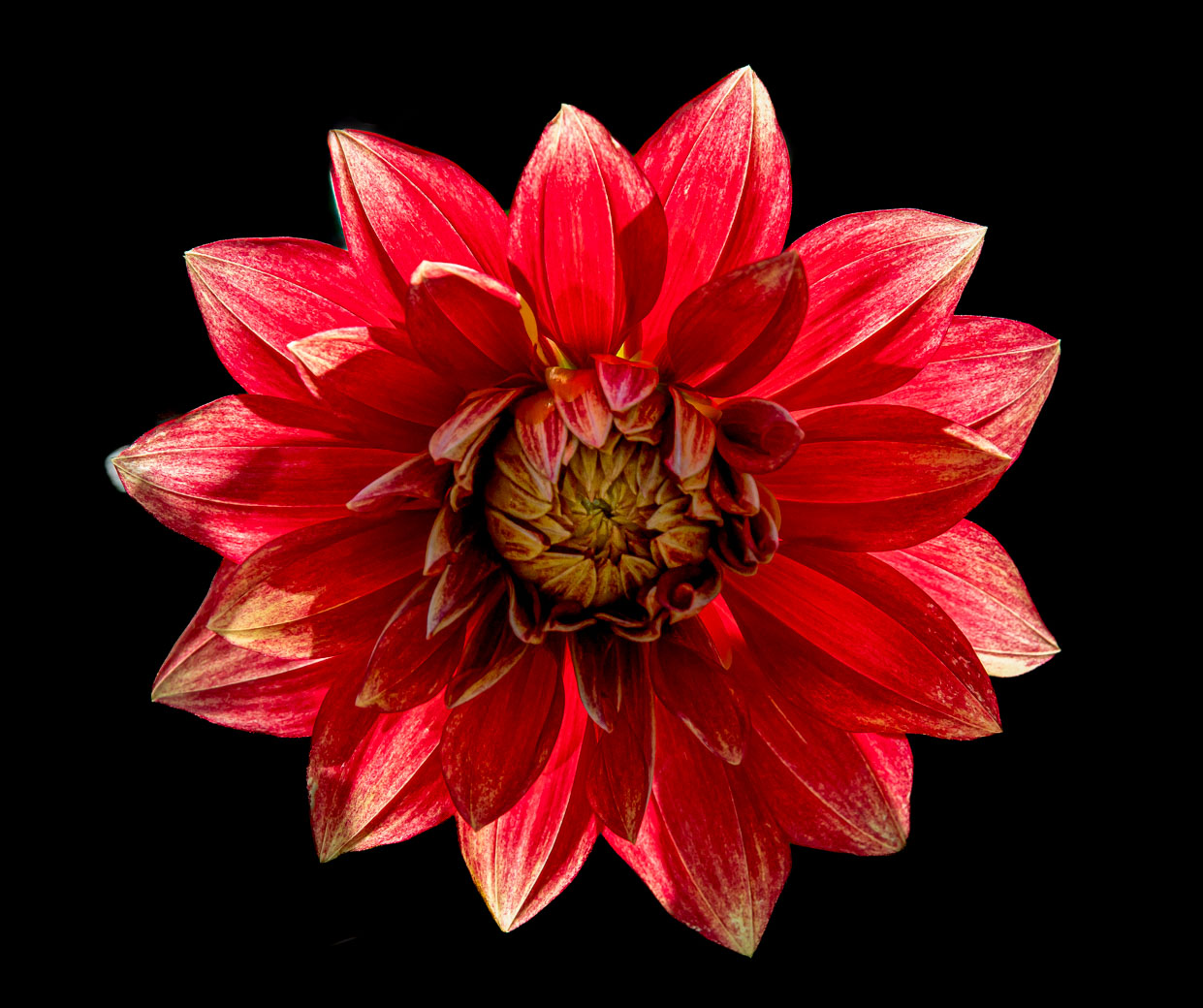
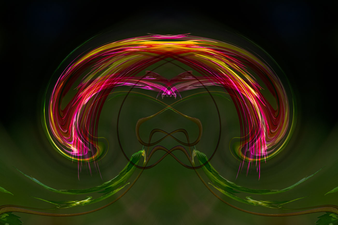
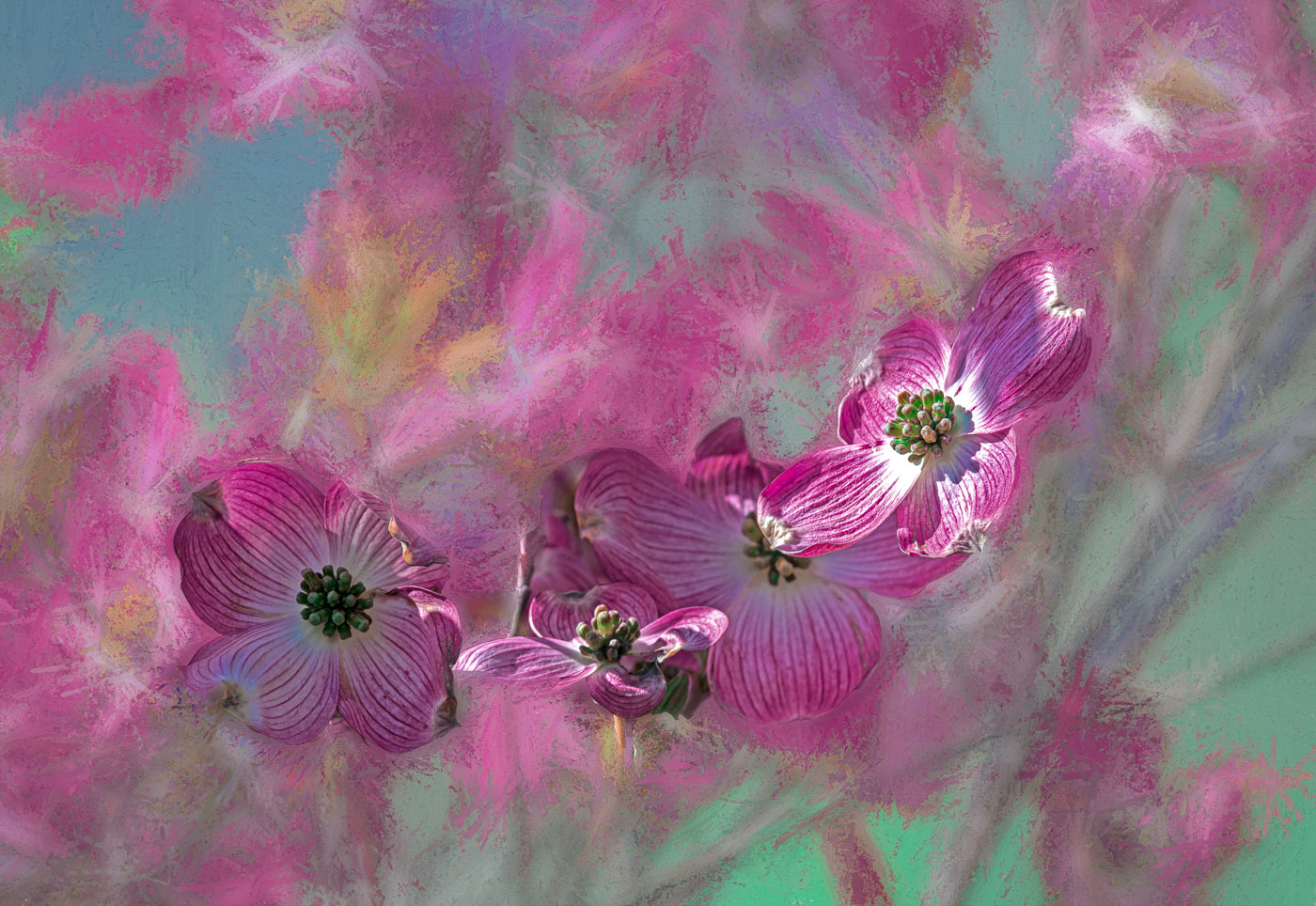
Hi Kathryn. You certainly have worked hard to create this beautiful image. The editing to create the original image as a background texture is excellent. I do have to question the reason for the choice of these colors? They work well together but not within the vibrant or muted colors of the dahlias that I have seen. Not that it has to, as the artist you have the right to use whatever colors you wish. For the creative flowers that I do, I tend to stay within the safe zone. As a true artist you are more comfortable to create beyond. |
Feb 17th |
8 comments - 6 replies for Group 80
|
23 comments - 13 replies Total
|