|
| Group |
Round |
C/R |
Comment |
Date |
Image |
| 29 |
Oct 22 |
Reply |
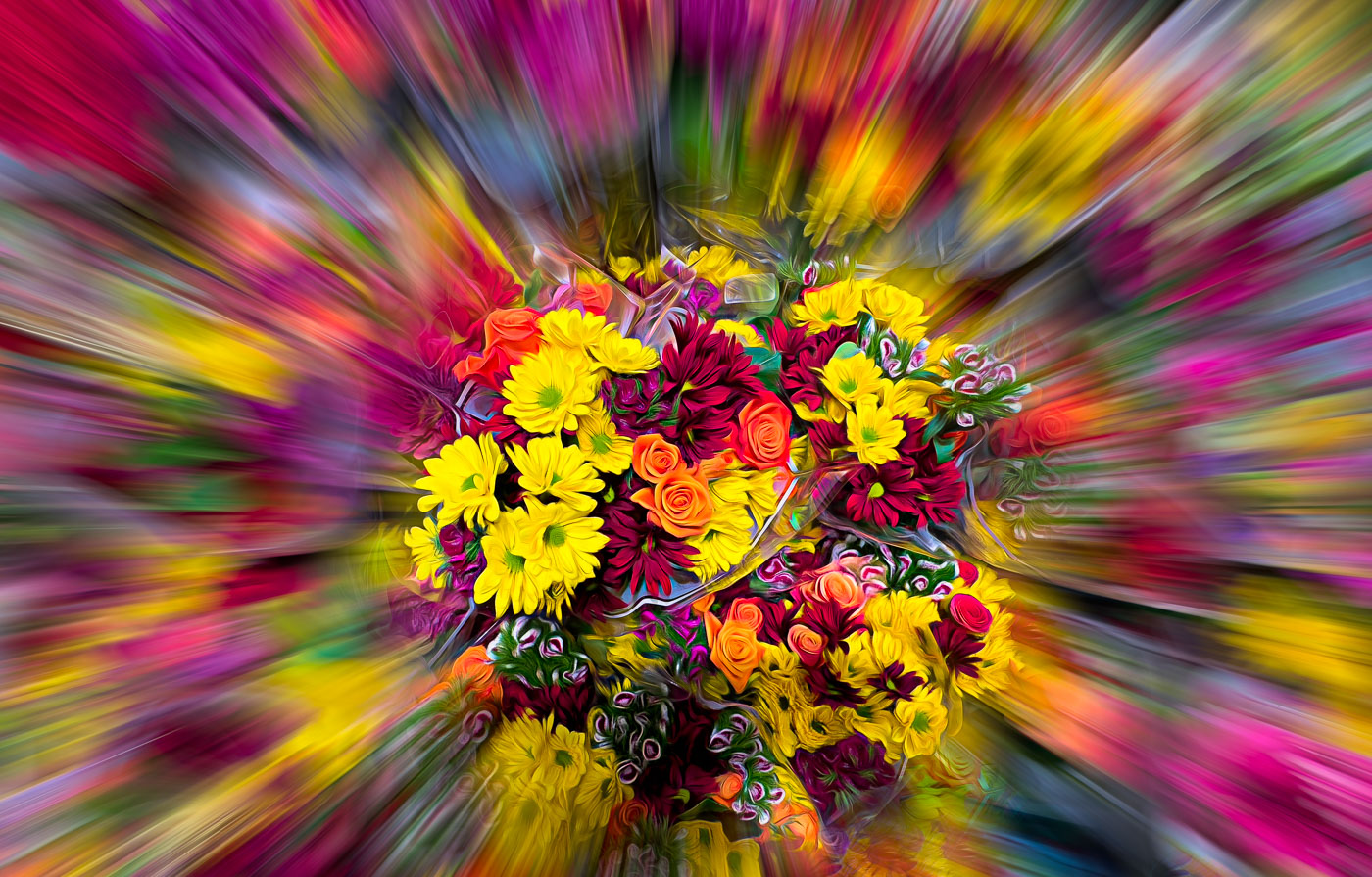
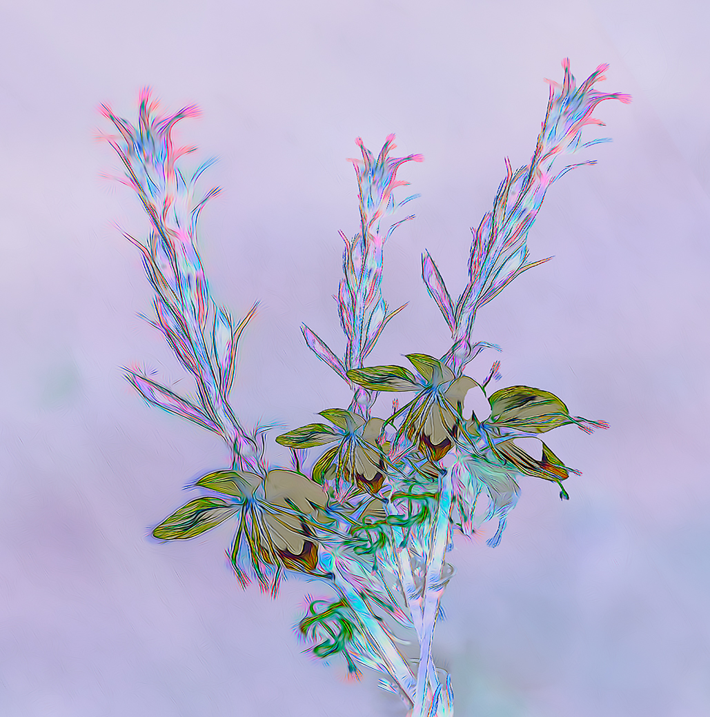
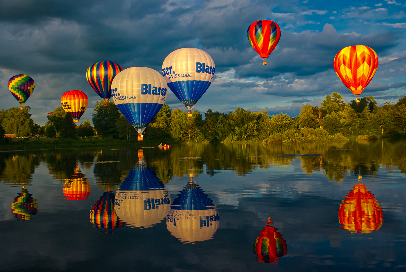
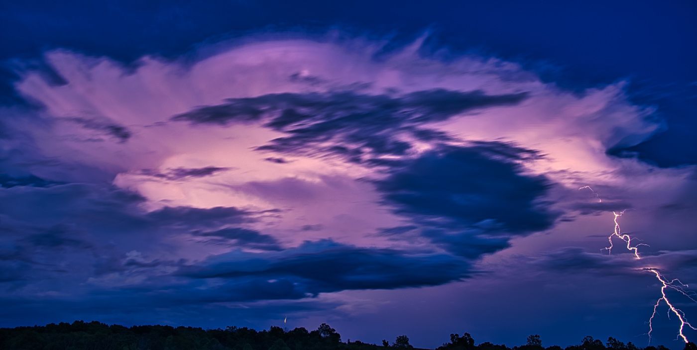
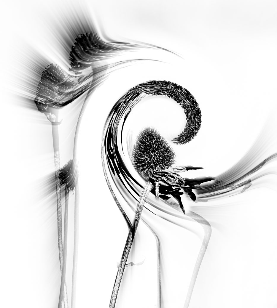
But Gunter, the Aurora Borealis is not man made. I also love that green and your green is not natural or the right color green. Could you make it the right color and add some Radial Blur, it might work. |
Oct 25th |
| 29 |
Oct 22 |
Comment |
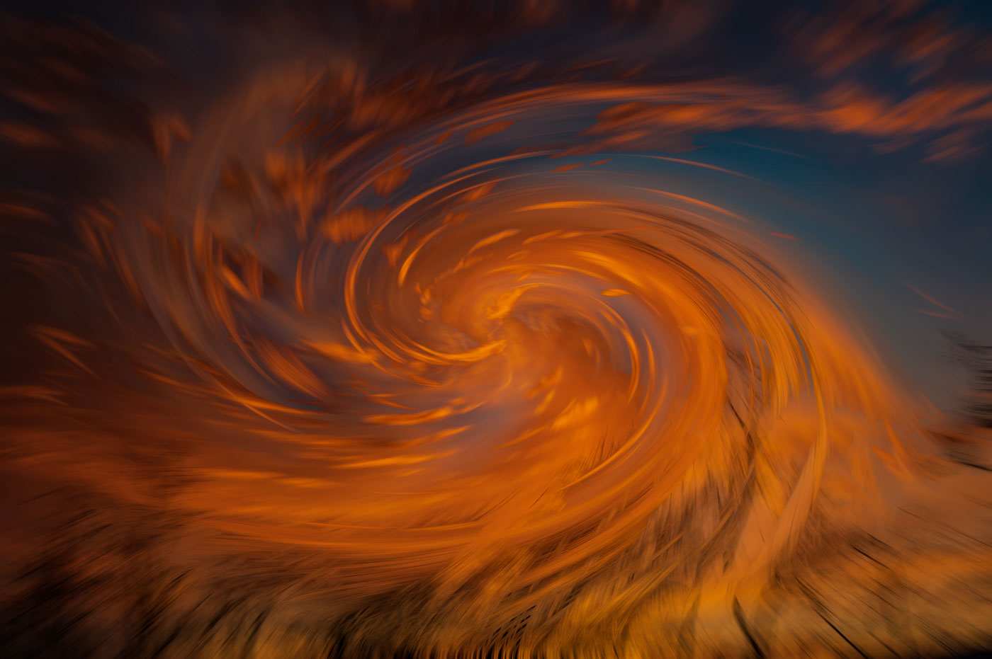
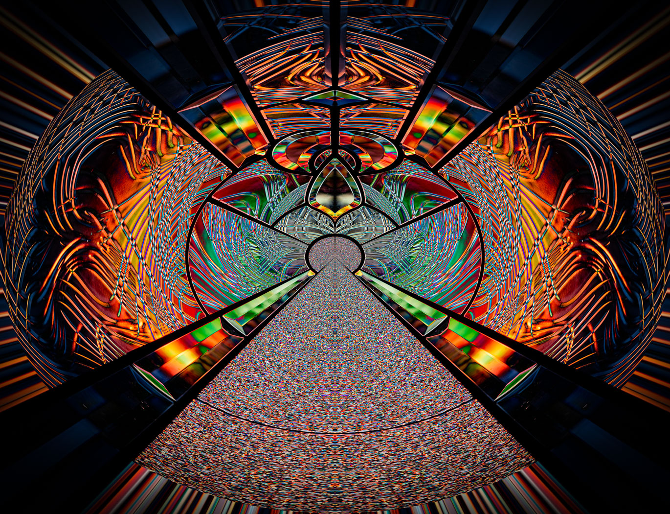
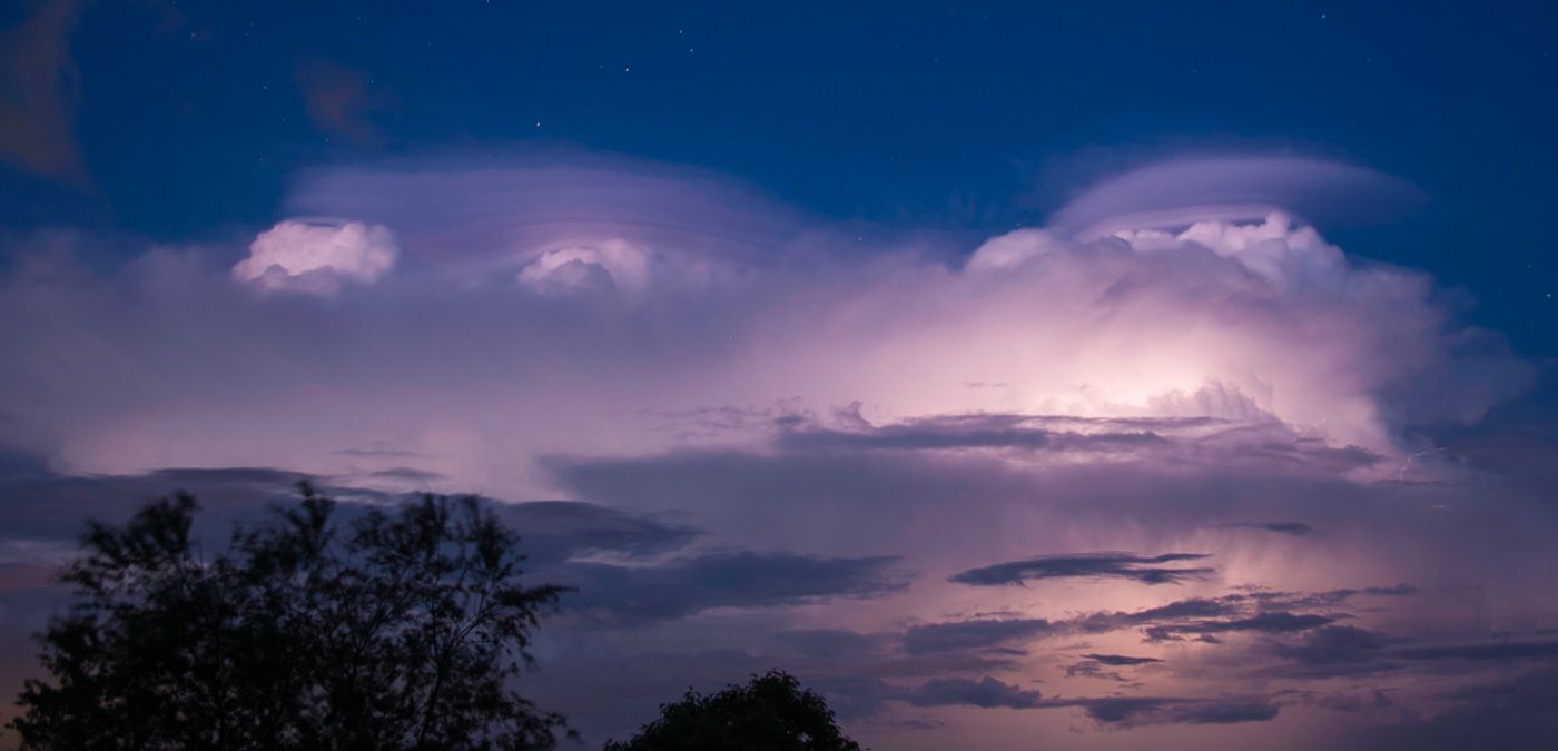
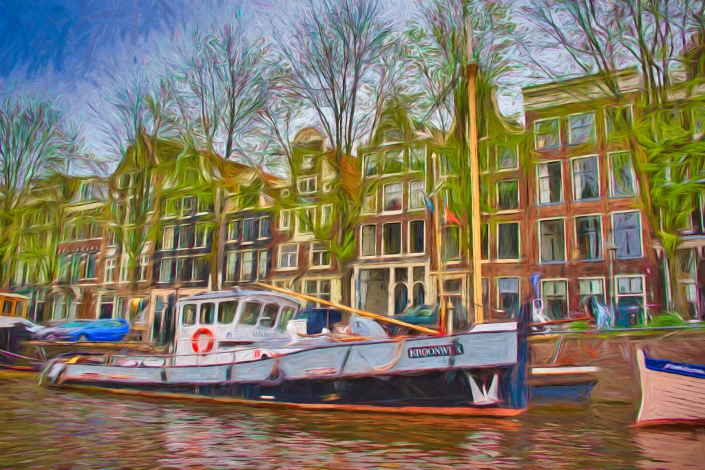
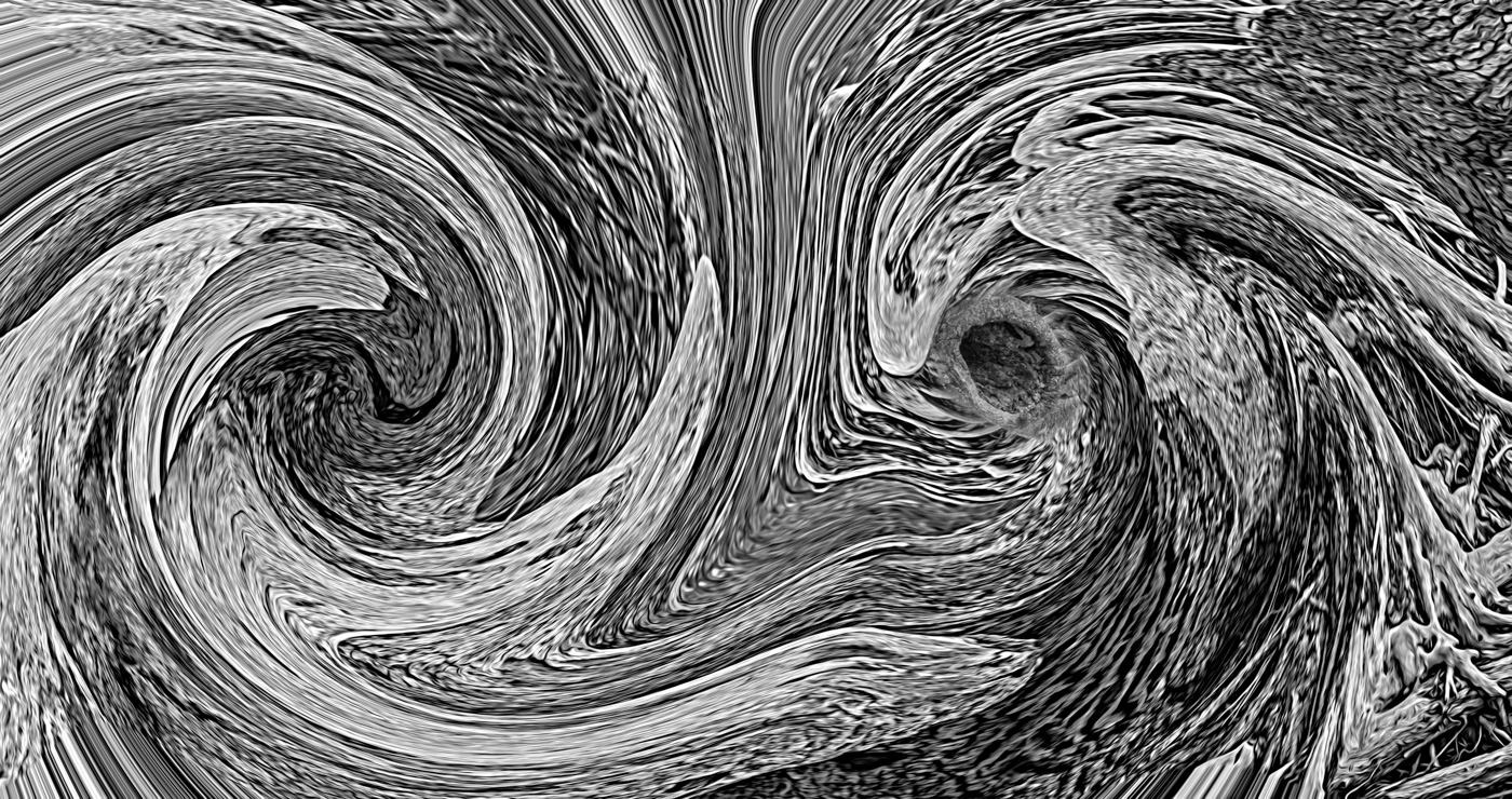
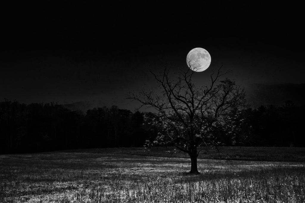
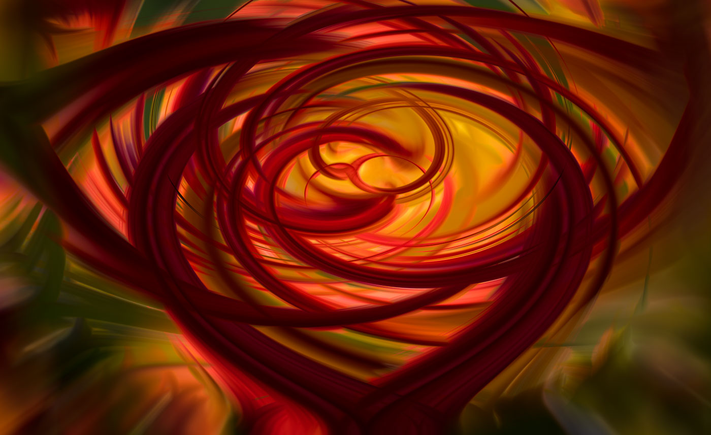
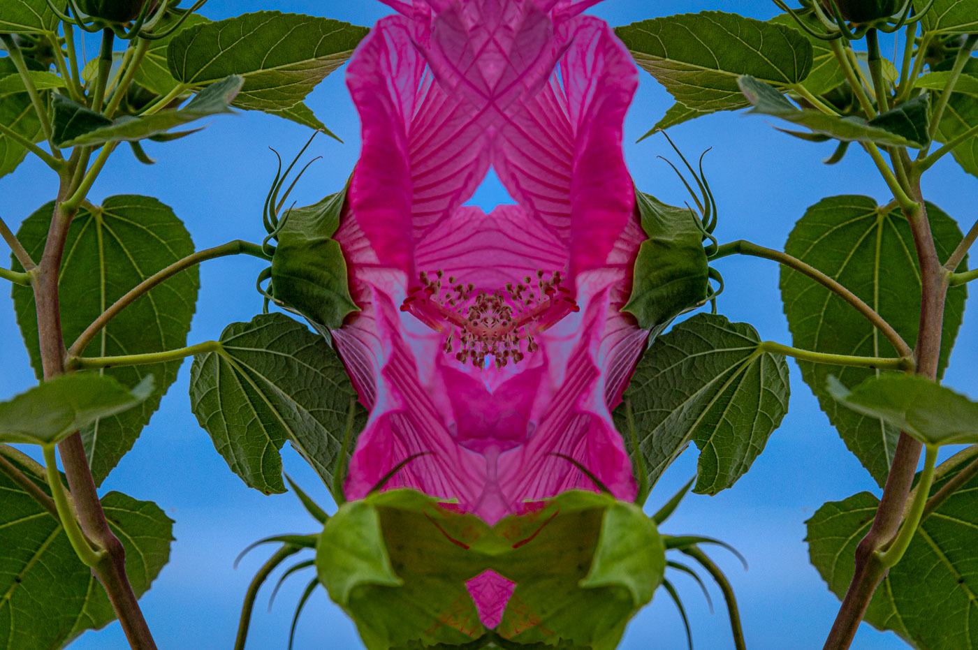
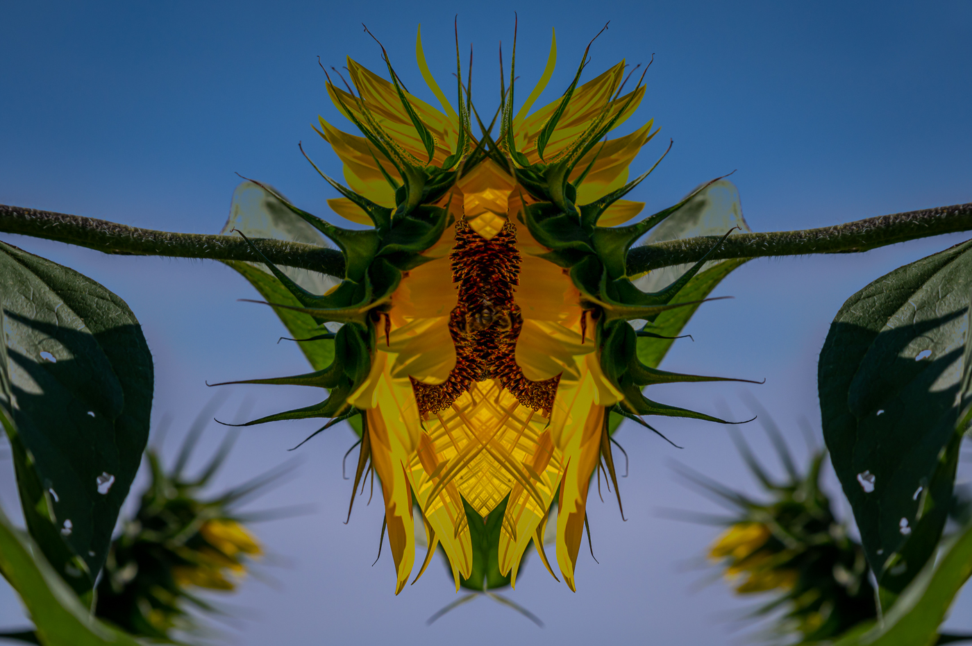
Gunter, I'm not really sure what to say about this image. The center (side to side) of the image has nice color but is lacking a compelling subject of interest. As a photographer that presents some odd/or many odd images, I'm finding it difficult to give you reinforcing comments because the sky and cloud color are not normally greenish. The top and bottom are monochrome but not the center where you have reality. So I'm not certain if you accomplished your Goal. There's always the new month coming next week. |
Oct 25th |
| 29 |
Oct 22 |
Comment |
Thanks Judy. I've seen a few of your creative images. You see very well, you might just need shoot more or less and spend more time playing with editing filters and sliders or programs. My dance card is pretty filled so I'm short of time to give you lessons. I do have this video that I posted some time ago. Maybe it will be helpful. |
Oct 25th |
| 29 |
Oct 22 |
Comment |
Ron this is a great idea and image you captured here. I think Gunter used your image and did a fantastic job of editing by cropping away the reflections and out of focus areas and leaving us all with some good ideas how an image can be improved with cropping problem areas. |
Oct 15th |
| 29 |
Oct 22 |
Comment |
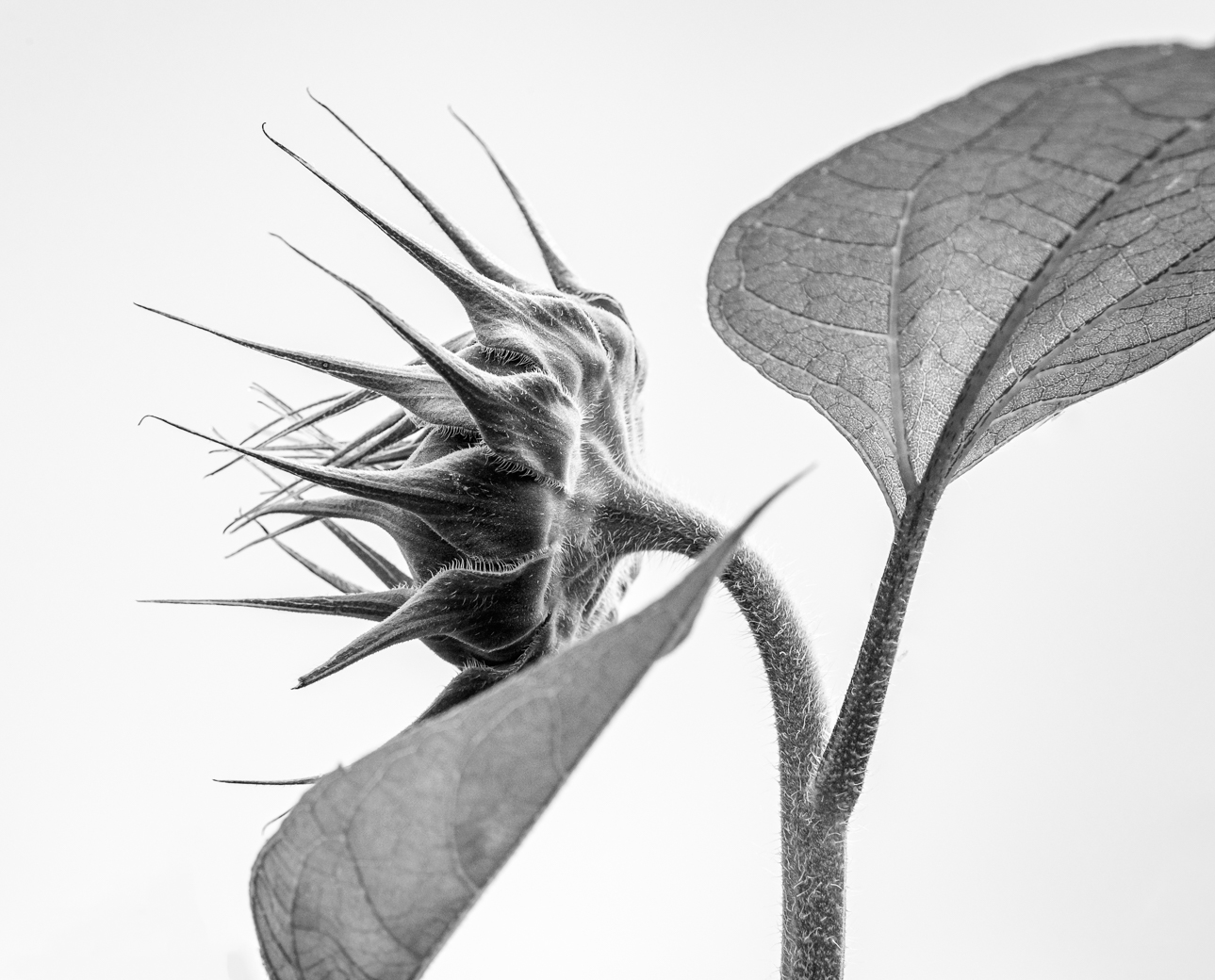
Really an excellent image Karen. I like the hairy eyeball and expression the best. No suggestions to improve. So by now, you should of at least won a couple of competitions or ribbons. Super job!!! |
Oct 15th |
| 29 |
Oct 22 |
Reply |
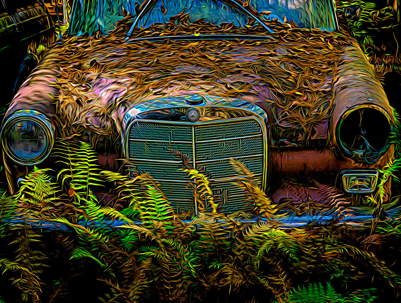
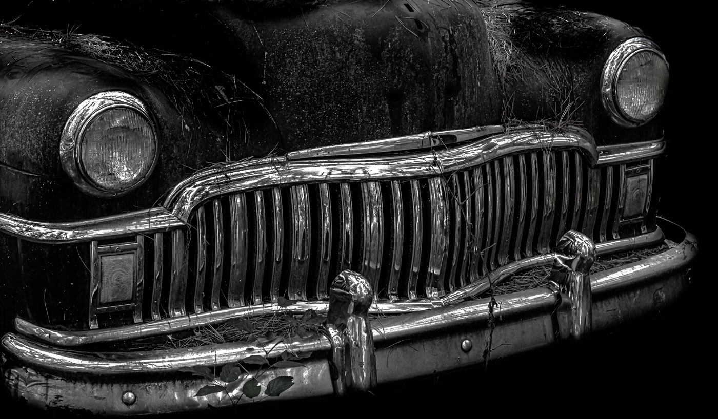
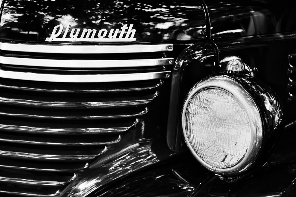
Thank you for your suggestions Gunter. The top extra pieces you are very correct and spot on with your suggestion. The headlights on the other hand would require a complete redo for me as I'm unsure how you went about your alternate version. Also, I suppose it depends on how much balance you wish to put on the headlights matching. |
Oct 15th |
| 29 |
Oct 22 |
Reply |
Thanks Tim. |
Oct 15th |
| 29 |
Oct 22 |
Comment |
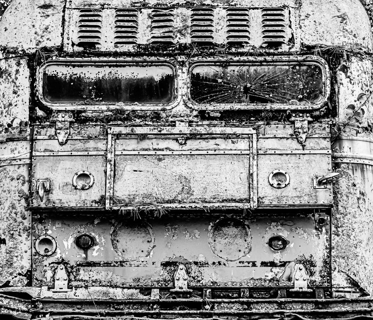
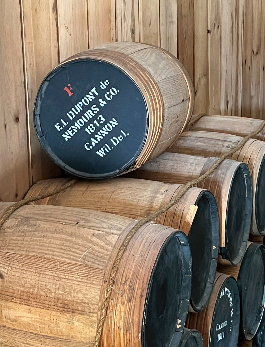
I like your image Judy. Well composed and great that not every barrel is labeled on the outside end. The wood patterns work very well together. I was slightly bothered (Just because it didn't look natural) by the black area at the top of the frame. So I brought in to Ps and used content aware and spot healing and tried to fix it. I know it shows I did it quickly but I think it looks better than the black stripe. Just a thought. What do you think Judy?
|
Oct 15th |
 |
| 29 |
Oct 22 |
Comment |
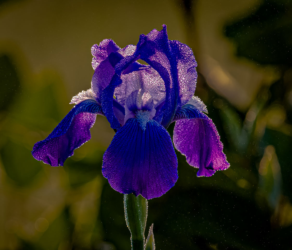
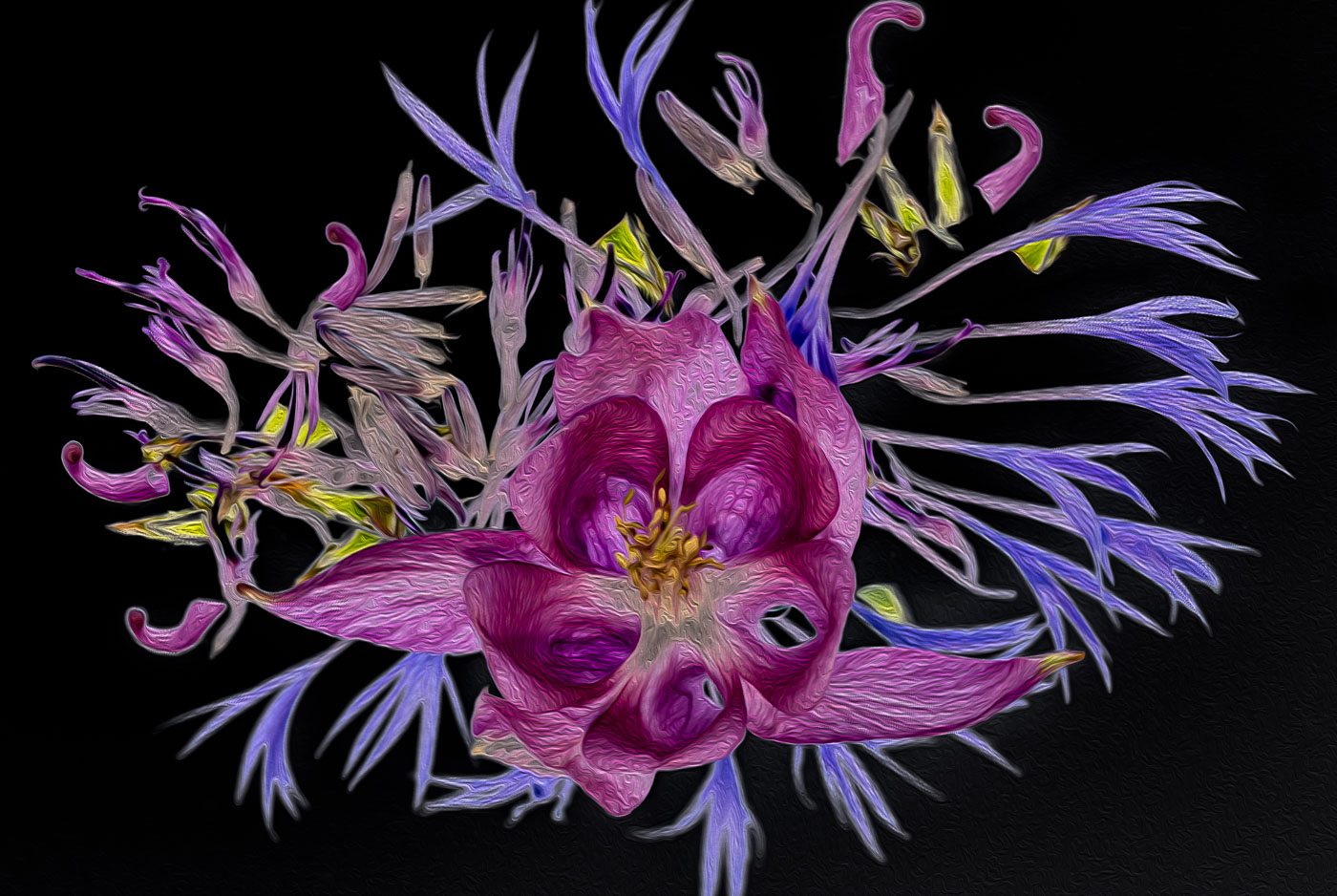
Hi Tim. What I believe you have here is a Hoverfly. A very small insect indeed. I shot a variety one of my cornflower flowers. They at least stay in place longer than some other insects. Nice and sharp, good lighting and composition. I might drop the hi lights a bit but very pleasing. |
Oct 6th |
| 29 |
Oct 22 |
Comment |
Hi Tim. What I believe you have here is a Hoverfly. A very small insect indeed. I shot a variety one of my cornflower flowers. They at least stay in place longer than some other insects. Nice and sharp, good lighting and composition. I might drop the hi lights a bit but very pleasing. |
Oct 6th |
7 comments - 3 replies for Group 29
|
| 62 |
Oct 22 |
Comment |
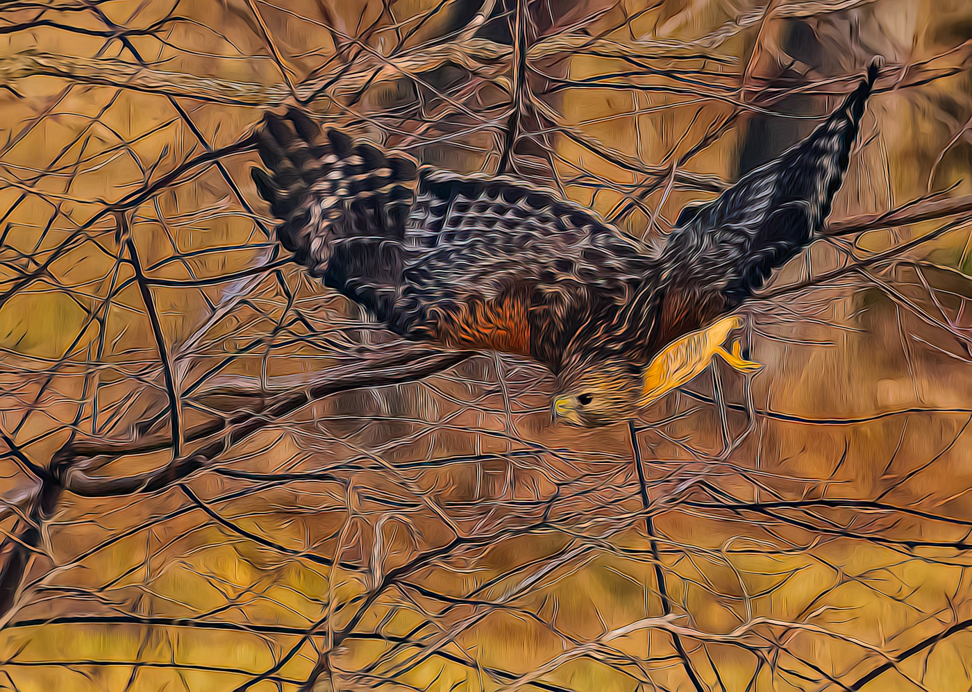
Great seeing Israel. I think the B&W version by Pete made it easier to see the folks working, and that increasing the exposure of the rocks made it easier to see the workers. While colorizing of the works made it easier to spot them, purist B&W competitions won't that fly. So the answer is to increase the exposure of the rocks and reduce the contrast in the image. |
Oct 11th |
| 62 |
Oct 22 |
Comment |
A unique perspective Bunny. I don't make or recommend large changes to a makers image. In this case I like your composition of the lighthouse and the dark sky in the upper right. I'm not bothered by it at all and have no recommendations to make. Well Done. |
Oct 11th |
| 62 |
Oct 22 |
Reply |
What can I say. Sorry for being late to the critique session. I approve of the crops that Emil did and also prefer some detail in interior like Pete and Emil. LuAnn you only need to darken the upper part of interior. I never found the sad face. I do see Taylor's smiley face and that's what makes the photo. Well done LuAnn. |
Oct 11th |
| 62 |
Oct 22 |
Comment |
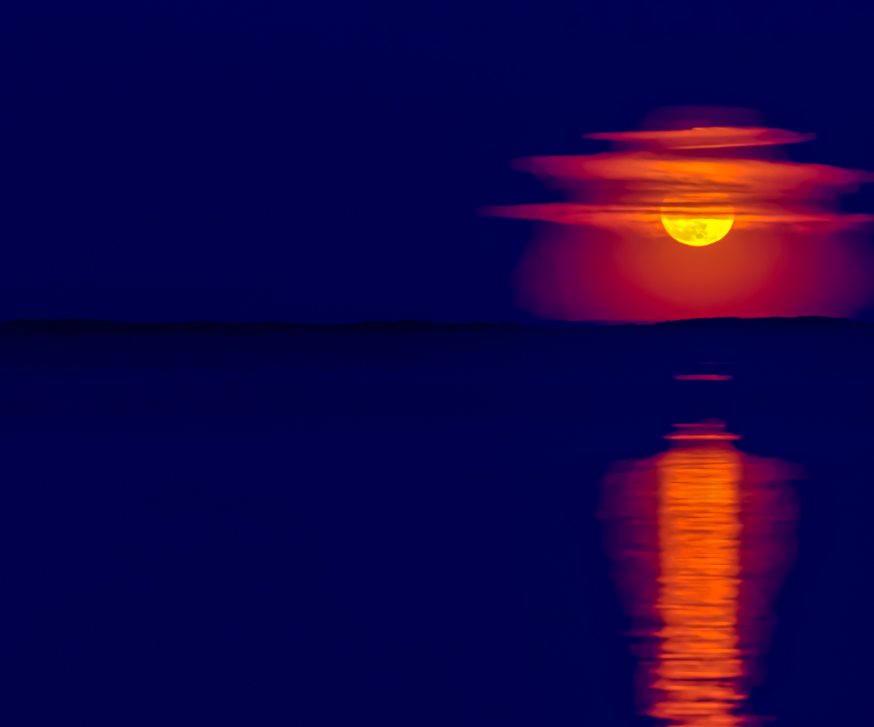
Excellent image Mark. I prefer images with contrast and this image fits very well. Kudos for great seeing the subject and making it for us all to see. BTW, I do prefer the sharper more contrasty upper curve as in LuAnn and Emils. |
Oct 11th |
| 62 |
Oct 22 |
Comment |
Thank you LuAnn for your inspirational words and encouragement. That pushes me to do more "artistic" images. |
Oct 11th |
| 62 |
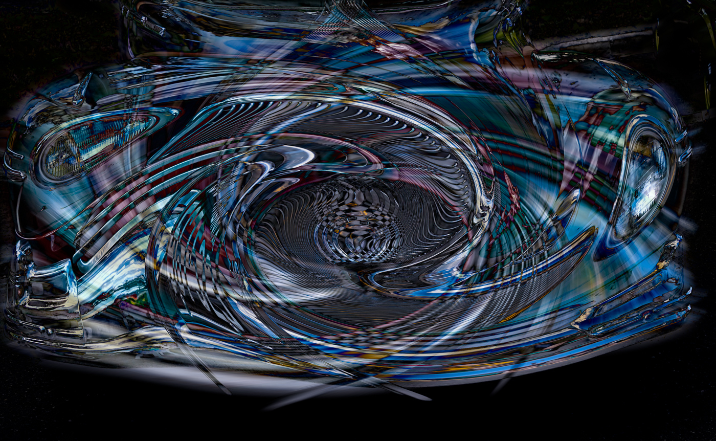
Oct 22 |
Reply |
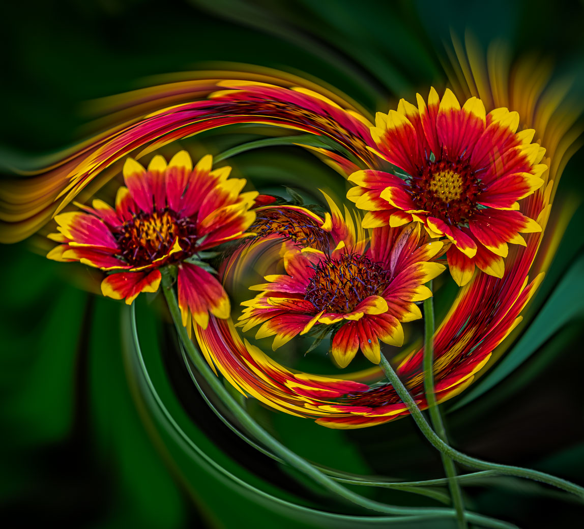
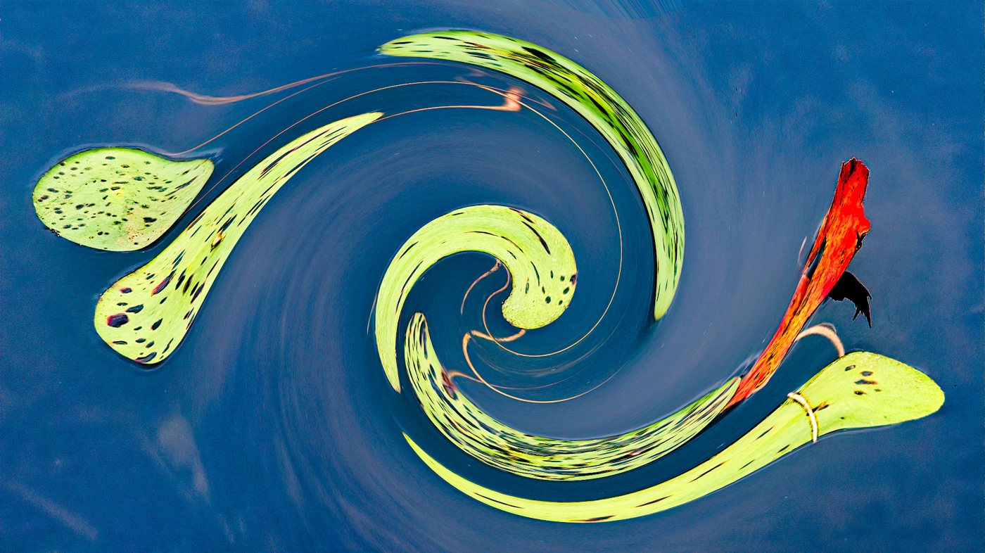
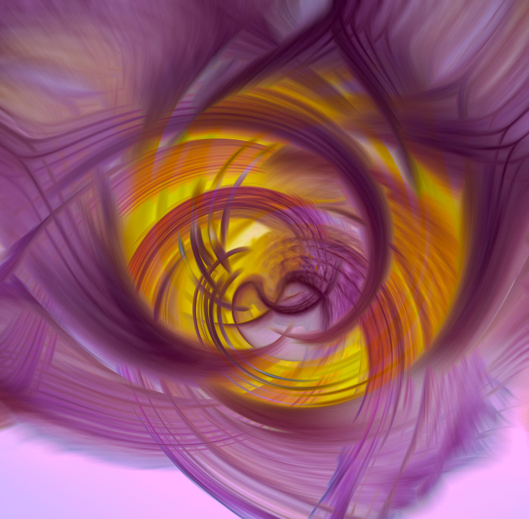
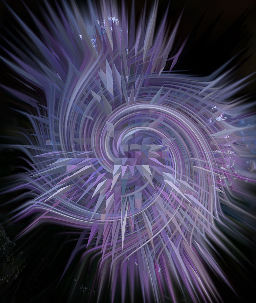
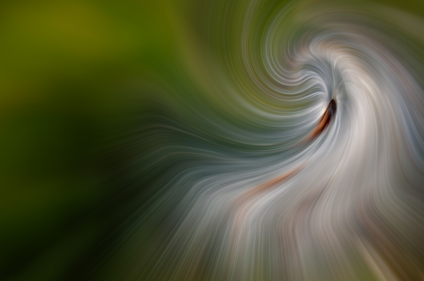
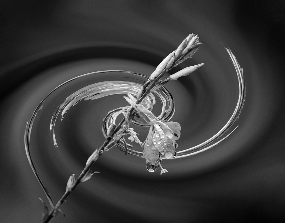
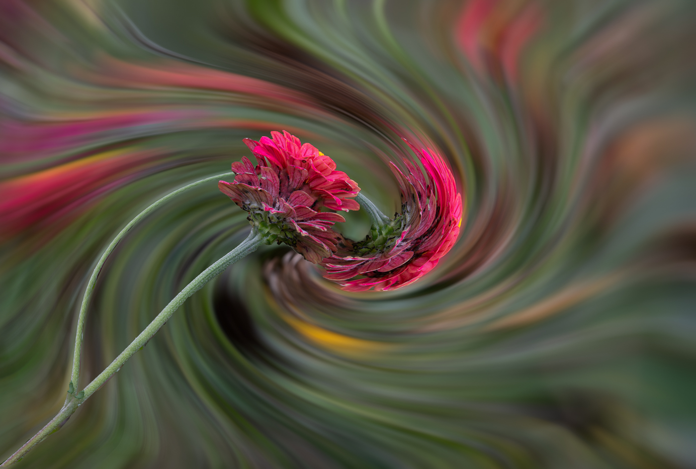
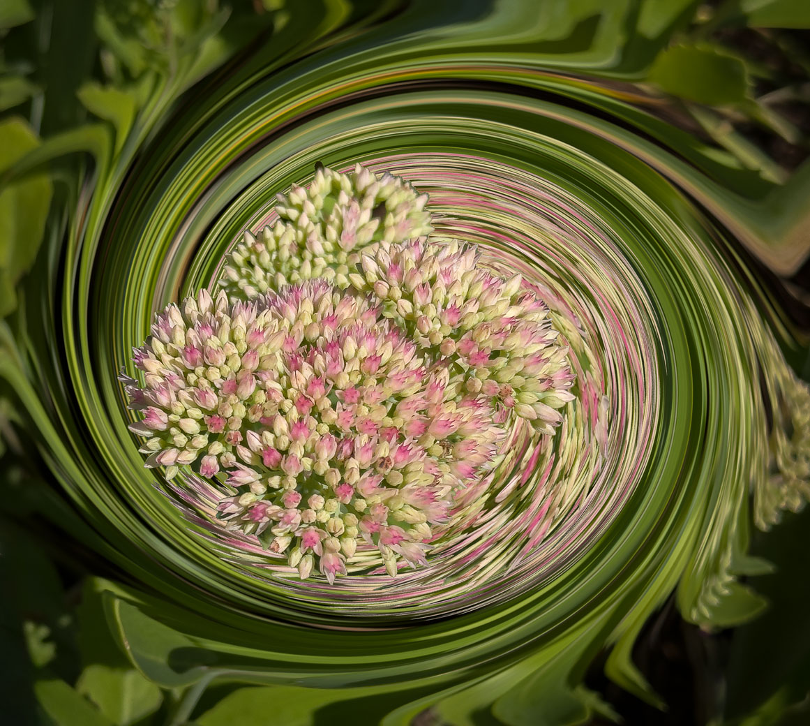
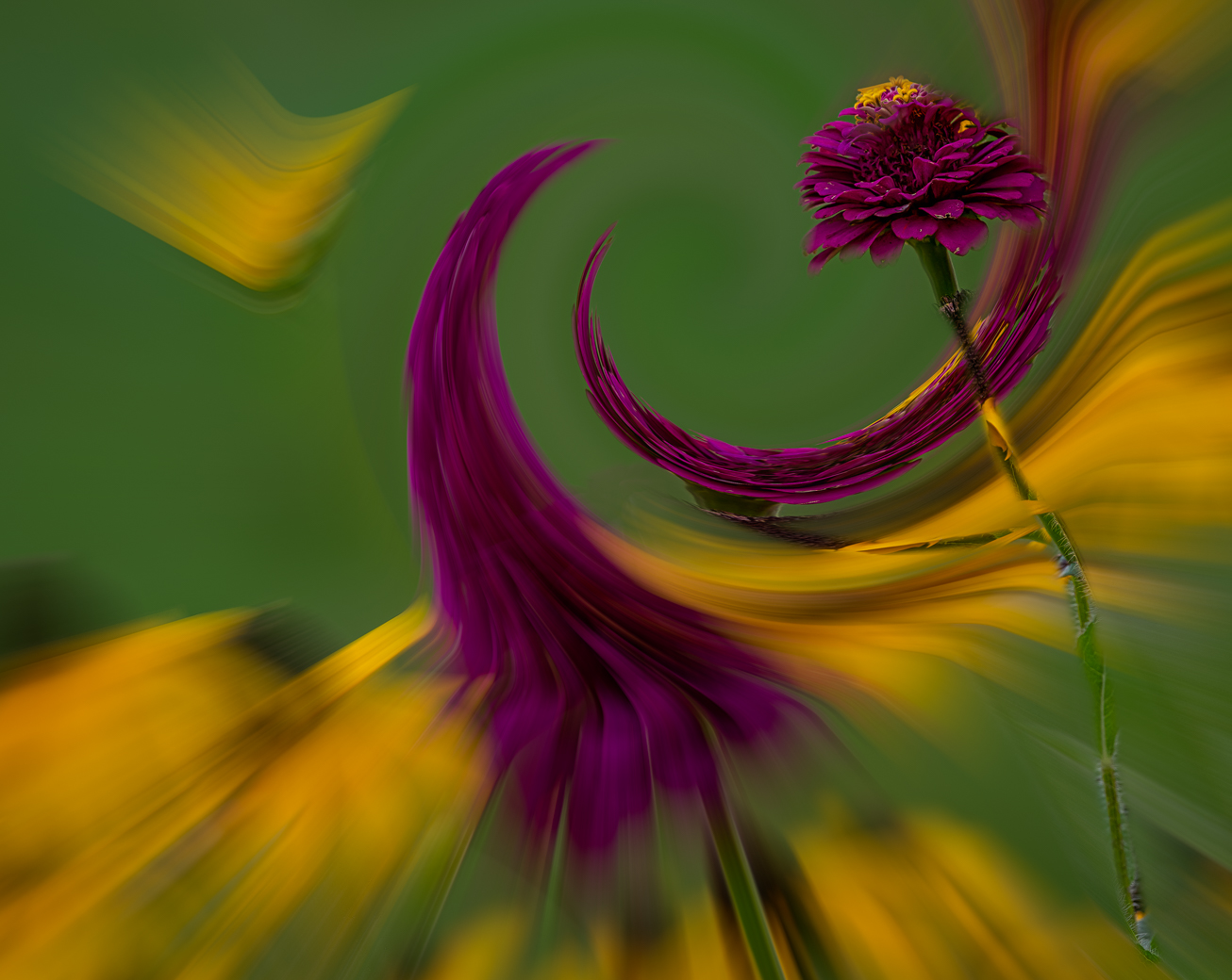
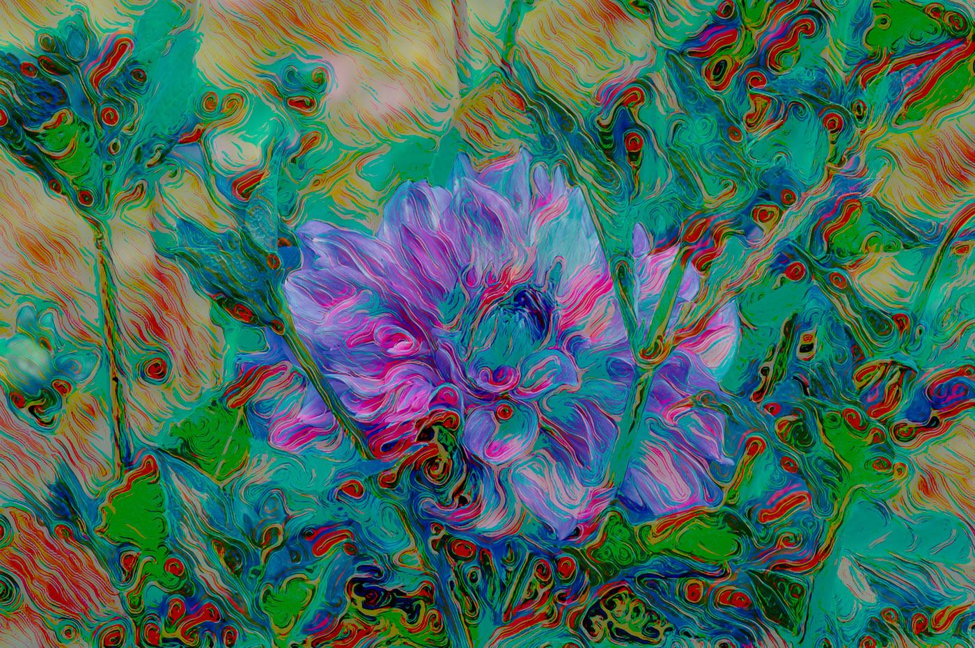
Emil, thank you for the compliments. You were joking about the insects wings!!?
Swirls result from mask on the flower while swirling a copy, but it does look like it could be insect wings. |
Oct 11th |
| 62 |
Oct 22 |
Reply |
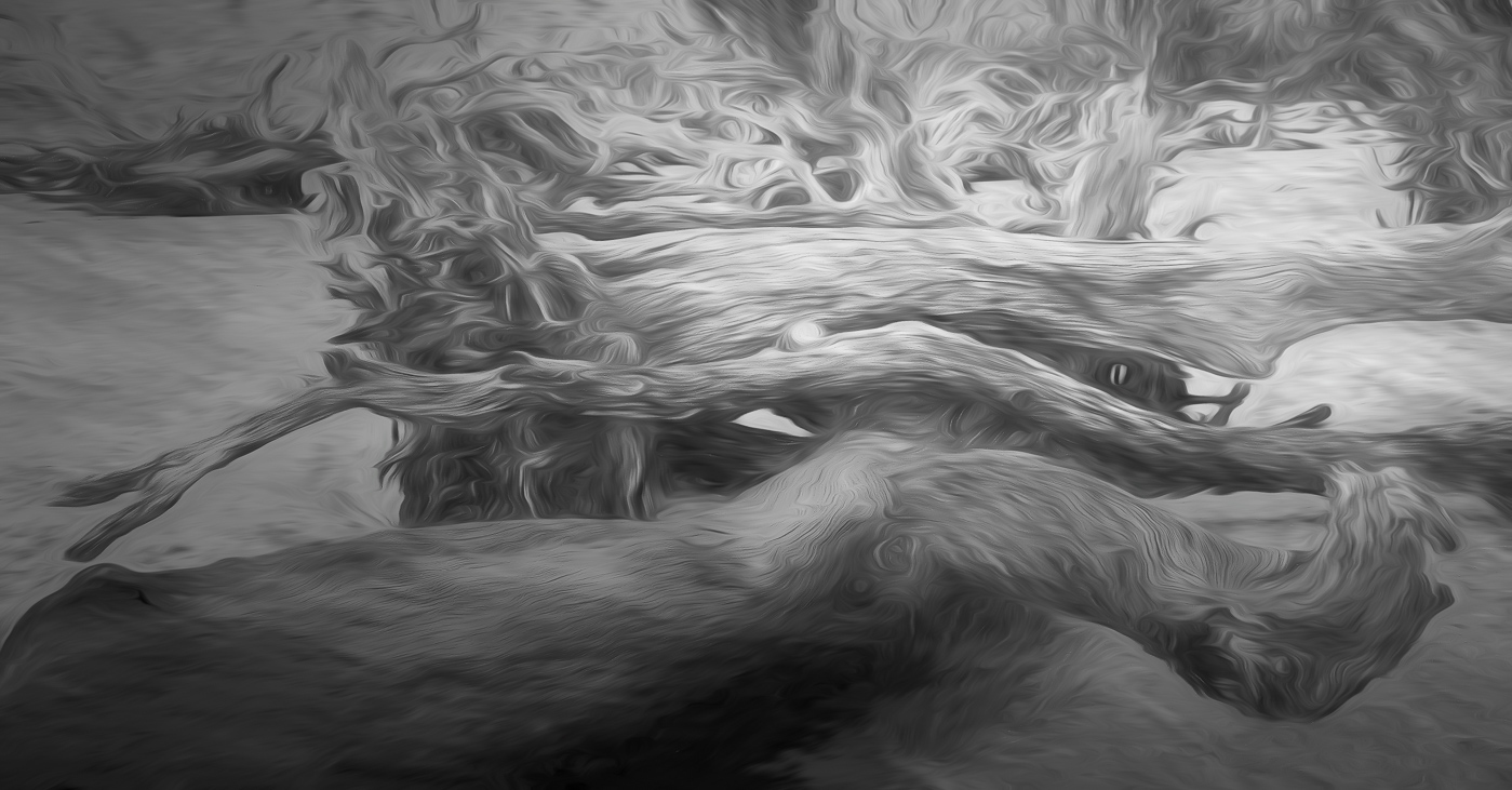
Thanks Pete. Adobe makes it very easy now to select subject and add or subtract. I don't believe I used a vignette, but the darker colors in the original created the vignette effect as a result of the twirling.
|
Oct 6th |
| 62 |
Oct 22 |
Reply |
Thank you Mark. |
Oct 6th |
4 comments - 4 replies for Group 62
|
| 80 |
Oct 22 |
Reply |
Thanks Nadia. I'll try to meet your expectations. |
Oct 24th |
| 80 |
Oct 22 |
Reply |
Thank you Syed. |
Oct 24th |
| 80 |
Oct 22 |
Comment |
Good seeing Jacob. I agree that the image is more pleasing in the flipped orientation. |
Oct 24th |
| 80 |
Oct 22 |
Reply |
That's a great editing tip Kathryn. Thanks for sharing. I agree with your other comments as well.
|
Oct 11th |
| 80 |
Oct 22 |
Comment |
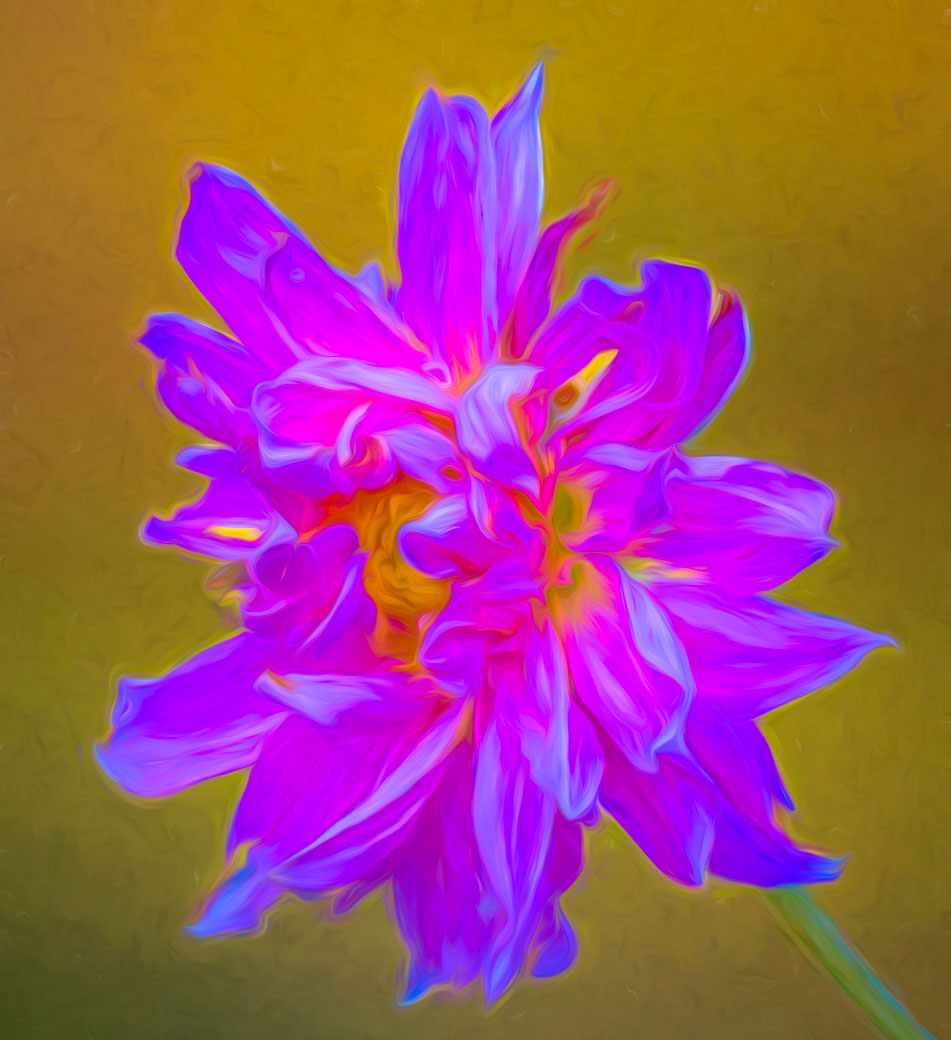
Syed, you did a great job capturing the cornflower with its beautiful blue color and bokeh background. Not sure of your intentions, in regard to the image being sharp or soft, but you have both. I believe you would be happier with the image if you used a higher iso and therefore a higher f/stop, think f11, you should be able to get the center of the flower and the bottom and right blue petals to be sharp. You could also use a tripod if you didn't have to deal with the wind. The other option is to go blurry/out of focus for the entire image. Photoshop has numerous blur tools that could potentially help. |
Oct 11th |
| 80 |
Oct 22 |
Comment |
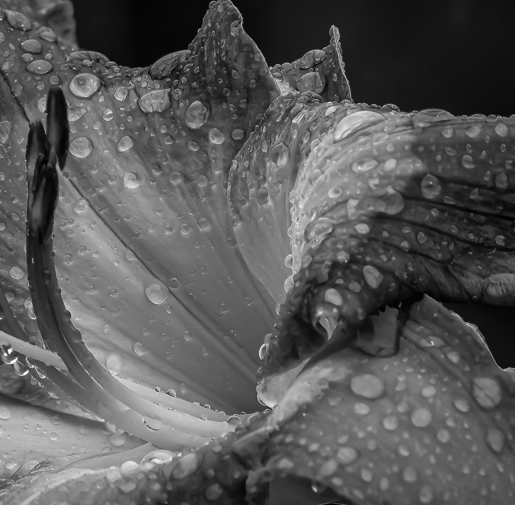
Kathryn, this is a lovely image with good composition, and exposure. You did a great job converting the distracting background into a background that has some detail and does not detract from the flower. I do not have a problem with the flower floating or by the close crop. Converting the white Hibiscus to blue/green color works for me, as it brings out the texture in the image. Well done! |
Oct 11th |
| 80 |
Oct 22 |
Comment |
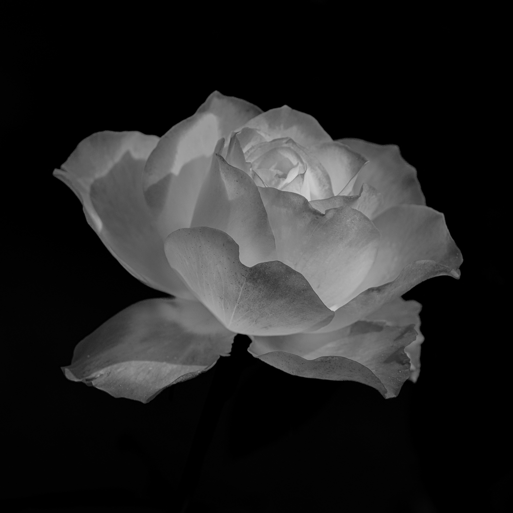
Doug you have a good idea here. The Rose (Carnation) is well exposed and composed, and I like the top edges of sticking up thru the texture. I also like the texture, do you know where you got it or how you made it? I do however think that the opacity for this image should be dropped to make the texture fade into the background just a bit more. |
Oct 11th |
| 80 |
Oct 22 |
Comment |
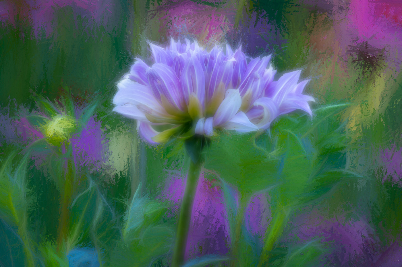
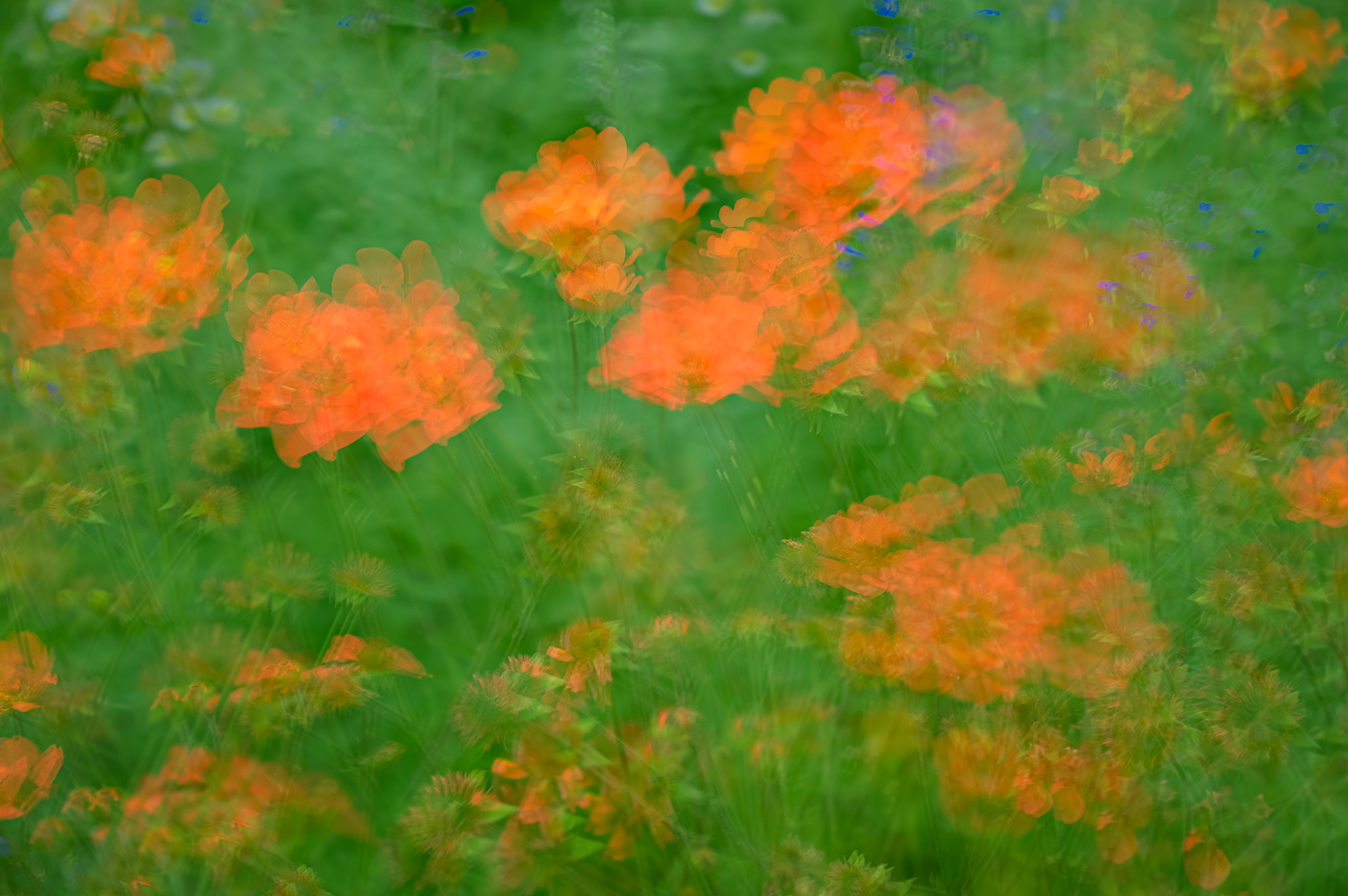
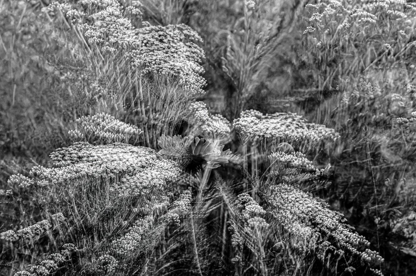
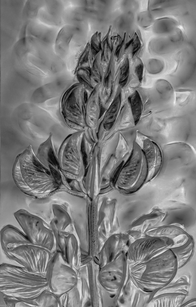
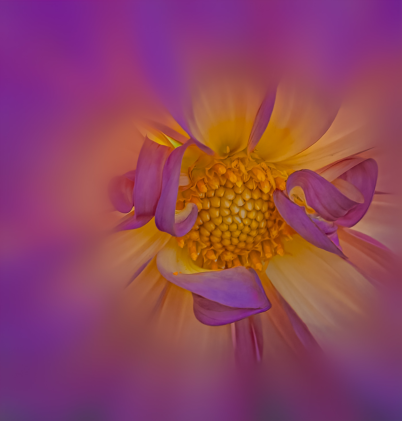
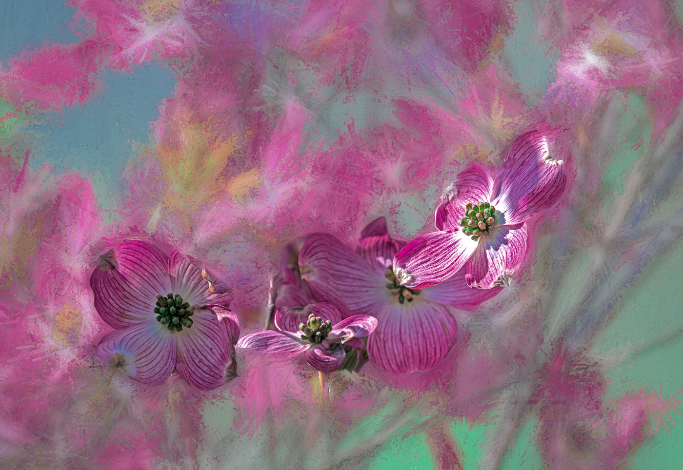
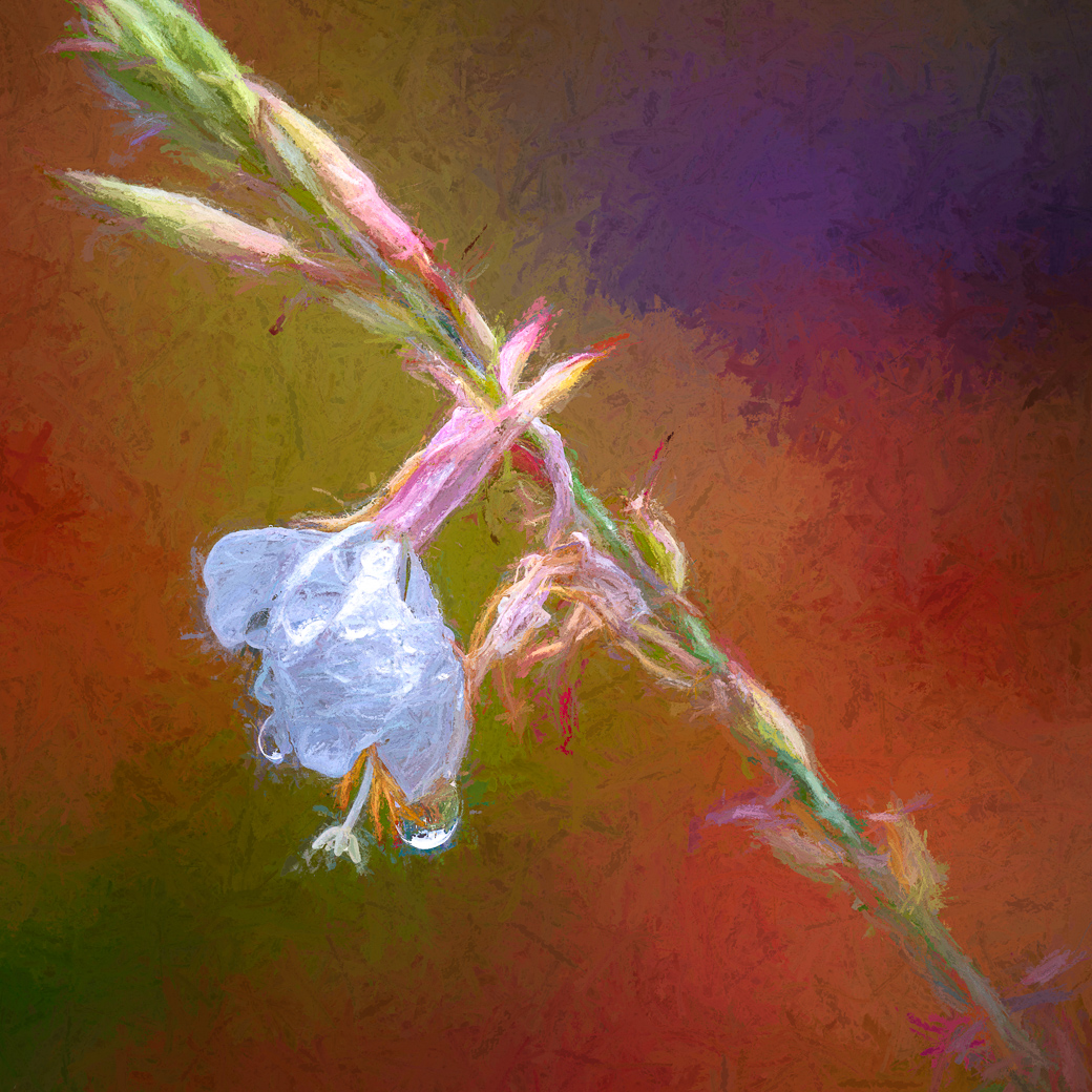
Nadia, I really like Magnolia buds and you captured this one beautifully with the curves still in the petals. I like the fact that you flipped the image so the blossom stem leads your eye into the subject. I have to admit that the brush stamps are too inconsistent for my style, particularly the small grid style at the tips of the petals. Just my own preference, but I think the brush styles should be consistent as though they were painted. |
Oct 9th |
| 80 |
Oct 22 |
Comment |
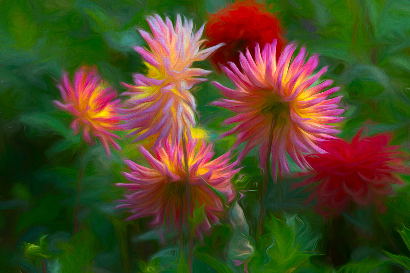
Jacob, this is a very nice image. I like your edit of the original bringing in more saturated warm colors and darkening the background. Perhaps I would try to do content aware fill/or clone out or use the high light slider to remove the white pole at the top of the flower and the whites in the top right and left corners can also be darkened. Well done. |
Oct 9th |
| 80 |
Oct 22 |
Comment |
Thank you Kathryn. I like your edit. I like your edit and yes I should of cropped to square. As I remember it, there was no easy way to remove the bud pieces in the bottom corners, so I left it. Thanks for sharing. |
Oct 9th |
7 comments - 3 replies for Group 80
|
18 comments - 10 replies Total
|