|
| Group |
Round |
C/R |
Comment |
Date |
Image |
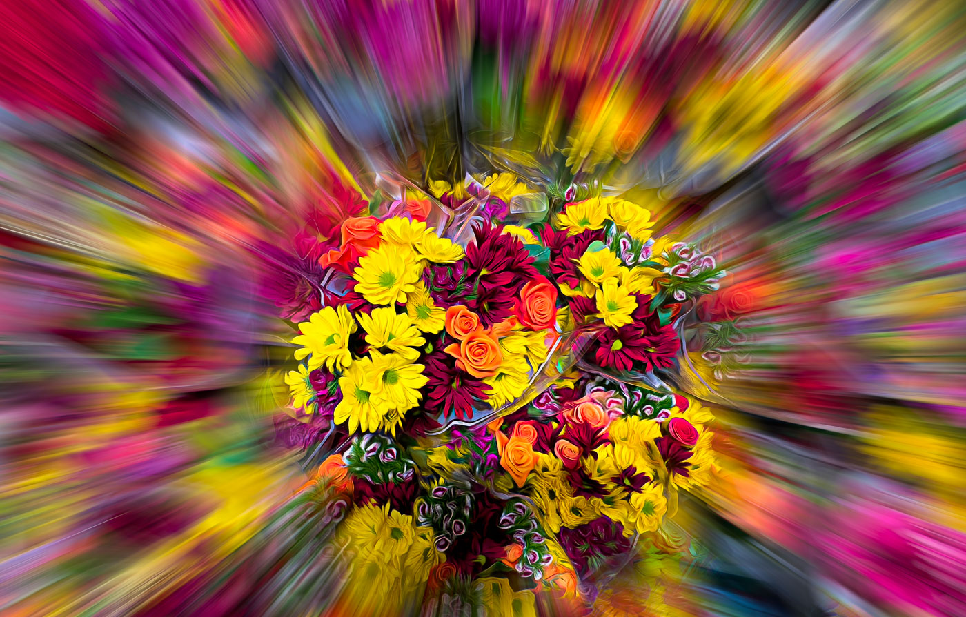
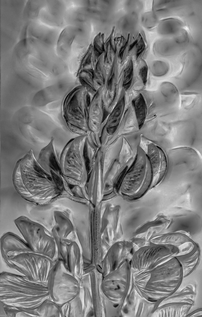
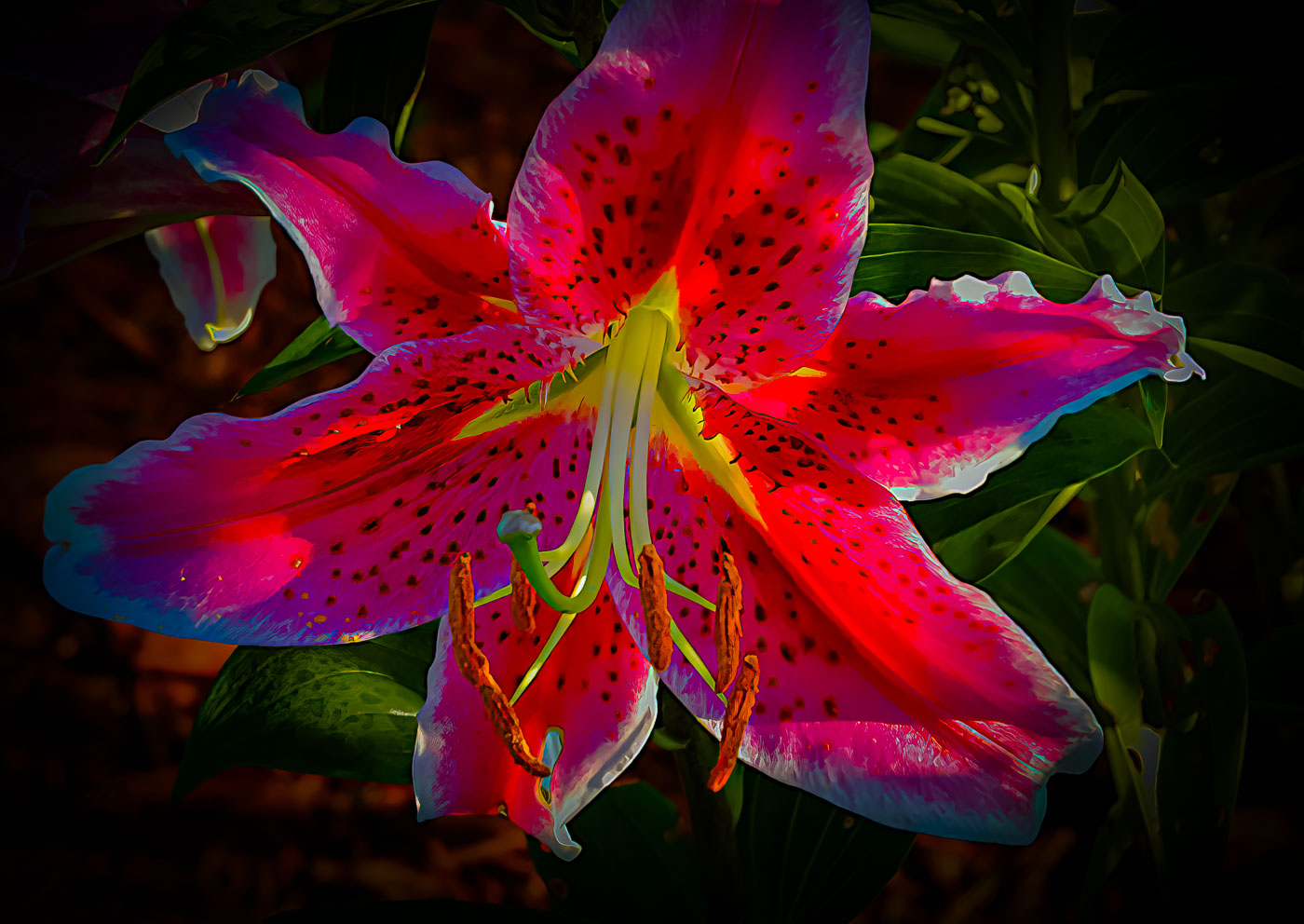
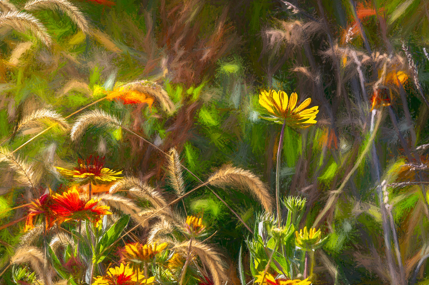
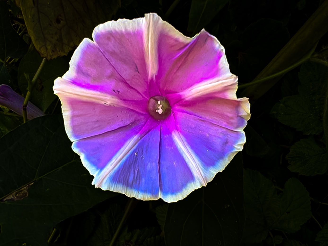
| 3 |
Sep 22 |
Comment |
Color Dodge
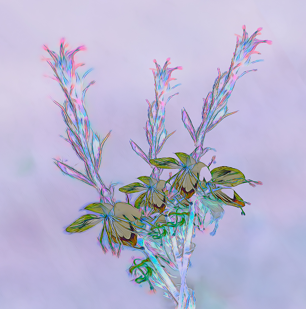
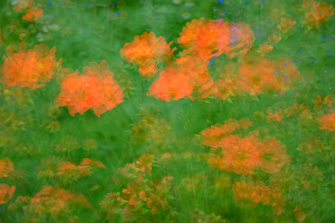
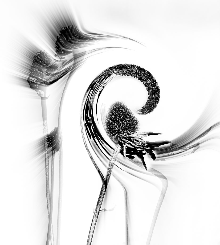
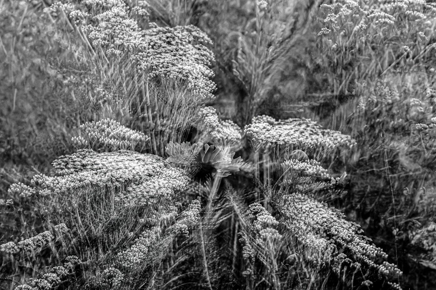
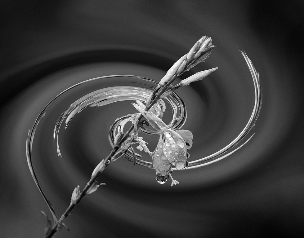
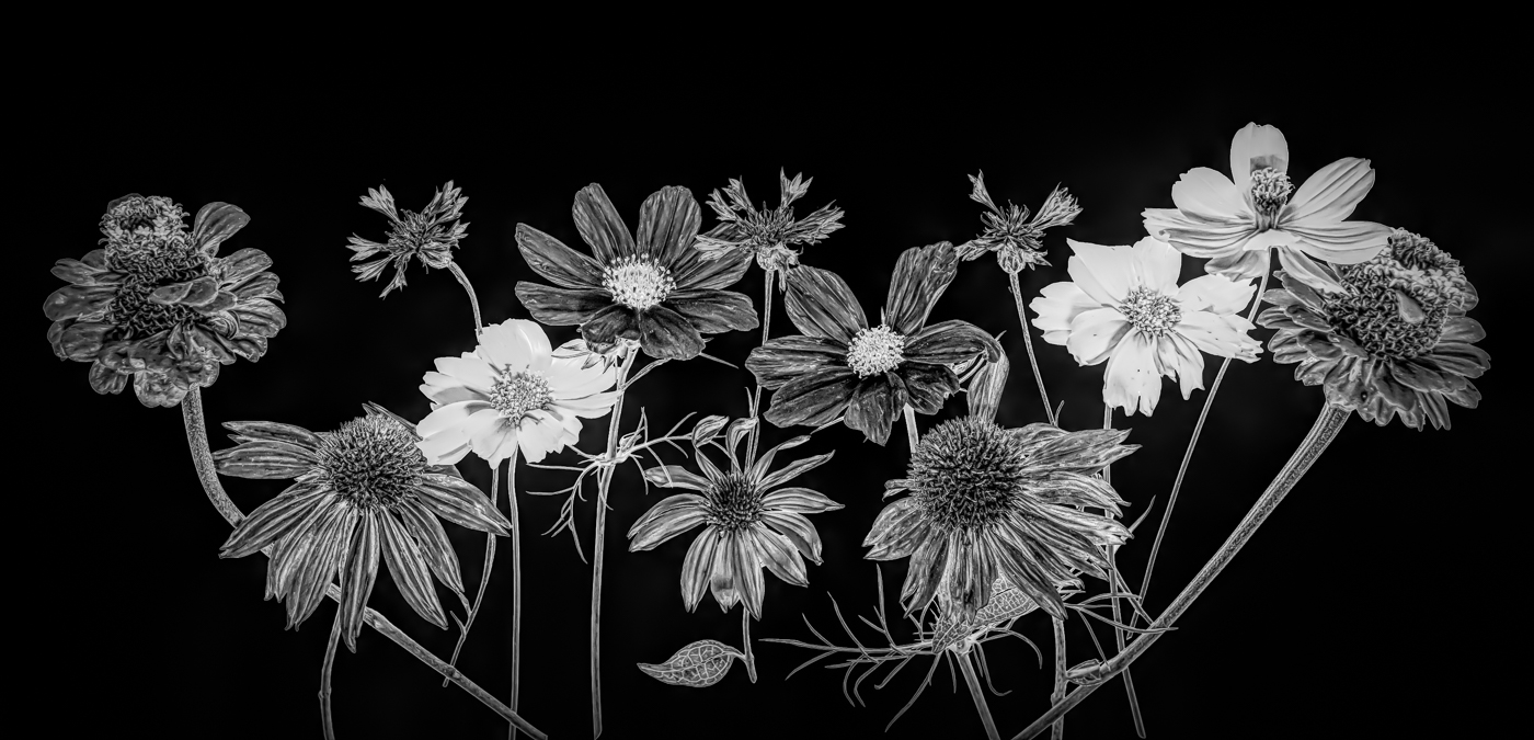
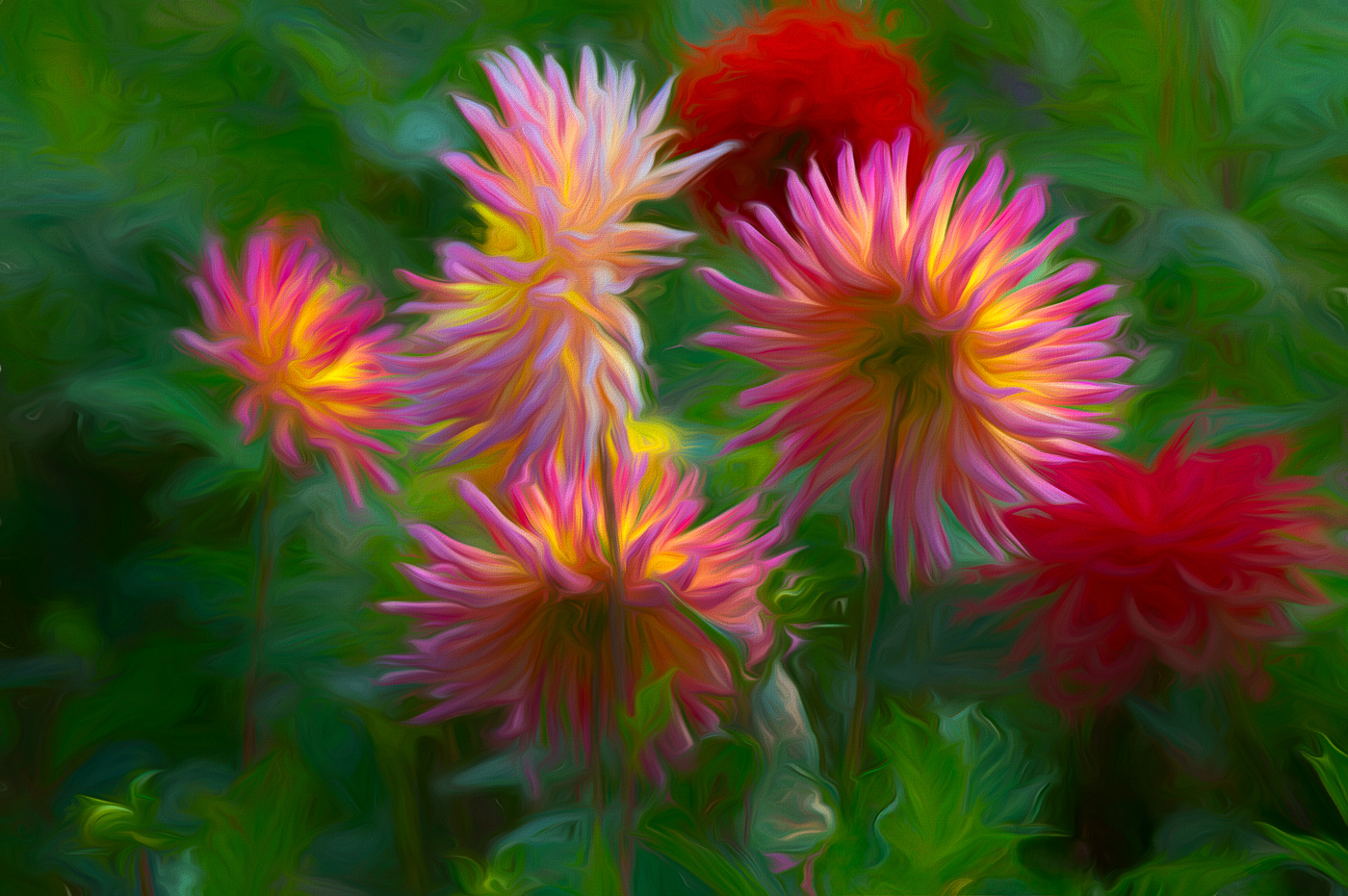
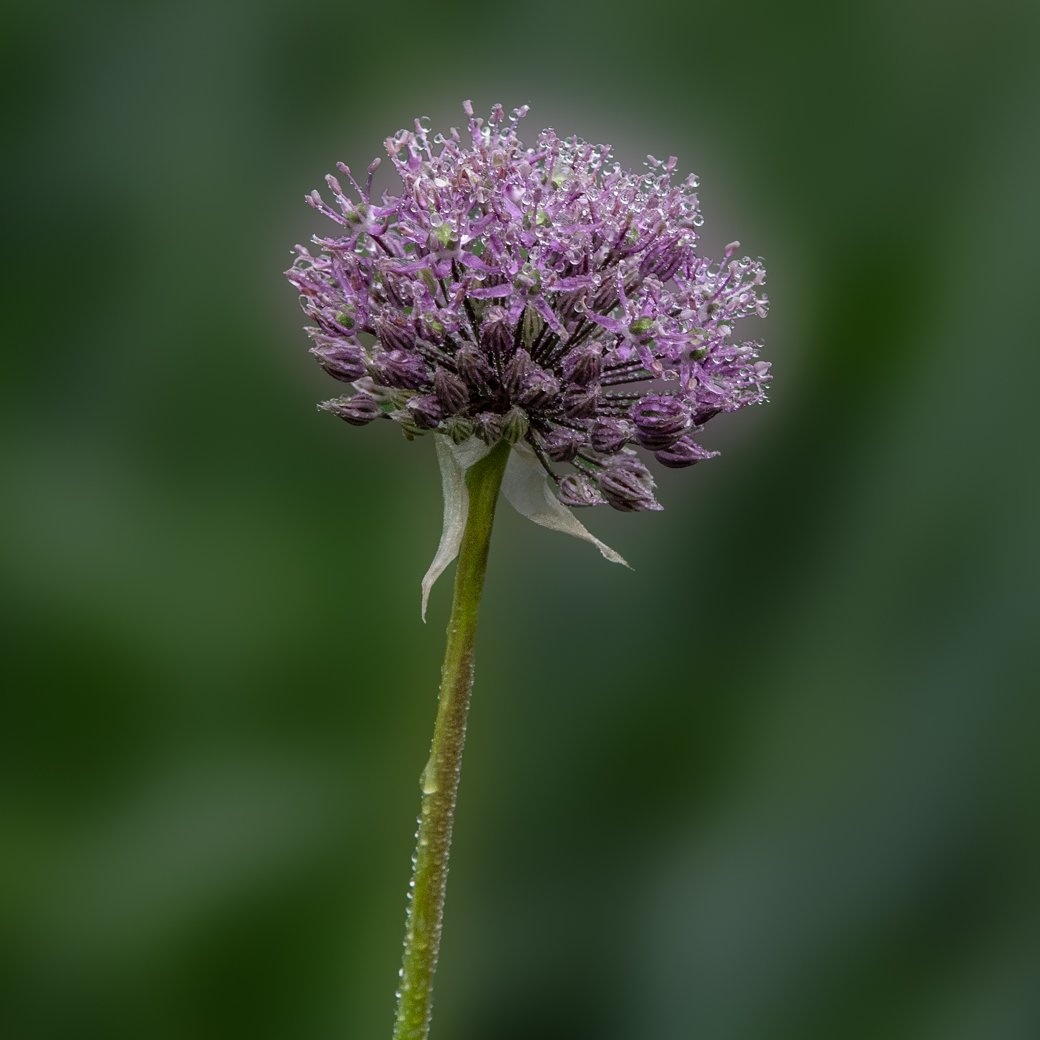
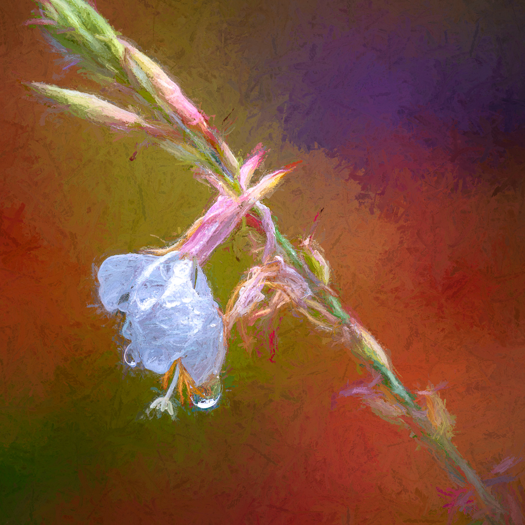
My Cam. Data Nikon D780,ISO 1600,500mm (using 200-500) f7.1 @ 1/320 sec
As you can see I was taking advantage of shade, and stopping motion from the breeze. These flowers are growing about 8' tall and the stalks do not support all the heavy flowers and buds in a breeze.
Thanks for your help Michael and hopefully I've shared something that will be of assistance to you.
Bob |
Sep 6th |
 |
| 3 |
Sep 22 |
Comment |
|
Sep 6th |
 |
| 3 |
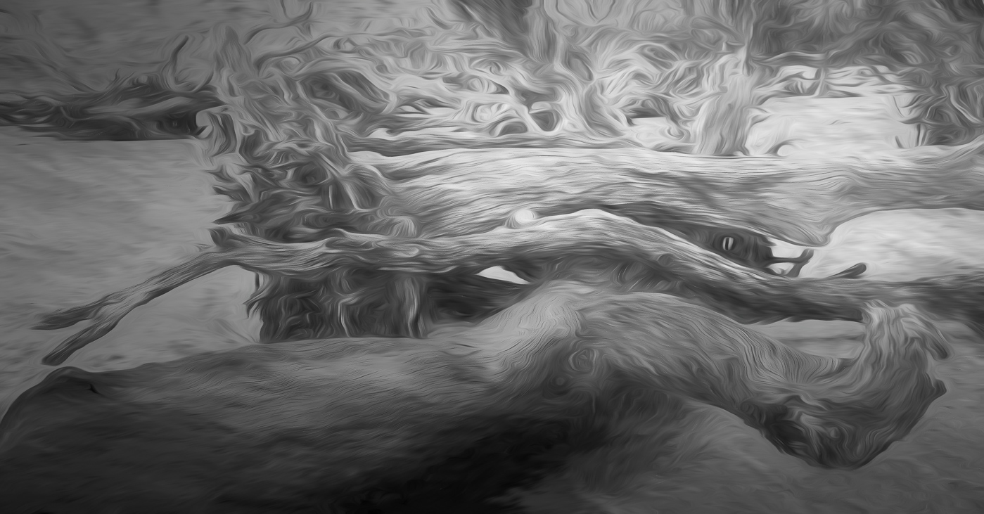
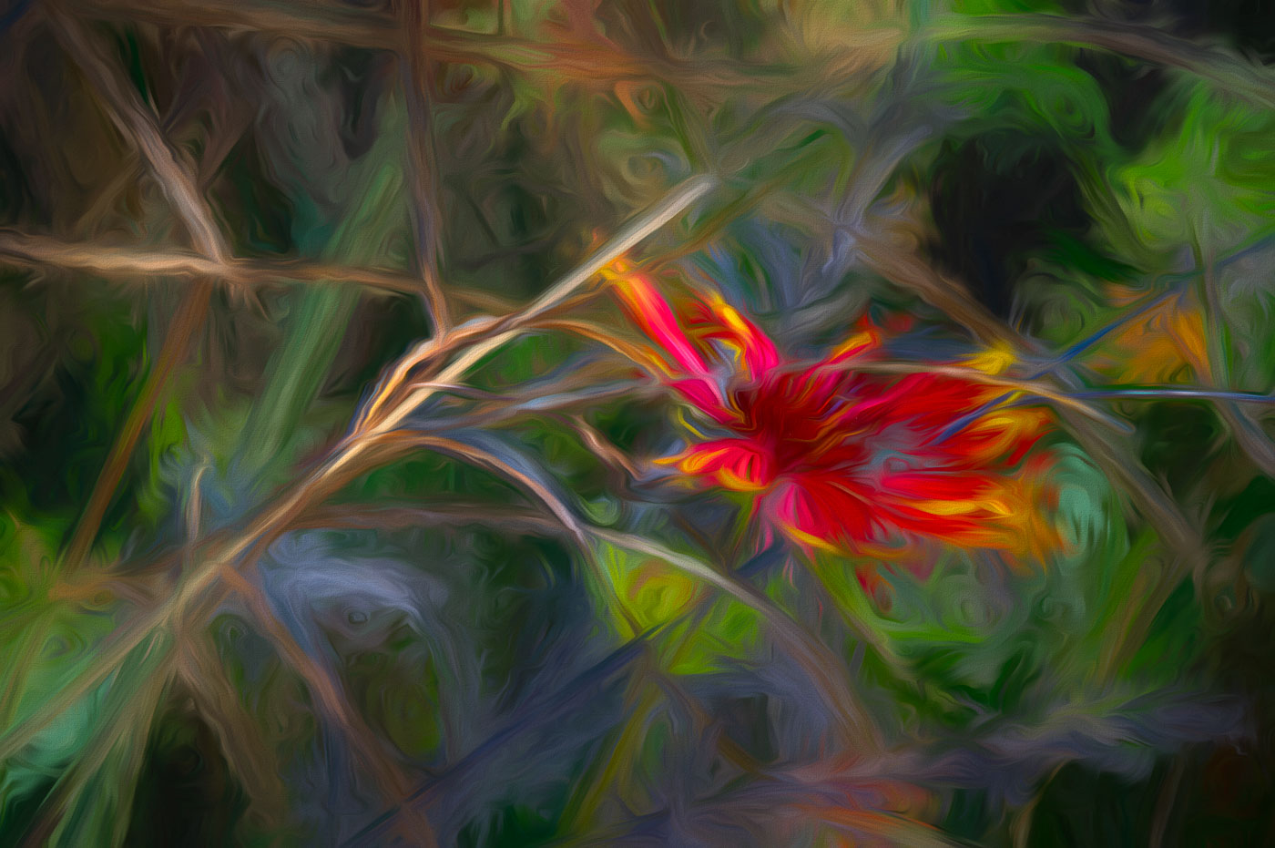
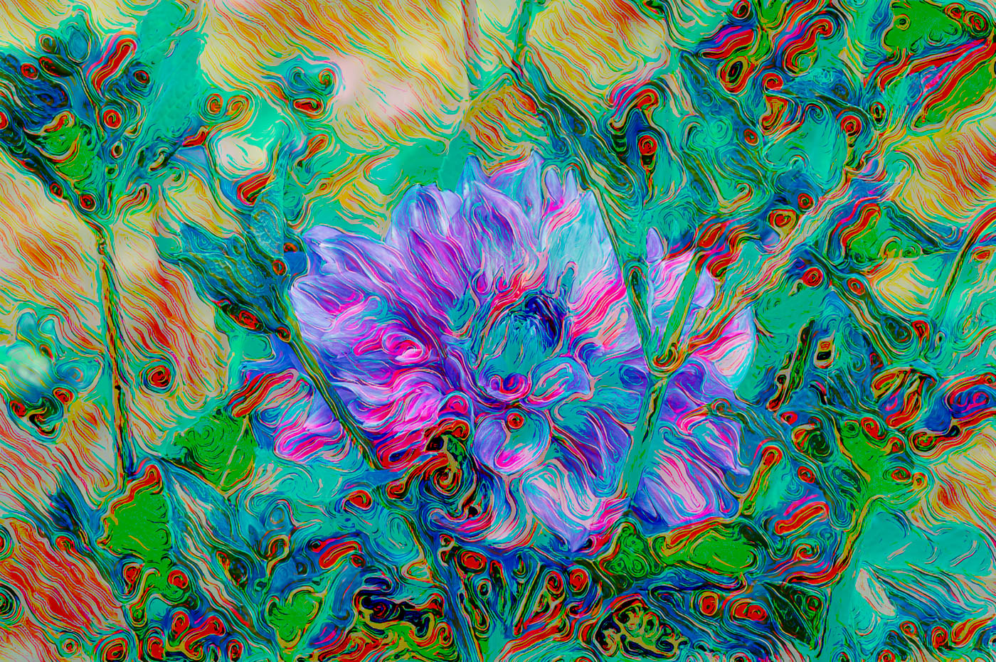
Sep 22 |
Comment |
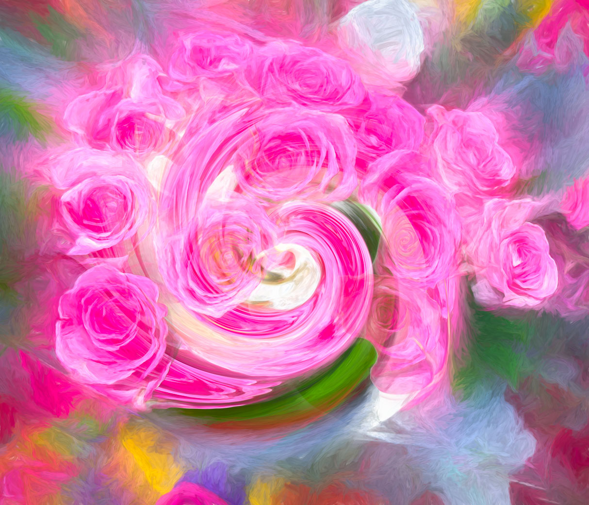
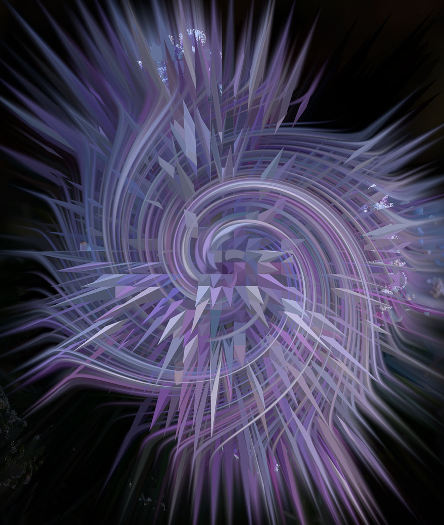
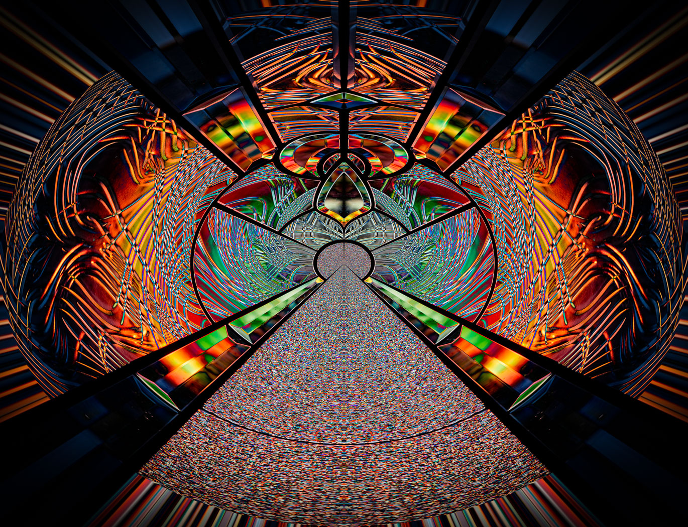
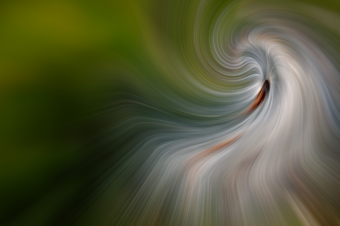
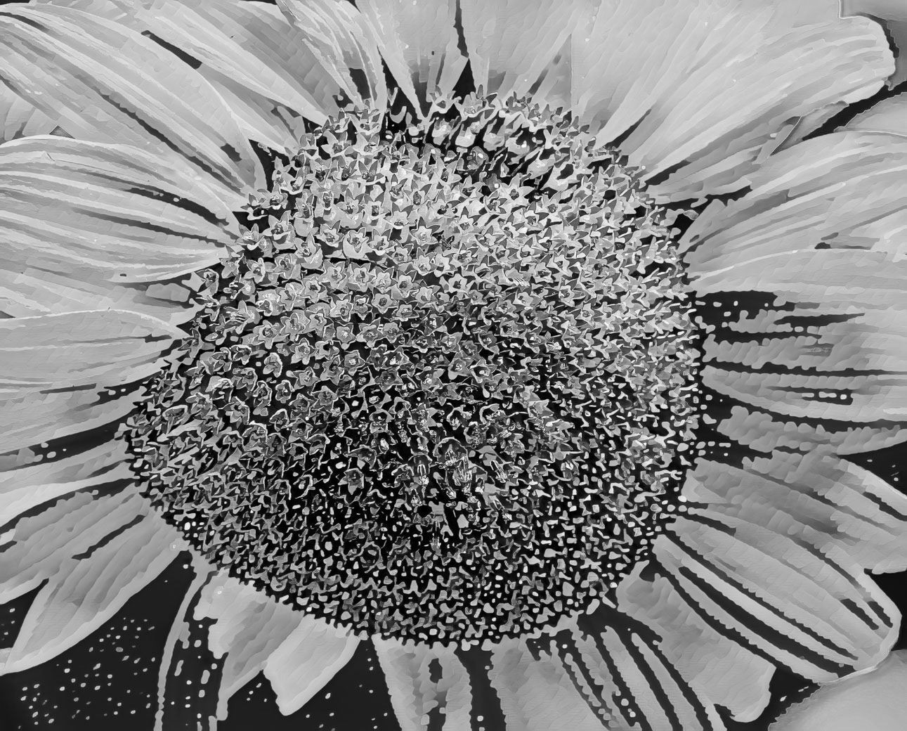
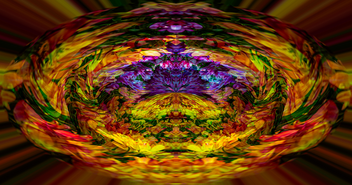
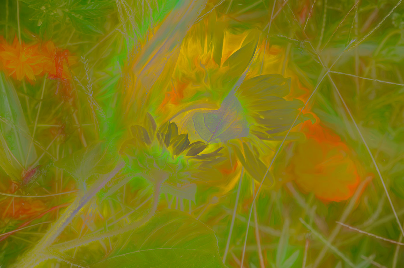
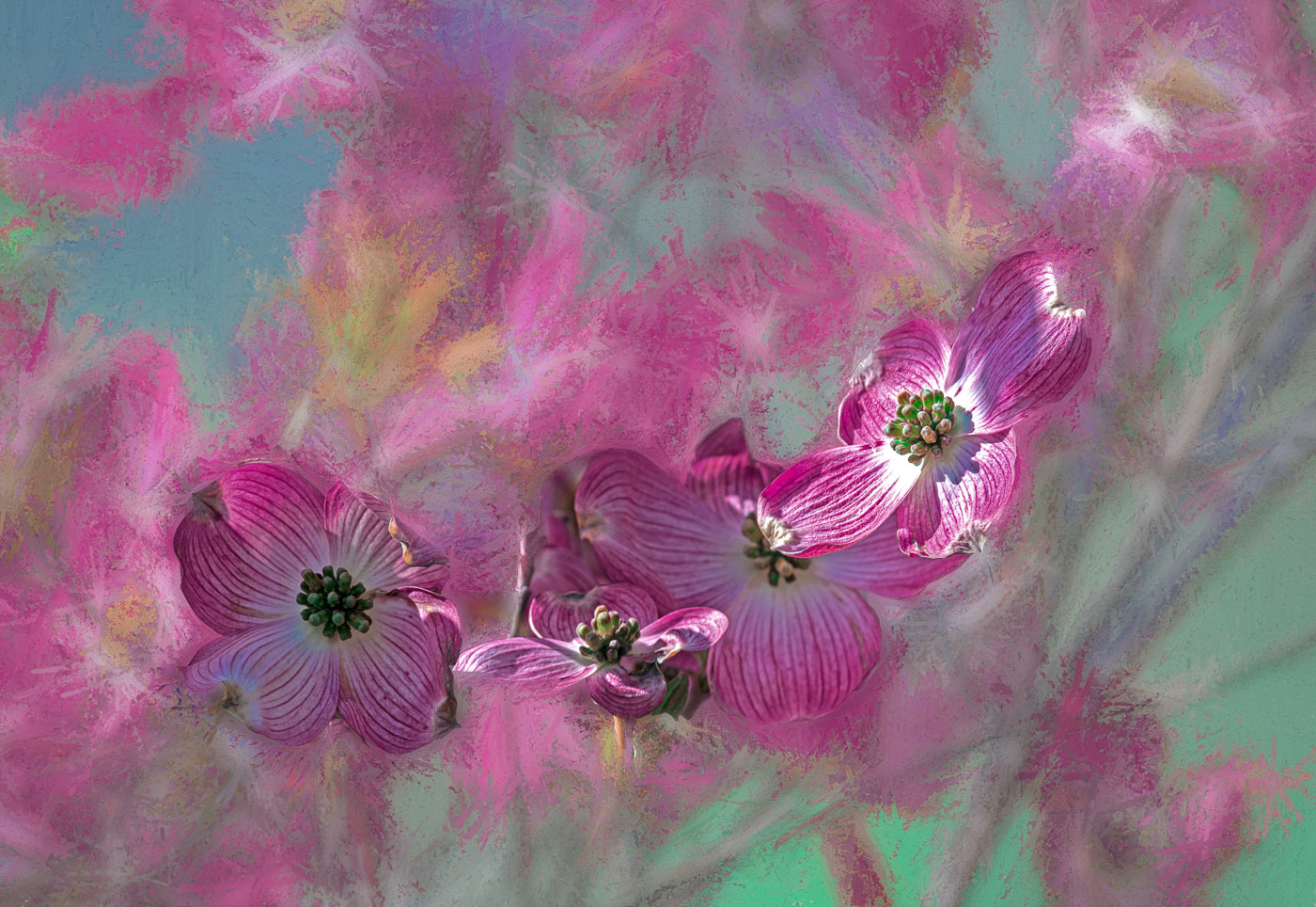
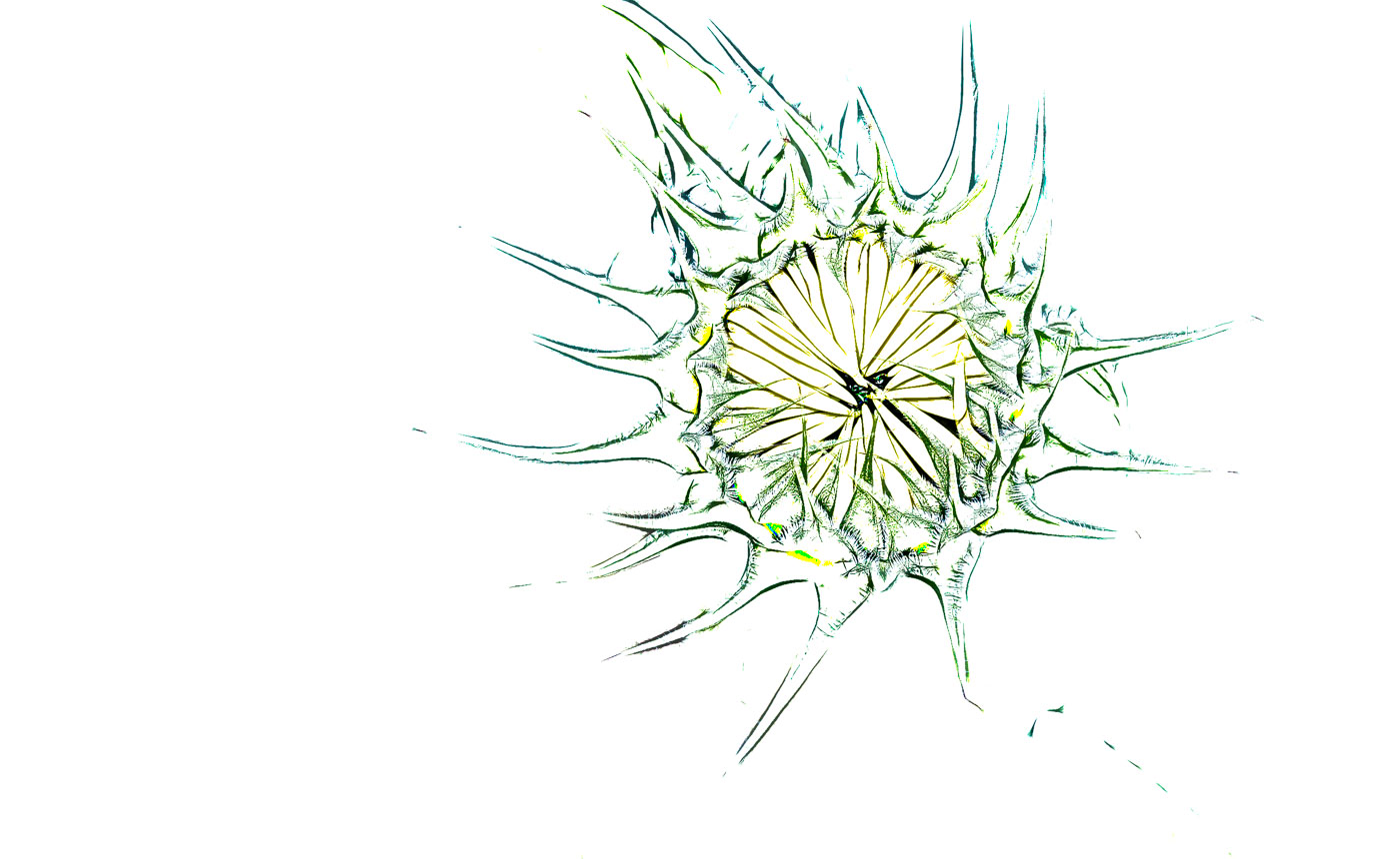
Michael, here are my results. As it turns out my method using Topaz2 SketchOutline w/Smudge turned off did a great job making the outline. I imported into Ps with original, as layers, made copy of background layer, and contrary to Ps training I do NOT use opacity layer, but go thru each blending mode. I can never remember what spot I liked on the slider when trying to go back and find it. In this case combining layers between sketch and original there were several good options for this impressionistic guy, Color dodge and Luminosity came out virtually the same and others I didn't write down. I explored using the invert(negative)layer but it didn't do anything positive for me. On my way to look at Ps Sketch filters I found the glowing edges, and it popped for me for I've included that. I've since increased exposure. I'm off to sleep shortly so if I can remember I'll answer any questions tomorrow |
Sep 6th |
 |
| 3 |
Sep 22 |
Comment |
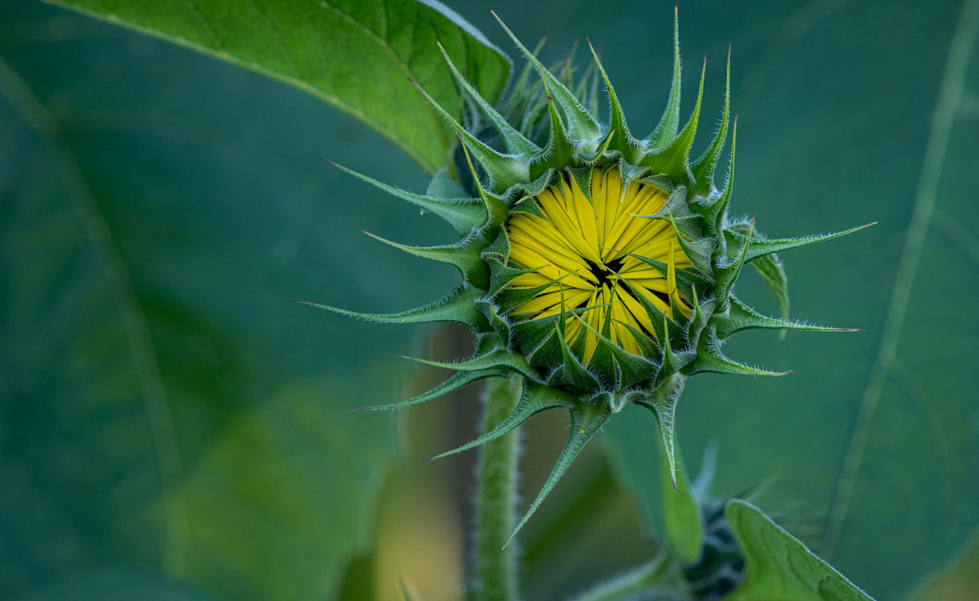
Michael, I can't compare my work to yours. I'm not that patient to put three works of art into 1 submission. And I also have limited Ps skills and not able to reconstruct images like yours unless I found the specimens and put them on my lightpad or are you making sketches in Ps or Topaz? I There is a member, Douglas Wolters, in my DD80 group that is making unusual images from Hosta plant leaves. Last night I was working on a Sunflower bud which is quite large and not opened up yet and was trying to give it the sketch/outline appearance but give it some color and was unable to do it. This was before seeing your images. They are excellent and work together and probably more salable, but me personally I would probably do one large and in your face. I've done that for years and my 1 word for my type of image is IMPACT. Not trying to convince you to do that, just giving you my mindset. Great to chat with you again.
Bob |
Sep 6th |
4 comments - 0 replies for Group 3
|
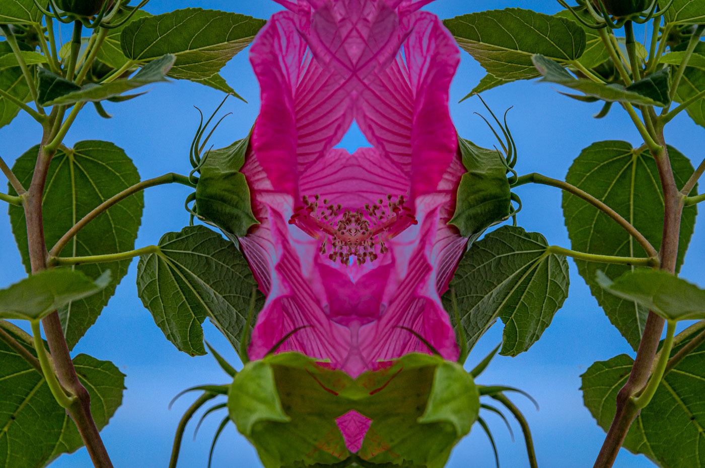
| 24 |
Sep 22 |
Reply |
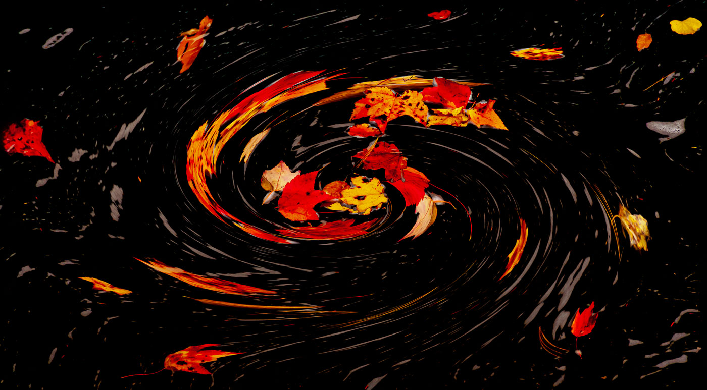
I'm good with the dropped exposure on the upper leaves and leaving the different and interesting leaf on the bottom right. Possibly its different because it is forming a Rose Hip. |
Sep 18th |
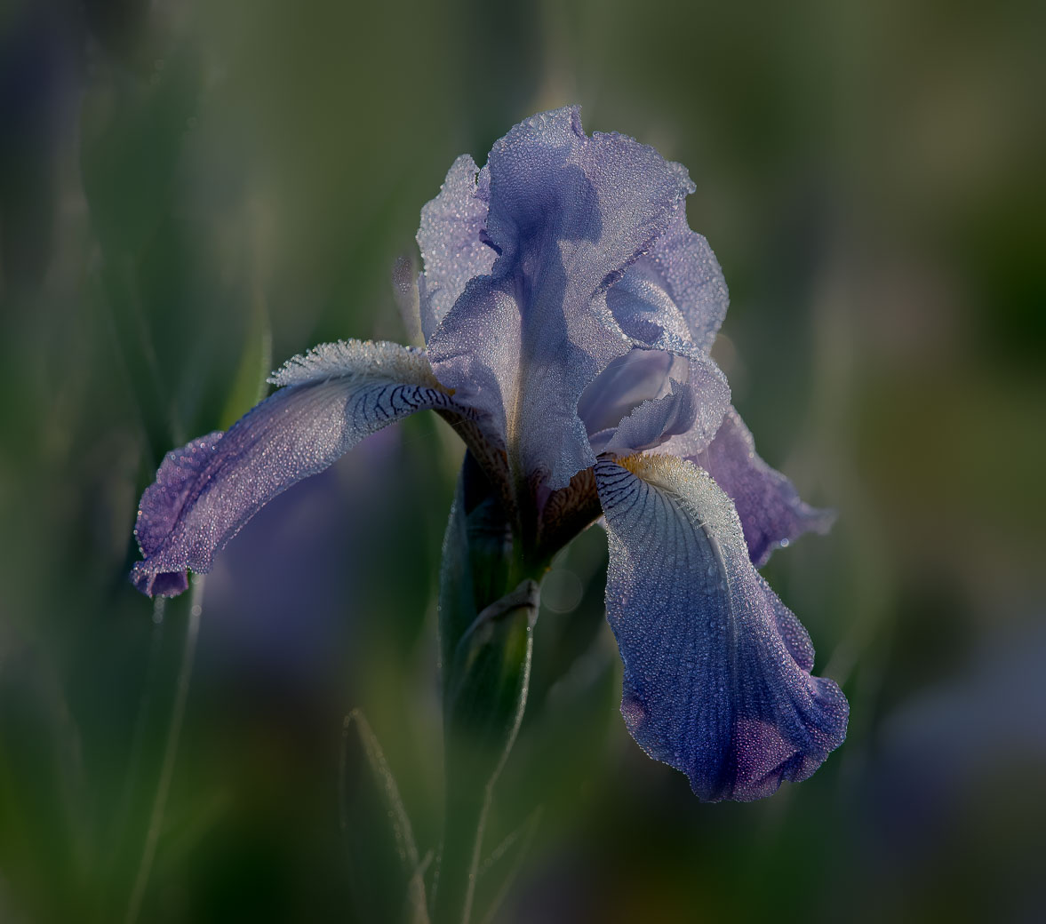
| 24 |
Sep 22 |
Comment |
Lynne, this is a stunning image. I Love the translucency that you created, the colors and the water drops and even the small leaves on the lower stem. Just beautiful. |
Sep 11th |
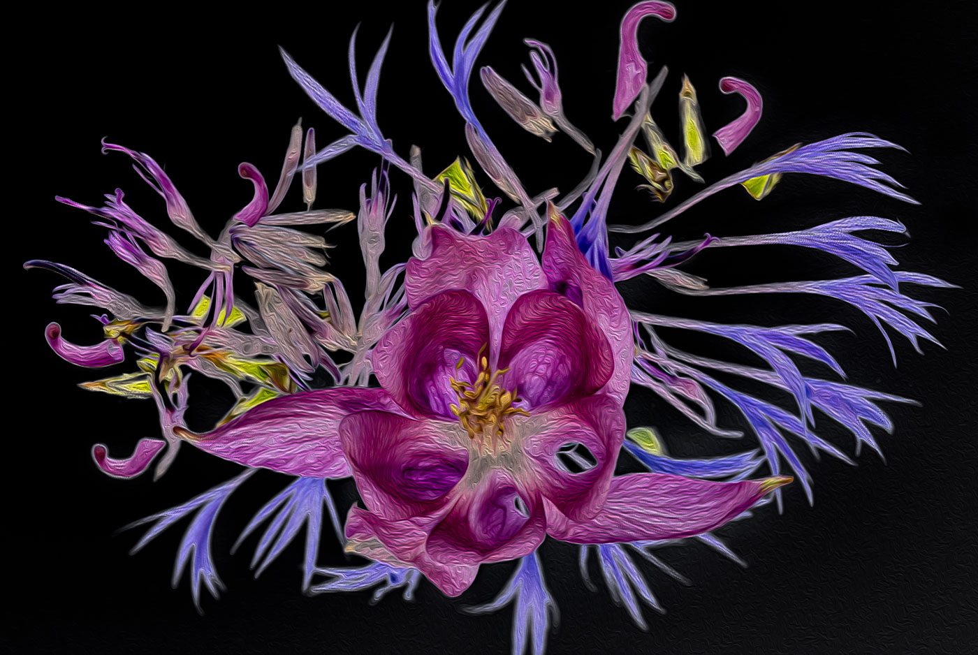
| 24 |
Sep 22 |
Comment |
Beautiful colors and sharp details on the flowers. I don't have a problem with the black background but the bright tones on the top green leaves could be dropped. I like the bottom right leaf. |
Sep 11th |
| 24 |
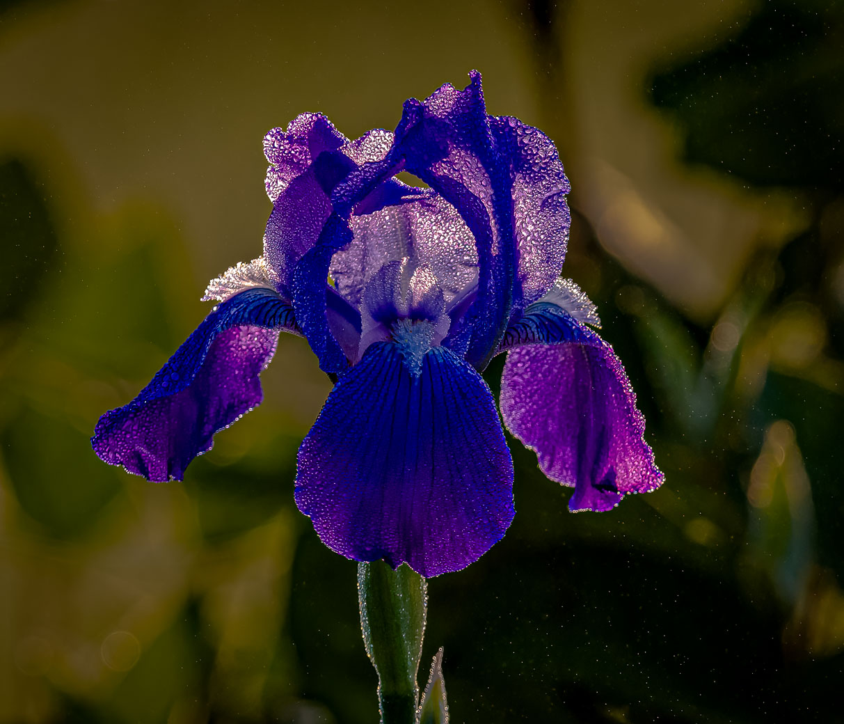
Sep 22 |
Comment |
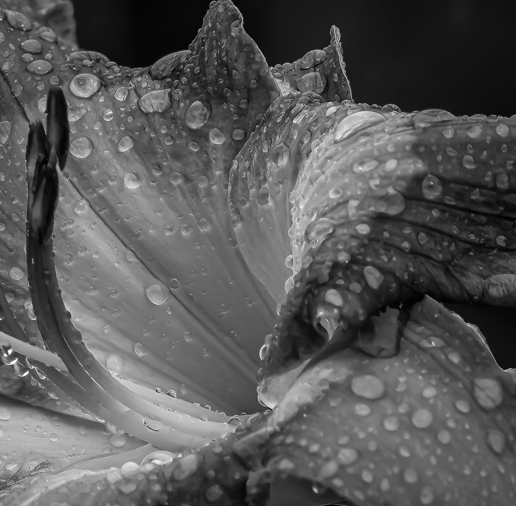
A beautiful Iris Carol. Well Done. |
Sep 11th |
3 comments - 1 reply for Group 24
|
| 29 |
Sep 22 |
Reply |
Thanks Judy. The luminance on the side green leaves is an easy fix. Had to leave some improvement. Yes, I can work with you on enhancing with Topaz. Not sure the best way to do that. I generally start with a great image. In this case the beautiful backlight on the flower gave me a great start on editing. |
Sep 10th |
| 29 |
Sep 22 |
Comment |
Thanks Tim. Tell her to grow them and then shoot them. The trick is to get the back lighting and the dark background. Okay I won't tell her. |
Sep 7th |
| 29 |
Sep 22 |
Comment |
Thanks Gunter. I've had a good crop of sunflowers and you'll see more version before winter. Have a great day. |
Sep 6th |
| 29 |
Sep 22 |
Reply |
Tim, I understand smoke coming out front would be distracting also. If you did this edit more than a year ago, perhaps the new selection tools in Ps and LrC and content aware replacement features in Ps can make the mantle disappear & maybe just use the stone above mantle to recreate. |
Sep 6th |
| 29 |
Sep 22 |
Comment |
I am aware of those conversions and most people are happy with them. I have just 1 camera body and have passed up the conversions in the past. I'm going to stick with my flowers. Thanks for the info Ron.
|
Sep 5th |
| 29 |
Sep 22 |
Comment |
Excellent Ron. Yes, at least the colors synch up so someone won't prejudge without looking at the work you put into it. If you love IR do more of it. You are off to a great start.
Did you have a DSLR converted to IR and you use different filters depending whether you are shooting color or B&W? |
Sep 5th |
| 29 |
Sep 22 |
Comment |
Ron, It the size did you export it between 1200 & 1400 wide? |
Sep 5th |
| 29 |
Sep 22 |
Comment |
Thanks Ron, Yes Sir, Love my Topaz filters. |
Sep 5th |
| 29 |
Sep 22 |
Comment |
Thanks Ron for giving it a try. As soon as you enter the IR world it is all whimsy. Ron, is it possible that when you attached the edited image that it was oversized? I have the thumbnail but when I click on it, it enlarges to a point that I only get a portion of the sky.? |
Sep 5th |
| 29 |
Sep 22 |
Comment |
Ron, you've handled this very well. I like the blue foliage and reflection in the water. I do find the hint of magenta colors in the grass and foliage and wood in the water not matching. I have no idea if that is what you wanted or not? I might change the color temp to see if that made it better or worse. The replacement sky works very nice also. Then again I ask if you changed those color temps to see if the blue in the Milky Way would come closer to the blues in the grass or water reflection. But then again I don't know if your objective was to make it look realistic or more Creative. |
Sep 4th |
| 29 |
Sep 22 |
Comment |
Hi Gunter. I like this image. All edges appear to be sharp and I like the composition with the glass pointing down to me. It certainly is minimalist, and the crystal cuts in the glass at the top of the stem reinforce its beauty. I would of not seen this type of image without your good work. Excellent. |
Sep 4th |
| 29 |
Sep 22 |
Comment |
Very Nice Karen. It's on my bucket list but may not happen. This is the first time I can remember seeing these,Fireweeds, in a Lake Louise image. I really like the color they bring into the image with the contrasting blue green of the glacial lake. Well exposed and foreground is sharp where it needed to be. Excellent. |
Sep 4th |
| 29 |
Sep 22 |
Comment |
Nice Capture Judy, Cannon balls in foreground work nicely. Depth of field is fantastic and its sharp front to back. Exposure is great. No suggestions about technical data, except that it is helpful. In regard to balance you probably had little choice about another composition. Cropping the left side to the edge of the cannon balls would of eliminated that nice curve in the bricks, moving to the right would of given you more concrete that appears there. Going horizontal wouldn't have helped either. You might of moved further to the right to prevent the merge of the cannons and kept the cannon balls? Just some composition thoughts! |
Sep 4th |
| 29 |
Sep 22 |
Comment |
Hi Madeline. You are getting some nice wildlife viewing and image opportunities. Understand you can't pose this moose but you did very well capturing it. I'd recommend cropping some from the top and from the right. Those areas aren't adding anything to the subject and making the subject closer is always good with wildlife. The brighter stick leading to the moose is helpful and I think that some more of the vegetation could be cropped up from the bottom. Maybe an equal amount of cropping on 3 sides (not the left side), say an inch? Great image. |
Sep 4th |
| 29 |
Sep 22 |
Comment |
Hi Tim. My eye was immediately drawn to the orange flame and the light smoke going up the chimney. The window light is beautiful also as well as the exposure on the gentlemen. My only nit is what's happening at the fireplace mantle. It's dark and blurry as well as above it. No reason to be blurry in that spot unless you needed to repair something or it went funky when you brought up the darks inside the fireplace cavity. Maybe that's where the lens correction was? I don't have a good suggestion for fixing it. Sorry. |
Sep 4th |
13 comments - 2 replies for Group 29
|
| 61 |
Sep 22 |
Comment |
David, this is a beautiful Dreamy image. I do agree that the background is a tad too bright. Excellent use of Ps to add the flower into that empty space. |
Sep 11th |
| 61 |
Sep 22 |
Comment |
Excellent image Ingrid. Beautiful exposure, sharp details (amazing for only a f4) and very nice background. Post processing well done. |
Sep 11th |
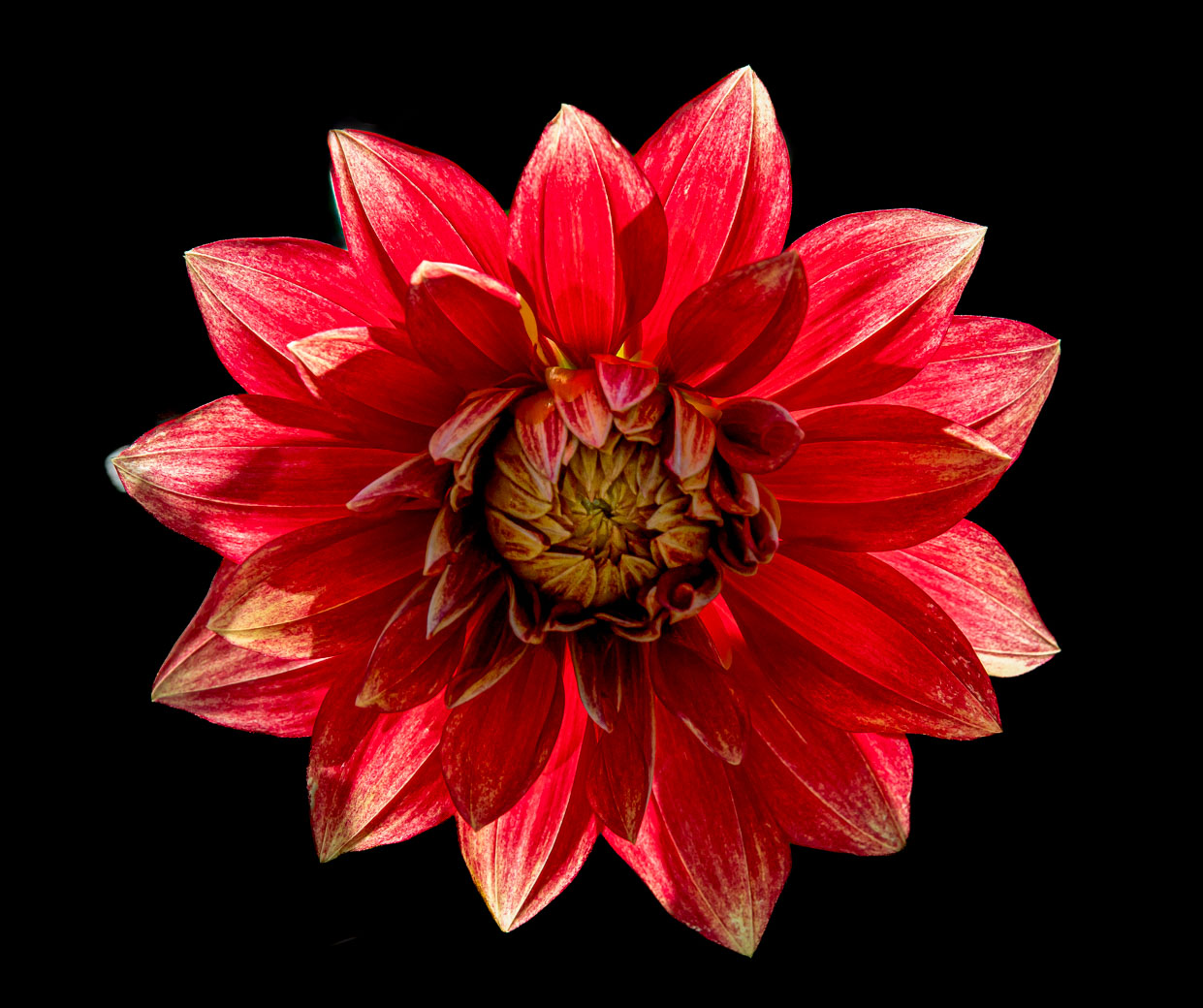
| 61 |
Sep 22 |
Comment |
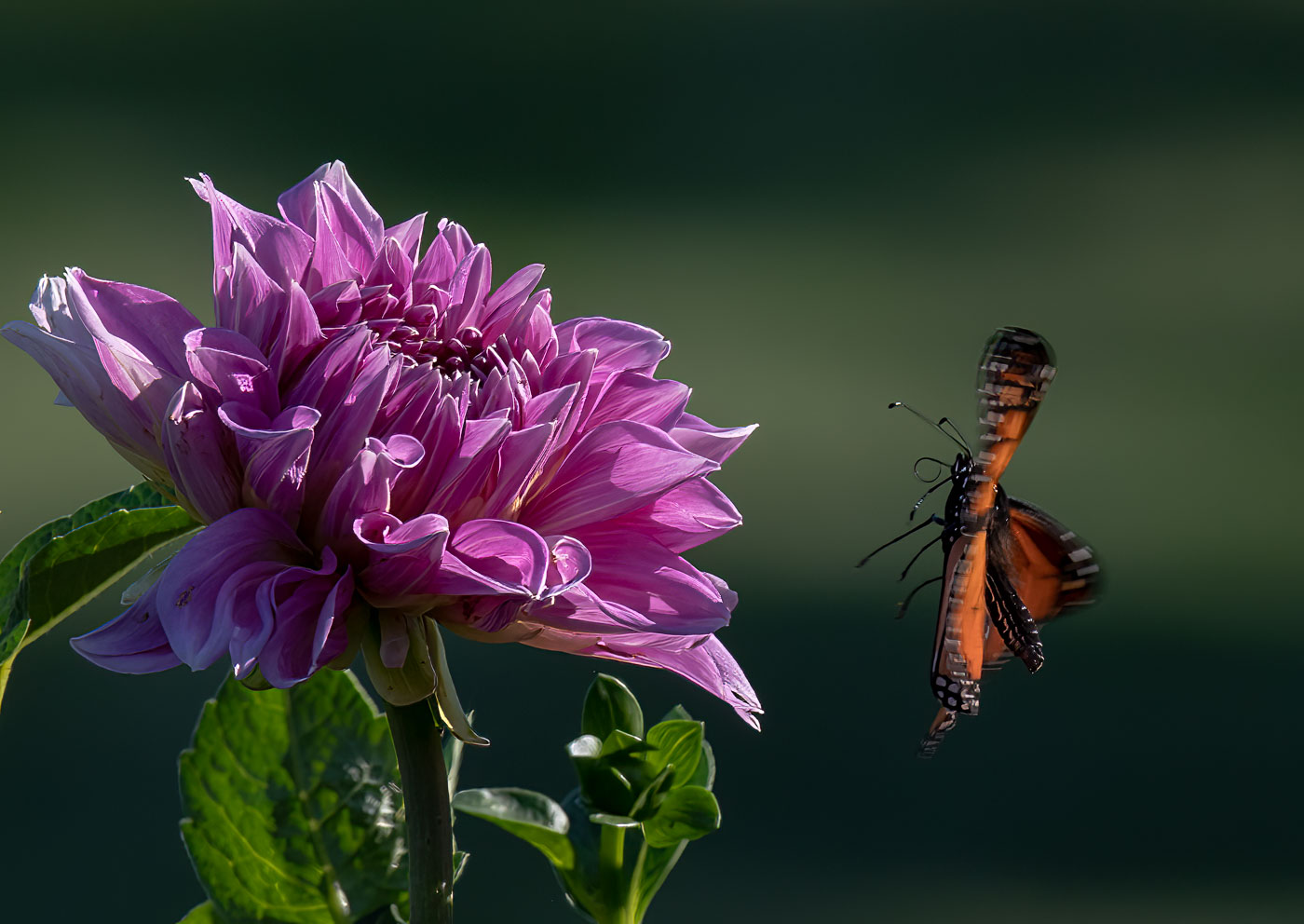
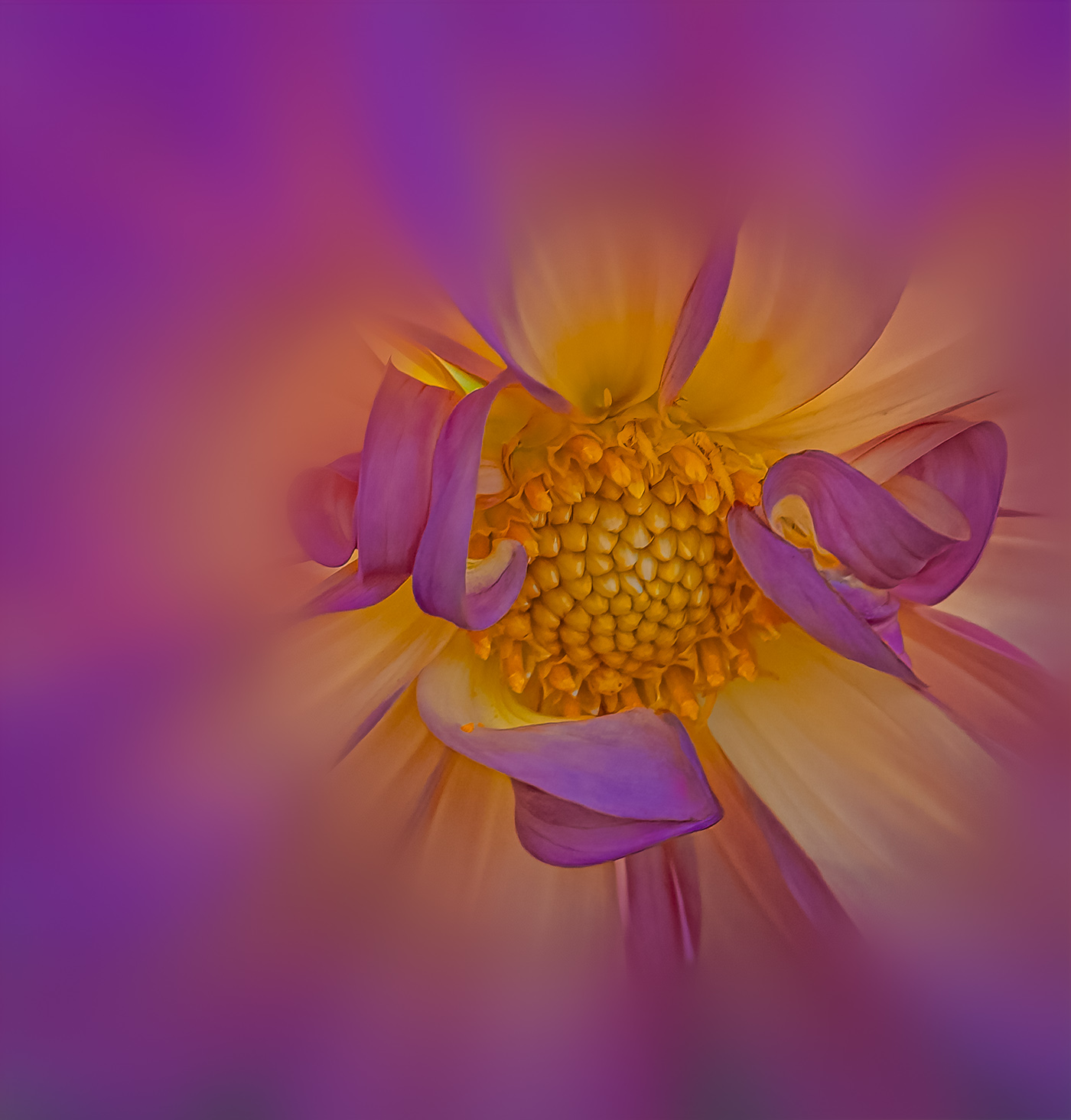
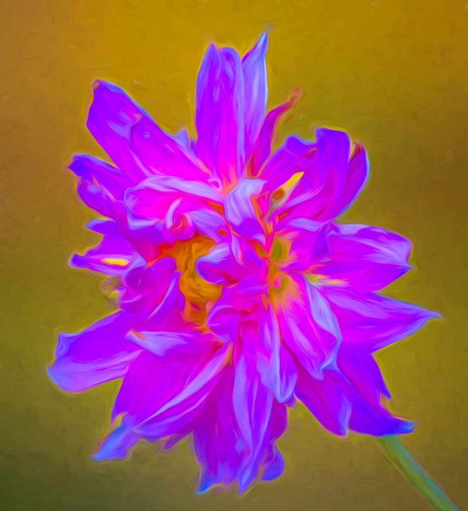
A very nice image Marti. I like the black background and the colors of the Dahlia. I wondered if you had tried lightening the stem and moved that along with the bloom? I've been using the select subject in Ps and adding stem if Ps fails. The benefit would be that flower wouldn't be floating in the black space. |
Sep 11th |
3 comments - 0 replies for Group 61
|
| 62 |
Sep 22 |
Reply |
Thanks LuAnn. No competition at this time. Only 1 club of 3 clubs have competitions and they have categories that this subject won't fit in until new year begins in January. No framing on the horizon at this time. So I'll just have to spend my time creating more images.
Bob |
Sep 19th |
| 62 |
Sep 22 |
Comment |
Emil, I for one (and probably the other members) feel you vastly improved your image and hopefully you Love it more and feel better knowing that you showed us how it was fixed. It takes a Mono Master to accomplish what you wrote in 4 lines.
Thanks, Bob |
Sep 11th |
| 62 |
Sep 22 |
Reply |
Thank you Ian, a great tip that I'll remember. |
Sep 11th |
| 62 |
Sep 22 |
Reply |
Thanks Ian, but what is a key line? |
Sep 11th |
| 62 |
Sep 22 |
Comment |
Thank you Michael. Appreciate the encouraging words. |
Sep 6th |
| 62 |
Sep 22 |
Reply |
Thanks Pete. I'll have to pick only the ones with good texture. I guess getting dinged for non-textured flowers isn't too bad. |
Sep 6th |
| 62 |
Sep 22 |
Comment |
Thank you Emil. |
Sep 5th |
| 62 |
Sep 22 |
Comment |
I'm on board with Pete's suggested edit if that half stop lighter was applied to the right stone wall and planter but cut down the hilites. The light on the path works to bring the eyes in and around the corner. In fact Emil's original right wall toning with hilts dropped works well for me so maybe its just the light foliage overhead and midway on right in Emils image that causes the confusion with the eyes completing the trip down the path. |
Sep 5th |
| 62 |
Sep 22 |
Comment |
Emil, I Love the textures of the wall, path and the trees in your color image. I'm just not feeling that the B&W conversion works well. Not enough variation in the tones of the vegetation. Granted you have lighter tones mid image, but it doesn't bring my eyes beyond the brighter area over the wall at the corner, so I'm left with no subject or follow through on the path. We've all converted images to B&W thinking they will work but some just don't. |
Sep 4th |
| 62 |
Sep 22 |
Comment |
Hi LuAnn. I also did not associate your image/shadow with a shuttlecock. It is right in your wheelhouse finding a minimalistic item and creating its shadow to make a compelling image. I also think the shuttlecock is a tad over exposed but I'm fine with the background cloth and the darkness of the shadow. A Great Idea. |
Sep 4th |
| 62 |
Sep 22 |
Reply |
Israel, great capture of the actors in their Tableau. Beautiful moment to capture.
Bob |
Sep 4th |
| 62 |
Sep 22 |
Reply |
Pete, I believe that an actor (front row left) has red on his eye lids and 2nd Row Left guy has red in creases of his coat. My eyes, my screen, or didn't it convert fully?
I do agree with you removing the actors from the floor to strengthen the interaction with the viewer and the expressive actors standing. |
Sep 4th |
| 62 |
Sep 22 |
Comment |
Thanks Israel. Issue is cropping in my post above.
Bob
|
Sep 4th |
| 62 |
Sep 22 |
Reply |
If he has Facebook and email, then he has his facilities and that's what he chooses. I don't blame you for not asking him to move his hat. You did just fine. Thanks |
Sep 3rd |
| 62 |
Sep 22 |
Comment |
Pete, my understanding was that the change to 1400w happened about the time I joined DD and that's when they also changed the sizes for PSA competitions. Every submission I have made has been using the 1400x1050. Maybe the server has been downsizing but this is the first I have noticed. My other 2 DD's and PSA Int'l have all been the larger size. No according to the rules I can't let you resize for me :-). Leave it as it is please. |
Sep 3rd |
| 62 |
Sep 22 |
Comment |
Bunny, I'm with the others about being hesitant to do this shot. Fantastic for you as you made a beautiful image. I bet he didn't have any before yours. The idea of the crossed hands to shown them of is any stroke of genius. My thought, which probably would NOT of come while in the moment of shooting, is what is tattooed across his forehead? |
Sep 3rd |
| 62 |
Sep 22 |
Comment |
That's a great capture and edit by Pete, but Bunny has made it a completely different, and I believe, a more powerful image. Sorry Pete, right out of the box, Bunny is on her game for this one. ps: I wouldn't know where to start with making this edit. |
Sep 3rd |
| 62 |
Sep 22 |
Comment |
Thanks Bunny. You got that right, but who would of forecast that it would take 50 years to come to fruition. Regarding the crop, I submitted both images at 1400x675 so either PSA's server changed the submitted image. The black is cropped on both sides and the original is not. Perhaps I can get PSA to check that out. Glad I was share the flower power with you, Bunny. |
Sep 3rd |
11 comments - 7 replies for Group 62
|
| 80 |
Sep 22 |
Reply |
Doug, I was just being a devil advocate and by eliminating the two right hand corners and not wanting to place the stem in the safe lower left corner you had no other choice but to break a rule that is meant to be broken. Well done. |
Sep 28th |
| 80 |
Sep 22 |
Reply |
Doug, I don't agree with your judge. It might not be the absolute best direction for the stem to go, but if it was in the lower left it would lead the viewer into the image but it would be to common and not in keeping with such a dynamic image. What do you think about a horizontal flip putting it in the lower right? |
Sep 22nd |
| 80 |
Sep 22 |
Reply |
Doug, I also like the softening and therefore removing/easing some of the aging spots. So by the end of the month Kathryn would it be reasonable to think that you can give us your opinion whether softening, or making the aging spots more noticeable will potentially result in better reviews and greater appreciation of our own work? |
Sep 14th |
| 80 |
Sep 22 |
Reply |
Doug, I also like the softening and therefore removing/easing some of the aging spots. So by the end of the month Kathryn would it be reasonable to think that you can give us your opinion whether softening, or making the aging spots more noticeable will potentially result in better reviews and greater appreciation of our own work? |
Sep 13th |
| 80 |
Sep 22 |
Reply |
Nadia, I look forward to seeing it. Bob |
Sep 10th |
| 80 |
Sep 22 |
Reply |
Doug, I understand your desire for more intensive colors, but feel the lighter background colors in the upper left causes my eyes to go up out of the image. I want the eyes to focus on the flower. As I mentioned the AIRemix has a mind of its own and my result wasn't close to my original or to your LR version. But a worthwhile investigation in my mind. Thanks for your input. |
Sep 9th |
| 80 |
Sep 22 |
Comment |
Thank you. I have to go back and see how a lighter center looks. |
Sep 7th |
| 80 |
Sep 22 |
Comment |
Very Good Jacob. Perhaps you should use the exposure or the white slider (your preference) to make the edges of the flower more white like they are in your original. Another thing to practice is using the bandaid button to try and fix some of the imperfections in the flower and try to remove the white spot that's above the 7 o'clock arm/radial of the flower. Excellent cropping as long as its nothing important or size you need to fit into report.
|
Sep 7th |
| 80 |
Sep 22 |
Reply |
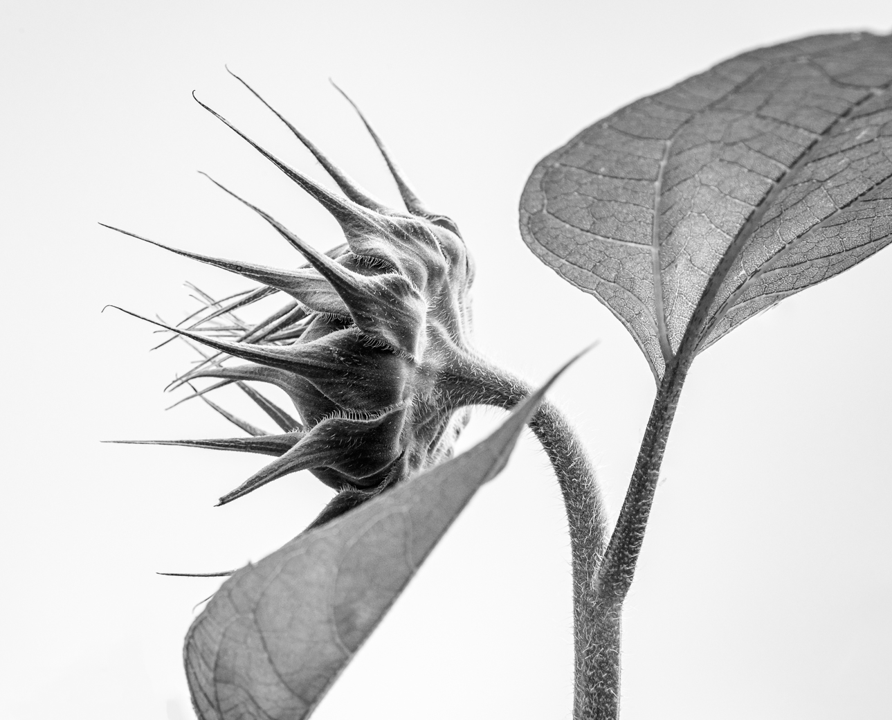
Hi Doug, yes I have the Topaz Sharpen but I didn't use it and the original Studio probably wouldn't run on my computer. Tried to use my Sunflower leaf, but I messed up somewhere probably because the leaf filled the frame.
Bob |
Sep 7th |
| 80 |
Sep 22 |
Comment |
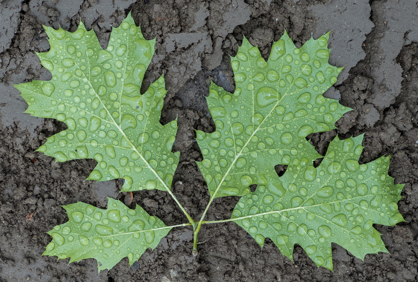
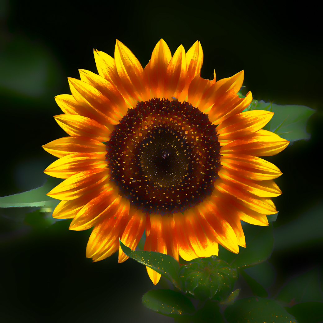
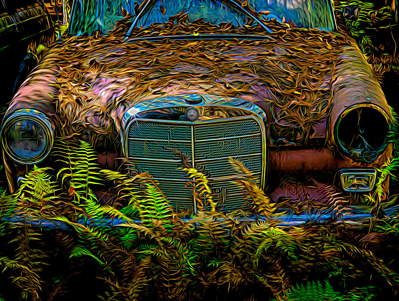
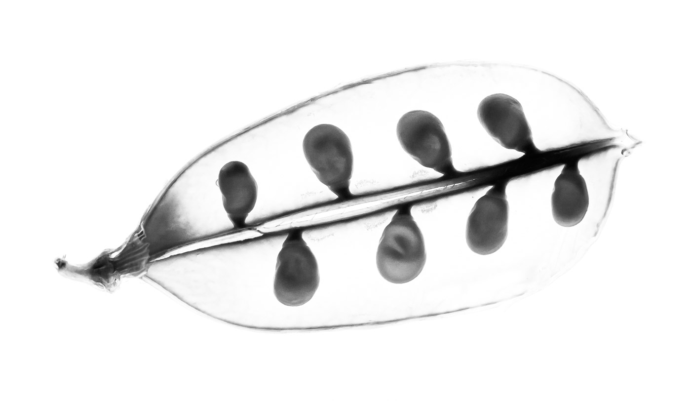
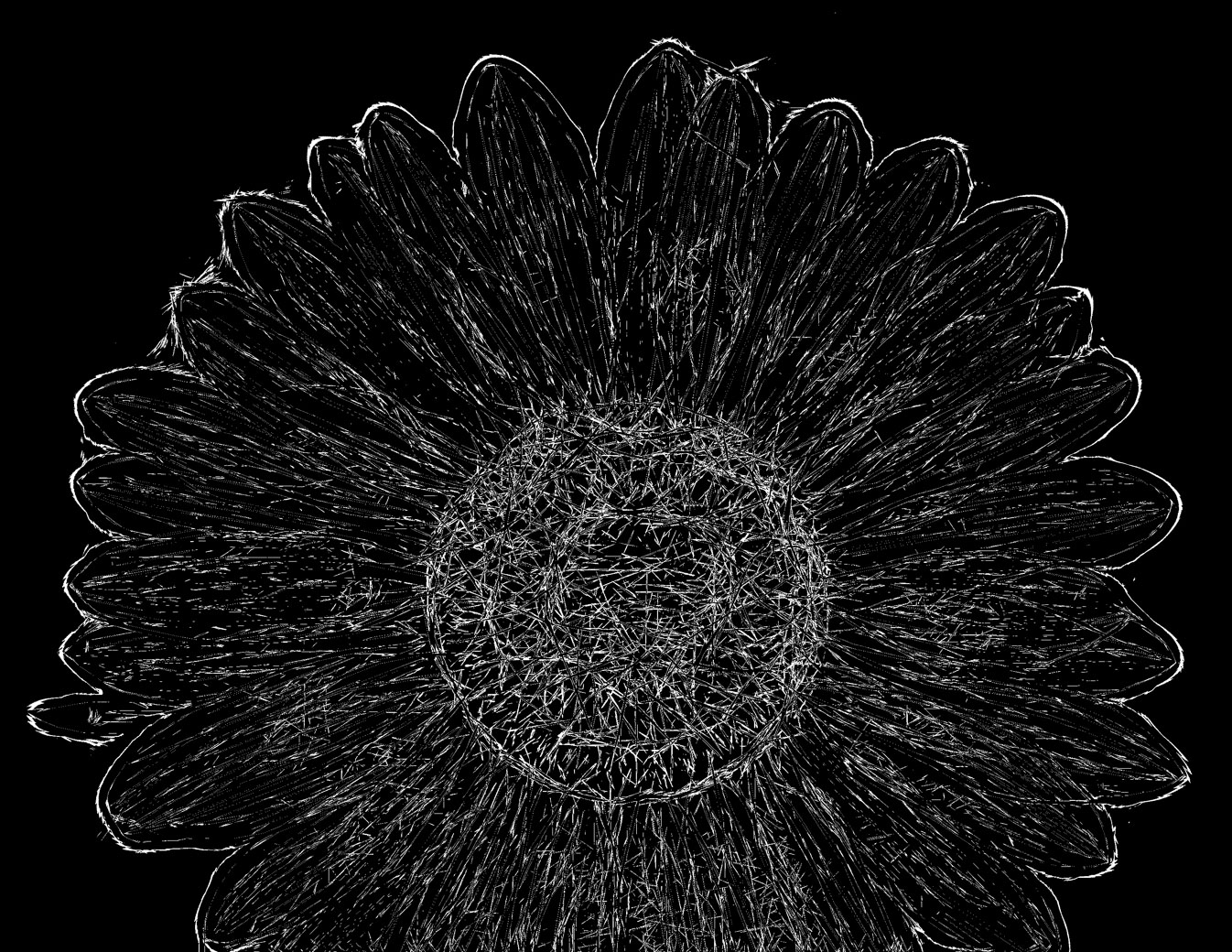
Hi Doug. I am fascinated by your leaf x-ray images and thank you for giving us a hint on how you accomplished. I've never taken my Topaz Glow filter to just deep edits but I came closer than I thought, but no where near to your polished edits. No Hostas to use so I used a Sunflower, Glow got it to a black on white background and then in Ps to use selective color to switch background to black and levels and blending to increase whites. Back in Lightroom I used B&W & White to increase the whites as far as I could. Fibers are not as fine as yours but that maybe having to do between a leaf and a large flower. Not sure how I can use the technique but I'm going to try a Sunflower leaf and see what happens and whether I can follow my own history. But I appreciate you getting my wheels turning. I'm always looking as many of us are for other edits and methods to make our images unique. |
Sep 7th |
 |
| 80 |
Sep 22 |
Comment |
Jacob. I'm suggesting you look into editing like below if you desire the dark background type of result. Using Lightroom select the round button under the histogram. Tell it to selective subject, it does a great job of selecting the flower, sharpen the flower, selective the subject again and click the invert box, now your background should be selected, drop hi lights,drop exposure and increase blacks as desired. Done. No need to use vignette and notice how nice the edges appear vs the overlapping darks from the vignette. I believe this is much better than trying to edit on iPhone. Please give it a try and post your results.
Bob |
Sep 7th |
 |
| 80 |
Sep 22 |
Comment |
I'm anxious to see what Kathryn and Nadia come up with as I don't use Nik. The light color (maybe sky reflection on water) drew my eye to that bright area taking it away from the flower. |
Sep 7th |
| 80 |
Sep 22 |
Comment |
Thanks Nadia for your encouragement. It gets boring to shoot and just do basic edits. I'm always on the look for filters and techniques to change the final image(s).
Problem is I have more images than days and people to share them with. |
Sep 7th |
| 80 |
Sep 22 |
Comment |
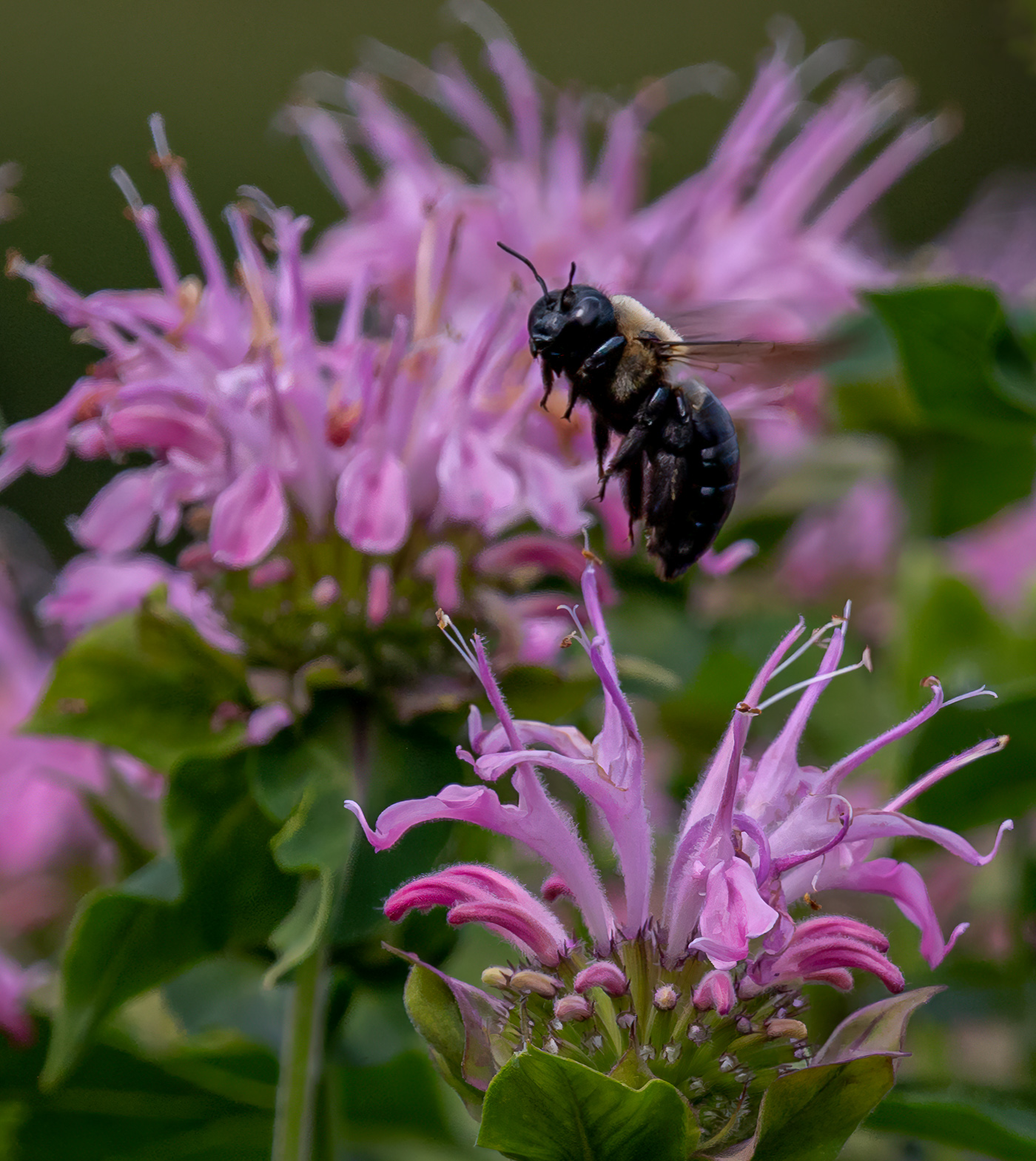
Hi Syed. I use the subject feature in Topaz Sharpen. It works quite well. Another option is to use higher iso's because I think a noisy image is easier to fix than a blurry one, and Topaz makes a great Denoise app also. Topaz is also beta testing Photo AI that contains Sharpen,Denoise and Gigapixel in the same app. They haven't disclosed a release date yet. The newer cameras can also go easily go up quite a bit higher iso. What was 400 is now 800 or 1600. Also check the internet to see if you camera allows what Nikon calls "Back Button Focus". It allows you to have continuous focus by using your thumb to activate and keep on it while tracking the moving flower or the bees. Keep shooting those poppies and you'll get better results. |
Sep 5th |
| 80 |
Sep 22 |
Comment |
Thank you LuAnn for your extra kind words and thoughts. I'm just a retiree with plenty of time and I spend it shooting flower pics and making them different and exciting (to me at least). I've raised the brightness by increasing the lights and decreasing the darks in the tone curve. Since there were no whites I hadn't pushed up the whites but also I walk the line between an unrecognizable subject (an abstract) and a Creative where the subject is recognizable. The Remix filter makes it more difficult because moving the opacity filter can completely block the subject and the viewer is left with "what is it"and therefore might not like it all. |
Sep 5th |
 |
| 80 |
Sep 22 |
Comment |
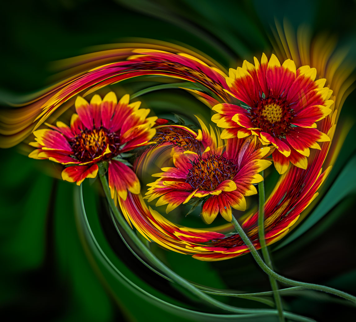
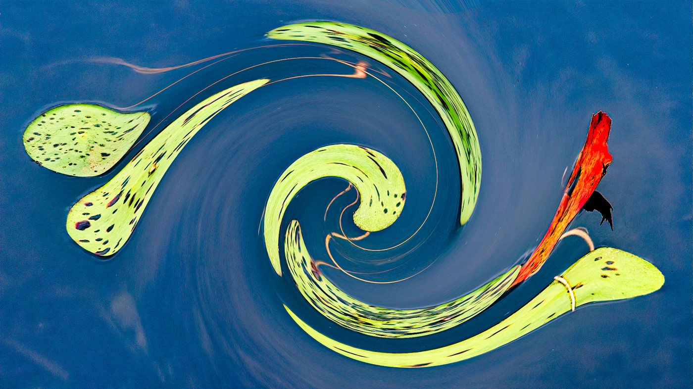
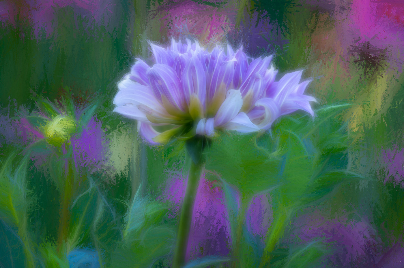
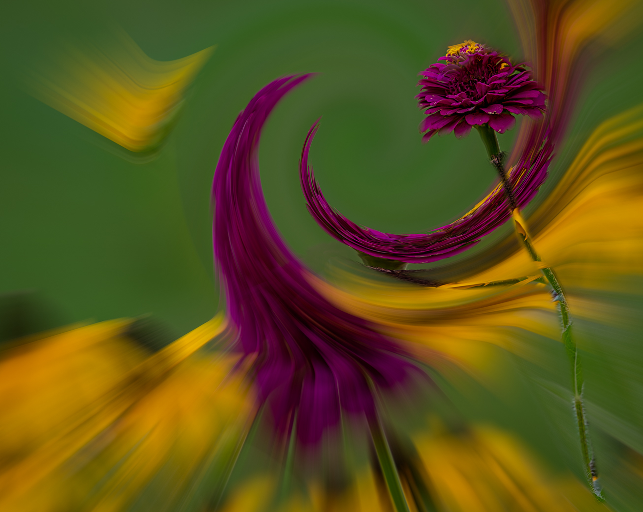
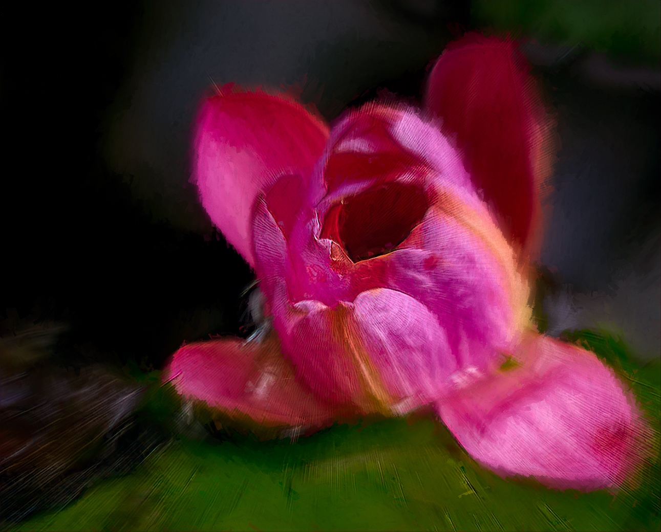
Hi Kathryn. I do shoot "wabi-sabi" images of flowers past prime and then ponder whether to edit so they look better or more past. I've never tried it with a water lily like you have here. I went out on a weak limb and edited your image with your goals, as I interpreted them and came up with this. I use Topaz Studio and maybe due to the file size and not Raw it has have some artifacts (Lines) I can't explain. I used LrC subject select and inverted to remove hi lights and exposure in the background. Then everything in Topaz. I used motion zoom@.10, SoSoft Look @40opacity and Impressionism @50%. I lowered the opacity to reveal the brown spots on the flower.
Sorry if I failed 100% but I was unable to put into words what I would do and this type of editing has no right or wrong turns, in my mind, just preferences belonging to the artist. I fully suggest Topaz studio2 for my artistic edits. Be honest with mean to what you like or don't like and maybe we'll agree on something.
Bob |
Sep 4th |
 |
| 80 |
Sep 22 |
Comment |
Hi Nadia. Interesting flower as poppies I've seen on the other side of the world have a different bud structure. I love the color and the little bit of green. I like your background and textures and they look better than the background in the original.
You don't have to submit current season images but it appears that it should be getter warmer there as you go into spring. Thanks |
Sep 4th |
10 comments - 7 replies for Group 80
|
44 comments - 17 replies Total
|