|
| Group |
Round |
C/R |
Comment |
Date |
Image |
| 24 |
Jul 22 |
Comment |
I understand that heat thing, but Virginia in summer is not equal to Florida. I pity you. I sit in my AC home doing editing until a cloudy day comes along and then I just need to go around the house and have plenty of subjects. Stay cool. |
Jul 16th |
| 24 |
Jul 22 |
Comment |
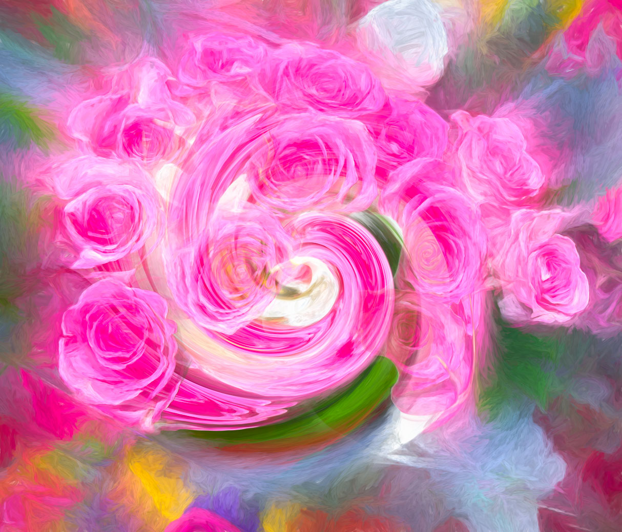
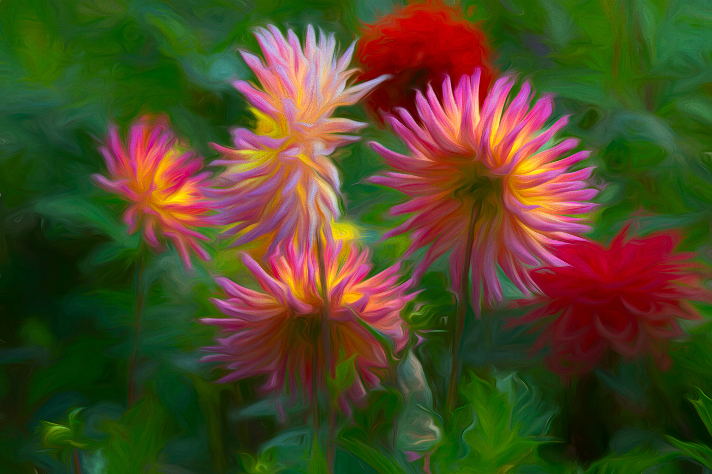
Hi Bev. I find your flower (a Summer Tulip-Curcuma, at least according to my phone plant identifier) draws me in with the beautiful pink and green colors. I do see the flower, as noted, not sharp, but you handled it beautifully in my favorite program-Studio2. I also love the background texture that you've added. Well Done.
Bob |
Jul 16th |
2 comments - 0 replies for Group 24
|
| 29 |
Jul 22 |
Comment |
Thanks Ron. Yes, Topaz offers me many editing techniques that I like. I have been doing more in Ps and find they both can exist to help the image. I don't use virtually of the standard adjustments in Ps and I use LrC before and/or after Topaz. Nothing wrong in using the strengths in each app. I don't get to do many large landscapes so flowers are my choice. Make better use of those florist flower shots by making creatives, abstracts and black and whites.
Bob |
Jul 9th |
| 29 |
Jul 22 |
Comment |
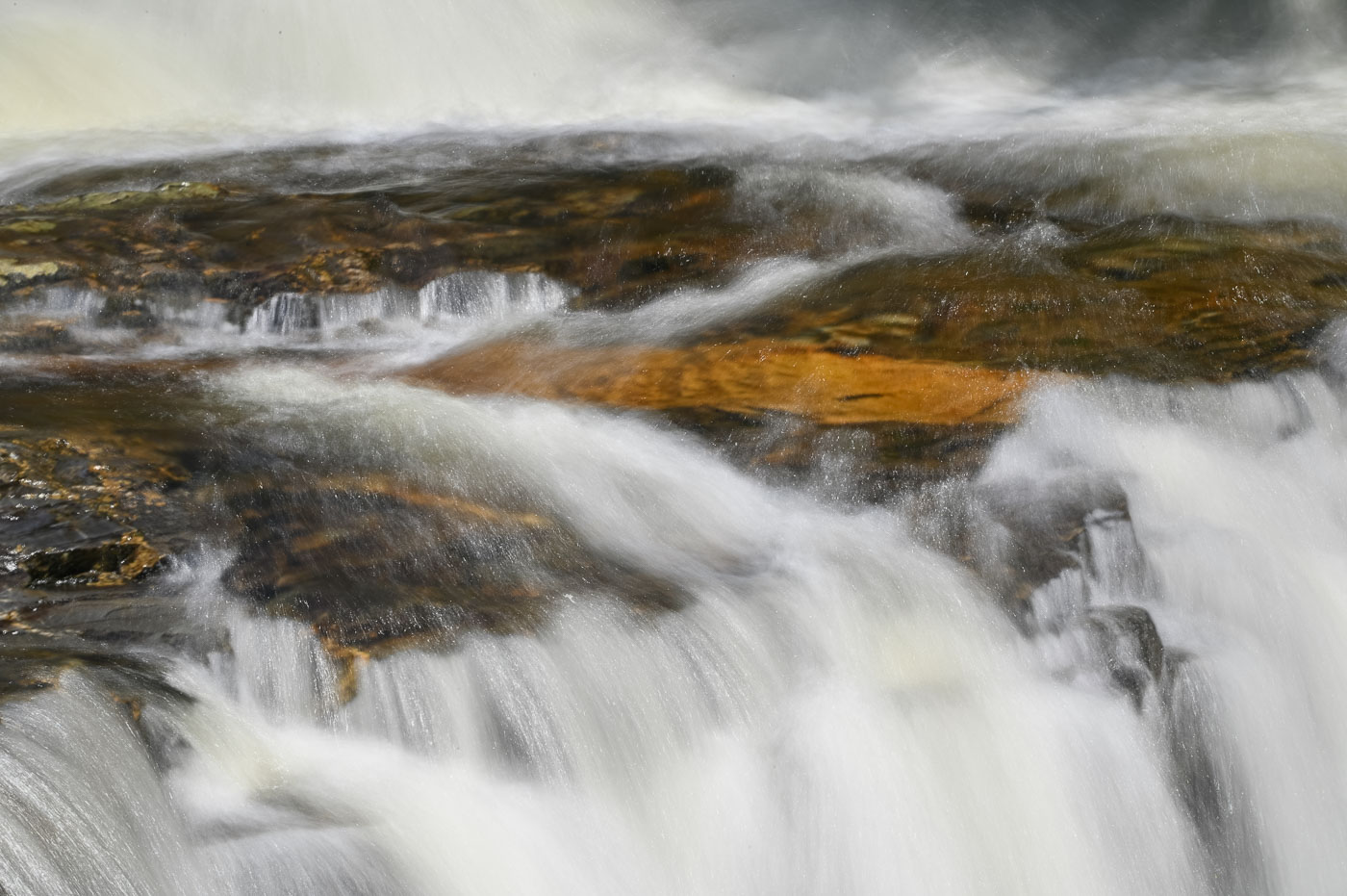
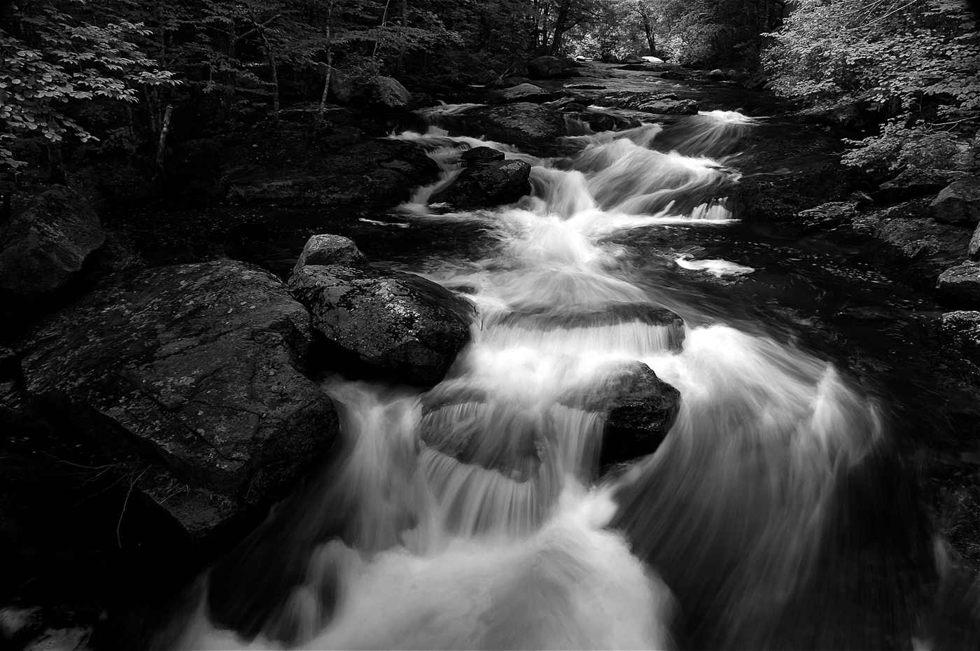
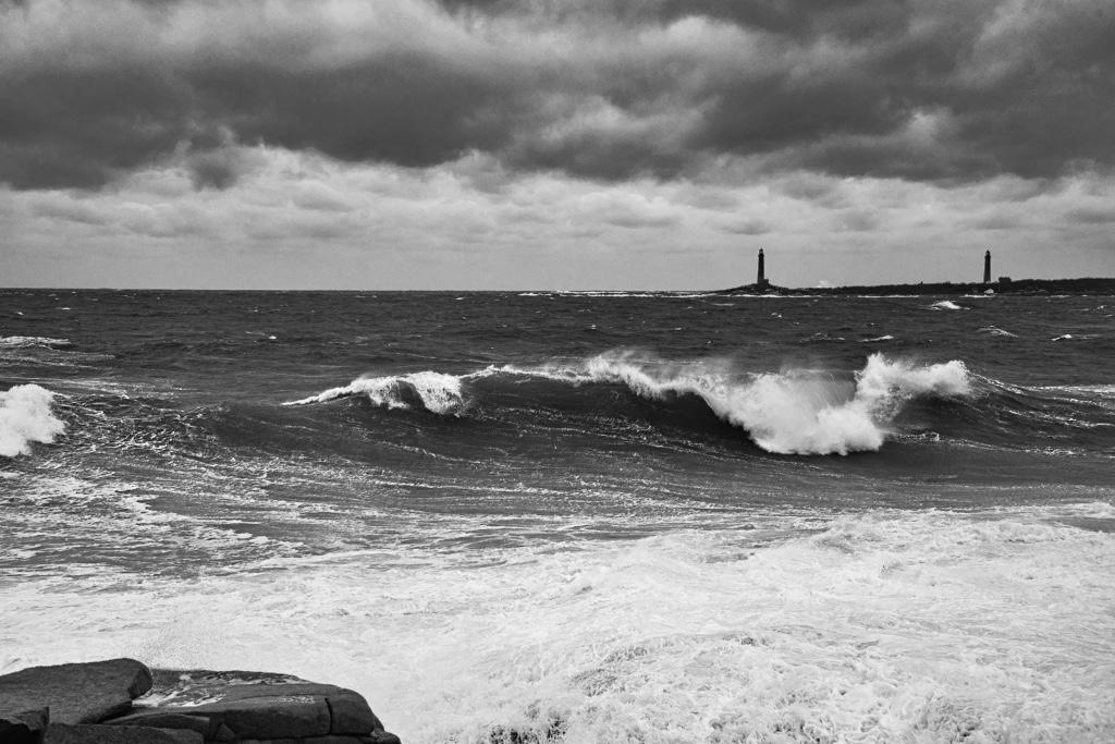
Hi Ron. I like you image. The framing is great and the softening of the waves works for me. For my taste, I would of tried moving the clarity and dehaze sliders to get more details in the rocks below the logs and on the rocks jutting out to see. Quite possibly you already did that and the haze/fog couldn't be overcome. Maybe later in the day and the warm tones resulting would work for you as an option. |
Jul 8th |
| 29 |
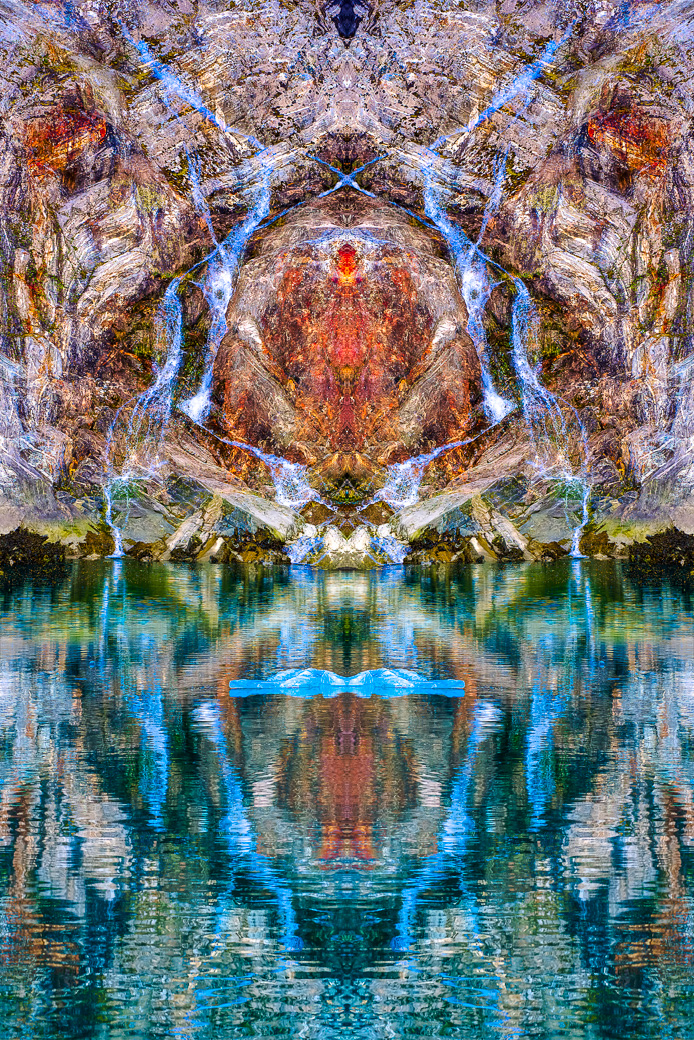
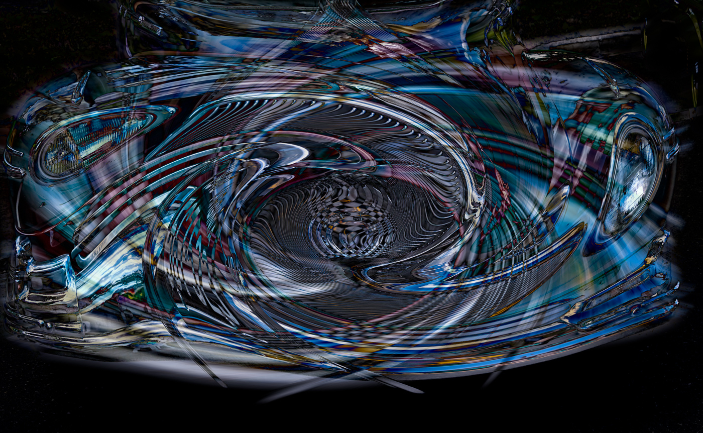
Jul 22 |
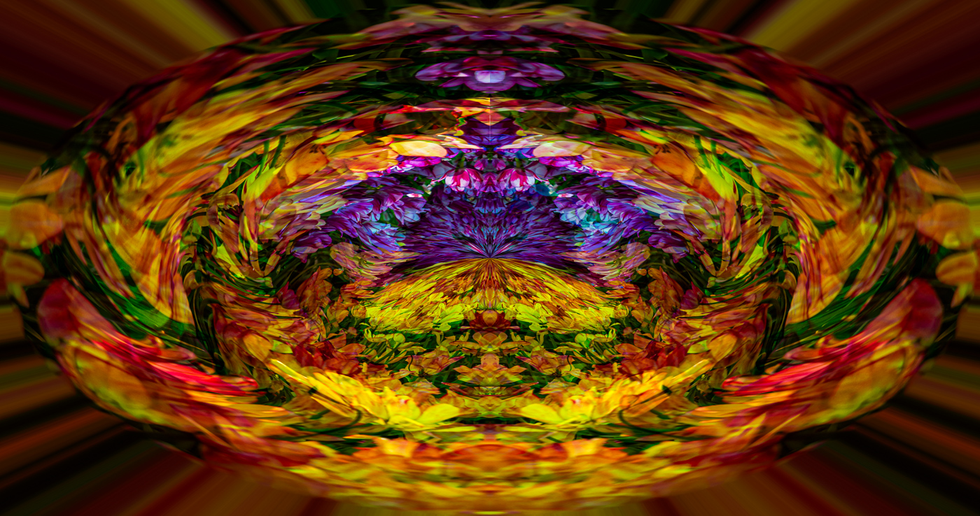
Comment |
Gunter. You've started off quite well with your abstracts. I like this image and the refinements and reflections you made with Mirror Lab. I'm at a loss of words and can think of any improvements to suggest. I know the reflections don't look natural, but heck this is an abstract and I like what the you and the software have done. Looking forward to seeing more. |
Jul 8th |
| 29 |
Jul 22 |
Comment |
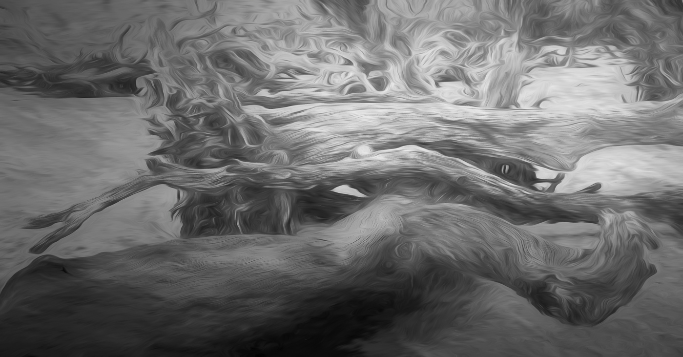
Hi Madeline. I don't have an issue with your log tonality, saturation and prominence in the frame based on the assumption that its interesting and it caught your eye. I do have a few suggestions. I believe your original sky was "burnt" out because the wide angle lens and camera settings you were using over exposed the sky. There was no need to use iso 3200 on the image. A simple edit of the dark center of the log, by increasing exposure when post processing. The wide angle lens has a large depth of field (focus) and you could of used f8. Go back and you'll be happy with results. |
Jul 8th |
| 29 |
Jul 22 |
Comment |
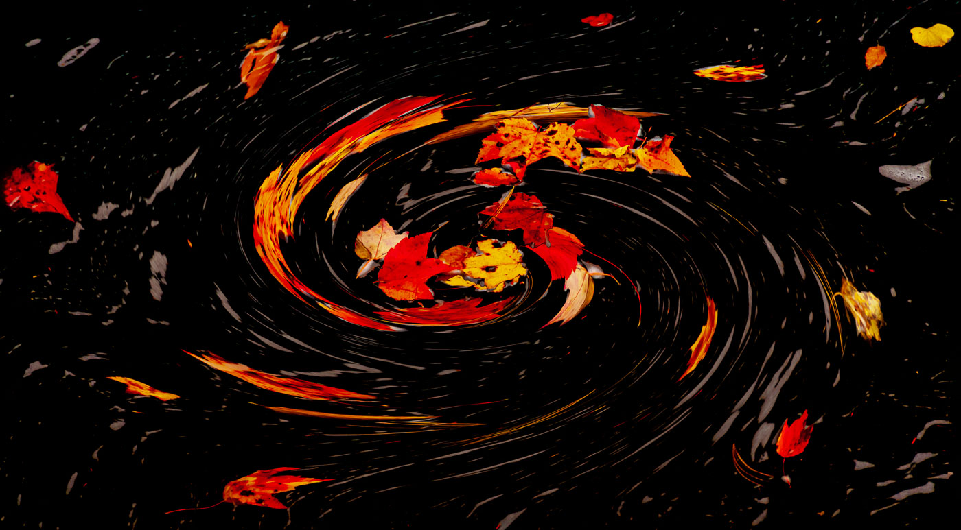
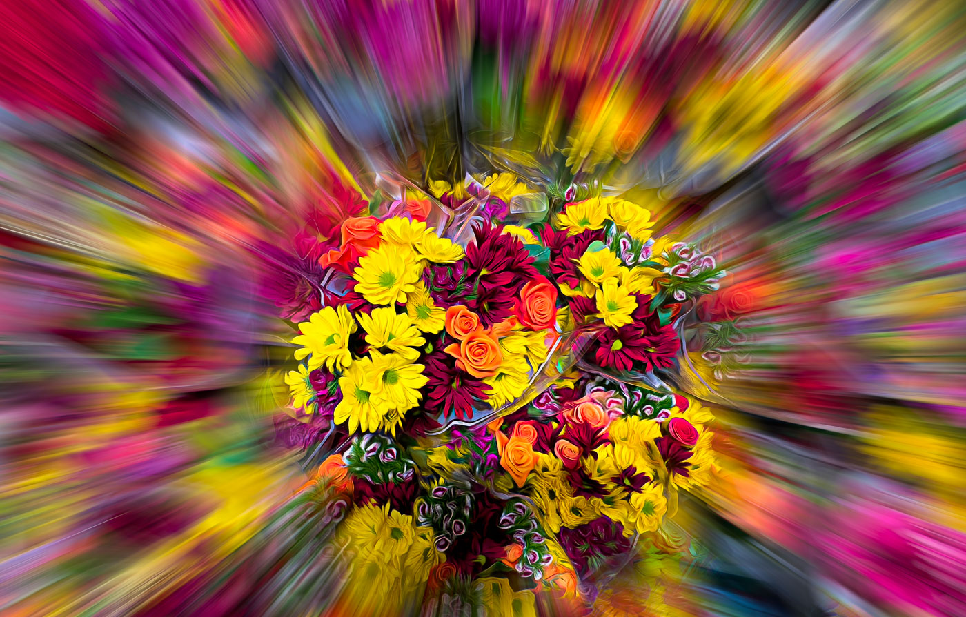
Thank you Gunter,Tim and Judy for your comments. When folks get bored taking regular images of regular objects this is one avenue they take. I'm relatively new at this as its been less than 2 years. I blame it on Lightroom which saved me many many hours of editing and organizing and of course, COVID. My wife's love is tending to her flowers and I help some but more importantly I take photos. I've taken over 3000 and we haven't left home. Gunter, I like the dark background and will try myself. Nothing wrong with your image, but this Topaz look spoke to me. Come on Karen join the party. :-) |
Jul 8th |
| 29 |
Jul 22 |
Comment |
Karen, I find this to be a compelling image that is composed very well and the long bike just added to its beauty.The glowing hair from the rear biker adds authentically to the image versus a composited image. The only nit (tiny) I have is too see if the light spots in the sky can be cloned out as well as the dust spots over the sun. You were rewarded for hanging around with your 500mm lens ready to shoot. |
Jul 5th |
| 29 |
Jul 22 |
Comment |
Another well done street image Tim. One suggestion I have is to use content aware and clone tool to remove the trash barrel and the conduit and window edge on the right side. Not your fault the painting artist should of scaled their image to have started the painting further to the left. You did well cropping the top and Botton and getting the runner sharp. I think a Mono conversion will help but the right side might still be a problem because the hose is so necessary to the image and that is where the distractions are. I might try an abstract or other edit process to make the best of your good work. |
Jul 5th |
| 29 |
Jul 22 |
Comment |
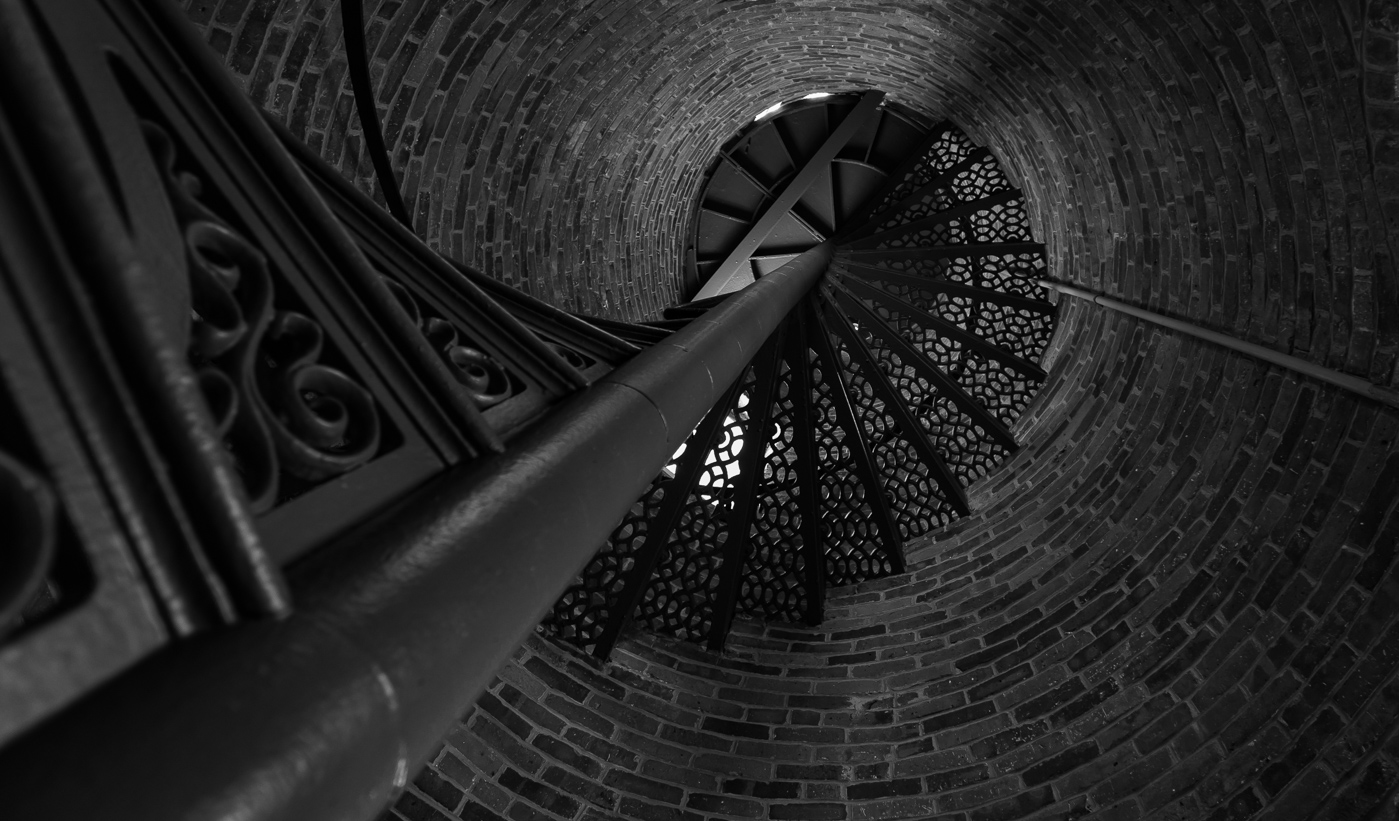
Very Nice Judy. I like the composition and the orange flame-like structures. The stair/and bannister images in the center draw me into the image and I find them appealing. I'm not bothered by the orange flame-like parts of the image being too close to the edge of the frame. I'm sorry your original has disappeared. I think we had the discussion before that the Circular and Tiny Planets are apps. for Android phones. With many folks upgrading their phones every 2-3 years it's imperative that backups be made to your computer and or a cloud with a searchable name ie:Stairs-Location. There is nothing I do not like or wished you would change with your image. Just perfect for those of us that see differently. |
Jul 5th |
8 comments - 0 replies for Group 29
|
| 62 |
Jul 22 |
Reply |
Thanks Emil. |
Jul 30th |
| 62 |
Jul 22 |
Reply |
Thanks Nick. No worries, you won't see it again. Sometimes it's necessary to make the color image first. |
Jul 27th |
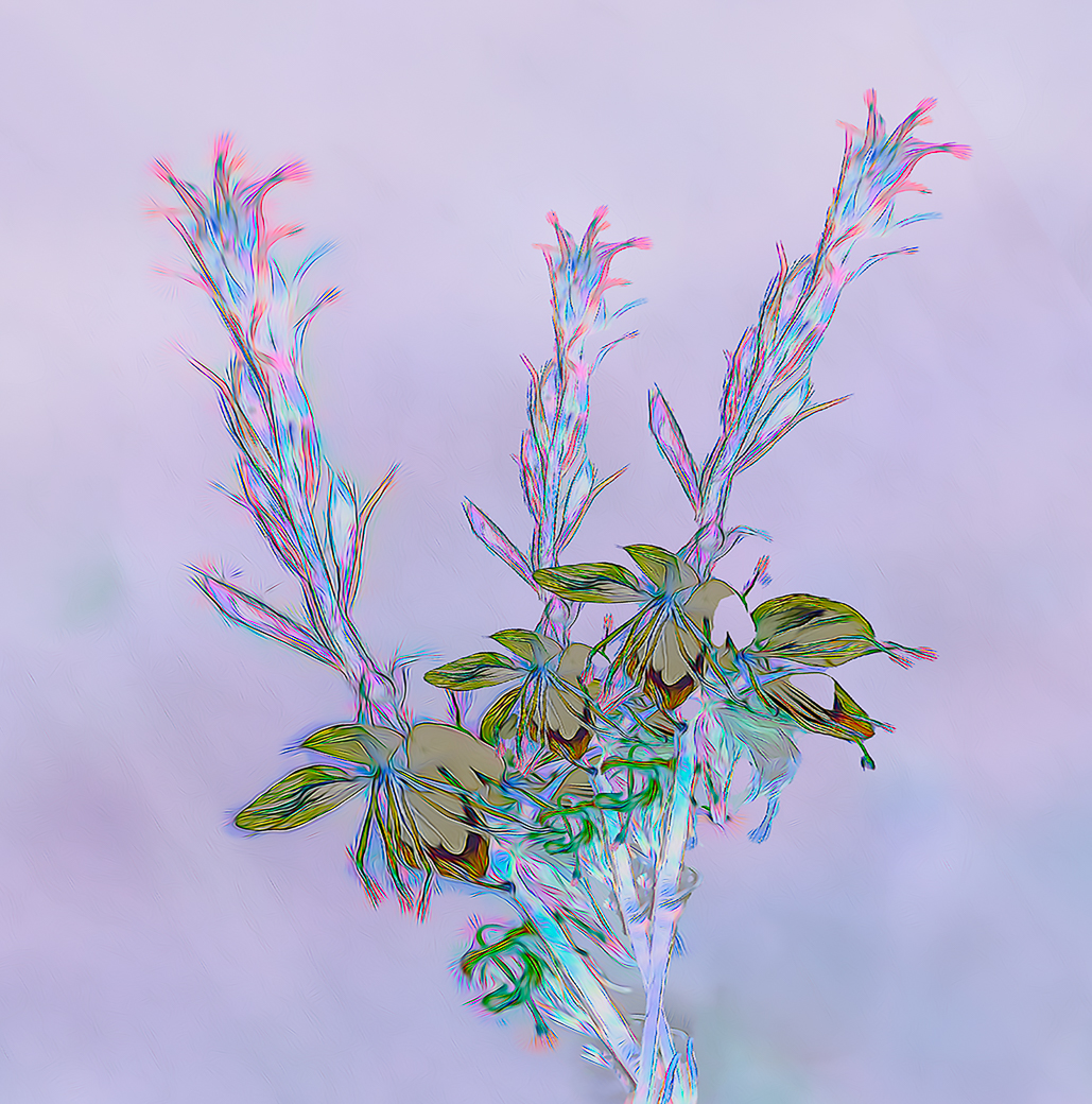
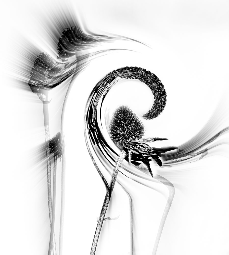
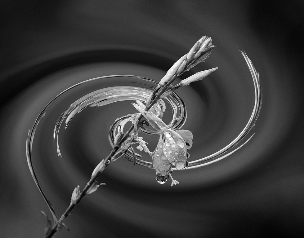
| 62 |
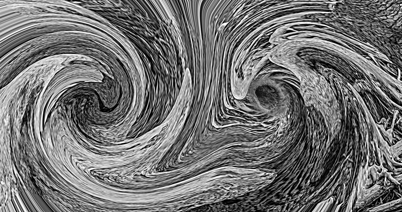
Jul 22 |
Comment |
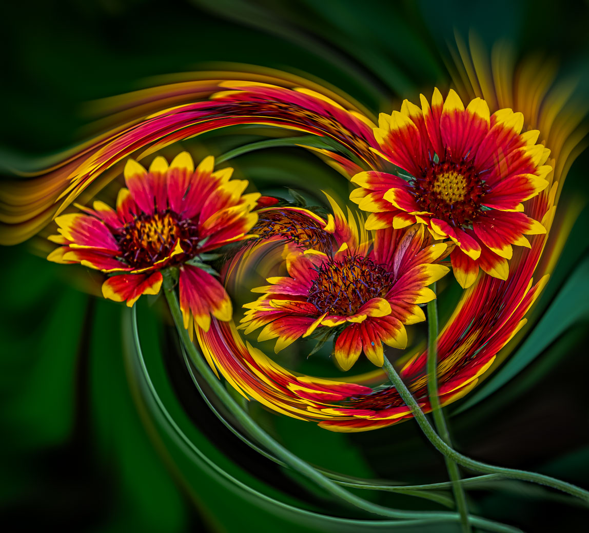
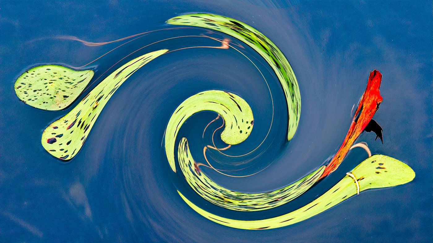
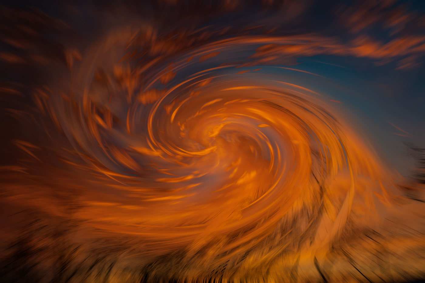
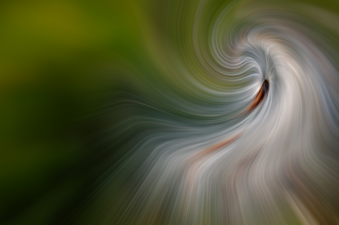
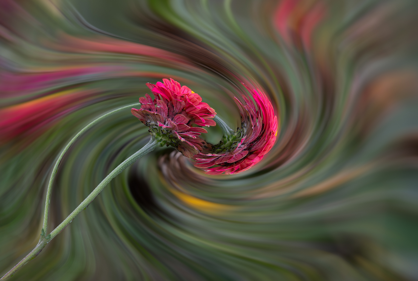
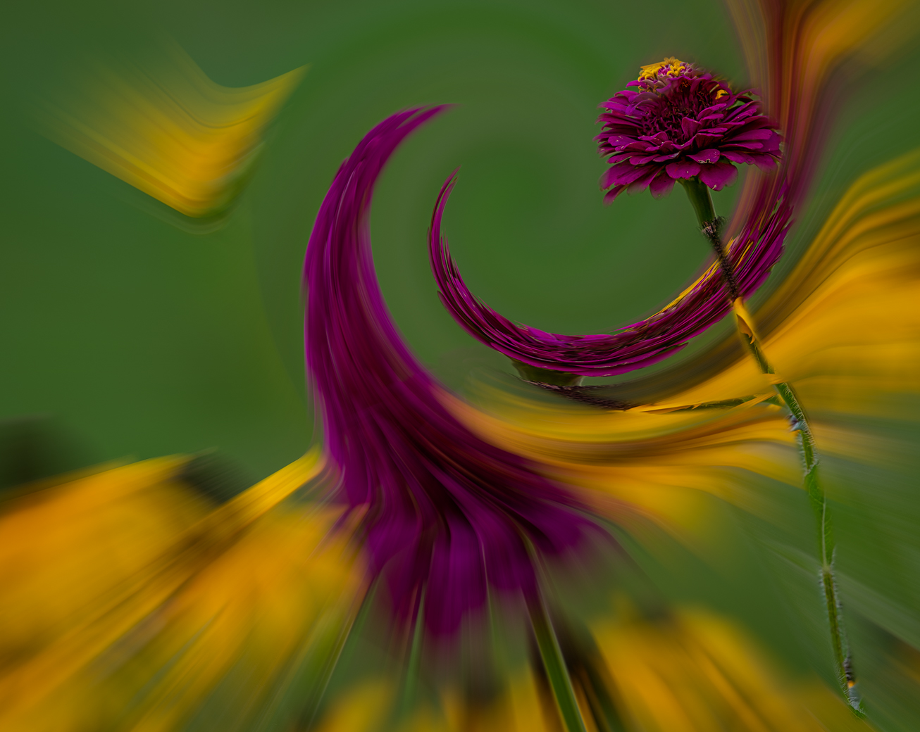
Hi Bunny, I've yet to try your technique, but I've copied and you should see a different creative for my August submission. I definitely like your creative version as it falls into my wheelhouse. I did a less interesting creative color version using a stronger twirl setting. Did you happen to record what your Twirl setting was?
Thanks for creating and sharing.
Bob |
Jul 25th |
| 62 |
Jul 22 |
Comment |
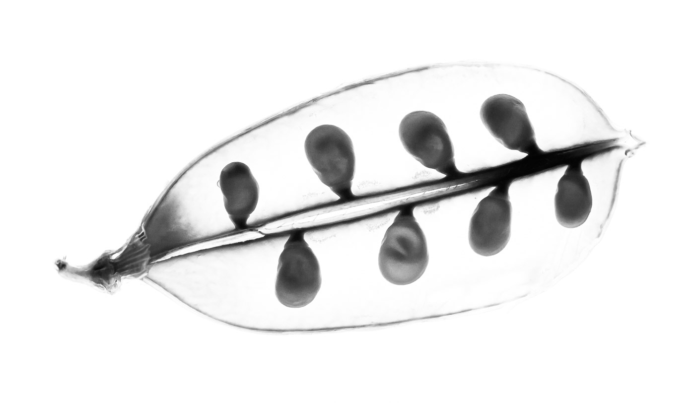
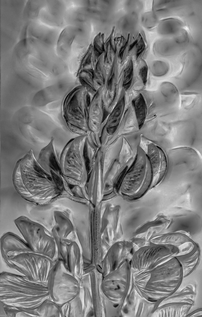
Thank you LuAnn. I've thought about this image for a couple of days now. It's difficult for me because I shot low iso slide film for my CC activities and did shoot BW film but only for local paper during the 90's and off course the grain was standard back then. In this PeaPod image I think the grain actually does look great in full screen because we know the peapod is not clear and without texture. You correctly picked up on my being too heavy handed with the white slider. I appreciate your comments my good friend.
Bob
|
Jul 16th |
| 62 |
Jul 22 |
Comment |
Thanks Pete, I can tell from the number of comments on this image that this image fell flat and I'm not sure if the ant would of made it something to love. At least it saves me time responding on comments. :-) |
Jul 14th |
| 62 |
Jul 22 |
Comment |
Nick. Nice composition and exposure. A bit confusing but I agree it's best to go with clients wishes. |
Jul 3rd |
| 62 |
Jul 22 |
Comment |
Another PJ shot Israel that is exposed very well and is sharp. The various stage lighting methods made the exposure difficult. I'm not familiar with this play, but I prefer Pete's version as it crops off the actors on the far right. I assume the staging was orchestrated to represent multiple scenes from within the musical and you did a great job in exposing for all. |
Jul 3rd |
| 62 |
Jul 22 |
Comment |
Pete, you certainly caught the flowing juices from the clam. Not easy to do at 1/160 sec. I'm sorry to say that the black and white version doesn't (in my mind) show a discernible item under the knife. If the image included the clam shell then you would have what I think is the more important part of the image story. Inserting the knife into the closed shell and getting the clam to open up is what I see the knife being used for. Now maybe Baltimore clams were soft shell variety but those have a long neck so image with the shell is more relevant. You are sentenced to go back and buy 5 pounds of clams and open them up cook and eat and of course take images. I'm half serious, the photo editor in me says the B&W image while technically well composed and exposed misses the mark. |
Jul 3rd |
| 62 |
Jul 22 |
Comment |
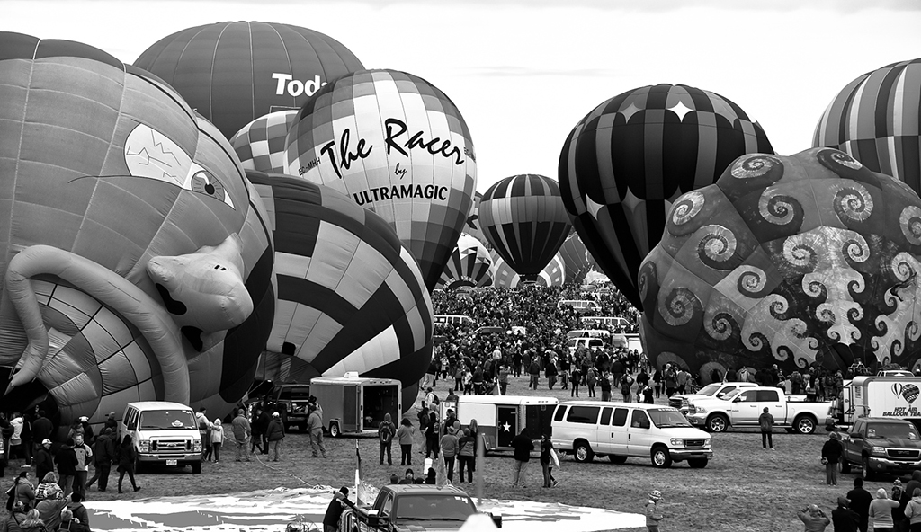
Emil, a great find and editing. A perfect sky replacement. I agree with the editing you did on the flag. I don't have any problem with the sidewalk and the ramp probably indicates that the occupant has a disability. Well done. |
Jul 2nd |
| 62 |
Jul 22 |
Comment |
LuAnn, I like the leading lines down the stairs and the curved tree further leading your eye to the bench. Exposed and edited very well. All those great composition features lead to an empty bench that leaves me asking why? I can't honestly say I like the mood because I never shoot subtle moods as I am the WoW guy.
BTW, re: location. Find the date of the image and put that date in the search block of finder window (outside of LrC) and click "In this Mac" and you should find other images taken that day/month or drop the day and search on month and year and you should recognize other locations that you shot in that time frame. If that fails you can assume it was taken somewhere locally ie: use keyword for hometown MN |
Jul 2nd |
8 comments - 2 replies for Group 62
|
| 81 |
Jul 22 |
Comment |
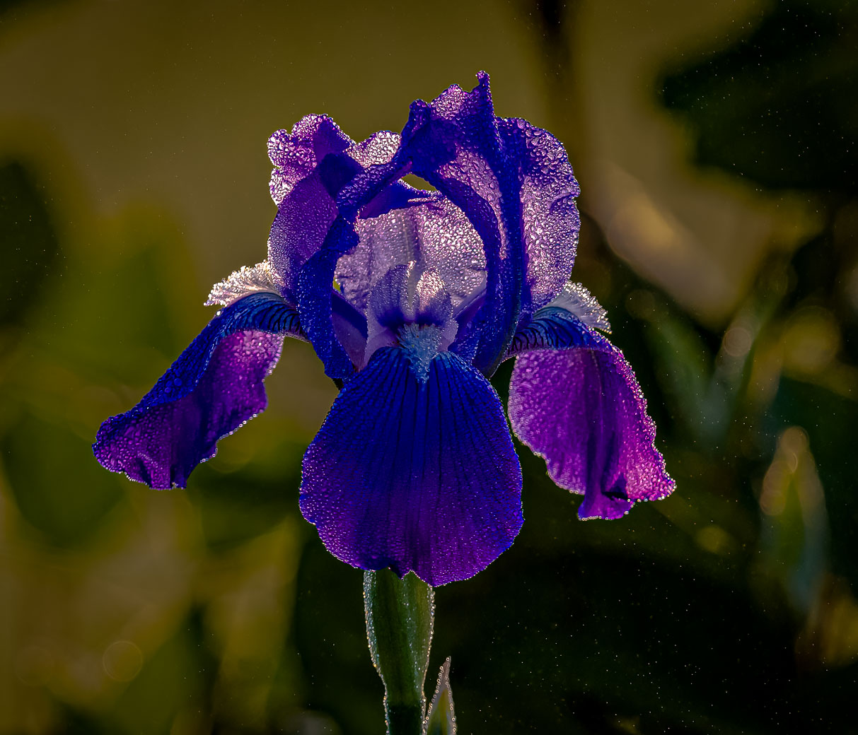
Angela, thanks for stopping by and liking my creative. I can't get over how beautiful the Roses are. I'm in VA in the USA and keeping insects and black spots off my wife's Roses is a chore. Being from England,I think you have the perfect climate. I don't think I would of used that brush to make the background base. Just me, I would of tried more realistic. I'm not experienced in brushes (either) but I have used Kyles Concept Brush-Foilage Mix 2(a Ps Standard brush). But I will defer to you. BTW, I don't see any bright spots as reported above.
Great work. |
Jul 8th |
1 comment - 0 replies for Group 81
|
19 comments - 2 replies Total
|