|
| Group |
Round |
C/R |
Comment |
Date |
Image |
| 29 |
Jun 22 |
Comment |
Thanks Tim. |
Jun 14th |
| 29 |
Jun 22 |
Comment |
No problem Gunter. I'm one of those stubborn Yankees. |
Jun 12th |
| 29 |
Jun 22 |
Comment |
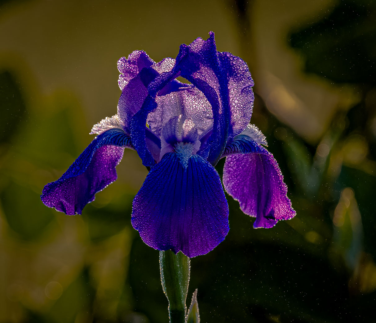
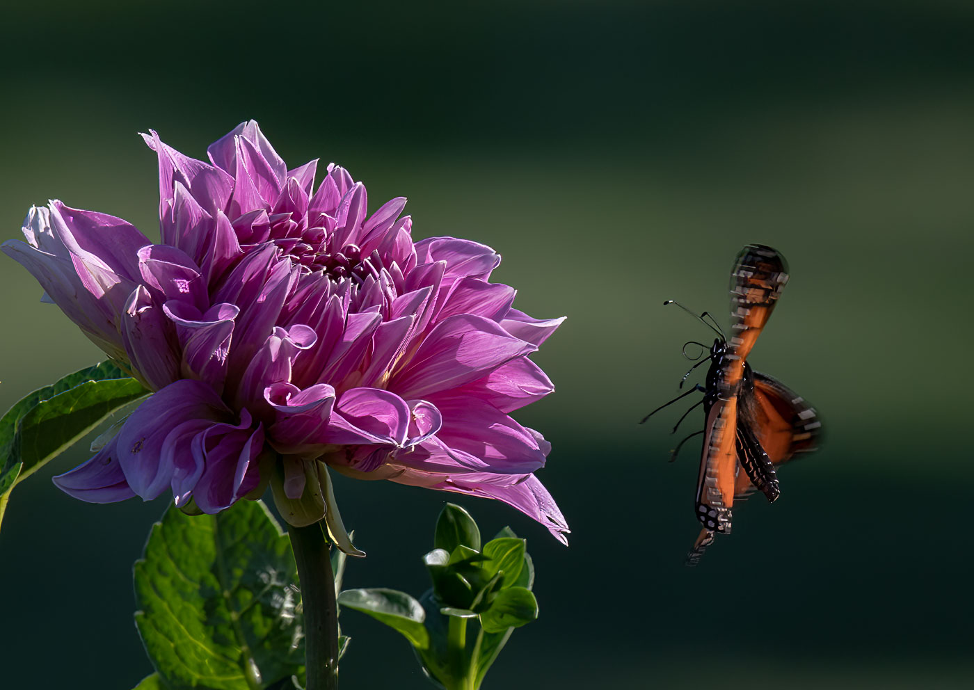
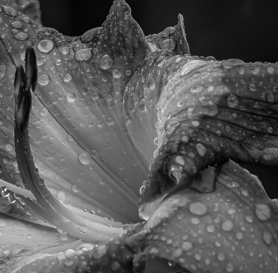
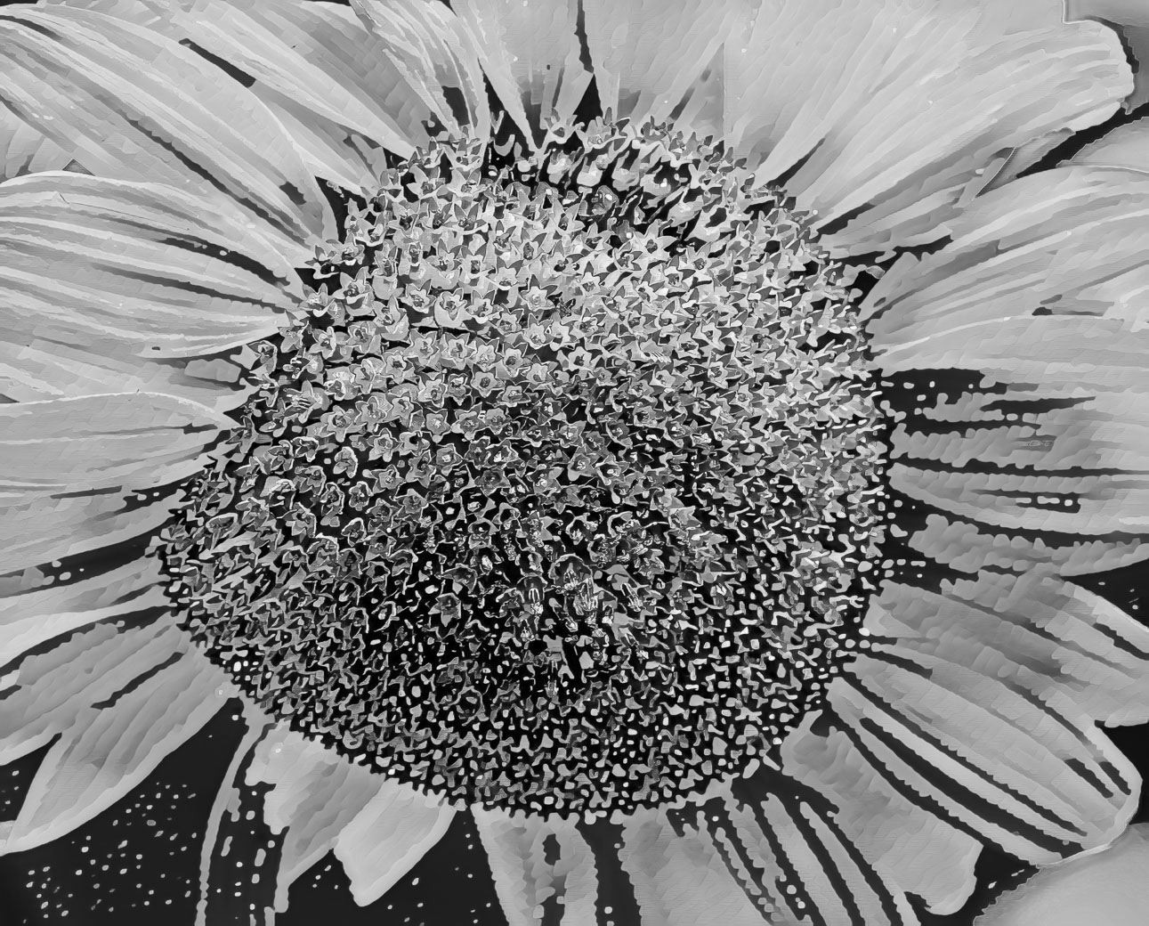
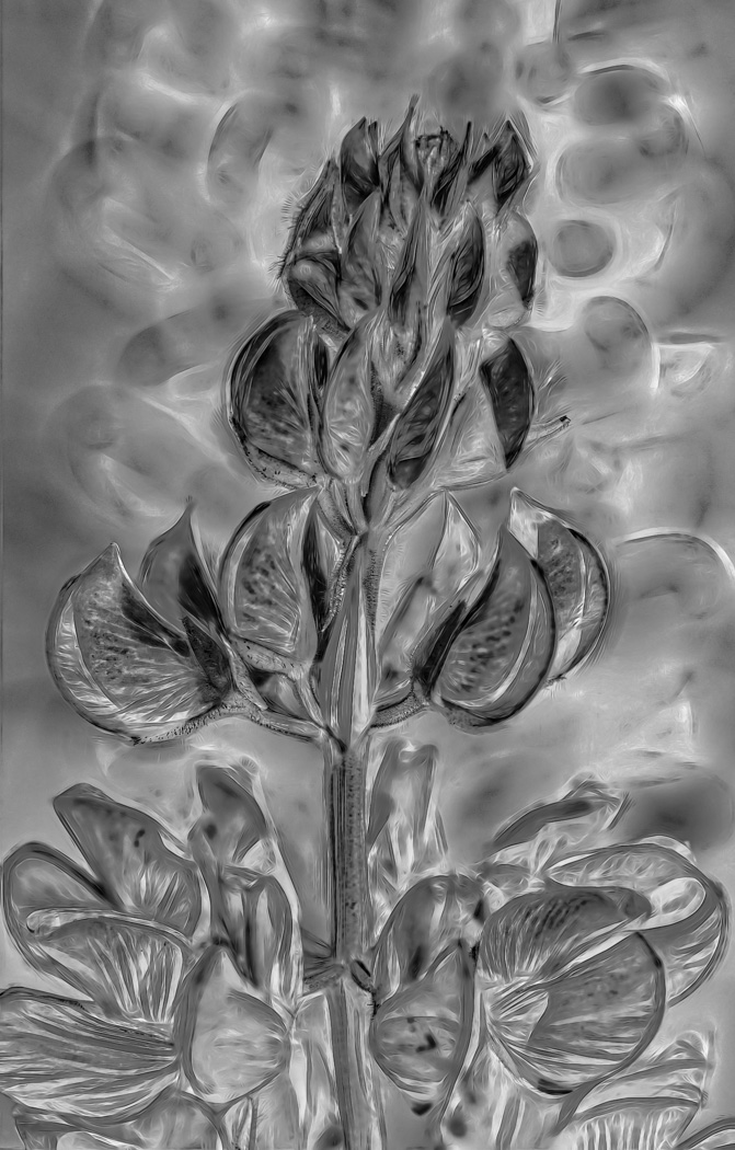
No problem Gunter. With Creative/Abstract like images every is room for other opinions and cropping as we all see the subject differently. I fully understand the distraction in the upper right. My wife thought it should stay so I agreed. You mention portrait orientation but your edit is square. I understand, no problem finding the point of interest, but I had taken the approach of using the lines in the bottom left to guide the viewer into the POI. Someone looking at your version may wonder a little longer than my version. I have no issue with you edit, I just think more space to enter from the left makes more sense. I also do not agree with the top petal being cropped that much. Thanks for doing the edit and bringing the conversation to the table. |
Jun 10th |
| 29 |
Jun 22 |
Reply |
I would suggest to learn Adobe Lightroom classic before Photoshop. Menu's and features are much simpler to learn as Photoshop has many features that you won't need to use as they are for graphic artists. You can always go from Lightroom to Photoshop and return with ease. Lightroom Classic also manages your images for you while allowing them to be stored on your HD where you choose. Many great videos on you tube regarding the Lightroom features. Only look at the 2021&2022 versions as Lightroom 2021 contained some very substantial improvements in selecting your subject and or sky. MattK.com is what I have used but many others. |
Jun 9th |
| 29 |
Jun 22 |
Reply |
Super! I look forward to seeing other images. |
Jun 9th |
| 29 |
Jun 22 |
Comment |
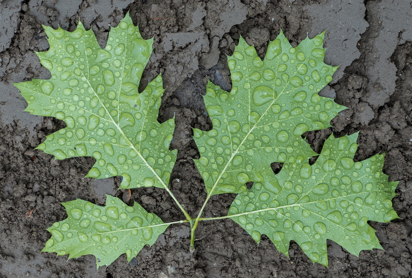
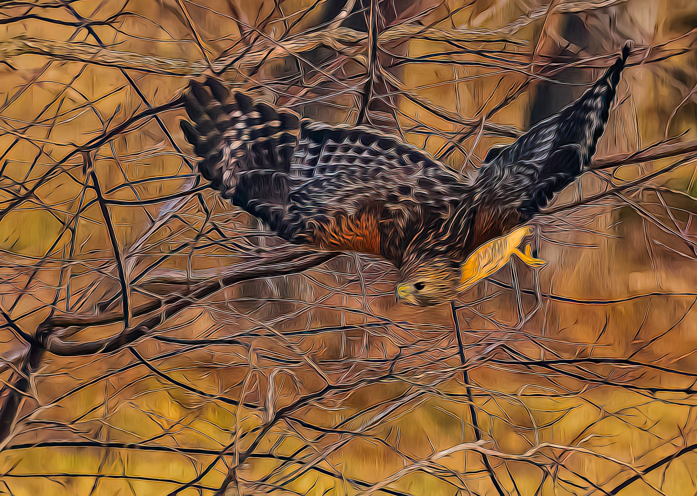
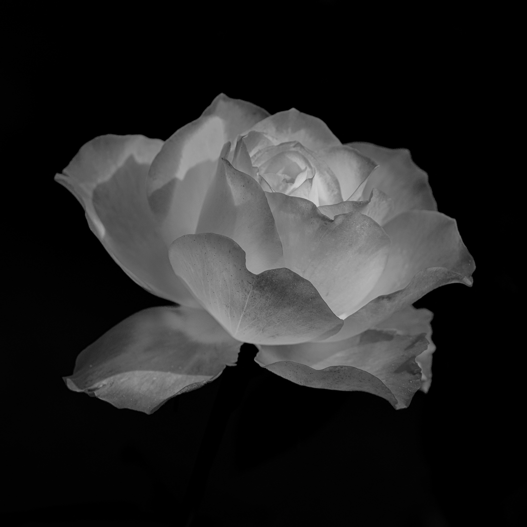
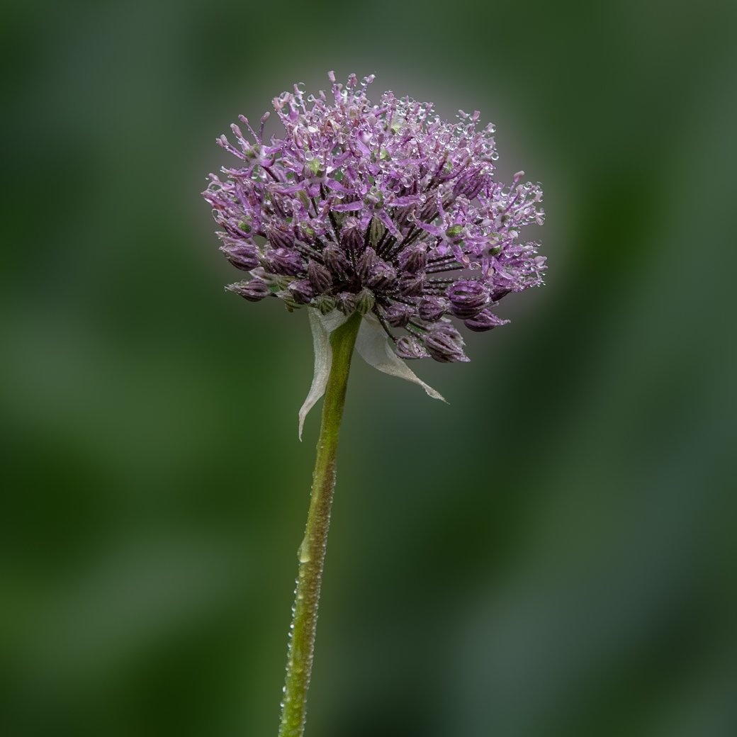
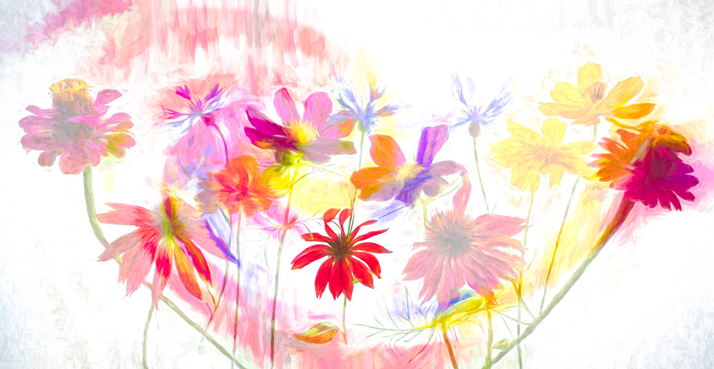
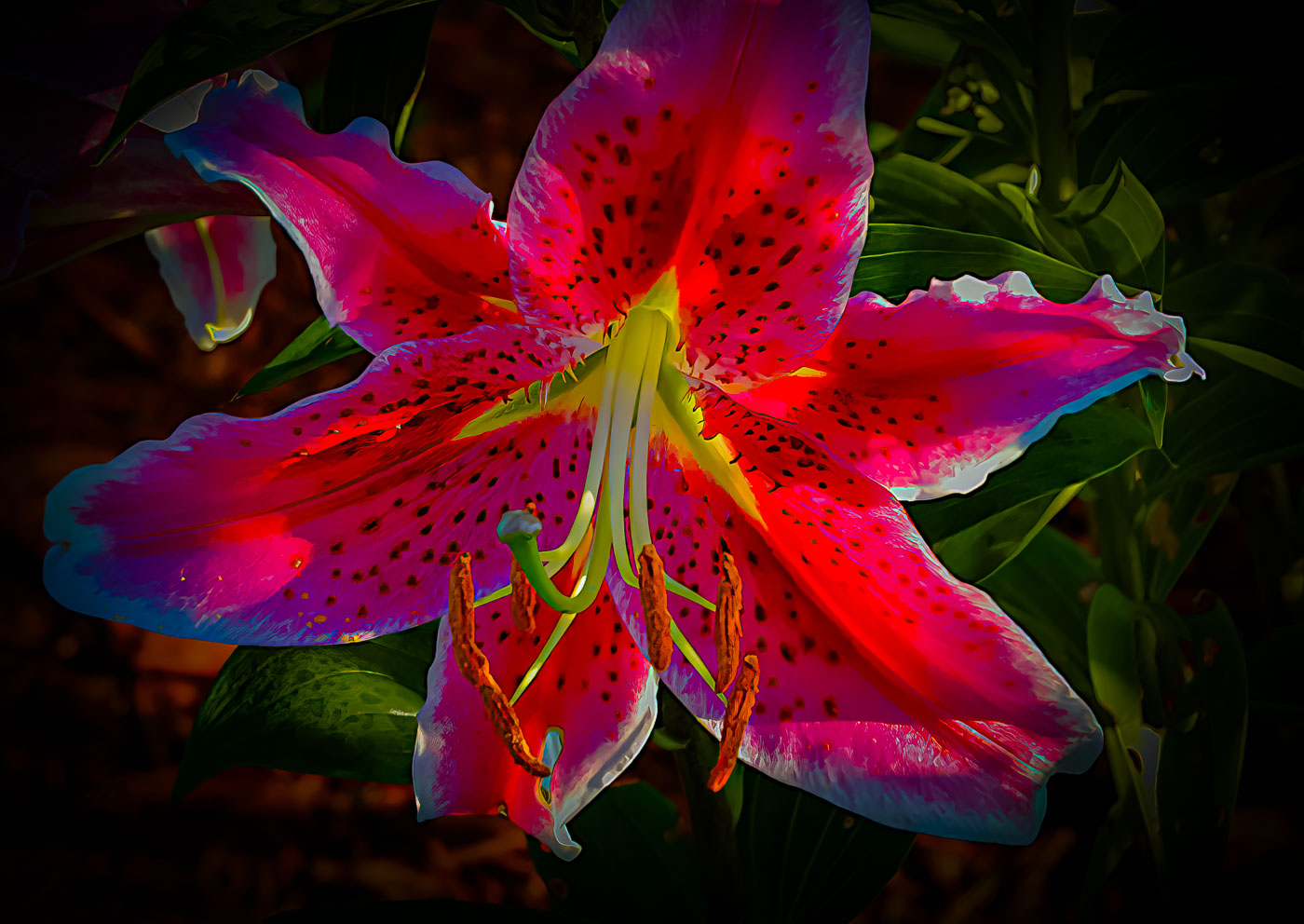
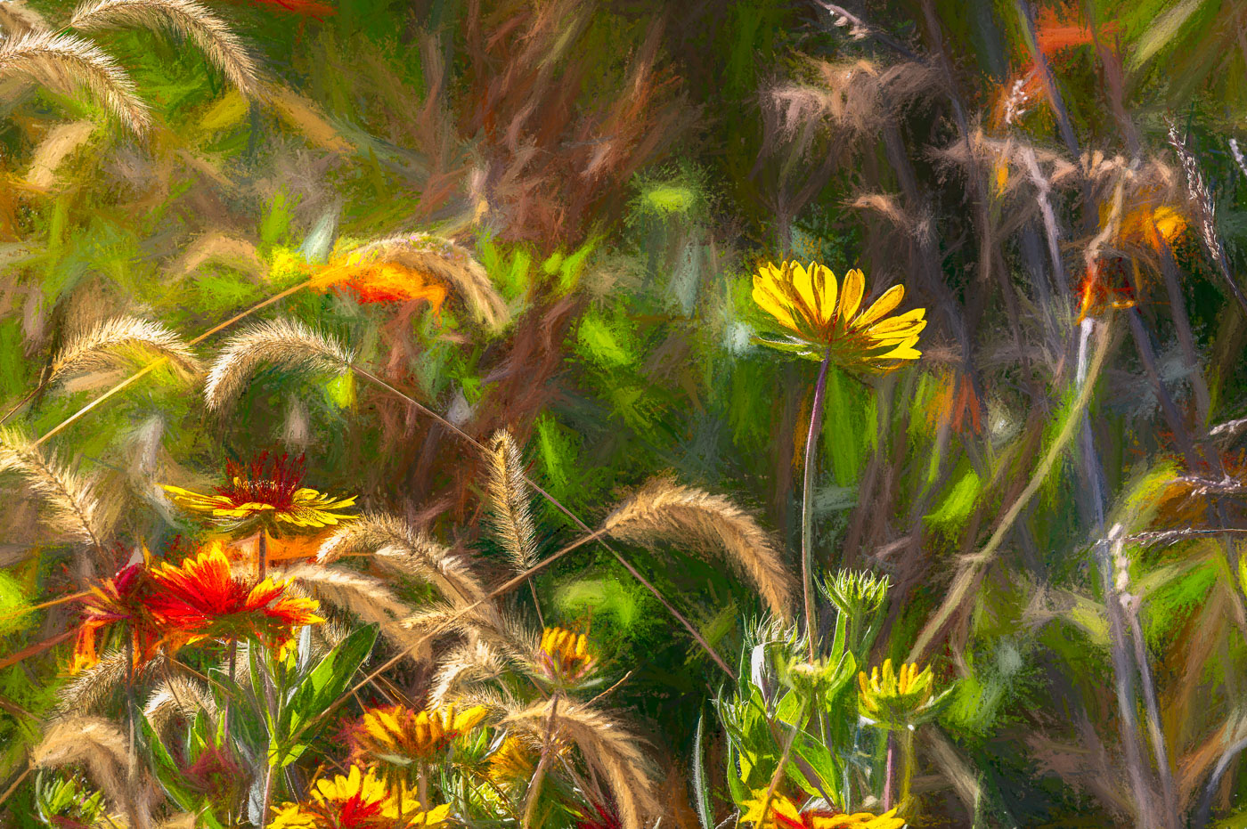
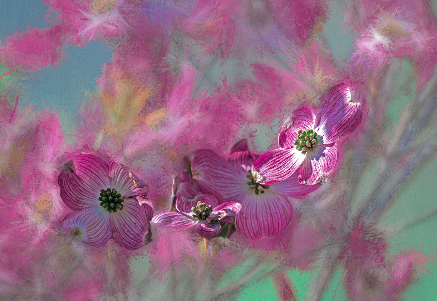
Hi Madeline. Welcome to DD29. You have a nice Rose here with sharp pedals and center in prime color. Like Karen, I believe in cropping to include only the subject, unless other subjects within the frame. understand you wanted to include the outlines of other roses, but other than the pink color those roses lead the viewers eye away from the main subject and really do not add anything to the image. The exception being the unopened bud. The fence does not add to the image.
Not many options for you to resolve, other than cropping, without having an image editor. Most of the editors have a 30 day trial. Some camera mfg have editing software also. A lot of the editing comes down to the amount of time you can put towards learning the editing software, but until then, crop the best you can in the viewfinder of the camera and move around to remove distracting elements in the image background. |
Jun 8th |
| 29 |
Jun 22 |
Comment |
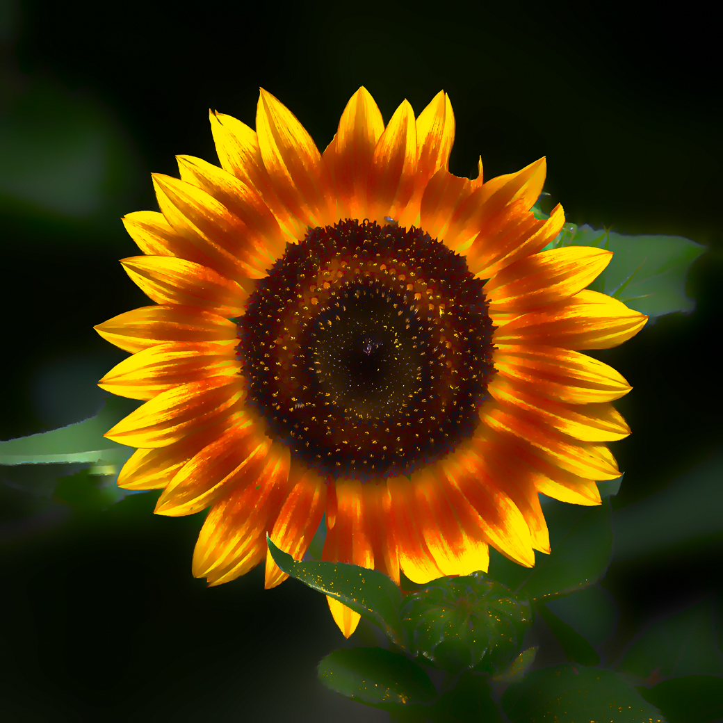
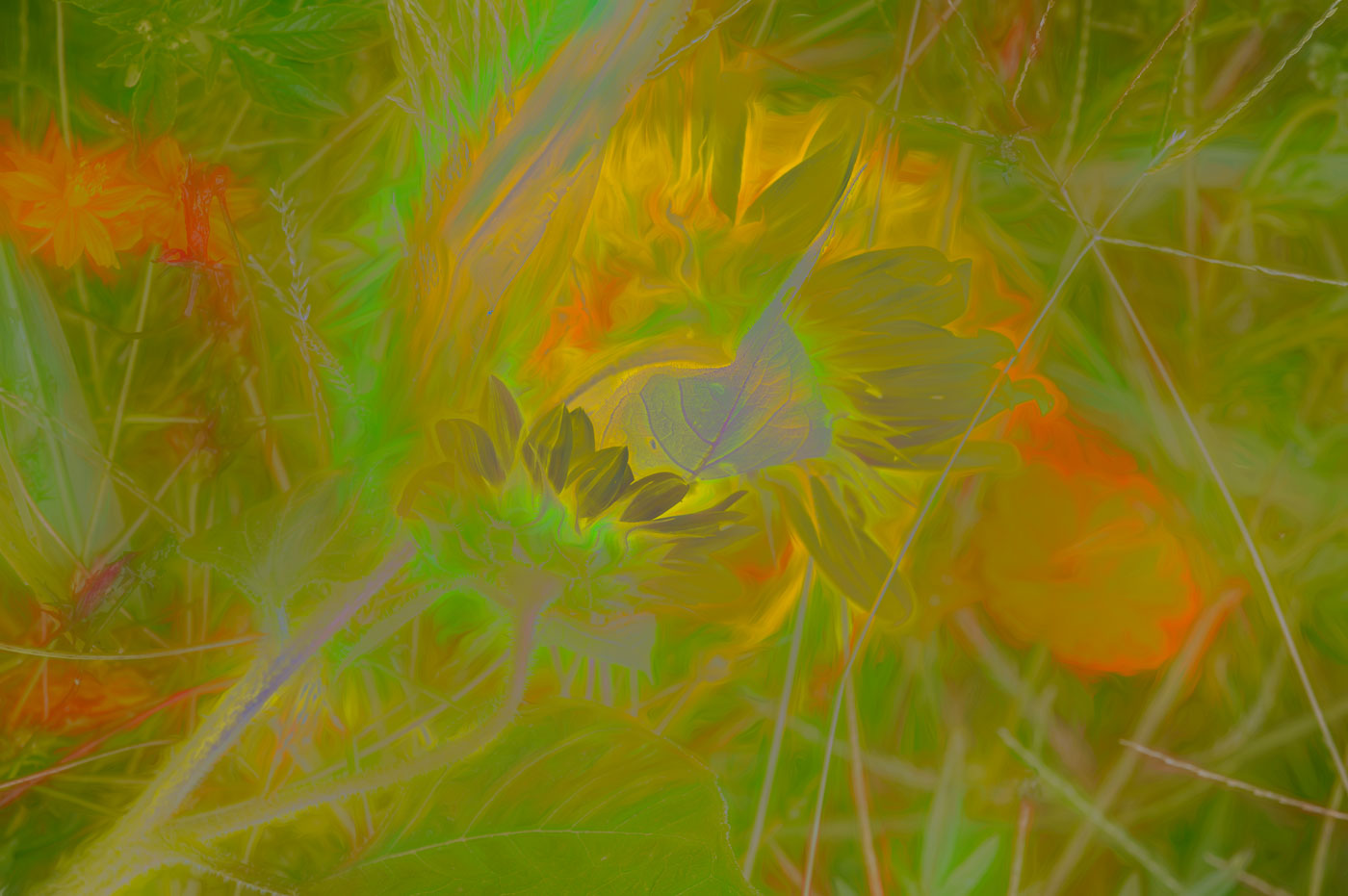
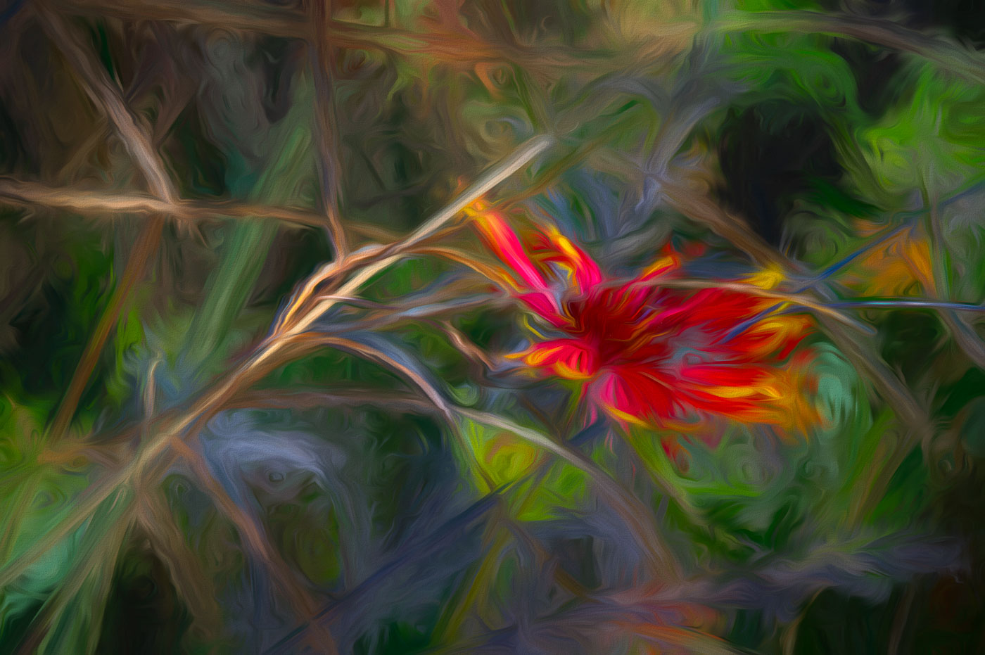
Hi Ron. The subject is certainly interesting and your composition is almost perfect. I'd suggest a small crop up from the bottom. I like the colors, but my personal preference is to knock down the highlights or shoot in the shade and give it more saturation. You left yourself few options for getting greater depth of field with only an f 2.8. If you don't have versions with a larger f-stop, then I would use the Gaussian blur filter and create a more pronounced selective focus or shallow DofF. In my mind I believe the focus point should be the opened yellow flower that you can see inside of. The image just lacks enough depth of field. Not sure the lensbaby would of helped here, as you would need to pick the area for sharp focus or blurred it all. Give that Gaussian blur tool a try would be my thought for dealing with this image. |
Jun 8th |
| 29 |
Jun 22 |
Comment |
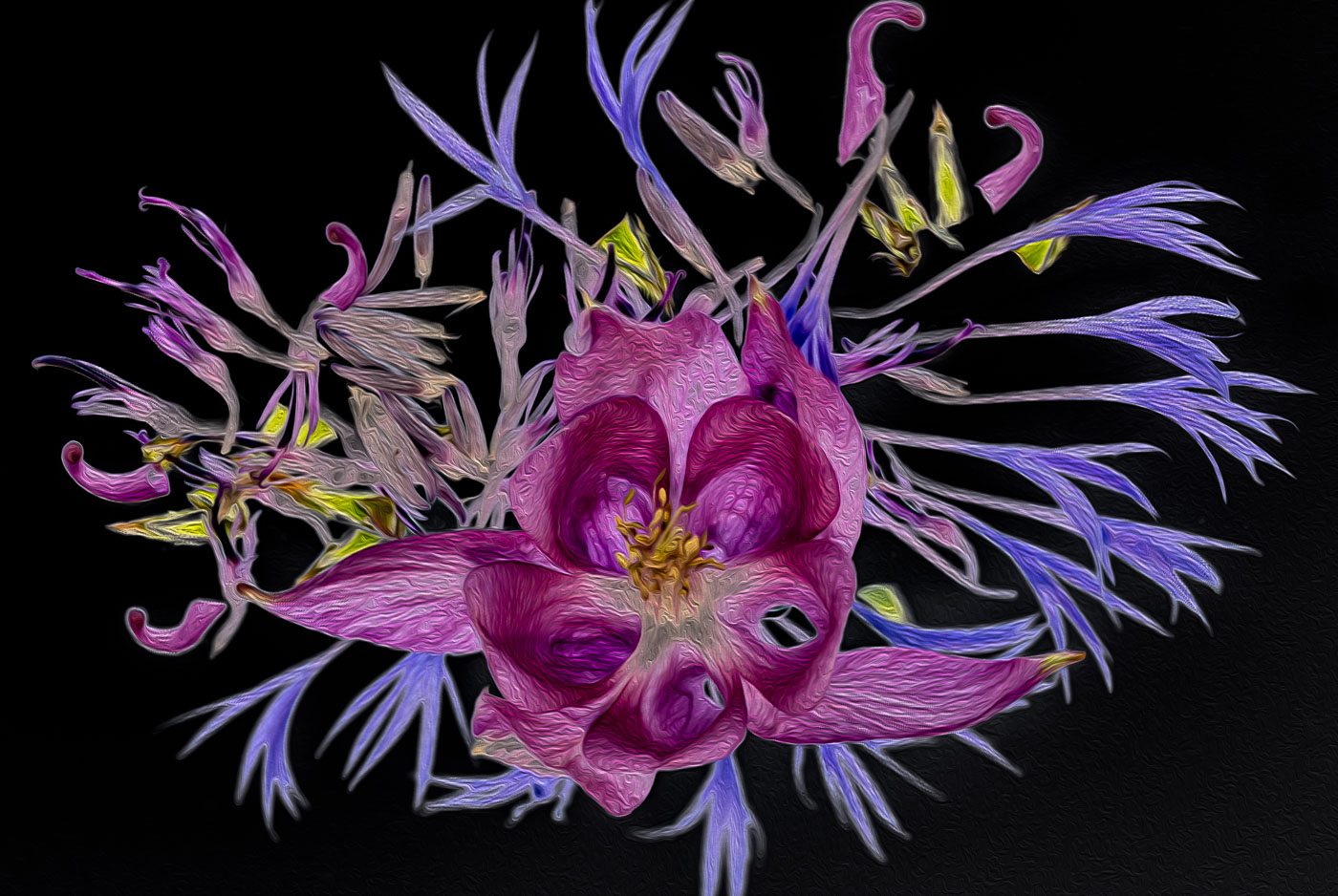
Well done Gunter. Excellent composition and sharp through out. I've never done something like this but in my mind you nailed it and don't have any suggestions to improve. |
Jun 8th |
| 29 |
Jun 22 |
Comment |
Judy, I like the image as is. I might of given a little more saturation to the original edit but need to be careful with the color change in the sky. I do feel Karen's darkening the sky caused a halo around the barns roof which may or may not be to your liking. |
Jun 8th |
| 29 |
Jun 22 |
Comment |
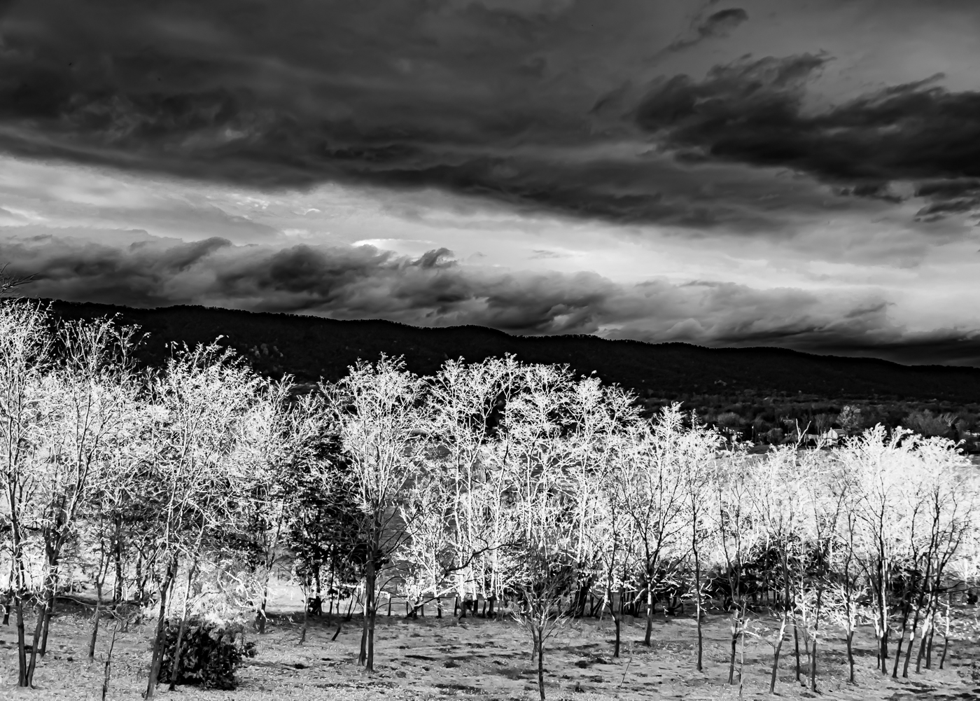
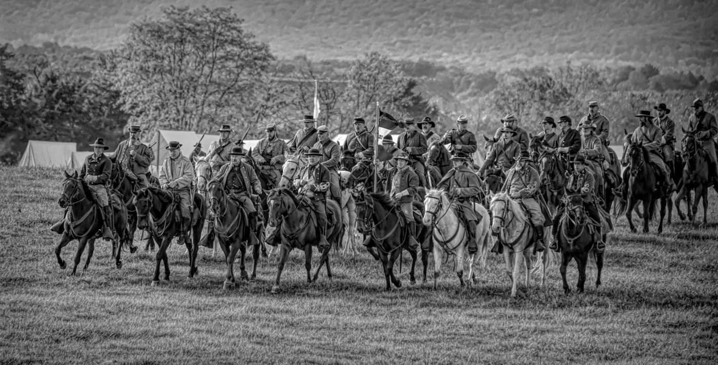
Tim, I too did the search for Wiscombe Park Hillclimb and watch a short video. So yes older folks can "drive" the hill. I know you seem to gravitate to the photo journalism type of images and for that reason I would like to have seen a race car somehow in the frame or his credentials or hat. Just thinking out loud. :-) I like your original image as well as Karen's edits. I do not favor the halo behind the Marshalls upper body. I do wonder if you used LrC or Ps "Select subject" features to select the sky or subject to edit and inverted to select the other? Not much that needs to be done in the sky or to the Marshall other than the halo. Very good thinking for getting an out of the usual image. |
Jun 8th |
| 29 |
Jun 22 |
Comment |
Hi Karen. Wow another great wildlife shot from Rocky Man NP. Seems like you live there. I like the composition and the highlight in his eye. The animal portion is accectably sharp. I do wonder about the background sharpness. I understand it being soft but the areas behind the head look different and unsure if you had to use a different method of removing distractions in that area? |
Jun 8th |
| 29 |
Jun 22 |
Comment |
Thanks for picking up that line Karen. That's created by the software and I was negligent in not seeing it. Probably would require a brush to blur that line and goes to show that a closer inspection is needed when the edits are complete. |
Jun 8th |
10 comments - 2 replies for Group 29
|
| 62 |
Jun 22 |
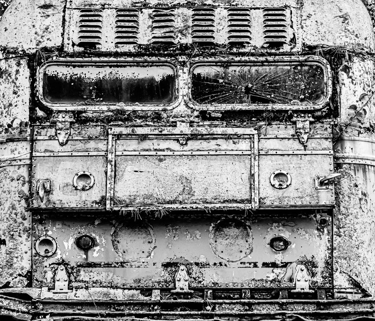
Comment |
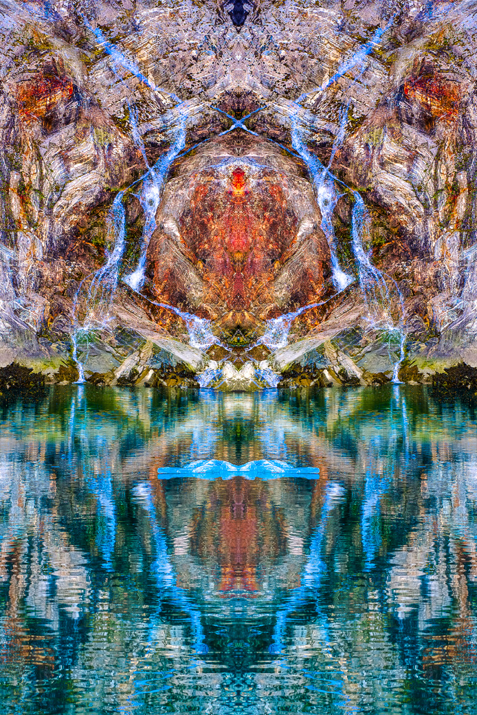
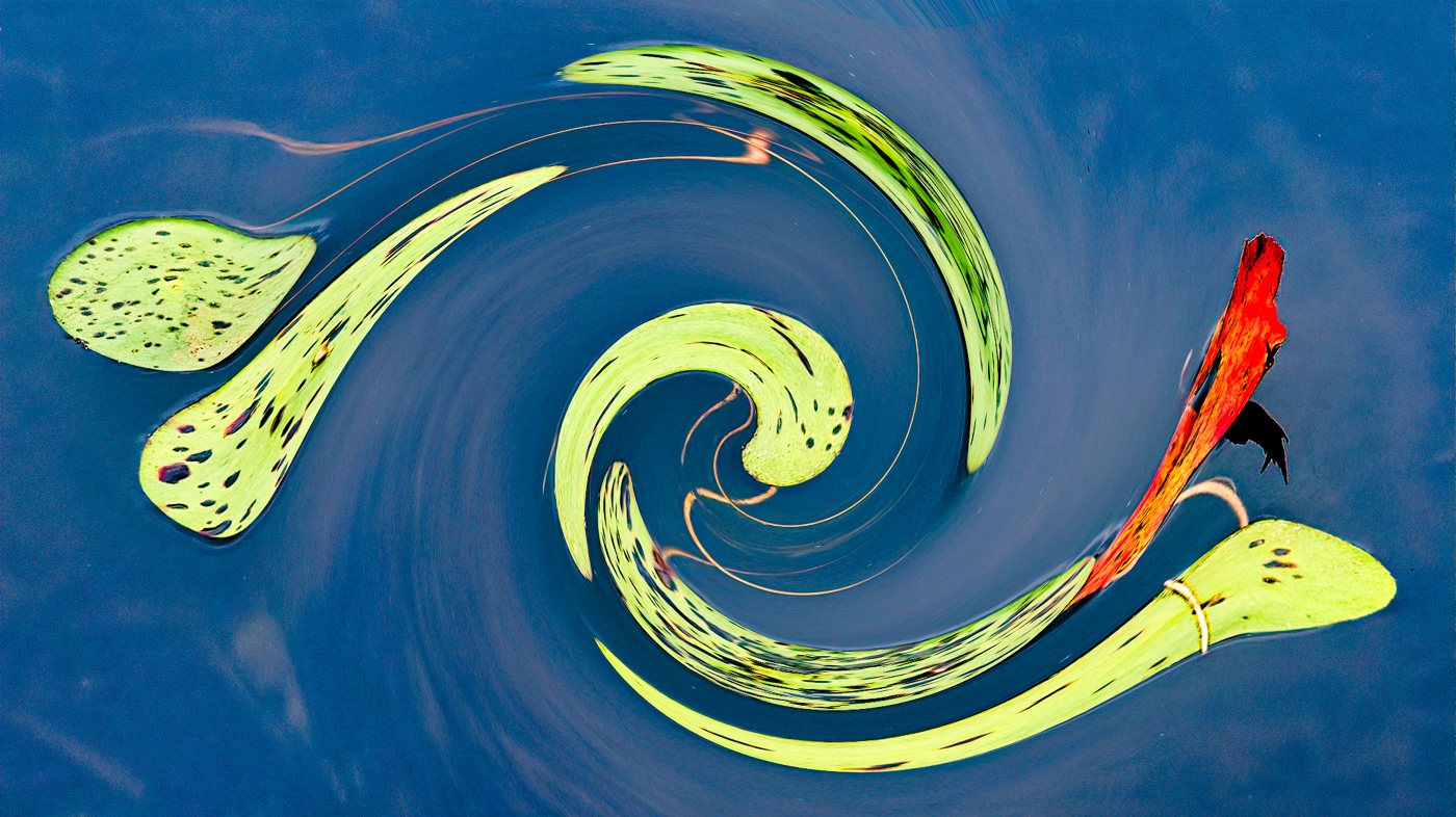
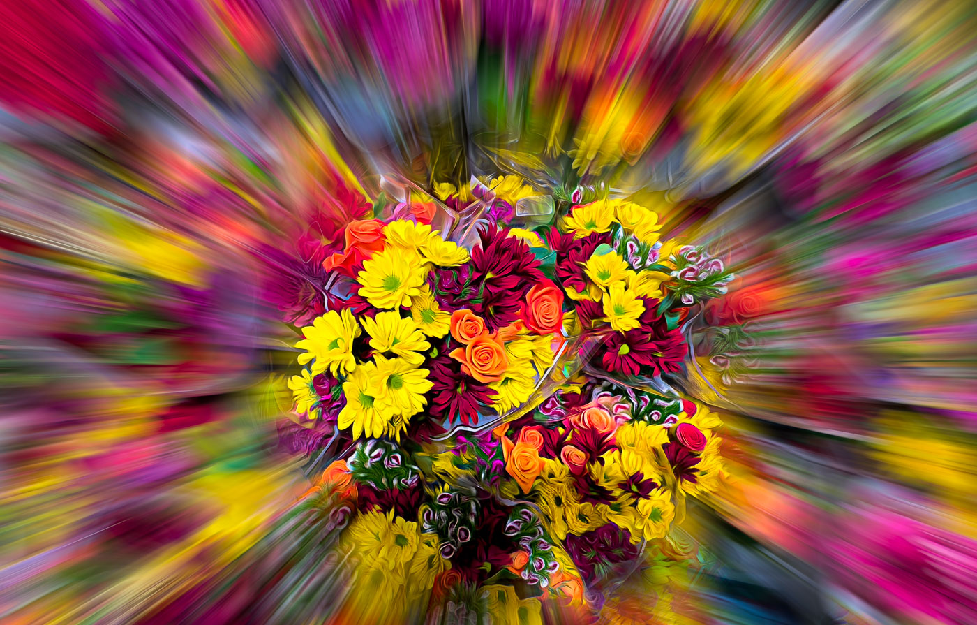
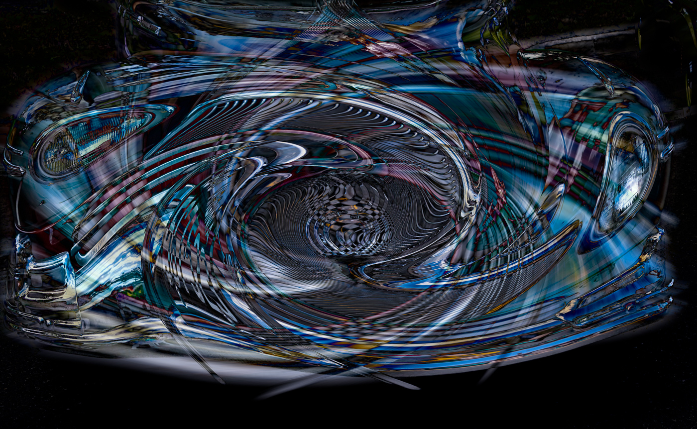
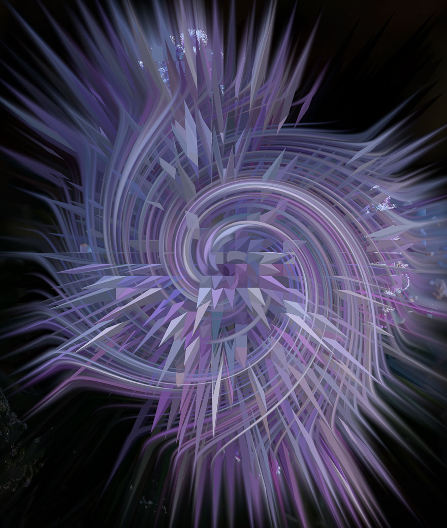
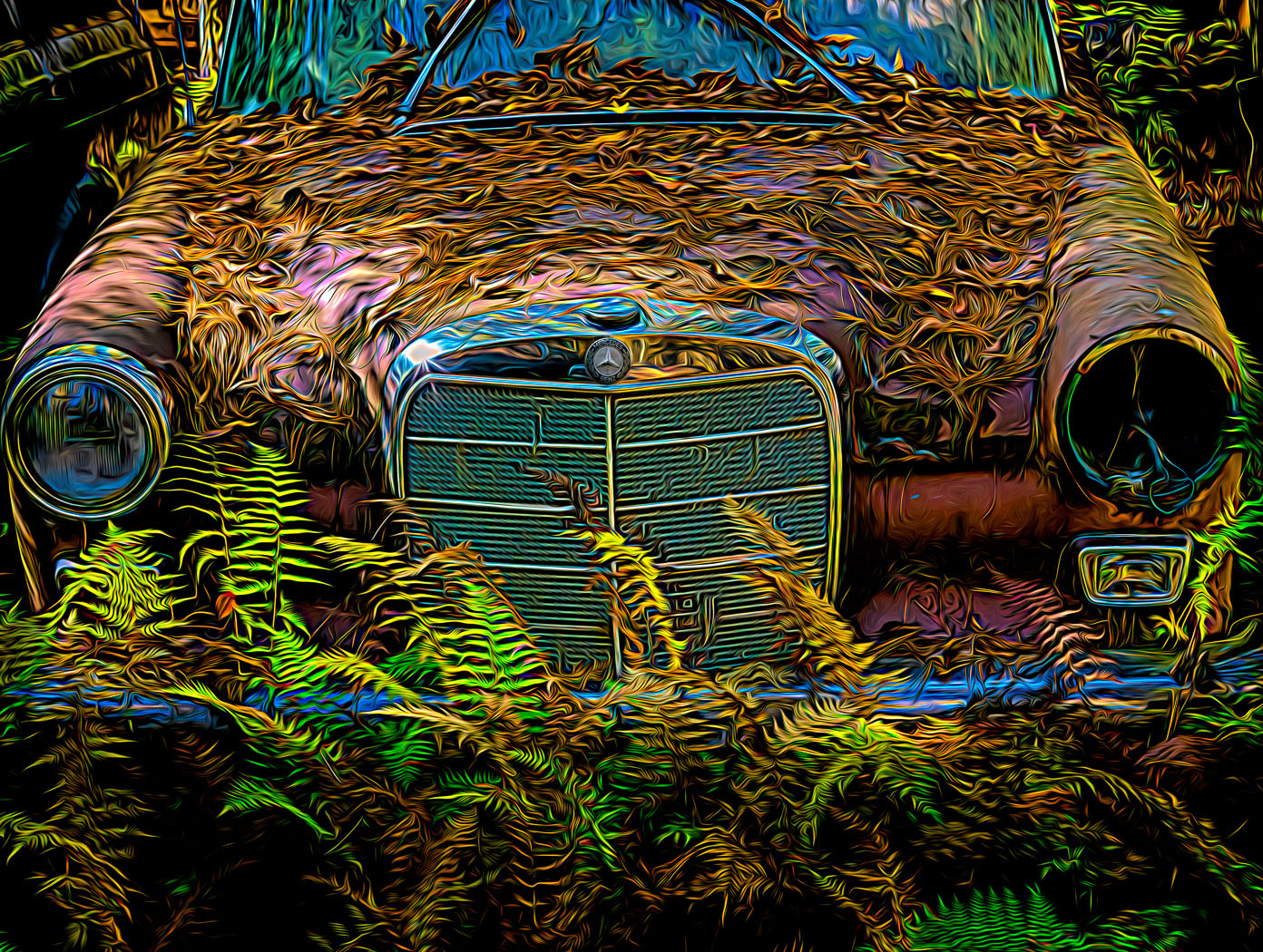
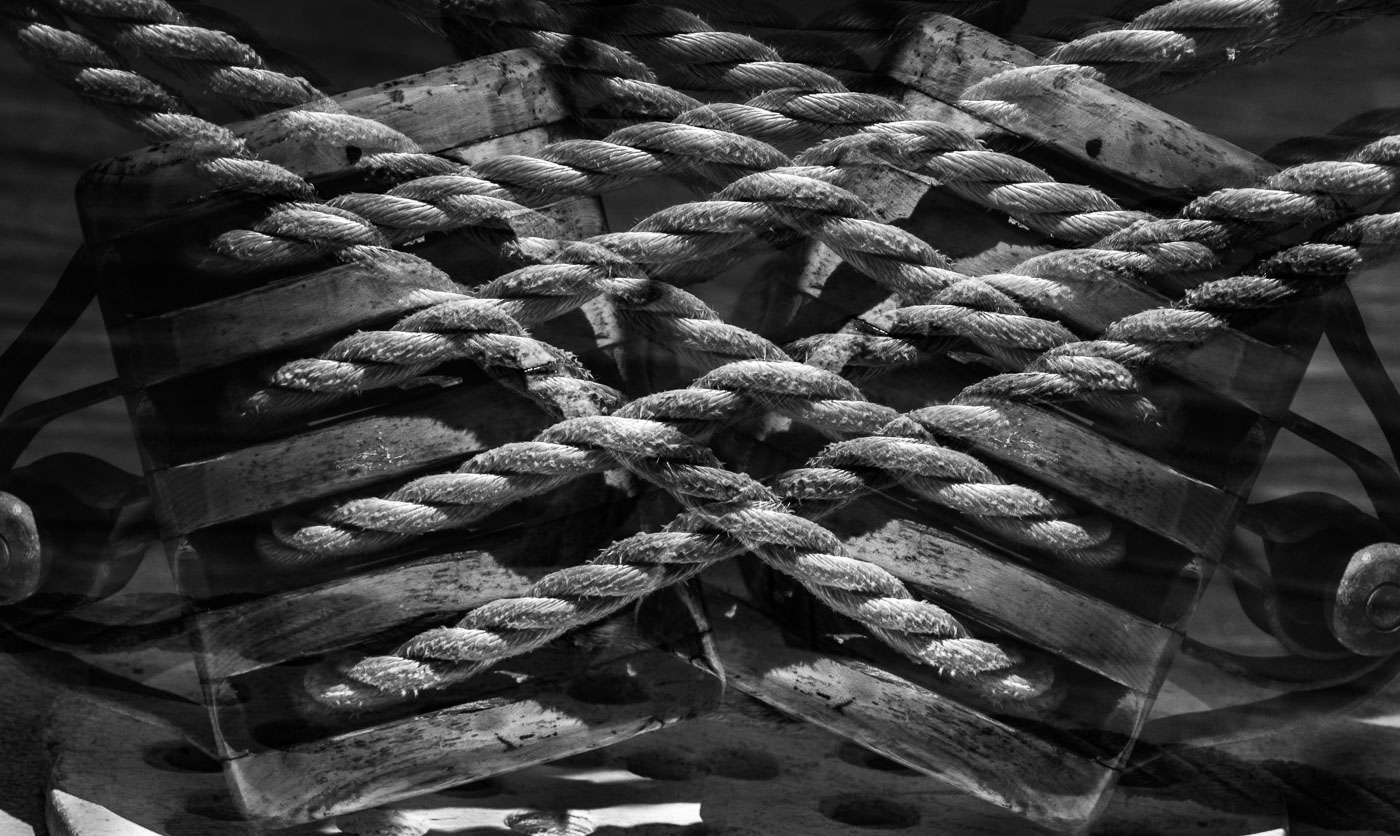
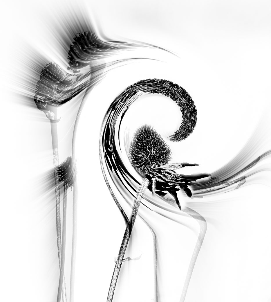
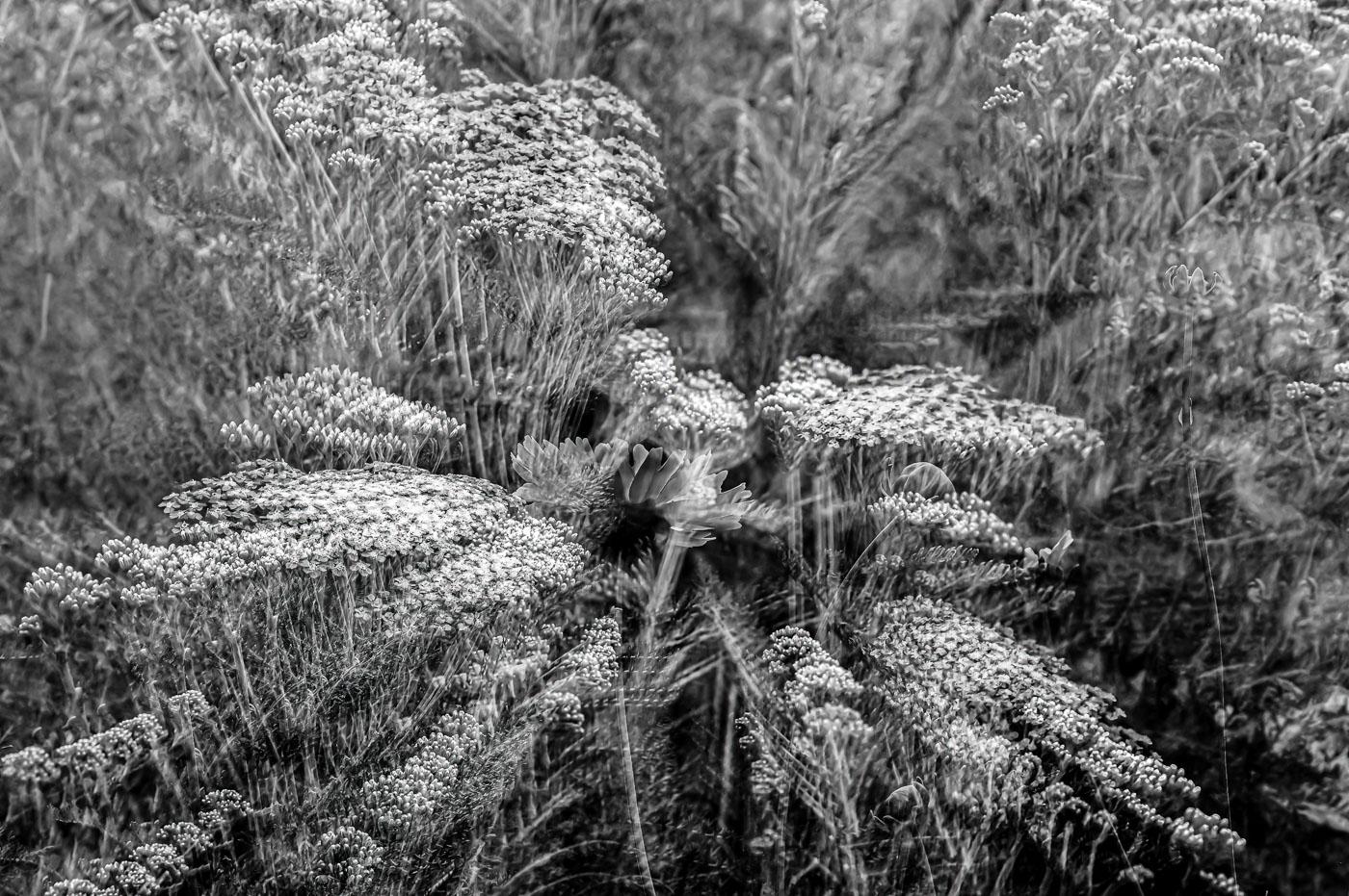
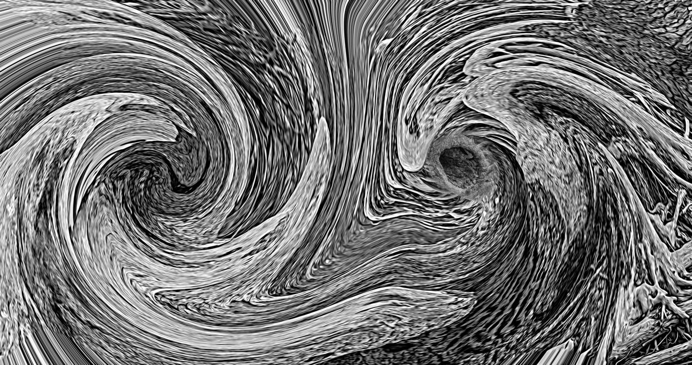
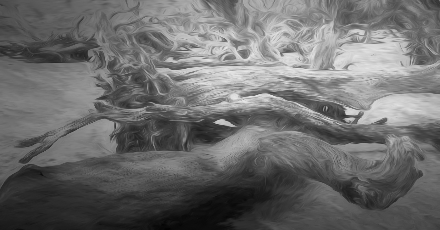
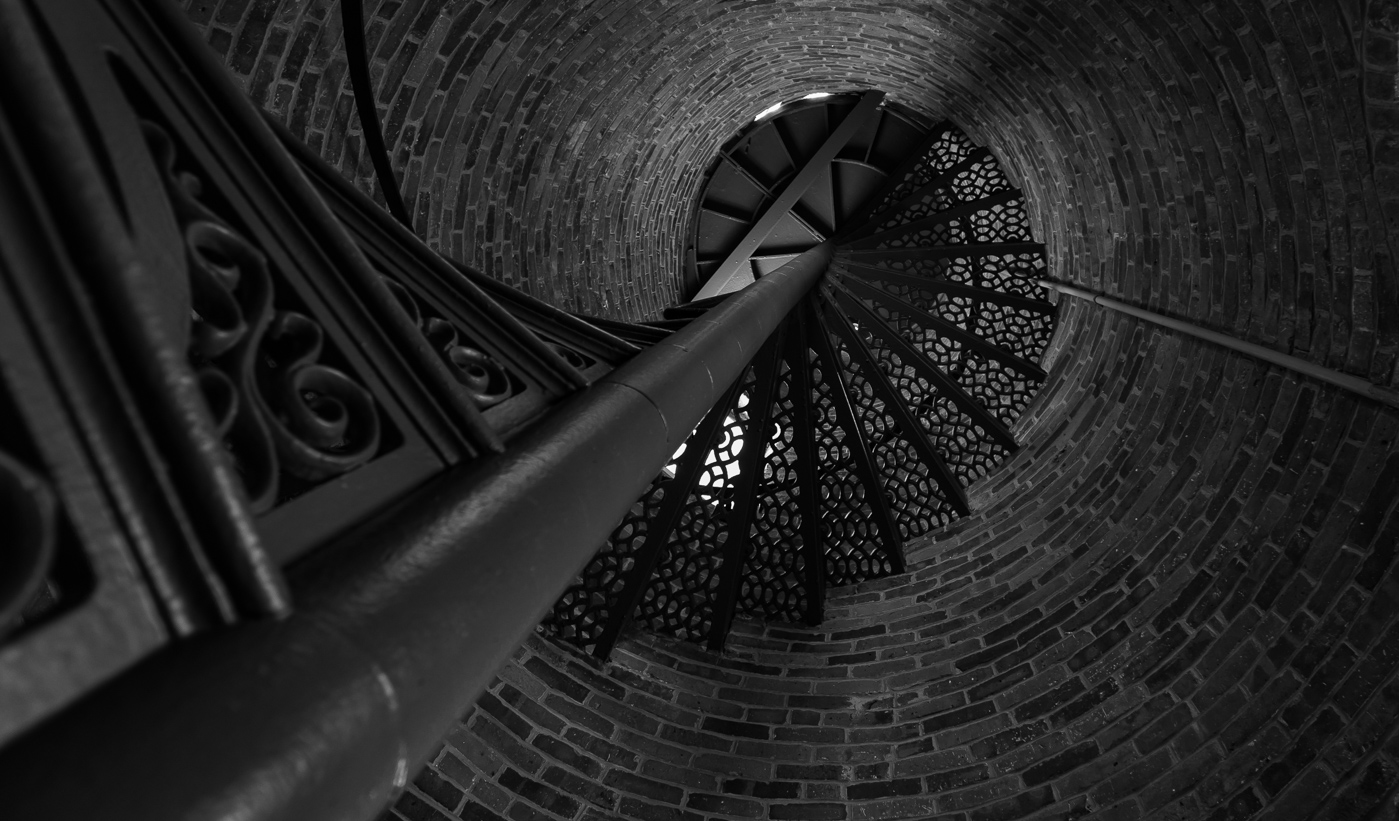
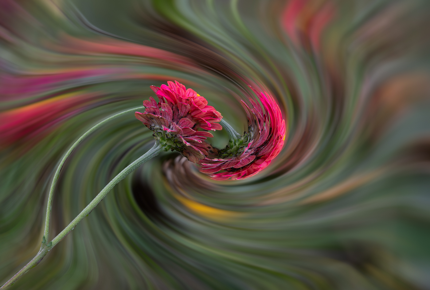
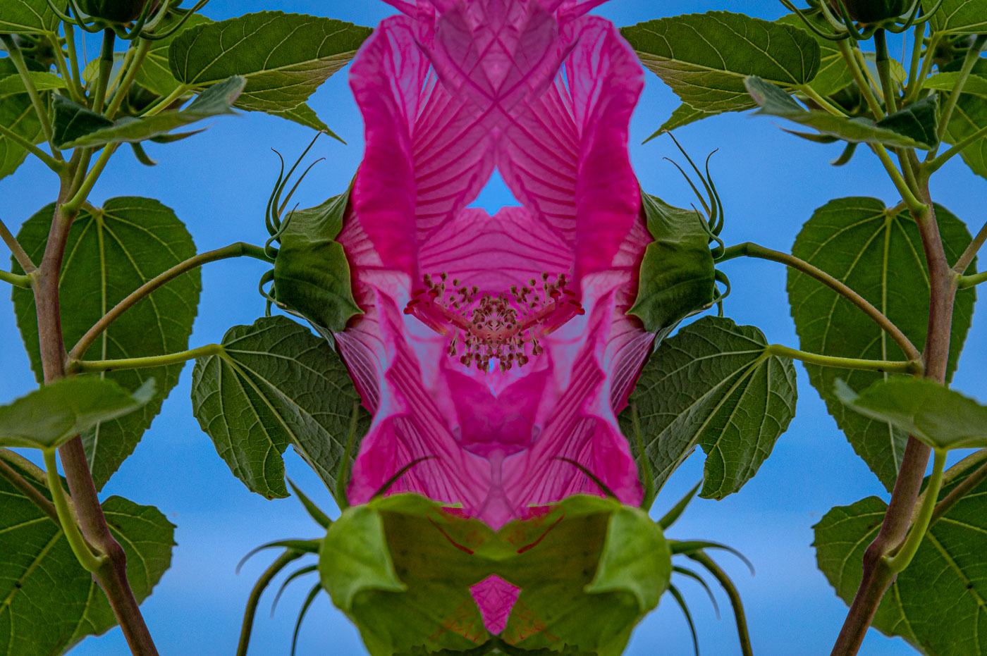
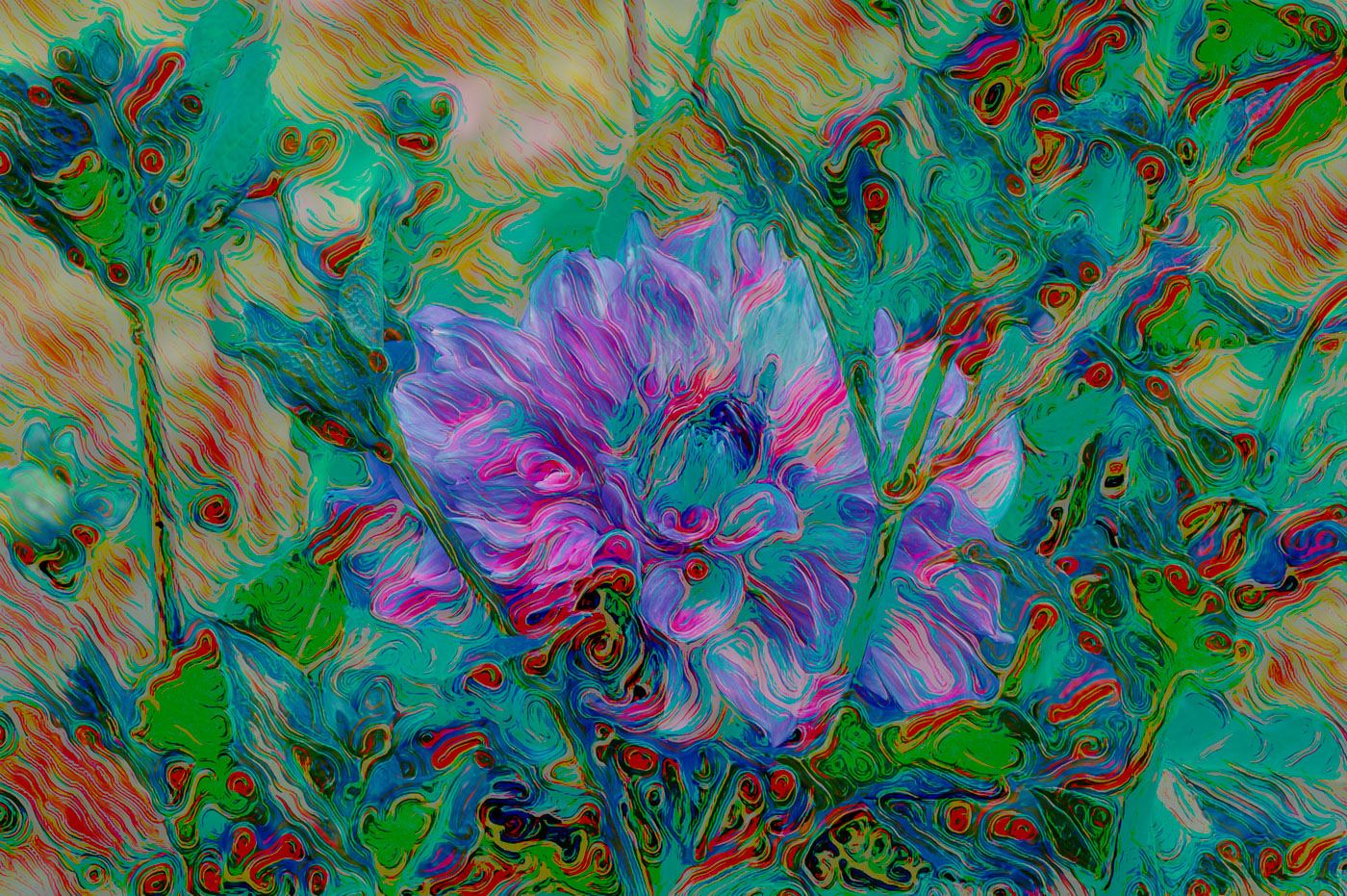
PSA INTERNATIONAL Annual 22 Exhibition Update. I received my report card back from PSA (4 judgings) and this image and with scores of 21,17,18,16 I did not get an acceptance. That's the way it goes with Abstract art. I will keep on creating. Thanks ALL for your good wishes.
Bob |
Jun 28th |
| 62 |
Jun 22 |
Comment |
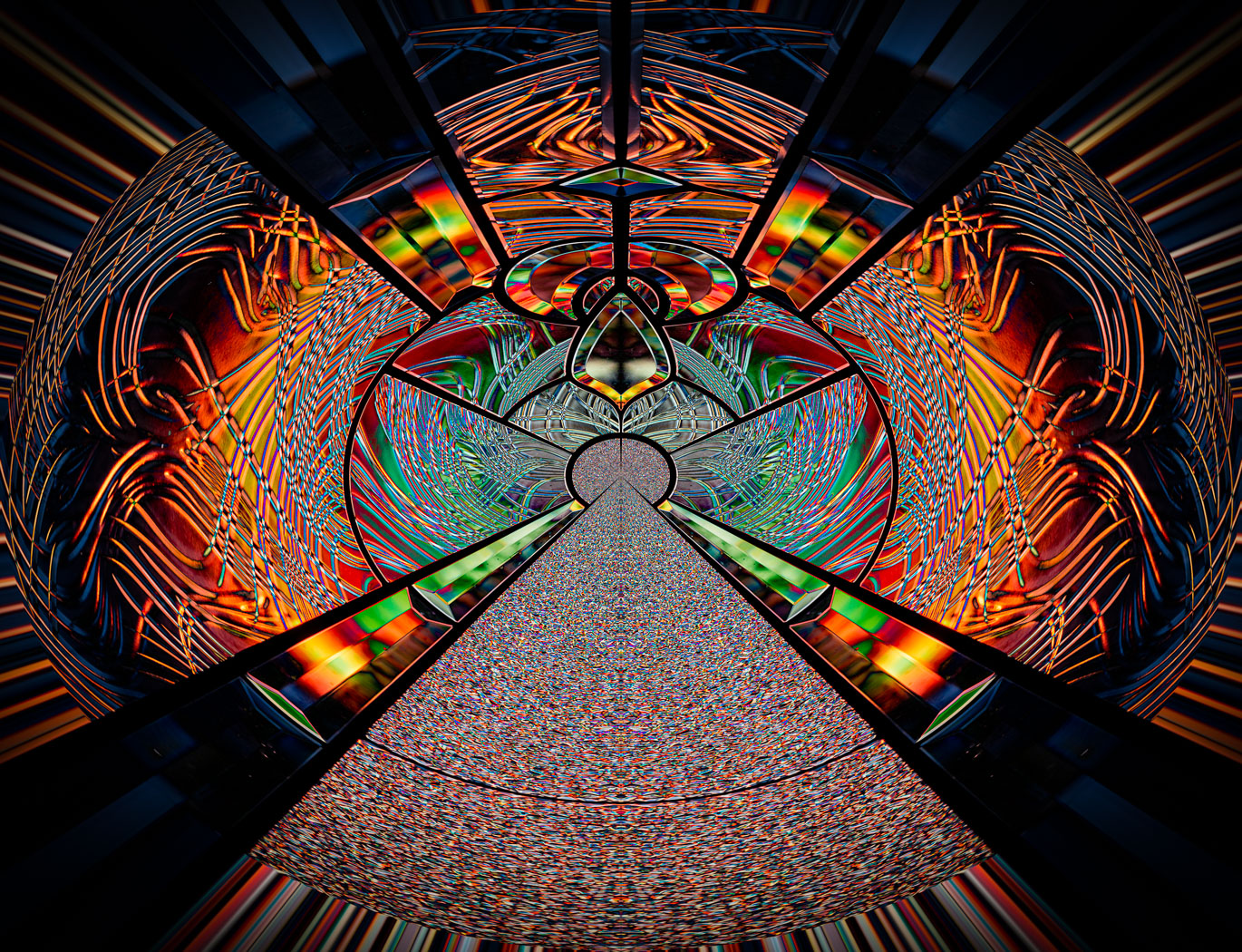
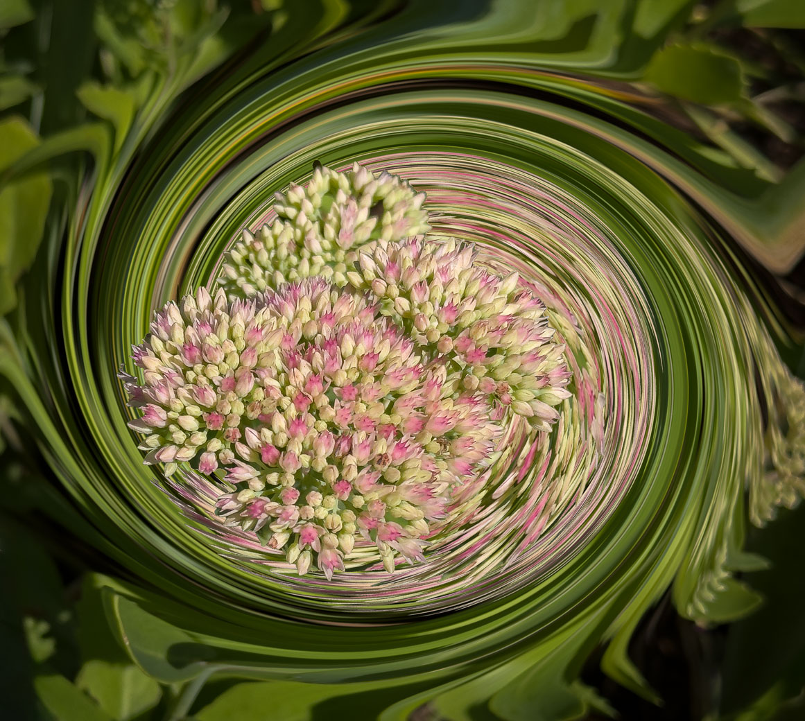
Thanks Emil. I can't take credit for all the perfection. Composition and cropping yes, but Adobe Ps software deserves credit for making/seeing the Raw file and perfecting the composition. Yes, I can envision "some" of the final composition features but impossible to see compositions that I've never envisioned before, especially with this images' lines and textures that don't exist in most photographs. |
Jun 8th |
| 62 |
Jun 22 |
Reply |
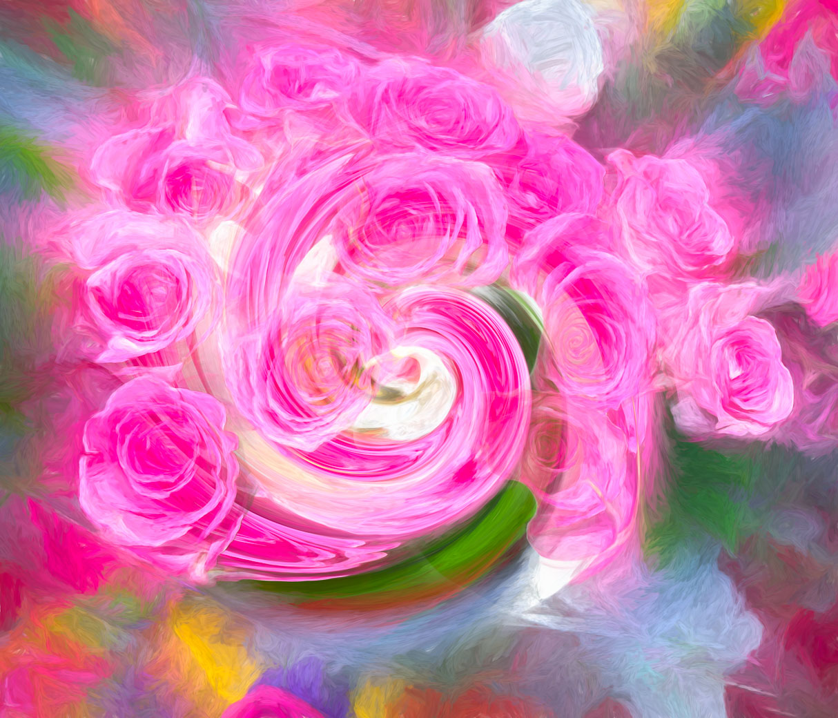
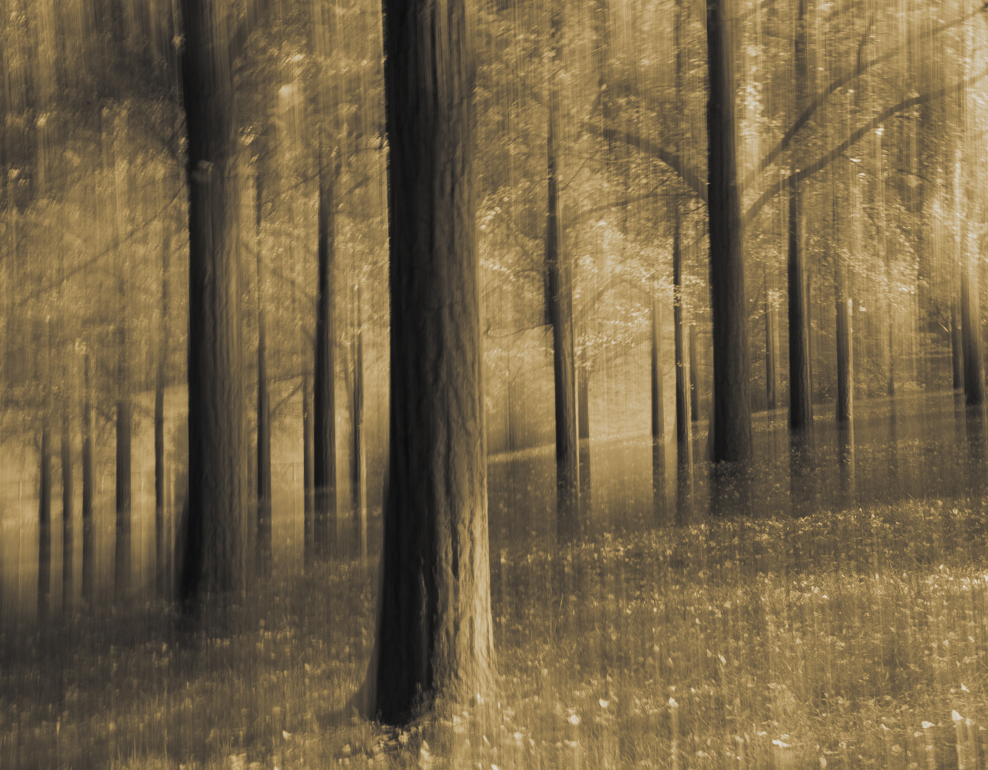
Thanks LuAnn for your comments and preferences for the BW. It's been less than 2 years that I consider myself an abstract artist, but when I go back and look at my digital images from 2006 to 2020 and I see that I shot details and closeups that are the foundation for good creatives and abstracts. That 2020 time frame ties in with Covid lockdowns and more importantly joining the Adobe Photo software ie: LrC and Ps. I had been wandering for 6 years or so trying to find a replacement for Apple Aperture and tried Photos, Nik,On1 and Luminar. I wasn't happen with any of them for managing my photos. Luminar did well with editing, but terrible software for managing my photos. Once Luminar declared they were not continuing with image management, I was gone and made a huge effort to learn LrC and imported all my images. I'm still cleaning the database up and deleted over 20,000 images while continuing to shoot and make creative edits. I now have smart collections for creatives and abstracts based on those keywords totaling about 1600 of my 46000. I enjoy making good images totally unique to take them to the next level. Competitions using creative and or abstract editing only have a 50% at best acceptance.
Sorry for the long answer, I just finished lunch after overworking in the yard and garden this morning. Yes, it is very beneficial to be able to get comments and share with a quality group of photographers. |
Jun 7th |
| 62 |
Jun 22 |
Comment |
Thank you Pete. It's a process and the first images didn't work like this so fortunately the door is always available and that is the ideal situation to try and try again |
Jun 4th |
| 62 |
Jun 22 |
Comment |
LuAnn. I can honestly say I have none of these towers in my collection. Once I reread your image statement I changed my mind about making an abstract from it. Your approach was to question the safety and I agree with your PJ approach Your edit works for me, darkening the road in the foreground, and the vignetting. A more artistic editing might be an indication that you thought they were artistic and or beautiful. I wouldn't want any near my home. They are for city folks, not us country folks. |
Jun 4th |
| 62 |
Jun 22 |
Comment |
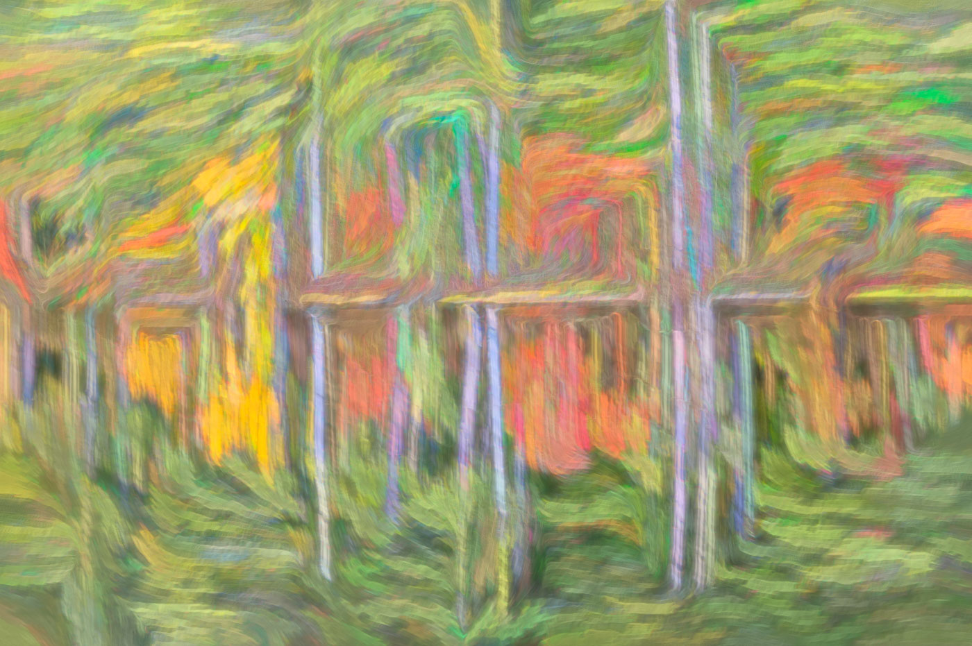
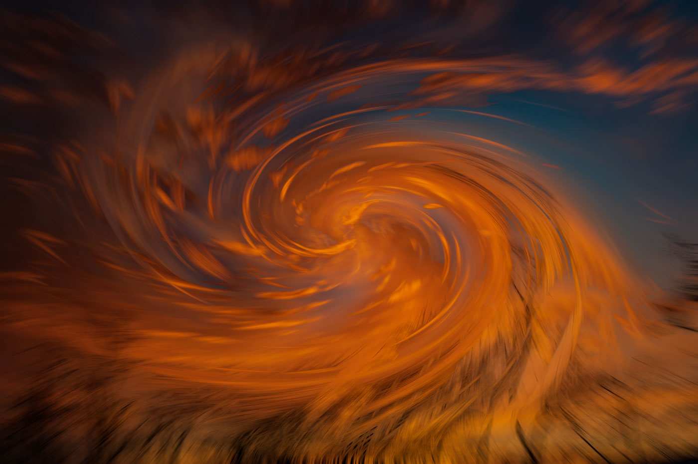
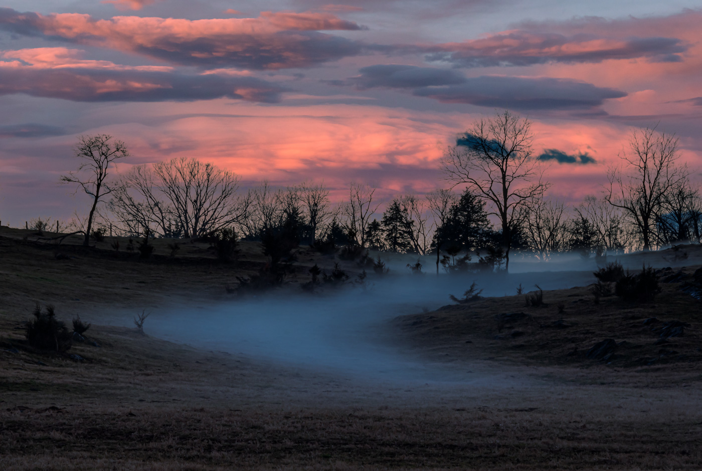
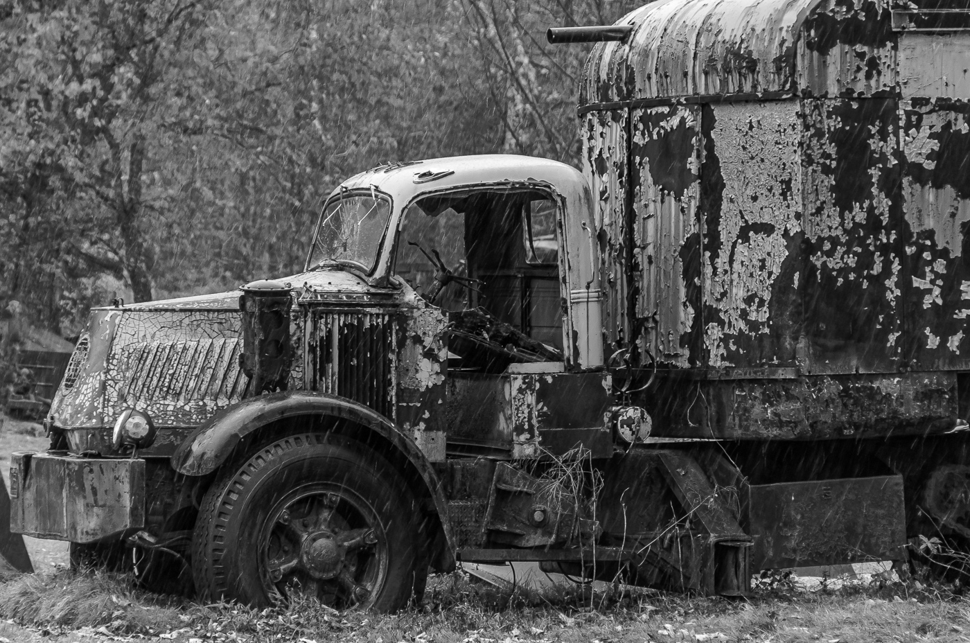
Emil, this had me thinking you went into your archives and pulled out this image you took from the 50's. Just fantastic that you were able to bring the look and feel of that time in history into this modern photo format. Excellent use of blur and masking to make this happen. I like your sky treatment and think that the wire should be included since you have the service on the building. |
Jun 3rd |
| 62 |
Jun 22 |
Comment |
Another great PJ image Israel. I was first drawn to the split flame as that is the brightest part of the image. Nothing wrong with that as that is the attention getter and draws my eyes in to the monks face. Intensity on this face is also perfect. You captured the moment and it appears as you were the only photographer and or witness. Your images have that quality to them and that causes the viewer to be there also. |
Jun 3rd |
| 62 |
Jun 22 |
Comment |
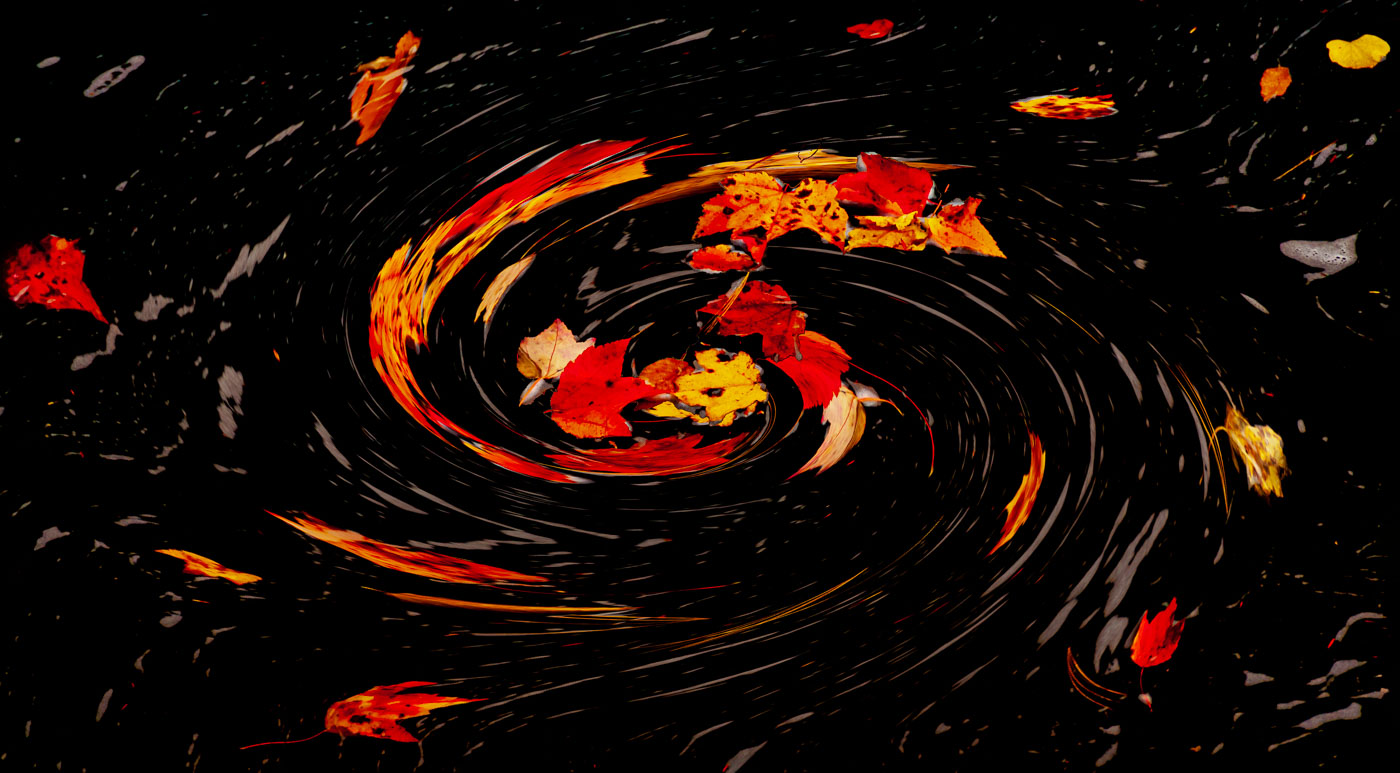
A very nice creative image Pete. I'd never have the patience to shoot all of those images of the same subject. I like the repetition in the image and that the frame is filled with practically all sharp lines and they make a beautiful composition. The NVACC just held their Abstract competition and they have hundreds of images in their gallery that might provide ideas for you. Your image is closer to the creative side as it might be easily identified. According to Joseph Miller and others an abstract should NOT have a recognizable subject. |
Jun 3rd |
| 62 |
Jun 22 |
Reply |
A very nice edit LuAnn. You've caught the abstract bug, but you must not have thawed out yet from your cold winter. I'm infecting the group with Abstract disease. I'll see if I can help generating heat from Danger Danger. LoL
Bob |
Jun 3rd |
| 62 |
Jun 22 |
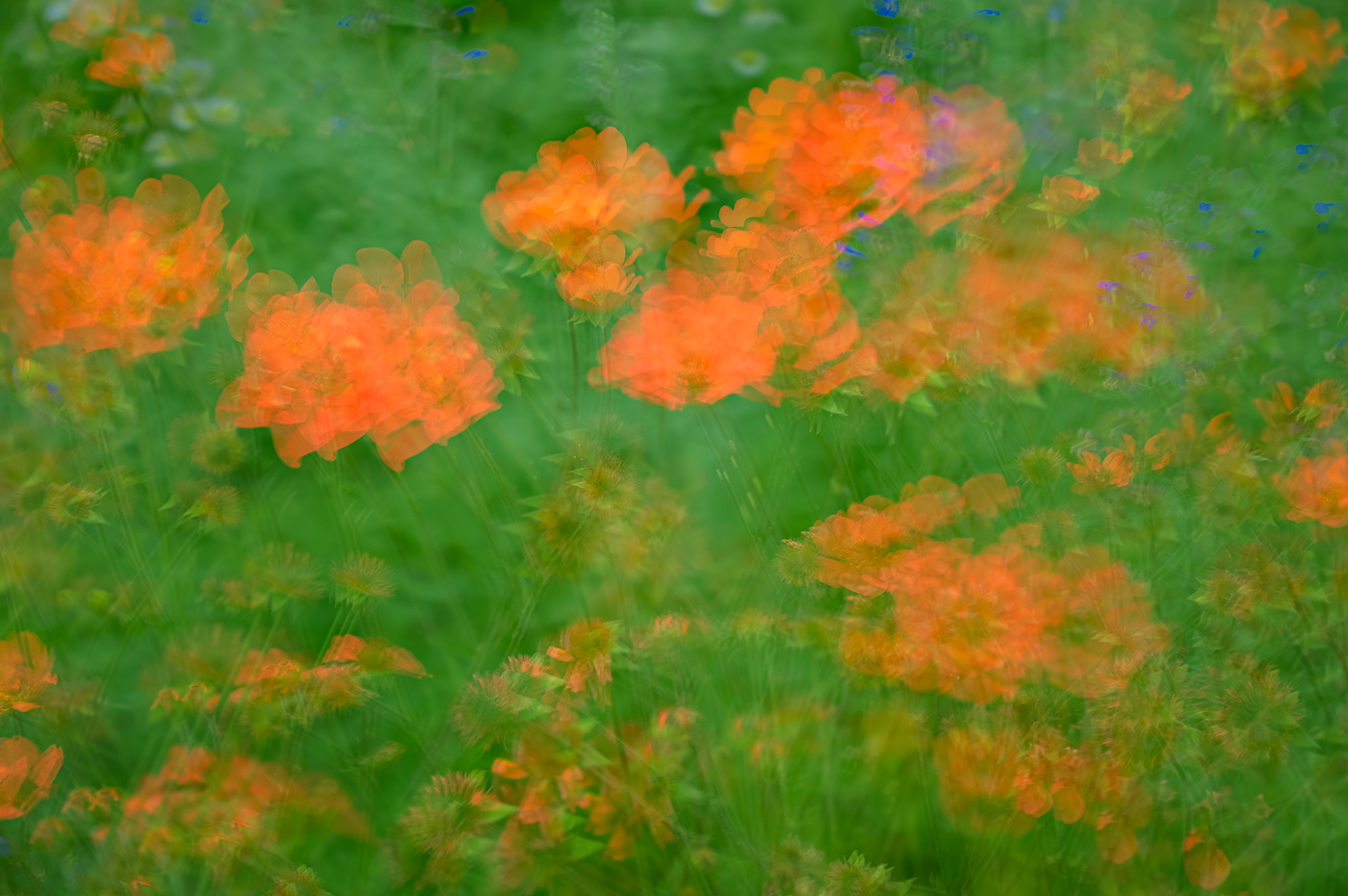
Comment |
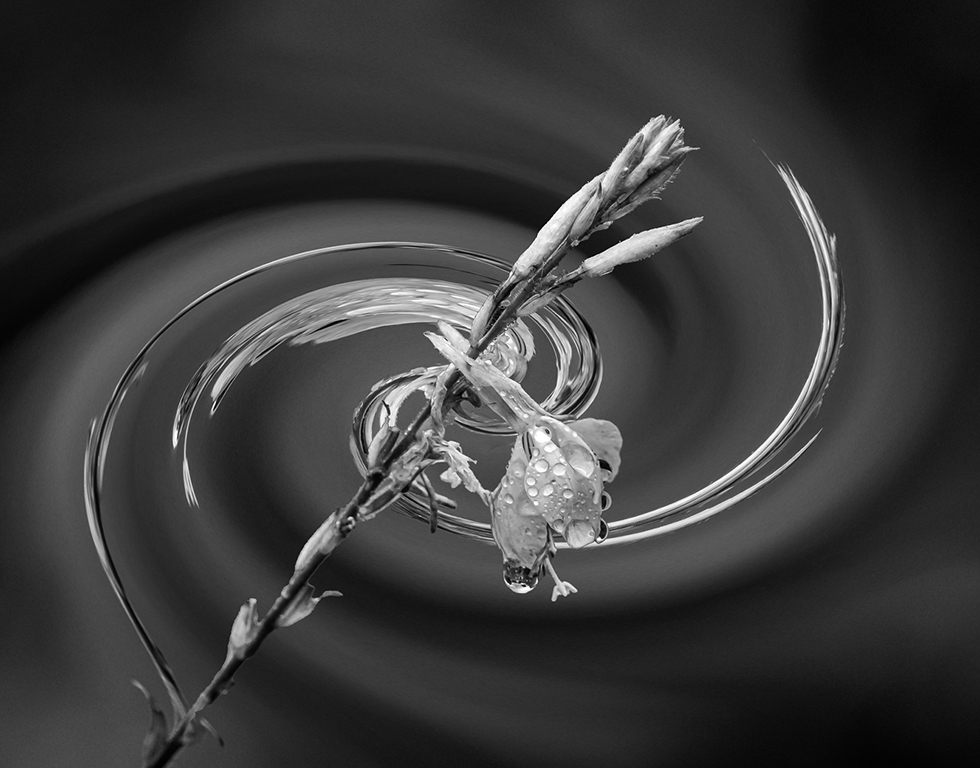
Bunny, before I scrolled down I was preparing to write that your multiple exposure or edit was very good and required a vision to see the multiple wheels to make your image. But your creative edit is just fantastic and it even ties in with your small boat portion of your trip as I envision ripples in this edit. So fantastic to see your editing go beyond what's normal. |
Jun 3rd |
| 62 |
Jun 22 |
Comment |
Thank you Bunny. It's always great to start the month with positive remarks. I appreciate it.
Bob |
Jun 3rd |
9 comments - 2 replies for Group 62
|
19 comments - 4 replies Total
|