|
| Group |
Round |
C/R |
Comment |
Date |
Image |
| 3 |
Apr 22 |
Comment |
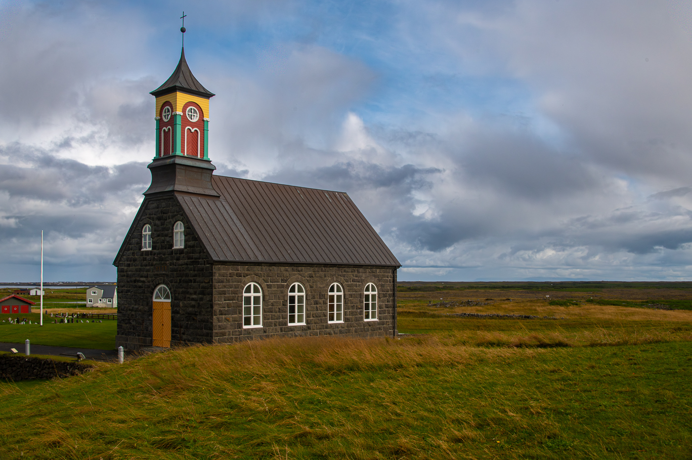
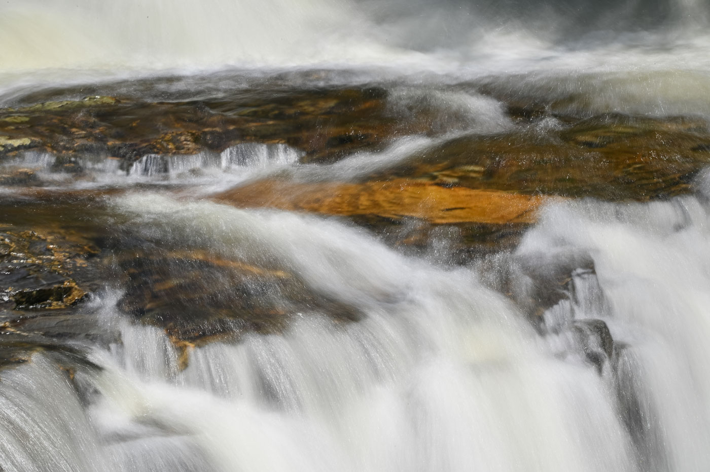
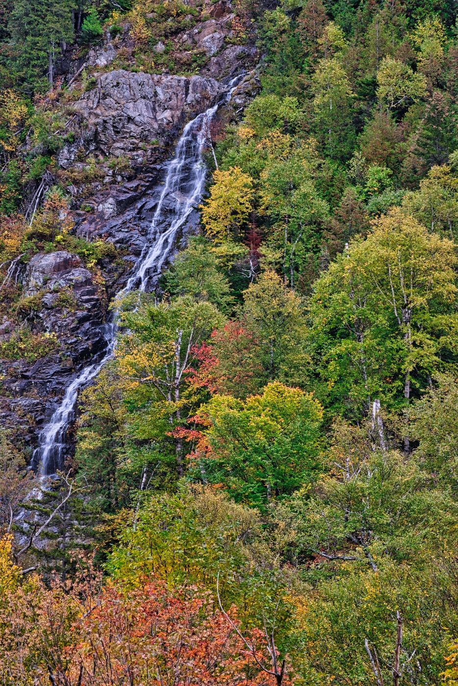
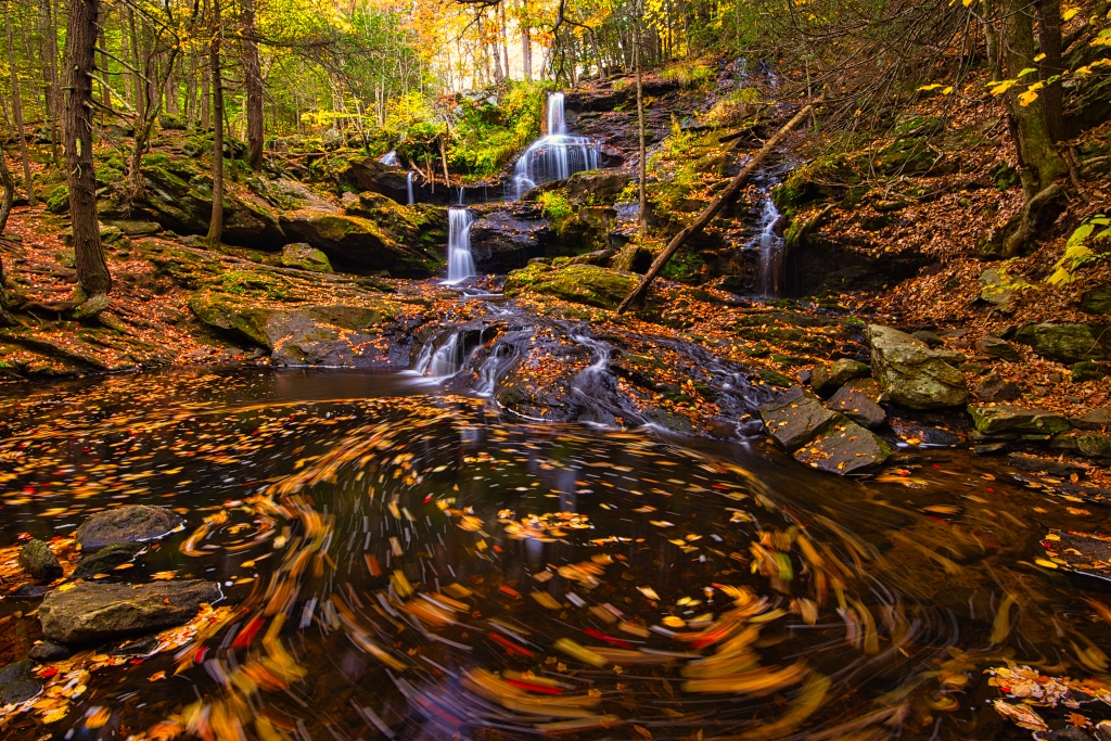
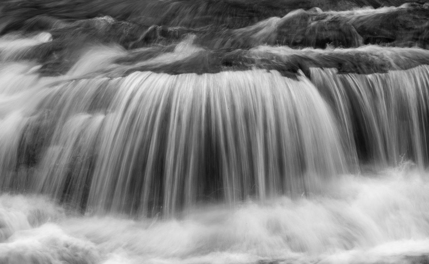
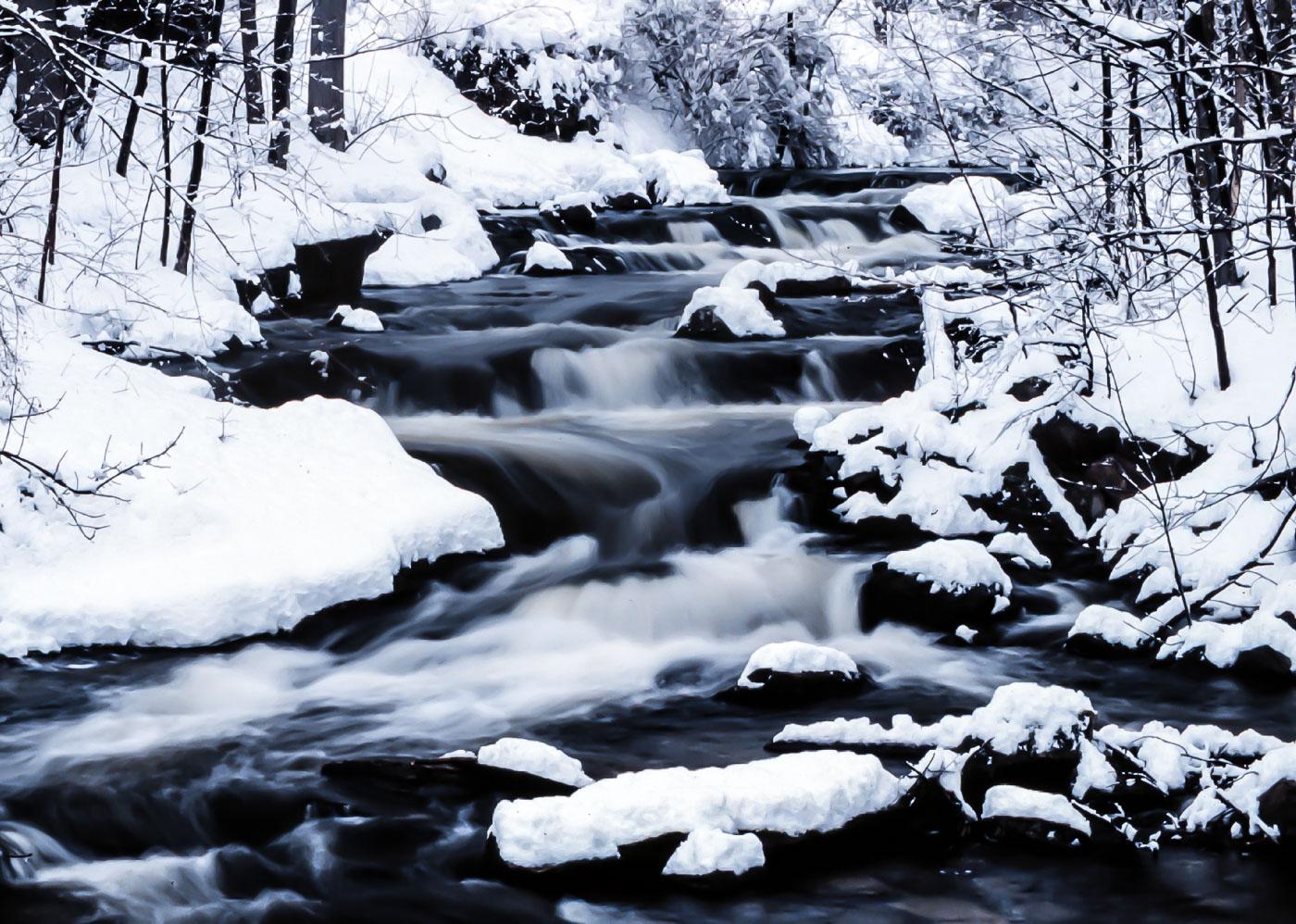
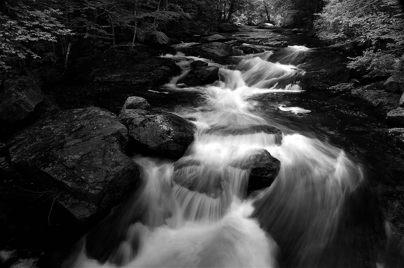
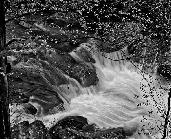
Hi LuAnn. A beautiful waterfall composition. I see the Moose (once you gave us the hint) but see no dog or rooster. I don't think the snow in the image adds much but understand it is necessary to give a heavy water flow. I do prefer the B&W image also. I'm glad you warmed up to take water falls images. |
Apr 7th |
1 comment - 0 replies for Group 3
|
| 29 |
Apr 22 |
Comment |
Thanks Stephan. I Appreciate your comments |
Apr 17th |
| 29 |
Apr 22 |
Comment |
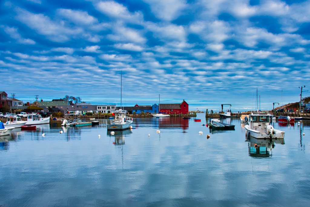
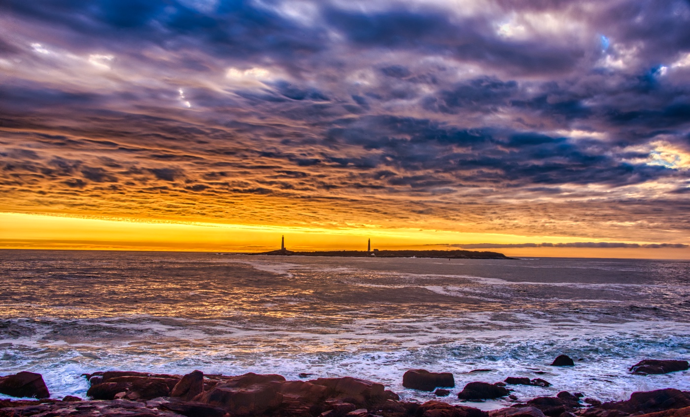
Hi Ron. Welcome to the group. Yes, one of the most photographed lighthouses in Maine. I have no issues with your composition and while Gunter's flip works quite well, I think the people of Maine would protest as East Coasters Love their Coast.
The HDR worked quite well, but the white blown-out sky I find in need of improvement. If you didn't leave too early, then a darker (maybe even one in the HDR stack) image might eliminate that hi light, or maybe try to edit in LrC with sky as subject and knock down those hi lights. BTW, many of us find it helpful if you give us the shooting metadata and in your case what you used to process the HDR. I look forward to seeing other great New England shots.
|
Apr 15th |
| 29 |
Apr 22 |
Comment |
Thanks for visiting Ron. Yes the island, but I wouldn't flatten and add the reflection. I try to keep my Landscapes and PSA nature images legit and change and create with my Abstracts. |
Apr 11th |
| 29 |
Apr 22 |
Reply |
Thanks Tim. |
Apr 9th |
| 29 |
Apr 22 |
Reply |
Thanks Karen. |
Apr 9th |
| 29 |
Apr 22 |
Comment |
Thanks Gunter for a good points. As you can see in the original I had plenty of room on the right but cropped it too close to the edge of the frame and I should of run it thru Topaz but did not. |
Apr 9th |
 |
| 29 |
Apr 22 |
Comment |
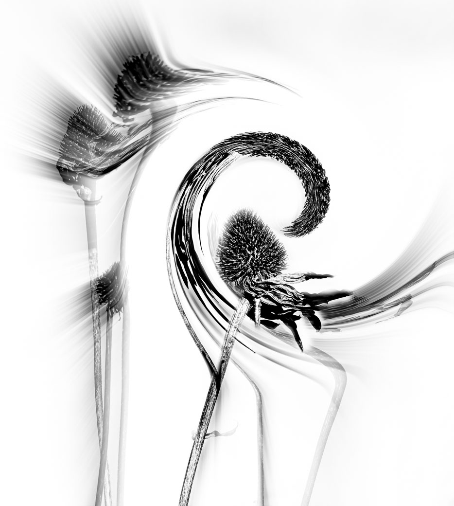
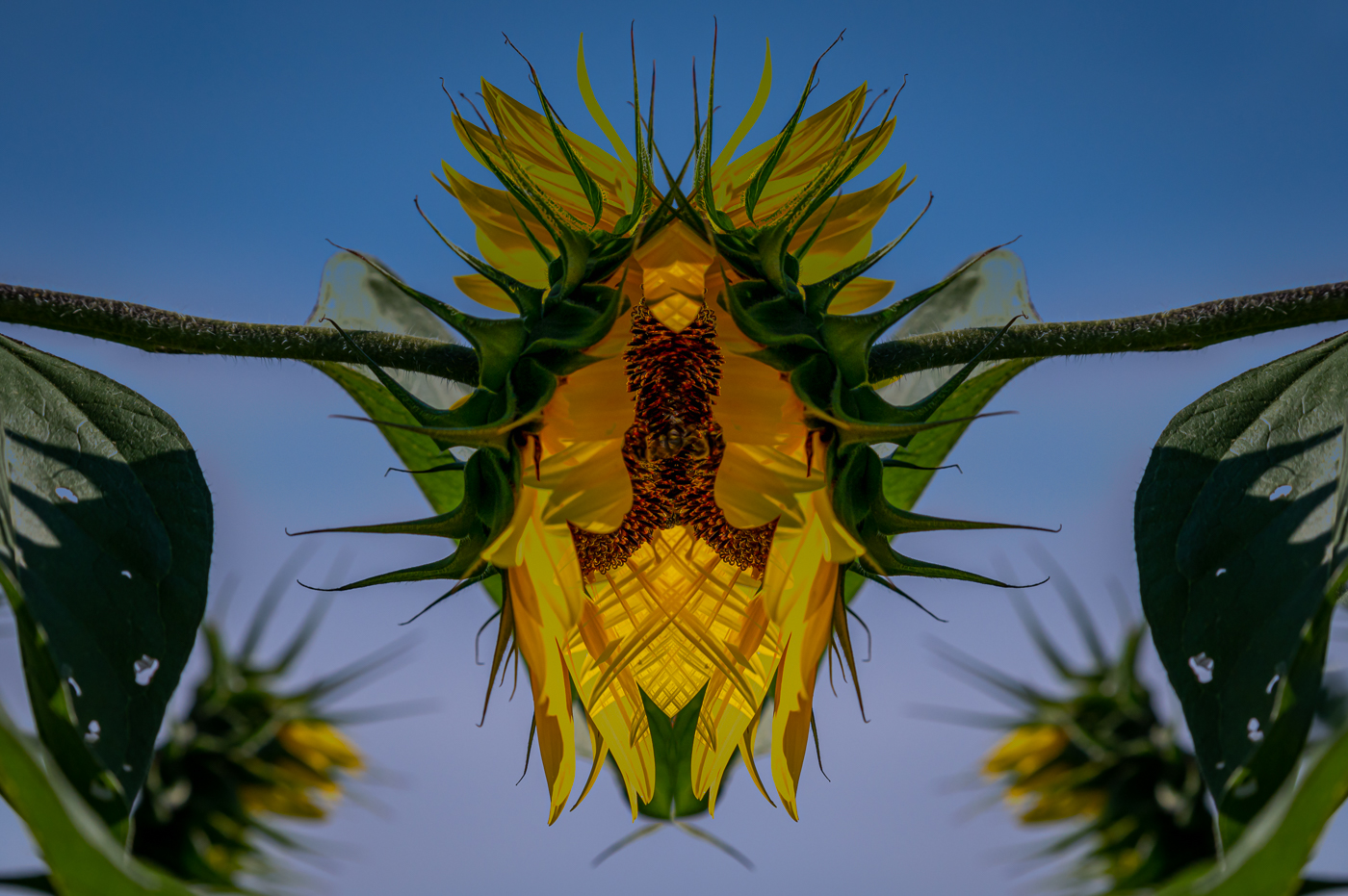
Gunter, this is an interesting image with both the B&W and Color versions. I feel the composition works well. Not sure what you call the textures and if that is something you found in Topaz Studio. I do think that the white textures on the right side of the color model is overexposed and would benefit from reduced highlights giving more detail to that area. Definitely fantastic creative thinking to envision and get onto film/chip. |
Apr 7th |
| 29 |
Apr 22 |
Comment |
Indeed your lucky day Karen, the geese on the diagonal was just perfect framing vs them passing 10 feet more towards the bridge and the darker water. Composition on the bridge is perfect. I had a D750 for 4 years and my suggestion would be to use a higher iso like 200,320 or even 400. A photo with some noise (very little even at 400 with this camera) will always outperform an image with motion blur or a lack of/failed DOF. At f5 and 1/100 sec you had very little leeway to keep everything in focus with an adequate DOF. To this day my goal is to shoot at f11 unless I'm going for a more shallow DOF. Here's to more luck days. |
Apr 7th |
| 29 |
Apr 22 |
Comment |
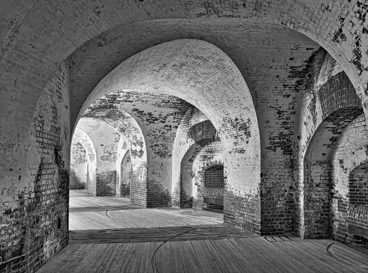
Judy, this is a good image, but I think I would of done it differently. I would crop in-camera or post to get past the doors (left&right) and that ugly water damage on the first left column. That will solve your light question but puts the next light in the foreground and I would clone that out. I would also drop the highlights on the columns and floors moving in towards the formal doors. |
Apr 7th |
| 29 |
Apr 22 |
Comment |
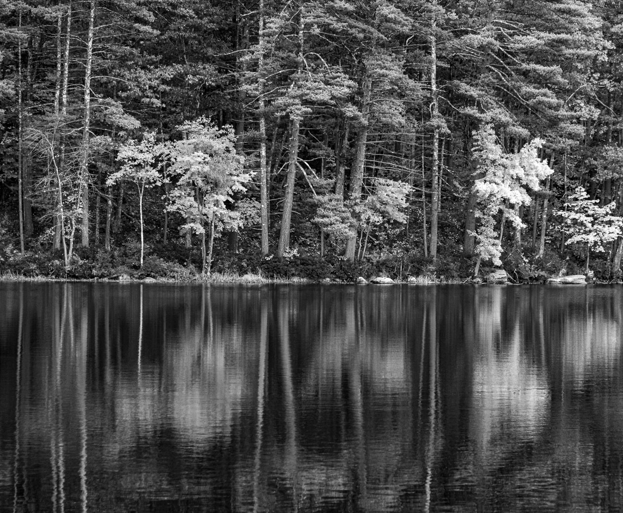
Hi Stephan. Good seeing to find this image and to make this very nice composition. Beautiful green colors and everything appears to be sharp. My only nit is that the water closer to the viewer is a tad over exposed and a slightly higher shutter speed would give you more detail in the water. Perhaps you can do a selection and knock down those water highlights.
Bob |
Apr 7th |
| 29 |
Apr 22 |
Comment |
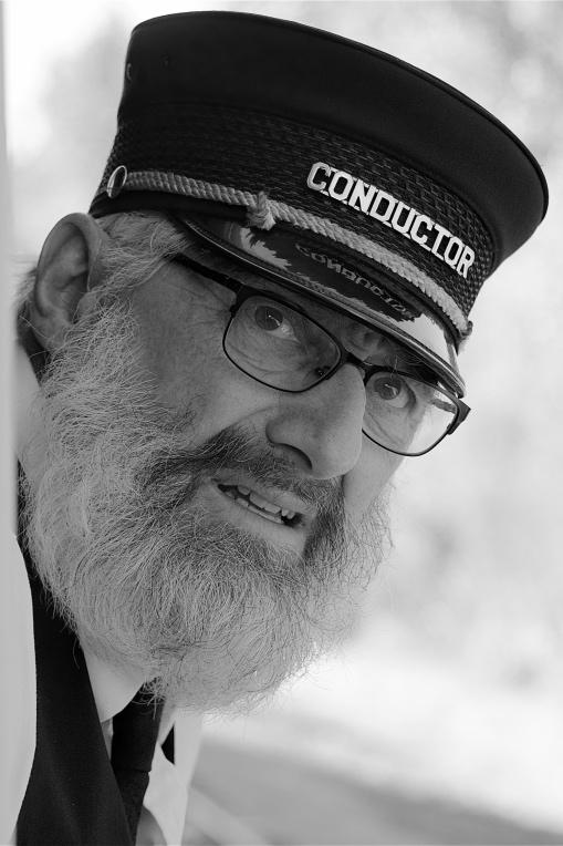
Hi Tim. Your image tells part of the story as it appears that the Red Lady's face is already extinct. Nice and sharp, good composition, and nice Red wardrobe and background. Then the whiteish face. Great photo journalism as it will attract viewers to see what the story is. But its not a look of "beauty" in my book. |
Apr 7th |
9 comments - 2 replies for Group 29
|
| 62 |
Apr 22 |
Comment |
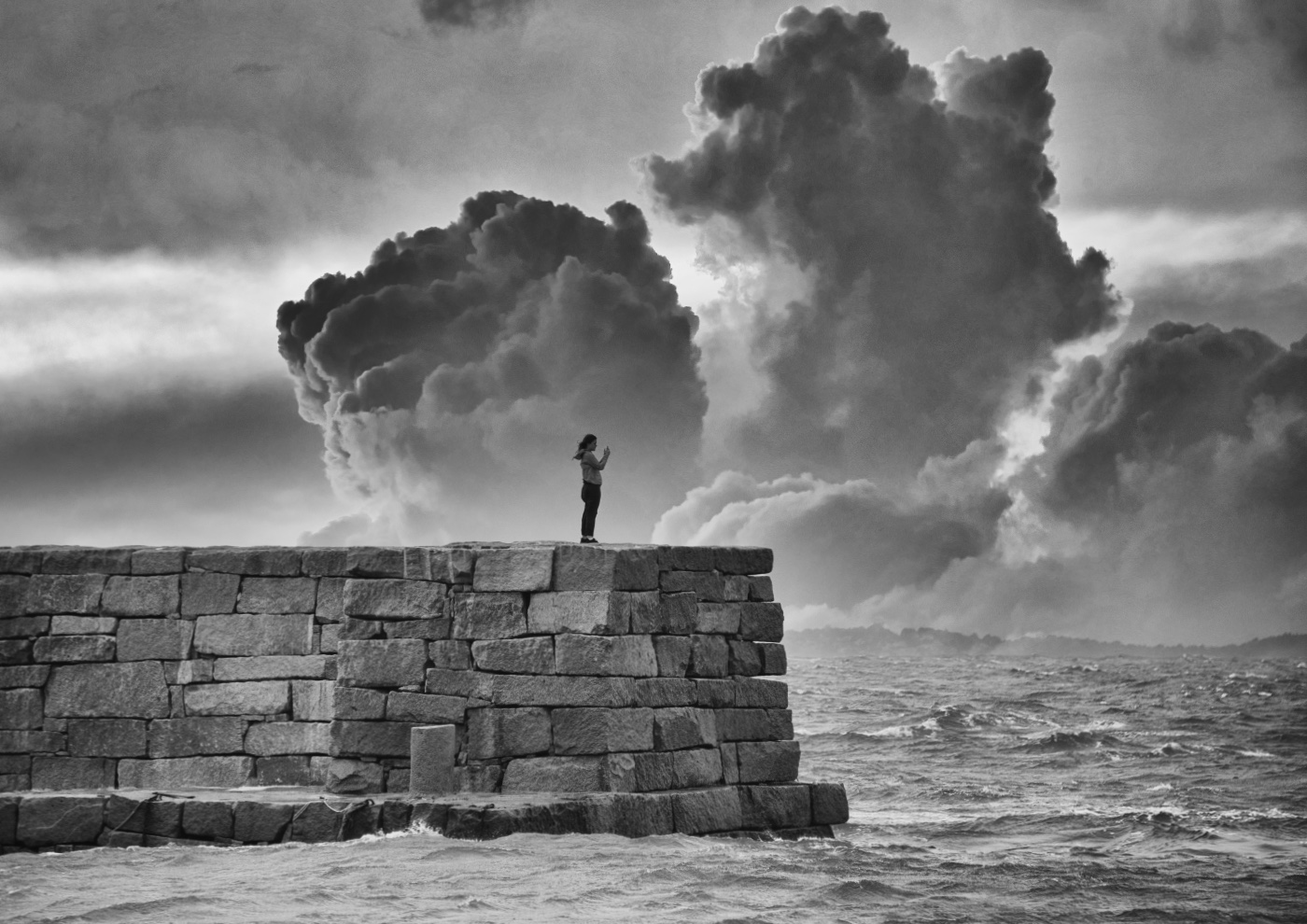
Hi Israel. Sorry for being late. You had a beautiful image and the groups comments and suggestions have improved it more. I agree with the emphasis on the clouds, especially if they are not common. Keep up the great work and remember these words that a fellow photographer kept repeating to me. "Border Patrol". Do whatever is necessary to remove objects at the borders of your image. Brite areas, objects like trees and subjects that cross over the border or come very close to the border to give them no breathing room. Bob |
Apr 15th |
| 62 |
Apr 22 |
Comment |
Thank you LuAnn for your comments and encouragement.
Bob |
Apr 15th |
| 62 |
Apr 22 |
Reply |
Now I see the difference. Thanks Emil. |
Apr 15th |
| 62 |
Apr 22 |
Comment |
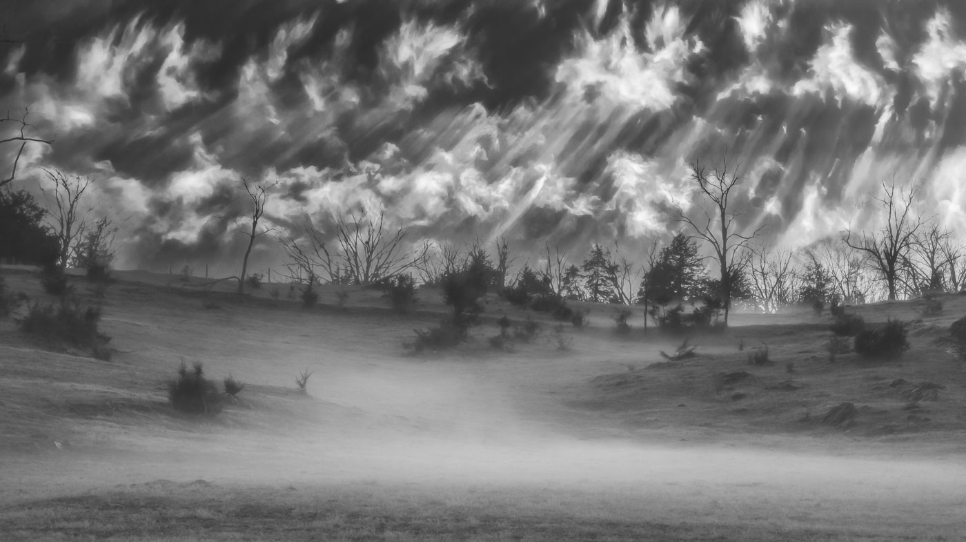
Hi Bunny. I Love your choice for the sky replacement clouds in your image. They have drama but they are what would be found in the higher mountains and they go along with your dramatic image. Beautiful composition and I agree with Pete that some snow highlights could be taken down in the center of the image. That was an excellent choice for a trek like this. You had plenty of light and more need or a wide angle than a telephoto. Well done. |
Apr 15th |
| 62 |
Apr 22 |
Comment |
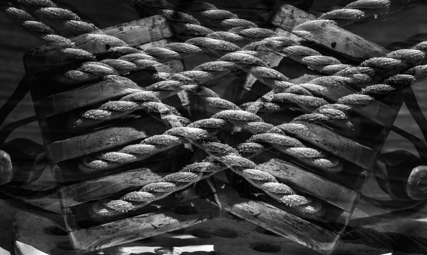
Hi Nick. You did a great job with the composition and leaving our the other ship and making the mooring lines prominent in the resulting square image. I do prefer the right mooring line being sharper and the right side cropped off. It's easier on the eye to follow up to the ship. A great find and edit. |
Apr 15th |
| 62 |
Apr 22 |
Comment |
Emil, your barn has such great character and this is exactly the situation that a better sky should be dropped in. Very well done. Bob |
Apr 6th |
| 62 |
Apr 22 |
Comment |
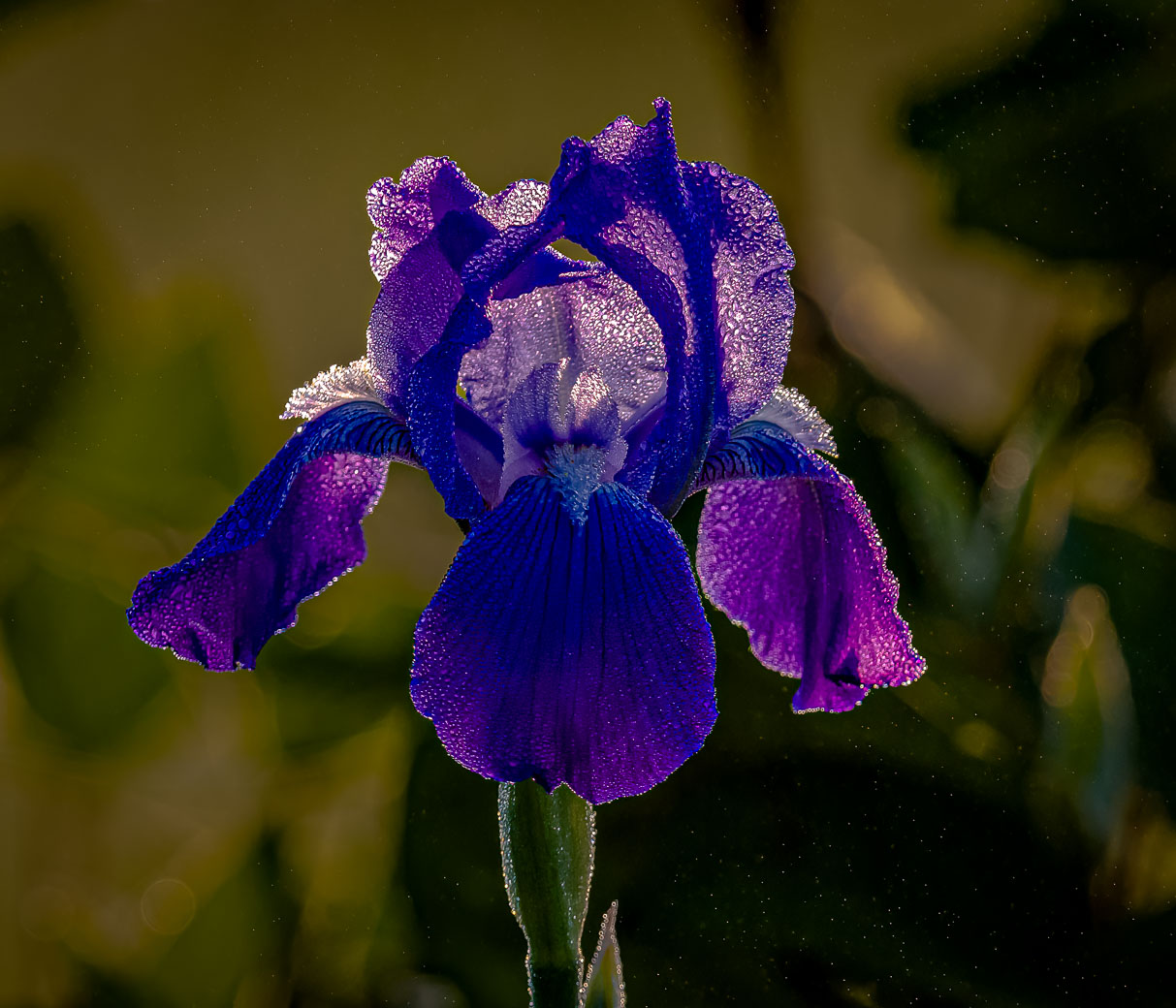
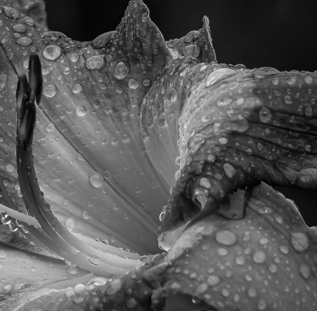
Hi LuAnn. This is a beautiful Cala lily. I like the position from above that you have used to show the inside and the composition. My Calas' are home grown and I don't use my Macro enough. I think your Minimalist approach works very well for you. I look forward to seeing your other subjects. Bob |
Apr 6th |
| 62 |
Apr 22 |
Comment |
Pete, another of your excellent candid portrait images. I agree with Bunny about the sunglass reflections but I wouldn't suggest any other edits.
The Topaz Gigapixel AI 6.0 for updated just this evening. I haven't had a chance to use it yet.
Bob |
Apr 6th |
| 62 |
Apr 22 |
Comment |
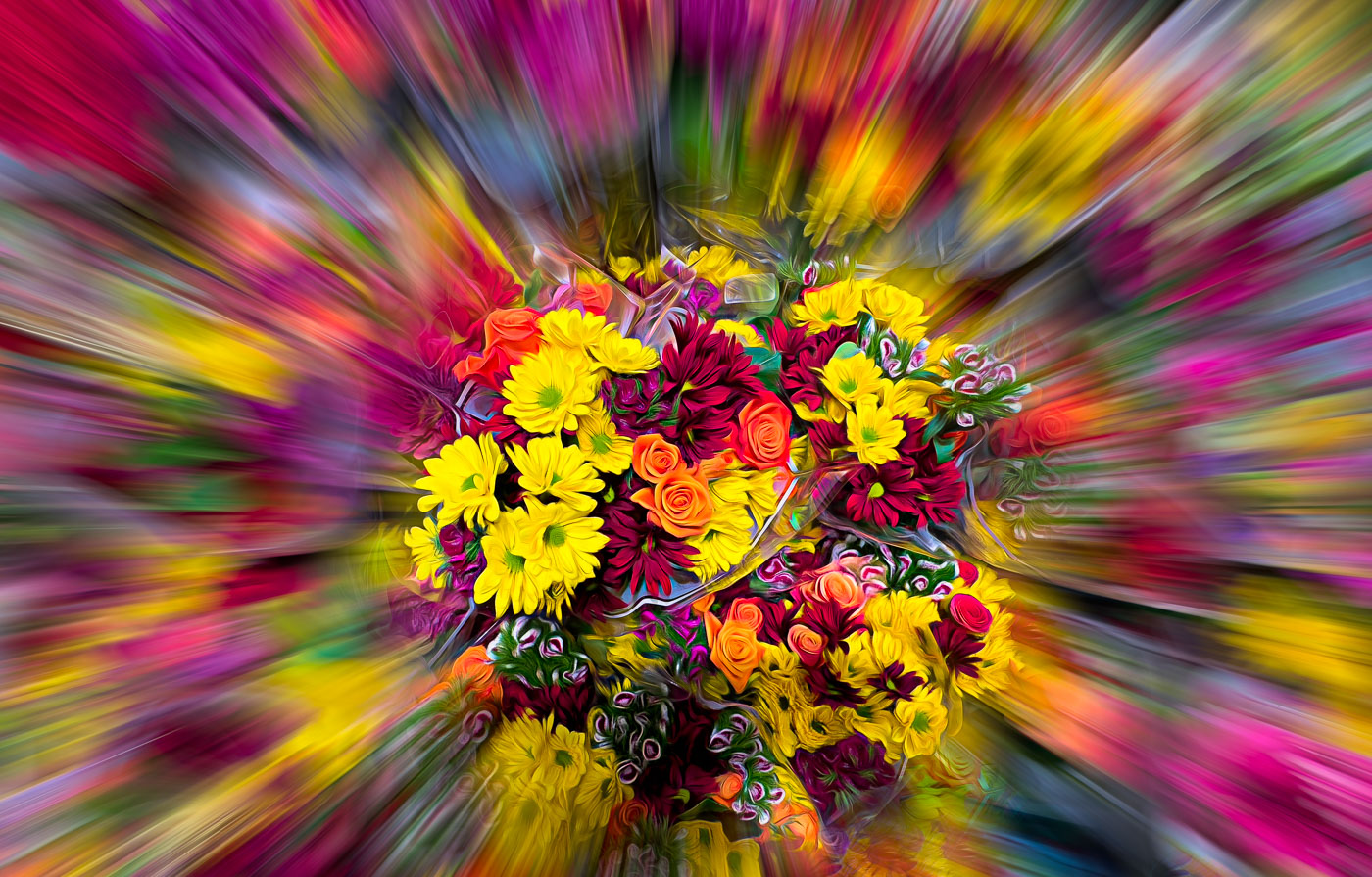
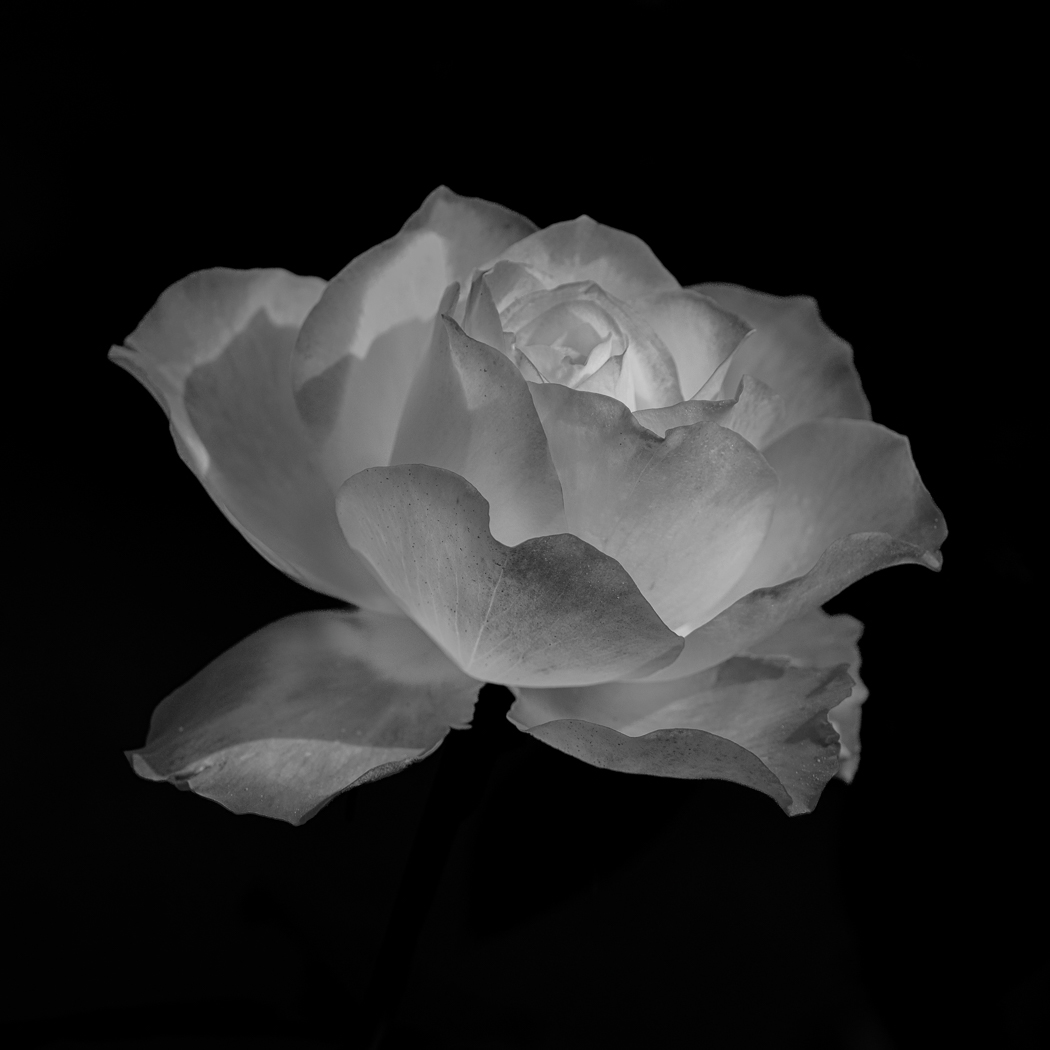
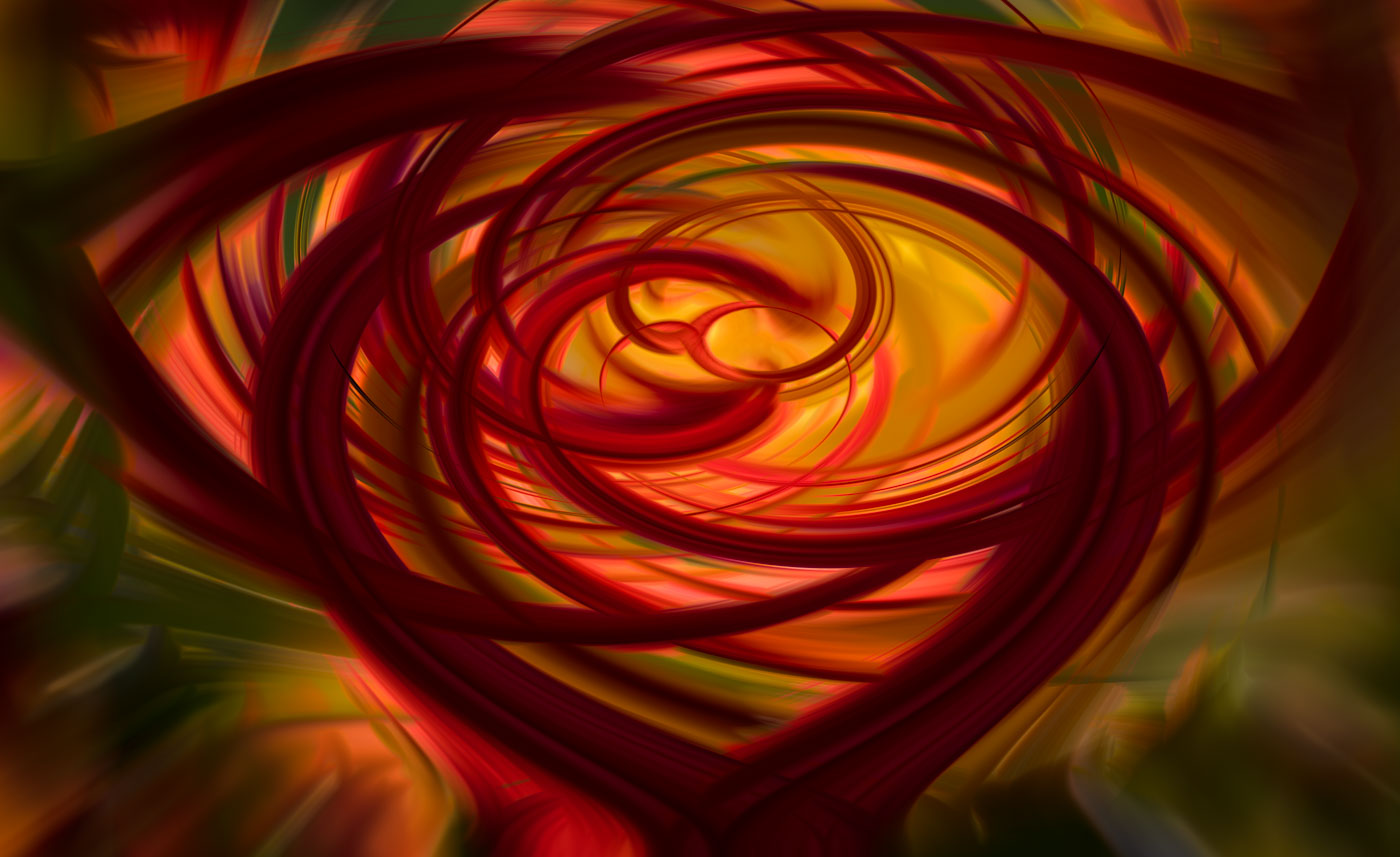
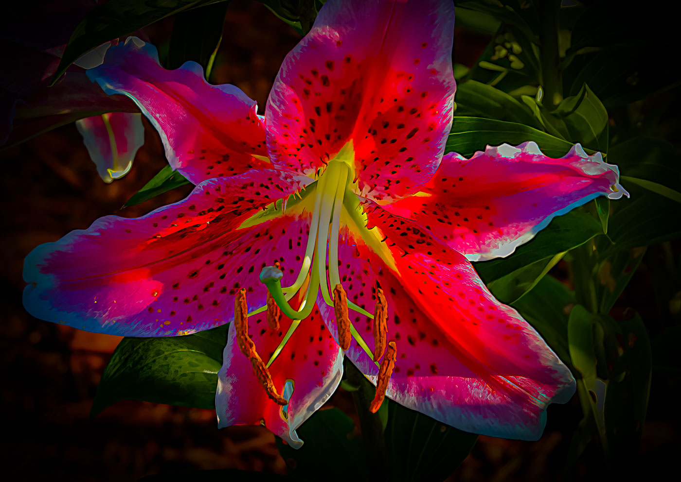
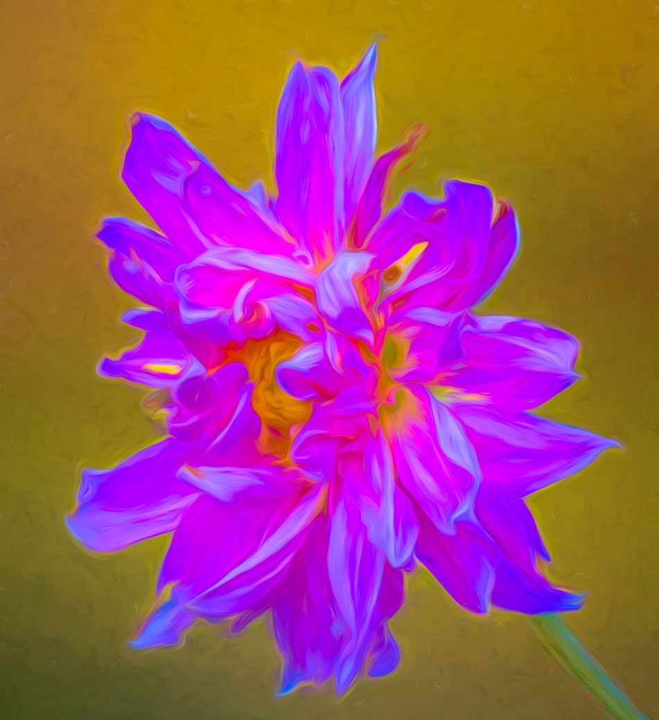
Thanks for your comments and edits Nick. I'm going to stick my version of this Rose. While your Rose in white is very nice I think it loses that special inner glow that I captured. Not sure how you were able to see details under my submitted Rose. It's solid black on my monitor so nothing to change here. |
Apr 6th |
| 62 |
Apr 22 |
Reply |
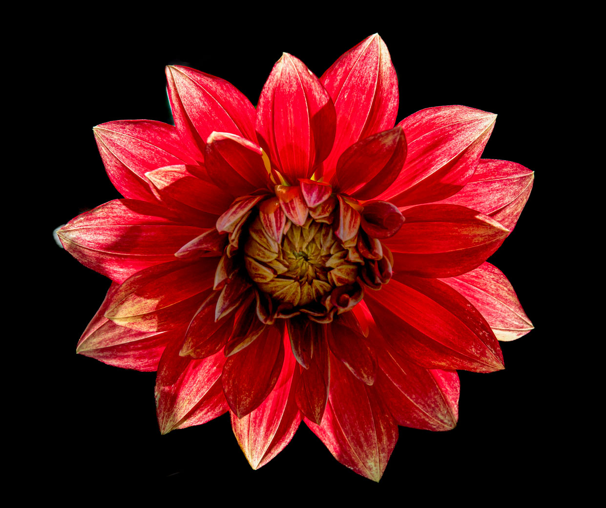
Thanks Emil. I agree with the center being lighter to attract the eye. My only problem is I'm unable to see any difference between your image and mine. It's not my monitor, it's my memory from not seeing the two images of equal size next to each other. I appreciate the confirmation of my artist interpretation. |
Apr 6th |
| 62 |
Apr 22 |
Reply |
Thanks Bunny for your suggestions and comments. Sorry, I don't do borders. |
Apr 6th |
| 62 |
Apr 22 |
Comment |
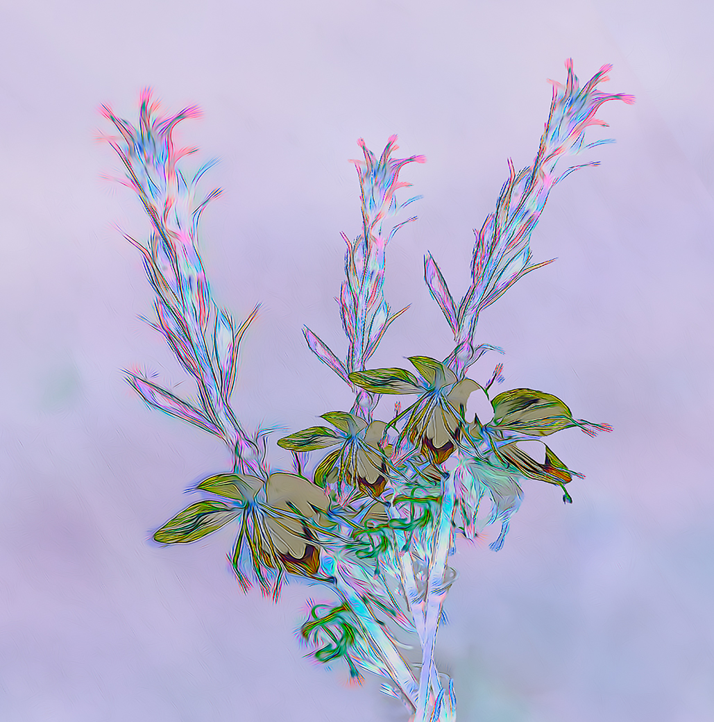
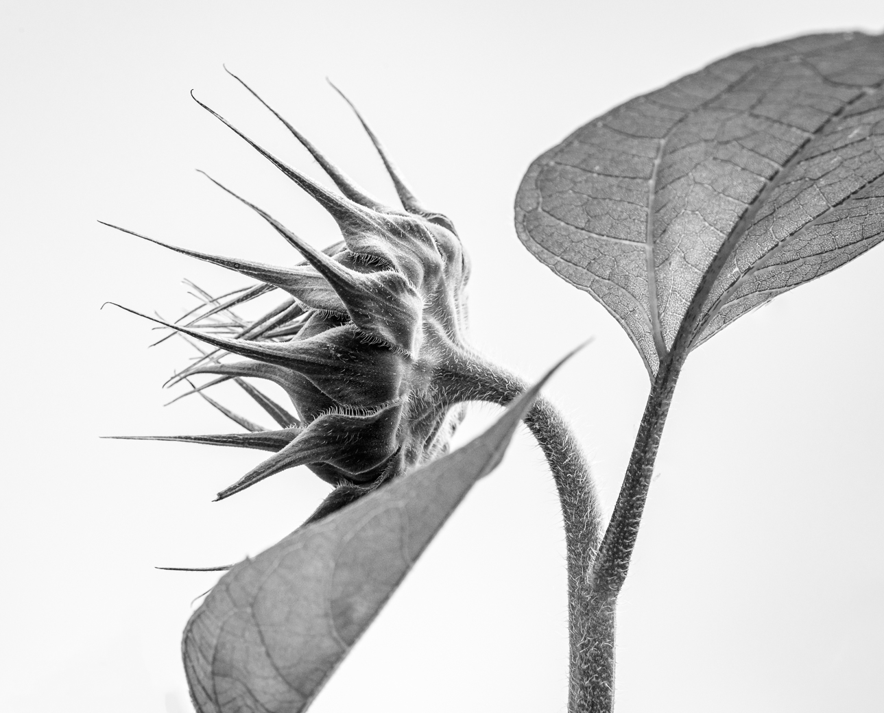
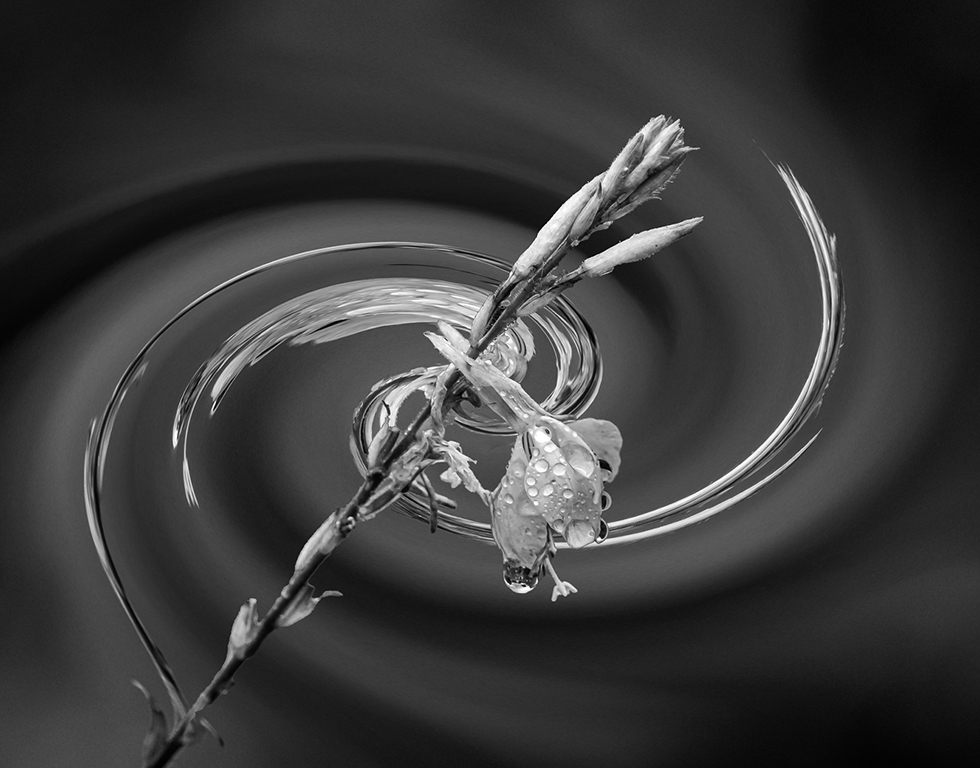
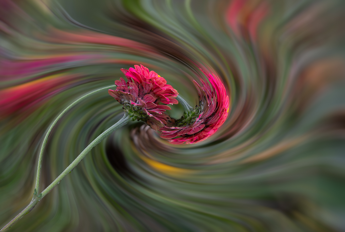
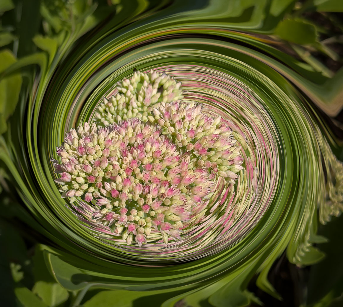
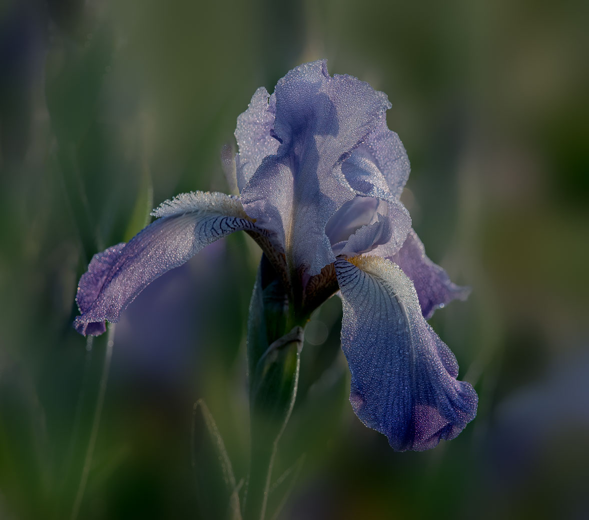
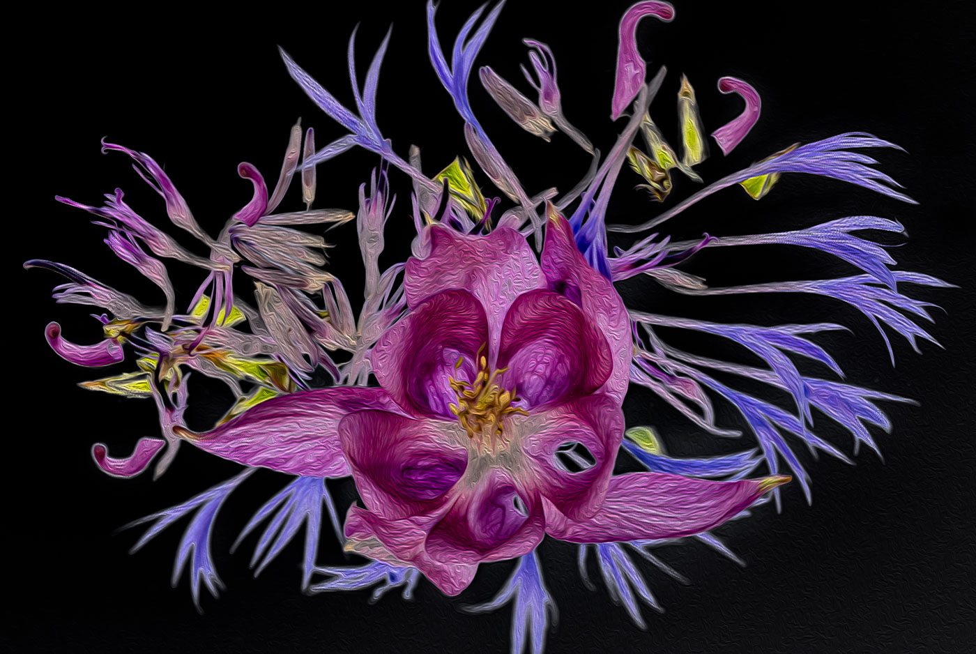
Thanks Pete, yes, I understand the idea of floating is not always desired. In this case, the stem was in shadow and I would need to brush or select the stem to lighten it. That might not look natural either. The comments that judges previously made (back in the film days) about dark backgrounds seems to be disappearing as a dark background is preferred over a distracting one. Is that something that you have observed? Another option is to lighten the stem and replace the background. I'm starting to do texture backgrounds so maybe this would be a good candidate for that |
Apr 1st |
9 comments - 3 replies for Group 62
|
19 comments - 5 replies Total
|