|
| Group |
Round |
C/R |
Comment |
Date |
Image |
| 29 |
Mar 22 |
Comment |
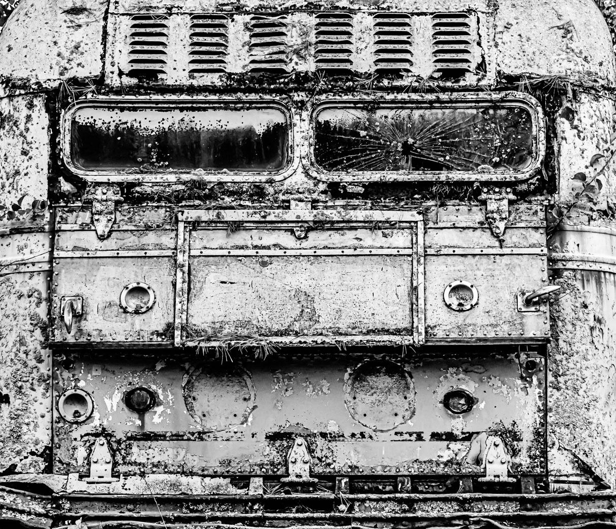
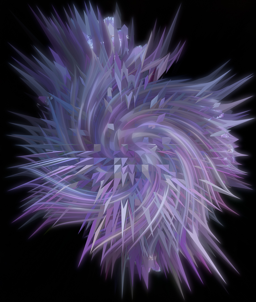
Here is my cleaned up resubmital of this months image. Thanks to everyones suggestions.
Bob |
Mar 20th |
 |
| 29 |
Mar 22 |
Comment |
Yes Karen, Above reference with Gunter. I just haven't had time to resend. It needed to be done at the base level and had difficulty making it exact. Yes, some nice things happening with Extrude. Thanks |
Mar 17th |
| 29 |
Mar 22 |
Comment |
Thanks Judy |
Mar 13th |
| 29 |
Mar 22 |
Comment |
Thanks Judy |
Mar 13th |
| 29 |
Mar 22 |
Reply |
Ahhh. I have a 12pro and a iPad Pro and I have very little interest in making images on them. I'm always on my iMac and have plenty of images to work on and since I'm not traveling much don't use the smaller tools or even look for apps for them.
Yesterday was definitely not a good day to go over your famous Memorial bridge with winds of 40+ and heavy blowing snow. |
Mar 13th |
| 29 |
Mar 22 |
Reply |
Thanks for clarifying the extra bottles. Sorry, I missed the overdose contemplation. I was thinking photographically and missed the substantial "hint" about the extra bottles.
|
Mar 13th |
| 29 |
Mar 22 |
Comment |
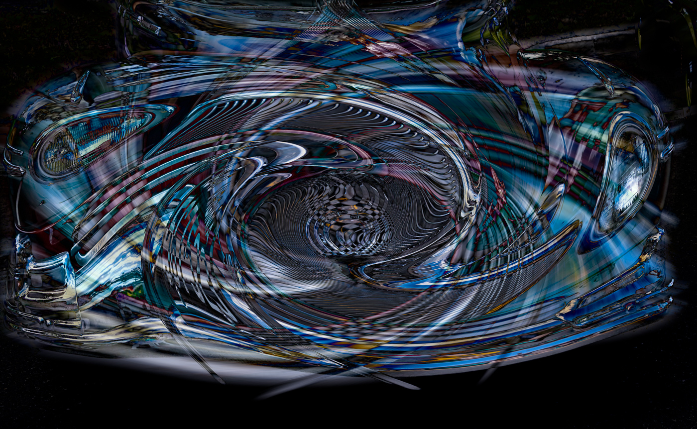
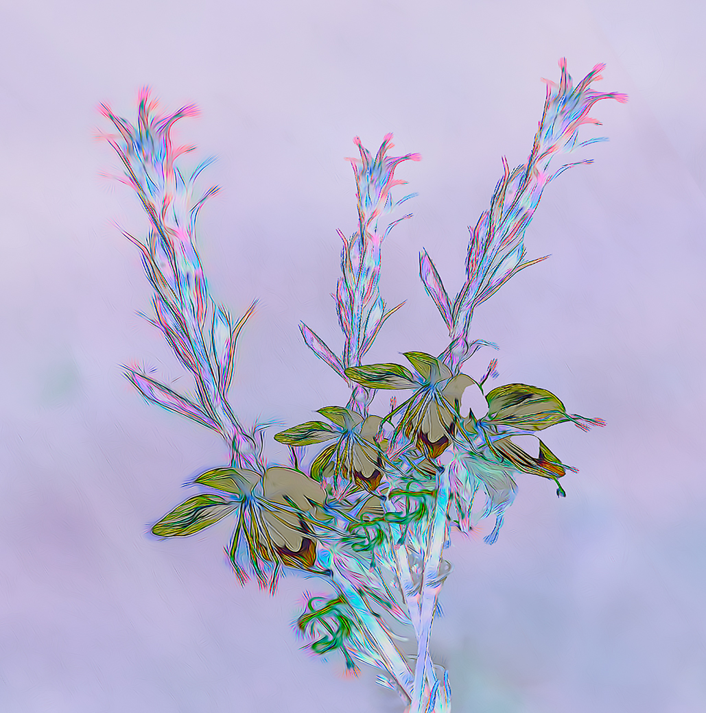
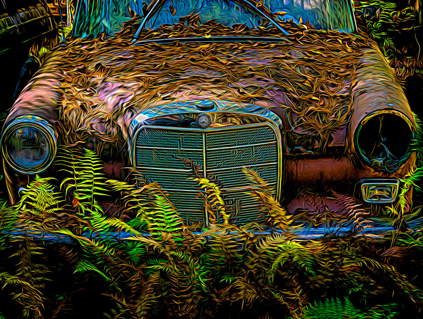
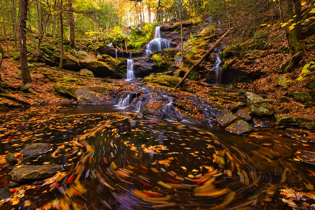
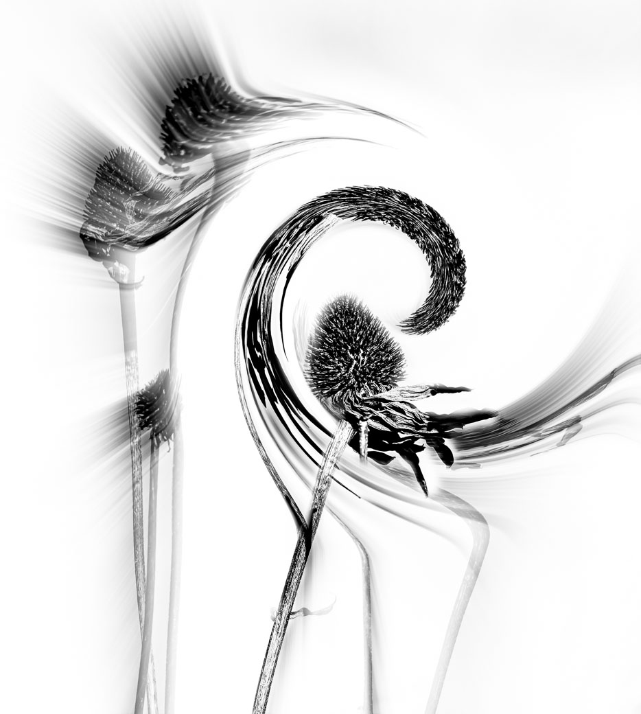
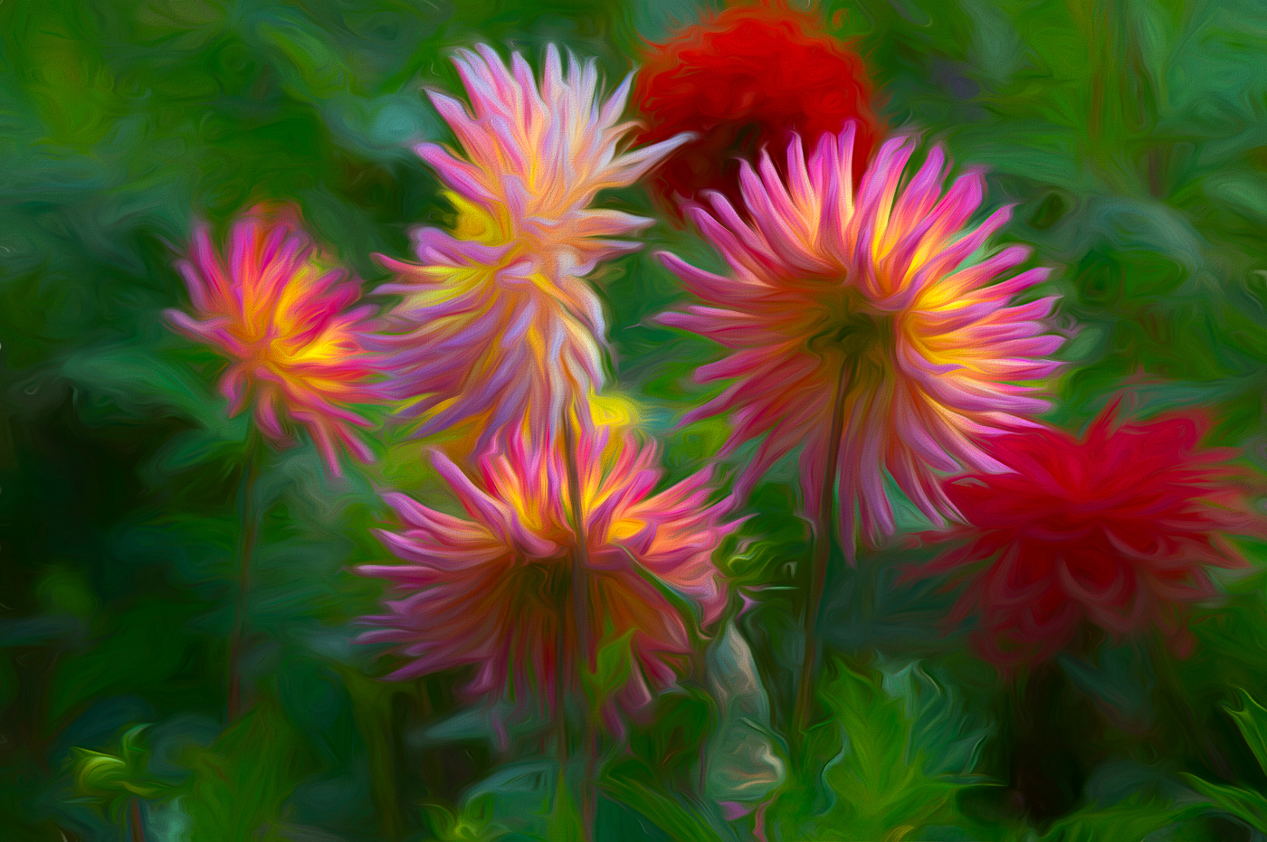
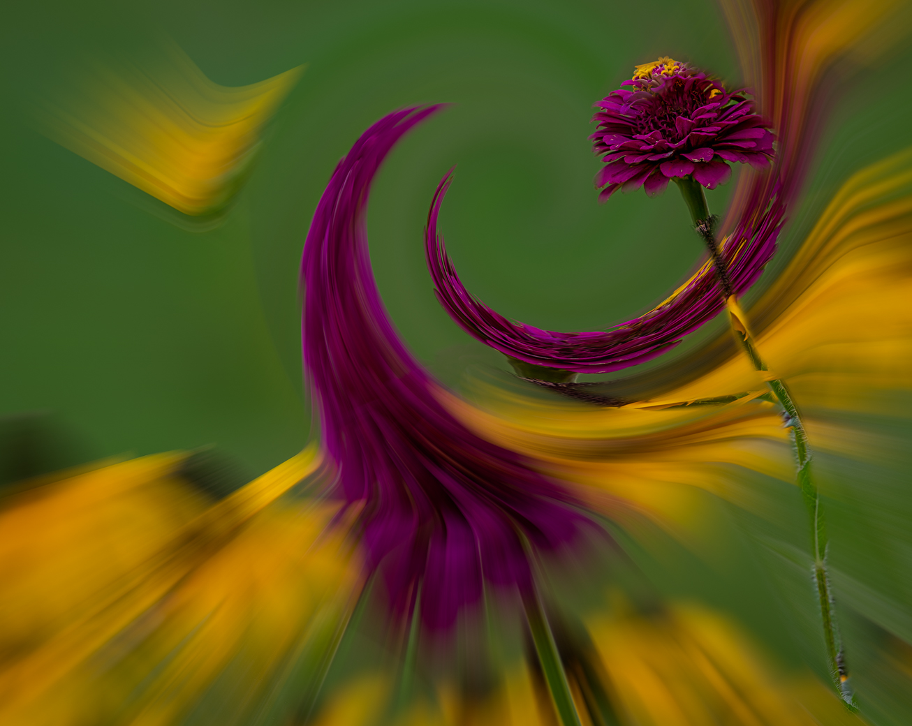
Gunter, yes you caught me. I went to submit the image to a PSA showcase thing and I was using content aware to get rid of that excess plant parts. It took me forever , not to do the content aware fill but I'm still not done as I do not have adequate notes regarding the twirl and zoom portion of the image that I blended. You did a great job cleaning up my mess. I started by cleaning up the original image. Glad that I gave you clarity to the Abstract/Creative road. |
Mar 13th |
| 29 |
Mar 22 |
Comment |
Gunter, I think you handled the assignment very well and the mix of B&W with the Blue Pills is excellent. Not that every image has to answer a question, but I fail to see what the decision is. 1 pill or multiples? Is each bottle the same? Why do you have more than 1 bottle? So If I make believe there are no unanswered questions and remove the unopened bottles then all is well. |
Mar 12th |
| 29 |
Mar 22 |
Comment |
Well done Karen. Both bird and Turtle are sharp and their reflections are also sharp and exposed well. My only nit is that the top of the Egret's head looks a tad over exposed and perhaps dropping highlights might put back a little detail there.
|
Mar 12th |
| 29 |
Mar 22 |
Comment |
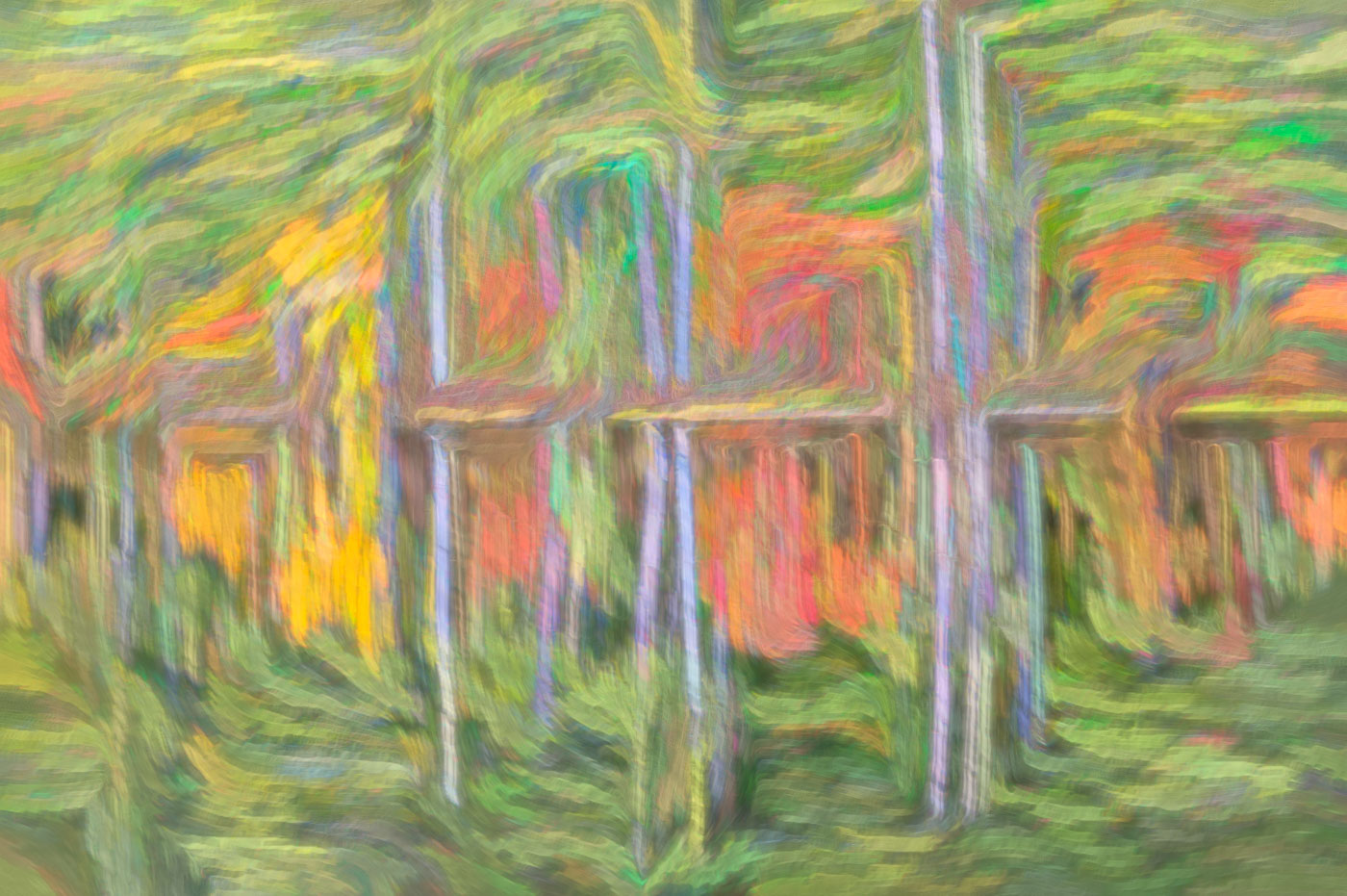
Hi Judy, I must be too young (I wish) to understand. Yes, I've heard of Dupont and Del,but I know nothing of retiring an image in PSA and never heard of Roll World or Tiny Planets. Maybe those are older PC programs.
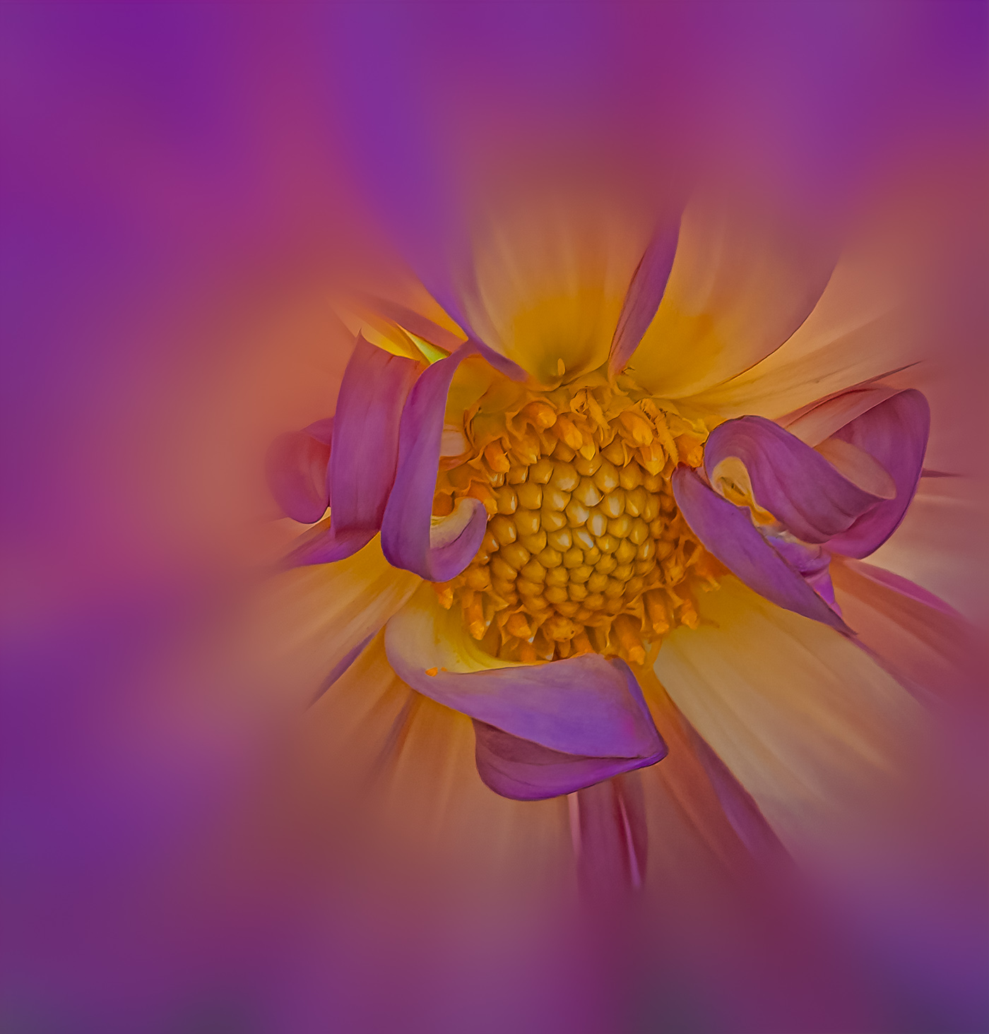
Re: Your image. I really like the composition with the leading line from bottom to the center and would call it an Abstract. Nice colors and looks like it was shot outside and lighting is very good. I don't have any suggestions to improve or feel that it needs to be improved. Well done. |
Mar 12th |
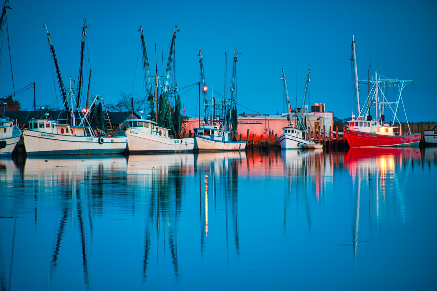
| 29 |
Mar 22 |
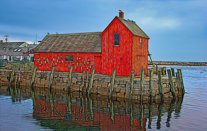
Comment |
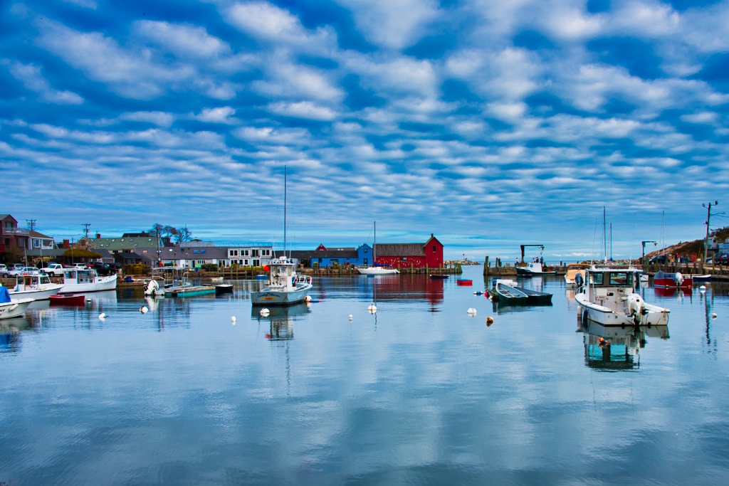
Hi Tim. Nothing to be ashamed of as this is a beautiful image. I Love the reflections, and the leading line of the bridge into the red buildings and the clock tower. My only comment would be regarding a little more sharpening. Reflection is acceptably sharp but I wonder if you tried sharpening in post. I'm not sure if you had focused on the bridge whether the buildings would be sharper? Well done. |
Mar 12th |
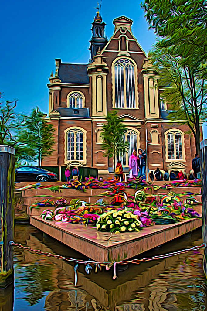
| 29 |
Mar 22 |
Comment |
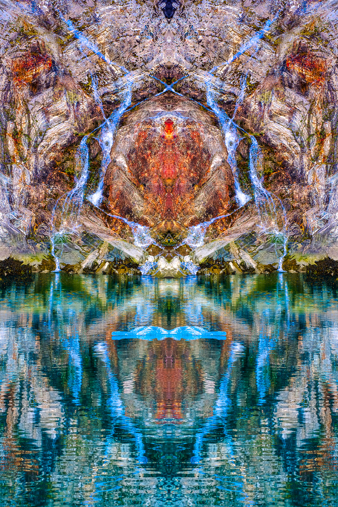
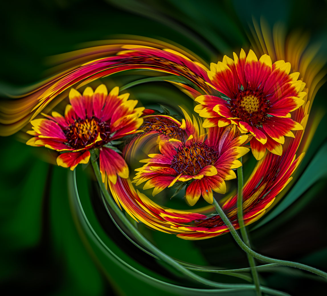
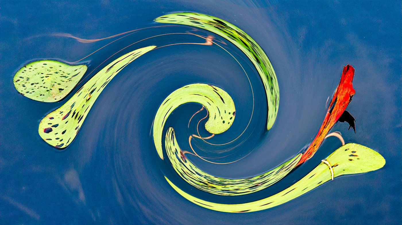
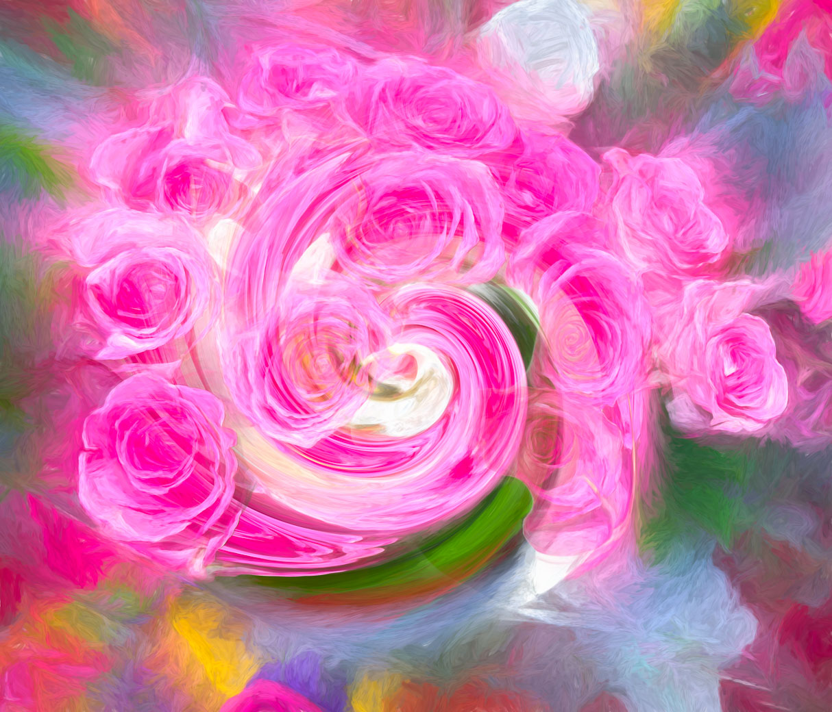
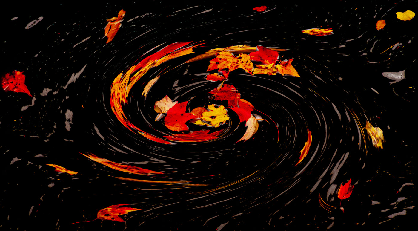
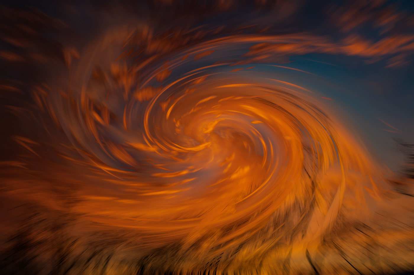
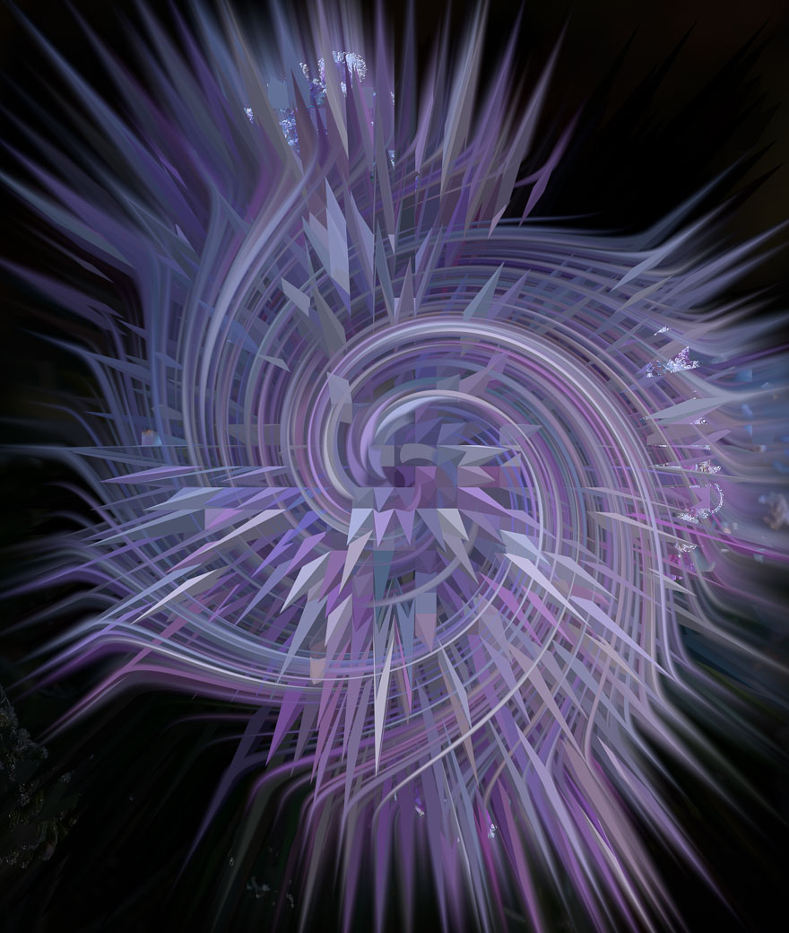
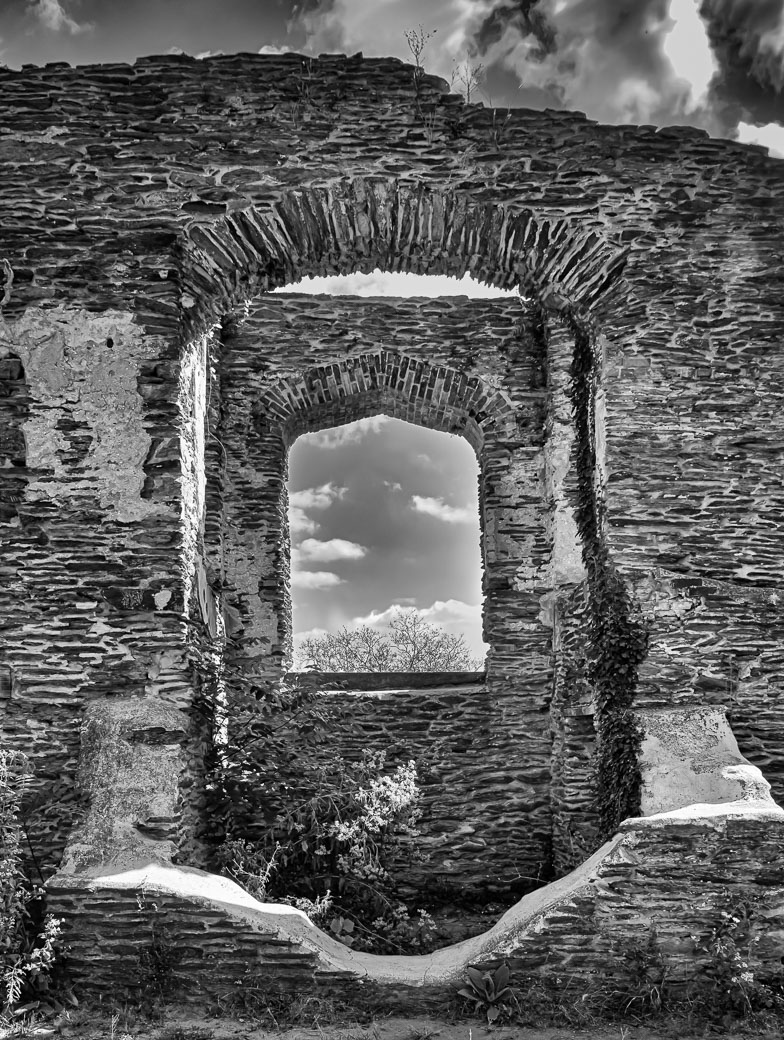
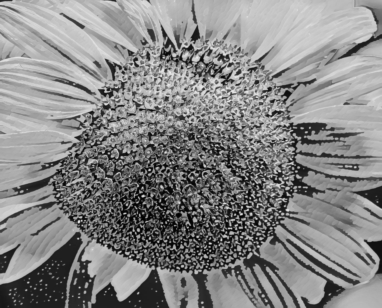
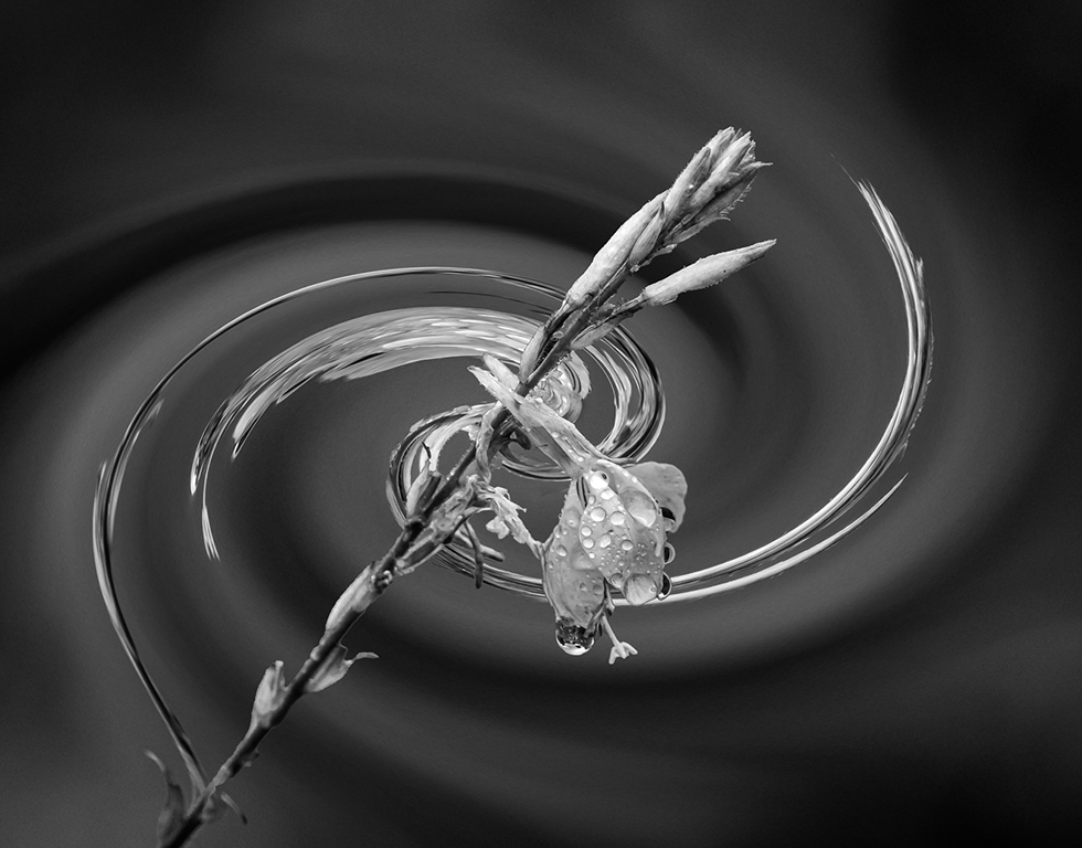
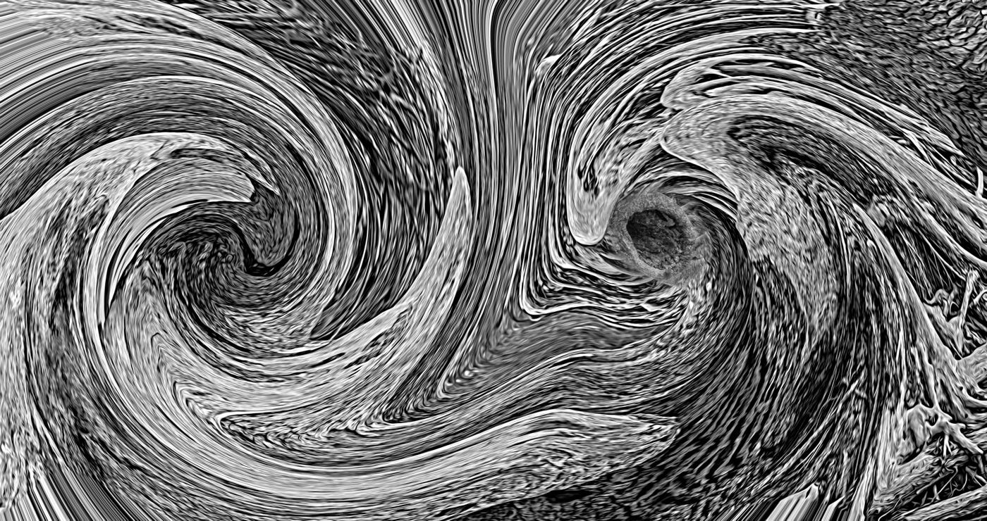
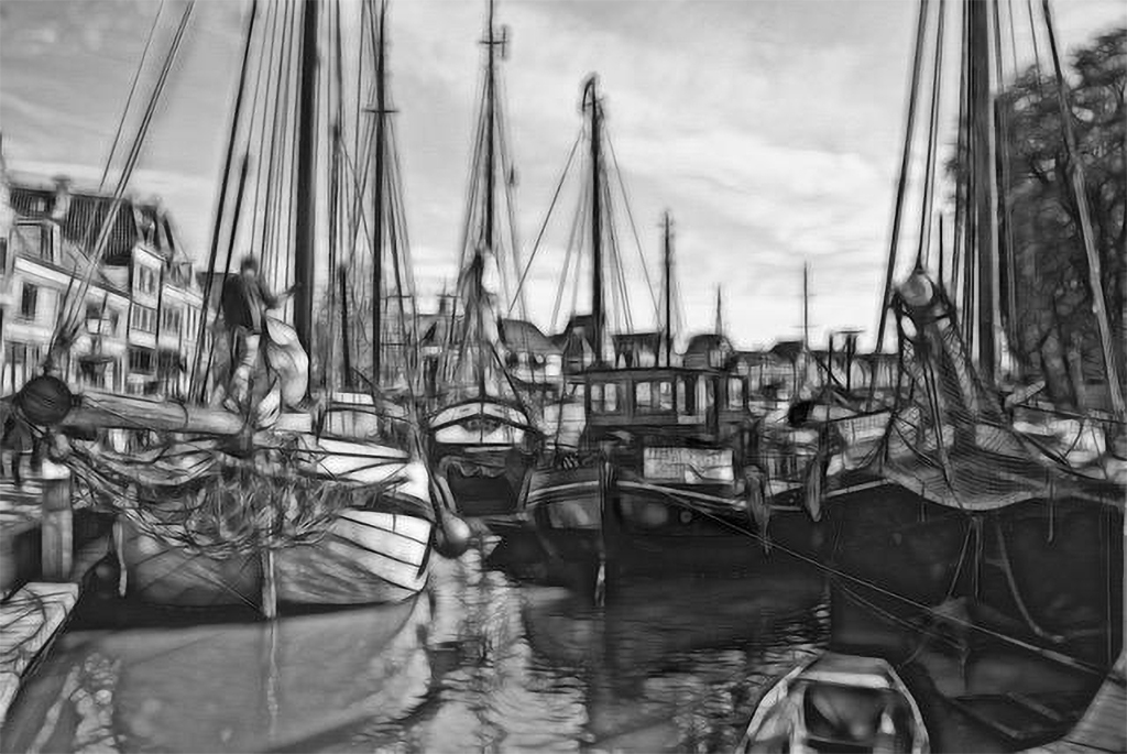
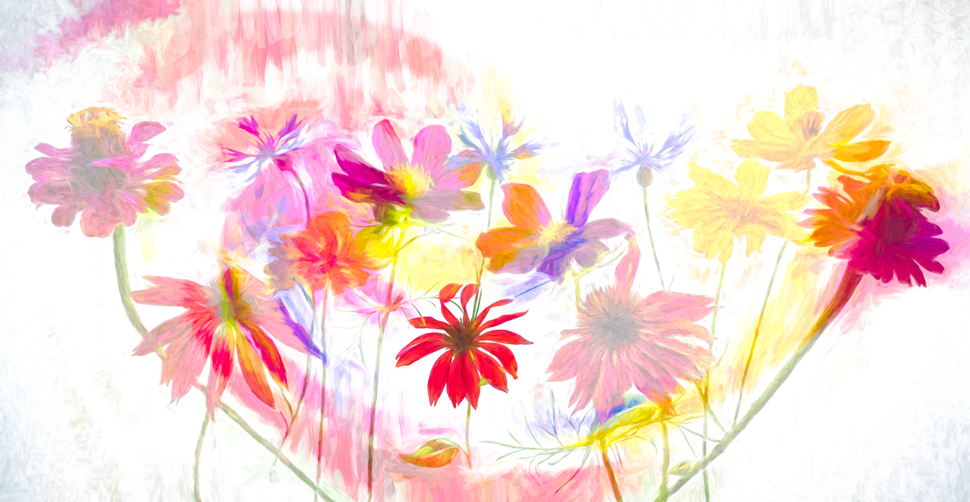
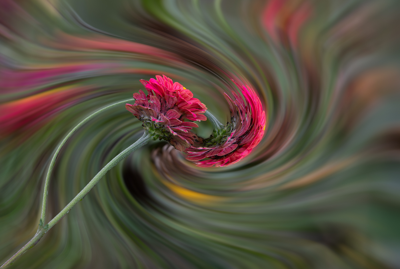
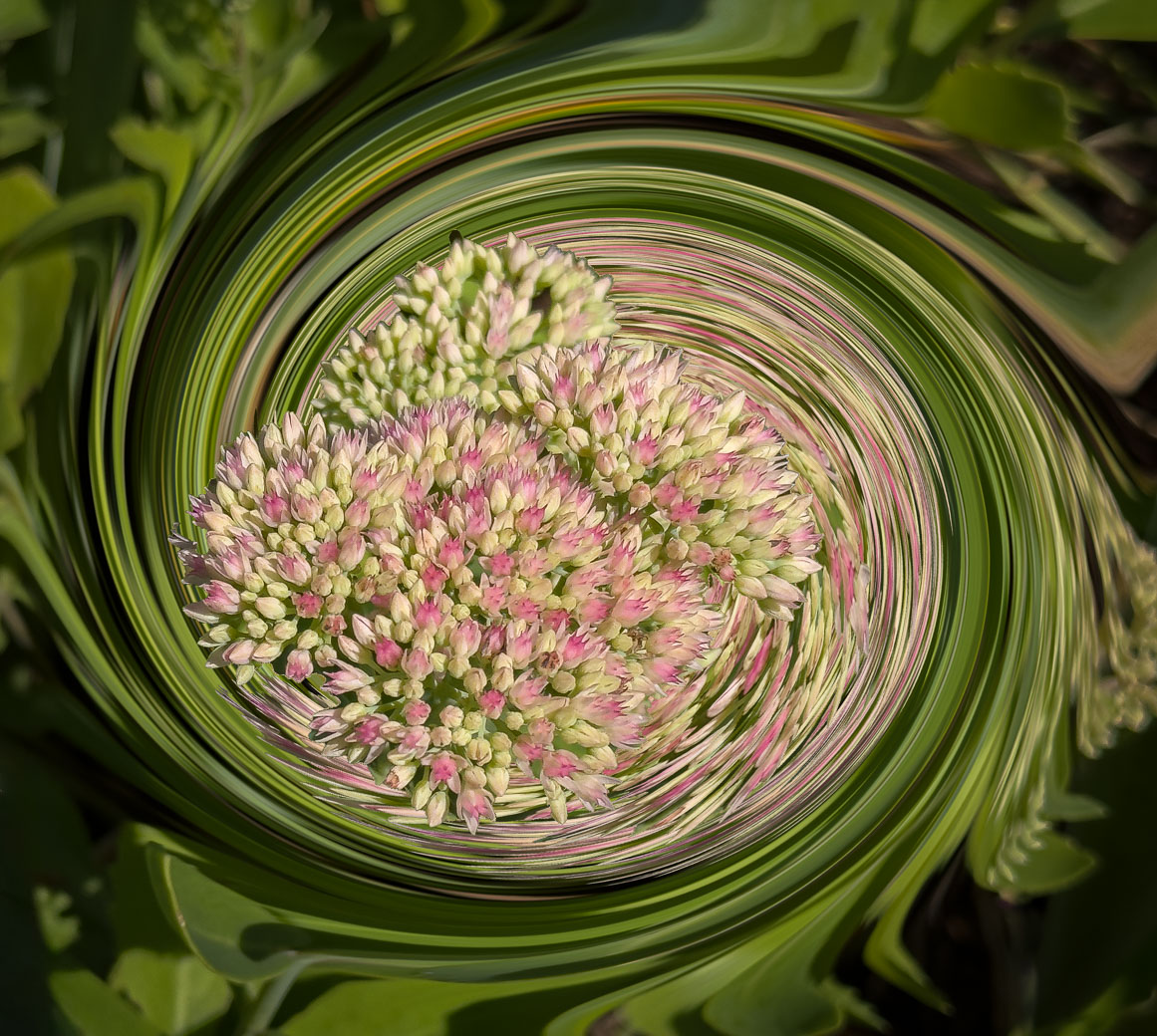
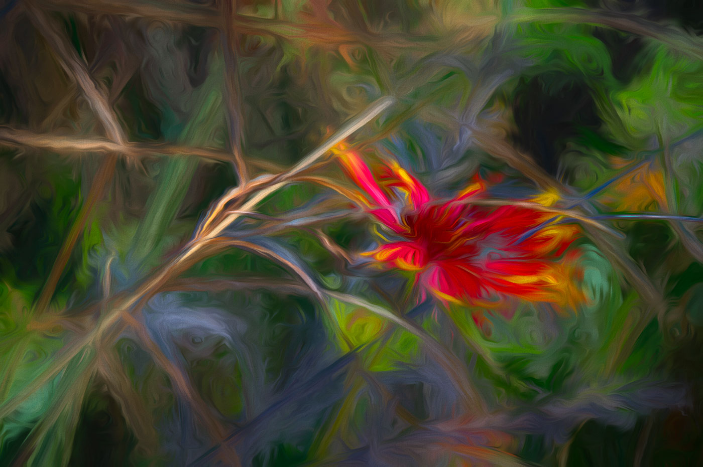
Hi Michael, thanks for stopping by DD29 and your kind words. Yes, these filters are in Studio2. They are in the Motion Blurs Filter Group. It defaults to Zoom and if you pull down you'll find Swirl and some other filters that I rarely use. Topaz makes it easy to mask and to move the Swirl to your desires vs Ps Twirl. I generally use -20 to +20 and idea that sometimes less is better.
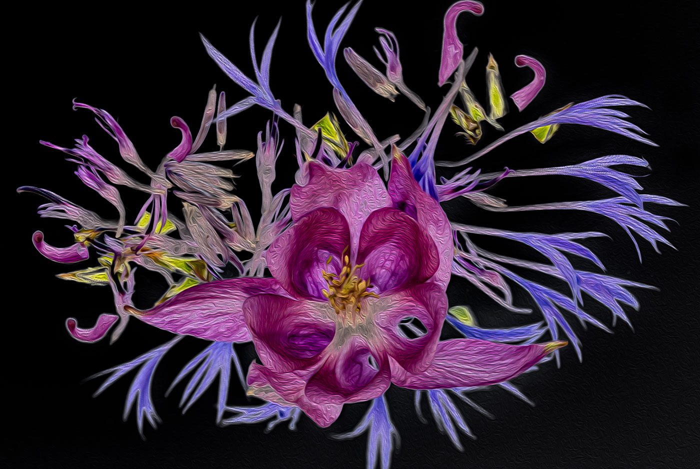
Are you into abstracts? |
Mar 12th |
10 comments - 2 replies for Group 29
|
| 62 |
Mar 22 |
Comment |
Thanks Nick. Appreciate your comments and helpful suggestions. Glad to have you in the group. |
Mar 20th |
| 62 |
Mar 22 |
Comment |
A Great group of posts by everyone and we've gotten Pete/Oliver going down the road of water drop photography full speed ahead. Each of us have reasons for doing our own thing but yet can offer suggestions that apply to everyone. I like Emil's details of his LrC process and because of my own Ps faults I like the LrC subject selections because they are more soft than the marching ants from Ps selection giving a much harder selection. Maybe there is a Ps command to feather or soften those selections?
|
Mar 19th |
| 62 |
Mar 22 |
Comment |
Hi Nick. Welcome to DD62. Sorry I'm late to your welcoming party. I haven't been to Montreal since digital cams were available. I do love your view and composition with the beautiful details in the architecture. I don't shoot city/metropolitan scenes but I do like shooting from elevated positions and Mont Royal would be a top choice when visiting Montreal. I agree that Bunny's crop would be too tight to the antennas but then I think your crop is too loose considering you don't favor sky replacement, I would recommend Oliver's enhancement of the details that are in the sky. My style would of been to add more detail in the sky by adjusting the mid tones or simply doing a sky replacement considering everything else in the image is beautiful. |
Mar 19th |
| 62 |
Mar 22 |
Reply |
Thank you Bunny. |
Mar 19th |
| 62 |
Mar 22 |
Reply |
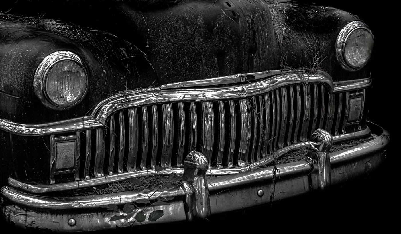
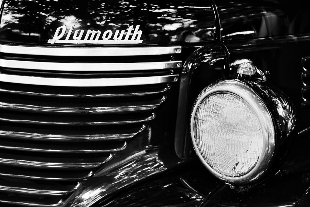
Thank You LuAnn. You are right on time as usual. I'm taking your recommendations on the hood composition and made the change before using it at one of my other clubs critiques. Had to say about the hood ornament distracting as I'm not even sure of the make and model of the car. Always great to get your perspective.
Bob |
Mar 19th |
| 62 |
Mar 22 |
Comment |
I've not been to Old Car City. This place in Maine is much less public and most of the cars still have their ornaments but owners are cautious but receptive to photographers. |
Mar 7th |
| 62 |
Mar 22 |
Comment |
Ahhh. I see the issues. Setup for the PR folks and the heck with the others. You got the best location you were allowed to have. That's happened to me before and frustrating.
|
Mar 7th |
| 62 |
Mar 22 |
Reply |
Thanks Emil. Like I replied to Pete. Yes, I could live with your suggestion on the hood, but since the hood ornament was gone I didn't see a good reason to include the holes so my rendering downplayed the missing ornament. I like your square crop and � rendering but your version doesn't visually fit into my vision of impact, ie "Wow" |
Mar 5th |
| 62 |
Mar 22 |
Reply |
Thanks Pete. Yes, I could live with that suggestion on the hood, but since the hood ornament was gone I didn't see a good reason to include the holes so my rendering downplayed the missing ornament. |
Mar 5th |
| 62 |
Mar 22 |
Reply |
LuAnn, Sorry but the whole page did nothing positive for me. At least I now know that your intention was to focus on the pen nib and use the pen to direct the viewers eye to a particular area or group of words on an historical paper. The only thing that comes to my mind is whether the Bill of Rights has any words that would work. Or do a keyword search of "Sold" and that would perhaps grab the viewers attention. Yes, you guessed it history and math were not good subjects either. |
Mar 4th |
| 62 |
Mar 22 |
Comment |
Israel a great image and yes situation made for BW. I like Pete's darkening of the 1st sax, and understand you needed to work around that having focused in on the sax player you did. As you probably found out being more in front of your sax player probably created glare on his glasses. Maybe you also focused on this sax player because his sax had less hotspots than he other. Well done. |
Mar 3rd |
| 62 |
Mar 22 |
Comment |
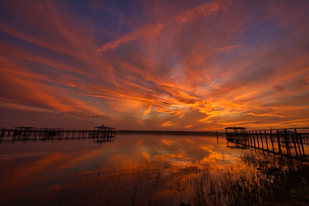
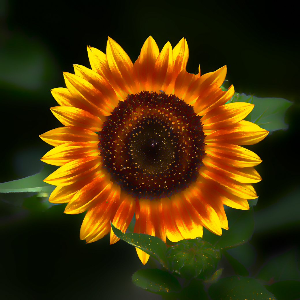
Bunny, a very nice capture of natures sun rays. Your iPhone to the rescue again, just proving the best cam is the one with you. Exposure was handled very nicely and your cropping the garden hose reel was nice as you didn't need to crop the rays. My only suggestion might of been to take another exposure moving to the left and composing with the sun more to the top right and avoiding the sun in the center.
Great seeing. |
Mar 3rd |
| 62 |
Mar 22 |
Comment |
Emil, A great opportunity to capture a very realistic moment in Transportation history. At first glance I thought the "models" were a statue as they looked so perfectly lite and dressed. I would of tried to move to the left, thinking that would give a better angle of the models and the engine. But since you weren't the only one there and it was a one and done event, I bet you had no choice. The tracks do provide a nice leading line into the models. |
Mar 3rd |
| 62 |
Mar 22 |
Reply |
Pete, I had to refresh my brain and this isn't exactly what I had previously seen, but I think it will give you ideas. https://www.youtube.com/watch?v=ngrmvaw5UlM
use a deep baking pan and bounce light off a white wall. Previous video used a black background behind the pan to prevent distractions. I never did the challenge because my wife said I wouldn't be putting a pan of water on the dining room table and creating splashes. Maybe you've already seen this?
|
Mar 2nd |
| 62 |
Mar 22 |
Reply |
Israel. As I mentioned to LuAnn I think your highlights on the pen, "nib handle", are right on and I like the darkening of the paper but I think your closer crop on the right side brings the dark shadows closer to the writing. |
Mar 2nd |
| 62 |
Mar 22 |
Comment |
Very Nice LuAnn. Maybe no planning but that just shows how good you are getting. Perfect focus on the pen Nib and the "Yours Truly" on paper. Beautiful planning to fold the paper to get the diagonal lines leading to "Yours Truly" and they also serve as stops from my eyes moving further to the right. I do think that Israel's darkening of the paper is helpful but maybe because I was looking to see words before and after "Dis" as that word was not in my vocabulary. I did a superficial look at Websters and see were it is slang. I was never an average student and took no college writing courses. Back to the photo, only the words "Yours Truly" have any meaning and other words cause me to lose focus on the meaning behind the image. |
Mar 2nd |
| 62 |
Mar 22 |
Comment |
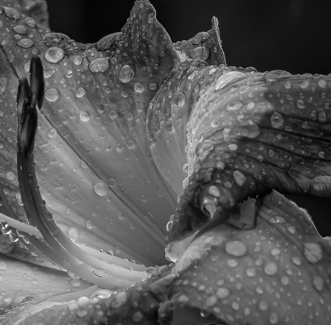
I've seen water drops in my camera club before and I've seen some pretty ones, however, this is very nice because of height and the drop on top. Beautiful reflection. Edited Background came out fantastic considering what you started with. My suggestion would be to make a better background for the setup in future images. |
Mar 2nd |
10 comments - 7 replies for Group 62
|
20 comments - 9 replies Total
|