|
| Group |
Round |
C/R |
Comment |
Date |
Image |
| 15 |
Oct 20 |
Comment |
Thank you Joan and everyone else for the positive reinforcements about my image.
Bob |
Oct 26th |
| 15 |
Oct 20 |
Comment |
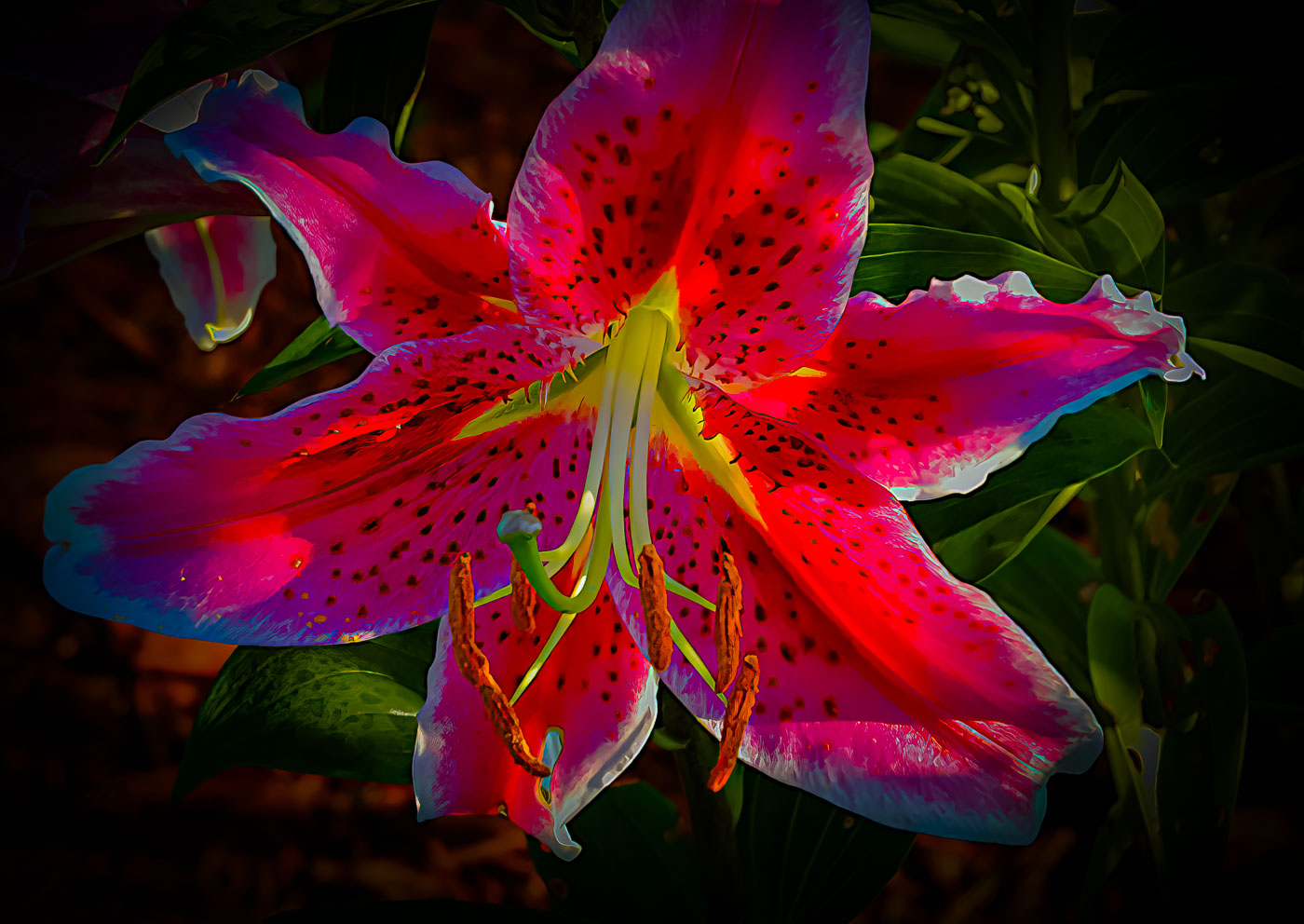
Rick. Your phone did a great job of capturing the intensity of the rainbow. Like Kirsti, the greens could be brought down. I also see the magenta artifacts in the top left of the sky. Maybe the Luminar color sliders can fix that. Slightly distracting, I'd do a little clone on that blue ? in the trees. |
Oct 17th |
| 15 |
Oct 20 |
Reply |
Kirsti. It's not wrong because you should be shooting for yourself and if you like it then that's perfect. You just have to accept that not everyone is going to agree with you if you shoot and submit something that others may not appreciate. You see where we are the only two submitting comments. Lets see what happens over the next week or two. |
Oct 17th |
| 15 |
Oct 20 |
Reply |
Thank you Kirsti. |
Oct 17th |
| 15 |
Oct 20 |
Comment |
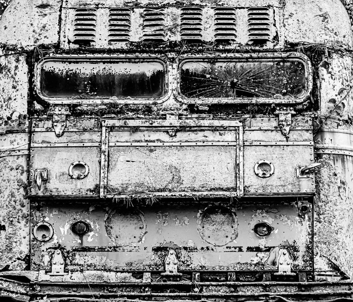
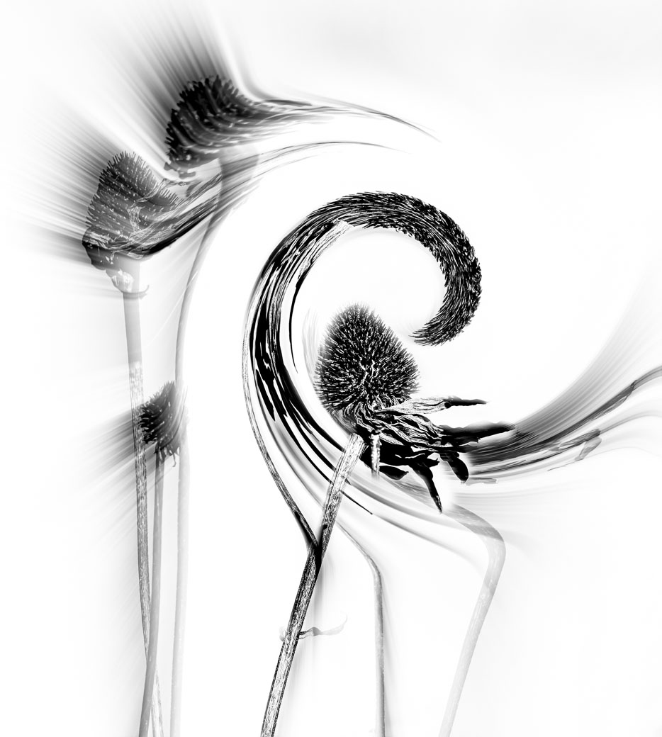
Kirsti. I like the image above that is lite with sunlight over this most recent original. I just can't get my brain around all that black around the window. Sorry. Just the outside with broken glass at bottom of window and the piece below on the shelf. I know you had a vision but if the viewer isn't able to grasp it then...Maybe it's just me? |
Oct 16th |
| 15 |
Oct 20 |
Comment |
Kirsti. I'm sorry, but, I cannot fully appreciate your vision for this image. I see the broken glass part of the image and perhaps a broken piece of glass below. The trees outside also do not seem sharp, but its just too small to determine. I believe that you might of had a problem with your export because the image does not enlarge when it is clicked on. Total height should be 1050 dpi. I'm also not sure why you have that black space at the bottom of the image. I also think it's possible that PSA computer might not of sized properly considering all the black around the edge of the frame. Can you export again? |
Oct 12th |
| 15 |
Oct 20 |
Comment |
Jeri, I agree with Rick as long as you use the Luminar plugin to process. Try a demo, you will like how it works. I do like your image. I believe I would of cropped more on the left side to at least make the line of? parallel to the frame. BTW, I have no idea what you are referring to "new skin"? |
Oct 12th |
| 15 |
Oct 20 |
Comment |
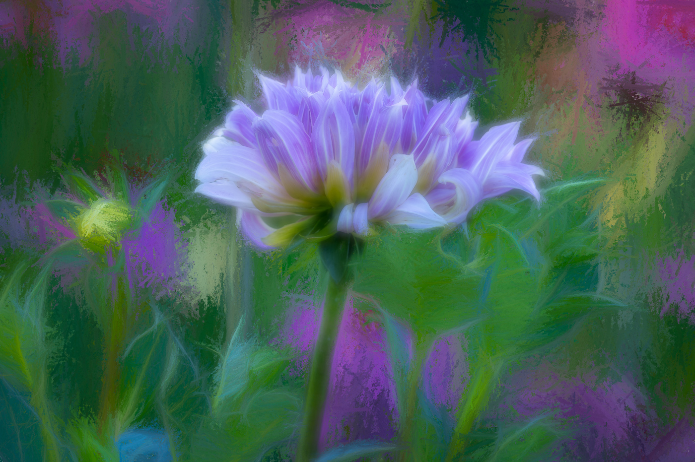
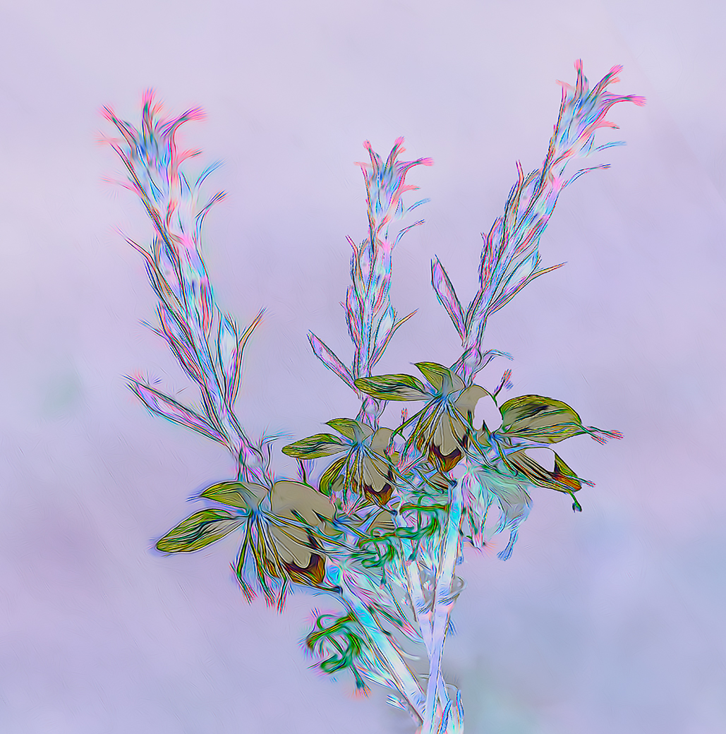
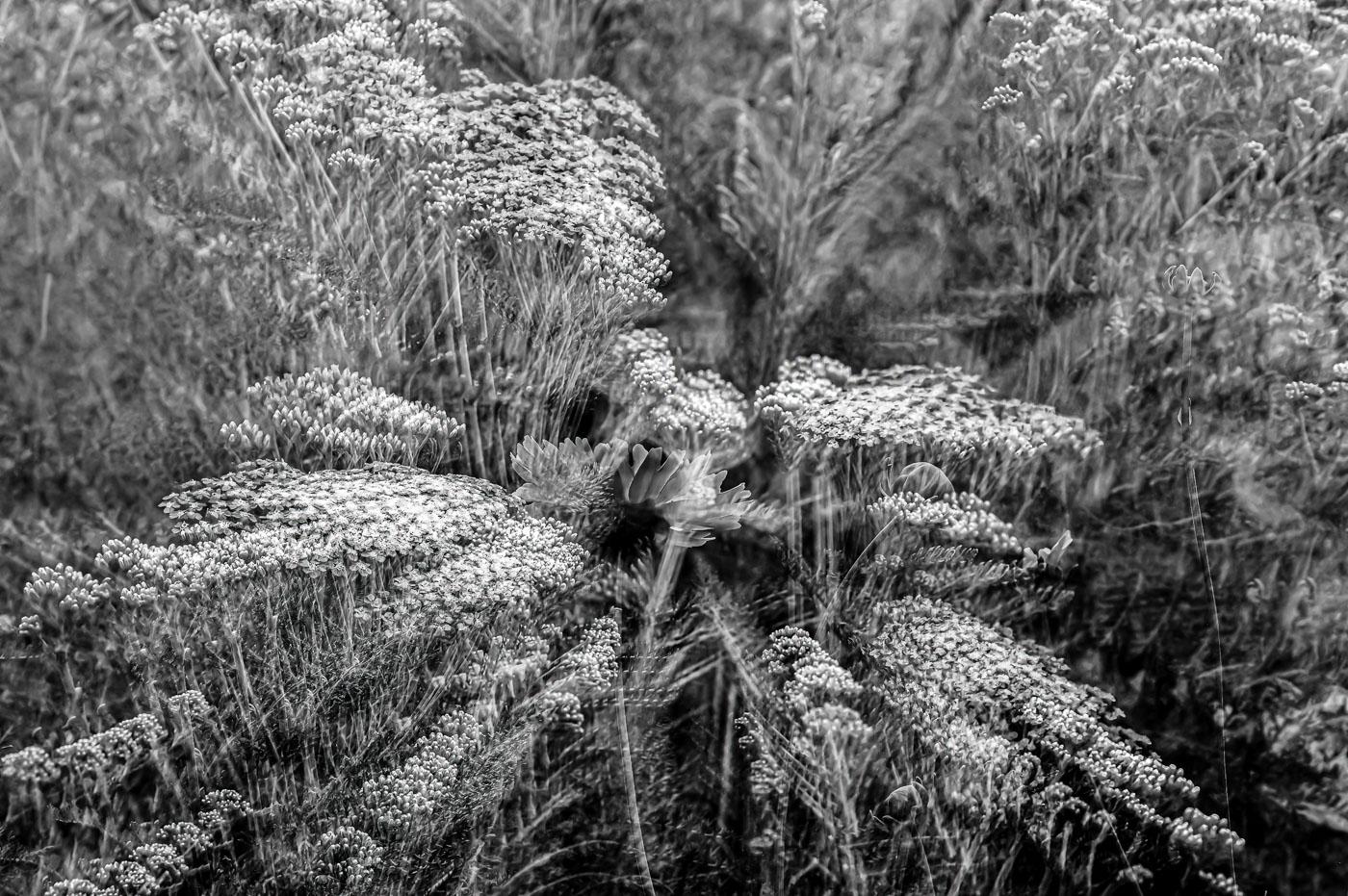
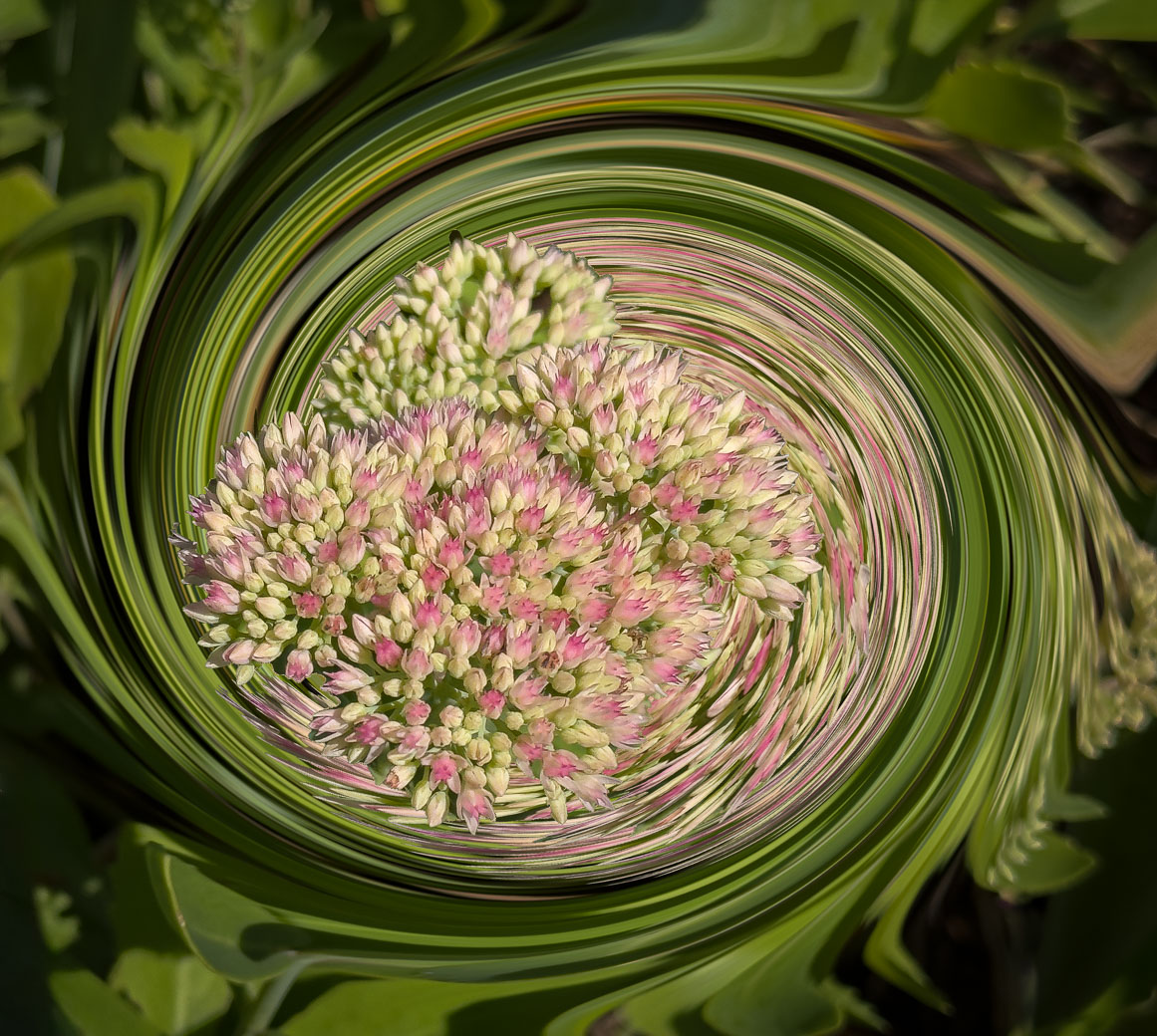
Joan, I've shot flowers on light tables at NECCC conference in MA in 2019. Their petals were transparent but the center was more interesting than the Chrysanthemum. I like the transparent petals, but can't get positive vibes from your flower center and overexposed green leaf. I'm not a PS user and appreciate what seems like a long process to get your edits done. I didn't use tripod or special edits. Basically just exposure and shadows. Did you shoot any head on vs from the side as you presented?
|
Oct 12th |
| 15 |
Oct 20 |
Reply |
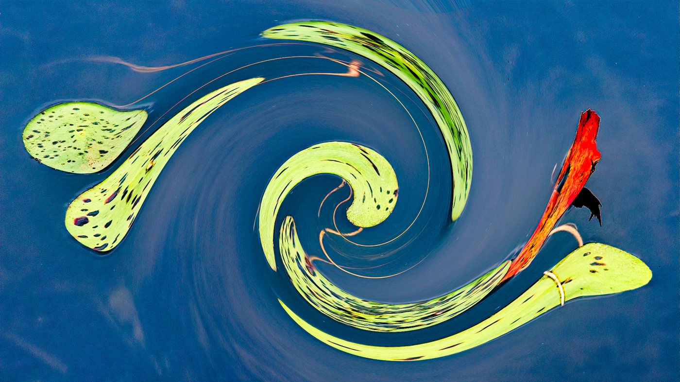
Thanks Rick. Yes, I did have the thought about making the panorama but I liked the current coming in from the left and directing the eye to the orange water. I'm sure everyone wouldn't agree...But..I always Appreciate your ideas Rick. BTW, I've given up on Luminar for DAM- managing my images and I've imported all in LrClassic and will use Luminar plugin for editing. |
Oct 12th |
6 comments - 3 replies for Group 15
|
| 29 |
Oct 20 |
Comment |
Thanks Judy. Already done, I have over 500 skies in a folder for sky replacement and I created a Cloudscape keyword also for those that have non-cloud foregrounds.
Im even adding Fireworks and Rainbows to the skies. So much potential to liven up a boring image. |
Oct 16th |
| 29 |
Oct 20 |
Comment |
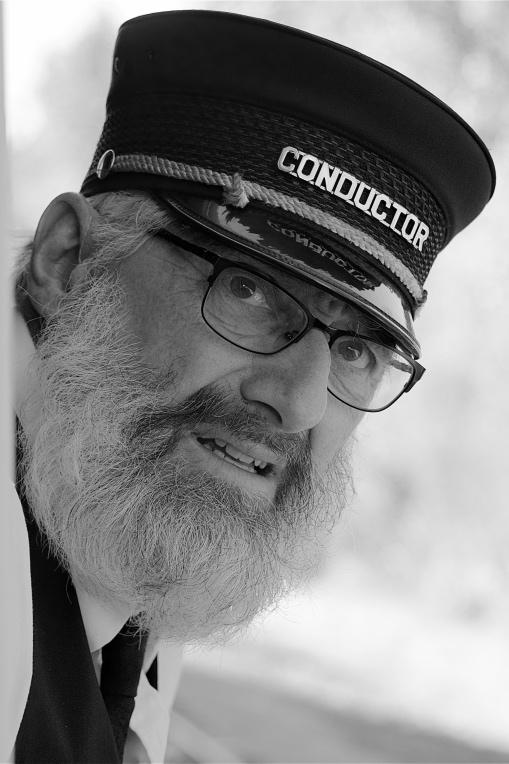
Great seeing and editing. Like others, background behind his head is very distracting and you didn't leave yourself enough room to edit it out and that would be very difficult with that kind of hat. |
Oct 16th |
| 29 |
Oct 20 |
Comment |
Karen, Good planning and positioning yourself. I love the reflections and the special circular ripple that you captured. I might of tried cropping that top overexposed area over the Elk or darkening as Bill suggested. I would also have tried to lighten up the shadows on the Elk's head/neck area.. |
Oct 12th |
| 29 |
Oct 20 |
Comment |
Nice patterns, shapes, shadows and colors in this image Bill. We exposed and acceptably sharp. I can't offer any suggestions to improve. Well done. |
Oct 12th |
| 29 |
Oct 20 |
Comment |
Judy, good seeing to find this pattern. Nicely exposed. I think I would of cropped the left edge and at the same time rotated the image so the Frond angled up in the upper right quadrant. The upper third of the image currently isn't really adding anything. The red at the right edge will be diminished when you crop. |
Oct 12th |
| 29 |
Oct 20 |
Comment |
Stephan, what great ideas you come up with all centering around water. Nothing wrong with that idea. I do love the reflections that you captured up behind the couple. I think that the bubbles make it sure the viewers understand this was taken under water. Bill is correct, the bubbles do make it look unnatural, but I would never think that a couple dancing underwater at night could be made to look natural.
Well done Stephan. |
Oct 12th |
6 comments - 0 replies for Group 29
|
| 62 |
Oct 20 |
Reply |
Well, your settings surely did get me to study oh so many settings. I appreciate your suggestions, but I generally do not go thru all of that work. I enjoy post-process but with the number of images I shoot and keep I could not make it thru initial edits after culling. I rely on compositions and easy edits to bring my images to the wow stage. I Love that fact that you showed me were to find the "other" presets and I really like what that Modern 5 preset did for the texture and toning but I don't see a substantial difference from mine , (other than the flip). I'm finding what I already had heard of, the many different ways you can edit, and I thought that pertained to Ps, but now I'm finding that to be true between LrC and Lr. This is a result of viewing more videos from Adobe. So thank you. I can certainly approve of your edit, but just can handle all of the possibilities in my mind. Thanks LuAnn. ps: I have LrC workflows class in a few minutes. |
Oct 21st |
| 62 |
Oct 20 |
Reply |
Excellent job. You are hired. I never knew to click on the 4 squares for presets. Thought they had a terrible selection on the left side. I'll have to continue later as I have a web training event at 3 Adobe Max. Lightroom for beginners.
Thanks again LuAnn |
Oct 21st |
| 62 |
Oct 20 |
Reply |
Hi LuAnn. I've finally made a determination that I was going to follow your edit path, but, difficulty right off. I'm not finding any "Basic" presets or anything called Modern 5. I might of waited too long as this AM my LrC updated to version 10, but I do not remember seeing that over the last week as I have been trying to use LrC presets. . Are you possibly using an older non CC version of Lightroom? |
Oct 21st |
| 62 |
Oct 20 |
Reply |
LuAnn. You will get my comments, but not yet, I have to have adequate time to read, understand and implement your suggestions. I've been busy getting my images into LrC and understanding everything. Bob
|
Oct 12th |
| 62 |
Oct 20 |
Comment |
Israel, I Love the composition and the subject. Excellent use of long exposure to smooth the water. I definitely would open up the shadows and increase texture on the ship as others have suggested. I might (always easier in hindsight) to have raised my tripod up a few inches to give a little more separation at the horizon as the bow and horizon are very close to merging. Well worth you trip to shoot this, I think. |
Oct 6th |
| 62 |
Oct 20 |
Reply |
LuAnn. I have not in the last 10 years+ processed anything with the word film. I just looked up the definition of the term and believe it has negative terminology associated with 40-50's cinema stuff. Sorry, not a chance I would do anything with it. Good luck. |
Oct 6th |
| 62 |
Oct 20 |
Comment |
Leah, you did a great job with the selective DOF and isolated the Keds. My only suggestion is I would of tried to either include the entire toe or crop it back to a point where you obviously made the choice as you do have room on the left that could be cropped, or was there no cropping beyond what you did in camera? |
Oct 6th |
| 62 |
Oct 20 |
Comment |
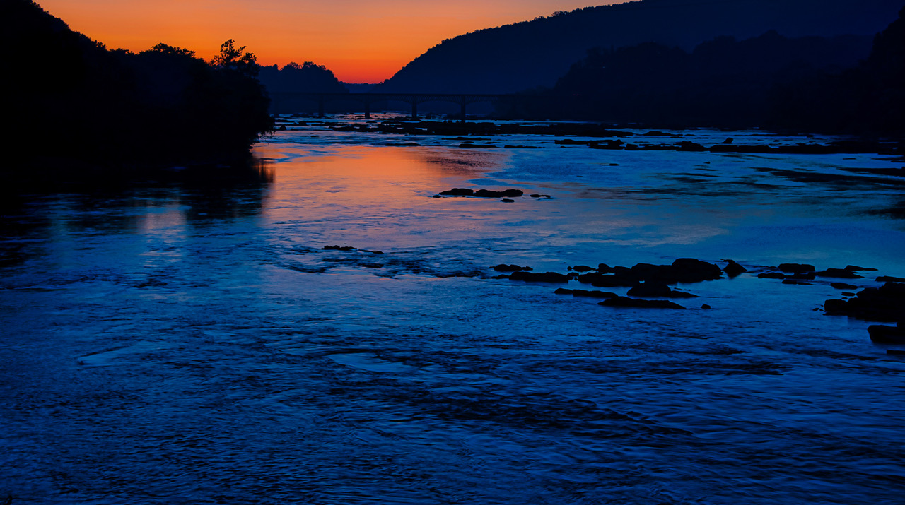
Emil, I like your bridge and the long exposure sky. That makes for a very dynamic image. I've been told that this works best when the clouds are heading towards or away from you, but you have managed to make it happen in a composition where the clouds are coming from lower right to upper left. I think because of the composition of the bridge and clouds this works wonderfully. |
Oct 6th |
| 62 |
Oct 20 |
Comment |
LuAnn. Yes, the Daises are rendered unique. They don't look quite like the normal sepia, BUT they are monocular and pass that test. I think that the texture color also falls within the norm. The back flower looks sharp to me, it has less detail, but not a problem for me. Composition is fantastic with the 2 stems not blocking the other. With the use of the tripod you could of gone to a higher f-stop. Isn't it fantastic to dig thru old images and bring them to life vs placing in the trash. |
Oct 6th |
| 62 |
Oct 20 |
Reply |
Absolutely. I've been trying to learn Lightroom Classic and forgot that important info that I always ask for myself. Image was taken at 1:32PM Feb 3rd, Exp 1/200 sec at f8.0, ISO 800 at 28mm on my 28-300 Nikon Lens, no Tripod, but I did brace my body against many walls. Nikon D780. I did not have access to all the metadata in Luminar. I've had to give up on Luminar for image management etc Except I still Love their editing and will continue to access Luminar editing via Lightroom plugin. I can tell via my file name that I edit edit in Topaz using Precision Details. That was one of the points I learn around Labor Day with the virtual classes from Out of Chicago in Depth. I hope this is helpful, but this is one of several images that I started in Luminar, back in the Feb-Aug time frame and then according to LR history I tweaked contrast, shadows and high lites. Thanks LuAnn for Praise. |
Oct 6th |
| 62 |
Oct 20 |
Reply |
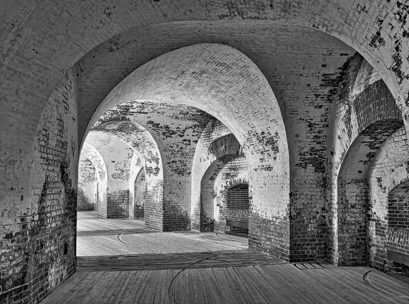
Emil, but as a brand new LR user, I had increased the contrast and used the "J" key to see the dark spots on the left and the areas in the top side arches went blue and blocked the texture so I settled on just a slight bit of blue and the arches at the end of the just had a slight bit of red. But I take it that you prefer dark shadows versus seeing textures. To me the details and textures makes the picture. I certainly believe that I do not know many of the methods that could come up with an edit like I did and what I think you suggested. |
Oct 5th |
4 comments - 7 replies for Group 62
|
16 comments - 10 replies Total
|