|
| Group |
Round |
C/R |
Comment |
Date |
Image |
| 15 |
Jun 20 |
Comment |
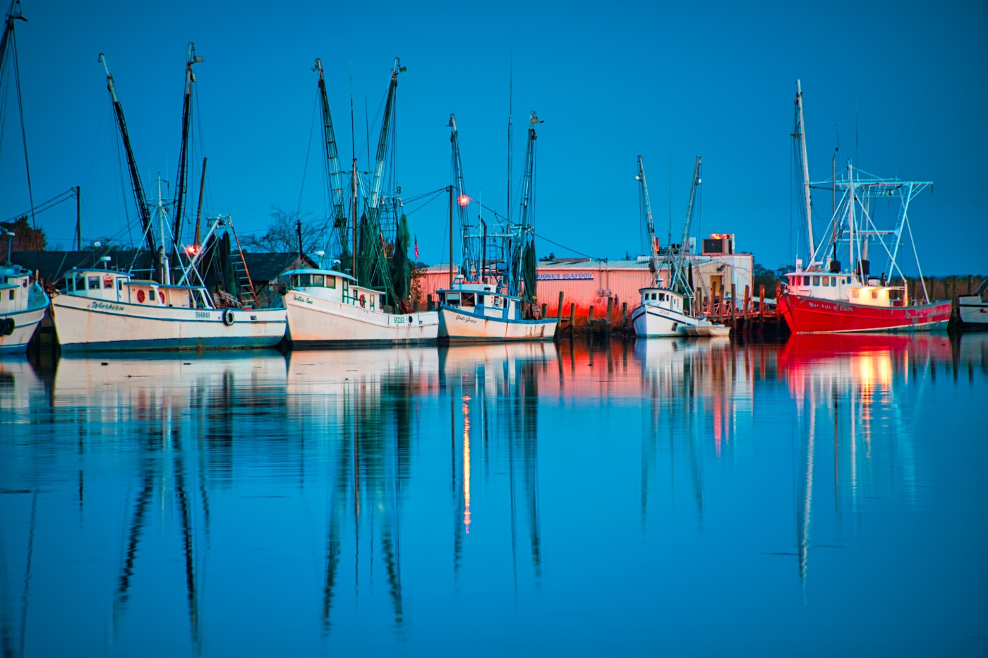
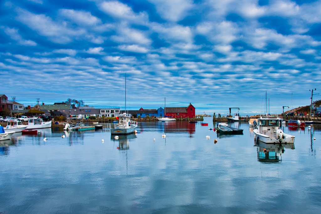
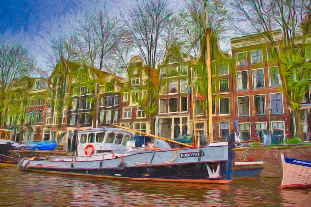
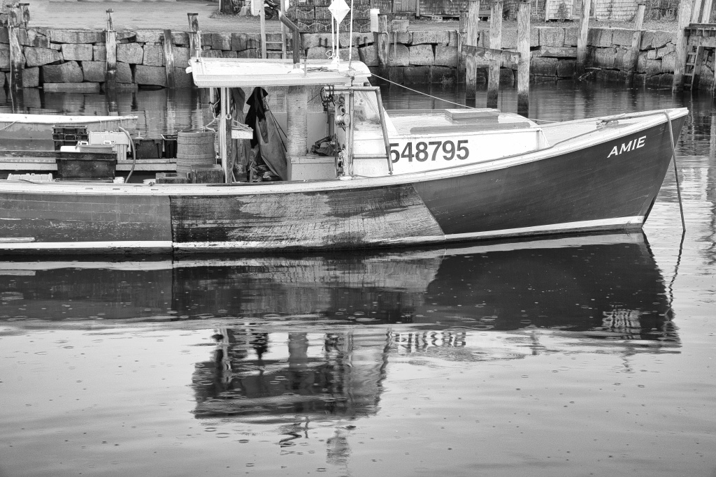
Joan, I have shot boats in Maine fog, but have not found this location or a circumstance where you only see the backs and top of most of the boats. My suggestion is contrary to your subtle colors, and that would be to pump up the saturation and vibrance. Also, by making a pano, you elimated the great reflections in the mostly still water. Maybe you have some of those reflection shots? |
Jun 18th |
| 15 |
Jun 20 |
Comment |
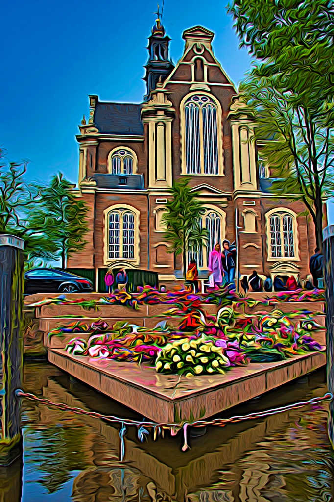
Linda, as I read above you were on a moving tour bus and shot thru the glass to get this beautiful and colorful image. I have no suggestions except to keep doing what you did. The auto ISO really did the job for you and that focal length lens was the one for varying subjects and scenes. As suggested above slight darkening or try increased contrast or a very slight lowering of your highlights. |
Jun 18th |
| 15 |
Jun 20 |
Comment |
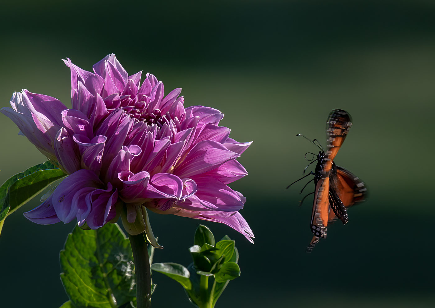
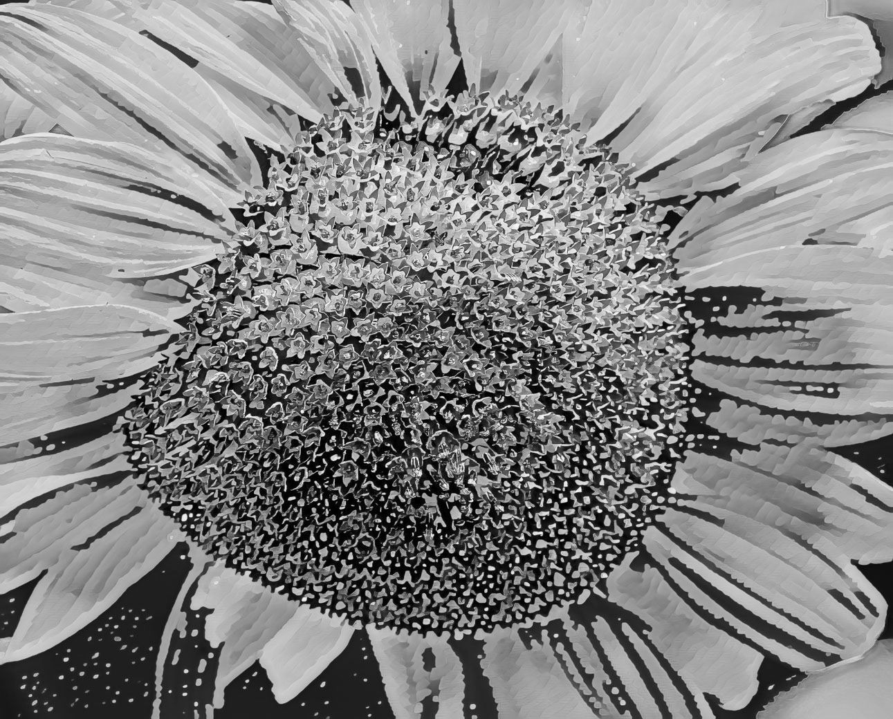
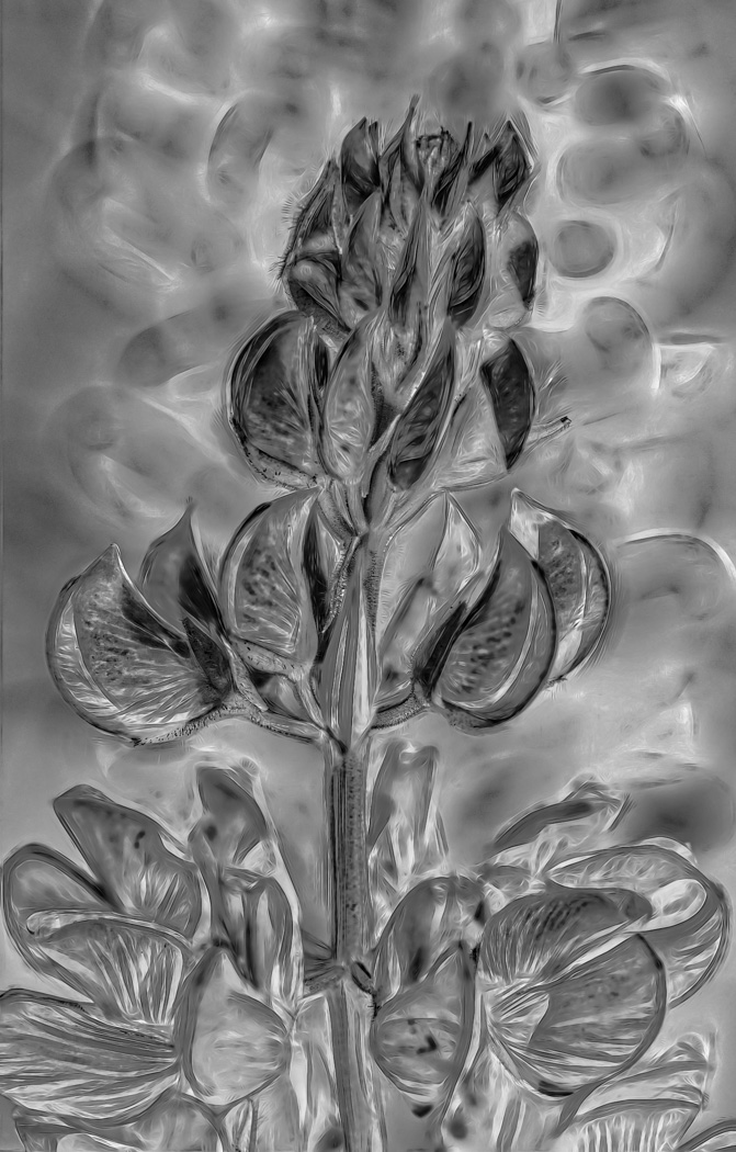
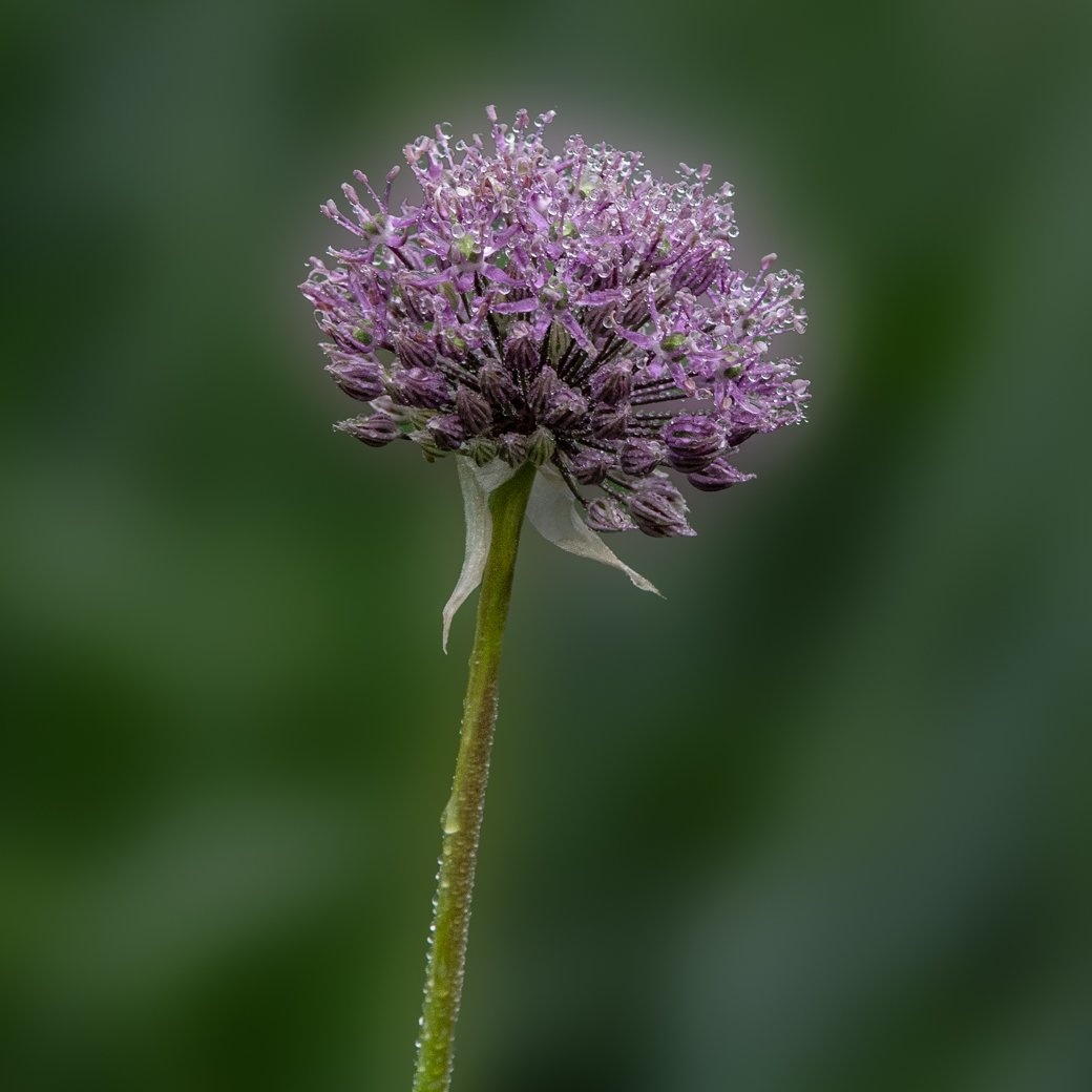
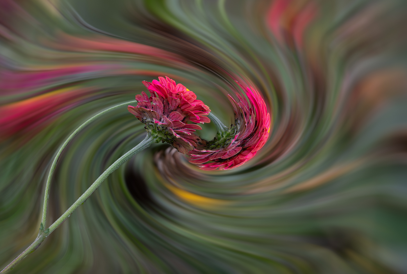
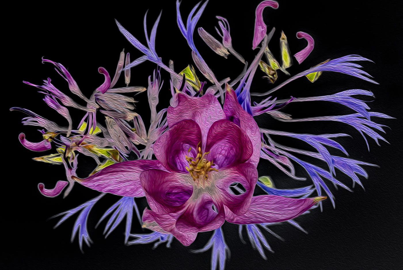
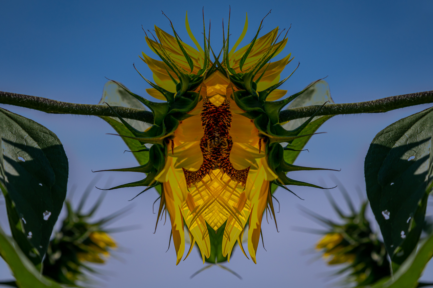
Jeri, I too would of shot that vivid color flower till my wife said we are leaving you. So perfect in it's design. Sorry, I don't know how to tell you on your Samsung to soften that background as far as you can or whether it makes sense to import it into your computer. I also do not know if you can clone the green to cover up the brown spots. Good find. |
Jun 18th |
| 15 |
Jun 20 |
Comment |
Kirsti. This is a very nice image, and you have learned Luminar well. The warm light and textures in the grass in contrast with the blue water gives it a beautiful look and feel. I'm also a Luminar user and I have 2 ideas. In the settings of the sky replacement tool, there is a slider called "Relight scene". I wonder if you moved that to the right to see if it would add a slight warm touch to the blue water? Also in the bottom right of the edit panel there is a clock face. Click and it will give you history of each step in your edit. You can start again with original or another step and that will answer all of your questions of what you did. I use it all the time as I can't remember what I did before. Glad to have you as another Luminar user in our group. |
Jun 18th |
| 15 |
Jun 20 |
Comment |
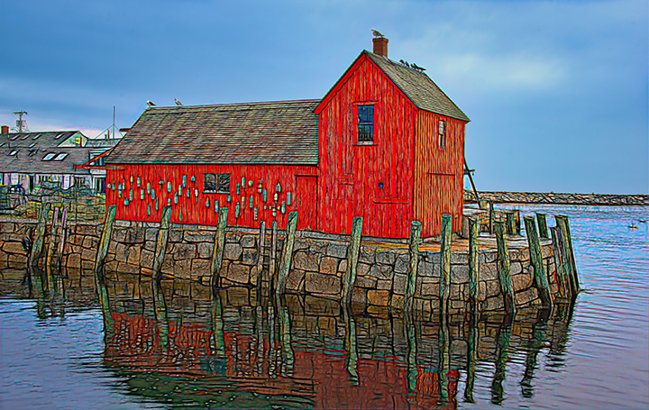
Well Larry. You get around for someone hangs their hat in Florida. Curious, did you put your lobster shack on a DD yet? As you can probably tell, I do Luv my saturated complementary colors. Thanks for the positive feedback |
Jun 7th |
| 15 |
Jun 20 |
Comment |
What a great job Rick. You are using the same post processing tools as yourself. I don't have such a great collection of bottles thou. I like the colors and textures that Topaz has given you. Just a nit: but I am not fond of the down slope on the front and the stainless panel in the back. Was it intentional to get the point of the red triangle to meet the clear bottle top? |
Jun 6th |
| 15 |
Jun 20 |
Comment |
Kirsti and Rick. I appreciate your varied views. I agree with both of you. By taking the image Landscape, I can crop it to square for a digital competition. For a print competition I won't have a choice. I only do standard opening mats.
Thanks |
Jun 6th |
7 comments - 0 replies for Group 15
|
| 29 |
Jun 20 |
Comment |
Judy, Luminar has a fantastic sky replacement tool and it's priced well. $69/89.
I literally downloaded your image, chose a Standard/enclosed blue sky #2 and did NO adjustments. You can make your own sky images and load them and you won't have problems with competition judges. Any questions: email me at boblegg@mac.com |
Jun 18th |
 |
| 29 |
Jun 20 |
Comment |
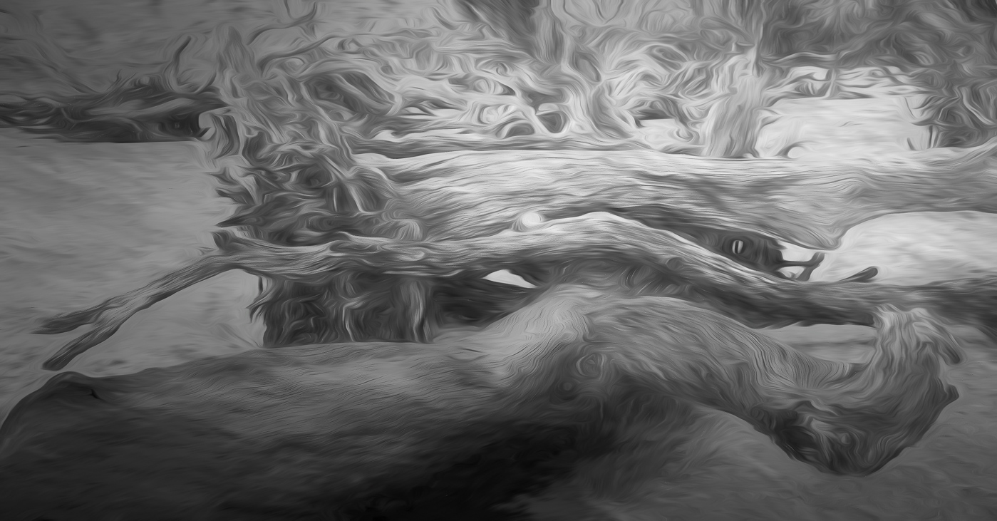
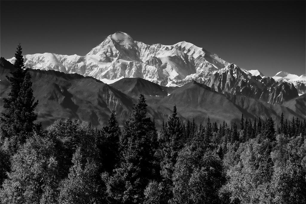
Stephan, I travel not so light by taking only my 28-300, unless I know that I won't have any long distance shots and then take the 16-35. You ask about the tree situation. Crop from left to just to the left of the top of the 2nd tree, as DD requires no standard aspect ratios and the remaining dead branches. Then I would clone out the ends of the dead (or not yet awake) branches with branches from (left) tree, 1, 2 and 4 using a mix so branches are repeating patterns. Sorry, my Mac did not want to download your image so I could try it out myself. The Mt is beautiful. |
Jun 18th |
| 29 |
Jun 20 |
Comment |
I'm with you Bob on the saturation. Just like the Velvia slides you probably shot in the late 90's. I tell people that my DSLR has Velvia film inside. |
Jun 14th |
| 29 |
Jun 20 |
Comment |
Bill, I think the leading line of the wall taking you to the red umbrellas is what caused you to flip the image. Also picking Portrait orientation was a great choice as it allowed you to capture most of those very nice cherry blossoms. Well done. |
Jun 14th |
| 29 |
Jun 20 |
Comment |
Thanks Bill and Judy for your comments. |
Jun 14th |
| 29 |
Jun 20 |
Comment |
Thanks Judy. I'm out in the Front Royal area. Keep me informed on that Mid_Atlantic website. |
Jun 13th |
| 29 |
Jun 20 |
Comment |
It wasn't me. Not sure how that happened to you. The X and 0's had a studdering issue? Now it is perfect. |
Jun 10th |
| 29 |
Jun 20 |
Comment |
Absolutely the best approach to shoot first and then make adjustments. A great moment caught. What happened to the Mom's ear on the right. Either she moved her head at last second or you made a clone in the water and caught the edge of her ear. Talk about last minute. |
Jun 10th |
| 29 |
Jun 20 |
Comment |
Thanks Karen. I re-edited this image just before sending and I obviously forgot to fix that foreground as for the 8x10 vs the 8x12 I generally crop to the original aspect. I take it that you found it more appealing to not have it centered,
|
Jun 10th |
| 29 |
Jun 20 |
Comment |
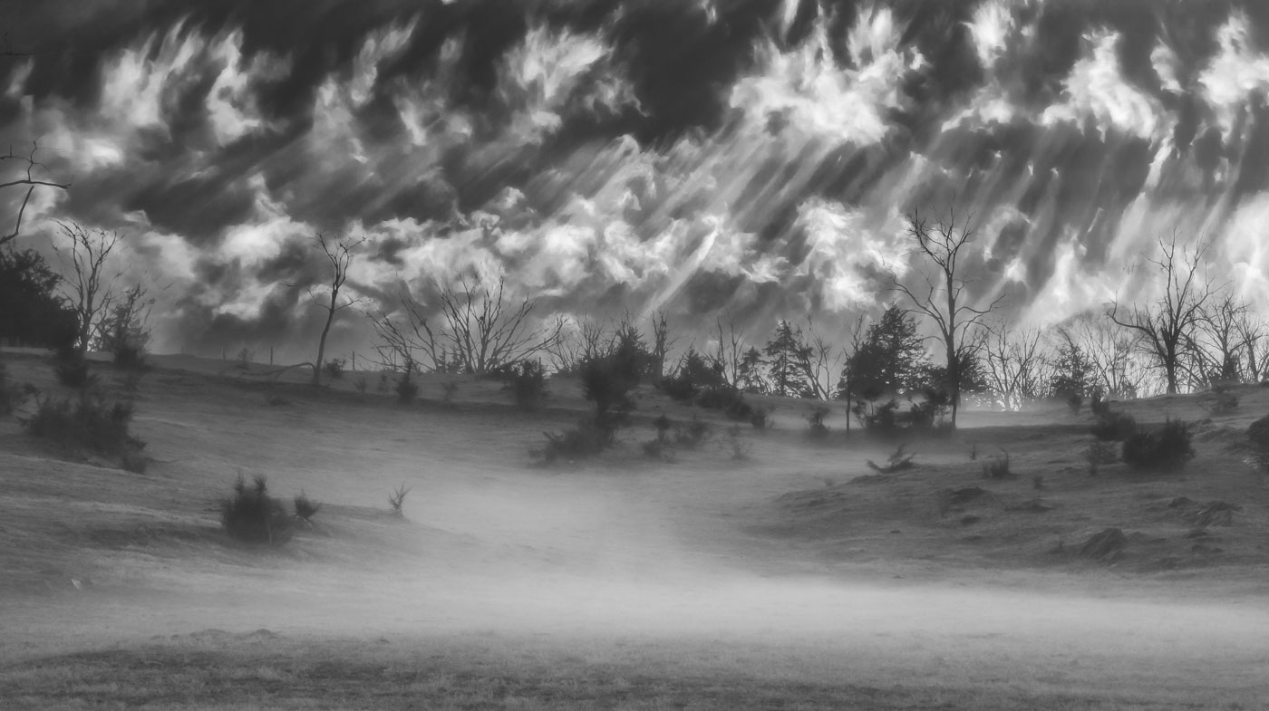
Well done Bob. You certainly captured the topography of this Palouse farming region with your capture during the golden hour bringing out the details in the land. Fantastic texture and lighting even in shaded areas.
Get Well. |
Jun 9th |
| 29 |
Jun 20 |
Comment |
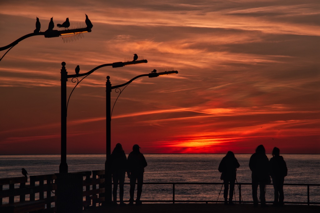
Very nice image Tam. Her strawberry hair is perfect for this group of flowers. She is position ideally looking into the flowers. I might of asked her to look a little more to the right so that you had a little more of her face and asked her to pick a flower and smell it. Just my thoughts since you had Mom's permission. |
Jun 9th |
11 comments - 0 replies for Group 29
|
| 62 |
Jun 20 |
Comment |
Understood. I agree. |
Jun 14th |
| 62 |
Jun 20 |
Comment |
I would hope that you comment on one of my images that is below standards. I believe you have improved the image by adjusting contrast and opening up the shadows inside the tea room. The reflections in the water are also improved. It does have good composition with the rule of 3rds. However, it just does not have impact. If the State and DC were open for travel, would you go back to shoot it again? Yes, maybe in peak fall color (depending if any of those trees produce red leaves) it might work well, but otherwise I think you will find better options. |
Jun 14th |
| 62 |
Jun 20 |
Comment |
Pete, I've been to your image multiple times and can't easily get my thoughts in order. I like your BW image the best versus the darker edits. I find the tea house too complex for BW. Lots of detail, but no real subject to rest my eyes on. Yes, lots of nice details in roof and fence and tree/shrubs, but it's just not winning me over. What was the reason for the photo? Not color! Not dramatic lighting or composition! Yes, the detail, but I don't find it interesting enough to make the grade of your usual work
Sorry buddy. |
Jun 9th |
| 62 |
Jun 20 |
Comment |
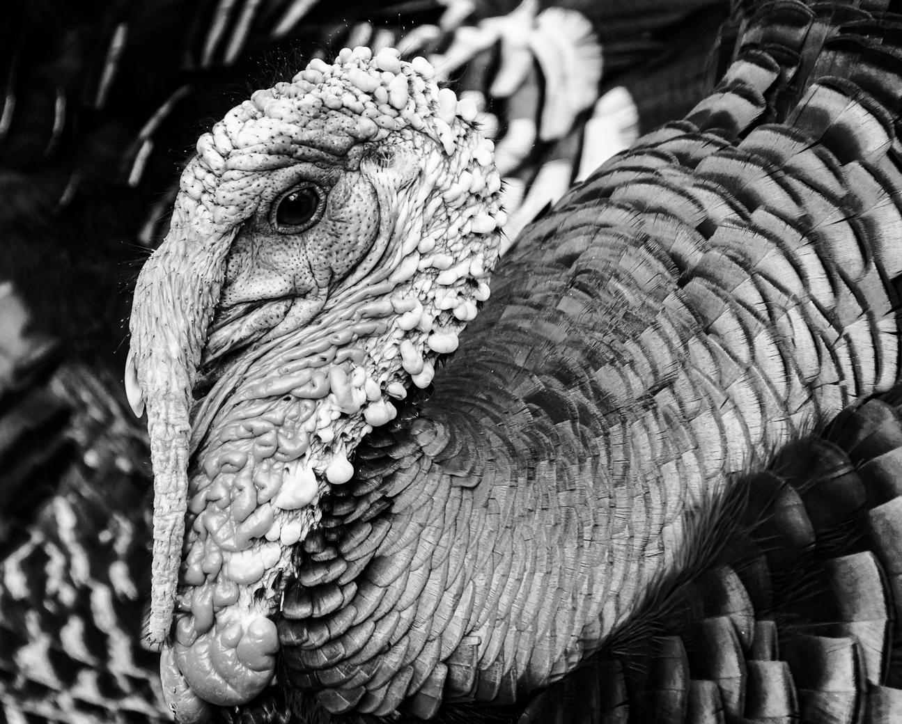
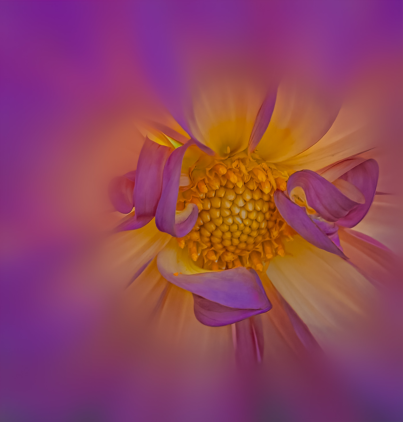
Israel, another beautiful image that you created. A perfect match of detail in the flower, leaves, sunburst and the clouds. That's a home run. |
Jun 9th |
| 62 |
Jun 20 |
Comment |
Gary, I like your "rough pastel" version as it closely resembles the reality of the conch shell. Polished smooth inside and rough on the outside. I still have my conch from Key West in 1970. I like the black mat board idea that you photographed on with the natural light. Great use of your downtime.
|
Jun 9th |
| 62 |
Jun 20 |
Comment |
Leah, a very nice monochrome. I agree with darkening the line above the keys and I would of cropped the light area on the top left. I used to crop with the same original aspect ratio as thou I was making a print. Here on DD any crop dimension works and I would of cropped out more of the RHS (new abbrev to me also). I understand your point about the piano being old and showing that black on the key that is out of synch, however, that key is not in your depth of field. If that had been in focus the viewer could have seen the defect as part of your subject. Now I'm questioning which key you were focusing on the simple black line or the key 2 keys to the right is is out of alignment and doesn't return to its top position? |
Jun 6th |
| 62 |
Jun 20 |
Comment |
Thanks Leah. I have no problem with your edits. That's the beauty of this DD sharing. Yes, everyone could edit this image differently. |
Jun 6th |
| 62 |
Jun 20 |
Comment |
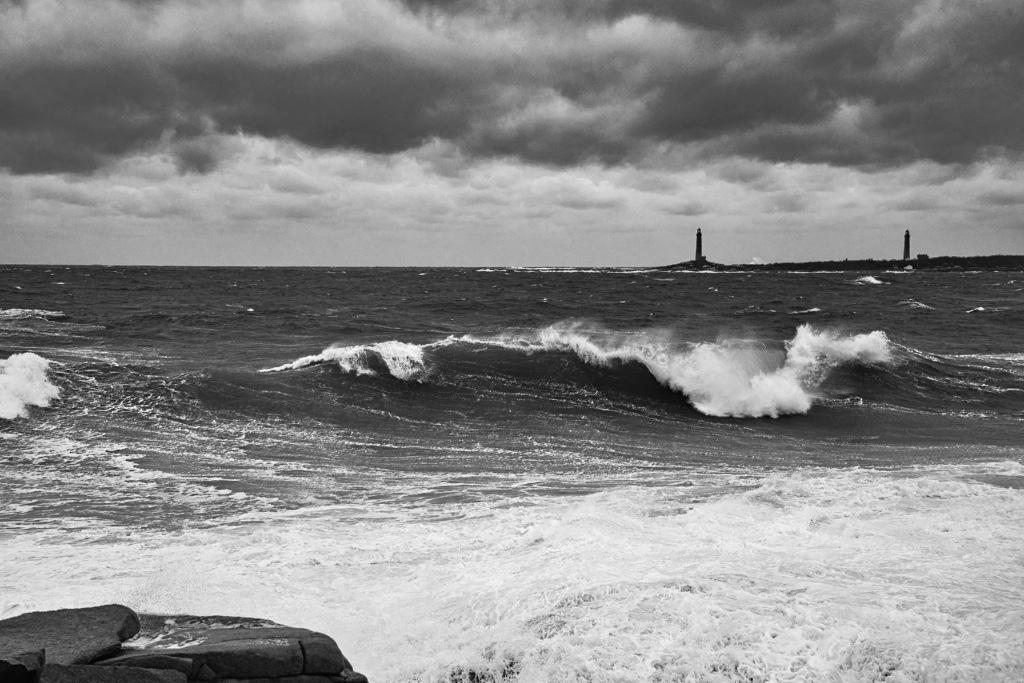
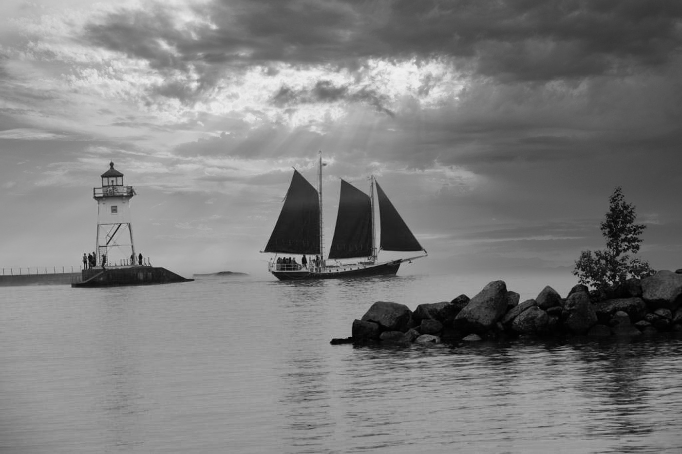
Sorry I saddened you, I DID NOT FIND IT NECESSARY to change your sky but I wanted you to see the possibility if you were to use your own sky. While you white sky/now texture maybe your own style, the camera club competitor in me rages more than my artistic style. Not really sure I have a style after 35+ years in camera clubs. I'm an opportunist photographer and If I had an image that was a winner but it needed a dramatic sky I would try to find a way for it to happen. It's just like the darkroom where two images could be sandwiched together.
BTW: I forgot to mention that the people at the lighthouse and that "1" wave also add to the story. It is not that you could go back at another time or another day, to shoot it again. Not likely to catch the schooner and conditions the same unless you can work it out with the schooner captain.
Bob |
Jun 3rd |
| 62 |
Jun 20 |
Comment |
This isn't perfect, but I think you would like it vs the non-dramatic sky. In my mind you have the composition to make the image into a WOW. This isn't one of my skies, but an included sky with Luminar sky replacement. |
Jun 3rd |
 |
| 62 |
Jun 20 |
Comment |
LuAnn, I liked this shot from first site. Thought you have gone to the ocean then read that it's a very large Lake. I like the separation of the schooner from the light house and the breakwater. I do favor having a horizon vs your your texture. Texture is well done but just leaves a void where we all know there should be an horizon. I would of used another sky. I do not favor Emil's removal of the tree on the breakwater, I think it adds depth to your image. I'll try to find a sky that fits.
Bob |
Jun 3rd |
| 62 |
Jun 20 |
Comment |
Emil, you have done a really great job converting the color image that was lacking detail, dynamic sky, and a foreground into a very nice image that was composed from the beginning with all of the ingredients needed. Well done. |
Jun 3rd |
11 comments - 0 replies for Group 62
|
29 comments - 0 replies Total
|