|
| Group |
Round |
C/R |
Comment |
Date |
Image |
| 15 |
May 20 |
Comment |
Well Kirsti, I'm impressed with your redo motivation. The suggestions of including the entire mirror in great focus (the f11 made a big difference), the 50mm of the lens created the least amount of distortion, the 1/60 speed was necessary in stopping any camera motion and you are steady enough on your feet to accomplish this balancing on a chair. I agree that the BW works great. I also think that you change of hair styles adds to the image, it's makes the image more "polished" and not a last minute thought. I certainly would ask Joan to swap out the gold one and use this. It screams of a very creative photographer. |
May 29th |
| 15 |
May 20 |
Comment |
Joan, I find the pose on the cougar to be very good. The eyes, mouth and tongue add that extra color to make him so real. I can say that I wouldn't attempt a background like what you have done here. It is artistic and does fit into the general color scheme quite well. I can see myself replacing the background with a texture or another image, but I think the color mixing or blend modes you used putting color on the various body parts to be less desirable for this type of majestic animal. |
May 26th |
| 15 |
May 20 |
Comment |
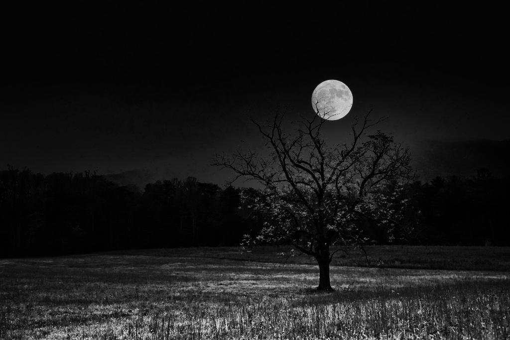
Hi Kristi. Welcome to DD15. I tend to shoot most of my images outside, but I do find your image interesting. As I understand it you didn't originally plan for this image to come under review, but here it is. I like to look at the metadata (camera settings that digital images provide). They provide fellow photographers with info to potentially help answer some questions. I agree with those that like sharpness throughout your image and your iso, f-stop, shutter speed and lens mm might provide answers. I look forward to seeing your creative and landscape works. I also use Luminar 4 and really love the pleasant surprises they sometimes bring. Welcome. |
May 26th |
| 15 |
May 20 |
Comment |
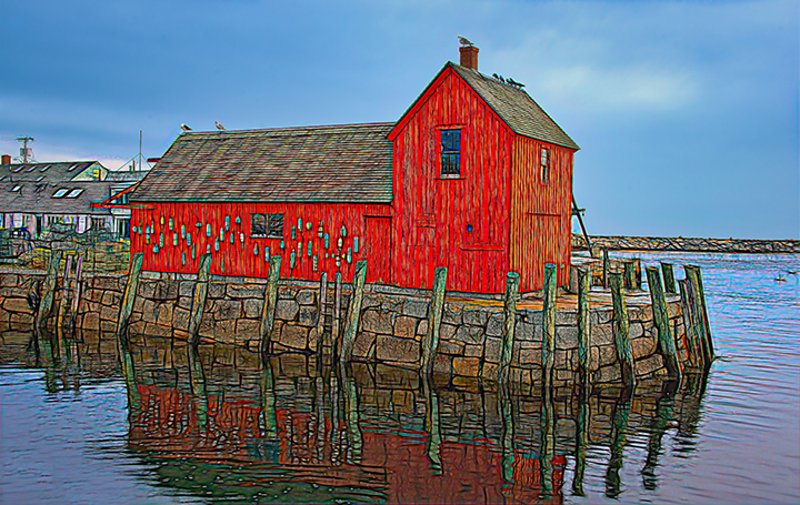
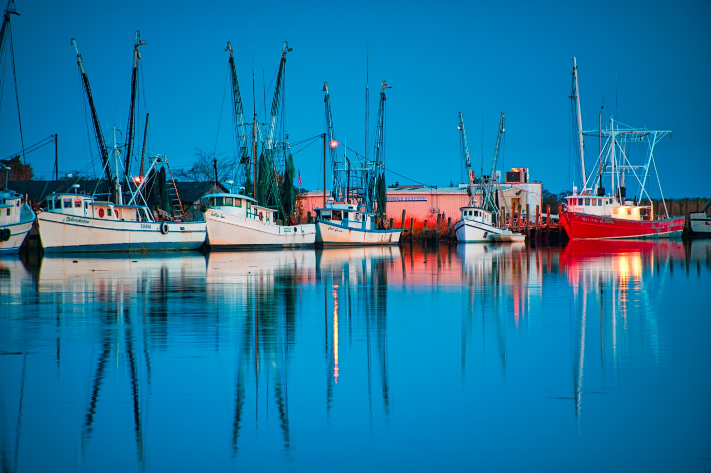
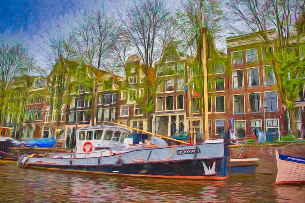
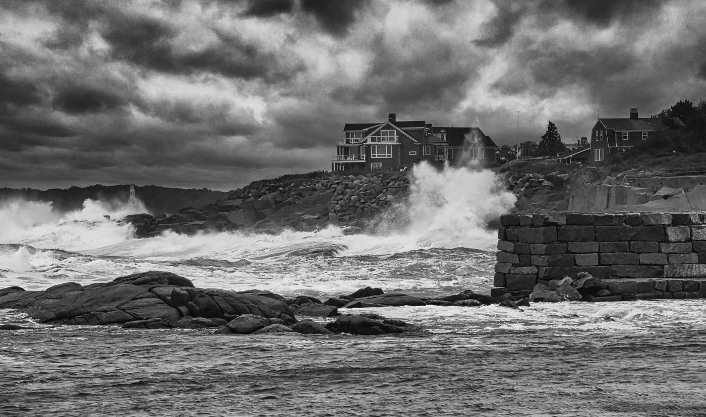
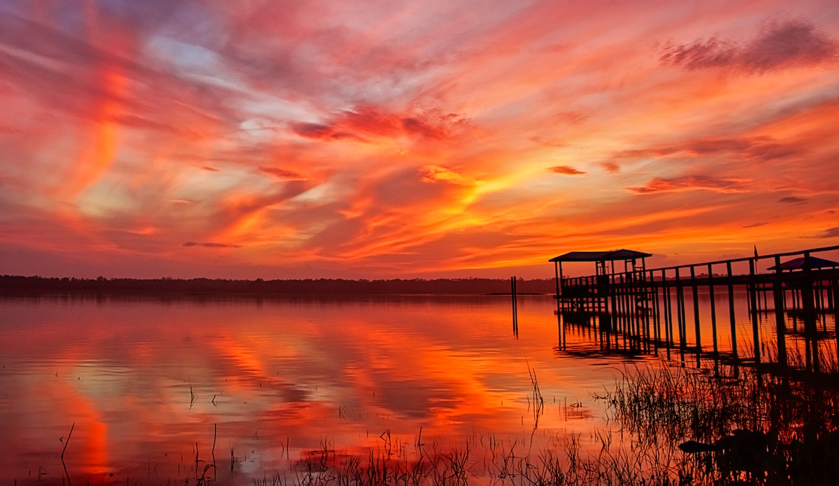
Thank you to everyone for your comments and suggestions. I do appreciate them. I've tried another image and cropped, wide angle lens transform and taken out the left pier to eliminate the conflicting merger etc. I know not every one with think its better, but we're all trying to learn and I thought this way might be helpful to us all.
With so many images to pick from and none of them absolutely perfect we will try this version. What do you think? |
May 9th |
 |
| 15 |
May 20 |
Comment |
Jeri, this discussion reminds me of an image that I took back pre-2000 on film and there was a fire a mile down the road at night in a mobile home. My 1 and only photo was a body and firemen there in the front yard and my image showed them in anguish but it wasn't known what my image actually showed until it was developed. It was too graphic to show, BUT if I had never taken the image there would be no discussion or ability to have evidence. I know not a similar situation but important for a photographer to get the image and discuss later if it should be seen. |
May 6th |
| 15 |
May 20 |
Comment |
Hi Jeri. What an extraordinary moment you have captured. Great cropping considering you had no control over the background. Perfect shutter speed except you didn't give us those details and techniques used to get the image. Please give us more photo info and maybe the images before and after this one. |
May 5th |
| 15 |
May 20 |
Comment |
Well Rick, as a Luminar sky replacement user, I have to admit that I am unable to match your work. One has to have the 3 images that will work together. You found those images in your library and they work well together. Yes, I believe the planet is a bit too big, but it works. The northern lights are perfect for this composition. I'm envious of your ability to create this image. |
May 4th |
7 comments - 0 replies for Group 15
|
| 29 |
May 20 |
Comment |
Thanks Stephan. Now there's no excuse to sleep nights when you can go out and light paint. Appreciate the edit.
|
May 12th |
| 29 |
May 20 |
Comment |
You did well Tam. Composition is really good considering you had to wait and probably didn't get the prime spot. The bird on the nest is very nice. I do think that you have too much exposure on the birds. Reduce via curves or exposure. I would try to get the sky to have more blue while you are doing some adjusting. The flying bird has face in shadow. Unsure if you can brighten that up. You didn't mention your iso but a higher iso would of allowed you to shoot at 1/750 or 1/1000 and stopping the wing motion. Just me, but thinking that you regularly do not get this opportunity, I would of used Aperture priority, maybe even bracketing, because there is not a lot of time during an event like this to make adjustments in your shooting settings. |
May 10th |
| 29 |
May 20 |
Comment |
Thanks Judy. I still some Club competitions but gave up on the PSA stars etc. Money could be used for other gear or excursions. |
May 9th |
| 29 |
May 20 |
Comment |
Thanks Bob. I agree. |
May 6th |
| 29 |
May 20 |
Comment |
Stephan,this is really a fantastic image. It has Impact, Sharp, Colorful, perfectly exposed. Only a tiny nit pick, I wish the shark closest to you had his fin protruding above the water or not behind that small ripple. Really excellent shot as it tells the viewer how beautiful the water and your vacation spot is. |
May 5th |
| 29 |
May 20 |
Comment |
Thanks Larry. |
May 5th |
| 29 |
May 20 |
Reply |
Thanks Larry. Those colored lights are actually shipping channel buoy lights. I had removed them from another version, but didn't get around to doing them on this one.
I checked out your cabin on DD36 and well done. Not sure how you got into Cades after dark? And I have not perfected Milky Way as I have a truck stop just 10 min down i81 that lines perfectly with summer Milky Way placements. |
May 3rd |
| 29 |
May 20 |
Comment |
Another beauty Bill. No more comments about the board being upside down this month. Great expression on the boarders face and great composition. My eyes are drawn to the 2 white buoys in the background. I would have erased or cloned them out as they serve no purpose. |
May 3rd |
| 29 |
May 20 |
Comment |
Nice capture Karen. I really Love how you positioned the camera/yourself so that the family did not interrupt the horizon and that you were able to get the glow of the setting sun on the water in the foreground. Well done. |
May 3rd |
| 29 |
May 20 |
Comment |
Judy, you did a great job to capture this glass composition in a store. Without a tripod and without blocking traffic in the store. I Love the curves towards the bottom of the images. They fit so well together. Minor, but I would try to bring down the white light inside the base of the left vase. |
May 3rd |
| 29 |
May 20 |
Comment |
Yes Bob, that sky is undoubtably better than what was present. I've never seen a photo of Mt Rushmore with this warm light and texture. I think it is stunning and well worth it to get up and shoot at dawn. |
May 3rd |
10 comments - 1 reply for Group 29
|
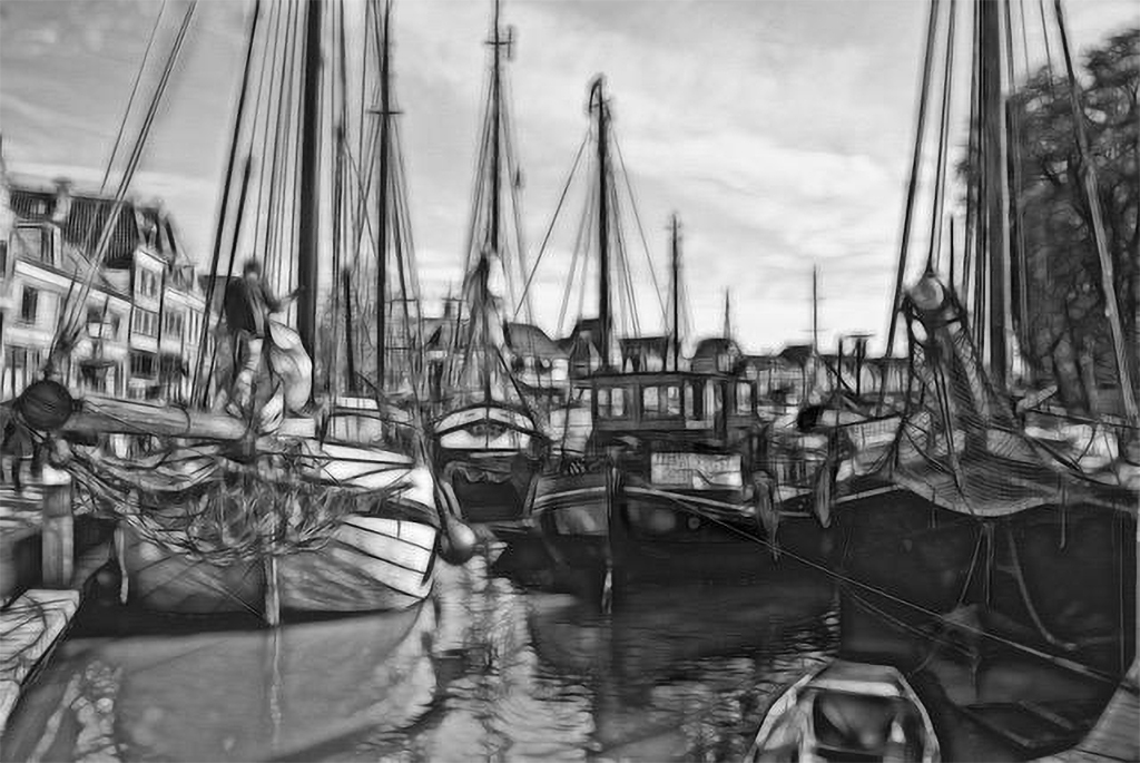
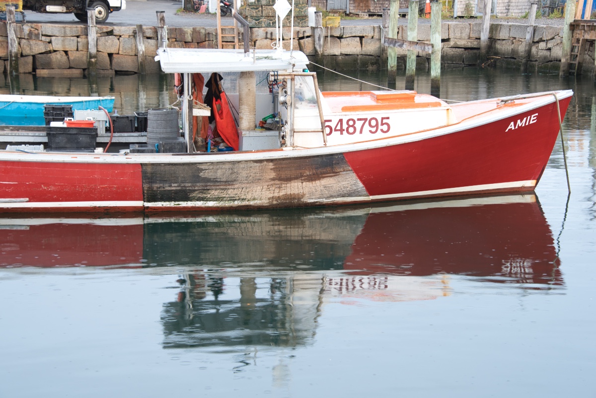
| 62 |
May 20 |
Comment |
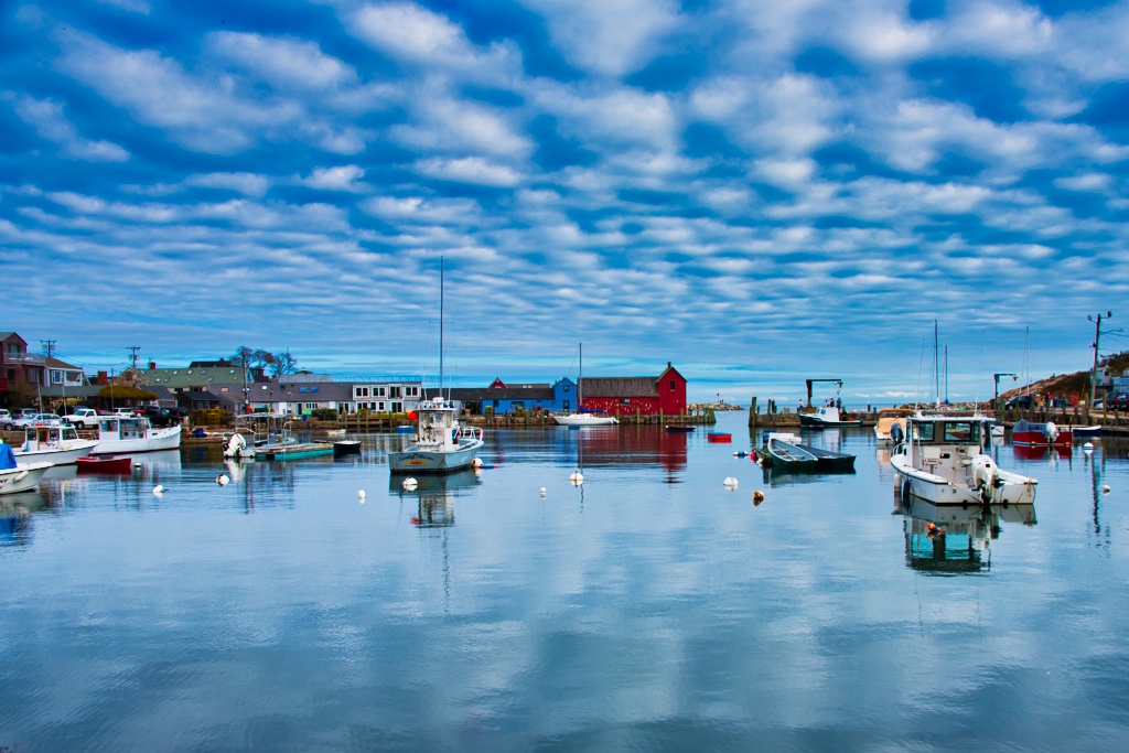
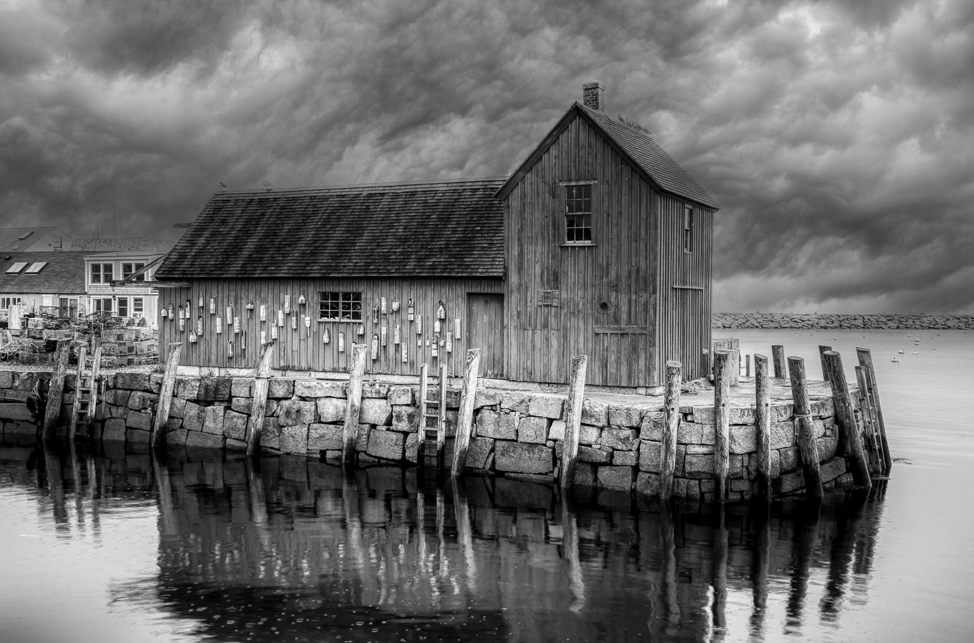
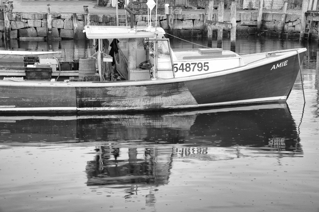
Thanks LeAnn. Well here is the real original. With my zoom lens I was able to selectively exclude what I knew I would not use. I wanted the reflection and worked the image to make sure that was included and the remainder would be erased. The Rule of thirds wasn't really a consideration. Other times when I went down to the harbor the boat was gone or packed in so tight that I had boats in the foreground. Since this was October less boats than summer and 3 of my 10 days we had Noreaster storm and there would of been no reflection. Also some people get picky when the photog crops various antennas, etc on the cabin roof. The odds are not 100% of capturing what you intend when you drive up to the harbor. Appreciate your comments. |
May 13th |
 |
| 62 |
May 20 |
Comment |
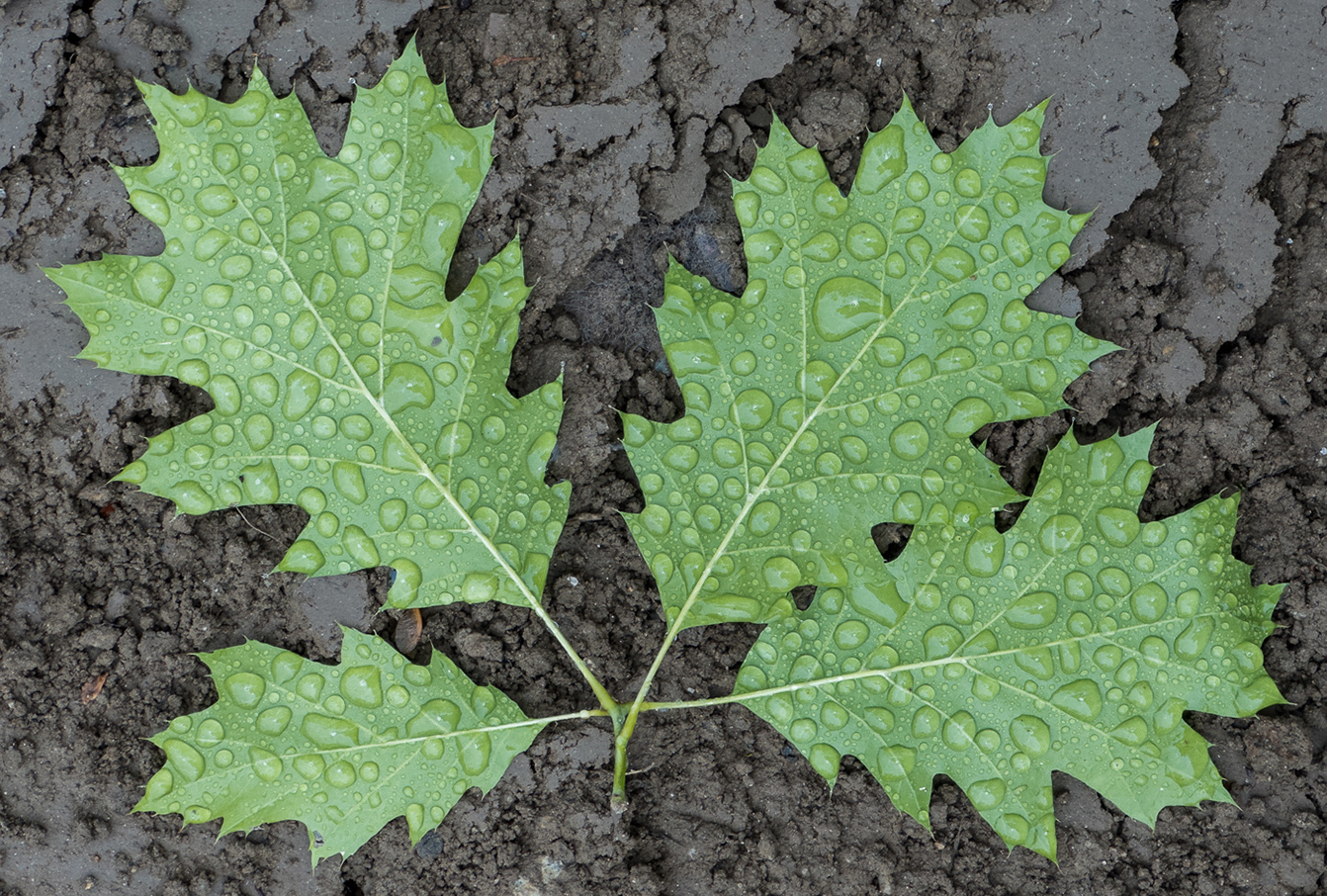
Well done Israel. You had your good eyes on to see this beauty. Good composition by showing the junction of the 2 leaves and twig and with great depth of field. I'm not bothered by the brightness of the small eggs. In fact, the eggs could very well be the subject as sume of us may have seen a small snail, but how many have seen small eggs not much bigger than the dew drops. Another great example of Israel's photo eyes. |
May 10th |
| 62 |
May 20 |
Comment |
Glad to have you in our group Leah. I love placement of the "subject" with the dual leading lines of the railing. I find the background with the exception of the previously mentioned hi-lights to the right, to be a tad distracting and I would of tried to reduce the exposure on the whitish books. I'm not the type to make this kind of art, I'm not being negative regarding your choice, but If I had to shoot it, it would be more on the line of Oliver's version. Just me. Regarding your choice of toning, I feel if you entered it in Monochrome, it would not rank as well as a B&W version. Just think that some judges might not see the artistic beauty in the blue tones during the 3 seconds they were allotted. |
May 10th |
| 62 |
May 20 |
Comment |
Oliver/Pete, I keep thinking about this image. So unique with excellent detail, tonal values and composition. I agree with others regarding the small details, so I'll score it a 27 and move on to the next. |
May 10th |
| 62 |
May 20 |
Comment |
Pete, thanks for working on my image. I do like the detailed contrast that you used on the reflection to make it sharper and the red color of the boat darker. I cannot agree with the cropping of the left side of the boat. It makes it less natural, the items are tools of the lobsterman's trade and I do not find them objectionable in the Mono version. I also tend to crop & stay with the 2:3 ratio so that if/when I get it printed it does not need a costly custom mat. Yup, I'm a thrifty Yankee. I don't print my own stuff, and I don't cut mats.
Thanks again. |
May 10th |
| 62 |
May 20 |
Comment |
Thanks for your comments Leah. Welcome to the DDGrp. Sorry for the delayed welcome, I've had yard work on the outside and trying to get my first RAID bu system up and running. I'm not seeing the "washed out" bit on my image. Not sure if you recently watch the BW webinar by Don Toothaker, and caught his comment about NewEnglanders believe in White Whites and Black Blacks in their images. I've only been out of New England for less than 4 years so I made the white on the bow White. Don't get me wrong, I'm not offended and appreciate your comments and I am thick skinned to protect from the cold. :-) Can you please clarify what you thought was too white? Gary also used a vignette, which I generally do not do on a subject this large. Gary's version also has less details in the shadows. I believe it is just a matter of preferences. Thanks again |
May 9th |
| 62 |
May 20 |
Comment |
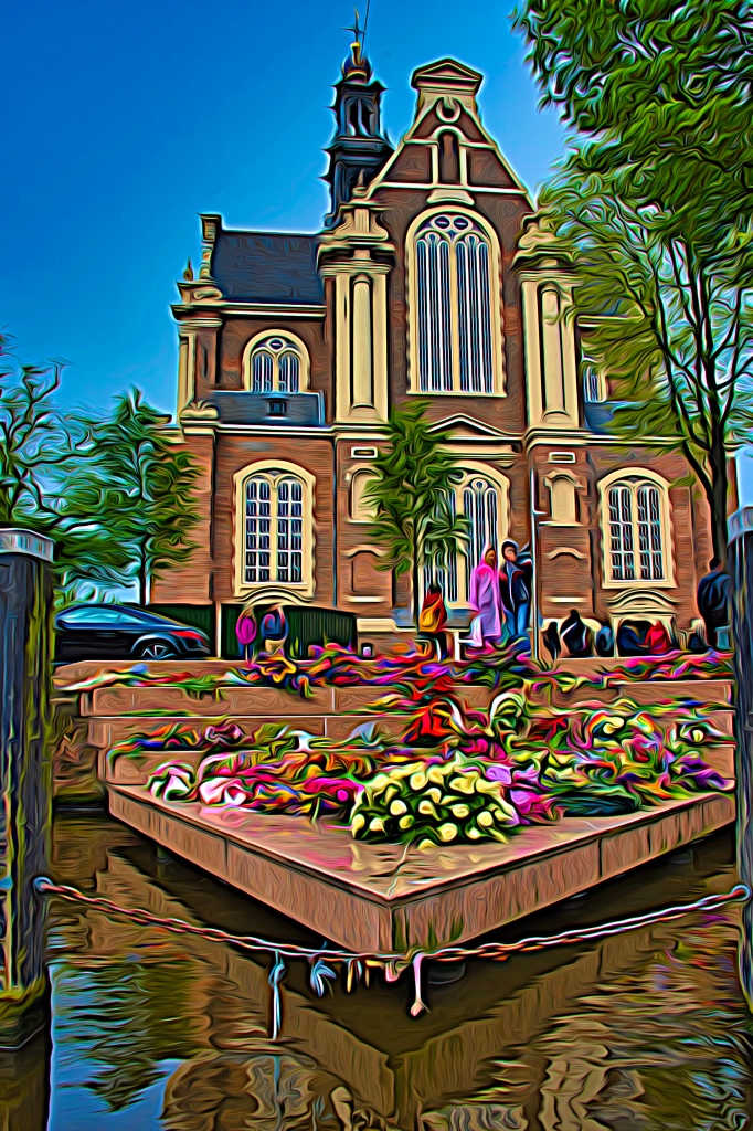
Gary, you really did well to envision an image and then come up with the way it can be done. I've never attempted anything like this, but I'm going to give it a try. I believe I have a wet street in Amsterdam that could use. I hardy ever use layers, but PSA is helping me work on layers. I agree with Oliver and Emil that the hot spot on the street needed to come down. I have no other suggestions except we all should take some isolation time to step up our creativity. |
May 5th |
| 62 |
May 20 |
Comment |
Thanks Gary. I tried that Silver Efex style but wanted to not lose detail in the other dark tones of the image. Your tweaks are just fine with me. Glad you enjoyed working on the image, |
May 5th |
| 62 |
May 20 |
Comment |
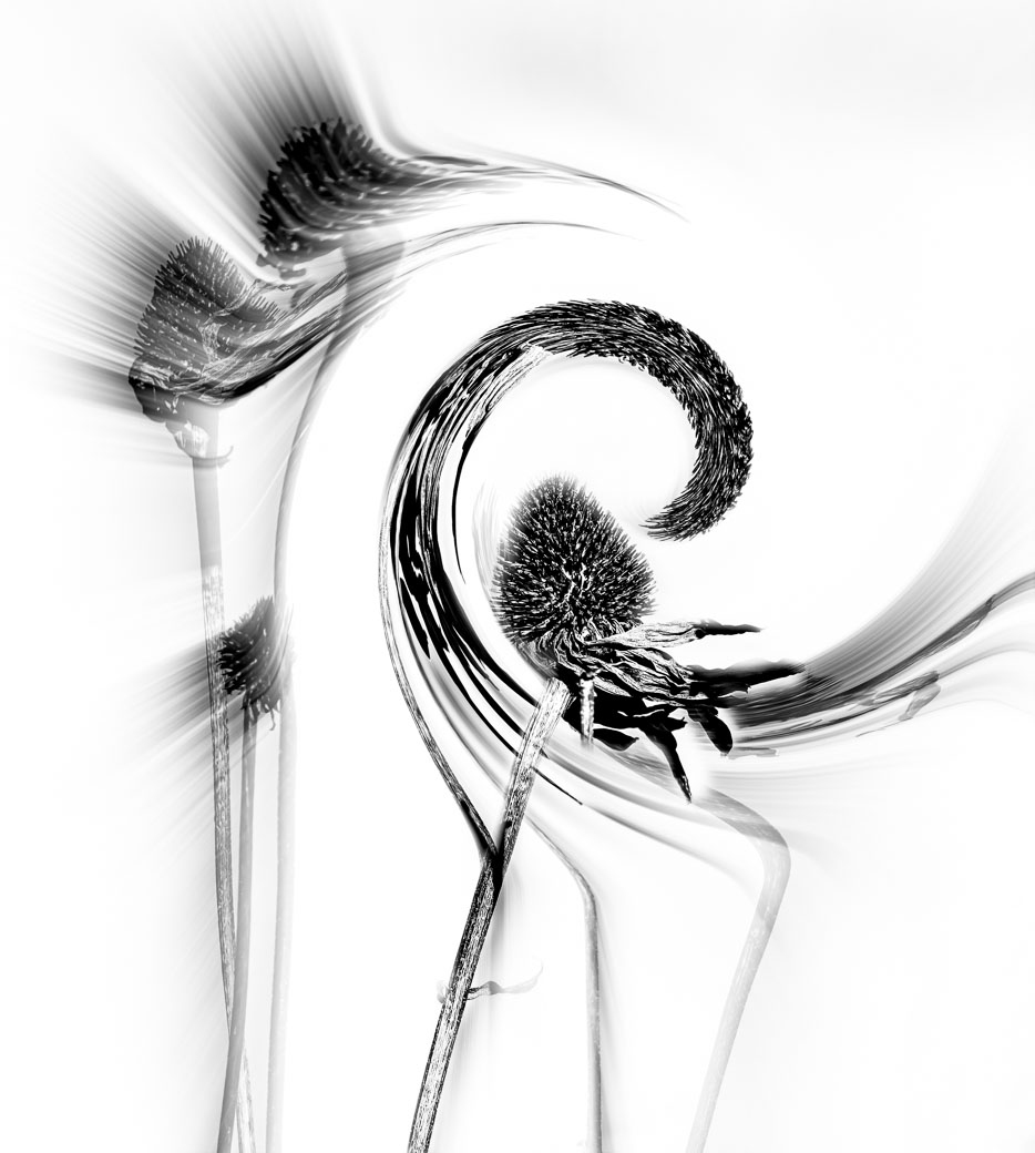
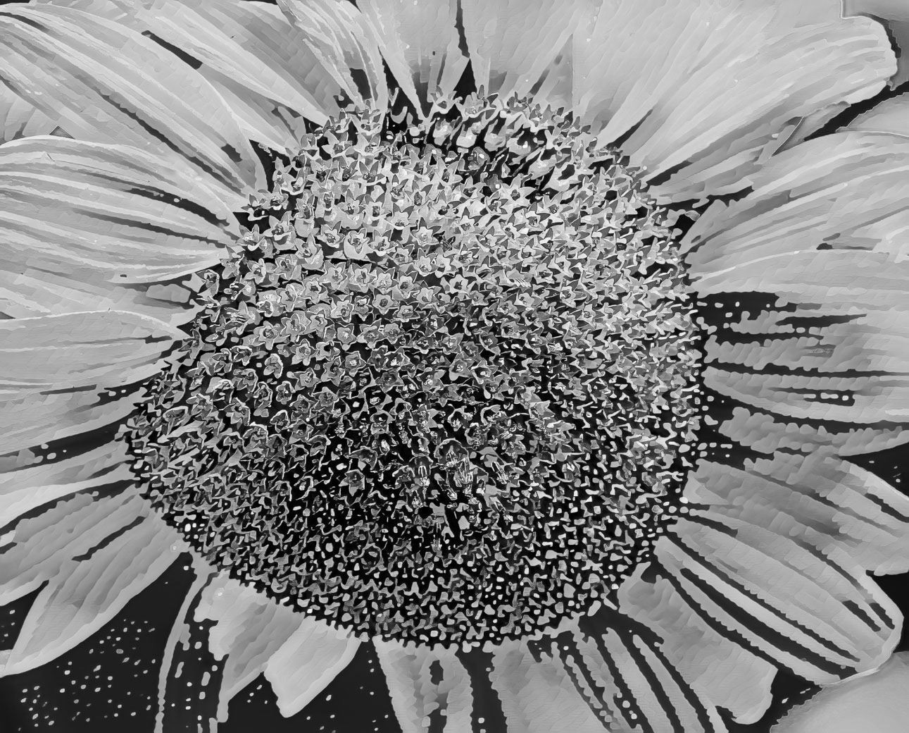
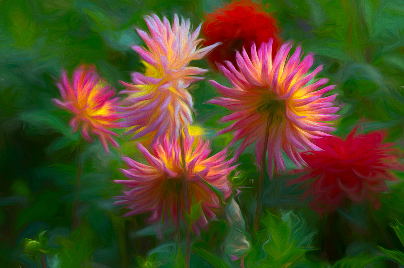
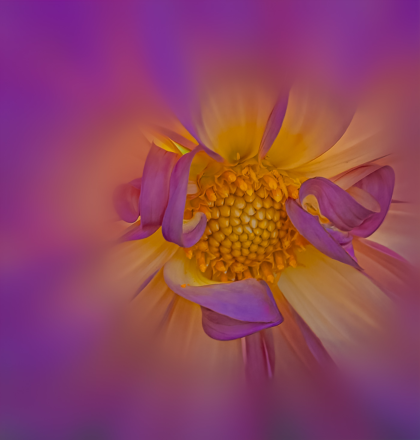
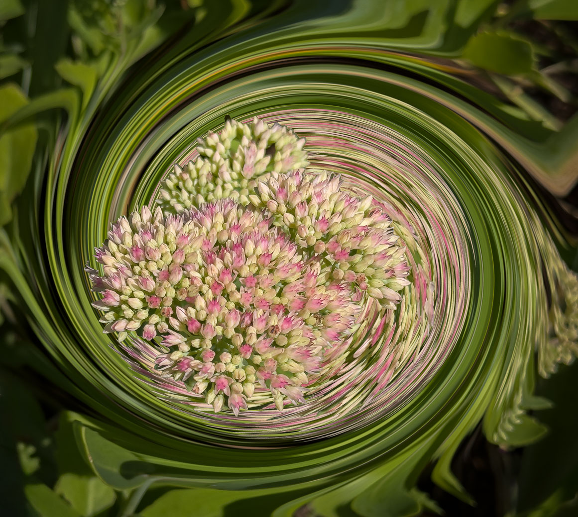
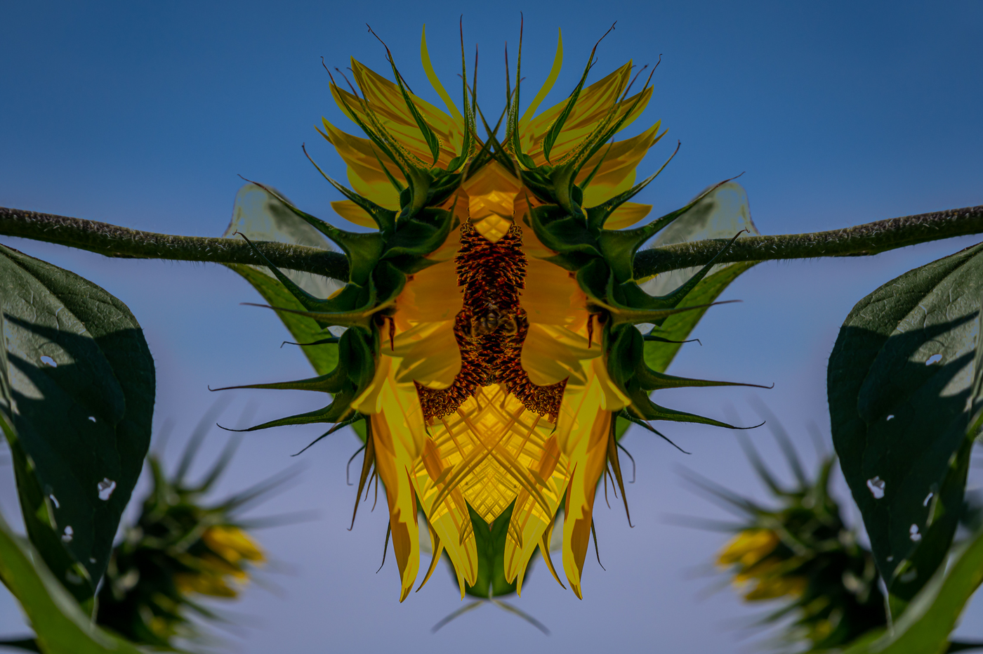
LuAnn, good to learn that you are finding the macro to your liking. This is a perfect example of seeing that does not have my passion for bold colors. Obviously I would of gone by this when selecting my tulip. I do however find your soft pink pastels in Original 2 a very compelling image because of the colors and increased saturation, from the Overlay I suspect, and as much as I Love B&W I would keep this one for use as a color ALSO. If anything I might of cut back on the whites, just a little, around the center of the flower. Great vision in picking out such a perfect tulip to photograph. |
May 3rd |
| 62 |
May 20 |
Comment |
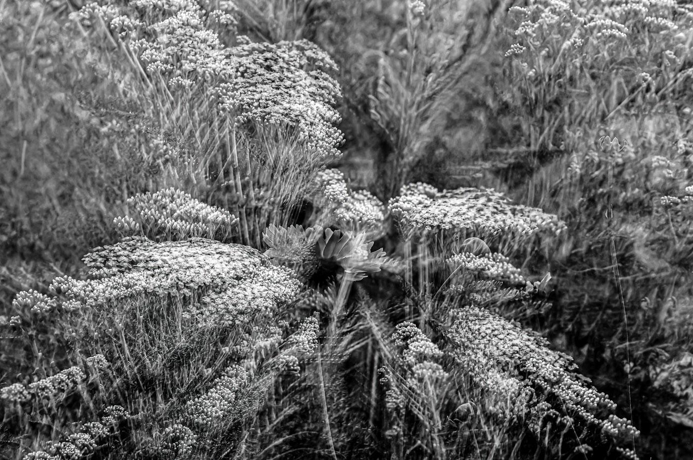
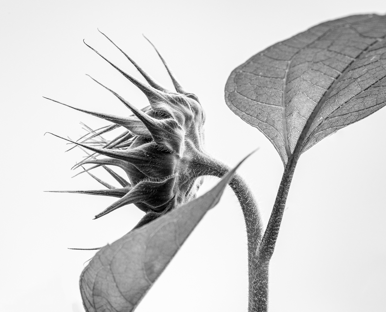
Welcome Emil. Happy to have you in our group. Beautiful IR images and landscape compositions I find with your name. I really like this image of the texture with the view underneath the black eyed Susies. Very sharp and good tonal range. I would of tried to compose with the top of the image having a darker background. My eye is drawn to the top right corner of the image and nothing is there. Cropping down to the top of the pedals, cuts that dark side of another Susy in half. And understand why you didn't. The real problem is finding many compositions for us older folks to get the underside of the flowers and then getting up from. Great vision. |
May 3rd |
10 comments - 0 replies for Group 62
|
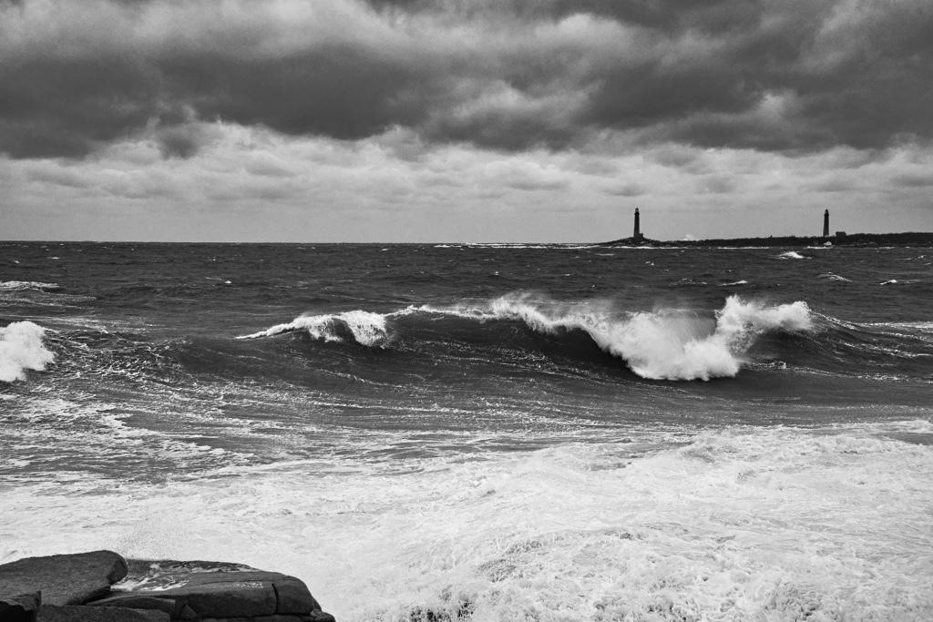
| 67 |
May 20 |
Comment |
Hi Larry. This is an exceptional shot. Besides that great light, I Love the bubble design in the wave. Never seen that, but I've never laid in such a position and shot at 1/2000 sec. Perfect composition and out of focus background just makes for a very nice image. |
May 3rd |
1 comment - 0 replies for Group 67
|
28 comments - 1 reply Total
|