|
| Group |
Round |
C/R |
Comment |
Date |
Image |
| 15 |
Feb 20 |
Comment |
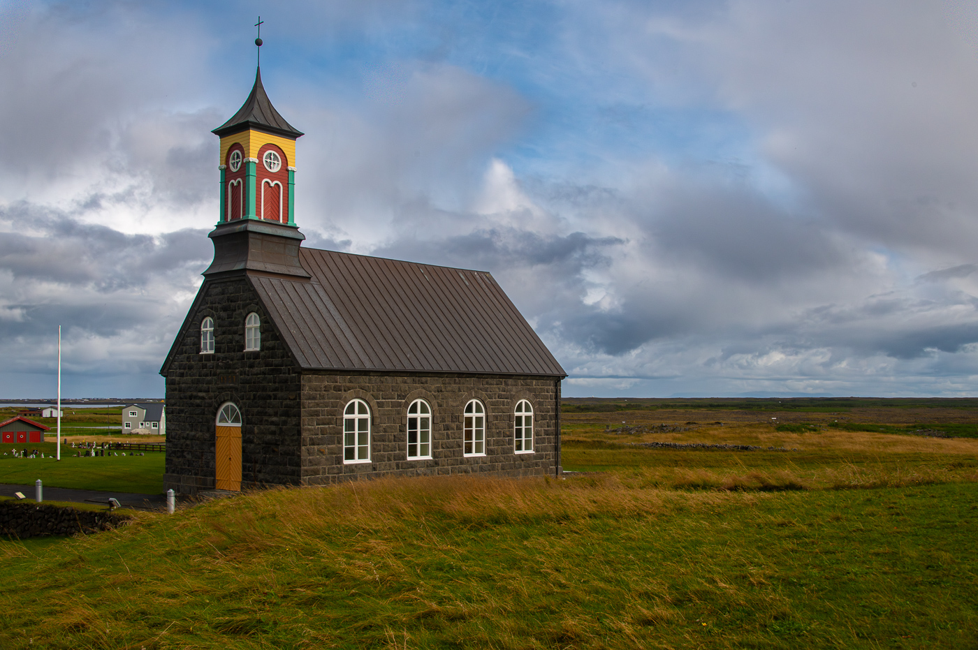
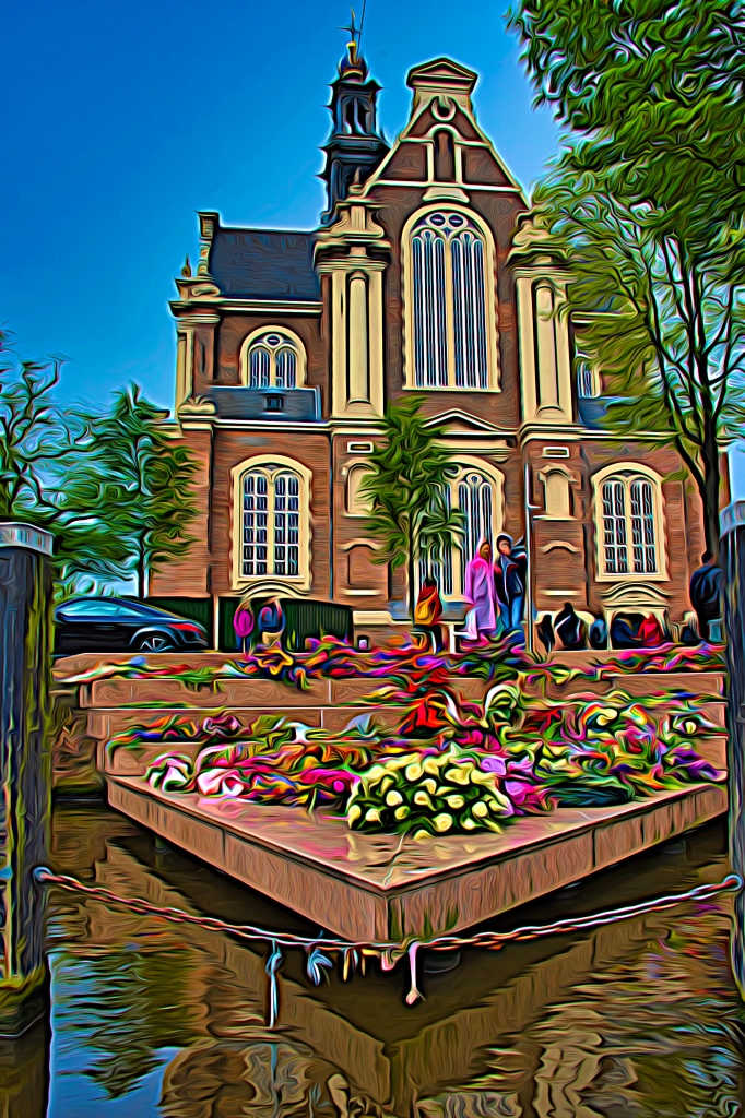
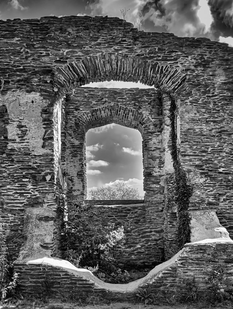
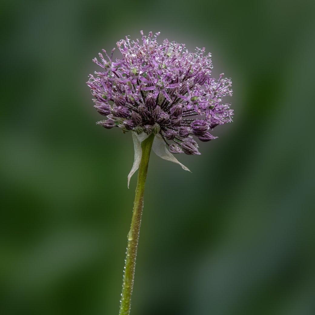
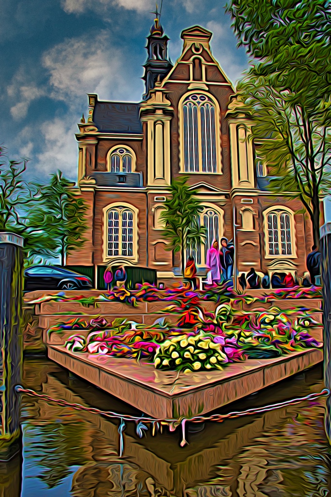
Rick. Here is a more interesting sky that I spent just a few minutes on. I made decision to not give it the Topaz treatment, and I wanted to use a blue sky (vs sunrise/sunset) because I like the colors of all the flowers and church. Your thoughts? |
Feb 27th |
 |
| 15 |
Feb 20 |
Comment |
Great capture of the "Portuguese Man of War" Jeri. Better to find it in the seaweed vs out in the water. Great focus. I would also suggest cropping some of the sand and making it 1024 on the long side. |
Feb 12th |
| 15 |
Feb 20 |
Comment |
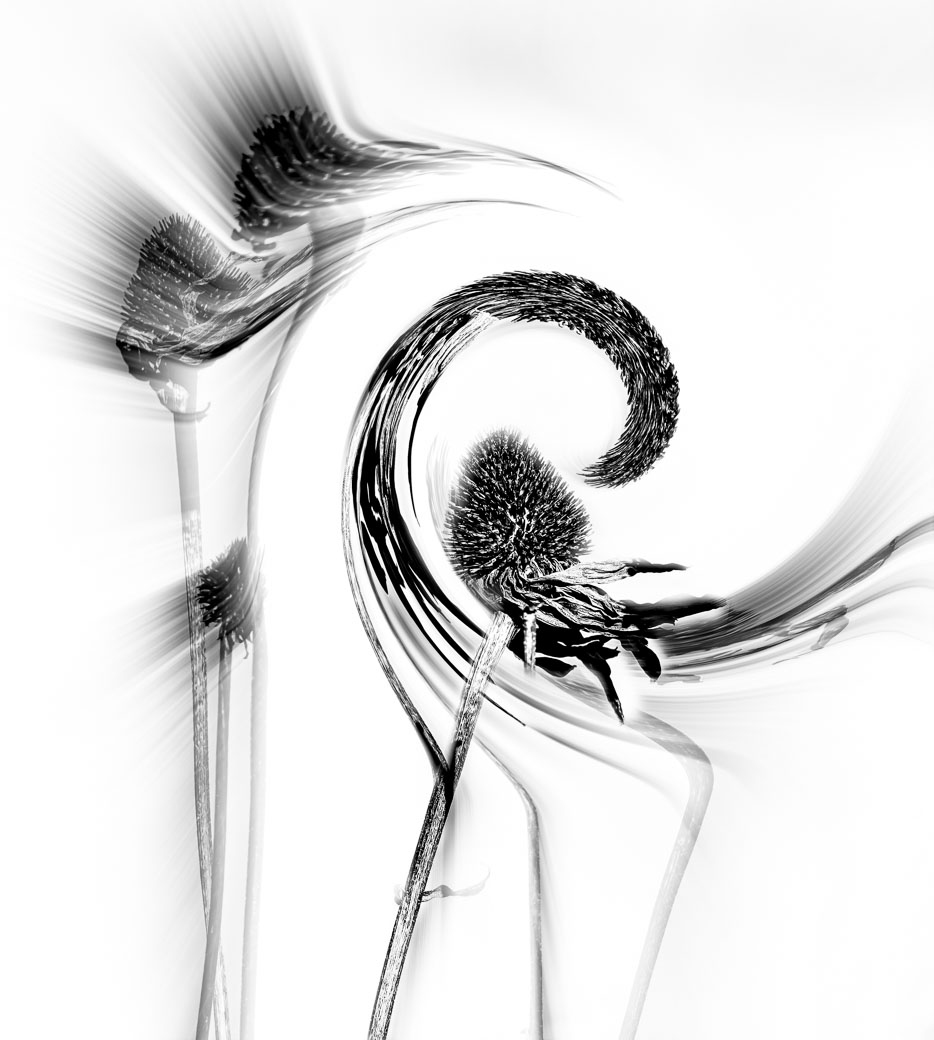
Great creative Rick. It makes for a very compelling image of memories. |
Feb 12th |
| 15 |
Feb 20 |
Comment |
Great image and processing. |
Feb 12th |
| 15 |
Feb 20 |
Comment |
Great capture Phil. Love the eyes and the background. |
Feb 12th |
| 15 |
Feb 20 |
Comment |
Great Creative Joan. |
Feb 12th |
| 15 |
Feb 20 |
Comment |
Image and Colors are beautiful and my only suggestion would be to leave more room in your framing so that the woman at the bottom of the image would not be cut off. I would not of removed the two women at the top of the frame as they probably are an important part of the story. |
Feb 12th |
| 15 |
Feb 20 |
Comment |
That's fine. I was unaware that some General groups call this creative and it shouldn't be entered. |
Feb 12th |
8 comments - 0 replies for Group 15
|
| 29 |
Feb 20 |
Comment |
Thanks Bill and everyone. I'm in Mono 62, I understand. I used the Creative for my local CC and thought I would post it here. On to next month!! |
Feb 20th |
| 29 |
Feb 20 |
Comment |
Thanks Bob. A Great Idea. I've made a version in B&W using tweeked Silver Efex Fine Art. and attached. Guess I was in a creative mood when I did this one and neglected making a B&W. Just goes to show there are images that look better in B&W. |
Feb 14th |
 |
| 29 |
Feb 20 |
Comment |
Bill, I'm not a Lightroom user, but think you did a good job processing. Stephan's suggestion of not shooting at the 12mm is right on, especially with trees and buildings on the edges. Your cropping could of been done in camera by simply zooming out to the 16-20mm . I prefer your colors especially the reddish roofs and the yellows. I have no idea what the real color of the roofs should be, but I always process for the more vibrant colors, but that's just my vision. |
Feb 11th |
| 29 |
Feb 20 |
Comment |
Tam, good focus on the birds eye, and the colors are right on and the composition is great. Some might be unhappy with cutting off the legs below the joints, but with this type of bird you went with the better composition. I would of used a higher ISO like 400 when hand holding and looking to get good depth of field on the bird. The longer lens made the background go soft and that is ideal. |
Feb 11th |
| 29 |
Feb 20 |
Comment |
Karen, you caught the moment that is for sure. Inside sports not easy. You nailed the focus just fine. I'm bothered some by the movement in the hands and the legs and wonder if the next time you could push up the ISO to 16000 and get to 1/500 sec to STOP MORE of the motion. Not sure if your camera will produce decent images at the higher ISO or not, but since you have the opportunity to shoot this same subject again I'd suggest you give it a try. |
Feb 11th |
| 29 |
Feb 20 |
Comment |
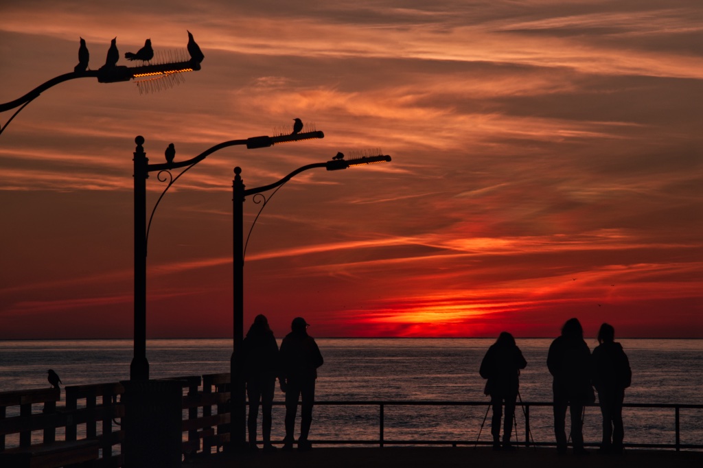
Judy, I agree with you that the reflections are very compelling. I wonder if you had shot from a higher level whether it would of changed the perspective. I do find the the white bottoms of the pier posts to be distracting. But it would be impossible to get the reflections and posts that were darker. I'm thinking I would give it a try in BW and flip the image horizontally. I downloaded your file to show my thoughts, but it seems to be a .php file that won't open on my Mac |
Feb 11th |
| 29 |
Feb 20 |
Comment |
Stephan, what a beautiful image and you proved that you did not need smooth water for these great color reflections. I might of been tempted to crop the brighter lights on the far left (at least to the lift side of the tower and maybe even to the right side of the ad wall) as I think they detract from the other colors. |
Feb 11th |
| 29 |
Feb 20 |
Comment |
Bob, I like the color version because of the beautiful colors and textures of the bricks. Great composition and I have no problem with the white sky. |
Feb 11th |
8 comments - 0 replies for Group 29
|
| 62 |
Feb 20 |
Comment |
Sorry for the delay. I've been editing many images from my latest photo excursion. I've taken suggestions and used the Luminar Dodge and Burn tool and hopefully I've improved the image attached. Thanks for the input, especially LuAnn.
Bob |
Feb 19th |
 |
| 62 |
Feb 20 |
Comment |
Thank you for your comments and ideas LuAnn. Please do not be offended. While photography is my passion, I shoot quite a few photos each year (5-10k) and there is a limit to my editing abilities, interests and time. I found you comments about leaving a place for your eyes to rest, insightful. I can't remember someone stating that before, but they probably have and I just have not remember. I've looked at both Redlin's and Yuri's images and find them worth the look, but I'm unable to translate their work into my images. Same goes for your suggestions. It's not you, it's my brain unfortunately. My wife gives me critiques and suggestions and only when she points out the fault do I get her point. She doesn't know photo editing skills so I am left with trying to fix on my own or moving on to another image. Your comments are nevertheless appreciated. Thanks |
Feb 14th |
| 62 |
Feb 20 |
Comment |
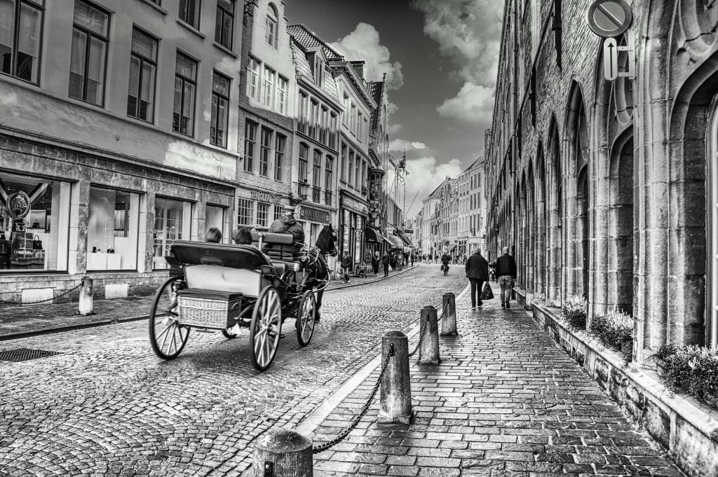
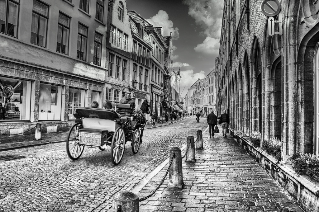
Thanks for your thoughts on the cobblestone street and the carriage. Since the original was in shadow, I wanted to make sure I could bring out the details of the street and the carriage which was originally a light wood. Pete, thanks for your fixing the keystoning and toning. |
Feb 12th |
| 62 |
Feb 20 |
Comment |
Israel you have a great eye for composition and lighting. I also like the darker version with emphasis on her face. |
Feb 12th |
| 62 |
Feb 20 |
Comment |
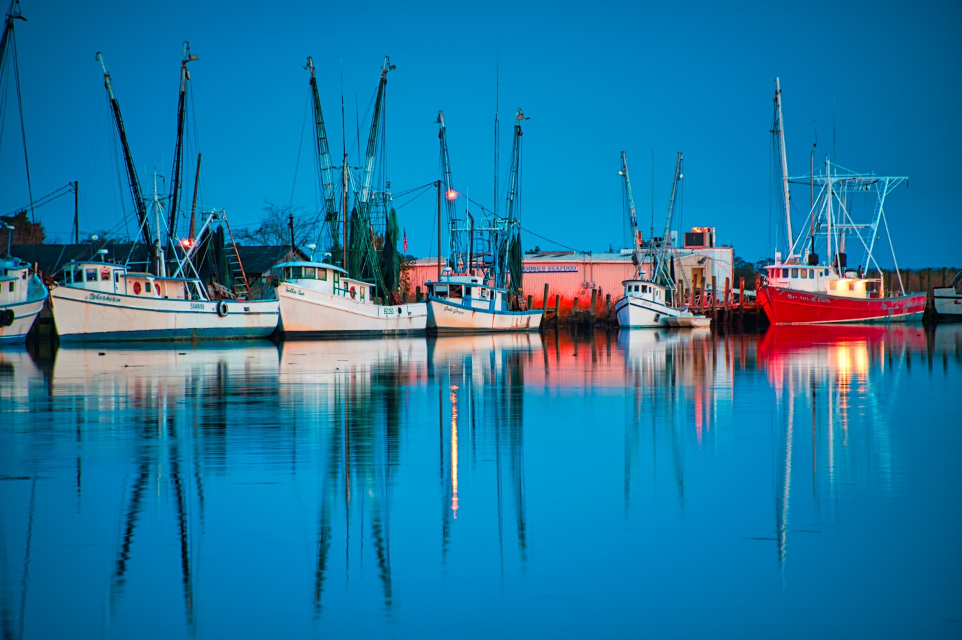
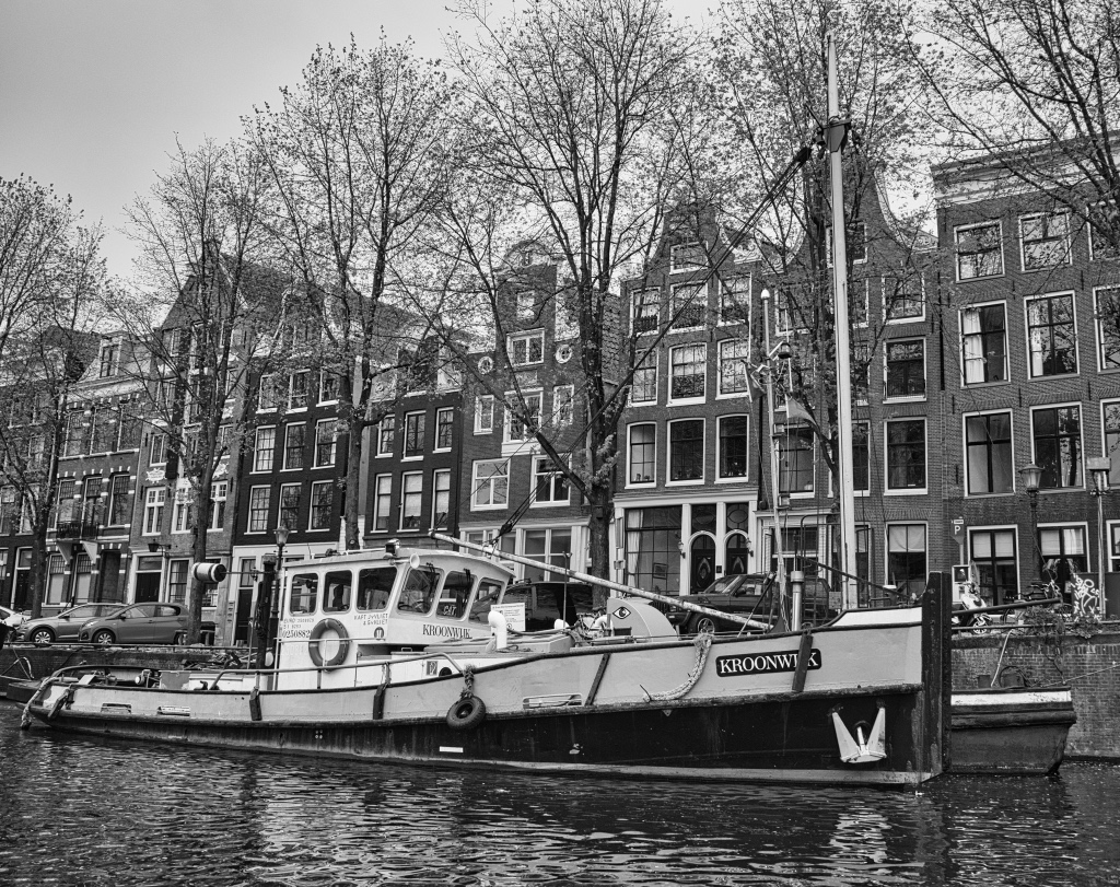
Gary, I really like what you have done here. Last week when I was in Georgia, I came across a similar shrimp boat at night. Wish I had taken the photo. Others were calling me as I had already used my "just one more" several times. I light the high contrast and will be surprised if you BW above is not the digital version. Just amazing how the digital files surpass the film images. |
Feb 12th |
| 62 |
Feb 20 |
Comment |
Another great portrait Julie. The eyes draw the viewer into the image. I agree with darkening the shoulder and cropping it so that the leading line performed by the hair bring you into those eyes. Very nice. |
Feb 12th |
| 62 |
Feb 20 |
Comment |
Pete, this is a great image that is technically perfect and with that compelling umbrella handle "hooking" the viewer to look further. As Gary mentioned, the image then comes together. |
Feb 12th |
| 62 |
Feb 20 |
Comment |
LuAnn, I agree with the comments above. You captured the moment. Very well done. If you use Silver Efex Pro2 I think you might be able to use control points on the yellow (bright) row of lights behind the head of the 2nd lady from the right. I think that is a tad too bright on the Mono version as a result of giving more light on the ladies faces. |
Feb 11th |
8 comments - 0 replies for Group 62
|
24 comments - 0 replies Total
|