|
| Group |
Round |
C/R |
Comment |
Date |
Image |
| 74 |
Sep 20 |
Comment |
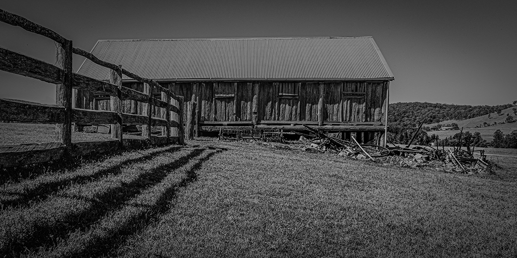
Thanks Angela
I was trying to frame the image as the fence was to be a leading line to the stable, but I failed to make the stable stand out.
|
Sep 24th |
| 74 |
Sep 20 |
Comment |
Hi Arne
To me I believe that the mono conversion works well as it makes the silos pop out of the image while the colour version is very dull. The image is very sharp and I love the way you have made the highlights on the stacks stand out to draw your eyes in. |
Sep 23rd |
| 74 |
Sep 20 |
Comment |
Hi Angela
Nice minimal image, you have captured the moon well and it is the only thing in the image so your eyes are drawn to the craters that you have darken. I like the mono conversion and it looks pretty sharp to me as well. |
Sep 23rd |
| 74 |
Sep 20 |
Comment |
Hi Bill
In my opinion the mono conversion works best. In the colour version you had to really look hard to see the b/w version they stand out and help to tell a story. |
Sep 23rd |
| 74 |
Sep 20 |
Comment |
Hi Ying
You must had plenty of time spent in the air while you were in Kenya looking at this picture and previous images. You have captured this image perfectly with the diagonals across the image and I like mono conversion but either image works well with me. Just a question, when I was taking pictures from the helicopter I was told because you are so high you camera is already at infinity and you should be at you lowest "F" stop number and speed above 2000. |
Sep 23rd |
| 74 |
Sep 20 |
Comment |
Thanks Ata for showing me this piece of history, in Australia are buildings are no older than 200 years. The conversion to mono looks good and the pattern of her dress really stands out. I agree with the others that you need to lighten her face and darken the sunlit areas behind her. Also as you were trying to show us a piece of history as well, why did you shoot at F4 and not F11 so that we had a sharp image right through the picture. |
Sep 23rd |
| 74 |
Sep 20 |
Comment |
Hi Haru
I can't add much to the other comments as Arne has definitely is putting you on the right track. After reading all Arne's comments and his mods and your latest picture I still thing you are missing the one comment that would make it a wall hanging picture and that is that you are still not removing the flower stem that appears straight behind the Dahlia |
Sep 23rd |
| 74 |
Sep 20 |
Reply |
Thanks Stephen, the overall effect of your changes is differently and improvement on my last attempt. |
Sep 14th |
| 74 |
Sep 20 |
Comment |
Thanks for the input, I have made some adjustments to add some contrast to the image, |
Sep 1st |
 |
8 comments - 1 reply for Group 74
|
| 94 |
Sep 20 |
Comment |
Hi Jeffrey
I like the sharpness and depth of field of the image, but to me the whole image is just to busy, there is nothing to fix your eyes on as many things are happening at once. Maybe you could pick just one bird and it's reflection and crop to it. |
Sep 25th |
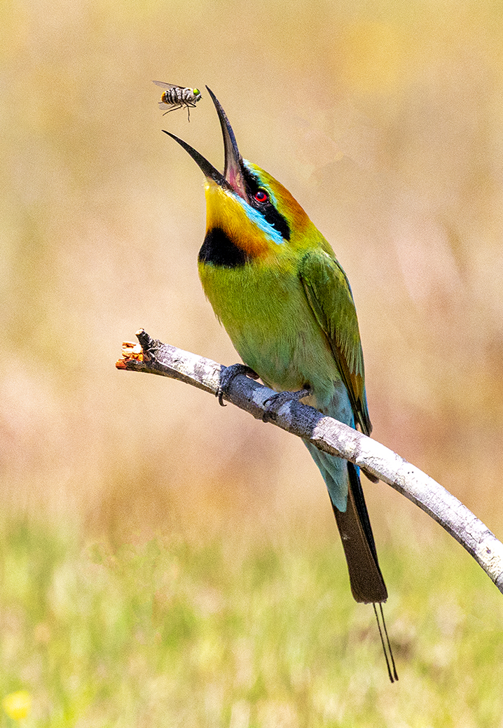
| 94 |
Sep 20 |
Comment |
Hi Donald
The composition looks good with the way you have positioned the fly on the stick running left to right. Even with the big crop the sharpness still looks good. |
Sep 25th |
| 94 |
Sep 20 |
Comment |
Hi Sarita
Beautiful capture of the butterfly, sharpness is spot on and you have got the depth of field correct as the butterfly is sharp from the head to its tail. On top of that you are telling us a story of how the butterfly is drinking the flower nectar. |
Sep 25th |
| 94 |
Sep 20 |
Comment |
Hi Sherry
Nice capture, very sharp and I like the way you have captured the water droplets from the egret flipping the fish. In my opinion I would have cropped as a 3 : 2 and remove the reflection as I feel it does nothing for the image. Also the egret to me looks a bit dark and could do with some lightening to help it stand out more from the water. |
Sep 25th |
4 comments - 0 replies for Group 94
|
12 comments - 1 reply Total
|