|
| Group |
Round |
C/R |
Comment |
Date |
Image |
| 74 |
Apr 20 |
Comment |
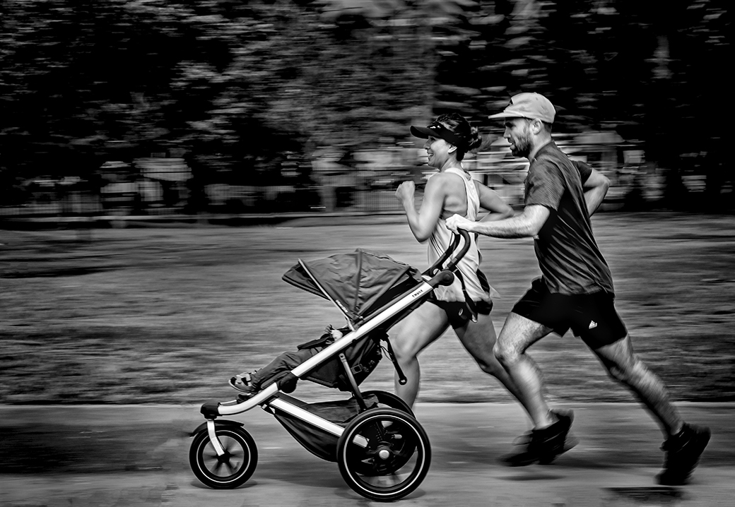
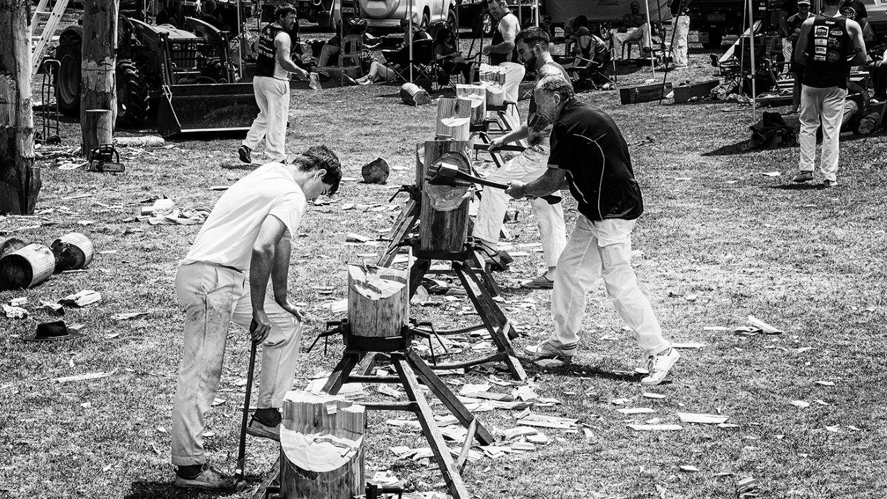
Thanks for all the comments, I think the different shades on the forearms and neck are the Australian workers suntan, the outside workers usually wear tee shirts |
Apr 18th |
| 74 |
Apr 20 |
Comment |
An a interesting image with its shadows and sharp edges of the canyon rims makes this image stand out in mono. I feel that that this image has been cropped in too much. I would have left the sky in place and the best part of the image is the line of canyons running from the bottom left hand side to the top right hand side which would have created a line for my eyes to travel throughout it. |
Apr 10th |
| 74 |
Apr 20 |
Comment |
Great example of street photography, you have got the depth of field spot on with the person pin sharp and the car and even the water bottle being slightly blurred. The mono conversion is better than the colour one with the bright red jacket being dull down and as a result my eyes are drawn first to his face. Other than that Arne's comments would make it an even better image. |
Apr 10th |
| 74 |
Apr 20 |
Comment |
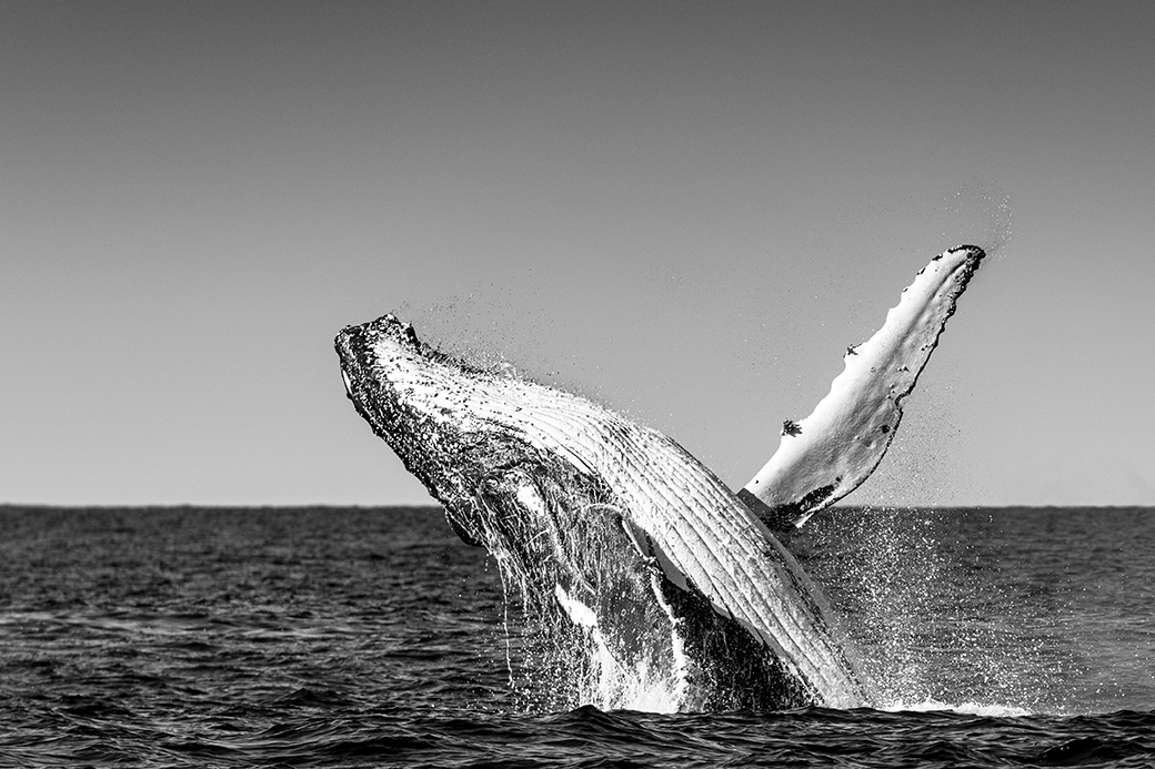
To me this is an a good example of minimisation in and image. In reality there is very little to look at except the bird and splashes. I feel that the mono conversion has been done well and definitely better than the colour one. |
Apr 10th |
| 74 |
Apr 20 |
Comment |
What can I say, I think Ying has done a pretty good job showing you what could be done and with Arne additional comments added it would make it even better. |
Apr 10th |
| 74 |
Apr 20 |
Comment |
To me the the white cloud above the building looks very creative and adds to the mood of the image. You have done well in photoshop to bring out the shadows of the right hand buildings which gives even more depth to the image. The tones throughout the image has been handled well, but I agree with the above comments in that it would have been nice to see a doorway or two in the building. |
Apr 10th |
| 74 |
Apr 20 |
Comment |
I feel that the composition of the image is is very nice, and the exposure is great, but to me the B/W image looks flat compared to the colour one. I think to make this image to stand out more editing needs to be addressed with the sky and some cropping to move the sun slightly left to the rule of thirds vertical and lift the horizon to the to horizontal line. Plus maybe darken the highlights of the sun as it seems to me that that are blown out. |
Apr 10th |
| 74 |
Apr 20 |
Reply |
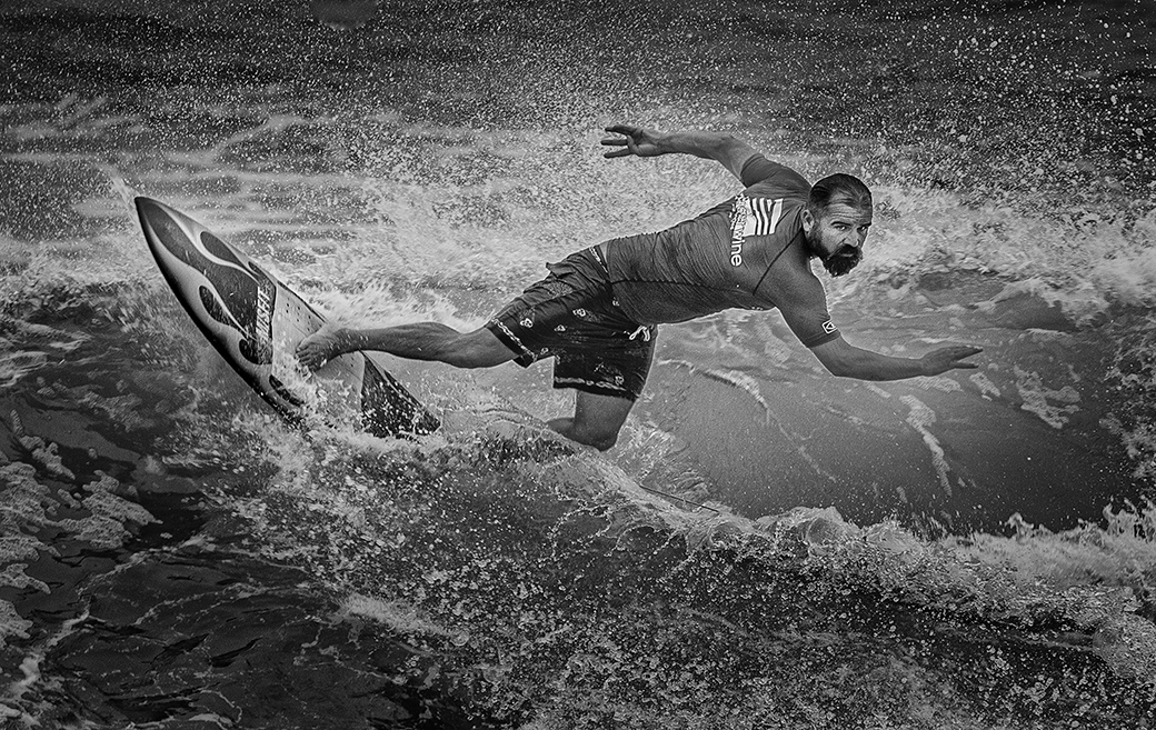
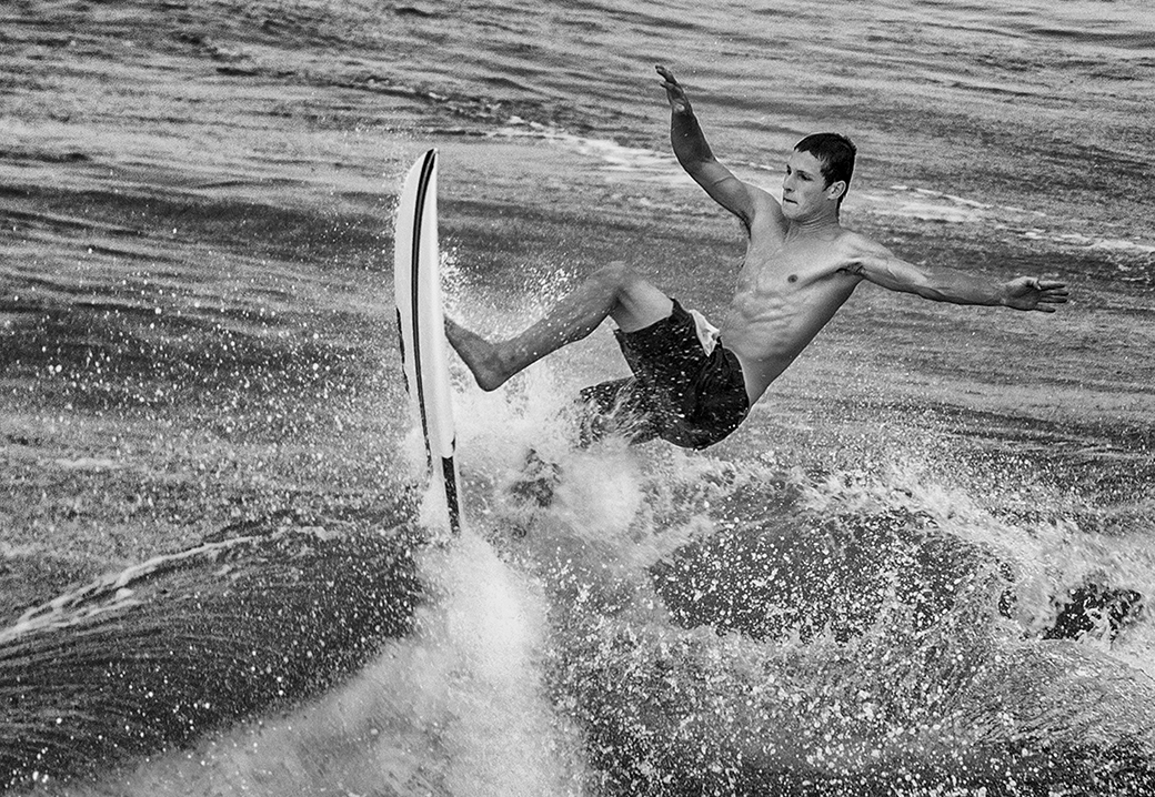
Thanks Ying for comments but I feel they your crop take away some of the movement of the surfboard |
Apr 7th |
| 74 |
Apr 20 |
Reply |
It was one of continuous shooting, the next one had him falling off the board |
Apr 3rd |
| 74 |
Apr 20 |
Comment |
Hi Ata
I
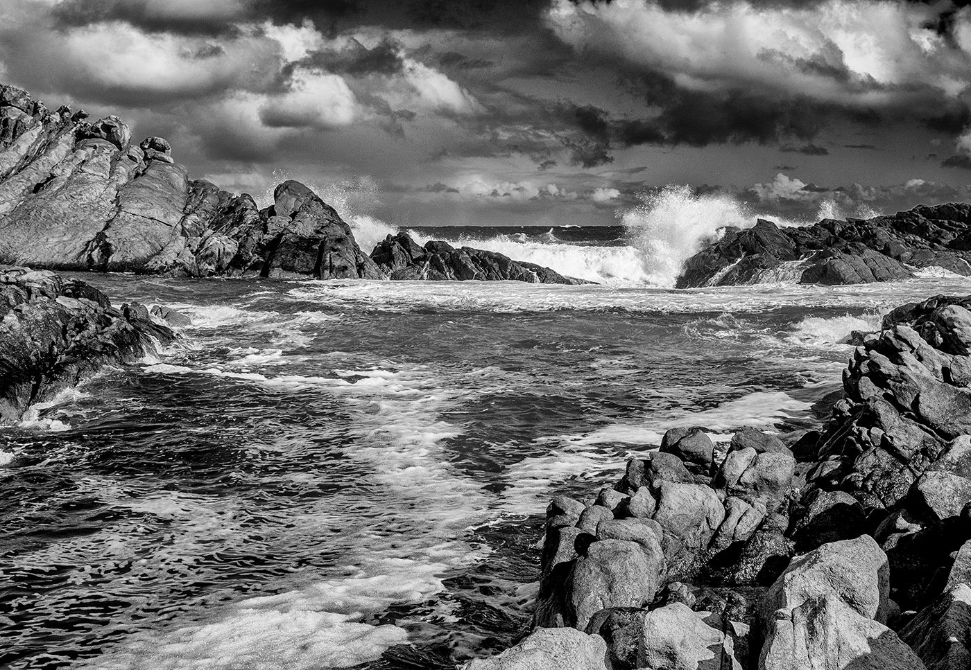
The surfers were surfing waves down a breakwall and a was able to get down the rocks to be level with them and was no more than 30 to 50m away. |
Apr 2nd |
8 comments - 2 replies for Group 74
|
| 94 |
Apr 20 |
Comment |
Detail in the feathers looks great as well as the highlight in the birds eye. I just wonder whether there is enough pixels to crop the image to a horizontal one to bring the stork to the front of the image. |
Apr 13th |
| 94 |
Apr 20 |
Reply |
Thanks to you and Sue for your comments, I tried your suggestion and it makes it a lot better picture |
Apr 11th |
| 94 |
Apr 20 |
Comment |
The composition of the stork is good placing it to the left allow movement. It appears to me that you have placed the focal point on the storks eye (which is correct) but by using f6.3 it appears to me that the back of the stork is soft and missing detail, maybe try F8 or F10 next time as there is no background to blur out. |
Apr 11th |
| 94 |
Apr 20 |
Reply |
Thanks |
Apr 10th |
| 94 |
Apr 20 |
Comment |
To me the face of this Coyote is lovely and the contrast between him and the grass creates a good composition. I feel that you still need to lighten up his face a bit more to help him stand out and just lighten his eyes separately to help the look into the viewer. |
Apr 10th |
| 94 |
Apr 20 |
Comment |
Lovely detail in the feathers and the head of the bird. Nice contrast between the bird and the green of the trees. I wonder if you gave and consideration to trying changing your F stop to maybe F6.3 or lower to try and blur out the background as it is still sharp. Also there maybe some blown out highlights on the neck of the bird but it may only be the lower quality of the image. |
Apr 10th |
| 94 |
Apr 20 |
Comment |
Nice colours and contrast with the animals and the fields of yellow. I think that this image should have been cropped more from top right hand corner as this will put the animals more into focus. Also the faces of the animals needed to be lightened so you can see their eyes. The other question is what are these animals, are they domestic or wildlife as domestic cannot be used in nature. |
Apr 10th |
| 94 |
Apr 20 |
Comment |
Great detail on the head, beak and chest of the bird. With the blur of the wings it gives us a sense of movement in the image. The depth of field is good with the background nicely blurred. It's a shame that you could not clean up the background first so that the stick poking through the bird was not there. |
Apr 10th |
| 94 |
Apr 20 |
Comment |
Good depth of field to have both birds nice and sharp. Exposure almost spot on with my only negative comment is the bee eater in the front seems to have slightly over exposed points on his wings. |
Apr 10th |
7 comments - 2 replies for Group 94
|
15 comments - 4 replies Total
|
